Don't wanna be here? Send us removal request.
Text
youtube
Group - Sophia , Kawai , Dana
Technology comes in so handy nowadays that it is so convenient for us to capture stuff while travelling. However, often times we do not actually look back on them which is a pity. So by compiling the clips of footages from trips, we try to take people down a memory lane--the sceneries in the clip do not show really "iconic" locations but pretty vague ones that most people would have experienced at some point in life, in turn creating a sense of collective nostalgia.
We decide to use more than one projectors because we want this to be a space where people can decide which corner they feel comfortable watching in a relaxing atmosphere. You can decide not to look at any of the projections but stare into the analog television because it is reminiscent of your childhood; you can fall asleep half-way because we love the phase between conscious and unconscious when we immerse ourselves in memories.
The glitchy take on this is also showing how most of the times, memories aren't actually what exactly happened, but as we recall it every time, we re-picture it with a different color according to the moment we remember it.
Sound: Daniel Birch - Sleep, http://freemusicarchive.org/music/Daniel_Birch/
Process and Experimentation on Kawai’s tumblr
0 notes
Photo


FINAL WORK & CONCEPT STATEMENT
Humans have the capacity to explore and discover the world. Whether it be climbing the highest peaks on earth or diving deepest depths of the ocean, there are still things yet to discover. Humans have made an imprint on the environment, directly and inadvertently. Due to human-induced modifications, the increase of greenhouse gas emissions has affected ecosystems, leaving them vulnerable. Particularly, the increase in water temperature has bleached coral reefs. In 2018, marine scientists have found that the 2016 ocean heat spike that affected The Great Barrier Reef has not only impacted shallow reef corals but has even led to the death of deep-water corals living 40m below the surface (Kimberly Riskas 2018). Thus, destroying habitats for marine creatures, affecting the marine food chain leaving these coral reef ecosystems more vulnerable and less likely to bounce back to its natural state.
My artwork portrays the marine environment in the twilight zone or disphotic zone, meaning poorly lit, which extends from 200-1000m below surface level (Oregon Coast Aquarium n.d.). This zone is where bioluminescent deep-sea creatures are found. I have used different markings and patterns to represent features of bioluminescent creatures. This has been influenced by aboriginal art, through symbols and meanings to represent narratives and to display knowledge of the land (Artlandish n.d.). Particularly the artist Wingu Tigima’s has influenced my artworks through the use of different styles. Tigima uses modern tools and techniques and uses desert imagery from her sand drawings, rock art and body paintings (Mary Knights 2011). Tigima’s artworks display an array of earth colours through the hues of red, oranges and purples creating multilayered and textured artworks.
Thus, ecosystems should not be a remnant of history but something humans should explore and discover to see the wonders and natural beauty of the world. I have also been influenced by Louise Zhang, as she explores different elements of colour combining the idea of innocence contrasted with the perverse and monstrous (Louise Zhang n.d.). I have incorporated the abstract expressionism style of painting through the marking and markings that fill the page, creating a sense of urgency to highlight the threat humans have on the environment. By using non-conventional art practices and materials, my artwork is contemporary which can resonate with today’s audience.
My process involves experimentations both physically and technologically. Originally, I used acrylic paint to create random circles with colour and squiggles with cardboard and then imported the painting to Photoshop. When the painting was inverted, it resembled bioluminescence as the colours were bright and luminescent. I then experimented with different patterns influenced by bioluminescent marine animals such as jellyfishes, aquatic worms, eels, and octopuses. To create these patterns, I used strips of cardboard to act as a compass, creating circles to symbolise jellyfishes. I also used the edges of the cardboard to create the lines for the tentacles. I further experimented with the complementary colours through the influence of James Turrell’s artworks as he explores the vivid contrast between colours and the physical presence of light. I experimented with using two colours to create the circles which were effective. This was then created into bioluminescent corals which used complementary colours. However, I had difficulty tying the artworks together as they each had different randomised techniques. Then I used Photoshop to link all these images together, using repetition and placement of octopus rings in empty spaces of the paintings. Lastly, I used the idea of the flashlight and searching for these marine creatures by using After Effects. I used a layer mask to subtract a circle to show the painting in the background. I experimented with the feather of the circle to make it more realistic and seem like an actual flashlight. The flashlight effect represents the way humans are exploring uncharted territories and have the potential to discover. However only to realise that soon enough there will be nothing left to discover as the environment has been destroyed.
Ultimately, ecosystems and creatures that live within should not become an unfortunate event in history. But rather, today while we can, we must consider to what extent we humans are neglecting the natural environment before there is nothing is left to enjoy.
Artlandish n.d., accessed 15 September 2018, <https://www.aboriginal-art-australia.com/aboriginal-art-library/the-story-of-aboriginal-art/>
Oregon Coast Aquarium n.d., accessed 15 September 2018, <http://oceanscape.aquarium.org/explore/subecosystems/twilight-zone>
Knights, M 2011, accessed 16September 2018, <https://www.daao.org.au/bio/wingu-tingima/biography/>
Rikas, K 2018, Cosmos, accessed 15 September 2018, <https://cosmosmagazine.com/biology/deep-water-corals-also-bleaching-badly>
Zhang, L n.d., About, Louise Zhang, accessed 15 September 2018, <https://www.louisezhang.com/About>
2 notes
·
View notes
Photo
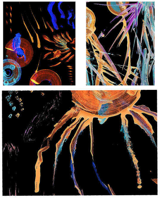


Experiment:
I wanted to capture the details of the markings I have made with paint. I took a snippet of some paintings I have made and arranged them in Photoshop. The top left image does not really tie in well with the other two images with a lighter orange.
I then used after effects to have the idea of a flashlight to look around the painting, as if someone was underwater and looking around. I experimented with different masks and using subtract to keep the image of the painting behind. I played with the tempo and the ‘Mask feather’ of the circle to see what worked well. The use of the flashlight effect allows the work to be unified rather than different paintings of different designs.
4 notes
·
View notes
Photo
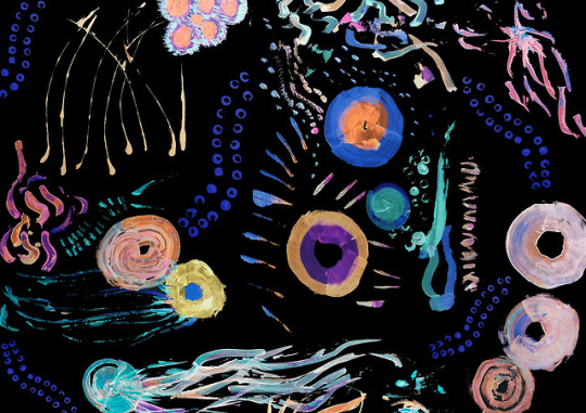
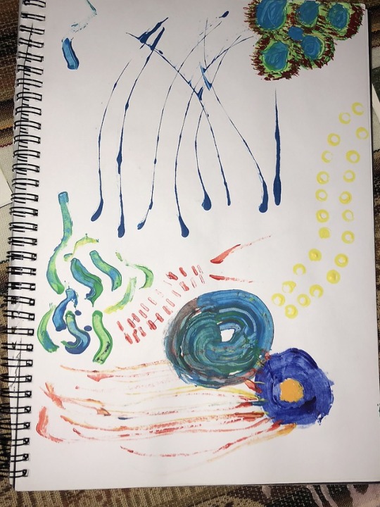


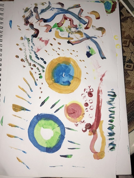

Experiment:
I made more paintings that used complementary colours. I then thought about how I was going to unite these individual paintings in my book. I used the octopus markings to tie all the paintings together and to fill in space using layers in Photoshop. When I make more I will create more corals and small dots to represent different organisms.
3 notes
·
View notes
Photo
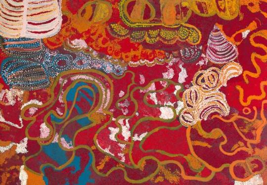
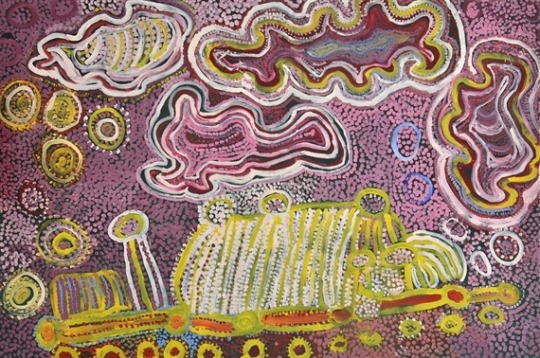
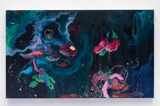
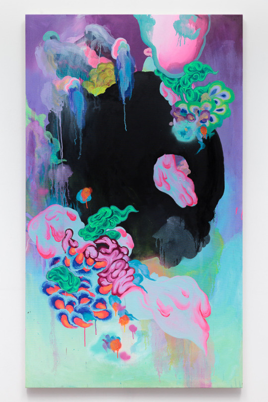
Artists of influence:
Wingu Tingima
Kungkarangkalpa – Seven sisters (2009), synthetic polymer paint on canvas, 141.0 × 201.5 cm,
Pukara (2005), Acrylic on canvas
I like Tigima’s use of colour and line as she fills up the whole canvas to create an artwork.
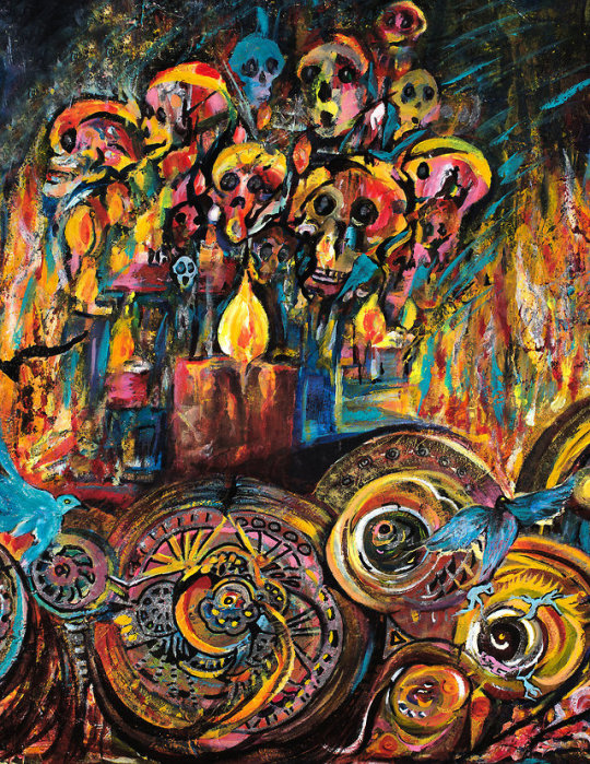
Louise Zhang
Ascent of the Blob, 2016, Acrylic, oil, glitter and resin on canvas, 183 x 107cm
Phantom Underground, 2015, Acrylic, oil, glitter and resin on canvas, 152 x 91cm
Zhang uses vibrant colours that are contrasted with dark backgrounds that have influenced my work.
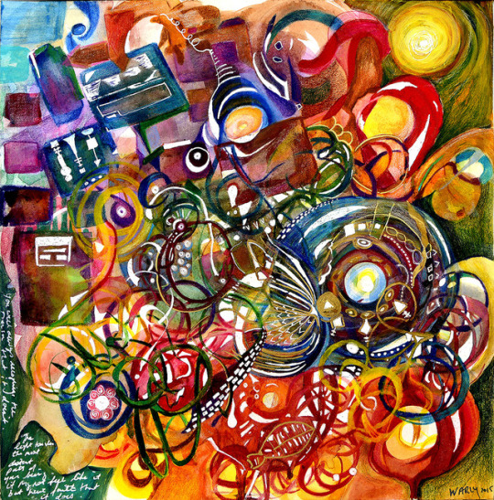
Dorothy Warly - The Healer, The Tragedy
Warly’s use of colour and different types of hues are seen through her work. I like how she uses circles, curved lines and patterns in her work. There is a sense of busyness and life within her work.
1 note
·
View note
Photo
Experiment
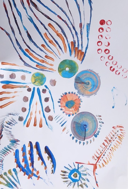
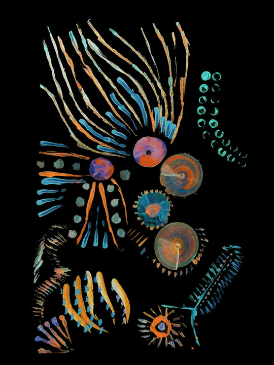
More inverted paintings.
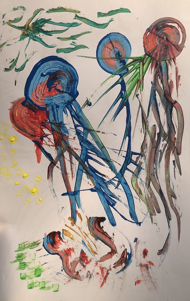
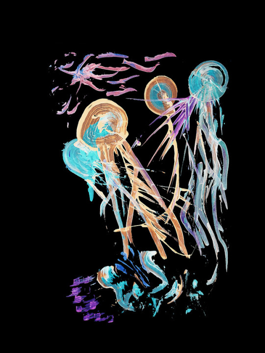
The first one was more controlled in the way I created designs and patterns. I kept using my technique of a piece of cardboard to create the circles and the tube to create the rims.
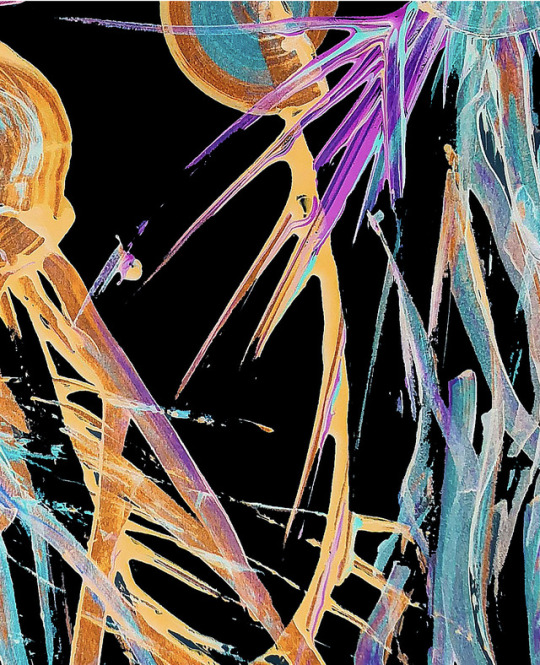
The second painting was more abstract expressionistic as I merged the paint together to show the different tentacles of a jellyfish. I also zoomed in to an aspect of the painting which I quite liked.
These paintings are similar in the way that they use the same colours and are inverted, however the styles are quite different. This can cause less cohesion with the overall work, and how I will curate and pick which style I will be using for my final work.
2 notes
·
View notes
Photo


Experiment
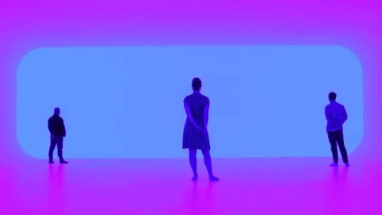
Creating a palette/samples of each of the colours I am using, helps me identify the inverted colours which allows me to know what to put together.
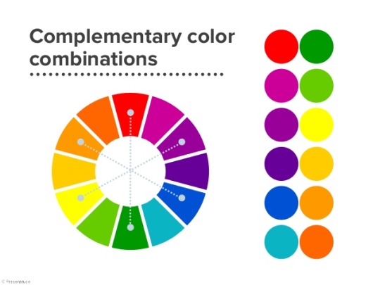
Trying out the use of two complementary colours with the circle pattern to represent an octopus. I have been influenced by James Turrell and the use of complementary colours and his fascination with light.
1 note
·
View note
Photo
Experiment:
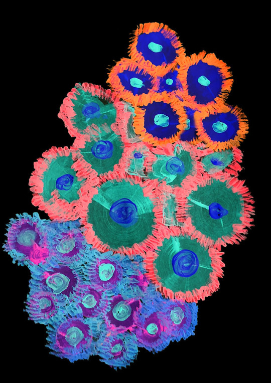
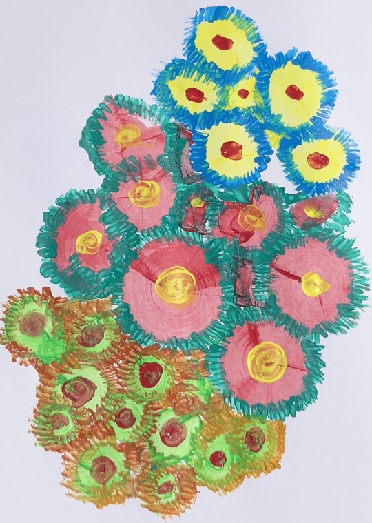
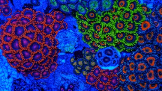
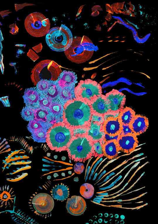
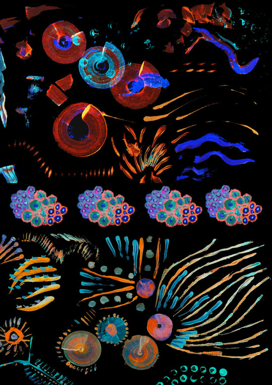
I wanted to explore bioluminescence within a marine environment by focusing on corals.
I found that bioluminescent corals contain interesting colours and patterns. The corals natural have complementary colours, for example the blue on the outside and the orange on the inside.
I used only acrylic paints and slithers of cardboard to create the corals. I dipped the cardboard into different colours and made a circle by using the cardboard like a compass. I then used the edge of the cardboard to add the texture around the circle.
The blue and yellow paint really effective when it was inverted and it resembled the corals.
I also experimented with combining everything together in one document. However I think the corals are very different to the markings made and if blended, should be the central aspect of the work.
5 notes
·
View notes
Photo

Experiment/Research:
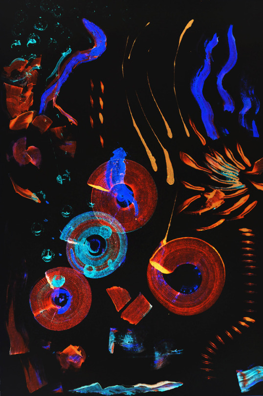
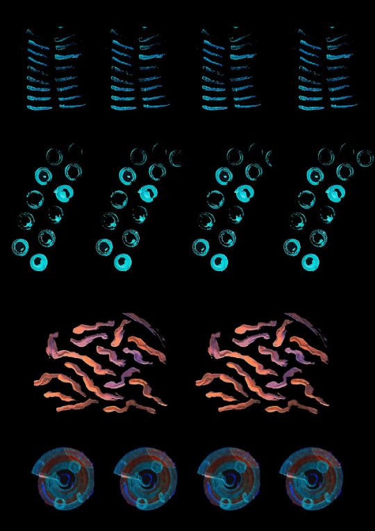
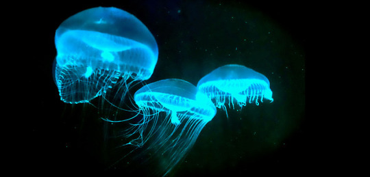
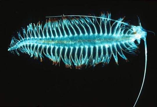
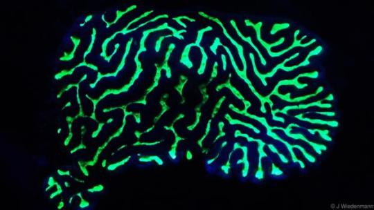
Bioluminescence is found in many marine organisms. They can be found in jellyfishes, aquatic worms, eels and deep sea corals. Some bioluminescent creatures use light in order to communicate. I wanted to create an artwork about bioluminescence and the way that humans have discovered these organisms, but to what extent are we willing to keep searching for these new wonders of the world. I have used primary coloured paint and inverted the colours on photoshop (1st image). I then used repetition of different patterns found in these organisms (2nd photo). It reminded me of dissection and the way that people study organisms for scientific purposes.
Source:
http://awesomeocean.com/guest-columns/glow-dark-sharks-like-raves/
https://www.hakaimagazine.com/features/secret-history-bioluminescence/
http://www.bbc.com/earth/story/20150625-the-corals-that-glow
https://earthnworld.com/top-10-amazing-bioluminescent-animals-planet-earth/
1 note
·
View note
Photo

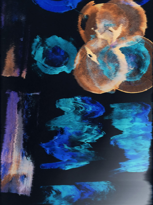
Assessment 2 Experimentation:
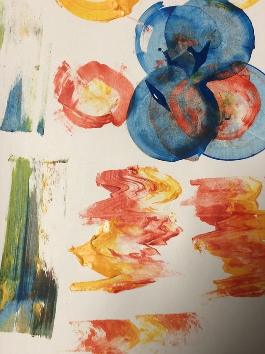
I wanted to try and create these glitch like patterns with paint. I used a piece of cardboard and primary coloured paint. I then exported the photo into photoshop and inverted the image and added a wind effect to create texture. I also experimented with the layer masks and different paint brush types.
I then thought about changing my question about binaries to the humans and environment question as the circles and the colours reminded me of bioluminescent animals in the deep ocean.
2 notes
·
View notes
Photo
4. Contemporary art and design often looks at the idea of constructed binaries, such as man/woman, soft/hard, straight/gay, dirty/clean, organic/synthetic. Considering the history of these ‘pairs’, how can art and design interrogate these binaries and offers new insights?
Final Poster
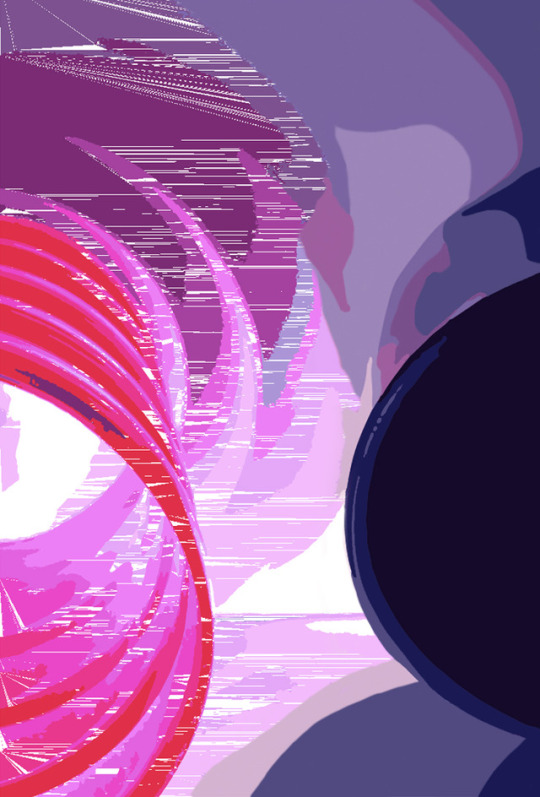
Control is the power and one’s ability to influence behaviours, decisions and events. However, no control is the complete opposite, where there is uncertainty and random occurrences. The concept of control and no control is portrayed in my poster seen through the unpredictable nature of technology and the directed use of technology. Sometimes people often get caught up in the digital world. Technology has become domesticated and become a norm in our lifestyle.
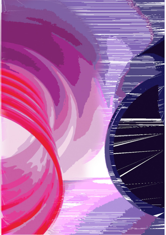
I have taken an image of household objects to represent the idea of how easily technology has become as a casual and personal item. I have used the objects of two different cups, pink and blue. The pink being transparent and curve liked and the blue being a ceramic mug. I took images of the cups next to each other and imported it into Illustrator. However, when I used image trace (16 colours) in illustrator (RGB mode) it glitched and displayed weird and random patterns. I wanted to explore the stark contrast between two textures and to show elements that are controlled and not controlled. Using a layer mask in Photoshop I layered both images, half glitched and half that was filled with areas of distinct colour by using the paintbrush tool. I have also decided to portray my poster digitally on a screen to show the how we live in a digital society and the prevalent use of technology within our lives.
I have been influenced by glitch artists Heitor Magno through his use of contrasting colours, Jeremy Nealis’ use of texture, and Ferrucio Laviani’s idea of the binary of craftsmanship and technology where there is tension between something well-constructed and something that is chaotic and random.
3 notes
·
View notes
Photo
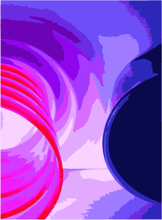
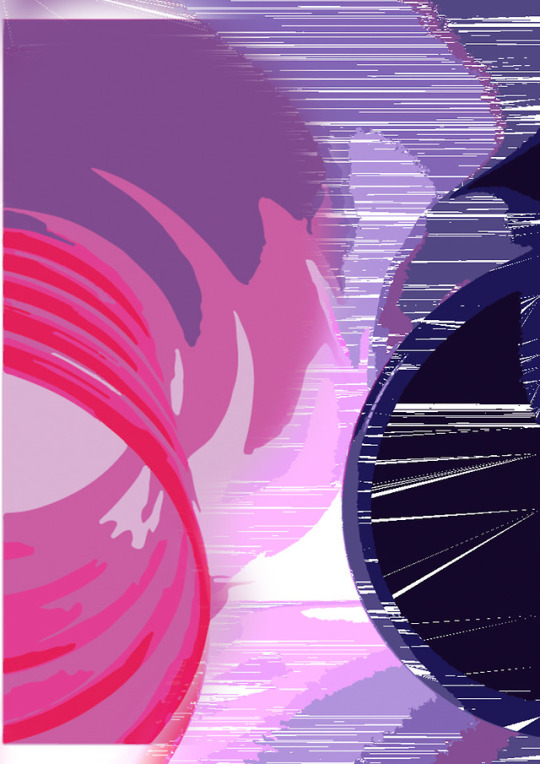
Experiment
I have decided to go back to the images I had of the cups. I experimented on illustrator with image trace (16 colours) and then exported the image into photo shop and added a layer mask to make it half glitchy and half smooth. I wanted to portray the idea of control and chance, the randomness seen in one side and the structured/planned artwork on the other
1 note
·
View note
Photo



Experiment
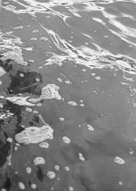
I used the same glitch in illustrator, but with different images I took with a 35mm camera. One was an image of water with black and white film and the other with Kodak 200 coloured film. I liked the aesthetic of the glitch in the water photo, but I felt like it would be a bit plain.
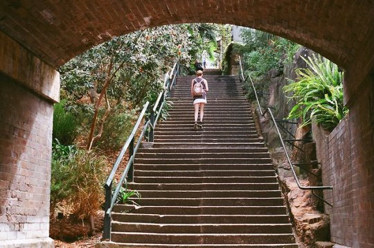
With the second photo, I exported the glitched photo into photoshop and used a layer mask to create half of the photo with a glitch and the other half being the original. I liked the idea of two different worlds, the digital and the real world and how people get caught up in social media and technology and miss out on the beauty of the real world. I also liked the texture contrasted with each other.
0 notes
Photo
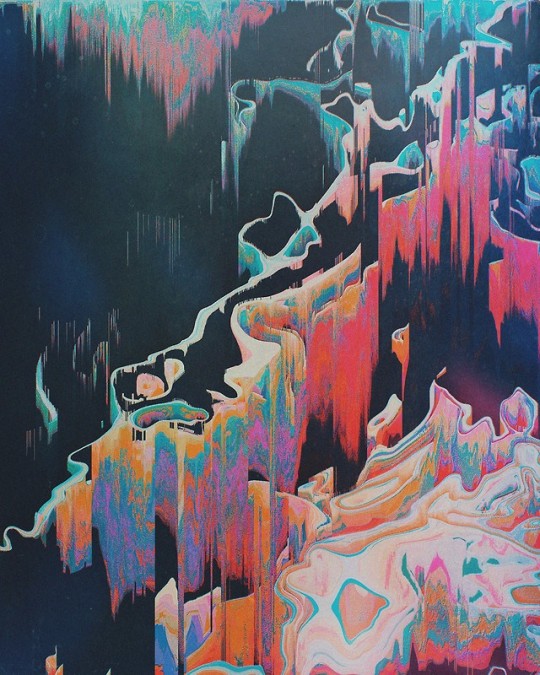
Influence - Jeremy Nealis
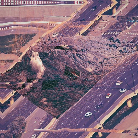
Nealis is a glitch artist who plays with dimension and space using a pixel-sorting process. I like the use of colour in both of these artworks and the contrast between textures especially seen in the first artwork. He also uses the binary of digital/natural elements by creating mountain landscapes.
Artwork 1. rshutrh (2016)
Artwork 2. frhrnrgī (2016)
0 notes
Photo
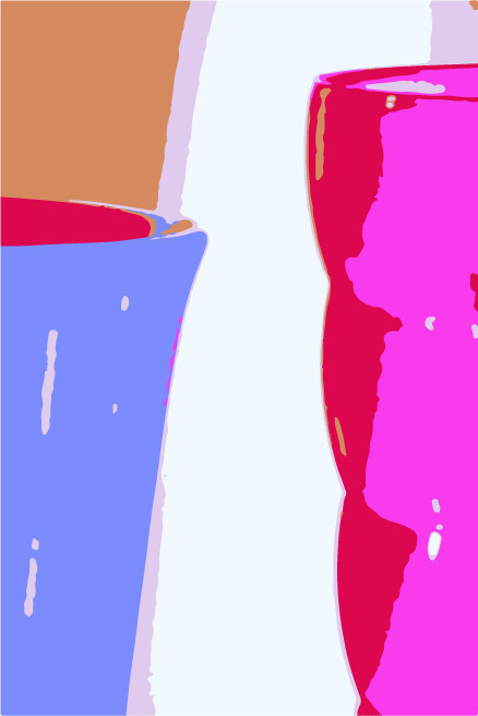
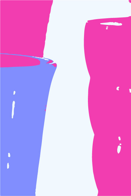


Experiment
I experimented on Illustrator by using image trace with 6 colours and 3 colours on CMYK. However, I didn't really like the outcome and the way it left jagged edges.
Then I used the RGB mode on Illustrator and it created a glitch within the image, creating these cool patterns.I liked the way it added texture to the image and the object.
0 notes
Photo
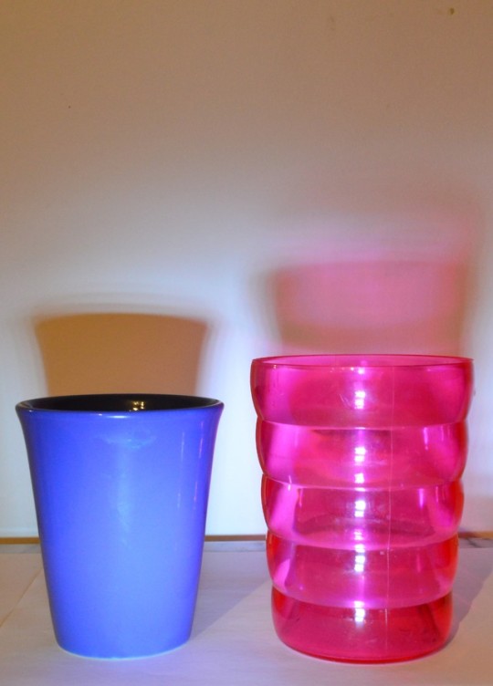
Experiment
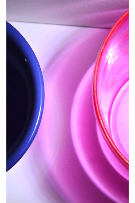
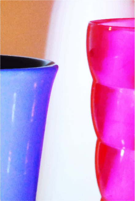
In this experiment I explored the binary of different textures/opacity of objects. I took images with a dslr of the cups and shone a flashlight on the cup to create a shadow that would reflect off of the cup. It gave me different patterns, especially with the pink cup.
I then took the photos into photoshop, cropped the image and used the adjustment layers of hue/saturation and brightness/contrast. (3rd image)
1 note
·
View note
Photo
Influences
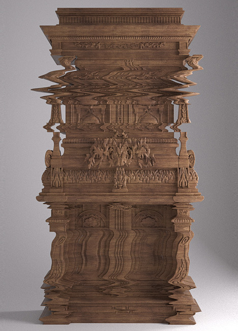
In Ferrucio Laviani’s series ‘Good Vibrations’ (2013), he created a wooden cabinet that was carved and controlled by a computer. He wanted to incorporate different styles such as Neo- Renaissance furniture. Laviani states that he was interested in ‘the quality of the craftsmanship and the low-quality image distortion.’ Laviani uses the binary of old/new and the craftsmanship/computerised technology. Laviani has influenced my work through the of household objects as the main idea, and the mix of different styles all integrated into one piece.
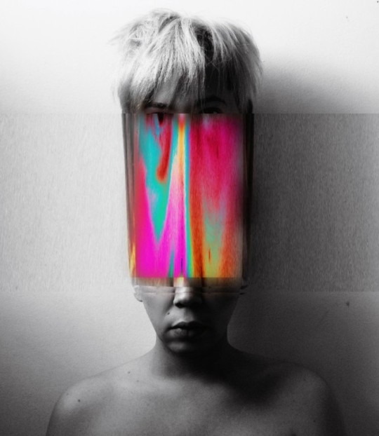
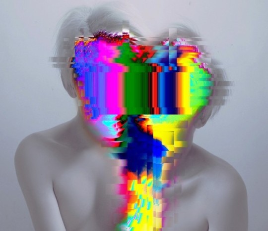
In Heitor Magno’s glitch art, he uses double exposure and then layers glitch images, distorting the picture. His concept centres around the idea of how technology affects human behaviour. He uses monochromatic colours agains the bright vivid glitch images. Magno has influenced my work through the vivid glitches and the use of technology to layer the images. Also through creating contrasting moods within the work (loud/soft colours, distorted/smooth).
Chalcraft, A. (2013). Good Vibrations by Ferruccio Laviani for Fratelli Boffi. Available: https://www.dezeen.com/2013/03/14/good-vibrations-distorted-cabinet-ferruccio-laviani-fratelli-boffi/. Last accessed 10th Aug 2018.
Shi, D. (2017). Glitch Artist Attempts to Synthesise Brains with Wavy Alien Landscapes. Available: https://creators.vice.com/en_au/article/8qp97p/aertime-glitch-artist-attempts-to-synthesize-our-brains-with-wavy-alien-landscapes. Last accessed 10th Aug 2018.
n/a. (2017). Selfie Glitch Art By Heitor Magno. Available: http://www.hungertv.com/feature/selfie-glitch-art-by-heitor-magno/. Last accessed 10th Aug 2018.
0 notes