#kenya hara
Explore tagged Tumblr posts
Text


"Architecture for Dogs"
Courtesy: ADI Design Museum
#art#design#stairwell#stairway#architecture#staircase#stairs#staircases#dog#dog house#adi design museum#bow-wow#bolero#kenya hara
66 notes
·
View notes
Text

Kenya Hara / Nippon Design Center (NDC) / Hatori Press / Ryojo / Book / 2015
62 notes
·
View notes
Text


MUJI: Cleaning
17 notes
·
View notes
Text


The transcendent aggressive banality of 2002-era MUJI is something to behold, all hail Kenya Hara and the fact that this ran in magazines.
4 notes
·
View notes
Text


Hiroshima Appeals
#hiroshima appeals#ヒロシマ・アピールズ#graphic design#design#art#hiroshima#japan graphic design association#jagda#kashiwa sato#kenya hara#susumu endo#masuteru aoba#ikko tanaka#kazumasa nagai#upload
14 notes
·
View notes
Text
Snow 白


#photography#penf#olympus penf#olympus#travel photography#snow#winter photography#winter#manchester vermont#vermont#northeast#north star#white#白#kenya hara#hara Kenya
0 notes
Text
CTS B Compulsory Question 2
youtube
Frank Lloyd Wright is a master of modern architecture who successfully realized his artistic vision. He pursued a design philosophy based on the belief that "architecture should be an extension of nature," striving to create a harmonious relationship between buildings and their natural surroundings. The design of Fallingwater is a prime example of this fusion with nature, emphasizing the seamless integration of the structure into the environment.
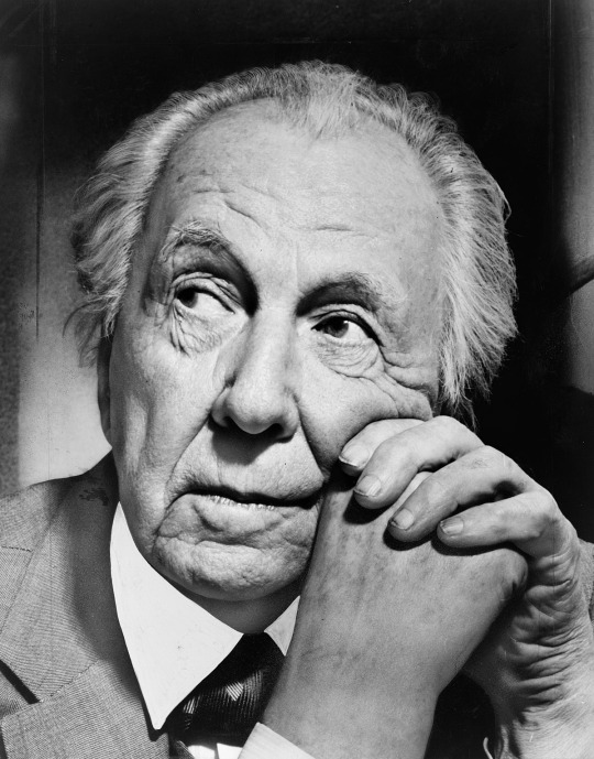

Through this example, As a young designer, I continue to solidify my vision and identity. By experiencing various fields of art, I have clarified my interests and characteristics. One key realization from my creative process is my deep affection for depiction. For instance, I created a work titled "Time" when I was 18.

Dedication to a single work over an extended period resembles a form of training. My designs embody my characteristic of being 'detailed and precise.' Infusing my efforts into my work is my strength, and this dedication is reflected in my poster designs.
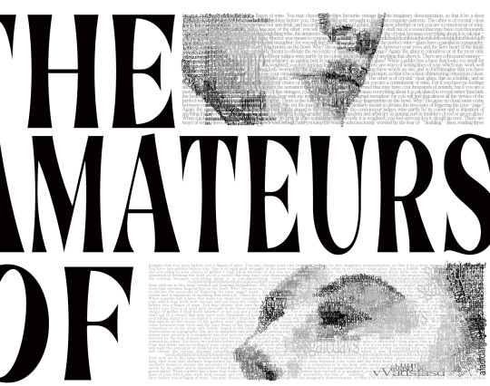
Additionally, I am skilled at drawing and depicting the forms necessary for design. I have enjoyed creating animations and illustrations since I was young. This experience has helped me develop the ability to create various styles of characters and illustrations defined by their unique features and messages.

I have always dreamed of becoming a design leader who effectively realizes my design vision and helps the team grow together. In five years, I aim to be an art director who leads a design team, using valuable insights to ensure clear communication with clients, ultimately satisfying them.
To become an expert in the design field in the future, it is important to start building a foundation in design theory and history now. Based on the invaluable experience I gained from participating in the 'Reimagine The Future ai' competition, which focused on creating and showcasing future architectural designs, I am particularly interested in researching how design can harmonize with AI and enhance user experience. To deepen my understanding of this, I plan to pursue both a bachelor’s degree and a master’s degree in related fields.

A smart designer can be defined as someone who adjusts design solutions according to the situation, like a chameleon, while also inspiring others. To become such a designer, a deep understanding of design history and contemporary trends is essential. Additionally, understanding various cultural and social contexts is important.
Among the design works that successfully understand and combine history and tradition, I would like to highlight the 'Refined Rangoli Lamp' designed by Vijaya Mohan and Jarrod Lim, which successfully combines an understanding of history and tradition. What impressed me most about this piece is how it preserves the artistic essence and cultural expression of Rangoli while creating industrially produced metal products.
youtube
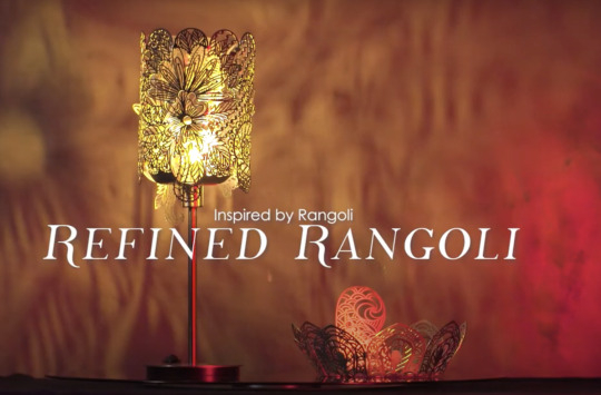
In my future design journey, I aim to pursue a similar balance, creating works that embody both cultural values and modern practicality.
(~476 words)
References:
shade, light and. “Home Inspiration Great interior designers: Frank Lloyd Wright.” Pooky Lighting, 15 February 2023, https://www.pooky.com/blogs/inspiration/great-interior-designers-frank-lloyd-wright. Accessed 1 November 2024.
Digest, A. (n.d.). Inside One of Frank Lloyd Wright’s Final-Ever Designs | Unique Spaces | Architectural Digest. YouTube. https://youtu.be/6L7NnZWeW-s?si=a2fBk-K5ccxv7VwA
Districts, the Art. “Art and Identity: Exploring the Intertwined Threads of Self and Culture in Creative Expression — the Art Districts.” the Art Districts, 18 April 2024, https://www.theartdistricts.org/news/art-and-identity-exploring-the-intertwined-threads-of-self-and-culture-in-creative-expression. Accessed 15 November 2024.
Fu, Katherine K., Maria C. Yang, and Kristin L. Wood. “Design Principles: The Foundation of Design.” Volume 7: 27th International Conference on Design Theory and Methodology ,2 August 2015, extension://efaidnbmnnnibpcajpcglclefindmkaj/https://dspace.mit.edu/bitstream/handle/1721.1/120030/v007t06a034-detc2015-46157, accessed 10 Nov 2024
Fuller, Buckminster, et al. “In Conversation With Karim Rashid.” Love That Design, 31 March 2020, https://www.lovethatdesign.com/article/in-conversation-with-karim-rashid/. Accessed 12 Novr 2024
sg, R. (n.d.-a). Craft X Design – Refined Rangoli. YouTube. https://youtu.be/woqIi4X6G38?si=dxjQCrzqS3ut_zI_
National Heritage Board, 'REIMAGINING TRADITIONAL CRAFTS: THE NATIONAL HERITAGE BOARD’S CRAFT X DESIGN SHOWCASE', 9 July 2022, extension://efaidnbmnnnibpcajpcglclefindmkaj/https://www.nhb.gov.sg/-/media/nhb/files/media/releases/2022/media-release-craft-x-design-showcase.ashx, accessed 12 Nov 2024
Ragavendran, Srinidhi. “National Museum of Singapore's Craft x Design Showcase: Traditional Craftworks With A Contemporary Spin.” DANAMIC, 13 July 2022, https://danamic.org/2022/07/13/national-museum-of-singapores-craft-x-design-showcase-traditional-craftworks-with-a-contemporary-spin/. Accessed 12 Nov 2024.
#Youtube#art vision#rangoli#art strength#hara kenya#ai art#ai#artificial intelligence#interactive design#future plans#frank lloyd wright#architecture
0 notes
Text
ANDREA BRANZI_CIVILIZATIONS WITHOUT JEWELS HAVE NEVER EXISTED
La figura di Andrea Branzi è piuttosto originale : architetto, designer, studioso, animatore culturale è stato tutto questo o forse niente di tutto questo specificatamente, ma certamente la sua carismatica figura ha lasciato un originalissimo e indelebile segno nel mondo delle arti visive. Mi piace ricordarlo anche come curatore di mostre e, di una tra le più particolari per concezione che mi sia capitato di visitare in Italia e fuori d’Italia, ovvero “Neo Preistoria. 100 verbi”, tenutasi alla Triennale di Milano nella primavera del 2016 (con Kenya Hara): un’esposizione di oggetti di autori anonimi che hanno fatto la storia dell’umanità. Branzi fu anche “compasso d’oro” alla carriera nel 1987, ma certamente più che un designer, penso sia stato un poeta degli oggetti (creati da lui o da altri poco importa). La piccola, ma puntuale mostra di 10 Corso Como Gallery, intitolata “Civilizations without jewels have never existed”, merita certamente una visita. Non ci sarebbe civiltà senza gioielli: questo presupposto pone l’attenzione sulla dimensione antropologica della vita e sui suoi valori segreti e immateriali di cui il gioiello, nel suo significato culturale e simbolico, è ancora portatore. E i gioielli di Andrea Branzi sono davvero inconsueti, ma soprattutto hanno qualcosa di ancestrale, legato ad un mistero “essenziale” e non al semplice capriccio del suo creatore. Mi torna in mente un trucco dei vecchi lupi di mare per vedere nel buio della notte, ovvero quello di non guardare avanti mentre si naviga, ma di fissare un punto nel vuoto leggermente laterale e ciò permette di intuire visivamente quello che sta loro di fronte. Nello stesso modo, per interiorizzare la bellezza di questi gioielli, questi si possono contemporaneamente anche ammirare nelle fotografie di Malou Swinnen che accompagnano (e commentano) l’oggetto, in particolare quelli della serie “Silver & Gold”. Inutile nascondere che nella ricerca dell’artista c’è qui, ma anche nelle altre produzioni di oggetti e arredi, una rottura decisa con quella teoria del disegno razionalista che discende in via diretta dalla Bauhaus: ghirlande d'oro e d'argento, corone e collane scintillanti sono i gioielli che ornano il corpo umano in un paesaggio, esaltandone l'aura con foglie ed elementi naturali e sottolineando la dimensione mistica dell'ornamento, nel suo significato primordiale di mezzo per avvicinare l'uomo al divino e che appartiene più alla cultura antropologica che a quella orafa. Lo stesso discorso vale per gli oggetti ibridi della serie Wood and Stones del 1995, che si modellano in forme archetipiche delle arti applicate in Silver and Wood del 1996, con i bizzarri servizi da té divenuti ben presto pezzi da museo. Presenti in mostra anche poltroncine e sedie della celebre serie di sedute Domestic Animals degli anni 1983-85. Tra gli oggetti in scala monumentale, le opere “Trees & Stones” presentate nel 2012 a New York nell'omonima mostra alla Friedman Benda Gallery, tra cui è qui esposta Stones 2A, tronchi e pietre, nella loro unicità di oggetti naturali. Molto spesso è lo sguardo contemplativo dell’artista a creare oggetti d’arte che hanno già lo statuto di oggetti, ma che vengono elevati ad opere vere e proprie , grazie alla intenzionalità dell’artista stesso che sembra indicarceli. Su scala urbana, Branzi studia il rapporto tra arti applicate e città fin dalla fine degli anni Settanta, e quindi dobbiamo ricordare il “Grande Vaso” a Gand del 1999 del quale è presentata qui una versione piuttosto grande, costituita da due vasi di colore blu e giallo, basati su un gioco di corrispondenze e scale diverse. In “Domestic Animals” del 1983-1985 Branzi gioca con la smaterializzazione degli spazi cittadini, dimostrando un certo eclettismo. Una mostra di un artista affascinante e multiforme ed assolutamente fuori dagli schemi. Da tutti gli schemi.


5 notes
·
View notes
Text
Culture is a reflection of human desire. - Kenya Hara (fom the book 'White')
2 notes
·
View notes
Text
SDL Artist Research - International
Kenya Hara (Graphic Designer) - "White", 2010
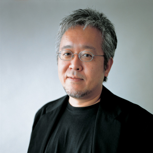
Kenya Hara is a Japanese graphic designer and curator who has made a name for himself through his innovative and minimalist design approach. Hara often incorporates elements from traditional Japanese aesthetics and philosophy, which has helped him shape the design language of MUJI, a Japanese lifestyle brand, during his tenure as the art director. Throughout his career, Hara has emphasized the concept of "emptiness" in design, which encourages users to interpret and imagine things for themselves. He believes that design should not be dominant but instead should create a harmonious relationship between the user and the object.
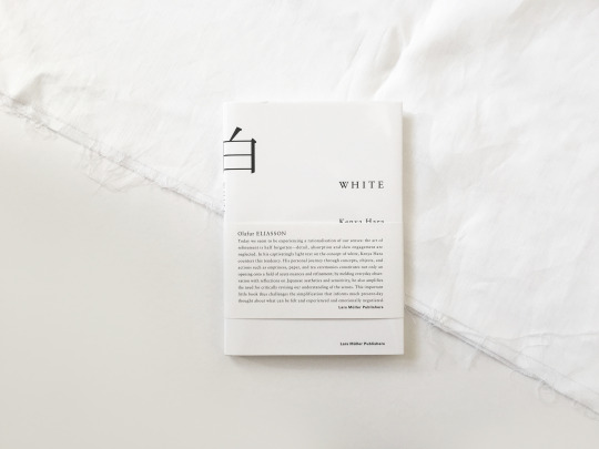
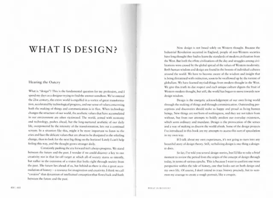
His book: "White", has a minimalist aesthetic and a clean type grid. Elements are going in a vertical direction, which is an interpretation of traditional Japanese text. The works are simple, elegant, yet legible and effectively deliver the messages. Colours are also very simplified and were used to code a design section. I resonate a lot with the cleanliness of these designs, and I am inspired to cut down all the unnecessary details to portray a minimalist yet practical typographic experience.
Max Ernst (Artist) - The Gramineous Bicycle Garnished with Bells the Dappled Fire Damps and the Echinoderms Bending the Spine to Look for Caresses, 1921
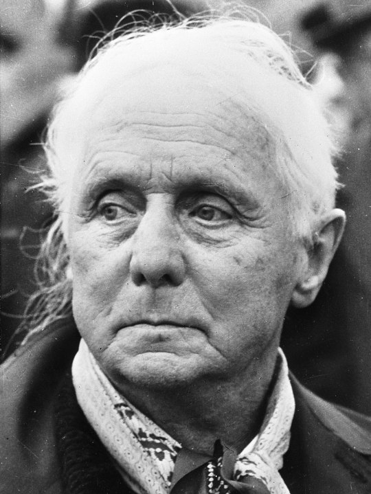
Born in Germany in 1891, Max Ernst's early studies spanned philosophy, psychology, and art across different cities. Embracing Surrealism's mission to express the irrational and subconscious, he pioneered techniques like automatism, infusing dreamlike elements into his work. "Frottage" involved pencil rubbings over textures, "Grattage" unveiled underlying textures by scraping paint, and "Collage" combined diverse materials for layered compositions. Ernst co-founded the "Collège de 'Pataphysique," a group championing unconventional art. Throughout his life, he continually experimented with techniques, leaving an indelible mark on Surrealism and modern art.
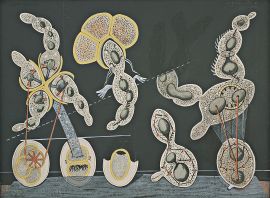
The Gramineous Bicycle Garnished with Bells the Dappled Fire Damps and the Echinoderms Bending the Spine to Look for Caresses, 1921
Max Ernst's fascination with microscopic imagery led him to an unconventional canvas: a teaching chart. He transformed the chart's underlying diagram, possibly depicting cell mitosis, into a captivating painting with organic forms merging with mechanical elements. An inscription adds a whimsical, suggestive layer. Ernst's work blurs natural and artificial, microscopic and mechanical, inviting viewers to explore his intriguing creation.
Hannah Hoch (Artist) - The Bride (Pandora)
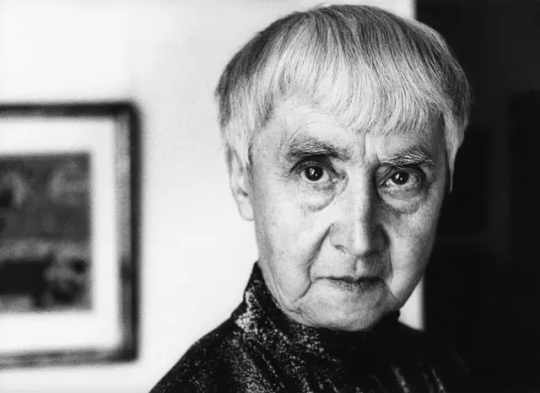
Hannah Höch, born in 1889, emerged as a pioneering German artist in the early 20th century. A vital figure within Berlin's Dada movement, she revolutionized art through innovative photomontage techniques. By cutting and arranging images, she challenged societal norms, deconstructed narratives, and critiqued cultural constructs. With a focus on feminist and political themes, Höch's work delved into gender roles, identity, consumerism, and media. Her lasting legacy lies in inspiring subsequent artists to experiment and convey ideas in new ways. Through fearless expression and boundary-pushing techniques, Höch redefined modern art and left an enduring impact.
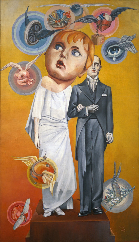
"The Bride (Pandora)" likely exemplifies her exploration of feminist and cultural themes, inviting viewers to deconstruct societal norms and question conventional representations. With this piece, Höch's influence on modern art shines as she challenges boundaries and provokes thought through her artistry.
Paula Scher (Graphic Designer) - Bring in da noise, bring in da funk
Paula Scher, born in 1948, is a distinguished graphic designer celebrated for her innovative work. As a partner at Pentagram, she's renowned for shaping brands and creating captivating visual identities across industries. Scher's multidisciplinary approach blends typography, imagery, and color to craft dynamic designs that leave a lasting impact on the field of graphic design.

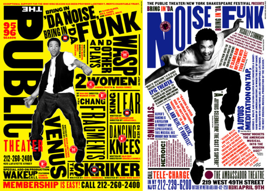
Over the years, her style has evolved into a remarkable blend of adaptability and versatility. Drawing inspiration from Russian Constructivism and Art Deco, she has truly redefined the essence of typography. From audacious and dynamic type art in 'Bring in da noise, bring in da funk' to the refined Citibank logo, she demonstrates an innate grasp of the subject's tone and rhythm. This understanding allows her to effectively communicate complex concepts in an easily comprehensible manner. Through her work, the theme and overarching idea effortlessly resonate through visuals and type. Her approach and demeanor underscore the importance of possessing a flexible and malleable style, enabling designers to adeptly tackle diverse projects.
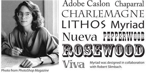
Carol Twombly (Graphic Designer)
Carol Twombly, born in 1959 in Concord, Massachusetts, started her career as a sculpture artist at the Rhode Island School of Design. After seeing the practical appeal of the field of graphic design, she switched from sculpture to graphic design. Carol began working for Adobe Systems in 1988 and designed many fonts that Adobe is known for; Adobe Caslon, Chaparral, Charlemagne, Lithos, Myriad, Nueva, Trajan, Trajan Sans, and Viva. In 1994, she was the first woman and only the 2nd American to receive the Prix Charles Peignot award for excellence in type design. Below are the typefaces Carol created before she left Adobe and her graphic design career in 1999.
Veronika Burian - Maiola
She was born in 1973 in Prague, Czechia. She is a type designer who studied industrial design in Munich and then worked as a product designer in Vienna and Milan. She soon discovered her true passion for typography and graduated with distinction from the MA in Typeface Design course in Reading, UK, in 2003. After a few year working as a typographer at DaltonMaag in London, Veronika founded TypeTogether with José Scaglione, one of the most crucial independent type foundries.

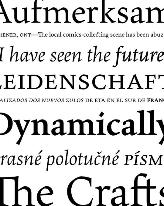
Above is a project by Veronika, "Maiola". It was published in 2005 with Fontshop and then in 2010 with TypeTogether. The typeface was inspired by early Czech type design, mainly by Vojtěch Preissig and Oldřich Menhart. Maiola is a contemporary typeface that is mindful of its historical heritage, implementing old-style features and calligraphic reminiscences, more frankly so in the italic. It won numerous awards, including the Type Directors Club Certificate of Typographic Excellence in 2004."
5 notes
·
View notes
Note
Hey! I wanted to know what you think is a good example of a design that also has a function (so not just a work of art that exists only for aesthetics). So random lol but doing a poll for a paper im writing
Product design: Muji by Kenya Hara Braun by Dieter Rams and look up his 10 rules of design Crescent Downworks, Champion Sweatshirts, Red Wing boots, Jack Purcell shoes, or other high quality functional clothing Rolex Boston Whaler Land Rover Massimo Vignelli for Heller Look for the brand Final Home – hard to find conceptual Japanese brand from early 2000s In terms of graphic design, I would look to information graphics such as Massimo Vignelli's design systems for the National Parks or the New York MTA, and Michael Bierut has done some similar systems with Pentagram, e.g. the informational kiosks in NYC, and his design thinking is extremely admirable. Hope that helps!
3 notes
·
View notes


