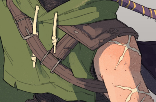
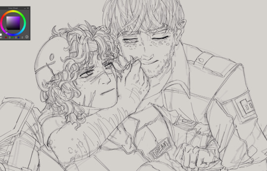
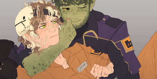
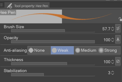
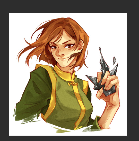
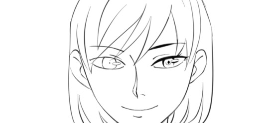
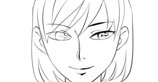
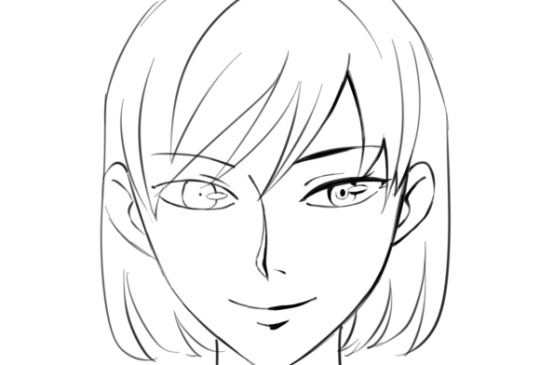
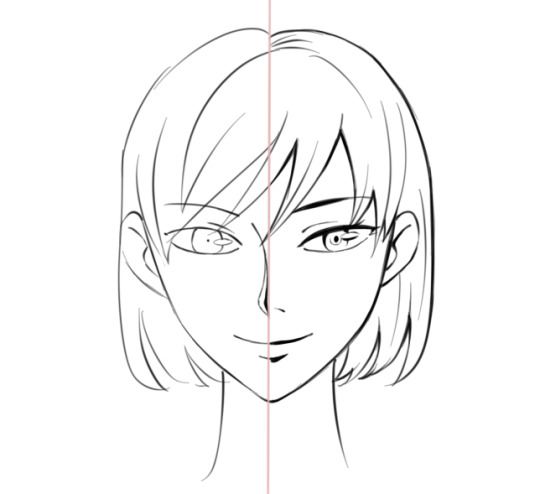
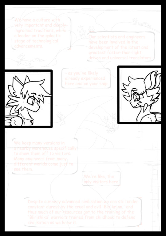
#keeping my lineart sketchy keeps me happy
Explore tagged Tumblr posts
Visit Tumblr Blog
Explore Tumblr blogs with no restrictions, modern design and the best experience.
Last Seen Tumblr Blogs


Fun Fact
The Tumblr office adopted Tommy, an 11-year-old Pomeranian.
Text

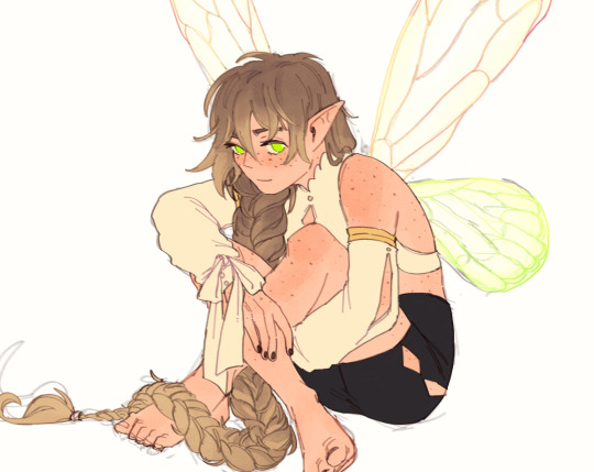
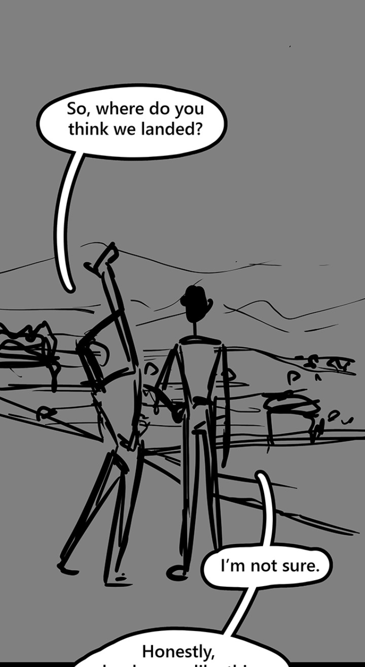
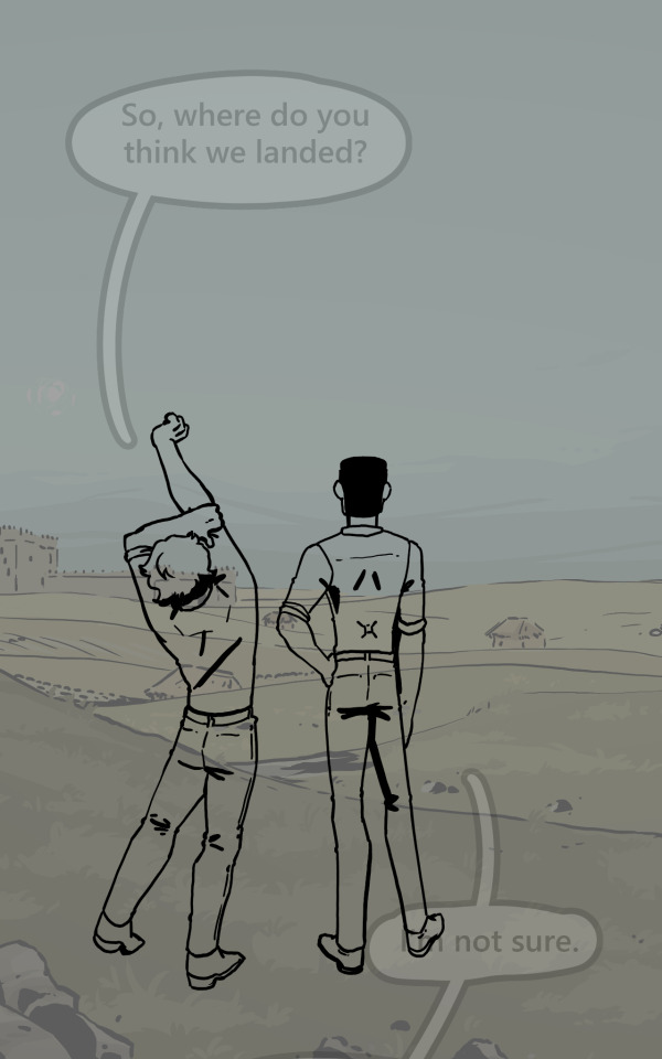
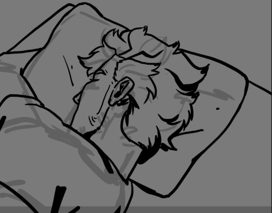
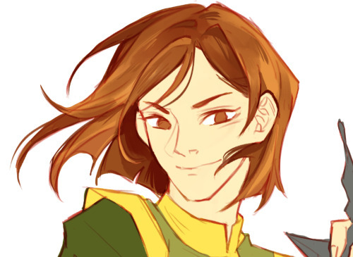
These 2 characters are connected in my brain. I cannot explain why but they are.
#a shut up#art#drawing#abd heartless#revolutionary sabo#one piece#alchemy valentine#this was fun to draw#also my first time drawing alchemy#keeping my lineart sketchy keeps me happy
31 notes
·
View notes
Text
Okay so last night I was having an "art style panic"? I guess you could call it that? But I was feeling really bad, so i started drawing other peoples art styles and picking points and peaces out of it!
I did this last night when I was really tired and i used a pen so the drawings may not be how i usually do my drawings haha
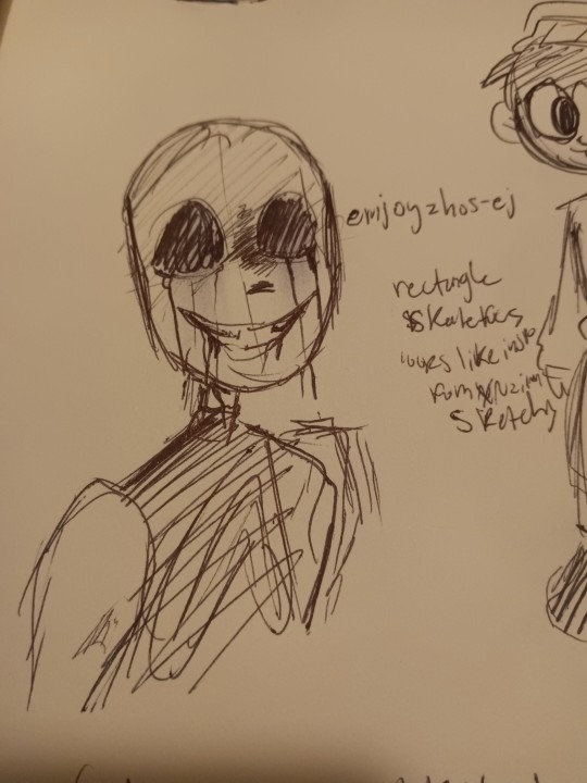
Ok so first up we have @emjoyzhos-ej !! I recently just found your account but you have a very cool style!!
•Your skull shape is very unique, very rectangle
•your lines are very sketchy (most people I follow have this trait in their art..)
•when you color it looks like you mayy have rook inspiration from itsxroxannex? Idk i wrote that down, maybe it's not true but I guess i thought that last night
But I love your style! Your art is so cool and I had fun trying to replicate it!
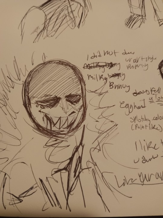
Next we have @milkybnnuy ! Omg so I really like you!! Your art is sooo good
•You draw a lot of fell, so i made the drawing of killer like how you made that one fell killer drawing
•when you color you have a very paintly-style and that's cool!!
•your skull shape reminds me of an egg (i guess thats why i said "egg head" last night)
Up in the top I wrote "I did not replicate your art properly enough," and that's true! Your art is so unique and different from what i usually drew so i had a hard time replicating it! But nonetheless, i had a fun time trying and hope you ain't disappointed lol
Btw- I really like the way you draw your fuzz on hoods!! So satisfying to look at!
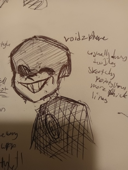
And now we go onto @voidzphere !
I've followed you for a while, and you're cool to be around and I like when you post! Though i had a hard time finding the art hidden around, I still was able to replicate it (luckily i chose to draw killer for this haha)
•so I see that you usually draw/post doodles, unless i just didn't scroll down far enough haha (plz tell me if you have drawn something big i wanna see)
•I noticed you have more pointy and thicker lines
•you have a certain way you draw your Skulls, I can't really put a shape or object here to describe it
Even though I couldn't find more drawings, I still tried! I hope you like it, friend, cause u cool
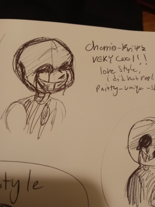
Here is @cherrio-krispz ! I just started following you last night, like seriously I had to search you up just now to figure out who you were cuz I forgot, but when i saw your art I immediately recognized you
•you have a very recognizable style!
•again, i did not replicate well.
•very painty-like when color
•sketchy lines, seems like you don't do line art?
•I like ur skulls, they look like skulls
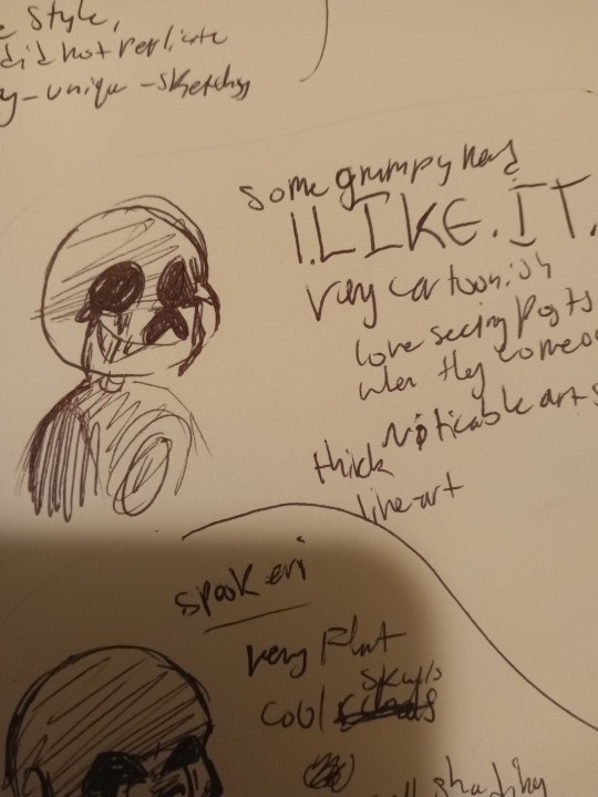
OMG I'VE BEEN WAITING TO TALK ABOUT YOU. YOU. YOUUU. @somegrumpynerd OMG YOUUUUUU. I REALLY LIKE YOUR ARTTT.
•I LIKE IT
•very cartoonish
• noticable art style
•thick lineart
I LOVE seeing posts when they come out!!! They're really really cool and make me feel so happy when I see them! Keep going because you're so cool!
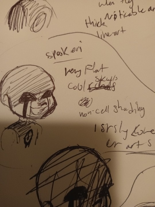
@spookeri haiiii
You're here tooo
i like ur art :)))))) a LOT . Same as the last guy, I get very excited when you post. Your DTIYS were fun, and yeye... Yeah
•Very flat colors
•flat lines
•cool looking skulls
•you have an "air-brush" shading style (i guess you could call it), which isn't a bad thing! Do what you want to do! But maybe try out cell-shading? Idk you don't have to, but idk i feel like cell-shading fits your art style
Also if you look in the bottom you can see a scratched out drawing, that was my first attempt haha
You can see it in the drawing below

@wyllaztopia !! I like your art :)) you have a very noticeable style and when you post I get excited as well!
•clean lines
•you make skulls longer than how other people make their skulls in this last
•I liked replicating it
Idk what else to say ... Its just all really cool!!
And last but not the worst
My art style!
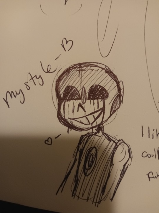
My art style is
•cool
•easy to draw
•and funny lookin'
What did i learn from this whole thing i did? That everyone has a unique style, that even if they try to change it it still stays theirs and it's still unique
I also found out that everyone, small artists and big artists, has flaws! It's comforting to know that everyone has flaws so I know I'm just learning and getting better everyday
Another thing I got from this is that everyone's styles are always changing and warping. But thats fine! Because everyone's moving and changing, and the worlds always moving and changing!
So, don't be so hard on yourself if you're struggling to draw or find an art style, how you draw is unique to you and you'll like it one day
Just keep drawing everyday and you'll get there.
I suggest doing this challenge, on paper or digital, wether you color it or not, or post ot or not!
It's great to try out.
228 notes
·
View notes
Note
Your AweSamDream art has given me so many brain worms how do you make your lines so thin and smooth??? Any time I try ultra thin lineart it always looks very... first time digital artist.
For me it was first i found a brush i liked and then I slowly just kept making it smaller or the canvas bigger. It's a gradual thing and I honestly don't really know what I do or don't do to make the lineart look good. I think maybe part of it is me doing alot of detailing?
I'll put some examples under the cut!
I don't know if these examples will help because I have no idea what im actually doing and can only guess based on what i think i might be doing æsldkjfælksd I colour my lineart which kinda hides(?) the mess a bit sometimes, smooths it out.
I think its important to note that my lineart isn't actually that smooth, it's kinda messy and sketchy alot because i don't put alot of details on my sketches (comparatively) and i dont follow the sketch perfectly when i line. my lineart would probably count as a detailed sketch for many. (the colouring helps alot!)
For an example c!dreams leather armour! in sketches or older arts its more flat where i draw more dimension to it now which also lets me add damage to the leather which i like doing because otherwise i end up feeling the lineart is "empty?" if theres too much space with no lines

I also paint on top of lineart when i don't like how it looked! (link to timelapse of this art)

In the second example i used a round brush for a new way i like with drawing hair! which is why as i wanted to use my favourite brush in this art, i made the lines so small so i could have more lines in the hair! as my favourite bush is fixed in a flat 20 degrees!
My sketches are generally pretty thick lined compared to what i end up lining so many times one line in the sketch becomes two lines in the lineart! i also draw pretty quickly which I'm happy with for the loser energy it gives the lineart (even tho colouring in the lineart can be a pain when i cant just select it all because of so many goddamn holes) But ultimately when you zoom in you can tell its not that smooth, its just smooth-sketchy but throughout it all which makes it conhesive! (i think) (maybe)
the fact c!dream is my own design i know basically on the back of my hand also helps! it means i can just slap it out without really thinking that hard about it because im so practiced ! (which is why i draw him alot lmaoooo) when i dont know a character as well i stuggle more with thinner lineart because i keep refrencing back instead of just doing what i want. when i draw new characters i usually start thicker and then slowly get thinner lines as i figure out how i want them to be drawn.
45 notes
·
View notes
Text
linktober 31 - HAPPY HALLOWEEN!!!
I thought for the last day I'd write a little retrospective on what this whole thing was like and what I learned. I'm too tired to draw literally anything else I'm due for a break lol
So this was my second time ever attempting a linktober/october drawing challenge, but my first time managing to complete all the days and prompts. I feel super proud of myself and accomplished for pulling it off.
There were a number of things that were surprising and that were challenging for me that I wasn't expecting this month. If anything, I think this challenge really highlighted my flaws and mental blindspots with how I approach making art.
For one thing, I came away from this not liking everything I made. I think I only like about 9 or 10 of the 30 pieces I put out there. When I don't like my art, I tend to get stuck in this mental stalemate of refusing to finish a piece until I like it, but also refusing to retrace my steps and erase/rework what I have so far for fear of losing progress or not being able to replicate the line/angle/color/etc that I liked.
It was surprisingly hard to accept when I didn't like a piece but had to move on for the sake of time and post it anyway. But once I did it a few times, it got easier. I realized prioritizing my standards over my available energy is not gonna promote progress. If I kept sinking myself into one piece and not moving on until it was optimal, I never would have finished anything-- that was the pitfall that ultimately made me bail out 10 days in last year.
I also realized my sunk cost fallacy/"what if I erase this and can never redraw it good again" stems from some real lack of confidence in my knowledge and techniques with art. I'm self-taught, and I think I tend to believe that everything I make is a dumb happy accident, even though I have mental rules when I draw, use tons of references, and have a process lol. There are a few pieces I started over 2-3 times before I got them right, and that's starting to feel liberating instead of like failing to me now, which I never expected to come out of this experience so that's cool.
Another place I had to learn to let go of control in this was with allowing for style variation. I really wanted each and every piece to be coherent and painterly, like they all came from the same book or something. But then I couldn't decide whether I wanted to do all/no lineart, all/no detailed background, all/no heavy rendering, etc. At the end I settled on just keeping the same canvas dimensions and just prioritizing filling up the space. Glad I ended up doing this, because I really would benefit from continuing to chill out and scale back how much I default to making dramatic, high-render pieces. I gotta break out of my comfort zone and make more sketchy little guys!
Sometimes my attachment to the prompts fluctuated; some prompts I thought I would love and then just wanted to get them over with. Some prompts I thought I would hate and subsequently half-ass, then I ended up redoing them and putting more effort & time into and loved the end result!
It was funny to also see how some pieces that I loved straight up did not get a whole lot of notes or attention. Some pieces I was "meh" about did crazy numbers lol. I'm used to posting maybe 5-6 times a year on here, so I'm usually indifferent to getting notes (by which I mean, I'm super grateful for likes & reblogs and the super sweet & funny messages in y'alls tags, but I'm not butthurt when I don't get notes because whatever happens, happens). Churning out 30 pieces in 30 days made me sometimes get bewildered by what did and didn't get notes, but frankly in the end I think it helps reaffirm that I should continue putting whatever I want out there because it! is! not! graded!!!
So would I do Linktober again? Probably not, sorry! it was a lot of time & effort and took me away from fall festivities more than I would have liked. I kinda only managed to pull this off because I was transitioning between jobs this month and had a week off to just draw. But I also completely see the value in taking on a challenge like this and finishing what I started, I'm super glad I did this, I think my art improved from it. I would definitely do future drawing challenges/prompt things that are quicker or have less prompts!
My advice to prospective future linktoberers: pace yourself and be gentle; this is a great chance to do something exciting and new with your art, but above all it's about you having fun. There are no prizes at the end except for what you've learned and how you feel about it, and that's for the best!!
One thing's for sure, I am zelda'd out lmao so I'll be branching out towards some little projects I have lined up for personal art and other fandoms I'm into right now
So anyway thanks to all of you who read this or who gassed me up this whole month, I appreciate you!!!!!!!! ヾ(^∇^)
73 notes
·
View notes
Text
Happy webcomics day!!!
I'm not home (on a trip right now with family), but I still want to talk a little bit about my process, so I did what I could to find some wip shots 🧡
Plus, I'd also like to update my extremely patient readers with a little taste of what's to come!!!
Step one, of course, is writing.
When I'm writing I have four documents open. A "dump" document, a "yes this!" Document, an outline document, and a drawing canvas!
In the dump document, I put ANYTHING. complete stream of consciousness. The 'yes this' document is where I put anything useful from the dump document, and the outline is, of course, the outline. The drawing canvas is for me to sketch out problems and ideas and get sort of a different angle on things, since I can't really visualize.
Once I have a book completely written, I start thumbnailing!
My thumbnails pretty much look like this. Text, sketchy poses, indications of expression and maybe environment...
I thumbnail the entire book at once. I don't let myself do any edits on it until it's done, but I take note of edits I'd like to make! Then, once the first draft is out, I edit.
I'll move entire scenes, delete whole episodes, bring in bits from the end to have proper foreshadowing... Etc! It's a long process that makes my arcs feel much more complete and something I can be really proud of.
I can only do this when I'm really ahead, though, so that's why I've been on a long hiatus!!! I was forced to work without my process for a few arcs, and the difference is so huge to me that I refuse to let myself do it again. It makes a loner hiatus, but work way more worth waiting for!
Next step is lineart!
Yes, I skip sketches! I go right into lines.
I save every head I've ever drawn, and that lets me copy paste in a basic head angle. Then I redo the face, fix up the hair, etc. so it fits my panel, and then I draw the rest of the body!
This seriously saves me so much time, but less so for the drawing (i still draw a ton of heads and I'm very fast) and more just for helping me skip sketching entirely!
Then I do character flats, which since all my lines are closed that goes pretty quickly (slowest part is Steve's hair, I refuse to use a brush cause every one I've made looks terrible!!!)
And then I draw the backgrounds!
Which, I keep layered, clean, and HUGE so I can use them throughout the arc.
I used to feel bad doing this, but then I realized... It's not like backgrounds "change" irl. So why make them change in my comics...? It saves me so much time, but it ALSO lets me put in more detail per background! I draw probably 3 very large backgrounds per episode like this, and then I draw maybe 5-10 unique backgrounds for single panels per episode as well. I save these too, but they're rarely re-used.
And then my panels are done!!!
So there's a bit of my process for you all!!!
Happy webcomics day 🧡🧡🧡
And here's my comic, if you haven't read it and want to see the end result of this process, or if you have read it and would enjoy a re-read with the extra knowledge:
Or, if you would prefer books I have those too!
Happy to elaborate on any step, as well!
I make comics extremely quickly and as my full time job, and my process allows me to easily manipulate my format as well. I'm happy to share any of my knowledge if you have questions!!!
#webcomics day#webcomicday#webcomic day#time and time again#webcomics#webtoon#webtoon originals#ttawebcomic#art process#writing process#my art#comic#my comic#comic process
111 notes
·
View notes
Text
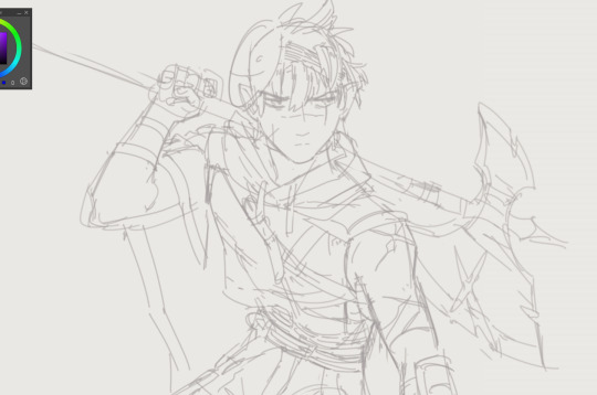
My messy process for drawing that zero people asked to see XD ...
Sketch #1: just shapes, zero definition. The scruffier, the better - it adds movement and flow, and I neaten it up later. All about composition, character proportions, checking sizes/heights, who's going where, etc. If I'm happy with a character's shape but not their placing or pose, I just select and drag around.
Sketch #2: go over the bare bones with an equally scruffy but more detailed sketch. I've got references on hand for hands, my greatest nemesis - I still screwed up Solar's hand here, but oh well, every day's a school day. Experiment with expressions, wrinkles, hand poses, double-check character references to add in details I'd otherwise forget later (individual eye shape, markings, etc.)
Depending on the complexity, I may do a third sketch, but not needed here. I don't want to have to make changes at the lineart stage when clean-up takes twice as long, so this scruffy stage takes a while.

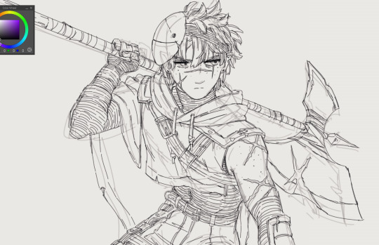
Lineart: weirdly, I love sketchy styles, but am completely incapable of doing them myself. I prefer sharp lines and crisp edges, so I use a small, pressure sensitive brush in deepest black, and annihilate it with the eraser tool to taper edges and add sharp detailing. I also play with sharpening filters to get the resolution I want.

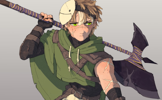
Colour: I add a fill layer beneath the lineart in a colour that's not going to feature on the characters at all. This means I can a) get into the nooks and crannies and erase any overlap from the select tool, and b) any missed spots when I colour in will stick out like sore thumbs, so I don't leave gaps for background to shine through in teeth or sclera etc. I then colour on top of that. I keep it simple, only adding variety and shading to the eyes and odd detailing - bells, buttons, etc.
This will sound bloody obvious, but adding colour can change the whole look and feel of the picture. For example on this piece, once colour had finished, I realised the lack of neck ruffles made Solar look weirdly exposed compared to the equally shirtless Eclipse, like he'd been interrupted getting ready for a shower or something. So a rescue shirt was added! (You can see shirtless Solar on the original post here.)
Background: I'm allergic to drawing backgrounds so I speed-run with shapes and textures, mucking about until it looks good enough. I have no idea why but I'm adding borders to all my drawings at the moment, so that goes in too. Normally I also add a white border around the characters, but not for these refs.
And ta da. Nothing special, but works for me! Moment of silence for Solar's haunted hand.
#drawing process#how I draw#belabour the sketch stage to save a life in lineart land#why are hands so wickedly difficult#you can never have too many expression details#tsams solar#tsams eclipse#sun and moon show
23 notes
·
View notes
Note
sorry if youve talked about this before, but do you have any tips relating to your coloring process? i ADOREE the way you render things and it looks soso cool and once i saw a post where you said your art typically only took a couple hours and i was in SHOCK. cuz ive been working on a yuji piece that has a similarish (not really but idk how to describe it…) coloring style and ive been working at it for. about a month now…sorry this is rambly i hope u have a good day!!!
hi!!! first of all thank you so much I'm happy you like the way I render! honestly it Is still the aspect of drawing that takes the longest for me, I've only recently started to come up with ways to streamline my process (mainly through keeping my layers/brushes limited and overall being less anal about details) . these days my average drawing does take about 2.5-4 hours I'd say, with Big Illustrations obviously being the exception
i wouldn't beat yourself up too much about taking longer to finish a drawing tho ! it took me. a While to learn how to speed up and honestly my biggest piece of advice is loosen up and let certain things look imperfect or unfinished ! and if you're like i was and want to work at getting faster then i would recommend practicing churning out sketchy/rough pieces and see what tricks and habits you can implement or adjust to save time
all that being said I realize haven't done an updated overview of my colouring/rendering process so I guess this can be that ! I'll put it under the cut because i too like to ramble and this Will get long
lineart and base colour/underpainting


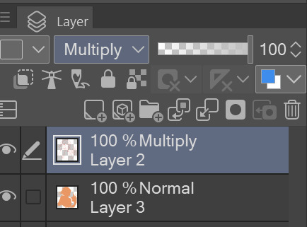
my lineart is nearly Always on multiply. it helps the lines stand out less starkly against the colours and makes it so that I don't have to change the colour of as many sections of lines later on
the base colour layer is honestly completely optional, tbh i sometimes skip it so you don't Have to have one but i like it for a few reasons: - I like to keep all my colours on the same layer so if i'm going for a painterly style this serves as an underpaint layer of sorts . having this means that when i paint, whatever colour i have here will blend with all the other colours i use and help them look cohesive - even if I'm not painting, i still like to work with all my colours on the same layer and it helps me make sure I'm not missing any spots, which helps when it comes time to section individual areas off in the next steps
2. flats

lock transparency button my beloved . this makes it so that you're only able to paint on areas where there is Already colour (which is where having an underpaint layer comes in handy)
not much else to say about this step, just choosing colours rly !
3. shading
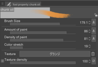
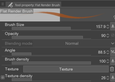
here's where the fun starts ! since i'm working all on one layer, i use the wand or lasso tool to section off whatever area I want to work on, then go in with (usually) one of the three brushes below: from left to right 1. my favourite dry brush that i use to cover large areas, it has an amazing dry paint stroke-y texture and i use it in everything. great for skin/clothes/hair/fur/organic material...she does it all 2. smaller, blendier/smoother brush that I use to soften out the rougher edges left by the first brush. I find it's really good for hair and small clothing creases 3. rough pen brush that I use to add little bits of flavour in the form of crosshatches or stray lines, usually to hint at individual hair strands! I also use it to line sometimes but I'm using it less for that recently
also, since the lineart layer is set to multiply, it's super easy to colour directly under the lines on my colour layer and use that as a way to make certain lines Darker . it's most obvious at the eyelashes and under the jaw but I do it everywhere

4. finishing touches and texture overlay
here I add another layer above the multiply/lineart layer and use it to add highlights and other details! this is also the layer i use to paint directly on top of any areas that got messy or need extra definition
my texture overlay of choice is just a rough monochrome static file that I got on the csp assets page but use whatever you'd like tbh ! set the layer mode to overlay and adjust the opacity to your liking (I also like to rasterize the layer to make it easier to work with but it's not too consequential if you skip that step since you're basically done by this point anyway)
And done ! slap a signature on that bad boy and send it <3

#answered#flowingredscale#art advice#my art#i rly hope this was helpful!!!#best of luck with your yuuji piece <3
34 notes
·
View notes
Note
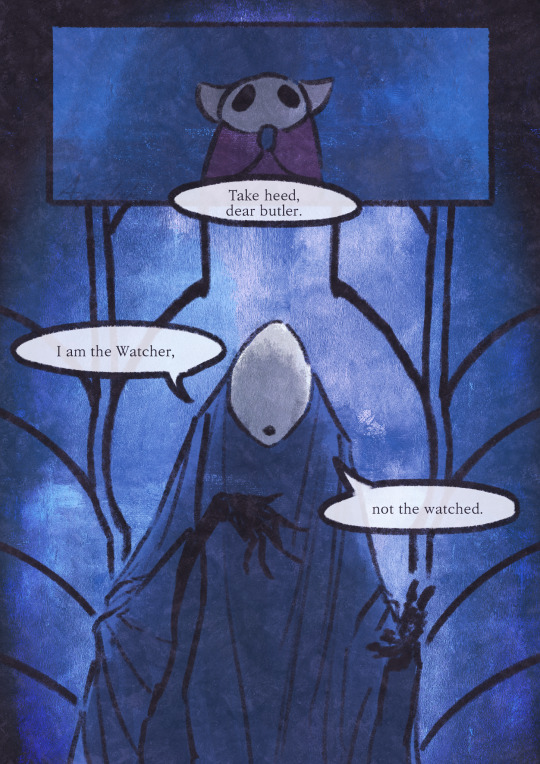
Your technical skill with lineart and shading is amazing in itself, but it's your ability to convey emotion and atmosphere in your work that is trademark to me :) its incredible how you can show through gesture and body language just what these masked, expressionless characters are feeling, and how the environment itself conveys that. Your lurien comics, especially the one that ends in something along the lines of "I return to the kingdom you abandoned" are I think the spark that made Lurien go from Some Guy to Deeply Interesting for me, and your use of color pop and shaky line contributed so much to the feeling in those comics. You are one of the artists whose skill at evoking emotions I aspire to <3
Oh wow, I've been reading and re-reading this for the last 20 minutes this is amazing.
So, emotions!
If there is one thing I'm proud to have accomplished during my time in Hollow Knight, it's the skill of expressing tone. Because here's the thing, facial expressions are just one of the many components of tone. (I even wrote about this in another ask some time ago.) Colors, gestures, camera angle, lighting, paneling, lines and narration - all of these come together to convey the mood of the scene.
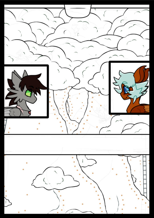
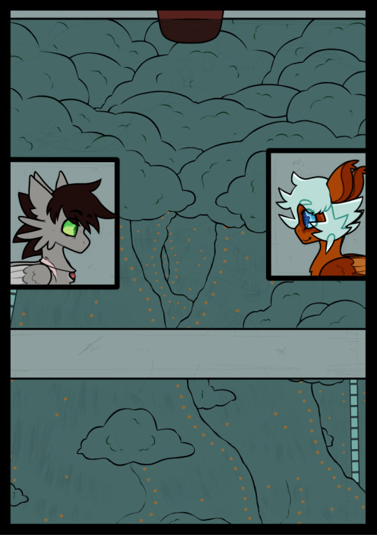
Check out these wips from the Watcher and the Watched comic, for example.
You can see that color played a huge role in setting the atmosphere in the comic. It shows that this comic is taking place in the Watcher's Spire, but it also gives a dark, subdued feeling that wouldn't come from idk, a yellow background. The backlight emphasizes the ominous tone of the last page. As does Lurien's pose - coupled with the butler looking up and Lurien looking down, it makes it look like Lurien is looming over his butler (and the reader). All this builds up to deliver Lurien's lines with maximum impact.
So yeah, a lot goes into conveying tone in comics, and I'm very happy to hear that it was recieved well!!
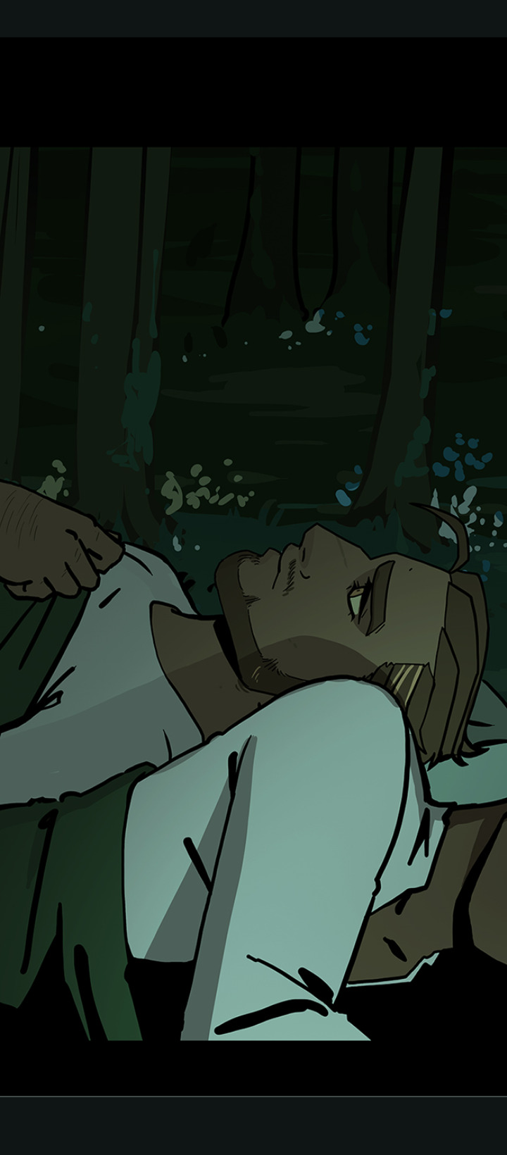
The Lurien, Dreamer comic. It's almost 2 years old now but it's still one of the favorite comics I drew about him. Together with the City of Tears comic, it's the epitome of my interpretation of Lurien. My characterization of Lurien's relationship with the Pale King was quite different from the usual fanon at the time (I don't know how it is now, I haven't gone into the tags in years haha) and I wasn't really sure how people would take it. So I'm glad to hear that it got you interested in Lurien!
It's the one that took the longest too lol. Usually I draw comics in a single setting, but that one took 3 days. Besides Two Ghosts (which was an 18 chapter+@ comic that was over 50p and took about 2 months), no other comic has broken this record. I put in a lot of care into it, and it still holds a special place in my heart.
Honestly half the reason I use messy, sketchy lines is that I suck at drawing clean lines lmao. But I like to think that I've made the best of it and utilized it as an art style. In that comic especially, because the whole thing takes place in the dream realm and I wanted to give a rough, unreal feel to it.
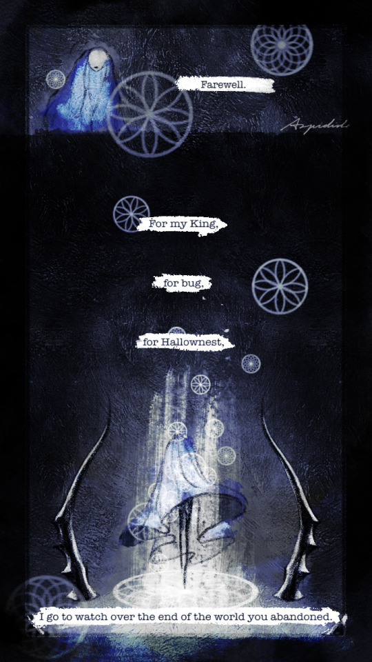
I'd show breakdowns of this one too but the file is so big it keeps crashing lol. (Pro tip - draw your comic pages in separate files. Don't be like me and draw 300dpi 10p comics with 30 layers in each page in a single canvas. It will crash and you will be sad.) But drawing the White Palace was a interesting challenge because I usually draw in highly saturated colors whereas the Palace is, well, white. So I had to work out a way to color this without making everything looking grey, while also making it recognizable as the palace. iirc I used a lot of overlay & burn & dodge layers along with a few difference & subtract layers to give the white a slight yellow tint to stand out from the dark blue. (I'm pretty sure they're the culprits crashing the file.)
Sorry this got long, I really took this as an invitation to ramble about my art hkfsldjkflj
Thank you for all the compliments! It's an honor to hear that my art could be someone's aspiration, and I'm very happy that all my Lurien art got someone else into Lurien. I hope you have a nice day :D
51 notes
·
View notes
Note
what's your process for coloring like? the look of that elendira is so textured and interesting, i can't figure out how you do it
AA THANK YOUU ^__^ !! textures & brushwork are my favorite things abt my art, so im happy you find it interesting hehe . its SOO cool to look at & so much fun to draw imo
i prefer to color by building in layers , if that makes sense 🤔!! hundreds of them !! such that i'm always drawing on Top of previous layers, working from big & messy blocks of color to, eventually, small and refined blocks of color until it feels processed enough. as a result, i rarely ever erase (!!) and i rarely ever draw lineart aside from the initial sketch
a rough, patchy textured brush is key here, as it'll give you dimension and variability w/ your colors. i recommend "Brush and various sets of fountain pen style (万年筆風ブラシと色々セット)" on Clip Studio (ID: 1679706) !! :3

im terrible with explanations though, so i'm going to show a step by step of that elendira drawing if you dont mind :3
sketch layer !! because i mostly render through color alone, i try to make this as close to the finished thing as possible . ^__^ i hateee drawing the same thing over and over and like the expressivity and movement of my sketches anyways , so the more i can preserve at this step, the better. if u were to look at a side by side of my sketches and finished pieces, youd notice a lot of those og lines are present in the final drawing :3

2. flats !! pretty self explanatory, but the solid background gives me an idea of where the figure begins & ends while the colors themselves help distinguish whats what . i stick to ambient lighting @ this point because im usually not sure what i want to do with the overall palette or lighting yet . having two tones (ex, dark and light in her hair or dark and light on her skin) can also help in identifying key features early on that u wanna preserve. as you build layer by layer, sometimes these areas will remain untouched and i think it makes for a rly lovely feel at the end

3. start blocking !!! to be totally honest with you, i dont really know what i do here HAHAHA. like i just scribble the shit out of it, usually focusing on what i might want to do with lighting (ex: grey areas to accentuate folds in her costume). i think i like to start "erasing" the sketch where possible by coloring on top of it .. like if you look at her hat or her arm , you can tell i'm starting to get a sense of the shapes i like vs the ones i dont. it's at this point that the final image starts to emerge in my mind , like im gradually pulling her from a tarpit of scribbles until shes recognizable lol. chipping away at the marble until i can free her. tbh.

4. keep blockingg...when u think u are done , block some more . as you can probably see, the brushwork becomes more intentional as i add more shape, with specific focus on line weight. this is also where the patchiness of that textured brush comes in - notice how none of the colors seem totally uniform (ex: the red cross or the original sketchlines for her waist). you can see bits and pieces of the layers underneath pushing through and i really like that !! ^__^ its very fun and sketchy to me, so i try to keep them around. those areas are also great to colorpick from, because it'll give you "new" colors to work w/ that are already part of your palette.

5. GRADIENTS & GRADIENT MAPS !! TONE CURVE !! COLOR PICKER !! this is the best stage tbh. flatten your image so its all on one layer and just go crazy with all the color settings in ur program. add gradient layers and set them to darken, or overlay, or subtract, orrr. lighten or dodge glow or divide or soft/hard light.! OR!! edit the hue, saturation, luminosity and contrast.and then color pick from these edits, block even more on top of ur image, flatten, color edit again, etc. etc. until u feel satisfied.
ANYWAYSS . i hope that makes sense @__@ sry i wrote this out and deleted it like 23 times trying to make it make More sense but thats what ive got HAHA i hope its useful though :3 !
#SRY I STRUGGLED 2 EXPLAIN THIS#dude its like my brain bcomes stuffed w/ cotton anytime i try 2 write#i hope it makes sense tho..#it also probably sounds so redundant to make new layer one after the other for just a few brushstrokes#but those brushes i linked have a multiply property so if you draw on top of prev lines they'll create dark patches#and so if im working over a large area ill generally need like . 5 layers each with one brushstroke :sob: if that makes sense#this one had . 84 i think. total. layers i mean. the merylvash one had 300+ HAHAH so it rly depends#like YEAAH i could just use a normal brush but i really like the way this looks#andd sometimes the multiply function works really well or will give me the proper shadow tone im looking for#anywas.wanywaysn anyways#asktag#anonymous#long post
58 notes
·
View notes
Text
The Nomination Period for the 2nd Term 2023 Inuyasha Fandom Awards is now CLOSED!!
Hey everyone!
Below the cut you'll find a complete list of all the Fanart nominations received for this term!
The list of Fanfiction nominations can be found here!
Thank you to everyone who participated in this term for taking the time to do so. We hope you enjoyed your experience! If you do not see your nomination, please reach out to us as soon as possible!
We strongly encourage that when you view a work of art or read a fanfiction, please reblog or leave a review to let the creators know how much their work and talent is appreciated!
As a reminder, we are giving 3 weeks time to enjoy all of the creations. The voting period will begin June 5th and end June 20th.
In order to be able to vote, you'll need to register so we can keep it all neat and clear. We will be posting the link to the voting form on the first day of the voting session.
Got a question? Check out our FAQ or send us an ask. You can also message one of the mods directly!
Don't forget, we also have our Feedback Form open until the end of this term! We'd love to hear any and all feedback, suggestions, and recommendations!
Thank you to everyone who nominated for making this 2nd Term absolutely wonderful, and happy voting!

Best Action/Adventure
“A quick sketch” by @cati-art
“Unnamed” by @amlli
Best AU/AR
“Phantom of the Opera” by @kalcia
“Valentine’s Day” by @sagiriti
“Hades & Persephone AU” by @m2moon94
“Orgullo & Prejuicio” by @m2moon94
Best Canon Universe
“InuKag” by @alasxeart
“Three years separation” by @len-barboza
“Oh Brother (Part 2)” by @mama-ino
Best Angst
“✨ Brothers ✨” by @xtaisanax
“Welcome Home” by @valgreys
Best Dark
“He’s angery” by @brain-rot-hour
Best Humor/Parody
“Magic in Bed” by @mamabearcat
“But I followed the recipe” by @daikiidokii
Best Kiss
“Love languages” by @rubbesart
“Midnight Bribe Moonlight Bride” by @elevenharbor
“Welcome Home” by @katballesteros
“I Miss You” by @sayuri-liu
Best Character
“Naraku” by @soluryn
“Kagura” by @rhapeseuhans
“Hit the Mark” by @spiralofdragon
“Untitled” by @mama-ino
“Naraku from The Deadliest Sin” by @moonkissedart
Best Duo/Pairing
“By my Side” by @pachworldx-1
“Under the Moon” by @thepadawanartist
“Sleepy Journey” by @hycopank
“I felt him, Mama! He Moved!” by @katballesteros
Best Doujinshi
“Way of the House Demon” by @lucymorningstar257
“The Last Days” by @liquidashesart
“Nameless” by @heavenin--hell
Best Redraw
“Another redraw 🌸” by @angstiana
“Screencap redraw” by @bre-draws
“Live” by @thunderpot
“Untitled” by @geda-art
Best NSFW
“The Wolf” by @alicepupurred
“The Doubleganger” by @valgreys
“A Bit of Naked Inuyasha” by @kalcia
“Inuyasha’s Dream” by @geda-art
“Mermaid Service” by @sayuri-liu
Best InuKag Romance
“A letter from daughter” by @sollee-art
“記念日おめでとう” by @len-barboza
“Prometo Volver” by @pachworldx-1
Best SessKag Romance
“You and Me After All” by @thepadawanartist
“Welcome Home” by @valgreys
“Little Miko” by @milkfromcats
Best Romance
“She Will Always be Loved” by @elevenharbor
“Kagome Watching Like” by @brain-rot-hour
“Not to Her” by @classysassy9791
“Gift Exchange” by @izakimi
“Leap of Faith” by @ashleys-canvas
Best Lineart
“Inuyasha y Kagura” by @meliboquin
“Anyone has that urge to draw a webtoon” by @weeeting
“Did I watch Inuyasha when i was 8” by @il---re
“Sketchy sketch WIP” by @lucymorningstar257
Best Group Depiction
“Pictures of Happiness” by @memilylove
“Making Waves Family Portrait” by @clearwillow
“Oh Brother (Part 2)” by @mama-ino
“Thinking about Kagura” by @tmetta
“Happy Mother’s Day!” by @eliza-faust-diary
Best Overall
“Kagome” by @alicepupurred
“Kikyo” by @purilly
“Making Waves Family Portrait” by @clearwillow
“Under the Moon” by @thepadawanartist
“Moroha like Mutt Williams” by @nikelaos87
“Untitled” by @inumysuzue
82 notes
·
View notes
Text

@wild-moss-art Hi there! I'm more than happy to share art philosophy about lineart! You are correct, I am definitely spending less time than usual on my lineart to get these requests done, but I'm still glad with the final results. :3
Here are the three stages that I take to achieve clean and polished lineart.
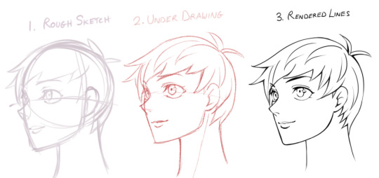
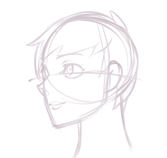
1) The Rough Sketch is used to figure out what the final product may look like. No fine details yet, only guidelines and basic shapes. I make sure the proportions, alignment, and composition is correct. The completed Rough Sketch gives me a good idea of what the rendered lines may look like, but is a bit too messy to follow. While I do have the option of erasing all of the guidelines and cleaning up the lines, what I usually do is lower the opacity of the rough sketch and start on a new layer.
2) The Under Drawing is done in a non-black color on top of the rough sketch. Here is where I get into finer detail with expression and anatomy. However, because we are following the messy lines of the rough sketch, the Under Drawing will still look a little unpolished. It is still very suitable for coloring if you plan to render all of the details in the painting stage, or if you are going for a more sketchy style.
In order to get sharp, detailed, finely rendered lines however, an additional stage is required.So lets lower the opacity and start a new layer using black ink this time.

3) When Rendering Lines, I carefully follow all of the details provided by the Under Drawing, which shows exactly where each line should be placed. I take my time going over each line, using the zoom tool and rotating the canvas when needed to get the best angle.

Because the final product should have a sharp and clean look, it can be very time consuming and pain staking to go over all the details. That said, I have a few tips that will help this stage go along faster while adding visual appeal to the final product.
Let's use an example. Suppose you place down your lines and end up with something that looks like this.
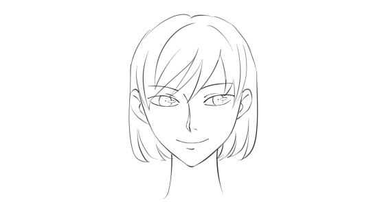
It's not bad, but it could use a little work. The expression and level of detail that we want isn't there yet, but it's actually a good starting point. If you are new to line art or still practicing, you may wish to aim something like the drawing above so that we can take it a step further using the steps I will demonstrate in the tutorial below.
So how do we make clean lineart into something even greater?

Here is what I mean by line weight. Lines of lower weight are lighter and thinner. Lines of heavier weight are darker and thicker. Then there are modulated lines, which gradually increase or decrease in weight.
In the example drawing, all of the lines are of equal weight. We can make the line art less monotonous by increasing the weight of certain lines. For demonstration purposes, I will only make changes to the right side of the drawing so that you can see the difference.
To start, we will add another line to the upper eyelid and fill in the gap, creating a new, bolder line.

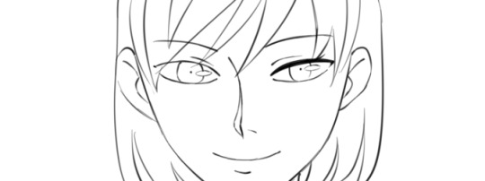
We will also build up the iris, pupil and highlight, adding details as we go. Already, it is looking more expressive.
Lets build up the nose and mouth lines while keeping the ends nice and thin.
Then, we can add weight to the face and ear lines. For the hair outline, we want to make the lines heavier closer to the roots while keeping the ends thin. Hair lines on the inside can be left alone.
Finally, we make the outside line of the character heavier. With these small changes, we have a much more expressive, detailed, and visually appealing product.
Here I've highlighted in red where the lines remained unchanged. You will definitely want to leave some lines alone while building up others. As a rule, outlines should be thicker while the detail lines on the inside should be thinner.
If you increase the weight of all lines with the same amount, it will remain flat.
So, you should aim to have a variety of light lines, heavy lines, and modulated lines. You may wish to use the eraser to lighten up heavy lines or create modulated ones.

If you can do all the steps above, then a lot of detail and expression will be preserved even when the image is shrunk down

Hope that helps :3 Let me know if there are any other questions I can answer.
81 notes
·
View notes
Text
I drew traditional for once and I got to try out a new pen my aunt got me and it works really well so I threw some red pen in there. And I'm actually pretty happy how these turned out because I was mostly just winging it. I also tried to make some of the lineart more sketchy? I like it but I probably won't use it a ton.
Anyway everyone's favorite golden boy, except he's very stressed because keeping track of like 30 peoples survival while being cheif, it's not very fun.


#lotf#lord of the flies#lotf fanart#lotf ralph#I feel so bad for Ralph#The kid was so stressed out he did not deserve that#nor did he deserve to see most of the things he saw#glad he got home tho
62 notes
·
View notes
Note
Hey what's it like being so swag? The people wanna know! (It's me, I'm people)
I just wanted to drop by and say something silly since I've been lurking following you for a while and your art is such a delight! You've been a huge source of motivation for me to work on improving my own art and keeping up with your fan continuity has been super fun! (I love all of your trans headcanons so much, it's really nice to see people like me)
I was wondering if you had any advice on how to build up confidence with physical art work? I'd like to try and go beyond just pencil sketches but using pens for line art or adding color to a piece can feel so intimidating since that's a lot harder to undo than pencil lines... Part of me knows it'll just take some time and practice but the rest of me can't seem to work up the courage to start anyway (^~^;)ゞ
Regardless, you're very cool and I hope you continue to feel better! Have a nice day/night! :D
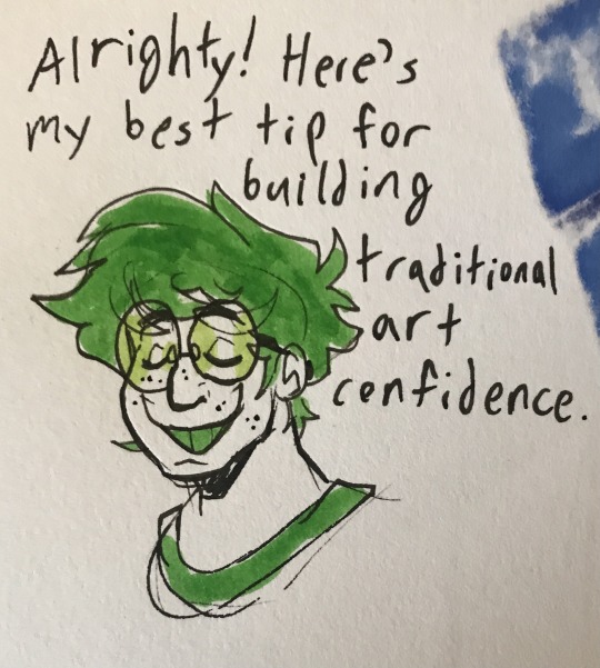
First of all, thank you so so much for the kind words! I'm so glad you enjoy all my art and trans headcanons! And I'm so so happy to hear my work has been inspiring you! That makes me so glad to hear. I am very passionate about encouraging other artists to explore and develop their own process and work.
And second, here is my hot tip for building traditional art confidence. And it is...make stuff in mediums you have been hesitating to use. Non-erasable mediums work best for building up confidence. Pens. Markers. Even paint if you prefer. You can find and watch traditional process videos if you want as you do. However, the best way to figure out your favorite way to use art supplies and to figure out how to make it look the way you want is just to experiment.
You may notice that the lines on my traditional pieces are sketchy and not polished lineart. With practice, I figured out how to do that my way and make it visually clear and appealing like I wanted. Sometimes, it really does help to just move out of your comfort zone and say "no pencils and no erasers I gotta be a little messy for a bit". I hope this helps!
And thank you for the well wishes! I hope you have a good day/night too!
57 notes
·
View notes
Note
Your art is SO detailed i love it keep up the good work

!!!!!! NOOOO WAY, you are so sweet!!!!!!!!!!!!!! Thank you!!!!! ;-;

I really like your art as well! Sorry recently I don't give much reactions to anything, I am checking Tumblr much less because reasons but I love your lineart and the way you draw faces so much.. (And also I've seen an absolutely incredibly done doodle with Micolash and Eli as I type this response ;-;)
I also assume you've sent this ask after yesterday's doodle dsjfdds I'd say that my fixation on details is ALSO my curse because even when I AM deliberately trying to take it easy with coloring or keep line sketchy, I am still overdoing it a bit. Can't even draw 'chibi' style in the intended way - very simplified and minimal. Let me show an (old-ish) example for my point:

Like.... you see the problem, even when things are supposed to be simple I just.. can't help myself. xd Must..... overdo..... EVERYTHING. Drawing is both fun AND pain for me for this reason, but honestly, I am happy to hear from people that enjoy the way I art. Thank you for this ask again;
#ask replies#doodles#creativity#sorry if it might feel like I am over-reacting but this ask just made me very happy hfhhdsfhdsd#it means a lot for me to hear compliments for my art
7 notes
·
View notes
Text
"What's your drawing process? Care to show a tutorial of how you colour, shade and render?"
I don't really have the energy to go into detail (visually at least) but I'm happy to show my general process and explain what I do for each step.

1) I draw the rough page with "prelim" sketches, using a 10px ink tool in red. These are usually just stickfigures with ears, eyes and a few features that differentiate them, in the rough poses I need them to be in. The simplicity means I can move things around easily. I also add prelim text-boxes to get an idea of how much space I need for dialogue.

2) I draw over the prelims with the actual sketch, using a 1px sketch tool in black. When drawing over sketches of any kind, I put the sketch at 9-11% opacity so it's just visible. It's harder to make mistakes that way and forces me to be more careful with my lines. Here I also add the other panel lines and keep the prelim text boxes.
3) I line over the final sketch using the same sketch opacity rule, for the character illustrations. The lines start out rough initially as I use a mouse and thus can't draw with pen pressure, so once the lining is done I erase and add to the lines to simulate line weight and make it look cleaner.
4) I begin colouring by first using the selection tool on the areas outside of the character lineart, then inverting it so it contains all of the character. This is easier than directly selecting each section of the character.

5) The selected section is filled out with the character's base/main colour. I usually do this with accessories turned off, as they are on a different layer (ie Miltei's blade and Ash's necklace). Then I make a hair layer, eye/mouth/scars layer, and 1-2 marking layers, in that order of dominance. These are set as clipping layers to the base colour layer so I don't have to worry too much about going beyond the lineart. I just use the pencil tool at whatever size needed for colouring, and at 5 px for lineart.

6) I finish the accessory layers and colour the inner lineart to simulate depth and connection between certain body parts. Eyes receive "eye lights" (white dots of varying sizes at a low opacity) to simulate eye reflectiveness.

7) I then line the background using the same lineart rules/process established earlier. (Ignore that it's been coloured already idc)
8) The base colours are added for the background. Some sections get rendering before others.
9) Final colouring and extra details added. I usually add some shading or details to suggest depth and texture.

10) Final tweaks; ambience! Skyrays like the ones shown are done by drawing a large beam of yellow light and blurring it a ton. Then I do it again. On the second layer I add thin yellow lines using the spread tool. Then on luminous layers I add little dust particles like in the sunbeams you'd see in real life (though usually you can only see the dust up close).

11) I import the page into CSP and rewrite the dialogue using the prelim text boxes as a guide. I get them in the shape I want, then draw the speech bubbles using CSP's bubble tool. It's set to a sketchy outline to make the bubbles look a bit rough. These are coloured to match the character speaking, as are the text. The text and bubble layers are then reimported to SAI and the watermark is added. And we're done!

extra notes: 1) Eyes are generally drawn on a separate layer to the rest of the lineart, and pupil lines on yet another layer. This makes it easier to edit them and colour them without accidentally interfering with the other lineart.
2) There are rules I follow with how I do eyes and eye lights, but it's hard to explain. If I make an eye tutorial I'll make sure to go into plenty of detail about it.
3) I don't usually merge layers unless I know there's no reason to keep them separate. Those eye lineart layers always stay separate from other lineart.
4) The panel/page outlines are never on the lineart layer. When selecting the lineart so I can colour, I just draw small lines to connect the lineart that goes into the panel outlines. This is in case I need to edit the lineart position or something like that.
5) How I actually approach lineart changes on a case-to-case basis. Sometimes I'll do hair first, or body first, or ears first, sometimes I draw them all on different layers because of a complex pose, etc. I almost always draw eyes and accessories last though.
6) Preferred font is comic sans (thought I use both upper and lowercase as purely uppercase is irritating to me as a writer) for readability. I use a mix of other fonts for varying purposes.
0 notes
Note
Hi hi!! I just came by to say that i absolutely adore and LOVE!!! your artstyle!! I love how sketchy you make your drawings and it honestly validates me further with my own style, i always forced myself to do lineart and i've never much enjoyed the process at all + it took so much of my time as well. I preferred to stick to sketchy art since its always made me happy in the process but i got concerned after seeing a lot of artists sticking w lineart and it honestly made me afraid;. So seeing you keeping up with it really makes me happy and is helping me to be myself and do what i enjoy rather than force myself to do smth i dont like,, thank you so very much <3!!!
Aagwa tyy <33 +Yeah ngl I hate doing the whole sketch--> lineart --> color thing that seems to be the standard drawing process . For me doing rough sketches is the most fun , and I think actually enjoying drawing is more important than being professional or whtv
48 notes
·
View notes