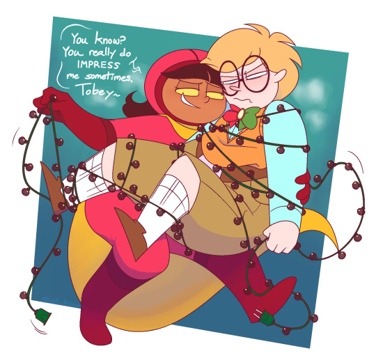
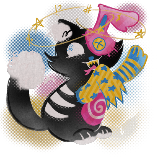
#just changed some linework and levels on it
Explore tagged Tumblr posts
Visit Tumblr Blog
Explore Tumblr blogs with no restrictions, modern design and the best experience.
Last Seen Tumblr Blogs


Fun Fact
Tumblr was acquired by Yahoo for $1.1B in 2013.
Text
I think we as a society need to be reminded how good the original Powerpuff Girls was. Here's some of my favorite things about it:
the fight scenes had a level of punchiness and impact that was rare for cartoons of the nineties, and fight scenes that were way better than what one would expect from a comedy
The character writing is so good that a large portion of the show's most iconic episodes consist of just showing how the girls' personalities react to different scenarios, for example in one episode the girls take turns recapping a fight that had just happened, and the tone and art style of the flashback changes depending on whose telling the story
One of the recurring extras is a talking dog that goes about it's day like a normal human
Each girl has mostly the same powers with one special ability that sets them apart. Blossom has ice breath. Bubbles can speak to squirrels and is also fluent in Spanish. Buttercup can curl her tongue.
while the majority of the show is lighthearted comedy sometimes it'll just decide to be nightmareworld for an episode and i think thats pretty cool
The show utilizes a blend of classic upa linework and sixties art deco shapism to create a visual style that is utterly timeless. If the majority of the show wasn't cell animated you would not be able to guess when it came out
The main villain's speaking patterns were directly inspired by The Super Dictionary. AKA, the same book that brought us this:
You can tell.
In the season one finale, the girls fight a giant monster using a mech suit. During the fight, there is a sequence that is literally just 20 uninterrupted seconds of an absurd amount of missiles coming out of every possible orifice of the robot. And then they miss.
There was an anime adaptation made in the 2000's and its actually pretty good, like it does take a lot of creative liberties but its clear that the people making it understood the spirit of the original show and were just adapting it to reflect japanese pop culture in the same way the og show reflected american pop culture.
The show had an insanely kickass soundtrack consisting of early techno so clean it's kind of shocking that it was made in the late nineties and not the early 2010's pre-dubstep era
satan is there and he serves cunt
7K notes
·
View notes
Note
Dear Jakkenpoy, I hope you are doing fine!!
This will be a little long, hope you don't mind!
Okay, so I just wanted to tell you that I'm so in love with your art. You are one of the best and most dedicated artists I have seen. Your artstyle is beautiful, colorful, and so expressive that words are not needed to explain what is happening on your artworks.
The love you put in every piece is shown, and every time I look at them, I get flooded of emotions, inspiration, and hope that I can reach your level of creativity.
Your love for our favorite major it's fascinating, your way of drawing him it's so beautiful that I keep staring at the screen to analyze him and your art in general, believe me when I say that your art literally change me for the better and made me love him even more (and also Paulie, he is so silly, and beautiful, I think your artstyle really fits him!) . And don't get me started in your ship art, you made me an Icepaullie shipper thanks to your art, but even then, every artwork you make, no matter the ship, it's just gorgeous, smooth even, it's so lovely and even dare I say, soft.
Your art is soft, it's warm, like I'm getting embraced by your colors and words and I feel happy, it's just so soft, the colors, the compositions, the expressions, the linework, the emotions behind every detail you put in the canvas, the way you write is beautiful.
"Mark-making" was one of the first Icepaullie fics I have read and I have no regrets, your way to show their relationship is soft, in words or visually, and just everything is soft and nice, calm, unique and I wish you the best so you can keep creating artworks that you love and you would want to share with us! (Please give us more fics!!)
Water 7 is and always will be a special arc for me since it was the first arc I saw content of, and that made me watch One Piece, so when I first saw your art, giving your love to the characters, and the arc in general in every art piece made me sooo happy.
I have so many questions and things I want to say, but it's difficult when English is not your native language, lol, so I will probably drop them in the ask box later
Since this ask got so long, I will stop here. I hope you are having a wonderful week, and I wish you the best!!
Atte. A fan of your work :D
🥹🥹 ooguhghh wwooowww thank you so much for writing this!!! <3333 (holds this ask gently in the palms of hands) (very glad for this comment on my Paulies. mayor Iceburg is a conclusion of loving labor but Paulie is special, Paulie comes so naturally to me!)
i'm so so so glad you enjoyed my fic! Mark-making is the first one i ever published* so it's quite dear to me. wrote it in a haze over a couple days and the loving push of some dear friends got me to send it out into the world
i draw a lot of inspiration from the Water 7 arc so i never quite run dry of ideas to make, and notes from the community like yours keep driving me to share :)
[*so not the first one i wrote! i'm still hacking out my first official icepaulie fic but i'm in the midst of a detour to improve my command of english so i can write it better ��️🩹 i so sorely plan to finish and publish more fic but i have a love-hate relationship with my writing, so comments like this motivate me all the more to write :) thank you, again!]
#your english is great. well-received 🙏 i'm also not a native english speaker so i get the struggle#i don't mind questions either. i love questions. i'm a fiend for those. keep shooting away!#jakkenpoy answers
11 notes
·
View notes
Text

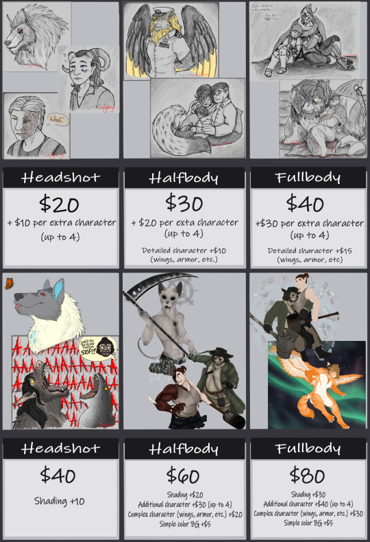
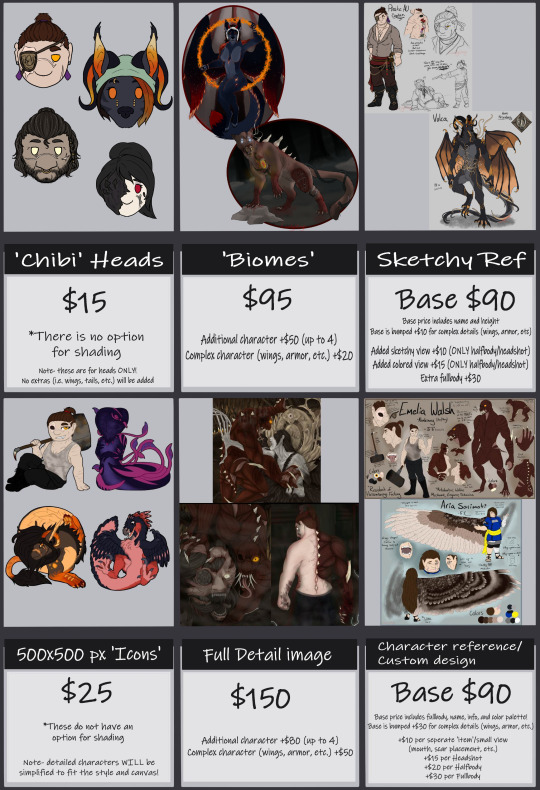
EDIT: PLEASE IGNORE THE BASE PRICING ON THE SKETCHY REFS. The base price is actually 50, NOT 90!! I just realized it a while ago and haven't been able to change it properly. So yeah- :')
Haven't posted these in a while and I ended up adding more, so-
Commission Price Sheets!
Commissions are OPEN! (Currently no slot limit)
General info is on the first slide, but the important things-
Due to... well, life, the TAT is 2 weeks minimum for smaller things, longer for larger things. Yes, sometimes I will get some things done ALOT faster, but my energy levels for different things really do depend on the day. Please be considerate of that if you commission me, I can only work when my brain lets me. I do often work on my own stuff in while also working on others too lmao
You will get sent WIPs of each stage of work, specifically the sketches and linework, and mostly for larger pieces! Sometimes I do just keep working for the smaller ones (headshot sketches and the 500x500 icons specifically) so it's a little harder to get WIPs for them. They are also easier to alter because they're only 2-3 layers.
Speaking of edits- I'm willing to do any edits for the sketch, linework and flatcolor stages- anything else may require an additional cost depending on size of the edit. Please for the love of the gods tell me if you need any edits when I send you the WIPs and don't wait until it's almost finished to ask for something different. Please.
I do very much have severe message anxiety- please be a lil patient with me if I don't reply right away, I promise you I am not ignoring you, I just struggle with messages :')
Uh... I think that's the important stuff! Like I said, there's no limit to 'slots', and shares are definitely appreciated...! <3
For even MORE examples, I have a whole profile on Toyhouse with them! Mostly because it's the easiest site for me to manage, and it's organized how I like it.
If there's any questions, feel free to ask!
~~~~~
Also, yes, I DO take NSFW commissions as well- /UNCENSORED/ examples and prices under the cut! (because censored examples kinda defeat the purpose.)
Please for the love of the gods ONLY look and contact me about these if you're over 18. Consider this your only warning.
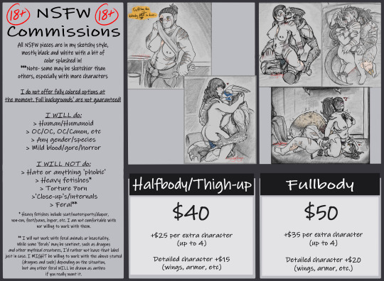
There aren't as many options for these but I still very much enjoy them, and there's alot more examples I have that I just haven't posted.
Like my normal Comms, TAT is 2 weeks minimum and you'll get a basic sketch WIP to make sure everything is alright <3
Again, any questions, feel free to ask~ uwu
#lovelywingsart#LovelyWings Commissions#commissions#commission prices#commission price sheet#price sheet#open commissions#commissions open#commission art#art commissions#adding the 2 fandom tags in the examples >#resident evil#resident evil village#mass effect#resident evil art#mass effect art#18+ commissions
11 notes
·
View notes
Note
What are some things that a beginner artist should know/learn?
Oh boy...I don't know that I'm really qualified to give advice on this, but I started typing and couldn't stop, so
LONG answer below the cut.
I'm going to steal a quote. I first heart it on Drag Race, but I'm not entirely sure of the origin of it besides that.
"You have to learn all of the rules before you can break them."
Essentially, learn the "standard" methods/styles (this does not mean master them! It just means to LEARN them, gain an understanding of them) so that you can take what is useful and beneficial to you and your style/methods, and leave behind the rest.
There's a million ways to do this. You can go to art school, study under another artist, be fully self-taught, whatever is best for you, but the fact remains: You cannot develop a style if you don't even know how, or what a style even is.
Here's where I'm going to sound a little controversial, but it needs to be said:
DON'T BE AFRAID TO TRACE AT THE START, OR EVEN IN LATER YEARS!!!
You have to practice somehow, and if you only ever practice free-hand without reference, then you're going to reinforce the bad habits and hate the result. Bad habits here referring to things about your own art that you find subpar.
For example, when I first started posting my art online, this is the quality I had with freehand, no reference:
Tracing is a way to build muscle memory, and visual memory. It trains you to notice the proportions, the anatomy of a subject, and it gets your body used to drawing those proportions. Muscle memory and visual memory work together to craft the image you have in mind, and by training them both through tracing, you develop the ability to freehand it far better.
This does not mean to trace and then say you did it all yourself! Tracing images should be done for PRACTICE, not credit/posting unless you outright state it was traced, and cite your reference.
Now! Some things I want to talk about that I can use the image above as examples for...
I mentioned earlier the bit about bad habits meaning things about your art that you personally find subpar. Now, we're artists, we ALL find our own work to be subpar (unless you're Anish Kapoor or Miles-DF, but they're both known to be grade-A douchebags)
When I say that bit about bad habits, I mean things that you look at and go "that isn't me, that's not my style". NOT things you look at and go "It's my style, but it could have been done better".
For example, in the image above, see how I drew the sweater? That is 100% my style. You can see it, even in my newer work, that when I draw a sweater I draw them the same exact way. My linework has improved, my detailing has improved, but the actual style hasn't changed a bit. So that sort of thing is NOT what I mean by bad habits.
Now, notice the way I drew the mouth and fangs? A single, thick black line with two white lines going down from the halfway point?
That's not my style. It isn't how I draw mouths. I don't like the way it's drawn, but it's how I drew it and it's the style I drew it in, despite not being MY style. It needed to be changed. THAT is what I mean by bad habits. With the good habits I have now, I would have had the lips be two distinct things, the fangs would have protruded properly, there would be a noticeable bottom lip.
Part of being an artist is finding your style. That means finding other artists who draw in styles that you find appealing, adapting what you like about theirs into your own hand, as well as leaving behind anything you find hurts your style or your feelings on your style, while finding your own unique methods, your own one-of-a-kind ways of creating art.
Another example, from my own life: I adore an artist called Black-Kitten (Minors, don't look them up, antis/puritans shouldn't either).
I love their art style, immensely. I love the line weight, the way their brush strokes are so clear and deliberate, the level of detail they use that rests somewhere between "realism" and "cartoon".
But I don't want to copy their style. I don't. That goes against ME as an artist, and it disrespects THEM as an artist. So instead, I identify what SPECIFICALLY about their style suits me as a person. What I've found is that it's the line weights. So I emulate their line weights.
Another artist I admire is Fluff-Kevlar (again, minors, do NOT look them up). I love their style for all the same reasons I love BK's style, but something about it is different. From their style, what suits me is the way they blend fur patterns.
So I emulate it, adapt it into my hand, which results in a style that has adapted the line weights of BK and the fur blending of FK, mixed them into something new, and all of the rest is entirely my own.
All of this is to say "Don't find a successful artist and copy them, find an art style you enjoy and adapt the part you love most from it, blend it with yourself, and you'll find your style."
Or you can come up with a style that is 100% your own! There's no reason you can't! But most of us are inspiration-based workers, and we emulate what inspires us, consciously or not, so why not actively seek what we emulate, identify it, and work at it to make it something of our own?
Another thing to be wary of is that little voice in your head that says the result on paper doesn't match the image in mind.
That's the devil talking, and he will tell you that no matter how close your work is to the mental image you had of it at the start.
You could be one single pixel, one tiny little graphite speck, off of the mental image and he would still tell you that.
IGNORE HIM.
"Finished, not perfect" is the name of the game. Doesn't mean rush it, it just means that when it's done, it's done, and whether or not it's perfect, done is good enough. Done is valid.
On top of that...
Draw what you want to draw.
I'm serious. No matter how bland, normal, interesting, weird, fucked up, crazy, insane, stupid, hilarious, jokey, off-putting, insensitive, sensitive, appropriate, inappropriate, or just plain strange it might be, draw what you want to draw.
There are millions of artists out there. There's only one artist that will draw your ideas in your way, and that's you.
If you want to draw a car flying on penguins, do it!
If you want to draw a fat, black, trans character eating churros and dancing the macarena, do it!
If you want to draw steve from minecraft sitting at a campfire, do it!
If you want to draw an airplane with super NSFW anatomy, do it!
If you want to draw smut, or children's book illustrations, or LITERALLY ANYTHING, do it.
Because nobody else in the world will draw it the way you would.
Don't deprive the world of your work, however odd that work may be. Artists are odd by nature, so let your freak flag fly and be proud of it.
The last thing I can really say on this is...well....
Just draw. If you want to get better, if you want to improve, you HAVE to draw. Draw a ton of lines. Draw a ton of circles. Draw a ton of eyes, mouths, lips, noses, ears.
Draw squiggles and zigzags, draw Xs and Os, draw hair and fingers and toes and hands and feet and legs and arms, draw fur and teeth and claws and tails, draw humans and aliens and animals and monsters.
Doesn't matter what you draw. Just draw.
Every line put to paper is practice, every curve is training. You get better and better with each and every one of them.
Do you want proof?
My very, very first art piece to ever go up online:
versus my most recent art piece:
The first image was posted in 2016. I was 18, and thought that using a linework tool in PaintTool SAI was better than using my art tablet because "the linework tool has uniform lines and doesn't leave gaps anywhere"
In 8 years, this is the difference. I went from not even being able to detail hair to being able to do all of this.
And I'm not even that great. I know there are artists who have done 10x better in half the time, and there are artists who can't hold a candle to my work after 10x the time.
Which leads to my closing notes...
You will never be as good as you want to be. Every time you notice improvement, you'll set your own bar higher and raise your expectations. That's how we are. And that's okay.
There will always be artists who are better than you, and artists who are worse than you, and artists who are just as good. DO NOT compare yourself. Acknowledging the existence of better, worse, and equal is fine. Telling yourself "I'm not as good as X..." or "I'm so much better than X!" are paths to the darkness.
“If you compare yourself to others, you may become vain and bitter; for always there will be greater and lesser persons than yourself.” ― Max Ehrmann, Desiderata: A Poem for a Way of Life
Be fair in your judgements of your own work, and the work of others. Practice often, learn from those with more experience/skill, take many teachers, and make their teachings your own. Adapt the good into your hand, and discard the bad from your thoughts.
Sorry if this got rambly, but hopefully you could glean something positive from it.
I'd advise asking other artists this question as well. Like I said, take many teachers. Learn from as many sources as possible, keep what works for you, drop what doesn't, and if anyone tells you otherwise, if anyone says "Actually you should be doing this specific stuff!" as if there's one surefire, perfect way to be an artist, ignore them.
Art is subjective, and there is no wrong way to do it, but there is also no RIGHT way to do it. The best way to be an artist is to be YOUR kind of artist, as unique and one-of-a-kind as the works you create.
#artblr#artist#ask#answer#i really dont know if my advice is any good#but its what has helped me#maybe it will help you too
11 notes
·
View notes
Note
Fuck- I forgot to add the following question to the last one SLWNWKWBS
But uhm,,, I was just wondering how you do your sketch progress if I may ask?
I always find it interesting To see how artists do their sketches and put down the shapes to archive their wonderful artworks! (And I feel one can learn a lot from seeing the progress :0)
-💜🐈
OHH WELL, WHAT A QUESTION... 💕
i don't think i do it much differently than any other artist really... especially in more RECENT years when i've leaned more into more of a " traditional artist process " rather than just being the most insane person & drawing from nothing,
because i used to do that. no sketch, no skeleton, no regard for anatomy, no pillow, no NOTHING & let me tell you. i'm better mentally for changing that
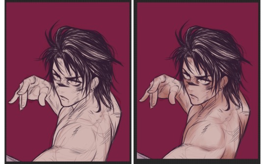
( no nothing on the left vs used a presketch / skeleton / structure on the right )
okay maybe you can't tell because these were drawn years apart anyway BUT BELIEVE ME ONE OF THESE TOOK MORE PRE SETUP THAN THE OTHER & IT'S NOT THE ONE ON THE LEFT
hi everyone who's been with me since 2018
ANYWAY. THE CURRENT DAY PROCESS;
STEP 1 ) the " beta sketch "
my clients will Especially recognize this term & these shapes;
SEE HOW THIS LOOKS LIKE A LOT OF BULLSHIT NOTHINGNESS? i usually start with This Nonsense to get a good feel of the pose / situation i'm working with / to give a poor client working with me some idea of where i want to go with their request;
this is the starting phase to put an idea in everyone's heads but everything is plenty subject to change;
NOW, STEP 2 ) uhhhhh beta sketch part 2. thumbnailing maybe
NOW i start shaping the ball of clay i've birthed a little more, NOW i start taking anatomy, structure, the final positions & expressions into account according to how i or a client may want them;
this is the stage JUST before linework so the majority of changes are usually done Here. this is still obviously way messy but Much more coherent ( at least to people who are me ) & what i imagine professionals deliver to their clients first as to save time. i however have plenty of that & will harass you with every passing second
STEP 3 ) linework !!!
HOWEVER clean or messy it may be, this is the lineart stage! the second to last course! this is where the BIG SHIT goes down & everything falls into place; everything's WAY cleaned up, the picture is Almost done, & well- you get the idea,
STEP 4 ) heueheuhsijhruigrjhdihirednguerhgiudf DONE

this is where the final colors & details & SHADING & WHATEVER needs to be incorporated comes into play, OF WHICH INVOLVES LIKE 3 ADDITIONAL PROCESSES but i consider this just One Big Step considering it's all relative to me & i don't even stop to BREATHE once i hit this stage
& THEN WE END UP WITH THE FINISHED PRODUCT! just like that!
of course, it maybe takes a bit LESS depending on the seriousness / level of detail necessary for each piece, maybe i feel more than confident to skip right to the lineart & cook, BUT THIS is USUALLY how the process goes!
& i'm sure there's someone out there who probably laughs at me & thinks they can do better or quicker or sexier & TO THAT I SAY
ok cool
MAY THIS HAVE BEEN AN ENTERTAINING & / OR INTERESTING READ FOR YOU! because god knows i have as much trouble explaining this as any marvelous thing i do
THANK YOU FOR YOUR CURIOSITY!
#anonymous#inbox#FEATURING A TRADE WITH MY LOVELY FRIEND ORCA#OF WHICH I ACTUALLY DOCUMENTED COHERENTLY#so that i may share with thee#ENJOY#I AM FUCKING NUTS
15 notes
·
View notes
Text
An Orange-Hooded Tattoo Artist
So, I've been dying to share and have previously alluded in an abstract manner to my take on adult Kenny. It's a different path to Post-Covid, but in no way a bad one - he takes so much joy in his work. He's inspired by my mind running wild with a cool little piece drawn by @foxydodo a while ago, and tbh this odd little AU blorbo lives rent-free in my head.
so uh...think of it.
----
If you're getting a tattoo, you want to feel trust in that the artist knows what they're doing - needless to say, the best tattoo artists tend to have a lot of tattoos themselves; be it done by themselves, or someone else.
So you're a person who wants a tattoo, and you want to pick the best in the business. After seeing many lacklustre instagrams of blowouts and shaky lines, you come across the portfolio of this guy from a small mountain town in Colorado - this is the one. There's no photos of him - he's a bit of a private person, apparently - but he seems legit. His studio is top-of-the-line and his work next to none. His colorwork is so enigmatically expressive and linework faultless.
You get in touch, make your arrangements, and get down there on the day of the appointment.
It's not only his studio that's spotless...he is too. No tattoos of his own whatsoever. That's weird. Is this the same guy? You persevere.
He proves himself.
You're never gonna meet another guy with this much thoughtfulness, this much care, and this much patience with his clients. He understands what you're looking to get on a level your friends just didn't, and wants to make sure you have the best time possible with the process to make something you truly love. The end result is unforgettable to anyone who sees it.
---
No one quite knows how Kenny McCormick got so good at doing tattoos so quickly - the lack of them on him just confuses them further. Many swear they've seen some on him, but others claim his skin is a blank sheet. Where photos could exist, people would definitely refute it with physical evidence if they could. They'd have an easier time of that too if that evidence didn't change by the day.
No one notices, but Kenny isn't exactly mortal. Death has befallen him frequently ever since he was a child, and in increasingly absurd ways. As he grew older, he became jaded by it and began to take advantage of this - drugs, alcohol, many failed death-defying stunts - but eventually after a series of digital explorations through youtube, real-life urban exploring caught his eye some time in his teens. More often than not his friend Stan would come along, and they would attempt to make youtube videos of their own of the derelict building and dilapidated malls they would find; but it was a time on his own when Kenny found his very first, very questionable tattoo machine. Amazon's finest; perhaps abandoned by other teenagers who had the $60, but not the sense that regular people need. He thought maybe he should draw something on his upper arm to remember the occasion for now. A hot lady with big boobies would do.
---
About two weeks later, Kenny died from a unique and vicious infection that stumped doctors - waking back up into life, he cursed under his breath about how he should have swapped the needles first before scribbling that silly stick figure on himself. His handiwork from that slip-up had been wiped, though. Maybe it was time to make something to show off at school? Maybe it was the first of many things.
#south park#sp kenny#this turned out longer than I meant it too oops#kenny mccormick#sp kenny mccormick#there were a lot of details i thought about adding but i am not about to start writing a fic lmao#he wouldn't hide in the coat as an adult the title just seemed the best way to convey things lmao#the ending feels like it could be way better to me but w/e like I say I just wanted to tell people the idea
3 notes
·
View notes
Text

Batman Ninja vs. Yakuza League Review
Movie - Batman Ninja vs. Yakuza League
Release Date - March 18, 2025
Writer(s)/Director(s) - Kazuki Nakashima, Junpei Mizusaki, Shinji Takagi
If you haven't yet plunged into the chaotic brilliance that is *Batman Ninja vs. Yakuza League*, you're seriously missing out. This film is a wild fusion of DC's dark knight lore and the audacious flair of Japanese pop culture, resulting in an experience that's as unpredictable as it is exhilarating.
Picking up just a day after the events of its predecessor, the movie catapults us into a Gotham that's under siege by a "yakuza hurricane"-yes, you read that right. Yakuza henchmen literally rain from the sky, setting the tone for a narrative that's unapologetically absurd yet captivating. The plot spirals into a whirlwind of time travel and alternate realities, introducing us to inverted versions of Japan and twisted renditions of familiar heroes and villains. Imagine an evil Superman donning yakuza attire, complete with aviator sunglasses, exuding a menacing charisma that's hard to ignore.
The film doesn't just stop at flipping character alignments; it dives headfirst into a pool of anime tropes and Japanese cultural references. From impromptu musical numbers reminiscent of '90s enka ballads to over-the-top "Science Ninja Techniques," every scene is a testament to the creators' deep appreciation for Japan's rich pop culture tapestry. It's a love letter wrapped in satire, and it works brilliantly.
Visually, *Batman Ninja vs. Yakuza League* is a feast. The character designs are meticulously crafted, blending traditional yakuza aesthetics with the iconic features of DC's heroes. The action sequences are choreographed with a frenetic energy that's both dizzying and delightful, ensuring that viewers remain glued to the screen from start to finish.
In essence, this film is a masterclass in creative insanity. It's a cinematic rollercoaster that doesn't just break the fourth wall-it obliterates it. For those who can appreciate its audacious blend of genres and cultures, it's an absolute must-watch. And if you can't? Well, perhaps it's time to broaden your horizons and embrace the beautifully bizarre.
This movie was a lot of fun. The first one was ok, but this one was an improvement in every way. I loved that the writers figured out that the Bat Family is basically a science ninja team and ran with the idea. I loved all the 70's throwback stuff. I really loved how much the writers seemed to know the characters. All of the characters kept their core aspects and there was some pretty cool and creative uses of their powers, which I always like to see.
Definitely not a flick to take too seriously, but its a good time for sure.
The only thing I didn't get was the different art styles. In Batman Ninja the art style changed for dramatic effect but in this one it seems to just switch back and forth kinda randomly. Maybe its the switch between 2D and 3D animation? Not sure, but it was distracting.
Batman Ninja vs. Yakuza League is an absolute triumph-a breathtaking fusion of classic Batman mythology, anime-style action, and stunning Japanese aesthetics. As a sequel to Batman Ninja, this film takes everything that made the original great and cranks it up to an entirely new level. With jaw-dropping animation, intense fight sequences, and a gripping story, this is one of the most visually and narratively exciting Batman films ever made.
Visually Stunning and Uniquely Artistic The animation in this film is nothing short of a masterpiece. Every frame is crafted like a moving painting, with rich colors, bold linework, and seamless transitions between 2D and CGI. The art team beautifully blends Edo-period Japan with Gotham's dark, gritty atmosphere, creating a world that feels both immersive and larger than life. From rain-soaked rooftops to candle-lit dojos, the visual storytelling alone makes this film worth watching.
An Engaging and High-Stakes Story The plot follows Batman and his allies as they confront the *Yakuza League*, a deadly syndicate led by Gotham's most infamous villains-each reimagined as fearsome, honor-bound warriors. Unlike typical Batman stories, this film leans heavily into samurai and ninja themes, with Bruce Wayne forced to rely on strategy, martial arts, and sheer determination to defeat his foes. The stakes feel higher than ever, with unexpected twists, emotional moments, and a sense of urgency that keeps viewers hooked until the very end.
Brilliant Character Adaptations One of the film's biggest strengths is how it reinterprets Gotham's rogues' gallery. Joker as a ruthless yet theatrical Yakuza boss is pure brilliance, while Bane, Poison Ivy, and the rest of the League are given unique, visually striking designs that blend seamlessly into the feudal Japan setting. Batman himself is at his most disciplined and strategic, forced to adapt and fight like a true samurai. His allies-Nightwing, Catwoman, and others-each bring their own flair to the action, making every fight scene unpredictable and thrilling.
Incredible Action and Choreography If you're a fan of high-energy, beautifully choreographed action, this film is a dream come true. The fights are a mesmerizing mix of hand-to-hand combat, swordplay, and Batman's signature gadgetry. Every encounter feels fresh and intense, with creative set pieces and cinematic camera angles that enhance the impact of each strike. The final showdown is nothing short of legendary, delivering an emotional and visually stunning conclusion that will leave audiences in awe.
A Must-Watch for Batman and Anime Fans Batman Ninja vs. Yakuza League is more than just a sequel-it's a cinematic event. It perfectly balances anime-style spectacle with the depth and intelligence of a great Batman story. Whether you're a longtime Batman fan or simply love stunning animation and samurai action, this is an experience you won't want to miss.
So Overall, this movie gets a total score, of 9.5 out of 10. this is like amazing when the team the Japanese Office of Warner Bros has done this masterpiece. A True Animated Masterpiece With its breathtaking visuals, engaging story, and some of the best fight sequences ever put in an animated Batman film, Batman Ninja vs. Yakuza League is a must-watch. It proves once again that Batman is a character who can thrive in any genre, and in this case, the blend of historical Japan and Gotham's darkness creates something truly unforgettable.
Final Rating - 9.5/10
Batman Ninja vs. Yakuza League Belongs To Bob Kane, Bill Finger, Gardner Fox, Kamikaze Douga Co., Ltd. YamatoWorks Inc. Barnum Studio, DC Comics, Inc. DC Studios, DC Entertainment, Warner Bros. Animation Inc. Warner Bros. Television Group, Studio Distribution Services, LLC, Warner Bros. Home Entertainment, Inc. Warner Bros. Japan LLC, Warner Bros. Pictures International, Warner Bros. Pictures, Warner Bros. Motion Picture Group, Warner Bros. Entertainment Inc. WarnerMedia And Warner Bros. Discovery, Inc.
0 notes
Text
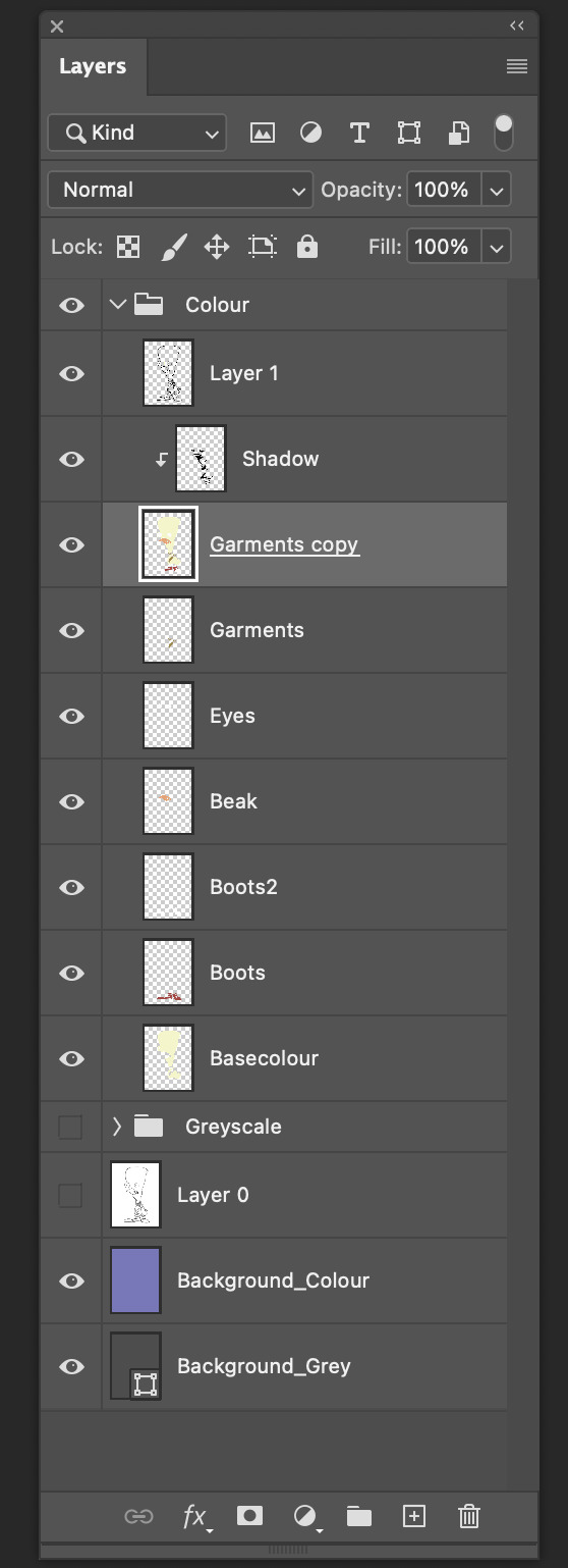
Digital Character Design Workbook - Pt.1
In class today we explored using line stability on our paint tool to create smooth and seamless linework. We traced over an existing draft character design employing a few different tools and techniques.
Some of the other techniques we used included, using both the selection tool and paint bucket tools to quickly fill in sections of our linework; with a proper organised layer setup, this setup allows for an easy to navigate, non-destructive workflow to allows for quick and easy adjustments to values and colors. We used the "Some of the other techniques we used included, using both the selection tool and paint bucket tools to quickly fill in sections of our linework; with a proper organised layer setup, this setup allows for an easy to navigate, non-destructive workflow to allows for quick and easy adjustments to values and colors. We used the "Expand" tool to remove any anti-aliasing that occurs using the paint bucket tool.

Once you have your selection expanded and ideally on a layer of it's own, you can quickly change values like hue, lightness and saturation by using the shortcut "Ctrl - U"

We practiced these tools and techniques on a quick donut sketch we did in class. To quickly create different colour variations of the donut, I made sure to group all layers and then I could quick duplicate these groups and adjust the new donuts colour groups as I went.


Below are some of the shortcuts we learned -
Ctrl - U - Colour Change Settings
Ctrl - A - Select All
Ctrl - D - Deselect All
Shift - Command - I - Invert Selection
Alt - Delete - Fill Selection (Used After expanding Pixels
[ - ] - Changes Current Toolsize/Brushsize
Change Opacity Levels - Numpad keys
Value Study -

Today in class we moved away from lines all together and moved on to practicing values.
The first stage of this process involved a flat greyscale blockout that most represented a middle value shown in the reference picture.
The next step was a basic blockout of the shapes, their general location and scale. A tried and true technique while doing this is to place your image close to the study you’re attempting. Also, blurring of the eyes can help remove unimportant information and allows you to focus on the larger scale tasks.
After this study we moved onto creating an original character of our own. I decided to keep it simple and try creating an anthropomorphized animal. I went with a Western theme and chose to use Owls as my animal. I find their strange head and neck flexibility rather menacing and predatory so I took these features and attempted to create a wild west bounty hunter/deadeye type character.
The first thing I did was gather a bunch of references from google images and Artstation. General pictures of different types of owls and Wild West Cowboys and other figures.

Once I had a loose Idea of the types of imagery and subject matter I wanted to roll with, I began doing some very loose shape and linework. At this stage of the design, I was really just trying to gauge what type of stylisation I wanted to use for this character. I'm generally used to creating more realistic character designs, so I wanted to take this as an opportunity to challenge my normal workflow.


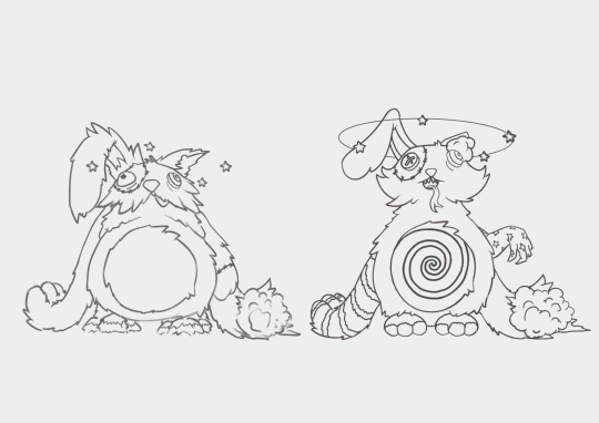
After doing some designs ranging from heavily stylised to slightly more dialed back, I decided to go with the design on the right.

I worked on refining this design a little further by adding some more costume elements, and doing a cleaner line pass over the rough sketch.

I then went through with a range of different greyscale values and blocked out each piece of the character, with an aim to keep readability through contrast of values and shapes.
Below are the various value studies I ended up with, I haven't got an overall favorite, but I lean more towards the left most designs value setup.


In class, we were assigned into groups of three, and tasked with both writing a brief relating to a character we worked on developing as a group, and then passing that brief onto another group and receiving our new brief. While waiting for the groups to be set up I jumped into another value study, I wanted to explore the planes of the face this time so I found this sculpture reference through Pinterest and spent about 1 hour total studying (some of the study was done at home after class too).

The brief we received involved a goofy magical minion who was involved in a summon accident, it was left pretty ambiguous in regards to its visual design, so the first thing our group did was put together a reference board with a rough idea of the type of creature we were thinking of. Something goofy but also cute, we also wanted it to be apparent that something was a little off on account of being involved in the summoning accident, so most of our references have a slightly uncanny goofiness.

we all went off and began just brainstorm sketching, we would regroup after a little sketch session. Below is the second stage of the brainstorming where we’ve all done some designs and considered a colour palette, and I’m working on loosely matching my first sketches with elements of the other group members sketches.

This is the third stage where the line art is being cleaned up, the smaller shape language is being refined, and all the colours are now on the design and matching the other group members designs.

the final sketch has shadowing applied, line art cleaned up and a background, that was built on ideas of retro tv studio contexts (This was also part of the brief character story). The style of this character is meant to loosely represent a mobile game character, but I took a higher fidelity stylised approach to the design.
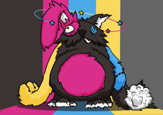
Here’s the A4 lineup of all our groups characters, I love that their all so stylistically different, yet they are cohesive in their design choices and colour palette.
In class, we compiled these designs as a group page and passed it off to the original brief writing group to see what they think, whether it matches what they envisioned, and what couple be improved.
Each group member went away with the feedback we had recieved from the other team, to create revised versions. Below is the list of things needing adjustment or changing for my character in particular.
The next step for me was to compile all the feedback points that were specific to my character, as well as general design changes across the board for all of our characters.
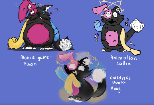
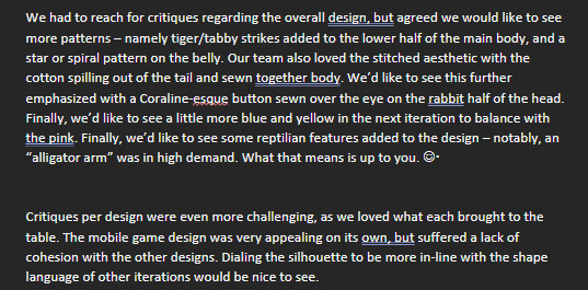
I quickly jotted down the points of revision in my procreate character project file, as well as gathered some new reference images for the additional design changes ("Add tiger stripes to lower torso, and an Alligator arm)

One key piece of feedback specific to my character was the lack of design cohesion with the other group designs, so i started by grabbing a reference of the new design Abby had sketched up, and I did a sketch over my original character to figure out which areas needed dialling back or complete redo's. This was also a chance to slot in the new design elements we had received in our feedback.
From here I did a simple colour blockout, aiming to match Abby’s reference as accurately as possible this time.
The final and longest spent section was line clean up. I could've probably done a completed fresh sketch, but I instead opted to work my way around the existing sketch and incorporate linework from the old design. I enjoyed dialing between the two designs, and really thinking about which elements to keep, which to bin and which to modify.
To tie the design in even closer to Abby’s I added some stipple-like effects to the shading It also adds a nice subtle texture, and comic-print feel.
Here is the final revision A4 layout of all our new characters.

0 notes
Text
Sun Wukong, the Monkey King: my design notes [!! click here for the full line-up !!] [click here for just the goodies on tumblr]
also titled, "I underestimated my file sizes" TAT Separate images and info below the read more, beware this is LONG <3
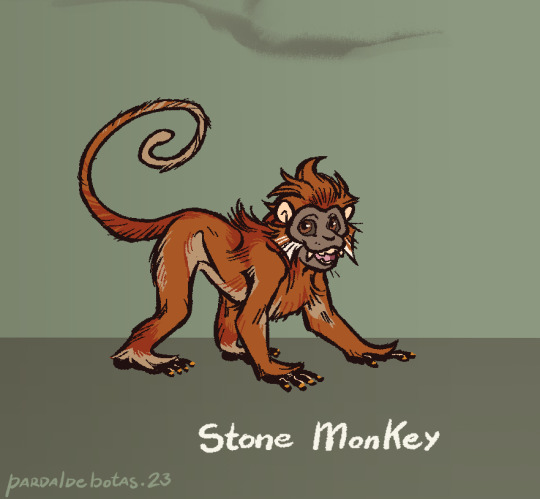
Stone Monkey: himbs baby, that is all <3 he's mostly based off the François Langur, but some of his anatomy and proportions lean more on the Gray Langur and Macaque side of things. His facial fur sort of forms a pentagon shape for the five elements, and I gave him ginger fur cus it's a common depiction for him but also baby langurs are very bright orange, and him not growing dark feels like an apt display of his more childish side, both good and bad. His nails are golden for a bit of a "hidden gem" from a stone egg. Also keeping the tail either in a spiral of C-curve when "engaged", and when droopy it has a feel of a heavy rope. Old World monkeys don't have prehensile tails, he can use it for balance and basic mobility but it's not a third hand for the sake of keeping his monkey-ness.
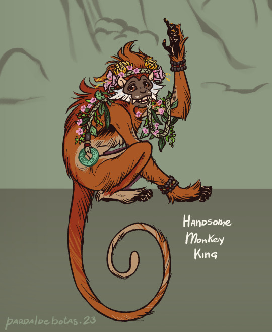
Handsome Monkey King: in one of the poems the monkeys are said to weave grass for mattresses, so I can see them coming up with a crown of woven grass and never-fading leaves and flowers for their king at the very least. His face skin is darker as an adult, but not much else changes overall. The fuzzy upper lips and sideburns are a feature of the species I'm basing him on and it felt like a good fit to add. I also love the forest langurs are so long-furred, makes for a good way to give him dimension but also, the linework style reminds me of old woodcut shorthands for fur. Added a jade coin for the symbolism, and it feels fitting that the king of such a miraculous mountain would have a treasure like that on him. Placcid chill eyes are imperative, dude's not had an existential crisis yet, he's straight up vibing.
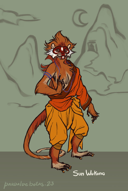
Sun Wukong: during his odd-ten years away from home, he learned human manners so he can stand but, I can see him still needing to lean on his tail to keep up his balance here and there. As he reaches the Western Continent (India) and learns the Way under Patriarch Subodhi, he adopts proper clothes for an apprentice and eventually becomes a Rishi. He dons his facial paint from then on, and after he masters the Way, there's a brightness in his pupils to show his cultivated immortality. The beads are purple solely to stand out over the deluge of oranges that is his design.
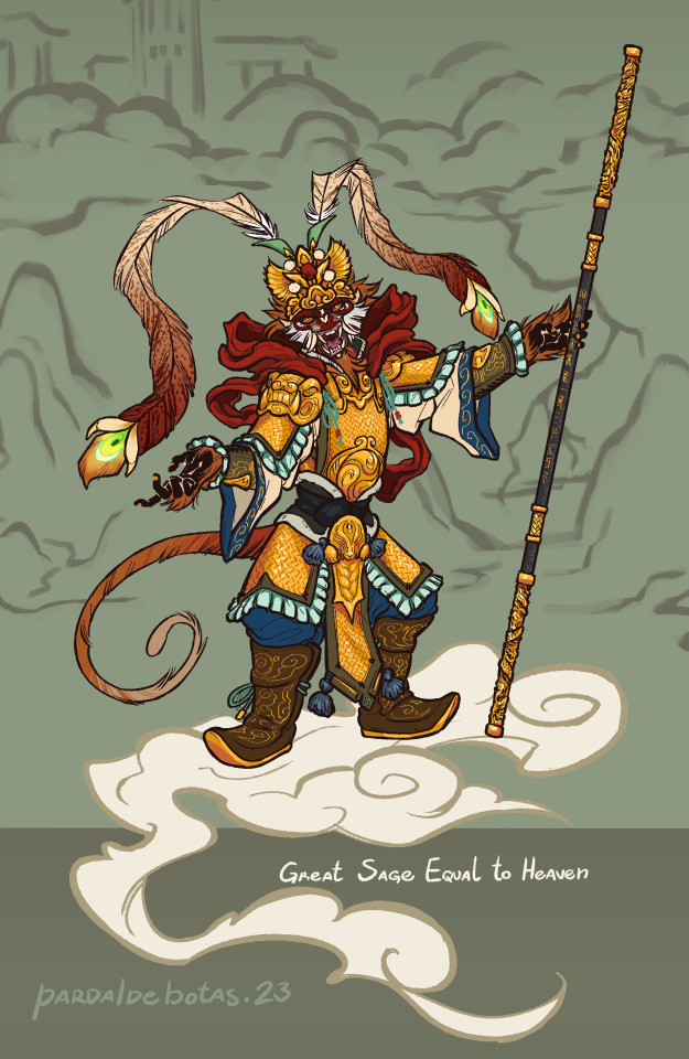
Great Sage Equal to Heaven: really went all out on this one orz this is Wukong at his most egotistical and ambitious, and I wanted his fit to truly embody that. Took bits from Peking Opera costumes and common depiction elements of him, with some bit of extra for appropriate levels of flair, like the phoenix feather design. I wanted to go for a mountain pattern mail but I couldn't figure out how to draw it, so I winged a pattern. I,,, doubt I'll ever draw this armor as detailed as here, but I wanted it to feel a bit overwhelming to look at, while also seeming like it doesn't quite fit him perfectly like it's swallowing him. Bit of a "baby wearing their parent's shoes" kind of vibe; he's stupidly powerful but he doesn't have what it takes to sit on the throne of Heaven. Also I leaned his expression to how he might appear during the Havoc in Heaven and then his bet with the Buddha. Full unbrindled rage murder monkey <3
-- Ruyi Jingu Bang: can't quite move on without my notes on the golden-hooped cudgel, now can I? The secondary hoops are there for further design appeal and for my own visualization of how the staff changes size (the hoops move over the staff's length as if to push it outward or inward). The metal is dark damascus alloy, though the pattern can be omitted for ease of drawing. One hoop end depicts a dragon, the other a phoenix, and in the middle of the staff is the canon inscription as described in the books, in seal script. Glow is optional and mostly for aesthetics.
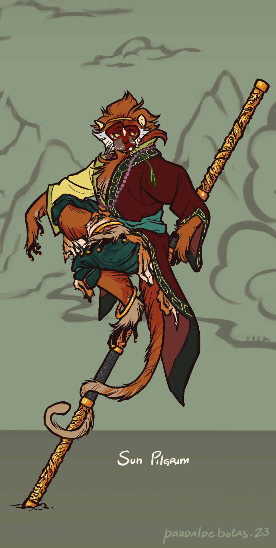
Sun Pilgrim: out of his stolen armor, Wukong seems to swim in his robes but in a less overwhelming way. Went for the simple fillet headband cus his face is busy enough as it is. I know he's skilled enough to skin a tiger into pretty decent squares, but after one too many battles, anything would get tattered. He wears red, teal, black and yellow, four of the five cardinal colors, while white (the West) is still missing. His red and black half-robe doesn't fully cover the yellow underneath, a call back to his golden armor; he tries to use his wisdom and teachings to fight back the impulses of his past, but they still shine through at times. I kept only the leg bangs for dynamic elements to better show movement, but also one could say he's got.... golden hoops (haha get it, like his cudgel?? :oD)
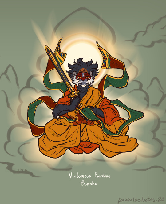
Victorious Fighting Buddha: leaned hard on the actual portrayals of the Buddha. Seeing that he's depicted with dark/blue skin, it felt appropriate to let the guy grow out of his baby ginger fur and into adult black, but a patch remains where the golden headband used to be. I didn't want to give him long hair so no bun, but instead, his fur has a sorta lotus-petals shape now rather than his single point. His face paint changes into a more domino-mask style, and his brow white line resembles a teardrop urna. I made the mail piece he holds longer to keep the flowy bits of his previous outfits, and I turned Ruyi Jingu Bang into the sword he wields.
Hello hi, this robbed me of three days of my life and I'd like to receive compensation x.x Anyway hope you enjoy this lad, I know I do! Also if you wanna send me asks about him pls feel welcome to, I'd love to chat about this bastard monkey (affectionate) (loving) (i`d die for him)
#jttw#journey to the west#xiyouji#jttw sun wukong#sun wukong#jttw fanart#monkey king#stone monkey#victorious fighting buddha#buddha victorious in strife#sun pilgrim#bell dragon art#expedition to the west au
353 notes
·
View notes
Note
Sorry if this is a weird question but how long did it take for you to start making art you felt was good enough, at least at the time? I have a lot of ideas for projects I want to make but I'm slowed down by not quite being at a level I'm happy with for professional endeavours. Wondering if I should quit while I'm ahead and just hire an artist I like.
Hoo. Good question.
It's hard to keep track of, honestly. I think every artist is going to feel a degree of "this could be better" about anything they make, and if that's all you're keeping track of it can feel like no progress is being made - but in hindsight, I think "this could be better" means a lot of different things, and what it means for my work has changed over time.
One of my earliest art-related memories is having a very clear image in my head of a pencil sketch I wanted to make (a family portrait of some wizards, a mom and dad flanking a young daughter) and then being immensely frustrated that what I produced was a pale, inexpert shadow of that image. The starting point I was at was "this doesn't look right and I don't know why," and I stayed there for a long time, even as I got overall better.
The first time I remember trying and failing to emulate a specific cartoon style, it was the manga Steam Detectives - I'd mostly been exposed to newspaper comics and scientific illustration, so I had never seen that sharp-angled straight-lined manga style before. There was a liveliness to it I couldn't capture, and that frustrated me. At this point I could see what was wrong, but couldn't yet correct it - my unconfident pencil sketching wasn't going to produce the same kind of three-dimensionality and flow as the brush strokes used in the, in the same way that a traced figure can look strangely odd and off-balance because it's only mimicking the outlines. At this point I'd hit "this doesn't look right and I know why, but I'm not sure how to fix it."
At that point, practice was kind of the only solution - unconfident linework can only be improved by honing the muscle memory and confidence of the artist, which I didn't know at the time or do on purpose but ended up happening anyway, especially once I got going on the channel and was regularly doing dozens to hundreds of drawings per project.
I do remember the first time I thought "oh, that's actually better than I expected" - I had broken my clavicle and my right arm was in a sling, and my art teacher encouraged me to try drawing something with my left instead. I am very much not ambidextrous and my lines were spidery and shaky, but when I stepped back at the end, the thing I'd tried to sketch - a portrait of a regal-looking elf man - actually wasn't too bad. The muscle memory in my right hand was completely absent from my left, but apparently my basic understanding of shapes and shadows had come through and made something that got across the gist of what I wanted. That was the first time I felt "this doesn't look right, but I already knew that, and what it does do is actually pretty solid."
At some point in the process of cranking out channel illustrations, and later chibi character commissions, without even noticing I hit a baseline level of confidence in what I was doing. Certain things got easier because I was doing them a lot more. I stopped thinking about whether a facial expression was communicating exactly what I wanted it to, stopped spending long stretches of time trying to refine poses - because in those specific areas I was no longer experiencing "this doesn't look right and I don't know why." I'd draw a face, realize it could look angrier, redraw the eyes and brows to be angrier, then move on. I'd block out a pose, decide the leg didn't look right, redraw it, line it and move on. It wasn't that I was nailing everything first try, it's that I'd had enough time and practice to quickly diagnose what wasn't working and quickly try something else to correct it.
Instead, I was thinking "this doesn't look right and I don't know why" about other things. Trees, buildings, figure shading, fire, water, metal textures. I still didn't feel ready to do the comic in earnest, but I'd started doing digital illustrations of the characters and mock-up pages/covers, and I kept finding problems in the composition. It didn't look right and I didn't know why. If I didn't know why, I couldn't fix it. A lot of that process boiled down to redrawing stuff until it managed to look right, then trying to reverse-engineer what had worked about that. I'd accidentally draw the most perfect torso and try to figure out what magic combination of lines had made that work. And again, it was a slow process, almost unnoticeable from my perspective, because I just gradually stopped worrying so much about unsolvable artistic problems because the solutions had just arisen with practice and experience. The background looks wack - it's probably under-shaded, darken some corners to make it match the foreground. This texture looks off - probably needs some particle effects to help give it detail. Etc etc.
At present, I very rarely think "this doesn't look right and I don't know why." I still have moments of "this doesn't look right" - almost constantly, probably - but they aren't noteworthy because I've had enough practice improvising solutions that it turns into a brief experimental phase before I fix whatever was bugging me and move on. It doesn't mean it's perfect, it just means whatever problems or places it could be improved are either subjective choices that are fine either way, or small mistakes I don't notice at the time. The process of error-correction and bug-fixing becomes quick and painless enough that I hardly think about how I used to spend ages agonizing over something that was wrong that I couldn't make look right.
The point I eventually got to could probably be best described as "I could make this better if I wanted - do I want to do that?"
Making a comic like this, it's very important for me to consider the value of pouring too much into any one page. If I vastly overdesign anything, I'm going to need to keep up that level of design every time it shows up. If I drew every forest shot by hand-drawing every single tree I'd never get anything done. If something looks off and I know the solution would be more detailing and more texturing, sometimes I'll do that - filigree and particles and all that good sauce - but sometimes I'll just try a few things until I find a shortcut that makes it look fine to my eyes. Art can always be more polished, so that's not really a metric for completeness or ready-ness - I really do think the most helpful metric is whether you're regularly struggling because you can see something is wrong but you can't figure out what. If you consistently know what's wrong - or, more accurately and less judgmentally, what could be polished if you wanted to polish it - you're probably in a pretty good spot.
171 notes
·
View notes
Text

thank you ToT
linework is by far one of my most-practiced art skills, with quite literally hundreds of hours put into it over the last few years, both in traditional and digital media... so it's taken a hella long time to get to this point but i must admit i've grown to really like how I do my line sketches!
i can try and describe what I do in more detail to help you get a sense of what's going on, because it's not like i have some secret technique or tool that lets me make magical lines. I'm like, 99.5% sure that you could probably get linework like this (in your own style of course) with practice & effort, so long as you actually understand what it is that you're trying to practice, y'know?
I like to generally break up the skill-learning process into three broad components:
Understanding the desired effect
Understanding what it takes to achieve said effect
Developing the muscle memory to execute that effect
For the first part, essentially, you want to be able to know what it is you'd like to improve at. For instance, using this as an example for the rest of the parts as well, imagine you want to get really good at muscle anatomy.
Well, that can mean a lot of things: for instance, you might want to learn about all the muscles of the body so you can get better at depicting bodies in motion (i.e. squash & stretch of muscles during physical activity), or you might want to get better at drawing accurate 3D forms of muscles for the sake of aesthetic appeal (i.e. drawing buff guys & gals for funsies).
So lets say you just want to draw visually-appealing and somewhat accurate muscles. In that case, you still want to learn the basics of all the anatomy, but the #1 thing you'll want to do is observe a LOT of examples of real-life human anatomy and see what different human bodies have in common when it comes to varying degrees of muscular form.
For instance, it's INCREDIBLY helpful to be able to adequately draw the difference between fat, bone, and muscle. The fat of a thigh has a different visual quality than the bone of the collar which has a different visual quality than the muscles of the deltoid. You ideally want to the viewer to be able to look at a part of a human that you draw and be able to identify that one part of the body is soft and squishy and another is hard and solid and yet another is firm and tough.
Onwards to the second part: actually understanding what marks you need to make to achieve those effects. Since we're talking about visual art, you need to somehow create some mark in your desired media to create something that other people will physically see. I learned a lot with charcoal, so I'll choose charcoal/graphite as the medium of choice when I explain my own drawing process later on.
In the case of bones vs. muscle vs. fat, surface-level bones of the human body (collar bone, ASIS points, knees/elbows, ankles, etc.) often cause the skin around them to get pulled tightly around their form. This means that the 3D form of the bone is relatively visible despite being covered by skin, and thus you'll see strong plane changes.
Imagine a cube, or rectangle, or pyramid. These 3D forms have very strong transitions from one side to another, and we often draw those sharp transitions using crisp, clean lines. So, since bones aren't perfect geometric shapes but often still have these sorts of sharp plane changes, we would like to use those sorts of sharp, crisp, fine lines to show the outlines of these bones.
In the case of fat, it's the complete opposite. Fatty deposits on the human body are often very smooth and curve evenly, making organic 3D forms with lots of gradual changes. These fatty deposits, like a plump tummy, will virtually never have sharp plane changes in their form, so you don't want to use crisp lines. Instead, you'll use few or even *no* lines at all, and mostly use gradation/shading.
Muscles are a sort of middle ground. They often do have form, with deltoids and pectoral muscles (chest) being an excellent example, but they also often have curved portions that have some degree of gentle transition between sides. So, instead of big soft shapes of value gradient, and instead of crisp thin lines, you might want to use a mix of larger, soft lines and smaller, soft shapes. Think narrow triangles like wedges, for instance, which are still line-like but aren't razor-thin, nor are they absolutely gigantic.
The third part to this muscle-drawing journey is actually developing that muscle memory to create these different types of lines exactly when you want to, quickly, and accurately. This is the part where you actually sit down and practice drawing these muscles over, and over, and over, and over, ad infinitum!
Ideally you want to make lots and lots of drawings, with a bit of variety in the length of each drawing. I personally prefer very high volumes of very quick drawings (60-180 seconds/1-3 minutes), and lower volumes of longer and more detailed drawings (5-15 minutes, etc.). For example, in a single hour-long drawing session I might make a couple dozen quick sketches under 2 minutes each, but then do only three 5-minute sketches and a single 10-minute sketch.
By no means is that the ONLY way to practice, but it has a distinct advantage: you get to expose yourself to a very large variety of human bodies (different proportions, muscle masses, volumes of fat, heights, skin tones, genders, etc.), but still dedicate some time to a handful of more refined drawings.
This can help you make sure that instead of getting very good at drawing *a single particular human*, you learn about the many variations in how humans can exist and get good at drawing *humans in general*. This is obviously very helpful in helping you be able to accurately depict different humans well, capturing their likeness, and also creating unique character designs, and avoiding same-face syndrome.
As you practice over time, you'll want to spend at least a bit of time reflecting on some of your past practice, and making comparisons with what you drew with what you were trying to draw (comparing your sketch with your reference), seeing what you succeeded at depicting and what you failed at depicting, and then trying to figure out what needs to change.
You might mess up a muscle by using too many soft lines, for instance, making it look like a pile of cotton instead of living, breathing, human flesh. Then you just harden the linework! Alternatively, you might've tried to draw a soft squishy tummy and ended up making it look like a block of granite. In that case, soften the lines up!
So, that's a broad overview of how I would approach the learning process. Since you commented on my linework in particular, I'll now actually to describe what *I* personally do, and you can decide to what extent you'd like to try out that sort of drawing technique, keeping in mind what the learning process will be like.
As briefly mentioned before, I studied for a long time using just charcoal and paper. So when I draw digitally, I try to emulate not the final appearance of drawing w/ charcoal, but the PROCESS of drawing w/ charcoal.
That is to say, I don't use charcoal brushes in my digital art software, nor do I use paper textures. Instead, what I do is I think about how I manipulate the charcoal on paper to create a given visual effect, and try to replicate that with my digital tools. It's become pretty intuitive for me now, but about two years ago I had to spend a LOT of time consciously thinking through this process and experimenting with different tools and settings to settle on something that felt comfortable for me!
If I were to draw with charcoal and paper right now, I'd probably be doing so on a giant canvas (i.e. 24" x 36"), using a handful of types of charcoal: soft willow/vine charcoal, ordinary charcoal pieces, a little bit of harder compressed charcoal, a handful of charcoal pencils w/ varying degrees of softness & hardness, an eraser, and my hand.
Typically, as I was taught by my professors, we'd often start with maybe 5-10 seconds of incredibly quick, simple, and light lines to roughly plot out the figure on the paper. If you're drawing a person sitting on a chair, for instance, you want to be able to get a sense of roughly where the feet, hips, torso, and head are.
The goal isn't to accurately draw any of the detail, but just to roughly mark where on the paper these different landmarks should be, such that they are in a roughly correct perspective (i.e. you don't want the feet over the head), and take up a lot of space on the paper (i.e. you don't want to have 12 inches of empty space over the person's head and 20 inches of empty space in front of them).
With practice, we wouldn't really take more than a handful of seconds to do this, and it's a 50/50 split between two things: getting good at doing it quickly & accurately, and getting good at telling your dumbass brain to shut the hell up and quit worrying about making it perfect, because you're going to erase it. IMMEDIATELY.
Literally, you erase it. Because as we all know, 99% of the time when you try to erase pencil marks on paper (although in drawing I'd start with the softer charcoal chunks), you can never erase all of graphite; just *most* of it.
So that's what we do: we use the eraser right away, not to "erase a mistake", but simply to remove some of the charcoal dust and lighten the marks we've made. This is really important to consider because it highlights one of the key things that makes my drawing style what it is: I try not to think about it as erasing mistakes, but rather darkening and lightening marks on the page, with both actions serving the same purpose of modifying what I've already created to try and get it closer to what I ultimately wish to create.
After that first 20 seconds or so of drawing & erasing, we'd use the soft willow/vine charcoal to block out the basic ofrms of the body. A little blob for the head, a bigger blob for the torso, longer and thinner blobs for the arms, etc. This is another 20-40 seconds, usually.
Then, we erase again. But this time I probably wouldn't even use a proper eraser, and instead I'd just wipe the charcoal away with my hand, because my hand is a lot bigger than a typical pink rubber eraser, so I can quickly wipe away most of the charcoal with ease.
By doing that, again, I lighten the marks I already made, but I'm not trying to erase a mistake. Rather, the goal is to have these vague, faint blobs on the canvas as a rough guide that tells me where the important body masses are.
Next, for maybe 5-15 minutes, I'd start putting the major landmarks of the body. You don't want to waste time drawing pretty eyelashes or lovely fingers or toned muscles. The goal is to try and quickly & accurately draw those important details of the human body that tell your viewer all the info they need to know to understand the scene: the perspective of the body, the tilt/twist of the different forms of the body, the rough proportions, etc.
The collarbones serve as a useful landmark for the top of the torso, the sternum tells you where the center line of the chest is, the belly button helps you get a sense of where the stomach is, the ASIS points of the front of the hips help you get a sense of the tilt and angle of the pelvis, and so on. Elbows and deltoids are useful landmarks for the arms, the brow ridge and nose are useful for the face, the ears & jawline are good for the side and bottom of the head, the sternocleidomastoid (a muscle) connects the ears to the collarbones and can clearly show you the twist of the head, and so on. There's similar landmarks for the feet, hands, legs, back, etc.
The reason I've learned to draw in this way is that by starting with the most vague aspects of a drawing first, you make it incredibly ease to constantly shift and modify your drawing to correct errors and make it more accurate to what you want to create.
That doesn't necessarily mean making it more REALISTIC unless realism is the goal, of course. What it does mean is that by focusing on those general big-picture ideas, you don't need to worry about things like wiggly lines, or messed-up line pressure, and whatnot. You can correct all these little details later, once you get those important foundational aspects like proportion and perspective done well, y'know?
Then, after those landmarks are done, that's when I'd often focus on adding other details. That's when I try to capture the likeness of the face (i.e. I'd start to draw the eye sockets, the volume of the cheeks and lips, the lines of the forehead, the hairline and volume of the hair), or I'd try and get the form of muscles and fat done well, or I'd try and add the details of cloth and fabric.
So, that's how I draw w/ charcoal. What I do digitally is I try to emulate that process, albeit with some differences due to my personal preference. For instance, I often start with lines and stick with using lines, especially in those shorter 2-3 minute drawings.
I use brush and eraser tools with a handful of preset sizes and preset *opacities*, and use pressure sensitivity (drawing on my iPad with Procreate, or more rarely using an XP-Pen screenless tablet w/ Krita on my desktop) to further change the size of the brush marks, but NOT the opacity. So I might use a 75% size brush at 50% opacity, and light pressure gives me 25% size and heavy pressure gives me the full 75% size.
What I'd usually do with start with a 5-10 second scribble, sort of like a "line of action" but more rough and messy, with the goal being to capture a very vague sense of movement but also proportion. This lets me put the figure on the canvas in a way that fills up space and feels good as a composition. If I don't like it then that's okay! because I spent literally just a few seconds, and I can erase it immediately and try again, lmao
I make that scribble with a thick-ish pen-like brush that has a little bit of size variation, but not too much, and keep it at 50% opacity. Since it's a very rough mark, I don't need it to be permanent, but I still like it to be dark enough to see easily. Then I quickly use a big and high-opacity eraser (usually 75%) to lighten it up, and immediately start draw over it.
By lightly and partially erasing, instead of using a 100% opacity eraser, I can still "push back" the early scribble so that it doesn't stand out and grab the viewer's attention so much, but it lets me use it as an intermediate guide to help me draw my next lines with ease.
Then, usually for the next 50 seconds or so, I scribble a bunch of quick and rough lines to block out the rough form of the figure. I might use three or four lines total for the entire torso, maybe just a circle and two lines for the skull & chin, maybe two to four lines for each arm, etc. This lets me get a sense of what the proportions and angles of the different body parts are, but doing it quickly & roughly so I don't waste time on fine details that will likely need to be corrected anyways.
At that point, I once again erase with that 75% opacity eraser. What's useful is that this erases the original 5-10 second scribble even more, making it nearly invisible to the viewer, and that's good because that original scribble has served its purpose and is no longer necessary. And this also pushes back the 1-minute sketch, which I still need as I will draw over it to further correct the figure, but I don't need it to be too strong because I don't want it to overpower the next lines I'll add.
The next few minutes are often where I start doing that detail of form, hair, clothing, etc., switching to a slightly smaller brush size, and then maybe using a slightly higher opacity (like 75% instead of 50%).
I'll try to start with those important landmarks, like collarbone and jaw & ear, and so on. Then I just build up the details, trying to avoid getting all the fine details (i.e. I'd rarely draw the complete eye at this point, but I'd probably do a rough circle for the eye with a single line for the upper eyelid, then do a couple lines for the nose and a line for the mouth, and maybe some lines for the contour of the temple & eye socket & cheek down to the chin, etc.).
Sometimes, if I want to add value or color, what I'll do is I'll keep this section short, then duplicate the layer at this point and turn off the original layer to preserve my original line sketch. Then I'll take the new layer, erase the entire line sketch again with that 75% opacity to lighten up the lines, and then draw using a big blocky rectangular hard brush.
I'll probably use a single color as the sort of dominant color for either the shadow or the light of the drawing, then using another color to contrast with it. For instance, if I'm using a dark color to draw with on my brush, and the scene I'm drawing is very light, I might start by painting with a lot of big blocky shapes using a light color, then use a smaller size to add some finer shapes that are darker and indicate shadow.
At this point I'm straying away from the line stuff, but the general idea is pretty much the same!
There's one more key thing about the linework, though. Sometimes, I add lines back over my shapey-blocky-painty drawing, and if that's the case I may use both dark and light lines instead of only drawing with dark lines. I like to do this so that I can use the dark lines to indicate areas in shadow (i.e. the space between the eyes and the eyebrows), and the light lines to indicate areas in light (i.e. the length of the nose, the top of the chin, the forehead, etc.).
Looking specifically at that sketch study of the Detective from Silver Palace, you can probably see all these different aspects of my drawing more clearly now. The original 5-10 sec scribble is pretty much gone, as is much of the early blocking. But if you look at the hair, you can see some very faint lines from my earlier sketches of it. That's because I painted heavily over the body, but used very few brushstrokes on the hair and background, so that part of the original line sketch survived.
Since I painted over much of the body, losing some detail, I ended up going back over it with the dark and light lines. That helped me preserve the general structure of my drawing, so then I could go over it with a different brush at high opacity (75%) and using specific colors to more accurately drawing the clothing, face, hair, and so on.
You can also see how I used the big blocky brushstrokes to fill in the big empty space of the canvas, and then used a few simple lines to add a bit of visual interest. The goal wasn't to make a detailed background, but just to add a hint of visual clutter so that if the viewer's eye wandered away from the figure, instead of dwelling on an awkward empty space they'd instead be guided back to the figure.
Another thing is that I put a little extra detail into the face, hair, and hat; this is because I am very tired and out of shape w/ my art and didn't want to do a super detailed drawing, but I still wanted to make it fairly presentable. So what I did was put extra effort on the face, because the face is often one of the most recognizable parts of a person or character, and the face (as well as hands and feet) often attracts the viewer's attention. Nobody's really gonna notice if you screw up the thigh a little bit, but everyone's gonna notice if the nose is too small or the eyes or uneven, y'know?
SO YEAH. that's how I draw, I guess :D
I've decided to upload the timelapse of that sketch drawing right here, so feel free to follow that link and check it out! It's only 1 min 15 seconds long, so it shouldn't take up too much of your time, and you can replay it and study it as much as you'd like ^.^
quick & rough sketch study of the Silver Palace MC, the Detective (time taken: ~1 hr)
19 notes
·
View notes
Photo

I’VE HAD THIS BLOG FOR 10 YEARS
Here’s to many more years of fish, vampires, aliens and bird people! To everyone who follows me and/or has praised my art, in any way, at any point, thank you, from the bottom of my heart.
I’ll be ranting about art progress and style changes under the cut, but before that, just a reminder that I’m going through a complicated time in my life and if you want to support me and my art there’s a few ways to do so.
Now back to my goofy doodles.
Maybe because I've drawn ever since I can remember, I've never felt a ton of pressure to improve my art skills. It's always been something I knew was going to happen as long as I kept drawing, and that's what I've been doing. I try not to stress too much about staying consistent with my practice or achieving any self-imposed goals. I like to discover what I'm able to do, one drawing at a time.
I also believe progress is not linear, and not every single piece is better than the last. While my 2023 art shows a higher skill level than that of 2013, I think some of my older work looks perfect the way it is. I'm drawn to expressiveness, movement, and compelling characters, and that can be achieved at any level. I've gotten better at some technical aspects, of course; my linework is far more decisive than it was before, and my endless battle with color palettes gets easier every day. I'm also capable of unwillingly drawing the crappiest, most horrendous doodle you've ever seen, just as I was in 2013. Just as we all are. I'm not sure why I find that reassuring, but I do.
When I started this blog, what really worried me was developing a distinct style. I studied other artists and stole specific elements of their work, sometimes drawing and redrawing the exact same thing until I was satisfied with the result. At some point, and I can't exactly tell you when or why, I stopped caring about that. It's not that I thought I'd found My Perfect Style, because that doesn't exist. I guess I started focusing on other stuff, and that's when my actual style started coming together. I followed my instincts, tried to strike a balance between what came naturally to me and what I was envisioning every particular piece to look like, and it worked. Any alteration my style has gone through since then has been unplanned and intuitive, and I can't see myself approaching art in any other way. I'm excited to discover what kind of artist I'll be in ten more years.
Thanks for reading this far! Warm regards from me and every notebook I've used since opening this blog (#9 to #37 in my overall archive) ♡

62 notes
·
View notes
Note
Hello! I was wondering if you could a small tutorial on how you render your pieces?? They’re all super pretty btw!! I love your art :D!!
Ahh thank you sm!! <3 0: i’m not very good at explaining my process, and it changes depending on what I’m drawing as well, but I’ll try my best to explain it!
imma use the choso panel redraw since it’s a pretty simple portrait (done in Procreate, but most of this can be applied to CSP too)
once i’ve got a decently refined sketch, i fill in a basic starting skin colour for the character. i start some shading once i have a basic idea of where i want lighting. colour-wise, i usually go a bit darker & warmer for the first pass. (i use a brush that’s a basic airbrush settings but i replace the shape source with a reuleaux triangle) besides where shadows will fall, ill also focus on making the colour more dense on the ears, fingers, around the eyes, and sometimes the blush area. (also let it be known i use Liquify a lot, and constantly flip my canvas. as you render you’ll often start noticing lil adjustments that need to be done)
ill build up passes of colour, going darker & more saturated as i do. as the colours darken, they’ll be in the more receded/hidden areas of the face (like under brows, under chin, inner ear, unless the lighting calls for otherwise) in this case though, he’s also kinda beat up, so i added more colour under the eyes/on the cheekbones to add to the bruise vibes
for the nose/brow/shoulder highlights, i made a new layer & set it to Add. it’s a handy way to get a highlight colour and brighten your hot spots for lighting. this is usually when ill mess with the sketch/linework, sometimes i switch the layer mode to Multiply if i know i want to fully paint over it. in this case i think i just Alpha Locked the layer and painted in the hair/eyeliner since i wanted them darker. once the linework is thoroughly fukt with, i make a new layer and start painting over. usually involves a lot of colour picking & making some adjustments, playing around with levels of colour. I also swap between the reuleaux and a funky dense rectangle thing for rendering, sometimes little sketch pens for smaller details too.
(technically the blue-tinge reflective lighting wasn’t very accurate for the bg/scene colour i chose, but i got carried away and didn’t wanna change it lol)
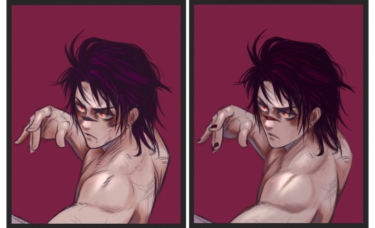
hair rendering is fun sometimesssss. i make a new layer, choose a slightly brighter colour, and messily block in where i want the highlights. idk how else to explain it besides like, think about using H-adjacent shapes when you’re erasing/refining the highlights. for the last step, i make a new layer, set it to Add, and paint inside the highlights for the sharper look.
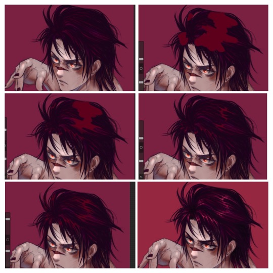
When it’s getting to a place i kinda like, (added some blood/cuts on this one before moving on) ill usually start messing with some overlay effects. this usually involves picking a random colour, filling in a new layer, and seeing how it lays over the piece. depending on the vibe im going for it can change a lot, but i find myself usually liking Exclusion & Subtract a lot. (sometimes ill throw a Noise + Overlay layer on top as well, but didn’t for this piece)
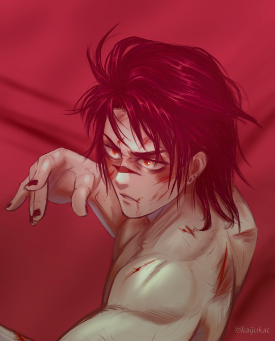
i hope that makes some sense??😭 im sorry if anything isn’t clear, i can try my best to answer specifics if needed.
it’s not my most thoroughly rendered portrait but it’s one i got a decent amount of wip screenshots for.. my style in general is still a wip, and i change it up a bit every time. i encourage experimentation always!!! it’s helped me a lot. i’ll see about making a more thorough tutorial for a properly rendered piece soon too!
52 notes
·
View notes
Text
BAD BOYS WITH DEATH DRIVES (Mars)
by Fuyumi Soryo | 15 chapters | 1996-2000
8.5/10
I’m sick of all these shoujo schoolgirl romances that aren’t willing to make their “bad boy” archetypes actually bad: dangerously violent, traumatized, panic attack-prone motorcycle racers. I think that’s the best way to describe the male love interest of Mars, Rei Kashino, a daredevil who is psychologically haunted by his twin brother’s suicide three years before. Then there’s Kira Asou, a quiet and closed-off artist loner carrying her own trauma from sexual assault. When the two begin an unlikely romance they slowly learn and grow together. Sometimes they mess up and hurt each other along the way, but the key trait of their relationship is how they manage to change each other, and change together.
It’s surprising how many shoujo series take the idea of change and growth at a superficial level, or just allow relationship dynamics to fall into lazy tropes and patterns for comfort/amusement. Which is weird because the shoujo genre mostly consists of high school romances, and isn’t adolescence defined by transformation? Mars, on the other hand, understands this and takes it to heart - Fuyumi Soryo never shies away away from the discomfort that comes with growing maturity. She’s written characters here that are desperate and sensitive and cunning; who understand that if they don’t adapt, they won’t survive.

Soryo’s panels descend hazily into cascading vignettes. The emphasis on verticality gives the effect of a heart dropping in its chest, adding to the serious tone maintained throughout the entirety of the manga. The gravity of drama is also emphasized by the sparse internal narration from Kira. Sometimes we get a few short lines of thoughts she’s having, but most of the time her emotions are conveyed through flashbacks or just frames that show nothing but her eyes (the artist looking on attentively). The emotional beats and body language are reminiscent of Joanna Newsom’s “It Does Not Suffice”: I have gotten into / Some terrible trouble / Beneath your blank and rinsing gaze...
As for the dialogue, the characters are refreshingly articulate about their feelings and speak with a lucidity that prevents Mars from ever feeling juvenile or trite or too “loud”. Just like Kira’s character, there’s a quiet restraint to the storytelling that develops from the tight linework and intense storytelling.
As a result, I was pleasantly shocked at how believably this manga treats trauma. I never felt like I was being hit over the head with obvious emotional notes. It really delves into the complications of grief and guilt as we’re let in to each character’s particular struggle. In one sequence shown below, snatches of violent memory are interweaved with expressions of a physical intimacy: In an expert handling of the panel form, a moment that should be tender and loving fractures in the prism of Kira’s mind.
Mars isn’t afraid to stray from moral questions, either. Characters are often preoccupied with “good” and “bad”, punishing themselves or confessing to violence or mean-spirited responses to the trials and tribulations of life. These issues seem to haunt Rei in particular as he attempts to balance his recklessness and dark past with his love for Kira. Rei’s struggle with his own moral flaws draw in the reader just as it draws in Kira’s gaze. Subconscious thoughts threaten the hope for a better life as dangerously as Rei’s motorbike tearing through the racetrack.
Rei (to Kira): When you look at me like that, I really can’t stand it. I keep thinking that one day you’re going to look at me the same way Sei and my father did. My father’s eyes...so full of hatred, but scared, too. He doesn’t think of me as another human being... those eyes deny everything about me. When someone looks at me like that, I don’t know what I am anymore. I don’t know who I am anymore.
(Mars, Volume 7)
Despite how serious the subject matter gets, Mars is ultimately about two kids who are hurt and trying their best to do right by each other. Soryo balances realism and melodrama as she creates an all-consuming vortex that is the central romance of Mars. It’s the kind of romance only adolescent minds can get caught in: So entwined that they need each other to stay upright and so soft they they change in response to the other’s every move. You really feel the depth and power of that vortex...maybe the kids are going to be alright.
Rei: A long time ago, when [Shiori] or Sei would cry, I really wanted to do something. But...
When Kira cries... I just... don’t know what to do. It makes me want to cry, too.
(Mars, Volume 5)
P.S. Why do I like older mangas so much? I’m noticing my bias. Something about the specificity of the anatomy, the stylishness, the line quality really creates a warm feeling for me. Also, Fuyumi Soryo is making eyebrows that are bushier on the sides hot again, and for that I must thank her a thousand times.
48 notes
·
View notes
Note
MXY’s fate changes when LQR takes him as a student…?
"I have to admit, I don't know why you're asking me about him. Isn't his education a matter that should be taken up with his sect?"
Lan Qiren clasped his hands behind his back. "I brought it up with Jin-zongzhu when the boy failed to show up alongside his peers this past summer. He insists that despite the best tutoring that can be offered, Mo Xuanyu remains barely above the level of intellectual disability and would only be a drain on any class that takes him. Given that Xichen mentioned you had been giving him painting lessons before your ascension to sect leader, I wanted your perspective as one of those tutors."
Nie Huaisang frowned, the movement of the fan in his hand stilling. "Is that so?" he asked, a slightly cold edge to his voice, and though Lan Qiren had already been reasonably sure of his decision to approach the younger man, now he was absolutely certain he had made the right call.
"Tell me what he was like during your lessons."
"Curious, but initially terrified of asking questions," Nie Huaisang said as he leaned against the table between them and rested his chin on one hand. "He was constantly apologizing for his handwriting, but at worst it was a little sharp-edged from his being so nervous about it. Somewhat shaky on usage of color washes, but a good eye for detail and immaculate linework."
Nie Huaisang paused to take a sip of his tea, then looked at him over the rim of the cup. "In fact, the only times he ever actually had difficulty with his lines were when the other students would target his hands. And even then, he would insist on trying to work because he didn't want me to cut our time short and send him back to the other classes."
Lan Qiren bit back a sigh and picked up his own teacup. "I suspected as much. And your opinion on his class presence?"
"It's true that he is considered dead weight, but only because the instructors single him out as such. I highly doubt that he's responsible for even half of the failure they accuse him of. That said, just putting him in another class probably wouldn't do him any good either. Too much damage has already been done."
"Hm. So you're suggesting a mentorship would be more beneficial."
"It would certainly be less traumatic."
"I see. I thank you for your insight, Nie-zongzhu," Lan Qiren said as he finished the last of his tea, then squinted at the younger man. "Perhaps if you had displayed some of it during your own classes-"
Nie Huaisang laughed. "You'll still be hounding me about that when when we're both dead, won't you?" he asked with a mirth that didn't reach his eyes. "In all seriousness, though, I hope that you have better luck than I did. Yu-er is a good boy and an eager student when he's actually given a chance to be."
As he left the Unclean Realms, Lan Qiren began turning over options in his head for how to go about his next moves.
First off, he had some letters to draft.
#mdzs#lan qiren#nie huaisang#mo xuanyu#as sir not actually appearing in this fic#even though it's all about him#story of his life#fanfic
48 notes
·
View notes
Text
Painting (Steve Rogers x Reader)
[Summary: You decide to paint your friend, Steve Rogers, realizing that no one had ever painted him without his uniform. However, things start to get heated after you start to daydream during your painting session. (She/Her pronouns)
Warnings: SMUT (18+, but with emotions), Not Canon Compliant (Because fuck you, Marvel.), Swearing, unprotected vaginal sex
Request: From my request survey (https://forms.gle/D9rsJtkERoBPaKvv8)]
You and Steve Rogers were widely considered to be an unlikely pair. There were a lot of things that you didn’t exactly agree on. Steve was a lot more social, being bold and outgoing. You were a bit quieter, preferring to avoid the company of a crowd. Steve was prone to waking up early to exercise. You stayed up into the quiet hours of the night, choosing instead to get a majority of your sleep in the morning. You weren’t exactly fond of Steve’s workout routines either, though you would join him on a short jog on occasion.
While you were technically considered an Avenger, you were really only brought out to fight for emergency circumstances. You had some incredibly powerful, incredibly volatile powers, but you really had no interest in using them unless it was completely needed. So you ended up making a few deals. You’d be treated like an Avenger, but you were basically benched unless some drastic, world-ending issue came up. So until then, you were kept on hold in Avengers Tower, spending most of your time painting in the studio that Tony had gotten set up for you.
Despite this power, and despite your title as an official Avenger, you were still a bit of an outsider among the team. You tended not to talk to them a lot, becoming a bit easily overwhelmed by the chaos that the team seemed to radiate. But surprisingly, you and Steve got along incredibly well.
You had originally bonded over your love of art. You loved Steve’s drawings. You admired the linework and shading in his drawings. He could do so much with just a pen, let alone if you gave him a few colors. He admired the amount of emotion you managed to instill into every single painting that you made. No matter what you painted, whether it was a portrait, a landscape, or something entirely different, it was always filled to the brim with the emotion that you had felt while painting it. It was like looking through a window into your soul. It was so honest and refreshing.
Eventually the two of you started to talk a bit more while you worked. It started pretty tame, just discussions of how your day was or general questions about each other like “What’s your favorite color”. But eventually you moved on to the harsher topics of your lives. Steve would talk about how exhausting it was to be the face of America, to be held on such a pedestal while also being expected to sacrifice everything at the drop of a hat. You talked about how cold and dehumanizing it felt to be seen by the American government as nothing more than a weapon, a walking nuclear bomb.
Your struggles overlapped at certain points. You both spent a lot of your time being used by the government. You were both seen as tools more than you were seen as people by a lot of the general public. You were a weapon and he was an idol, some sort of trophy. So you bonded a lot over your shared struggles as you talked to each other and worked on art side by side. And when the hard stuff got a bit too heavy, you’d sit and talk about art. About subjects that you just loved to add to all of your work. About what each shade of every color meant to you, about the emotions that you saw in every tiny color shift.
It was so nice, for both of you, to have something like that. The studio that you spent time in was so safe and peaceful for both of you, since the other Avengers tended to avoid it. And the two of you had started to see through each other’s masks enough to truly get to know each other. Steve couldn’t remember the last time someone had known him as Steve Rogers more than they had known him as Captain America. He had Bucky, but Bucky was far too busy with his own issues for Steve to even consider burdening him with anything else. But with you he could truly be himself, even if that meant getting angry, sad, or frustrated.
So the two of you had become incredibly close, despite your differences. And every day that you had some free time without any big meeting or mission, you would be in the studio helping each other with art. It was a good way for you to relieve stress, just relaxing with each other. It was one of those days that you came to a realization.
- - - - -
“Has anyone ever painted you?” You asked suddenly one day as the two of you sat side by side in the art studio. He looked a bit surprised, and then he looked confused.
“Of course. There are murals of me up all over the place, (Y/n).”
“No, there are murals of Captain America,” you responded, shaking your head, “They don’t really look that much like you. You really only look like that when you’re working as Captain America. So has anyone ever painted you? As Steve Rogers?”
He looked surprised again. And you could tell as the emotions cycled through his face that he didn’t really know how to respond. You supposed it was a bit of an odd question. And you knew that it was a bit odd to think of someone and their superhero persona as two different people, but Steve couldn’t disagree. He wasn’t Captain America all the time, and he loved that you understood that, “I suppose I’ve never really thought about it, but I guess not.”
You hummed a bit, “That’s a shame. It feels like a waste that everyone paints a costume. You should let me paint you sometime.”
You said it in a way that he wasn’t sure if you were serious. Your face was entirely serious when you said it, but you said it so casually, not even really looking at him, “Really?”
You finally looked up at him, noticing the pure confusion on his face, “Of course. I mean, you’d have to sit still for a while, but honestly, you could probably just sit and sketch for a while. You just seem too good of a subject to not be painted without the costume.”
Steve wasn’t really one to blush, but it was quite the compliment coming from you. He had women trying to hit on him all the time now, being Captain America, but that never really felt heartfelt. It had been a fairly long time since he had actually felt a real connection with someone. But to hear you compliment him, thinking of him as Steve Rogers instead of Captain America, made his heart flutter a bit. And the fact that he knew that you were rather picky about the subject you painted only made it more effective.
“I, uh, think that’d be cool,” He responded as soon as he was sure that he could trust his voice not to crack, though he couldn’t hide the slight stutter. It was honestly endearing how much his personality changed when he wasn’t working. While he was still headstrong and stubborn, he was a bit less confident. He knew he could win a fight. He knew that he looked good on television. But he didn’t really know how to interact with people in the new modern age. He was lucky to have the friends that he did. At least, that’s how he felt about it.
“Wonderful,” You hummed, starting to put away all of your supplies, “Why don’t we pack it up for the day and I can start painting you tomorrow if we aren’t too busy?”
“Yeah, sounds like a plan.”
- - - - -
The next day was surprisingly slow. You had to say that you were thankful. You had been looking forward to getting to paint Steve, even though you knew it was making him a little nervous. You were honestly excited to have a new project, and part of you was excited for the opportunity to stare at Steve for a bit without it being considered weird. He was easy to admire, both physically and on a personal level, so you found yourself staring more often than you’d like to admit. You were pretty sure that you had been lucky enough to avoid being caught though.
He was physically gorgeous. Obviously. But something about the way that he looked when he was drawing was nearly angelic. The way he furrowed his brows just a little and turned his paper at odd angles to make sure that the proportions of his sketches were right was adorable. The look in his eyes when his work started to come together made your heart melt. When he got a bit frustrated and would run a hand through his hair you could feel your heart skip a beat. You felt a bit dumb to be drooling over your friend, but you had to admit you were falling pretty hard for him. So you’d use this painting as an excuse to admire him without any questions.
He was already blushing a bit when he came into the studio, and you had a feeling that part of it was from Tony teasing him. He had a habit of giving the two of you a bit of a hard time about how much time you spent together. But the blush was still adorable. Something about Steve when he was nervous stole your heart. He was surprisingly soft when he had the space to be.
“So, uh, what’s the plan?” He asked as he strode over to your work station that you had already gotten set up.
“Just pull a chair up in front of me. You can get comfortable, start sketching, and I’ll get a base outline and block out as much as I can. Just let me know if you need a break and try not to change your pose too much. At least until I can get all of the base shapes right,” You instructed, trying to keep your voice even. You were surprised at how well you managed to hide the fact that you were completely lovesick.
“Alright, sounds good,” He responded, pulling up a chair and getting himself situated. He crossed one of his legs over the other, resting his ankle on his other thigh to give himself a place to set his sketchbook. You tossed him his pencil once he got himself settled, and then you got to work.
You had to admit you had started to get a bit frustrated with how easily you managed to get distracted by him while you were trying to paint. You had hoped that maybe painting him would help. You had no reason to get distracted from your painting when you were painting him. At least, that’s what you had thought before you started sketching out the form.
You felt yourself losing focus as your brush moved smoothly, the incredibly thin, light paint building a form that you found yourself wanting to know a bit more intimately. You tried your best to stay focused on the canvas in front of you, but you couldn’t stop your mind from drifting. You imagined what his body looked like under his clothes as you blocked out the lights and shadows of the fabric that rested over his abs. And the vivid image in your brain, the detailed picture of his body that you had conjured up in front of you, followed your brush as you worked.
The brush slid smoothly across the canvas, outlining his muscles, almost all of which showed through his thin t-shirt. Your brain almost instantly conjured up a matching image, the fantasy becoming more and more dynamic as you went on. It shifted from regular images of what his abs looked like when he was shirtless to more detailed images. Thoughts of his biceps flexing a bit as he held himself over you, his arms covered in sweat. Thoughts of his hands sliding across your skin. It only got worse as you moved down, eventually reaching the point between his legs.
“(Y/n)? Are you alright?” Steve’s voice finally broke you from your thoughts, his eyes which had been focused intently on his drawing when you had last looked were now trained on your face, scanning for any sign as to what was causing you to space out, “You don’t normally get distracted when you’re painting, is everything alright?”
“Oh,” You tried your best to pull yourself back to reality, though the fantasies seemed to be burned into your brain, “Yeah, sorry. I was, uh, spacing out a bit.”
“Do you want to take a break for a bit? Maybe we should get up and stretch,” He suggested. You nodded in response, hoping it would help you refocus on your painting.
It didn’t help much, though, as Steve stood, stretching his arms above his head. His shirt lifted up just enough to show some skin, and his pants were riding fairly low. Your eyes almost involuntarily moved to look at him, landing right about the button to the jeans that he was wearing. The muscles in his hips and stomach formed an almost perfect V shape leading into his pants.
“(Y/N)?” You had been caught staring. You tried your best to look casual, relaxing your posture. Your mistake was to try to lean on the table, setting your hand directing on your palette, which was covered in paints.
You froze, and Steve’s eyes landed on your hand, the red and blue paint gushing out from the sides. You felt like an awkward teenager, doing stupid ridiculous shit in front of your crush. You watched intently for a reaction from Steve, not really knowing what to do and hoping that the way that he reacted would give you something easy to respond to.
He raised one of his eyebrows at you, a look of confusion, with a small hint of amusement under the surface painted across his face, “You seem to have set your hand in your paint.”
“Uh, yes, it would seem so,” You responded awkwardly, finally lifting your hand out of the paint. You still really weren’t sure what to say, and not knowing where to put your hand so that you wouldn’t smear any paint anywhere wasn’t really making you feel any better. You cleared your throat a bit, trying to think of something smart to say, something that wouldn’t signal exactly how far gone you were into your fantasies, but instead you just signaled to Steve how flustered you were.
You knew that Steve had never been the biggest ladies’ man. From what he had told you, he was actually pretty awkward growing up, but the confidence that washed over him as he finally figured out what was getting you so flustered was visible. He walked closer to you, standing close enough to emphasize how tall he was, “Got something on your mind, sweetheart?”
“Oh, uh,” You stuttered, not sure what to say. You could tell that he knew from the smirk on his face, but you could feel your face heating up as you thought about explaining your fantasizing to Steve. He smirked even more as you got visibly flustered.
“It’s okay, honey, I don’t mind if you stare a little,” He said, standing a bit closer, his hand moving to hold your chin. You swallowed deeply as his fingers brushed against your skin softly. Your eyes locked with his as his hand tilted your chin up just a little.
As much as he was keeping up his confident, masculine persona, you could see the complete warmth in his eyes. He softened completely when you looked at him, pure admiration in your eyes. He had to admit it warmed his heart to see you looking at him like that, like he was your whole world. And maybe it was because he felt the same way. He had been falling in love with you slowly, and as he looked at you, he wanted to find every way possible to express it.
“Can I kiss you?” He whispered, his voice soft.
“Please.”
His lips were much softer than you thought they’d be, but you didn’t think about it too much as his lips moved against your own. It was soft at first, but it began to escalate quickly, getting rough and more passionate. His hands moved to your waist, pulling your body into his own, and your hands moved to his face, too focused on the kiss to notice the fact that you were smearing paint across his cheek.
He pulled back, allowing you to get a breath of air. That was when you noticed the red and blue streaks across his cheek, “Shit, sorry.”
“Don’t worry about,” He brushed it off, before pulling you into another kiss. He truly didn’t seem to care at all about the paint, choosing instead to focus on you.
This kiss started off much more passionate, building even further. Before long he pulled away again, pulling a groan from your mouth as you instinctively wanted more. Your complaints were silenced, though, as he began to kiss down your neck, nipping slighting at a few select spots, leaving marks for you to see later.
“If you want me to stop, just say it,” He said, as his hands started to move towards the hem of your shirt. He was moving slowly, giving you the chance to stop him at any point. You didn’t.
Before long, your clothes were entirely discarded, scattered haphazardly across the floor. Steve’s followed shortly. Neither of you could keep your hands to yourself, feeling the curves of each other's bodies as you continued to kiss. Both of you were desperate, the tension that neither of you even realized had been building finally crashing to the ground around you, any sort of restraint being thrown out the window.
However, you had to take a few moments to admire his body. You knew that it was perfect, he was a super soldier, of course it’s perfect, but you didn’t really know how perfect until it was right in front of you. There was no way you could’ve imagined it in a way that did it true justice. The warmth under his skin, the pace of his breathing, the firm feeling of his grip on your waist. Those were things that you could never have imagined fully.
He lifted you up without any issue, placing his hands under your thighs, carrying you to the work table and setting you on a clear section of the table without breaking the kiss. His hands slid across the tops of your thighs before grabbing your hips. Yours moved from his cheeks to rest on his bare chest, smearing a bit more paint across his scalped chest. You could feel his erection brush against your leg as he leaned over you, the two of you trying to get as close to each other as possible.
You were breathing heavily, your brain clouded with need, both new and left over from your earlier fantasies. Fantasies that were coming true, “Please, Steve.”
“What is it, Sweetheart?” Steve asked, looking down at you, his pupils blown wide with desire, “What do you want?”
You began to grind against his thigh without really thinking about it. He had to admit that something about you needing him this much turned him on, but he wanted to wait until you said it before he did anything, “Please fuck me.”
He would’ve liked to have a bit more foreplay, but both of you were so needy, having built up to this for so long with so little release until now. So he complied with your request. He pulled you quickly to the edge of the table. You were forced to lay your upper body down completely so that he could pull your hips to hang over the edge a bit. He took a few moments to rub himself against the entrance to your pussy, coating the head of his cock with liquid that was practically dripping from your pussy. Finally, he pushed himself into you slowly, making sure to monitor your reaction for any sort of discomfort. You were indulging in the feeling of him slowly stretching you out, completely enjoying the feeling of having him as close to you as possible.
He started moving after he was sure that you were comfortable, his hands beginning to wander your body, squeezing at your hips and breasts, basically any part of you that had a bit of squish, something for him to grab. His mouth latched on to the base of your neck, leaving a deep, dark hickey. You could feel every movement of his hips, his cock brushing against your internal walls again with each thrust.
You couldn’t hold back your moans as he found the perfect spot to hit, one of his hands gripping one of your hips tightly to hold you in place as his thrusts gained momentum. He started picking up speed a bit, taking care to continue to hit the spot that made you moan the loudest. His other hand slid down further, his fingers making their way between your folds. He was surprisingly quick to find your clit, not that you were complaining. Your eyes practically rolled back in your head as he started to rub small circles over it, keeping pace with his thrusts.
You were practically putty in his hands, falling apart as he found every way to make you moan. Touch, squeezing, kissing, and biting exactly where you needed him to. You had no idea how he knew exactly what you wanted, but you didn’t really care as a knot began to build in the pit of your stomach.
You practically screamed his name as the knot finally snapped, Steve continuing his motions, continuing to rub your clit, as you rode out your climax, your whole body feeling as though fireworks were shooting through your veins. Your walls tightened with the waves of your orgasms, the fluttering feeling clear to Steve as he continued to bury himself inside of you. Soon after your climax finished, you could feel his thrust begin to get a bit sloppy, focus clear on his face as he tried his best to hold on longer.
He couldn’t hold on that long, though, soon giving in to the building pleasure. He came hard, his hips snapping into your own and his head being buried in your neck to hide his curses as he came completely undone. You could feel the thick hot ropes of his cum coating your insides as he finished. You both stayed like that for a few moments in order to catch your breath.
As you started to come back to reality, you finally noticed the mess you had made. Steve’s hair was a mess, blue paint sticking some of the tips together. You couldn’t even remember when you had grabbed his hair, but the paint smears left a clear map of where your hand had wandered. The blue and red stripes across his face and chest were clear, too. In fact, you had gotten paint all over his sculpted body, the blue smears outlining his muscles.
“We should probably clean up and get back to work, huh?” He eventually sighed, his eyes never leaving your body.
“I suppose.”
(A/N: Thanks for reading! If you want to send me a tip for my writing feel free to tip me over venmo! My venmo is Al3x13l. Tips aren't required, but as a broke college student, they are appreciated.)
#steve rogers x reader#marvel x reader#marvel#steve rogers#captain america#captain america x reader#smut#friends to lovers
90 notes
·
View notes