#jojo's bizarre adventure quality frames
Explore tagged Tumblr posts
Visit Tumblr Blog
Explore Tumblr blogs with no restrictions, modern design and the best experience.
Last Seen Tumblr Blogs


Fun Fact
Hackers stole 65M passwords from Tumblr in 2013.
Text
Signed by Artist,
Framed + Free Shipping
Step into the world of JoJo’s Bizarre Adventure with this hand-drawn, one-of-a-kind illustration featuring Jotaro Kujo and Star Platinum in a bold, high-energy pose. With a vibrant pink backdrop, intense DO DO DO!! sound effects, and a classic Stardust Crusaders aesthetic, this piece captures Jotaro's unshakable confidence and Star Platinum’s unstoppable power.
Meticulously drawn with high-quality markers & colored pencils, this 9” x 12” original is professionally framed in sleek black, making it ready for display in your home, office, or anime collection.

#Signed by Artist#Framed + Free Shipping#Step into the world of JoJo’s Bizarre Adventure with this hand-drawn#one-of-a-kind illustration featuring Jotaro Kujo and Star Platinum in a bold#high-energy pose. With a vibrant pink backdrop#intense DO DO DO!! sound effects#and a classic Stardust Crusaders aesthetic#this piece captures Jotaro's unshakable confidence and Star Platinum’s unstoppable power.#Meticulously drawn with high-quality markers & colored pencils#this 9” x 12” original is professionally framed in sleek black#making it ready for display in your home#office#or anime collection.#jojo#jojosbizarreadventure#stardustcrusaders#starplatinum#jotarokujo#jotaro#manga#anime#oraoraora#star platinum#jojo's bizarre adventure#jotaro kujo#jojo no kimyou na bouken#jojos bizarre adventure#jjba jotaro#polnareff#jotaro x kakyoin
17 notes
·
View notes
Text

fowl play
(early story Stella is she/her, but a Stella with this design (open jacket, strawberry earring) is usually they/them, sometimes he/him. Always Stella though. They're about 13 years old when they start figuring themself out)
#murolo got chased out of frame by geese because I didn’t wanna draw him#For those who don’t know: stella and Fugo have no biological or legal relation. They are brother and sister though.#Giorno Giovanna#jjba oc#jojo oc#fanstands#jojokes#Pannacotta Fugo#Trish Una#Guido Mista#Limbo Adkins#jjba#jojo's bizarre adventure#jojos bizarre adventure#golden wind#vento aureo#amby draws#my art#memedrawing#screenies#not my screenshot#Stella Octangula#Sheila Erinni#Sheila E#PHF#Purple Haze Feedback#sketch quality
31 notes
·
View notes
Text

“Good Grief, Jotaro 🌟 “ 9” x 12”
Signed by Artist,
Framed + Free Shipping
Step into the world of JoJo’s Bizarre Adventure with this hand-drawn, one-of-a-kind illustration featuring Jotaro Kujo and Star Platinum in a bold, high-energy pose. With a vibrant pink backdrop, intense DO DO DO!! sound effects, and a classic Stardust Crusaders aesthetic, this piece captures Jotaro's unshakable confidence and Star Platinum’s unstoppable power.
Meticulously drawn with high-quality markers & colored pencils, this 9” x 12” original is professionally framed in sleek black, making it ready for display in your home, office, or anime collection.
#jojo #jojosbizarreadventure #stardustcrusaders #starplatinum #jotarokujo #jotaro #manga #anime #oraoraora
Materials
Shipping & Returns
Dimensions
Care Instructions
Share
You may also like
GOJO SENSEIRegular price$200.00 USD
"HOLLOW PURPLE" original artRegular price$90.00 USD
SILENCE IS GOLDEN - originalRegular price$250.00 USD
#“Good Grief#Jotaro 🌟 “ 9” x 12”#Signed by Artist#Framed + Free Shipping#Step into the world of JoJo’s Bizarre Adventure with this hand-drawn#one-of-a-kind illustration featuring Jotaro Kujo and Star Platinum in a bold#high-energy pose. With a vibrant pink backdrop#intense DO DO DO!! sound effects#and a classic Stardust Crusaders aesthetic#this piece captures Jotaro's unshakable confidence and Star Platinum’s unstoppable power.#Meticulously drawn with high-quality markers & colored pencils#this 9” x 12” original is professionally framed in sleek black#making it ready for display in your home#office#or anime collection.#jojo#jojosbizarreadventure#stardustcrusaders#starplatinum#jotarokujo#jotaro#manga#anime#oraoraora
7 notes
·
View notes
Note
Fucking Dio- XDD

He’s always there.
#Mun#Dio Brando#Dio#low quality screenshot#In between frame#Lol#shitpost#funny#jjba#jojo#jojo no kimiyo na bouken#jojos bizarre adventure#part 3#sdc#stardust crusaders
4 notes
·
View notes
Text


stand proud (opening 1), stardust crusaders.
#sdc gifs#stand proud#jojo gifs#stradust crusaders#jjba part 3#jjba gifs#jojo's bizarre adventure#i love these sweet frames 😭💓#esp the foreshadowing for iggy AAAAAAAAAAA#click for better quality!!#jotaro kujo#joseph joestar#noriaki kakyoin#mohammed avdol#jean pierre polnareff#miragifs
119 notes
·
View notes
Text

legacy.
(click for quality, image ID under the cut)
[Image ID: a digital drawing of Giorno Giovanna and Dio Brando from Jojo’s Bizarre Adventure. The drawing itself is of a medieval or royalty AU. Dio is depicted in a painting dressed in fine black and red clothing with a spotted fur coat over his shoulders. His hand is on the arm rest of his golden throne, and a red and gold crown is atop his head. He is making direct eye contact with the veiwer, his expression blank. The frame surrounding his portrait is ornate and golden, with detailing on the corners. A shadow is cast over the painting, covering all places where Dio’s skin is exposed. Giorno is in the bottom right corner. He walking past his father’s portrait with a blank look on his face. He is wearing a tan blouse and pearl and blue earrings. The background is a blank off-white wall, and light from what could presumably be torches are on each side of the drawing. End ID]
#my art#jaspercasperart#fanart#art#jjba#jojos bizarre adventure#jojos bizzare adventure fanart#jojo no kimyō na bōken#giorno giovanna#dio brando
24 notes
·
View notes
Text
Maria-sama Ga Miteru, a blu-ray review
(Disclaimer: The following is a non-profit unprofessional blog post written by an unprofessional blog poster. All purported facts and statement are little more than the subjective, biased opinion of said blog poster. In other words, don’t take anything I say too seriously.) Just the facts 'Cause you're in a Hurry! Manufacturer’s Suggested Retail Price (MSRP): 99 USD How much I paid: 69.99 USD, the Pre Order price Animation Studio: DEEN Original Localizer: Nozomi Entertainment Licensed and Localized Currently by: Sentai Filmworks Audio: Japanese Audio with Subtitles Number of Episodes: 39 Episodes and 5 OVAs equaling a run time of 1237 Minutes. Length per Episode: 25 Minutes on average. 21 Without Intro and Ending song. Length per OVA: 50 Minutes on Average Number of Discs: 8 Blu Ray Discs Episodes per Disc: Seasons 1, 2 and 4: Episodes 1 through 9 on the 1st Blu-ray Disc. Episodes 10 through 13 on the 2nd Blu-ray disc as well as “Don’t Let Mother Maria Know”, funny ‘outtakes’ of the characters in Chibi From. Season 3: OVAs 1 – 3 on 1st Blu-ray Disc. OVAs 4-5 on 2nd Blu-Ray Disc. Aspect Ratio: 4:3 for Seasons 1 and 2. 16:9 for Seasons 3 and 4. Are there plans for a DVD release?: A DVD release of the series exists from Nozomi Entertainment. Does this come a digital voucher to redeem?: No. This only has the Blu-ray discs. Also on: HiDive, Sentai Filmwork’s Streaming Service. Bonus Features: Clean Opening Animation, Clean Closing Animation and “Don’t tell Mother Maria”, ‘outtakes’ of the characters in chibi form. Notable Localization Changes: Onee-sama, a popular phrase Yumi addresses Sachiko with, has been translated into “Dear Sister” (which is more or less the same thing). Honorfics such as –san or –sama have been omitted in the subs or changed. (For example, when a character refers to Sachiko as Sachiko-sama, the subs translate it into “Lady Sachiko”). Make of that as you will. My Personal Biases: I actually reviewed Marimite a long time ago on this site. I still hold fond memories of the show to this day.
My Verdict: A long running staple of the Shoujo genre and said to have kickstarted the Yuri trend that gave us Kannazuki no Miko, Strawberry Panic, Aoi Hana and Sasameki Koto, Maria-sama Ga Miteru still holds up to this very day. And thanks to Sentai Filmwork’s ability to print it on Blu-ray, now even newcomers can enjoy the quiet campus of Lilian Academy. Buy it! Maria Sama Ga Miteru, a blu ray review
“The Maidens who assemble in Mother Maria’s Garden have such angelic smiles that today, too, they pass through the tall gate. Their pure bodies and minds are wrapped in dark colored school uniforms. The pleats on their skirts shouldn’t be noticeable. Their while sailor collars should always be tidy. Walking slowly is preferred here. St. Lilian’s Academy is a Garden for Maidens.”
youtube
Our Protagonist, Yumi Fukuzawa, is a freshman in St. Lillian Girls’ academy, an all-girls Catholic School. One day, while praying in front of the Virgin Mary, Mother Maria, someone comes up to her. It is none other than the school’s idol, Sachiko Ogasawara. While Sachiko fixes Yumi’s collar, Yumi’s friend, Tsutako, takes a photograph and blackmails Yumi to get the scoop. While Yumi goes to the Yamayuri council, which acts as the governing body for the school, Sachiko storms out of the room and trips on top of her. Sachiko attempts to make Yumi her petite Souer. Through the Souer system, upperclass girls can make a lowerclass girl their ‘sister’ by handing them a Rosary. If the underclass girl accepts, they become partners and look after each other until graduation. While seemingly innocent at first, the system can lead to all sorts of conflicts and misunderstandings but also joy and laughter. This is the story of how Yumi first accepts Sachiko’s Rosary and ends when she eventually bestows that rosary to another. I really love Yumi as a character. While she does act as the ‘ordinary outsider’ meant to be the audience Point of view character, there’s a charm to Yumi. She’s actually very quick on her feet, eager to help and very kind and friendly. She does make mistakes but there’s a very human quality and the small moments where she shines (initially rejecting Sachiko’s rosary, practicing her routine to impress the graduating Seniors, helping out during the school festivals, standing up to some rich snobs) that really makes her shine. (Though I will give some credit to Yumi as she manages to possess proper hand eye coordination and inner ear balance that her successors Himeko Kurusugawa and Nagisa Aoi seem to lack.) In some ways, Sachiko was the inspiration that lead to the creations of such characters such as Shizuru Fujino from My-Hime, Chikane Himemiya from Kannazuki no Miko and Shizuma Hanazono from Strawberry Panic. On the surface, Sachiko is a cold, stern and almost unbendable force of nature, bent on getting her way. However, slowly but surely, Yumi melts the icy exterior to find the human underneath. (It also helps that Sachiko occasionally is the butt of the joke at times, such as, being her first time at a fast food restaurant, she remembers to order correctly and pay the server, but forgets to pick up the food). Among my favorite characters is the adorably lovable Satou Sei, a senior of the school and the canon lesbian of the show. Sei is often flirtatious but also very humorous to boot. There’s a sort of fandom clash as many people ship Sei and Yumi together and Shimako and Sachiko together. (There’s the implication that if Sei had not picked Shimako to be her petite seour, she would have picked Yumi and Sachiko is jealous of that fact since she wanted to give Shimako her rosary first, but Shimako refused her). Rounding out the cast are Rei and Yoshino, a Kendo Senior and her sickly cousin who might switch the idea of a tomboy on its head and Touko, Sachiko’s cousin who’s prickly exterior might hide someone much more vulnerable and Noriko, a girl who might share a love of Buddhist statues the Shimako does. A lot of people cite Maria Watches Over Us (or Marimite for short) as the revitalization of the Class S genre, which focuses on romantic friendships between school girls. A lot of people have pointed out that the genre has had its fair share of negative stereotypes and doesn’t exactly portray a healthy or realistic relationships for young queer women. But, I’ve always stated I would rather have a problematic show that affects me emotionally over a well-meaning show that has a good social message but leaves me cold. Of course, the show is self-aware of its genre roots and occasionally pokes fun at it. (At one point, Yoshino does the ‘rich girl laugh’ with another person and all it does is draw unwanted attention from passerbys). If there’s definitely a weak spot to the series, it’s definitely the animation. Panning shots and freeze frames are all present here, but the direction is solid enough where you’re enjoying it even when you notice the stitches and seems. (It’s an early 2000’s show centering about the school lives of ordinary girls. What were you expecting, Darling in the Franxx?) Granted, Season 3 is when the animation quality (as well as the aspect ratio) picks up but even the older seasons are passable and enjoyable to watch. What sells the show isn’t necessarily the animation, but character interactions with one another. Those looking for Women Love Women relationships probably aren’t going to find it here, but it did lead to the inspiration for other works to tackle. Each movement, each subtle touch or facial reaction or slip of the tongue feels weighty. You can tell there’s so much more being said than what’s on the screen and the characters missing or picking up on those subtleties really is the highlight. Season 3 is where the show changes format from a half hour episodic series to an hour long OVA (Original Video Animation) format and they play out more like self-contained movies than a series of over-arching episodes. And yes, the blu-rays also include “Don’t let Mother Maria Know.”. These are a series of humorous shorts included with the original DVD releases that contain cartoonized versions of the characters engaging in very silly behavior and outtakes.
youtube
After Nozomi Entertainment sold the rights off, Sentai Filmworks bought them and did a pretty good job localizing the show. The show contains no English Dub, but translates the Japanese text to pretty close to its original source material. One thing to note is the lack of honorfics. Honorfics are titles one refers to when addressing another person, like –san meaning Mr. or Ms. in English. “Onee-sama” is translated to “Dear Sister” while “Sachiko-sama” is translated to “Lady Sachiko”. (Though for some reason, Kashiwagi’s nickname for Sachiko, Sacchan, is kept in). CAVEAT: There’s the implication that Maria Watches Over Us feels dated in its depictions of girls’ relationships and class differences and promotes not quite so healthy relationships. But, had it not been for Studio DEEN and the characters of Yumi and Sachiko, we might have never gotten Himeko and Chikane or Shizuru and Natsuki or Fumi and Akira or Kazama and Sumika or Kase and Yamada or Touko and Yuu. Hell, even Flip Flappers did a parody of Marimite for an episode. With Nozomi Entertainment selling off the rights (as well as Seasons 2 and 3 DVDs being sold for outrageous prices), Sentai Filmworks has done the anime community a service by preserving this work and making it available to Western audiences. So, it all but depresses me to know that this great work will go unnoticed while the inevitable fans order the next Umaru merchandise instead. If you have enough of an attention span to watch a show that doesn’t have constant explosions, fanservice or attack names being shouted out, it’s definitely worth a look see. Of course, speaking as someone who binge watches Jojo’s Bizarre Adventure during his off hours, I enjoyed every bit I had with Maria-sama ga Miteru.
Verdict: Buy it!
youtube
#maria sama ga miteru#maria watches over us#sentai filmworks#hidive#yumi fukuzawa#sachiko#Ogasawara#sachiko ogasawara#touko#satou sei#sei satou#lilian#yuri#lgbt#review#anime
12 notes
·
View notes
Text
Dreamcast Fighting Games
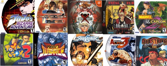
Top 10 Sega Dreamcast Fighting Games
The Sega Dreamcast is often regarded as a less important console than its peers, the Xbox, PlayStation 2 and Gamecube. However, if you were a fighting game fan, the Dreamcast was (and still is) the way to go.
There was a significant amount of support for Fighting Games On The Dreamcast. both through official releases and through controller support. The Dreamcast had more options for gamepads and fightsticks than any other console!
Plus, arcade games that ran on NAOMI hardware (a kind of arcade system board) were easily convertible to the Dreamcast, as both were manufactured by Sega. This means that ports from the arcade were almost perfectly 1:1–even for 3D games with cutting edge graphics. Sometimes, the Dreamcast’s graphics and sound would be even better than the cabinet.
Almost every single influential fighting game franchise has had at least one Dreamcast installment or port. In this article, we’re going to run through the top 10. There’s a perfect mix of hardcore, high-skill games and casually accessible romps with friends.
10. JoJo’s Bizarre Adventure: Heritage for the Future
If you’re already a fan of the wildly popular JoJo’s Bizarre Adventure manga and anime series, you’re definitely familiar with this game. Heritage for the Future, despite its awkward name, is a game built to please fans of the series. It has nearly every memorable character from “part 3” of the manga/anime, titled “Stardust Crusaders.”
Besides the fanservice, though, it’s a wonderful fighting game with fun mechanics. There’s a very unique “stand gauge,” which lets fighters take out their “stand,” which is a magical spirit that fights alongside them. It changes their move properties, but also makes them vulnerable; you can get put into a stunned state when you’re hit while your stand is out, and they also run out gradually.
Not every character has one, though, and there are some more ��normal” characters if you want a simpler experience.
It’s worth playing even if you’re not a fan of the series, even just for the creative game mechanics and unique characters. No other fighting game has a character like Hol Horse or Dio, with his flashy time-stop super.
9. Guilty Gear X
If you were part of the fighting game community in the 2010s, you probably heard people talking about how great Guilty Gear was. It’s a franchise that went on hiatus for a long time, but in the early 2000s, Guilty Gear was hot. There’s a spectacular lineup of interesting and goofy characters. Each character has a well-stocked repertoire of extremely flashy moves; it’s much different than what you would see in games with a more grounded style.
Instead of having a gauge just for supers, X has the “tension gauge.” As the match goes on, characters can use the tension meter for super moves, counters, or an advanced technique called roman canceling. Roman cancels allow you to spend the meter to cancel attacks into others, allowing for combos that otherwise wouldn’t exist. This is similar to the FADC mechanic in Street Fighter 4, for readers familiar.X doesn’t have much in the way of single player content, so if that’s what you’re looking for, try another one of the entries in this list. What it does have, though, is some of the best visuals and gameplay out of any game on this list. The sprites in this game are of unmatched quality. (Except for later entries in the series, of course.)
8. Dead or Alive 2
This is a series known for its aesthetics and sex appeal, but when you strip all that away, the game is a great 3D fighter. During the Dreamcast era, DoA2 was considered a direct contender to Namco’s Soulcalibur and Tekken series. Not only were the graphics pristine, but it was one of the few fighting games on this list to focus on a realistic aesthetic. (Well, semi-realistic.) In many ways, DoA is a sister series to the critically acclaimed Virtua Fighter.
The foundation of this 3D fighter is an extremely heavy focus on the classic rock-paper-scissors dynamic. What sets DoA2 apart is the ability to use “holds,” even after getting hit; these act like parries and let you defend yourself in situations when you’re getting combo’d.
Quick throws also make this game play very defensively. It’s common for you and your opponent to circle each other looking for an opening. Moves are often unsafe, meaning if your opponent blocks, they can counter very quickly. Depending on your playstyle, this can be a blessing or a curse. Regardless, it’s unusual for a fighting game to have this much focus on defense, which makes it interesting and fun.
7. Project Justice (also known as Rival Schools 2)
Much like MvC2, Capcom took the 2v2 gameplay from the first Rival Schools game and turned it into a 3v3 game. There’s team-up attacks with two of your fighters, or all three. This is one of Capcom’s few forays into 3D fighters, alongside the Street Fighter EX series which came out around the same time.
The school-based setting with delinquents brawling it out over a classic shounen plot made this series a cult classic, even though it hasn’t been revisited in almost two decades. It’s considered a cult classic fighting game, which is already a genre mostly comprised of cult classics, outside of the Mortal Kombat juggernauts.
If you can get your hands on the Japanese version of the game (and have a translation document ready), give it a shot. There’s a character creation mode centered around a board game mode. The mode was never localized to any other language because of the amount of text it came with, but it’s the only fighting game with such a character creation system.
The first game did the character creation as a dating sim, if you’re into that. The gameplay is obviously more shallow, but it’s worth mentioning that the series as a whole had some pretty interesting ideas about how players can make characters.
6. Power Stone 2
The Power Stone series isn’t a traditional fighting game; it’s more of a 3D brawler with several characters in an arena perspective. Even though it’s very different from other games on this list, it has earned its spot. Flat out, it’s one of the best Dreamcast games period.
The first Power Stone was a one-on-one arena fighter that featured characters slugging it out with their bare fists and item pickups. Power Stone 2 ups the ante, with more weapons, more vehicles, and more characters. The game can be played with 4-players, making for awesome free-for-alls and tag-team matches, both in the single player mode and with your buddies.
It might not be as technical or skill-intensive as the other games on this list, but it’s just so much fun. There’s no juggling, no wall-combos, no two-frame combos and no complicated stick motions. Those aren’t necessary to make a game as simple and fun as this.
The formula has been attempted since by other companies, but never to as much critical acclaim. Power Stone 2 remains a favorite in college dorms everywhere. The cool college dorms, at least.
5. Fatal Fury: Mark of the Wolves
Although the company SNK isn’t as well known in America as they are overseas, Terry’s release as a DLC character for Smash Bros. Ultimate reminded the world how awesome the old school Neo Geo fighting franchises are.
Back in the Dreamcast days, SNK was hitting their stride. They didn’t have to develop exclusively for the Neo Geo anymore, meaning their franchises were able to reach a wider audience. King of Fighters went all over the place, to Xbox and PlayStation, but Garou was a heavy-hitter specifically for the Dreamcast.
Garou is the final game in the Fatal Fury series, which is adjacent to SNK’s other series King of Fighters. SNK brought many fighting games to the Dreamcast, but Garou stands out as a classic. Originally ported from the Neo Geo system, it’s been lauded as one of the greatest games made by its developer with an outstanding legacy.
You can also play the game on modern platforms. It’s been re-released on PS4, Vita, Xbox live Arcade, and PC (both through GOG and Steam).
4. SoulCalibur
For many people in the late ‘90s, Soulcalibur was the Dreamcast’s system seller. This 3D weapon-based fighter had some of the best graphics on the system and really accessible gameplay. Throw in some memorable characters and you’ve got an instant classic.
Because the game is centered around weapons and a 3D environment, the character playstyles are based more around their range and speed than anything else. Instead of having characters be defined as “zoners” and “rushdown” like in 2D franchises, Soulcalibur has a set of unique characters that are hard to classify.
Not only that, but Soulcalibur introduced the “8-way run” to the franchise, changing the series drastically from its Soul Blade roots. Movement became a lot more fluid and skill-intensive, adding an extra layer to the spacing and mix-ups already present in the game.
The gameplay elements in SoulCalibur transfer easily to the rest of the series, meaning this is a great entry point if you want to get into the franchise. SoulCalibur VI is on current generation consoles (and PC), but if you want to see where the franchise really exploded, check this one out.
3. Street Fighter Alpha 3
If Third Strike doesn’t suit your tastes, give Alpha 3 a shot. The Dreamcast version of the game has some more characters than the arcade version, and an extra single-player mode that the PlayStation version doesn’t have.
Alpha 3 features the unique “-isms” mechanic, which allows you to choose the way you want to play your character. A-ism gives your character several super moves and a three-bar gauge. X-ism gives you a single-bar gauge and a single super move, though it is more powerful than the ones you find in A-ism. V-ism gives your character more custom combo variety at the lack of super moves.
This game feels very different from others in the series due to air blocking and a depletable block gauge. These two mechanics alone almost make the game feel like it’s part of another franchise. Even if you aren’t a fan of other Street Fighter games, give this one a shot — the deep and customizable gameplay might surprise you.
2. Street Fighter III: 3rd Strike
Capcom brought the third installment of its flagship fighting franchise to the Dreamcast after its arcade release. It had three versions — New Generation, Second Impact, and Third Strike. Third Strike is widely considered the definitive version, with additional bug fixes, characters, and some content.
Even though this installment is missing some fan favorites from SF2, like Guile, E. Honda and M. Bison, it more than makes up for it with wild new additions. Hugo, Q, Urien and Makoto became instant favorites; and when all else fails, you still have Ryu, Ken and Chun Li.
Many hardcore fighting game players consider Third Strike to be the best game in the entire franchise; others consider it the best fighting game of all time. The combos are smooth, the pacing is slow and methodical, and the game’s parry mechanic has made for some of the most hype moments in gaming history. Just look up EVO Moment 37 and turn your speakers down a little bit.
1. Marvel vs. Capcom 2
If you’re looking for an arcade-perfect game with lasting appeal, look no further. MvC2 is a three-on-three fighter with a bevy of complicated mechanics and fast action. There’s a healthy roster of Marvel heroes and villains, and an even larger selection of Capcom fighters from many of their series.
One of the defining mechanics of this series is the tag-in combos, tag ultras, and assists. Unlike some other franchises with two or more fighters per player, MvC2 lets you have several characters on screen at once. Even at a casual level, the game encourages you to discover synergies and develop your own unique playstyle.
The other games in the Marvel series are great, but MvC2 has the most characters and is the last game to have 2D sprite-based graphics. Its community is alive and well today, decades after the game’s release — and for good reason.
#Dreamcast Fighting Games#Top 10 Sega Dreamcast Fighting Games#Sell Video Games#Retro Game Store#gamex
3 notes
·
View notes
Text
Toilet-Bound Hanako-Kun and the Power of Visuals
Unique animation and background art can be selling points when it pertains to whether an individual decides to watch a new series. Although great story writing and characters can create an amazing series, it is difficult to know these two qualities without first watching the anime itself (as well as reading the light novel or manga). The easiest way to impress a person into watching a show without any prior knowledge is to have an interesting art style. This sort of technique is used in more than just Japanese animation, but also in other countries such as The United States with Spider-Man: Into the Spider-Verse and Loving Vincent. Spider-Man: Into the Spider-Verse brings a comic book to life by using frames and onomatopoeia words, while Loving Vincent was hand-painted using stop-motion. With these concepts, movies that would have been a simple crossover and a documentary would be dull and not cause more people to watch and marvel at what is to come. The anime and manga of Toilet-Bound Hanako-Kun do just that; the animation and background art draws people in to enjoy what is to come.
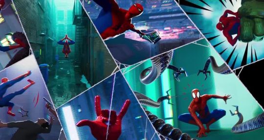
Figure 1 Persichetti, Ramsey, Rothman, “Spiderman: Into the Spider-Verse”
Figure 2 Kobiela, Welchman, "Loving Vincent"
The Impact of Visuals
As with other art forms, anime has its general groups where you can expect a certain art style to go along with the concept; seinen (mature themes) are often done with more darker schemes and muted styles, shounen (aimed at boys) is brighter and smoother, hentai (animated porn) focuses on exposure and shojo (aimed at girls) is bubbly and sparkly. While there are these general groups, there are subgroups that contain their own styles, and even then, there are always exceptions. As mentioned before, Toilet-Bound Hanako-Kun is one of these exceptions.
As stated on Mangakalot, Toilet-Bound Hanako-Kun is a shounen that includes comedy, supernatural, and school life themes. With these themes, the first thought would be to compare this to shows such as Noragami and Natsume's Book of Friends. Both Noragami and Natsume's Book of Friends are stereotypical looking anime with thin lines, dry colors, and standard scenery. While these shows are impressive with their storytelling and inclusive to supernatural myths, the amount of uniqueness and creatively put into the art style does not instantly draw the viewers in.
Figure 3 Tamura, "Noragami"
Figure 4 Miyake, "Natsume's Book of Friends"
Although I can go on and describe Toilet-Bound Hanako-Kun’s animation and background, James Beckett from AnimeNewsNetwork summaries it perfectly: “The environments feel hand-crafted, like they were plucked out of an especially evocative picture-book, and the way the show uses overlays of comic panels to break up some of the gags and establishing shots makes everything even more painterly.” This kind of exceptional work is common with the producers and directors of the show. As reported from AnimeNewsNetwork, Studio Lerche employed director Masaomi Andō, writer Yasuhiro Nakanishi, character designer Mayuka Itou, and animation producer Yūji Higa. Both Masaomi Andō and Yūji Higa have previously collaborated for a child-like show, Hakumei and Mikochi. With this team, they would go forward to produce another amazing series.
Figure 5 Andou, "Hakumei and Mikochi"
There are three important factors that go into making Toilet-Bound Hanako-Kun series’ art special: manga frames, vibrant colors, and creative lighting.
Manga Frames
When discussing this subject, it is important to remember its origins. When reading manga, the frames and panels are outlined boxes stacked against each other that contain drawings and words. This concept is common across manga and comics alike but employing this type of style of boxes containing drawings is not common in anime. As referenced at the beginning, the American movie Spider-Man: Into the Spider-verse uses the same notion with it being a parody towards superhero comic books. Toilet-Bound Hanako-Kun does this in a similar fashion with its manga-inspired animation.
(Below will be images for this example) Episode 6 of Toilet-Bound Hanako-Kun features many examples of manga frames, but for this example, we are focusing on a screencap from time 3:42. The screencap has two visual planes, in the background is an open book with a red page reading “Future” while in the foreground is Yashiro Nene’s, the main character, face being shown within white manga-panel borders. This image shows an interesting way to convey Yashiro talking while still being able to see what she was talking about on-screen. This scene is comparative to the one drawn in the manga. In the manga, the panel that has the book and “Future” is read first, then the next frame has Yashiro talking about what she is looking at. The way the producers decided to adapt to this scene is interesting; they were able to see the original concept and impact, but also integrated the feeling of being able to still see the first image while also continuing to read/watch on.
Figure 6 Andou, "Toilet-Bound Hanako-Kun" Ep 6
Figure 7 Aida, "Toilet-Bound Hanako-Kun" Chp 11
Vibrant Colors
Different anime may use color schemes to enhance themes, specific events, or symbolism. Color is everywhere in anime, and it is important for the animators to place certain colors in places to bring meaning or impact to the watchers. A popular example of this is in JoJo’s Bizarre Adventure where the color scheme inverts at random yet important times during the episodes, which brings about the weird and unique flare that this series holds. A series does not need wild color changes to be recognizable.
The very first noticeable feature of Toilet-Bound Hanako-Kun is how bright and lively the art looks. James Beckett’s description that this show looks like a picture book is accurate in this sense. Children’s books often have bold and contrasting colors to allow for easy viewing and longer attention spans. Rachel Pancare wrote a Sciencing article title, “How Do Bright Colors Appeal to Kids?” which states, “Bright colors catch young children's eyes because they help kids to distinguish objects from one another in their field of vision. Children spend more time looking at bright colors as opposed to looking at muted shades or pastels.” While this is true, some of the tones and circumstances within the show are not child-friendly, and even then, the coloration and art style are still able to bring the fear that is needed.
Figure 8 Andou, "Toilet-Bound Hanako-Kun" Ep 1
Figure 9 Andou, "Toilet-Bound Hanako-Kun" Ep 1
Creative Lighting
Lighting can be used in many different forms; it is used to brighten a landscape, a special character or object, or to create a certain atmosphere. In the average anime, lighting may not be diverse but may be only used to brighten the landscape so that the viewers can watch. There would be no major variation or casting that would change the mood of the scene. At times, there is seemingly no direct light source, but just everything is filled with brightness by either the sun, indoor lights, or for no reason. If the setting is at night, a streetlight may light up a character but that is seemingly the only option. Incredible anime typically takes a dive into using light sources and shadows dynamically, especially when there is a dramatic scene or an object that needs to be emphasized.
Toilet-Bound Hanako-Kun possesses the traits of having various light sources and accurately placed shadows, but there is another layer that is added. An integral part of the art style is that light can take a variety of shapes, but usually hexagonal. The pictures below demonstrate this; a light that emanates from the lamps and the lenses flare are hexagons, providing a creative change other than the usual faded circle of light surrounding an object. The other light sources are the light blue, glowing gems and the sunlight from the window. These two light sources provide the rest of the scene to be lit but within proportion to how bright the source is. Shadows are used accurately as well, causing darkness on the two character’s backs as well as slopping downward on the stall doors. These small additions can contribute greatly to the finished product and can transform how a scene is seen and the feelings that are derived from it.
Figure 10 Andou, "Toilet-Bound Hanako-Kun" Ep 6
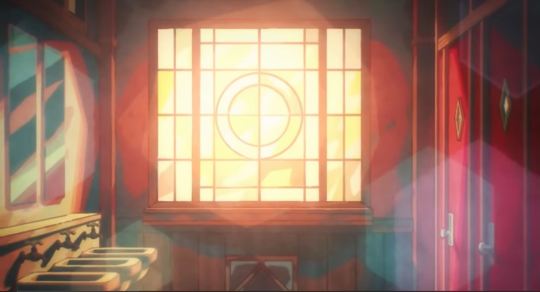
Figure 11 Andou, "Toilet-Bound Hanako-Kun" Ep 1
Conclusion
The three essential components to Toilet-Bound Hanako-Kun are creative lighting, vibrant colors, and manga frames. Analyzing and discovering what goes into a series can improve your experience and create a deeper devotion to the content. With this being said, not all shows that have the typical animation style and dull background are bad, but that they need to be analyzed in other areas and be appreciated in those. Toilet-Bound Hanako-Kun deserves praise and attention for its art style, and studios should look after this show and put forth the effort to make more series like this.
When considering what new series, you may watch or if you would want to stop watching a series, stop and think for a moment, “Does this art style impress me? Was the effort of the animators shown?” If the answers to the questions is “yes,” then I recommend that you follow through and continue watching that series. While storytelling and character development are important aspects to a show, there is more to the story than that. So, take a minute, turn the volume off on your favorite anime and watch—does the art tell a story? Does it make you laugh, scared, sad, or any emotion? Looking out for these feelings is important, and so is analyzing why this show may look so wonderful, because the smallest details matter the most, and it shows the dedication and love the creators have for the series.
4 notes
·
View notes
Text
Research - Character Design
Straight off the bat, I had a few mental concepts as to how I wanted my characters to look, and a lot of them have stemmed in actuality, from the experimentation in my summer project. I was given the opportunity to play with style, and not only in my animations but in my character design, I discovered drawing quirks that I became really fond of. I feel like researching these particular traits and where exactly they’re present in the industry could help me adapt and apply them a lot better, and so below I have pasted a few of my favourite researched examples, and why I like them so much. For complete transparency, I am aware a lot of these things will also be present in the project being completed with Mark, but I personally feel like using the same style for both projects will only help me to perfect it, and may result in the projects being a higher quality on completion, because of all the research and practice that’s gone into it.
Disney’s Hercules

This point of research applies a lot more to the poem project, but that doesn’t mean I’m not mentally applying it to this project also. The Hercules style as of recently has been catching my eye a lot, I think due to the combination of curves and angles in the peculiar way it’s achieved. A lot of my thunder and inspiration for the next few projects is centering around a particularly Greek style that I’ve developed a love for, and as basic a choice as this is, I do think Hercules is a rather good example of the application of it, especially since it uses the traditional Greek pottery style in intervals also. If anything, I hope to take inspiration from the colour patterns and body designs from these characters, since it may help make my own characters more unique and tailored to the style.
Jojo’s Bizarre Adventure Style

I am aware this style and comparison has been popping up a lot this year, and I feel I owe the blog at least an explanation as to its sudden involvement with my life and style. I began to watch the series in early 2021, and what kept me engaged at the beginning was the beautiful art style, and the care and compassion that went into every drawing and frame. As a result, I really wanted to attempt to recreate the style for my summer project, and the more time I spent on it, the more I absolutel fell in love with the style, despite how utterly different it was from my own. The black linework is so vastly different from my usual work, but reproducing it was almost a catharsis, a break from the mundanity of the usual production. Jojo I think applies to this sector of my research because of the angularness of it. A few particular traits I have adapted into my own style recently, most notably the big eyelashes, hair and lips regardless of gender presentation or character. When applying this along with other features such as the Greek nose I have also started to implant, things just really come together. I hope to be able to take more inspiration from this style as the year goes on and on.
Inner Workings - Pixar

For whatever reason, when I was considering style and how I wanted my animation to look, the appearance of ‘Inner Workings’ came to mind. This short is one I haven’t seen in a long long time, potentially years, and yet something must have stuck with me so much to make it pop into the forefront of my mind once again. I am almost certain it’s the angular properties of the characters, the square head and nose, as well as the flat-tipped fingers are so sharp, even when the characters themselves are designed rather softly. I think this is an effect I want to attempt to achieve in 2D animation in some aspect, the sharpness likely coming from flattened fingers and sketchy linework, but the characters keeping that signature cute, almost magical quality. I am hoping that my short film, should I come to utilise these properties, come even remotely close to the quality and charm Pixar once again hit with Inner Workings.
Character Sheets - Various


My final source of inspiration and research should only fittingly, be looking at character sheets, which for the longest time have been my favourite aspect of the pre-production process. Mapping out and concepting what a character looks like, I feel gives you the required room to flesh out the rest of your story that you were unsure of; creating that character essentially finishes writing your tale. The character sheets above were each produced by talented and successful animators for big name films, but aren’t necessarily polished, nor do they have explanation. The quality of the designs of the characters gives all of the information the audience needs, and that I think is the sign of a truly successful character sheet. I am going to attempt to whittle my sheets down to a similar format as this, with less writing for the future, since I really want to push my visual boundaries.
0 notes
Text
FEATURE: 86 EIGHTY-SIX's Ending Credits Perfects The Art Of The Sawano Drop

The best anime opening credits speak for themselves. Introduce the main characters, bust out some flashy animation, set it to a catchy song, and you’re golden. Ending credits are a different matter. If an opening sequence is meant to hype you up for the coming action, ending sequences are punctuation on the events of that episode. So what kind of punctuation? Take Showa Genraku Rakugo Shinjuu’s first ED, which allows the viewer to quietly decompress and reflect on the episode’s events. Or Mob Psycho 100’s first ED, which clues us into Reigen’s genuine respect for Mob while ending each episode on an energetic note. Or the EDs for JoJo’s Bizarre Adventure, which can serve as either hilarious metajokes (A Savage Garden closer for Diamond is Unbreakable? Really?!?) or exciting next-episode stingers, like the first season’s infamous use of Yes’s “Roundabout.”
86 EIGHTY-SIX's ending sequence is simple. One of the show’s two ending songs plays during the episode climax. When the chorus drops, the show stops on a juddering freeze-frame photograph and rolls the credits. That’s it. Yet 86 EIGHTY-SIX’s ending credits are my favorite of the year so far, as deserving of homage as JoJo’s Bizarre Adventure’s use of “Roundabout.” That it achieves so much by combining two well-worn anime tricks is absurd. But execution speaks for itself, and those two tricks work like gangbusters together.

The first of these tricks is the postcard memory. Pioneered over decades by anime auteur Osamu Dezaki, the postcard memory is an illustrated freeze-frame meant to punctuate important moments in the story. It’s a shortcut first and foremost, a way of adding impact to a scene without requiring movement or the multiple drawings that facilitate it. There’s an austere magic to the postcard memory that’s led countless other artists to borrow the device for their own projects, whether to punctuate a cliffhanger, capture a key moment, or simply pay homage to the classics. If you’re an anime fan, you’ve almost certainly seen one of these before in shows like Gurren Lagann, Symphogear, or Hunter x Hunter. Even anime-inspired western cartoons like OK KO! Let’s Be Heroes! have borrowed the postcard memory.
Every episode of 86 EIGHTY-SIX plays its ending credits over a unique postcard memory. Some are dramatic, like an abandoned blackboard or heroine Lena’s command desk. Others are inspiring or even funny, like the unwrapped chocolate bar that punctuates Episode 6. One adaptation 86 EIGHTY-SIX makes to the postcard memory formula is that it uses photographs rather than pastel or simple line art. Of course, a photograph overlaid with a filter doesn’t quite capture the charm of a classic pastel, Dezaki-style postcard memory. But they do represent the staff’s ambitions to depict the cast’s day-to-day life on the front without embellishments. Either way, each episode somehow finds exactly the right image and note to end on, whether that be tragedy, irony, or comedy.

The second trick is Hiroyuki Sawano’s music. Sawano shares credit with Kohta Yamamoto for 86 EIGHTY-SIX’s soundtrack, but the ending themes (the focus of this article) are indisputably reminiscent of Sawano’s works. If you have been watching popular anime for the last few years, you have likely either heard a Sawano track or a track from a composer who rose up in his stable. Some initial chords, anticipatory vocals, the music cuts out and then — the drop. It’s a formula that’s powered larger-than-life anime like Attack on Titan, Kill la Kill, and Promare. It’s also consistent enough to be ripe for parody; one of the funniest aspects of the now-vanished first episode of Mr. Osomatsu was Yukari Hashimoto’s pitch-perfect riff of the wailing vocals that often appear in Sawano soundtracks.
86 EIGHTY-SIX’s ending sequence weaponizes Sawano’s music as a stinger for the ending of each episode and it works every single time. When a character dies in battle and Lena cries in horror, our heart falls into our stomach along with the Sawano drop. When Lena realizes she’s developed a crush on a soldier under her command, the sudden freeze-frame and accompanying music sting works as a hilarious joke. Because the postcard memory is different every single week, the credits occasionally hit before or after you’d expect them, and the ending music alternates between songs depending on the focus and mood of the episode, the drop can be unexpected and always feels fresh.

Most importantly, 86 EIGHTY-SIX uses Sawano’s music with purpose. What allows Sawano’s theme songs to work in a series like 86 EIGHTY-SIX is that, despite its smooth direction and thematic ambitions, 86 EIGHTY-SIX is absurd — a melodrama where teens are forced by their villainous government to fight to the death against drones on the battlefield. In perhaps my favorite ending sequence in the series, we are given three images in succession, perfectly choreographed to the drop: an open hand, a hand holding a gun, and a closed hand. It’s on the nose, but in such a way that perfectly evokes dramatic teenage angst. The staff knows exactly what register they are working in, and that is the Sawano register.
I've written previously about how 86 goes the extra mile as an adaptation, fleshing a single volume of material into a ten-episode story, splicing the timeline to convey the division between Lena and the 86, tying in effective (if obvious) visual metaphors in such a way that they feel as if they were a part of the story all along. If you were to draw a line between this quality and the show’s ending sequences, the commonality would be that same attention to detail: cutting at exactly the right time, choosing the right music for a given episode, picking the right image for a smash-cut. Making an anime is complicated, even when it appears simple. If there’s something to be said for 86 EIGHTY-SIX’s adaptation, it’s that it makes careful and obsessive craft look easy.
Do you have a favorite ED? What's your most memorable Hiroyuki Sawano moment? What's a good Postcard Memory you've experienced in your daily life? Let us know in the comments!

Adam W is a Features Writer at Crunchyroll. When he isn't obsessively rewatching Shin Sekai Yori (From the New World)'s first ED, he sporadically contributes with a loose group of friends to a blog called Isn't it Electrifying? You can find him on Twitter at: @wendeego
Do you love writing? Do you love anime? If you have an idea for a feature, pitch it to Crunchyroll Features!
By: Adam Wescott
0 notes
Text

“Good Grief, Jotaro 🌟 “ 9” x 12”
Signed by Artist,
Framed + Free Shipping
Step into the world of JoJo’s Bizarre Adventure with this hand-drawn, one-of-a-kind illustration featuring Jotaro Kujo and Star Platinum in a bold, high-energy pose. With a vibrant pink backdrop, intense DO DO DO!! sound effects, and a classic Stardust Crusaders aesthetic, this piece captures Jotaro's unshakable confidence and Star Platinum’s unstoppable power.
Meticulously drawn with high-quality markers & colored pencils, this 9” x 12” original is professionally framed in sleek black, making it ready for display in your home, office, or anime collection.
#jojo#jojosbizarreadventure#stardustcrusaders#starplatinum#jotarokujo#jotaro#manga#anime#oraoraora#Anime & JoJo-Specific Tags:#JoJosBizarreAdventure#JJBA#JotaroKujo#StarPlatinum#ORAORA#StardustCrusaders#JoJoArt#AnimeArt#MangaArt#JoJoCollector#JoJoMemes#JoJoPose#Art & Illustration Tags:#HandDrawn#OriginalArtwork#AnimeIllustration#ColoredPencilArt#MarkerArt#FramedArt#LimitedEditionArt
14 notes
·
View notes
Video
tumblr
SUBSCRIBE! https://ift.tt/2RbLvuV Henry Thurlow is a 2D animator working in the anime industry in Japan, he has worked in series like One Piece, Tokyo Ghoul, Naruto Shippuden, Jojo`s Bizarre Adventure: Golden Wind, Overlord seasons 2 and 3 and others. Later he started a new studio with a friend called “D`Art Shtajio” where he’s directed projects like “Sturgill Simpson`s Sound and Fury”, “Indigo Ignited” & Castlevania Season 3 and now they have started a new blog & YouTube Channel where they’re putting their knowledge of the anime industry to the English speaking public. Henry Thurlow started as a 2D animator in New York working in projects like Superjail, MGMT "Kids" music video & Ke$ha "Your love is my Drug" music video. He studied in Delaware College of Art and Design and Pratt Institute. He wanted to become an animator in the Japanese anime so he moved to Japan to become an English teacher and from there he started working in the industry from ground zero. Click here to get resources and more info on this interview: https://ift.tt/3hOFZtn If you want to see better quality of videos please support us by becoming our Patron and help us bring you more amazing videos. https://ift.tt/217VgHc SUBSCRIBE! https://ift.tt/217VgHa Facebook: https://ift.tt/1SwWWZe Instagram: https://ift.tt/2nCI5QM Twitter: https://twitter.com/FrameFreak2D Vimeo: https://ift.tt/217VjCI Linked In: https://ift.tt/217VgHe RSS Channel: https://ift.tt/1SwWWZg Frame Freak Studio is a small 2D Animation Studio registered in Wilmington Delaware, which has worked with 100+ clients over 20+ countries all over the world working on TV commercials, Explainer Videos, Animated Series, Cartoon Animation and Internet Advertising, we also specialize in Illustration and Character Designs and Animation. FRAME FREAK STUDIO TEAM: Co-Founder and Marketing Director: Rodrigo Flamenco Co-Founder and Animator: Edmundo Landaverde Co-Founder and Rigging: Monica de Landaverde The Creative Hustlers Show is a series of interviews featuring successful artists and creative professionals from all over the world who are successful in their careers or projects and finding out how they did it so you can learn from the very best. The people interviewed here have founded their own studios, projects, won Academy Awards or worked at the best animation companies in the world such as Disney, Pixar, Cartoon Saloon, Dream Works, Frederator, and Many More. Click here to get resources and more info on this show: https://ift.tt/2ysuJiP #Anime #2DAnimation #Japan #Podcast #Streamers #Animation #CreativeHustlers #TraditionalAnimation
0 notes
Text

“Good Grief, Jotaro 🌟 “ 9” x 12”
Signed by Artist,
Framed + Free Shipping
Step into the world of JoJo’s Bizarre Adventure with this hand-drawn, one-of-a-kind illustration featuring Jotaro Kujo and Star Platinum in a bold, high-energy pose. With a vibrant pink backdrop, intense DO DO DO!! sound effects, and a classic Stardust Crusaders aesthetic, this piece captures Jotaro's unshakable confidence and Star Platinum’s unstoppable power.
Meticulously drawn with high-quality markers & colored pencils, this 9” x 12” original is professionally framed in sleek black, making it ready for display in your home, office, or anime collection.
#jojo#jojosbizarreadventure#stardustcrusaders#starplatinum#jotarokujo#jotaro#manga#anime#oraoraora#“Good Grief#Jotaro 🌟 “ 9” x 12”#Signed by Artist#Framed + Free Shipping#Step into the world of JoJo’s Bizarre Adventure with this hand-drawn#one-of-a-kind illustration featuring Jotaro Kujo and Star Platinum in a bold#high-energy pose. With a vibrant pink backdrop#intense DO DO DO!! sound effects#and a classic Stardust Crusaders aesthetic#this piece captures Jotaro's unshakable confidence and Star Platinum’s unstoppable power.#Meticulously drawn with high-quality markers & colored pencils#this 9” x 12” original is professionally framed in sleek black#making it ready for display in your home#office#or anime collection.#stone ocean#diamond is unbreakable#stardust crusaders
3 notes
·
View notes
Photo

help
#between frame#duwang#low quality#Dio#Dio Brando#Screenshot#JJBA#JoJo#JoJo's Bizarre Adventure#Jojo no Kimyou na Bouken#part 3#Stardust Crusaders
144 notes
·
View notes
Text
DCB20 | Line and Point
Rather than looking at a trailer and focusing on a single design element individually, here I’ll be focusing on two different artists’ work and how line and point interact in each. Both illustrate manga, meaning that they have a strong sense of line in work of a gray scale medium, as well as conveying the point in visual storytelling.
HIROHIKO ARAKI


Araki is an artist known for his graphic line work and unique style, most notably associated with his long-running manga JoJo’s Bizarre Adventure. Above is a piece for a comic strip exhibit at the Louvre (with a closer shot for a better look at the lines). Araki often uses lines as value to define the shape and form of his characters. This can be seen in the images above: the lines around the nose, mouth, and eyes create a sense of value, their thin weight blending together to create form. The main forms are outlined with explicit lines, while smaller details like the raised portion of the headband are shown through softer, more disconnected lost and found lines. The lines in the background are especially eye-catching in this piece; the curved form of them draws the viewer’s eye through the image while creating a unique shape. They lead towards the focal point of the character, front and center.

Araki’s use of line is very apparent in black and white, especially because he tends to only create value through the use of different line weights. The line work is all fairly thin, and thickens most on the outline of certain shapes and forms. Otherwise, hatching and crosshatching of thin lines are used to create form and value where no color exists to create shadow. Looking closely, there is a subtle difference in values, but the strongest sense of form the viewer gets is created by line. In the top panel, the character occupies the entire frame, both eyes being points in the image as well as the focal point. The stars within the character’s design also serve as a series of points to create a pattern, while the SFX text are points on a path that lead the viewer’s eye through the scene.
KENTARO MIURA

Another manga artist, Miura is known for his series Berserk, and is admired for the increasing amount of detail that he puts into the art for it. Like Araki, his strong use of line is incredibly apparent within his gray scale work. Though different values are used to separate forms and lighting, they’re usually accompanied by different types of lines. In the corner of the sky, thicker, clumped forms of lines give way to thinner, sparser lines to create the form of clouds. This gives a unique texture to the sky. Because there are so many similar figures in the background, a lot of their forms are repeated with similar lines so that they are easier to read as a background. As the figures move farther back, they become almost more dotted or even pixelated. In this particular piece, eyes are major points throughout; the glowing eyes of the skull knight and his horse, the less defined eyes of the creature in the back, and the more realistic and detailed eyes on the sword. This sword also serves as a diagonal line towards the foreground where the main figure rests. Ironically, you cannot see this figure’s eyes, but he’s a major focal point of the piece. The other eyes, or points, around the piece surround this figure and almost seem focused towards him. This creates an implied line to the frontmost figure.

This panel heavily utilizes line to create movement and form. The cape is made up entirely of lines, meaning that its form and values are created by the quality of the lines themselves. In lighter areas, lines are thinner and sparser, almost more implied. In darker areas, they’re thicker and crowd together. The pattern and motion of the lines even makes it so that the white space could be seen as additional lines. The texture of the sword is largely created by points with an almost stippled or dotted look. Using different techniques allows the forms to have different textures, contrasting them from one another. Looking at the armor, it’s shaded primarily with straight lines, using the same varying line quality techniques in the cape to create values. There are points of blood coming out of the armor, creating implied lines moving outwards from the figure. The sword also creates a diagonal line that leads the viewer’s attention to the character’s face (despite being covered).
To summarize, both Hirohiko Araki and Kentaro Miura greatly utilize line to create form in a black and white medium. Because comics are a form of visual storytelling, creating a focal point in each panel or scene becomes important, meaning that design techniques need to be utilized to effectively convey the story.
0 notes