#jessiemakesmaps
Explore tagged Tumblr posts
Text

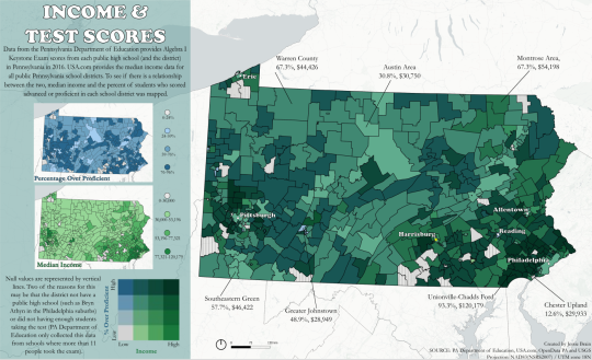
Median Income and % of Students who tested either Proficient or Advanced in their Math Keystone Exam in 2015. In my background in sociology, I learned about income disparities and how they can affect many aspects of someone's life, including quality of education.
This map was made as my final project for Cartographic Design. The median income data comes from USAToday.com and was included in a CSV file with the name of each School District. The test score data came from the PA Department of Education website. The original test score data only included the percentage below proficient, proficient, and advanced. To normalize the data, if there was only one high school in that district, the proficient and advanced percentages were added together. If there was more than one high school, the mean was taken from the sums of the proficient and advanced percentages.
The CSV was joined with a PA school district shapefile, which was obtained from OpenDataPA, in QGIS (or ArcPro, I tend to prefer ArcPro when it comes to joins, as I find the attribute table to be more user-friendly). I then put that shapefile into QGIS, I'll list the tutorial that helped me develop this map down below, but basically you just make two choropleth maps (which I actually included on the left!), then mess around with the opacity until you think it looks even. For the legend, I used the bivariate legend plug in on QGIS.
For the layout, I created a new print lay out in QGIS, then exported it to an SVG. I then opened Inkscape, imported the SVG and fiddled around with that until I liked the outcome, then exported it as a png. As you can tell, the quality is quite low. I'm not sure why that is, as other QGIS/Inkscape maps I have made don't come out low quality.
In retrospect, I wish I did more research on better bivariate colors. Obviously, I wanted to use green to represent income, but I think layered with the blue, it became to dark, so maybe yellow would have been a better option...
I really liked the title font when I completed this project, and so did my professor! Although I do think it makes the map seem a little less serious than I wanted it to come across.
I came into this class with no cartographic experience and little GIS experience (check out my about me section for more information about that), and was overwhelmed when we talked on the third week about our final project. Throughout this class I developed my style (which pretty much always includes this base map - it's my favorite!), and for my first infographic including a map, I felt pretty proud!
Here's the link to the tutorial and other websites I found helpful!
Tutorial: https://bnhr.xyz/2019/09/15/bivariate-choropleths-in-qgis.html
Includes some more help and example legend colors: https://www.joshuastevens.net/cartography/make-a-bivariate-choropleth-map/
#maps#gis#qgis#inkscape#choroplethmap#education#income#pennsylvania#PA#testscores#jessiemakesmaps#bivariatemap#infographic
6 notes
·
View notes