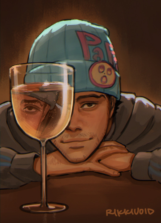
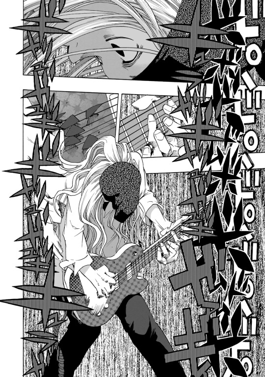
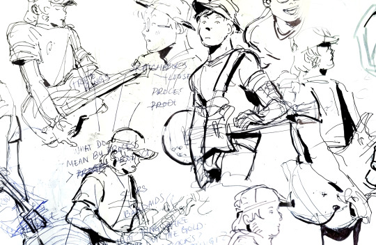
#it’s been really fun/challenging to find visual ways to convey their dynamic!!
Explore tagged Tumblr posts
Visit Tumblr Blog
Explore Tumblr blogs with no restrictions, modern design and the best experience.
Last Seen Tumblr Blogs


Fun Fact
US Tumblr user growth rate is estimated to slow down to 4.1%.
Text

‘how do you see me?’
#aa4#kristoph gavin#beanix#krisnix#it’s been really fun/challenging to find visual ways to convey their dynamic!!#the manipulation under the guise of friendship AUGH#FOR 7 YEARS????!#i find them very compelling HDJJDD#mystuff#rikkivoid
3K notes
·
View notes
Text
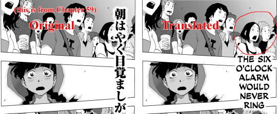
Lettering sound effects in Shiori Experience
Hi! I’m Toast, the letterer on #dropout’s English translation of Shiori Experience. This series was my first time doing typesetting, and I’ve learned a lot over the two years I’ve been involved in the project. Each new chapter brings new challenges, and as our team has matured we’ve gotten more ambitious. We recently began translating the comic’s sound effects along with the dialogue, a decision which instantly doubled the size of our workload.
Our most recent release, Chapter 64, was probably the most technically complex chapter we’ve done so far. The sound effects in this chapter were varied and complicated, presenting a number of interesting challenges. Today I thought it would be fun to give y’all a peek behind the curtain, and show the thought process and effort that goes into the adaptation of sound effects in Shiori Experience.
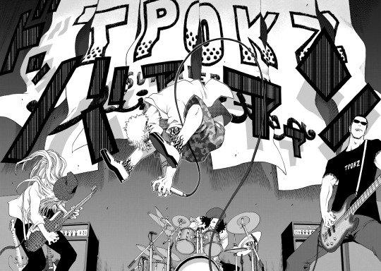
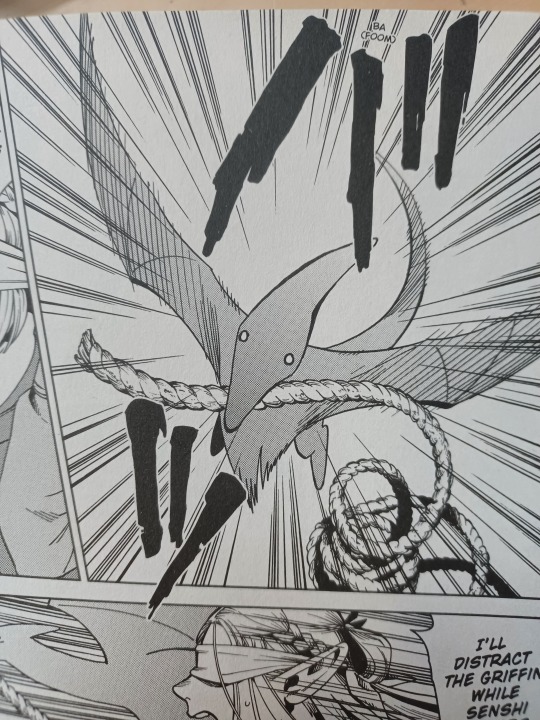
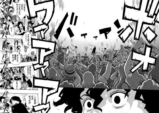
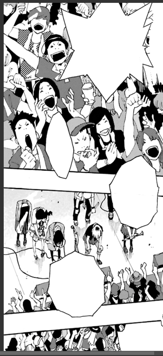
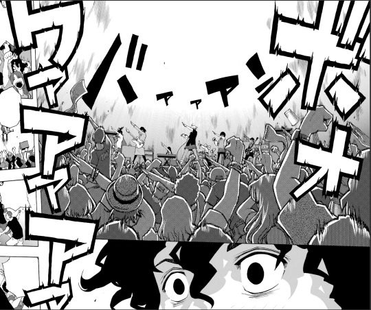
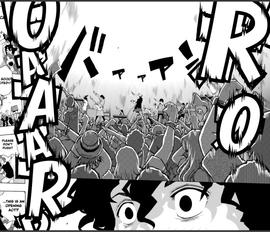
Shiori Experience is a music manga [citation needed], so it isn’t surprising that the sound effects can get pretty complicated. Music manga need to convey not just the sound, but more importantly the impact of a performance, conveying an auditory experience in a totally silent medium. Shiori Experience’s approach to this problem is to make the sound effects semi-diegetic objects. They hang in the air, burst out of crowds, get obscured by foreground objects, and cast shadows on their environment. This is a really cool effect, but also makes converting them from Japanese to English a fucking nightmare.
(Look at the shadows)
Shiori Experience is kind of a nightmare
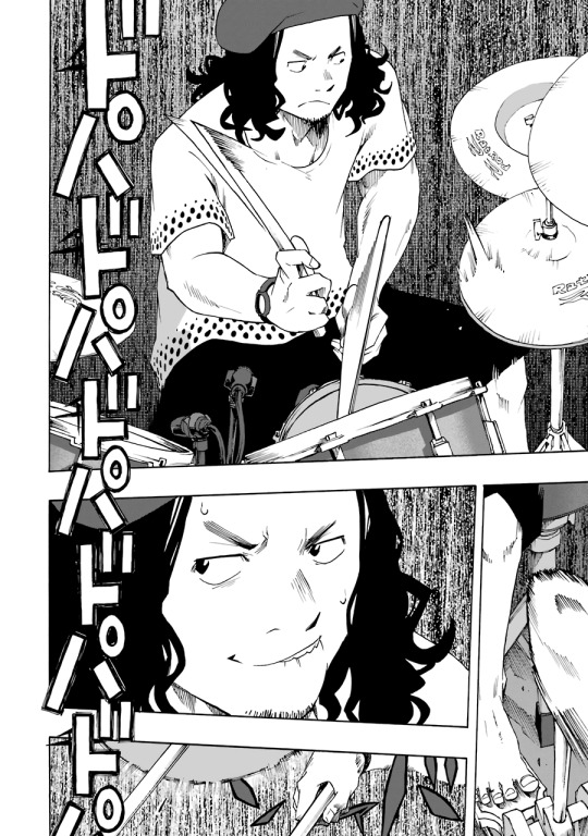
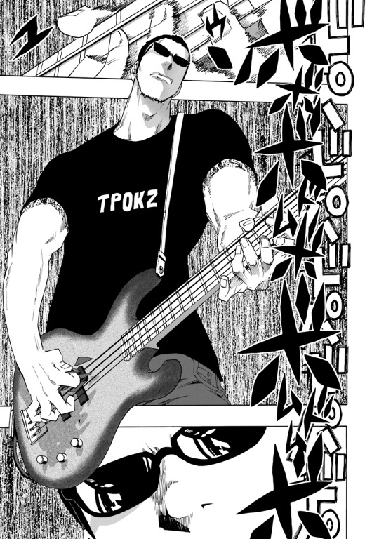
In some ways, lettering for Shiori Experience isn’t actually that difficult. Sound effects in this series are goddamn everywhere and they’re fucking gigantic, but they’re always straightforward. Much like the art of the series, the sound effects are clean and angular, strong dynamic shapes which are easy to parse even if you can’t read the katakana. For a great example of this, look at this sequence from Chapter 64.
This sequence demonstrates what you can achieve with good lettering. The sound of the band is conveyed perfectly with these visuals. The clear and regular beat of the drums, the dark and energetic bass line, the screaming uncontrollable energy of the electric guitar. We didn’t even bother translating it. We didn’t need to.
But look at the sequence again. In spite of its apparent complexity, there’s only two fonts here, a dynamic block text and an angular brush. Those two fonts represent the vast majority of SFX in Shiori Experience. The rest is just text effects and perspective tricks.
So to convert these sound effects into English, we just have to find equivalent fonts. It took me a while to pin down a set of fonts I was happy with. For the pointy brush font I eventually settled on Jolly Lodger, a brush font with a sort of piratey vibe. I’m still not 100% satisfied with this conversion, it isn’t as pointy as the original, but it’s good enough for now.

And for the big block font I chose Boogaloo. It looks a little thin when it’s on its own like this, but it really bulks up with the right text effects.

Great! We’ve got our fonts! Doing the sound effects should be as simple as erasing the old text and replacing it with the new text, right? Wrong. The nightmare begins.
Different approaches
There are several schools of thought when it comes to lettering manga SFX. One is the "keikkaku means plan" approach. In a translator's note outside the panel, or in plain text near the SFX, describe what the sound is. This is incredibly easy. This is also lame.
(This is from the official release of Dungeon Meshi. I wouldn’t want to redraw this one either, but like, come on guys.)
Another school of thought is style matching. Similar to the translator’s note approach, but rather than plain text, the translation uses similar text effects to the original SFX. This works fine, but it can create a lot of visual clutter if implemented poorly.
(This is from Drifting Dragons. Please read Drifting Dragons.)
The last approach is full replacement. In this approach, the original SFX is (are you ready for this?) fully replaced by the new SFX.
SFX Redrawing
Replacing a sound effect isn’t as simple as just erasing it. We work with tankoban pages, scans of the Japanese volume release. These files are flattened, with the art and text all on one layer as a single image. We can’t just disable the text. In order to remove the original SFX, we have to redraw them.
(for context this is from when I had covid)
Redrawing means recreating the art hidden by the original SFX. This is a complex process, requiring a steady hand, sharp eyes, and a lot of guesswork. Since we don’t know what precisely is underneath the original SFX, we have to use context to reconstruct it. The goal of any localization is to make the translation invisible to the reader. The same principle holds true in redrawing. The art we add needs to be invisible, meshing seamlessly with the original artwork.
(I made this dude up out of whole cloth. I’m honestly really proud of how he came out.)
#Dropout uses a mix of style matching and full replacement, with the choice between the two being determined by a number of factors. To illustrate that decision-making process, let’s break down the process of redrawing a page of Shiori Experience, specifically the spread across pages 172 and 173 from Chapter 64.
Deciding between Style Match and Full Replacement
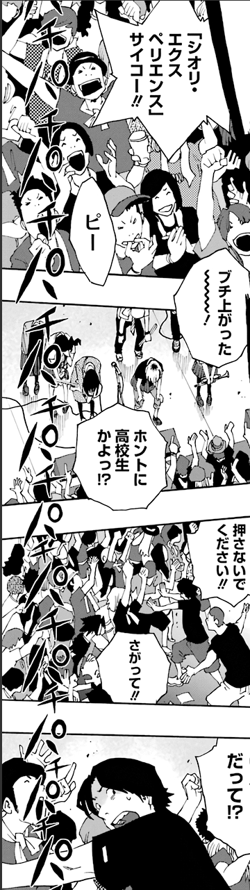
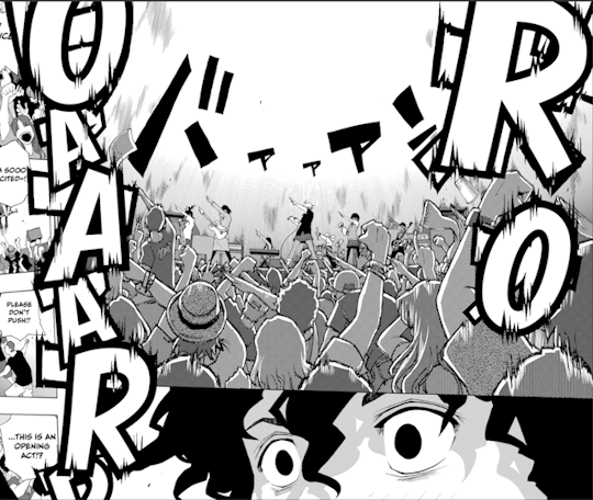
This is the original untranslated page, and there’s a lot going on.
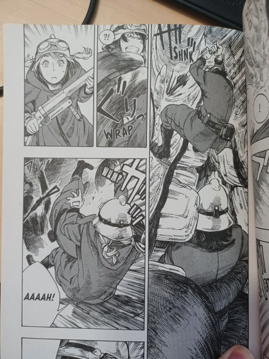
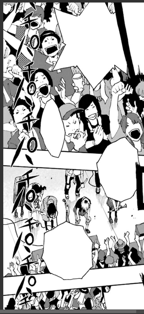
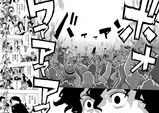
In the background of the first panel is the sound of the band, バアアアン, phonetically translated as "BA-A-A-A-N", localized as “BWAAAM”. In the foreground is the cheering of the crowd, ボオワアアア, "BO-O-WA-A-A-A" phonetically, “ROOAAR” localized. Lastly, along the side of panels 3 through 6 is applause, パチ, "PA-CHI", “CLAP”.
At a glance, this page is overwhelming. The cheering sound effect is huge, with custom text effects conveying the energy of the crowd. Worse is the clapping, which overlays multiple panels with dozens of unique partially obscured faces. This looks like a pain in the ass to redraw, but in the end I decided to do a full replacement instead of a simpler style match. With the number and size of the SFX combined with the visual density of the panels, doing a style match would result in a cluttered unreadable mess. Too much of the original artwork would be covered, and there just isn’t enough space. So, full replacement.
The redrawing process
As I’ve gained more experience, it’s been surprising to learn what constitutes a difficult redraw. You’d expect crowd shots to be the hardest, with lots of unique faces and little details, but they actually aren’t that bad IMO. More detail means more context means less guessing. Definitely a lot of work, but not difficult. Meanwhile, something like a gradient or screentone pattern which looks simple is actually a goddamn nightmare to recreate, as we'll see later.
That’s why I started my redraw for this page with the clapping. Again, this looks like it would be really hard, but looks can be deceiving. There’s a lot of clapping, yes, but the text is thin and spaced out. Whiting out the text reveals just how little artwork is actually hidden by the sound effects.
After whiting out the original text, the next step is connecting as many existing lines as I can. I do the panel and bubble borders on a separate layer since they’re simple structural elements. The artwork itself requires a bit more thought. I need to examine the original artwork carefully to avoid connecting lines that shouldn’t be connected. Context can also provide guidance where there are no lines to connect, such as the cheering guy’s hat in the first panel, or the clapping hand in the second panel. Also, when there’s lots of little SFX like this it’s easy to miss a few lines, like the box thing near the bottom of the last panel (don’t worry I catch it later).
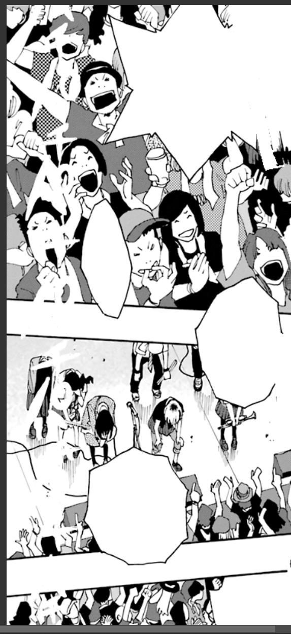
The last step is adding in all the inking and screentones, the pattern templates which fill in the “color” to the line work. I have to go through with the clone stamp tool, collect samples from the image, and extend the pattern to fill the blank areas. This is the most annoying step in the process for me, because it requires a level of precision even beyond what’s required for the line work. Humans are pattern-recognition machines. Our brains are really good at catching tiny discrepancies, like when a section of a pattern doesn’t quite line up with the rest of it. My patch job on this panel wasn’t perfect, and you can see where I couldn’t quite line things up in areas like the guy’s checkered shirt in the first panel.
And with that, this redraw is complete! Now it’s time to insert the English translation of the sound effect.
SFX Lettering
The clapping SFX is in that same brush font I pointed out earlier, which we use JollyLodger for. There’s no real perspective things or text effects here, so mimicking the original isn’t difficult. Here’s the before and after.
This approach of fully redrawing the old SFX before inserting the new SFX only works in situations like this, where the text is small and there’s enough detail to reconstruct the image with a high level of confidence. As an SFX gets larger, like the roar of a crowd, the harder it gets to fully replace. This calls for a different approach.
Because of the size and complexity of this sound effect, I decided to do the lettering first. This is the block font I identified earlier, which is replaced by Boogaloo. I do some basic manipulation right away, applying a black outline and distorting the text to create the same perspective effect as the original. The SFX in this series are subtly three-dimensional, and the replacement text needs to be in the same orientation to sell the effect.
I’m also being careful with my placement here, doing my best to align the new text with the old. This will be important later.
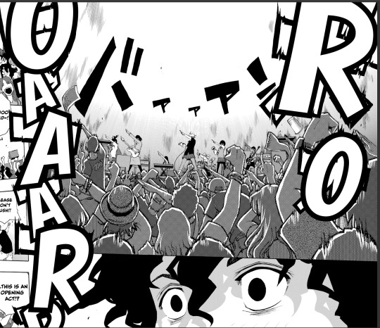
Next we need to recreate the distortion effect. Photoshop has functionality to mimic this kind of effect, but I opted to do it manually. Osada (the mangaka) does all these layouts, SFX and all, on paper. The original effect was hand drawn, so the replacement effect is hand drawn.
The lettering for this effect is now complete, and we can begin the redraw process. Since we already have the letters in place, we have the advantage of knowing exactly where a redraw is needed, turning what would otherwise have been an enormous replacement into a minor patch job. From here, it’s the same process as the clapping SFX: Raw, Blank, Line, Fill.
Minor sidebar: translating Japanese sound effects presents an interesting and incredibly niche problem. The katakana symbol オ is translated phonetically as “o”. The problem with that is that when you’re replacing a オ with an O in a sound effect, the hole of the O is positions right on the center of the オ. This makes オ really annoying to redraw. Every O turns into a little window of totally new art, with barely any reference points to draw from. It violates the principle of invisibility, but there’s really no way around it. You can see I got a little lazy here, and clonestamped a different section of the crowd into the hole. As long as I don’t draw attention to it nobody will notice. I hope.
Sidebar over. Just for fun, here’s the before and after for the whole page.
Closing thoughts
So that’s what it takes to do the sound effects for one page of Shiori Experience. This page alone took me multiple days to complete, and it wasn’t even the most complicated page in this chapter. It isn’t why our releases take so long (that can be laid at the feet of staffing and scheduling issues), but hopefully I’ve given you a sense of how much work goes into each new chapter.
This chapter would have taken even longer without the help of Adi and Bangistus, who pitched in on a lot of the smaller SFX. Up until now the lettering of this series has been a solo show, Toast all the way down. Now that Adi and Bang are on the team I’m still keeping most of the big pages for myself, but being able to toss to the others when I get overwhelmed is going to be invaluable. Hopefully I can rely on them in the future as well, there’s some big things coming down the pipe
This series is a labor of love. Sometimes frustrating, often exhausting, but always worth it. I owe this series a lot, and I hope it shows in the work I put into it. I think it would be fun to do more behind the scenes process content like this, so maybe keep an eye out for that in the future.
Lastly, just as a status update, #dropout is not dropping Shiori Experience. We have a temporary translator who’s helping us put together Chapter 65, which will be coming out Eventually™. Not as long as last time, but like always don’t hold your breath. We’re not sure what will happen after 65 drops. We’re still desperately hiring for a main translator, seriously if you know anybody please hit me up.
That’s all from me. Take care y’all.
265 notes
·
View notes
Text
once again i am answering asks in a big compilation post. included is... gotham, patrick stump, tips about drawing backgrounds, tips about drawing in general, links to my faq, and infinity train
like.... the tv series? No... I’ve drawn dc comics fanart before, though. But it’s been years since I’ve been really into it. I like jumped ship like 10 years ago when the New 52 happened LOL.

AFJHDSLKGH I’m sorry I (probably) won’t do it again??
Actually full disclosure I have a truly cringe amount of p stump drawings/photo studies in my sketchbook right now LOL. He’s just fun to draw... hats, glasses, guitar, a good shape... but I don’t think I’ll rly post those until I can hide them in another big sketchbook pdf.. probably Jan 2022. Stay tuned........ (ominous)
(ominous preview)
These are all sort of related to backgrounds/painting so I grouped them together even though they’re pretty much entirely separate questions.... ANYWAYS
a) How is it working as a BG artist? Is it hard? What show are you drawing for?
I think you’re the first person to ever ask me about my job! Being a background artist is great. It’s definitely labor intensive but I think that could describe pretty much any art job (If something were rote or easy to automate, you wouldn’t hire an artist to do it) and I hesitate to say whether its harder or easier than any other role in the animation pipeline. Plus, so much of what truly makes a job difficult varies from one production to the next, schedule, working environment, co-workers etc. But I will say that I think while BGs are generally a lot of work on the upfront, I think they’re subject to less scrutiny/revisions than something like character/props/effects design and you don’t have to pitch them to a room like boards. So I guess it’s good if you don’t like to talk to people? LOL
A lot of my previous projects + the show I’ve worked on the longest aren’t public yet so I can’t talk about em (but I assure you if/when the news does break I won’t shut up about it). But I’m currently working on Archer Season 12 LOL. I’m like 90% sure I’m allowed to say that.
b) ~~~THANK YOU!! ~~~
c) What exactly do you like to draw most [in a background]?
@kaitomiury Lots of stuff! I really like to draw clutter! Because it’s a great opportunity for environmental storytelling and also you can be kind of messy with it because the sheer mass will supersede any details LOL.
I like to draw clouds... I like to draw grass but not trees lol,,, I like to draw anything that sells perspective really easily like tiled floors and ceilings, shelves, lamp posts on a street etc.
d) Do you have any tips on how to paint (observational)?
god there’s so much to say. painting is really a whole ass discipline like someone can paint their whole life and still discover new things about it. I guess if you’re really just starting out my best advice is that habit is more important than product. especially with traditional plein air painting, I find that the procedure of going outside and setting up your paints is almost harder than the actual painting. There’s a lot of artists who say “I want to do plein air sometime!!” and then never actually get around to doing it. A lot of people just end up working from google streetview or photos on their computer.
But going outside to paint is a really good challenge because it forces you to make and commit to lighting and composition decisions really quickly. And to work through your mistakes instead of against them via undo button.
My last tip is to check out James Gurney’s youtube channel because hes probably the best and most consistent resource on observational painting out there rn. There’s lots other artists doing the same thing (off the top of my head I know a lot of the Warrior Painters group has people regularly posting plein air stuff and lightbox expo had a Jesse Schmidt lecture abt it last year) but Gurney’s probably the most prolific poster and one of the best at explaining the more technical stuff - his books are great too.
e) Do you have tips for drawing cleanly on heavypaint?
@marigoldfool UMM LOL I LIKE ONLY USE THE FILL TOOL so maybe use the fill tool? Fill and rectangle are good for edge control as opposed to the rest of the heavy paint tools which can get sort of muddles. And also I use a stylus so maybe if you’re using your finger, find a stylus that works with your device instead. That’s all I’ve got, frankly I don’t think my drawings are particularly clean lol.
f) Tips on improving backgrounds/scenes making them more dynamic practicing etc?
Ive given some tips about backgrounds/scenes before so I’m not gonna re-tread those but here’s another thing that might be helpful...
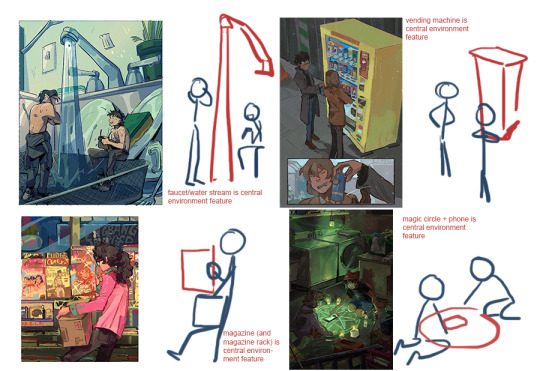
I think a good way to approach backgrounds is to think of the specific story or even mood you want to convey with the background first. Thinking “I just need to put something behind this character” is going to lead you to drawing like... a green screen tourist photo backdrop. But if you think “I need this bg to make the characters feel small” or “I need this bg to make the world feel colorful” then it gives you requirements and cues to work off of.

If I know a character needs to feel overwhelmed and small, then I know I need to create environment elements that will cage them in and corner them. If a character needs to feel triumphant/on top of the world then I know I need to let the environment open up around them. etc. If I know my focal point/ where I want to draw attention, I can build the background around that.
Also, backgrounds like figure compositions will have focal points of their own and you can draw attention to it/ the relationship the characters have with the bg element via scale or directionality or color, any number of cues. I think of it almost as a second/third character in a scene.
Not every composition is gonna have something so obvious like this but it helps me to think about these because then the characters feel connected and integrated with the environment.

Some more general art questions
a) Do you have any process/tips to start drawing character/bodies/heads?
I tried to kind of draw something to answer this but honestly this is difficult for me to answer because I don’t think I’m that great at drawing characters LOL. Ok, I think I have two tips.
1) flip your canvas often. A lot about what makes human bodies look correct and believable is symmetry and balance. Even if someone has asymmetrical features, the body will often pull and push in a way to counterbalance it. we often have inherent biases to one side or another like dominant hands dominant eyes etc. you know how right-handed artists will often favor drawing characters facing 45 degrees facing (the artist’s) left? that’s part of it. so viewing your drawing flipped even just to evaluate it helps compensate for that bias and makes you more aware of balance.
2) draw the whole figure often. I feel like a lot of beginner artists (myself included for a long time) defer to just drawing headshots or busts because it’s easier, you dont have to think about posing limbs etc. But drawing a full body allows you to better gauge proportion, perspective, body language, everything that makes a character look believable and grounded.
Like if you (me) have that issue where you draw the head too big and then have to resize it to fit the proportions of the rest of the body, it’s probably because you (I) drew the head first and are treating the body as an afterthought/attachment. Sketching out the whole figure first or even just quick drawing guides for it will help you think of it more holistically. I learned this figure drawing in charcoal at art school LOL.

oh. third mini tip - try to draw people from life often! its the best study. if you can get into a figure drawing/nude drawing class EVEN BETTER and if you have a local college/art space/museum that hosts those for free TREASURE IT AND TAKE ADVANTAGE OF IT, that’s a huge boon that a lot of artists (me again) wish they had. though if youre not so lucky and youre sitting in a park trying to creeper draw people and they keep moving.. don’t let that stop you! that’s good practice because it’s forcing you to work fast to get the important stuff down LOL. its a challenge!
b) I’ve been pretty out of energy and have had no inspiration to draw but I have the desire to. Any advice?
Dude, take a walk or something.... Or a nap? Low energy is going to effect everything else so you gotta hit that problem at its source.
If you’re looking for inspiration though, I’d recommend stuff like watching a movie, reading a book, playing video games etc. Fill up your idea bank with content and then give yourself time/space to gestate it into new concepts. Sometimes looking at other art works but sometimes it can work against you because it’s too close.
Also something that helps me is remembering that art doesn’t always have to be groundbreaking... like it’s okay to make something shitty and stupid that you don’t post online and only show to your friend. That’s all part of the process imo. If you want to hit a home run you gotta warm up first, right? Sports.
I should probably compile everytime i give tips on stuff like this but that’s getting dangerously close to being a social media artist who makes stupid boiled down art tutorials for clout which is the last thing i want to be... the thing I want to stress is that art is a whole visual language and there are widely agreed upon rules and customs but they exist in large part to be broken. Like there's an infinite number of ways to reach an infinite number of solutions and that’s actually what makes it really cool and personal for both the artist and the viewer. So when you make work you like or you find someone else’s work you like, take a step back and ask yourself what about it speaks for you, what about it works for you, what makes it effective, how to recreate that effect and how to break that effect completely, etc. And have a good time with it or else what’s the point.
for the first 2, I direct you to my FAQ
For the last one, I don’t actually believe I’ve ever addressed artwork as insp for stories/rp but I’ll say here and now yeah go ahead! As long as you’re not making profit or taking credit for my work then I’m normally ok with it. Especially anything thats private and purely recreational, that’s generally 100% green light go. I only ask that if you post it anywhere public that you please credit me.
(and I reserve the right to ask you to take it down if I see it and don’t approve of it’s use but I think that case is pretty rare.)
a) @lemuelzero101 Thank you!!! I haven’t played Life is Strange but actually that series’ vis dev artist Edouard Caplain is one of my bigger art inspirations lately so that’s a really high compliment lol. And yeah I hope we get 5-8 too...!
b) Thank you for sticking around! I’ve been thinking about Digimon and Infinity Train in tandem lately, actually. They’re a little similar? Enter a dangerous alternate world and have wacky adventures with monsters/inanimate objects that have weird powers... there’s like weird engineers and mechanisms behind the scenes... also frontier literally starts with them getting on a train. Anyways if anyone else followed me for digimon... maybe you’d like Infinity Train? LOL
c) @king-wens-king I’M GLAD MY ART JUST HAS PINOY VIBES LOL I hope you are having a good day too :^)
a, b, c, d) yessss my Watch Infinity Train agenda is working....
e) aw thank you!! i think you should watch infinity train :)
357 notes
·
View notes
Text
Jimin: “There’s people who’ve been rooting for us throughout this difficult time”
In the “ARMY Corner Store” video posted by BTS on their YouTube channel BANGTANTV to mark the eighth anniversary of their debut, Jimin talked about the leather riding jacket that the older members passed down to him when he was still a trainee. The jacket was first worn by SUGA, handed down to j-hope after SUGA’s debut, then given to Jimin with the words, “This riding jacket is passed down from generation to generation.” Jimin still wears the jacket when it’s cold. Many things change, and, even in times when they must, there are things that do not.
You released three songs in a year: “Dynamite,” “Butter” and, finally, “Permission to Dance,” and BTS grew more popular all the while. How do you feel? Jimin: At some point, it stopped feeling real. The reactions from fans, the cover videos they uploaded and the dance challenges they did—I’m just so thankful for that. It lit up my life. We made those songs with a good purpose in mind, so just hearing people say they enjoyed listening to them was fulfilling. And that was our original goal. “Permission to Dance,” in particular, was the perfect message for right now, so I think I got a lot of comfort from it, too.
How so? Jimin: I think it was both the atmosphere and the actual content. It was comforting right from the title. Thinking about it now, the fact that it made me think, Oh yeah, I might not be able to see ARMY right now, but I will soon, was one good point. I’ve been thinking by myself about how the future’s going to be better, and being more careful, and ended up waiting longer. And meanwhile, we had a fan meeting in the middle of all that. So my thinking changed to be more positive. That was great.
Was there any part you placed particular emphasis on to express such positive emotions in the song? Jimin: I think I just followed my heart. Before, there’d be some kind of concept, and I wanted to show off something about myself in that context, but lately I’ve just been following my heart, following the feeling of conveying the feelings I want to share with others. At first I was worried whether the feelings we were trying to convey in the songs would get across to people since we’d never tried songs in those styles before, but after giving the performances a shot, we found out they’re really fun and easy for us to follow along to, too. So I thought it should be easy enough for people to approach these songs, thankfully.
Even though the three songs—“Dynamite,” “Butter” and “Permission to Dance”—all have something in common, I imagine they were all completely different when it came to figuring them out. You did “Butter” before “Permission to Dance”—how was that? Jimin: They’re totally different. The attitudes I take on are different, the thought process is different, and I think the emotions I feel are all different, too. I think “Butter” was a bit hard for me. It wasn’t a style I was used to, but I thought the actual dance was elegant when I saw the video and it had a lot of footwork, so I thought I’d be good at it, but it was way harder than I thought. During practice I even thought, Why am I so bad at dancing? If you look at our usual choreography, it has very powerful parts with big movements and lots of power, but “Butter” felt really difficult because all the power went in at the same time even though it was loose. So I watched Hoseok dancing a lot, and since every member has their own style of dancing, I watched the way Taehyung loosened up, and the way Jung Kook danced by the book, and I combined all those. So for some of the broadcasts of “Butter” I really loosened up and for others I used a little more strength. I tried all different things.
Maybe that’s why even the style of clothes you’re wearing seems to change the way the dancing feels. It felt like you danced a little differently in a suit than when you were dressed casually. Jimin: I never noticed before but the songs do sound different depending on what I’m wearing. Sometimes I danced all excitedly when I wore casual clothes, but when I wore a suit, something about the song sounded sexy. There’s a different vibe when I dance alone versus when I dance as part of a group, so I visualize how I should dress to make my dancing look cooler every time.
The “Dynamite” performance at the Grammys was very impressive, too. I felt that the music, clothing style and poses where you jumped out were all a perfect match. Jimin: I think it all depends on what kind of outfit I wear, where I am for a given part, and how much I weigh. There’s a pronounced difference to the way a dance looks and feels based on how much I weigh. I think the dance and outfit were a good match in “Dynamite.”
On that note, when you performed “Black Swan” at the end of the year, what pair of shoes could you dance the best in? Looking at the fancam focus video, your dance changes in feeling slightly depending on the design of your shoes. Jimin: For me, it’s barefoot. I think it’s got to be barefoot when I’m doing a classic style dance. It looks sharp and attractive when I wear dress shoes, but it always feels more natural to express myself barefoot. It’s more dynamic, I guess you could say. So I wanted to go barefoot for all my other performances, too. I wanted to be barefoot for when we recorded “ON” at Seoul World Cup Stadium at the end of the year, too, but I gave that up because it could’ve been dangerous.
The performance of “ON” at Mnet 2020 MAMA, right? I was curious about something while watching that video: I wondered how the members of the group could perform with such effort in that big, audienceless stadium, with the new solo performances added into the original choreography and everything. What helped you to find strength even under those circumstances? Jimin: There’s people who’ve been rooting for us throughout this difficult time. I think we have to give them a reason to root for us, then. If we’re going to make them want to see us and make it fun for them to watch us, I wanted to give them a good reason.
Then how did you feel when you performed at the Grammy Awards? Surely it must’ve been meaningful to you in a number of ways. Jimin: I wanted our performance to show what it meant for us to be up on that stage. A group of kids from Korea, each from their own neighborhood, can do this, too, so what’s the big deal about winning an award? That’s one thing I thought. Of course you can’t get it if you’re not capable enough yet, but the important thing is that the people who like us can be proud of us, too. We did the performance in return for all the support they show us.
It must be hard being unable to see your fans since you can’t hold any concerts. It’s hard to tell how well the performance was able to convey that return of their support. Jimin: I learn a lot from going on tour. I combine the audience’s immediate reactions and the parts I wasn’t satisfied with and practice based on that, and ask the other members about it too, but right now there’s no time to review that. So I keep practicing a lot, but it’s hard to tell how the things I’m doing will end up looking, so I keep trying things out on my own but without any feedback.
That must’ve made it harder to get ready for “Dynamite,” “Butter” and “Permission to Dance,” especially since you still have to sing in English and the emotions in the songs are a lot different from your previous ones, and it’s hard to feel the reaction in the concert hall under these circumstances. Jimin: Even the pronunciation is definitely different, and the part of your throat the sound comes from changes depending on the pronunciation. I think that’s why I was a little flustered. On “Butter,” if I had done it the way I always do, it wouldn’t show up. So I studied a lot on how to sound more clean and simple.
It felt like you had to meet all sorts of conditions; you have to keep it breezy and hit high notes, all while maintaining your unique voice. Jimin: I guess you could call it the song that most made me think like I was just starting out again. I think I practiced harder than ever before. I think I’ve worked extremely hard to have my own unique style, but then I hit a wall and had to go back to the beginning to find a new way. And I went over it a lot with Jung Kook. What if I sing it like this? Or what about this way? How should I practice? I asked so many questions like that and practiced a lot, too. But I enjoyed the process. At one point I was like, I can get that kind of voice out of my throat too? Even though it didn’t make it onto the final recording, I tried doing different adlibs while singing other parts and I found my strengths that way.
In previous songs you had fairly strong emotional vocals when you sang high notes, but this time around they’re cooler. How does it feel having different emotions in your vocals? BTS also sought to allow people to feel more positive emotions during the pandemic. Jimin: It was hard to adjust to the changes, but in other ways, since the group saw a greater outpouring of love, I thought we should be featuring emotions and content that’s a little more comprehensive. Personally, it was hard adjusting to a situation where I couldn’t perform. But after “Butter” was out and we moved on to “Permission to Dance,” I saw how lots of people took positively to the way I put so much effort into attempting to change things a bit more with these songs, and I realized that we could find a new side to ourselves in the process.
I saw on “ARMY Corner Store” that you were drinking with the other members recently and all talking together, which makes me think you’ve had a lot of thoughts since the pandemic started. The world’s changed so much, and the group’s status has changed since “Dynamite” came out, too. Jimin: It wasn’t just the time mentioned in “ARMY Corner Store”—we also talked while going here and there by car, whenever we would get together, and when we were on set. I think it took me a long time to calm my nerves. It took around four or five months, I guess, but after we kept dealing with it and talking with each other, I think that’s when we got used to the new normal and our new selves.
When you performed “Daechwita” at BTS 2021 MUSTER SOWOOZOO, the part you did was, as it happens, “Remember, remember days gone by remember.” Maybe it was a coincidence, but now that BTS, the team who debuted with “No More Dream,” currently sits at the top of the Billboard Hot 100, I’m wondering how you feel about the days gone by. Jimin: I only realized it recently, but I used to be really unstable. I was acting like I was well-grounded when I was around other people, like my family and friends. It meant I had to pretend a lot. I worried about others by saying things like, I’m fine, but how are you? I spoke like I could always take care of anything that came up, but looking back, that wasn’t the case.
What made you think like that? Jimin: I’m still young, and because I’m making a lot of money at a young age, I end up wondering what money and success ultimately mean. Because I’m young, I hear a lot of people talk, and some people can be jealous or envious. But there’s a lot of people I have to repay and a lot of relationships I need to hang onto. I thought I could take care of all these problems, but looking back, that wasn’t the case. It hasn’t been very long since I realized that I was the one to grab on and forced everything to happen.
Was it some sense of responsibility? It reminds me how you called yourself “the kind of person who likes to be loved” in your last interview with Weverse Magazine. So I imagine you probably try your best for the people in your life. Jimin: Yes. I was just being headstrong, you know. Being headstrong. (laughs) It’s the kind of situation where people look at you and they might say, You can’t even take care of yourself. (laughs) But there were still a lot of points where I kept thinking things like that. Now I think I didn’t have to go quite that far, and as times went by, I started to think, Oh, I’m glad I can think about this now so I can let things that I should let go of, go. When I couldn’t let things go, my resentment kept growing. My pain, too. Rather than admit I had those feelings at that time, I’d say there were emotions in different situations that I came to unconsciously accept, and I started to feel like I could see how much of a hard time I was having after some time passed.
You’ve tried so hard. How did you feel after letting go of all those feelings? Jimin: I felt like I was becoming empty sometimes, at first. I felt like I was denying my own thoughts and beliefs. But I talked a lot with my parents, and I said, Did you know I was going through all that? And they said, We didn’t know what you were going through, but we knew it was something. So finally I shared what I was feeling with them, and my mom and dad talked to me like they were my life coaches. After coming out of that whole period, even when I do similar things, I can tell my mind has changed a lot. If I was more focused on my surroundings before, now I’m able to focus on myself as well. My mom told me it means I’m growing up, and that I’m finally becoming an adult. So I said, I don’t wanna be an adult—it’s too hard. (laughs)
It seems like you ended up doing a lot of self-reflection during the pandemic. Jimin: Last year I saw how lots of people were having a rough time and how there was a big social crisis, but as time dragged on I started to feel like I was trapped. But it was mostly okay when I was working.
What would you say work means to you these days? Jimin: I guess it’s hard to separate it from myself. I’m me, and there’s also a separate me who works, but it’s hard to tell the two apart.
© source
35 notes
·
View notes
Photo

(diagonal) REALM
Single map.
By 4MaTC
2020
https://www.doomworld.com/forum/topic/118682-diagonal-realm-boomsingle-map/

Starting area.

Acid river.

Warehouse.

Yard.

Exit area.

End.
Overall:
From time to time, we have debuts that manage to leave a good impression, but most of the time we know that ''hey check out my first map'' is not usually the kind of title that we expect to appreciate very much, not that it is something bad, but the quality is usually a little low. On the other hand, sometimes, on rare occasions, certain exotics are born out of the fog and leave us certain special gifts, quiet, silent and without too many surprises. Sometimes those unexpected gifts are just what we need. Introducing @4MaTC, a newcomer to the mapping scene that has contributed with some maps to community projects, also known for being one of the main editors of the Doom Master Wadazine. @4MaTC doesn’t stay only behind editing work, but he’s also quite the skilled mapper that focuses on delivering some interesting pieces that feel like vanilla at heart but have such a nice and modern style that it manages to capture the best of both worlds.
Realm aka (diagonal) Realm is a medium-big map which stands out for being formed mainly by diagonals. If you know about mathematics or understand a little bit of geometry, you probably already imagine how it will be. What I can say, uneducated and ignorant of numbers, is that the fact that this map has been built in such a style means that we will find a pretty interesting level design that stands out for offering depth and detail. Realm manages to show us an excellent level design even with stock textures of the vanilla Doom 2, but by making use of excellent skills to place textures and a good color palette, it creates an attractive panorama that feels so puritanical in appearance but reveals itself with a more modernist touch that influences quite well the general perception that the visual theme offers. Diagonals in the layout mean that we find ourselves with well-curved maps and delicious geometry, as well as accompanied by a solid progression that makes us travel through different areas ranging from simple corridors to large progressive rooms that reveal more and more demons at every step. A wonder to admire thanks to its solid combination of simplistic textures with a good level design that evokes a fascinating geometry. The detail is another point to highlight, since every map needs a little detail to stand out in a good way and because Realm has just enough to make us stop for a few seconds to observe the landscape. Roofs with holes, animated acid rivers, realistic corridors with defined curves, dark areas with flashing lights, hidden interiors that combine earth with metal, etc. As far as appearance is concerned, Realm satisfies. All diagonally good.
@4MaTC is also kind enough to warn us about the possible difficulty outburst that might present in our playthrough, stating that some parts may be a bit slaughter-ish in essence. Well, he’s going on the right spot! Realm feels, indeed, like a good vanilla map with a modern twist, but the gameplay also manages to convey such feeling by delivering some well-grounded combat that escalates in difficulty the more we advance. The map begins with a classic style without major difficulty, presenting numbered combats that we can pass without so much trouble, simultaneously that gives us a good variety of encounters in different scenarios, creating a dynamic flow that feels quite entertaining (although with a few pauses that slow down the gameplay just a tad bit) achieving a good balance between traditional combat and a more modern gameplay. On the other hand, we also have certain encounters where the fights turn towards the classic slaughter style: One arena, many enemies, much ammunition, much blood. Classic Slaughter combat that in part feels welcome in terms of the complete picture that presents the scheme of the difficulty and balance. On the other hand, you should not worry too much if you think that this is a masochistic adventure, since the author has also taken the great trouble of balancing the map in different skill levels, giving a door for all kinds of players who want to get into this type of gameplay without having to stand dry before a wall of difficulty.
(diagonal) Realm is a one big adventure that throws some really nice vanilla aesthetics at our face. Launching us into a beautiful combat arena where most of the fun lies in the nicely-balanced combat and the dynamic progression of the map. While some part might feel a bit slow and some enemy positioning feels a bit out of place, most of the map is just one big joyful ride that everyone should enjoy. A big plus point is the fact that despite having quite the difficulty curve, Realm is also very welcoming to all kinds of players that want to achieve victory through some small specks of persistence and skill. If you want the challenge you can always jump right into UV, but don’t feel obligated to do so, instead you can also try lower skill levels for a more welcoming experience into this diagonal world of simple vanilla beauty and hot combat.
1 note
·
View note
Text
My SPOILERY Be More Chill review
In honor of tonight’s opening, I wanted to put together my impressions of the show, brought to you by five off-Broadway and four Broadway preview viewings. I will divide things up by scene/song to better order my thoughts. Please DO NOT read if you haven’t seen or don’t know the story well already.
(In that case, here’s a mini-review for you: GOOOOO SEE THIS! Okay now do yourself a favor and close this window.)
More Than Survive:
I like the change to Mr. Heere just eating cereal in his underwear, and unable to drive Jeremy to school. This better conveys Jeremy's real frustration with his dad being mentally checked out than the (admittedly funnier) off-Broadway scene, which just made Jeremy seem grossed out by him.
I miss the Chloe-Jake breakup scene a bit, but it didn't really add much to the narrative other than seeing them as a couple for a brief moment. The next mini-scene where Jenna addresses the breakup with Chloe accomplishes what's needed, plus adds to Jenna's narrative as the girl everyone goes to for the dirt and nothing else.
I Love Play Rehearsal:
I would shower Stephanie Hsu with multiple Tonys for this scene alone. Her Christine is equal parts adorable and batshit, and we can easily see why Jeremy finds her so much more fascinating than the conventionally attractive popular girls at school.
Minor gripe: BRING BACK JAKE'S DAB. That shit was hilarious, and in a simple move showed how Jake, while trying to live up to the cool jock everyone knows him to be, has the same amount of dork inside that everyone does.
The Squip Song:
Ugh I get they're trying to clean this up for a staid Broadway audience, but Rich drawing the penis on the wall and brazenly peeing in front of Jeremy are both missed. Not just for the humor, but because without it Rich just seems like his Squip made him merely mean, instead of confident. That confidence would presumably be what Rich was seeking with a Squip, not to become a garden variety bully, so it loses something in the translation when Rich isn't displaying that through his inappropriate jokes.
I do appreciate Rich's bullying of Jeremy being stepped up, because it's important we get a fuller idea of Jeremy's suffering. Off-Broadway, it just came across as "I can't get the girl I dig and a boy at school sometimes says shitty things." Though certainly emotional bullying is awful, its pervasiveness over a long period of time is hard to convey in a few short scenes. Having Rich also physically intimidate Jeremy makes you feel Jeremy's fear in a palpable way, which leads you to sympathize more with him.
Also can we give Gerard Canonico a Tony merely for the "It's from Japan!" scream? I think, yes. Seriously, his performance in this role is so iconic, it's hard to imagine another actor playing Rich.
Two-Player Game:
The perfect scene for conveying the true dynamic of Jeremy and Michael's friendship. That dynamic being, Michael is a much better friend to Jeremy than Jeremy is to Michael. This is one of the challenges for Will Roland in portraying Jeremy: he is not an easily likeable character. Yes, Jeremy is bullied at school, but he also makes everything about him, his needs, his pain, etc. There isn't a moment in which Jeremy checks to see how Michael's doing (lest we forget Michael is also bullied - the backpack prank was pulled on him, too.) So this song works as both a fun bop, and as a display of the unequal nature of this friendship.
Also, on the whole I *love* Chase Brock's choreography. Especially in "Halloween" and the utterly phenomenal "The Pitiful Children." The one exception is when Jeremy and Michael get up from the bed to finish this song; these moves are clunky and not sharp. It's hard to tell if executed more crisply, they would work better for me, or if the actors are intentionally sort of keeping it loose to demonstrate that these dudes are not as cool as their peers.
Be More Chill:
Jeremy's Squip being activated and the ultimate dramatic appearance of that Squip is one of my favorite moments in the show. My God, the evolution of the Squip from last summer has me floored. It was always good, but what Jason Tam is doing with this character now is must-see. This Squip is like an emotionally abusive partner. He coldy points out what he sees as your flaws, then smooth talks you about your amazing potential, and you forget that you were ever hurt or mad to begin with. Rinse, repeat. He also reminds me of the current administration, in that he'll say something totally out of bounds, then quickly walk it back to where he really wanted you, and you're temporarily swayed by the dial-down that he's not so bad after all. Fucking masterful.
If this man isn't nominated, seriously fuck the Tonys.
Do You Wanna Ride?
What I love most about this besides its hilarity is that it shows a bit of quid pro quo in the seemingly one-sided Chloe/Brooke friendship. While Chloe pretty openly treats Brooke poorly on multiple occasions, when Brooke wants an assist in trying to get Jeremy to say yes, Chloe immediately jumps to her cue and joins in. This is actually more than Jeremy ever helps Michael with anything in the entirety of the show, which is pretty fucking sad when you think about it.
Katlyn Carlson and Lauren Marcus have perfect chemistry as the best frenemies we'd love to hate if only we didn't kind of totally love them so damn much.
Be More Chill Part 2:
I liked the staging for this better at Signature. It serviced the choreography much better when they didn't throw a mall fountain mid-stage that forces them to redirect the dance moves in a less visually striking manner. I especially miss the hoveround rolling down center stage with the mall shoppers trailing behind it. We've already been to Payless and the food court; we know it's a mall. The fountain is unnecessary. Also, can we give Troy a better alter-ego when he goes on? The Starbucks get-up just looks like Michael went to work at his mall job and for some unknown reason put a wig on.
Sync Up:
I love the expansion of the supporting roles in the show, something this song supports to great effect. I don't have a lot more to say on this scene since it's new to Broadway, and I don't remember as much as the other scenes. Also I believe before this song is when Jeremy ditches his glasses, and I like the change from first preview in how that was accomplished (though I did laugh at the Spiderman rip-off that first night).
A Guy That I'd Kinda Be Into:
I MISS THE PART WHERE BROOKE NODS HER HEAD ALONG WITH CHLOE WHILE LECTURING CHRISTINE. This is in all caps because that shit was comic gold; why take it out? It also demonstrated how in tune with Chloe's whims and emotions Brooke is, which is to say, too much. If I can't have this back, I'm going to at least need someone to explain why it was taken out.
I believe this scene is where the Squip puzzles over the person Christine is, and I love both that she's entirely confounded him, and that post-song, she ultimately defeats his carefully constructed plotting just by being the unpredictable person she is.
As for the song, this has been unchanged that I can see, and that's because it does exactly what it needs to do well.
Upgrade:
One of the best changed scenes from Signature. It was fine there, but is much more fleshed out now, and gives more insight into many of the characters that is needed and appreciated. I especially appreicated the added dialogue between Jeremy and Brooke, in which we get Brooke's insight into her self-doubt, and how Jeremy's seeming interest moved her.
I did prefer how the Squip insinuated himself more in this scene at the first preview. When he was trying to get Jeremy to get with Brooke, he pretty much physically climbed on him to push him into her on the bleachers. In a future preview, the Squip stood completely away from them onstage, directing Jeremy with hand motions, and I didn't think that worked at. All. Last Sunday, he stood near them and physically pushed Jeremy with just his hand to kiss Brooke; while an improvement, it still wasn't as effective as the first preview for two reasons.
One, the complete disregard for personal space is just much funnier. Two and more importantly, when the Squip was literally pushing Jeremy's body into Brooke's with his own (imaginary) body, it demonstrated an important aspect of the Squip's control of Jeremy. What looks like the Squip being physically seductive is really a demonstration of his seduction of Jeremy's mind. This is significant, because Jeremy ends up doing a lot of things he doesn't particularly want to do, but the Squip seduces him into thinking he does. I found that incredibly effective.
Loser, Geek, Whatever:
My gripe with this otherwise effective scene is the singing of the song itself. Every time it starts to build steam melodically, it's cut off by Jeremy saying/shouting so many of the lyrics. The build-up then has to start again, leaving the song to finish up not as impactful as it could be. This could be a barn-burner Act 1 closer, and instead it's just pretty good. Also I don't know how Will Roland takes that loooooong end note up and down and back again, and still belt as powerfully at the end of it as the start. The show must be using some new can't-even-look-it-up-on-the-internet technology to pump air into his lungs from backstage. This actor has taken on a very difficult character and pitched it just on the line of where it needs to be to work. So impressive.
Halloween:
Love the song. LOVE the choreo (lookin' at you, Chase Brock.) Love LOVE the addition of the Squip front and center. This makes so much sense, because by manipulating Jeremy he's really manipulating all of them, and his inclusion in the midst of the party instead of on its periphery demonstrates this incredibly well.
I don't love the substitution of a pumpkin candle for a gas can. What even was that thought process? That sucks up the drama of that moment almost entirely. What level of foreboding does one accomplish with a pumpkin?
This scene contains my only major problem with the show, and that is Jake's sudden and unexplained loss of interest in Christine. Are we to infer that they slept together once and that's all Jake was after? And that all of his character development in Act 1 was bullshit? In which case what was the point of developing his character at all? This whole thing could be easily fixed by a line or two where Jake realizes he still has feelings for Chloe, but that never happens. I haven't seen the show since last Sunday (when multiple people told me it was locked in), so I hope since that time they've unlocked it to fix the one glaring flaw, either clarifying Jake is a dick, or Jake misunderstood his own feelings. In any event, Britton is absolutely CRUSHING IT with the nuances of Jake, and I can't wait to hear him on the Broadway cast album.
Do You Wanna Hang?:
Katlyn Carlson is a comic genius. All the little touches she throws into this hilariously awful attempt at seduction are amazing. The only part of this I liked better at Signature is when Jeremy asks her if she's jealous, and in this version she's crying while saying "obviously not." (Or at least she was on Sunday). I think this works better if she immediately *stops* crying at that point, playing it like it's the most absurd possible question Jeremy could ask.
Michael in the Bathroom:
Alternate title: George Salazar at the Tonys
Michael is quite simply the beating heart of this show, an odd role for a supporting character. As played by George, he is that quirky, too weird to be popular but too sweet to not love friend that if we were very lucky, we had growing up. Michael is so important because to be frank, Jeremy is kind of a self-involved dick. That would make the show entirely dependent on Will Roland's ability to make us relate to Jeremy through those trials he faces that we've all experienced - and he does an amazing job. But he also gets a Herculean assist from George, who so convincingly relates how steadfast and loyal to Jeremy Michael is, it makes us believe there's something special in Jeremy that warranted this devotion.
A Guy That I'd Kinda Be Into (Reprise):
During the couch scene between Jeremy and Christine, they've cut out Christine's very valid explanation as to why she can't date Jeremy (it involved getting to know herself better first). This is a problem, because it doesn't make sense at the end of the show when she likes him - we never see why she made that leap, so we're meant to assume she likes him for doing the bare minimum of correcting his own mistake. The way it was at Signature, we find out at least that she just isn't in a head space to date someone on the heels of her breakup with Jake, which shows she could be interested in Jeremy once she gets past that.
The Smartphone Hour:
Easily one of my favorite scenes. Tiffany Mann as Jenna is a delight from start to finish, and this is her moment to shine. Her comic sensibility is perfection. Lauren and Katlyn chime in with equally hilarious support.
My only complaint in this number is the slight lyric change to "Jake's house." For pity's sake, we just spent three or four songs at Jake's party; I promise you, we grasp who's house it is. And the change ruins the flow of the song a bit.
The Pants Song:
Okay yes this song is sweetly funny and does exactly what is needed to advance the plot here. But I just want to talk about Jason SweetTooth Williams overall right now. HOW IS HE A REAL PERSON THAT CAN SO EFFORTLESSLY JUMP FROM ROLE TO ROLE WITHIN SECONDS WITHOUT MISSING A BEAT. Mr. Reyes and his delusions of grandeur is my favorite, but Williams brings equal skill to all his roles, including Jeremy's dad. What a talent.
The Pitiful Children/The Play:
This may be my favorite song. Especially with the song, choreography, and performances here, this show is firing simultaneously on all cylinders. I also love that Jeremy and Jenna have an extended conversation that lets us know her a little more. Tiffany Mann gives a heartfelt authenticity to this that is lovely.
I think this is the scene where these critiques go (apologies if not). I wish Jeremy didn't tell his Squip "you were supposed to make Christine like me!" One thing I love about Jeremy is that he is not really into the popular girls, but the most interesting girl. He digs Christine because of all that she is.
When he says this line, he is upset because the Squip didn't make Christine do what he wanted, meaning he now wants her to change to like him. I think this would work better and make Jeremy come across as less of an incel if the line were more like, "you were supposed to make me someone Christine would like!" It was, after all, himself that Jeremy was looking to change - not Christine, who he loves as she is. That is this character's saving grace, and this diminishes it a bit.
That said, I do think there was an overcorrection in trying to make Jeremy more likeable. In the three previews I saw before Sunday, Jeremy tricks Jenna into drinking the Squip-spiked drink. In the last version I saw, he actually tells her what it is, and she immediately drinks it. It's pretty unrealistic that she would do that. Worse, it conflicts with Jeremy's "you were supposed to make Christine like me!" outburst. If we must allow for the fact the Squip has gained so much control of Jeremy he no longer cares that Christine likes him of her own choosing, he's certainly not going to care about respecting Jenna's need to consent to taking the Squip. Given the choice, I would either change Jeremy's line about making Christine like him, or his choice to tell Jenna what's in the drink. Back-to-back, they don't give us a good sense of how much control the Squip has of Jeremy at that point.
After Jeremy and Michael battle everyone and Jeremy makes his final choice, as the result becomes clear, Michael bizarrely explains what is happening on the spot. This makes little sense, especially in light of the fact that at the hospital, he asks Jeremy how he knew what would result from what he did. Um, he didn't know, you literally explained it to him in the middle of the last scene, bro. I would omit Michael's inexplicably instantaneous explanation from the Play scene and let the audience sit with the aftermath a moment, before having it clarified in the hospital scene.
Voices in my Head:
Not a fan of the lyric changes here, which seem to water down the edge of the teens ("she probably thinks that acne is hot") to morph them into Stepford children ("we got your back 'cause we are your squad" - vomit). Otherwise, this scene wraps everything up well and leaves you satisfield with the weird, wild journey you just went on.
What a score (my #1 favorite in all of musical theater history), what a cast, what a show! If there are not multiple Tonys thrown at this masterpiece, any significance the Tonys have is null and void.
In short, GET THERE or you’re missing the show of the year!
#Be More Chill#Joe Iconis#Will Roland#George Salazar#Stephanie Hsu#Gerard Canonico#Jason SweetTooth Williams#Tiffany Mann#Britton Smith#Lauren Marcus#Katlyn Carlson
46 notes
·
View notes
Text
Developing Your Art Ideas for the Cap-IM Reverse Bang

EVENT INFORMATION | ARTIST GUIDELINES | WRITER GUIDELINES
The resources and tips for artists that we mentioned in the last post are relevant to any artwork involving Steve and/or Tony that you may choose to create (and some that are useful for any kind of art!).
In this post we’d like to focus on creating art specifically for the Cap-IM Reverse Bang, and what new elements you might want to consider when keeping the challenge in mind.
Once you have some ideas you want to move forward with, it's time to go back to the fundamental aims of your artwork: for the Reverse Bang specifically, you want to create an interesting piece of art that inspires a writer to tell an awesome Steve/Tony (or Steve & Tony) story!
So think about the kind of narrative you want your art to tell, and how your characters and setting can help you do that. It’s important to remember that for the Reverse Bang, writers will claim an entry based only on the artwork(s) that you submit—you can’t provide them with additional information until after you have been partnered up. Thus, we encourage you to make anything important about your artwork's story to be clear and visible in your RBB submission entry. That way, you are more likely to inspire a writer to create a companion fic that includes that piece of information, and the writer who ends up claiming your fic won’t be surprised by it.
With that taken under advisement, have a shot at fleshing out what sort of narrative you have in mind. What’s the main theme you want to draw upon? Is there a twist you can illustrate? What moment or piece of information is absolutely crucial to your idea? That thing should make its way into your art. For example, if your idea revolves around the identity porn trope where Steve has no clue that Tony is Iron Man, it’s important to try and convey that lack of knowledge through your art. If you really want Steve to find out that Tony is Iron Man, then it’s a good idea to centre your art entry around this: illustrate a scene that makes it clear Steve didn’t know about Tony’s alter-ego and now does (like the reveal itself, or a flashback) so that you’ve put forward this concept.
If you’re thinking of a particular point in canon, how can you make that obvious? Are there visual clues you can give the viewers? For example, Tony’s eye colour or facial hair can help identify a universe to some degree. So can superhero costumes and the Avengers’ team roster.
If you’re considering an AU or universe fusion, what part of Steve and Tony’s dynamic are you most attached to? What about their characters do you want to highlight?
Ask yourself what the most important element is about your scene or concept. What about this idea do you love most—the setting? The costuming? The potential angst or feels or fluff that the moment conveys?
The Cap-IM Reverse Bang runs from January until the end of May, which means that you have 4-5 months of time to spend with your artwork(s). You want to really love the idea you decide on illustrating, so choose whatever speaks to you most and focus on it. If you find something that you connect with, pay attention to it and carry it forward into your submission, as this investment and sincere love for your creation is what will make it shine! If your idea impacts you, chances are good that it will impact others, too.
You can take this event as an opportunity to try something completely new: maybe a format you haven't tried; a set of brushes you've been meaning to pick up; switching to a traditional medium like acrylics or charcoal; imitating a certain style you admire. Challenge yourself to create art in a universe you haven’t ventured into yet, or subjects you’ve never drawn before. Alternatively, you can create versions of Steve and Tony you know you do really well, or employ your distinctive artistic style, or play around with a trope that’s right up there in your comfort zone.
The Reverse Bang is a fun, collaborative event that lets you explore what you like best about drawing Steve and Tony, whether that’s experimenting with novel concepts or returning to re-imagine the familiar.
We look forward to receiving all your fabulous entries in our inbox! Remember that if you have any questions not covered by the Guidelines of the RBB (linked at the top of the post) you can flick us an email at [email protected].
14 notes
·
View notes
Photo
Book Covers (Are an Act of Trust)
An Interview With Lisa Perrin by Christine H. Lee
We write our books alone. We have control over our words and our narrative. And then someday, it gets published. And then we have little say over how our work is represented. It’s a nerve-wracking thing. You as a writer have had agency over the content of your work. Every word—likely even the title.
But starting with the cover, you learn that the book is in the hands of others and that you have to let go. When it comes to book covers, writers are asked to step back and accept what’s created on their behalf. There’s little input on image, on font choice and size, or colors; in the end, writers may have limited veto power. The reality being: how many times can you veto politely?
There are wonderful covers out there. And there are missteps too. (Consider Japanese fans on the cover of a book written about and by someone Chinese). Bottomline: there is risk in putting trust in others.
I was lucky to have had Lisa Perrin illustrate the cover of Tell Me Everything You Don’t Remember—Lisa illustrated my BuzzFeed essay off which my memoir was based. She “got it” and of course I befriended her. I had to know the person behind the art and the person who, I am convinced, helped elevate my essay to become so widely consumed. Again: I am so lucky.
I wanted to share a little bit of the process behind book covers with you. I interviewed Lisa long ago, well before the pandemic, with the intention of publishing her words in this newsletter. My apologies if some of this is a bit dated. But truly, her perspective on book covert art is heartening—because she is a fellow artist, too, with great empathy for the creative process. With book covers, we are putting our faith in someone else toto take what we have created and put it into an image. But they too are artists.
And I hope what she says enlightens you too. Lisa Perrin’s art is amazing—and while I knew her from my work at BuzzFeed, she has an amazing portfolio of illustrations. She’s illustrated greeting cards for American Greetings, for Macy’s, and book covers for publishing houses. She teaches at her alma mater, Maryland Institute College of Art (and often assigns her students book covers for assessment!). Her work is vivid and inventive—and filled with energetic movement. Truly beautiful imagery that keeps your eye moving. It’s no wonder she’s become popular as a book cover illustrator. And when you read her interview, you’ll also understand the care she takes with how she interprets the writer’s vision.
In this time when trust feels fragile—it’s good to know there are to trust with your words. Thank you, Lisa.
Here’s the interview.
——-
Christine Lee: Part of my intention is to put a spotlight on book cover artists--and the process of book cover art from the illustrator’s perspective. You’ve been such a crucial partner to my work--and I’d love to learn a bit more of what you do--and hopefully publish to my readership.
Lisa Perrin: Hi Christine, thank you for your patience! I hope you are well. I appreciate that you wanted to interview me! :)
CL: Hi Lisa. For so many writers, the accompanying artwork is something to which we aren’t privy in the publishing process. We largely don’t pick the artwork accompanying our published essays or stories--and we definitely don’t have much insight into book cover design. So I appreciate you taking the time to open up what is a black box to us all. For starters--what is the title of your role? And what exactly is it you’re responsible for in delivering book cover art?
LP: I am delighted to talk about and demystify the process! I am an illustrator. I create visual art for many different types of clients, such as editorial, advertising, and surface design, but book covers have become the majority of my work. I think I have done about thirty book covers in the past six years! In the end, I deliver a layered Adobe Photoshop file with the custom-made artwork I’ve created. I am also a hand lettering artist and often hand letter the book’s title.
CL: How did you find your way to designing book covers? You were a working artist prior to working on book covers. Was this a pre-designated goal of yours? Are there any ways in which your work illustrating cards for American Greetings informs your book cover art?
LP: Creative career paths are rarely linear. In college I double majored in English and fine art painting. I think I have always been drawn to vehicles for story telling. I am also a lifelong fan of theater. My first job in high school was reshelving books in the local public library. Picture books often have an “about the illustrator” biography on the back flap of the dust jacket, and I would always flip to that as I was reshelving. I didn’t know anyone who was a professional artist or how to become one. I resolved to go back to school to earn a master’s degree in Illustration at the Maryland Institute College of Art. The program really helped me understand this industry, learn new digital tools for art making, and develop a portfolio.
Shortly after graduating with my MFA, I was hired to be an in-house illustrator for the American Greetings card company. Even though I was working full time, I actively sought out many freelance illustration projects. My time at AG was an invaluable learning experience. While I was there I was able to take lettering classes every week with a master calligrapher. I believe that being an artist who could do both the illustrations and hand lettering gave me an advantage in jobs where words and pictures mingle.
I cannot say that I set out specifically to become a book cover illustrator or a greeting card artist. I had a passion for design and a compulsion for drawing. I just want to put things that I think are beautiful in the world. I think all of these experiences have informed my current work. I often say that book covers are just posters for books. A poster is a classic illustration assignment. You have to convey the information clearly and aesthetically in a way that appeals to the right audience. You need to consider style, tone, and mood, as well as the hierarchy of information, conveying the most important things first. The artist tells you where to look and guides your eye around an image. I enjoy having my work be a part of our visual culture!
CL: Can you describe the process of designing/illustrating a book cover? How much do you know about a book as you make the art? What is your approach to deciding and envisioning what will be the image for the book?
LP: Typically the process begins when the designer at the publishing house reaches out to me or my agent to gauge my interest in the project and my availability. From there I usually receive a brief and a synopsis of the story. Sometimes I am sent a full manuscript. They may include a piece of artwork I previously made as reference, suggesting that they want something similar. They may list some other books that are cut from the same cloth as this one stylistically to help guide me as well. I usually ask a lot of questions at this point as I try to understand what the designer is looking for. There are many people who are part of this process, such as the design team, the editor, the author, and the sales and marketing team. There are projects where they know exactly what they want and other times its more about exploration and finding just the right note.
I usually get about two weeks for sketches. I try to incorporate anything specific that was requested, as well as include some other options as well. I typically send about four sketches. Next, I will get feedback on those sketches to change or revise certain elements. This part of the process can go on for weeks or months. Sometimes we will change course at this time if its not working. Once the sketch has been approved I send in color studies which are rough drafts of what the colors may look like. Once that has been approved, I can then begin to make my final art.
CL: Do you consider the reader or the writer most?
LP: I personally always think about the author when I’m designing. I only have this project for a few months, but for them it’s their baby that they have spent years on. I want the cover to be something that feels like the right home for something they care about so much. People do indeed judge books by their covers, and a dynamic and compelling cover can really help bolster interest and sales.
CL: If you could ever be in touch with the writer as you create your art, is there something you would say? Or do you feel it’s best when writers and illustrators are silo’d (as they currently are)"?
LP: This is a great and really interesting question. My understanding is that authors and illustrators are intentionally kept apart during this process. The author is so close to their work that it can be challenging to see it interpreted in other ways. The publishing house has experience with design and marketing for book covers and know industry trends and so on. I would love to have more contact with the author and hear what they envision and potentially incorporate that.
CL: If you could make the book cover for any book--classic or contemporary--what book would that be? And why?
LP: I have so many dream projects! So far I have only worked on covers for contemporary novels, but I would absolutely love to create covers for some great literary classics. I think a fresh or modern cover has the power to help revitalize and reignite reader’s love for those classic works. I’d be thrilled to make covers for some of Shakespeare’s plays, or Edgar Allan Poe’s dark mysterious stories. I would love to do a series celebrating great women authors! I also love folk and fairy tales, so that would be a very fun project as well!
I am fortunate to be a professor of Illustration at my alma mater and assigning book covers is one of my favorite projects.
0 notes
Text
10 Basic Principles of Visual Design
Yesterday I was listening to a podcast and heard someone who was about to ask a question saying something along the lines of "..long time fan, first time caller…" and for some reason that got me thinking about Medium. I've been consuming content here for a long time but have never contributed myself with my 2 cents. Today is the day this changes.
As my introduction I decided to write about something close to my heart, Visual Design (aka graphic design), more specifically the basic principles I learned to use which I consider essentials for me to perform my job well.
I want to keep this article short, for that reason I will try to be brief in each of these principles, for the ones that deserve a bit more depth I might dedicate a full length article in the future.
Ok, ready? It all starts with…
#1 Point, Line & Shape
These are the most basic building blocks of any design, no matter what it is. With these you can create anything you want, from simple icons to very complex illustrations, everything is made with the combination of these simple elements.
In geometry a point is a combination of x and y coordinates, add a z axis and you’re in 3D, but let's stick with 2 dimensions for this article.
If you connect two points you'll get a line. A line that is formed by an immensity of points, a bit like a bunch of atoms form molecules which, in turn, form all the objects around you. Then, if you add a third point and connect them all you have a shape, in this case a triangle, but as mentioned before you can use this basic elements to achieve pretty much anything that you want.
Now, to your eyes these shapes don't really exist until you add something to it…
#2 Color
The human eye can see over 10 million different colours from red to violet, and from young age all of us learn to attribute certain values or meanings to specific colours.
Imagine the traffic lights for instance. They’re just colours but we learn that red means stop, green means go and yellow means step on the metal because you can make it before it turns red. This to say that we take very different actions just based on a colour, sometimes even without thinking about it.
In my opinion this happens simply because we learn these things, not because a colour has an intrinsic meaning attached to it. This is more true if you consider that these meanings will change depending on your culture, where and when you were raised.
All this to say that you can add meaning, intention and a tone just by picking the right colour, you just need to make sure you understand very well who you're designing for.
Now that you can see your triangle, how about making it more interesting…
#3 Typography
This is a big one and I consider one of the most important, and difficult, things for designer to get right. It’s not only about what you write but how you present it. Typography is how your words look like.
With the right typeface you can have a banal piece of text and make it powerful, but that’s not easy to do, what is easy is to completely mess up a powerful statement just by selecting the wrong typeface. Typography, as well as colour, allows you to define a tone.
Most typefaces are designed with a purpose, you just need to learn what that is and use it in your favour. Some typefaces are great for big blocks of text, some work great as titles. Some are merely functional and super clear and others are just meant to be fun or used ironically (you know what I'm talking about).
There are thousands of different typefaces to choose from but unless you need something whimsical or you're trying to make something very specific I would always advise to stick with the classics. However, if you're felling bold you can even design your own typeface, although I think that is one of the most challenging things to do properly as a designer, but if you think you’re up for the task one thing that you can't forget is…
#4 Space
The way you balance your space can be a maker or a breaker, specially in typography.
You need to consider how each element/letter relates to each other, give them the precise breathing room they need, this is usually referred to as negative space (positive space are the actual letters).
You need to take the negative space as part of your design and use it well, space can be powerful and help your viewer to navigate through your design. It can also be a place to rest the eyes.
Use it wisely though, too much space and your design will look unfinished, too little space and your design will seem too crowded.
Managing to find the right ratio between positive and negative space allows you to create…
#5 Balance, Rhythm & Contrast
This is when you’re starting to make a bunch of plain elements into something interesting and appealing. Balance well all the elements on your design by considering their visual weight. A big black square in the your bottom right corner will sink your design from that side. Compensate for that weight or move it to other position.
he way you lay elements in the page is crucial, making some elements heavier than others will help to to create contrast and rhythm and lead your viewer's eyes through your design gracefully and effortlessly.
Something that may help you with rhythm and balance is also to play with…
#6 Scale
Scale helps you not only creating rhythm contrast and balance but also hierarchy. Basically not all the elements in your design should have the same importance, and one of the best ways to convey that is size.
Now, this must serve a purpose. Don’t go for the “make my logo bigger cream” approach and forget about the space I mentioned before.
For instance, take a newspaper page. What’s the biggest thing in the page?
The titles, that are also usually short. Why? So you can scan the page quickly and see if there’s something interesting for you to read. Then we have the subtitles that are smaller but give you a little more information about the article, and finally we have the article that has the smallest font size but also the most comfortable to read a long piece of text.
So, it’s all about making the size serve a purpose and never forget about the person who will consume your design. Speaking of newspaper, is time to bring some order with…
#7 Grid & Alignments
It’s like that oddly satisfying feeling when you're playing Tetris and you stack that last bar that clears your screen.
These are supposed to be invisible but you'll see them if you open a book or a newspaper, but (no matter what you’re designing) following a grid will structure your design and make it more pleasant and easier to digest.
Even if you’re making a chaotic design purposefully, there must be an order for that chaos.
Alignment is specially important with text, there are several ways to align it but my rule of thumb is to align it left. It always depends on what and for whom you’re designing of course, but generally, people read from left to right, top to bottom, which makes text that is center or right aligned much more difficult to read.
#8 Framing
This is a key concept in photography but it also applies in visual design.
Whether you’re using a picture, an illustration or something else, framing something properly makes all the difference.
Try to direct the eye to what matters, crop/frame images to make your subject stand out or to reinforce your message. It’s all about telling the right story and telling it well.
After all this, if you feel there's something missing, you can play around with…
#9 Texture & Patterns
I personally see texture and patterns like accessories, you don’t have to use them necessarily and you can live without them but sometimes they can, almost on their own, make your design or add that little extra interest it was missing.
Textures are not as trendy as they used to be a while ago but with them you can add another dimension to your design, making it more three dimensional and touchable.
The texture doesn't have to be in the composition itself, if it's something that is going to be printed, picking the right paper, add things like bevel, emboss or UV varnish can make your design pass from banal to something superb. But pick one, don't go crazy with the special finishings.
Patterns are all about repetition, and can be almost considered textures depending on how you’re using them. I see them mostly used as a way to inject rhythm and dynamism into a flat design and a way to compensate the excess of negative space.
Last but not least, and this is actually what I personally consider to be the holy grail of visual design…
#10 Visual Concept
This is the idea behind your design. What do you mean with it and what’s the deeper meaning behind the superficial image.
This is what distinguish a great design from something you can download from a stock website.
Design with intent and always have an idea that connects everything in your design. Pick your fonts carefully and with a purpose, think about how every tiny part of your design follows that base concept. Coherence is everything.
If your concept is strong you’ll be able to defend it and sell the idea to your client/boss or whomever you're presenting it to.
Also, a properly thought out will last for ages. Trendy hipster things are nice and cute but, as the moustaches and the checkered shirts, they come with an expiry date. I really believe that a good design does NOT follow trends, but it creates them instead.
There you have it, "my" 10 Principles to build a good design. Even thought I consider #10 the essential one, you need to pay attention to all the others principles and make sure you really become a master of your craft. You might have a great idea but I think you also need to know how to make it justice (or have someone who does it for you).
If you really want to know about Creative Design Decks please share your thoughts in comment section.
0 notes
Text
Design Integration: Mastery Journal
Month Overview
The month 8 class was Design Integration. The month began with research and exploration in creating the characteristics, voice, and tone sample for our chosen community. We quickly moved into the creation of a static vision board which combined the collective knowledge discovered up to this point in a purely visual format. From there, a dynamic vision board was created to show the look and feel of the brand using motion graphics and audio. We then wrapped up the month by creating a media plan and designing a final design brief that will be used to guide all creative design from this point forward. Continuing to delve into research was a core skill exercised and strengthened over the course of the month. I am still having trouble researching using Full Sail’s library databases, so I always end up returning to Google and beginning my search there.

Connecting/Synthesizing/Transforming
The research completed during the course of Design Integrations was focused on several areas. The areas of research included crafting several solution statements; brand characteristics, voice, tone, tagline, and mission statement development; static and dynamic vision board development; media plan creation, and design brief creation. Several resources provided detailed information as to “the why” more than “the how”. This allowed me to synthesize solutions that would solve the design problem effectively based on the research.
A great example of how this was used can be found in the discovery phase of the solution statements. During research, it was found, according to Curren, that creativity can drive a place brand and bottom-up branding can really work (2017). These strategies rely on the strength of the community to help determine the direction and influence the vibe of the community’s brand. This bit of research helped me understand how to bridge the gap between solving the design problem and including the target audience in its formation. This solution will effectively solve the problem by engaging and allowing community members to be a part of the overall narrative.
Another example of how the research was synthesized and helped transform the work was in the choosing of the primary color for the brand. The primary color chosen to represent the brand is orange. In the research Sutton and Whelan discuss how orange is a stimulating, energizing color that appears friendly, outgoing, cheerful, and adventurous (2004). This directly corresponds and conveys the brand characteristic of entertaining. Orange also projects an inviting message. Using these type of connections within the framework of the brand helped solve and convey the necessary voice, tone, and feel even through the use of color.

Problem Solving
The design problem we are solving for is community locals are looking for an authentic, lively, and distinctive experience unique to this area because currently, one does not exist. The design problem is usually solved by increasing community awareness and recognition through community-focused events. Branding may or not be the driving force of this effort when others in the industry complete this type of work. I solved the problem by using the design thinking process which places the target audience’s needs and wants to the top of the list of priorities.
Innovative Thinking
When researching how other communities solved design problems regarding community brand awareness and identity design, my approach is similar but unique in one respect. Using design thinking methodology has led to crafting an empathetic, target audience- focused solution. This approach keeps the target audience at the center of all design choices. Using this framework ensures that the solutions crafted to solve the problems meet both the client and target audience needs in an authentic way. The subject of innovation was approached in the way the design choices tie into the audience preferences and overall brand aesthetic. The information gathered using in-person interviews and insights help define an aesthetic and strategy that will resonate with the target audience on an emotional level.

The work is innovative in the way the design process was approached using design thinking versus the traditional design process which doesn’t put empathy as a priority. This important difference can dramatically shift the focus and scope of the design problem and solution.
Acquiring Competencies
The challenges faced this month resulted in a few new research skills being acquired, a deeper understanding of efficient motion graphic workflows using After Effects, and a deeper understanding of grids and hierarchy in page layout. Because I continue to have issues finding relevant research using Ebscohost and the other research databases available, I have begun mastering conducting relevant research using other resources such as Google. Being able to search using specific keywords has been a skill I continue to develop as the program has progressed. The development of completing the dynamic vision board required me to research how to create the logo reveal effect and scene transitions. I learned about using advanced shape layer animation to create the line grow effect, how to tweak the graph editor to create particular ease in and out combinations that reflected the brand voice and tone, and how to use adjustments to create blended effects affecting multiple layers in a unique and interesting way.


During the development of the design brief, I learned how to maximize custom, asymmetrical grids to ensure that all elements were aligned for visual consistency. The grids changed from page to page and I ended up with a variety of custom templated pages that I could use. Using this approach helped me keep the design brief interesting. I also researched typography and hierarchy and now I could maximize the hierarchy for the greatest visual impact. The competencies learned and improved in this month will help me become a more efficient and proficient media designer during both the discovery (pre-production) phase and production.


Reflections
The experience this month was very filling for the analytic and creative part of me. Refining gathered research and putting it into an aesthetic format was pretty challenging but fun at the same time. After completing the voice and tone sections, the design brief was ready for design. I had an interesting research and trial and error phase while designing the cover. Originally the research led me to a solution that had 60% whitespace on the cover. I re-evaluated this after putting the rest of the design brief together. The solution I ended up with matches the overall brand voice and aesthetic of the design brief. Creating interior pages for the design brief was also challenging because the brand voice encourages variety and new experiences. These characteristics need to be conveyed through the design brief as much as possible to present a unified presentation.
This course was challenging but has forever altered my approach to new projects. I’ve had the opportunity to incorporate the knowledge I’ve learned this month (and last month) into new client projects. I’ve found that when you present to clients from a place of research and consumer insight they are more likely to accept your problem and solution statements. More importantly, providing them detailed insight into their target audience shows that you are intent on solving the real problem. The problem may be different from what was originally considered. I hope to build upon this knowledge going forward as a media professional and continue to sharpen my research, problem and solution defining skills, and technical mastery with the programs and processes used to complete creative projects.
Final Files Dynamic Vision Board YouTube link Community Village North Design Brief
References
Curren, D. (2017, July 17). 8 Lessons in Place Branding from City Nation Place Americas. Retrieved from https://aboutdci.com/2017/07/8-lessons-place-branding-from-city-nation-place-americas/
0 notes
Text
EXCLUSIVE: In/Spectre Producer On the Challenges of Turning Manga into Anime
In/Spectre is one of the most endearing and unique series to come out of this season of anime. Kotoko and Kuro are at the center of an intriguing story of yokai, romance, and the power of internet rumors that swept fans up into a world of love and mystery. At last year’s Crunchyroll Expo, we had a chance to talk with Tatsuya Ishiguro, one of the anime’s producers about how the original novels became an anime, how the main characters were cast, and how he became a producer working in the anime industry.
Can you tell us a little bit about your career, and how you ended up becoming a producer in anime?
I wanted to become a creator, but entered the industry with a non-creative role. I kept switching companies and jobs, and then I ended up in King Records and then Pony Canyon, and then eventually I became a producer.
Producers are often very intense roles in the sense that they have to manage so many different aspects of scheduling of recordings, making sure the scripts are coming along and keeping up to date with the animation process. What draws you to this role, as opposed to any other roles in the anime industry?
Again, I wanted to be a creator, but I can’t draw. I can’t really write or act and, I don’t really have any talent in music, so I just ended up as a producer.
Is there something about the role of producer that you’ve grown to enjoy or that you found to be special?
I get to be involved in all these things. I get to see all the art, I get to look at the script, I get to go to the recordings, but I also get to have input on all of these things, too.
That sounds like a very unique position to be in. To have a broad view of all these different creative processes coming together seems very special.
Personally, I can’t do any of those things in a special way, but I do get to be involved with all of the different aspects, which is special in itself.
Can you speak a bit about how the In/Spectre novel was chosen for an anime adaptation?
This might not be too interesting, but we produce a lot of anime with Kodansha, and Kodansha pretty much asked me, “would you like to make this into an anime?”
Is that a common route for anime adaptations, the book publisher asking for an adaptation to be made?
It’s one of the more common patterns.
Can you tell us a little about the process of adapting a novel into anime?
So, they have a novel for this title, but there’s also the manga version, and the anime draws more on the manga instead of the novel. Basically, everything within the show is adapted from the manga series.
Are there any aspects that draw from the novels at all, or is it completely focused on adapting the manga?
Yes, there is be some stuff from the novel that will be in the anime, as well.
Before we move on for another question, I’m just very interested in hearing: what is the difference in adapting a novel to anime versus adapting manga to anime?
Most of it is the same. The biggest difference is that with the manga you actually have something to look at, visually. With the novel, it may be harder to visualize, so in that case, it lands on pretty much if the creative visualize correctly from the novel.
In/Spectre balances mystery, romance, drama, and comedy. Can you talk about the process of adapting these very different tones from the manga to the anime? Was it challenging?
More than the actual story we wanted to focus on the characters, how unique and interesting Kotoko is and why Kuro might be very charming, or why people might find him interesting as well.
It feels like fans really picked up on the character dynamic when they watched the first episode, and it feels like a very very strong driving force. How did your team land on Mamoru Miyano and Akari Kito as the leads for the cast?
Like most anime, it was pretty standard. We had an audition and then landed on those two.
What about them do you think is a good fit for the two main characters?
In the series, Kotoko describes Kuro as a goat, or compares him to a goat, and Miyano Mamoru has a very soft, kind-sounding voice. But also there’s something lingering in the background that’s sort or strange and unique, so it’s perfect.
(Laughter) I very much understand that.
With Kotoko, since this is a mystery series, she generally has very, very long lines, and she talks a lot. She needs a very serious tone, but also she’s able to flip really quickly and have a cutesy tone, and Akari Kito did that really well.
What is the most important thing that you and the rest of your team wanted to convey to the viewers in the In/Spectre anime?
There are battles in this series, they’re not really physical though. They don’t involve magic, psychic abilities, pretty much no weapons. What it is is a battle of lives, and that part is really hard to convey so we worked pretty hard on that.
It’s really interesting and fun to see that play out in the series.
If you could be a producer on any anime adaptation or any novel or manga that hasn’t been adapted yet, which would you choose and why?
If I had the chance... there are so many series right now. Most anime is one cour, so 12 episodes or so, and there are so many series that have been out there that haven’t been completely finished, for various reasons. But if I had a chance I would like to finish things that have already been established.
If I could, I’d like to adapt a novel from the Edo era. I’d like to adapt Satomi Hakken-den, it’s the Legend of the Eight Dogs. It’s been adapted to various media… it’s been an OVA series before, plenty of manga, and it’s been adapted into other indirect anime, but if I had the chance I’d like to fully animate that into a series.
I’d love to see that.
Crunchyroll is heavily involved in the In/Spectre anime. With anime fan communities growing all over the world, and companies like Crunchyroll taking a more hands-on approach with anime production, could you talk about how global anime fans and companies are changing the industry?
I’ve been to various cons overseas, like Crunchyroll Expo, Anime Expo, SakuraCon. But right now anime, if it’s just being made for Japan, it’s not really a good business model anymore. And for creators, it’s not very fulfilling. So we do sell to America and Asia, as well as various other countries, and we feel that Crunchyroll is a very special partner because it’s an anime streaming site. They specialize in anime and they understand anime, and perhaps we can look forward to more original content from them.
So the last question: do you have anything else you’d like to share with Western anime fans who might be looking forward to In/Spectre?
I’d like to expand on a previous question and go on a little more about In/Spectre.
We did take In/Spectre from the manga, but despite it being a manga, there’s a lot of dialogue and a lot of words, and the staff at first was very worried that they weren’t going to be able to fit all the dialogue in a 30-minute episode. When we adapt something from an original story, usually we can add padding or take stuff off that we don’t feel fits. But for this series, it was extremely hard to cut anything out. So again, we have to drop some stuff, so we’ve been very carefully cherry-picking the absolute best things we can, and we hope that the viewers can actually see that the staff is actually picking the absolute best parts that people will enjoy.
It’s like very carefully pruning a bonsai.
Ah! Hmm-hm, perfect analogy.
Well, is there any else you’d like to share with Western anime fans before we conclude the interview?
Even now, in Japan 3D animation is getting bigger, it’s getting more commonplace. But this series is 2D and has a very experienced director and a very young animation staff, so I want to show that 2D animation is still appealing. I want people to experience that more, still, as long as I can.
As someone who really loves 2D animation and hand-drawn artistry, I’m very thankful for that. So thank you for keeping this art alive.
---
Watch the first episode of In/Spectre here!
0 notes
Text
Fish Have Feelings, Too
During his first year of graduate school in California, Brad Erisman’s advisor instructed him to watch a group of kelp bass gathered under a dock. Many mundane hours later, he returned and asked Erisman what he had observed. “They’re not doing anything,” he replied. “They’re just sitting there.”
“It’s not that they’re not doing anything,” his advisor corrected him. “It’s that you’re not cued in on their behaviors.”
He returned to the dock. Thousands of hours of observation later, Erisman—now a fisheries ecologist at the University of Texas—readily recognizes the errors of his early days. There was a whole underwater world of subtle communication, individual behaviors, and group dynamics taking place right in front of his eyes. He just couldn’t see it at the time.
Most of us, however, never learn that lesson. As Erisman says, “People just look at fish as something to be put on a plate.”

Many of the world’s 33,000-plus known species of fish possess incredible senses and abilities, some of which we are only just beginning to understand.
In fact, science is increasingly revealing that fishes are intelligent, emotional beings—but the inflated value we tend to assign to all things human often prevents us from accepting such findings, says biologist Jonathan Balcombe, author of What a Fish Knows. Because fishes lack faces like ours, we assume that their mask-like features mean they do not experience feelings. And because fish cannot cry out, we interpret their silence as meaning they do not perceive pain—even as their gasping mouths and flopping fins on a ship’s deck indicate otherwise.
“Their bodies are shaped differently, their eyes don’t blink, they’re bathed permanently in water and—while they make lots of sounds underwater—we don’t hear them because they’re transmitted in an aqueous environment,” Balcombe says. “But they are sentient creatures with the capacity to feel.”
Humans also tend to assume that because fishes are cold-blooded (put more precisely, ectothermic) and began evolving around 100 million years before land animals, they must be “primitive.” But evolution is anything but static, and fishes’ early start actually means they’re the most highly evolved of all vertebrates, Balcombe points out. Many of the world’s 33,000-plus known species of fish possess incredible senses and abilities, some of which we are only just beginning to understand.
“People forget that fish were here long before we were, so they’ve had much more time to specialize and to do funky things that we haven’t even wrapped our heads around,” says Marah Hardt, author of Sex in the Sea and research director for Future of Fish, a non-profit dedicated to solving ocean challenges. “When evolution is given time, she really gets creative.”
Indeed, as scientists like Balcombe and Hardt slowly chip away at the mysteries of lives lived under the sea, it’s becoming more and more obvious that we have grossly underestimated our underwater cousins. “There’s so much we’re still learning,” Hardt says, “and what we’re learning is that they’re far more complex than we previously thought.”
Tools, Toots, and Treats
People tend to assume that fish are little more than aquatic automatons, when in fact many are highly intelligent. For one, some can use tools—something we once assumed was limited to humans and their closest primate relatives. But tuskfishes and wrasses have been observed picking up mollusks in their mouths, carrying them over to specially selected rocks and then self-assuredly bashing those morsels open.
Fish are also quick learners, with strong memories. Despite the enduring “three-second memory” myth, even goldfish—which can live up to 40 years—can recall exact colors and locations of specific feeding tubes up to a year after exposure.
At some mental tasks, fishes even out-perform primates, including chimpanzees and young children. In 2012, researchers presented two identical helpings of food on a red and blue plate to capuchin monkeys, orangutans, chimpanzees, and cleaner wrasses. The animals could decide which plate to eat from, but after two minutes, the researchers removed the red plate and left the blue one. After 45 trials, all of the cleaner wrasses had learned to eat first from the red plate and then move on to the blue after the red’s removal, maximizing the total amount of food they consumed.
All of the orangutans and monkeys, on the other hand, failed to figure this trick out, and just two of four chimps cracked the system—but only after 60 and 70 tries, respectfully. Balcombe adds that when one of the study authors tried the same experiment at home with his four-year-old using two plates of M&Ms, she failed to catch on even after 100 trials. Such findings, Balcombe says, are “another reminder of how brain size, body size, presence of fur or scales and evolutionary proximity to humans are wobbly criteria for gauging intelligence.”
But even if we do consider brains the ultimate measure of intelligence, some fishes can measure up. Several hundred species of electric fish in South American and Africa have brains that are almost the size of our own, proportionally speaking. “For fish, their brains are just immense,” says Bernd Kramer, a professor of animal behavior at the University of Regensburg in Germany. “That should signal caution to us humans in issuing our judgement.”
In the electric fishes’ case, their large brain likely evolved to accommodate all the information they receive through electroreception, or a specialized ability to perceive electric stimuli in the microvolt-per-centimeter range. Electric fishes possess three different types of electroreceptor organs: one for detecting predators or prey by tuning into the natural electric fields that all animals give off in water; another for active electrolocation, allowing them to navigate through dark water as a bat does in the night sky; and a third for communicating with each other.
The latter receptor is used not only for distinguishing members of their own species from similar ones, but also for identifying themselves and others as individuals. Incredibly, personal identification signals are produced at up to 1,800 pulses per second and differences in signal waveforms can be detected down to one microsecond, Kramer says. Courting males and females synchronize their signals into a type of duet, while competing males take turn issuing their pulses, as though they are arguing. When socializing as a group, individuals will even tweak their frequency by 10–15 Hz from their neighbors, to assure everyone’s electric voice gets heard.
“They’re using electric signaling in a way that is unimaginable to us,” Kramer says. “It’s quite amazing—and we don’t know how they do it.”
Other species have similarly inventive means to communicate, including by vibrating their swim bladders, grinding their teeth, rubbing their bones together, jiggling their gill covers, and even farting, Balcombe says. Pheromones and visual signals further help fishes convey messages to each other, from signaling danger to broadcasting come-hither invitations for potential mates. All this complex socializing indicates that fish have a sophisticated social lives and depth of feeling—something that evidence has come to support, Balcombe says.
But until recently, he continues, it was near scientific heresy to even speculate as to whether fish have emotions. Research findings have changed that. We now know that fish, like mammals, seek out pleasurable experiences and avoid painful ones. Captive aquarium fish ride bubble streams for fun, for example, while wild mobula rays throw themselves up to ten feet into the air for no detectable reason other than they seem to enjoy it. Fish also have social lives not dissimilar to our own, with friends, enemies, and “frenemies,” and they do not limit those bonds to members of their own species.
For example, cleaner fish, which remove dead skin and parasites from other fish, can recognize up to 100 regular clients of various species. They even can remember when each client had their last appointment (individuals who haven’t visited in a while are prioritized). Clients likewise remember their designated cleaner and may drop by up to 144 times per day—not because they have an exceptional load of parasites to remove, but apparently because they enjoy the caresses of their cleaner’s fins. “They [visit] because they want to,” Balcombe says.
Fishes even seem aware of us as individuals. Captive fishes have been known to recognize the humans who feed them and ignore those who do not. Balcombe recalls a pinktail triggerfish named Furchbar, for example, who learned to pick up a pebble with his mouth and tap on the glass to get his owner’s attention around feeding time—demonstrating not just interspecies communication but also tool use. Likewise, researchers studying archerfishes found that, when presented with two human faces, the animals readily learned to identify the person that was paired with a food reward.
Even wild fish can come to know and recognize humans. Moray eels, groupers, and even sharks often form bonds with regular divers and, like an eager dog or cat, will approach their ungainly land friends for chin scratches and belly rubs.
Most likely, we will never fully understand fish or know all there is to know about them. As Hardt points out, we’re still discovering new species, let alone coming close to cracking the mysteries of their biology.
“To fully understand a fish, you would have to be a fish, I think,” Kramer adds. “They’ve kept me busy all my adult life, and the questions never seem to finish—never, ever.”
Read Rachel Nuwer’s commentary piece on this story here.
0 notes
Text
‘Out Here, In the Field’ Workshop Review
In this workshop, I’m looking at creating non-linear comics and how these non-sequential narratives can help me to generate bigger ideas for this project.

The Context
Inspired by the early panelled studies of Japanese artist Katsusika Hokusai, experimental cartoonist Aiden Koch and local illustrator Sam Elston, we were to create our own interconnected comics practicing our drawing skills and generating more influential ideas for my Final Major Project. These non-linear graphic narratives allow us to explore the idea of Gestalt Theory - how our mind groups unrelated things together in order to make sense of the world.

The Aims
Make panelled illustrations based on field observations and photographic references
Create at least 1 A4 comic page made up of a minimum of three panels.
Build a non-sequential group comic book using these pages
Compare the results and review our work, exploring the validity of primary research
Explore and discuss the theory of how we make sense of the world through various psychological theories (Gestalt) using comics as a vehicle to do this.
The Review
An important context to establish first would be defining what a comic actually is. Most people think of expendable, superhero kiddy fare - illustrated stories of Batman punching the Joker - and nothing more than that. Whilst there are superhero comics, and that does make for the majority of mainstream readers, that is just one genre of comics. Just like there’s different genres in film- that is to say, comics aren’t a genre - they are a medium.

In his Eisner-award winning book Understanding Comics - The Invisible Art, writer Scott McCloud opens with a search to define the medium. Eventually, he settles on the somewhat lengthy definition of “juxtaposed pictorial and other images in deliberate sequence, intended to convey information, and or to produce an aesthetic response in the viewer’. To put it simply though, it’s sequential art: using images with or without supplementary text to tell a story, or communicate an idea.
In this workshop, we are beginning to challenge this idea of storytelling with comics, producing non-sequential graphic narratives which don’t possess any real relation or narrative threads. If a comic has panels which don’t relate in any way, the transitions are labelled “non-sequitur.’ To define this, let’s take a look at comic artist Kaitlyn McCafferty’s explanation of the term.

Whilst the creator of the comic may not have had any specific narrative in mind, the reader will try to draw associations between the images shown. In this workshop, I’m going to be creating these non-sequential comics based off primary observations of my surroundings.
The “irresistible human tendency’ to put these elements together to form a whole can be explained by Gestalt psychology, suggesting that human perception is based off the sum of it’s parts. It’s a term used in psychological studies, roughly translating to “unified whole”. It refers to theories of visual perception developed by German psychologists Kurt Koffka and the Berlin School of Experimental Psychology, in the late 1920’s. These theories describe the mind’s need for closure, where the brain tries to connect unconnected pieces together. This forms the basis of Gestalt Theory, which is broken down into a set of principles, shown below.

The first step was to make a view-finder, a cardboard contraption that focuses our field of vision onto specific, singular subjects and compositions. Our comics are made of a family of images, and it’s through this simple viewfinder that we find the subjects of those images. To create a viewfinder, I simply cut out a large rectangle of cardboard, and then cut out four separate panels, forming my views. The most important thing to consider in this initial process was to have adequate, solid card space around each panel, in order to prevent the piece from falling apart. To complete it, I added a solid handle allowing me to hold the viewfinder when taking photos.

Before I go on, I want to briefly discuss what happens when we use a viewfinder. Instantly, we are able to scrutinise the world around around us - the viewfinder focuses our vision onto a small area and allows us to notice things that we wouldn’t have, without it. It may sound a bit over the top, but a viewfinder allows us to look at our surroundings in a new light. It allows us to see the world in a comic-like format, and most importantly - it allows us to create interesting compositions to draw from.
With a viewfinder, I can look around and spot interesting subjects, and then look at it from different angles to create the most interesting composition. With regular observational drawing, however, there’s a certain restriction, a monotony that one feels when simply drawing a subject in front of you - but with a viewfinder, the artist can compose the most interesting shot, and then draw from that photograph. It simply makes observational drawing more exciting, fun and interesting to a graphic artist - and the idea of panels suggests a fragmented, experimental approach to including narrative into our drawings - something that really interests me.
Having made the viewfinder, I wanted to simply draw what was directly around me. Challenging the ideas of ‘sequential art’, I began taking photos of my workspace through the viewfinder, in order to begin my line of enquiry into observational comics. As a change of pace to my normal practice, I decided to jump straight into inking with a black Sharpie, creating a bold, monochromatic aesthetic to my work. The purpose of this workshop is to develop our skills in observational drawing, capturing the world around me, so I wanted to illustrate an inherently boring and realistic scene. Once I had begun drawing a few attempts, I soon realised that this was going to be something I did on a regular basis.

My initial idea was to create a three-panelled comic, as the brief suggests, but after looking at artist Sam Elston’s numerous examples, I decided to explore a more experimental approach - creating a one-panel comic with accompanying text. I liked the visual aesthetic of just a single panelled illustration juxtaposed with loosely-connected prose, as if it could be part of a greater narrative, but it probably isn’t. It’s just a moment, captured in a comic. With this single development, though, I’m challenging the very definition of a comic - it’s not sequential art. There’s only one illustration, and one line of accompanying text - so is it even a comic?

Melancholic Monday. (2018). Sam Elston.
It’s this experimental and unorthodox approach to comics that the workshop centres around, challenging preconceived ideas about the medium through auto-biographical, primary drawings and fragmented, non-linear narratives.
As a visual style, I find the monochrome black and white aesthetic to be quite excitng. There is that confident, bold line quality, but there’s also a looseness to the drawing, with the imperfect panel and energetic type. Whilst there is a confident look to the style, the methodology I’m using centres around an observational and loose philosophy - I’m inking and drawing at the same time, so there’s no room for mistakes, or erasings - I’m simply drawing. The brief asks us to embrace this idea of loose drawing, but suggests a structured system, involving sketching the subject in pencil first.
Whilst this works, I feel it results in a more safe, considered and structured outcome. With the workshop’s ideas in mind, I feel like jumping straight on with a pen allows for this loose approach to illustration and observation. Artist Sam Elston’s work embodies this idea - his work is incredibly energetic, looking as if he’s only got minutes to capture the composition on paper. These works have an appealing dynamic aesthetic, with expressive, loose linework and gestural marks. Looking at comic artist Aidan Koch, however, this expressive style is replaced with an analogue, hand-sketched visual language - focusing on loose narratives and panel compositions, instead of an aesthetic. Where Koch is telling a fragmented, experimental story through pencil illustrations of characters talking, Elston is more interested in capturing the everyday. He’s got a limited time to capture that fleeting image: it’s a moment in time, instead of a panel in a story.

As an illustrator, Elston’s work isn’t concerned with character design or a dialogue - it’s about drawing what he sees, in a hand-drawn, naive and lo-fi aesthetic, similar to that of Koch’s approach, but with a more bold finish. Japanese artist Katsushika Hokusai’s early panelled works are historical examples of this “watch and draw’ mentality, creating several panelled studies of his local village, drawing the townspeople in everyday situations. Created during the Edo Period of Japan, Ukiyo-e drawings around 1700-1868, these works acted as a way to visually record his surroundings, which effectively forms the basis of Elston’s “observational comics”, and this workshop.

Hokusai Manga. (1760-1849). Katsushika Hokusai.
It’s this idea of quick, observational drawing that forms the basis of Sam’s work that influenced my decision to abandon any pencil construction lines and jump straight to inking. Using this method also requires you to create a large amount of drawings in a short amount of time - I can’t erase any marks, so I simply have to start again. Whilst there are obvious reasons to use an eraser in traditional sketching, I feel like this rapid, autonomous approach to observational drawing allows for a more authentic final outcome. With this, I’m also working on my tutor feedback to draw much more frequently and in a loose style.
As an initial comic and response to the workshop, I feel as if I have been able to produce an experimental and interesting piece. The monochrome Sharpie aesthetic creates a unique and visually striking style, and the accompanying prose hints at a more meaningful comment on a “plugged in” society. Whilst it only consists of a singular panel, I feel as if it’s an exciting outcome as I am beginning to challenge the very idea of a comic.
We will produce a group comic book collecting a page from each student when we return. Whilst this meant that we were not able to produce a final zine, this also meant that we had two weeks to work on the project, independently. Looking at the aims of this workshop, I feel as though I’ve covered the main concepts, but there a few ideas that I haven’t mentioned.
As a process and technique, I found creating ‘observational comics’ to be a brilliant way to record primary research - and make observational drawing interesting to a graphic artist. I enjoyed the spontaneous nature of the technique, drawing from these composed and scrutinised windows into everyday life. Storytelling is something that I’m really engaged by in Graphic Arts, and this was an opportunity to really challenge my understanding of visual storytelling through comics, based on observational drawing.

As I have created a single panelled comic as a response to this task, I have decided to continue this process during the Easter holidays, with my aim to produce several non-linear graphic narratives over these two weeks. I will be walking around my local area and taking many more photos through my viewfinder, as a way to gather primary research for my project. As to what I will use this research for, I am planning to draw people additionally to interesting compositions, locations and objects - which I will develop into more refined ideas for character designs and potential visual narratives. I also want to experiment with these viewfinder narratives, perhaps having full-blown comics with three or four panels, loose approaches to the form with boarder-less drawings and adding a singular colour for tonal effect.

Not Much To Say. (2018). Sam Elston.
I’ve only briefly touched upon Gestalt psychology here, but it’s something that I want to discuss in further depth in a later post, exploring how we make sense of the world through closure and perception theory, using comics as a vehicle to do this.
As a way to explore the potential of this workshop, and the ideas and concepts discussed, I wanted to create a mind map listing the potential developments of the session - where I could take these ideas, and how I could develop it into animation. This is a process that I will adopt in future review sessions, evidencing a clear set of potential ideas and methods to explore and a reconsideration of ideas.

Through this workshop, I’ve built a greater understanding and appreciation of primary research - going out into the world and drawing, making or documenting my surroundings and how I can take the ideas from here and apply them into visual storytelling and character design. Primary research is an area that I mostly neglected in a few previous projects, and it’s something that I want to do regularly in this Final Major Project. It’s something that makes a project individual, unique and personal - collecting primary research requires the artist to go out and experience things, so the work they make in response to these experiences is going to be completely unique and individual.
Drawing people in public has always been an intimidating concept to me, with the very few times I’ve actually gone out and done it resulting in some puzzled, and then angry faces. However, this is something that I’ve established that I want to begin doing on a regular basis. Drawing people is a great exercise for animators as a way to develop skills in character design, gestural drawing and figure drawing - not to mention the various landscapes and objects that I’ll be illustrating in the process. During the Easter holidays, I plan to make an effort to go out and draw people around my local area, capturing their character in quick, observatory sketches.

Above is an excellent example of observational drawing by Pixar story artist Matt Jones, 2012.
Moving forward, I will create several more observational comics over the two weeks, walking around my local area and taking photos of locations, objects and landscapes through the viewfinder. As a side-project to this, I will be simply drawing people who I see on these walks, without the viewfinder, as a way to generate ideas for characters.
Actions
Create more observational comics
Take more photos with my viewfinder
Go out and draw people in my sketchbook!
References
Not Much To Say. (2018). Sam Elston.
Hokusai Manga. (1760-1849). Katsushika Hokusai.
Melancholic Monday. (2018). Sam Elston.
Interests are Interesting. (2018). Sam Elston.
Bedroom Artist. (2018). Sam Elston.
Reflections. (2012). Aidan Koch.
https://artduckomagazine.wordpress.com/2017/02/08/the-power-of-non-sequitur-transitions-by-kaitlyn-mccafferty/
http://mattjonezanimation.blogspot.co.uk/2012/07/30-day-sketchbook-challenge.html
0 notes
Text
Digital Painting: Concept Art, Techniques, Tips, and Tutorials
Digital painting has a lot of nuances and challenges.
Now that tablets are more common, there are now a ton of options for digital painting apps and tools.
These developments have made it a lot easier to learn how to create a digital painting.
There are so many options out there to help you out and allow you to express yourself artistically, many of them things that haven’t been seen before.
Even if you haven’t picked up a pencil or a brush before, you can learn the digital painting process.
Of course, as with all artistic endeavors, digital painting techniques take time and practice to master. The first thing you need to do is select your digital painting software. It can be a program on a computer or a tablet app.
A quick search on the Apple or Google App store shows that there are a ton of apps available. Take a look at the features, the user reviews, and the screenshots. Different apps have different setups which may or may not work for you.
Some offer more elaborate brush sets or extensive customer support. If you want to record your digital painting process, pick an app that supports that capability. Be careful if you choose to spend money, as there are a lot of good free apps out there. Please note that many free apps sell extra brush sets and other options.
For the desktop, you may want to learn to create a digital painting in Photoshop. Photoshop has been the go to for desktop digital painting. Its controls are very simple to learn and there are a lot of digital painting tutorials online for it. You can also find a lot free plugins and fonts for Photoshop very easily.
Photoshop is a good choice to invest in if you’re looking to start doing digital painting on a regular basis. It’s been around so long that there are nearly limitless options for digital painting with Photoshop.
With your digital painting software selected, it’s time to figure out how to use it. We’ve prepared a guide to digital painting. Whether you want to try your hand at digital painting concept art, or are just looking for a way to express yourself, these digital painting tips should help you out.
The Usefulness of a Pen Tablet
It’s going to be much easier to create a digital painting if you have a pen tablet, even if you are using Photoshop on a computer. What a pen tablet (or a tablet app with a stylus) does is allow you to draw and/or paint as if you were using a brush or pen on a piece of paper or canvas. This ia much easier than using a mouse or using your finger.
If you’re doing your digital painting on Photoshop, there will be some unique features with using a pen tablet. You’ll be able to access additional settings in the Brush Panel if you connect your pen tablet to Photoshop. Even if the pen tablet is designed to work with Photoshop, it will not be the most intuitive, cooperative, or easiest thing to use. You will get frustrated.
There are a lot of options for different pen tablets. They vary pretty widely in size and cost. Whatever one you choose, make sure it has Pen Pressure, as that will make it much easier to use.
There are just as many options for styluses if you opt to use a regular tablet. The Apple Pencil is designed to work with the IPad, but there are a lot of other Bluetooth compatible styluses and even some that don’t require any connection. Check reviews and see if you can try them out to see how they feel.
Using Brushes
You’ll quickly find that there are a lot of brushes you can use when creating a digital painting. Figuring out these brushes is perhaps the most important of the digital painting basics. You should learn which brush you want to use for what effect, the size and settings you will need, and what sort of pressure to use.
There’s no brush or brush setting that will make your painting better if you do not know how to use them correctly. No brush will guarantee a particular look, regardless of its title or the title of the brush set. The only way to get better digital paintings is to practice.
Brushes can be used for a variety of things. Some of these include:
Sketching
Painting
Filling in large areas with color, like the well-known Paint Bucket Tool
Creating gradients of transitioning colors
Doing general shading with dark tones, highlights, and mid tones
Adding realistic textures
Painting in patterns quickly
Fine-tuning details
Throughout the course of digital painting, you will probably use a brush for all these things. The wide variety of brushes means that you can typically find the right one for the job. If you can’t, good digital painting software will allow you to modify existing brushes. Sometimes you can change the whole look of the brush by tweaking these settings.
Brushes are really, really great for adding realistic and interesting textures to your digital painting. Photo texture brushes are easy to find. It’s hard to convey a texture like denim with a normal brush and consumes a lot of time.
Use texture brushes to make your digital painting look like a real photo. If you want a texture brush you can’t find, look online for digital painting classes that teach how to make these brushes yourself.
The most common brush used is the Standard Round Brush. If you hear someone tell you they use the ‘round brush’, they mean this brush. By tweaking this brush’s settings and size, you can achieve a lot of different effects and textures.
Even by doing something as simple as changing the Hardness of the brush from 0% to 100% creates noticeable differences.
Hardness, Size, and Opacity
You hear these terms a lot when looking at various digital painting classes and tutorials. They are the simplest settings to change and also the ones that make the best difference. For a soft feel, go for a soft brush, while crisp edges are best done with harder brush setting.
Play with the settings if you feel stuck or frustrated. If you stay with only one brush setting, your digital painting will probably look very boring and one dimensional. You should be changing your brush settings often as you progress through the digital painting process.
Specialty and Texture Brushes
Texture and specialty brushes can make your life easier. Instead of requiring you to paint fur or fabric textures out by hand, you can just find a brush to paint the pattern in for you, achieving the effect you want in seconds. Trying to do it by hand might take you hours, if you can pull it off at all.
As tempting as it might be to use this kinds of brushes at all times on your digital paintings, try not to rely on them too much. It can reduce the variety and visual interest of your work.
The Eraser Brush
In many respects, the eraser tool is just another brush. Don’t think of it just as way of getting rid of mistakes. It can also be used to do a lot of other things on your digital painting.
Erasers can be used to create highlights, much in the same way they are used to create highlights on charcoal or pencil artwork. What’s amazing about the eraser in digital painting software is that it can have its opacity, size, softness, and shape changed much like any other brush. You can use it to create all sorts of effects. It can be used to clean up edges or overspills of color, but it can also be used to soften edges. All you have to do is play with the settings to see what effect you get.
Layers
Layers are one of the key elements of digital painting. You can create an outline of your painting on one layers, then color it in freely on a layer below that. This will make sure you can consistently see your guidelines throughout the digital painting process. Background details can be their own layer so you can make adjustments to the foreground without having to everything else.
Layers not only make it easier to organize and edit your artwork, but also allow you a chance to try out different looks. Want to see which colors or which different shades of one color work better? Make a layer with each one. You can switch the visibility of each layer on and off so you can see what each one looks like.
The Undo Button
The undo button is a great feature in digital painting. You should not rely on it too much, and it does have its limits, but it can help you out. If your hands slips and ruins a brushstroke, you can just get rid of it with a click.
As you learn how to create digital paintings, don’t let the undo button’s easiness turn you into a perfectionist. For one thing, the undo button will only go back so far. Second, you might be surprised how well something that isn’t quite perfect turns out.
Sketching
Sketching is a great exercise to improve your skills as a digital artist. It allows you to learn the different brushes and get a feel for how to create different weights of lines with your pen tablet or stylus. It’s also a great way to try out ideas for different digital paintings. You can use your sketch as the base for a new painting.
When sketching, you should avoid soft edges. You don’t want a blurry sketch. Here are some fo the best brush settings for sketching:
Brush Hardness: 100%
Spacing: under 30%
Brush Size: smaller size brushes make for cleaner sketches; 5-10 pixels is a nice size range
Shape Dynamics: Put Size Control to Pen Pressure for tapered ends
Transfer: Put Opacity Control to Pen Pressure.
These settings make for some nice clean line art. Shape Dynamics will also make your sketches look more traditional, but don’t start thinking of it as a necessity.
Colors in digital paintings
Learning how to color a digital painting can be a lot of fun.
First start out filling in the base colors of the digital painting, then move onto carving out shadows, highlight, and mid tones. Your goal is to get the paint on canvas, so don’t worry if the different colors are a bit too hard against each other or a bit sloppier than you like.
Here’s some brush settings to help you out with this basic coloring stage:
Brush Hardness: Will vary based on the effect. Soft brushes will makes realistic shadows. Hard brushes will help to sculpt. Stick to 30-50% in most cases.
Brush Size: Bigger works better for quick application.
Shape Dynamics: Make sure you turn the Pen Pressure Off after you finish sketching. If you leave it on, the brush strokes will be tapered and difficult to apply.
As rough as the end result of this stage may appear, you will be smoothing it out when you begin blending.
A Recommendation when drawing digital paintings
It’s tempting to start painting in vivid colors, especially because the digital color palette offers such a vast range of colors to choose from with a click or tap. However, this can make your digital painting look like a cartoon or painful to look at. Bright, vivid colors work very well for a few styles, but anything more realistic than certain styles of cartoon will not look great in those unnatural colors.
Instead, paint with more natural tones. Take color samples (easy to do on almost any digital painting software) from photos to get a good naturalistic color palette. Using these kinds of colors will make a big difference in the realism of even the most fantastic digital painting concept art.
If you want to paint people, look at natural color palettes for skin tones. Skin is more complex in color than you might think. Realistic depiction of skin tone requires more than using varying shades of brown.
Blending
Blending is when you start using your soft brushes. Hard brushes are very hard to use for blending. Gauge how useful your brush settings are by setting them at the lowest level of Hardness. If that doesn’t work, steadily increase it until it works perfectly for your digital painting. Your chosen style will determine which brush settings are best, but here are some digital painting brush guidelines to help you get started on blending:
Brush Hardness: Begin with 0% and increase after you start experimenting
Brush Size: Large brushes cover more area’ you will rarely use very tiny brush sizes
Shape Dynamics: Keep Pen Pressure off during the blending phase
Detailing a digital painting
Detailing becomes more important with higher resolutions. Overall, painting will be much easier when working at high resolutions, but the detailing typically becomes harder. The larger file size simply creates more brush lag (especially on Photoshop). Be patient and keep working through the brush lag for best results.
Some brush setting guidelines to help you out:
Brush Hardness: Keep the settings between 60-100% for the most crisp details
Brush Size: Will depends on your painting resolution. In general, it’s best to use smaller brushes to help you get into the nooks and crannies of the digital painting for the best details
As always, feel free to experiment and see what works best for your piece. You may end up using very different brush settings from those described here.
Using Photo Textures in digital paintings
The addition of photo textures can add an extra layer of realism to your digital painting. What we mean by photo textures is taking parts of photographs that you manipulate to blend into your digital painting. It’s a good digital painting technique to use to get perfect textures for all sorts of things from clothes and skin to a general gritty texture. It’s a technique that takes a bit of experimentation and practice to get to work right, but it can be great for those times when you can’t find a brush for the texture you want to use.
Applying Ambient Occlusion
Ambient Occlusion is a shading technique used to figure how exposed each point in a painting would be to ambient lighting. For grayscale painting, using it breaks down quite simply: One grayscale base + colors set to different blend modes = a nearly completed digital painting.
Getting your lighting right can turn an okay digital painting into something amazing. Photoshop’s Ambient Occlusion capability will apply a universal lighting scenario to your image. This will save you a lot of time and effort. By painting in grayscale, using Ambient Occlusion, then converting your grayscale image to color, you are nearly done with your artwork. You don’t have tweak and fix the digital painting until it drives you insane with frustration.
Painting Additional Light Sources
One of the most important elements in any composition is the lighting. Understanding lighting is one of the most important things you can do for digital painting or any other kind of visual artwork. Lighting effects so many elements of the image, including mood, color, and the poses you will use for figures.
The best way to learn about lighting is to study photos, since they capture the way real light works. A quick internet search can yield up a lot of different photos showcasing a lot of different lighting effects. Some good lighting terms to look up and study are:
Ambient Lighting
Rim Lighting
Back Lighting
Different Combinations of Lighting
Adding Noise Filters
If you aren’t going to use different brushes in your digital painting, you can fix the sense of visual dullness quickly by using a Noise Filter.
It’s very simple to apply a Noise Filter. Add a new layer to your digital painting and fill it in with some shade of gray. Go to your digital painting software’s filter settings and Add Noise. Set the Amount to 1%. Set the Opacity level to 30%.
This will add a sense of grit and texture to the image in a handful of seconds. Don’t add too much noise, however. It can easily ruin the entire digital painting, obscuring the outlines of the images you’ve painted. You need to make sure that the Noise Filter adds a bit of interest to the brush strokes, but does not obscure them.
Common Mistakes and How to Fix Them
Digital painting might seem quite simple now that you’ve read out guide, but it’s all too easy to get into bad habits. It can be frustrating to see your digital paintings turn out badly time after time and not be able to figure out what is going wrong.
Digital painting software gives you the illusion that everything is simpler than it is. The various tools and filters make fixes to problems seem easy. If you want a particular effect, there’s a brush out there that can make it happen. The Undo button seems like it can simply make problems go away.
The thing is that relying on all these tools can essentially allow Photoshop or whatever program you are using to paint for you. It makes a digital painting look better than you would normally be able to pull off on your own. You can create lots of images fairly quickly at decent quality without ever realizing that you have a lot of elements to improve on.
Professional digital painters use digital painting effects in a different way than amateurs do, and it does produce higher quality images. These pros imagine their effects before they start, then they get the program to produce that effect. Most amateur digital artists toy with the program until they see an effect they like.
This mindset creates a lot of the problems we discuss below. Changing it is going to take time and work. As with any new skill, especially artistic ones, be patient with yourself and continue to make effort to improve, even when it seems like you can’t make progression fixing a problem.
Please note that what seem like mistakes in one style of digital painting might be a desirable effect in another style. If it isn’t a mistake, but rather a planned effect, don’t fix it. It doesn’t need it.
1. Using the Wrong Canvas Size
It’s so easy to start a new digital painting. All it takes it creating new file, which is so simple hat most desktop programs have a keyboard shortcut and most mobile apps have a simple button to tap. However, this can lead to a problem with three aspects.
The Canvas is Too Small
All digital paintings are made of pixels, and measured that way, too—200×200, 400×1000, 9999×9999, etc.
It’s a typical beginner mistake to use a canvas that is smaller than your screen resolution. The problem with doing this is that you don’t know what resolution the people who view your digital painting will use.
More resolution means more pixels. In a smaller resolution, an image might take 20 pixels to depict, but in higher resolution it can easily be ten times that all on its own. This means you can include a lot of interesting details in the larger area.
If you paint a smaller detail in a larger resolution, you’ll find that—no matter how rough or sloppy it seems up close—it will look better from a distance. If often looks like an intentional detail and will probably add more visual interest to the digital painting.
The Canvas is Too Big
The opposite problem of a canvas that is too small occurs, too. Sometimes a canvas that is too big causes its own kind of issues.
With a bigger resolution, your brushstrokes will have more pixels. More pixels in the stroke means it’s harder for the computer to process it. Pressure levels with variable Flow have a particular problem. To use larger resolutions, you’ll need a more powerful computer.
Larger resolutions are meant to be used for very detailed artwork. Not every digital painting requires this level of detail. There are a lot styles that don’t work with more detail. Even very realistic digital paintings don’t need those sort of details. It can easily turn the image too busy and too hard to look at.
Using a larger resolution canvas size than you need, you might be tempting to add a lot more detail than you should because it’s so much easier to do. You can’t really switch it back, either. For faster, more painterly results, you shouldn’t be spending hours on details in only portion of the digital painting.
The Final Size is Too Big
You may choose the perfect resolution of your digital painting but still end up with canvas size issues. The resolution you originally chose was your working size. You might have wanted more pixels to get higher levels of detail, but the finalized version of that detail will be visible from further out.
Before you save your digital file painting for its final review, you should resize it. There’s no set optimal resolution. More detailed artwork is best presented in a larger resolution. Sketchier, less detailed pieces will look fine as smaller files (which will also load faster when emailed or as a part of a webpage). Make sure you check to see which resample algorithm works best. Some will sharpen the image, which may not be something you want.
Take a look at the works of your favorite artists and see what resolutions they use. This can be a great way to learn more about how to adjust your finalized file size.
2. Starting Off With a White Background
A lot people envision a blank canvas as a white background, perfect for starting a new digital painting. The neutral color helps you see your colors and shapes really well, right? It’s just like a sheet of paper!
The truth of the matter is that there is no such thing as a neutral color. A transparent is as close as you can get, but it’s also impossible to paint. A color is a color is a color. Where any combination of colors meet, their relationship appears and affects how your eye sees things.
Against white, every other color looks dark. Even if you want to paint something bright, it won’t look right, because you’ve started with the brightest possible background.
Traditional painting is done on white backgrounds for several reasons. For one, that’s just eh color of paper and canvas. For another, it is easier to put dark colors on a white background than the other way around. Digital painting does not have these limitations. It’s possible to paint bright colors on black backgrounds perfectly well.
That does not make a black background a better choice than a white one. It has the opposite effect of a white background, making all colors appear bright. The most neutral color you can find for your digital painting background is going to be 50% bright gray (#808080).
Background colors change the way you understand the other colors of the digital painting. You want colors to appear neither too bright (as they do on black backgrounds) or too dark (as they do on white backgrounds).
Black backgrounds will also make darker colors seem too dark, while white backgrounds will make brighter colors look too bright. Any attempt at contrast will be hobbled once you try to add some other background.
More practiced artists can work with any background color and get some pretty good results. Years or even decades of practice with color theory allow these artists to understand how to use the background color to their best advantage.
Unless you are very confident in your understanding of color theory, stick with a neutral background that is neither too bright nor too dark for a while.
3. Avoiding The Use of Strong Contrast
A poor quality screen can cause issues of your perception of bright and dark. Anyone who has sued a laptop has probably noted that the contrast changes depending on the angle of your screen; a lot of us use it to our advantage when reading or viewing certain things.
With digital painting, it can be hard to figure out how to use contrast properly for every viewer, regardless of the kind of screen they are using.
Even on good screens, focusing on a picture for while throws off your perception. If you are going to change shades slightly with as your progress, the contrast might seem better because it’s better than it was a few moments ago. It might not actually be that way, however.
Photoshop in particular has a tool that can help with this issue. This tool is called Levels. It’s a histogram and can show you how much of each shade there is in an image. Other digital painting programs also have a similar feature, thought it tends to go by different names.
4. Using Complex Brushes Too Often
Digital painting brushes are not like physical ones. Physical brushes allow for a finally limited number of kinds of strokes, while the ones you use in digital painting programs can be much more complex. Some of them are small bits of artwork unto themselves.
Every time you use that sort of very complex brush, you’re giving up a bit of control over your own digital painting. Simpler strokes are considered more professional because they allow you to show off your own skills much better. Complex brushes should be used to support the simpler ones. Using them too often will make you lazy and slow (or even stop) the development of your own artistic skills.
It’s easy to look for ways to get the effect you desire in the easiest, quickest way possible, especially when you are just starting to create digital paintings. You’ll get results immediately with some of the complicated brushes, after all. This can be useful, of course, nut they should not replace your own skills. Sometimes the complex brushes might not be as good at creating an effect as you would be with simple strokes. For things like fur or hair, the brush may not be able to communicate the way movement or lighting effects them quite right.
Spend some time pretending these sorts of brushes don’t exist. Learn how to create textures and effect with more simple brushes instead. This will not only make you a batter artist, but may also look better as well. Your digital painting will often have a more handcrafted feel, and the details will be more accurate for the environment and lighting.
5. Using Too Many Colors
You don’t need to mix paint with digital painting, unlike with traditional painting. You just select the color you think you need from a gradient or grid. This is much, much easier, but it is also a hindrance to developing a proper understanding of color theory.
Color theory is not something people know intuitively. Studying it can help an artist’s work immensely. Colors can’t just be what they were before you started doing digital painting. You need to understand them through the concepts of Hue, Saturation, Brightness, and Value.
Colors exist not only on their own, but also in their relations to other colors. Background and adjacent colors can change the way a color is perceived, making it bright or darker. Every aspect of color can change due to its surroundings. Warm colors can even look cool depending on the colors around them. Professional artists understand these complex relationships and know how to manipulate them to get the results they want. It’s well worth your time to look into and will make you better.
6. Choosing Colors Directly from References
The Eyedropper Tool is a tempting cheat. It means you can get the right color for skin or hair, right? Yes, but it’s also not as useful as you might think. The hue and saturation of your digital painting will change the effect of those colors, as will the light source.
Picking your colors from references is also little better than tracing. You can’t claim credit for those color choices. It doesn’t help you develop your understanding of color theory. You don’t progress by doing this. Understanding why certain colors work is more worthwhile than using the same ones directly.
7. Using Dodge and Burn Tools For Shading
The Dodge tool does not add light to image and the Bun tool does not add shadow. It’s a fairly rudimentary way to add shading and highlights. The tools are fine in themselves, but using them this way is not effective, either visually or for your one artistic understanding.
Shadows are more complex than a mere darkening of the base color. That sort of thinking works very simple styles, like cartoons and cell-shading, though it is a kind of cheap shortcut even there. For more complex styles, this sort of shading flattens the objects and no amount of added texture can really help.
Using Dodge and Burn like this is another shortcut that stops you from progressing. Shading is much more complex than that. Actually take the time to study the way shadow and light play on objects. You will steadily be able to learn how o bring those nuances to your own digital painting.
8. Blending with a Soft Brush
Blending with a soft brush is a very quick way to do your color blending. If you use larger strokes, you will quickly find you have flattened the object and made it unnaturally smooth. This is another one that adding textures will not make better. This digital painting technique can be useful for starting the painting. For a nicer, more subtle kind of texture, use a harder brush setting with Pen Pressure controlling the Flow.
Digital art examples
The games digital art that people can get today are all truly impressive. There was a time in which games rarely produced anything that could truly be considered art.
The graphics were very crude. Stills from games were not going to be interesting to look at, and they certainly couldn’t rival the other visual arts of the day. This games digital art is both breathtaking and powerful, and these are the sorts of games illustrations that would inspire anyone to get involved with expanding the art form.
These games illustrations depict dramatic military scenes. The scenes are quite realistic. From a slight distance, people might easily mistake them for photographs. However, there’s enough exaggeration in the color scheme that their artistic aspects become that much more apparent to anyone that is really paying attention when it comes to the work.
The color saturation is strong enough that these military scenes almost seem more real than actual military photographs, as if they better match the mind’s idea of what these kinds of military actions really are, in terms of the emotional effect.
Some of these games digital art feature more stylized images of people fighting back in action scenes that feature women and demonstrate female power in only one brief image.
The triumph of these characters over the vaguely futuristic soldiers has a certain power to it in its own right. Juxtaposed against many of the more modern military scenes, this image and images like it seem to make an even more powerful statement.
League Of Legends – Zed
DOTA 2 – Mirana
VI
Imperius – Storm Of Light
WoW Fanart – Illidan
Diablo 3 Monk
Illidan
Retribution
Headhunter Caitlyn Splash
Mordekaiser
STRIFE – Rook
Samus Tribute
Thief
Demon Hunter
Barbarian
Lunar Revel Diana
Val, Queen Of Thieves
Ending thoughts on digital painting
Digital painting may seem simple, but doing it well is more complex. Use your tools wisely.
They’re there to help you improve your skills and add details, but not to replace your own skills. Be patient, apply your digital painting basics, and you will find yourself steadily improving.
If you liked this article filled with digital paintings and useful info, you should check out these as well:
The Best Drawing Tutorials: Learn How To Draw
How to draw anime: learn to do anime drawings
How To Draw Chibi: 33 Drawing Tutorials
Inspiration and tuts on Pinterest
The post Digital Painting: Concept Art, Techniques, Tips, and Tutorials appeared first on Design your way.
from Web Development & Designing http://www.designyourway.net/blog/inspiration/digital-painting/
0 notes
Text
Zoe Meagher · Experience Developer, Museums Victoria
Zoe Meagher · Experience Developer, Museums Victoria
Dream Job
by Elle Murrell
Zoe Meagher works her dream job as an Experience Developer at the Melbourne Museum. Photo – Caitlin Mills for The Design Files.
Zoe with specimens in the Melbourne Museum’s test space for the forthcoming exhibition ‘Inside Out’ for which she is overseeing the experience development. Photo – Caitlin Mills for The Design Files.
Behind the scenes with Zoe, who has worked for Museums Victoria (across their three locations) since 2009. Photo – Caitlin Mills for The Design Files.
Some of Zoe’s amazing notes – she’s an exceptional illustrator – on a visitor experience test cart she had made to assist with prototyping exhibitions and gaining feedback. Photo – Caitlin Mills for The Design Files.
‘When I was studying I didn’t know that this was something I could aim for,’ says Zoe. ‘So I just did the bits and pieces that I wanted to, little by little, and it ended up building into the experience that helped me secure this role.’ Pictured is one of her illustrations from a meeting.
Just going about her day-to-day alongside a gigantic polar bear. Photo – Caitlin Mills for The Design Files.
Zoe and fellow experience developer David Perkins (of Client Liaison music-video fame, they joke!). There are five Experience Developers at Museums Victoria. Photo – Caitlin Mills for The Design Files.
Zoe describes her role as ‘almost like a museum dramaturge’, weaving curation as well as audial and visual element of an exhibition together into an overall experience.
Zoe will often cruise around the Museum testing out her audio tour prototypes. Photo – Caitlin Mills for The Design Files.
Zoe Meagher studied a course that doesn’t exist anymore, to gain a job that wasn’t created until a couple of years ago. The Creative Art graduate’s path to Museums Victoria Experience Developer certainly reveals the dynamic state of the current employment landscape.
An ultimate go-getter, and today’s imperative: ‘a generalist’, Zoe is one of five experience developers at the Museum, and she is currently working on its forthcoming exhibition, ‘Inside Out’.
As part of the project team, Zoe advocates for the visitor, constantly questioning: what does someone actually experience in an exhibition, why should they care, and what’s the best way to communicate the interesting aspects? ‘There is always something cool about an object or topic here, it’s just about finding the key to unlock that for people, and to communicate it,’ she tells, as a 100-year-old taxidermied baby rhinoceros gets wheeled passed, post face-lift.
Today, the 30-year-old schools us on why you shouldn’t wait for an invitation or a big break, but pursue what you love bit-by-bit and look widely for experience and inspiration – such as abandoned Melbourne Airport buildings, Australia’s first supercomputer, or the recently discovered TRAPPIST-1 planetary system, for example.
The talented performance artist and skilled illustrator modestly acknowledges she’s been lucky a LOT, but as we talk, it quickly becomes clear Zoe’s incredible work ethic and enthusiasm have been the drivers of her success, rather than any matter of chance.
At the close of our interview, she struggles to distinguish her future goals from her aspirations for the Museum, as intertwined as they are – the ultimate indication that we’ve really found someone working their dream job!
The most important verb in the get-your-dream-job lexicon is…
Cross-pollinate!
I think it’s really important to look for experience and insight outside of the specific field that you think your dream job is in, because you never know what is going to end up being unexpectedly relevant further down the track. When I was attending university, I was also waitressing the whole time and I remember thinking, ‘this is never going to be relevant to anything I want to do in the future!’. But being able to work under pressure, learning resilience, and how to talk to anyone came out of that.
What all of your experience adds up to is something that is going to be unique to you.
I landed this job by…
I studied a Bachelor of Creative Arts at Melbourne University, majoring in Visual Media and for my Honours year I wrote on film theory, did some sound design and produced a folio of drawing. It was kind of this Jack-of-all-trades degree, a good mix of theory and practice, but unfortunately it doesn’t exist anymore.
Following university, I started working for Museums Victoria in 2009, in a customer service role at Scienceworks – I was looking for a place that I enjoyed being in, and like so many ‘90s Melbourne kids, I’d had really happy memories their, so it was my pick!
After a couple of years, I moved to customer service at Melbourne Museum, and later into the education and community programs department where I was working on lessons for school groups. Next, I was at the Immigration Museum doing the same work but full-time – so I have the trifecta of working at all three venues! – before taking my current role.
Alongside to all of this, I have continued to work as a performance artist.I really like focussing on little-known historical stories and one project that I did, before I started in my role at Melbourne Museum, was actually at the Melbourne Museum with the support of the Next Wave Festival. It was an audio tour and performance about the CSIRAC Computer, which was Australia’s first digital computer. Through this, I got to know some people working at the Museum – that’s my version of volunteering or interning, making connections and gaining experience.
This position was externally advertised and I was persistent; when I got this job, it wasn’t the first time I applied for it. The first time I wasn’t ready, but then I tried again. I had also done a performance at an abandoned building at Melbourne Airport not that long before the second application, and some people doing similar work at the Museum happened to attend. They were able to see the relevance of what I was doing in performance, to what I could do in this role.
A typical day for me involves…
It’s always different and it really varies project to project. Usually I will be across a few different projects at one time, but at the moment I am really focussing on the end of year exhibition: ‘Inside Out‘.
I have been working on the audio layer, so the curator and I have been doing lots of interviews with subject specialists from both inside and outside of the Museum. Last week we interviewed an Egyptologist, and later that afternoon a tattoo artist from Preston! Tomorrow it’s an iconic Australian fashion designer.
Getting to interview and meet all those people is really exciting, and then I go away with the recorded audio and figure out how that will fit into the script for the audio layer of the exhibition. I put a very rough edit into the headphones so I can wander around (looking very strange) and test it to see if it is doing the job that we need it to do for the visitor.
In the afternoon, I usually go and sit down with the curators, designers and the creative director and see how all our respective work is fitting together, to see if it is weaving together into a story that we can share with the visitors.
The most rewarding part of my job is…
Having conversations with the people that actually visit the museum, because this means I get to understand our finished product!
Also getting to collaborate within this organisation is really rewarding; the unique mix of people who work on each individual aspect of a project, makes each one super inspiring and its own kind of unique beast! It’s really interesting to see what can spring out of the unexpected collaborations.
On the other hand, the most challenging aspect is…
…I think, sometimes just answering that basic question of : why should someone care about these things? Because for some of the items we have in the museum, it’s not that obvious. The CSIRAC computer is an example; it just does look like a big metal box with a whole heap of wires sticking out of it, and many people will just work straight past it.
The flip side is getting to seek out the story of a particular thing, through talking to people who really know and love it – the curators, researchers and scientists in the building. Getting to witness their passion, drawing that out of them and feeling that spark too, before working out a way to convey it to the visitor turns the challenge into another highlight.
The culture of my workplace is…
The people who work here are very passionate about what they do, and they bring a whole lot of love to the museum. Everyone is also very supportive of one another, but people are also supportive of one another’s individual aspirations, their interest and passions outside of the museum. Our workplace culture allows people to have their own lives too.
I continue to do my performance art under my art name, Zoe Mars. Recently, I did a little audio tour and projection for the Gertrude Street Projection Festival in collaboration with a composer. It was about the TRAPPIST-1 planetary system, which was identified earlier this year. You could download it and stream it, and it was to scale, taking you on the 40 light-year journey from Earth to the TRAPPIST-1 planets over the course of 15 minutes. I also created these projections that were based on 70s sci-fi illustrations, it was a lot of fun.
I’m always…
…sketching on my iPad during meetings. I find it can be a really helpful to storyboard or draw a diagram that communicates an idea or concept. I was also always doing this at school too.
Sometimes I’m doing it so much that it starts to look like I’m not listening, but I am. As I interpret things they just come out the other end of the pencil
My idea of the perfect workplace is…
I think one that encourages playfulness, calculated risk taking and experimentation, but also one where you get the opportunity to collaborate with lots of different people, I think that is really so valuable.
Practically speaking, a workplace where baked good are plentiful.
And also one where the line between colleagues and friends is a little bit blurry. Here, we’ll go out together after work and see theatre or live art shows. And just having that, being able to be friends, makes the workplace much more wonderful.
The best piece of advice I’ve received is…
…not to wait around for the one big project, or one big opportunity, but instead to dive in and find small ways to start doing the things that you want to be doing. Collectively they will unfold and turn into something bigger. If you don’t, I think there is a danger of always only talking about that big thing that you want to do and never actually getting around to doing it. Then it becomes too intimidating to ever start… ‘Just do it,’ – some wise words from Shia LaBeouf… and Nike, but this advice actually came from my partner Mathew. He used to work in live art too, and is just one of those people with an excellent work ethic who is always doing things and never hesitating, not waiting for an invitation, just going ahead and trying stuff out.
Over the years, the Museum has…
Well, the job I have now didn’t exist three years ago, so that is one big change.
Another one would be the approach to now developing, not just exhibitions or programs, but experiences that mean something beyond just delivering information to people.
I am also really pleased to see a big growth in collaboration with people outside of the Museum, as well as making it much more accessible. There have been really beautiful initiatives over the last couple of years, like The Autism-friendly Museum that provides resources for families who have members on the autism spectrum. Another one called I Want To Go To The Museum, makes it easier for people who would otherwise find it difficult to visit, by assisting with transportation, costs, cultural differences… and just making it more open and welcoming for everyone.
In the next five years, I’d like to…
…find ways to work with even more objects that are currently tucked away in storage. Of our 17 million, only around 1% is on show. I know that there are some really excellent supercomputers that are just waiting for someone to come along and love them – I would LOVE to be that person!…computer history is so so rich, and there is really interesting feminist history with computing as well. A lot of the early operators and programmers were women, because people thought it was a clerical position, and then as soon as it started to get more prestige a lot of women got pushed out of the industry – I could rant about that for age!
The work that is happening here is changing all the time, there are always so many interesting things going on, who knows what’s going to happen in this place over the next five years.
If you had said to me three years ago, ‘You’ll be able to work with virtual reality by 2017!’ There is no way I would have believed you, but that is something that has emerged all of a sudden. The scope for new kinds of technology to affect how we experience museums is really exciting.
I definitely want to continue with my personal art practice. And I want to go and see lots of live art and theatre so I can find ways to incorporate unexpected inspiration from other disciplines into what we do at the Museum!
Melbourne Museum’s ‘Inside Out‘ exhibition opens on December 23rd and runs until February 11th. For more information, visit the website, here.
0 notes
Text
Five Childhood Favorites

The Hopper series by Marcus Pfister, Copyright 1991-1998
Synopsis: The plot of this story revolves around Hopper the Artic Hare learning how to be a good rabbit while also learning to be safe. After getting ready for the day with his mom, Hopper goes to wake up his friend Nick so they can play. Playing makes Hopper hungry, so he and his mom must search for food while hiding from predators. Hopper doesn't take this seriously at first and almost is scooped up by a Falcon before he is saved by his mom. Following this, Hopper must listen to his mom in order to stay safe and find food. The book does a good job connecting with students as Hopper has a voice and key plot points sunaminous with that of a young child. What Hopper finds fun makes him appealing to a young audience as he likes to play with his friends, looking for food, as well as sleeping in. Hoppers challenges are similar to a small child as he must learn how to stay safe and to listen to his mom. overall this book connects with children on a basic level while still managing to explore the Arctic ecosystem.
Prompt: As a child, I enjoyed this book for a multitude of reasons. Visually, the book was stunning as well as different. I remember really enjoying the way that the edges of images melted into the paper. Everything had so much detail and I quite literally spent hours just looking at the cover page. the story itself appealed to me as well because it contained truth. I found Hopper funny when he would complain about getting ready for the morning or when he would whine about the snow. Being a child quite interested in nature, the informational aspect of this book was entertaining as well and I very soon became interested in any books about the Arctic. It should also be mentioned that I loved this book because it had a bunny in it, the one animal I could not have as a child because I was allergic. Hopper did not help my situation as it made the idea of having a white bunny with brown eyes and blue tipped ears that much more appealing.

Moira’s Birthday by Robert Munsch, Copyright 1987
Synopsis: This book is about a girl named Moira who is about to turn six. For her birthday she wants to invite Kindergarten, First Grade, Second Grade, Third Grade, Fourth Grade, Fifth Grade, and Sixth grade to her birthday party. Her parents only allow her to invite six. While Moira intends to follow her parent's instructions, Moira feels bad for the students she does not invite and allows them to come anyway. What follows is a series of hilarious antics each crazier than the next. “Moira’s Birthday” is really just a book for entertainment, though it has exaggerated situational themes on a topic any child could relate to.
Prompt: I would have read this book when I was in 2nd grade and boy was I a fan. what I enjoyed most about this book, as well as many other Munsch books, was its exaggerated as well as repetitive nature. The characters facial expressions and responses conveyed emotion and the book followed a pattern of the big problem, turn page, silly solution. The format was predictable yet the plot was funny and outlandish. this was one of those books that I never really got tired of and would read almost religiously. I remember at one point renewing it three times at my school's library. I was sold after reading that book and Munsch became the first author to which I actively sought out.

The Magic Tree House Series By Mary Pope Osborne, Copyright 1992
Synopsis: The Magic Tree House series follows a brother, Jack, and a sister, Annie, and their crazy adventures through time using a magic tree house that they discover in the woods. Each book in the series has a different themes including people, animals, places, events and legends. For example, the first book is set during the late Cretaceous period and deals with dinosaurs, while the following 54 and counting books include themes like Harry Houdini, gorillas, the North Pole, the sinking of the Titanic, and the legend of Camelot. These adventures are all connected as each book has a clue to the mysteries behind the magic tree house and its purpose. While reading these books, students can learn about various historical topics in on entertaining and relatable fashion.
Prompt: These books were my lifeline into the literary world when I was younger. They were my first series and the first books that really got me excited to read. I can remember all the anticipation I would have when I would pick up one of these books in the library as well as the fact that that anticipation remained on through reading the beginning middle and end of each book. At one point, a special edition bookshelf and activity workbook were on my Christmas list to Santa, only after I had collected every single book that had been released. these books were akin to collecting comic books to me, and during a time when reading was generally just a struggle, these books were just simply a godsend. I accredit my love of these books to a number of things. First, the titles and topics were really fascinating to me. I really appreciated the alliteration for whatever reason as a child, even coming up with my own at one point, and the topics or themes of the book were my first glimpse into history, a fascination that has lived on into present day. These books were also really relatable to me. so many of the books had topics that I was interested in and would look forward to reading. the fact that the stories followed a brother and sister duo was also relatable to me as my brother and I shared a lot of the same dynamics as the Jack and Annie.”The Magic Tree House ” series always seemed to balanced making a book understandable for children, while also understanding that children are capable of perceptive thought. for example, the books themselves followed a very repetitious plot, to the extent that some lines would be repeated in each book. However, the simplicity of the structure and plot elements were matched with mysteries that would take several books to solve even just a portion. I was a breath of fresh are that made me the reader and literary lover I am today.

The Shadow Children series by Margaret Peterson Haddix, Copyright 1998
Synopsis: The “Shadow Children” series takes place during a dystopian timeline in which a country similar to the United States is placed under a law limiting the number of children to two per family. this law is heavily enforced by the government-run population police who punish any and all who challenge this law, whether by choice or by circumstance. The books in the series center around a boy named Luke who is a secret third child. while his early years are pleasant as his family lives on a farm, far away from prying eyes who would report him to the population police, his life soon changes when a housing development company buys the surrounding land boxing him into a life of seclusion. The following books follow Lukes story, as well as the stories of other shadow children, and the fight to find freedom in a world to which being born is a crime.
Prompt: After reading the synopsis you are probably wondering how in the world this is a children's book. My answer for you is that I have not the slightest idea but this was yet another favorite of mine. I was introduced to the book series in fourth grade while reading it with my class. I think this gave me a good foundation to the book and helped me to understand the world to which the book was based on. After reading concluded as a class, I was hooked I began reading the rest of this series by myself. I am fairly certain that this lasted until sixth grade as the final book did not come out until my sixth-grade year. this series is really what I graduated to after the “Magic Tree House” series, and though the concept was an adjustment, the “Shadow Children” series followed so many of the traits that had me so in love with the Magic Tree House series but amped up to eleven. The “Shadow Children” series had the mystery that I enjoyed in the “Magic Tree House” series, however, it also had the element of suspense which made it impossible to put down. The “Shadow Children” series also had really relatable characters, however looking back on it now, they were more developed and came in a wider variety. Some of these books were from different characters points of view, a concept to which I to this day still rebel initially against. Simply put this book challenged a lot of the norms I had begun to develop regarding the way books were intended to be structured, presented, and read but it was a challenge that I really enjoyed facing up to.
Running Out of Time by Margaret Peterson Haddix, Copyright 1995
Synopsis: This story is centered around a girl named Jessie and her life living in 1840 or at least she thinks it is 1840. Jessie is ripped from everything she thought she knew about her life as quarantine signs begin to slowly paint the doors of several houses in the town in which she lives. With a brief explanation from her mother, the town doctor, Jessie is forced to face the truth; she has been living in a reconstructed village made to look like 1840 though it is actually 1996. Her entire life she and her family have been in a living history museum and while the adults know the truth, the children have no idea. On the outside, tourists watch the townspeople using cameras in trees, walls, and two-way mirrors. Jessie's mother is only telling her this so Jessie can escape into the real world and find help or even a cure for the members of the town that are now sick.
Prompt: Running out of time is one of those books that I still think about. It was written by the same author of the “Shadow Children” series, so a lot of there are many elements to which enjoyed that bled through to “Running Out of Time” as well. I actually read it with the rest of my class right after among the hidden in fourth grade. The concept, use of suspense, and sprinkle of history were what really made me love this book. I began questioning my entire existence while reading this book. I distinctly remember looking into a mirror and wondering if I was in a historical simulaton, similar to the one in the book but in a different timeline. While I will admit this book caused some paranoia, it honestly came from a place of curiosity more than fear. Not many children's books were tackling interesting concepts like this, most likely because they didn't want to scare children. Never the less it is still one of my favorite books of all time,
0 notes