#it’s a similar shade to the drawing’s background but a few shades lighter
Explore tagged Tumblr posts
Text
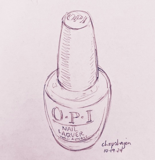
10-19.
OPI is expensive as balls but I’ve always heard it’s really good nail polish, and I recently got this bottle on clearance. Might be the color (the incredibly-named Suzi Chases Portu-geese) but the coverage is really bad?? Maybe that’s why it was on clearance LOL I’ll have to try more colors by them
#the color is like a really really pale purple that’s basically just white#on my nails it just looks white but in the bottle it’s got this tint to it that makes it obvious it’s not just white?#it’s a similar shade to the drawing’s background but a few shades lighter#anyways it took like 5 coats to get my nails to stop showing through RIP#my art#Draw Anything At All October#Essie is still my fave nail polish brand but it’s also expensive alas
2 notes
·
View notes
Text
New Wings of Fire sona wow wow wow
His name is Bulrush & he’s a Mudwing/Nightwing hybrid with xanthochromism, which is why he has a pale yellow complexion. I’ll put some more stuff about him below the image description :3
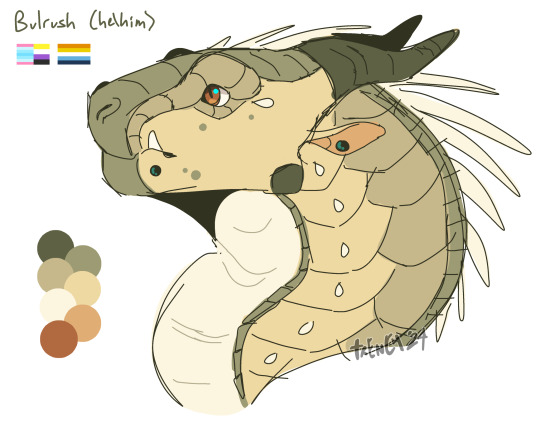
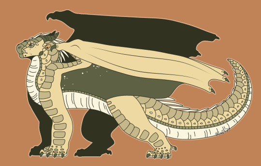
[Image Description: Two digital drawings of a dragon character, the first is a headshot and the second is a full-body illustration. The dragon has various shades of light yellow/green scales, with dark green horns, orange eyes, and long, off-white spines. There are a few small dots of green scales on his face. He has small, circular earrings that match his black lip piercings. In the first drawing, he is depicted looking to the left with a neutral expression. To his left is a piece of text that reads “Bulrush (he/him)”. Below the text is three pride flags, the transmasculine, nonbinary, and aroace flags. Below that is a small color palette, containing all of the dragon’s colors. The background of the drawing is solid white. The second drawing is a full-body image of the dragon, who is looking to the left with the same neutral expression. He’s standing in place, his tail slightly curled upwards and his wings partially folded at his sides. The membrane of his wings is dark green with a few off-white stars speckled near the joints. The background of the drawing is an orange similar to the color of his eyes, and he is outlined in a lighter version of the orange. End ID.]
More info on him below!
Bulrush is a very weak seer, his only ability is getting “feelings” of when bad things are about to happen. Basically there’s always a little hum of dread in his mind, which increases when in crowds, during conflict, right before events, etc. He doesn’t get visions but he does have nightmares, mostly of wildly unrealistic possible futures. He’s very pessimistic and antisocial, both because of his abilities and because he’s just like that. His anxiety and powers kind of merge into a weird mess of symptoms that can’t be differentiated from each other (e.g., his nightmares, increased dread when in crowds, etc). He works as an entomologist in the outskirts of the rainforest, identifying, cataloguing, and preserving insects. He lives in a small hut that’s closer to the Mud Kingdom, where he keeps all of his collections. He prefers the company of bugs and animals over dragons and has a pet Burmese python named Prince (based off of my ball python, Princely :3). Prince is his only official pet, but he often feeds the animals near his home and has names for them. He’s never met his father, a Nightwing named Snaketail, who left Bulrush and his mother when he was an egg. He has a good relationship with his mom, a Mudwing named Crayfish, and visits her in the Mud Kingdom frequently. I’m not sure what I’m going to do for him story-wise, but I’ll probably give him a Rainwing friend since he’s in the rainforest so much!
#my art#digital art#digital artist#digital artwork#art#digital illustration#wings of fire#wings of fire oc#wof oc#oc art#original charater art#original character#wof sona#sona design#my sona#sona art#character design#mudwing#nightwing#nightwing oc#mudwing oc#wof hybrid#oc reference#reference sheet#oc info
218 notes
·
View notes
Note
Do u have like ref sheets or smth of your characters?
I think your ocs look rlly interesting and i would like to scribble them pls 👉👈
Also please use this ask to info dump about your characters i would like to learn about them!!
YOU WANT TO SCRIBBLE THEM???? THAT'S SO NICE I MIGHT EXPLODE.
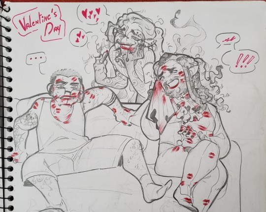
Okay i'm pretty sure you were referring to the OCs in my drawing of that one guy digging his hand in that other guy's guts so here i drew a proper "reference" for them + the third guy who's with them

They are my silly billies, Ceaser (he/him), Missy (who goes by many names)(she/he) and Remy (he/him).
Remy is like a thousand years old vampire, Ceaser is a much younger vampire (turned around the 1970's or something idk) and Missy is a former vampire hunter. Shenanigans happened where Missy was supposed to kill Remy but is now living with the both of them.


I have a whole story of how they all met and how Missy ends up staying with them, but i prefer focusing on using them for worldbuilding of my own take on vampires + i like just thinking about them chilling together.

Ceaser is almost always tipsy or straight up drunk to cope with his vampirism. Him and Remy have a little sewing/tailoring business going on + Remy owns an antique shop (a lot of the items he sells are stuff he found dumpster diving and decided to repair). Missy is trying not to lose his mind over his cultist vampire-hunting family that may or may not be looking for him, and Remy is just chilling taking care of the two of them in his manor.
Here's more drawings of them. Ceaser's tattoos always change that's normal i just can't decide. Let's say they're all tattoos he drew himself with sharpie ♡
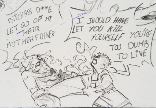
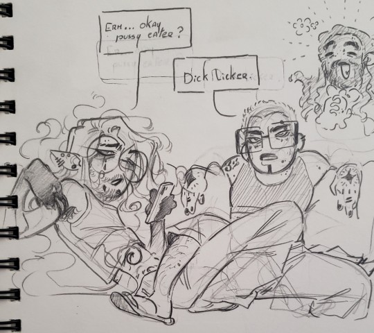
There's a lot more about them and the things around them and the vampire lore i make up (like. Remy feeds on blood and Ceaser feeds on thoughts or whatever) but i don't like making long posts so. Yea ♡
Thank you for asking about them this is so nice and so enabling for me to get an opportunity to talk about them
[Image Description in Alt Text and under the cut.]
Image 1: A digital drawing of 3 characters drawn from the shoulders up.
One the left is a character named "Ceaser"; he has light brown skin, a long face and droopey eyes with eyebads, long messy and wavy white hair that has black roots showing, and various piercings. He wears round glasses, has tattooed sclera and white irises, and tattoos on his cheek, neck, collarbone and torso.
The next character is bamed "Missy"; she is lighter skinned and is shorter with a rougher face, a short buzzcut with a few white hair, and wears square glasses. She also has an eyebrow piercing, a tattooed line going from her lower lip to further down her body, and scars on her torso.
The third character is named "Remy"; he is darker skinned and looks much older, has long, greying black hair in dreadlocks and a beard that is also greying. His eyes are almost entirely white.
Ceaser and Remy are vampires, while Missy is a human.
Image 2: A drawing of the previous three characters, now in a chibi-esque style, seen entirely. Ceaser is wearing a black sleeveless top and baggy pants, and he has tattoos on almost the entirety of his arms. Missy is wearing slim clothing in shades of black and combat boots. Remy is wearing Victiorian-era adjacent clothing in hues of purple and white.
Image 3: Another drawing of the same characters, very similar to the previous one. Missy this time is wearing a red tank top and jeans, and Remy is wearing a turquoise vest.
Image 4: Various sketches of the same three characters in different styles and situations.
At the top left is Remy holding a bag happily, saying "Today's dumpster diving was fruitful ! Thank you lots, kids !". In the background is Ceaser laying on the floor saying "Anything for you Remy", and Missy standing with text next to her that says "I used to kill people".
next to it is an exchange between Missy and Remy; Missy is gripping Remy's shirt threateningly saying "Look at me in the eyes when i talk to you", to which Remy responds "I don't know... That's scary....".
At the bottom left is Ceaser hugging Remy while saying his name, and Remy responds "Good morning to you too, Ceaser".
At the bottom right is Ceaser sitting on a couch, holding a phone and a jpeg of a Heineken bottle to his lips, and Missy is leaning over the couch, talking to him.
Image 5: A traditional drawing of the same characters. Missy and Remy are sitting on a couch, covered in lipstick marks from Ceaser who is standing behind, smilling and drooling. Missy is sitting bewildered and confused while Remy is wiping the lipstick off and smilling.
Image 6: A doodle of Ceaser and Missy fighting. Ceaser is saying "Bitchass dyke let go of my hair, motherfucker", while Missy is yelling "I should have let you kill yourself, you're too dumb to live".
Image 7: A drawing of Ceaser and Missy sitting on a couch; Ceaser is laying on the couch looking at his phone and Missy is sitting with a leg over him, looking directly in front of her. Ceaser is saying "Erm... okay pussy eater ?", to which Missy responds "Dick licker".
#itchyballstalk#itchyballsart#been a while since i drew humans#my baby darling sunshines how i love them#yea they're not like romantically involved also.#All of them are in some way aroace. Remy dgaf ab that kinda stuff while Ceaser is a gay man and Missy is a lesbian#Although Missy and Ceaser are fuck friends bc i find it funny
57 notes
·
View notes
Note
Not ship chart related but I think your art is so pretty!! Do you have any tips? Especially with coloring if it’s okay <] (/nf)
waah thank you very much! i'll try and explain but here’s my colouring-specific tips, or at least how i choose my colours !! <3
unless for stylistic reasons (e.g. greyscale drawing), i personally avoid pure black, greys and white for colouring. go and choose off-colours instead! for lineart, black is okay but i always go for an actual colour anyways heheh. for the background colour of your canvas, sometimes an actual colour (rather than white or grey) may help you pick your palette to be more harmonised!
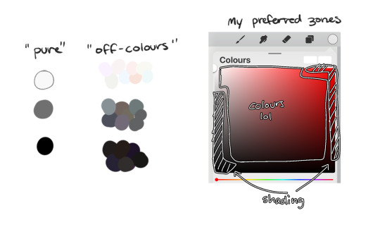
following this, i also don't like using pure/neon for colours (aka the top right corner), unless it's for a certain aesthetic or artstyle (e.g. the character has a "toxic/radioactive" aesthetic; the character is a scenedog (or similiar); or highlights). see below for examples! they may be subtle but sometimes the subtly can make the difference you are looking for, especially if you're looking for a natural look. if you're aiming for the bright/old 2000's artstyle, then pure/neons may be your friend!
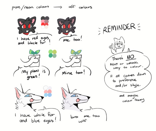
when i'm casually drawing characters (oc or not), i rarely colour-pick from the reference image. i find that when you're "forced to make the palette", it can come out more pleasing to your style/atmosphere of the drawing! it’s more personalised that way... like yea, that’s my favourite versions of those colours! i'm not saying that my colours are better though, only that "hey that's me! in those colours!!" you can have the reference image on the side or go by memory. here’s me doing this with pride flags:
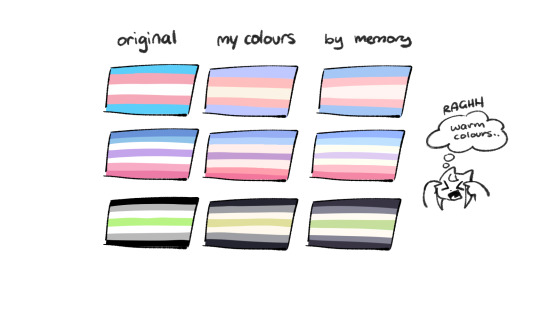
nowadays, when drawing the spooky month characters—who have simple designs god bless—i can just imagine their reference and adjust the colours in my head lol example: if i know that Lila's colour palette is purple, and that her winter sweater is coloured lighter than her hair, then i can just go ahead and pick whatever shade i want following that rule!
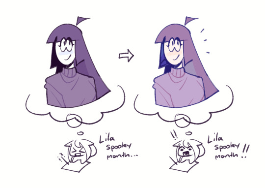
(of course, always double check with the actual reference for physical design inaccuracies and skin tone if it applies. my advice above is just for general hair/clothing colours! …because yknow you don't want to accidentally whitewash a character's skin in the name of aesthetics lol. if you’re unsure and want to be on the careful side, please do colour pick the skin at least !!)
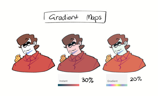
moving on... gradient maps and certain blending modes (like exclusion, luminosity and darken) can be a game changer too. for normal drawings (e.g. drawings with no environment), i use darken the most because it changes a few colours rather than the entire piece... (the percentages are opacity levels!)

oh and as a really basic shading tip without using blending modes: sometimes, you just gotta go for grey. shading a warmer colour? use grey to make a cool tone. shading a cool colour? use grey to make a warm tone. not all the time (because you don’t wanna make your shading seem muddy), just sometimes…
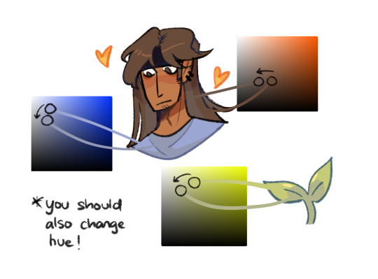
and that's that! there's always exceptions to rules and often times, your headshot doodle ends up as one big experimental mess (in a fun way, hopefully)!
this is how i choose my colours though most of the time, it is just me going “good enough”
i think we're pretty similar on how we like warm colours! i enjoy going the simple/lazy route and avoid blend modes but then again, shading is a whole different thing…
hope this helps in any way !! <:3 !!! <3
#if anyone wants to ask for specific tips i’m happy to share!#if i have any lol#[ the askbox mourns ]#[ the art of mourning ]#[ mourn's mourns ]#anyways yea i kinda do just imagine the spooky month characters with a light orange multiply layer and then try to replicate it irl#my personal/lazy rule is that if it looks good faraway its good enough AHAHA#spooky month lila#spooky month jaune#spooky month rick#spooky month aaron#spooky month#“actuallyyy the 'black cat' is actually dark grey—” SHHHHHH SHUT SHUT IT. SHUTUT !!!!! i need u to see the lineart /silly#[ mourn's resources ]
98 notes
·
View notes
Text

Funguary, Day 25 - Trumpet of Death 🍄
So I had several more creative ideas of how to illustrate the death theme, like dancing 1920s skeletons and the extinction of the dinosaurs via asteroid, but once I started drawing the mushrooms, I realized none of those really worked, and there wasn't enough space on the page left for detailed backgrounds anyway; I was going to leave it blank to keep the greater value range, but it was too empty, so I ended up filling it in with a smoky background, similar to what I did for the devil's cigar a few weeks ago [NOTE: This commentary was originally written and posted on February 25, 2025]. Anyway, the entire drawing was done using just the Faber-Castell Polychromos coloured pencil in black, similar to if I was using a graphite pencil; I had fun playing around with different tip sharpness and which part of the lead I used for different effects, and my value range is getting better, but I should have used fewer lines and shading on the stems to increase the lighter values.
7 notes
·
View notes
Note
Is there any particular artist, show, game, or movie that inspired ur art style? It’s so pretty ^^
I have so many!!! I definitely can't name every single one but heres a few that have been extremely influential to me!! This took me 2 hours to write i am SO sorry lmao
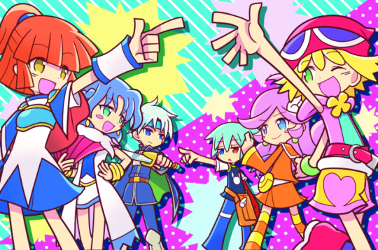
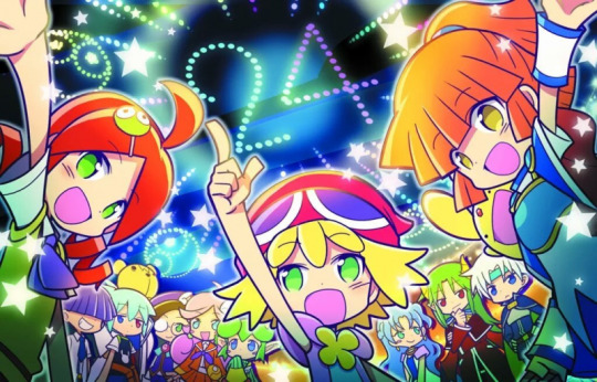
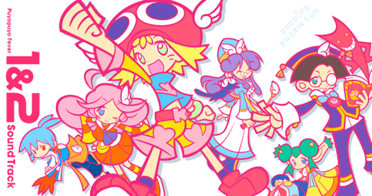
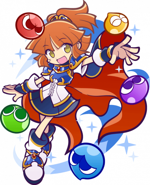

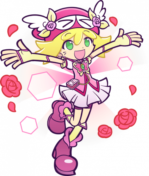

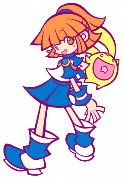
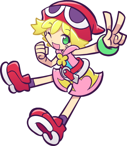
Puyo Puyo (Specifially Fever, Quest, and Tetris)
CUTESY BRIGHT BRIGHT COLORS!!!!!! Thats everything I love!!!!!! I'm pretty sure I talked about this when I first got into puyo puyo but I for SURE instantly decided that yep Im steering my style in this direction sorryyyyyy!!! I just think its so fun and silly and cute and rahhh it makes me so happy.
Especially for the work I do most often, which is character portraits without backgrounds, I will often look at puyo puyo posing just to get ideas!! (I've drawn Arle's dumbfounded pose 100000000 times becus I love it so much). The puyo puyo anatomy has very noodly arms and legs but with big ass shoes and accessories which is probably my favorite design thing in the world....
I seriously recommend just looking through the Puyo Puyo Nexus wiki for pose ideas (if you want something cute/silly of course) because every single one is just perfect. I am trying to get out of some dumb art habits of my own right now, but hopefully in the future you'll be able to see more goofy poses with sillier effects :3
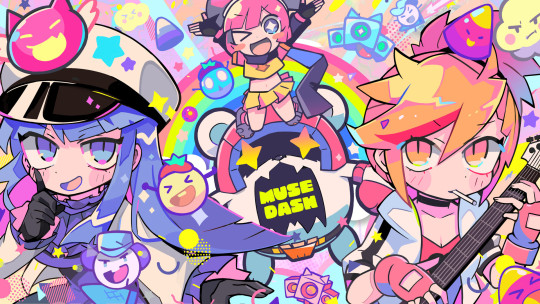
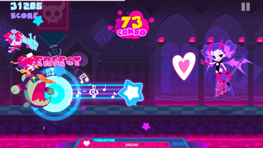
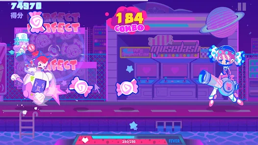
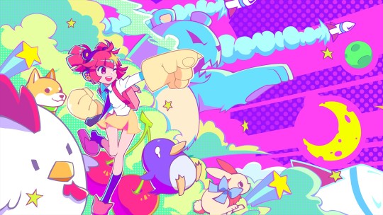
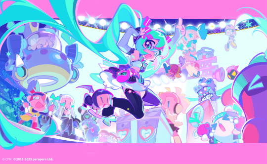
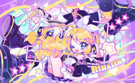


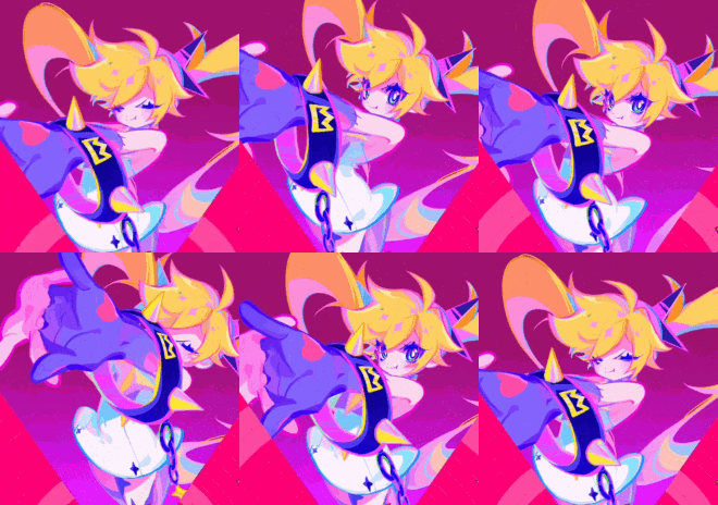
Muse Dash Again I want you to look at the COLORS. Its so bright and this time you can really tell where I took my shading style from. I dont want my shadows to be dark I want them to be PINK or PURPLE. thank you. For my own art, I really try to make it so the darkest "black" is actually a deep purple or blue, and as I keep making art that dark color keeps getting just a bit lighter haha...
This is also the reason I color my lineart the way I do. I just really want to add as many colors as possible into the image. And if the image looks a bit more pink after that then thats just an extra perk!!
I also need to bring up the animation because they're just so bouncy and alive!!! This is like an instant stunlock for me, I have to look at them, theyre so BOUNCYYY!!!!!! I don't do much animation but every other week I get the sudden urge to try tweening again just to eventually get to the point I can make something similar to these for my own ocs lol


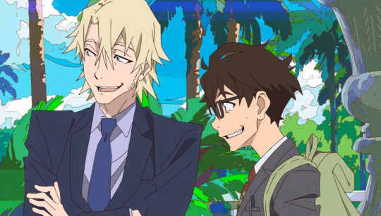

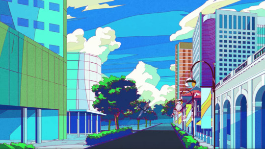
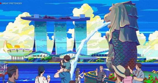
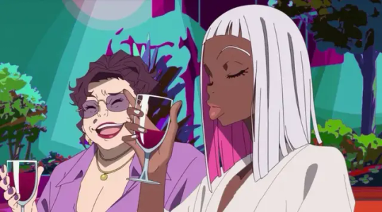
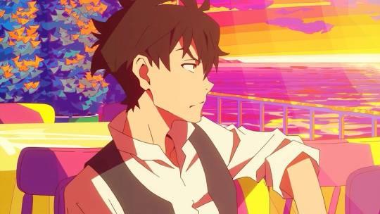
Great Pretender This show has some of the most gorgeous art ive ever seen. All the backgrounds are so bright and colorful. I dont usually draw art with backgrounds anymore sadly, but when I used to I really tried to study these for them. And I hope in the future I can make more art and show how far I've come.
Though I;ve changed to a more chibi style in recent times (thanks puyo puyo), this was still one of the first times I had ever watched a show and said "Oh my god I love this artstyle I need to get better at art" and Its always in my mind for that reason.
Ive definitely stolen lots of elements from the style. Though they've gotten more subtle over the years. I dont really know how to describe it any further but I hope you understand what I mean by looking at these screenshots,,,
20 notes
·
View notes
Text
Do you want to hear me talk about The Animatic? No? Well that sucks because I'm talking about it anyway.
I don't know what made me suddenly want to make a full length animatic, but the urge descended upon me and I did anyway, despite my horrible horrible track record.
●~●~●~●~●
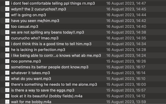
I'd actually had a couple voice clips cut out since July (because that's when I started Jealousy), but the bulk of it was done 15/16 August. And! This song (Pentatonix's God Rest Ye Merry Gentlemen) is actually the second one I tried piecing together.
The first song was AURORA's Runaway! I swapped songs pretty early on because
Runaway was 4 minutes long and God Rest Ye Merry Gentlemen was 2.5 minutes long
3 minutes in, I ran out of voice clips.
I used a lot more voice clips for Runaway than God Rest Ye Merry Gentlemen, not just because it's longer but also because the song is significantly slower and thus easier to fit voice clips in it. Not just more voice clips, but the voice clips were longer too.
(God Rest Ye Merry Gentlemen had 9 source clips. Runaway had 15.)
Hindsight is 20/20 though, because due to the slow-paced nature of Runaway in comparison to God Rest Ye Merry Gentlemen would have resulted in far less frames needing to be drawn, or precise cuts or-
Well, you get the point.
●~●~●~●~●


I have two files for this project! Yes, it was pure Medibang. The reason for the two files is that there were so many layers that the first file was lagging to hell and back and I couldn't even draw a straight line because of how bad it was.
●~●~●~●~●

This was the actual first frame I ever drew for this! If it looks familiar, it's because I was mirroring this. It's my first ever fanart for QSMP.
At the time of starting this, I had maybe 3 pieces of QSMP fanart and was super uncertain of what I was doing, so it definitely happened again - mirroring a piece of fanart into an animatic frame.

●~●~●~●~●
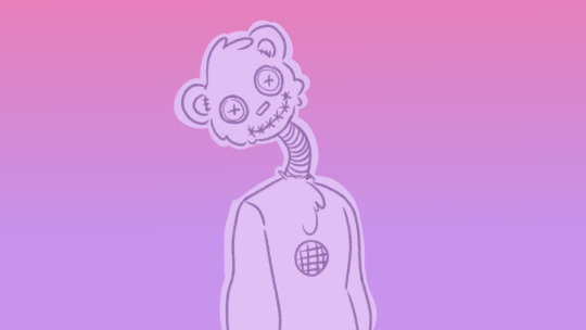
This was the first time I ever drew Cucurucho. I had an idea and it was simple to execute but over time I forgot about the voice box.
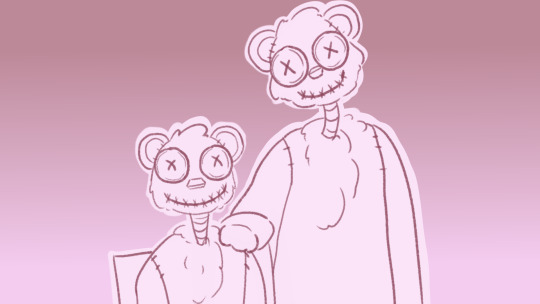
This, on the other hand, was the last frame I ever drew. The Cucurucho designs are largely the same, with some minor differences (bigger eyes, more stitches, no voice box, thinner tube).
●~●~●~●~●
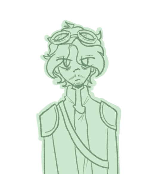
This was the first time I successfully drew Cellbit. Emphasis on successfully because even this one bit took me forever. I never really had to redraw any frame once I drafted it, but this. This took me 5 redraws. It was my greatest nightmare.
●~●~●~●~●
I've said it before but these two frames side by side?
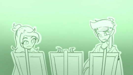
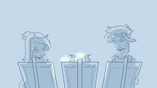
It was my favourite part of the animatic for the longest time. Hands down, no debate, I adored it.
●~●~●~●~●
You may notice that most frames had the subjects coloured in a lighter colour, but a couple didn't. Some were intentional, to better show off lighting and backgrounds and depth and stuff.
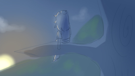
Some.... were not.
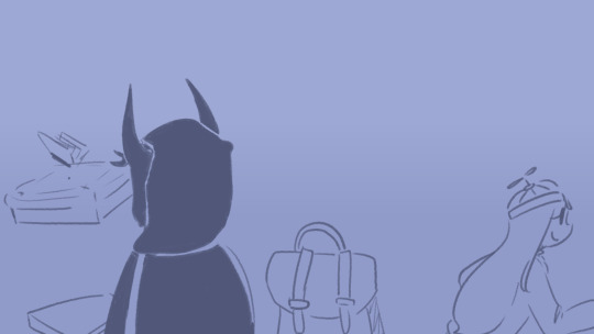
(Oops.)
●~●~●~●~●
Some of my other favourite frames include:
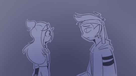
Which would have been better if I hadn't messed up the shading.
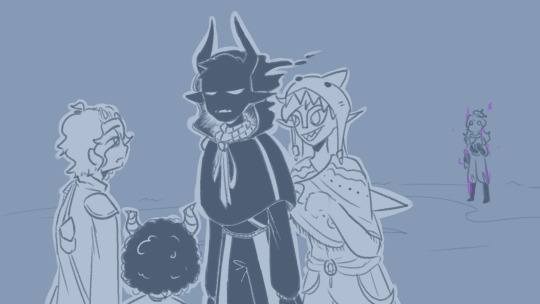
Because this was so many characters. And Cellbit.
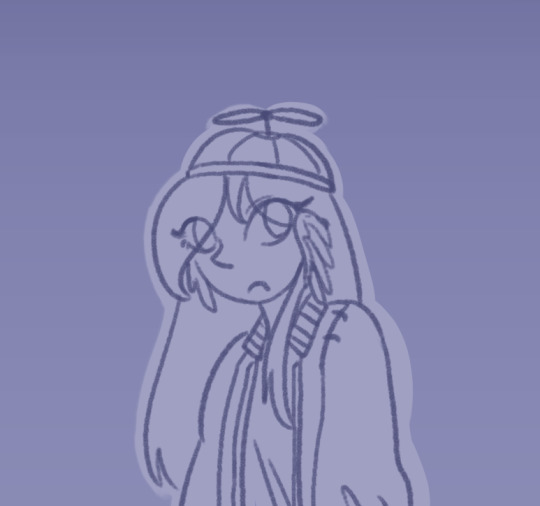
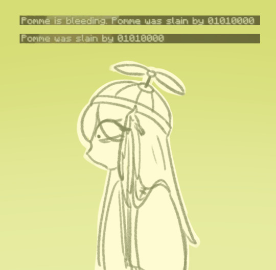
And the Bagheras, which I really had a ton of fun drawing near the end. Because these two were drawn at the end. The same day, actually. The first one did have a draft already, though.
●~●~●~●~●
Some little details:
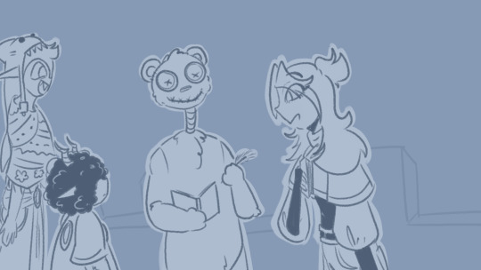
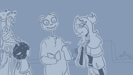
Between these two frames, BBH and Cellbit pop up in the background. There's a flash of white immediately after, which is supposed to be the camera flash when BBH takes a photo.
••●••

Jaiden (and Roier) in the early scenes have perfectly normal eyes.

This changes immediately after Bobby's death, albeit rather subtly.
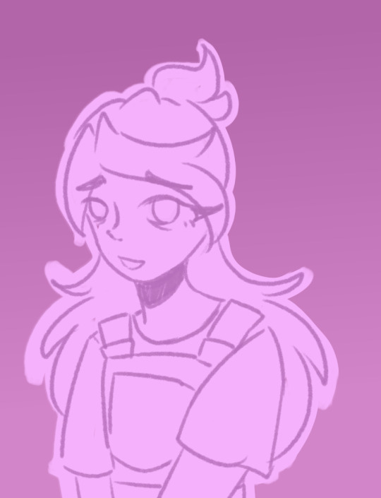
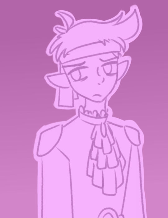

By the time the beginning of the Cucurucho tasks rolls around, the shadows under their eyes have had time to develop and become more prominent.
••●••
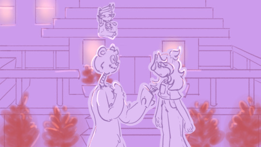
Roier does a little rooftop espionage.
••●••
Similar/Similarly located scenes have similarly coloured backgrounds!
It's most prominent with Bobby Fields' Rose/Lavender palette, with a few (not all) examples.


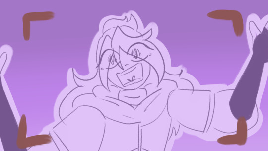
(The words associated with this last image are actually from when Jaiden got stuck on a ladder on her way down from the sunset tree while trying to chase Cucurucho. I just found that funny.)
But the colour thing is also key with Baghera and Jaiden's conversation with Pomme's non-canon death.
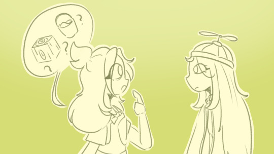

The colours used for 1) the gradient background 2) the lineart and 3) the subject base colour are identical in both images, even if they're a third of the video apart.
●~●~●~●~●
Anyway, this was made with Medibang and iMovie, even if I do have Krita and DaVinci Resolve and FlipaClip and-
.........Yeah.
Tried and true basics, I guess.
(Krita and DaVinci both cause my laptop to overheat. I struggle with Krita so incredibly badly, even though I have friends who swear by it.)
●~●~●~●~●
Also I maxed out the image count on this post.
12 notes
·
View notes
Text
how i did the shadows in MAGIC SHOW
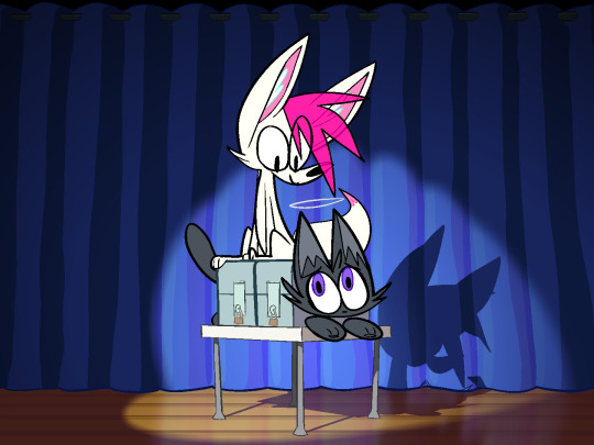
I thought it might be fun to write a little breakdown of how I made the shadows in my animation!
so. magic show! i made this animation very quickly! it was a gift for @xxacidnekoxx, and in total i worked on it for about 2 weeks.
there wasn't an animatic stage, and i drew all of the final frames as i went. i didn't even know it was going to have shadows at all until I finished coloring it and realized the whole thing looked a lot more flat than i had anticipated.
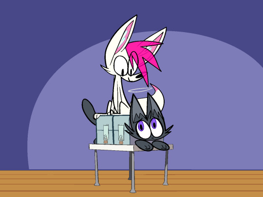
oops!
luckily, getting the animation from this to its shaded state only took a few hours.
so let's break it all down!
Part One: Some Basics
it's worth noting that the animation software I used for this is toon boom harmony. a lot of what i'll be talking about is harmony specific, although you could certainly apply similar techniques in other programs.
Masking
the idea is simple. you have three images. the first two images are the same image, but with different palettes. the third image, known as the mask, is grayscale, and defines which areas use which palette.
when combined, the black areas use the first palette, and the white areas use the second palette. grey areas mix between the two.
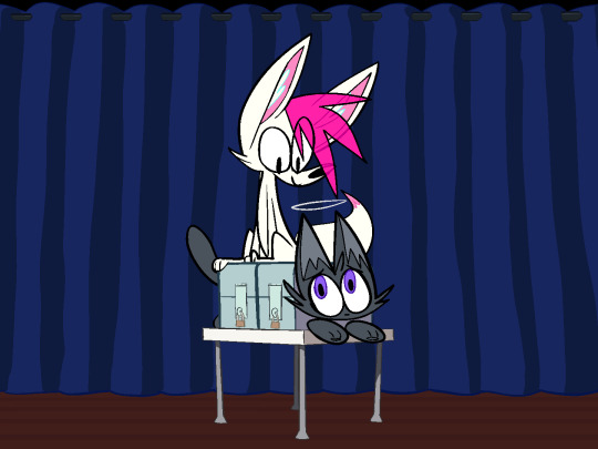
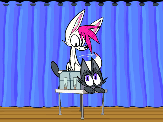
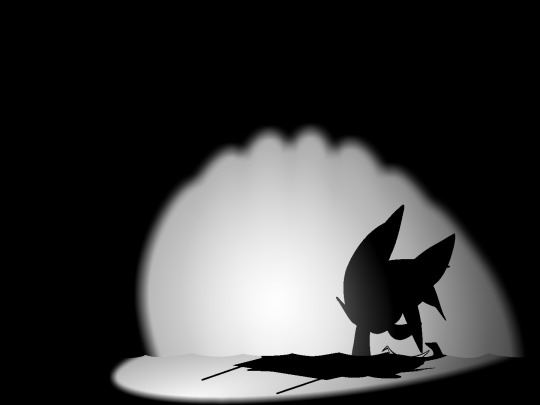
in harmony this is easily accomplished with just a few nodes.
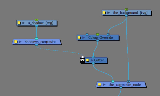
the unlit background is layered on the bottom. the lit version is masked by the cutter, and layered on top of the unlit background.
this kind of setup will likely work for most cases. however...
by default, cutter nodes will only use the alpha channel of whatever is plugged into the matte to determine which areas to mask, ignoring the actual brightness values of our mask.
this causes some issues for us! our lighting has layers. we want our spotlight to make the background lighter, and we want our characters to cast shadows on top of the spotlight.
luckily, we can force harmony to use the matte input's brightness values to determine the mask instead by inserting a greyscale node before the cutter and ticking the "matte output" box.
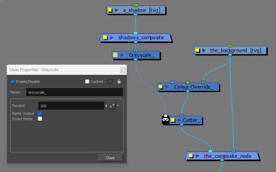
(btw, if you need a layer or matte to become a solid color, you can plug it into a Matte Blur node and pick which color you want there. very handy in combination with the greyscale node's matte output!)
Color Overrides
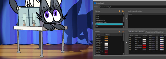
the easiest way to make alternate palettes in toon boom is to right click on the palette in your palettes list, and click "Clone..."
this makes a copy of your palette where all of the colors are linked to their respective counterparts in the original palette.
with cloned palettes, harmony uses whatever palette is highest in the list (or whatever palette is currently selected) to determine which version of the palette it uses in the scene. you can override any layer's palette priorities by plugging it into a Colour Override node and adding the new palette you want as a whole palette override.
Apply Peg Transformations
the Apply Peg Transformation node is simple. normally peg transformations occur before the drawing node. this means every instance of the drawing will share the same transformations. but this node lets you apply them after the drawing node.
this allows you to insert multiple instances of your drawing, each with unique transformations!
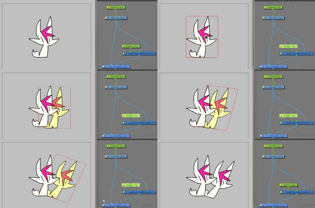
perfect for our shadows!
that's the basic gist of it! combining these elements gets you most of the way there.
Part Two: Getting The Rest Of The Way There
unfortunately, our table looks like it is floating at the moment.
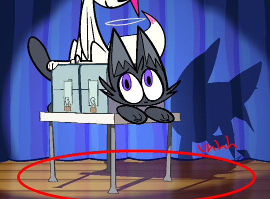
this technique is very efficient, but the results are far from perfect.
shadows are what happen when an object blocks light from hitting another object. generally these objects are "three dimensional" and have "volume", which, in combination with the position and angle of the light source, changes the shape of the shadows they project.
the truth is that reusing flattened 2d artwork of characters to create shadows can only get you so far. the effect looks better when the light source is coming from a similar position and angle to the camera, but looks worse when the difference is greater.
in our case, the light source is close enough to look convincing on the curtains, but the shadow doesn't line up with the table's feet on the floor, absolutely shattering the illusion.
so how do we fix this?
Color Overrides Again
the Colour Override node also lets you non-destructively remove specified colors from a layer.
here i've "deleted" the table's shadow by using a Colour Override node to replace all of the table's colors with 0 alpha colors.
this is a very efficient method of removing objects from a lot of frames at once!
cutter nodes can be used to further mask away any remaining parts of a shadow that you don't want. example:
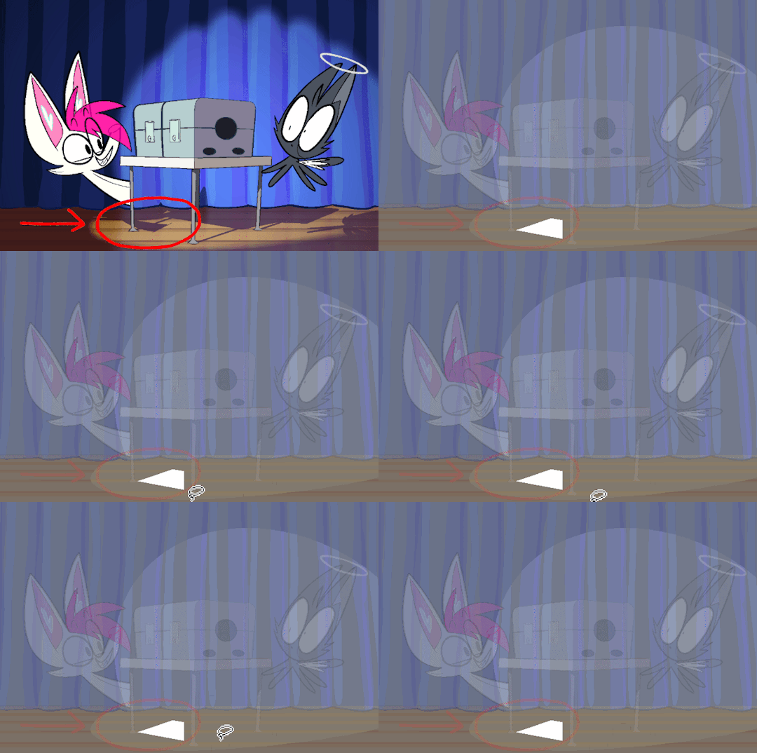
Manually Adding The Shadow Back In
no node fuckery here. i simply made a new layer and drew the table's shadow by hand for each frame and included it in my shadow composite.
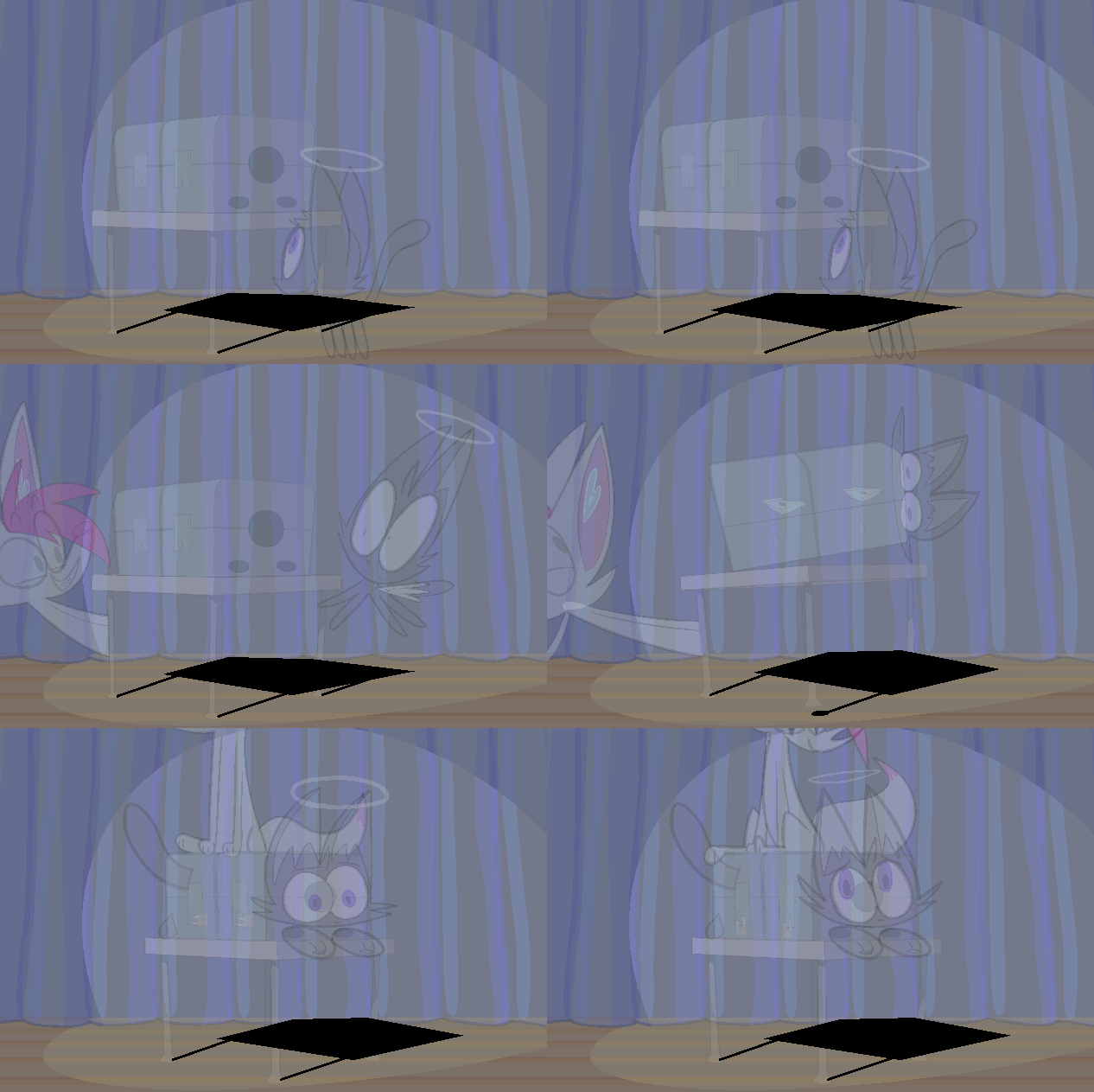
this little bit of manual shadow animation really ties everything together and sells the effect in my opinion.
Part Three: Finishing Touches
these aren't necessary, but they add a little bit of polish
Mesh Warping To Add Form
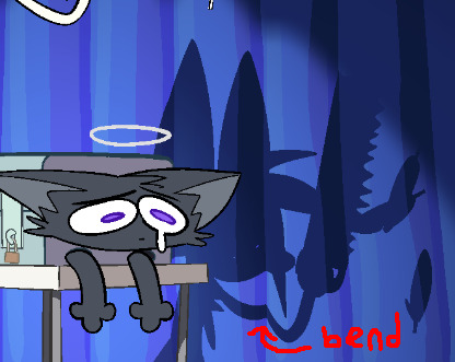
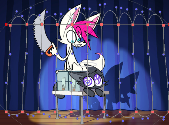
the shadows subtly wrap around the curtains as if they were a little bit round. just gotta run the shadows through an Apply Peg Transformation node connected to a Mesh Warp node. be warned that the bezier handles on this thing are a lot more finicky than the other bezier handles in harmony and sometimes they bite you.
Blurring Spotlight Edges
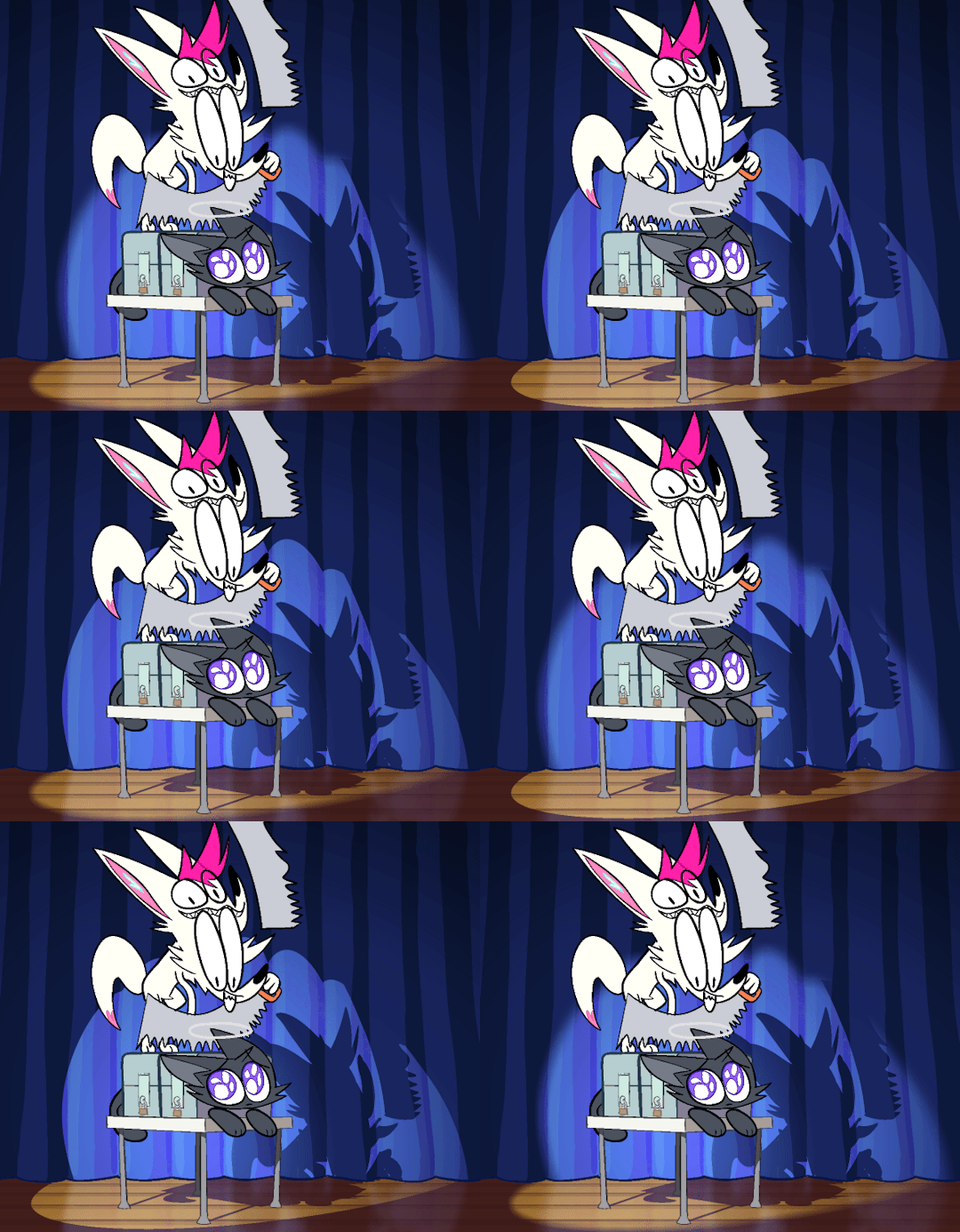
in the real world, shadows get blurrier the further away they are from the object that's casting them. it probably would've been a lil more realistic if i slightly blurred the shadows that the characters cast on the curtains as well, but i thought they looked better sharp here. realism doesn't actually matter just do whatever looks Good Enough.
Floor Reflection
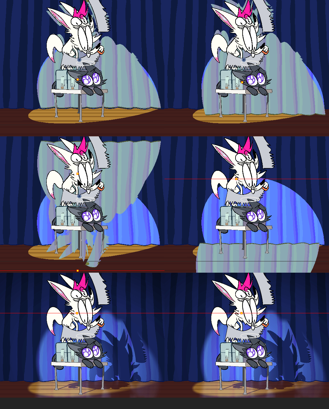
i used an Apply Peg Transformation node along with a simple peg to layer a flipped instance of the curtain's Lit shading on top of the floor. blur it (more vertically than horizontally,) set the blending mode to add, and lower the opacity. done!
that's about all i can think of right now. thanks for reading if you got this far!
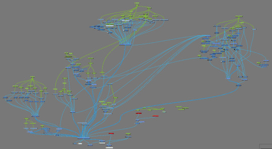
as a bonus here is what the whole node tree for this animation looks like. most of the shadow & background stuff is happening over in the upper right cluster.
43 notes
·
View notes
Note
Do you have any coloring tips? I'm trying to get better at coloring but it's hard :/ everything looks so out of place and I lose motivation fast
Of course!
By no means am I an expert on this (I still forget to choose a light source 90% of the time) but here's a few things that I do when I'm colouring something digitally. Remember these are all individual to the way I make art so they may not all be applicable to yours and are simply me explaining how I do colours, not a tutorial for all colouring styles.
Buckle up folks, this one's a long one (sorry in advance!!)
Here goes nothing.
Losing motivation is totally normal and okay, take a break if you need it, maybe send it to some friends for some hyping up (art servers full of other artists are great for this!). Colours ain't gonna look perfect first time you try to do them, I never put down a colour that I like first time, it takes some messing around and asking friends for me to get them down.
So don't feel pressured to get them perfect in the beginning, that rarely happens!
Here's a mini explanation of how I do my colours, hope it will help a little :)
1) GET THOSE BASE COLOURS IN!!
It doesn't matter if they're not exactly what you're going for rn, go with roughly the colour you want and start there! Personally, I do big blotches of colour just to get something down on the page as this helps me want to actually finish it. Then you clean up those edges so they're all in their correct spaces.
I've found that working on a neutral mid-tine grey background helps you see the colours best at the start so all of my 'paper' starts off grey when working digitally.
Here's the example I'm going to be using (this is from the ghost files fanart I'm working on)

2) ADJUST THOSE COLOURS!!
So, now you've got those colours down, you can adjust them to be roughly how you want them to look. If you're unsure on what colours look best together, you can either take some time out, find some YouTube channels and learn a little about colour theory... OR you could grab some colour pallettes from online and have a play around with gradient maps or simply placing the colours in yourself. There's no shame in using resources like those, that's literally what they're there for.
I didn't need to do this on this drawing as I was happy with the colour selection. This is because I chose the background colour and simply adjusted the hue and saturation slightly until I got the colours I wanted. This is my general technique for choosing colours as my work tends to be fairly similarly coloured (browns, oranges, reds, yellows with hints of purple)
3) ✨SHADING✨
Right, well done! You've got your base colours in.
...but oh god, what now?? They look so flat and lifeless, what shall you do?!
This, my friend, is where shading comes in. It's both a way of telling the viewers where the light and shadows are, can change the mood of the drawing, can change what we feel about a character or it can just look real pretty but shading and lighting does all sorts of fun things to a drawing.
If your style is more simple and doesn't require shading/has minimal shading: apply this tip to any shading you do have and don't forget the importance of rim lighting in simpler styles.
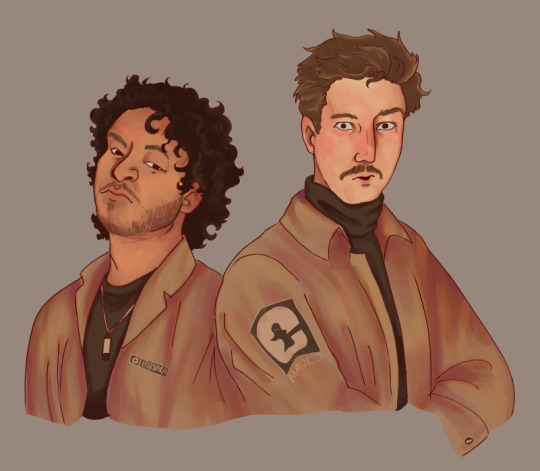
For shading both skin and clothes, I use the original colour, shift it down into a darker shade and on the colour wheel I shift it down too (eg. shading green with blue, red with purple) sometimes you can shift that even further to create similar shading to the one above, where I shaded orange/brown with pinks/purple's.
The principle is the same with highlights but like,,, opposite. Shift everything up, shade browns with yellows, blues with greens, etc.
SIDENOTE ON HOW I COLOUR SKIN:
Okay so, these next two paragraphs are based entirely from what I've learnt during studies and aren't rules, just simply how I do it.
For lighter skin tones, I tend to start from one of the lightest colours and shade darker, like you would if you were working with something like watercolours. This allows you to build up shadows in areas of darkness. Once you've done the shadows, you can then go in and add highlights and lighter sections where necessary.
For darker skin tones, I tend to start at one of the darkest values, as dark skin tends to reflect light differently to light skin. Then I add lighter shades in sections that the light would reflect. You can add shadows too, I tend to add them if the drawing still feels flat after doing the highlights.
3) OVERLAY + MULTIPLY LAYERS ARE YOUR BEST FRIEND
These things are literally lifesavers for me, I love an overlay layer.
I can't really explain what they actually do so I'm not even gonna try, just play around with them. But using a purple/blue multiply layer and erasing where the light hits, that makes the illusion of full shading without the same effort of painting in the shades.
Overlay layers are 100% a 'fuck around and find out' resource, I tend to use red and pink overlay layers as my colours tend to be more desaturated and this helps with brightening them up. However they can also be used to change the genre/mood of the drawing, like this:
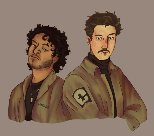
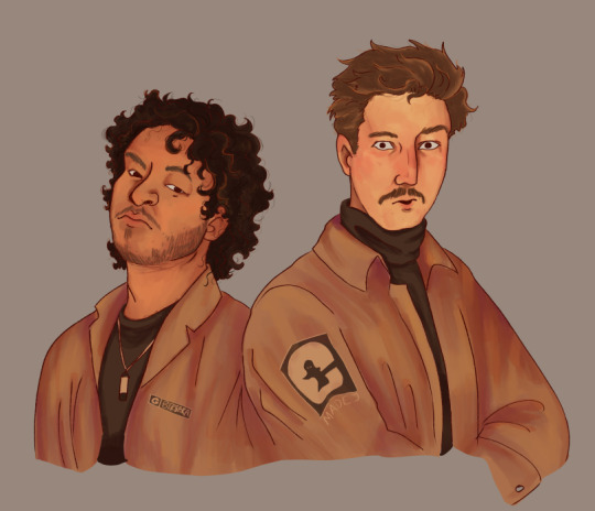
These two drawings are the exact same. There's no difference between them other than an overlay gradient map layer in green or sepia. (These gradient maps are built into clip studio paint, I'm not sure about other programs)
But the whole vibe is completely different. So yeah, fuck around with different colour schemes and overlay layers (the bi flag colours are a great choice for experimenting with overlays as the colours are naturally very harmonious so maybe start there.)
You can also try a noise later for a bit of texture, it's my go-to fix it for any drawing ngl
Uhhhhh, yeah. That was lengthier than I expected, hope it helps even in the slightest. As I said at the top, I am by no means an expert and am still figuring things out myself, so just fuck around and find out.
Bye now!
#artists on tumblr#art#artwork#digital artist#fanart#ghost files#art tutorial#colouring#art tips#deathian answers#digital painting#digital art#colour tutorial
21 notes
·
View notes
Text
Nimona OC - Charlotte Swiftheart/Corova
Hi, hello, remember that "something in the works..." post I made a few days ago? Well, the works have set it free and here it is. My own drawing of Ms. Charlotte Swiftheart/Corova.
Original Post about Charlotte

Here she is! I used a lot of colors from Ambrosius, specifically from this picture:

I wanted to make it clear that they were related yet also not clear? Obviously no one knew until they were told (though I'm sure people were suspicious since they are supposed to look kind of alike), and they didn't know, but honestly some people look alike when they aren't related, so maybe it was just one of those things where no one assumed until the halfblood thing became public. Anyway, I'm semi confident that their skin tones are similar, I used a lot of Ambrosius's features as reference when I was drawing Charlotte's face, and her hair is a similar shade as his (and there are strands that are this lighter, almost bleached blond that Am has going on). I gave her a few details that aren't as noticable, so I'll point them out really quickly. So the bracelet on her right (left side of the drawing) wrist is blue and gold. Blue is kind of her color, and gold is, of course, Ambrosius's. It was obviously a gift from one of the children at the sanctuary, probably before she reunited with Ambrosius and Ballister. The ribbon she's using to tie her braid off is Nimona pink (no further comment). She's also wearing a gold ring on her left (right side of the drawing) middle finger. Probably was something left from when she was at the Institute, maybe a gift from Ambrosius or Ballister, and she could never bring herself to get rid of it even if it could've gotten her some much needed money.
Oh, and the whole golden plating looking background with the black brick splashed over it kind of just represents her? She's got that golden blood but it's overshadowed by the commoner part of her. Tainted, I guess. And then the little spray painted KB symbol is obviously for her band of vigilantes and do-gooders.
Close-Up and Symbolic(?) Overlay below the cut:
Close-Up:

I was absolutely delighted when I realized that Ambrosius has little freckles and now I don't even know if you can see the freckles I gave Charlotte. I'm going to throw something (you can kind of see them if you zoom in, but not as clearly as they looked on my drawing software).
Symbolic/Artistic Overlay thing:

I think that these are things that Charlotte has unfortunately internalized since she left the Institute. They define who she is not only to the kingdom, but to herself as well. "She was a mistake, the result of an affair." "She's a stain on the family legacy." "Nothing more than a bastard." "A Gloreth forsaken halfblood."
Lovely tagged people:
@ammonitetheseaserpent @perfectkittystranger @xxlunadrawsstuffxx @floxu
#nimona#nimona oc#nimona 2023#nimona movie#nimona netflix#nimona film#original character#oc: charlotte swiftheart/corova#ambrosius goldenloin#my art#artwork#digital art#procreate#digital drawing
7 notes
·
View notes
Text
Pedro Medieros, pixel-art practitioners; an explanation - By RPG.
Saint11
Pedro Medieros, who otherwise goes under the pseudonym "Saint11", is a Brazilian-born game developer, programmer and illustrator who is renowned for his developments for the game Celeste.
He now resides in Canada, where he previously co-owned Miniboss; the company that he contributed to via his illustrative works in pixel-art style.
The games he has worked on:
Celeste 6: Fragments of the Mountain
Celeste
TowerFall
Out There Somewhere
He works with a variety of tools, this can include Aseprite; being a specific software program that is dedicated to the creation of both still and animated pixel art works. Medieros, however, doesn't only specialise in pixel art but in high resolution works; where he uses a variety of drawing tables to complete said task.


(A few of his works, from his collection "Pixel Dailies")
Notes about his artwork:
They all feature a pretty uniform colour palette, utilising darker shades and simultaneous vibrant shades to invoke a certain feeling. For example, the candelabra is made to look vibrant because it invokes power and light; in a series of artworks that are otherwise made to appear dark and hellish, implying that it is of some sort of importance to something. This could also be said about the portable shrine, with its golden-hued statuette.
Shading is a big part of these works, with a green outline prevalent in all works within this collection. The changes between the darker green background, and the lighter green hues that are showing light in a dark environment also present themselves differently; attention to detail is used well in these artworks, where you can see the different refractions of light by the variation in green colours.
The colouring of certain items is done really well. For the shrine, the carvings in the wood are marked really well; the detail might be small, but gives a big indication into how such an asset would be implemented into a game, and what it even might be. My favourite example of this is the plague mask, where the brown becomes lighter as it reaches the "lit" part and becomes slowly engrained into the black neckpiece.
For it being a "concept" for pixel-art style inventory/waypoint/map icons, they make use of a golden border. This is really indicative of inventory icons, and sports them as those that could possibly be featured in some mystical low-fantasy game similar to that of Runescape.
The focus on this specific collection of artwork is that of mysticism, in my opinion; the iconography and nomenclature just really fit the theme.
There are 12 different pixel-art icons in this collection, here's a list:
Plague Mask
The Valley's map
Lost Seeker's bag
Summer berries of the Empire
Eastern Kingdom garment
Bottled lantern
Basket of Mushrooms
Candelabra
Imp claws
Portable shrines of Saint Ignas
Seraph's halos
Sand of the Valley
...and all this is contained with a fictional world, "Terminus". Seems pretty Runescape like in both appearance and way its presented.
The scale is done within this collection, in terms of resolution, is smaller than his other works; this would be considered as a 128x128 res asset, but he has other collections which consist of 512x512 res works.
Conclusively, his artwork is very unique and very otherworldly. His works in a nice, consistent and sleek blend of colour contrast, a contained palette and necessary attention to detail.
RPG-7
0 notes
Note
Is it just me or has the card illustrations (specifically the groovy) been kinda bad lately? Like don't get me wrong most of the pre groovy are absolute bangers, but the groovies? Not so much. But lately there has been an obvious decrease in quality with anatomy, and even 😐 a whitewashing problem.
Take Lilia's dorm groovy for example— the piece is gorgeous, but whenever I zoom into his face the way they draw his face looks so off.
As for the whitewashing issue, I've noticed that Leona's beastly garb groovy had him very ashy looking (but some may argue that it's just the lighting casted on him)
Right now though the one that's been bothering me the most is the obvious whitwashing on Kalim's tsum groovy. We really can't argue that it's a lighting issue there, cause Jamil's firework card had a similar setting and he didn't look that light.


Personally, I think TWST’s Groovy illustrations have always been hit or miss since the beginning. I have similar issues with the faces in Lilia and Leona’s Dorm Uniform Groovies, and the anatomy seemed slightly off in a few others. I can’t find the original post anymore (I think OP didn’t tag it??), but I clearly recall an artist having spoken about how the pose in Epel’s initial Dorm Uniform art looked weird; they included drawings of how Epel’s spine and limbs looked vs how they should look to illustrate what they meant. Those are just a few examples of then and now though, and we have to keep in mind that if we include ALL available cards then the funky faces and weird posing/proportions only make up a very small percentage of what’s out there.
The more important issue at the moment is the coloring choices that were made for a few recent SSR event Groovies: Beastly Garb Leona and Tsumsted Kalim. They are pictured below with a few other card illustrations I pulled that have similar lighting (or as similar as I could find). You’ll notice (especially for Tsumsted Kalim’s Groovy) that the characters’ skin colors are much lighter than they should be.
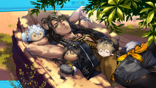
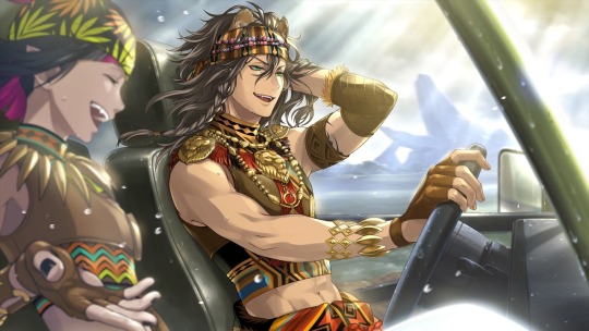
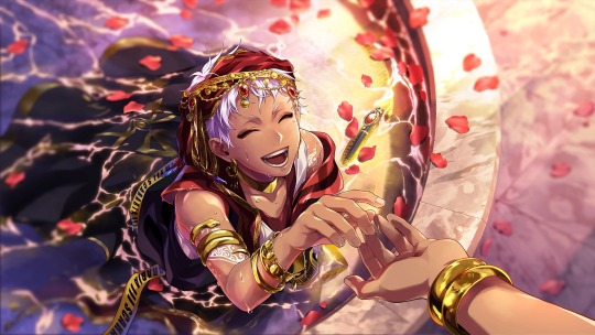
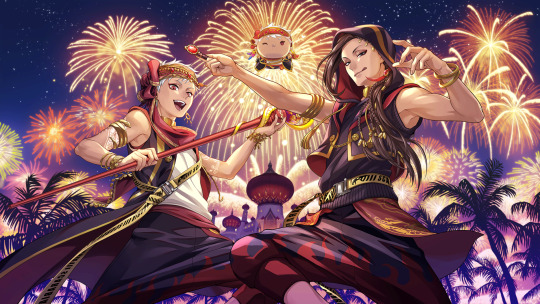
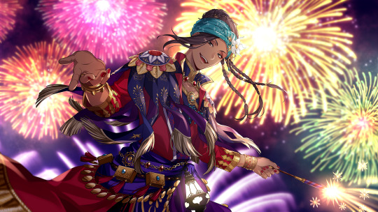
Now I’ll be honest here 💦 I actually can’t tell (even when eyedropping the colors to compare; I don't even know if eyedropping is an accurate way to compare colors since the lighting and environment in every illustration is never EXACTLY the same) if Leona’s Beastly Garb Groovy is just the strong sunlight or if it has been whitewashed. I don’t have enough knowledge and/or experience with color theory and in real life to know for certain. However, as the Anon has said, that same argument cannot be made for the Scarabia duo. It’s particularly bad for Tsumsted Kalim because Yasmina Silk Jamil also had fireworks in the background, and his skin color is fine there. Sometimes artists purposefully use an altered color palate to achieve a different feeling in their pieces (for example, pastel colors for a soft, soothing look). I don’t think that was the case for Tsumsted Kalim because everything else in the Groovy art looks pretty true to color for the lighting (but again, I'm not an expert in coloring so I could be wrong). When taken in conjunction with Leona’s Beastly Garb… it could indicate a troubling pattern.
There’s been a lot of speculation going around for why this has happened, chief among that speculation being the TWST team has likely hired new staff and/or colorists (and Japan, being Japan, is pretty homogenous; it may be difficult to find artists with an understanding of how to color and shade darker skin tones). Again, these are just guesses circulating in the fandom. Nothing is confirmed, and nor does this excuse what has happened.
This has, very understandably, caused a lot of hurt and upset in the TWST fandom and community. So now the question is…
What can we do about it?
You can communicate your feelings to the TWST team! They have a form to collect thoughts and opinions from the playerbase, which can be accessed here.
PLEASE NOTE:
Be polite and professional. Nothing good comes out of anger, especially if the anger is directed at others; if you are rude and/or curse at the staff, they will be much less likely to hear you out.
Communicate in Japanese. The staff you are sending your complaint to are Japanese, and the game itself is Japanese (Beastly Garb Leona and Tsumsted Kalim are not yet out in the EN server, which is staffed by totally different people).
If you don’t know how to write in Japanese, this Twitter user has created polite templates to communicate our concerns with the whitewashing. (Their whole thread is great; please reference it if you need additional assistance!!) I would not recommend adding extra text, especially if you would be relying on a translation program to do so. Speaking in broken Japanese can be perceived as rude and will only detract from your message.
A similar situation to this occurred during the initial run of Fairy Gala; TWST had used “exotic” in its text, and after receiving an influx of feedback from the players, the devs went in and changed the dialogue to no longer use the term. It’s possible to make the change we want to see a reality if we respectfully make our thoughts known.
#twst#twisted wonderland#Leona Kingscholar#Jamil Viper#Scarabia#disney twisted wonderland#Lilia Vanrouge#Kalim Al-Asim#notes from the writing raven#advice#tw // whitewashing
184 notes
·
View notes
Text
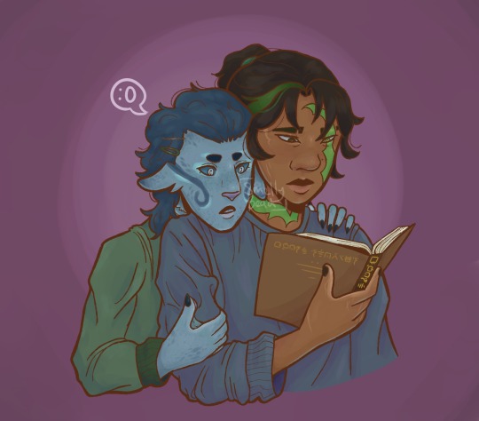
I thought my Bentho minifig might arrive today but it didn't :(
ID under cut
ID: Rendered halfbody drawing of two people on a light purple background that fades to be lighter in the centre. The line art of the drawing is dark brown. The person in front is a revived version of Morro from Lego Ninjago. They are relaxed and looking down, reading a brown book titled "Ghost Stories" in Ninjargon, the lettering is gold. Morro is drawn with brown skin and black hair with a green streak on their right side and a middle part, it is tied up in a ponytail with a green hairband. He has full, two-toned lips and monolids. They have a bright green scar starting on the right side of their forehead and running over their left eye, down their face, and wraps around their neck. The eye the scar runs over is a similar shade of green, the other is a dark brown-green. They have a slit in the start of their right eyebrow and a mole next to the left side of their nose. They have a few faded scars on their face and hand. Their nails are painted black and their palm is lighter than the rest of their skin. They are wearing a blue sweater. The person sitting behind Morro is Benthomaar from Lego Ninjago. He has his left hand on Morro's left shoulder, his left hand on Morro's right upper arm, and his chin resting on Morro's right shoulder, looking at the book Morro is holding. His expression is one of slight suprise or intrigue. Benthomaar is drawn a light-ish blue with a dark blue curly mullet. The front of his hair is held back with a bobby pin and a hairclip. His eyebrows are circular and a darker blue than his hair. His scaleras are dark blue and his irises and pupils are light blue, he has visible bottom lashes. He has a pink, cat like nose and light purple-blue lips. On each of his cheeks, he has a dark blue swirl that is rimmed by light turquoise, these start at the base of his ears. His ears are long, triangle shaped and downturned, they have a slight double ear at the base. His ears do not have any visible contours and details like human ears do. They fade into a darker blue at the tips. A pair of gills are on the visible side of his neck. His nails are pointed and dark blue, his palms are lighter than the rest of his skin. His fingers are webbed. He is wearing a green sweater. Above Benthomaar is a small speech bubble with a simple surprised face drawin in it. A low opacity watermark reading "smellybead" is over the centre of the image. End ID
#benthomorro#seabreezeshipping#theyre wearing each others colours#gay people exist and its these two#morro wu#morro ninjago#ressurrected morro#prince benthomaar#ninjago benthomaar#beaddrawz
73 notes
·
View notes
Text
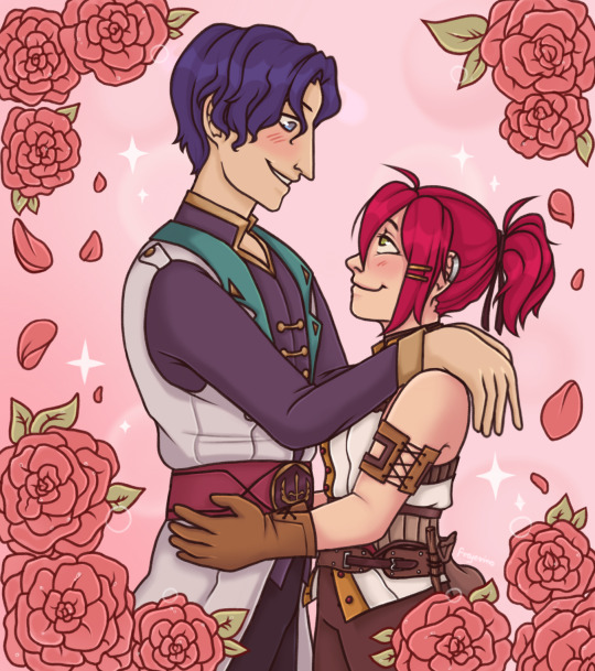
as you can see watching OHSHC as a kid has done some irreversible damage to me bonus doodle by my bf inspired by our convo while i was drawing :3
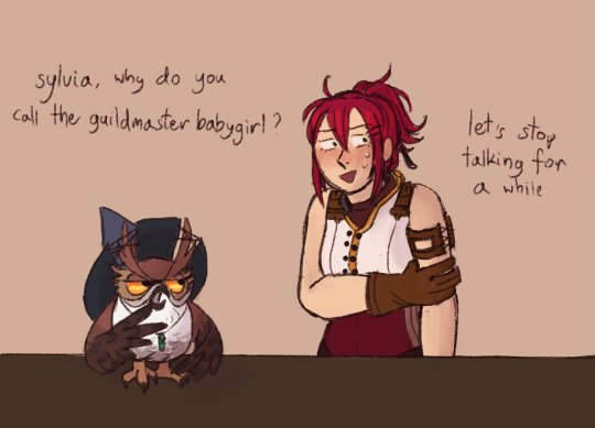
Image description under the cut
[ID: A fully shaded halfbody digital drawing of Baptiste and Sylvia from Potionomics embracing lovingly looking into each other's eyes. They're both blushing and smiling as they do so. Sylvia is a light skinned woman with green eyes and a small upturned nose. Her medium length vibrant red hair is tied into a high ponytail. She is dressed in her usual work attire, which includes a white sleeveless shirt with yellow hemming and red buttons, a brown waist corset overlaid on top, a pair of brown gloves and some accessories like a coin pouch attached to her belt and a laced bracelet on her bicep. She's holding her hands on Baptiste's hips. Baptiste is a tall man with a slightly more tan skintone. He's about a head taller than Sylvia. His hair is dark blue, and his eyes are a similar but lighter shade of blue. He has slightly Asian facial features, most notably monolid eyes, but his nose is fairly large and straight. He's dressed in a dark purple shirt with a gold hem and linked golden buttons. Over that, he's wearing a white sleeveless coat with dark teal lapels. He has a wide burgundy belt on his waist that is adorned with a bronze symbol of the Hero Guild on the buckle. His arms are resting on Sylvia's shoulders, with his palms loosely hanging behind her back. There's a pink sparkly background behind them. The image is framed by large moist roses covered in dew, reminiscent of the imagery present in Ouran High School Host Club.
The bonus is a digital colored sketch of Owl and Sylvia from Potionomics. The background is beige, and there's a brown shop counter. Sylvia stands behind the counter while Owl is standing on the countertop. Owl is a large brown and white owl with yellow eyes. The feathers on his face are forming a shape resembling bushy eyebrows and curled up moustache. He's wearing a crystal tied to a string as a necklace and a witch hat with holes made for his feather eyebrows. He's gesturing with his wings at Sylvia and saying "Sylvia why do you call the guildmaster babygirl?". Sylvia is looking very uncomfortable and gripping her arm with the other one. She's blushing and there are a few beads of sweat forming on her face. She's looking in the opposite direction from Owl and saying "let's stop talking for a while".] Image description written by @desersko
#i want that man obliterated#potionomics baptiste#potionomics sylvia#owl potionomics#potionomics#my art#artists on tumblr#small art blog
133 notes
·
View notes
Note
Do you have tips on coloring? Your art is beautiful!
everyone always mentions basic color theory and i will too because it's the foundation for most things, like understanding complementary colors and values and how colors interact with each other. googling "color theory" gives you like a million of those wheels and although adobe is a piece of crap they do have this online color wheel tool that lets you fuck around with palettes. screenshot those bitches when you find cool ones to play with
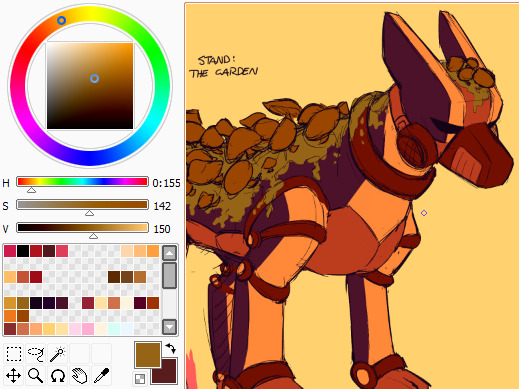
besides that i tend to shift the colors i use towards warmer shades as a general rule solely because i like warm colors. also, often times the color you PERCEIVE in an image is not what the color actually is, but rather the other colors around it make you think it's a different shade. like the green moss in this pic, for example. it's not actually green at all!
another thing i do somewhat frequently is coloring the lineart some other shade than black. black definitely has its purpose and can be an aesthetically important in some styles, but colored lineart tends to help me approach the coloring process from a different angle. speaking of, i rarely use pure black or pure white in my art these days. again, they have their purposes but i save them for occasions where i want to emphasize a particular detail or draw attention to the other colors in the image
in a similar vein filling your background layer with a color that isn't white can also help you in the coloring phase, both because lighter colors will be easier to see on it but also for me it makes me try and tint the colors to something that fits in better with my chosen shade
there's also the shortcut of using multiply-overlay-screen layers on top of the flat colors to adjust them further and bring them together more. i don't do that terribly often these days but it helped me a lot in the past, like here:
with multiply-overlay-screen
without them
it's not the a perfect method but can help you towards the right direction
and don't be afraid of saturation, especially with skintones! im sure there are ways of coloring that omit a lot of saturation, but for my purposes i crank it up whenever i can to add more life to what im working with and make things pop out more. i do steer clear from straight up neon stuff generally though and tend to use those more as highlights if anything
that, and eyeball colors from reference images! whether those are colors other people have used in their art or stuff from photos, try to recreate them yourself and see what makes them work the way they do. and add things to them when you see fit! or remove colors from your art and try to work with as few as you can! that's how i ended up with the colors i use most often in my art these days, actually, i studied some night in the woods art and screenshots for a piece i did about a year ago and wound up with this selection:

it doesn't cover everything and i do frequently add things to this when the cause needs it, but it's versatile enough for a lot of occasions and provides a base for me to work off of. and none of them were eyedropped!
also mandatory mention that coloring techniques used for traditional art are different from those in digital art. colors on a screen don't work the same way as paint does, hence why smudging together some primary colors gives you results like this

but with the right layer effects you can get colors to behave more like this

idk if this was helpful but i hope you got something out of it! ":D
18 notes
·
View notes
Text
Lucky One
Pete Davidson x Reader

Word count: 2k
Warnings: Swearing, mention of needles, slight angst, drug use
A/N: This is my first Pete fic but I think I will definitely be writing more. Please let me know what you think!
I sat in bed, joint in one hand, lighter in the other. I’d been staring at the wall for the past half hour or so, drowning in my thoughts, forgetting the joint I’d been fiddling with was there to be smoked.
I was thinking about everything and nothing all at once. Have I taken my antidepressant? What do they do with the bagel holes? You’re gonna be alone forever. Don’t forget your earring is behind the back left leg of the desk. New thoughts beginning before the last one could end. I was exhausted yet I hadn’t done anything to warrant feeling so drained. I’d only left my bed to piss.
“Hey you home?” I glanced over at my door, reality setting back in, before realizing how messy my bed was; sketchbook and pencils scattered everywhere, weed crumbs and ash from not paying attention to what I was doing and empty monster cans. I kicked as much as I could off the end of the bed before putting the long forgotten joint to my lips and sparking it. The door slowly opened, Pete standing in the doorway holding a bag and a coffee.
“Whatcha doing in bed B?” he asked climbing into the bed handing me the coffee. I took a toke and thanked him while passing him the joint.
“I just don’t feel like moving. I feel like shit, my brain won’t stop for just a second. I just want everything to stop.” My voice breaking as I began to fight back tears. He blew smoke into the air, putting his arm around my shoulder, pulling me into his side, handing me the joint.
“Breathe B, you’re gonna be okay. I know that sounds like bullshit but I’m here to help you through it.” I took a take and wiped a stray tear from my eye. “It’s always been me and you hasn’t it, that’s not gonna stop now. Did you take your antidepressant today?”
“I can’t remember,” I squeaked, letting the tears win the battle. Pete put his other arm around my chest and squeezed tight, resting his hand on the back of my head and rubbing his thumb.
He would whisper little pick me-ups every few minutes while I cried. “At least you didn’t walk straight into a street light like I did.” I looked up to see him pointing to a small bruise on his forehead. “I saw a woman carrying a dog in a baby sling thing and then boom! Street Light.” I giggled before taking a deep breath and wiping my tears with my sleeves.
“I guess you could say she threw you off your rhythm.” He rolled his eyes and pushed my head playfully before chuckling.
We’d been friends practically our whole lives, yet it was rare for us to talk about deep shit. Not because we didn’t care but we were good at talking each others minds off all the bullshit.
“Movie, smoke, munch? I brought gushers and twizzlers.”
“Only if I get to pick.”
“Obviously, you always pick.” I scoffed and sat up, rolling my eyes.
“Bullshit, we constantly watching The Mule.”
“Not my fault you can’t appreciate a masterpiece,” he said as he grabbed my rolling tray from the end of the bed and I began flicking through Netflix for something to watch.
“Your hair looks nice by the way,” he mumbled, eyes focused on rolling the joint. I glanced over at my reflection in the mirror, I looked as if I’d just climbed out of the hedge. I smiled and thanked him, deciding to put on Knocked Up.
Pete told me what he’d been up to all week and who the guests were gonna be while we watched the film. I made him a twizzler ring and he attempted to make me a bracelet but he couldn’t work out how to get the knot to stay tight.” After a couple more joints I sat up on my knees and faced him.
“Could... I maybe colour in your tattoos?” I asked, placing my hand on his leg to stay balanced, realizing how high I was after not moving for so long.
“Yeah of course, which one first?” I smiled and pointed to the unicorn on his arm and leant off the end of the bed to grab my pens, Pete grabbing hold of my foot as I almost fell off. After I’d finished the unicorn I moved onto the direwolf underneath. Pete was flicking through the pages of my sketchbook as I added icy blue to the eyes.
“Y’know,” he started, passing me a joint, “I reckon you could be a tattoo artist. You could even practice on me.” I stopped and looked at him a bit taken back.
“I’ve never thought about it before.”
“Maybe you should.”
Once I finished the direwolf I looked up to see Pete had dozed off, I smiled and pulled a blanket over him, moving the sketchbook off his lap. I rolled a joint and glanced at the open drawing of a group of clouds I’d been working on but hadn’t yet worked out what should accompany them.
I thought about what Pete said and picked up the sketchbook and a pencil. I smoked while drawing Frank the bunny’s head from Donnie Darko. It was my favourite film and Pete had watched it with me countless times.
After an hour or so I finished the outline and most of the infill with different shades of blue. I felt Pete roll over and put his arm across my lap. I looked down to see him, eyes half open, observing my drawing.
“That’s amazing.” His voice gruff and low.
“Thank you,” I said passing him a monster from my bedside table. He sat up partially and took a sip before handing it back to me. “Good nap?” He nodded and laid back down into my side.
“You should put that on me,” He kicked his leg out from under the blanket and pointed to the side of his thigh. “Here would be perfect.”
“If you’d like.” He sat up again and gently tore the sketch out of the book.
“Come on then.” I frowned and tilted my head slightly. “There’s a guy that could do this now, you could get one too?”
I stared at him in a bit of shock, not expecting him to actually want one of my pieces on his body. I thought he was saying it just to be nice. Also as I’d never considered getting a tattoo before. Not because I didn’t like them but more because I was nervous; I wasn’t great with needles and if tattoo’s would suit me.
“You up for it?”
“What if I look awful with one?” I blurted, Pete’s smile morphed into confusion.
“Why would you look awful?” You always look great.” I could feel my cheeks getting warm and I couldn’t help but ever so slightly smile. “Plus I think you’d look hot with one,” he mumbled handing me the sketchbook, open to a small drawing of a sheep I’d done high while watching Shaun the Sheep.
“It’s small, if you want it to be hidden then it’s easy.” I looked down at the doodle and thought about it for a moment.
“Fuck it lets go.”
I sat on a chair next to Pete watching as the tattoo artist, Jon, carefully traced over the light purple outline in dark blue ink. I began adding to my sheep. A few clouds in the background, similar to the ones on Pete’s.
“What you doing?” I handed him the paper, glancing over at his leg, in awe at how it was turning out. I looked back at Pete who was smiling at the drawing. I held out the pencil to him, when he didn’t notice I poked his arm with it.
“Ow, dick,” he said pouting and rubbing his arm. “What am I meant to do with this?”
“Add something to it, you got a piece of me,” I pointed to his leg. “Your turn.”
“I can’t draw like you and-”
“And I don’t care. Draw.”
While Pete drew, not phased at all by the needle going in and out of his leg, I chatted with Jon, asking him question about how he became a tattoo artist and what it’s like. I was slowly becoming more interested the more I watched him work. Once he was done he turned to me.
“You ready?” he asked, I nodded nervously and Pete passed him the design. Pete swapped places with me after taking a look at it in the floor length mirror. I decided to get it on my arm as I decided I wanted to always be able to see it now Pete had added to it. I told them I didn’t want to see it until it was finished, wanting Pete’s addition to be a surprise. I looked over at Pete, nerves starting to kick in a little.
“Have I ever told you I’m not brilliant with needles?” He chuckled and took my hand in his.
“Yep,” I winced as the needle hit my skin. “Like the time you gave blood because you thought that nurse was cute and threw up all over him before fainting.” I chuckled before biting the inside of my cheek and gripped his hand tight. “You’re good, just keep your eyes this way,”
Pete kept chatting with me and rubbing his thumb on the back of my hand, keeping me distracted from the pain.
“Should I be nervous with what you drew? It’s just clicked how much trust I’ve given you.” He pursed his lips, holding back either as smile or a laugh. “Pete...”
“Nah nah nah, it’s not that bad, but you said to add a bit of me. Trust me you’ll love it.” I raised my eyebrows before gripping his hand again, feeling a muscle in my arm unintentionally spasm.
“You’re good, it happens sometimes, we’re almost done here.”
After ten more minutes it was all done and he was wiping it up. It was aching it a little but I was really excited to see it.
“You ready to see it?” I nodded and looked at my arm to see the best tattoo I could imagine. The clouds were a beautiful combination of greys and whites, my sheep now with a spliff in its mouth and a second, slightly wonky looking, sheep with a spliff also in its mouth and sunglasses on. It kind of looked like a child drew the second sheep but I loved it even more for that.
“I put our initials at the bottom so we don’t forget who is who.” I giggled looking at his scruffy handwriting underneath. “So... what do you think?”
“I fucking love it!” I said wrapping my arms around him hugging him as tight as I could. “Thank you Pete.” I pressed a kiss to his cheek and let Jon wrap my arm up in cling film.
We grabbed some Taco Bell on the way home, I was designated DJ and he driver. I was, questionably, rapping along to Colson and Corpse’s new song while Pete laughed at me. He slipped his hand into mine, giving it a small squeeze and continued driving and started rapping along as if that was a normal for us to hold hands. I smiled and gave his a squeeze back even though I was a bit shocked. Shocked but yet it felt normal.
“You can roll the next one, my arm aches,” I said flopping onto my bed.
“Is that gonna be your excuse for the next week?”
“Did it work?” I looked up to see him shaking his head and chuckling as he picked up the rolling tray.
“You’re lucky you’re cute.” I smiled and winked as it sat up.
“You’re lucky too, you get to look at this cute face all the time.” Pete leant forward and took my hand, pulling me into his lap.
“What would you say, if I asked you out... to dinner or something?” I wrapped my arms around his neck and furrowed my eyebrows.
“What like a date?” His smile and confidence drained from his face immediately and I had to force myself to hold back a laugh.
“It doesn’t have to be no, I just- aw fuck.” I started pissing myself laughing, holding onto him tight to keep my balance.
“Yes I’d love to go on a date, if you hurry up and roll that joint, I teased winking at him, swinging myself off his lap. “I’ll even put on The Mule yeah?”
“I’m definitely the lucky one.”
200 notes
·
View notes