#it also doesn't help that i exclusively draw fanart
Explore tagged Tumblr posts
Text
every once in a while I think about trying to open commissions or make stickers or something but then I remember how inconsistent my art style and motivation is 😔
#and specifically in regards to the sticker thing there's a high up front cost and everybody is broke af bc everything sucks lmao#gotta love that late stage capitalism#it also doesn't help that i exclusively draw fanart#I should've started a small art business or gotten into freelance work 10 years ago instead of being 13 /j#just like i should've bought a house in 2008 instead of being in 2nd grade#mine
0 notes
Text
I'm selling little Snape goods with my art to support my daily life!✨
My fellow Snape fans! Long time no see, I hope you've been doing alright. I'm back once more, after what might be my longer absence on here so far.
I owe you an apologize, and even if I won't develop very deep on my personal situation, I wanted to give you some kind of explanations. I've been leaving far from home in Japan for more than 2 years now; last year, I started to work as a 2D animator for the anime industry in Tokyo, and got through a very difficult experience. Working culture in Japan is far from the one why might have in Europe or in the rest of the world, and the anime industry makes no exception; insane working schedules, very bad working conditions, no consideration of personal life and low salary are basically considered as the norm here. Sometimes I was shamed for only working +50 weekly hours and not commiting to work for free on weekends.
As I couldn't stand the toxic environement anymore, I finally moved to the Japanese countryside where I managed to find a little animation studio that works on my favorite series of all times: Pokémon. My collegues now are all very nice peoples, I feel accepted and respected despite the very rought working conditions; But above alI can now realise my dream and work and be implied on my childhood favorite anime.
However, I get close to no money from my long 6 working days week. I hardly pay the rent, and I rely on my savings for paying bills and food. I'm happy and I'm not in immediate danger: I have been saving money in preparation for this kind of cases for years before moving to Japan; However, I want to continue to pursue my dream and know that in the long run, I cannot afford to leave a life that doesn't allow me to move more freely and meet my family even if it's only one time in two years.
That's why I'm now trying and hope to develop a little side hustle to help cover the daily life expenses while developing my skills for creation and illustration. I have little to no visibility on social medias and it's difficult, but I want to trust time and would be extremely grateful in even a few of you could consider checking my work if interested. Of course I don't exclusively draw Snape, but I'm putting all of my heart in my recent illustrations including Pokémon fanart, food illustrations and sketches on the daily life in Japan. My main tumblr is https://lucie-foselle.tumblr.com/ , I also have a IG page called "tenma_draws_pokemon".
However, I have a little treat for you Snape fans: I recently come up with the idea of making postcard and stickers with some of my Snape fanarts. I'm pretty happy with the result and would like to propose you to get them if you want to either get a little Snapey decoration, want to share your love to another Snape fan, or support me and my work!

Everything is printed, signed and stamped on demand! Note that the colors and result might therefore look slightly different than the pictures. My stamp will also appear in the 2 darker background cards, as featured in the visuals bellow.
Everything is made by me, I print in a small local shop and look for the best quality as possible for the illustrations! I can ship worldwide from Japan, and it would be made with love, care and an immense gratitude.


✨ Poscards (4 patterns available now, can be seen on this Tumblr) ✨
Price: 3$/3€/3£ /pc, worldwide shipping included! ✨ I can make little discount if several items are bought.
Size: 10x14.7 (~3.9x5.7 inches)


The little pumpkin is part of a collection I have on my main illustration Tumblr, you can check at https://lucie-foselle.tumblr.com/)
✨ Stickers (Snape crest pattern) ✨
Price: 3$/3€/3£ /pc, worlwide shipping included! ✨
Size: ~5x6cm (~2.5 inches), might add holographic effect. ✨
You can contact me via DM here or on my IG, and payement is made via Paypal. I plan to launch my kofi page soon and might consider selling other goods and take commisions in the future if I feel like it could interest some of you! 💚 I can either draw and animate, still have to sort it all for 2025! 🤗
Note that I would do my best but I'm just starting to print and ship my art, there might be a little delay in the shipment and the goods might take up to 3 weaks to reach you. Plenty of non Snape pattern are also available so if you are interested do not hesitate to check or ask, my DM are open! 🤗
Even a little like, comment or share gives a lot of support. 💚 A huge thank you to all of you who would have read until now, and would show a little bit of support! ✨ Have a good rest of your week-end, fellow Snapers. 🐍

#harry potter#severus snape#fanart#pro snape#severus snape art#harry potter fanart#my merch#snape#severus rogue#professor snape#art#drawing
33 notes
·
View notes
Text
The most common Bloodborne fanart mistakes
We all approach fanart differently! Most people draw characters simple and get the point across, with any alteration being down to art-style. Some people willingly take artistic liberties based on their preferences. And some people try to be very accurate to the canon, to the point where they feel sad upon finding out that they've been unaware of something (like me and all three of my fans fsjfhjds). The latter is often caused by both lacking spread of good references and artists using fanart of other people for the reference rather than the source material. If you also belong to this category of fanartists with me, here are some of the most common fanart pitfalls to avoid!
Lady Maria's eye colour: It is a somewhat frequent mistake to draw her eyes blue! In reality, her eyes are very pale green, even a little desaturated, so, greyish-green:

Henryk's skin colour: In the game, it is hard to know unless you deliberately zoom in his face, and even then it might be accidentally blamed on the lighting! I especially see this mistake in Eastern fanart. Thanks to a dataminer Zullie the Witch though, we can know for sure that he is brown:
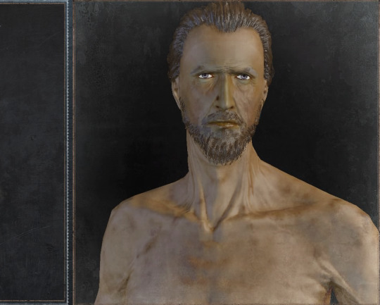
(Here ( x ) is the page with all sliders)
Little girl's ribbon: Most drawings depict this one as simply... well, white ribbon. It can be tied around a braid, a ponytail, or simply rest on whatever other hairstyle. But in the game both the icon and the way it is worn by Messengers features a layer of frills:
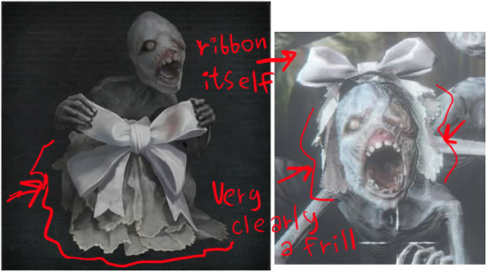
Only one daughter: Gascoigne and Viola have two daughters: one, younger, is the little girl that used to wear the white ribbon which we never see, and another, older, is the one we can talk with later and see dead.
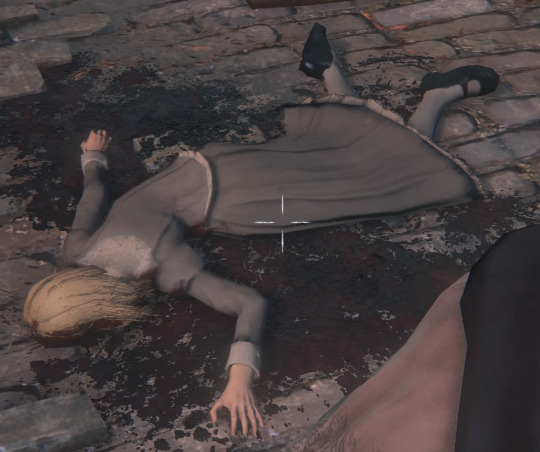
She is not an obvious encounter, and it certainly doesn't help that her little sister doesn't mention her! There are many fanarts that only depict just the little girl whereas the intention is to depict the whole family, and some even use this older sister's design for her, though, as a result! Two of them existing is also confirmed by the voice credits:

Micolash's hair: This is probably the most obvious case of people using existing fanart as a reference. His hair is purely black and somewhat messy, even curling somewhat!

But it is a common fanart thing to give him brown, 'pointy' hairstyle. I think it is sorta 50/50 though because black hair is hard to work with in art, and sometimes 'brown' is just a way to have better colors in general! Lighter color is needed, and simply lessening it to 'dark grey' can just feel not so satisfying. It is an error usually if he is like.. idk, next to a character whose hair IS drawn as black, so there is an obvious comparison.
Adella's hair colour: She has a reverse problem! Commonly drawn with completely, no-shade, pure raven black hair, exactly what Micolash's hair is, when hers is simply dark brown:
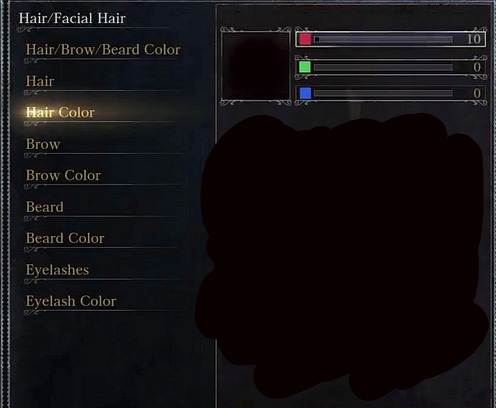
Edgar's hair colour: A frequient one is depicting him as that 'yellow' type of blond, when in reality he is strawberry blonde (if not somewhat a redhead):

Yurie's hair and eyes colour: I've fallen for this one myself, and it took me some time to withdraw from, so it is better to just not do to begin with. However, it is simultaneously 'the most widespread mistake' and 'not a real mistake' since this character is bald; although her data states she is a blonde, only her (rather fluffy!) blonde eyebrows are observable. Her eyes are grey, like with plenty of the characters in Bloodborne!
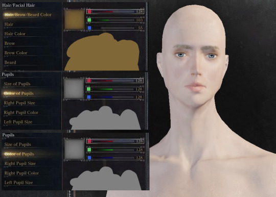
Fanart of her almost exclusively depicts her with black hair and blue eyes, though. Again: technically she is bald, and colour of eyebrows might not match head colour, so the real error is only when artstyles that color eyebrows and eyelashes darken them!
+ Possibly this happens because her name is mistaken for Japanese name Yuri. This is not true: the existing name Yuri is written as ゆり or ユリ, whereas this character is named ユリエ. This little fucker エ at the end is not silent, and this is the key: she is yu-ri-YEE, not yu-REE! Also, ユリエ would be a Japanese spelling of the name Julie - Czech, French and Danish variant of the name Julia. I personally think this is most likely, since Yharnam is heavily inspired by Czechia!
Brador's beast hyde: It is hard to call a frequient, because fanart of these characters together is not frequient... xD But I've seen a few instances of Brador wearing his beast hyde while next to a Laurence who is still alive and a human. This is not possible, since Laurence was the first Cleric Beast, and the hyde Brador is wearing IS that of a Cleric Beast:
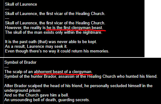
We can not know whether Brador killed Laurence or someone of the following clerics since Soulsborne hates clarity and Miyazaki drinks my tears and my tears alone jfhdfhsdhfdhs But we can conclude for sure that he only has this hyde after Laurence was killed. (Naturally, in some types of fanart, this doesn't count! For example, the 'everyone is here' types of fanarts or simple shitpost doodles do not have to be strict to the timeline! In fact, they should not be, lol)
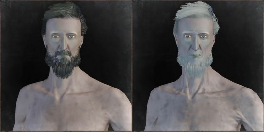
"No-Beardor": Again, this is sensitive to the time context and intention: it counts when the intention is to depict his 'invader' state as it is during the game! Naturally, bro probably shaved more than once in his life fhhhdjss I think it is the fault of a particular "screenshot" of him going viral as a reference for him, when in reality his invader and jail state features a rather noticeable beard:
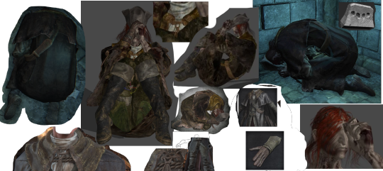
Gratia's clothes: Again, not a popular character to draw, but at some point a fanmade Wiki claimed that she is wearing Yharnam Hunter's set! This found the way in fanarts of her, when in reality, she is wearing an altered Old Hunter set, wearing a cap instead of a wide hat and missing the large flowing cape and her left glove:

Arianna's hair and eye colour: Her eyes are often drawn as either blue or brown, when it reality, it is, strangely..... purple? Meanwhile, there is a frequient fanart trend depicting Arianna with her alien baby in which her hair is still yellow, whereas in reality her hair loses colour after the event:


I've actually made the exact same error the one time I drew her with her kid :') This situation ties Arianna with another important character, Annalise, who used to be a redhead and has lost her hair colour in connection with her pregnancy, presumed aborted. I elaborated more here ( x ), but the point stands: this change is impossible to spot in the game with its dramatic fucking lighting dfdsfsgdfs It is something only really spotted through data analysis!
__________
I think that's the most frequient ones! There is really no problem in taking artistic liberties, but there is a category of artists that do not really want to and there are details that just can't be spotted in the game by normal means! And some errors can be painful to look at, like white blue-eyed blond Henryk fanart :pensive:.
In recent couple of years, we are being spoiled with awesome references thanks to dataminers and bloggers that spread the information! As for ER fans, they are actually having it easy since dataminers started to expose all the models right away whereas BB fans had a long 'dark era' xd But in general, Soulsborne games are built around the idea that no one will be able to beat the game alone; we all gotta communicate online through the notes other players have left! This mentality further travelled into understanding the story of these games by exchanging the information we've found.. And like, what I am trying to tell is that I am very happy that the same mentality of cooperating spreads on creativity as well! All the references here are the result of awesome dataminers hacking the game and being kind enough to share with the community! There are many more things such as model rips, internal filenames and super handy screenshots galleries that sometimes help to not only create a more accurate fanart, but also to even understand some extra lore! Yeah, like Arianna's hair hinting at a very important plot twist about Cainhurst. x) My point is!! communicating about what we have noticed with other fans is how these games existed and formed the coolest community, and fanart might be not different. What I shared here is just a really small portion of what can be used, and someone found this post useful, I am happy!
#bloodborne#bloodborne reference#bloodborne observation#use later#creativity#tips#screenshots#not art#text post#I probably did not communicate it well but recently I've had so many of the 'ahhhh shit I never knew about [detail]' that-#-I've decided to link the most superfical ones in one place#sometimes I am just so thankful that we have Zullie and Sinclair's models vid and more fdjhshfdds
56 notes
·
View notes
Note
what are your thoughts on through dwebble line? been one of my favorites since first getting into Pokémon!
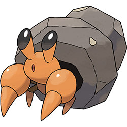
I don't know how GameFreak managed to make a hermit crab so cute, but they did it. The body reads well but is super simple, and the all-black eyes have a neat shape to them; kind of being cylindrical with the black part of the eye taking up the top. It's just very pleasing to look at.
The main focus of the design, the rock "shell", is also well done; it's obvious as a visual focus and the orange and brown go very well together. It makes for a nice little twist on the usual hermit crab shell while still feeling like an organic and natural element for an animal to utilize. I especially like this detail about them forming a mutualistic relationship with Hippowdon:

The only thing I find questionable about this line is the Bug/Rock typing, as hermit crabs aren't insects at all. Part of me does wonder if these guys are even crabs though, as they seem to have tails and very un-hermit crab-like bodies without their shells:

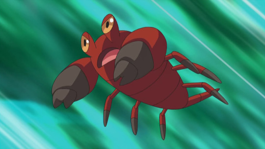

And thankfully Crustle, while less cute, keeps all the good elements of Dwebble while expanding upon the rock-shell theme. The colors once again look great, expanding into a yellow-brown-brownish red palette that feels very natural with the earth tones they were going for. The body gains a little more detail but still doesn't feel overly busy, and the striations in the rock help break up the large object and draw the colors through it nicely. No complaints here.
The only other note I have about these guys is that they apparently started out as having pottery shells (note: artwork shown in Tweet is fanart and not reflective of any actual beta design):

While I think that going with the rock idea worked out really well, I can't help but want a regional variant that harkens back to the original pottery idea; maybe they live exclusively in ruins, and have bug/ground typing to reflect the clay pots they've moved into.
Regardless, this is a pretty perfect line. The colors are pleasant, the theme is obvious, the evolution feels meaningful and suitably different from the pre-evo, and there's some nice biological aspects tossed in there as well. I'm a big fan.

204 notes
·
View notes
Note
How do you deal with or avoid artist block &/or burnout?! <8O
Hmm, I don't think I've ever really had 'artist's block', or at least to the extent people describe it. Or maybe I do and I just don't see it as artist's block, idk. I will say that what I'm about to say is comin' from the perspective of someone who ain't doin' it as a career and mostly keeps it as a passionate hobby.
I do from time to time feel a creative lull where I don't feel particularly inspired or have any real urge to draw, that's a completely normal part of bein' creative and it's unavoidable. I think also sittin' round and constantly thinkin' 'oh no I've got art block' only exacerbates the problem n doesn't help, it's just passive pessimism. Part of dealin' with it is acceptin' the fact you're in a lull and just, go off to do other things. Do other hobbies, play a new game, go outside, watch a series, read a book, anythin' that isn't makin' art basically. These art block periods are a good opportunity to search for new inspiration and I find eventually, either from doin' one of these things or just lettin' the creative lull simmer for a bit, you'll find a lil nugget that gives you an idea that you really wanna draw. There's gonna be times where you feel ya can't draw or everythin' that's comin' out sucks and that's fine, just take a break if you can. Sometimes I still feel the itch to draw durin' these periods and instead of tryin' to make somethin' exclusively from my brain/original I'll do studies, animal portraits, fanart, basically just somethin' that isn't as mentally intensive as doin' entirely original stuff. That and also mindless doodling, drawing with no vision or goal in mind n just lettin' your hand draw what it wants to draw. Another thing you can try is different mediums, sculpture, 3d modelling, embroidery, ect. It's good for the soul to try out different things, and the good thing bout tryin' somethin' new to you is you can't expect it to be good, so it doesn't matter if it looks bad. Makin' bad art is good for you actually.
As for avoiding burnout, again I'm speakin' from the perspective of someone who isn't doin' this as my job so I only draw when I feel like drawin', which just happens to be pretty often. In fact not doin' it as my job is probably one of the best things I could've done in avoiding severe burnout, I did commissions for a few years and the burnout was Real (not to put people off from doin' commissions it just wasn't for me). These days I feel I'm constantly operating on low energy and as a result I don't really do a whole lotta 'big finished illustrations' anymore, at least not as often as I used to. I don't really try to push myself beyond the energy levels that I have and as a result I feel I create stuff generally a lot slower these days than I used to, and that's fine! Just gotta accept it and move on. Also just doin' sketches is fine! Don't gotta do fully finished paintings n whatever all the time. Also be realistic about your goals n projects, if you wanna make a 300 page comic n you haven't even completed a single 1 page comic then you're just settin' yourself up for failure. You can still have your 300 page comic idea but focus on makin' multiple much much smaller comics first, you'll feel a lot better and more motivated havin' completed many smaller projects than only havin' that one massive unfinished project loomin' over your head, and it'll train/prepare you for makin' that bigger project. This applies to any sort of creative project, comics are just on the brain right now. Bein' realistic with yourself n not biting off more than you can chew, n lettin' yourself have breaks helps with burnout a lot. I also almost exclusively these days just doodle my characters, so it helps to just draw the things you really wanna draw, especially if you're just a hobbyist. Nothin' kills motivation more than constantly makin' yourself draw shit you simply don't wanna do.
This gotta kinda long but basically my advice just boils down to just chill out, creative lulls are normal, be kinder to yoself, hopefully somethin' in there helps ya out.
2 notes
·
View notes