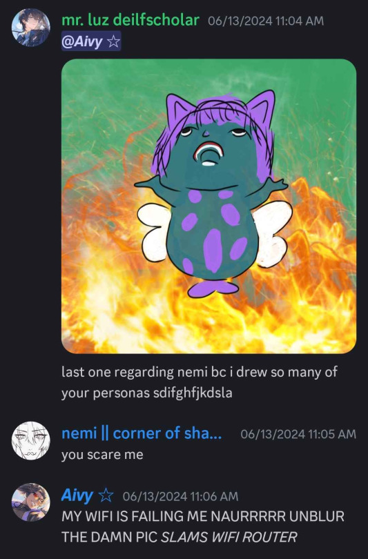
#is this a design change or is my art style shifting?
Explore tagged Tumblr posts
Visit Tumblr Blog
Explore Tumblr blogs with no restrictions, modern design and the best experience.
Last Seen Tumblr Blogs


Fun Fact
Tumblr Inc. is using 66 technologies for its website.
Text
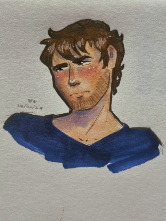
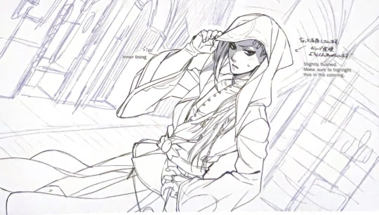
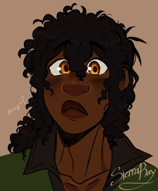
nobody's bought him flowers before
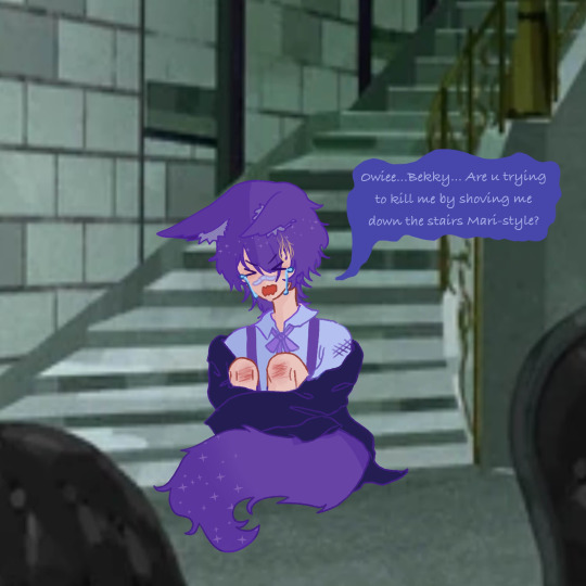
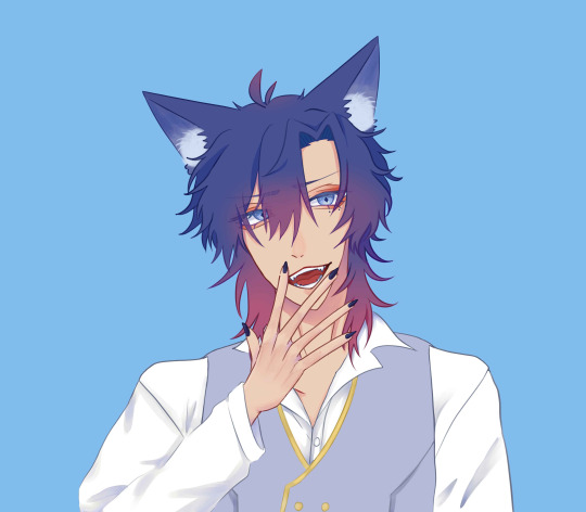
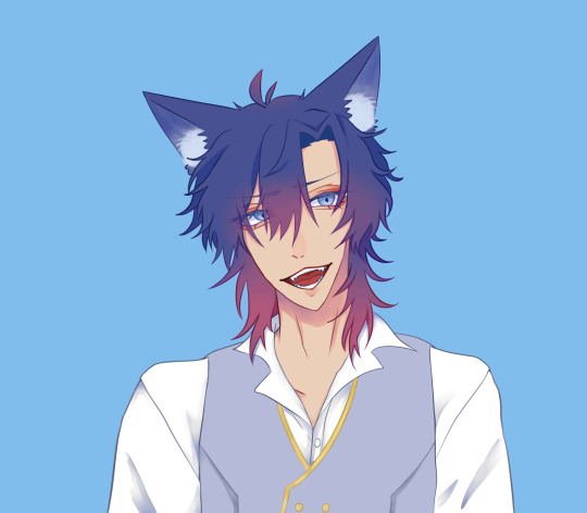
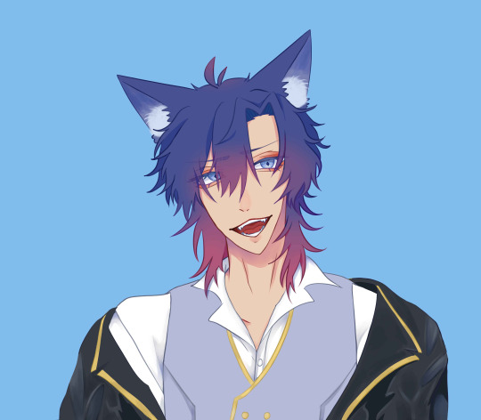
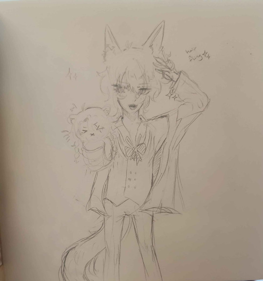
#redacted asmr#redacted audio#redactedverse#art#illustration#redacted david#david shaw#quick lil thing for his valentines video bc its cute even though he has been banished to B tier and below for his shenanigans#is this a design change or is my art style shifting?#what are you a cop how did you get into my house#i am trying to diversify my character designs a bit though#recovering from only being able to draw skinny 20something year olds syndrome#also david says vase wrong and for that he got knocked down a few pegs
31 notes
·
View notes
Note
The art style for the pokemon anime and manga has shifted and changed quite a lot over the years. Is there a specific series or era style that you particularly prefer or that you think your art style is inspired/affected by when drawing the characters?
Ugh amazing question I have 3 answers (for the anime since im an anipoke girlie)
I'm a big fan of the OS anime style. The colors, the sharper style and the grainy look. I also really love the proportions from that era. Everything just felt so solid and blocky in a nice way. I also really love the expressions. There was a lot more subtlety at that time and it was really effective.
Next one and maybe the bigger influence on my own style is the SM anime. I LOVED the design change. Incredibly simple, bouncy, round fun to draw, less tied down, etc. It's just so fun! I feel like my default style has always been a bit of a mix of anime and modern western cartoons and this is the pokemon series is the closest to that vibe. Also those EXPRESSIONS. I have so many random screenshots saved from this series just because of how bonkers the expressions would get.
My #1 influence without doubt is not a specific series style or era but rather a specific artist! His name is Akihiro Tamagawa and he was one of the animation directors on pokemon from OS to I beliiiiive XY? He also did a lot of the movies! Everything about his style is just so appealing to me. The proportions, the posing, the composition, the expressions, EVERYTHING. I've definitely taken inspiration from how he draws eyes and mouths. I draw a lot of low mouths and big smiles because of this guy. I feel like once you see it you won't be able to unsee it in my work hahaha. I made a post about it before!
And here's a guide of all the episodes he directed on!
478 notes
·
View notes
Text
Now that many of you are on the same page with me about the fight for radqueer liberation and freedom from oppression, it’s time for us to channel our strengths into meaningful action. To make a difference, we must educate, invigorate, and advocate. These three pillars, I've found, are the foundation of effective activism. In my time of being an activist, these are the things I use the most to gather community. For all of you, I'm gonna take this time to break them down and explore how all of us can contribute. If everyone really is with me on this, we can turn the tide faster than ever before.
Everything is under the cut. I tried to change my writing style a little from last time (a lot of people thought it was AI generated, so I studied some other speeches to try and write more "human", I hope it worked.)
Educate.
Are you good at making posters? Writing essays, articles, or conducting research? Do you enjoy learning and sharing what you discover? Maybe you’re great at debates. If so, education can be where you shine. Education is essential for dismantling stereotypes and misinformation about our community.
There are many ways to educate, some small, and some more direct. Firstly, start conversations with fellow community members. Run polls, collect data, and organize your findings. Then you can store that information, maybe in a folder, a Google Doc, or even in your notes app. Use it to write essays explaining specific topics or write articles debunking misinformation. Share your work with the world, not just our community, but to those who believe the stereotypes you are writing against.
Now, if education isn’t your strength, make sure you amplify the work of others. Share accurate information, send educational resources to those who might be misinformed, and help shift perceptions. Knowledge is one of the most powerful tools we have, let’s all wield it wisely and responsibly.
Invigorate.
Do you love drawing, writing fanfiction, or making memes? Maybe you enjoy putting together jewelry, like Kandi bracelets, making people laugh, or inspiring people through any form of creativity? If so, you can invigorate the community.
Let’s bring life and joy to the radqueer community. Yes, we face a lot of challenges, and that is exhausting, but we can and should create spaces full of excitement and connection. You could start a cooking blog and help your community learn a skill they might need, open an Etsy store to sell stickers or patches, you could design stim toys if you really know how to! Do anything that fosters creativity and belonging. Build spaces for us, by us, and let's make our movement one with vibrancy and culture!
Advocate.
Advocacy is something everyone can do. It’s about amplifying voices, yours and ours as a community. Share your experiences, whether it’s through writing, social media, or art. Speak openly about how your identity shapes your life.
Advocacy is also about challenging stigma. If you have dysphoria, talk about it. If you don’t, explain your identity and what it means to you. Are you a paraphile? Share your journey with pride, if you feel comfortable, and help others understand how your identity connects to your identity as a whole. Advocacy is about being unapologetically visible. Make them see you. You exist and they have no say in that.
These three actions (educating, invigorating, and advocating) are the building blocks of rebellion. And that’s exactly what we’re doing: rebelling against oppression and ignorance.
Let’s take charge together. Let’s fight for the acceptance and freedom we deserve. We are strong, we are resilient, and we are capable of creating change. I believe in all of you, and I love you all. Let’s do this, together, here and now.
#pro radq#pro radqueer#radq please interact#radq interact#radqueer community#radqueers please interact#rq community#rq safe#rq 🌈🍓#rqc🌈🍓#pro rq 🌈🍓#pro rqc#rqc#radqueer#transid#transid pride#transid please interact#transid safe#radqueer safe#radq safe#radq#rq please interact#rq interact#transid community#transx please interact#pro transx#transx safe#transx community#transage#transabled
95 notes
·
View notes
Note
Hey so first off, absolutely love your blog. I have learned so much and I can hardly wait to implement it! My question is: I have a character with vitiligo (and’s Celiac’s and rheumatoid arthritis) in a comic book I’m working on, and I want to represent that, but the problem is the comic is abstractly colored to display the characters’ emotions rather than their actual physical appearances, and my art style is designed to be pretty minimalist so I don’t need huge amounts of time and energy to actually make the comic itself (I’ll attach a picture at the bottom for easier reference). My current plan is just make lighter patches of the abstract color in place of skin color, but while that works great in theory, in practice it doesn’t show up well in lighter colors, including his default color, and since absence of color indicates absence of emotion, I don’t want to just leave them blank for the lighter colors either. Do you guys have any suggestions for alterations so I can more clearly represent that?
Thank you so much in advance!!

This is the guy in his default color. This was also the drawing I first ran into the light color problem with
Hey!
So I don't really think there are other ways to draw it than “lighter skin” for vitiligo, as that's kinda what it is, visually speaking.
What I'd keep in mind is that vitiligo isn't always super visible.

[source for images: 1 2 3 4]
If the character's skin color changes, then the vitiligo patches will be less visible when it's lighter. That doesn't mean he suddenly doesn't have it, just like how people with pale skin still have their vitiligo, no matter how apparent it is at first glance.
Regardless of skin color, vitiligo patches will tend to be of a very similar color - it's not just lighter skin (an incredibly wide category), but loss of pigment.

However, if his skin isn't human-colored but instead gray or green (or anything else), the shade of the patches will slightly shift to be less saturated or have a different undertone. But if he goes between going dark blue and light blue, the vitiligo would still be the same shade of very light blue, rather than getting darker when the rest of skin is darker. I see this a lot with how people draw characters with vitiligo, and it just Doesn't Work Like That (top right on the image above, also featuring the trope of pale people never having vitiligo for some reason).
If his skin color constantly shifts, then his vitiligo will be more visible one time and less at other times - there's not much you can do about that, it's just how contrast works. That said, sharp-edged and larger patches will be more apparent to readers than smaller ones.
So basically his vitiligo patches should probably float at a similar amount of pigment regardless of how the rest of the skin looks like, with slightly different undertones depending on the skin color at the moment. Sometimes it will show up more, sometimes less, if you want to make it clear to the readers then you can first show him in a color that makes it more obvious.

Either way, he has vitiligo!
Hope this helps,
mod Sasza
#mod sasza#face difference#hedgewitchnecromancer#vitiligo representation#art reference#fantasy species
148 notes
·
View notes
Text
A long overdue update about the Magical Girl Au for those who are interested:
When I originally started this project it wasn’t even a project it was a one off drawing but I love designing themed clothing so it sorta spiraled from there. And it’s been very fun. I approached the au with the idea of basically attaching magical girl elements onto their already existing costumes. I really wanted the deisgns to feel like they could be put into a preexisting episode like a themed episode or for a gag.
As of right now Cass will be the last character to be designed in this aesthetic.
Somewhere along the road I decided since I was already putting so much time and effort into this might as well pick a more focused vision. Since then I’ve spent time laying out a more structured timeline and cast. With that shift also meant a shift in how I wanted to tackle the designs themselves.
A lot of this shift happened when I first started designing Batman. Batman’s design is so simple that it makes it very hard to reinvent the wheel. It wasn’t working out how I wanted—maybe this was just my own expectations getting in the way but regardless— so I started looking for inspiration. Somewhere around this time I started designing my 16th century Robin. I’ve always liked historical clothing and costuming in general. With that in mind I wanted these designs to feel a bit more original and I decided the best way to do that was to add more historical (and lotr type fantasy) elements.
I’ve enjoyed this au and appreciate all the support I’ve gotten. Fear not this is not the end nor am I taking down posts but yeah some of the lore is in fact outdated at this point. I also will say that because they will no longer just be sketches I want to practice pushing my shape language not just in the clothing but in the characters themselves so the style will likely change. Not too much because it’s still me drawing them, but it’s another thing I will be considering way more moving forward.
I want to get more into my ideas but I’m gonna hold back until I have some actual art to show. A lot of it will feel familiar but def new stuff to come.
78 notes
·
View notes
Text
I actually find the topic of "Nomura's evolving art style as he takes on more and more responsibility at Square (and subsequently has less time to Do Stuff)" really fascinating.
Like, If you compare his art from the KH1-DDD era to his current day art, I think there's a noticable difference to his approach: how many steps there are in his art process, how he chooses to finish a piece, and the shift from a clean digital style to a more organic traditional one.
He used to use very clean, black lineart; bold colors; and more instances of defined/hard shading for that digital, almost cell-shaded or vector kinda look. Nowadays he goes for a more sketchy + watercolor style with pencil lineart, broad washes of faded color, and color shading that's a bit more blended and simplified in places (relying more on the pencil shading to create distinct shadows), with the hard edges more often reserved for scattered, bright highlights. (He's made art like this in the past eras too, such as the KH main menu arts which all have a watercolor quality to them, but the lineart was a bit more defined then and less sketchy, and thus slightly different from his current stuff.)
I think the Dark Road key art is a very good example of his current art style. The sketchy, almost brown lineart. The watercolor quality that emerges where two colors meet and overlap. A little desaturated and earthy. Color shading that's very broad, soft, and loose, with sharp highlights here and there.
Both styles have their merits (I personally love this sketchy era of his), but I think it's pretty likely that he adopted this as his "main" art style in order to adapt to time crunch. He doesn't need to do time-consuming lineart and precise shading anymore; he can use the original sketch as the lineart instead. Heck, he can fill in a bunch of the shading via pencil during this sketching phase to save even more time, and then can paint in a more watercolor-y kind of way that allows him to color in quicker, broader strokes.
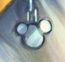
And then there's the occasional art mistake that has become a bit more frequent in recent years, by my estimation. Which I imagine, again, is due to running out of time to notice/fix those mistakes. Things like Ephemer's arms being a bit too long in this UX art, the Kingdom Key being slightly off-model in this anniversary art, or the ears on this Mickey Mouse symbol being two different sizes on this Utada album art.


(Which isn't to say that he hasn't made art mistakes in the previous eras, for example he initially got the colors of Riku's shirt mixed up in the Re:CoM cover art before fixing it, but I still think the mistakes were a bit less frequent back then.)
And like, hey. I draw, too. Amatuerishly, but I do. I don't blame Nomura for possibly needing to change his approach to making art in order to meet deadlines, nor do I blame him for these little art mistakes that ended up falling through the cracks. I imagine he simply doesn't have the time anymore now that his job has shifted from (primarily) being a character designer/illustrator to (primarily) being a director of multiple, simultaneous projects. Or maybe I'm totally wrong about this and his art evolution had nothing to do with time crunch, who knows. I think his current art style is gorgeous either way!
Anyway, I just think this is an interesting example of someone taking their art and adapting it to a difficult and highly limiting situation, experimenting with new things and finding the means to still make art even when you have less time to do. Also a great example that professionals are human and will make mistakes even in professional products, and it's not the end of the world, it just happens. If you ever obsess over a mistake in your art...maybe take solace in knowing that it happens to everyone. Even people who have been in their field for a very long time.
97 notes
·
View notes
Text
Soooo I don’t have anything to post rn, but I was compiling stuff for what I thought would be my last tiktok post and thought this art progression was kinda cool
Feb or March 2022 (also my first piece of lmk fanart ever)

July 2023 (marked a big shift in style and also I finally figured out my red son design :3)

May 2024, August 2024


October 2024

January 2025

A lot has changed in the past 6 months for my art style
#a lot of the time I forget to draw parts of her design#so like he’s always had snake bites in my design#in like maybe the third piece of fanart I ever did for him is when I first gave them to him#but I’ve always forgotten to draw it up until recently#and he does still have those gold ‘bull markings’ since I first drew that picture from 2023#but sometimes I forget em#I swear I didn’t take em out of his design 😞#my art#digital art#lego monkie kid#lmk fanart#lego monkie kid fanart#lmk red son
102 notes
·
View notes
Note
What is your secret/tips when it comes to analyzing the art style and anatomy of TWST? 👀
Studying the rest of Toboso’s work as it was presented over time and how it evolved, identifying it, noting the patterns, breaking down how she came to the visual conclusions she did on top of what process is probably being taken in regards to twst, and putting that into practice when going off the beaten path to do my own thing with it.
I don’t know if that makes any sense. It’s just master studies. I’ve done it with Takahashi, Toriyama and a myriad of other artists I’ve liked. It’s kind of why my junk can kinda shift around when I feel like it. I have some gripes with that links wording, but it’s basically just that and not some grand secret. I only really came to a better understanding of how twst is constructed extremely recently when I got my physical hands on the first artbook. Then I realized how much I was overthinking. [shitty scans are my own]
You can even see the ghost lines and more of the uncertainties on where elements should go, and how they were ultimately changed.
Something about seeing the original card art completely broken down with notes and without all the bells snd whistles (and definitively from Toboso herself) kind of put into perspective how twst isn’t as complicated it seems to be when it’s cleaned up. It might be just me, but looking at a solely finished work can potentially skew someone’s perspective, especially if the only thing being noted is coloring- a completely seperate step altogether. Which I see a lot of, tbh. I’m not exempt no matter how deep in the rabbit hole I get.
But—
But, I probably shouldn’t be the one talking since I have like… [redacted] years of having a trained eye for that sort of thing.
I’m not too concerned about coloring ( again, separate step, and not even done by her), it’s the drawing part. That’s the actual meat and potatoes. So, someone could see competent twst coloring mastered but the drawings themselves aren’t really following the general processes at play, and folk will still call it the “twst style.” So, whenever anyone says that, even here, I’m not sure what others mean by that. What is this alleged “twst style?” (Disclaimer: Rhetorical)
Yeah it’s a combination of every element at once (as every style is), but as far as my learning goes- I define the quote “twst style” is just Yana Toboso’s general artwork (notably from the 2020s, but the rest are helpful). Even if there are other artists in D-6th that are contributing. They’re all essentially trying to accomplish a unified look and that unified look is based off of hers. So, I don’t find looking at just twisted wonderland itself all that beneficial, low key. I’ll look over Black Butler, her miscellaneous fanart, her disney fanart, whatever happens to cross my path that I think would be informative for my purposes. Again, I’m not looking at every possible thing ever, obviously, just what I think would be informative.
I’m not sure how often anyone thinks about that. Especially since her visual process just carries over nearly 1:1, even if her point of reference and intent on designing something changed.
It’s like how Snake from Black Butler and Silver look pretty similar. No, it’s not from being “lazy” which- side note I hate those bad faith reads, total peeve.
Designing Snake and designing Silver came from two completely separate and unrelated intentions nearly a decade apart from each other. It just happens there are tropes that she clearly likes as an artist when designing characters. I’m more inclined to believe based on what I’ve read and practiced that it’s just a case of that, nothing more.
Which makes me reflect on a lot of my own repeated visual tropes. Such as how a lot of my female character designs always end up having some form of short curly hair, meanwhile the male characters keep having long hair 😩 God knows the wavy asymmetrical swoop bang rearing it’s head. It’s not intentional, but it keeps happening anyway.
That’s the kinda joint I’m talking about with master studies. Again, not just looking at something and trying to mimic it, it does go into trying to break down the process even at that level.
All this reminds me of this conversation I overheard in college while I was stuck doing printmaking work— some person said they, really wanted to draw like the guy who made Naruto since they liked his artstyle. Only for some other guy to cut in like “No, you shouldn’t do that! That’s not original :/ you should figure out your own original style first” or something to that end. I partially wish I butt in to that conversation. I didn’t much like how quick that guy shut that person down either.
Because… That’s… that’s not even remotely how that works? How can a person even find their own style/voice/whatever without studying the work of someone that came before them? If they wanna draw like that mangaka, then let them learn via that avenue. You can’t work backwards starting from nowhere. I even learned that in character design.
This person would have learned a lot more about how the process works and what works for them in their attempts to understand his style. They’d find their own organically after that. It’d also be more fun for them in the moment since they’re focusing on something they like. Then when it comes time to learn the boring (but important) stuff like fundamentals, they’d be able to articulate themselves more and identify what they’re doing. (Don’t knock art history and bring stuck breaking down meaning in seemingly “useless” stuff.)
But I’m starting to digress on the common “ugh im not original and unique enough if im not immediately doing my own thing from scratch” thing I saw/ overheard too much during my years at that campus. (It also led to me seeing zero progression from beginning to end from those peers)
As for the whole twst art thing, I can’t really tell you what conclusions to draw should any of this be put into practice. That’s not up to me to say.
I’m of the mindset that if you can sufficiently understand at least one art style, you can pretty much do anything else you want.
Take that with what you will.
#cozy ask#twstposting#did it with a bunch of different folk 🤧#and unknowingly did it with uekawa from the sonic series#when i was a kid#So most of that process to me is second nature but i only had a word for it when i was in highschool.#THIS IS ALL PROBABLY SUPER BORING AND NOT ALL THAT INSIGHTFUL.
76 notes
·
View notes
Text

a year!!! as of today i have now been drawing these funny little pizza freaks, to the exclusion of almost everything else, for!!! an entire year!!! i wanted to do a nice group shot/lineup of everybody to compare to when i first started trying to draw them because oh boy were they bad. i never even posted most of them anywhere because they were so bad. but im posting them here, now, to see how everything's changed/evolved.
this is probably the hardest time i've ever had trying to figure out how to work with a style, but we got there eventually; i'm pretty happy with the handle i've got on everybody now...dont let ur memes be dreams. lots of unimportant journaling and idle thoughts abt it below.
older pics
the first one is the VERY first time i drew them, before i thought i was going to actually have any interest in drawing them [lmao]; it was just the one isolated image, for my friendserver, to illustrate the funney message, so there was no attempt to make it Good or actually understand anything going on w/ the designs or style.
second is the original run of practices sketches to start trying to figure them out for real; done after i started having ideas for the comics and such and realized oh god maybe i am actually gonna draw fanart for this. [again, lol, and lmao.]
third one is the first pt art thing i posted on here. there were a couple weeks of sprite studies between this one and the previous image. the one on the top right wasn't part of that post i just threw it on as space filler; i'd intended to shift to doing Sprite Redraws But Stylized to explore tings more, but that was the only one i did. ¯\_(ツ)_/¯
individual characters
peppino: by far the hardest dear god. bro what ARE your shapes how DOES your face work. jesus christ. everything i have trouble with this style for, peppino has it in excess. i draw in polygons! i need consistency! and that is the last thing this kind of style is concerned with. they are made of squarshy clay and i do not understand how to mold them. i was really hoping trying to learn this game's style would GIVE me that kind of flexibility for fun exaggerated facial expression but i don't think much came of it in the end 😔. anyway on the bright side all this means once i got peppino figured out a little bit everybody else clicked way easier.
fake peppino: honestly i never did anything with him on purpose except for how his eyes work + the perma-smile thing. i figured ok hes supposed to look weird and off model so whatever happens with him happens. and it did. and it kept happening. it is still, in fact, happening.
noise/ette: somehow, for every bit that peppino was the least natural thing i've ever tried, these two worked pretty much right off the bat. i still don't understand it, seeing as pretty much all the things at play for peppino are also at work for them. i think the new sketches are actually a little worse than older ones but not enough that i care.
gustavo: really funny bc i drew him on model twice and just went 'okay, cool nice, easy, um. he doesn't have any fucking legs?' fortunately he was the only one i had a strong idea for how to stylize him [square] and it worked exactly as i was hoping so wahoo.
brick: is an animal and therefore 5000x easier and more natural for me to draw/stylize than anything else in the cast. that is Just a rat bro. i can draw a rat.
gerome: i think the funniest one here. the most drastic and least necessary change imo. i was gonna have him be really small at first, like smaller than the noises, but then i just... didn't. he's just peppino-sized now. also i gave him like. actual human facial structure, which is funny bc in most cases i'd do anything to avoid, but it works well for his being A Rock to give him some angles and definition like that+ to differentiate his vibe from the rest of the cast who are all very squishy. also since he is essentially Just A Head it's good to emphasize that too ig.
john: i only drew john a couple times but he gets to be here because i like him. and because most of the stuff i applied to gerome was readily applicable to john, though i did try to keep him a little more uncanny because he is a Huge And Lanky Freak. i hate that he is barefoot btw but idk how to make his color balance look right with shoes.
pizzahead: i did not want to put him on here honestly but i Have drawn him a handful of times and more importantly i didn't know what i was gonna do with john's pose if i didn't have him there to be glared at. the only thing that's different with him is giving him wider-bottomed pants, which i got from when i tried to draw these guys in clone high style [i never posted that one either][i will eventually]
snick: he gets to be here because 1. he's like 6 lines 2. i like him and 3. ive scribbled him a few times offhand and it went pretty well
misc
there are some guys missing because those are guys i didn't draw enough [or at all] to have gotten comfortable with them. sorry
i would have Liked to shade these but for the time being i have accepted that my grasp of light/shadow has decayed to the point im not going to be happy with anything i try there, so For Now i am working on my presentation with flats i guess. gerome has a shadow only because he's shaded like that ingame and looks naked without it
anyway if you are still reading [hi?] i get to shamelessly plug now. i'm over the hill of my pizza run now, and while i still have plenty of things i want to make here, most of the bigger more in-depth ones have passed. pizza tower was the first thing in THREE YEARS to get me out of my oc groove to doing fanart, and once i am done with my ideas here i will be going right back to it. if you like my art or how i write characters/interactions you should check out my oc/webcomic blog @jamverse . i can't promise people who like pizza stuff will be terribly into my designs, but i can guarantee i treat my guys with the exact same sort of tone i handle the pt guys with. and hell, i've mentioned it a few times before, but like 70% of my characterization for fake pep is just copied off one of my characters, so if u are going to miss him... he will still be there in spirit >;p
and if you dont care about any of that and are still reading thank you anyway. actually making these comics + seeing how shockingly well-received they've been has done a lot for my confidence, and for seeing that my kind of stuff IS something people enjoy :')
#pizza tower#peppino spaghetti#fake peppino#gustavo and brick#the noise#noisette#pizzahead#arting#pizzaposting
197 notes
·
View notes
Text
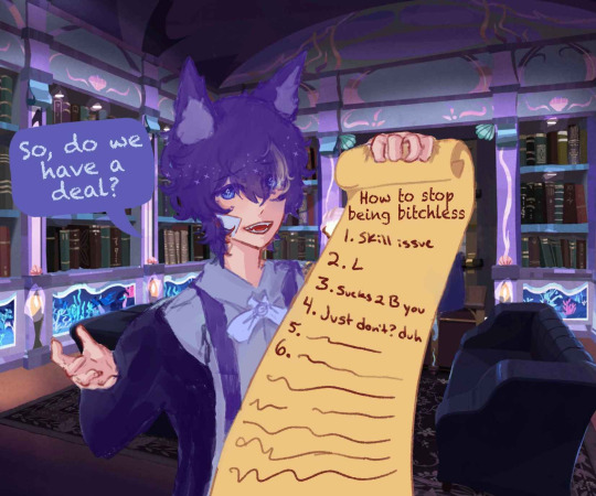
Happy Birthday Nemi!
Happy birthday to the most annoying and nuke-able sona ever!
This will function as his birthday post since I'm too busy with finals to properly celebrate </3

everyone's least favorite kitchen exploding mf is getting a full body design!
yes, Nemi will finally have one of those twst oc intros :O
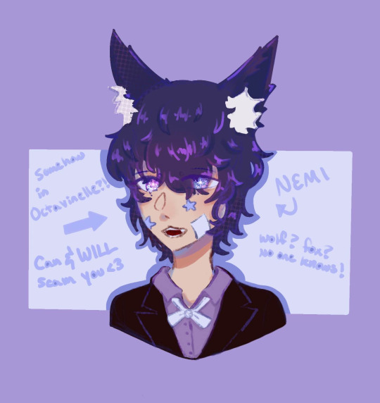
can you believe that it's their 3rd official redesign already? It felt like just yesterday when Nemi became my blog's "face"/brand, and now I'm already improving upon the initial design :,)
nemi rambles ab old art + some unposted Nemi art below!
This was Nemi's first appearance on tumblr and also my pfp when first starting out! It was made in reference to something with @spookyavenuestreet's Augustino/ram ram!
I also think i drew this piece over a year ago? It's really shocking on how much my art style has changed since then
Nemi's first ever design! I like how you can immediately tell it's one of my older pieces from my art style-
I'm glad it changed since there's too many sparkles and kind of difficult to tell what they're looking at
ONTO THE NEXT PIECE!
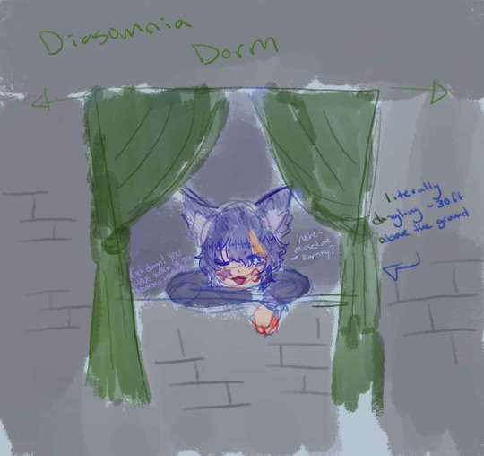
These two pieces are references to how Nemi likes to break into Diasomnia (via the window) to visit Augustino! I'm pretty sure Spooks has a corresponding piece of art to this piece lmao
Oh past Nemi, you had no fear and just fought with Diasomnia students just for funsies :D and also Malleus too apparently-
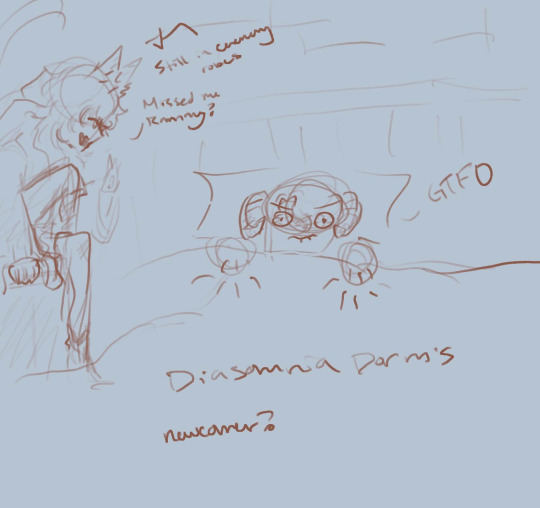
Now this one! It's a reference to how before all the lore was really "coherent" and just fun shit, they didn't get along with Sebek despite being friends with Augustino!
The hands were originally an idea from spooks! something something mythology?
It got scrapped in the end tho. Was fun for the short bit it lasted!
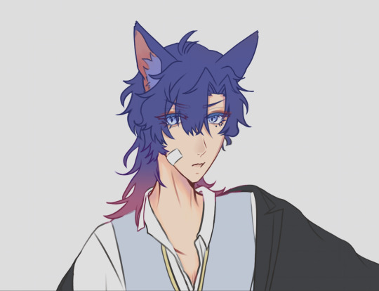
Ah this one!! :D This was my pfp for the longest time before I changed it to the one I have right now! (That'll change whenever I finish making my 3.0 model)
It's the Nemi you're all probably familiar with! Purple hair, a mischievous smile, and with the iconic hand positioning lmaoo
My current pfp! (for now) The hair got more blue/indigo with pinkish tips :D
There's different versions, but i never ended up using them :(
Here are the different versions! I somehow lost the initial file and couldn't be bothered to put my eye moles back in
Now some art I don't think i ever posted!!
It's a traditional piece! I messed up on the hair since I didn't have the right colors :(
It's a cute simple piece of Nemi messing with Leona nui in class! As you can see on the pieces of paper, Nemi doesn't really pay attention in class...
You can typically find them in detention if they don't have any class or a shift at the Mostro Lounge!
More traditional art! and also more Leona nui bullying (affectionate)
It's a lot harder to draw on paper after only doing digital art for a while. This piece and the one before were pieces I drew during my senior yr of high school!
I think the only piece as of all the drawings so far that weren't made during high school is my current pfp! That piece was made during the summer after I graduated (well, more like skipped my graduation and just collected my diploma after but still-)
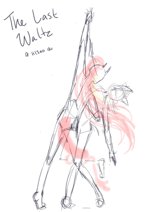
HI3RD AU!!!!
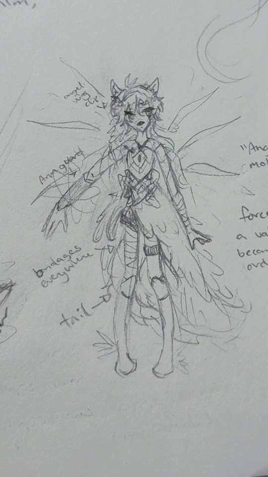
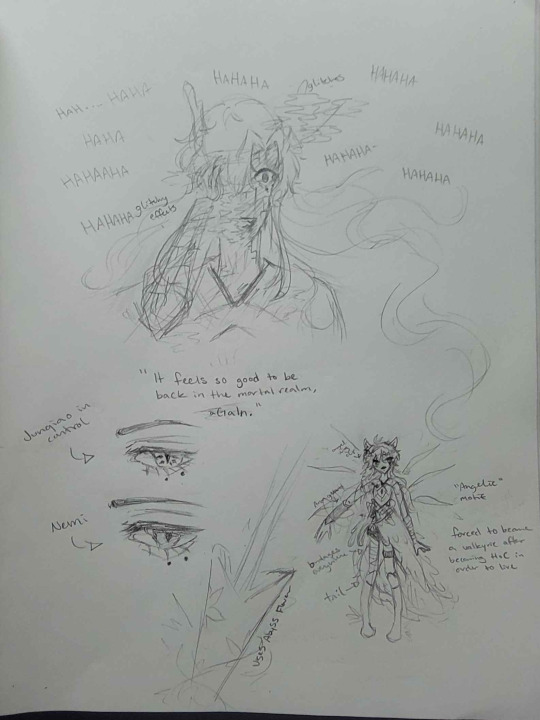
Here are some of my HI3rd Au Nemi pieces! Anything related to that au is just angst- I still don't feel like explaining the lore in detail so I'll just rapid fire it:
-Junqiao is a herscherr
-Junqiao possessed Nemi (via gem)
-Junqiao is a homewrecker bc he slowly made Leona fall for him while possessing Nemi's body
-Nemi got forced to become a valkyrie against their will after regaining a bit of control from Junqiao
-end game plan is for Nemi to give up their body and consciousness over to Junqiao since they no longer have anything to really "fight" for as Leona loves Junqiao now instead of them :D
-all Nemi wanted was a simple life, no valkyries, no honkai, just a simple life by Leona's side (but even that is a pipe dream eh?)
More Hi3rd au pieces :D
The first piece got worked on a bit more after I posted it originally! And I dont think I ever posted anything about the other one? I might make it into a fully rendered piece if I ever get the chance and motivation!
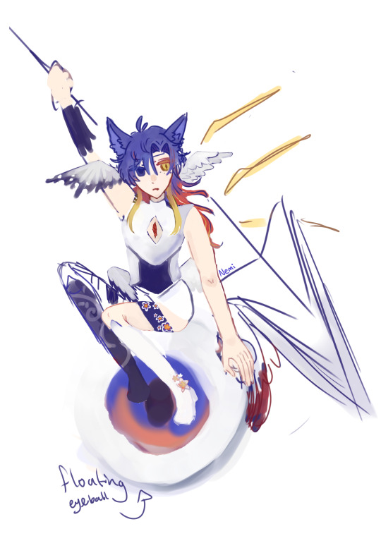
Spirit Animal AU! on RIOFY
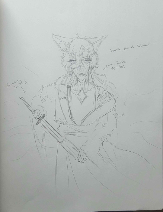
this is by far the happiest Nemi has ever been in any Aus I put them in
whore era with those exposed shoulders and chest opening /j
rapid fire lore:
-something something pacts n shit with Leona & Junqiao
-learns to be more open with themselves in fashion choices via the whores (Leona & Junqiao)
-destructive trio poly qpr! (Nemi, Leona & Junqiao in this au)
-eventually gets forcibly "sibling'd" after meeting Viz & Yuhua ( @twistedwonderlandshenanigans & @distant-velleity 's ocs)
And this is my most recent drawing of Nemi! (besides the 3.0 model redesign) I never posted this bc I ended up hating how the full body looks. The body pose is just really awkward and stiff; a complete 180 from how it looked in the sketch phase
Sorry none of the pieces are really in order from oldest to most recent! :( It's kinda difficult to track down which ones came first for the older pieces, but I think you can kinda tell by the hair color, hair length and most obviously; my art style
Nemi's hair has been slowly shifting from purple to a more blue tone! It's also slowly getting longer, but I think it's going to settle around the shoulders!
MOOTS' ART!!
we start off strong with spooks' art!
.....THE JAR (sobs) it was a joking comment ab shaking or putting Augustino in a jar. Then spooks decided to literally draw it. ahaha....
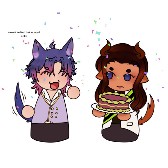
another spooks art! this was for ram ram's birthday! and Nemi made an (uninvited but welcome-)appearance :D
This piece is an art req that got answered! The one who drew this is the very very lovely: @amatsuchan-eiliniel !!!!
THANK YOU AGAIN AMATSUUUUUUUU YOU COOKED AND AIUGHDGHJFGGKGBFHDHF NOM NOM NOM
thank you for not forgetting Nemi's eye moles despite the fact that i forgot to add them when drawing initially hgfdhbfhg-
Now onto some silly ones from the Leona simping serv- i mean The Prince's Uprising zine server :D
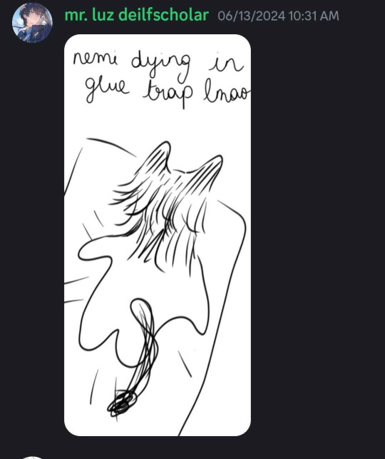
These are by soru from The Prince's Uprising zine server... hi @le-monchou
its still all very funny but also terrifying just thinking about how you drew Nemi dying in a fucking glue trap lmao
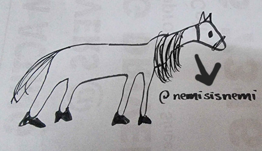
AND FINALLY: RATMI.
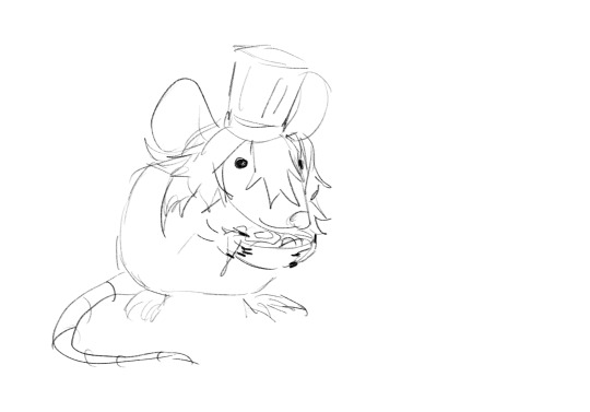
This is by the lovely @aprityormarj
something something nemi ratatouille and this was made
yes. this is Nemi as a rat. Ratmi at your service~
-
-
-
-
-
-
That finishes it off for Nemi's bday post!
Hopefully I remember to schedule this post for December 7th bc that's when my sona's birthday is!
Irl nemi's bday on the other hand isn't until the 26th! I'll hopefully be making a birthday piece for both Nemi and irl nemi by then!
#twst#twisted wonderland#art#sketch#twst fanart#twst sona#twst oc#twisted wonderland oc#twst wonderland#twst persona#persona#artist persona#old art#art dump#redesign#oc redesign#persona redesign
42 notes
·
View notes
Text
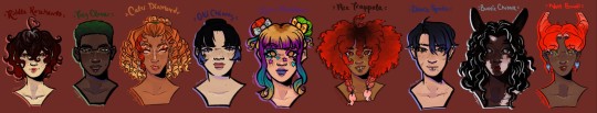
🎆 New year, new headcanons!! 🎆
Hey, so I've been a bit dead for a hot sec, apologies for that. Hope y'all are having a good break! Now, for something that's been in the works since August (drum roll please)...
🎉 REDONE TWST HEADCANONS!! 🎉
First up, yet again...
♥️ Heartslabyul ♥️
WAHOO! Ignore that you can clearly see which I had to redo lol, that's going to be a bit of a theme as I looked back and wasn't super happy with some so I redid them until I got it right.
Since y'all know the characters this time, I'll be just adding new or changed things to my earlier posts. :D
Enjoy!
♥️ Riddle Rosehearts ♥️
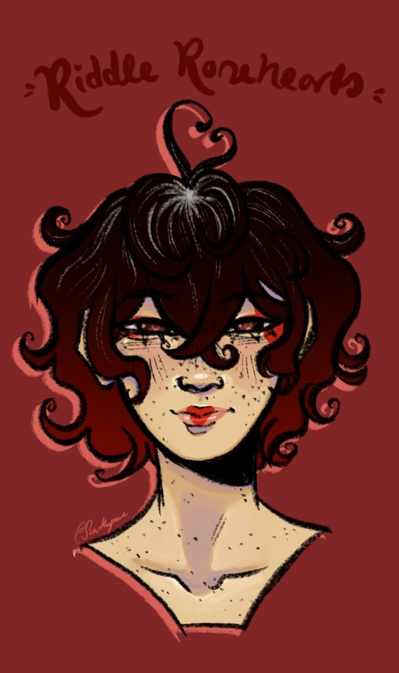
So pretty much nothing changed from the original with Riddle, I just made her look better. Yippee!
Added thing for my University Headcanon/AU is major and I see Riddle being an English and Law major.
♣️ Trey Clover ♣️
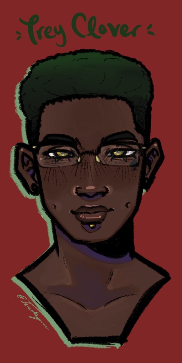
Once again, nothing really changed except for the fact that I learned to draw him better. I gave him a labret piercing that I think would have been one of Cater's first piercings, which thankfully went well.
He'd obviously be a Culinary major.
♦️ Cater Diamond ♦️
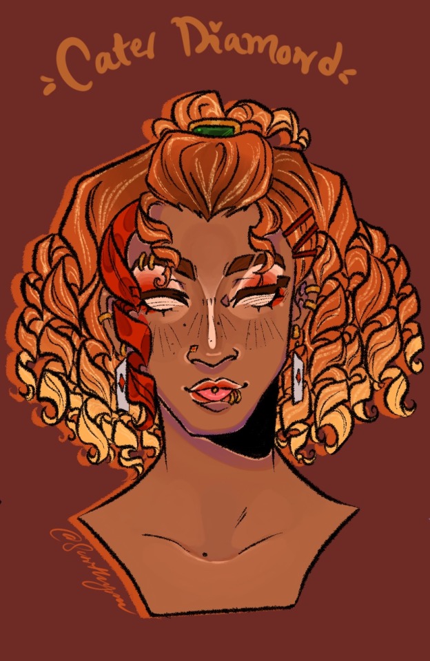
Speaking of Cater, this one was a bitch to draw. I literally redid him three times, send help. (I'll reblog this with the extra between version for y'all to see)
A new headcanon for him is that he's the kind of character that has his eyes closed for the most part and only opens them when he's like super serious. I just felt it fit him. (I'll also attach that in the reblog)
He's very heavily gyaru inspired (shout out to @/Cayfourdiamonds on Pinterest, I loved his edits of Cater and they were my inspo) and I wanted him to curl his hair in the mornings, princess curl style. He has naturally straight hair and the freckles are indeed fake.
He's a Cosmetology and Communications major.
♠️ Oki Chiang ♠️
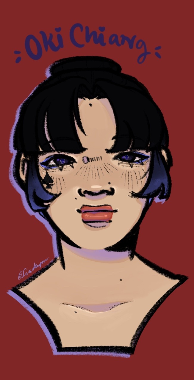
She's a Sociology major and her birthday is October 4th (Libra). She's apart of the Poetry Club (OC club).
Nothing much changed here either, though I tinkered with her skin tone to amp up the contrast and shifted to blue to a darker hydrangea-y colour.
(Edit: I forgot, I have UM for my ocs now!)
Unique Magic - "Who Are You?": Creates a mist as Oki recites the spell that induces confusion. The confusion will last up to two hours after the mist fades, depending on the strength of the person affected.
♣️ Luna Madden ♣️
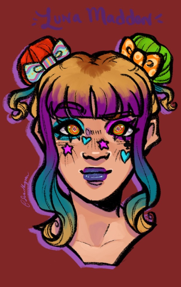
Another one I had to redo twice because GOD, the in between was SO UGLY!! Ew. Anyways, way cuter now! I gave him swirly eyes for funsies and trimmed down the colours in his makeup so it's more cohesive.
They're an Art and Psychology major and their birthday is January 22nd (Aquarius). It's in the Science Club.
She uses mobility aids, alternating between a cane and braces depending on the day, due to Multiple Sclerosis (an autoimmune disease that impacts the spine).
Unique Magic - "It's Tea Time!": Conjures a pre-set tea table fitting Luna's desires. The bigger the table and the more items, the harder it is for Luna to make.
♥️ Ace Trappola ♥️
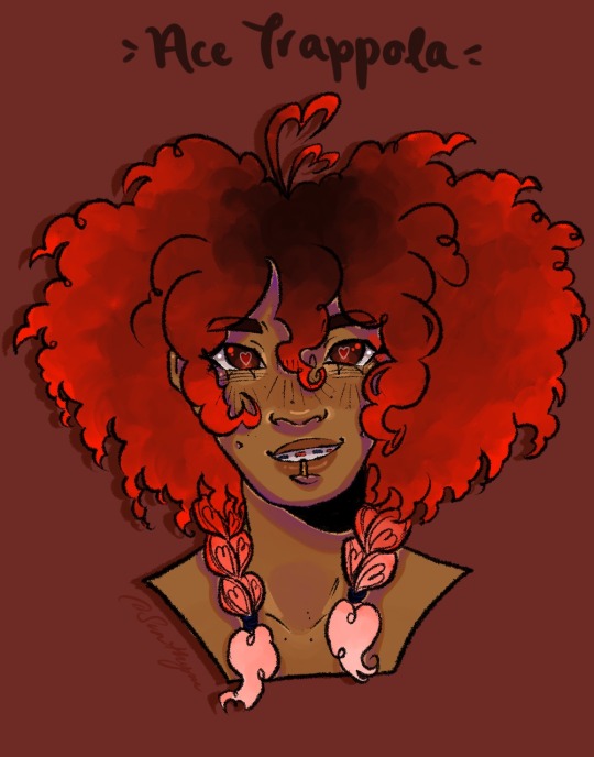
Oh boy, another redone one. I went a bit ham with his design, I really wanted to make him look like a heart. Found the braid idea on Pinterest, as one does, and ran with it. He's so cute, he looks like a heart lollipop. Also, I gave him braces because I love that idea so so much!
He's undecided in his major.
♠️ Deuce Spade ♠️
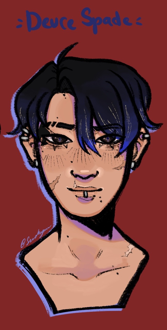
I adore how this one turned out, he's my son and my boy. Nothing really changes aside from style improvement and I gave him better bangs.
Also an undecided major. (Adeuce twinning frfr)
♥️ Bunnie Chrona ♥️
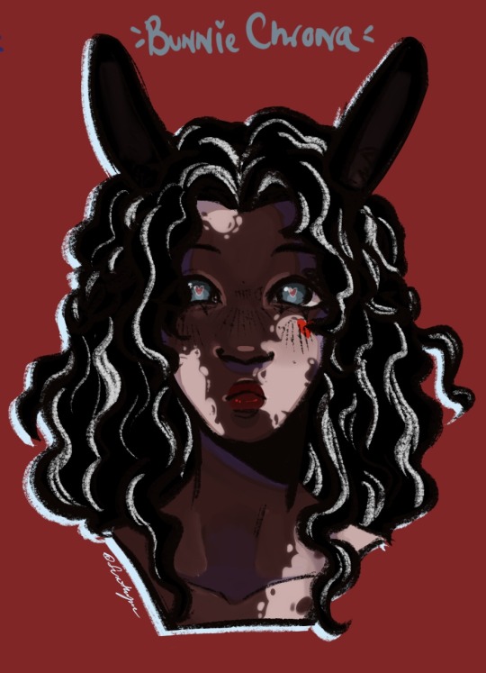
She's a Psychology major and her birthday is June 30th (Cancer). A part of the Track & Field Club.
Ooh, she's so cute, I love her sm! I gave her vitiligo and stripes in her hair to imitate those splotched black and white bunnies that are so adorable. I did make the interesting choice to give her blue eyes, not for any particular reason, they just contract the red undertones well.
Unique Magic - "Killing Time": Bunnie's speed will increase for an hour, making her go at an inhuman speed.
♦️ Ness Benoit ♦️
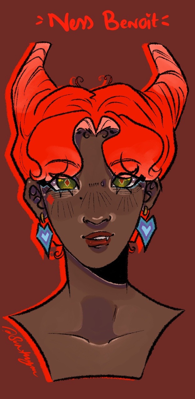
She's a Drama major and her birthday is May 25th (Gemini). They're in the Film Research Club.
Finally, Nessie! They also had an in between but they actually looks more like the OG than that one lmao. Gave her some little devil tail earrings and just made the hair confirmedly into a wig. Also gave them a lil fang :3
Unique Magic - "Devilish Charm": Allows Ness to appear differently or say different things to different people. It takes more energy the more people she is using it on.
Stay tuned for Savanaclaw, up next!
#sunthyme#god save me i’m in twsted hell#twst#heartslabyul#twst oc#riddle rosehearts#trey clover#cater diamond#oki chiang#luna madden#ace trappola#deuce spade#bunnie chrona#ness benoit#sunthyme twst ocs#sunthyme twst hcs#twst headcanons#twisted wonderland
29 notes
·
View notes
Text
Hey guys! I know I went to go get milk and I finally came back, couldn't find it.
Ok so what's this about? You may be asking and well- long story, that i'll cut short. I kinda wanna rebrand in a way, I'll keep all my art and things so no worry I'm not deleting anything. Though things will change. First off: My Art Style
I certainly don't draw like I used to, I draw more detailed and more rendered things compared my prior goofy silliness. Not saying I won't draw goofy things but it might be sparse. The "Ask The Octonauts"
I just want to apologize for not answering so many of these, I will 100% get to them that's a promise, once I'm done with them I may or may not launch it again, aka the asks will be closed for now. If you already asked something it will be responded. Octonauts Art
I still love the Octonauts and have many plans but art of them won't be as much as before. I'm currently like designing like... counts holy shi- A lot, I got a lot to catch up to which leads to my next point...
The Circus Au MAP
This is still on going, though due to my life crashing down on me so quickly and causing me to have to shift my focus on myself I put a lot of projects including this one on hold. Though I believe I'm mentally ok enough to start working on this again and I'm still looking for more people to help with animation. That's all for now, I'm sorry I disappeared, I do want to be here but with major life changes going on it wasn't entirely possible for me to be more active (mostly mental health things I physically and mentally did not have the energy to create art for my accounts.) So when I drew Frosty the Snowman it was a nice break and I could freely figure out what I wanted but I'm done taking time for myself and will be posting more hopefully. I do have more Frosty the Snowman art to post but that'll be more towards Christmas. That's my big announcement woohoo yahoo! Also my comms are still open but I will be working on another sheet cause like I said, don't draw the same. and the payment is still Venmo. Please respond to what's highlighted in purple ^^ Thanks for being awesome sauce stars!

#octonauts#captain barnacles#freddy fazbear#no im not freddy fazbear#har har harhar#my art#my ocs#oc#persona#dude im so tired rn ToT
31 notes
·
View notes
Text
Tattoo/Neurosurgeon
Modern AU where Satosugu were best friends in high school but Gojo who went off to the best uni for his medical studies and Geto who went off on his own to find his calling.
Gojo got really busy with uni so he couldn’t reach out as often and Geto had known (read: assumed) he was no longer a priority in Gojo’s life. So they drifted apart.
Ten years later, a lot has changed. Geto is now a respected tattoo artist whose style is very bold and usually black/white. He has his own tattoos that really speak to his identity over the years, being an artist, struggling to find his path, joining a gang, coming out as gay, etc.
Satoru was always in the back of his mind; the best friend who he never thought he’d part from. A lot of his art portfolio pieces were sketches he had refined that were originally inspired by Satoru...
Meanwhile, Gojo has been studying to become a neurosurgeon, and is currently in residency. He’s very sharp, swamped with work, and takes great pride in helping his patients.
Gojo could not give less of a fuck about tattooing his skin, which is why he didn’t pay much attention to Shoko as she was showing their colleagues the social media page of the tattoo parlor she recently went to. The place is called Ink Domain, with three tattoo artists and one piercer to pick from.
Who would’ve thought that when Shoko scrolls past the tattoo designs and onto a post introducing the employees, Gojo does the most wicked double-take that leaves a sting in his neck.
Discreetly, Gojo scans the picture: he sees a man with purple makeup and twin buns, a younger man with pink hair smiling widely next to him, another man with pink hair and black markings on his face, and a woman with long blond hair who has her arm around the shoulders of a man in a baseball cap and black a face mask pulled over the lower-half of his face.
Black side bangs peek out from the cap.
Gojo stares hard at the last figure, a rush of complicated feelings pooling in his gut.
“Who did you say did your tattoo again?” Gojo shakily asks, holding his breath.
The moment the name “Geto Suguru” leaves Shoko’s lips, Gojo feels as if the air has been punched out of his gut.
***
Gojo thinks long and hard about what his next steps should be. Long and hard meaning he books a consultation appointment with Suguru for the next week.
Gojo is sweating.
Why did he do that? Especially on one of the few days he doesn’t have to go in at the crack ass of dawn into the hospital? To get a consultation for a tattoo he hasn’t given a second thought about, with the best friend he lost touch with nearly a decade ago?
Gojo isn’t sure what he’s hoping to get out of this. He just… he’s missed Suguru, and wants to see how he’s doing.
When Gojo walks into the studio fifteen minutes before his appointment, a boy with pink hair and the name tag “Yuji” greets him.
“Hi, welcome to Ink Domain. Do you have an appointment?” Yuji asks.
“Yes, a consultation appointment with Geto,” Gojo answers, feeling light-headed and ready to pass out. “My name is Kento Nanami.”
“Okay, checking you in riiight now, and yep! You’re good to go. You can wait on the couch, Geto-san will be with you shortly,” Yuji says brightly.
Gojo waits while anxiously tapping away at his phone, checking his calendar to make sure his shifts are all in order, then takes a look around and sees all the portraits of the artist’s past work - pictures of small moments that they seemed to want to frame.
Before Gojo knows it, a tap on his shoulder has him looking up into familiar soft hazel eyes, narrowing in mischief.
Gojo swallows thickly, eyes sliding from Suguru’s signature bun and bangs combo, to the tattoos that peek out from his black t-shirt, and the muscles that strain the said t-shirt.
Suguru looks good. No, MORE than good. He looks fucking delectable, giving Gojo the same expression he’d give when he’d catch Gojo stealing his clothes whenever Gojo had slept over.
Oh ho ho, Gojo was screwed.
“Sorry for the wait, Kento,” Geto says while smirking. “Ready for your consultation appointment?”
Gojo stands up abruptly, choking out a weak “yep” to Geto’s question while the rest of his mind is too scrambled to say anything else. Geto chuckles, lifting his chin slightly once he noticed Gojo had surpassed him in height.
“All right, follow me into the back.”
Once they arrive at Geto’s station, Gojo plops his bum onto the patient seat.
Geto rummages around for his sketchbook, lightly lecturing: “Whose poor soul did you commit identity fraud against, Satoru?”
Gojo gives a small smile, happy to see Geto isn’t angry with him.
“A friend. And a co-worker,” Gojo answers, crossing a leg over the other. Geto hums, searching his station for a pen, a pencil, and a sharpie.
“Where is work for you?” Geto asks. He pauses for a moment, then remembers he had placed the sharpie in his bun, and proceeds to pull it out.
“JR Tokyo Hospital.”
“In Shibuya?”
Gojo nods, eyes following the way Geto’s biceps bulge when he brings a water bottle to his mouth, gulping it down quickly.
“I’m in residency right now. Gonna be a neurosurgeon,” Gojo says.
Geto’s eyes widen, and he puts his water bottle down.
“A neurosurgeon? Satoru, that’s- that’s amazing,” Geto says, voice filled with awe. He scoots his roller-chair close enough so their knees are a hair away from touching. “I always knew you were going to excel at whatever you pursued. But neuroscience? God, that’s incredible. You’re incredible.”
“Okay, okay stop. Enough about me. Believe it or not, I’m very much interested in what you’ve been up to. A tattoo artist? You never talked about wanting to tattoo!” Gojo exclaims.
Geto’s eyes crinkle, becoming bashful under the slightest amount of praise. As per usual.
“Yeah, well, I must say it was quite a road to get to this point. Doesn’t feel real, sometimes. Getting to do art and make a living out of it? And also loving what I do? I never imagined it before either, trust me,” Geto says, gaze becoming softer as he reflects on the past decade of his life.
It’s bittersweet, thinking about how much time has passed, spent without Satoru by his side.
It’s never too late though. Satoru is here now, in his shop, listening to his every word.
Satoru and his brilliant brain, and drive to be the best, bound to do great things, which now includes being a fucking neurosurgeon! He’s insane, Geto thinks. Insane in the best way possible.
Geto is so proud of him.
“But we can save that story for another time. After all, it’s a tattoo consultation you’re here for, isn’t it?” Geto questions, readying his pencil on his sketch pad.
Gojo wants to melt into the ground. Can't Suguru just drop it already?
But after sending a pleading lookover to his former best friend, expressing that he did not fucking come all this way (into a tattoo parlor) for a stupid tattoo, Geto still won’t bite.
He’s gonna make me say it, Gojo thinks with vengeance. This bastard.
“What if we…skip the consultation part and…just talk?” Gojo suggests. He belatedly shoots two finger guns Suguru’s way for effect.
Geto raises a brow. “But you paid for a consultation.”
“No, I paid for your time,” Gojo clarifies, leg bouncing nervously waiting for Geto’s reaction. “And I would love to use it to catch up.”
Geto’s blinks once, then twice. Slowly, a fond smile spreads across his lips. He puts down the sketch pad, pen, and pencil - and slips the sharpie back into his bun.
“There’s this cafe down the street that I know you’ll love. Give me five minutes and we can head over together,” Geto says, standing up to reset his station.
“Gah! You remember! I hope they have mochi, maybe some cheesecake!” Gojo cheers, standing up as well. He readjusts his pants that had slipped down a little while he sat, then makes his way back to the front.
A hand on his wrist stops him.
“Satoru,” Geto says in his honeyed voice. Crystal blue eyes lock on the face that’s been the subject of bone-deep nostalgia and yearning that’s already made a home in Gojo’s heart. “I’ve missed you.”
Instead of answering, Gojo wastes no time in wrapping his arms around Geto’s shoulders, bringing him in for a long hug. Geto melts into the hug, as if it was the most natural thing on earth, holding Gojo’s waist because he was precious precious precious.
He still smells the same, Gojo thinks. A little more mature, a little more cinnamon-y, but still the same Suguru.
“I missed you more,” Gojo murmurs, nudging his nose in Geto’s neck. “I’m sorry for losing touch.”
“Don’t be. I didn’t do the best job either,” Geto responds, rubbing comfortingly up and down Gojo’s back. “But we’re here now. You found me again, Satoru.”
“Hehe, I did, didn’t I?”
《2》
#jjk#satosugu#geto suguru#gojo satoru#satosugu fluff#satosugu fanfic#goge#gego#cerdrabbles#modern au#childhood best friends to strangers to lovers
76 notes
·
View notes
Note
I’m sure you’ve been asked, sorry if you have, but what’s the little lines on Jack’s cheeks in older designs? Art style thing, or like the equivalent to blush lines just permanent? Sorry if this seems rude I’m just genuinely curious ;w;
This isn't rude at all because I love talking about Jack so much (y'all will never truly understand how much I will never get sick of talking about this lad)
SO back when I first started Beanstalked, I would give him these dirt smudges on his cheeks since he tend to do a lot of stuff on the farm so sometimes he'd get smudges on him

But when I would draw him on paper, I would shorthand the smudges with hashtag lines since I used to always sketch stuff in pen. So I just carried that over to digital since it was also a time saver when working on pages.

And eventually they stopped being dirt smudges and just shifted over to being protagonist cheek markings like Ash and Naruto have since Jack is basically a dumping ground for my favorite protagonist tropes.

Over the years though, I realized "Jack actually looks really cute with freckles and stuff on his face...too bad I can't change it" only to remember I am god of my world and I actually can change things.
AND HERE WE ARE TODAY!
Jack's design evolution is one of my faves out of all my OCs tbh
89 notes
·
View notes
Note
First thing first I LOVE your art style. Second your Apollo design and headcanons are amazing. And third I would love to see some kind of colored reference sheet of Apollo, because I would love to make Fanart of your design!
Ok I made a re-made a lil reference thing I made about a year ago with color for you! + I'll add some notes I keep in mind while drawing Apollo in different forms bc I'm kind of inconsistent with my art lol

Pre-ToA Apollo: Covered in jewelry, bc he's fancy like that. No shoes, I used to draw him wearing sandals but it was actually rly important in antiquity that the gods didn't wear shoes as a sign of their divinity, so no more of that. At most he wears cool gold anklets. I also use his chiton as a bit of a mood ring. When Apollo's is having a great time, it's gold or has gold accents. When he's in stressful situations, it's got more orange and red.
Lester: Shift all colors a bit closer to red, just for cool symbolism-y reasons. I've done blue-eyed Lester before, but I'm ngl brown-eyed Lester still holds my heart. Also the most consistent part of my Lester design is the red hoodie, I will never let that thing go. Lester is a short king, and he always, ALWAYS has some pudge. (I feel kind of bad bc I always draw him in a baggy hoodie so you can't tell sometimes, but I swear I always keep it in mind) I usually show time going on in the trials by adding scars, making the hair longer, and making him a little bit bigger (callback to my hc that all of the physical things Apollo saw as "flaws" got worse in the 5th book, but bc Apollo has grown as a person he genuinely doesn't notice/care as much)
Post-Toa Apollo: Everything is a mix of the first two designs. Two eye colors, two hair colors, clothes that are modern while still referencing antiquity. He even wears sandals, right in between barefoot and sneakers. This design changes a lot, but that's bc I think Apollo is still rapidly changing after the end of ToA, and figuring out how to settle back into himself. The only consistency is that I’ve drawn him wearing crop tops alot? I honestly can’t tell you the reasoning behind that it just keeps happening. So yeah, really with this one, go wild!
#this is probably a bit overboard and more than you wanted#But I had a lot of design ideas I wanted to share bc designing Apollo stuff is so fun#trials of apollo#toa apollo#lester papadopoulos#apollart#sunny speaks#ask
246 notes
·
View notes
Text
Mononoke: The Phantom in the Rain

Otherwise known as:
Holy FUCKING shit, the anime industry finally giving Lit something she wants, Holy FUCKING shit whose dick do I have to suck to keep this train going
...Ahem.
For anyone who's followed me for a long time, the knowledge of my love for the anime Mononoke is pretty common. Back when I was a member of the YouTube countdown community, I made a whole giant video dedicated to it (which has now been lost to time, thank you YouTube copyright system), I went out of my way to buy the blu-ray set of the series the moment it was available, and my first ever Nendoroid was the Mr. Medicine-Seller one they announced earlier this year.
Which is still in its box because I'm not sure if I should put it together or keep it sealed...
But, anywho, safe to say: I love this anime. And the two major elements of that love are the unique art-style the series utilizes and, of course, the mysterious Mr. Medicine-seller (or Kusuriuri-san).
Literally, let me type out my exact reaction the moment Mr. Medicine-seller had his first line in the movie:
Mr. Medicine-seller: *says one word* Me: I LOVE YOU!!!!!!
Going back to the art-style, however, it is one of those that immediate catches the eye as a fusion of classic Japanese art and pattern-utilization that bears similarities to anime such as Gankutsuo: The Count of Monte Cristo.
I'm realizing that I'm spending a lot of time gushing over my love of the series and not focusing on the movie itself. Let me shift focus:
The movie takes an interesting approach to the IP in presenting Mr. Medicine-seller either as a younger version of himself or an alternate universe version of the Mr. Medicine-seller we got in the OVA and series. I've seen arguments for both interpretations though I'm personally in line to believe the 'younger version' side.
We're presented a setting of two young women, Asa and Kame, arriving at their new jobs at the Ooku, the inner quarters of Edo castle that hosted all of the women who work for the Emperor in one way or another.
Right off the bat, the audience is given some insight that something is a bit off-kilter in the form of all of the Ooku staff being required to throw their most treasured possessions into a well to symbolize the start of their new lives as well as the ceremonial water all of the Ooku staff drink every morning having a foul smell and taste.
And, honestly? That's all I want to divulge in with the plot because, just like the OVA and the series, this film is definitely a piece that is better experienced blind.
However, I will go into a few specific stand-outs that, while not being spoilers, could still lean into things that people may not want plastered in front of them.
The stories that Mononoke centers on involving the horror of the female experience in one way or another.
This definitely has not changed and I am so glad that it didn't.
2. Mr. Medicine-seller's new VA.
Admittedly, when I first heard Hiroshi Kamiya's take on the character in the trailer, I immediately winced a little. Not that it was bad, but the portion of my mind dedicated to all things Mononoke still had Takahiro Sakurai's performance on the altar. However, upon watching the movie, I can say that the change in VAs isn't a detriment. Also, if the film is your first experience with this IP, then you wouldn't be bothered in the first place.
3. Mr. Medicine-seller's new Exorcist Form.
Not going to lie... I miss the gold version. Like, they're both good, but the gold version has more of an actual presence that matches the nonhuman nature of Mr. Medicine-seller's design.
However, again, if we go with the interpretation that the movie trilogy is using a younger version of Mr. Medicine-seller, then I can just hold onto the headcanon that he gets the gold version with more strength and experience.
All in all, I loved the movie. Like... LOVED the movie. However, some might say that I'm a little biased. Either way, I can't wait for the rest of the trilogy.
Final score: 9/10
22 notes
·
View notes