#iron boulder
Explore tagged Tumblr posts
Visit Tumblr Blog
Explore Tumblr blogs with no restrictions, modern design and the best experience.
Last Seen Tumblr Blogs


Fun Fact
Tumblr Inc. is using 66 technologies for its website.
Text


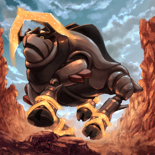


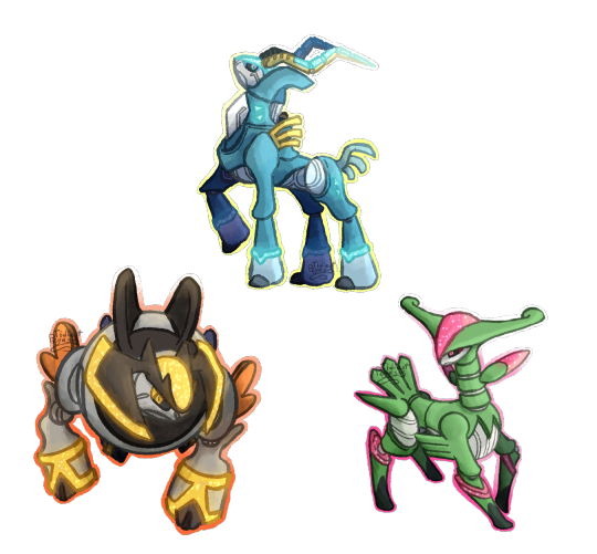
Violet paradoxes! Some of these nerds took longer than average since I took a lot of liberties with their designs, but I regret nothing.
#pokemon scarlet and violet#miraidon#pokemon art#pokemon#pokemon fanart#iron bundle#iron hands#iron valiant#iron thorns#iron jugulis#iron moth#iron leaves#iron treads#iron boulder#iron crown#fried unicorn studio#paradox pokemon#genuinely had a blast with these guys#I love drawing robots and mechanical characters#its just very satisfying to put the pieces together and draw a bunch of reflective surfaces
350 notes
·
View notes
Text

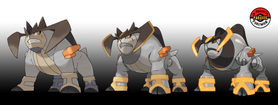
#639.? - According to legend, Terrakion, alongside the other Swords of Justice, had challenged humans in order to protect other Pokémon and their homes. Said to possess phenomenal strength, Terrakion cannot stand bullies, and will mercilessly crush anyone or anything that torments small or weak Pokémon. Theorized to be a possible transitional form between Terrakion and the mysterious Iron Boulder discovered in Area Zero, this Pokémon is beginning to develop a powerful metallic body and psychic capabilities. Its body retains the rugged, bulky appearance of its predecessor, but faint crystalline growths on its horns and legs suggest a shift toward more energy-based abilities. Some researchers theorize that Iron Boulder is merely a counterpart of Terrakion from another timeline, while others hypothesize that it was once been an ordinary Terrakion that was modified by a villainous organization in the far future. If this speculative evolution truly exists, it may hold the key to understanding how a creature of raw, natural strength could evolve into the cold, calculated machine that is Iron Boulder.
Named: Terrakion - - ? - - Iron Boulder
- - - - - - - - - -
Follow for more In-Progress Pokemon evolutions!
FAQ | Social Media | Pokemon Index | Commission Information
#pokemon#fakemon#in progress pokemon#terrakion#iron boulder#gen9#gen5#unova#paldea#future pokemon#paradox pokemon#IPPparadox#rock type#fighting type#psychic type#unnamed
151 notes
·
View notes
Text


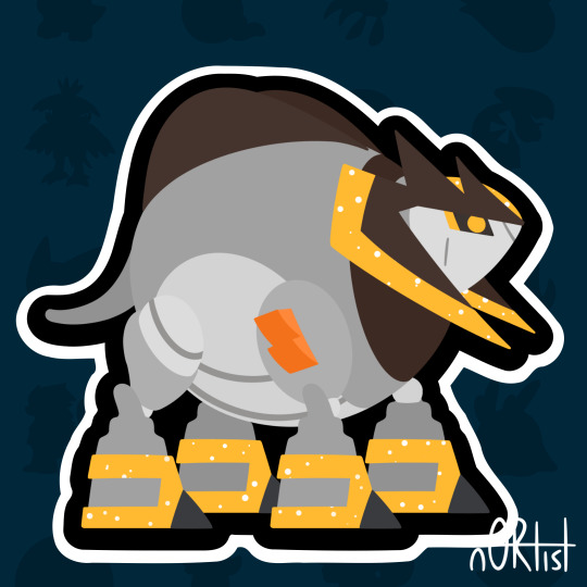
#1022 Iron Boulder
#pokemon#crochet#amigurumi#pokemon crochet#pokeamidex#pkmnart#art#artists on tumblr#plush#poqueuemon#iron boulder#pokemon scarlet and violet#paradox pokemon
131 notes
·
View notes
Text
Which one of you.... was made to be the very best....

#inanimate insanity#ii spoilers#ii fanart#inanimate insanity fanart#ii ep 17#ii knife#ii suitcase#ii steve cobs#pokemon#kingambit#dusknoir#iron leaves#iron crown#iron boulder#pokémon#object show fanart#steve cobs ii#suitcase ii#knife ii#ii 2#legend's art#inanimate insanity suitcase#inanimate insanity knife#inanimate insanity steve cobs
238 notes
·
View notes
Text


Some new HOME stickers via Mattyoukhana.
#pokemon sv spoilers#pokemon sv#pokemon scarlet and violet#ogerpon#terapagos#iron leaves#iron crown#iron boulder#gouging fire#raging bolt#walking wake#pokemon art#pecharunt
444 notes
·
View notes
Text

#this one's for you‚ tumblr user ironboulderfan#iron boulder#hilarious that we're gonna get through all the paradox forms until we actually get to this one. tumblr user ironboulderfan i am so sorry
174 notes
·
View notes
Text
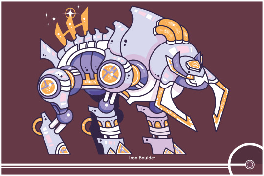
Pokemon Redesign #1022 - Iron Boulder
Ancestor
210 notes
·
View notes
Text
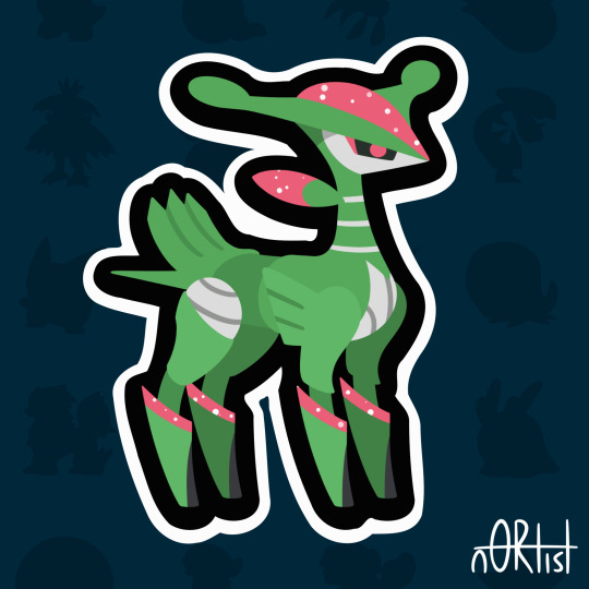
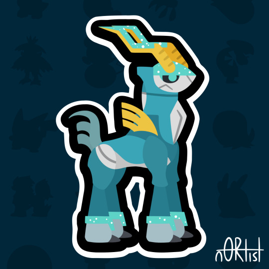
paradox… uh… deers? ungulates? idk man have some robo sword fellas
+shiny versions (aka no paint jobs lmao)

#posing sucked bc robot limbs are stiff af but oh well#art#my art#Pokémon#paradox pokemon#iron leaves#iron crown#iron boulder#shiny pokemon
171 notes
·
View notes
Text

got to draw this beautiful girl for the scarvi art collab 🥰
youtube
171 notes
·
View notes
Text
Thought this meme was appropriate for the blog

#pokemon#pokemon violet#paradox pokemon#iron jugulis#iron hands#iron thorns#iron moth#iron bundle#iron treads#iron valiant#iron boulder#iron crown#iron leaves#miraidon
125 notes
·
View notes
Text
Here are the Paradox Swords of Justice as emojis
#pokemon scarlet and violet#pokemon#indigo disk#terapagos#paldea#fanart#emoji#iron leaves#iron boulder#iron crown
220 notes
·
View notes
Text

Day one thousand twenty two 1022 Iron Boulder
32 notes
·
View notes
Note
have you seen nagimiso's future paradox swords of justice card art?


Yes!! I'm particularly found of their Iron Crown ex but it's like 60 bucks so I'll have to admire it from afar
38 notes
·
View notes
Text


Jan-New-Ary Day 9/10! Took 7h20. Paradox pokemon are so! weird! This one wasn't too hard but it was difficult for me to tell the two different shades of gray apart, I probably could've just done the one gray since they're so similar anyway 😵💫
#pokemon#crochet#amigurumi#iron boulder#paradox pokemon#pokemon scarlet and violet#art#artists on tumblr#pkmnart#foth#fresh off the hook#that means i just finished this one!#poll#jan-new-ary 2025
174 notes
·
View notes
Text
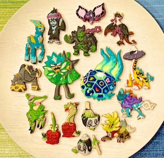
Scarlet and Viiolet DLC Pokemon cookies by YKTBKic!
#cookies#dipplin#poltchageist#sinistcha#okidogi#munkidori#fezandipiti#ogerpon#hydrapple#gouging fire#raging bolt#iron boulder#iron crown#terapagos#walking wake#iron leaves#pecharunt#legendary pokemon#mythical pokemon#paradox pokemon#gen 9
80 notes
·
View notes
Text


New stacking tins coming out on Mar7! The Treasures of Ruin 👀
#pokemon tcg#pokemon cards#pokemon trading card game#treaures of ruin#ogerpon#walking wake#iron leaves#iron boulder#gouging fire#pokemon merchandise#pokemon merch
73 notes
·
View notes