#instead of listening to your users and actually fixing real issues
Explore tagged Tumblr posts
Visit Tumblr Blog
Explore Tumblr blogs with no restrictions, modern design and the best experience.
Last Seen Tumblr Blogs


Fun Fact
69% of Tumblr users are millennials.
Text

This is so fucking funny to me. Tumblr, gorl, I hit the 100 posts milestone about 12 years ago. You're a little late.
#once again i want to thank you tumblr for implementing another useless change#instead of listening to your users and actually fixing real issues#you give us this shit#what is the point of this?#tumblr shit
4 notes
·
View notes
Text
I listened to the TAZ Grad finale!
Fellas is it gay to become imbued with the essence of the sea after influence from your water genasi teammate, pester said teammate afterwards to name a boat after you, and sail away with them into the sunset to run a cruise line scam and become morally righteous pirates?
Ive been looking at people’s reactions on the finale and yeah I loved the chaos magic parts! The whole issue with the mishandling of D&D mechanics was never really a problem with me, although I know some people feel more strongly about that than I do.
Personally, I’ve always listened to TAZ for the story and not the actual D&D so I never really took issue with any of the DM-ing mistakes Travis did. Parts of the actual story had problems (the centaurs, Ranier, other points where Travis tried to be inclusive but implemented it where it wasn’t relevant) but overall I think the enjoyable parts far outweighed the bad.
And the McElroys in general are funny as hell so even though Grad wasn’t as profound as Balance or as sad as Amnesty I still enjoyed it a lot! I would probably put Grad above Amnesty but below Balance, but of course Balance holds a special place in my heart.
A problem people had with the finale that I didn’t notice while listening was that of all their talk of “destroying capitalism,” the trio settled down to comply with capitalist society at the end. And while I do agree that the “this system is bad but let’s slowly make change from within” message has been done to death, I don’t think that the ending was necessarily performative and disingenuous on the McElroy’s part.
The first point is that even though the trio decided to participate in Nua’s society in stereotypically “exploitative” careers, (particularly in Fitzroy and Firbolg/Gary’s case) they did so explicitly to keep people from being exploited by the system. Not to mention their paths fit their character arcs pretty well.
Fitzroy’s “who will protect the weak from the strong” speech doesn’t indicate a sleazy lawyer willing to exploit the law to make a quick buck. One person described him as one of those pro-bono lawyers and I agree with that comparison. Fitzroy is a morally good person at his core, and he initially thought the hero society would help him do good, and after becoming disillusioned with hero society, he decided to carve out his own system to allow him to do good, both by being a lawyer and by being a pirate that only attacks rich assholes. (I really like that he clarified he would only attack rich assholes my chaotic good lawyer boi <3)
Firbolg’s whole character arc of being conscientious of resources to help the community instead of hoarding things to himself, in my opinion, culminates neatly with his decision of becoming a financial advisor. He has learned that both the “share all your resources without regard for the future” ideals of the Firlbolg and the “hoard all your resources for your own benefit” ideal of Nua’s society are both flawed extremes, and has dedicated his career to helping communities find a balance between the two.
Argo’s cruise seems more of a small business to me than a capitalistic venture, but I have never taken an econ class in my life so I digress. His character arc was about finding something to live for other than the past and I think it’s a good conclusion to his arc that he commemorates his mother and friends with the cruise line but still seeks out his own future outside of that by becoming a pirate. His original plan was to go with the establishment and work with one of the most powerful heroes in the world until he gets revenge, so it’s nice to see him grow to find his own self sustaining outside of the establishment.
The second point is that TAZ Grad was never about destroying capitalism. That was a joke that Travis laid the foundation to, but it was the players who made that joke and rolled with it. Tumblr user @fitzroythecreator wrote a really good analysis of how the main theme of Grad was self reliance which I agree with. While that is one of the main themes, I will be focusing on the theme of capitalism that a lot of people tend to focus on.
The characters’ goal was to destroy the HOG, which was an allegory for how organizations function under capitalism, but never a direct parallel with capitalism as an ideology or functional system itself.
When they first joked about “ending capitalism” by blowing up the HOG I was concerned because that’s not how anything works. The HOG was just one cog (heh) in the capitalist machine that was Nua’s society, and while destroying it would cause significant damage and change, it wouldn’t immediately shift everyone’s worldviews to discard their capitalist society as a whole. If the boys carried out the mission and all of a sudden the whole world was fixed, it would be even more disingenuous to present a utopian solution to a pressing, real world problem that simply cannot be solved this way.
I’m glad that they didn’t end capitalism. Social issues like this can never realistically be resolved by three spunky heroes on an adventure. You would need action from an entire population. Often violent action. There were already issues with too many NPCs in the spotlight so describing and entire population’s uprising would have exacerbated the problems even more. As four white men, the McElroys neither had the answers for how to end capitalism, nor would their medium of a D&D podcast have allowed them to present them effectively.
From my perspective, the way they would have actually ended capitalism was to go to war like Chaos and Order wanted. In this case, the entire social order and way of life for Nua would have been overturned. The main characters, Fitzroy most vocally, reject this option because of the human toll (or elves, or dwarves...whatever the term for that is for D&D races). Instead, they disturb the system to expose its flaws and let society recognize said flaws in the background. (Again, they couldn’t focus too much on it as it would take away from focus on the main characters.) Then, they choose to find their own place in the system and fix it from within.
I’m not surprised that the McElroys would pick the “change the flawed system from within” route over the “use continuous and possibly violent action to force rapid social change” route in the end. While the second stance could work if written correctly, there’s a lot more room for the message conveyed to be catastrophically bad if the writing doesn’t work. I’m personally glad that the McElroys, who don’t have a solution, presented the tamer first take instead of trying to give a solution with the second take and failing spectacularly.
TAZ: Grad was social commentary on the problems of late stage capitalistic society, but it never tries to present a clear answer on how to end this society. Rather, it recognizes that this is a problem that can’t be solved by one small group of people. It presents several possible solutions to navigate this society to bring yourself happiness within this soul crushing system while slowly changing the attitude of the society. After all, if everyone quietly changed societal attitudes for the better, then perhaps one day the population will be united enough to bring about the drastic social change that we all hope for.
#taz: graduation#taz grad#fitzroy maplecourt#argo keene#taz firbolg#SHUT UP JESSICA#this is the kind of analysis i do with media when im bored#except none of my friends that i share my bad takes with know about taz grad so#its your problem now
45 notes
·
View notes
Text
behind the taylor swift gundam was in fact another, smaller gundam: a brief inquiry into the events of june 2020
so back in june this year june and i got together and we made this motherfucker of a story with this motherfucker of a thread to keep track of it all. but you already know that! and i’ve already got one foot and three elbows in my grave, so i’ll spare you the long-winded stuff. you wanna know how i wrote 93,035 words in 4 weeks? i’ll tell you how i wrote 93,035 words in 4 weeks-
-by linking you guys to copies of my planning documents because i feel like those words speak louder than any words i can offer in the present day. these are long documents. but they are also historical artifacts. very interesting. very weird. very, uh, full of cussing. so anyway, here’s

BIG DADDY: THE ORIGINAL PLANNING DOCUMENT
for those, like me, who have no motivation left in life to do anything and rely on summaries from others to acquire new knowledge, it all started with a single line.
prince of a fallen kingdom atsumu tries to kill hinata but falls in love with him instead
june, april something, 2020
with that in mind i tested the concept out with a few paragraphs of text, which you can find at the bottom of the Big Daddy document in the graveyard segment, accidentally sold my soul to the image of hinata with epaulettes, and then worked backwards, structuring an entire plot around two images:
a) hinata getting the shit beat out of him, with snark b) hinata and atsumu dancing in an empty ballroom under the stars
if you want a betrayal, you have to have something worth losing. if you want to fall in love with someone you don’t know, you have to meet them. if you have to meet them, there has to be a reason for that meeting, and so somewhere in between atsumu became a sword instructor and hinata the prince with daddy issues. june and i used this method of glancing anxiously over your shoulder to see what you’d missed to fill out the blanks in the story, after which i tacked up a bunch of post-its, typed out the plot, consulted june, typed out the plot again, and then broke the characters down into a bunch of questions, like ‘what do they want?’ and ‘what do they have?’ and ‘what are they afraid of?’
with the plot more or less ironed out, i decided it was time to start writing, and then i decided that i was actually too scared to start writing after all, so instead i set a couple of timers using classroomtimers.com (15-20 minutes long) and i sat down and i wrote about the world that hinata and atsumu inhabited.

each warm-up was 300-500 words long, and for the first few days, i’d write one before getting into writing the story proper. later these evolved into simply picking a scene from the story and launching straight into it, which became useful for opening those scenes later when i got to them organically.
then i got lazy! so i stopped. but these shitty little exercises were really useful for me because, unfettered by plot, convention, or any kind of tradition hovering over my shoulder, i was able to fuck around loosely enough to realize what i wanted this story to be. it was a very contrived kind of trial-and-error, an exploration of the characters, the story, but most importantly, the tone.
RESEARCH, PLANNING, AND VICTORIAN BOUGIE FASHION
this is a loose map of the castle and Important Locations within it, which i drew up at the start so i could keep track of where everything was and how i could get my characters from point A to point B. i wanted the story to have Some kind of internal logic, you know, even if that logic amounted to ‘a compass would function normally in this world whereas kageyama tobio would not’.
99% of my planning and organizing within those five weeks took place in this lovely dotted cat journal which my sister gave me for my birthday and i repurposed into a metaphorical Diary of Suffering while working on juno. i used it for everything from keeping track of narrative threads to clothing consistency checks, but the main purpose was this: each day at about 10 pm i’d crack open the cat book to a fresh page, stamp the date and the day of suffering at the top, and then write down a list of things i wanted to write, address, or fix today. then i’d sit at my laptop and write like a madman until about 7 in the morning. with breaks, of course, for sitting in the bathroom and staring at the wall and sitting in the kitchen and staring at the wall, but mostly i was writing. and complaining about writing. you were there, you probably remember that.
anyway, here are some pages from the cat book.
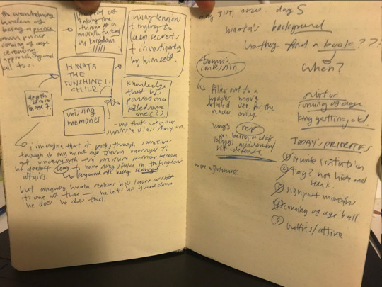


aside from the fact that my handwriting is complete shit, you can see that i made zero effort for any of this to be presentable. it was mainly a way for me to keep track of my thoughts because i have the attention span of an ikea wardrobe and tend to forget things as soon as i think of them. the lack of structure also mirrored the way that i went about writing juno. while i did proceed, for the most part, in chronological order, i had a lot of weird and useless revelations during lunch, which by this point was happening around 2 am, and in the 5 minutes before the exhaustion finally hit and carried me down to hell. i changed A Lot. again, to understand exactly how much the story evolved from day one onwards, please consult the big daddy document.
in the meantime, here’s something else.

once june sent over hinata and atsumu’s character designs i sat down like the fucking fool i am and spent 2 hours poring over a document about victorian and other fashion movements of the past so i could assign a noun, adjective, and verb to each element of their outfits. i don’t know why i did this. i certainly could have not, but i attempted to make sense of their ‘fits from a logistical perspective and that went into the cat book too. everything went into the cat book. the cat book is a relic of the past now, stuffed with artifacts such as the birth of oikawa tooru, and also his demise.
MEDIUM DADDY: EDITING, PROOFREADING, AND CREEPY MURDER CATS
i finished writing on june 26th, 2020, approximately a month after i’d first started planning, somewhere around may 27th or 28th. at that point i had about 90,000 words’ worth of story and no sanity left whatsoever, so i took a day-long break to stare at a wall and listen to taylor swift’s enchanted on loop.
and then i made a new document, which you can look at using the link above, and i laid out everything i had to do. i’d discovered a fuck ton of plot inconsistencies and general errors while writing and lying awake in bed at 9 a.m., sleepless in seattle, and now that i was free of the demon egging me towards the first finish line, it was time to Deal with them. i speed-scrolled through the draft, which was 200+ pages compressed into one google doc, because i like to tempt god’s wrath, and fixed up all the plot issues over the course of a few days. this was the fun part.
the actual, hard editing was the extremely un-fun part. i reread the entire thing, paragraph by paragraph, line by damn line, from start to finish, paying especially close attention to awkward phrasing, incomplete dialogue, and moments which had fallen flat in my haste to get on to the next one. this was really fucking terrible. i spent more time lying facedown on the floor than actually editing anything, but after a long time (about a week), that, too was done.

SMALL DADDY: TITLES, SUMMARIES, AND GOOD FUCKING BYES
i spent a good eighty days thinking about the title, though hilariously enough we ended up with something that was a blend of our names. june + elmo = juno, which is, all things considered, pretty perfect, but the process of picking the title was Hell, and i Did Not Come Up With The Title until about 2 hours before posting. you can take a look at the haphazard clusterfuck of my title-selecting process in small daddy, which is linked above.
so the title was a last-minute choice. so was the summary. and the chapter divisions. and actually all the songs in the playlist for juno. the day we dropped juno onto planet earth like a newborn baby pitched out of the sky, i spent an hour hunched over my laptop, cutting my 213 page google doc into chapters based on nothing more than a Vibe. two days before that, i also attempted to voice-act the entirety of juno, an affair which ended at the 20,000 word mark with a sore throat and the kind of exhaustion one typically wants to sleep in a coffin for 23 years to get rid of. so in all honesty, i did very little editing, which is why there are definitely minor typos and/or mistakes hanging out somewhere on that chunky ao3 webpage. but whatever.
my attitude by july 5th (was it july 5th? or 4th? somewhere around there) was basically whatever. anything so i could get finish this damn thing, chuck it out of the window, and never see another google doc until the next century. i’ve been asked a few times how exactly i wrote at a rate of roughly 2000-3000 words per day for four weeks straight, and my answer has always been this: i died. what died, you ask? my soul. my spirit. my Will To Live. i’m a creature of fixations, and juno was my fixation for june. will i ever be able to do this again? would i recommend this experience to anyone? is god real? the answer to all of the above is probably no. juno was a fever dream, and so is my cat book. and so are all the lattes i had. and so was my 9 am to 4 pm sleep schedule.
but what we made is real. the research, oikawa tooru, the 4 am conversations in which i was like ‘how the fuck do i end this’ and june was like ‘jade proposal’ (the proposal was her idea. all rise for twitter user atsuhinas. she is the mastermind behind all of the Inch Resting moments in this story; i just flapped a korok leaf in her direction and made sure the air circulation was working properly) are real as fuck, and looking back, there’s a lot i’d change, but i’m lazy. and college is starting. and anyway, i did write 93,035 words in just under five weeks, four if you don’t count the week of Editing Hell, so i think that’s pretty cool.
thank you for reading this to the end, and for following us on our journey through the enigmatic taylor swift gundam fic which quite literally consumed my entire twitter account for the five weeks i spent working on it. retrospectively speaking i really was butt-obsessed so i am frankly incredibly impressed with everyone around me for putting up with a Husk of a Man for a month. thank you for doing that. thank you for indulging my vague tweeting, and our butterfly dns, and for reading 93 thousand words of gay fanfiction set in a high fantasy world with epaulettes and galettes. on behalf of june, once again, we are incredibly grateful for all your support.
if you have any questions about specific aspects of the writing process, or anything you’d like to know in general with reference to JUNO, feel free to drop me an ask through my tumblr inbox, or through my curiouscat over here. i’m aware i didn’t cover everything, but there’s frankly too much to put in a tumblr post without passing away somewhere around the 56% mark, so let me know what’s on your mind, and i’ll try to answer that to the best of my abilities. but anyway, before i go, here are some

TAKEAWAYS
one: don’t try to write 93,000 words in five weeks. seriously don’t fucking do it you will end up jittery and sleep-deprived and you will leave all your friends on read for a month. pace yourself. set realistic goals. you wrote 2k this week? that’s fantastic. you wrote 4k in a day? you absolute motherfucker. i hope you’re taking a long fucking break tomorrow. your story will not run away from you, but if you run too fast, you will get tired, and then you will pass away.
two: you don’t have to know everything about your story before you start writing. in fact if you have a single camera shot of two characters holding hands under a rose garden awning, i think that’s fucking wonderful. if you look at big daddy, you’ll realize that my initial plot draft, and all the ones following that, are not perfectly aligned with the final version of juno. i improvised over half of the scenes in this motherfucker, and to be completely honest, some of the improvised scenes were the best. fucking oikawa tooru was improvised out of nowhere. he only got written in way later, around chapter 8 or something, because i realized i needed a plot device and a source of information to keep the playing table from toppling over. i Sat Down one day and was like ‘okay, it’s time to write oikawa into the introduction. because he matters now. he didn’t matter last week but now he does, and soon he’s going to be the fulcrum of the entire story, because it’s like that with oikawa tooru’. it’s okay to change your mind halfway. it’s okay to go back and rewrite entire scenes or segments. it’s okay to highlight 4 pages of fresh, sentimental writing, and hit delete. writing is a fluid process, and you Will make discoveries as you progress through your story alongside your characters. be understanding of that iterative process. be kind to yourself.
three: You Are That Motherfucker. you, me, your dog, your dog’s friend, your dog’s enemy, all of us are that motherfucker. i never thought i’d be able to write anything longer than the great big map, which was a much simpler, linear story in which the other main character did not appear in the current timeline until like the eighth chapter. juno was different. juno was the motherfucker, and i was scared shitless of it, and to cope with that fear joked constantly while writing that it’d never see the light of day.
but it did. it was a rocky process, and i was awake for 48 hours after posting it because of the sheer adrenalin stuck in my skull, but i got through it. and i wouldn’t have been able to do it without june, who stepped in when i flopped over facedown on the floor and dragged me to my feet like the badass friend she is, and without everyone else in my life, who put up with me talking about The Thing that i couldn’t really talk about, but juno’s up there now. forever, or until the internet collapses and civilization goes extinct. and if the nineteen year old clown with the attention span of an ikea armchair and an a level certificate from hell wrote the 93,000 word long thing, so can you. i mean this completely unironically and with every ounce of genuine emotion i can summon from the cracked asshole of my heart.
writing is hard. writing is scary. writing is an investigation of the world around you and therefore, by extension, yourself, and that kind of honesty is freaky. it’s like going skinny-dipping next to the president’s mansion. who’s going to see you? what if they take a photo? what if you lose your spot at university?
but don’t think about that. our world is overrun with stories the way cereal bowls are full of cereal, but it’s those stories that keep us all sane in the disgusting day-to-day muck of reality, so think about your story. what’s haunting you today? what message do you want to leave printed in font size 666 comic sans across the southern hemisphere of the planet? what will you be tomorrow?
a writer. you’re going to be a motherfucking writer.
36 notes
·
View notes
Note
Wait when did makoto go like "I didn't care enough" in regards to kamoshida? Last I recall the stuff before the 3rd palace was pushing pretty hard into the idea that officials like the principal strictly kept makoto into doing what they wanted rather than what she wanted
P5: It’s not Makoto’s fault! It’s the adults they stopped her! :( Also P5:


2nd pic especially right there.
And, I know you didn’t ask for it, but mini rant under the cut explaining why this is a big sack of rotten bananas (aka the messiness of her arc) (also “what Makoto wanted” what Makoto wanted was not to investigate the PT, it was a burden to her to even look into them, hell it seemed like everything was a burden to her, with the exception of that one little blurb in Royal after Shiho’s jump it’s all an inconvenience. You talk to her in the Library? She’s like don’t bother me. Has to investigate the PT? Not worth my time, also I’ll take my frustration out on the PT. Now I have to solve a mob thing? Well I’ll just force the PT to do all the leg work, but I’ll also be very sad when they call me useless for doing nothing but making a lead run away :( Her way or the high way, can’t be bother. A bit of a user....at least towards the PT, ironically she won’t tell her student council guys what’s going on.....but I’m not sure what that says about her character since she is def fine dumping work onto us....just more contradictory info I guess. I mean I’m down for a haughty and/or manipulative person not wanting to help others and learns as the game goes on but they didn’t do that....also not saying the wrote a haughty/manipulative person....but there is some groundwork laid there)
Anyway actual rant:
Makoto point planks says she knew and didn’t do anything. And what’s worse it tries to change the events of Anne and why she feels guilty about Shiho to put her on the same level as Makoto. Anne didn’t know Shiho was being harassed by Kamo (or about his other stuff iirc), the reason is because Anne misread Shiho’s signs of distress (she thought it was about her place on the team). So Anne was worried about fixing that because she thought that was the issue, not the other thing. And she can feel guilty, she’s the victim, and if she wants to feel guilty she can.
But what isn’t ok is freaking Makoto coming up and blaming Anne (who, as the victim, had every right ask Makoto, who was stalking her, if she knew about the abuse via a rumor she was hearing, and Makoto decided to be defensive and blame a victim, probably cause she didn’t want to confront the shitty thing she did), you don’t get to do that Makoto. 1) You know Anne’s situation because Kamo confessed the whole damn thing to the whole school, 2) You had enough suspicion that you could’ve done something but didn’t, 3) Not only were you in the perfect position to do something (you aren’t really someone he can target or was on his radar due to not being associated with the team, but you also have the influence of other teachers thinking highly of you AND you have a sister who is a VERY SPECIAL LAWYER). 4) Anne didn’t know any of this BUT YOU DID (so you aren’t the same, no where near the same, and it’s bullshit the game tries to act like it is).
Listen game, it’s not that hard to show Makoto was a good person but we had the wrong idea. But you didn’t do that. You wrote a shitty person who gets away with stuff and is rewarded. You could’ve written Makoto as knowing about the abuse AND TRYING TO FIX IT BUT BEING ROADBLOCKED (which goes in line with your bs narrative about her listening to adults, what adults Makoto? Your sister who is asking reasonable demands from you[aka do well in school, and not even like restricting her freedom or being a “tiger mom”]? Or the principal who is asking such a cartoonish thing from you that you actually just get to say no to at the end, but regardless if this game had an integrity it wouldn’t have gone with the principal narrative to begin with cause it was just stupid)
Or they could’ve just, you know, had her not known, and her and Anne could’ve bonded over being blind (tho Anne was blind cause she was too close to Shiho and misread signals Makoto could’ve been something else, maybe too busy studying or something to notice the people around her?).
But here’s the thing, the game ALSO wants her to regain her justice she lost sight of (which we don’t know what that was, or what it is now), which means she.....probably needs to have known. Which means they need to fix what we have so it doesn’t come off as “yeah you stalked us, belittled us, got us involved in a MOB-90% of all these issues were because of your EGO to boot-and now you give a quick, disingenuous, even gaslight-y apology (seriously she’s like “I’m sorry so can we just DROP IT???” no bitch we had to put up with you now you get to put up with us), but yeah you can join our team you like...are TOTALLY LIKE US!” Which she isn’t?????
If I had to rewrite Makoto (usually I just remove her but if I HAD to keep her >.>), I’d make her believe that all authority figures are correct (I mean she grew up with a cop, not completely out there imo). She doesn’t go on some BS goose chase cause of the principal, but because she doesn’t believe Kamo could do anything wrong and wants to take down the PT because yadda yadda her own justice (maybe she thinks they caused more chaos than good?). She believes the PT made him lie, or something. Over the course of the game (I’d have her join later like Haru time instead btw), she slowly sees her viewpoint of the world crumble, and have the confront the idea of siding with the PT. To which she would have to give a genuine apology (that she starts, not have to make you know the victim of her tantrums have to sit them down for a sincere apology). It’s an arc, not wishy washy (tho all of P5 is wishy washy so eh), she takes responsibility, and it’d be handled with a lot more time and grace that it needed to have.
But yeah as for the adult thing, I hate it. There’s like 2 adults, Sae is literally not THE WORST person out there. Not perfect but not who you should be holding up as an antagonist for Mako’s arc (esp since they plan on making her an accomplice later, which ends up downplaying a lot of Sae’s negative aspects that could’ve flourished but instead she’s just.....watered down? And not treated with the respect she should have). And then we have the principal and his whole thing is juuuuuust bullshit, like do you want to deconstruct that the Student Council President isn’t all powerful (which some people argue she’s a deconstruction of Mitsuru, I mean she is at least Mitsuru is competent and if anything gets by her it’s cause she wasn’t aware of it but always makes sure to take responsibility and resolve it)? Then don’t give her bs chores like this. And don’t make it so she can just boss Kawakami around (”I can’t believe I’m doing errands for a student....” or something to that effect). She’s either a normal prez (and at most she can gain favor from teachers to use to her advantage but nothing else within school limits), or she’s OP like Mitsuru/other anime prezs. You can’t have a middle ground, pick one logic otherwise everything falls apart. Since P5 tries to be “realistic” (aka stuff in the real world is grounded, not supernatural stuff) the principal should’ve never had that idea cause it’s not realistic. It’s also poor I can’t really name a single teacher outside the Principal (and obvie Kamo....actually maybe lil Kamo and his friend? So I guess I should say “any teacher outside a CoOp” instead) that knew of Kamoshida and didn’t help. Sadayo didn’t know, and the english teacher I think acts like a batman so she either didn’t know and wants to make sure it never happens again, or she feels guilty and is trying to save face (I’mma assume it’s the former cause I haven’t found anything contradicting that and it seems more likely). There’s also the fact Mako literally admits that she didn’t do anything cause she didn’t care, so regardless of what I said about the teachers, they weren’t blocking her cause she didn’t even approach them.
So uhhhh yeah, mini analysis of why there’s issues tied to Mako’s arc and why it’s a mess. 8U I don’t get why Royal even doubled down on the narrative that Mako was pushed around or something, when we 1) still never really see it realistically (principal is really the only one that does it, and as stupid as the whole idea is, it’s also not good to you know....have only one real problem when like......there’s implied to be many? “All these adults held me down” Who Makoto? Humpty Dumpty??????, 2) it completely ignores her own faults as well as inconsistencies they also created. You just pull on this little thread a little and it unravels with like 1000 questions (which is basically all of P5 but still.....just cause it’s a norm of P5, doesn’t mean it shouldn’t be pointed out. XP)
(btw I loooove how the entire game is always tries it’s damndest to devalue Kamo’s arc, just at any point it’ll try to contradict it. I’m being sarcastic there. I hate it. Esp since it’s the best arc, by which I mean it’s the most solidly/competently written, like it establishes itself well, no real contradictions, just solid, nothing really to fix, can still improve if they want but nothing broke. Next....I think would be the last dungeon in Royal....but I do have some issues with it hence why I rank Kamo just above it).
10 notes
·
View notes
Text
Edwin week, day 7: Promise
Summary: Ed brings Winry a special gift from Creta (and may also attempt to ask a question). (Part 2/2)
A/N: here is the second part to the fic I started yesterday! <- Go read it first if you haven’t, as this will make more sense after that. This is my last post for the Edwin week (;_____;) this year so I’d like to thank the mods for organizing this event, and everyone for the amazing contributions! ♥ It’s been a real blast, and I hope to see you guys again next year! But now, enjoy this, and don’t forget to review!
@503week
AO3
Words: 1900+
Genre: floof
Warnings: Ed’s language
The day of Winry’s homecoming started surprisingly smoothly. When she exited the train, Ed was at the platform waiting for her, with a small bouquet of flowers he had picked on his way to the station in his hands. Al had once again insisted that’s what he should do, especially after what had happened to his automail. That way he could most likely protect himself from Winry’s wrath for a moment longer.
Winry was all smiles when she spotted her fiancé’s (she wasn’t sure what name to use) golden hair among the crowd. As she got closer, she noticed he had flowers in his hands, and her happiness changed into confusion. Since when was Ed so considerate that he’d even bring flowers? She got a strong suspicion that Ed had some ulterior motive, because the Ed she knew wasn’t usually that thoughtful. Of course it was possible, she thought, that Al was behind it… She decided to not question it as she finally reached her destination and gave Ed a warm hug.
“Hi! I wasn’t expecting to see you here!” she greeted him when they separated, Ed offering to carry her bag.
“Of course I came! You’re… I mean, that old hag would have made me wash two months’ worth of laundry if I had stayed in the house,” Ed claimed. “She’s still doting on Al; he only has to peel a couple of potatoes for the stew…”
“Right,” Winry snickered, seeing right through him. The blush on his face told her that was actually not the reason why he was there.
“Uh, these are for you,” he pushed the bouquet in Winry’s hands awkwardly.
“Aw, thank you, Ed! They look nice.” She buried her face into them for a moment, taking in their nice scent.
“That was nothing… So, how was your trip?” he asked quickly before Winry could think of some other way to make him blush.
“It was good! I am so close to getting my official automail mechanic license now! Mr. Garfiel still wants me to write a final analysis on the use of different metals in automail limbs, but that’s easy for me, I have years of practice on… why are you looking at me like that?” Winry asked when she saw Ed stare at him weirdly.
“No reason… I had just forgotten how passionate you get about mechanical limbs,” Ed grinned, making Winry glare at him angrily. “Sorry, sorry. Please, go on! You were about to say something about that analysis…” Ed had realized that the longer he let her rant, the less likely she was to pay attention to his slight limping, but there was something else too; he actually found himself interested in what she had to say.
“You were actually listening?” Winry asked with surprise.
“Why do you sound so surprised, I always listen…” Ed retorted.
“Yeah, right. Well, anyway… As you know, some metals are lighter and thus more comfortable for the user to wear, while…”
Winry continued her ranting happily all the way to the Rockbell house, while Ed made an occasional short comment. He sighed of relief when they made it inside the house without her noticing his issue at all.
…
Later that afternoon, it seemed it would start raining soon, and a neighbor of the Rockbells came to ask if someone would be willing to fix a hole on the roof of his sheep barn before that. He would have done it himself, but his back had been acting up a lot recently, and he didn’t think he’d be able to climb on the roof in that condition. Ed volunteered, happy about an excuse to get away from Winry’s knowing look for a moment.
In about 15 minutes, Ed managed to get the roof fixed with no problems. However, things took a turn for worse when he was trying to come down the ladder. It had gotten slippery in the rain, and unfortunately for Ed, he was wearing a shoe only on his real leg because he hadn’t bothered to put the other one on for such a short period of time. The combination of smooth, wet wood and a metal leg turned out to be dangerous for Ed, who could only scream when he slipped on the ladder and fell several meters before hitting the ground. Thankfully, there was nothing sharp under him, so his real limbs got off with relatively little damage… but he wasn’t so lucky with his automail. It got big dents on the surface, and based on the weird feeling on his leg, Ed was worried the wiring had gotten damaged too. Winry would definitely kill him now…
“Are you alright?” the neighbor asked him worriedly when he saw Ed lying on the ground helplessly.
“I… think so,” Ed lied, cringing as he tried to put on some weight on his automail leg.
“You don’t look OK… Let me take you home with my horse,” the man offered. “You are lucky that you have two medical experts living under the same roof with you… They will surely be able to check you up.”
“Lucky… or doomed.” Ed mumbled under his breath as he sat down on the carriage that took him back home.
…
“What happened?” Al yelped immediately when he saw Ed’s condition.
“I just fell from the ladder a couple of meters… The damn automail made me slip. But don’t worry about it… I have been in much…”
“Brother!” Al stopped him angrily. “I don’t care if you have fought Homunculi and gotten me back from the gate! You should be more careful. That could have ended badly.”
“Al, relax… I swear I’m OK, I just…”
Ed didn’t get to finish his sentence because a young woman’s voice said quietly:
“Edward…”
The blood seemed to escape Ed’s brain when he saw the sadness in Winry’s eyes. She had of course seen that the automail she had built with love was hanging from its port in an awkward position, and the skin of his arms was scraped badly.
“Win, please, let me explain…”
“What is there to explain? That you are the most reckless, irresponsible…” At that point Winry’s voice got so high pitched that Ed couldn’t figure out what else she said. She swept the corners of her eyes with her hands and ran back inside without looking back again. To Ed, that reaction was far worse than if she just started yelling at him.
“What the fuck was that about? Shouldn’t she be happy that I didn’t break my neck or something? Does she only care about her automail?!” Ed asked, kicking the ground with frustration.
“Brother…” Al said calmly. “I really don’t think she was upset about the automail this time, no matter what she says. She must have heard what happened to you and she simply freaked out.”
“Yeah but why?”
“Edward,” Al said seriously (Ed noticed that he used his full first name instead of the usual ‘brother), “you asked her to become your wife, and you still don’t understand how she’s feeling? Imagine how you’d react if Winry fell the same way you did and hurt herself in the process? Possibly because of your automail?”
“Oh,” Ed finally understood Al’s point. “I guess I really messed up. Again…”
“But it was an accident!” Al reminded him. “Just go tell her you are alright. I’m sure she will want to fix that automail of yours.”
“Fine.” Ed gritted his teeth. “Uh, can you help me out a bit? It’s a bit hard to walk with this…” He pointed at his automail.
Al helped Ed inside and upstairs where Winry’s room was but left him alone as Ed braced himself to knock on her door.
“Winry…” Ed said tentatively.
No response.
“Winry, I’m coming in.”
When he opened the door, he was surprised to see Winry working on a blueprint at her desk.
“What are you doing?” he asked, just to say something. He had never been good at this kind of stuff.
“Drawing an automail leg blueprint for an idiot who can’t take care of it,” she said without lifting her gaze from her paper once.
“About what you may have heard outside…” Ed said hesitantly, “I never meant it was your automail’s fault I fell. In fact, it has saved me from more accidents that you know…”
“I know, Ed,” Winry sighed. Her voice had already lost most of its earlier edge. “I just… freaked out.” Just like Al had suspected, Ed thought.
“But I’m OK, I swear. Aside from a couple of scratches…” Ed showed her his arms.
“I know,” Winry repeated. “It’s just, worrying is in my nature; I spent years worrying about you guys, and when you came back, I thought you guys were finally safe… and then incidents like this happen… And I feel it’s my fault…”
“Okay, first of all, it’s definitely not your fault. I was being clumsy, OK? Second of all, I’m sorry. I really should take better care of my automail.” He tried to lighten the mood a bit by saying: “If this is how you react to a little scratch, it’s a good thing you don’t know about my shark fight…” “Your what?” Anger flashed in Winry’s eyes again, and Ed realized he had made a mistake again.
“Eh…” he rubbed his neck. “We just did a little fishing, that’s all…”
“Let’s get back to that topic later,” Winry decided to give up on trying to understand Ed. “Now, let me see your automail.”
Ed sat down on Winry’s bed and Winry lifted his automail leg on her lap. She removed some of the metal plates to see if the wiring was damaged, and that’s when her mouth went into a widest ‘O’ Ed had ever seen on her face. He had forgotten what was inside the leg.
The ring.
“Ed… what is this?” She took the necklace with the ring out of there and dangled it in her hand.
“Oh fuck, I forgot…” Ed cursed, slamming a hand against his face. “This is not how I was supposed to give it to you…” “Could you please explain a bit further?” Winry asked, even though she had an idea about what he meant. Her face turned a shade redder.
“I was…” Damn it, why did he always have to get so flustered in her company, Ed cursed in his head, “… Well, remember when I was leaving to Creta a year ago and we were at the railway station?”
“How could I forget that?” Winry asked. They had… they had promised each other to spend the rest of their lives together, after all…
“Yeah, well, anyway…” Ed stuttered. “I realized I never gave you a ring… uh, as a proof of my promise… So… this is kinda it… Winry… are you still willing to give those 85%... or how much you want… of your life to me?”
There was a long silence.
“Of course I am, you silly!” she finally exclaimed and forgot all about the automail when she threw herself at him, making him fall on the bed. The hug lasted pretty long, and when they finally pulled apart, Ed offered to put the necklace on her.
“I think it suits you,” he said, admiring the smooth surface of the golden ring.
“Thank you,” Winry beamed, and leaned to kiss him on the lips. “It’s beautiful. Now, how about we take care of your bruises?” She pulled some disinfectant and bandages from her drawer and started cleaning Ed’s wounds.
“So, I’m more important than that automail, after all?” Ed asked smugly.
“Of course you are, you dumbo. One question, though: was it already broken when I came here?”
“Let’s... talk about that some other time,” Ed said and pulled her for another kiss. She didn’t complain.
49 notes
·
View notes
Text
The Principles of IT Support Customer Service
youtube
So, what are the basics for a profession IT individual? Undoubtedly, different tasks may have various basics, however, a few of the basics correspond throughout the whole field.
Be Competent
Competence is one of the five principles of IT customer service success. This is about keeping your knowledge existing on the systems you support. It means updating your certifications as they expire.
Be Respectful and courteous
Remember your manners, even with your co-workers with whom you've worked for years (it's simple to take them for approved), and even with people you don't like.
Response Emails and Return Phone Calls Promptly
Even if it's just to acknowledge an e-mail, answer all e-mails without delay. I use a standard for myself of answering emails within 24 hours or by very first thing Monday early morning for e-mails that come in late Friday or over the weekend.
same thing with phone calls. Return them immediately, even if it's just to say, "I got your call and I'm working on it." If your consumer has to make several efforts to reach you, she or he begins to feel unimportant or disrespected.
Have Compassion for Others
Empathy is another of the 5 concepts of IT customer support success. Put yourself in the other person's position. What would you desire if the tables were turned? This uses to end users, other consumers, co-workers, vendors, and everyone else with whom you connect.
Do What You Say You Will, When You Say You, Will
Utilize the concept of "under-promise so you can over-deliver" when making commitments to end-users and other clients. People make strategies based upon your dedication to return to them at a specific time. Be proactive in letting the other individual know there's a hold-up if you can't fulfill your commitment.
Be Consistent
It's not enough to follow the principles often. You've got to be fully dedicated, "all-in" all the time, not simply when you seem like it or when you're feeling great.
Avoid curt greetings such as simply saying "Tech Support" and, alternatively, avoid lengthy, canned greetings such as "Thank you for calling Giganticom technical assistance services. How may I provide you with outstanding consumer service today? Something like this, "Tech Support, this is Don

Active Listening
After the greeting, you go into the active listening phase. When the caller begins to describe the issue, this starts. After the preliminary explanation of the problem, be sure to get a callback contact number just in case you get disconnected. Throughout the active listening phase, provide the caller verbal hints so she or he knows you're still there and taking note. This is likewise the stage where you collect info such as the software version that's set up and similar info to help ensure you provide the correct option.
Gain Arrangement
After the active listening stage, move into the gain arrangement phase. This is where you repeat the problem and get confirmation from the caller that you understand what the problem is.
Apologize/Empathize/Reassure
After the gain arrangement phase, you move into the apologies/empathize/reassure stage. Just ask forgiveness if the problem was caused by you, your company, or a product or service for which you're responsible. The reassuring part of this equation means you take ownership of the issue and let the user understand you're going to see it through to its conclusion.
Issue Fixing
After you end up the apologies/empathize/reassure stage, you're prepared to do the actual problem fixing. One comment about dealing with issue resolving. Problem-solving, however, is not the final stage.
Validate Resolution
The last phase is confirmation that the issue is certainly fixed. That's where you ask if the issue is solved to the user's fulfillment. If the user seems to be in a hurry, do not ask the last two concerns, however, you should constantly, constantly, always ask the first question to get verification of resolution before hanging up and closing the ticket.
What about in-person assistance calls instead of on the telephone? You must still do active listening and gain a contract to guarantee you properly comprehend the concern. You have actually still got to problem fix and you certainly don't desire to leave without confirming that the problem is dealt with.
Whether it's on the phone, personally, in a chat session, and even an e-mail, following these six steps will ensure you manage the support ticket or scenario in an expert manner that will show well on you and your department.
Remember Your Basics
Providing great client service includes lots of important strategies such as handling an upset customer or sophisticated service writing techniques. Simply as important as sophisticated methods, nevertheless, is remembering your principles: Be proficient, be respectful and courteous, respond to emails quickly, have empathy for others, do what you state you will when you say you will, and be consistent. The basics provide a terrific foundation on which you can provide regularly exceptional customer service while at the same time building terrific career credibility for yourself.
The assure part of this equation implies you take ownership of the issue and let the user understand you're going to see it through to its conclusion. Issue Solving: After you end up the apologies/empathize/reassure phase, you're prepared to do the real issue fixing. Problem fixing, nevertheless, is not the final phase.
Validate Resolution
The last phase is verification that the issue is indeed solved. You've still got to problem resolve and you certainly don't desire to leave without verifying that the issue is solved. Reference Links: 1) IT Support Guidelines 2) Customer Service 3) Online Support
1 note
·
View note
Text
Addressing Recent Discourse
My apologies to mobile users for the length of this post.
Here are the posts in question. I’ve linked the originals, you can surf the notes.
These are the statements I’ll be addressing:
“Politics is not above metaphysics.”
“Just because you don’t “ever suggest” something doesn’t mean it does not work or is not capable of working.”
“if you want to influence everyone who votes, there is a way to generate enough energy: believe in your spellwork, call upon strong ass deities or spirits, call on the elements and the Earth, align all of your corresponding herbs/crystals/tools, and cast the fucking spell. ... You don’t just send it out into the world and hope its self-sufficient enough to keep the energy going. Go back and re-work it, keep adding your energy to it, work on it everyday and dedicate yourself to its success.”
“The physical realm, first of all, is comprised of matter, and matter is just condensed energy. Our spirits are partially contained within condensed energy casings which we tend to call our “selves” or our bodies.”
“you’re thinking of politics as an idea, but not what it actually is. ... Politics is a word, okay? It is made by and given meaning by people. ... So the root of this issue is people, not some word invented by people. ... And people are not beyond being influenced by magick, because magick deals with energy and will, and people are just layers of energy in varying densities.”
“Magick cast in such a broad net, is bound to be spread too thin, especially if it’s just one person or coven”
“I knew we agreed on the difficulties mass spells have that go along with them. (A) I don't agree with politics being outside magick's influence. (B) I don't agree with magick not affecting the physical realm. (C) I don't agree with magick dealing only with the subconscious. (D) I don’t agree with telling witches that something absolutely won’t work. (E) I don’t agree with not putting forth the reason behind an answer you’ve provided to a question and instead just saying it won’t work over and over.”
And the kicker: “If you think that magick produces no real results in the “physical” realm, why are you doing magick? Why do you practice witchcraft if you don’t even believe in the basic fundamentals of magick? Because what you’re saying here is that you believe magick is about tricking your subconscious to believe in your ability to control an outcome or situation without any tangible results. So explain it to me. What are you doing in your practice where you think that magick doesn’t apply to the physical realm? Because I am trying to understand this right now. You have all of these followers and listeners looking to you for advice and guidance, and you’re telling them that witchcraft isn’t going to change anything for them. It can’t even change a fucking word. A word.”
These are my responses:
I disagree. The fact that we disagree does not matter at all since we practice witchcraft separately and neither of us are trying to dictate the other’s actual craft. But I will share why I believe an individual or small group cannot use magick to influence politics in responses #5 & #6.
True and correct. I gave my advice due to the converse reason. It wasn’t “this won’t work because I said so.” What I intended to say was “I don’t suggest it because I don’t think it‘s effective because of how I understand magick to work.” But anyone who disagrees is free to ignore me.
Very good advice for every witch regarding any spell. However, you contradict yourself later to say that you can’t successfully influence everyone who votes. At this point it doesn’t mater to me what your stance is on that
True. Everything is composed of matter. Everything is composed of and radiates energy. Our bodies/vessels/shells/casings are included in that.
I don’t appreciate boiling down an entire social structure into “a word” because you can do that to anything. Justice is just a word. Equal is just a word. Dictator is just a word. But they hold meaning and it is important to attach the idea to the word. Otherwise our whole language and society is useless and left without structure. I’m confused because you kind of contradict yourself by saying politics is just a word but it’s also about people. I agree that politics is about people. It’s primarily about the government system and the people who make up the government, along with the citizens affected. The Ask in question asked about influencing the outcome of elections. You can do that by either A) forcing the majority to vote a certain way B) rigging the elections through voting machines or government officials C) causing the government to override the popular vote. We as citizens can’t do a single one of these physically. Because the government holds too much power over citizens. It’s not a fair or completely logical system due to the amount of corruption within the world of politics. You can’t fix corruption with magick. You can’t cure greed or malice or spite through magick. You can’t cure politicians. The same way you can’t turn me into a (insert opposing political party here) with a spell, you can’t change the minds of politicians with a spell from an individual. We can barely do it through individual physical actions. You would need a LOT of support.
I agree wholeheartedly and is the major reason why I feel politics cannot be influenced by magick. Politics = government = many many many individuals, corrupt individuals. You can’t harness enough energy to make a noticeable change amongst ALL these people. You would need a whole nation of citizens to do that. And at that point, if you have that kind of support, why rely on magick! Just take political action. Also I’d like to point out that politics should be taken very seriously at this time across all nations and we should be doing as much as we can to make a change for the better. Magick is a passive act when it comes to politics. We need to be ACTIVE. Casting spells won’t hurt but it’s just not enough. I will always stand by this.
There’s a lot to unpack here. A) Agree to disagree. In theory you could target your intentions at a specific politician, but if you don’t have a taglock for them or have never met them or had contact with them, it decreases the possibility for it to be effective. Not impossible!! But less likely B) I said “magick doesn’t work in the physical realm” and that is entirely different than “it doesn’t affect the physical realm.” We only know that our magick was successful when it manifests and does affect the physical world! What I meant by my original phrase is that the process of magick, sending out your desires into the universe in the hopes that they manifest, is done energetically with the use of physical tools and our vessels (physical bodies). We can’t SEE magick. We can only physically see our actions and hopefully our results. It’s exactly like electricity. We can’t see it! We can only see its physical manifestations (electronics, lightning, etc.) C) Again, it doesn’t affect our physical bodies. Just like vitamins, magick doesn’t miraculously cure our ailments. It can only aid in the process. You can cast a motivation spell to increase your productivity. If successful, you’ve affected your subconscious by giving it a goal to strive for. Your physical body will then follow as a result or effect. Your magick didn’t jump into the physical realm to eliminate your ADHD. It worked through your subconscious and energy. D) I don’t regret telling someone my advice. It wasn’t intended to be law. All advice should be taken with a grain of salt. The seeker of the advice is always free to do WHATEVER the fuck they want anyway. E) I see why not immediately supporting my statement was frustrating. But to be honest I just had better things to do first. I’m not as passionately invested in this as you. That might not be apparent by how long my responses have been, but that’s just because you added so many false annotations to my very short statements and mistook a lot of what i said. After this I am done. I’m confident that I’ve said everything I can on the matter.
To reiterate: I do wholeheartedly believe that magick renders results in the physical realm. It is the workings of the magick itself before results are seen that doesn’t take place in the physical realm. That’s the part that affects energy and the subconscious. Please do not misconstrue my words as strongly as you did anymore. I am simply driven by logic. I carry a healthy dose of skepticism with my in my craft to weed out what I find to be ineffective. However, my skepticism never becomes cynicism. I’m driven by logic and feel most comfortable practicing and sharing only what makes sense to me based on logical analysis. Sometimes disagreements happen. I don’t care. If I am asked for advice I will give it because I assume the seeker knows that I know I’m not God or think I’m preaching the Laws.
16 notes
·
View notes
Text
Please read if you’re participating in the Tumblr boycott
On November 17th, the Tumblr app went missing from the Apple appstore and on the 20th it was confirmed that it was removed due to child pornography “issues” (understatement but sure). Not to long after that, Tumblr, under the ownership of Verizon’s Oath unit, began to consider removing content more aggressively.
The Verge article simplifies everything and is where i got all of my information, but basically, instead of fixing the problem at the root, you know, making it a policy that you can’t post child pornography or your blog will get deleted or something, or also fixing all the other problems that we, as users who may be scared or angry, have tried to bring to their attention. Nazis, nationalism blogs, porn bots, fascism blogs, and many others that are an actual harm to the safety of users as a whole.
Child pornography is also a harm to the many minors, including myself, that have found a home on this site, I wasn’t saying that it isn’t, but as i said, instead of making moves to really fix the problem, the staff have decided to remove all nsfw content. While it doesn’t personally hurt me, to my knowledge, it hurts many of the users that post nsfw or have come the the site to view nsfw.
Tumblr in my view, and I’m sure many others, is a place I turned to when I was really questioning a part of myself, where I felt comfortable being myself and viewing, posting, liking, and following what i wanted. It’s where I got submerged into the world of fandoms, that, in some cases, I’m actively apart of. It’s where I learned about political issues, became aware of news that I wouldn’t have heard anywhere else, learned about things that I haven’t learned in school but should have. What I’m trying to say, is that Tumblrs’ mission to make this place more family friendly is hurting us.
This new policy doesn’t hurt everyone, to my knowledge. But it does hurt most of us. LGBTQ+, nsfw workers, and in general, anyone who has ever felt like this is their safe space, where they are free to be themselves and view what they want, and that this is a home, at home. If you don’t really look into what’s happening, you might think that their policy is actually a good one that will make this safe for minors and adults equally. But, as I’m sure everyone has noticed, their flagging algorithm is absolutely shit. It has flagged posts that shouldn’t have been flagged.
The wording of the policy is also terrible, “female-presenting nipples” and “real-life human genitals” is definitely something that they’re going to regret phrasing (I’m just imagining Misha Colins with some kind of animal dick). This new policy may also, possibly, hurt any content made by fans. With all of that said, I’m participating in the Tumblr boycott, except I’m not just leaving for 24 hours.
There’s a post by @tominachristmasjumper that states that just one day won’t be enough, and I agree. One day will not be long enough to make the difference we want to make, to make them realize that we are not on board with what they’re doing and not doing. Another reason I think that one day will not be enough is this quote from The Verge article, “If users mourn the loss of adult content on Tumblr, D’Onofrio claims they have many other solutions. “There are no shortage of sites on the internet that feature adult content. We will leave it to them and focus our efforts on creating the most welcoming environment possible for our community,” he said. That argument will do little to curtail anger over this decision from people who have used Tumblr as a safe place to enjoy, share, and discuss their preferred flavor of porn and adult content.”
Tumblr staff, as a whole, seem to be okay with us boycotting and are expecting it. ONE DAY WILL NOT BE ENOUGH!
So, I propose i new plan, boycotting until the new year
While doing this may be harder for many other users, due to a much larger following, who actively put out content and interact with followers and/or friends or other reasons you many have, I urge everyone who sees this and who wants Tumblr to actually listen to us to do the same. We want them the pay attention to our anger and unwillingness to this change, but 24 hours will not make that happen, but maybe 15 full days will.
360 hours worth of very few posting, liking, and re-blogging may make them realize what they’re doing goes against the initial purpose of Tumblr, the Tumblr that we mostly-ish love. Tumblr, for as long as i can remember, as always been a place for the weirdos and outcasts, the only place we could view what we wanted, post what we wanted, and interact in whatever way we could that still fit within our comfort zones. But now, we are getting that ripped from our hands because Tumblr had dug themselves a hole a long time ago and can’t seem to climb out. They’re ignoring more problems to lazily fix another, to appeal to big name companies so they don’t kill their own workings. But by doing what they’re doing, they death of Tumblr is slowly approaching.
Again, maybe by boycotting for 15 days, 360 hours, will get them to listen to us and change. Then again, maybe it won’t but it’s worth the try.
Now, this is a long ass post and I’m sorry but here’s a really good post that I’ve come across that talks about the same thing if you want a different perspective: moment of silence for tumblr
Every one of my points is slightly messy but I hope my point comes across and that we can really make the difference that we want.
I’ll be leaving later on tonight because I’m not ready to leave but i do want to say that this is my first and last og post on tumblr and goodbye for now, you shitty website that we all claim to hate but don’t have enough willpower to leave from
#tumblr boycott#boycott tumblr#tumblr#artists on tumblr#sfw#new policy#sherlock#supernatural#supergirl#destiel#supercorp#superwholock#johnlock#john mulaney#books#bo burnham#merlin#merthur#art#artblr#arthur pendragon#morgana pendragon#colin morgan#misha collins#jensen ackles#jared padalecki#rob benedict#benidict cumberbatch#greys anatomy#staff
6 notes
·
View notes
Text
10 Tips for a Better Content Management Systems
You may be familiar with Content Management Systems (CMS) such as WordPress and Drupal, which let you easily add new content to your website without hiring a developer or programmer to set up the database structure or write code for you. But it’s important to use the right CMS for your site so that your site runs smoothly, looks great, and has all the features you need to manage it on your own later on down the road. This article lists 10 tips for choosing the best CMS for your website or web application.
1) Reduce the Number of Changes Between Releases
Though it’s important to make changes between each release, you should limit how many changes are actually made. Changing too much at once can result in more bugs and issues with your CMS, requiring more time to fix them. Additionally, if too many updates are being made at once, your users will have trouble keeping up. Your website or app might become even harder to use than it was before—forcing people away from using your product altogether. To get better results with your CMS website development plan, it’s best to stay focused on one aspect of functionality per release cycle. For example, keep an eye on performance during every update cycle but don’t try to optimize everything at once; you risk delivering new bugs without any tangible benefit.
2) Ask Users what they want
If you want to develop an effective CMS, it's important to find out how users work in real life. They may have special requests or limitations, and when your users are happier, they'll produce better content. So don't forget to ask them what they need from their CMS. You can even try building a mockup of your new system and showing it to users before you've written any code. This way, you can catch issues early on and potentially save hours of time down the road.
3) Adopt Good Documentation Practices
The longer you wait to get your product in front of users, either internal or external, the higher chance you have of getting it wrong. At best, users will find your product difficult to use and illogical. At worst, they won’t be able to figure out how to use your product at all. The sooner you test your idea in front of real users—and then change it based on their feedback—the better off everyone will be. You could even go so far as to write out an experimental plan that involves putting potential beta versions of your product in front of actual people before any code is written.
4) Release Early and Often
CMS (Content Management System) development can take years. The temptation is strong to keep your work private until it’s perfect. The reality is that most people won’t like what you develop or care about early versions—it’s simply too much effort to learn something new. So instead of waiting until it’s perfect, try releasing an early version and using real customers to improve it based on their feedback. By getting something out quickly, you can learn if there is interest in your product at all. And by interacting with customers as they learn how to use your product, you can design better experiences than if you had just designed in a vacuum.
5) Test Early and Often
To increase your chance of success, make sure you test early and often. Start with a small sample group of customers and build from there. In order to do that, though, you need to first identify your target audience as clearly as possible. Start with those customers that will benefit most from your product or service—that way, you can concentrate on streamlining usability based on their preferences. Also consider investing in analytics software to help you measure customer engagement with your platform over time. By identifying problems quickly and fixing them accordingly, you can prevent costly system overhauls later on down the line. To increase your chance of success, make sure you test early and often. Start with a small sample group of customers and build from there.
6) Don't Reinvent the Wheel
If you’re new to CMS development, focus on building something specific rather than creating an entirely new platform. While there may be a lot of code out there that looks familiar, don’t rely too heavily on pre-existing solutions. This is an opportunity to learn from mistakes made by those who have come before you, so it pays to know as much as possible about why some approaches aren’t good enough and what you can do to avoid making similar mistakes yourself. In addition, if things go wrong with your build early on and you have no idea how to fix them, having a unique platform won't help you move forward.
7) Use Good Architectural Patterns
The vast majority of content management systems in use today are based on open-source software—meaning they’re free to use and edit. However, if you’re looking to launch a high-traffic website with lots of unique features, you may need something more robust than an open-source CMS. In these cases, proprietary software is often your best bet. Other times, organizations will rely on hybrid systems that give them some level of proprietary customization without going all-in on a single platform.
8) Pick your Toolkit Wisely
For most projects, you’ll use different programming languages to achieve different goals. On one project, you might be developing an entire web app from scratch, while on another you might be creating some custom plugins. It can get confusing when so many frameworks are floating around in your CMS toolkit—but picking the right one for each project will save you time in production and increase your team’s overall productivity.
9) Keep Up Maintenance Efforts Consistently
Your CMS is an ongoing project, meaning you need to make maintenance efforts on it consistently. Having trouble keeping up with your CMS? Don’t worry; we all do. To help you get past any roadblocks, try adding staff to your team who are specifically in charge of maintaining your site. This way, if something goes wrong or needs updating, there’s always someone on staff who can quickly handle any issues that come up.
10) Communicate Well With Your Users
It might seem obvious, but it’s easy to get so caught up in your development process that you forget about your users. Make sure you’re communicating well with them by listening to their feedback and responding to queries efficiently. If they aren’t happy, they won’t use your CMS. So make sure you create an easy-to-use user experience by asking yourself what makes other systems hard to use and avoiding those mistakes! Good luck!
Conclusion
CMS development is so much more than writing code by a CMS website development company. There are plenty of tips and tricks to take into consideration when trying to perfect your CMS, but it all starts with having a good understanding of what makes a great website great. Once you have your users in mind, develop an efficient workflow that makes sense from start to finish, and try not to get lost in all of those tiny details.
0 notes
Text
And now, a better version of http://dramarising.com/post/171472034768/and-with-this-announcement-my-annoyance-with-frs now that I’m not so livid and can jot my thoughts down properly.
So! Let’s get started here, this is just my opinion, and if you like how FR is currently, good for you! But for me, I’m done with how mediocre the site is (to me and others I know), and this is how I personally think the site could improve greatly. Expect comparisons to both Lioden and Tattered Weave, as they’re both I think shining examples of how to do good in the pet site world.
Drama Admin, if you could add a read more here, that’d be great!
First off, the Coli: It’s…. a game, technically? I honestly think as a basic feature, the coli is fine. It’s a bit boring but some people have fun. The issue however is how the coli is deeply rooted as being THE ONLY good, consistent source of treasure. This is honestly a bad thing I feel for multiple reasons, the major one being accessibility. If you have issues with your hands like carpal tunnel, it’s already very very hard to go through the motions for hours (Yes I know, it doesn’t always take hours). But hey, we have keyboard controls now, right? Right. It’s a step in the right direction, but the issue here is you… you can’t go to the next battle with keyboard controls. Or do the Captchas, I assume. This pretty much makes the keyboard controls a waste. And speaking of captchas, that is where the main problem with coli accessibility now lies. There’s already many people saying the captchas are extremely hard if you are visually impaired. This wouldn’t be too bad of an issue if they happened less often, but it’s what, every 5 battles? For those who REALLY coli, that’s nothing! It’s both a nuisance and a hindrance, to those with or without disabilities.
How would I improve the coli? First off: make it FUN. Make it an actual game! Add more variance to how enemies fight, and what we can do with our dragons! One suggestion I liked was making it more like Pokemon. The second thing would be making it easily accessible to anyone. Proper keyboard controls, the option for audio captchas, etc. Please FR, at the very least make there be different options for the captcha. Along with that, currently the most viable option for any coli team, the only thing that makes it worthwhile to earn treasure and level dragons, is eliminate- which has its own problems (Please fix the goddamn drop rate for it already- newsflash, when you add more rares to a venue, the chance of getting a specific rare goes down. I know, shocking.) Adding other viable options besides eliminate, even something as simple as a magic based eliminate or maybe elemental stones that are as strong, would be something that could be added to freshen the coli up just a bit without changing it drastically. Not only this, but it could make PVP something people actually want to do! Encouraging PVP could be a lot of fun, especially if rewards come from it. Let people be creative with their sets so we can see more than eliminate for every coli-trained dragon!
Fairgrounds: Alright, this is the big thing I’ll be complaining about. Fairgrounds, where to start…..
Okay, the main thing: we need more games, FR! It’s been YEARS since we’ve had any additions other than more jigsaw puzzles! Games are really important, especially since FR’s games can give treasure. If the fairgrounds was actually fun, we wouldn’t need to be so reliant on the coli, as we’d have two major ways to earn treasure.
This will get flak, I know, but I honestly think it’d be for the best if the 75k limit was removed. “But then you could get millions!” Exactly! A few dedicated people can too. There’s no limit on training dragons in the coli, or exalting, why should there be a limit to playing a minigame? The limit makes the fairgrounds even more useless, since there’s no point in playing once that limit is reached.
So, fairgrounds: It needs to update its games and fix any bugs in them. Add the option for choosing jigsaw puzzle perhaps. Make it a valid option of income.
If there were to be more games, i’d also like to suggest: Solitaire (TW added this, it’s one of the best games there) as it is actually a lot of fun to play and earn treasure with, maybe chess or checkers, even a flappy bird clone could be nice. Even taking a look at some of the popular neopets games from back in the day could give some inspiration- a snake game, something akin to meerca chase, would be a nice addition- A friend of mine used to love Hassee Bounce and Ice Cream Machine as well, which both seem like fun games! Even something like breakout? Lots of fun potential with tha, you could do anything from powerups to levels of difficulty with more balls to keep track of.Ultimately though, having a variety of games would make the fairgrounds so much better- not everyone will like every game, but having a variety of options you are more likely to hit something nearly everyone enjoys.
Lioden’s system of giving item rewards for its minigames could also be a fun thing to consider with FR too. No genescrolls or the like, but chests could be a great incentive to play. Hey, even festival currency!
Festivals: I didn’t really mention them in my mega rant, but I think it’s important to say something about them. Let’s be honest. The festivals are a boring event now where it feels like nothing exciting happens. They need to be spruced up! The current system of gathering hoping for currency and then, once again, going to coli or wait for ages in baldwin is just plain boring. Shouldn’t festivals be fun? A celebration of the flight?
In-game events tied in with festivals could be great. Some kind of quest, maybe? They would give festival currency and also provide lore! Looking at Lioden mostly for this, but if you aren’t familiar, Lioden has monthly events. These last the entire month. Midway through, an event NPC appears, and everyday you do quests with them in order to gain lores and get story. It’s a lot of fun and a great incentive to keep playing! FR having a feature similar to this would be AMAZING. It provides lore, makes festivals fun, and gives potential options to get event currency if Baldwin or the coli isn’t an option for you. Players already do stuff like this every month to try and make festivals fun. They’ve come up with some great headcanoned lore. Why not give them the opportunity to see these things become a canonical event? In general actually, the Lore could be improved greatly. FR’s base lore is great, I love it! But having more lore events every few months would be a blessing, rather than this once in a blue moon wave of new information. (Also, maybe it shouldn’t happen right during a flight’s festival, hm?) I was not around for when the Beastclans were introduced, but more events like that would create new content for old and new players alike to enjoy, and keep people playing. Taking from Tattered Weave here, along with Lioden’s monthly events. This wouldn’t need to happen every month, but perhaps bi-monthly lore events could be fun? From information about the NPCs at the trading post (Tell us about Tomo! About Swipp and Baldwin, and Pinkerton and Crim! We know nothing about them!) to lore about flights and dragons, this could be a lot of fun and keep players returning. So much of the playerbase of FR is in it for the lore, and it’s probably one of the biggest selling points. Adding more of it would be great! Even the return of Q&As could be great, that at least gives SOME kind of content and answers player’s questions. The suggestions forum. Alright, this is the big thing for me. I’m sure everyone here is familiar with the suggestions forum and its reputation. I’m not here to talk about that, but instead: FR’s admins need to listen to suggestions. They need to at least acknowledge they are being read. Lioden and Tattered Weave both very consistently listen to user suggestions. People wanted lesbian lionesses in Lioden’s february event as an encounter? A week later, lesbian lionesses were added! People wanted some recolors of apparel in Tattered Weave? It took a few months, but they got added! Listening to popular suggestions from users shows admins care, that they listen to their player base, and it gives satisfaction to the players. Seeing a suggestion you recognize become a real thing is amazing. So, the big suggestions that FR should REALLY be at least considering at this point: Pose change scrolls, the ability to rearrange battle stones (although this might be happening in the coli rewrite), layering skins and accents, uses for perma babies from skins and accents to the coli, locking awakened familiars in the bestiary, and lair tabs. All of these things range from creating fun content, to quality of life improvements, which would surely improve the site somehow. These final thoughts aren’t completely related to any one topic, but I think I’ve gotten my major gripes across with the above paragraphs.
FR, think of accessibility. Before doing a site-wide unannounced forum revamp, don’t use blinding colors. Don’t do captchas many people can’t properly see. Think of lore, how players want more and more often, and it’s one of the appealing things through the game. Think of actual new content! We don’t need more cluttered apparel sets and premium boons, we need new games and features! Just…. Flight Rising, you can do so so much better. You’re more than 5 years old. It’s time for some major changes I think, or your playerbase is simply going to become smaller and smaller on a site stale from lack of worthwhile updates and nothing to do without waiting a month. Be transparent. Host forums asking for feedback on certain topics. Tattered Weave does it with great success, Lioden does polls at the very least! Ask the players “Hey, do you want a forum revamp?”. Acknowledge bugs happen instead of deleting threads when people suggest you to fix rampant bugs. Looking at you, blocked users could still send friend requests issue! Maybe act less like robots. Respond to ‘Contact Us’ messages so players aren’t left in the dark! The admins are so important for the site. Lioden and Tattered Weave’s are both successful with being friendly with players and joking around with them, and listening to what they want. Why can’t Flight Rising at least try to be like this?
And for the love of god add a new breed, September of 2016 is too long a wait.
#economy#drama#coliseum#rant#flight rising#staff#festival#lore#confessions#submission#long post#like seriously#long
34 notes
·
View notes
Text
Internal Linking for Mobile-First & Mobile-Only Indexing
Three years ago, I wrote a post for the Moz Blog advising how the latest news on mobile-first indexing would impact internal linking strategies, particularly for larger sites.
“By now, you’ve probably heard as much as you can bear about mobile first indexing”, I joked in my introduction. Little did I know.
Only now — in the summer of 2021 — are Google, supposedly, maybe, finalizing the rollout of mobile-first. Even as of August 2021, Google is still very much actively crawling sites with Googlebot desktop*.
As with the recent delays to the Core Web Vitals rollout, the issue here for Google is that they can’t push changes which make their results worse. As Mike King pointed out back in March over at iPullRank, there’s still a big disparity between the mobile and desktop versions of the web, especially when it comes to links.
I don’t need to persuade most SEOs that they should care about links, but I maybe do need to remind you that internal links are, for most pages, a much bigger part of how they get their strength than external links. On an even vaguely established site, it’s not unreasonable to think that including a landing page in your top nav is going to generate more impactful links than most digital PR campaigns could ever hope to. And yet, sites tend to focus disproportionately on the latter, which is perhaps what brings us to this conundrum today.
In this post, I’m going to point out some of the common causes of disparities between mobile and desktop internal linking, when you should care, and what you can do to fix these issues without throwing UX under the bus.
*(thanks to Dom Woodman and the wealth of data at his fingertips for confirming for me that this is still the case!)
A brief history of mobile-first
Back in 2015, SEOs had two months’ warning to prepare for what the industry nicknamed “Mobilegeddon”. This wasn’t the first time that Google had factored mobile friendliness into its rankings, but it was probably the first time they tried to make a really big deal out of it as a way of steering webmasters — a sign of things to come.
About 18 months later, in November 2016, we got the phrase “Mobile-first indexing”. Over the next few years, SEOs with access to multiple Search Console properties became familiar with the routine trickle of emails informing them of sites moving over to the new paradigm.
During this period, some SEOs, including the late Russ Jones, myself in the aforementioned post on the Moz Blog, and my old boss Will Critchlow, started to voice concerns about the potential impact on the linkgraph:
The overall impression at the time was that Google was using a hybrid index for now, but that “mobile only” was already on its way.
Fast forward to March 2020, and Google warned we had six months to prepare for the final toll of the desktop index. This initially suggested a September 2020 rollout, then that became March 2021, and then, as I’ve mentioned above, that date too seemed to pass without incident.
We should assume, though, that this is still coming, or perhaps largely already here, and as such that our mobile sites need to present the version of truth we want Google to see.
The roles of internal links
Internal links, like all other links, fulfill multiple vital functions:
Allowing search engines to discover new URLs
Passing on clues as to topical relevance, via their anchor text, and source URL
Passing on authority, via PageRank or equivalent
That’s of course without even getting into their roles in user experience, which is a topic for another post. (Although if you want to learn more about internal links, I recommend this Whiteboard Friday.)
A disparity in internal links between desktop and mobile versions, then, is likely to have far-reaching implications. (This also goes for any other two versions, such as rendered and raw HTML.) In most cases, one of the two versions will be the one that the site’s SEO practitioner(s) were happy with, and as such the other will not be.
At this point it’s common best practice, at least for your major templates, to routinely produce a list of links from both versions of the page and look for discrepancies.
That said, some differences are more impactful than others. For illustrative purposes, I’ve compared the desktop and mobile versions of five homepages, and in the rest of this post I’ll discuss some of the more interesting differences I noted, and what I’d recommend to the respective sites. Just to be clear: I am not involved with, or indeed pitching, any of these sites.
The five homepages I looked at were:
https://www.amazon.co.uk/ — the UK site of the global e-com juggernaut
https://www.optimizely.com/ — the well known CRO software
https://www.ebuyer.com/ — an electronics e-commerce site
https://www.zoopla.co.uk/ — a UK real estate site, similar to the US’s Zillow
https://www.nytimes.com/ — an American broadsheet newspaper
Interestingly, of these, two had no differences at all for us to discuss — congratulations to Optimizely and Zoopla for paying attention back in 2018. For the other three, read on...
Less harmful examples
Anchor links within a page
The Amazon UK homepage links to itself no fewer than six times, with anchor text such as “back to top”, “see product details”, and “next page” (within a carousel). These links are all unique to desktop, although the mobile version does have a “Top of page” link instead of the “Back to top” link.
Amazon UK desktop (top) vs. Amazon UK mobile (bottom)
You probably don’t need to be too concerned about links like these from an SEO perspective. There’s no dramatic difference in optimization or targeting implied by the different text, and pages linking to themselves probably aren’t going to reshape the linkgraph.
Links to non-indexed pages
Amazon UK desktop (top) vs. Amazon UK mobile (bottom)
The main nav link to the “Pet supplies” category on the Amazon UK homepage comes with different internal tracking tags on mobile vs. desktop:
Desktop: https://ift.tt/3jhR20M=nav_em__ps_t2_0_2_14_24
Mobile: https://ift.tt/3jhR20M=navm_em__pets_0_3_17_11
From a general SEO perspective, this isn’t an ideal way to handle internal link tracking — both of these URLs have a canonical tag pointing at the actual indexed page, but there’s still unnecessary dilution and wasted crawl budget here, compared to just tracking the link click using a JavaScript event listener.
However, from a specific mobile/desktop parity point of view, this isn’t a big deal. As I said, they both share a canonical tag pointing to the same place, so we end up with equivalent behavior.
A similar rule applies when linking to pages like “my account” or “basket” — there may be differences in desktop and mobile implementations, but as both pages are noindex and/or robots.txt blocked, it isn’t a big deal.
Anchor text
Ebuyer has a few instances of the same element using different anchor text on mobile vs. desktop:
Ebuyer desktop (top) vs. Ebuyer mobile (bottom)
Note the longer anchor text on mobile(!). I also noticed something similar on the New York Times site, although that may be due to them rapidly testing different headline variants.
Either way, I don’t think this is a huge deal as long as the behavior is intended and the implied topic is largely similar, which it is in these cases.
Common problems & solutions
Device-specific elements
One of the most common causes of disparity is navigation elements that are desktop-only. The example below is from Ebuyer, and shows a bunch of links that I was unable to find anywhere on their mobile homepage.
These links all point to URLs that also feature in the top-nav, so the impact on the link graph may not be huge. However, Google is likely to place different weightings on a prominent homepage link like this vs. a link buried in a navigation, so there are SEO implications to this disparity. Ebuyer’s desktop site implies that these are some of the most important subcategories on the site, whereas their mobile site gives them a more equal footing with other subcategories in the mega-menu.
Happening across millions of sites, this is the sort of issue that might impact the quality of Google’s results. Ebuyer has presumably featured here the categories that are core to their business, and if they rank slightly better in these cases than in other cases, that means Google is slightly more likely to show people results from a business that is highly competent in that area. That, from Google’s perspective, is surely a win, but one they miss out on by exclusively using the mobile version.
From Ebuyer’s point of view, the choice of what to feature in this element is a strategic lever that is lost when Google stops counting their desktop links. The only real solution here is to develop a mobile equivalent to this element, but one can be creative. It could be somewhere slightly different on the page, for example, or it could be a carousel on mobile but static on desktop. Alternatively, you can accept that this is a desktop-specific UX element that should be disregarded in any SEO consideration, and instead must justify itself through its benefit to conversion rates.
Mega-menus & subcategory linking
Many sites, especially e-commerce, handle internal linking by having a huge mega-menu on desktop that collapses into a hamburger menu perhaps four layers deep on mobile. This leaves users very many clicks from anything they might hope to find, and the ironic thing is that super-exhaustive top navigations aren’t necessarily optimal from an SEO perspective either. Sure, they get a lot of pages crawled and pass on a little equity, but they do nothing to concentrate relevance around subtopics, and they don’t allow you to focus your strength where it’s most needed.
Some sites improve on this with a section-specific subnavigation, for example these links on Amazon that only appear within the Grocery section:
This is a great alternative to a mega-menu in general, in that there are fewer sitewide links (meaning that each remaining sitewide link is a little stronger), and, proportionately, more links between closely related pages.
However, of course, this element doesn’t appear at all on mobile. D’oh.
Similarly, Amazon has these featured subcategories on desktop, performing a similar role:
Again, I’d say this is a great idea from an SEO perspective, but these links don’t exist on mobile.
Zoopla handles the same issue much more neatly:
Sidebar links to relevant subcategories
They similarly have subcategory links that only feature in the relevant category, but then on mobile, they retain them — just moving them to the bottom of the page instead of a sidebar:
Sidebar links shuffled to bottom of content on mobile
This isn’t hugely attractive, but it doesn’t matter — few people will scroll to these depths anyway, and Zoopla’s SEO strategy is robust to the mobile-only index as a result. Plus, because of the focus on interlinking only relevant subcategories, the volume of links here isn’t extreme.
SEO copy & hidden content
A similar argument could be made for Ebuyer’s treatment of SEO copy here:
It’s right at the bottom of the page, so perhaps this is an opportunity for internal linking? Indeed, there are a couple of links at the end of this block of text.
Without going too much into the benefits and drawbacks of this kind of copy in general, I’d say this is a little excessive for the bottom of an e-commerce category page (you can only see a fraction in the screenshot above). Instead, Ebuyer could do something similar to what they’ve done with their footer:
Collapsed or tabbed content can be a great way to handle bulky internal linking structures on mobile
On desktop, all of these footer sections are expanded by default, and all visible. On mobile, they’re hidden in these expandable sections. This is generally a good way to handle SEO elements on mobile, as Google has said repeatedly at this point that there’s no downside to doing this.
Conclusion: On-page linking, but tastefully
I’ve tried to explore here some of the common issues that sites face when aiming for mobile/desktop linking parity.
To quickly recap, the main issues I recommend sites focus on are:
Missing navigation elements
Opportunities for deep-linking without resorting to mega-menus
And my suggested solutions are:
Pushing linking widgets to the bottom of the page on mobile, rather than removing them altogether
Using tabs, carousels, expandable sections and other creative solutions to make better use of on-screen real estate
I’m keen to see more examples in the wild, though — how is your site handling mobile-first internal linking? Tell me on Twitter!
0 notes
Text
Internal Linking for Mobile-First & Mobile-Only Indexing
Three years ago, I wrote a post for the Moz Blog advising how the latest news on mobile-first indexing would impact internal linking strategies, particularly for larger sites.
“By now, you’ve probably heard as much as you can bear about mobile first indexing”, I joked in my introduction. Little did I know.
Only now — in the summer of 2021 — are Google, supposedly, maybe, finalizing the rollout of mobile-first. Even as of August 2021, Google is still very much actively crawling sites with Googlebot desktop*.
As with the recent delays to the Core Web Vitals rollout, the issue here for Google is that they can’t push changes which make their results worse. As Mike King pointed out back in March over at iPullRank, there’s still a big disparity between the mobile and desktop versions of the web, especially when it comes to links.
I don’t need to persuade most SEOs that they should care about links, but I maybe do need to remind you that internal links are, for most pages, a much bigger part of how they get their strength than external links. On an even vaguely established site, it’s not unreasonable to think that including a landing page in your top nav is going to generate more impactful links than most digital PR campaigns could ever hope to. And yet, sites tend to focus disproportionately on the latter, which is perhaps what brings us to this conundrum today.
In this post, I’m going to point out some of the common causes of disparities between mobile and desktop internal linking, when you should care, and what you can do to fix these issues without throwing UX under the bus.
*(thanks to Dom Woodman and the wealth of data at his fingertips for confirming for me that this is still the case!)
A brief history of mobile-first
Back in 2015, SEOs had two months’ warning to prepare for what the industry nicknamed “Mobilegeddon”. This wasn’t the first time that Google had factored mobile friendliness into its rankings, but it was probably the first time they tried to make a really big deal out of it as a way of steering webmasters — a sign of things to come.
About 18 months later, in November 2016, we got the phrase “Mobile-first indexing”. Over the next few years, SEOs with access to multiple Search Console properties became familiar with the routine trickle of emails informing them of sites moving over to the new paradigm.
During this period, some SEOs, including the late Russ Jones, myself in the aforementioned post on the Moz Blog, and my old boss Will Critchlow, started to voice concerns about the potential impact on the linkgraph:
The overall impression at the time was that Google was using a hybrid index for now, but that “mobile only” was already on its way.
Fast forward to March 2020, and Google warned we had six months to prepare for the final toll of the desktop index. This initially suggested a September 2020 rollout, then that became March 2021, and then, as I’ve mentioned above, that date too seemed to pass without incident.
We should assume, though, that this is still coming, or perhaps largely already here, and as such that our mobile sites need to present the version of truth we want Google to see.
The roles of internal links
Internal links, like all other links, fulfill multiple vital functions:
Allowing search engines to discover new URLs
Passing on clues as to topical relevance, via their anchor text, and source URL
Passing on authority, via PageRank or equivalent
That’s of course without even getting into their roles in user experience, which is a topic for another post. (Although if you want to learn more about internal links, I recommend this Whiteboard Friday.)
A disparity in internal links between desktop and mobile versions, then, is likely to have far-reaching implications. (This also goes for any other two versions, such as rendered and raw HTML.) In most cases, one of the two versions will be the one that the site’s SEO practitioner(s) were happy with, and as such the other will not be.
At this point it’s common best practice, at least for your major templates, to routinely produce a list of links from both versions of the page and look for discrepancies.
That said, some differences are more impactful than others. For illustrative purposes, I’ve compared the desktop and mobile versions of five homepages, and in the rest of this post I’ll discuss some of the more interesting differences I noted, and what I’d recommend to the respective sites. Just to be clear: I am not involved with, or indeed pitching, any of these sites.
The five homepages I looked at were:
https://www.amazon.co.uk/ — the UK site of the global e-com juggernaut
https://www.optimizely.com/ — the well known CRO software
https://www.ebuyer.com/ — an electronics e-commerce site
https://www.zoopla.co.uk/ — a UK real estate site, similar to the US’s Zillow
https://www.nytimes.com/ — an American broadsheet newspaper
Interestingly, of these, two had no differences at all for us to discuss — congratulations to Optimizely and Zoopla for paying attention back in 2018. For the other three, read on...
Less harmful examples
Anchor links within a page
The Amazon UK homepage links to itself no fewer than six times, with anchor text such as “back to top”, “see product details”, and “next page” (within a carousel). These links are all unique to desktop, although the mobile version does have a “Top of page” link instead of the “Back to top” link.
Amazon UK desktop (top) vs. Amazon UK mobile (bottom)
You probably don’t need to be too concerned about links like these from an SEO perspective. There’s no dramatic difference in optimization or targeting implied by the different text, and pages linking to themselves probably aren���t going to reshape the linkgraph.
Links to non-indexed pages
Amazon UK desktop (top) vs. Amazon UK mobile (bottom)
The main nav link to the “Pet supplies” category on the Amazon UK homepage comes with different internal tracking tags on mobile vs. desktop:
Desktop: https://ift.tt/3jhR20M=nav_em__ps_t2_0_2_14_24
Mobile: https://ift.tt/3jhR20M=navm_em__pets_0_3_17_11
From a general SEO perspective, this isn’t an ideal way to handle internal link tracking — both of these URLs have a canonical tag pointing at the actual indexed page, but there’s still unnecessary dilution and wasted crawl budget here, compared to just tracking the link click using a JavaScript event listener.
However, from a specific mobile/desktop parity point of view, this isn’t a big deal. As I said, they both share a canonical tag pointing to the same place, so we end up with equivalent behavior.
A similar rule applies when linking to pages like “my account” or “basket” — there may be differences in desktop and mobile implementations, but as both pages are noindex and/or robots.txt blocked, it isn’t a big deal.
Anchor text
Ebuyer has a few instances of the same element using different anchor text on mobile vs. desktop:
Ebuyer desktop (top) vs. Ebuyer mobile (bottom)
Note the longer anchor text on mobile(!). I also noticed something similar on the New York Times site, although that may be due to them rapidly testing different headline variants.
Either way, I don’t think this is a huge deal as long as the behavior is intended and the implied topic is largely similar, which it is in these cases.
Common problems & solutions
Device-specific elements
One of the most common causes of disparity is navigation elements that are desktop-only. The example below is from Ebuyer, and shows a bunch of links that I was unable to find anywhere on their mobile homepage.
These links all point to URLs that also feature in the top-nav, so the impact on the link graph may not be huge. However, Google is likely to place different weightings on a prominent homepage link like this vs. a link buried in a navigation, so there are SEO implications to this disparity. Ebuyer’s desktop site implies that these are some of the most important subcategories on the site, whereas their mobile site gives them a more equal footing with other subcategories in the mega-menu.
Happening across millions of sites, this is the sort of issue that might impact the quality of Google’s results. Ebuyer has presumably featured here the categories that are core to their business, and if they rank slightly better in these cases than in other cases, that means Google is slightly more likely to show people results from a business that is highly competent in that area. That, from Google’s perspective, is surely a win, but one they miss out on by exclusively using the mobile version.
From Ebuyer’s point of view, the choice of what to feature in this element is a strategic lever that is lost when Google stops counting their desktop links. The only real solution here is to develop a mobile equivalent to this element, but one can be creative. It could be somewhere slightly different on the page, for example, or it could be a carousel on mobile but static on desktop. Alternatively, you can accept that this is a desktop-specific UX element that should be disregarded in any SEO consideration, and instead must justify itself through its benefit to conversion rates.
Mega-menus & subcategory linking
Many sites, especially e-commerce, handle internal linking by having a huge mega-menu on desktop that collapses into a hamburger menu perhaps four layers deep on mobile. This leaves users very many clicks from anything they might hope to find, and the ironic thing is that super-exhaustive top navigations aren’t necessarily optimal from an SEO perspective either. Sure, they get a lot of pages crawled and pass on a little equity, but they do nothing to concentrate relevance around subtopics, and they don’t allow you to focus your strength where it’s most needed.
Some sites improve on this with a section-specific subnavigation, for example these links on Amazon that only appear within the Grocery section:
This is a great alternative to a mega-menu in general, in that there are fewer sitewide links (meaning that each remaining sitewide link is a little stronger), and, proportionately, more links between closely related pages.
However, of course, this element doesn’t appear at all on mobile. D’oh.
Similarly, Amazon has these featured subcategories on desktop, performing a similar role:
Again, I’d say this is a great idea from an SEO perspective, but these links don’t exist on mobile.
Zoopla handles the same issue much more neatly:
Sidebar links to relevant subcategories
They similarly have subcategory links that only feature in the relevant category, but then on mobile, they retain them — just moving them to the bottom of the page instead of a sidebar:
Sidebar links shuffled to bottom of content on mobile
This isn’t hugely attractive, but it doesn’t matter — few people will scroll to these depths anyway, and Zoopla’s SEO strategy is robust to the mobile-only index as a result. Plus, because of the focus on interlinking only relevant subcategories, the volume of links here isn’t extreme.
SEO copy & hidden content
A similar argument could be made for Ebuyer’s treatment of SEO copy here:
It’s right at the bottom of the page, so perhaps this is an opportunity for internal linking? Indeed, there are a couple of links at the end of this block of text.
Without going too much into the benefits and drawbacks of this kind of copy in general, I’d say this is a little excessive for the bottom of an e-commerce category page (you can only see a fraction in the screenshot above). Instead, Ebuyer could do something similar to what they’ve done with their footer:
Collapsed or tabbed content can be a great way to handle bulky internal linking structures on mobile
On desktop, all of these footer sections are expanded by default, and all visible. On mobile, they’re hidden in these expandable sections. This is generally a good way to handle SEO elements on mobile, as Google has said repeatedly at this point that there’s no downside to doing this.
Conclusion: On-page linking, but tastefully
I’ve tried to explore here some of the common issues that sites face when aiming for mobile/desktop linking parity.
To quickly recap, the main issues I recommend sites focus on are:
Missing navigation elements
Opportunities for deep-linking without resorting to mega-menus
And my suggested solutions are:
Pushing linking widgets to the bottom of the page on mobile, rather than removing them altogether
Using tabs, carousels, expandable sections and other creative solutions to make better use of on-screen real estate
I’m keen to see more examples in the wild, though — how is your site handling mobile-first internal linking? Tell me on Twitter!
0 notes
Text
Internal Linking for Mobile-First & Mobile-Only Indexing
Three years ago, I wrote a post for the Moz Blog advising how the latest news on mobile-first indexing would impact internal linking strategies, particularly for larger sites.
“By now, you’ve probably heard as much as you can bear about mobile first indexing”, I joked in my introduction. Little did I know.
Only now — in the summer of 2021 — are Google, supposedly, maybe, finalizing the rollout of mobile-first. Even as of August 2021, Google is still very much actively crawling sites with Googlebot desktop*.
As with the recent delays to the Core Web Vitals rollout, the issue here for Google is that they can’t push changes which make their results worse. As Mike King pointed out back in March over at iPullRank, there’s still a big disparity between the mobile and desktop versions of the web, especially when it comes to links.
I don’t need to persuade most SEOs that they should care about links, but I maybe do need to remind you that internal links are, for most pages, a much bigger part of how they get their strength than external links. On an even vaguely established site, it’s not unreasonable to think that including a landing page in your top nav is going to generate more impactful links than most digital PR campaigns could ever hope to. And yet, sites tend to focus disproportionately on the latter, which is perhaps what brings us to this conundrum today.
In this post, I’m going to point out some of the common causes of disparities between mobile and desktop internal linking, when you should care, and what you can do to fix these issues without throwing UX under the bus.
*(thanks to Dom Woodman and the wealth of data at his fingertips for confirming for me that this is still the case!)
A brief history of mobile-first
Back in 2015, SEOs had two months’ warning to prepare for what the industry nicknamed “Mobilegeddon”. This wasn’t the first time that Google had factored mobile friendliness into its rankings, but it was probably the first time they tried to make a really big deal out of it as a way of steering webmasters — a sign of things to come.
About 18 months later, in November 2016, we got the phrase “Mobile-first indexing”. Over the next few years, SEOs with access to multiple Search Console properties became familiar with the routine trickle of emails informing them of sites moving over to the new paradigm.
During this period, some SEOs, including the late Russ Jones, myself in the aforementioned post on the Moz Blog, and my old boss Will Critchlow, started to voice concerns about the potential impact on the linkgraph:
The overall impression at the time was that Google was using a hybrid index for now, but that “mobile only” was already on its way.
Fast forward to March 2020, and Google warned we had six months to prepare for the final toll of the desktop index. This initially suggested a September 2020 rollout, then that became March 2021, and then, as I’ve mentioned above, that date too seemed to pass without incident.
We should assume, though, that this is still coming, or perhaps largely already here, and as such that our mobile sites need to present the version of truth we want Google to see.
The roles of internal links
Internal links, like all other links, fulfill multiple vital functions:
Allowing search engines to discover new URLs
Passing on clues as to topical relevance, via their anchor text, and source URL
Passing on authority, via PageRank or equivalent
That’s of course without even getting into their roles in user experience, which is a topic for another post. (Although if you want to learn more about internal links, I recommend this Whiteboard Friday.)
A disparity in internal links between desktop and mobile versions, then, is likely to have far-reaching implications. (This also goes for any other two versions, such as rendered and raw HTML.) In most cases, one of the two versions will be the one that the site’s SEO practitioner(s) were happy with, and as such the other will not be.
At this point it’s common best practice, at least for your major templates, to routinely produce a list of links from both versions of the page and look for discrepancies.
That said, some differences are more impactful than others. For illustrative purposes, I’ve compared the desktop and mobile versions of five homepages, and in the rest of this post I’ll discuss some of the more interesting differences I noted, and what I’d recommend to the respective sites. Just to be clear: I am not involved with, or indeed pitching, any of these sites.
The five homepages I looked at were:
https://www.amazon.co.uk/ — the UK site of the global e-com juggernaut
https://www.optimizely.com/ — the well known CRO software
https://www.ebuyer.com/ — an electronics e-commerce site
https://www.zoopla.co.uk/ — a UK real estate site, similar to the US’s Zillow
https://www.nytimes.com/ — an American broadsheet newspaper
Interestingly, of these, two had no differences at all for us to discuss — congratulations to Optimizely and Zoopla for paying attention back in 2018. For the other three, read on...
Less harmful examples
Anchor links within a page
The Amazon UK homepage links to itself no fewer than six times, with anchor text such as “back to top”, “see product details”, and “next page” (within a carousel). These links are all unique to desktop, although the mobile version does have a “Top of page” link instead of the “Back to top” link.
Amazon UK desktop (top) vs. Amazon UK mobile (bottom)
You probably don’t need to be too concerned about links like these from an SEO perspective. There’s no dramatic difference in optimization or targeting implied by the different text, and pages linking to themselves probably aren’t going to reshape the linkgraph.
Links to non-indexed pages
Amazon UK desktop (top) vs. Amazon UK mobile (bottom)
The main nav link to the “Pet supplies” category on the Amazon UK homepage comes with different internal tracking tags on mobile vs. desktop:
Desktop: https://ift.tt/3jhR20M=nav_em__ps_t2_0_2_14_24
Mobile: https://ift.tt/3jhR20M=navm_em__pets_0_3_17_11
From a general SEO perspective, this isn’t an ideal way to handle internal link tracking — both of these URLs have a canonical tag pointing at the actual indexed page, but there’s still unnecessary dilution and wasted crawl budget here, compared to just tracking the link click using a JavaScript event listener.
However, from a specific mobile/desktop parity point of view, this isn’t a big deal. As I said, they both share a canonical tag pointing to the same place, so we end up with equivalent behavior.
A similar rule applies when linking to pages like “my account” or “basket” — there may be differences in desktop and mobile implementations, but as both pages are noindex and/or robots.txt blocked, it isn’t a big deal.
Anchor text
Ebuyer has a few instances of the same element using different anchor text on mobile vs. desktop:
Ebuyer desktop (top) vs. Ebuyer mobile (bottom)
Note the longer anchor text on mobile(!). I also noticed something similar on the New York Times site, although that may be due to them rapidly testing different headline variants.
Either way, I don’t think this is a huge deal as long as the behavior is intended and the implied topic is largely similar, which it is in these cases.
Common problems & solutions
Device-specific elements
One of the most common causes of disparity is navigation elements that are desktop-only. The example below is from Ebuyer, and shows a bunch of links that I was unable to find anywhere on their mobile homepage.
These links all point to URLs that also feature in the top-nav, so the impact on the link graph may not be huge. However, Google is likely to place different weightings on a prominent homepage link like this vs. a link buried in a navigation, so there are SEO implications to this disparity. Ebuyer’s desktop site implies that these are some of the most important subcategories on the site, whereas their mobile site gives them a more equal footing with other subcategories in the mega-menu.
Happening across millions of sites, this is the sort of issue that might impact the quality of Google’s results. Ebuyer has presumably featured here the categories that are core to their business, and if they rank slightly better in these cases than in other cases, that means Google is slightly more likely to show people results from a business that is highly competent in that area. That, from Google’s perspective, is surely a win, but one they miss out on by exclusively using the mobile version.
From Ebuyer’s point of view, the choice of what to feature in this element is a strategic lever that is lost when Google stops counting their desktop links. The only real solution here is to develop a mobile equivalent to this element, but one can be creative. It could be somewhere slightly different on the page, for example, or it could be a carousel on mobile but static on desktop. Alternatively, you can accept that this is a desktop-specific UX element that should be disregarded in any SEO consideration, and instead must justify itself through its benefit to conversion rates.
Mega-menus & subcategory linking
Many sites, especially e-commerce, handle internal linking by having a huge mega-menu on desktop that collapses into a hamburger menu perhaps four layers deep on mobile. This leaves users very many clicks from anything they might hope to find, and the ironic thing is that super-exhaustive top navigations aren’t necessarily optimal from an SEO perspective either. Sure, they get a lot of pages crawled and pass on a little equity, but they do nothing to concentrate relevance around subtopics, and they don’t allow you to focus your strength where it’s most needed.
Some sites improve on this with a section-specific subnavigation, for example these links on Amazon that only appear within the Grocery section:
This is a great alternative to a mega-menu in general, in that there are fewer sitewide links (meaning that each remaining sitewide link is a little stronger), and, proportionately, more links between closely related pages.
However, of course, this element doesn’t appear at all on mobile. D’oh.
Similarly, Amazon has these featured subcategories on desktop, performing a similar role:
Again, I’d say this is a great idea from an SEO perspective, but these links don’t exist on mobile.
Zoopla handles the same issue much more neatly:
Sidebar links to relevant subcategories
They similarly have subcategory links that only feature in the relevant category, but then on mobile, they retain them — just moving them to the bottom of the page instead of a sidebar:
Sidebar links shuffled to bottom of content on mobile
This isn’t hugely attractive, but it doesn’t matter — few people will scroll to these depths anyway, and Zoopla’s SEO strategy is robust to the mobile-only index as a result. Plus, because of the focus on interlinking only relevant subcategories, the volume of links here isn’t extreme.
SEO copy & hidden content
A similar argument could be made for Ebuyer’s treatment of SEO copy here:
It’s right at the bottom of the page, so perhaps this is an opportunity for internal linking? Indeed, there are a couple of links at the end of this block of text.
Without going too much into the benefits and drawbacks of this kind of copy in general, I’d say this is a little excessive for the bottom of an e-commerce category page (you can only see a fraction in the screenshot above). Instead, Ebuyer could do something similar to what they’ve done with their footer:
Collapsed or tabbed content can be a great way to handle bulky internal linking structures on mobile
On desktop, all of these footer sections are expanded by default, and all visible. On mobile, they’re hidden in these expandable sections. This is generally a good way to handle SEO elements on mobile, as Google has said repeatedly at this point that there’s no downside to doing this.
Conclusion: On-page linking, but tastefully
I’ve tried to explore here some of the common issues that sites face when aiming for mobile/desktop linking parity.
To quickly recap, the main issues I recommend sites focus on are:
Missing navigation elements
Opportunities for deep-linking without resorting to mega-menus
And my suggested solutions are:
Pushing linking widgets to the bottom of the page on mobile, rather than removing them altogether
Using tabs, carousels, expandable sections and other creative solutions to make better use of on-screen real estate
I’m keen to see more examples in the wild, though — how is your site handling mobile-first internal linking? Tell me on Twitter!
#túi_giấy_epacking_việt_nam #túi_giấy_epacking #in_túi_giấy_giá_rẻ #in_túi_giấy #epackingvietnam #tuigiayepacking
0 notes
Text
Internal Linking for Mobile-First & Mobile-Only Indexing
Three years ago, I wrote a post for the Moz Blog advising how the latest news on mobile-first indexing would impact internal linking strategies, particularly for larger sites.
“By now, you’ve probably heard as much as you can bear about mobile first indexing”, I joked in my introduction. Little did I know.
Only now — in the summer of 2021 — are Google, supposedly, maybe, finalizing the rollout of mobile-first. Even as of August 2021, Google is still very much actively crawling sites with Googlebot desktop*.
As with the recent delays to the Core Web Vitals rollout, the issue here for Google is that they can’t push changes which make their results worse. As Mike King pointed out back in March over at iPullRank, there’s still a big disparity between the mobile and desktop versions of the web, especially when it comes to links.
I don’t need to persuade most SEOs that they should care about links, but I maybe do need to remind you that internal links are, for most pages, a much bigger part of how they get their strength than external links. On an even vaguely established site, it’s not unreasonable to think that including a landing page in your top nav is going to generate more impactful links than most digital PR campaigns could ever hope to. And yet, sites tend to focus disproportionately on the latter, which is perhaps what brings us to this conundrum today.
In this post, I’m going to point out some of the common causes of disparities between mobile and desktop internal linking, when you should care, and what you can do to fix these issues without throwing UX under the bus.
*(thanks to Dom Woodman and the wealth of data at his fingertips for confirming for me that this is still the case!)
A brief history of mobile-first
Back in 2015, SEOs had two months’ warning to prepare for what the industry nicknamed “Mobilegeddon”. This wasn’t the first time that Google had factored mobile friendliness into its rankings, but it was probably the first time they tried to make a really big deal out of it as a way of steering webmasters — a sign of things to come.
About 18 months later, in November 2016, we got the phrase “Mobile-first indexing”. Over the next few years, SEOs with access to multiple Search Console properties became familiar with the routine trickle of emails informing them of sites moving over to the new paradigm.
During this period, some SEOs, including the late Russ Jones, myself in the aforementioned post on the Moz Blog, and my old boss Will Critchlow, started to voice concerns about the potential impact on the linkgraph:
The overall impression at the time was that Google was using a hybrid index for now, but that “mobile only” was already on its way.
Fast forward to March 2020, and Google warned we had six months to prepare for the final toll of the desktop index. This initially suggested a September 2020 rollout, then that became March 2021, and then, as I’ve mentioned above, that date too seemed to pass without incident.
We should assume, though, that this is still coming, or perhaps largely already here, and as such that our mobile sites need to present the version of truth we want Google to see.
The roles of internal links
Internal links, like all other links, fulfill multiple vital functions:
Allowing search engines to discover new URLs
Passing on clues as to topical relevance, via their anchor text, and source URL
Passing on authority, via PageRank or equivalent
That’s of course without even getting into their roles in user experience, which is a topic for another post. (Although if you want to learn more about internal links, I recommend this Whiteboard Friday.)
A disparity in internal links between desktop and mobile versions, then, is likely to have far-reaching implications. (This also goes for any other two versions, such as rendered and raw HTML.) In most cases, one of the two versions will be the one that the site’s SEO practitioner(s) were happy with, and as such the other will not be.
At this point it’s common best practice, at least for your major templates, to routinely produce a list of links from both versions of the page and look for discrepancies.
That said, some differences are more impactful than others. For illustrative purposes, I’ve compared the desktop and mobile versions of five homepages, and in the rest of this post I’ll discuss some of the more interesting differences I noted, and what I’d recommend to the respective sites. Just to be clear: I am not involved with, or indeed pitching, any of these sites.
The five homepages I looked at were:
https://www.amazon.co.uk/ — the UK site of the global e-com juggernaut
https://www.optimizely.com/ — the well known CRO software
https://www.ebuyer.com/ — an electronics e-commerce site
https://www.zoopla.co.uk/ — a UK real estate site, similar to the US’s Zillow
https://www.nytimes.com/ — an American broadsheet newspaper
Interestingly, of these, two had no differences at all for us to discuss — congratulations to Optimizely and Zoopla for paying attention back in 2018. For the other three, read on...
Less harmful examples
Anchor links within a page
The Amazon UK homepage links to itself no fewer than six times, with anchor text such as “back to top”, “see product details”, and “next page” (within a carousel). These links are all unique to desktop, although the mobile version does have a “Top of page” link instead of the “Back to top” link.
Amazon UK desktop (top) vs. Amazon UK mobile (bottom)
You probably don’t need to be too concerned about links like these from an SEO perspective. There’s no dramatic difference in optimization or targeting implied by the different text, and pages linking to themselves probably aren’t going to reshape the linkgraph.
Links to non-indexed pages
Amazon UK desktop (top) vs. Amazon UK mobile (bottom)
The main nav link to the “Pet supplies” category on the Amazon UK homepage comes with different internal tracking tags on mobile vs. desktop:
Desktop: www.amazon.co.uk/gp/browse.html?node=340840031&ref_=nav_em__ps_t2_0_2_14_24
Mobile: www.amazon.co.uk/gp/browse.html?node=340840031&ref_=navm_em__pets_0_3_17_11
From a general SEO perspective, this isn’t an ideal way to handle internal link tracking — both of these URLs have a canonical tag pointing at the actual indexed page, but there’s still unnecessary dilution and wasted crawl budget here, compared to just tracking the link click using a JavaScript event listener.
However, from a specific mobile/desktop parity point of view, this isn’t a big deal. As I said, they both share a canonical tag pointing to the same place, so we end up with equivalent behavior.
A similar rule applies when linking to pages like “my account” or “basket” — there may be differences in desktop and mobile implementations, but as both pages are noindex and/or robots.txt blocked, it isn’t a big deal.
Anchor text
Ebuyer has a few instances of the same element using different anchor text on mobile vs. desktop:
Ebuyer desktop (top) vs. Ebuyer mobile (bottom)
Note the longer anchor text on mobile(!). I also noticed something similar on the New York Times site, although that may be due to them rapidly testing different headline variants.
Either way, I don’t think this is a huge deal as long as the behavior is intended and the implied topic is largely similar, which it is in these cases.
Common problems & solutions
Device-specific elements
One of the most common causes of disparity is navigation elements that are desktop-only. The example below is from Ebuyer, and shows a bunch of links that I was unable to find anywhere on their mobile homepage.
These links all point to URLs that also feature in the top-nav, so the impact on the link graph may not be huge. However, Google is likely to place different weightings on a prominent homepage link like this vs. a link buried in a navigation, so there are SEO implications to this disparity. Ebuyer’s desktop site implies that these are some of the most important subcategories on the site, whereas their mobile site gives them a more equal footing with other subcategories in the mega-menu.
Happening across millions of sites, this is the sort of issue that might impact the quality of Google’s results. Ebuyer has presumably featured here the categories that are core to their business, and if they rank slightly better in these cases than in other cases, that means Google is slightly more likely to show people results from a business that is highly competent in that area. That, from Google’s perspective, is surely a win, but one they miss out on by exclusively using the mobile version.
From Ebuyer’s point of view, the choice of what to feature in this element is a strategic lever that is lost when Google stops counting their desktop links. The only real solution here is to develop a mobile equivalent to this element, but one can be creative. It could be somewhere slightly different on the page, for example, or it could be a carousel on mobile but static on desktop. Alternatively, you can accept that this is a desktop-specific UX element that should be disregarded in any SEO consideration, and instead must justify itself through its benefit to conversion rates.
Mega-menus & subcategory linking
Many sites, especially e-commerce, handle internal linking by having a huge mega-menu on desktop that collapses into a hamburger menu perhaps four layers deep on mobile. This leaves users very many clicks from anything they might hope to find, and the ironic thing is that super-exhaustive top navigations aren’t necessarily optimal from an SEO perspective either. Sure, they get a lot of pages crawled and pass on a little equity, but they do nothing to concentrate relevance around subtopics, and they don’t allow you to focus your strength where it’s most needed.
Some sites improve on this with a section-specific subnavigation, for example these links on Amazon that only appear within the Grocery section:
This is a great alternative to a mega-menu in general, in that there are fewer sitewide links (meaning that each remaining sitewide link is a little stronger), and, proportionately, more links between closely related pages.
However, of course, this element doesn’t appear at all on mobile. D’oh.
Similarly, Amazon has these featured subcategories on desktop, performing a similar role:
Again, I’d say this is a great idea from an SEO perspective, but these links don’t exist on mobile.
Zoopla handles the same issue much more neatly:
Sidebar links to relevant subcategories
They similarly have subcategory links that only feature in the relevant category, but then on mobile, they retain them — just moving them to the bottom of the page instead of a sidebar:
Sidebar links shuffled to bottom of content on mobile
This isn’t hugely attractive, but it doesn’t matter — few people will scroll to these depths anyway, and Zoopla’s SEO strategy is robust to the mobile-only index as a result. Plus, because of the focus on interlinking only relevant subcategories, the volume of links here isn’t extreme.
SEO copy & hidden content
A similar argument could be made for Ebuyer’s treatment of SEO copy here:
It’s right at the bottom of the page, so perhaps this is an opportunity for internal linking? Indeed, there are a couple of links at the end of this block of text.
Without going too much into the benefits and drawbacks of this kind of copy in general, I’d say this is a little excessive for the bottom of an e-commerce category page (you can only see a fraction in the screenshot above). Instead, Ebuyer could do something similar to what they’ve done with their footer:
Collapsed or tabbed content can be a great way to handle bulky internal linking structures on mobile
On desktop, all of these footer sections are expanded by default, and all visible. On mobile, they’re hidden in these expandable sections. This is generally a good way to handle SEO elements on mobile, as Google has said repeatedly at this point that there’s no downside to doing this.
Conclusion: On-page linking, but tastefully
I’ve tried to explore here some of the common issues that sites face when aiming for mobile/desktop linking parity.
To quickly recap, the main issues I recommend sites focus on are:
Missing navigation elements
Opportunities for deep-linking without resorting to mega-menus
And my suggested solutions are:
Pushing linking widgets to the bottom of the page on mobile, rather than removing them altogether
Using tabs, carousels, expandable sections and other creative solutions to make better use of on-screen real estate
I’m keen to see more examples in the wild, though — how is your site handling mobile-first internal linking? Tell me on Twitter!
0 notes
Text
Internal Linking for Mobile-First & Mobile-Only Indexing
Three years ago, I wrote a post for the Moz Blog advising how the latest news on mobile-first indexing would impact internal linking strategies, particularly for larger sites.
“By now, you’ve probably heard as much as you can bear about mobile first indexing”, I joked in my introduction. Little did I know.
Only now — in the summer of 2021 — are Google, supposedly, maybe, finalizing the rollout of mobile-first. Even as of August 2021, Google is still very much actively crawling sites with Googlebot desktop*.
As with the recent delays to the Core Web Vitals rollout, the issue here for Google is that they can’t push changes which make their results worse. As Mike King pointed out back in March over at iPullRank, there’s still a big disparity between the mobile and desktop versions of the web, especially when it comes to links.
I don’t need to persuade most SEOs that they should care about links, but I maybe do need to remind you that internal links are, for most pages, a much bigger part of how they get their strength than external links. On an even vaguely established site, it’s not unreasonable to think that including a landing page in your top nav is going to generate more impactful links than most digital PR campaigns could ever hope to. And yet, sites tend to focus disproportionately on the latter, which is perhaps what brings us to this conundrum today.
In this post, I’m going to point out some of the common causes of disparities between mobile and desktop internal linking, when you should care, and what you can do to fix these issues without throwing UX under the bus.
*(thanks to Dom Woodman and the wealth of data at his fingertips for confirming for me that this is still the case!)
A brief history of mobile-first
Back in 2015, SEOs had two months’ warning to prepare for what the industry nicknamed “Mobilegeddon”. This wasn’t the first time that Google had factored mobile friendliness into its rankings, but it was probably the first time they tried to make a really big deal out of it as a way of steering webmasters — a sign of things to come.
About 18 months later, in November 2016, we got the phrase “Mobile-first indexing”. Over the next few years, SEOs with access to multiple Search Console properties became familiar with the routine trickle of emails informing them of sites moving over to the new paradigm.
During this period, some SEOs, including the late Russ Jones, myself in the aforementioned post on the Moz Blog, and my old boss Will Critchlow, started to voice concerns about the potential impact on the linkgraph:
The overall impression at the time was that Google was using a hybrid index for now, but that “mobile only” was already on its way.
Fast forward to March 2020, and Google warned we had six months to prepare for the final toll of the desktop index. This initially suggested a September 2020 rollout, then that became March 2021, and then, as I’ve mentioned above, that date too seemed to pass without incident.
We should assume, though, that this is still coming, or perhaps largely already here, and as such that our mobile sites need to present the version of truth we want Google to see.
The roles of internal links
Internal links, like all other links, fulfill multiple vital functions:
Allowing search engines to discover new URLs
Passing on clues as to topical relevance, via their anchor text, and source URL
Passing on authority, via PageRank or equivalent
That’s of course without even getting into their roles in user experience, which is a topic for another post. (Although if you want to learn more about internal links, I recommend this Whiteboard Friday.)
A disparity in internal links between desktop and mobile versions, then, is likely to have far-reaching implications. (This also goes for any other two versions, such as rendered and raw HTML.) In most cases, one of the two versions will be the one that the site’s SEO practitioner(s) were happy with, and as such the other will not be.
At this point it’s common best practice, at least for your major templates, to routinely produce a list of links from both versions of the page and look for discrepancies.
That said, some differences are more impactful than others. For illustrative purposes, I’ve compared the desktop and mobile versions of five homepages, and in the rest of this post I’ll discuss some of the more interesting differences I noted, and what I’d recommend to the respective sites. Just to be clear: I am not involved with, or indeed pitching, any of these sites.
The five homepages I looked at were:
https://www.amazon.co.uk/ — the UK site of the global e-com juggernaut
https://www.optimizely.com/ — the well known CRO software
https://www.ebuyer.com/ — an electronics e-commerce site
https://www.zoopla.co.uk/ — a UK real estate site, similar to the US’s Zillow
https://www.nytimes.com/ — an American broadsheet newspaper
Interestingly, of these, two had no differences at all for us to discuss — congratulations to Optimizely and Zoopla for paying attention back in 2018. For the other three, read on...
Less harmful examples
Anchor links within a page
The Amazon UK homepage links to itself no fewer than six times, with anchor text such as “back to top”, “see product details”, and “next page” (within a carousel). These links are all unique to desktop, although the mobile version does have a “Top of page” link instead of the “Back to top” link.
Amazon UK desktop (top) vs. Amazon UK mobile (bottom)
You probably don’t need to be too concerned about links like these from an SEO perspective. There’s no dramatic difference in optimization or targeting implied by the different text, and pages linking to themselves probably aren’t going to reshape the linkgraph.
Links to non-indexed pages
Amazon UK desktop (top) vs. Amazon UK mobile (bottom)
The main nav link to the “Pet supplies” category on the Amazon UK homepage comes with different internal tracking tags on mobile vs. desktop:
Desktop: https://amzn.to/2Wg4OIV=nav_em__ps_t2_0_2_14_24
Mobile: https://amzn.to/2Wg4OIV=navm_em__pets_0_3_17_11
From a general SEO perspective, this isn’t an ideal way to handle internal link tracking — both of these URLs have a canonical tag pointing at the actual indexed page, but there’s still unnecessary dilution and wasted crawl budget here, compared to just tracking the link click using a JavaScript event listener.
However, from a specific mobile/desktop parity point of view, this isn’t a big deal. As I said, they both share a canonical tag pointing to the same place, so we end up with equivalent behavior.
A similar rule applies when linking to pages like “my account” or “basket” — there may be differences in desktop and mobile implementations, but as both pages are noindex and/or robots.txt blocked, it isn’t a big deal.
Anchor text
Ebuyer has a few instances of the same element using different anchor text on mobile vs. desktop:
Ebuyer desktop (top) vs. Ebuyer mobile (bottom)
Note the longer anchor text on mobile(!). I also noticed something similar on the New York Times site, although that may be due to them rapidly testing different headline variants.
Either way, I don’t think this is a huge deal as long as the behavior is intended and the implied topic is largely similar, which it is in these cases.
Common problems & solutions
Device-specific elements
One of the most common causes of disparity is navigation elements that are desktop-only. The example below is from Ebuyer, and shows a bunch of links that I was unable to find anywhere on their mobile homepage.
These links all point to URLs that also feature in the top-nav, so the impact on the link graph may not be huge. However, Google is likely to place different weightings on a prominent homepage link like this vs. a link buried in a navigation, so there are SEO implications to this disparity. Ebuyer’s desktop site implies that these are some of the most important subcategories on the site, whereas their mobile site gives them a more equal footing with other subcategories in the mega-menu.
Happening across millions of sites, this is the sort of issue that might impact the quality of Google’s results. Ebuyer has presumably featured here the categories that are core to their business, and if they rank slightly better in these cases than in other cases, that means Google is slightly more likely to show people results from a business that is highly competent in that area. That, from Google’s perspective, is surely a win, but one they miss out on by exclusively using the mobile version.
From Ebuyer’s point of view, the choice of what to feature in this element is a strategic lever that is lost when Google stops counting their desktop links. The only real solution here is to develop a mobile equivalent to this element, but one can be creative. It could be somewhere slightly different on the page, for example, or it could be a carousel on mobile but static on desktop. Alternatively, you can accept that this is a desktop-specific UX element that should be disregarded in any SEO consideration, and instead must justify itself through its benefit to conversion rates.
Mega-menus & subcategory linking
Many sites, especially e-commerce, handle internal linking by having a huge mega-menu on desktop that collapses into a hamburger menu perhaps four layers deep on mobile. This leaves users very many clicks from anything they might hope to find, and the ironic thing is that super-exhaustive top navigations aren’t necessarily optimal from an SEO perspective either. Sure, they get a lot of pages crawled and pass on a little equity, but they do nothing to concentrate relevance around subtopics, and they don’t allow you to focus your strength where it’s most needed.
Some sites improve on this with a section-specific subnavigation, for example these links on Amazon that only appear within the Grocery section:
This is a great alternative to a mega-menu in general, in that there are fewer sitewide links (meaning that each remaining sitewide link is a little stronger), and, proportionately, more links between closely related pages.
However, of course, this element doesn’t appear at all on mobile. D’oh.
Similarly, Amazon has these featured subcategories on desktop, performing a similar role:
Again, I’d say this is a great idea from an SEO perspective, but these links don’t exist on mobile.
Zoopla handles the same issue much more neatly:
Sidebar links to relevant subcategories
They similarly have subcategory links that only feature in the relevant category, but then on mobile, they retain them — just moving them to the bottom of the page instead of a sidebar:
Sidebar links shuffled to bottom of content on mobile
This isn’t hugely attractive, but it doesn’t matter — few people will scroll to these depths anyway, and Zoopla’s SEO strategy is robust to the mobile-only index as a result. Plus, because of the focus on interlinking only relevant subcategories, the volume of links here isn’t extreme.
SEO copy & hidden content
A similar argument could be made for Ebuyer’s treatment of SEO copy here:
It’s right at the bottom of the page, so perhaps this is an opportunity for internal linking? Indeed, there are a couple of links at the end of this block of text.
Without going too much into the benefits and drawbacks of this kind of copy in general, I’d say this is a little excessive for the bottom of an e-commerce category page (you can only see a fraction in the screenshot above). Instead, Ebuyer could do something similar to what they’ve done with their footer:
Collapsed or tabbed content can be a great way to handle bulky internal linking structures on mobile
On desktop, all of these footer sections are expanded by default, and all visible. On mobile, they’re hidden in these expandable sections. This is generally a good way to handle SEO elements on mobile, as Google has said repeatedly at this point that there’s no downside to doing this.
Conclusion: On-page linking, but tastefully
I’ve tried to explore here some of the common issues that sites face when aiming for mobile/desktop linking parity.
To quickly recap, the main issues I recommend sites focus on are:
Missing navigation elements
Opportunities for deep-linking without resorting to mega-menus
And my suggested solutions are:
Pushing linking widgets to the bottom of the page on mobile, rather than removing them altogether
Using tabs, carousels, expandable sections and other creative solutions to make better use of on-screen real estate
I’m keen to see more examples in the wild, though — how is your site handling mobile-first internal linking? Tell me on Twitter!
0 notes
Text
Internal Linking for Mobile-First & Mobile-Only Indexing
Three years ago, I wrote a post for the Moz Blog advising how the latest news on mobile-first indexing would impact internal linking strategies, particularly for larger sites.
“By now, you’ve probably heard as much as you can bear about mobile first indexing”, I joked in my introduction. Little did I know.
Only now — in the summer of 2021 — are Google, supposedly, maybe, finalizing the rollout of mobile-first. Even as of August 2021, Google is still very much actively crawling sites with Googlebot desktop*.
As with the recent delays to the Core Web Vitals rollout, the issue here for Google is that they can’t push changes which make their results worse. As Mike King pointed out back in March over at iPullRank, there’s still a big disparity between the mobile and desktop versions of the web, especially when it comes to links.
I don’t need to persuade most SEOs that they should care about links, but I maybe do need to remind you that internal links are, for most pages, a much bigger part of how they get their strength than external links. On an even vaguely established site, it’s not unreasonable to think that including a landing page in your top nav is going to generate more impactful links than most digital PR campaigns could ever hope to. And yet, sites tend to focus disproportionately on the latter, which is perhaps what brings us to this conundrum today.
In this post, I’m going to point out some of the common causes of disparities between mobile and desktop internal linking, when you should care, and what you can do to fix these issues without throwing UX under the bus.
*(thanks to Dom Woodman and the wealth of data at his fingertips for confirming for me that this is still the case!)
A brief history of mobile-first
Back in 2015, SEOs had two months’ warning to prepare for what the industry nicknamed “Mobilegeddon”. This wasn’t the first time that Google had factored mobile friendliness into its rankings, but it was probably the first time they tried to make a really big deal out of it as a way of steering webmasters — a sign of things to come.
About 18 months later, in November 2016, we got the phrase “Mobile-first indexing”. Over the next few years, SEOs with access to multiple Search Console properties became familiar with the routine trickle of emails informing them of sites moving over to the new paradigm.
During this period, some SEOs, including the late Russ Jones, myself in the aforementioned post on the Moz Blog, and my old boss Will Critchlow, started to voice concerns about the potential impact on the linkgraph:
The overall impression at the time was that Google was using a hybrid index for now, but that “mobile only” was already on its way.
Fast forward to March 2020, and Google warned we had six months to prepare for the final toll of the desktop index. This initially suggested a September 2020 rollout, then that became March 2021, and then, as I’ve mentioned above, that date too seemed to pass without incident.
We should assume, though, that this is still coming, or perhaps largely already here, and as such that our mobile sites need to present the version of truth we want Google to see.
The roles of internal links
Internal links, like all other links, fulfill multiple vital functions:
Allowing search engines to discover new URLs
Passing on clues as to topical relevance, via their anchor text, and source URL
Passing on authority, via PageRank or equivalent
That’s of course without even getting into their roles in user experience, which is a topic for another post. (Although if you want to learn more about internal links, I recommend this Whiteboard Friday.)
A disparity in internal links between desktop and mobile versions, then, is likely to have far-reaching implications. (This also goes for any other two versions, such as rendered and raw HTML.) In most cases, one of the two versions will be the one that the site’s SEO practitioner(s) were happy with, and as such the other will not be.
At this point it’s common best practice, at least for your major templates, to routinely produce a list of links from both versions of the page and look for discrepancies.
That said, some differences are more impactful than others. For illustrative purposes, I’ve compared the desktop and mobile versions of five homepages, and in the rest of this post I’ll discuss some of the more interesting differences I noted, and what I’d recommend to the respective sites. Just to be clear: I am not involved with, or indeed pitching, any of these sites.
The five homepages I looked at were:
https://www.amazon.co.uk/ — the UK site of the global e-com juggernaut
https://www.optimizely.com/ — the well known CRO software
https://www.ebuyer.com/ — an electronics e-commerce site
https://www.zoopla.co.uk/ — a UK real estate site, similar to the US’s Zillow
https://www.nytimes.com/ — an American broadsheet newspaper
Interestingly, of these, two had no differences at all for us to discuss — congratulations to Optimizely and Zoopla for paying attention back in 2018. For the other three, read on...
Less harmful examples
Anchor links within a page
The Amazon UK homepage links to itself no fewer than six times, with anchor text such as ���back to top”, “see product details”, and “next page” (within a carousel). These links are all unique to desktop, although the mobile version does have a “Top of page” link instead of the “Back to top” link.
Amazon UK desktop (top) vs. Amazon UK mobile (bottom)
You probably don’t need to be too concerned about links like these from an SEO perspective. There’s no dramatic difference in optimization or targeting implied by the different text, and pages linking to themselves probably aren’t going to reshape the linkgraph.
Links to non-indexed pages
Amazon UK desktop (top) vs. Amazon UK mobile (bottom)
The main nav link to the “Pet supplies” category on the Amazon UK homepage comes with different internal tracking tags on mobile vs. desktop:
Desktop: https://ift.tt/3jhR20M=nav_em__ps_t2_0_2_14_24
Mobile: https://ift.tt/3jhR20M=navm_em__pets_0_3_17_11
From a general SEO perspective, this isn’t an ideal way to handle internal link tracking — both of these URLs have a canonical tag pointing at the actual indexed page, but there’s still unnecessary dilution and wasted crawl budget here, compared to just tracking the link click using a JavaScript event listener.
However, from a specific mobile/desktop parity point of view, this isn’t a big deal. As I said, they both share a canonical tag pointing to the same place, so we end up with equivalent behavior.
A similar rule applies when linking to pages like “my account” or “basket” — there may be differences in desktop and mobile implementations, but as both pages are noindex and/or robots.txt blocked, it isn’t a big deal.
Anchor text
Ebuyer has a few instances of the same element using different anchor text on mobile vs. desktop:
Ebuyer desktop (top) vs. Ebuyer mobile (bottom)
Note the longer anchor text on mobile(!). I also noticed something similar on the New York Times site, although that may be due to them rapidly testing different headline variants.
Either way, I don’t think this is a huge deal as long as the behavior is intended and the implied topic is largely similar, which it is in these cases.
Common problems & solutions
Device-specific elements
One of the most common causes of disparity is navigation elements that are desktop-only. The example below is from Ebuyer, and shows a bunch of links that I was unable to find anywhere on their mobile homepage.
These links all point to URLs that also feature in the top-nav, so the impact on the link graph may not be huge. However, Google is likely to place different weightings on a prominent homepage link like this vs. a link buried in a navigation, so there are SEO implications to this disparity. Ebuyer’s desktop site implies that these are some of the most important subcategories on the site, whereas their mobile site gives them a more equal footing with other subcategories in the mega-menu.
Happening across millions of sites, this is the sort of issue that might impact the quality of Google’s results. Ebuyer has presumably featured here the categories that are core to their business, and if they rank slightly better in these cases than in other cases, that means Google is slightly more likely to show people results from a business that is highly competent in that area. That, from Google’s perspective, is surely a win, but one they miss out on by exclusively using the mobile version.
From Ebuyer’s point of view, the choice of what to feature in this element is a strategic lever that is lost when Google stops counting their desktop links. The only real solution here is to develop a mobile equivalent to this element, but one can be creative. It could be somewhere slightly different on the page, for example, or it could be a carousel on mobile but static on desktop. Alternatively, you can accept that this is a desktop-specific UX element that should be disregarded in any SEO consideration, and instead must justify itself through its benefit to conversion rates.
Mega-menus & subcategory linking
Many sites, especially e-commerce, handle internal linking by having a huge mega-menu on desktop that collapses into a hamburger menu perhaps four layers deep on mobile. This leaves users very many clicks from anything they might hope to find, and the ironic thing is that super-exhaustive top navigations aren’t necessarily optimal from an SEO perspective either. Sure, they get a lot of pages crawled and pass on a little equity, but they do nothing to concentrate relevance around subtopics, and they don’t allow you to focus your strength where it’s most needed.
Some sites improve on this with a section-specific subnavigation, for example these links on Amazon that only appear within the Grocery section:
This is a great alternative to a mega-menu in general, in that there are fewer sitewide links (meaning that each remaining sitewide link is a little stronger), and, proportionately, more links between closely related pages.
However, of course, this element doesn’t appear at all on mobile. D’oh.
Similarly, Amazon has these featured subcategories on desktop, performing a similar role:
Again, I’d say this is a great idea from an SEO perspective, but these links don’t exist on mobile.
Zoopla handles the same issue much more neatly:
Sidebar links to relevant subcategories
They similarly have subcategory links that only feature in the relevant category, but then on mobile, they retain them — just moving them to the bottom of the page instead of a sidebar:
Sidebar links shuffled to bottom of content on mobile
This isn’t hugely attractive, but it doesn’t matter — few people will scroll to these depths anyway, and Zoopla’s SEO strategy is robust to the mobile-only index as a result. Plus, because of the focus on interlinking only relevant subcategories, the volume of links here isn’t extreme.
SEO copy & hidden content
A similar argument could be made for Ebuyer’s treatment of SEO copy here:
It’s right at the bottom of the page, so perhaps this is an opportunity for internal linking? Indeed, there are a couple of links at the end of this block of text.
Without going too much into the benefits and drawbacks of this kind of copy in general, I’d say this is a little excessive for the bottom of an e-commerce category page (you can only see a fraction in the screenshot above). Instead, Ebuyer could do something similar to what they’ve done with their footer:
Collapsed or tabbed content can be a great way to handle bulky internal linking structures on mobile
On desktop, all of these footer sections are expanded by default, and all visible. On mobile, they’re hidden in these expandable sections. This is generally a good way to handle SEO elements on mobile, as Google has said repeatedly at this point that there’s no downside to doing this.
Conclusion: On-page linking, but tastefully
I’ve tried to explore here some of the common issues that sites face when aiming for mobile/desktop linking parity.
To quickly recap, the main issues I recommend sites focus on are:
Missing navigation elements
Opportunities for deep-linking without resorting to mega-menus
And my suggested solutions are:
Pushing linking widgets to the bottom of the page on mobile, rather than removing them altogether
Using tabs, carousels, expandable sections and other creative solutions to make better use of on-screen real estate
I’m keen to see more examples in the wild, though — how is your site handling mobile-first internal linking? Tell me on Twitter!
0 notes