#inconsistent artstyle??? more likely than you think
Explore tagged Tumblr posts
Text

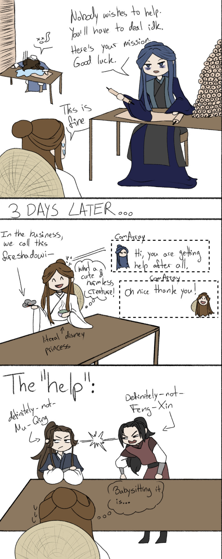
Go work off that debt Xie Lian! ....with an extra babysitting job.
Meme template for y'all under the cut + examples I made.
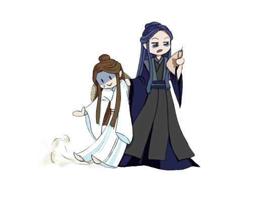

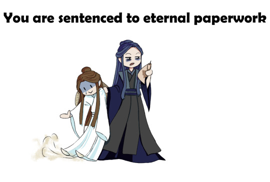
Anyway hopefully next episodes won't take too long. The thing is. The Ghost Groom arc is a lot longer than I remember. I'm still racking my brain over how the hell I'm gonna summarize it because I am not going every single instance
#poorly drawn tgcf#tgcf#xie lian#mu qing#feng xin#ling wen#Sorry if you didn't know fu yao and nan feng are just fx and mq in disguise#it's painfully obvious these two really only have a single braincell huh#even XL knows almost for certain from the get go but just played along with them#naturally in typical XL fashion he does not tell you this fact until like#book 7 or something. XL honey Ily but you're a little shit#guoshi must have gotten his white hair from raising both the lil shit that is XL and JW#rejoice soon hc will make his first (gay panic) appearance#dw LW and SQH (if u see him u get a cookie) will form a union at some point as they should#I continue to hide silly cameos from the other books in this#congrats to everyone who correctly identified Jiang Cheng in the last one LMAO#He isn't the only one though! there is a svsss character cameo in ep 1 as well#If anyone identifies it correctly and comments or tags it#I'll make a lil extra doodle#inconsistent artstyle??? more likely than you think#I hope I can make it a lil more appealing#idk it just doesnt click with me yet but we'll see#I mainly took inspiration from the manhua designs for MQ and FX#and then complitely pulled the colors out of my arse lmfao
84 notes
·
View notes
Text
@oya-oya-okay
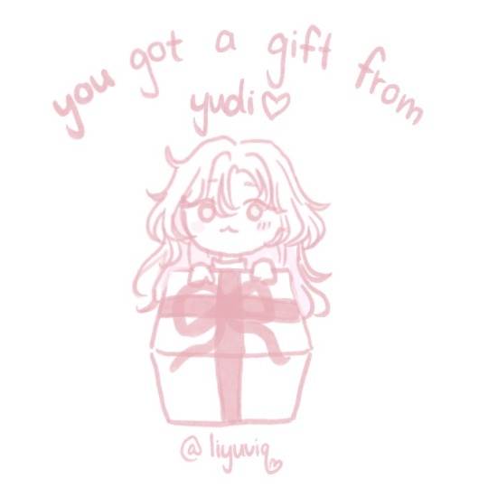
gift below! ➴
・
・
・
・
・
・
・
・
・
🎀
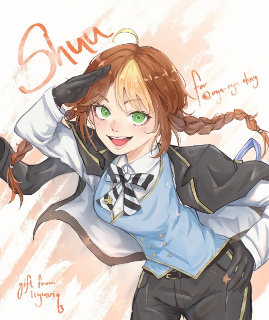
ISDJDOSJDOWEJDOEWDJOJ
HI OYA IF YOU SEE THIS
here is a gift for oya! she is one of the twst bloggers i’ve been following for quite a while in my personal private account, with her kuro x twst crossover art being my first introduction. she is also one among many that helped me out of my art slump and inspired me to start an art blog, so i wanted to draw something for her ☺️.
i started on this literally a few days before the birthday event announcement, so i was actually considering abandoning it to focus on the birthday event. thankfully i like the pose too much and this piece survived the wip phase.
sorry if it’s rougher than my previous work. my first art on this hell site was me more or less imitating twst’s art style. this one is actually closer to my art style (which im still figuring out so a warning for inconsistent artstyle in the future i guess.)
hi again oya if you are reading this 💕💕 please think of this as an early birthday present if im not able to whip out the art for the bday event in time. i hope you like it! i really enjoyed drawing shuu, especially her hair!
the version without the text:
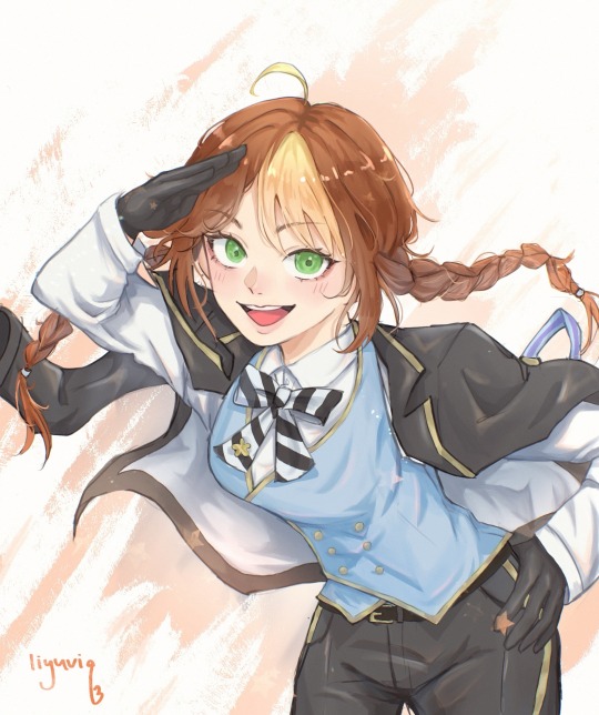
please don’t repost or steal my artworks 🙏 reblogs are much more appreciated!
#this is so embarrassing#hopefully she likes it 🤞🤞#and yes the chibi girl is my art persona#i can’t and hate rendering clothes 😭😭#art#my art#twisted wonderland#twst#twisted wonderland oc#twst oc#disney twisted wonderland#original character#twst art#twst yuu#not my oc#digital art#.🎀 yuart#.🎀 yumusings#.🎀 yuconnect
115 notes
·
View notes
Text
Runaan is kinda out of character in season 7 of The Dragon Prince
I decided to start this thread because I haven't come across anything similar yet and the issue is bugging me. I would appreciate your thoughts and opinions because I'm very curious if anyone else has had a similar impression or has any other ideas about where it might come from.
My feelings after watching The Secret of Aaravos were like, "Runaan is out of character. He's not himself anymore, not completely. Man, he's become less believable to me as a character." I started to wonder why. Here's what I've come up with so far.
1. Runaan started looking out of character for his age.
In The Secret of Aaravos, Runaan looks younger to me than in The Dragon Prince. And much younger. What's the logical point of that? Even if we assume that while trapped in the coin the aging process stopped for him (which is not confirmed in any way, as far as I know), still - Runaan should look at least the same age as in Season 1. Not younger. Sure, maybe the team just decided they preferred a slightly changed/"new" character design, but still - it makes me as a viewer confused. Because I look at Runaan and just think "why did he suddenly get a decade younger?".
And I know Ethari also seems to look a bit younger with her new hair compared to Season 3, but not enough to be confusing. It's entirely possible that a new haircut or different clothing can make you look younger (I believe that's what Ethari is going for). But Runaan hasn't changed a bit in his appearance, and he still - looks much younger.

Credits - I know, the artstyle depends on artist, but still - chrologically younger Runaan looks more like in season 1 than 7

Bloodmoon Huntress

artbook

season 1

season 7
I noticed that Runaan already looks a bit younger in season 1, when he's not serious, irritated, angry, etc., but still, not as young as in season 7. There are limits.


2. Runaan behaves inconsistently with his character.
I don't mean like all the time, but in very situations. In my opinion, it comes down to a few things:
A) in season 7, Runaan's facial expressions are often inadequate to the original character creation.
I really understand the plot situation (2 years in the coin, regaining freedom, Rayla, a chance to return to Ethari) and the fact that Runaan could have changed - become more gentle. And it's no wonder that he's often sensitive this season, after all, he's in the company of Rayla or Ethari.
But I have the impression that the creators wanted to show how much is going on emotionally in Runaan so much that they overdid it. And there's nothing left of the ''COLD AND SHARP as steel'' assassin. His face is so expressive, he constantly seems lost and sad (but like a puppy, not an elf who after 2 years of absence might not keep up with the world).
I love the scene of returning to Ethari and the subtle smiles when she looks at him after picking mushrooms or during dinner, and the fact that he's also shown when he's grumpy [ ''Runaan's expression sheet is the only one to not feature a smile. This elf exclusively broods'' (The Art of the Dragon Prince), ‘’ our favorite broody assassin’’ (https://thedragonprince.com/runaan-birthday/)] . Very interesting, after seeing him only on duty or in prison in Season 1. But most of what is in Season 7 seems to me to be out of place for a serious, composed assassin.
In my opinion, the flashback from Season 3 did a very good job of balancing Runaan's standard seriousness of his expressionless face (or just neutral) with a situation where tenderness towards someone close to him creeps in. It looked natural and very believable.


B) some gestures do not fit Runaan's previous portrayal
Runaan's body language this season is strange to me. Even if he is lost after two years, hurt, tired - ok, I understand. But while in Season 1 his movements were decisive, confident, and - I really don't want to refer to stereotypes, but I can't find a better comparison, for which I apologize - "masculine", in The Secret of Aaravos Runaan sometimes moves strangely "softly". Maybe it's the animation, maybe the choice of shots, their fluidity, I don't know. But for me, even during the mission with Callum, Runaan no longer has the confidence in his movements that he had in season 1.
Unfortunately, I will refer to stereotypes again, sorry, but these are simply the only comparisons that came to my mind.
Two gestures in particular do not fit Runaan's creation so far. The first, when he looks at Silvergrove, putting his hands to his chest, and the second, when he tells Ezran "And yet with grace and strength, you have managed to lead with kindness". I know what the creators wanted to show, but I think the way they did it does not fit how Runaan was presented to us. In both situations, she looks more like the archetypal delicate and sensitive princess, not like a composed assassin who deals with many emotions and changes in mindset. Don't get me wrong, I'm not saying that Runaan (or a man in general) can't be sensitive or delicate. I just think that it would be more consistent with Runaan's personality to show all of this in a more subtle way. For example, in the first situation Runaan might simply fall silent at the sight of Silvergrove, his gaze becoming softer and more thoughtful, camera focusing on his face (like when he saw a dragon egg or coins with Lain and Tiadrin in 1 season).


Apologetic but still self-aware worrior talks to king like that? It's hard to believe for me.
3. Runaan seems more like Rayla's brother than father
Because of his younger appearance, some indecisiveness in body language and a strange impression of "girliness" (again, sorry), as well as some plot situations, I stopped seeing Runaan as Rayla's father. At most an older brother, but it was really hard for me to convince myself that he was the same elf as in Season 1 or Bloodmoon Huntress.
And sure, I understand that maybe they wanted to show that now Rayla is taking care of him, that they are more equal, that Runaan allows her to take responsibility and prove herself. Still, the probably intentionally comical scene of Runaan resting and setting off to Ethari came across to me as if Rayla was scolding her siblings, not the adult elf who raised her. I understand that Runaan is impatient here and could have acted unwisely, but in my opinion it was a bit over the top.
In my language version, Runaan's voice actor changed - from someone with a ''typically male" voice to someone who sounds very "young". I know that this definitely affected my perception of Runaan, but then I watched all the scenes in English for comparison. It was better - now Runaan JUST LOOKED younger. But it still wasn't the Runaan from Season 1 or 3.
Summary
The more I think about it, the more I feel that Runaan's character in Season 7 is not consistent with what the creators presented in Season 1, 3 or the books (art book, Callum's Spellbook, Bloodmood Huntress).
I am deeply disappointed, because I followed this series mainly because of the Runaan, Viren and Aaravos storylines. And in each of them I see certain clashes and puzzling decisions of the writers. But nothing persecutes as much as the "new" Runaan - younger, more delicate (at times "girlish"), who says that he is Rayla's father, but somehow does not give that impression (cause he seems to be too young for that).
I do not understand these methods of the creators. I know what they wanted to show (maybe the confusion, the more delicate side of Runaan, his uncertainty, the change of previous beliefs about himself and his profession), but the way it was done does not convince me.
And although there are moments that I absolutely love and consider credible in the context of Runaan's personality (and the only problem is his younger appearance) - for me his character is no longer consistent with what we have seen and could read about him so far. In season 7 he's so often just looks like a lost, uncertain, delicate pretty princess to me.
I do not see in him that mature, determined warrior with the aura of a protector.
I feel more like I've met his twin brother - very similar in appearance, but very different overall.

season 1

season 7
#runaan#runaan tdp#ruthari#the dragon prince#tdp spoilers#tdp s7#the mystery of aaravos#moonshadow elf#character design#let's talk about#character changes#character consistency#thoughts#dissapointment
22 notes
·
View notes
Note
Forgive me but I was reading through your posts and was really intrigued by Doppio’s age, because if not for the reason it’s debated it could be an interesting topic to talk about. By this, I not only mean the fact that alter age is different body age, but also because alter age can and usually is inconsistent.
To preface, I’m fully agreeing with you that he’s likely a kid. However, I haven’t read VA in like 7 years so forgive me if I’m a bit off. I have occasionally seen people say it is more of an act, which isn’t really true to me, but I try to see what they mean.
Maybe it’s because Doppio switches from very childlike language and behavior to violence very fast, his face usually changes slightly as well (though this could just be Diavolo). While it’s a part of how erratic he is, It had me think about the fact that Doppio represents a childish part of Diavolo, while also carrying the responsibility of being a normal-ish person. DID alters often adapt to what is necessary, so being a functioning, adult-ish member of society (old enough to walk around on your own) would have some effect on his age. Especially if it’s deemed life or death in Diavolo’s head.
I don’t think it was written with all this in mind at all, of course. But I’m moreso saying an interesting interpretation of Doppio would be as an age-sliding alter. I don’t think he slides to very old mind you, like late teens early 20’s. This also is supported to me by Doppio having no sense of how old he actually is, just vaguely young or boyish. It’s not uncommon for alters to age slide or have an inconsistent age, especially if they have a hosting role such as Doppio does. I imagine Doppio commonly regresses in areas where its appropriate, or out of fear. When it comes to his appearance, I’m unsure because it doesn’t make much sense to begin with, but sometimes he looks older in some panels than others (albeit likely an artstyle thing) & without oversharing in your inbox, I will say I’m coming from a place of personal experience. Just wanted to share some non discoursey brainrotting thoughts on that. I could add how Diavolo essentially parenting has some effect as well but I’d be here all day.
I think that's a fascinating and totally sensical interpretation. I've seen people react with a lot of vitriol when you try to discuss Doppio's age for the aforementioned reasons, which is frustrating because I think Doppio's alter age is a big and very interesting part of his (and by extension, Diavolo's) character.
Your interpretation reminds me of something Diavolo's English dub VA, Kellen Goff said in some of his voice acting tendencies in a Twitter thread. The thread as a whole was... A mess I'm not gonna lie, but what stuck with me was his detail that he made Diavolo's voice shift in pitch when he's panicking because he's age-sliding (he didn't use that exact word but the concept is similar enough), reminiscent of how Doppio takes on the form of a boy. Despite the problems with that thread, that's a totally fascinating take on his character to me.
Considering one of Doppio's main traits is his inconsistency and ability to radically change personality from moment to moment, I think age-sliding fits very well into his character. I don't have much to add because you elaborated very well. I also do appreciate the non-discoursey discussion a lot, LOL thank you.
8 notes
·
View notes
Note
Hi!! Hope you're having a nice holiday season. I really apologize for writing a lot here but your characters are stuck in my mind these days!! This isn't a question but something I really like about your character design. I wanted to point out that first, I LOVE your artstyle, it's so unique and expressive and it's what drew me to play OW for the first time in the first place, but especially, I want to add that I love Orlam's big droopy ears. They add a lot to his character design and look generally different to the other characters' ears! And I love how you use this asset of his for example in OFW by making him an imp and making his ears big and pointy! Or in some images, you draw freckles all over his ears!! I just think it's a really cute and cool detail in his character design!
oh that's so kind ;-; 💕
I'm really touched you like the art so much, especially as for a long time I was getting nothing but mean comments about the art (and still do on occasion 💦) so hearing that really means a lot 💕
hahaha I am not completely sure what compelled me to draw his ears like that the first time, but it felt so fitting that it stuck (even if the exact design of his ears has changed slightly since the beginning). I tell myself it's because of those big hair clumps on the side of his head weighing down his ears 🤣
I love his imp ears tho sob 💕 they're so huge lol. I love imp Orlam in general I just really love how his design turned out. Genzou's pointy ears are so cute too. GUHHHH. I just really love various types of pointy ears. so I was glad to have an opportunity to give them some with OFW 🤭
Orlam's freckles are so funny to me because I've drawn them so inconsistently over the years. I used to just put them on his face to save time (because I draw them all manually and it takes a bit). then around arc 3 production time I got obsessed with them a bit and drew like 400x more freckles everywhere on him. that burnt me out on the freckles because it took so long so eventually I dialed them back again and now do less but on more than just his face (usually a few on his ears, on his neck, and on his arms). so because of that they're rather inconsistent when you look across both in-game and non-game art of him over the years 😅 (not that all the other characters don't have lots of little, or not so little, inconsistencies too 💦)
anyway this turned a bit rambly but I'm really glad you like his design! my char designs are not super extravagant and tend to be fairly simple... maybe too simple 🤣 but I feel like that makes them feel more "normal" perhaps. like someone you'd just see on the street. unremarkable
thank you so much for the kind words!! it truly means a lot hearing that 💕
11 notes
·
View notes
Text
My thoughts about Dragon Age: The Veilguard (Spoiler free)
After 67.5 hours of playtime, I have finished the fourth Dragon Age game. Overall, I give it a solid 7/10.
I loved
The performance. I have a good gaming laptop, but it is still a laptop. Veilguard runs buttery-smooth, never had any lag or framerate drop or anything. Didn't have any annoying glitches, some very minor graphics bugs two or three times. I know this SHOULD be the bare minimum, but considering it has become the norm to launch games that are basically unplayable because of the number of glitches, this is something to point out!
The overall story, tone and writing. Yes, these were criticised by many people, but I don't think that the dialogue was that clunky, and I certainly did not think that the tone was "not dark enough". Genuinely, people saying the game was too lighthearted and not "dark fantasy" anymore must have played a different game than me.
The look of the environments. Inquisitions landscapes were beautiful, and Veilguard manages to top that in certain areas. Arlathan Forest is absolutely beautiful, and other places you get to explore are horrifyingly, disgustingly vile and haunting and terrifying.
The Character Creator. So many details and so many hairstyles!!! And GOOD, long hairstyles, too!!!
I liked
The Companions. Rook's interactions with the companions is different than in Origins and Inquisition, most similar to DA2. You can't just always come talk to them. But they interact with each other far more than in previous games!! And I am glad there isn't a party banter glitch like in Inquisition - the banter triggers early and often. No hourlong running around in dead silence! And I also liked all the companions as characters, a lot!
The voice acting. Again, I don't really get the complaints so many people seem to have over the voice acting. Really solid imo!
The Combat. I did NOT think I would ever say that. It took a long while to get used to it because I am simply not used to playing action combat games. I only played on Keeper difficulty (2nd easiest), but that was ideal for me to figure everything out. I played a duelist rogue, haven't tried other classes. And I appreciated the uncomplicated respeccing. Especially because I was really intimidated by the complicated look of the skill tree. For rook and the companions, you can respec any skill at any time, so you can play around and try what works best for you.
Exploring. The game is not open-world and I think it was a good choice. But the relatively small areas are packed full with treasures to find. There are little puzzles everywhere. I am a sucker for that kind of stuff. Love puzzles and riddles. Only not putting this under "loved" because it kind of messed with the pacing for me in certain quests. ("Someone's in mortal peril? Sure, hang on, lemme get that treasure chest first")
Certain lore revelations. No spoilers! But we learn some big stuff. I think this was done well for the most part.
I was fine with
The look of the Characters. I was VERY worried about that at first because in general I am not a big fan of the cartoonish artstyle. What was odd is that not all characters seem equally cartoonish? Emmrich seems much more cartoonish than Davril, for example. That is an inconsistency that I found quite annoying. In general, could have been better, could have been worse. I really miss the DA2 look of the Qunari. That Arishok... still thinking about him.
The romance. So I have only romanced Neve, and it was nice. I know other romances are different, they might give you a bit... more. Again, don't want to spoil anything but.... There could have been more.
Cameos/tie-in of established characters. I want to keep this spoiled-free so I won't go into specifics. It was nice meeting some of them again, some of them were.... NOT done right. Yeah I'll reblog this post with a few spoilery thoughts on that. This could have been done a LOT better.
I did not like
Lore inconsitencies. I don't mean major, story-relevant stuff here, just some minor details. It's expected that they will get some stuff wrong but.... ugh. still annoying!!!
The villains are very black-and-white. When I think of Dragon Age Villains, I think of complex characters like Zathrian, Loghain, even the Arishok or Prince Bhelen. Characters you can empathize with, feel sorry for, even side with. The game is very lacking in that kind of complexity.
Lack of impactful, difficult choices. In previous installments, I AGONIZED over so many choices. Harrowmont or Bhelen? Celine or Gaspard? Kill or spare the Architect? Choices I took a long time to think about, choices where the game (and other media) gives you little snippets of information, not enough that you know what the right choice is for sure, but you have a lot to think about and to consider. This does not exist in this game. At all.
Rook can't be evil. I know Rook needs to be the hero. But so did the Warden, Hawke and the Herald. I personally don't like playing the "bad guy". But I like having the choice! If you have the choice to sacrifice Feynriel to the Sloth Demon, it makes the decision to do the right think just so much more meaningful.
And Rook's dialogue options are quite flat, too. The game uses tone indicators like in DA2 and Inquisition, but the tone barely even differs. The joking/sarcastic replies are not that funny (purple Hawke i miss you you will always be famous). The "aggressive" replies are really not that aggressive. Overall, that makes Rook feel quite flat.
I am VERY unhappy with
Okay. Deep breaths. No spoilers. But this game has... issues. For a game that has been in developement for such a long time, there are many aspects that are just unfinished. The Lords of Fortune for example. The entire faction makes barely any sense.
Ignoring most of the worldstate choices... This has been discussed at length before the release, so no need to get into it. But I have always admired Bioware for how they managed to tie in choices from previous games - even if they were just "throwaway oneliners". That was what made the world of Thedas feel real. That's what made Dragon Age special.
The lack of conflict and how slavery in Tevinter is just glossed over. Okay hear me out. I do NOT want more fantasy racism because I think it is cool or whatever. But we're in Tevinter for big parts of the game!! The dreaded empire that everyone in southern Thedas is scared of, where slavery is normal and they do blood magic for fun. All that worldbuilding and the setup is just... basically ignored. The venatori are throwaway enemies just like in inquisition, the politics of Tevinter are almost entirely ignored. And that is, I think, where Veilguard fails to be a proper Dragon Age game. DA was always about mirroring real life conflicts, adressing themes of prejudice, war, racism, homophobia and mental illness directly or through metaphors. Making you think about morality, both your PC's morality and your own as a player and a person. This game... this game doesn't challenge any sort of believes you might have as a person in that way. This is, in my opinion, the biggest failure of the game. The critical look at the real world, through the lense of a dark fantasy game. And if a Dragon Age game is missing that, then it just... misses it's heart and it's soul. Unfortunately, glitches can be fixed but there is no way to patch this.
Final thoughts
Okay, back to a bit more positivity. I enjoyed the game. I really, really had a lot of fun. I screamed, I cried real tears, I felt for the companions and I laughed at the funny moments. Dragon Age: The Veilguard is a good game. Not perfect. And it is perfectly understandable to be critcal of it, unfortunately a lot of criticism gets lost in either "it's too woke" or people who clearly have not played past the first act.
But in general, I think both Dragon Age fans and newcomers will enjoy it and have a good time.
14 notes
·
View notes
Note
hi corazón de melón <3 Can I have 4, 14 & 23 for the writers ask game pretty please? :)
hello my fig <3 u can have anything u ask me
4 - a story idea you haven’t written yet (like absolutely nothing)
me and @annori <3 yapped a lot about it on dash but right now what i am really itching to write but simply don't have the time for is the jayvik au with alien viktor!
for jegulus it's a dragon age au for a special someone <3
14 - where do you get your inspiration?
mostly from shows/movies! most my wips are inspired by them. followed by games and songs. only one wip is inspired by a song, or well, a genre: midwest emo and that is maybe you love me maybe you floridon't which is also the name of a song!
23 - pick three keywords that describe your writing
INCONSISTENT . my prose is all over the place and depends on what im writing and the vibe im going for. i don't think i have a writing style i can be recognized by because it's always vastly different. same with artstyles. i think ill always be that 'jack of trades' sorta creator. DIALOGUE-CENTRIC . a lot of foreshadowing is done through dialogue as well plus i think it's my strongest suit. i love dialogue. also im very lazy when it comes to everything other than dialogue. which is funny because if i write scifi or other fantasy aus then i can go INSANE? NICHE METAPHORS . speaks for itself. but also certain expressions. im originally from the middle east meaning that my brain just thinks differently when it comes to prose and i hit a HARD wall when certain thinks simply cant be translated into English or don't sound right in English the way they do in e.g. arabic. it infuriates me. like the way the english language will never capture emotion the way middle eastern languages do will always be something i really struggle with. like english simply doesn't have fixed phrases for heart-churning tragic romantique and it will always be a bummer. i can only hope that when i use a specific term or phrase someone from SWANA will go 'I SEE YOU!!!!! IS EE YOU!!!' and tbh that is enough for me
it's why iv been writing arab james so much. have u met arab dads. he's waxing poetry about regulus' eyes on a random tuesday afternoon, entirely unprovoked. he sighs dreamily, entirely sober, murmuring something along the lines of 'you could turn me blind and i wouldn't mind because you're the last thing i saw' and regulus will look up from the pot he was stirring like 'i just asked if this needed more salt???'
#UEEEE I RAMBLED IMS ORRY i had a dreary evening......#tucked in bed...reading persian poetry#how are u my beloved fig..
7 notes
·
View notes
Text
Okay, I know this is gonna sound petty and ridiculous but fuck me, give me this.
I dunno if I've ever stated why I dislike the hype around Palworld so much.
From what I've observed, it seems like a bitch basic survival game with unoriginal monster designs. It also seems to be inconsistently buggy as shit, since apparently you can still end up with the game crashing to desktop on launch and there's a bug that causes you to DELETE YOUR SAVE DATA that's been in the game since launch. I know this, I check the reviews regularly. But the unoriginality to the point of absurdity, the lack of any kind of polish and the numerous bugs seem to all be excused because 'GAME FUN!' It doesn't matter if the game would have been mocked if it were ripping off a different artstyle; or if the game is the quintessential cheap knock off of other popular Steam game (Ark) or if the game is the THIRD Early Access game going onto FOURTH from a developer that hasn't even finished their FIRST open world, 3D survival crafting game with monster collecting (Craftopia): It's all okay because 'GAME FUN!' and 'IT MAKE POKEMON FRESH AND FUN AGAIN!'
... You know. The exact same arguments given by SCARLET AND VIOLET FANS.
Yeah, this is why I hate the hype so much. Because I spent time trying to understand and get why people hated SV so much despite liking the game a lot. Promoting criticism of the game's bugs despite not GETTING those bugs myself. Trying to give credit to people who annoyed the piss out of me- Turns out I was giving too much credit. Because they went ahead and gulped down the SV slop just under a different name and genre.
Same issue. Same defenses. If you removed the subject from their defenses, I don't think I could differentiate between a Palworld and a Pokemon SV defender.
I love SV. I put more time into that game than even Pokemon Black, despite the fact that I fucking hated that game as a kid by the 300 hour mark vs. SV still being fun to me after 500+ hours. But yes- the games should NOT have released in the state they did. In fact, they probably needed more than a year of development because the artstyle of the game isn't very cohesive and would have made it look like shit 5 years from now without the cohesion every OTHER game had.
But apparently all my efforts were pointless because all GF had to do to get people slurping their dicks was publish SV under a different name and studio and market it as 'Fuck Pokemon'.
Because this fanbase has no standards, just blind spite and nostalgia.
9 notes
·
View notes
Note
Saw your tags about Star Wars, it seems Star Wars stans and modern MCU stans are two peas in a pod. :/
im not entirely sure which tags you were referring to, because i have reblogged several starwars posts with Tags, but honestly, the mcu and starwars really are two peas in a pod. And im honestly surprised there isnt more comradery/comparing between the fandoms
both started out as, while definitely not "high art" or anything, legitimately good enjoyable films, with relatable characters the audience could feel empathy and compassion for, exciting new powers and places, fun and adventurous stories, and more, which instantly became beloved classic that people thought about with nostalgia and pleasantness. And they were and by people who cared and the people who watched them were compelled to care and create communities.
But then both franchises saw a shift, from making films from a passionate and moneymaking point of view, to purely making films from a moneymaking point of view. While star wars saw this happen with the franchise being picked up a few years after to make sequels, the mcu's shift happened more gradually, since there was no time in-between making movies.
now, while i would not consider myself a StarWars Fan, my sister and cousins most definitely were, so i had to watch basically everything in order to keep a conversation with them (not that i didnt enjoy it, i quite liked it and all the lore, it just didnt hold the special place in my heart that thing i consider myself a Fan of do). I've watched the movies, the clone wars series, rebels, the mandalorian, etc all the way through. It's been a while since i was keeping up with everything, so forgive me for not having quite a comprehensive understanding and opions of it as i did say, 3-4 years ago lol.
But the starwars sequels are a lot like the latest phases of the mcu. While i cant remember if they explicitly go against any prestablished canon like the later mcu phases do, they definitely go against the spirit and point/purpose of the original (and even prequel) films.From what i remember, the sequels also had went through several different directers and had direction and script changes and was a whole mess, so even the three films were sort of inconsistent or at the very leat felt oddly-thrown together (<-i may be wrong on the specifics of that its been a while. but it was something along those lines). Also like the later phases of the mcu, they relied a lot on the "nostalgia factor" with not only easter eggs but bringing back old ideas, concepts, plots, even characters, since it "worked so well the first time," when really what the "first time" did was think of new things, present old things in new ways, and tell make art from a place of passion, community, and connection, rather than a "whats the least i can do to make the most money" mindset formula (a point brought up a lot by @therese-lokidottir on many of their recent mcu critiques).
Starwars, unlike the mc, did have a brief period of "redemption" where it looked like the franchise would be saved and given back to the hands of people passionate about starwars, stoytelling, and film, with stuff like the final season of clonewars, the mandalorian, and a few other things. That was a great time to be a starwars fan. I wasn't even a fan, and it was kind of magical for me. But now it seems like they are back of the capitalist art-destroying path, hard. They have been pumping out series after series after series (once again going for the "nostalgia" thing, bringing back the clonewars artstyle, several beloved characters, and more), but it all feels so hollow. The stories feel more like they are just putting in a whole bunch of "wow, thats so shocking" and sewing them together with "hey i loved that character!". The costuming and makeup is absolute trash. The worst by far is hera (an alien character from the animated Rebels series, showing up live-action in Ahsoka). It is hideous. I have seen cosplays of her better than what the actual multi-bullion-dollar corpoation disney with all the best resources put on that screen. The costume looked like it was from spirit halloween, the makeup looked patchy and strange, they left out simple details of her design, and all the colours were Off. Examples:
Hera in Rebels:

Hera Cosplayers (x and x):

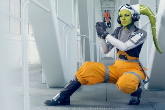
Hera in the Ahsoka Series: (it is like. seriously disconcerting to me)
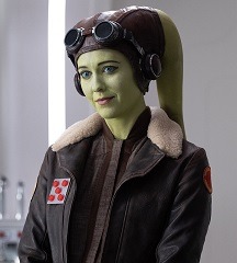
and again, the costuming was not the most pressing point. Its actually relatively low on the list of points of everything bad with current starwars. But its good for a visual example. My sister and my cousins loved starwars. Passionate. Ahsoka was one of my sister's favourite characters. She couldnt even get though a full episode of ashoka. I havent heard anything new of starwars from our cousins, either. And we see eachother relatively often. I havent watched a new starwars thing in like... forever now. And it seems like neither have they. And not because they got sick of starwas, i can tell you that. They got sick of the new starwars being pumped out and shoved down their throats where the only things that resembled what they had loved were twisted into something else. Which, at least in my experience, is far, far worse than if they just ended things ubruptly and unfairly. At least mutilated corpse can rest.
The mcu's decline was, again, more gradual, like boiling a frog. Thor ragnarok is where i would probably pinpoint the beginnings though. I didn't like it at first, because it was out of character, sort of reversed elements of the character's well-developing character arcs , narratively picked on some characters more than others, etc. But, it was still a well-beloved film by many, in-universe explanations for why the characters, arcs, and plots were so different could be plausibly thought up, it was fun and unique, and i could make myself ignore the bad parts and focus on the good and enjoy it for a while. But by the time the loki series came out? There wasnt even any of that anymore. No passion. No community. No love of art. No respect for the previous artists and their art, that the new makers were supposed to honour and continue. While ragnarok's morals of the story could be a little iffy at times (attempting to critique colonialism/imperialism, but falling flat because mocking loki for dismantling it; making jokes at points of the film where it was a little inappropriate), the loki series was straight up horrifying. Perhaps most noteably, fucking. GLORIFYING AND EXCUSING/SYMPATHIZING FASCISM??? and labeling genocide as a "necessary evil?" (though, once again, that was not the only immoral "moral" the series preached). Disgusting. And the MCU is pumping out way more films than starwars, and seem far deeper in the money-lust trenches too.
either way, both are suffering and both are bought by disney (and oddly, both keep giving more and more screentime to the fascist characters. but at least starwars isnt romanticizing it like the mcu is...)
and it hurts so much when something important to you is taken from you, and twisted, and ruined, and its mutilated corpse is hung up on string and paraded around as a puppet before your eyes, and burned into your mind even when you finally tear yourself away. And then swarms of people thinking your ridiculous for caring so much about something so unimportant, and others defending the very monstrosity that did this.
But its not ridiculous or silly or inferior to be attatched to a fictional character or fictional world or fictional story or whatever. They can provide comfort, and ways to explore and understand and even come to terms with yourself (or even others!) (and can be especially important coping mechanism for mentally ill people!). And art is a such an innately human thing, for us to express ourselves, and communal art (like film!) is a tradition across humanity and time!
And with the whole thing with people these days defending/denying what capitalism is doing to art, and denying the notion that art has any influence or effect on "real life"... why are these such absurd concept to you, that you liken to some crazy conspiracy theory? Are you really so blind as to not see it happening before you? Is the blindfold over your eyes really so soft it feels like nothing there? They say a bird who doesnt know its in a cage thinks its free. These people seem to think that drastic, unfair, unjust, immoral, inequal changes and systems are only things of the past. And often, the past doesnt feel real. Dinosaurs and the roman empire and some genocide in some faraway land in some faraway time can at times seem just as unreal as mythical creatures and stories. And even if such terrible things were to happen now, surely theyd be able to see it coming. But things like this dont change in an instant. They are gradual. Like boiling a frog. You dont notice. And even if things arent the worst they can be, and never become the worst they can be, they are still bad. Things arent required to be certified the worst of worst in order for change to be allowed to happen. The worst of the worst isnt even a thing.
Our art is being taken from us. We are being overworked and underpayed. Our whole lives are dictated by how "valuable" we are. Our environments are being polluted and decimated and our planet is becoming more and more inhospitable. Racism and queerphobia and ableism and more are taking lives. And none of those things are at the very worst they can be. They could all be much, much, much worse. But we shouldnt just sit around and be grateful its not worse and do nothing more, nor should we deny anything is wrong at all. If you had cancer youd want to do what you could to get better. If you If broke your leg youd do what you could to make it better. Even if you just accidentally cut your hand or finger while chopping vegetables, youd bandages it up. We always should try to make things better.
We deserve to have our art continue to be art. Just as we deserve all the much more pressing areas of our lives to be better too
Anyways, marvel and starwars really are two peas in a pod. And that pod is with other pods, and the plant those pods share is film. Or perhaps even art as a whole. The mcu and starwars are just really good examples of whats happening right now, because not only does it feel like perhaps its hitting them the most, but also because since they are such large franchises, you can really see and document the progression of whats happening with each instalment.
two peas in a pod :( <3
#yay i answered an ask :D#i wrote this whole thing in one sitting and its past midnight now and im scared of what typos lie within.#i especially hate the typos that completly change the meaning of the sentence. Like typing can instead of can't and stuff like that#i have done stuff like that SO so many times on other posts and i inevitably dont realize until someone reblogs and its set in stone T^T#please just use logic and understand what i mean T^T#i may edit it later idk#unityrain.txt#meta#rant#mcu salt#fuck disney#anti loki series#starwars#star wars#star wars critical
12 notes
·
View notes
Note
beginner tips for trying to draw characters similar to the Naruto style? like Kishi?
ps- your blog is incredible. I think about world building questions aaaalllll the time! So glad you made it and continue to post here. It's fascinating. It does not go unappreciated!! 💐💗😁
Thank you so much for the sweet words, dear!! You can always shoot me up some world building questions and I'll try to answer them to the best of my abilities! Your sweet words make my day! ❤
Before we begin, I have a words to say, especially if you're a beginner artist reading this. There is nothing wrong with your art style. Art styles evolve and change, they can be inconsistent and wonky, all of this is normal. We're all hypercritical of our art and its artstyle, however if you're genuinely unhappy with it, there are things you can do! Study your favorite artists and look at how they draw, watch speedpaintings and find what's best for you. The internet is full of resources, if you need help finding anything, you can DM me or send me an ask to give you recommendations!
That being said, let's begin!
How to draw in the Naruto art style, aka like Kishimoto
The artstyle of Naruto changes a lot throughout the series, I'm gonna show some characteristics of the mid to early shippuden style we know and love.
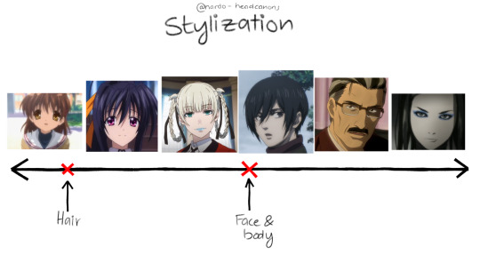
Stylization, like many things, exists on a spectrum. Most anime are between the second and the third image, however there's a broad variety of anime styles. With the Naruto art style, there's this phenomena of the faces being rather realistic, and the hair being very stylized.

The eyes
The eyes of most Naruto characters have the edge sitting higher than where the hypothetical tear duct is. Pupils, if present, are part of the lineart and therefore, pitch black. The irises are very round, almost circular. The eyes themselves do not have many details, as the eyelashes can often be counted on one finger. Compared to the other parts of the face, line weight also plays an important role in how the end results looks. I suggest playing around with your pen pressure settings and/or getting a brush ink pen. (I'm not getting paid) this is the one I use.
The nose
Minimalism is the best way to describe the way noses are drawn in Naruto. If they're drawn from the front view, it's just nostrils. The diversity of nose shapes in Naruto is not very high, unfortunately. Same goes for
The lips
When drawing the lips, you do not need to add many details. Unless the character is wearing lipstick, only the lower lip is drawn, and lips in Naruto all have pretty much the same shape and fullness.
The hair
The hair in Naruto is all heavily styled. Individual strands of hair are combined into thicker "hair bundles". If the hair is short, it can also be drawn in a spiky shape.
The headshape
The general headshape of Naruto characters is almost always the same, across ages and genders. It's characterized by a round forehead and pointy chin, followed by a slender neck.
The eyebrows
(The eye you can see there is in my own drawing style) Naruto eyebrows are thin and very straight. When the character is wearing a headband, more than half of it is covered.

General things
Reference is key. Always use references, even when drawing an OC, until you have built a large mental library of how to draw your character. Find a character from Naruto that has a similar eye shape to your character, and use that. Useful for that are screenshots from the series or reference sheets.
That's all, folks! If you need more help, send me another ask or DM me! ♥♥♥
#naruto#naruto shippuden#naruto fanfiction#naruto oc#naruto fanart#naruto fandom#art tipps#i guess#kinda
31 notes
·
View notes
Text
Gacha Games I've Played (And Dropped) in 2024

I'm broke but gacha games are free
= = =

Soul Tide (2022 - Present)
I didn't even stick with this for a week. I hate almost all gachas where the player characters have the magnetism of shitty harem anime protagonists. This game had that and a VERY inconsistent artstyle between all of its playable characters.

Fortress Saga (2023 - Present)
This shouldn't even really be here since it's more of an idle game than a gacha one, but it has the same shitty monetization as other gacha games and I didn't want to dedicate one post to one game since it's the only idle game I played.
This was fun for maybe the first hour, then it was addicting (but in an unfun, nasty way) for the next 20 hours. It's a shame because I do like the general concept (it's called Fortress Saga since you're running a Howl's Moving Castle-esque castle), but it's designed to be extremely addicting.
You do tasks that will get you pulls, and then you use those pulls to complete tasks which will get you more pulls, and you can use those pulls to complete more tasks to get more pulls to complete more tasks to- you get the idea
Didn't feel like I was playing a game, it felt like I was getting played by the game. I think certain types of people should REALLY avoid this.

Path To Nowhere (2022 - Present)
AKA "I can fix her" the gacha game
This game has some interesting things going for it. Even though I dislike "harem anime protagonist" syndrome, you can at least choose to be a female harem anime protagonist. It may have probably been designed with straight audiences in mind, but a not insignificant portion of the fanbase seems to be queer, so that's pretty neat.
...Unfortunately I just couldn't get into the gameplay. I thought it was just Arknights, but this game confirmed that I cannot play gacha tower defense games AT ALL. Gacha RPGs? I can deal. Gacha tower defence games? Absolutely unplayable to me.

Higan: Eruthyll (2022 - Present)
I thought I'd check out this game, because it's not doing so hot and an end of service announcement may be imminent. It's still not canned yet but I got nothing. Nothing to say about the budget Genshin designs, the story or the auto battler gameplay.

Grimlight (2022 - 2024)
I stuck with this one for a while, mostly because I'm going through a whole "South Koreans doing their own takes on western fairy tales" phase (other things that currently interest me are Lobotomy Corporation, Not Sew Wicked Stepmother and A Wicked Tale of Cinderella's Stepmother. I'm just hooked man).
The story is essentially Kingdom Hearts and the character designs (in the portraits at least) are very nice. There's not much of an actual game though. It's an auto battler so you're not really doing much of anything. The tiny battle sprites don't do the character designs any justice. And when the game's 'cancellation' was announced I had no real reason to continue.

Langrisser Mobile (2019 - Present)
The last game I dropped. It got me to stick around for 3-4 months, which almost no other game did. I think this is actually pretty decent if you're looking for a PVP game, that's just not what I wanted. Having to do PVP matches every day *just for my dailies* ended up being a big reason I dropped it.
The other reason is that progress is sooooo slow. I actually wanted to see how the main plot would get resolved. But 80% of my story progress was in the first month. After that it'd take weeks of grinding just to see the next story cutscene / fight. Then after progressing by one stage, you're back to grinding again.
Even gameplay progress is slow. I thought twice about dropping Grimlight since I had so many characters unlocked. But in Langrisser, I was still using the same 4-character team (Leon, Vargas, Almeda and Liana) from the beginning with only 2-3 new characters I actually picked up and was using (Varna, Bernhardt and Rozenciel).
I respect the game for having some of the coolest crossovers in any gacha (they got Slayers, Valkyria Chronicles 1, Yu Yu Hakusho, Gintama, even Pop Team Epic), I also *love* that dork Almeda, but if I ever play more Langrisser, I hope it's through remasters of the original games.
= = =
There is one final game I played, but unlike the others, I didn't actually drop it:

Reverse:1999 (2023 - Present)
That's right this was actually just a roundabout way of saying "I am now a Reverse 1999 fan".
I don't want to get into it now, but it feels more like "Touhou if it were a gacha game" than Touhou LostWord, which at this point, barely has anything to do with Touhou, if we're being honest. There are more of these "alternate universe" characters (read: OCs that are only loosely inspired by Touhou characters) than there are actual Touhou characters in LostWord.
All this to say that "I'll probably be posting about Reverse 1999" on this blog.
8 notes
·
View notes
Text
So as you might know bc I htink I've mentioned it I've been trying to draw more without thinking so I can get my art more consistent (and so that the most inconsistent thing can just be what brush I'm using) but that usually is short lived bc. I look up to people SO MUCH but lately I've been reminding myself that while that person I really like has good art, so do I! Like a little less than a month or so ago I looked at my art and had the revelation that WOW. I'M A PRETTY GOOD ARTIST.
Like I could be better and I want to get better but like!!! Wow!!! I can draw!!! And people like it!!!
Another thing I've been doing is picking out things I add to most of my artstyles without thinking (The squiggle to represent the nose bridge, the little shape to represent the nose, the eye shapes I use, the way I draw hair) and trying to focus on those. Everything else can be whatever because I clearly haven't settled on one thing.
Anyways this is ur reminder that you're a great artist whoever you are and these are just things I've been using to find my own artstyle lately and keep it that way!!!
11 notes
·
View notes
Text
Greetings everyone! It’s sure been a while hasn’t it? Feels like no time at all has passed since I was last active, but apparently six or so months have gone by? Not really sure how that happened, but nonetheless, I’ve returned with news of this blogs future!
As I mentioned in my last few posts, I’m thinking of rebooting the whole blog from the start with better understanding of where the plot is going and how to get there. I’ve decided this is the route I want to take, but unfortunately my time constraints are still in place so posts may still folllow my original month long hiatus schedule. Anyone who followed the blog is probably used to it by now, though it’s still something I wish I could promise would get better.
Going forward, I’m going to make a separate blog for the reboot as planned, as well as make a few design changes to the main cast. I’ve been working on them here and there and still might change a few things before the new blog is up and running. Here’s a peek at the main two:
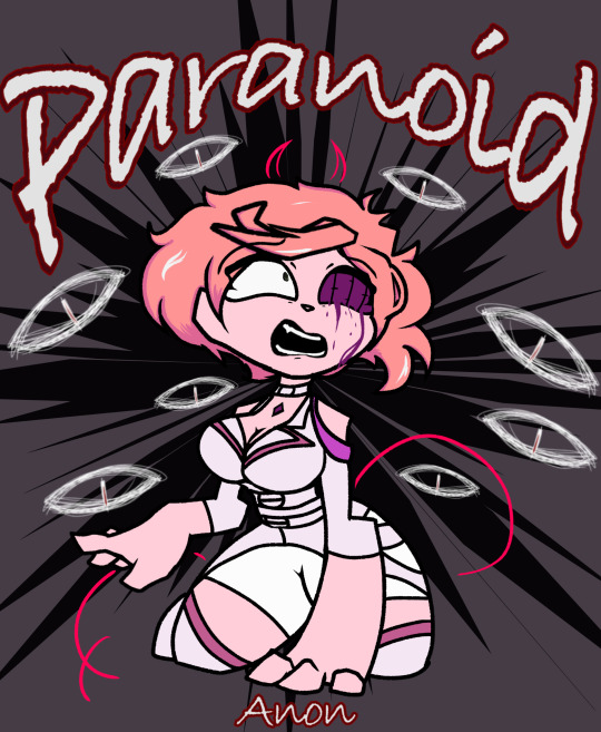
As you can see, Anon takes more inspiration from her design later in the blogs lifespan. Originally I didn’t have a concret idea of the story’s endgame, so Anon just had her official design that I occasionally removed elements from depending on how lazy I was feeling. This is generally how she’ll look from here on out, inconsistent artstyle aside.

As for Cul, she’s another of the key characters in the blog right from the start. In the original story, Cul was added haphazardly as a result of picking asks from the Vocaloid Amino, where people knew I shipped AnoCul and assumed Cul would be present in the story. This was kinda a mistake on my part, but I rolled with it and now I know for sure what Cul’s role is and how to reflect that in her design. It might see a few more changes before the reboot kicks off, but I’ve narrowed down the basics.
I’m currently working on locking down the story beats, so it’ll be a while yet before you all might hear from me again. The premise of the story has been expanded, so rather than working with a singular room for Anon to interact with, it’ll instead be an entire house for her to roam around. I’m really looking forward to all we can do with this new setup, and I hope you guys can have fun with it to!
Having said that, I’ll see you guys later!
- Mun.
11 notes
·
View notes
Text
Ranked from Best to Worst: Webcomics of Goddamn Webcomics (2023 Edition)
I made this ranking three years ago originally, but now that I've come back, before I start the next set of riffs, I should probably update my rankings. Thanks to @tjimmy1999 for giving me the idea.
0. Gene Catlow
Gene Catlow is completely uncomparable to any other webcomic I've riffed. It's probably the most unique piece of media I've ever seen. It has so many aspects in it that are fucking awful and horrible and terrible, but it also has just as many redeeming aspects. I am glad I came back to riff it to the end because what I riffed before the previous ranking was just the tip of the iceberg. Until another comic like it drops into my view, it will be uncomparable to anything else, completely outside the ranking as this fascinating piece of work that everybody needs to read for themselves.
Alien Dice
Alien Dice is my number one pick for the best comic I've riffed, but it's not really the best because of its content but because it does the bare minimum to be decent. It has likable protagonists, decent world building and it has an engaging story that can pace between dark and lighthearted moments. Unfortunately, it also has a ton of problems, with bullshit plot twists, Riley, unnecessary moments of sexual tension between animals, Riley, wildly inconsistent artstyle that never seems to stick to one style, Riley, very bland antagonists with no motivation, Riley and certain aspects of the main gimmick of the comic aren't explained well, and also Riley. I wouldn't recommend Alien Dice to anyone like I would recommend Gene Catlow, as I feel it needs to work out its issues.
2. Daisy Falls Apart
Daisy Falls Apart is a parody comic that doesn't exactly break new ground. It's harmless but I wouldn't read it a second time. It's held down by its horribly unlikable protagonist and how the whole conflict of the comic is very quickly resolved, and also too many sexual jokes in something that is based on a children's game. Out of all the comics I've riffed, this one is the most mediocre, and number 2 meaning mediocre should worry you.
3. Carnivores
This comic was originally a painful experience, but so many painful experiences came after it, it feels like one of the less worse ones despite having the worst art. Also i can tell Austin did this comic for fun, and not to convey a deep message. Also it’s probably the only fetish webcomic in history where fetish itself starts taking a backseat halfway through. Yeah, some of the entries will be the exact same as in the previous ranking, if I haven't given them any major revisits. Also the only reason it's under Daisy Falls Apart is because it has a much worse artstyle.
4. Bloody Mary
Bloody Mary satisfies your specific hunger for Johnny Test characters commiting several crimes in rapid succession. Reading the comic both entertains me immensely but it also makes me feel dirty. The crossover stuff is there to please the author and not really provide any point. It is unique in that the comic doesn't feature a full cast ensemble but it's rather just focusing on Mary ruining people's lives and interacting some random character from a North American animated thing. The only reason it's below Carnivores is the suspicious amount of unintentional racism???
5. Warmage
Warmage is enjoyable for all the wrong reasons. None of Dumok’s other comics have gone to the same level of bizarreness Warmage offers with each page. However it is also the host to the worst character to ever appear in this blog, Tsuki. Other than that, Warmage seemed to have semi-intriguing lore and also ended on a rather decent arc, so i think i could’ve been interested to see it continue, just because i wanna see how much worse it can get. But then again, spanking scene.
6. Kit n Kay Boodle
It's amazing that year by year, Kit and Kay Boodle gets more and more tame. More than anything it helped to expose me to Albert's usual writing bullshit, but somehow it manages to be tame compared to craziness of Gene Catlow. When you know that EVERYONE is fictional in the real life bits, it just loses the nightmare quality it once had. That being said I am bitter half of the riff is locked behind Tumblr's stupid filter system.
7. Dominic Deegan
Ah, Deegan, Deegan, Deegan... during my riff of Gene Catlow I apologised to you so many times I almost wanted to bump up your rating, but I feel like you're in a comfortable place. In a lot of ways Dominic Deegan is the quiessential mid-2000's webcomic, what started off as a gag-a-day comic soon became an edgy fantasy full of author screaming his political views and projecting his desires into the main characters. I think even Mookie is not too proud of the decisions he made, and Legacy of Dominic Deegan feels like an apology to correct the problems of the series. But there will always be the original Dominic Deegan, with its orcs and their fucked up culture, screaming manchild protagonists, exaggerated gay characters, magic that is random and nonsensical but also has schools based on teaching it, aggressive sports players and Siggy burial. However, who knows how it ranks after I finally finish it.
8. Roommates and 9. Chugworth Academy
The reason I made Gene Catlow 0 was also because I didn't want to rank it lower than these two, because I have no heart to say "Roommates/Chugworth Academy is better than Gene Catlow". If your comic ranks lower than these two, it's done and there is no coming back. I can safely say that I will NEVER EVER revisit these two comics, even if there are worse comics in this ranking.
10. Spinnerette
I said last time that Spinnerette was the worst comic I've riffed, and quite frankly I can't put it into words why that isn't the case anymore. After revisiting Spinny so many times since my last ranking, it has...improved. Remember that my last exposure to the comic was the Fat Spinny Arc and the first half of Hostess arc, and it seemed like Spinny was just embracing being a parade of Kraw's fetishes. However now that I've seen more of it, it's trying. But the comic is still like a fish flopping on dry ground in the middle of the desert. It doesn't want to pick a narrative, it just does random one-off stories forever. As much as I hated Colonel Glass I wish he came back just so this comic would have some semblance of seriousness again. Of course the comic has recently started fucking up the last decent characters, and I wouldn't be surprised if this comic bumped down again after few more revisits, BUT, it's still not the worst thing Kraw has made.
11. Las Lindas
Las Lindas is even more hopeless than Spinnerette, because this comic will introduce the decent thing, and before you know it decent thing is ruined. At least Spinnerette has decent variety of different stories. Las Lindas will never leave that fucking farm, if we don't count the spinoff comics half of which are non-canon and are about the same level of quality as main comic anyway. My brief revisit showed me the post-Alejandra era wasn't as hideous as I thought but it's pretty damn close, and with the ever-worsening artstyle and an apparent INTRODUCTION OF SUPERHEROES, Las Lindas's level of quality could best be described with that panel where Tootsie drives into a river.
12. Console Girl
Console Girl is the first comic in this ranking I just completely despise. It makes Ctrl-Alt-Delete look like Penny Arcade, it's a comic about an ecchi console that comes to life but midway through we get a plot twist and it turns out to be a cyberpunk comic that tries to treat humanoid consoles fighting seriously...or not really, as the comic has a problem taking itself seriously, outside of some questionable moments where the author seems to project their hidden anger towards video games into the comic??? We also have in-comic non-canon filler arcs, console girls eventually becoming random fetishes instead of things actually relevant to their real counterparts and TOO MANY LITTLE PEOPLE WHO ARE IN RELATIONSHIPS WITH ADULT MEN. I'm glad this comic was never finished.
13. Monster Girl Academy
Monster Girl Academy is just...the worst. It was solely created to make Kraw even more rich, but I would forgive that if the comic didn't just...fail as a webcomic, fail as a porn comic and fail as a narrative period. This comic was designed for lowest common denominator with fetishes that are too weird to be vanilla and too vanilla to be weird. Its existence pisses me off. While other comics I've riffed had potential, this never had any semblance of it. The main protagonist is a piece of shit and all his girls are also pieces of shit, the only likable character is a little girl who cries and prays in Spanish, because every character reading this comic can relate to her. Fuck this comic, and I mean it with every letter of that sentence.
4 notes
·
View notes
Text
Cereza and the Lost Demon is so beautiful
I’m going to be totally honest, I partially bought this game out of spite because people were being really annoying about how “it didn’t look worth the price” and “it isn’t bayonetta so it’s bad :/” (I was interested in it too but that definitely catalyzed it lol)
Were they right? Ok, I think it’s kind of a cop out answer, but I think “if this type of game looks up your alley” then it totally is worth it, and it really carves its niche out fairly well. No it’s not bayonetta but like.... obviously not lmao? Funnily enough, actually, amidst the revival of the dumb “give me back old zelda” with totk on the horizon, I think this game hits a lot of the notes of the more linear temple-centric zeldas...
It’s also a very pretty game in many ways, honestly possibly one of the most aesthetically appealing games on the switch overall, though I do have my gripes with gameplay. Full thoughts below, with minor spoilers so be warned.
I’m just going to start with what I loved about it, because if I dig into the gameplay first it’ll come off worse than it is, because my only real complaints were gameplay-related. The music was absolutely gorgeous and always so fitting, and the adaptations of music from the mainline games to this new aesthetic were done excellently. It might honestly be my favorite bayonetta soundtrack, and I really like those soundtracks. From fully orchestrated, lush environments, to more jovial lighthearted moments, to serious heartwrenching developments, the soundtrack covers everything so well.
The art, too, was great. In addition to the painted artstyle, they do the thing that I fucking love in animation where there’s like a still textured background, and as the characters move, they like, move past the background? I don’t know what to call it, and the internet doesn’t know what to call it, but if you’ve seen Chowder or Gankutskuou you know exactly what I’m talking about lol. The painted aesthetic also lends itself to like actually creative uses more than just looking pretty too, most notably a part at the very end that was so touching, when you play it you’ll know what I mean. If there’s any small nitpick it’s just that the storybook format of cutscenes leads to just a few “stiff” moments? But it’s like totally understandable.
That said, I loved the cozy storybook narration and framing, and I honestly don’t really get when people say it’s tonally inconsistent with bayonetta (I’m going to avoid the worst case explanation of this). The mythological vibes, for lack of a better word, are still extremely present, so people must just dislike that it’s a story about Cereza as a young girl? Because like obviously she isn’t going to be a badass, sexy witch as like, a 12 year old, but it’s not like the game moves the needle in the complete opposite direction and becomes a super cutesy wholesome 100 vibe. The vibe is, like I said, cozy, mythical, maybe whimsical, and yeah it’s at a slightly slower pace than the mainline games, but it’s not so out of the question, especially for a game exploring the journey of a young Cereza.
Her journey is not the deepest thing in the world, really, and it is kind of in part due to the set up of the game, where you have to collect these four elemental cores to unlock powers and get to the heart of the forest. Kind of like zelda, in a way. There are a couple twists and turns, but I think the main element is the growth of Cereza and Cheshire, independently and together. There are some tropey elements for sure, but I’ll be damned if I didn’t still tear up after certain events occur.
And speaking of zelda, I really felt like the overall gameplay loop was very reminiscent of that kind of style, but with a twist. As you traverse through each region, there are obstacles that serve as “puzzles” to solve to continue your path forward, sometimes using some mechanic that you may get in the future (there are literally bomb flowers lol), and then you get the upgrade, and solve more puzzles or traverse new types of land with the powers you unlocked. And of course, there are Tir na nOgs which, like literally everyone says, are pretty much semi-required shrines from BotW. Many of them presented interesting puzzles, some of them were just like tests of strength?? (like botw!) And of course this is all on top of the unique control scheme of controlling both Cereza and Cheshire with each side of the controller which certainly takes a good bit to get used to. The parts where you have both characters separately doing different tasks were really fun.
But, honestly, I felt like there wasn’t enough of that. Like I said there was a lot of combat trials, and honestly, even though I really did enjoy the combat, I almost wished there was less of it? There is a lot of fluidity possible between the 5 different stances Cheshire can get, and light and heavy combos, as well as bind combos, but besides that the enemies were hardly really that threatening (outside the bosses, which were certainly very cool fights) so it just felt more like an annoyance beyond the honeymoon period after I unlock a new skill. And it felt like it took away time from doing puzzles, which I wouldn’t call sparse but I would call just a little deficient. Maybe it’s because it’s relatively short, or the difficulty was designed to a younger audience? And as a result, I really didn’t feel like I wanted to go back to find the other Tir na nOgs, because their main reward was getting spirit orbs fragments of health, which I didn’t really feel was super necessary. And that’s a shame, because maybe I did miss out on some really cool puzzles. There are also upgrade materials for special skills Cereza and Cheshire can get, but I felt like I more or less got the ones I got from the materials I could get more conveniently. Overall it just kind of felt, both from a combat and puzzle standpoint, that they could have and maybe should have really fleshed it out more and get those gears turning.
I also just would like to mention that the opening of the game felt glacially slow. Not just like introductory stuff, but pretty much everything until your skill tree gets unlocked (and you get your first elemental core relatively soon thereafter). I think I get why, because they not only want to actually set the exposition and I felt that was paced fine, but also let people get used to the dual stick movement once you get to control Cheshire. But man the base combat without any additional upgrades is not that interesting, and the very early puzzles were, obviously, pretty simple to ease you into it. I absolutely think after that part, things start to really open up and feel much much better, but that opening segment has gotta be like, a couple hours or so.
Besides those gripes, though, I do think it’s at least a very visually pretty game with great music and a cozy story and setting, and the gameplay, if you’re vaguely interested in a game like this, definitely works well. While the extra chapter of this game does tie into Bayonetta 3, a game that I actually still haven’t played and am not planning to play soon, oops, the actual main story is fully independent. So regardless of if you’ve played a bayo game or not, if you think you’d like it, or if you’re one of those people who just really really wants old dungeons back in zelda, then I’d recommend it. Not my favorite, but a solid spinoff that I think they could really expand upon.
7 notes
·
View notes
Text
Phantom's Finished: Super Mario Odyssey (Replay)
On one random evening, I was chilling in call with @dayofpi as we gushed about Mario. Eventually it lead to me grabbing my Artbook of the game this post is about and adoring all the ideas and missed potential of the game, to the point for a few months I genuinely wondered if I might rank the game lower than I used to.
This thought lingered within me until I decided to finally start an important replaythrough of the game, and here's what I think...
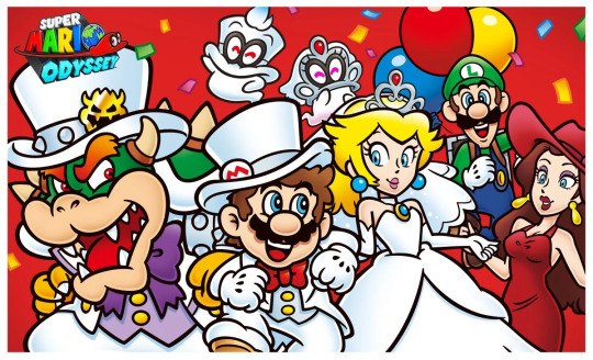
Upon booting it up, I already felt an endearing familiarity to what a 14 year old Phantom felt in 2017. I wanted to enjoy this game mostly for what it is and not what it wasn't. Super Mario Odyssey is still one of the best 3D platformers of all time that is like a playbox of fun left right and centre.
Sonic: Frontiers is often compared to Breath of the Wild when I couldn't agree less. With the mini platforming and challenges, I would absolutely compare it more to Odyssey in that regard. Before I state what I say, let it be known that I really enjoy Frontiers okay? Okay!
Sonic Frontiers wishes it was Odyssey when it comes to it bitesize challenges, as they almost always serve for strong level design in enclosed or open areas that consistently interconnects. Sonic Frontiers has a lot of mindless points to its bitesize elements of "press/hold button". That's what Odyssey gets right, the constant thrill of platforming within the sandbox level design and the freedom of how different of an order everyone's experience can be. You can play the main story moons, or during that grab side moons, challenges and items.
Gameplay:
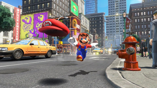
If there is one thing that always pulls me back into this game, it's gameplay. Odyssey is the perfect example for everything working around its base gameplay as a perfect core, that being the hat throw. the hat throw is integral to why moving as Mario in this game is so responsive and fun to master. Dive into the hat for horizontal air movement, use it to collect coins as you continue on your path, capture a vast selections of enemies and objects for a quick yet responsive gameplay change.
Speaking of, I love how the captures have a snappy switch up of gameplay whilst always limiting controls to two buttons for easy pickup for how many different things Mario can utilise. Everything is super responsive and it feels beautiful to experience the loop of this game. Every playthrough feels different due to how you can go for different moons each time, experiment with where I go and even get places I didn't know I could ahead of time! Its my favourite controls platformer in 3D (celeste being my fav 2D platformer controls)
However, I do feel the game sometimes lacks a bit in level design. A lot of the time it's really good! Sub-Sections are very good whereas I feel the Sandbox areas of the Kingdoms are inconsistent. My biggest issue is they often lack a level of cohesion with the rest of the world (New Donk especially is guilty of this) and I wish they covered a wider area a lot of the time as with Mario's moveset it is so quick to get through. I feel the best Kingdoms are ones like the Wooded Kingdom where there's multiple paths, elevation and it stretches a wide variety. New Donk for example does have that elevation but it's so simple to get up there it just kinda exists? I wish there was more interesting areas within New Donk to play around as it isn't as fun on replay.
Then there's the few Kingdoms that SCREAM missed potential with the Cloud Kingdom and the Ruined Kingdom. These two are literally just for a single boss and nothing else in the overworld, which is super disappointing with two really cool aesthetics, especially with Ruined Kingdom's unique artstyle.
Artstyle:
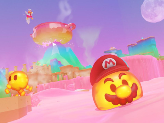
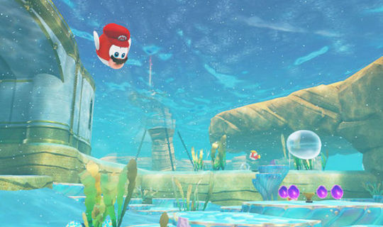
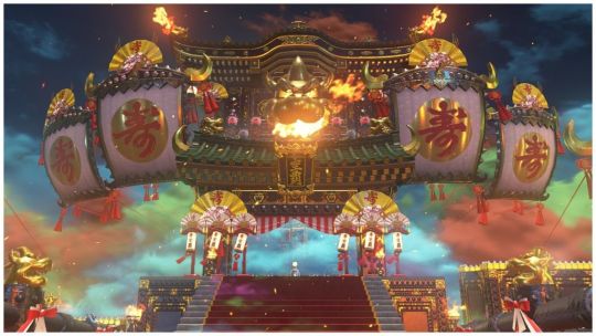

This is one of the trickiest part of the game to talk about. Because I both love it and have qualms with it for a lot of reasons...
Firstly though, this game has an insane variety of styles, setpieces and colours! From Bonnetons Nightmare Before Christmas inspiration to Bowsers Kingdom of Japanese traditional samurai aesthetic, the game constantly throws different visuals upon entering any new world. Odyssey thrives on this idea of different cultures and parts of the world for contrasting artstyles and it really works!
However... I feel this also is where my biggest criticism for the game lies. It's that these artstyles don't push themselves far enough when they could contrast even more! Bonneton for example, it has a fun Halloween vibe but why couldn't they have pushed that with the shapes of the environment being crooked and twisted and maybe have the shadows be sharper and stylised? That's what I mean, the styles still all fit into a mold they don't break out of that I wish the game did a lot more
And here comes the big one: New Donk City!This is where the game really conflicts me with its artstyle, as it tries to contrast in such a way that feels unnatural and uncanny. The realistic humans are extremely unnecessary and the artbook shows many better solutions they had in mind. The colours of this world are also lacking quite strongly which again the art book showed a bright bold bustling city with a lot of nods to the series. It feels they wanted this to be the contextualised version of Mario's origin home which makes sense when you consider all the donkey kong references and the fact Pauline is there!! This is considered the iconic local in the game when for me it feels like the one that could've been filled with beautiful fanservice and nostalgic feel. I don't like using the artbook as criticism but for New Donk City I feel it's kinda necessary due to how they clearly had a vision that wasn't able to happen and its one of this games biggest letdowns.
Other:
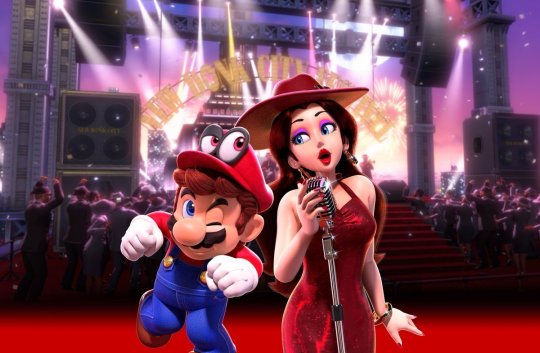
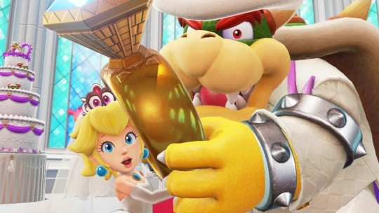
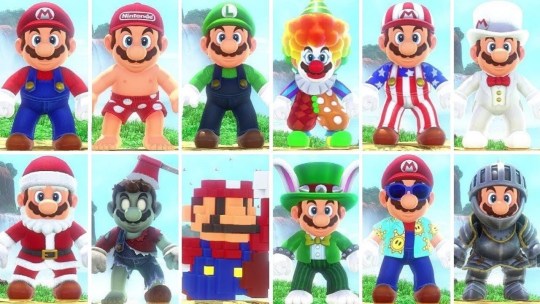
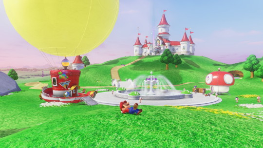
There's a lot I wish to get into that aren't as extensive due to how much I have to say, so it all goes into this last section!
Starting off with music, which is weird to me. There's a lot of really good music in this game! From Cascade Kingdom to the transition into the tech part of the Wooded Kingdom. However there's a lot of music that is just, average? A lot of music that isn't bad but nothing memorable, which isn't something I can say about most Mario Games' OST. There's also a lot of 8-Bit versions of music in this game which I really enjoy! But I do understand opinions that they should've used a better NES sound chip for it as it doesn't feel as perfect as it could be.
Next up is story and animation! Easily my favourite animation in a mario game with so much squash and stretch the recently released Mario Wonder seems to emphasise even more! I love Bowser and Mario's animation, and enemy animations are amazing too. However I feel characters like Peach could've had more stylised animation. The story itself is good! It's practically the perfect conclusion to the Peach being Kidnapped Saga, a full on wedding where Bowser takes it way too far. Obviously I don't like damsel Peach as she's a lot better when she's a participating role. However, in the context of her being a damsel this is her best one as she is actively seen throughout the game whilst standing her ground at the very end. I love how she doesn't reciprocate Bowser or Mario's feelings whilst Mario and Bowser have an amazing dynamic this game.
My favourite element of this games story is how it feels like an amazing conclusion to the traditional Mario story, whilst now we're getting new stories with Wonder, Origami King and even Peach getting her own tale. Mario stories don't need to be huge but it's important it still fits the themes and adds fun characterisation to them, alongside giving all of them amazing designs... speaking of
COSTUMES! Mario gets loads of cosmetics in this game through coins, giving them a purpose whilst having a very fun way to have different looks and fanservice. You can have a top hat fancy look fitting Cap Kingdom or a Samurai costume to befit the Bowser Kingdom. Then there's cool costumes that are just their own idea like skeleton, zombie or even underwear Mario! They range from cool, cute to gender and funny with so much to work with. I love this element of odyssey a lot, its one of my favourite things to do especially after I've beaten the game to run about it fun combinations (I love the Sunshine outfit)
Lastly is the postgame! A really fun fanservice Kingdom with the Mushroom Kingdom, and whilst I still criticise the level design cohesion like before, I still think this is an amazing world with a lot of fun to be had, alongside a really fun final level that brought me to tears with Cappys final like
"Thank you, Mario. For letting me walk a mile on your head."
.
This game is beautiful, I have my qualms but its still my favourite 3D Platformer of all time 💙
4 notes
·
View notes