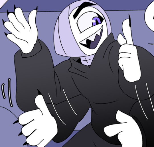
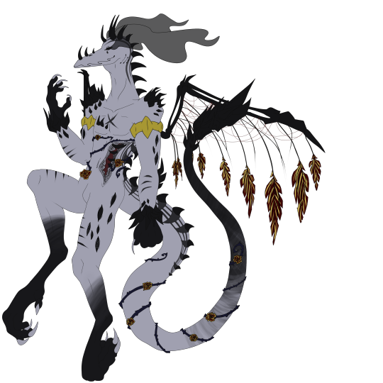
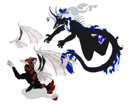
#im sorry the lineart is ugly
Note
Hello :D
I have been following you for the last year or so (a few days after I got my Tumblr lmao) and I absolutely love your art!
I have been wanting to study your art style for a while but don't really know where to start,,,
Could you please show me a small portion of your art process, if it isn't too much trouble of course. Thank you and have a nice day!
hello. oh my god. this took forever to find.
im sorry it took 2 WHOLE FUCKING MONTHS for me to respond to this but i wanted to put it off until i felt happy with my art process again, so here it is
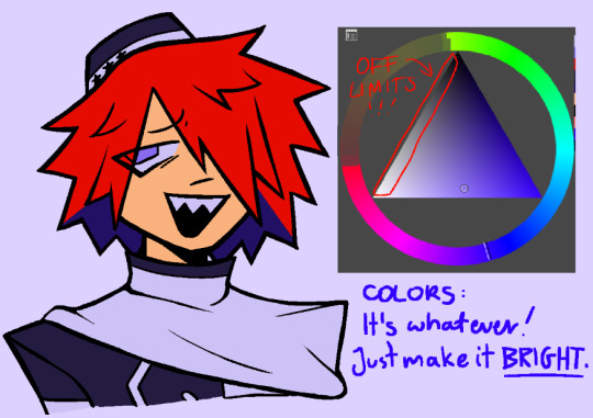
my fall 2024 rendering tutorial!
(this will be very very long)

FLATS AND WHATEVER YOU WANNA DO WITH LINES GIRL. then make sure to recolor the lineart to better match your base. trust me it helps, bold dark lines are Not your best friend when rendering. wait for that post-rendering
i start off with a doodle or a sketch, and then filling it in with flats and other details such as blush

FIGURE OUT YOUR LIGHT SOURCE. FIGURE IT OUT GIRL YOU CAN DO IT you can make it as simple as possible, make it as big as possible, dont even THINK about the details.........just make it really fucking big so you at least know where the shadows and the light goes THEN add smaller shading details LISTEN TO ME. LISTEN TO ME OKAY!!!!!!!!
my key point with this is for you to learn lighting fundamentals.
it's SOOO ANNOYING but alas......they are all correct. it helps a lot.
one thing i also really want to point out is that i like creating a big shadow shape first before fixing up the little details (such as folds and whatever) because it helps me focus on the way the lighting actually works instead of tunnel vision-ing into making the shading make sense on the clothing.

contact shadows (i dont remember if thats what theyre called okay) theyre fucking ugly because im not actually thinking sorry 💔
okay so basically:
contact shadows (if that's what they're called) are the spots in shading and lighting where light will NEVER hit.
shadows are still influenced by the colors and lights around it (it's why a blue shadow and a yellow shadow feel completely different, despite both being shadows) so it's not always COMPLETELY dark.
BUT! there are small points in shadows where light never hits, and they're almost always super dark or pitch black.
it's hard to explain shadow and light so briefly for a tutorial, but you'll notice it when watching fundamental studies and when trying it out for yourself


YES i unclipped the multiply layer YES its ugly and terrifying but it makes coloring the multiply layer easier okay
the colors merged w multiply so now it looks cool and has depth
overlaying colors that actually make sense
so basically what i did was color the multiply layer that i used to shade the overall drawing
adding a band of red/orange/yellow around where the light hits, and blue where the shadows get big and wide, gives it a fake ambient occlusion effect in the way that a person would get if they stood under the sun with a clear blue sky
the colors don't have to make sense, especially because i never draw backgrounds, but coloring the shadows really help it give a sense of depth and extra subtle detail and effect that just helps make the painting look nicer
around the end, i also put in colors (in an overlay layer with a low opacity brush) that actually make sense in context of the drawing, which is the lit cigarette and the yellow eyelights
mostly because none of the colors were making sense and i needed to actually make use of the lighting that DOES exist in the drawing lol

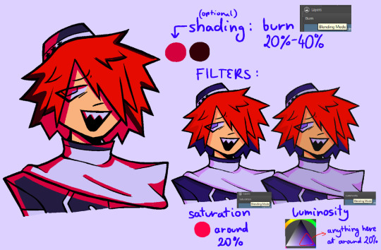
adding a muddy golden yellow pin light layer (opacity turned down to like 40-50%) to make the light colors less ugly lol
i SWEAR by the fucking pin light layer style. it's so useful and so so underrated.
i used an almost brown-ish gold color on stop of all the layers, and with the pin light layer, it helped make the bright (almost blue-ish) white colors more warm and more yellow. it just helps make things more warm (something i prefer)
i could probably show what it looks like without adjusting the layer opacity to truly show off what i mean (like in the coming section) but i sadly forgot to do that lol


make a layer on top of your drawing with this color in these ranges YES the drawing is fully merged NO don't be afraid, the base was fucking ugly anyway 💔
make this layer into an exclude/exclusion layer style TRUST
turn down your exclusion layer opacity from a range of 10% to 40% literally until you're happy with the contrast and the way the color over the drawing. use your eyeballs. i know you can do it im so proud of you
this is pretty self-explanatory instruction-wise, so i'll go into why i do this instead
i really like art that seems like it has low contrast, with almost mid-gray shading and lines. i don't personally use dark and bold lines and shading, unless i find it necessary for the tone of the piece, so using this method helps lower the contrast of the art and make it look "pleasantly muddy" in the way that it's easier and softer on the eyes.
the inverted blue color also helps makes things warmer!
the exclusion layer style is still a bit of a mystery to me but i really like the effect it gives, even if i don't completely get how it works lol
if you want an alternative method to this, and if you have access to it (because i primarily use sai and sai only),
i absolutely encourage you to play around and experiment with gradient maps.
there are so many out there you can make yourself or even get from others that just give the painting an extra amount of depth and color variation. they're SO fun.
personally, if sai2 gets a gradient map update, it's over for y'all it will literally be so over no one will be able to stop me


then i merged everything and actually adjusted the contrast back up because it was looking too muddy for me 💔 but the color adjustments are still there so all hope is not lost
here's a comparison of the adjusted contrast in black and white
(adjusted on the left) (newly merged layer without adjusting the contrast on the right)
as you can see, i actually turned the contrast back up (despite talking all about how i liked things with less contrast lol)
i wanted to demonstrate that doing adjustments should be done in moderation, and is why i adjust layer opacity often when making color effects
you are free to play around with colors to help your style, but don't lose your initial idea and colors along the way.
you still need to trust your own colors and intuition!
along with that, i just want to say that it's completely okay to change your mind mid-painting, and it's okay to make somewhat drastic changes.
don't be afraid to change things you don't like or change your mind about certain aspects way later on
that's basically the whole thing of this!!! don't be scared!!!

now im gonna hold your hand when i say this..........but you need to learn how to render by yourself. it seems like i can teach you but i literally can't, because rendering is different on every piece and depending on how clean your base is. i have to render A LOT because of how fucking ugly my sketches are LMAO
to simplify it, think of it as obsessively cleaning up every detail you can see, but with a color picker and a clean, hard edged brush. if you have shit lineart, you don't have to redraw it cleanly over and over, just paint over it. that's basically what rendering is
THIS especially is where you need to be brave and stop being scared.
like i said, i can't teach you how to render, and it's something you have to discover yourself because rendering is something that will always be personal to every single piece you make. the way you render on every piece is different.
on one piece, you will barely need to render, and on another, rendering is more than half of your ENTIRE process.
don't be afraid to paint over your old art.
rendering is a process that's both very perfectionist yet also very careless.
find your balance and just go for it.

and then that's it……..u did it………..now yuo know how to paint and render. it's literally just layering shading and lighting knowledge until you think it makes sense and looks okay lol
additional note: since i render in only one layer (you don't HAVE to do this, but it'll be harder for you…), i also made slight adjustments with the transform (and liquify, if you have it) tool to make things more proportionate. (i drew the head too big lol)

if you compare the finished piece to the final unrendered base, you can see that a LOT changed, including a bit of subtle proportion adjustment.
particularly, the sleeves changed A LOT (because i really didn't like them)
but it's also over all cleaner and more coherent, instead of having haphazard colors and shading just thrown about.
rendering is when you finally use all 100% of your brain to finalize and figure out where the shading should go, where to clean up your lines, where to ERASE or ADD BACK in lines, and make sure all your colors look coherent.
it's not as intimidating as it seems, i only use a hard edged brush with a little bit of color mixing and my color picker.
it's like dragging and dropping colors to cover up mistakes, it's really quite fun when you get used to it
i wish i could explain it clearer but it's hard to describe without visuals!
i hope this helped, and i hope all my yapping isn't annoying (art as a special interest beloved)
have fun studying and trying to render in my art style!
#long post#art tutorial#rendering tutorial#art help#art tips#tutorial#kia doodles shit#artxstic-scr1bbles
98 notes
·
View notes
Text
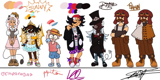
The full lineup is almost done!! (just needs some touch ups and a Chunsik design👍) FEEDBACK IS GREATLY APRECIATED!!
Design process under here (whole lot of yapping)
General thoughts: Ive given them in my previous design sheet (you can find it in my blog)(tldr: designs match characters but still childish, 8-12 years old). Only thing different here, is that these eggs were eggs who I had less of a clear idea of what I wanted to do with them (though I still really liked where I ended up!!)
Empanada: Didnt want to go for the full sweet lolita route, mostly because I thought it'd take away the "little kidness" of it all, but something that still resembles the aesthetic. She's wearing "carneirinhos" (idk the name in english) which is very cute little girl to me, and shes also a demon! Her tail resembles a frying pan!! Though I might change her fringe (it was supposed to be baby hairs but now that I think about it, her type of hair probably wouldnt have them) and put some argyle pattern in her sweater vest. I just forgor💀 to do that...I also wish I had made her shorter, but unfortunetely I drew this before the eggs did the height check (YES ITS BEEN THAT LONG).
Sunny: My beautiful baby girl. She means the world to me. I love this minecraft egg with all my heart. Shes wearing Light up sketchers and some fairy wings like Pomme, and shes actually wearing a swimsuit, she just put a tutu over it. The diamonds they're always holding are rings, they have a "terere" in their hair (idk name in english😭😭) and the beads were inspired by an artist on twt (@\BLUETOMATOSODA). Also if you are wondering why her hair looks like tentacles, its because I had originally made it puffy, but changed my mind after doing the lineart, so i had to get creative with me covering it up. Just pretend she has a fan, shes a star after all!
Pepito: Basically, he is very smoll. Chiquito even. He has strawberry hair and MASSIVE glasses that take up his entire face. Hes wearing a swimsuit aswell (dont ask how it works idk either), and has floaties since he cant swim. Hes got crocs, since flip flops hurt his toes, with a spider man charm on them! Also hes got a sunhat, mostly cause I wanted some other accessorie but didnt want to go with gas mask since it'd kinda kill the whole swimming vibe (since his model is wearing a swimsuit). sorry if its not too accurate to his character. Side note: Him, Em and Sunny all have freckles! Him and Sunny all over their bodies while Em just has on her cheeks.
Leo: Cute sporty vibe, love her shorty spiky hair. Wanted to try to make her face spiky aswell, for the whole shark dad thing. Shes got a necklace with a shark tooth (I guess she got it from Foolish??). He changes tshirts randomly, and opens and closes his attack on titan hoodie depending on the tshirt's expression (basically my version of Leo changing her player heads constantly). His trainers have dragon wings and also: whealies!!
Dapper: Im gonna be honest: did not expect to like his design THIS much. The colouring really elevated, with the long blue hair (the same colour as the ghosties!). Wanted to make them, y'know, dapper, so I had to sacrifice some of the "little kid vibes" unfortunetely, but I think it fits her still. The hat has part of the helmet that they used to wear a lot, demon horn to match Pomme, and a suit that is VERY inspired by Death the Kid from Soul Eater (very fitting for a reaper in training imo). Might be my favourite design!
Ramon: Jesus fuck you'd think designing your fav egg would be easy BUT NO. I struggled long and hard. Again, he doesnt have that much "little kid" vibe whatever man😭😭 Im just happy that I even managed to make SOMETHING. Hes got Create googles, his meathead is a massive hat that completely hides his hair. Very simple, very Ramon, though I will probably end up making a version with an ugly sweater just like he likes instead😔. I still like it but. man...
ANYWAYS IF YOU READ ALL THAT MWAH, YOURE A REAL ONE, THANKS FOR ENTERTAINING MY THOUGHTS🫶🫶🫶
#qsmp#qsmp fanart#qsmp eggs#qsmp empanada#qsmp sunny#qsmp ramón#qsmp ramon#qsmp pepito#qsmp leonarda#qsmp leo fanart#qsmp dapper#qsmp sunnysideup#ramon the egg#ramon qsmp#leonarda#leonarda the egg#leonarda fanart#leonarda qsmp#pepito#empanada#sunnysideup#sunny the egg#empanada the egg#empanada fanart#sunny fanart#dapper the egg#dapper fanart#breakfast trio#my art tm
54 notes
·
View notes
Text

ITS FINALLY DONE!!! WOAH!!!
lol but seriously, sorry this took so long. I finally got the sims on my computer and it took over my life for a bit and i completely forgot about this.
yeah the background and "logo" are pretty lazy and a little ugly, but im proud of how aubrey and basil look!! ive been trying to experiment with my art style a bit. I tried doing smoother lineart for this and tbh im not a fan. i like my usually sketchy style, but i did have fun messing with the line weight!!! :D
and yes i edited aubrey's hair, she deserves her own hairstyle instead of mari's hairstyle slightly to the left
TLDR: The sims 4 is addictive, and i had fun drawing this even though im not super proud of it (I still like it, just some stuff i couldve done better)
#omori#omori fanart#omori basil#basil omori#omori aubrey#aubrey omori#omori photobomb#omori photobomb fanart#omori basil fanart#omori aubrey fanart#also basil is so much fun to draw#like his hair is so fluffy and pointy and his face is jdkahdkeashfui#idk i love this little guy#my art
162 notes
·
View notes
Note
The artist satchel makes me so irrationally angry bc its such a fun looking item that i love and then they had to go and put those ugly ass paintbrushes on that look like a fucking accent. Half these cunts don't evwn fucking have ears what is that for. literally who likes that shit take it OFF. huge support for that fuckin post that my for you page keeps forcing upon me constantly about separating apparel SPECIFICALLY so i can use the artist satchel without looking at those stupid fucking ridiculous babys first skincent paintbrushes that dont even work because THESE CUNTS! DONT! HAVE! EARS!!!!!!!!!!!!!!!!!!!!!!!!!!!!!!!!!!! ENOUGH!!!!!!!!!!!!!!!!!!!!!!!!!!!!
it's the artist satchel guy im back i need to say more i really need to get this out of my system. imagine a picture of it on M Fae right now okay. and tell me that is not the most cluttered ugliest thing in this entire game im being dead serious. ive been on this site 9 entire years and no item has ever made me this mad i have had nothing but sugar for this game all these years but these paintbrushes are tearing me apart. its literally so fucking cute and thenyou see the head and it doesnt make any sense and it makes me want to punch bricks its so UGLY! THIS CUNT DOESNT HAVE ANY EARS WHAT ARE YOU DOING! WHATS WRONG WITH YOU! STOP THE FUCKING MADNESS!!!!!!!!!!! STOP IT!!!!!!!!!!!!!!!!!!!!!!!!!!!!!!!!!!!!!!!!!!!!! WHY DOES IT LOOK LIKE THAT WHY CAN I LITERALLY SEE THE LINEART UNDERNEATH THE BRUSHES. FOR WHAT? This isn't an accent it is a site item and if it was a nod to accents well its ugly and im sorry. Im sorry that its ugly but it is and i need it GONE. I would pay 50 real life dollars to have a version of this that didnt have these stupid paintbrushes because when i see them i am filled with a primal urge to kill like ive never had in my entire life. Sorry for being dramatic about uglyass paintbrushes. Have a great week everybody
88 notes
·
View notes
Note
Can I ask what your art process is? Your art is just so eye catching I gotta know how you pick your colors and stuff...
yes. heres an awesome and totally cool easy to follow highoncatfood guide to make ur art look like a rainbowpuke mess
ive given up on doing lineart a few months ago and now i just sketch whatever, then rescale it to my liking. i use a default pixel brush in krita so rescaling makes the sketch all pixely and ugly but it doesnt matter bcuz then i just erase and add to it until its shaped. its kinda like sculpting

now even tho everyone always tells me my colors r the most unique part abt my art there is actually nothing special to them at all! i just pick everything by eye as long as its bright. looool
and yeah i mostly dont pay too much attention to what colors i pick cuz the filters save everything in the end. epsecially saturation cuz making all the colors kinda the same level of saturation makes them fit together and everthing looks nice and it causes u the eyestrain u so desire (i have no idea what im saying right now im sorry if this isnt helpful at all) theres also luminosity which i LOVE and i would put it at 100% on everything if it didnt make u feel like u have no idea what ur looking at. but uh, yeah, it kinda makes it look like u put my art on eye-saver mode and the darker colors dont look so strong
so yeah thats basically it thanks for reading uhhh like and follow if ur awesome
#asks#I HOPE THIS ISNT TOO CONFUSING ITS 3AM#should i tag this with raincode shit. probably now#not*#uhhh#art tutorial#i guess#also thank u for saying that and giving me an opportunity to talk abt myself i love doing that#catfood art
20 notes
·
View notes
Note
Sorry for spamming your notifs I was just wondering if you have any lineart/ coloring tips!
Im trying to improve my art and your style is perfect!!!
A joy you'd ask such an extensive question:
I recorded a quick timelapse (Sorry I don't control the speed on Clip Studio)
I draw with vector layers for line art, meaning I can erase overlapping lines SUPER easy with a Vector eraser:

To make them not highlighted in orange btw (For CSP specifically) I believe you gotta go into "View" and "turn off vector paths".
I usually have a layer behind the characters that is "Grey" so I know where I've colored until I change it to black with protect Alpha.
In GENREAL advice I'd give: Do "Figure drawings" I think they're called. VERY QUICK rough sketches to get a figure/pose down. I draw like a speed demon because I don't focus on "Getting lines perfect" either. Paper is a less forgiving medium, when I was a kid (And even now) i sketch on paper with Pen. NO MISTAKES. WE DIE LIKE MEN. It makes you think a lot more about "How am I gonna do this right the first time"
Basically: Your boy is quick, he likes to do it in 1 go and art style is pretty simple.
Affective for making comics FAST. Which is what I care about since my stories/dialogue are kinda the highlight not the pictures, they just take my stuff to THE NEXT LEVEL. :)
Lately I've been trying to "Care less" about getting perfect clean line art (Tbh I think I've always cared a little less because SOME PEOPLE SPEND 8 HOURS ON A DRAWING AND HALF THE TIME THEY SPENT WAS ERASING SHIT. I COULD NOT. O.O)
The need for speed is because I need to make so many pages for all my comics in a timely manor.
Looking at AOT's butt ugly art and Chainsaw man's beautiful scratchy lines made me realize I was being way to uptight about my own shit looking "Perfect". So I've tried to be more fluid with it.
Speaking of: I recommend anyone who likes manga to try to mimic some art styles to learn stuff. "Why'd they do xy or z" "How'd they achieve x" ya know? Here's two of my avatars from my zelda videos (OOT is still in progress)

But it also depends on what you're TRYING to go for:
I don't WANT/NEED a consistent art style. I mostly just do whatever I feel fits whatever I'm working on. "On model" isn't in my vocabulary. X'D
I recommend studying anatomy because it REALLY amped up my abilities to draw the human body better. Full figure drawings, don't run away from things you might be bad at. X'D (Or work with what you do, I am shit at drawing hands, so they'll turn into weird monstrosities but nobody's said anything yet! XD)

People are seemingly willing to forgive a lot of mistakes: If it's funny. X'D I gotta try harder in serious scenes hahaha.
Also having weird as fuck/abstract character design like my boys Ball and Bat
You're not gonna question anatomy choices for a thing that looks like THAT.
Simple character design is my passion~
For coloring: Outside of me understanding basic color theory I just do what makes my brain go BRRR so I can't really DESCRIBE why I like what I like? X'D
But here's some of my color palettes! I implore anyone to use them if they like them. They're not some trade secret, they're just colors.
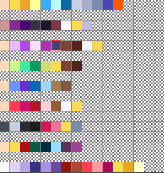
Anyways that's all I got hope it helps. XD
15 notes
·
View notes
Note
HI HELLO I LOVE YOUR ART SM and it’s is such an inspiration to me! ^-^ i’m a beginner artist and am self-teaching, and i was wondering if you have any tips or advice :]
OHHHHHH HIIIIII OH MY GOD THAT'S SUCH AN HONOR 😭😭💌 aheemmmhhhm i have MANY and it's long sorry.....
if you're focusing on the human body then when you're studying take literally any pic you see and study it. it's not about what pic looks more interesting or pretty because a study is a study and any pic of any pose will give you new knowledge. you never know when you're gonna need to draw a person in the most simple pose you can think of in the future. even not actively doing studies like observing your surroundings can be a nice tool to learn, like looking around and see a certain way clothes folds or how light and color works and go """ohhhhhhhh☝️💡💡💡""" it's mostly unintentional as you go on your day i think. im a very observant person so this is very useful to me hehe
a basic and important one is try to block basic shapes when doing studies. always try to start simple and slowly add detail at the end. besides it's reallyyy fun to draw shapes lol you can get a little funky with it. ALSO focus on the white space of what you're drawing. for example, when i draw someone standing with their hand on their waist i like to first draw the triangle of white space that the arm forms between the torso and the arm itself. it can be applied to whatever you're drawing
mmmm......outside of technical advice i'd tell you that you should find fun and comfort in what you're drawing, enjoy your process. i believe that's the most important thing when doing art. it's kinda sad to see art as a burden, try to make every part of the process comfortable to you. you can even drop certain stages of it if they are not enjoyable, for example a lot of people don't do lineart because it's tedious and not fun for them
another is DO NOT cater to what you think social media may like the most. im not talking about """don't draw what's trending""" because you can draw whatever you want (and it's a different topic), it's more about being true to yourself. all that about: you like what you enjoy, what you like, what you think is pretty or ugly or any other ajective; basically is to merge your own mindset with your art, because art is SELF expression. and you may read this and think """ohh but i only draw characters standing in a white background :( it's meaningless/boring :(((""" DOESN'T MATTER!!! IT STILL APPLIES!!!! it doesn't matter how pretty, detailed or how meaningful your art can be, your linework, color palette, the way you draw a face or a house and overall style down to the simplest things can also say something about you and personally it's very interesting to see. it's up to you if you enjoy it as it is or want to improve, or both👍
LAST is don't worry about finding an art style right way or about the dumb imperious necessity of having a single art style, really don't worry. and if you have settled with one don't be scared of the possibility that your art may change with time, because we change and if we do so then our art is subject to do the same, it's kinda pretty when you think about it
#asks#long text#i got really into it at the end but im only human peace and love 🫰#things i wished someone would've said to me when i was young..#i also did this thing as a kid where i would only sketch using a ballpoint pen to force myself to be cleaner and make less mistakes#if you're on digital draw on a gray canvas so it doesn't hurt your eyes#rest after drawing for hours it's NOT worth it to keep drawing at midnight#u have plenty of time don't hold your pee GO PISS GIRL
4 notes
·
View notes
Text

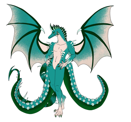
I havent posted in so long i-
#my art#traditional art#sketch#she kinda looks like wadnohara ngl#im sorry the lineart is ugly#and the lighting
1 note
·
View note
Note
you've probably already gotten some questions about this, but can I inquire as to your drawing process? i recently discovered that i may have been working against my own thought process in drawing and that it was hurting my ability to create, and your own work seems somewhat similar to the way i naturally go about making things, so i was curious. thank you for your time!
alright *cracks knuckles* lets give this a go
My process changes pretty much every 2 milliseconds so im just gonna try to sum it up as of right now (and i doubt it will be helpful but dammit i am gonna try)
I work from some really ugly sketches, especially now that im trying to get the hang of composition. More than anything, I think I just try to find some potentially interesting shapes from the very start, because there’s no way for me to spend actual time on a thing without it. I latch onto well-defined areas of light and dark like my life depends on it.
Here’s some of my recent sketches and thumbnails just to really drive home the point that I just don’t give a shit


Lineart is my mortal enemy (surprise), and so I take any kind of lines I put down more as a friendly suggestion than anything else. Sketching is really just a mapping tool to slap color on top of.
In the rare cases I do refine a sketch, it is only to better figure out what it is im doing. Then I promptly proceed to ignore it, and go straight to filling in a silhouette that feels good with my most recent love: the polygon lasso tool in photoshop. Then I lock that baby down and uhhh improvise

Here’s (hopefully) a slightly more helpful example of my background study process:

It hopskips over the parts where I try to figure out shapes (because I tend to work on a single layer im sorry making process gifs of finished pieces is hard), but regarding my process in terms of planning out composition, light and color, it is pretty representative.
I start with the chicken scratch thumbnail, map out the major values and refine them into some interesting shapes. Then I go over with lines to figure out the 3-dimensional space, complete with some gosh dang perspective lines. I get some base colors going, and then I just go wild overpainting that using square and triangular brushes, and the polygon lasso tool.
The most important realisation for me the last year was that I don’t actually have to render stuff. The goal of my final overpainting is to reduce everything into seperate, well defined parts, because that is what fascinates me the most with visual art: abstraction and stylisation of light.
So yeah, I hope this was at least a little bit what you were looking for. If you’re stuck, go embrace what is most enticing to you in your actual art process technically speaking. It has completely changed the way I approach mine.
Here’s some bonus gifs bc why not:


#long post#just as incoherent as usual#feel free to hmu with anything guys im really just improvising here#and yes i am still planning on making a speedpaint /at some point/#ask#advice#process
967 notes
·
View notes
Note
i agree with the other person, it's easier to do stuff once you already have, especially because you still /have/ the jacket. even if you won't be able to wear it and the back is messed up, you still get to keep it for the memory. and plus, you have a ton of photos of it. i'm still really sorry it happened, sending hugs/thumbs ups/your desired form of comfort
Yeahh im not worried itll be hard or anything but i am sorta worriedlike... Yknow when you do the lineart after a really really awesome sketch and the lineart is just.. Bad. Like same picture but worse? Thats what im afraid is gonna happen. Same jacket but rushed and ugly
9 notes
·
View notes
Text
Quick update about my current health, both mental and physical

I will be talking about a lotta' things here.
Sorry for inconveniences or, anything.
My health wasn't the best in these days, my fingernails are bleeding cuz i bite em cuz my anxiety shit and i literally can't draw in traditional, my right thumb hurts and burns when i touch anything with it even a little bit.
Depression haven't hit so little in so many time. And by “Little” i mean that in this year i haven't tried to hang myself again, or tried to cut my arms with a cutter or some shit, yunno'.
2020 wasn't even CLOSE to my worst year. But, i didn't have a blog then. And, i like that people like my things. That, i reached 10 followers. That's like, phew, a fucking LOT. And it meants so much for me. Even when 5 pf them were porn bots that i already blocked like Tumblr i know that i dont have 15 followers stop-
But im very thankful for y'all. Thanks, really. It meants a lot to me.
Im trying to get better, but my health is so garbage, and with some pills isn't enough. I will go to a therapist or something, i really, REALLY, need one.
B4 you think “What 'Bout the event pile of garbage”-
Well, well. I didn't finish all. I couldn't. I will do it when i have the opportunity, but as it is right now, im writing this with my left thumb and with my right index finger and OH BOY IT ISN'T FUN AT ALL.
I will put everything that i got rn. Soon everyone in my list that i have right... Here, yes.
7 people.
I got 4 of the 7, but- one needs a redraw. It's ugly.
Soo. Three.
And 1 needs the lineart. Yikes...
Ill try to finish that----
(Update:
At the time im publishing this, i got a little better, my fingers are... Fine, i guess, and i got more energy!
Not a lotta energy, but, its better to go a step at a time. Hope y'all reading this have a good day and new year!
I chaged my mind and i will put every gift in one go, instead of one at a time. Anyways, good wishes.)
4 notes
·
View notes
Note
I was reading through people's tags this morning and i wanted to personally come thank you for all that you wrote on your ardyn piece... *inhale* IM DYING THAT MADE ME SO HAPPY YOU CANNOT BELIEVE HOW IM UGLY CRYING RN YOU ARE TOO KIND!!! THANK YOU THANK YOU SOOOO MUCH
oH MY gOD it’S YOU!!!!!!!!!!!!!!!!!!!!!!!!!!!!!!!!!!!!!!!!!!!!!!!!!!!!!!!!!!!!!!!!!
PEOPLE
CHECK THIS ARTIST OUT
JESUS CHRIST, THEIR ART IS INSAAAAAAAAAAAAAAANEEEEEEEE!!!!!!!!!!!!!!!!!!!!!! SERIOUSLY, OHMYGOD I CAN’T- AHSKDFAGJDLKDJALKGJAD I CHOKED ON OXYGEN AS SOON AS I SAW THIS MAKE IT INTO MY INBOX BECAUSE ¿¿¿??? HOLY MOOGLES ABOVE IN THE CRYSTAL REALM, THIS- MAGNIFICENT ARTIST TALKING TO ME???? LKAJSDKFADLG JADKLGJALKGAJDA LKGADJGADLGJAD AAAAAAAAAAAAAAAAAAAAAAAAAAAAAAAAAAAHHHHHHHHHHHHHHHHHHHHHHHHHHHHHHHHHHHHHHHH
JEEEEEEEEEEESUSSSSSSSSSSSS CHRIIIIIIIIIIIIIIIIIIIIIIIIIIIIIIIIIIIIIST
AAAAAAAAAAAAAAAAAAAAAAAAAAAAAAAAAAAAAAAAAAAAAAAAAAAAAAAAAAAAAAAAAAAAAAAAAAAAAAAAAAAAAAAAAAAAAAAAAAAAAAAAAAAAAAAAAAAAAAAAAAAAAAAAAAAAAAAAAAAAAAAAAAAAAAAAAAAAAAAAAAAAAAAAAAAAAAAAAAAAAAAAAAAAAAAAAAAAAAAAAAAAAHHHHHHHHHHHHHHHHHHHHHHHHHHHHHHHHHHHHHHHHHHHHHHHHHHHHHHHHHHHHHHHHHHHHHHHHHHHHHHHHHHHHHHHHH
*EXPLODES INTO A HUNDRED SNOWFLAKES*
THIS IS ONE OF THE CUTEST MOST HEARTFELT ASKS I’VE RECEIVED IN A WHILE IT’S SO BEAUTIFUL AND SO PRETTY I DON’T KNOW HOW TO REACT TO IT BECAUSE BESIDES BEING PRECIOUS AND SO TOUCHING IT’S FROM AN ARTIST THAT LEFT ME WOWEE OMG GASPS BECAUSE OF THEIR STUNNING MESMERIZING INSANELY BEAUTIFUL ART OMG HOW DID THIS HAPPEN I’M FREAKING OUT ASDKJFDKLGJDLAKGJADLKGJDA
OMG PLS DON’T BE CREEPED OUT I JUST HAVE TROUBLES MANAGING MY EMOTIONS AND *DEEP BREATH* I’M SO EXCITED TO BE TALKING WITH YOU BECAUSE WOWEE WHAT AN ARTIST YOU ARE!!!!!!!!!!
BEING HONEST, TUMBLR ONLY LETS ME WRITE 30 TAGS, SO I DID STAY SHORT ON EVERYTHING I HAD TO SAY, BUT I MEAN, EVEN IF I HAD INFINITE TAG SPACE, I STILL WOULDN’T HAVE MADE JUSTICE TO YOUR ARTWORK NO MATTER WHAT OR HOW MUCH I SAID BECAUSE HOLY SHIT HAVE YOU LOOKED AT YOUR ART????
HOW DO YOU DETAIL LIKE TAHT!?!?!? ALL THOSE TEXTURES, THE ATTENTIVE COLORING, THE EXQUISITE LINEART, THE HAIR!!! THE HAIR IS ABSOLUTELY INSANE, IDK HOW YOU DO IT, YOU COULD SHOW ME THE PROCESS AND IT WOULD STILL BE BEYOND ME BECAUSE HOLY SHIT, HOW DO YOU DO ALL THAT?!?!?!
LITERALLY EVERY INCH OF YOUR WORK, EVERY LINE AND DOT AND EVERY PIXEL IS INCREDIBLE, IT’S ABSOLUTELY INSANE, WHAT YOU DO MUST HAVE TAKEN YOU YEARS OF PASSION AND HARD WORK AND PRACTICE AND WHAT STUNNING, BREATHTAKING RESULTS, HONESTLY, LIKE WOW MAN FUCK HOW YOU DO THAT.
LIKE, THE DETAILING IS SO MAGNIFICENT AND EXQUISITE, THE LIGHT/SHADE JOB IS UUUUUUUUGGGGGGGGGGHHHHH EYEGASM AND HONESTLY I COULD GO ON BUT I LACK ARTIST LANGUAGE AND I WOULD GO ON ABOUT EVERYTHING BECAUSE LITERALLY EVERYTHING IS SO INCREDIBLE AND I’M SORRY FOR RANTING I JUST NEEDED MORE SPACE IN THE TAGS AND YOU GAVE ME A PLACE, SORRY THANKS I’M DONE.
*hyperventilates*
Okay, let me add a keep reading line omg ahahah, I’m sorry this got so long, I’ll be short this time, promise ;w;
So first of all, BESIDES ALL THE THINGS I STILL HAD TO SAY ABOUT YOUR INCREDIBLE ART, you’re welcome!
Second and more important, thank YOU so MUCH!!!! ( ´ ▽ ` ) ZOMG IT MADE ME SO HAPPY TO READ THIS ASK!!!!
Thank you for taking the time to read the tags. I know it’ll probably sound senseless but sometimes writing in the tags gets exhausting (because I try to do that in everything I reblog), especially when it’s something as incredible as your artwork, everything just hoping that it will make the artist happy. So thank you for taking the time to read them; all my time & energy put there could have easily gone to the void, but you gave them sense. Thank you
Thank you as well for taking the time to drop by to say thanks!! That speaks so nicely about you, you’re so kind. Not all artists drop by to say thanks, and it’s my honor to receive those that do, you among them. Thank you immensely for the time put into writing this, you could have just shrugged it off, but decided to let me know you saw it and that you’re grateful for it. Thank you so much :’3
I’m so, so, SOOOOOOOOOOOOOOOOOOOOOOOOO very absolutely hyped to know that my comments made you happy!!! YOUR WROTE THAT WITH SUCH SINCERE HYPE OMG I’M A MESS OF EXCITEMENT MYSELF ALSDJLKAGDJAKLJ
AAAAAAAAAAAHHHHHHHHHHHHHHHHHHH, I’M SO HAPPY THAT MY TAGS MADE YOU HAPPY, YOU HAVE NO IDEA!!!! THANK YOU SO MUCH FOR REACTING IN SUCH A WAY, IT FEELS SO NICE ASKLDJSKALGJADLKGDAJ
Thanks a LOT to you as well for sharing your work with us!! I know it takes a lot of everything to get art done, and you deciding to show us is a gift. So thank you for sharing your creativity and INSANE art skills with the world! :D
DEAR ARTIST, THANK YOU AGAIN
KEEP UP THE INCREDIBLE, AMAZING WORK AT CREATING!!!!!!!! (ノ´ヮ`)ノ*: ・゚
1 note
·
View note
Note
(Aphex) Mod shit can we straight up get a design shitting edition for InsaineMembrane's designs?? APHX-714, APHX-666, APHX-667, APHX-838, APHX-1263, APHX-843, APHX-1341, APHX-1032, APHX-1737, DPHX-1431. in order of how they have them on the website. Love u sorry for torturing u </3333. Tried not to grab any dupes that have been on the blog before but if I got some that have been featured before please roast me to death. Also hope I'm using pronouns they're comfy with but let me know if I'm not
at first i was going to tell you to go fuck yourself because i dont want to but then the bus got delayed so here i am. this one has the faintest hints of a good design actually and that's probably because it's not a clusterfuck of shoddy textures and glaring colors. still not that impressive but considering who makes these it's almost passable. the spikes always look terrible and jut out from weird places, and it took me a second to realize the black clouds on the eyes are wisps but i have less to shit on this other than it's just a touch ugly instead of glaringly ugly
of course they have the 666 one and it's as needlessly edgy as it could be. not even that edgy either compared to the usual clusterfuck. the legs remind me of big bird and its hand behind it looking like it's trying to pull out a wedgie really decreases the edge factor. on the nose also looks like a nose clip for people who go swimming. most of it's just repeating patterns for the sake of filling space
i might just have very low standards but this design is completely fine. the right version gets to the weird overcomplicated nonsense but the one on the left has nothing wrong with it. right looks like it got a disease
I kind of appreciate the various poses these are drawn in but this one's closer to what i expected. a shitton of spikes and zigzagging segments that is more confusing than anything, on a pose that is clearly either eyeballed or traced somewhat because anything that has to be drawn from scratch has incredibly low skill. they've gotten better at color placements though. idk i feel i just have to reward actual progress. this does not stop it from looking a lot like a chicken or the fuckugly hands though
im glad you discovered the darken layer in procreate now can you learn some better things too. same spikes though im unsure if these are standards for the species or whatever. idek what the effect is trying to pull off or why the right wing looks broken. in fact both wings appear broken because they just out of the wrist when usually wing membranes are connected to the hand themselves. the eyes almost look like trypophobia and the amaazing stamp brush used for the circles

click on the link because this one couldn't be assed to be properly colored in at bits or even have the lineart connect. idk what the reference was but why is it doing a weird look over the shoulder. points i guess for trying to copy what a flail looks like even if it's incredibly obvious. the horns don't make a lick of sense and nothing is even which is almost a breath of fresh air compared to the over used symmetry ones. almost, it still looks bad.

idk which part of it lets it have two bodies with entirely different designs but sure let this person make more bad designs. these would actually look fine if anyone else was designing them, though right one is very hard to see because it's mostly black god forbid this be drawn with any shadows or you'd lose the bitch
this looks like a crook because of the mouth and limb situation. the lines aren't smooth at all do they do this with a mouse

another common sign a person's a beginner is their overuse of a single interesting stamp brush. it works for the wings but does not work as well for the wrists or ankles. the tail is very hard to see past the two octopus tentacles in face they are covering it entirely. the webbing on the forearms make little sense
another attempt at a plague rat. the limbs are already jacked up but they couldn't even make them look attached or like they'd even bend properly. also apparently the mask is a trait too. the subtle tint of gross piss yellow adds a nice touch for infected sewer rat just fix the anatomy and this almost could be decent

0 notes
Note
hi! i ADORE you and ur work, ive been kinda cheering u on in silence but im gonna work on being a more Obvious fan :P anywho sorry but i was wondering if you have any tips on starting a comic? Ive been wanting to for months but im a bit nervous on where to start on the story + art process!
First of all, thank you so much! I appreciate the support regardless of how vocal it is ❤❤❤
In terms of starting a comic, I completely understand the hesitance; it’s difficult to start a comic, and speaking from experience, motivation is one of the most challenging things you’ll deal with.
1. Support Network:
Find people who you can bounce ideas off of and will help you write/develop the story and characters! Support networks will keep you motivated and also act as a test audience for ideas so you can make sure your story is cohesive.
2. Planning:
It’s really easy to get wrapped up in planning, but keep these things in mind:
a. How many characters? What are their names, personalities, motivations, goals, careers?
b. What is the main issue they are dealing with? Why do they care?
c. What location/time period?
d. How long do you want this comic to be
I heavily recommend not doing a long story as your first comic; I kept trying to do these massive comic plots that involved a SHIT TON of world building, multiple main characters, and various plot twists, and this fucked me over so badly. I got too caught up in the tiny details and so stuck on certain things and characters having to happen that I never ended up drawing anything because I stressed myself out.
3. Understand that you will have to cut characters and plot points, and you must be willing to do so
A lot of issues I notice with other artists, and especially myself, is that you’ll have these characters that you desperately want to put into a universe together, or you’ll have this one plot point that you really, really want to do… and in trying to force pieces into the plot that don’t necessarily belong, you end up with a congested, awkwardly forced cast that don’t blend together well.
One of the most common things I’ve read with comic startups is to make your plot first, THEN make the characters, and while making Brimstone and Roses, I definitely can see why. Trying to bend a plot around precreated characters with their own backstories is a headache and a half, and can stagnate your progress.
More under cut
4. Understand that no idea is original, and THAT’S OKAY.
It’s hard to come up with something that’s never been done before, and while I’m not saying to just rip off someone’s story, I am saying that it’s important to get that no matter how hard you try, someone has done something similar before. This is okay though! Part of storytelling is taking a familiar thing and bending it or reinterpreting it so the audience can see it from a different perspective. Don’t be discouraged, be motivated and see how you can change your story.
5. Time Management and understanding format
Create a rough schedule and stick to it; comics are really fuckin’ hard to make. They take a LONG time, and can be difficult to get people interested in so it means that you will start with a small audience and have to build. If you’re using Webtoons, there’s already a large base on there of comic readers, but do know that it’s not guaranteed you’ll be an instant success and it’s hard work to grow an audience.
Bimonthly updates are suggested at least, just so that your comic doesn’t lay stagnate and the updates will make your comic appear more often on the ‘new’ page, which will lead to more viewers. A lot of people also like to read comics once they have a few episodes so that it’s not so painstaking to wait for updates.
Personally, I’ve been trying to do weekly updates, but I am also taking summer classes so I’ve tried to break up my workload into 1 day is for thumbnails and rough sketches, 2-3 days is for line art, 3 days is for coloring and posting.
6. Be passionate about your comic
It’s hard to say to be passionate about your comic whenever I just said that you shouldn’t use characters/plots you’re already invested in, but honestly? You really do need to love what you’re working on and the characters involved because otherwise it will be really difficult to get yourself to draw them constantly. Talk about the characters with your friends, do sketches for fun, just do ‘What If’ scenarios; get yourself involved with them and their personalities and it will be so much easier.
As for my process;
I have a synopsis of the entire comic written up already (so I know each arc and what will happen, and the character developments of all characters involved).
I then took that and broke it into arcs, and then the arcs into chapters. I take each chapter and estimate how many panels it will be and if it should be broken up due to length.
Once that’s done, I create a script like so:

I then do thumbnails on paper, which usually are stick figures and very fuckin’ ugly (always plan for the word balloons).
Then, on my computer, I do a rough sketch of all the panels and readjust as needed based on pacing
Then I just do refined sketch, lineart, then coloring, then the after effects (lighting, tonal variation, etc.), and finally add word balloons before slicing it up and uploading to Webtoons. I’m sorry; I’d give a more in-depth reveal of my process but it’s fairly straight forward and I don’t honestly have screenshots of the editing stages.
It’s mostly just a lot of time consumption and planning.
I hope this helps! And good luck with your comic! Feel free to bounce ideas off of me if you want!~
35 notes
·
View notes
Note
SO HAPPY I found your blog your art is SO precious! Just a silly question tho, how do you do the lineart? It looks so soft I love it
omg firstly thank you this made my day! you are the absolute sweetest!
So line arrrtt. A new thing I’ve been trying is doing any color besides black lineart if I can, it makes it look the soft way and just more natural. (I think, I am 100% not an expert) I tend to stick to stuff in the range of pink to blue, so purples, berry colors and navy type things. For stuff like the Kleisen drawing I do what a lot of people do at make my lineart a multiply layer and sample from the colors that sit under them to get my lineart colors. Then to add to that I’ve been using pencil or charcoal brushes for lining the lack of “cleanness” of the line means the lining can be kinda ugly and the drawing doesn’t look too bad, so basically im allowed to be messy, which I always am lol
That was sooo long winded sorry about that, I just wanted to make sure I answered you question, hopefully i did!
5 notes
·
View notes
Note
hey hey hey your art is amazing! you are one of my fav artists, and i actually admire your lineart style ... what did you used to draw when you didn' know how to? I don't practice as much as i would like to because i see my drawings so ugly... thank you and sorry for my english !
omgggg i’m so flattered,, thank you!! uhh well this is a bit hard, if I REALLY dont like it then I’ll probably never gonna do it again haha. mmm but my advice is,like, if you’re stressed out by something its okay to leave it behind for a while to practice other things first. AND THEN you’ll try again. You’ll probably see a difference there. Also pls dont be afraid to use references!!
I’m sorry if im not too helpful hhaa;;;;
5 notes
·
View notes
Last Seen Blogs

lookingforancestors
Bowling for Ancestors :.)
art-wishes
Just some things I want to buy

ruzgarin-esintisi
The Authority

lrxdudvbtsr-blog
바카라 프로그램