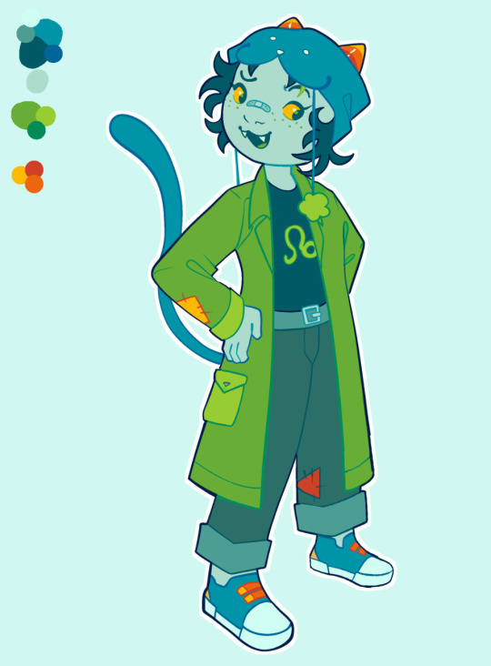
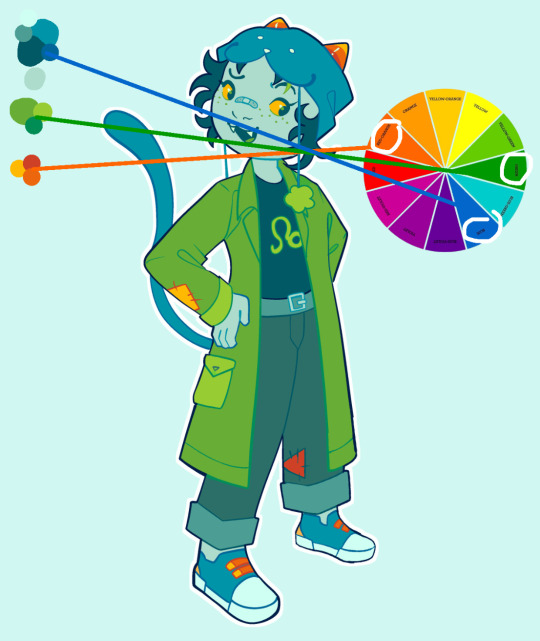
#if you're thinking color palette it's like. red and blues and greens for me.
Explore tagged Tumblr posts
Visit Tumblr Blog
Explore Tumblr blogs with no restrictions, modern design and the best experience.
Last Seen Tumblr Blogs


Fun Fact
Tumblr’s reach among the 26-to-35-year-olds in the US is 11%.
Note
tumblr user atopvisenyashill do u have any clothing inspo for beyond the wall👀 i know uve done faceclaims for characters. however...
asking bc i plan to make clothing refs for westeros and am unsure how to style the freefolk🫡
ahhhhh okay. exciting question.
so for wildlings, in both fashion and appearance, i go for the coldest places on earth for inspiration, obviously. thinking greenland, arctic & yukon, and siberian bc that’s real far up there, cold as all hell, places that don’t even get sunlight for part of the year. there’s crossover here with the skagosi & the mountain clans like the flints, wulls, or liddles, or the more remote parts of the north like the last hearth - they’re less interested in andal customs bc they don’t really interact with andals (as Jon points out, some of the wildlings only speak the old northern language + we know the mountain clans & skagosi still use old honorifics like referring to their leader as “the x” ie “the Ned”).
definitely something i think the show really misses out on is that even in cold climates, people love COLOR especially bright red, deep blue, and deep green. obviously i'm not like, an anthropologist or whatever, but i think that just makes sense that like - if it's snowstorming all the time, you want your kid in something bright red so you can see them. you want some color around to cheer you up because the sun set two months ago and it won't rise again for another four weeks. they also love to decorate with funky, kinda geometric patterns, florals, and animal bones.


outdoors you’re looking at lots of furs and leathers, indoors you’re looking at knitwear. i imagine the more “kneeler”-y ones, like the thanes, have more embroidery work whereas the more "true north" types stick to knitwear (it's just like, easier). wildlings are still heavy into tattoos as well so I always imagine a lot of facial tattoos.


#dead ass thought i hit publish on this a few days ago i guess not aldjsfls#so like. greenland inuit. chulym of siberia. koryaks and Chukchis of siberia. the sami.#whereas for the north i tend to go like. mohawk. inuit. algonquin. some crossover here obviously w the sami and like. the subarctic regions#but that's on purpose because as jon learns the wildling culture is not like THAT far off of the northerners.#there's that band otyken and the documentary the last ice. the movies/shows the terror and the fast runner and maina#i hate that the show had them in those white fits. no fucking way someone like tormund is wearing the same thing as someone like ygritte#if you're thinking color palette it's like. red and blues and greens for me.#asks#wildlings#ndn starks#a chaotic dumbass
12 notes
·
View notes
Note
hi!! i just wanted to say, i LOVE your art!! i started drawing my kris design with braces after seeing dubs of your comic on yt, and when i found you on tumblr i was beyond excited to see all of it in context. i’m a comic artist as well, and i was wondering— how do you choose your color palettes ?? besides obviously picking colors from the characters themselves, that’s a given— but your comics are bright and colorful and just a real pleasure to read because they’re so visually appealing. hope this question hasn’t been asked before!!
Thank you so very much!
So I really went into your question under the cut. So feel free to proceed if that is something that interests you.
The answer is honestly not that exciting. For the characters I really only do pick colors off the original sprites. Which is why they look so bright and colorful. If you try to do that yourself, you will quickly notice how SATURATED the sprites are. And not only the sprites, but also the backgrounds.
A little trick I use is that for pre-existing backgrounds I take all the colors and brighten + desaturate them just a teeeensy tiny bit. That way the characters in the foreground pop way more.
Another way to make the colors pop even more is to use colored shading AND colored lineart! That really IS what ties everything together. Let me show you..

This is a panel without the colored shading and lineart.

And this is it again WITH all that good stuff. Quite the difference, no?
But you're asking about color palettes, so I guess you also mean for the characters/outfits I designed? A lot of it boils down to color theory. I am by NO means an expert on that subject, but when looking at the Dark World designs specifically, you will notice how I did it.
For example: Frisk's Dark World color scheme is mainly analogous. That means the colors are right next to each other on the color wheel. But there is a little bit of complimentary in there.
Here, lemme visualize it...

Frisk's color scheme is a light green, darkish blue green, light yellow and a splash of pink. The red is there mostly just for lore reasons.
One thing I noticed when looking at the sprites of all the Dark World versions is that they are EXTREMELY bright and saturated.

That is something I tried to capture as well, but I think it didn't neccessarily nail it a lot of the time. Especially for Frisk's color scheme. If I stuck closer to what the game is doing, then in theory they would look more like this (using Kris' colors as a reference)

Looking back, I WOULD tweak their colors slightly more nowadays. Just so that the contrast between the colors is a little stronger and they don't blend together as much. This improves the readability of your design. Not all people are able to perceive every color of the rainbow, so readability is EXTREMELY important. Best way to see that is by desaturating them and checking the grayscale. Like so (left is the one closer to the game's colors)

Man, this REALLY makes me wanna fix their color scheme. This has been bugging me for a while now. (Though I'm kinda afraid that people point out that they look different.)
166 notes
·
View notes
Note
What are your thoughts on the 25th anniversary pet colours?

As a whole, I really like the 25th anniversary colour. I have a few gripes with some more technical things, which I'll touch on momentarily, but I think it's a fun colour that stands on its own.
Visually, I think it manages to nail the three big aspects: base colour, individuality, and customization. For the base colour, the semi-opaque stars are a great nod to the Neopets brand that also happen to look "celebratory", and it makes sure the base isn't too similar to any plain colours. I've heard some argue that 25th anniversary is too close to starry as a colour, but I disagree; sure, they both have stars, but one is always blue with yellow stars and no wearables, while one is... not that. Like, you're never going to confuse the two.
I also think the colour works in terms of both overall coherency and and individuality. Each pet has a simple main hue for the base with stars, and then a few small celebration-y items for custimization. However, the base color is different for each pet and the wearables also vary, so each pet still feels unique. The wearables are also a nice touch because they add a little something and are unique to this colour, but are completely optional. It reminds me a lot of valentine in execution, which is a good thing.
The colour also comes in "celebratory" styles. The styles are variable in quality; some of them have really fun poses and good shading, while others look very flat and have very thin linework or strange proportions. However, I'm not quite as picky with these because they're all-new styles not based on any actual pre-customization art, unlike something like the recent dynamic Halloween and Ghost styles. Either way, I do like the styles and I think they add some life.
My only issue with this colour is that we only have, like, five pets in it. Don't get me wrong, it's normal to only get a handful of pets in a given colour when it debuts... but the reason is that each species needs to be designed, whereas here, we know most species already have a 25th anniversary design thanks to promo materials. It probably would bother me less except we have way more pet styles than we do non-styles, which feels kind of gross; almost like part of the colour is paywalled for certain species until further notice.
Also, my other minor beef is that "25th anniversary" is a very clunky pet name; not only is it a mouthful, but it doesn't make sense in-universe (the 25th anniversary of what, exactly?) and makes it weird to release 25th anniversary pets on any other anniversary, which they're apparently planning to.
Favorite Species:
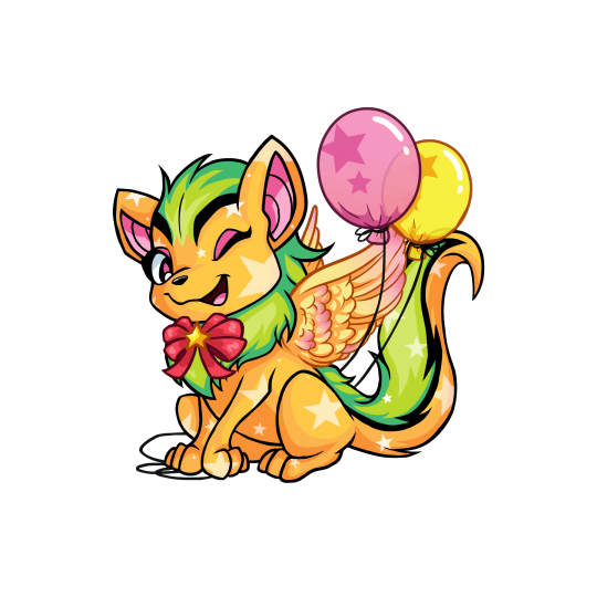
Xweetok: Unfortunately there's no NP colour for this one yet, which like I said above I'm really not a fan of as a practice. However, this is a really 25th anniversary pet regardless. It comes decked out in a bow, wings, and balloons, and uses a pink/green/orange palette that really shouldn't work and yet somehow does. The winking pose for this one is also very fun and adds a lot of personality.
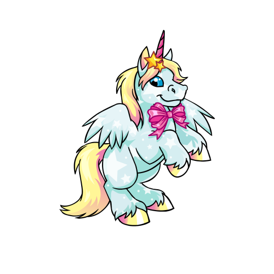
Uni: I don't know why I like the Uni so much; maybe it's just the nice rearing pose, or maybe it's just that I like the light blue, yellow, and pink palette. Regardless, it's very pretty, and that's coming from a person who normally isn't huge on Unis. My only beef with it is that the hair clip stars and the bow have colored lineart for some reason, and the bow is stapled directly on the body without a ribbon around the neck—a weirdly common problem with 25th Anniversary pets for reasons I don't quite understand.
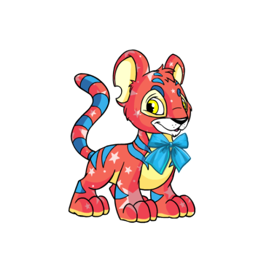
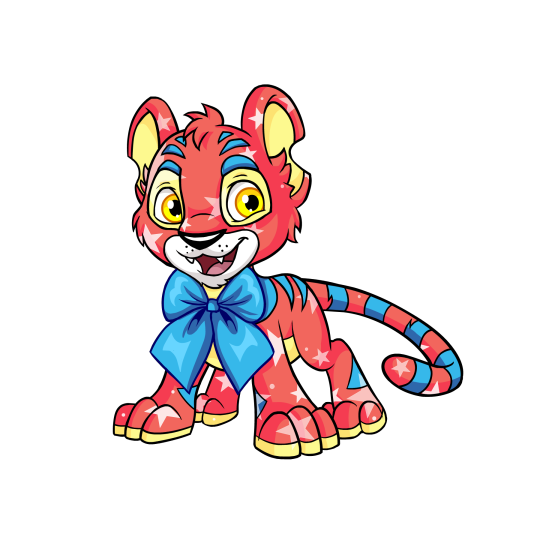
Kougra: Of the five pets to currently have both a NP option and a style, the Kougra has a very fun base color; a mix of red, blue, and yellow that's kind of similar to the base red Kougra but also not at all. There's not a whole lot of wearables, but the Kougra's fairly complicated default design combined with the colours makes it kind of work, seeing as it would likely look too busy otherwise. My only issue with the customized version is, similar to the Uni, the stapled-on tie with colored linework, though at least you can remove it here. The style is nice, more expressive but not over-exaggerated; proportions are a bit off (the head is way too big, and the body's a little too skinny), but that's not a huge deal.
40 notes
·
View notes
Text
Flower Ranchers (Double Life Fic)
"You took my husband from me!" Scott exclaimed, barging through the barn doors of the Ranch. Tango whipped around to call for his partner, but froze as the tip of an iron sword was posted under his neck.
"Hey man! Put the weapon down!" Tango warned the green life with a shaking voice.
"They- I was promised I would get my husband back! Jimmy's supposed to be mine-" Scott's blue eyes flared.
"I didn't ask for him to be my soulmate!" Tango hissed in alarm, Scott was nowhere near being a red life, and yet he looked like a madman.
"Jimmy died 'cause he's stuck with you!"
"Get off of our Ranch, Smajor." Tango snarled. He went for the nearest axe, but Scott pairied and stopped him.
"Do you have any idea what you're committing to? Do you?"
"I know you should keep your nose out of my allyships." Tango bared his teeth. He brushed the sword aside and got in Scott's face. "Don't even think about trying to nick me with that sword, I won't let either Jimmy or myself lose even half a heart to you."
"OH, Jimmy's fixing to lose more than just a stupid heart in a series like this. Do you really think a nobody like you could protect him from that curse of his?"
"At least I'll even stay loyal to him long enough to try!" Tango's fire blazed.
"He'll die anyway!"
"And I'll die trying."
"You better watch it, Ta-" Smajor was cut off by a songbird sweet voice.
"Tango! I just crafted a cake!" Jimmy extactically called to his soulmate from the inside of the barn.
Silence fell between them, and Scott's facial expression went blank. Cautiously, Tango turned his head to the house."I'll be there in a second-" Tango's throat went dry. "I'm harvesting the wheat."
When Tango looked back, Scott had tears welling in his reddening eyes. The man stared longingly through the window of the barn, fearing he'd catch a glimpse of his- of Jimmy. Through narrowed eyes, they faced off.
Though Scott was still on his green life, there was a jarring pop of yellow in his color palette. Tango's eyes lock on a golden fleather loosely stuck to Scott's aquamarine hair. He reaches a hand out to grab it, and Scott flinched hard, forcing the sword closer than comfortable to Tango's side. The blazeborn hissed with pinned ears, and slowly grabbed the feather. He pinned it to the center of Scott's chest with an open palm.
"You don't have to worry. Jimmy's in good hands now.
"Scott's hard glare momentarily became enamored in Tango's firey glow. Tango's vision danced with the shimmery blue crown atop the former winner's head. Slowly, the iron sword was lowered. Scott's hand reached up and hovered closer and closer to the fire, and Tango let him, tightening a grip on Scott's shirt. Willingly, Scott was pulled down to Tango's eyes level, and in the movment he cupped the blazeborn's face in his hand. He kissed Tango briefly, and both of them lean into eachother. Before Tango could open his eyes again, Scott walked off. Tango watched the entrance doors to the Ranch shut behind the green life, feeling his dislike for Jimmy's ex conflict with this new feeling of... desire.
(Author's note: Y'all let me know if you want the prolog and/or epilog I wrote for this short fic. The epilog is from Jimmy's point of view, and the prolog is from Scott's)
#jimmy solidarity#solidaritygaming#tangotek#scott smajor#smajor1995#solidaritek#flower husbands#flower ranchers#double life ranchers#team ranchers#ranchers duo#double life#trafficshipping#trafficblr#traffic series#traffic life#dangthatsalongname#canary curse#3rd life#headcanon#fanfic#fanfiction#I put my heart and soul into this#plz read it yall
37 notes
·
View notes
Text
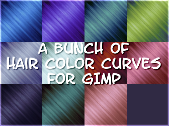
HAPPY BIRTHIVERSARY part 1 - THE SIMS 2 IS 20???
FUN FACT: The Sims 2 (2004) was released 3 days before the date upon which I was released from my mother's womb, therefore making me younger than The Sims 2 by 3 days as of September 14th 2024, but objectively older by 6 years as of September 17th 2024. The march of time is inevitable and frightening! Let's celebrate!
Admittedly I didn't have very much to give when it came to sharing content for the Sims 2's anniversary because I've been battling the Chronic Exhaustion Demon, but then I realized I still haven't released those hair colors I showed a while back. And then I realized I could share EVEN MORE content by spreading it out across a few days instead of condensing it into one day. And it just so happens that, as stated above, there are two special occasions (for me at least... lol) close together on the calendar. SO. HERE'S SOME COOOONTEEEENT.
Today's bundle is mainly a resource for creators who use GIMP 2.x, and includes 11 UNNATURAL HAIR COLORS in the form of Curves that can be used on just about any texture you want, as long as you use it on a Volatile base These only come in Curve form, but if anyone would like to convert them into Photoshop actions, you're more than welcome to.
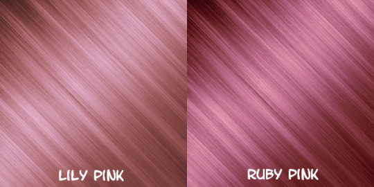
The colors are named, in order of appearance above: Sapphire, Tanzanite, Azurite, Alexandrite, Moonstone, Aquamarine, Bloodstone, Ruby, Entropy, Blue Moon, and Lily. You can read more about them under the cut.
DOWNLOAD (sfs)
(btw I made the Gemstone colors and the Alien black and brown a year ago, and I made Ruby and Lily this year, which is why they're in separate folders in the .zip)
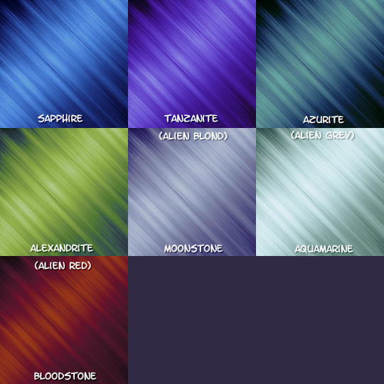
The Gemstone colors were inspired by, of course, gemstones. They were my first attempt at making a hair color palette of my own. Out of them all, Moonstone, Bloodstone, and Alexandrite are my favorites.
I wanted to go for something fantastical. I also wanted to push GIMP's Curve function to the limit and see how many shades I could put into one color without it looking like garbage.
I use Bloodstone, Moonstone, and Aquamarine as Red, Blond, and Grey respectively in my (still hypothetical) Alien hair color family.
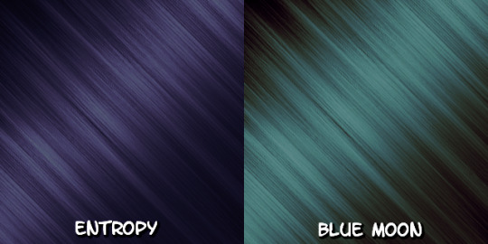
Entropy - intended to be alien "black", a very desaturated indigo color. since Alien sims born in game typically have black hair genetics (unless using a pt mod that changes this), I wanted it to really stand out against both the Maxis mint green and any alternative Alien themed skin tones despite its overall 'plainness'.
Blue Moon - intended to be alien "brown", I wanted to go for a color that was strange and unsettling in comparison to human brown hair. I think I originally intended it to be more blue but it came out more desaturated teal instead. Attempts to change this made it too similar to Entropy for my liking, so I left it as it is.
These colors were originally created and named after the sims I specifically made them for, and I was going to use them only on a small handful of hairs. But I liked the shades so much that I decided to incorporate them into my personal palette. And so, with that in mind, it didn't feel right to keep them to myself.
'Lily' maintained its name as a color, but 'Ruby' was renamed to what it is now. In my game I bin them as Brown and Black respectively because they're meant to be considered 'dyes' in-universe and I wanted to be able to make their associated sims in CAS without having to make them go to the mirror in-game every time I put them in a new hood, but you can do whatever you want with them lol.
#ts2#s2cc#ts2cc#sims 2 cc#the sims 2#the sims 2 anniversary#ssd cc#dl curves#dl resources#happybirthiversary2024#i will have something of real substance to give later on. probably
42 notes
·
View notes
Note
🙃🌈🎼🙊
🙃 Which is easier: faces facing left, right, or front view?
think i've got the Faces Facing Left tendency, might be a righthandedness deal since if you're drawing the face First & then back of head stuff, your hand won't cover or smudge what you've already drawn if you're moving it rightwards like that. or maybe it's a left-to-right reading deal. or neither or both, or also/entirely a third thing, or something completely isolated from anything
🌈 Do you use more warm or cold colors?
gotta be cold, since my fave greenish blue would count as that, & i don't do much Full Coloring or even much lighting/shading/atmosphere w/color either that could involve broader use of color, mostly for fun & flair & Flat Monochrome to me. i use bluer blues a lot less & then i think Warm Purple for lineart might be my main hottest color usage, though pink & yellow can crop up in highlighting, primary colorish palette, you can't go wrong, probably mainly blue though. having cause to use more orange has been fun, i do like that color, & while i like my blues greenish i feel like i use greens most rarely, but i like that color a lot too. red would be rarest maybe in terms of using it flat out but since i do use Pinks here & there & reddish oranges / purples it's at all present
🎼 Your favorite music to draw to right now?
without using playlists or the like i usually draw to podcast type audio, but lately like maybe as of this week lol i Have been more so listening to music, which has meant finding something i can potentially Loop For Hours, or at least like most of An hour, pretty much the smallest relevant unit of time when it comes to my drawing process....which is many things really but i still gotta find & select it. things that are energetic & engaging to me such that there's no like "oh i could kinda skip / tune this part out" b/c if anything then that'll be a distraction rather like uh oh less stimulation :( lol but yknow given that much of what i have on hand is Lively / holds my attention in these ways, can't go too wrong....but Just Today i have a more specific answer in that i've revisited this nonstop stream of beethoven's 9th symphony slowed to last 24 hrs, which is helpful audio input / stimulation that's always Interesting to listen to, doesn't really give you a melody due to the pace but in exchange it's the nonstop Variations & never resolving or becoming predictable. also b/c it's mostly drawn out tones that you can still also hear shift over time in pitch & volume it's fun that despite that very nonmelodic nature it can be like, after listening to it for a while, Environmental Sounds can be like oh some music happening there huh, just another sustained note
🙊 Share your latest silly doodle with no context
hmm well latest doodle, could be silly

similarly Sketches That Exist, Sillyish? Lateishish? i don't have many of these things, that often, so:


#o7 the humoring#corned beef#i guess further tagging is Some Context. but you can guess#figuratively tip of my tongue what one of these sketches is channeling to me. a preexisting panel from something somewhere....#less doodles more drawings that didn't get going; so seeing them more Afresh w/the chance to rediscover them like oh yeah i forgot this one#vs the defeat like alas; these drawings i didn't get going b/c i couldn't really draw how i wanted to be drawing#more overlookable now to just be able to go [ah look at that] at all
7 notes
·
View notes
Note
MORE of your house of colour ted talk please, that was really interesting to read!!
Oh my gosh, I'm so happy you enjoyed my mini TED Talk/crazy person rant in your tags.
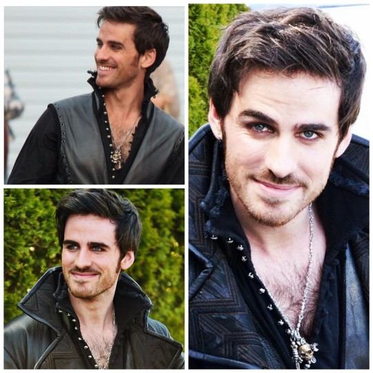
For those who don't know what the HECK I'm talking about, I reblogged this fantastic little gif set and went off in the tags about how lucky we all are that Colin O'Donoghue happens to be a winter.
So for those unfamiliar, everyone fits into a color palette or season, according to House of Color, which came about in the eighties and is based on color theory. The idea is that based on your skin's undertone, hair color, and eye color, you fit into a "season" of color. You're a spring, autumn, summer, or winter. Spring and autumn are on the warm end of the color palettes, and summer and winter are the cooler seasons. Think warm oranges in fall and bright, sunny greens in spring. Bright blues and berry pinks for summer, harsher whites, blacks, blues for winter. Makes sense, doesn't it? (Honestly, it took me a long time to understand it all, but once I did, it kind of broke my brain and I can't unsee these things. 🙃)
Well, I make the case that sir Colin O'Donoghue, our dear Captain, is a winter. And we are so damn lucky that he is. Do you know why? Because winters are the only season who can truly pull off black. 😎 And true red, actually! Because of the high contrast between their features and their cool undertones, winters look amazing in high contrast, vibrant cool colors. Those colors don't wash them out like they would other seasons.
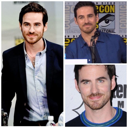
Let's get down to the photo evidence, shall we?
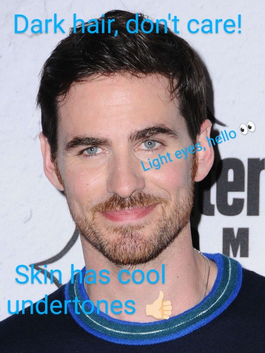
Here we see Colin in all his smirky glory.
Now, we all know what this man looks like, but let me point out the obvious. Dark hair, light eyes. The contrast between the two is high, allowing him to pull off a more high contrast color, such as black, white, and that vibrant blue at his collar. His skin has a cool undertone (which is a whole other thing but just trust me there for now). You can see a more pink look to his skin, instead of a warmer yellow undertone. It's easier to see on people with lighter skin, but you can also determine undertone on folks with darker skin. So, there you have all the makings of a true winter.
What does that mean, in terms of clothing and picking out colors that will complement your features? Let's look at some pictures of Colin NOT wearing colors in his winter palette and maybe you'll see what I'm talking about.

Now, you'll never see me on this website saying this man looks bad in these photos. Obviously you'd be hard pressed to make Colin look unhandsome in anything you put him in. But just take a look at him wearing this muted wine colored shirt. His features don't pop at all, like they normally do. It's doing nothing for him. He'd actually be better off just wearing that white undershirt, in terms of making his features pop. And then the photo with the beige on the right is just... I mean, we can all see that's not good, right? We can all see those colors are doing nothing for him? Winters and beige don't mix. Beige is on a winter's no-no list.
It was actually difficult to find photos of Colin not wearing colors in his season. He actually does pretty well for himself, in that regard. He generally wears cooler colors and a lot of black. Here's another photo example though of him in a warm, olive green. Does he look ugly? Absolutely not. Would this sweater look better on him in black, or almost any shade of cool blue? Absolutely.
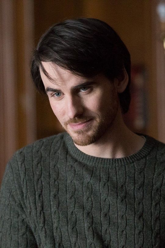
The olive color washes him out, actually. Let's compare this to Colin in a bright white and dark blue, below.
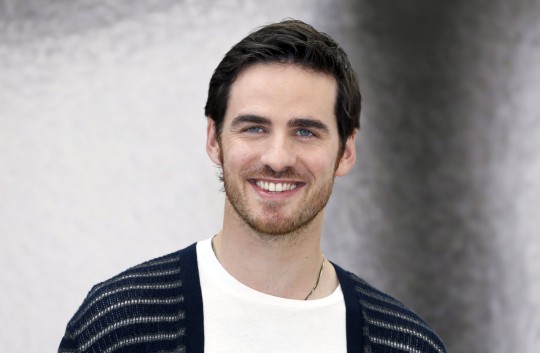
See how his eyes pop, and his skin doesn't look so washed out? The olive green sweater seen above is a warm green, which would look fantastic on someone in the autumn season. On a winter, though, it just doesn't work as well. And because I love Colin in blue, here are some more examples of him wearing his colors well.
Now, you might be saying to yourself, "Tori, you silly goose. You're forgetting about the magic of lighting benefits, and also the magic of facial hair, which is basically makeup for men." Sure, I'll give you that. Most men look better with stubble or a light beard, and lighting helps. I take you now to my next example of Colin not in his best colors.
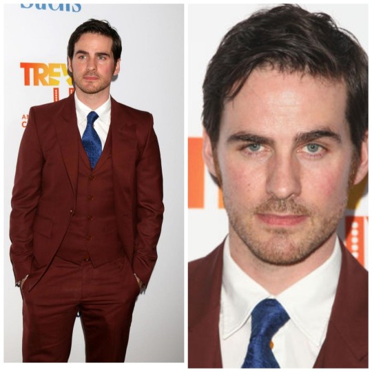
The white undershirt and the blue tie are great for Colin! The rust brown suit, however, makes me feel yucky inside. I keep using this phrase, but you can see how this color is just not doing the man any favors. It doesn't help bring any vibrancy to his features in any way. Let's compare these now to (the moment we've all been waiting for) Colin wearing black and see if we can tell a difference.
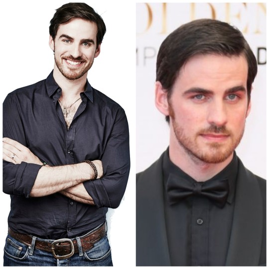
Do you see how his eyes look brighter, and his skin tone doesn't look so muted and washed out? The skin beneath his eyes isn't as shadowed, either. People generally look healthier when wearing the colors that suit them best. Now, add in Hook's eyeliner to make those blue eyes pop, and you've got some real magic.
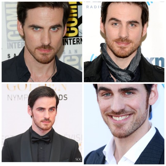
Winters also look great in red. (Think of Monica Gellar, also a winter, in her signature red from Friends.) Let us not forget Killian's fan favorite "red vest of sex", as seen below. Someone in the costume department really knew what they were doing with Colin, it must be said.
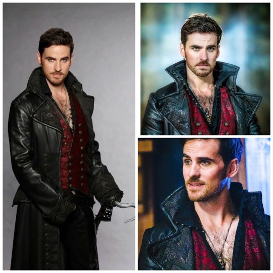
It's also important that they had him wear silver jewelry, instead of gold, as silver goes better with cool undertones. And how fortunate are we that they cast a man who naturally looks so good in black? The whole "little black dress" as a closet staple for women simply doesn't work for so many of us who just don't look good in black. The only season that truly shines in black is the true winter. ✊🏻 More power to them.
TL;DR Colin looks fantastic in black, and there's a scientific reason for it. Emma didn't stand a chance against not falling for Killian Jones, and neither did we.
Thank you for attending my TED Talk.
44 notes
·
View notes
Note
rapid when your art comes across i want to yell and scream it’s so so amazing. i love love the way you color, what did you do to study color/ how did you get so good at it?
Thank you so much! I'm definitely not an expert but I do have my methods of picking colors, I'm very happy it doesn't go unnoticed <3 Alright SORRY this got kind long but I have a lot of thoughts regarding picking colors xd so im gonna put this under a cut.
I got more interested in my choice of color when I got into supernatural tbh, I just really loved the vibe of the early seasons. I know I did a bunch of studies of some screenshots. But really in my opinion, you just have to know what vibe you're going for, like, maybe choose a color of the lighting, like blue or purple, and the next step for me is to establish what the white color looks like in this lighting. It will never be white. Even without a light source, this is my own way of coming up with whatever color palette for a drawing - I pick a color that isn't white to be my white, all the other colors will be tinted by this color I picked.
I think this isn't going to be very obvious in the beginning? You should pay attention to the color wheel and such, and there's color theory involved. I often end up wanting to have a green object in the scene, but the color i'm going to have to pick is gonna be like, gray or something, but in the context of all the colors it WILL look green. It's still hard to figure out sometimes (dear god don't even get me started on drawing Knuckles next to the light of the Master Emerald???? Red and Green cancel each other out, my man is gonna be like what? Gray or black. It pisses me off so much I usually just ignore it or work around it sdffsfedfgrggfdg)
and what I think is a really good exercise is that whenever you're using things like blend modes, like an overlay or multiply layer, it's good to later use the color picker and pay attention where your actual desired colors are on the color palette in your program. With time you just learn how to pick your colors directly instead of using filters and I just think that allows for more freedom and experimentation with your colors.
At the same time blend modes are fun af so of course you should go ham with them, I do whenever I feel like experimenting a bit or if a drawing needs some tweaking
I also recommend the youtube channel Light Mentor, this guy has a ton ton tonn of videos about colors and color theory.
#asfdsesggr sorry giving advice is scary even thought i have so much stuff to say vfbgrggnrtg#if i didn't explain something well enough and you're interested in what I actually mean pls feel free to ask me to clarify X|#i HOPE i didnt leave any typos i can almost write words backwards sometimes lmaooo
16 notes
·
View notes
Note
7. Easiest thing for you to draw?
14. Favorite thing about drawing?
22. Favorite color palette to work with?
30. Something you're proud of in your art style?
HI CARLO !!! ty for the ask !!!! 🫶🫶
7. I don't know 😭😭 I struggle with everything I draw bro Nothing's easy for me 👍👍
14. I don't know either? I think it's just like. watching everything come together while you're drawing and being proud of it, it's always the best feeling tbh
22. I really like working with reds, greens, and oranges!!!! maybe yellows and blues too!
30. my rendering style 100% 🙏 I may be extremely shitty at it these past few weeks but my fav part abt my art is always the rendering tbh, it's always so fun to do
(artist ask game)
4 notes
·
View notes
Note
your colors are alwasy SO GOOD.... do u have any advice for how u pick them
thank you! for advice, i have a few tips:
the first is to always keep in mind what color palette you are using. as you become more experienced this will likely become something you do subconsciously, but when i was starting out with drawing i would usually deliberately choose a color palette and reference that while coloring in my drawing.
i'll go into some basic color theory (ha ha) but feel free to skip this if you're already familiar with it.
there are many different types of palettes to choose from, but the most common ones are:
monochromatic
analogous
complementary
split complementary
triadic
square
tetradic
for example, the drawing i just posted follows a split complementary palette (which is favorite scheme btw)
i can explain this more in-depth if anyone want me to but for the sake of brevity i'll leave it at that. the only other thing that i think is important to note if you're following a color palette is that it's important to balance out the values of the colors that you are using (how light and dark they are) as well as use it as a guide but you don't have to strictly adhere to your pallete 100% if the time within your piece. for example, the my drawing uses MAINLY blue, green, and red-orange, but there is also some orange, yellow-orange, yellow-green, blue-green etc. in there as well
my second tip is to experiment! i hear the phrase "learn the rules before you break them" a lot when people are giving advice to beginner artists, which i don't always agree with because i think experimenting and finding out what you like and what you think works is very valuable (especially when you are drawing for fun and not professionally!) have fun with it, do the opposite of what people tell you to do just to see how it looks, etc. i remember getting the advice to always shade warm tones with a warmer tone and cool tones with a cooler tone (this is only a rule of thumb btw) and one day i started doing the opposite and found that it can look cool in certain circumstances
my third tip is to use references! i joke a lot about colorpicking from the most random images but i think that looking at other images and asking yourself "how is the artist/photographer using the colors to make it look this way? how do i recreate that?" and using that as a way to study their use of colors can be really helpful. i you find a drawing that has cool colors, try using those colors in your own drawings and see how they look!
the fourth tip is to play around with contrast. some drawings will look better with LOTS of contrast (where the darkest points are black and the brightest points are white), while others will look better with low contrast. stylistically, i prefer using low contrast. going back to the drawing above, there is no true #000000 or #ffffff used anywhere (except the white outline). i find that in certain situations this can help colors stand out. but like i said, it's more of a personal preference
the fifth tip is more for digital art, but it's to play around with blending layers, adjustment layers, and gradient maps if you don't like your colors but have no idea how to fix it. some programs don't have this feature but using blending layers/adjustment layers/gradient maps is sort of like using a filter to change the hue/value/saturation of your art in different ways
hope that helps! if there's anything i need to explain further please lmk!
44 notes
·
View notes
Text
Beetlejuice Coloring Process! 🪲
Since my new artwork is gonna take me some time to complete, I decided that now would be a good time to talk about my coloring process for Beetlejuice's design! Specifically, I want to talk about picking out the palette for his eyes and outfit. It was a confusing process that's nice to look back and reflect upon.
Beetlejuice took me the longest to design... I almost gave up on completing him, but I'm glad I persevered! I really love how he came out in the end!
Since this will be a long post with several images, I will add a "read-more" link in case people wanna keep scrolling.
Otherwise, here's my coloring process!
-
After I finished laying out the colors for his skin tone and hair, I started thinking about how exactly I wanted his eyes to look like. I really like designing eyes in general because I feel it adds a lot more character to a design!
My initial idea was to give Beetlejuice slightly dark scleras with yellow pupils in order to create this eerie, uncanny effect.
The problem with that idea was that it ended up feeling... too eerie.
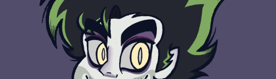
I felt as if it was leaning a lot more on him being a demon, with not enough leeway to show a more human side of him. As a result, it made it difficult to connect with him as a character... which was not what I wanted.
My next idea was to merge the color palettes from my two artist references - creaturologie and shnikkles.
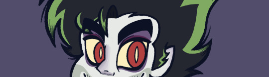
While I felt like I was moving in a better direction, this made it very clear to me that I needed to find a palette that better suited my art style, because I felt the red here was just... too much? It ended up overpowering the green which was definitely not what I wanted.
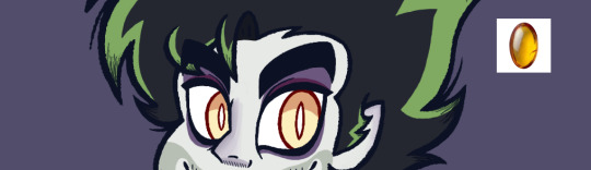
Finally, I decided to stick to the original stage production and make his scleras white. This also made it easier for me to balance his eyes with his skin tone.
As for his pupils... I started thinking about amber stones, and how they illuminate in a way that is very subtle and beautiful...
That's when I realized that Beetlejuice's pupils didn't need to be consistently illuminated in order to have that subtle, eerie effect. They just need to create the illusion that they can illuminate wherever he went or however you looked at him.
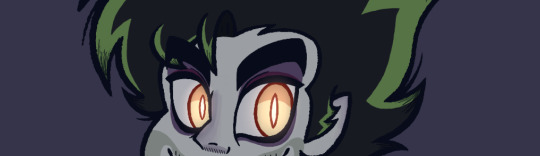
With this in mind, I created the final version!
I couldn't be any happier with how it came out! I felt as if I finally hit that perfect balance between his human and demon characteristics! You're able to connect with him better, all while he retains the more frightening elements of his character.
That being said... his eyes can very much glow in the dark, if he so chooses.
-
I'd like to quickly touch on the outfit, because I had been going back and forth as to whether I wanted to add some semblance of color to his design or not...
I did try coloring his button-up with a magenta similar to the cartoon version... but I wasn't a huge fan of it. I realized I wanted more of a consistency to Beetlejuice's design.
This brought me to another challenge - how much value did I want to add in each part of Beetlejuice's outfit? I knew right away that I did not want to use pure black and white, but I still wanted to create a distinction of some kind for each outfit piece.
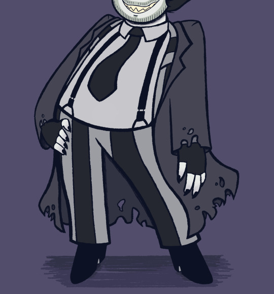
For this, I heavily referenced the musical - I've always loved how Beetlejuice's outfit wasn't a bright white. Rather, it was weathered out to be gray. It gave him a more gothic feel, which I fell in love with. I took it up a notch and gave him just a slight tinge of blue, as an homage to Corpse Bride - one of my favorite Tim Burton movies! I would eventually use a similar palette for Lydia in order for her and Beetlejuice to match.
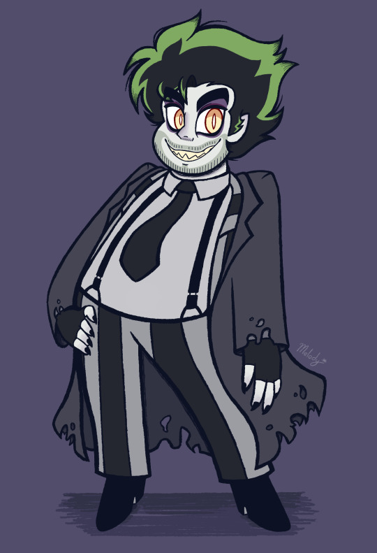
With that, I completed the look of my Beetlejuice design! ✨
15 notes
·
View notes
Text
Color Analysis of The Boyz Members: Part 1
I am back again with another color analysis post. This will be halved into two parts because unfortunately, I cannot fit all 11 members in the post.
Just a disclaimer, I am not a professional nor do I have professional education, I just happen to watch too many Tiktoks and I happen to notice the differences with a keener eye than your usual person. Feel free to disagree, but I wil literally cry.
By the way, I am surprised by the amount of warm-toned people here, and even the cool-toned members are warm-toned adjacent (neutral-cool toned) except Kevin LMAOOOO
Also, another thing, I strongly align myself with Carol Brailey's rules when it comes to color analysis, therefore there are NO light seasons.
The order is not by age. I will be posting whichever member I was able to finish searching for pictures. I am sorry, but all these men ever wear is black and I am fucking TIRED.
Eric Sohn: Deep Winter

(The first pic is actually lethal. It's the reason i was inspired to do this.)
- The only Deep Winter in TBZ. He has a neutral-cool undertone and looks best with the pinks and purples of the palette. His next best palette is True Winter.
- You can just tell he's a winter palette. I already typed him as a winter and Deep Winter was my best bet. I was right.
Lee Juyeon: Deep Autumn

(I just knew he was warm-toned when the 4th pic dropped. Siargao Boy Juyeon, you're the only one I allow to gentrify that island.)
- He is a great example of a Deep Autumn that can rock Deep Winter colors. Having a neutral-warm undertone, he looks best with the violets and reds of the palette.
- This one is a no-brainer. Juyeon is easily what one would think of as a Deep Autumn. Actually, him and Sunwoo are your typical Deep Autumns. I always typed him as Deep Autumn so I am very happy that he is one.
Choi Chanhee: Bright Spring

(You would think that since Chanhee wears so much colors, I would have an easier time but NO. It took an hour.)
- An example of a Bright Spring that can pull off True Spring colors better than Bright Winter colors. With his neutral-cool undertone, he best fits the blues and the pinks of the palette.
- I originally typed him as a Bright Winter, but then I was like...he looks spring though, so I processed him again and LO AND BEHOLD, the Bright Spring palette revealed itself. He just couldn't handle the harshness of winter seasons. I was so sure about that.
Jacob Bae: Deep Autumn

(I actually gave up in looking for warm colors in this man's whole celebrity life that I just edited the pictures. Men truly will be men and they LACK fashion🙏)
- Having a neutral-warm undertone, Jacob is better suited for the darker colors of the autumn season. He can absolutely wear colors from the True Autumn palette with better results than Deep Winter. He looks best with the browns and greens of the palette.
- I thought he was Soft Autumn because he looks so nice, so I am genuinely surprised that he's a Deep Autumn, because he doesn't give me the vibes that he is one, but seeing him in Deep Autumn colors, I just know it suits him.
Kevin Moon: True Winter

(The only time I am happy that a man is wearing black or white. Do you see how it suits him? Exactly. He has it easy.)
- With his fully cool undertone, he looks best with the True Winter palette followed by the Bright Winter palette. He looks the best with the purples and blues.
- I almost typed him as a Bright Winter, because he has that brightness in him, but his cool undertone revealed itself when I gave him lime green LMAO. The season fits him though. He does look good in black.
Kim Younghoon: Bright Spring

(Leo men and the Bright Spring palette is forever my favorite thing. By the way, I hate that he always wears black or gray. Invest in a good dark brown ISTG. Also, by the way, the stylists know what's up.)
- Having a neutral-warm undertone, Younghoon looks best with the bright warm colors of the Bright Spring palette. He looks especially the best in the pinks and blues. He can pull of Bright Winter colors better than True Spring colors.
- I genuinely thought he was a summer LMAO, but there's an ongoing theme of Bright seasons looking like they belong in a Muted season, but he looks genuinely good in warmer, brighter colors.
Other members are in part two, whenever that will be released💀
#the boyz#tbz#kim younghoon#lee juyeon#eric sohn#choi chanhee#jacob bae#kevin moon#color analysis#personal color
5 notes
·
View notes
Text
I got to think about how Anne's (she/they) design has changed over the years since their intial drawn design in July 2021! So here's a whole post about that! Putting the rest under the cut since it turned out long oops.
[7/6/21] The initial picture (above) is the first drawn OC art that I can honestly say I'm proud of. I liked the color scheme compared to the blues/greens that would make her look more like her siblings (especially Medb), so reds and pinks became her palette! Along with orange eyes because I thought they looked nice (and they do but more so later on!)
[10/15/21] Next up is Anne cosplaying Blueberry cookie from cookie run kingdoms! I do like how this turned out, but I know I had a long way to go in terms of design.

[12/30/21?] These are some doodles because I wanted to come up with more outfits (and draw outfits I would see via ads) and these are okay. I prefer the first one and the second one is lacking tbh.
[2/21/22] I was planning on making a 4koma style comic that just has everything escalating, but I scrapped it since it doesn't feel that funny to me. I do like hair down Anne though, so I cropped that out and use for reference sometimes.

[10/21/22] This was done for an art warm up, the theme was coffee! I changed her palette (mostly skintone) because I felt it fit her more! I really like this art and I hope to redraw it when I work on drawing black hair again! It has such a cozy vibe that would work when they're just getting up in the morning.

[11/28/22] And this is the full art of her current design! I still want to work on it (giving her leggings and shoes, probably boots) I'm really happy with this design, especially how the colors work together! The pinks and orange are nice focal points while the browns and reds compliment them nicely. It's a shame I haven't drawn her more recently than this (other than OC-Tober) but I'm happy this design is this good!!!


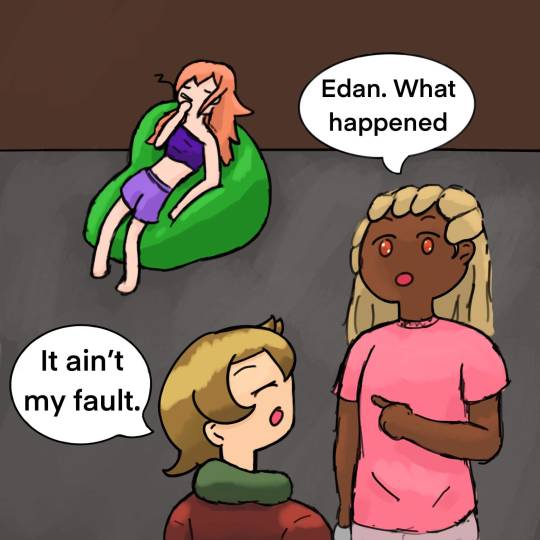
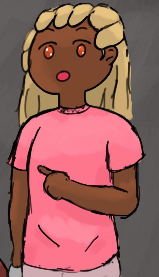
[10/20/23] SPEAKING OF OC TOBER!!! Look at them! flourishing!! (siblings from top to bottom: Edan, Rupin, Anne, Grainne, and Medb) I love them all dearly and I miss them.
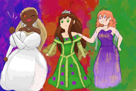
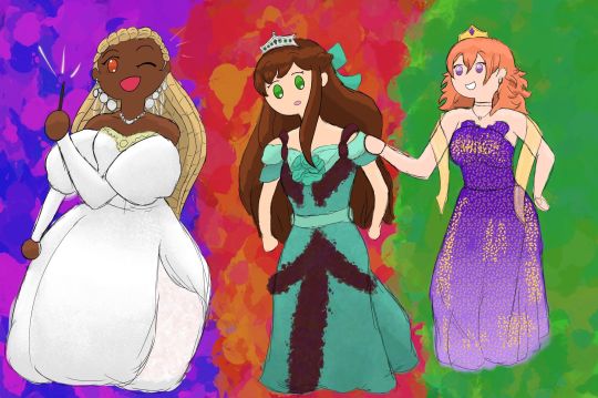
To wrap this up: have a bonus pretty dress sequence feat. Anne, Grainne and Medb! from September/October 2021! Anne is cosplaying Sarah from the ballroom scene in Labyrinth and the other two are in random dresses I found!
Thank you for reading this far, you're awesome and I hope you have a great day! 🫶
#vestige of earth#my ocs#oc stuff#oc art#original character#my ocs <3#ocs#original character art#long post
6 notes
·
View notes
Note
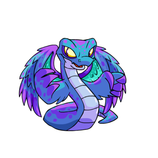
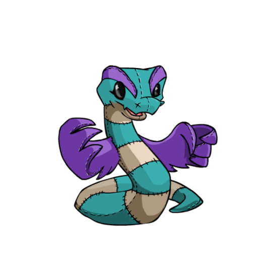
thank you for doing neopets reviews! could you review hissi, including my favorites UC plushie and darigan hissi? thank you!
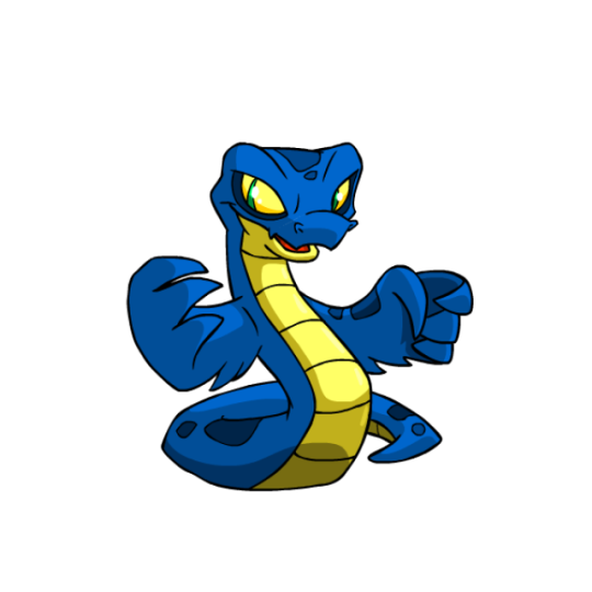
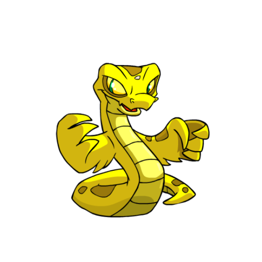
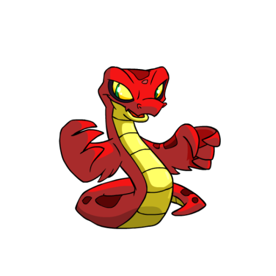
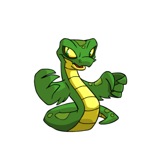
Hissi are pretty simple, basically just a snake with wings, but they're a well-designed snake with wings, which is what matters. The wings themselves add a lot of memorability to what would otherwise be a pretty generic design, and the light yellow underbelly breaks up the solid color a bit while accenting the eyes. Another nice feature are the rattlesnake-like spots, which add just the right amount of detail to the design.
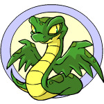
For the most part, Hissi were mostly left unharmed from conversion... except for the wings. Changing the wings into more hand-like structures is just such a strange decision—no other Neopet with wings had this done, for starters (Pteris and Lennys just had their wings cupped a bit, but weren't given anything resembling hands). Plus, was it really so important to have them hold items that it was worth screwing with one of the best parts of the design? Converted Hissi are still pretty nice, don't get me wrong, but the original will always be the better version.
Favorite Colors:
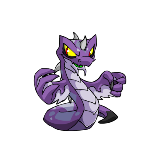
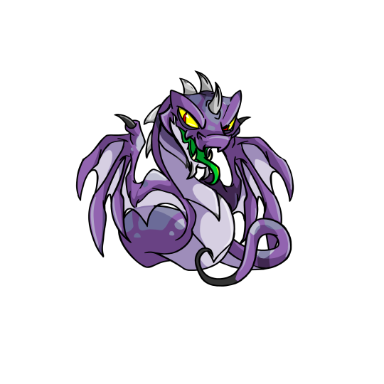
Darigan: The UC Darigan Hissi is just amazing. The body is fairy straightforward, now sporting spikes and V-shaped underbelly scales, but the big changes are to the tail, mouth, and wings. The mouth has a long tongue, the tail is extra thin and long with a black tip, and the wings were given this awesome webbed look with very distinct anatomy. The purple-and-black palette also looks great. I do wish the tongue was maybe a yellow or a blue, as the green feels a little out of place, but it's otherwise pretty fantastic.
The converted version is... fine. It's just inevitable that a design that relies on unique body shapes would feel more generic when converted. On the plus side, the conversion is pretty loyal, missing only the black from the spikes and sporting slightly different spots. Either way, a good color all around.
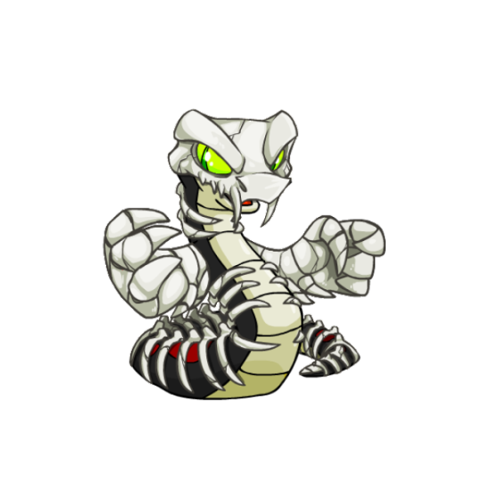
Halloween: Continuing with the spooky vibes, Halloween Hissis have always been pretty cool-looking. They sport a black-and-red base color that works well on its own, and then top it with a really nice-looking set of bones that resemble actual snake vertebrae. Particularly nice is the skull, which doesn't have a jaw and sits on top of the head, with a pair of fangs to boot. I do think the wings look a bit clunky due to being entirely bone instead of only partially, and the eyes might've worked better with the accent red, but overall a really nice design.
Faerie: I've just always found this one very pretty. It sports a fairly low-contrast palette of blue, turquoise, and purple, but it just works really nicely together. It having four pairs of wings is pretty cool conceptually, and the second pair have a bright turquoise inside that really make them pop. The body also has a lot more spots than usual, including sort of a mottled purple that goes over the entire body, and the yellow eyes accent the body well. I have heard it said that it would be better without the hand-wings, which is agreeable, but overall this one's just really pretty.
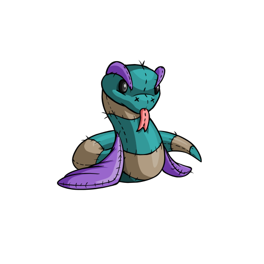
BONUS: Reviewing this one on request. The plushie Hissi isn't really my cup of tea, but it is very cute, sporting a well-worn look and a soft color palette befitting of an old plushie. It's very cute, and I love the tongue on the UC version.
However, I guess my issue with the UC version is that it never really felt much like a Hissie to me, on account of the wings being down and the entire head being vastly different. I feel like the best UC plushies still keep the iconography of the base pet, but here it gets lost a bit. Still, its an appealing pet if you're into that kind of look.
(The converted version is mostly accurate to the UC, but the brow ridges drive me nuts because the perspective on them is all wrong. But I digress.)
42 notes
·
View notes
Note
Hello, good morning, good afternoon, good evening, good night - whichever you like more!
I know you're currently obsessing over Bed Friend, so I bring you questions.
Do you think the yellow lamp with a smile is supposed to be representative of something, or is its sole purpose to distract me from the scene?

2. There are several flashback scenes, but only one of them had these flashes of red and green around the characters. Do you have any theories as to why? Is it because that specific moment triggered Uea more than other moments?

Also, when is Saturday coming and why are there only 8 episodes to this show? 😔
@sliceduplife - It's the week of Lent, so I no longer operate on a morning/noon/night schedule. The only time that matters is how many days before Lent (two), how many days of Lent (40, technically 46), and after. Kind of like my obsession with this show - days before the next episode (five), how many weeks I still have this show (seven), and the aftermath.
I must cherish this show while I have it, so let me scroll through my mind's storage room to find some other queer friends to help with these answers.
Do you think the yellow lamp with a smile is supposed to be representative of something, or is its sole purpose to distract me from the scene?
In the infamous words of Bad Buddy's Pat and Pran:

Do you see the smiley lamp in the picture above? That smiley lamp launched a hundred think pieces on its symbolism in this scene, and a majority came down to two conclusions: 1) it's the light in a dark time aka it's the hope in this depressing scene where Pran gets his hopes swiftly crushed by an unknowing Pat, and 2) it's Pran immediately putting on his facade, so Pat doesn't suspect that Pran actually likes HIM and not Ink.
Applying those ideas to Bed Friend, the lamp is showing us that 1) even though Uea just had an alarming episode in the parking lot, there is hope that he will be okay, and 2) he will continue to wear this mask of happiness. Jade and King ask Uea if he is okay, and each time, he says he is fine. The lamp shows hope, but it also demonstrates how Uea covers up his pain with a smile.
Pran and Uea got their lamps from the same store - The Smile & Denial Store.
There are several flashback scenes, but only one of them had these flashes of red and green around the characters. Do you have any theories as to why? Is it because that specific moment triggered Uea more than other moments?
I'll let the boys at Semantic Error take this one:
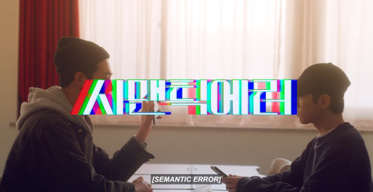
Maybe you can already tell where I'm going with this. The color palette for a command and error code is a mixture of red, blue, and green. Right before we see Uea's flashback in the parking lot, the colors go into the negative.

In the parking lot, the darkness triggers his episode. The switch into the negative happens quickly, and when the color comes back, it has the error code written throughout the flashback.

Uea's brain can't tell what is happening right now and what is the past. Both of them are blending together at that moment, and he can't escape. His brain cannot distinguish reality, in the present. This is when King grabs him and tethers him to the present.

Later, we see Uea sitting on his couch thinking about his past, but he clearly knows he is thinking about the past instead of believing he is living that experience because the error code colors are missing.

Also, when is Saturday coming and why are there only 8 episodes to this show?
Me, refreshing this Gagaoolala page eighteen times an hour just in case the episode is released earlier.
Old Fashion Cupcake got me in five episodes. My Beautiful Man did me in with six. To My Star had me in less than two hours. If Bed Friend knows what to do with each one of these episodes, which by the looks of episode one, it does, I'll be thrilled with each episode and the story that is being told.
But I'm always a sucker for a second season!
#Bed Friend#Uea x King#episode 1#the colors mean things#so does the lamp#the cinematography#the directing#King will be an anchor for Uea if he let's him be#Tie him to the present instead of him constantly living in his past
44 notes
·
View notes
Text
Top Curtain Rod Finishes and How to Choose Them
In the grand symphony of interior design, curtain rods play a subtle yet crucial role. They're the conductors, guiding the flow of fabric and light, setting the tone for your entire room. But like any great conductor, the best curtain rods know how to command attention without stealing the show. The secret? It's all in the finish.
Let's embark on a journey through the world of curtain rod finishes, where form meets function in a dance of style and sophistication. Whether you're aiming for timeless elegance or contemporary chic, the perfect finish awaits to elevate your windows from mere openings to works of art.
The Classic Contenders
Brushed Nickel: The Versatile Virtuoso
Imagine a finish that whispers rather than shouts, complementing without competing. That's brushed nickel for you. Its soft, matte sheen brings a touch of modern sophistication to any room, effortlessly blending with both warm and cool color palettes.
Why it works: Brushed nickel is the chameleon of finishes, adapting to various styles from transitional to contemporary. It's particularly stunning against light-colored walls, where it adds depth without overwhelming.
Gold: The Timeless Troubadour
Picture the warmth of ancient gold, mellowed by time and touch. Gold exudes a sense of history and permanence, perfect for those seeking a touch of old-world charm in their décor.
Why it works: This finish excels in traditional and rustic settings, adding gravitas to your window treatments. It pairs beautifully with rich, earthy tones and natural materials like wood and stone.
The Modern Marvels
Polished Chrome: The Bright Spark
In the world of finishes, polished chrome is the life of the party. Its mirror-like surface reflects light, adding a bright, energetic feel to any room. It's the finish that says, "Look at me!"
Why it works: Chrome is the go-to for modern and art deco-inspired spaces. It's particularly effective in rooms that need a little brightening up, as it maximizes the play of light.

Matte Black: The Bold Statement
Enter the realm of high drama with matte black. This finish is for those who aren't afraid to make a statement. It's bold, it's beautiful, and it demands attention in the most sophisticated way possible.
Why it works: Matte black creates striking silhouettes, especially against light-colored walls. It's perfect for contemporary and industrial-style interiors, adding a touch of urban chic to your windows.
The Luxe Looks
Antique Brass: The Warm Embrace
Antique brass wraps your windows in a warm, golden glow. It's the finish that feels like coming home, bringing a sense of comfort and timeless elegance to your space.
Why it works: This finish excels in creating a cozy, inviting atmosphere. It's ideal for traditional and transitional interiors, adding a touch of vintage charm without feeling outdated.
Rose Gold: The Romantic Touch
For those who dream in blush tones, rose gold is a dream come true. This trendy finish adds a soft, feminine touch to your windows, infusing your space with warmth and romance.
Why it works: Rose gold is surprisingly versatile, complementing both neutral and bold color schemes. It's perfect for adding a touch of luxury to bedrooms, dressing rooms, or any space that could use a bit of glamour.
Choosing Your Perfect Finish
Selecting the right finish is an art, blending personal taste with practical considerations. Here's how to make your choice:
Consider Your Color Scheme: Your curtain rods should complement, not clash with, your overall color palette. Cool metal finishes like chrome or brushed nickel work well with blue and green tones, while warm finishes like bronze or brass harmonize with reds, oranges, and earthy hues.
Match Your Hardware: For a cohesive look, coordinate your curtain rod finish with other hardware in the room, such as doorknobs, light fixtures, or cabinet pulls.
Think About Lighting: Remember that different finishes interact with light in unique ways. Bright, reflective finishes can help illuminate a dark room, while matte finishes absorb light, creating a softer ambiance.
Style Consistency: Ensure your chosen finish aligns with your overall design style. Modern interiors often favor sleek, polished finishes, while traditional spaces might call for more ornate, antique-inspired options.
Durability Matters: Consider the practicality of your chosen finish, especially in high-traffic areas or rooms with varying humidity levels. Some finishes are more resistant to wear and tear than others.
The Final Flourish
As you stand before your windows, contemplating the perfect finish for your curtain rods, remember that you're not just choosing a functional item. You're selecting a design element that will frame your view of the world and contribute to the story your home tells.
Whether you opt for the timeless appeal of brushed nickel, the bold statement of matte black, or the warm glow of antique brass, your choice will be a reflection of your personal style and the ambiance you wish to create.
So go ahead, let your curtain rods shine – or shimmer, or glow, depending on your chosen finish. After all, in the grand design of your home, even the smallest details deserve their moment in the spotlight. And with the perfect curtain rod finish, your windows will be ready for their close-up.
#curtain rods#curtain poles#drapery rods#home decor#home interior#interior design#living room#home design#interiors#window treatments#bedroom#kitchen#balcony#interior#home & lifestyle#decoration#fashion designer#luxury#luxury lifestyle#luxury living
3 notes
·
View notes