#if you know the pose they are doing 100000000 points to you
Explore tagged Tumblr posts
Text
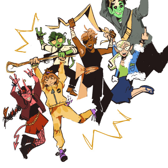
HOOT GROWL HOOT GROWL 🏴☠️
#d20 fantasy high#dimension 20#fantasy high#dimension 20 fhjy#fhjy fanart#fhjy#kristen applebees#fig faeth#riz gukgak#gorgug thistlespring#fabian seacaster#adine abernant#if you know the pose they are doing 100000000 points to you#i wanna do a rat grinders one too#my art
7K notes
·
View notes
Note
Is there any particular artist, show, game, or movie that inspired ur art style? It’s so pretty ^^
I have so many!!! I definitely can't name every single one but heres a few that have been extremely influential to me!! This took me 2 hours to write i am SO sorry lmao
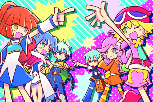
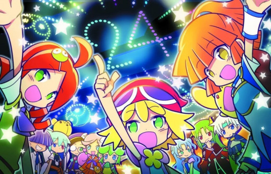
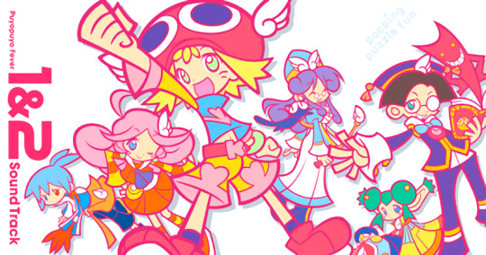


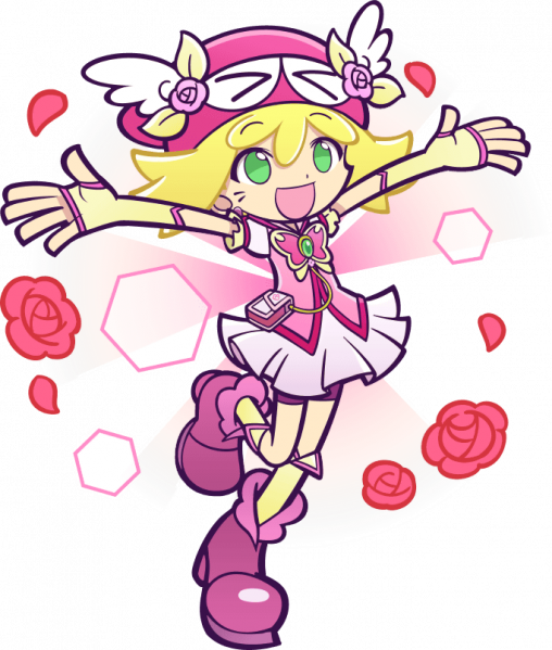

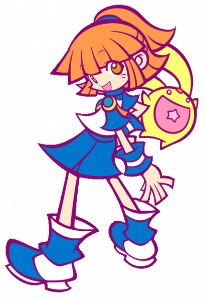
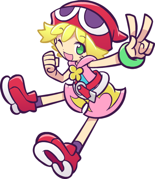
Puyo Puyo (Specifially Fever, Quest, and Tetris)
CUTESY BRIGHT BRIGHT COLORS!!!!!! Thats everything I love!!!!!! I'm pretty sure I talked about this when I first got into puyo puyo but I for SURE instantly decided that yep Im steering my style in this direction sorryyyyyy!!! I just think its so fun and silly and cute and rahhh it makes me so happy.
Especially for the work I do most often, which is character portraits without backgrounds, I will often look at puyo puyo posing just to get ideas!! (I've drawn Arle's dumbfounded pose 100000000 times becus I love it so much). The puyo puyo anatomy has very noodly arms and legs but with big ass shoes and accessories which is probably my favorite design thing in the world....
I seriously recommend just looking through the Puyo Puyo Nexus wiki for pose ideas (if you want something cute/silly of course) because every single one is just perfect. I am trying to get out of some dumb art habits of my own right now, but hopefully in the future you'll be able to see more goofy poses with sillier effects :3
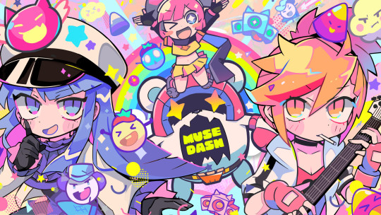
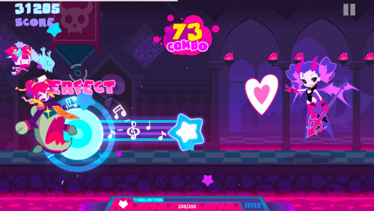
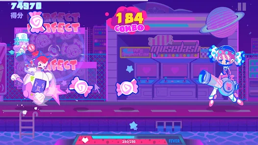
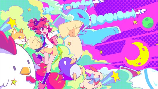
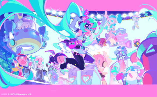
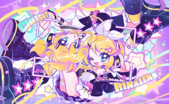


Muse Dash Again I want you to look at the COLORS. Its so bright and this time you can really tell where I took my shading style from. I dont want my shadows to be dark I want them to be PINK or PURPLE. thank you. For my own art, I really try to make it so the darkest "black" is actually a deep purple or blue, and as I keep making art that dark color keeps getting just a bit lighter haha...
This is also the reason I color my lineart the way I do. I just really want to add as many colors as possible into the image. And if the image looks a bit more pink after that then thats just an extra perk!!
I also need to bring up the animation because they're just so bouncy and alive!!! This is like an instant stunlock for me, I have to look at them, theyre so BOUNCYYY!!!!!! I don't do much animation but every other week I get the sudden urge to try tweening again just to eventually get to the point I can make something similar to these for my own ocs lol

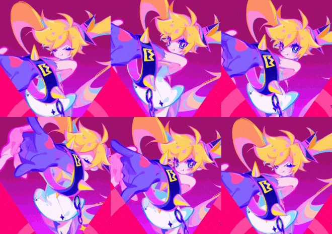

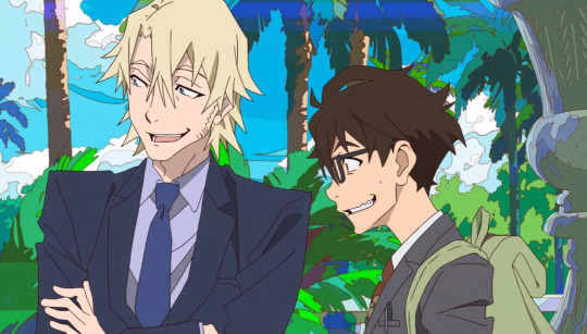

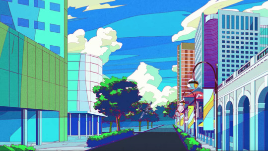
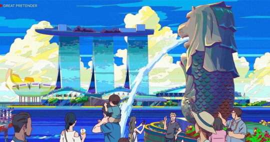
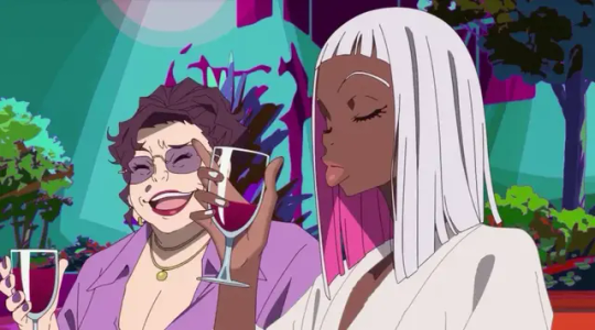
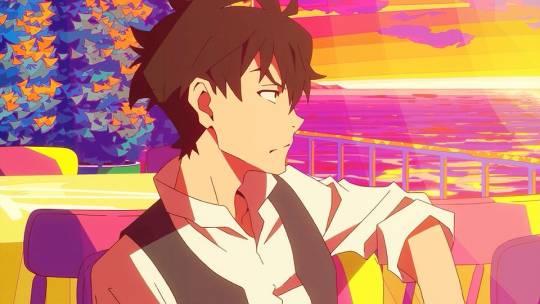
Great Pretender This show has some of the most gorgeous art ive ever seen. All the backgrounds are so bright and colorful. I dont usually draw art with backgrounds anymore sadly, but when I used to I really tried to study these for them. And I hope in the future I can make more art and show how far I've come.
Though I;ve changed to a more chibi style in recent times (thanks puyo puyo), this was still one of the first times I had ever watched a show and said "Oh my god I love this artstyle I need to get better at art" and Its always in my mind for that reason.
Ive definitely stolen lots of elements from the style. Though they've gotten more subtle over the years. I dont really know how to describe it any further but I hope you understand what I mean by looking at these screenshots,,,
20 notes
·
View notes
Text


THE PACT : PART 11 | jhs×yn; ksj×yn
<< 12 cheese puffs >>
A/n: a small blurb down below about how Jikook met etc. Warning I've been told it's uwu × 100000000. Next part is written!
Summary: after Min Yoongi broke her heart and ended their engagement during senior year of college, Yn made a pact with her best friend Kim Seokjin that they would get married if they were still single at 30. At the end of their twenties, will they keep the promise?
Taglist [comment, ask or dm!] @black-rose-29 @halesandy @ephyraaaa @minclangyyy @cholychi @miriamxsworld @burningupp-replies @marpotterhead @lilacdreams-00
Jeongguk was thirteen when Jimin's family moved in next door. He hadn't figured out yet if he liked boys or girls, but he knew right away that he liked Jimin. He liked the way the older boy ran his fingers through his hair, the way he smiled from his eyes, the way any bit of laughter made it impossible to remain vertical.
You, being the social and friendly person you are, had offered to walk with Jimin to your school, which meant Guk got to tag along until you dropped him off at his middle school on the way. It quickly became his least favorite part of the day, making him jealous that you got to spend more time with his first crush.
Jimin didn't think too much about the boy next door for the first year or so. He was busy with high school, making new friends, finding all kinds of new interests. Guk didn't know the first thing about Latin, but he knew that Latin club was something that regularly kept Jimin from joining the afternoon walk home.
"Tough day at school?" You'd ask when you saw your little brother's long face as he approached you waiting outside his school gate alone.
"It was fine," he'd grumble and push you away when you tousled his hair.
There was one activity Jimin loved that Jeongguk knew he could get involved in, and when he got to high school the first thing he wanted to do was sign up for track. Jimin had been one of the fastest boys on the team, but Guk was faster. At first he'd get Jimin's attention by speeding past him during warm ups, posing unnecessary challenges to the smaller boy. Challenges Jimin always rose to, and despite his best efforts, always lost.
At some point their friendly rivalry included races home, even after a long practice. Races often ended with snacks at Jimin's. Snacks at Jimin's turned into dinners with his family and Friday night sleepovers. Until one night, just before the start of his senior year, Jimin couldn't seem to stop himself from kissing the cute boy next door.
#bts social media au#bts fake texts#bts smau#jin smau#suga smau#jin#jhope#kim seokjin#hoseok#hobi#jin x you#jin x y/n#jin x reader#bts jin#jhope x you#jhope x y/n#jhope x reader#hobi x you#yoongi#suga#jeongguk#jimin#taehyung#bts v#jikook#namjoon
99 notes
·
View notes
Text
T. rex emojis, as rated by a palaeontology student
by popular request, a sequel to the sauropod one!
apple

off to a really poor start here. it’s standing in a tripod stance. now, they couldn’t walk in this position, but standing is a possibility and nothing looks objectively wrong about the posture, so i’ll let that slide. however, the torso is far too short, and the head is wayy too rectangular. it looks overall like it stepped out of the 30s, and that’s not a compliment.
score: 3.5/10 mediocre
google

this looks like they intended to do a velociraptor, but didn’t know what velociraptor looked like so they just based it on jurassic park. as a T. rex it could be worse - it’s got a recently correct posture, and looks more out of the 90s than the 30s. so some points there. the “dewclaw” on the foot is pointing the wrong way, the wrists are turned a way they couldn’t in life, the torso is too short, the head isn’t quite shaped right and is shrink-wrapped, and its tongue shouldnt be so muscular. if it seems like i’m being too harsh on it, that’s because it’s not too far from being decent.
score: 6/10 could be worse
microsoft

bucks the green trend! some points for that. it’s attractively outfitted in brown with a tan underbelly and stripes. it’s pretty simplistic but not overly so in my view, but it’s got broken wrists and that downward-pointing tail that makes it look outdated, but it certainly doesn’t seem too horribly so.
score: 6/10 but in a different way
samsung

this is just a knockoff of the apple one.
score: 0/10. academic dishonesty
whatsapp

some effort put into perspective here, which i appreciate! its dewclaws seem correctly oriented, and its tail is correctly raised off the ground. however, its wrists are broken, and its leg muscles lack definition. its metatarsals are far too long for an adult T. rex. the head is also not quite shaped right, as the eyes seem to be raised up above the nose, and the back is too humped. however most grievously it has THREE FINGERS PER HAND. this is not a T. rex, it is a neovenatorid. accept no substitutes.
score: 4/10 an impostor
twitter

oh no this one has three fingers too! ouch. it’s elegantly simple, with pleasing curves, and is brown rather than green. but this emoji is specifically meant to be T. rex, and a T. rex it is not. its head is too rounded, and it has too long of arms with three fingers. this is a carcharodontosaur. its metatarsals are too long, and its wrists are broken
score: 5/10 for pleasing curves
facebook

i’m real torn on this one. a lot of attention to detail was put in, but into the wrong things. the head is excellently shaded and has a defined shape. it’s just the entirely wrong shape. it’s very clearly based off of the T. rex from jurassic park, which looks little like a real T. rex. the metatarsals are too long, the wrists are broken, the back is humped. however it does have correctly placed dewclaws and correct posture, so it regains some points.
score: 7/10 i wish it were better
joypixels

now what the hell is this? the tail is glaringly short, like they ran out of space, and the neck and torso are also too short. the neck is attached to the bottom of the head rather than the back. these things combined have the effect of making it look like a human in a suit. the tongue is too muscular, and the head is too jurassic park-based. the mouth seems to be open way too much, but I’m not positive how the weird neck placement affects my perception of that. on the flip side, the legs seem decently muscular and not too horrible. they’re the best thing about this one.
score: 4/10 behold! a man!
openmoji

NO FACE NO FACE NO FACE
okay seriously, what? i guess they were going for cartoony. that’s fine, I get that. but why not give it a face? some teeth?? eyes at the very least??
score: 5/10 baffling
emojidex

this looks suspiciously familiar, like it’s been plagiarised from a plastic toy. which it has. specifically this one, which is itself plagiarised off of jurassic park. emojidex has shamelessly copied the pose, but here’s the thing: they didn’t even manage to do that right. they gave the damn thing three fingers. aesthetically, it’s horrible. the torso looks like a predatory slug erupting out of the hindquarters of a dinosaur. it’s unpleasant to look at. it’s a game of telephone that’s three steps removed from anyone looking at an actual dinosaur. this is what you get. it may resemble a dinosaur from forty paces, but this is no dinosaur. at least, not anymore.
score: -100/10 a wretched hive of scum and villainy
emojipedia

wha-- who the fuck? how do you get worse? how do you do this badly? how do you mess up so much? how do you put this much effort into defining the shading and textures but absolutely none into making it look remotely like a dinosaur??? it’s got a heavy gorilla-esque brow that overhangs dead, soulless eyes. its hands have clearly been slammed in a cartoon piano. the legs — my god, they’re like ugg boots. each foot has ONE TOE. ONE. the body looks round like a sausage, and the tail is a cone that’s been superglued on. i can’t imagine caring this little about something
score: -100000000/10 i cant wait for the asteroid
3K notes
·
View notes