#if they are all the same shape where's the diversity in silhouette?
Explore tagged Tumblr posts
Text
But if the wigs aren't 80s prom-picture-glam-rock-teased-to-the-rafters big then what's the point?
#where's the panache and pizzazz?#where's the drama teased to high heaven?#angst and woe#extemporize back chat#honestly cats is a very 80s musical and attempts to modernize it visually sort of takes away#from it's charm just a lil bit#if they are all the same shape where's the diversity in silhouette?#where's the *meat* here#remember back in yhe hamburg and broadway days when tugger's wig was its own lifeform? yeah#london at it again
42 notes
·
View notes
Note
Could you talk about the designs Viv makes? I don't see many posts talking about this and I wanted some design tips, I intend to post my own cartoon designs (I just don't know when) and I wanted some tips <( ̄︶ ̄)>
Hey hey!! Id love to talk about designs!
I actually answered this entire question and then uh…. Tumblr deleted my draft so let me try to redo all this lmao
Vivzie has a problem with bodytypes I’ve noticed. Almost all of her cast is insanely skinny and the only two “plus-size” characters I can think of are Millie and Mimzy. Meanwhile, Angel Dust, Vox, Stolas, & Alastor are a few very skinny characters I can think of off the top of my head.
For the best example, I’m going to be using Vox for now. Here is my Vox design next to his canon appearance
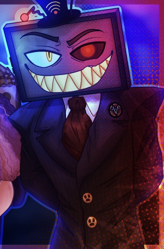
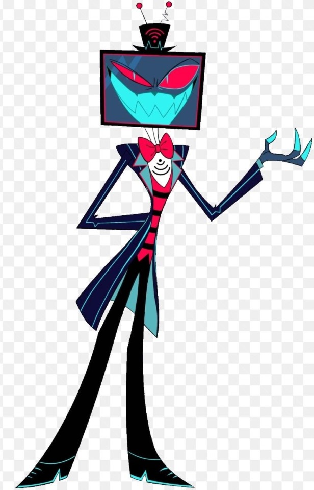
They don’t look too different right? This is still easily identifiable as Vox because his main characteristics are there; stupid little hat, tv head, thats about it.
My design also keeps elements of his suit with the stripes and shoulder pads, though in my design his body is a bit wider and his shoulders + waist make him look more commanding and intimidating while still maintaining a sense of professionalism. As for his canon design, he definitely looks sketchy, but he doesn’t really give me that commanding sense of popularity or authority that I feel an overlord should have, especially one with such a wide range of influence as Vox. His canon design looks top heavy and a little pathetic in that “he was born in a wet cardboard box all alone” way. Don’t get me wrong, a small waist can do wonders for a design, but when your designs start to look like… this
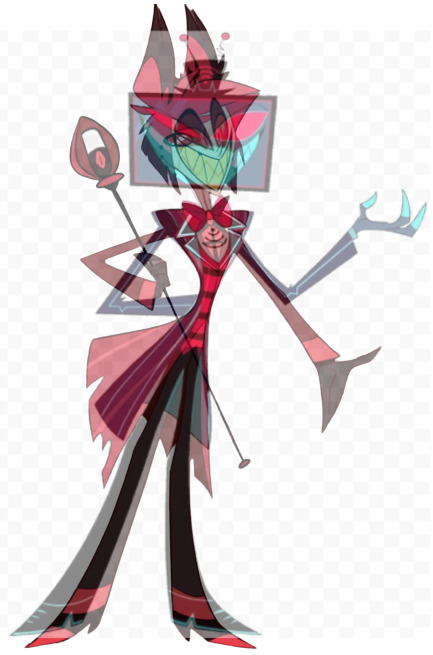
I think you might have a problem.
Now, I know I am nowhere near the best character designer in the world, but I have designed my fair share and I think I have enough experience to flatter myself a little.
This is a very simple design choice to make. Body types are probably some of the most intricate and interesting parts of a person in my opinion, and with a lineup like this where everyone looks more or lest the same from the torso down, it’s kind of a dead and sad looking cast, and not in the intended way.
I’m aware my designs are very detailed and wouldn’t be easy to animate with my style, but it’s very easy to draw extra body types with a style fit for TV.
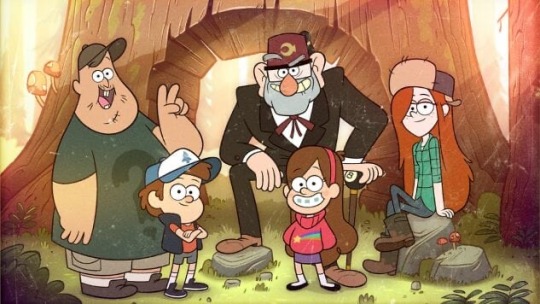
Gravity Falls is a great example of stylised bodies and also using them to build personality. By looking at these characters you can generally tell what their base personality is probably like right? You can do the same thing to an extent with the Hazbin Cast, but all of their designs get muddled into the other. Can you even tell where half of these people are positioned in this screenshot
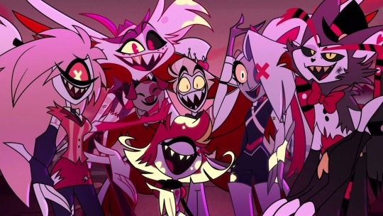
It’s so pink and red im going to start seeing green when I look away. There are so many colours, use them!!!! You can still slap a red overlay over it and make it “look like hell” or whatever, but you’re still gonna have more variety.

Here’s my body/fur references for Angel and Husk. They are almost entirely opposite to eachother but you can probably get an idea for how they are based on colour and shape. I recommend studying other TV shows and things like anime or movies to see how body types and colours impact character design, but general things I always think of are, like I’ve said, body type, personality, colour, and silhouette. Silhouette is a bit harder to pin since a character can have a very recognizable silhouette and still not be a good design, but honestly to me as long as you can tell which character is which from silhouette you’re good to go on that front.
- Generally just don’t reuse the same colour palette over and over (heres some of my hazbin colours)
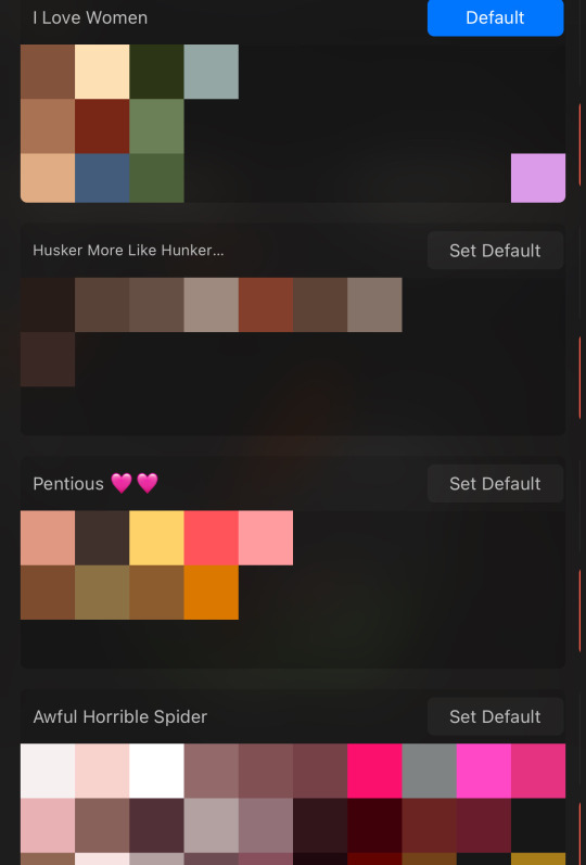
- Give diversity in shapes when you can and when it benefits the design
- Try to show their personality through their clothes and pose
- Don’t be afraid to add little physical or personality details that other people might not notice, a good design should keep you interested in tiny details like that or surprise you later on
- Pay attention to what would and wouldn’t make sense (ex. A character that doesn’t like modern fashion wearing modern fashion)
Im not the best at explaining all of this but I hope you could grasp even just a tiny bit of an idea from this! At the end of the day as long as you’re having fun and not actively harming people with the designs then you should be good to go
#raimble#hazbin hotel#hazbin critical#hazbin hotel criticism#hazbin hotel critical#anti vivziepop#hazbin hotel rework#hazbin hotel rewrite#hazbin hotel redesign#hazbin redesign#my art
104 notes
·
View notes
Note
This is probably a weird question, but what are some tips you could give on character design? I've been trying to feel confident with my own designs, but they feel kind of bland... what kinds of things would you suggest to help make designs stand out more?
Hoo boy. Hm. I feel like I am not the right person to ask about this because objectively I do almost nothing you're "supposed" to, but if it's working I guess that means I might be onto something?
A lot of my design considerations are practical. I don't want to give anybody a design that's going to be a nightmare to draw over and over again. I've done enough commissions in my time to know when somebody is overdesigned and therefore hugely annoying to draw, and that's a no-no. So I tend to stick with simple patterns at most, not too many layers, no need for five million belts, no need for incredibly intricate hairstyles, etc. This is a practical consideration for the medium of comic art, but other mediums have different considerations - 3D-modeled art, for instance, can overdesign the characters as much as they want because they only need to model them once, and a lot of visual novel characters are limited to a very small handful of poses and some interchangeable expressions, meaning it isn't prohibitively complicated to make them a little Extra. The most time-consuming and frustrating commissions I've ever done were for characters who were frankly never designed to be drawn more than once. A quick sampling of highlights for the design features I swore to myself I would never deal with again-


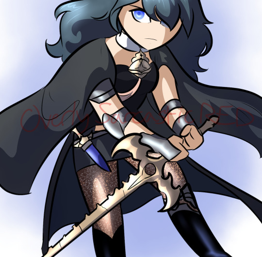
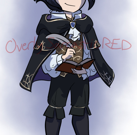
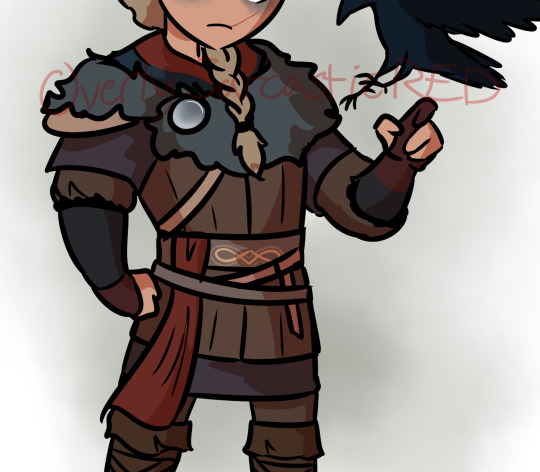
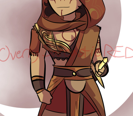


So on a basic level, if you're designing a character to draw over and over again, it needs to be something you're willing and able to draw over again. Intricate patterns, a lot of interlocking plates, anything with lace - those are all things I try to avoid.
I've often seen the advice that character silhouettes should be super visually distinct, that characters should be very strongly shaped like different things. I think that's great if your style is that flexible, but if you kind of want everybody to be shaped like a human being with a skeleton, this advice is not very useful.

I think a diversity of body shapes is great, but the style I favor requires the anatomy to at least sort of makes sense, which means while there can still be a lot of variation in the distribution of muscle and fat, everyone's bones are gonna be in roughly the same place. I can't just draw a square and fill it with a dude. So instead I try and distinguish my character silhouettes in other ways.
Everyone's hair is different, and because most characters have big hair, this plays a large part in their silhouette. Falst and Erin both have short hair, but Falst's is a bristling mane while Erin's is usually more swept and soft-looking. Dainix and Kendal both have long hair, but even when Dainix's hair is loose it doesn't hang or flow the same way Kendal's does - it gets in the way, drapes in front of his face and overall doesn't move the same. Alinua's hair is bouncy curls. On top of that, everyone's outfits are fairly simple, but no two of them are exactly the same - Erin has a monopoly on poofy sleeves, Kendal has cuffed boots and the back-slung sword, Dainix has the poncho and the poofier pants, Alinua has the v-neck top with slightly pauldron-y shoulders and the slippers, Falst's clothing is ragged at the edges, etc. Even without getting into their distinct color palettes, everyone's at least a little bit distinct.
And this is another place where I purposefully try to avoid overdesigning. If everyone has too much going on it can circle around to being hard to tell the characters apart, because too much is happening. Who can pay attention to the fact that one character is sleeveless and one has asymmetrical boots and one has a mullet when everybody is wearing eight layers of embroidered fabric with four belts and half a breastplate on top?
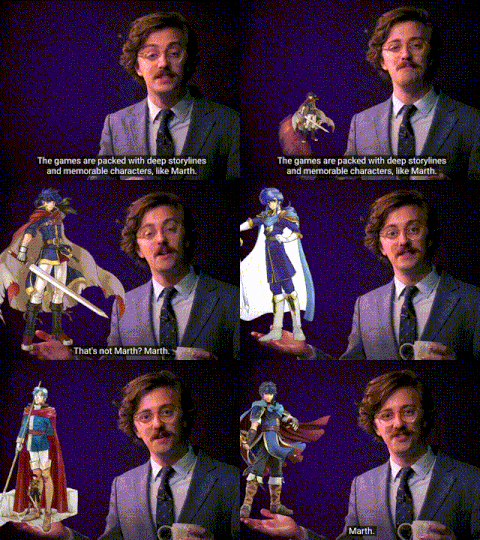
Avoiding same-face is hard, and I'm not very good at it. But I do try to make sure everyone's face shape, nose and eyes are at least slightly different from everyone else's. It might not show from a distance and it might not be as extreme as a pixar design sheet, but it's something.
Ultimately the main consideration I keep in mind when designing characters is - perhaps a bit redundantly - their character. Who they are as people, and how that will impact the way they look. Everybody stands differently, and shifts their weight differently when a situation is changing.
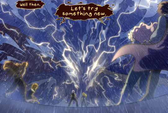
Despite both being short, lightweight guys with short hair, Falst and Erin are wildly different people and are not going to dress the same, make the same facial expressions or hold themselves the same way. Despite both being tall, long-haired, generally friendly warrior badasses, Kendal and Dainix carry themselves very differently and react to things in very distinct ways. Tess and Erin have the exact same haircut and nobody noticed for ages because of everything else.


The designs aren't complicated, and compared to some, they aren't even that distinct. But I try to make sure that their personality is visible in every aspect of their design. Every "why?" in their design has an in-character answer, and since they're all quite different on the inside, keeping things simple means that starts showing through on the outside.
This is also how I can visually distinguish between Vash and Kendal, who have the exact same body and clothes.


we can never underestimate the importance of ✨body language✨
391 notes
·
View notes
Text
With the reveal of an NB character in Ninjago, I feel that people are placing this theme on a pedestal because of this one single move of inclusion. Don't get me wrong— I'm glad that LEGO is including LGBTQIA+ identities into their themes, and I genuinely hope they continue doing so, but we're forgetting that they're investing a step forward into a theme that's always going two steps back.
I don't feel like pointing out the issues of Ninjago, especially because it's tiresome and it's not the point of this post, but I remember that there was an entire thread here on Tumblr about the problematic worldbuilding of Ninjago. I might write something about it as well, but it's unlikely.
Chima had a great amount of inclusion and diversity within its cast (though no canon LGBTQIA+ characters, unfortunately):
POC-equivalent characters (brown and blue crocodiles; vultures with tan and bright blue skin colors), of which a few of those are part of tribes that have a motif from predominantly white cultures (Longtooth and Lavertus, who are brown lions in a tribe with a roman motif; Ehboni, Eglor, who are black and dark blue respectively, alongside unnamed eagles of mixed origins [dark blue x white] in a tribe of greek motif, and even Ewald himself isn't white).
A majority of these characters are important to the plot and/or have reoccurring appearances;
Diversity in tribe lifestyles, with the Wolf Tribe being nomadic (and not going through the stereotype of nomadic traders).
Each vehicle in Chima follows the motif and lifestyle of their respective tribe. For example, crocodiles are ambush predators and require camouflage, thus their vehicles are heavily based on military vehicles, with camo colors and strong silhouettes;
Marginalized characters whose arcs actually end with them winning and gaining respect. The Ice Hunters vs. Phoenixes arc was an obvious allegory of colonization, and it ends with the Ice Hunters alive and thriving, while the Phoenixes (who started the war) lost and failed to 'educate' their enemies.
The Crawlers also have their arc finished with an anti-war and pro-diversity lesson, where Laval lends them Chi because it's not supposed to be earned, and instead is free for everyone, even though they had stolen all of Mount Cavora's Chi beforehand;
Characters whose appearance is distinctive and break barriers of ableism are not only present in Chima, but are also treated equally to other characters, without having their differences be a point, argument, or lesson. (Cragger with a blind eye, Crug with a prosthetic jaw, the Raven Tribe as a whole, Leonidas with distinctively shaped incisors and Longtooth with long canines).
However, the Rhinoceros Tribe is an unfortunate exception, as they're constantly depicted as dumb;
The Lion Tribe has a lot of diversity by itself, with lions having a variety of mane colors that represent hair colors in real life. Laval has red hair, Leonidas is ginger, Lavertus is blond, Lennox has brown hair;
Other cultural representations such as Dom de La Woosh being based on Brazilian carnivals;
There's Wonald, a vegan character;
My favorite fact of all: Chima and Chi are both real words who exist in multiple languages, and each of their meanings was instrumental to the interpretation we have in this theme. → Chi means: knowledge in japanese; water (literally) and source of life (figuratively) in chinese; god in igbo. Chima means "god knows all" in igbo → in LoC, the Phoenixes created Chi, which looks like water and is the source of life/knowledge in Chima, and they also sculpted Mount Cavora with each tribe's heads before they had even evolved.
All of this unfortunately flew over most people's heads, which is a bad thing, as all of the effort that was put on Chima's diversity was left unnoticed, but it is also a good thing at the same time, because everything was executed seamlessly and naturally, just like how people should view each other in real life (view one another without discrimination). However, this amount of care and thought put into adding a diverse cast of characters is probably not going to be seen again, in any lego theme or any story made by corporations/companies.
#lego chima#lego legends of chima#legends of chima#diversity#inclusion#inclusivity#diverse characters#inclusive design#inclusive writing#respect#anti war#anti ableism#equality#world building#worldbuilding#for chima#lego
35 notes
·
View notes
Note
hi. there is something I've been meaning to ask hope you could help me with. so how to draw a character (human) into a certain animal? like what you do in bunwell. there are some characters I want to give them what if they were a dog but like that. I don't really know where to look or where to start so I was hoping you can give me a tip or guide me where to look?
ty
Ooh, anthro question, interesting!
So the first thing to do is fine-tune your animal choice to a species level, to the degree that the animal both has some visual similarities to the human (think sharpness of features, length of hair, colouring) and personality associations (like labrador retriever for a really loyal, good-natured person, or a maltese poodle for someone who can be quite prissy and temperamental).
If you don't have any experience drawing anthro, I'd recommend studying some classic styles to get an idea of what sort of stylisation you want to do, such as Disney's Robin Hood for a more realistic set of features, or for something cartoonier, try Warner Brother's Road Rovers or Jim Henson's Dog City (the animated segments, but the puppets can be helpful too). Those are specifically useful for diverse dog anthro references.
Once you've chosen your species, there's the trickiest part: creating an ungodly fusion of human and beast! >:o If you want to keep human hair the same as the source, you'll want to use animal ears, but sometimes you can merge the animal's ears with the human hair, such as with a cocker spaniel whose ears lie in a similar way; this allows you to keep the shape of their heads quite close to the human's. Another big important choice is how much of a snout you want the anthro to have: an advantage of shortening the snout is that your face can look more human but with a few animal features, but that does take away from the recognisability of the species, and can come off as a lack of dedication to the concept. If a person has sharp features, embrace a pointier snout!
In the end, though, don't feel too hemmed in by the breed you've chosen, because this is stylisation. For instance, if you wanted to draw Laura DeMille as a rough collie anthro, because of their Scottish ancestry and their ample, long fur, but prefer the colouring and curly ears of a boykin spaniel, go ahead and say you're anthro is a mix of both! (This can be a particularly fun technique if the person you're anthroing is of mixed heritage, and you can research breeds for both sides) It's worth noting that there is a particularly maligned form of anthro where vastly different animals -- such as a fox and eagle -- are mixed in order to gain a specific set of features, for an essentially impossible species. But the degree to which the anti-science of this matters to you relies on how much the world you're creating follows specific biological rules that mirror our own (eg. wolves and domestic dogs can breed, snakes and frogs cannot). For an example of a fantasy series that threw all that out the window for a truly charming cast of characters, check out Disney's The Wuzzles (thereby wrapping up my tendency of recommending show that were on in my childhood), which includes Bumblelion (a bee and lion mix), Butterbear (a bear and butterfly) and Rhinokey (a rhinosaurus and monkey).
Traditionally, anthro characters are clothed, but artists tend to be split on how much human modesty concerns should apply to them: for instance, many (usually male) anthro characters wear only a tshirt or other item, leaving their more animal-shaped hindquarters and tail exposed. This can be particularly useful for characters whose bodies could make tailoring clothing difficult. It's also an issue of some variation whether female characters should have human secondary sex characteristic (breasts and wide hips) or just retain a similar body shape to their animal aspect, but bipedal. Many artists deal with the latter issue by using some kind of fur-ruff at the chest to mimic a female human silhouette without adding breasts (and thereby suggesting that their mammaries go down their stomachs, like in regular dogs, etc).
Good luck with your designing, and feel free to tag me in your sketches! :D I'm always interested in seeing how artists choose to do their anthros.
#anthro art#art tips#fursona#anthropomorphization#I'm so glad you enjoy the Bunwells!#I do owe the world more art of them probably ^^;
4 notes
·
View notes
Text
Modern Plus Size Women’s Fashion-Shop The Latest Collections With Stylish&Comfortable Fits
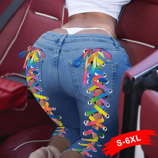
In a world where fashion often feels like it's designed for a single body type, plus-size women have long been sidelined. But times are changing. The fashion industry is increasingly embracing body positivity, with more brands recognizing the beauty and diversity of all shapes and sizes. If you're on the hunt for stylish, affordable plus-size clothing, this article is your ultimate guide to navigating the world of fashion that celebrates every curve.
The Evolution of Plus Size Fashion
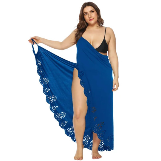
Gone are the days when plus-size clothing meant shapeless, oversized garments that did little to highlight a woman’s beauty. Today’s plus-size fashion is bold, stylish, and, most importantly, designed with the same level of care and attention as straight-size clothing. Designers are now creating collections that are not just an afterthought but a core part of their offerings.Embracing Your Shape
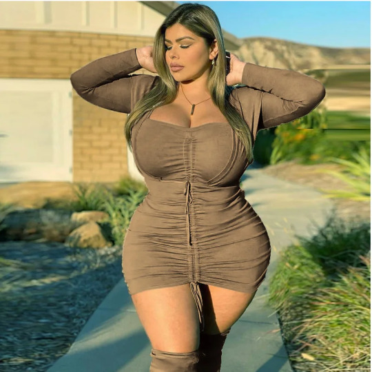
The key to looking and feeling great in your clothes is to embrace your unique shape. Understanding your body type and finding cuts that accentuate your best features can make a world of difference. Whether you're an hourglass, apple, pear, or rectangle, there’s a style out there that’s perfect for you.
For hourglass figures, wrap dresses and fitted tops can highlight your curves beautifully. If you have an apple shape, try empire waistlines or A-line dresses that draw attention away from the midsection. Pear shapes can balance their silhouette with wide-leg pants or dresses that add volume to the upper body. Rectangular shapes can create the illusion of curves with belts and fitted blazers.
Affordable Fashion without Compromise
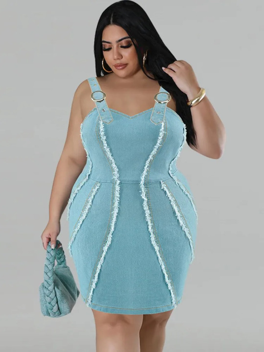
Affordability doesn’t mean you have to compromise on style or quality. Many brands now offer chic, budget-friendly plus-size options that look and feel luxurious. From trendy online retailers to well-known high street brands, there are plenty of places to find stylish pieces that won’t break the bank.
Shopping sales and using discount codes can also help you stay fashionable on a budget. Don’t be afraid to mix high and low fashion – pair a statement piece with more affordable basics to create a balanced look.
Must-Have Pieces for Every Wardrobe
When building your wardrobe, focus on versatile pieces that can be mixed and matched for different occasions. Here are some must-have items that every plus-size woman should consider:
Classic Jeans: A well-fitting pair of jeans is a wardrobe staple. Look for styles with a bit of stretch for comfort and a flattering fit.
Blazer: A tailored blazer adds polish to any outfit. Opt for one that nips in at the waist to create a flattering silhouette.
Little Black Dress (LBD): The LBD is timeless and versatile, perfect for everything from casual outings to formal events.
Comfortable T-Shirts: Invest in a few high-quality tees that can be dressed up with accessories or worn casually.
Statement Outerwear: A bold coat or jacket can elevate even the simplest outfit.
Comfortable Shoes: Don’t forget footwear. Comfortable yet stylish shoes can make or break an outfit.
Shopping Tips for Plus Size Women
Shopping for plus-size clothing can sometimes be challenging, but with a few tips, you can make the experience more enjoyable:
Know Your Measurements: Sizing can vary between brands, so knowing your exact measurements is crucial. Always check the size guide before purchasing.
Focus on Fit: Don’t be swayed by trends that don’t work for your body type. Focus on finding pieces that fit well and make you feel confident.
Try New Styles: Don’t be afraid to step out of your comfort zone. Experimenting with new styles can lead to discovering pieces you love.
Invest in Quality Basics: Basics like jeans, tees, and blazers are the foundation of your wardrobe. Invest in high-quality versions that will last.
Accessorize: Accessories can transform an outfit. Don’t underestimate the power of a statement necklace or a bold pair of earrings.
Celebrating Body Positivity
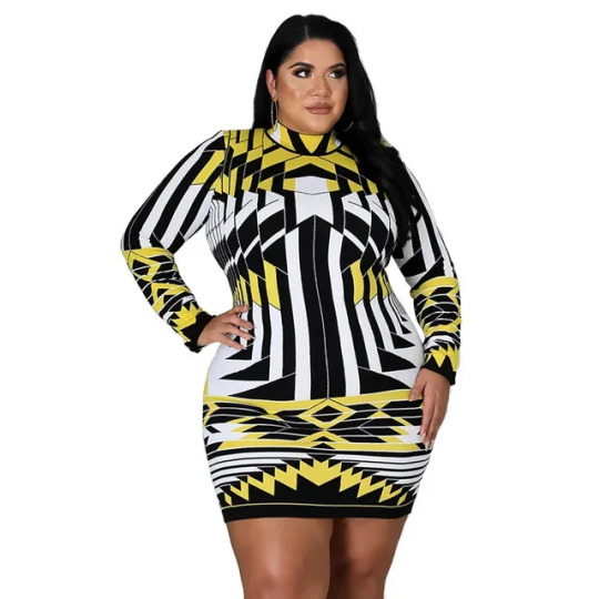
Fashion is more than just clothing; it’s a form of self-expression. Plus-size women deserve to feel confident and beautiful in what they wear. By embracing your shape and choosing pieces that make you feel good, you’re celebrating not just fashion, but yourself.
Remember, style has no size. The most important thing is how you feel in your clothes. Confidence is the best accessory you can wear, and with the right wardrobe, you’ll be unstoppable.
So, go ahead and explore the world of plus-size fashion – there’s a whole world of affordable, stylish clothing waiting for you!
2 notes
·
View notes
Note
Hello! I've been binging on the headcannons and designs of your AU all day, they're very creative and have quite a lot of thought behind that makes them feel organic and vibrant.
Now, my question is about what are your headcannons for the other half of the characters, a.k.a. "The Bakugan™"? Though I'm not only talking about the monster protagonists, but Bakugan as a species. I haven't seen anyone flesh them out as of yet.
RIGHT SO here's the issue I run into whenever I try to work on Bakugan: I only know how to draw people. I'm not creative enough to do diverse designs that don't follow the general shape of a bipedal humanoid. Sometimes I draw a tail or something. I have a lot of respect for people who can design and detail fantasy creatures; they're always so creative and some of them literally blow me away. Additionally, from a writing perspective, I'm not very good at alien society worldbuilding, because I'm not creative enough to make up a whole new society. I'm not J R R Tolkien, for sure.
This presents a problem because I like to tell stories through designs. I let a character's looks influence the story (instead of the other way around, but that's because I just really like drawing things and then trying to get them to fit my story hehe) but if I can't draw a character, their part is just void.
When it comes to monster designs, unless it's horror or very very pretty (very arbitrary decision, tbh), I don't like humanoid creatures at all. I don't like Ravenoid or Robotallion or whatever the fuck Drago becomes in the later seasons. Exceptions are Gorem because I love colossi and Monarus because they're beautiful. And Lars Lion but I'd be okay if she was redesigned. I'm thinking of a deer with its antlers forming a crossbow.
I'd like to headcanon that Bakugan themselves have more primordial, indiscernible forms, but Marucho's program is able to translate the energy readings into physical beings. I always find it strange when a supposed alien creature looks like a person except maybe their eyes are different or they're taller (looking at you, Vestals. I want them to look truly alien, almost freakishly so. Maybe they can retain a humanoid silhouette but generally I want to go for something COOL) but at least for Bakugan I can just say "yah like Marucho's program makes them look like a giant turtle trust".
A Bakugan's energy is very powerful and unstable, especially reliant on the state of the central cores, which fuels all Bakugans' life force. Two cores is kind of like two notes played that forms a dissonant core. The power generated is unbalanced (Silent core is stronger) and it ruptures the fabric of the universe over time. Powered up by the dissonant split cores, this energy escapes through cracks in the dimension, which leaks into new worlds. Usually this leads to preventing the heat death of a universe, but my AU's world was able to harness the energy and translate that into a pokemon game.
Once the cores are reunited, the energy flows in harmony, but lingering effects of the rips remain. The energy is still leaking out, and can be captured. This is how the Vestals found the dimension and colonized it.
I actually like the idea that because of the separation of the cores, all the attributes were separated as well, and the joining of the cores at the end of S1 meant that all the attributes intermingled. related to that, I think it would be mega fun if S2 onwards, there are bakugan with dual or even three attributes, because of the cores joining. It'll definitely bring an interesting aspect to a Bakugan tournament, where a two different attribute brawlers can use the same Bakugan.
I think Mikhail really missed a golden opportunity to study the sociology of sentient energy, honestly. Instead he got caught up in traveling between dimensions.
Honestly while I have thought about how my AU's Bakugan might differ from the show's, I definitely have not thought about it enough to be able to write a worldbuilding manual out of it :( It's all very surface level stuff.
What I will say is that at the start of every season they gotta shake up the main team's Bakugan and have them get new ones. I liked being able to see how the brawlers and the Bakugan interact in the beginning of their partnerships, but the later seasons just drop you in the middle of a fight with a Bakugan you've never seen before and never explain how they met. If you want to treat your Bakugan like real characters you gotta flesh out that backstory!
With all these disclaimers out of the way, here are some Bakugan design ideas I wrote down a while back:
"a hummingbird with a scythe shaped beak" : while hummingbirds themselves are pretty nonthreatening, imagine a grim reaper hummingbird. hilarious. Darkus or Ventus attribute. This was extremely inspired by oberus and the fact that her design is so good i have no idea what the fuck they were going for. Exactly what I want.
"just a bundle of wings (think biblically accurate seraphim but butterfly wings instead of feathered ones) that slowly fall off and reveal a cocoon. once evolution happens, the cocoon opens up to reveal-" : I didn't have an idea for what it would reveal, but i like the idea of an ominous bundle of butterfly wings. Ventus.
"Biblically accurate owl" : A barn owl looking creature with no eyes on its face, but with eyes all over its wings. Darkus.
"Monstrous barreleye" : honestly you can probably make any of the deep sea creatures into a horrifying Aquos Bakugan, but the barreleye is my favorite. Imagine a big fish but with a clear dome and inside is just like. a writhing mass of tissue. What's going on here?
"Stingray skeleton, but it flies" : Stingrays have insanely cool skeletons. Their bones look like feathers. Haos.
A slightly warped vers (don't even ask how it's warped, it's different ok) of the lion costumes you see in a southern Chinese lion dance. Pyrus.
"Earthwyrm" : I think I just wanted a cool giant worm. A million teeth and cutting it up creates multiple wyrms. They can burrow to different gate cards using wyrm holes. Subterra.
Now that I'm writing these out I think my design ideas are fun. Maybe I'll draw them one day. This post ended up a lot more rambly than I expected, I apologize. You do bring up an interesting question though, it seems like I should start thinking about how the Bakugan as a species fit into my world.
Recommend to me your favorite monster artist! My personal favorite currently is matryoshiiika, but I would love to study more!
12 notes
·
View notes
Note
Hi! I am absolutely obsessed with your art; it's vibrant and expressive and just all around stunning. I have always wanted to be able to draw and make fanart, but every time I try it ends up a hot mess express. Do you have any tips/resources for learning? Do you think it's something that you can get good at, even if you don't have any real natural ability?
Aaaa thank you for your kind words! I'll do my best to offer some tips that have helped me over the years:
Create some mood boards
This is one of my fav things to do. It's different from gathering reference images, which you use to draw from specifically like when you want to get a certain pose right. Mood boards are more about finding images that invoke a certain feeling you're trying to express. Here's an example from a project I did a while back:
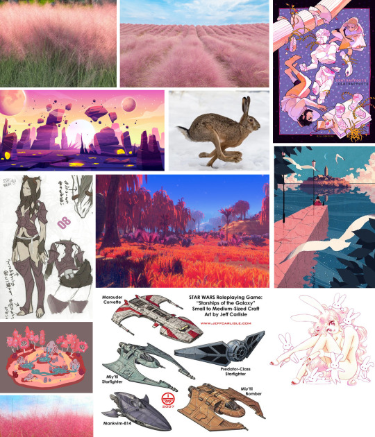
These are essentially ways to gather inspiration. You can look at the similarities between each of the images you chose and see if there are any connections you can draw. This gives your work a good starting line to come back to if you start to feel lost.
This can also be a great way to determine what types of art styles speak to you, and how you might like to emulate certain features in your own work. I grew up watching anime and would try to emulate the styles of Rumiko Takahashi and Hiromu Arakawa for example. Don't worry about being derivative at first. You'll eventually find your own voice through a variety of influences.
Start by working on understanding shapes
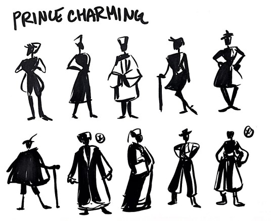
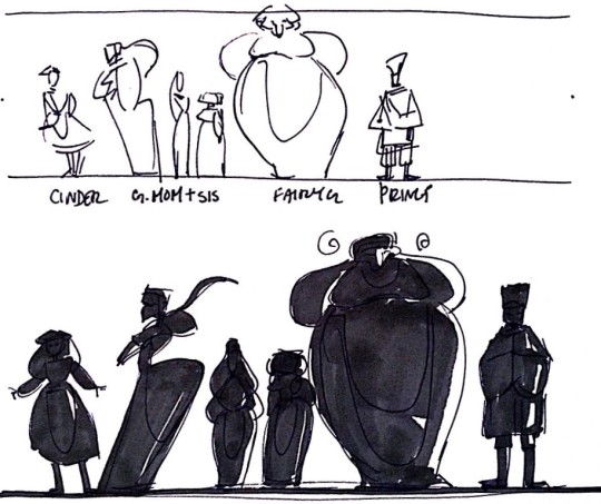
Drawing gets much less overwhelming as you learn to break things down into basic shapes. My one friend suggests drawing Pokemon as an exercise in determining how simple shapes build form. When you try to go right into drawing lineart first you start focusing on the details way too early and you can get into a stop-and-start that seems to go nowhere. People will also talk about the importance of silhouette. This essentially means you want your character to be recognizable by their shape alone. Cartoon styles particularly excel at this (Steven Universe is a really good example) but different art styles will adapt to this with varying success. This is still something I've been working on even after all these years and it's tricky, but it helps you think about diversity when you're drawing.
(These are some old examples from art school I did. They aren't great but they give you the idea lmao)
Keep a sketchbook and draw big
Keeping a sketchbook is the best. Put everything in your sketchbook and absolutely don't be precious about it. Blank pages are intimidating I know, so if that's stopping you one thing I do sometimes is start by drawing on sticky notes and pasting them in. Add anything you think is interesting - quotes, cutouts from magazines or fliers, cute snack packaging, etc. Anything that you like!
My friend also suggests taking up space in your sketchbook by drawing big. A lot of artists start small little sketches and get caught up in details. They start pages they don't like and move on without adding anything else in because they feel insecure. Don't worry about that, details can come later. And you can always draw over stuff you really don't like. You can paste stuff over it and draw on it again. You can use tracing paper to draw over something 5 times. There's lots of options to try before discarding a page all together. I find this helps combat feelings of discouragement when you're paging through your book. If all you see are abandoned sketches it can get you down. So don't give up!
Don't allow yourself to get precious about your sketchbook, no matter how many aesthetic sketchbook tiktoks you're forced to endure lmao. Sketchbooks are places for failure and experimentation. Let it be ugly. There's value in that too.
Draw both eyes at the same time
I still forget to do this but it really helps cut down on fucked-up-other-eye syndrome. Try not to fully draw one eye before you start the other one. Determine in your sketch phase where the character is looking and try to build on that, going back and forth between each eye until you're satisfied with them both.
Here is a comprehensive list of tips and tutorials my friend found here on tumblr too. I took a look through them and I think there's a ton of great stuff here.
Anyone can start to draw at any age for any reason. I think some people develop a knack for things not out of some inherent skill, but by taking an interest in the subject. I started drawing very young but I just stuck with it over the years because I liked it. There's no reason why starting later in life has to mean you can't get good at it. In fact, since your brain is more developed you might pick it up much quicker than you'd expect. Lord knows I've had to un-learn a ton of garbage over the years lmao. Habits die hard right?
I believe in you! Keep drawing! Have fun!
18 notes
·
View notes
Text
the thing about silhouette work is that it's never as simple as "you can tell who the character is". A bunch of character design teachers, tutorials and other resources act as if being able to tell from a silhouette exactly who a character is is the ultimate goal and the examples are always stuff like Cloud Final Fantasy or Pikachu. Of course these are recognizable, they're absurd in a way
For these uninteresting black/blue haired anime protagonists in hoodies the point isn't that they are recognizable in silhouetting, but that WHAT they are is. That is, middle of the road super normal guy. They need to be picked up from a lineup of what's possible bland best friends in sporty outfits and outlandish waifus.
Silhouette work is most of all a tool to be able to understand if a character's characteristics and roles are readable. The best example of this is rogue-like games and mobas where the very tiny model of a character should tell you not only who that is, but what they are. If they carry a staff and are tall and sort of lanky that's usually a wizard, for example (terrible, general example, i know)
basically if L in his iconic sitting pose was added to an anime character lineup, the pose first and foremost would pop out and then you'd go, why is he sitting like that? what does that say about him? even standing his posture, barefeet and messy hair say something despite his design as Just Some Guy. No armor big sword baseballcap whatever
So the best context for visualizing silhouettes is not an in-class gatcha Who's That Pokemon exercise (tho it does work for learning what designs are striking and memorable (newsflash it's usually the ones we're exposed to the most)) but actually inserting their silhouette along with other characters OF THE SAME CONTEXT/IP and seeing if they all read as different people with different characteristics and roles. It's In Context shape diversity
thinking abt that time in one of my art classes when the prof put up a silhouette of L from death note and said “this is not an effective design bc you can’t tell who this character is from this shape”
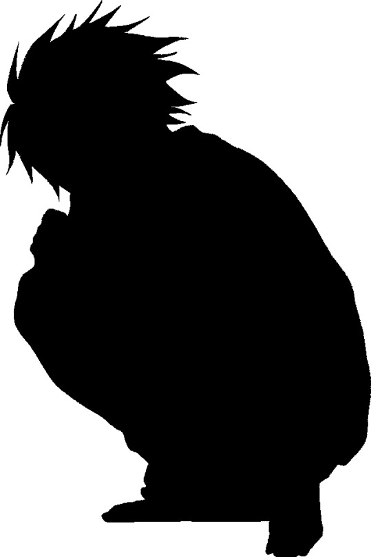
and everyone in the class went like “yes we can that’s L from death note”
#sorry this is really long but most young artists don't seem to be aware of this and then silhouette work becomes so hard and contrived#you're basically sihouetting against your own designs skills for the one character in a bubble comprised of the worlds most beloved charact#*characters#makes no sense#anyway#design#long post#rambles
87K notes
·
View notes
Text
I have had an absolutely terrible idea. Normally something like this would've been let put on Q but that place shit itself so I'm posting here instead
A Danganronpa style killing game, but the characters are killers from Dead by Daylight. There's enough for 2 of these killing games without overlapping characters and then some leftover.
The Entity could represent itself as some sort of spider varient of Monokuma, or it could be Zzl from the Anniversary Masquerade. She's kinda got Junko vibes.
Each killer has their memories reset so they may believe they're a normal person, or as close to as can be reasonably expected. Their ultimate titles are just their killer titles, which would serve as hints to their true nature. Killers with supernatural abilities wouldn't be aware of them until discovering them over the course of the game. Time displaced killers may simply believe they have some sort of heavier amnesia until discovering more about themselves through the game.
Entity magic would also be in play so they understand eachother, since there's no feasible way every killer shares a language when they're as diverse as they are.
As an example, let's say we have our 1st game with the 1st 16 killers: Trapper, Wraith, Hillbilly, Nurse, Shape, Hag, Doctor, Huntress, Cannibal, Nightmare, Pig, Clown, Spirit, Legion, Plague, and Ghostface. A lot of these killers are from different decades in the 1900s, so 90s or early 2000s setting would probably be fine.
Adiris (Plague) being heavily time displaced on account of being an ancient sumarian priestess from the dawn of recorded history, would suffer the most severe case of memory reset by a significant margin.
Then there's Frank (Legion), a unique case where the Entity, or Zzl, or whatever, would have all 4 members fused into a single body that they would uncover over the course of the game similar to uncovering powers. This could let them do some stuff that's only really advantageous in a killing game like this, where they let Susie or Julie take the wheel to access girl only areas or swap away from Frank to confuse stuff like fingerprints or silhouette.
Besides them, Anna (Huntress) notably doesn't have a last name and lived in isolation in the woods all her life, so she might appear to suffer similar amnesia to Adiris, or Adiris might be thought to have come from an isolated life similar to Anna's.
Besides Philip (Wraith) having a magic bell, the only other factor are that Sally (Nurse), Lisa (Hag), Herman (Doctor), Freddy (Nightmare), Rin (Spirit), and Adiris would be discovering their powers over the course of the game. Technically Michael (Shape) has supernatrual abilities as well, and it could be argued that Max (Hillbilly) was granted some for of running enhancement, but neither of these are obviously supernatural the same way the others' are.
Where this would really start to break down is doing the next 16 killers for game 2: Demogorgon, Oni, Deathslinger, Executioner, Blight, Twins, Trickster, Nemesis, Cenobite, Artist, Onryo, Dredge, Mastermind, Knight, Skull Merchant, and Singularity.
Of course there's a lot more time displacement going on with Kazan (Oni), Caleb (Deathslinger), and Talbot (Blight) all being from the 1800s, Charlotte & Victor (Twins) from the 1700s, Tarhos (Knight) from the 1300s, and Hux (Singularity) being from 300 years into the future. These characters would have the same 'amnesia' issues as Adiris, with Hux maybe having data and dates corrupted to accommodate him.
The biggest issue with this group of killers is that some of them were never people. Sure, Pyramid Head (Executioner), appears human and is physically manifested from human psychology, and Nemesis is biologically human, but then we have the Demogorgon, a psychic alien animal from another dimension, and the Druanee (Dredge), a psychic manifestation of the misery of a cult pushed to the brink. Maybe Dredge could take on a personality representative of the ideals of the Garden of Joy twisted into its current state, but for Demo the best way to include it I think would be to give it the personality of a dog.
Then of course there'd be Albert as the Ultimate Mastermind. That'd be a pretty loaded title for a killing game based on Danganronpa. Could make some fun character interactions.
After them we have some leftovers who'd probably start the 3rd killing game. Xenomorph is another inhuman animalistic character along the lines of Demogorgon, Good Guy would be easy enough, Unknown you'd think would suffer a similar problem to Dredge but Unknown actually has enough personality on its own I think it works, and then Lich...there's no fitting Lich into a timeline, he's from D&D, an entirely different world from any version of earth, so he'd probably suffer as much if not more amnesia than time displaced killers. We know Castlevania is coming next with presumably Dracula as the killer, don't know his title, but he works for killing game purposes.
0 notes
Text
Elevating Everyday Elegance: Discovering the Charm of Fabby Glamtique's Cargo Set and Cardigan Set
In the heart-stirring world of fashion, where the classics meet modern innovation, Fabby Glamtique has emerged as a beacon of inspiration and individuality. With its commitment to fusing timeless elegance with contemporary trends, this boutique has become a cherished destination for fashion enthusiasts seeking to elevate their wardrobe with pieces that speak to their unique style. Among the myriad of offerings that have captivated the hearts and closets of many, the Cargo Set and Cardigan Set stand out as exemplary reflections of Fabby Glamtique's dedication to quality, versatility, and style.
The Cargo Set: Utility Meets Style
In the ever-evolving lexicon of fashion, the Cargo Set has redefined what it means to marry functionality with fashion. Fabby Glamtique's rendition of the Cargo Set goes beyond the traditional to offer a sophisticated twist on utility wear. The set typically comprises a pair of cargo pants reimagined in luxurious fabrics, coupled with a matching top that can range from a sleek button-down to a soft, relaxed tee. The defining feature of these sets, however, lies in their meticulous design – pockets aplenty, refined lines, and a harmonious balance between loose and fitted silhouettes.
The versatility of the Cargo Set is unmatched; it transcends the boundaries of casual and formal attire, making it a perfect ensemble for a myriad of occasions. Whether attending a casual meet-up with friends or dressing up for a semi-formal event, there's a Cargo Set in Fabby Glamtique's collection to suit the moment. Available in a palette of colors that complement every skin tone, from earthy neutrals to vibrant hues, these sets embody the spirit of modern-day women – strong, versatile, and unapologetically stylish.
The Cardigan Set: Layering with Sophistication
On the flip side of Fabby Glamtique's sartorial spectrum lies the Cardigan Set – a testament to the beauty of layering and soft tailoring. This ensemble typically combines a delicately knit cardigan with a matching top, often complemented by a skirt or pants in the same fabric and color scheme. The Cardigan Set is the epitome of effortless chic, offering a polished look without compromising on comfort.
Fabby Glamtique has elevated the Cardigan Set by infusing it with textures and patterns that speak to a multitude of personal styles. From intricate lace detailing for a touch of romance to bold prints for those who wish to make a statement, each set is thoughtfully curated to enhance the wearer's individuality. The versatility of cardigan sets also shines through their transformative power; they can be mixed and matched, with the cardigan worn open for a more casual feel or buttoned up for a sleeker, more cohesive look.
The Essence of Fabby Glamtique: Quality, Inclusivity, and Style
At the heart of Fabby Glamtique's ethos lies a deep-seated commitment to offering high-quality fashion that is inclusive and resonates with individual style preferences. The Cargo Set and Cardigan Set, much like the rest of the boutique's collection, are crafted from superior materials that promise durability and comfort. Meticulous attention to detail in the design process ensures that each piece is not only visually appealing but also practical for daily wear.
Inclusivity is another cornerstone of Fabby Glamtique’s philosophy. Recognizing the beautiful diversity of body shapes and sizes, the boutique offers a range of sizes in both the Cargo Set and Cardigan Set, ensuring every woman can find her perfect fit. This dedication to celebrating every body type is a refreshing departure from the one-size-fits-all approach that prevails in much of the fashion industry.
Styling the Sets: A Canvas for Personal Expression
One of the joys of owning a Cargo Set or Cardigan Set from Fabby Glamtique is the freedom it offers for personal expression. These sets serve as a versatile canvas that can be styled in myriad ways, allowing for creativity and experimentation with accessories, shoes, and complementary pieces. For instance, the Cargo Set can be dressed down with sneakers and a cap for a day of errands or elevated with heels and statement jewelry for a night out. Similarly, the Cardigan Set can transition from a cozy, at-home ensemble to a sophisticated office outfit with the right shoes and accessories.
Making a Sustainable Choice with Fabby Glamtique
In today’s era, where the call for sustainable fashion grows louder, Fabby Glamtique stands as a beacon of hope. The boutique’s dedication to ethical sourcing and manufacturing practices ensures that each Cargo Set and Cardigan Set is not just a style statement but also a step toward a more sustainable future. By choosing Fabby Glamtique, customers are not only investing in quality and style but also in the boutique’s vision of a fashion industry that respects our planet and its people.
The Ultimate Fashion Experience: Shopping at Fabby Glamtique
Fabby Glamtique offers an unparalleled shopping experience, whether in-store or online. The boutique’s warmly lit spaces and inviting atmosphere make each visit a delightful journey through the latest fashion trends and timeless classics. Online, the boutique extends its warmth with a user-friendly website that showcases the Cargo Set, Cardigan Set, and much more, complete with styling tips and detailed product information.
Envisioning the Future with Fabby Glamtique
As Fabby Glamtique continues to grow and evolve, it remains steadfast in its mission to offer fashion that empowers and inspires. The boutique’s ever-expanding collection, including the beloved Cargo Set and Cardigan Set, is a testament to its ability to anticipate and cater to the dynamic needs of the modern woman. With every piece, Fabby Glamtique is not just selling clothing; it’s nurturing a community of confident, style-savvy women who believe in the power of personal expression.
Conclusion: A Tribute to Timeless Elegance and Modern Sensibility
Fabby Glamtique has masterfully captured the essence of what it means to balance timeless elegance with modern sensibility. Through its curated collections, including the sophisticated Cargo Set and the versatile Cardigan Set, the boutique has carved a niche for itself in the hearts of those who cherish quality, style, and individuality. As we look to the future, Fabby Glamtique stands as a shining example of how fashion can be both beautiful and meaningful, serving as a canvas for personal expression and a force for positive change. In the world of Fabby Glamtique, every piece tells a story, and every customer is part of a larger narrative of empowerment, style, and sustainable elegance.
0 notes
Text
Women's Suits: Power & Elegance - Bash South Africa Collection
In the world of fashion, few garments command attention and authority quite like a well-tailored suit. Traditionally synonymous with masculinity, the suit has undergone a remarkable transformation, emerging as a symbol of empowerment and sophistication for women worldwide. And at the forefront of this sartorial revolution is the Bash South Africa Collection, offering a range of impeccably crafted women's suits that exude power and elegance in equal measure.
Gone are the days when women had to sacrifice style for professionalism in the workplace. Today, the modern woman embraces her femininity while commanding respect in tailored suits that make a statement. Whether it's for the boardroom, a formal event, or a chic evening affair, Bash South Africa understands the importance of a well-fitted suit in a woman's wardrobe.
The collection boasts an array of styles, from classic pinstripes to bold colors and modern cuts, catering to every taste and occasion. Each piece is meticulously designed to accentuate the female form, with attention to detail evident in every seam and stitch. From tailored blazers that command attention to sleek trousers that elongate the silhouette, every garment in the Bash South Africa Collection is a testament to the brand's commitment to quality and craftsmanship.
What sets Bash South Africa apart is its dedication to inclusivity and diversity. Recognizing that women come in all shapes and sizes, the collection offers a range of sizes to ensure that every woman can find the perfect fit. Whether petite or plus-size, every woman deserves to feel confident and empowered in her attire, and Bash South Africa ensures that no one is left behind.
But beyond its aesthetic appeal, the Bash South Africa Collection embodies a deeper ethos – one that celebrates the inherent strength and resilience of women. In a world where gender norms continue to be challenged and redefined, the women's suit serves as a symbol of empowerment, breaking barriers and shattering glass ceilings with every stride.
Moreover, by embracing the suit as a staple of women's fashion, Bash South Africa empowers women to take up space – both literally and figuratively – in traditionally male-dominated spheres. Whether conquering the corporate world or making a statement on the red carpet, the women who don Bash South Africa suits are not just fashion-forward; they are trailblazers, challenging norms and inspiring others to do the same.
In conclusion, the Women's Suits: Power & Elegance - Bash South Africa Collection encapsulates everything that the modern woman aspires to be – confident, empowered, and unapologetically stylish. With its impeccable tailoring, diverse range of styles, and commitment to inclusivity, Bash South Africa has solidified its place as a leader in women's fashion, paving the way for a future where power and elegance know no bounds.
0 notes
Text
A Glamorous Affair: Unveiling the Magnificent World of Wedding Dresses in Atlanta
Here in Atlanta, Georgia is the modern capital of culture, history and style. People from all over come to the city with its Southern hospitality and busy streets can find fabulous wedding salons on every street corner, making it one of the best places anywhere for looking for your dream gown. Finding the perfect wedding dress in Atlanta is an unforgettable adventure, with its dazzling variety and combination of elegance, Southern flair.
The Mélange of Styles:
The bridal dresses in Atlanta is a kaleidoscope of various tastes and styles. From old-fashioned ball gowns to cutting-edge designs, the city ' s bridal boutiques cover every bride's personal dream. Renowned designers competing with local talents bring out the craftsmanship in a variety of styles, from bohemian chic to timeless sophistication. The city welcomes diversified preferences and helps each bride find a dress that reveals her unique self.
Boutiques with Southern Flair:
Southern hospitality and unparalleled shopping experience both flow from the city ’ s bridal boutiques. In boutiques such as Bridals by Lori--with a long history behind it, with its location near the camera in television shows--brides-to-be experience a personalized and luxurious atmosphere. This is where brides can pamper themselves with a selection of designer gowns chosen specially for them by skilled consultants who want to bring the bride's dream wedding dress into reality.
Designer Showcases:
Designer to designers At the same time, Atlanta becomes a paintbrush for masters of design. Hosted in the city are many bridal fashion shows and designer trunk-shows, all of which testify to Atlanta's role as a leader in the field. There they have the chance to view all of the latest styles and designs, usually before these are even shipped out. They range from the most intricate lacework to today's modern silhouettes, celebrating innovation and sophistication.
Custom Creations and Ateliers:
For brides who want to create a unique masterpiece, Atlanta's ateliers and bespoke services provide the opportunity. skilled craftsmen work hand in glove with brides to bring their creative ideas into reality through painstaking skill and care. Each step from initial sketches to the final fitting is a journey, and it's an exploration of exclusivity and personalization.
Embracing Tradition and Innovation:
Atlanta Bridal Fashion couples traditional elements with new ideas. With timeless aesthetic values honored, city designers and boutiques also embrace the latest. Blending tradition and modernity Whether it's about the fabrics, cuts or decorations, in Atlanta there is a wedding dress scene that celebrates this kind of balance.
Inclusive Sizing and Diversity:
One example of this universal commitment is the bridal industry in Atlanta. The city has many bridal boutiques, and every body shape or size can find a dress that makes her look beautiful on this special day for their wedding. The focus on inclusivity says a great deal about the city's determination to honor diversity, and make it one that all believers can share in.
Conclusion:
In the midst of Atlanta, this shopping for a wedding dress is so much more than that. It's an all-encompassing experience right in one's own backyard. Where Southern Charm meets the fusion of styles and a firm adherence to one's own style is especially true for Atlanta bridal world. For brides in Atlanta beginning this journey, it's not only dresses they are choosing--it is a world where human dreams give birth to fabulous fabric and the spirit of love takes shape as everlasting elegance.
0 notes
Text
How Do Crocs Clogs Redefine Footwear Comfort?
When it comes to footwear, comfort is key. In recent years, Crocs clogs have emerged as a game-changer in the world of comfortable footwear. Designed for both leisure and practicality, Crocs clogs have captured the hearts of many with their unique style and unparalleled comfort. In this blog post, we will delve into how Crocs clogs have redefined the concept of footwear comfort, making them a popular choice for people of all ages and lifestyles.
Understanding the Uniqueness of Crocs Clogs
Crocs clogs are known for their distinctive design, featuring a lightweight, slip-resistant construction and a roomy fit that allows for ample toe splay. As crocs clogs material provides a cushioning effect that moulds to the shape of the foot, offering support and comfort throughout the day. The ventilated design also allows for breathability, making them ideal for various activities, from casual strolls to outdoor adventures.
Versatility in Style and Functionality
One of the defining features of Crocs clogs is their versatility. While initially recognised for its classic clog silhouette, Crocs has expanded its range to offer various styles, including slides, sandals, and even sneakers, all incorporating the same comfort-driven design. This versatility has allowed Crocs clogs to transcend traditional footwear categories, appealing to individuals seeking both comfort and style.

Comfortable Footwear for Every Lifestyle
Crocs clogs have found their place in the lives of individuals across diverse age groups, from children to the elderly. Their easy slip-on design, coupled with the comfort they provide, has made them an essential choice for individuals with active lifestyles, healthcare professionals, and anyone seeking relief from foot-related discomfort. The brand's commitment to producing lightweight, durable footwear has contributed to its widespread appeal.
Embracing Innovation and Sustainability
In an era where sustainability plays a significant role in consumer choices, Crocs has taken steps to incorporate eco-friendly practices into its manufacturing processes. By prioritising recycled materials and sustainable sourcing, Crocs clogs stand out as a conscientious choice for environmentally-minded consumers. This dedication to innovation and responsibility resonates with individuals seeking products that align with their values.
Endorsement by Healthcare Professionals
Beyond their popularity in casual settings, Crocs clogs have gained recognition within the healthcare industry. Many healthcare professionals, who spend long hours on their feet, have embraced Crocs clogs due to their supportive design and easy-to-clean properties. The brand's commitment to providing comfortable footwear that can withstand the demands of the healthcare environment has resulted in widespread adoption among medical professionals.
The Evolution of Fashion and Function
With an increasing focus on the intersection of fashion and function, Crocs clogs have become a symbol of embracing comfort without sacrificing style, especially when paired with men's and womens shorts nz wide. Collaborations with renowned artists and fashion designers have propelled Crocs into the fashion spotlight, further solidifying their position as a trend-setting, comfort-centric brand. This fusion of comfort and fashion, coupled with the versatility of pairing Crocs clogs with shorts, has led to a shift in the perception of what constitutes stylish and desirable footwear
Engaging with a Global Community
Crocs clogs have fostered a global community of enthusiasts who celebrate the brand's emphasis on comfort and self-expression. From social media campaigns to user-generated content, Crocs has cultivated a strong and engaged fan base that transcends geographical boundaries. The brand's ability to connect with its audience on a personal level has contributed to the widespread recognition of Crocs clogs as a symbol of comfort and individuality.
Conclusion
In conclusion, Crocs clogs have redefined footwear comfort by prioritising innovation, versatility, and sustainability. Their distinctive design, coupled with a commitment to providing comfortable footwear for various lifestyles, has positioned Crocs clogs as a staple in the footwear industry. As the brand continues to evolve and expand its offerings, it is clear that the influence of Crocs clogs extends far beyond traditional notions of footwear, reshaping the way comfort is perceived and embraced in everyday life.
Beautifully crafted and exceptionally comfortable, Crocs clogs have undoubtedly left an indelible mark on the world of footwear, setting a new standard for comfort, style, and functionality.
Source by - https://bit.ly/47IT28G
0 notes
Text
Elegance for Every Event: The Ultimate Guide to Occasion Dresses
When it comes to dressing for special events, one can never underestimate the power of the perfect occasion dress. Whether you're attending a wedding, a gala, a birthday party, or any other noteworthy celebration, choosing the right attire is essential. In this article, we'll explore the world of occasion dresses, from where to find them in the UK to options for plus-size individuals and even special occasion dresses for older ladies. Let's dive in!
1. Occasion Dresses: A Wardrobe Must-Have
Occasion dresses are the epitome of sophistication and style. They are designed to make you look and feel your best during those significant moments in life. These dresses come in various styles, lengths, and colors, ensuring there's a perfect option for every event.
2. Occasion Dresses UK: Unveiling the Best Selection
If you're in the United Kingdom and in search of the ideal occasion dress, you're in luck. The UK boasts a wide array of boutiques, department stores, and online retailers that offer a stunning selection of occasion dresses. Whether you prefer high street fashion or luxury brands, you're sure to find the perfect dress to suit your style.
3. Plus Size Occasion Dresses: Celebrating Every Body
The fashion industry has come a long way in recent years, and inclusivity is now a top priority. Plus-size occasion dresses are widely available, catering to individuals of all body shapes and sizes. These dresses are designed with the same attention to detail and style as their smaller counterparts, ensuring that everyone can enjoy the perfect fit for their special occasion.
4. Occasion Dresses for Weddings: Graceful and Glamorous
Weddings are one of the most common occasions that require a special dress. Whether you're the bride, a bridesmaid, or a guest, choosing the right wedding occasion dress is essential. From flowing chiffon gowns for bridesmaids to elegant lace dresses for guests, the options are endless.
5. Special Occasion Dresses: Elevate Your Look
Special occasions demand a special dress. Whether you're attending a gala, a charity event, or a milestone birthday party, you'll want to shine. Special occasion dresses are often characterized by their unique designs, luxurious fabrics, and attention-grabbing details. Be prepared to turn heads and make a statement.
6. Womens Occasion Dresses: An Expression of Individuality
Every woman has her unique style and taste, and occasion dresses are no exception. From classic black cocktail dresses to bold, colorful gowns, women's occasion dresses offer a wide range of choices to express your individuality. Embrace your personal style and choose a dress that speaks to you.
7. Occasion Dresses for Wedding Guests: Be the Best-Dressed Guest
Being a wedding guest is a special role, and your attire should reflect that. Wedding guest occasion dresses come in a variety of styles to suit different wedding themes and venues. Whether it's a beach wedding, a rustic barn celebration, or a formal city affair, you'll find the perfect dress to ensure you're the best-dressed guest in attendance.
8. Special Occasion Dresses for Older Ladies: Timeless Elegance
Age is no barrier to looking and feeling fabulous. Special occasion dresses for older ladies are designed to offer both style and comfort. These dresses often feature classic silhouettes, longer hemlines, and elegant details that exude timeless elegance. Embrace your wisdom and celebrate your style with a dress that complements your unique beauty.
In conclusion, occasion dresses are a must-have for every woman's wardrobe, and the options are vast and diverse. Whether you're in the UK, shopping for plus-size attire, or searching for a dress for a specific event, there's a perfect occasion dress waiting for you. Celebrate life's milestones in style, no matter your age or body type, and let your dress tell the story of your unforgettable moments.
0 notes
Text
In praise of trees: a look at arboreal art
https://artuk.org/discover/stories/in-praise-of-trees-a-look-at-arboreal-art
I've long loved trees and walking among them. Each day I make sure to spend at least some time appreciating the beauty of trees; after all, it is trees that sustain our existence – without plants which turn sunlight into oxygen, we would not exist. Artists too have had a long love affair with trees and delving into the abundance of arboreal art is fascinating.
Trees stretch their branches throughout many paintings, from street trees to copses to parks to forests and rainforests, and trees are depicted in all stages of their growth, all around the world, and in their many varieties. We see their branches reaching high into the sky and their roots stretching deep into the earth.
Trees have long been potent symbols in mythology, folklore and culture – the Tree of Life, the Sacred Tree, the Tree of Knowledge – forms of 'the world tree' also called the cosmic tree, thought to be the source of life at the centre of the world.
The Tree of Life symbolises the connection of all forms of creation (famous depictions include that of the Austrian artist Gustav Klimt in his painting The Tree of Life) while the Tree of Knowledge connects heaven and the underworld.
Depictions of 'sacred trees' include Foliage, Flowers and Fruit of a Tree Sacred to Krishna by Marianne North (1830–1890), as well as Foliage and Fruit of Fig Tree held Sacred by the Hindoos by the same artist.
On a beautiful winter's day a few months ago, I strolled past London plane trees lining the city, reaching their branches up into a clear blue sky, on the way to Tate Britain where I saw an exhibition of the work of Victorian artist Edward Burne-Jones (1833–1898). He led the Pre-Raphaelite movement into new symbolist directions and his work interestingly draws on myths and legends. Art UK features his painting The Tree of Forgiveness, at the heart of which is an almond tree, and which is a dramatic reworking, in oil paint on canvas, of Phyllis and Demophoön in a style inspired by Michelangelo. In the myth, we see depicted Phyllis as she bursts out of the almond tree and embraces the lover who had abandoned her – a particularly powerful part of the painting is seeing her legs still inside the tree trunk.
John Woodward Lines (b.1938) Rugby Art Gallery and Museum Art Collections
On days when it has been raining too ferociously to step outside, I have instead been gazing at arboreal art on Art UK. Paintings capture trees in all stages of their growth cycle, from lush foliage such as in Study of Trees by Bernard Meninsky (1891–1950) and Trees by Charles Napier Hemy (1841–1917) to the inky silhouettes of Winter Trees by John Woodward Lines (b.1938).
Maurice de Vlaminck (1876–1958) Amgueddfa Cymru – National Museum Wales
These stages of growth are also captured in abstract arboreal art, all titled Trees, from the wonderful juxtaposition of green and browns by Eardley Knollys (1902–1991) to the bony bare branches by Madeleine Enright (1920–2013) and the eerie painting by Benjamin Haughton (1865–1924). I also love the abstraction of blues and greens in a work by Maurice de Vlaminck (1876–1958).
Looking at the copious amounts of copses in the archives I can imagine strolling through them, including Gifford's Copse and Cherry Copse at Stock Close, near Aldbourne by Lawrence Gowing (1918–1991).
Talbot Woods by Calvin W. Fryer (1871–1942) is awash with golden light and Woodland Scene by John Lally (1914–1994) is an abstract work excellently drawing out the shapes and patterns of trees.
Looking at the details in the rainforest depicted in ‘Dreams of Australia' Series, Rainforest Wildlife by Antonia Phillips, I am reminded of the vast diversity of life that trees sustain: beautiful birds and butterflies in this painting. Indeed, a single tree in a tropical rainforest can sustain up to 2,000 different species.
Whilst many artists have chosen to title their paintings, simply Trees, others have chosen more particularization and there are a wide variety of trees forking throughout the collection including Study of Birch Trees by Joséphine Bowes (1825–1874), Silver Birch Trees by Walter Duncan (1848–1932), Olive Trees, Les Baux by Frederick John Pym Gore (1913–2009), Oak Trees by R. Ellison, and Beech Trees by Bernard Meninsky.
Trees are depicted in all their full glory in landscapes as in the many paintings entitled Landscape with Trees, while other painters have chosen to focus on specific parts of trees such as the powerful painting Patterned Canopy Shadows by Lynsey Ewan. Paintings depict both the height and depth of trees: one of my favourite paintings is Understorey, also by Lynsey Ewan – the 'understorey' being the word for the layer of vegetation beneath the main canopy of a forest.
How do trees make us feel? Some painters have ascribed moods to their artworks depicting trees in paintings including Solitude by James Tyndall Midgley (b.1872) and Peace by Thomas Edwin Mostyn (1864–1930) with its wonderful colour palette of blues, golds and greens.
I'm reminded by such paintings of the increasingly popular practice of 'forest bathing', spending time in a forest to reduce stress and promote a sense of wellbeing. The Japanese term is 'Shinrin-yoku' which means 'bathing in the forest atmosphere', and was developed in the 1980s. These paintings go far in conjuring through colours and craft such an atmosphere – and looking at them did indeed have a soothing effect on my mood.
Looking at these paintings, I'm powerfully reminded of the 'deep time' collected within trees: the fact that they exist for hundreds of years, that many of them will be here long after we are gone. Many of these paintings immortalising trees will outlast the trees themselves, showing just what a potent combination is that of trees and art. Above all, in our Anthropocene age of biodiversity loss, appreciating arboreal art is a great reminder of the importance of valuing and protecting trees themselves – the 'lungs' of our world – which in turn protect and sustain us.
Anita Sethi, journalist, writer and critic
0 notes