#if the anatomy in this is wonky my b
Explore tagged Tumblr posts
Text
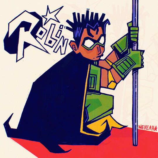
no clue what’s going on with dc but it’s crazy how tim drake hasn’t had a single appearance in over a decade! i kinda miss that little guy
#tim drake#i saw that costume and immediately yearned for simpler times (baby tim & rr suit)#if the anatomy in this is wonky my b#i drew this during class#bart (as in bug art)#robin#red robin#robin 1993#dc#dc comics#batman#detective comics#bisexual#<- can’t believe he came back to be bi and dipped. wtf
699 notes
·
View notes
Text
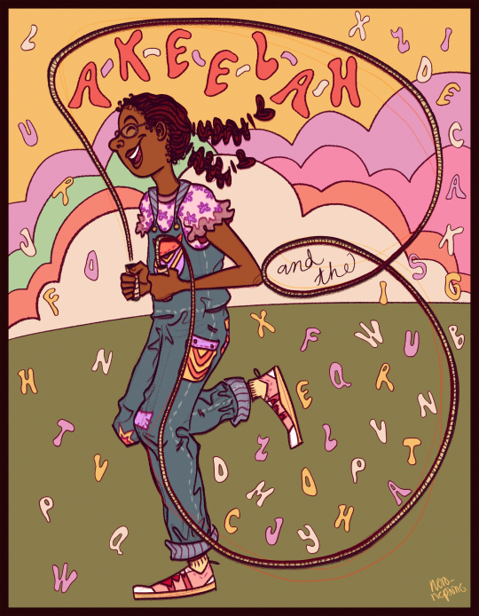
shout out to this movie for teaching me how to spell words that i've never found the opportunity to use in real life lol
#i hope it's very obvious that the jump rope is in the shape of the letter 'B'#also i attended an all black school when this movie went to theaters#so you Better Believe that every black girl there around my age knew how to spell p-r-e-s-t-i-d-i-g-i-t-a-t-i-o-n. 'prestidigitation'#(that's correct!)#akeelah and the bee#is perhaps a top 3 iconic keke palmer movie and i can still probably recite a Ton of scenes from this movie#tho i will say it Got Old being a black girl who wore glasses and being called 'akeelah' when this movie came out lol#my art#artists on tumblr#keke palmer#the anatomy may be wonky. but i don't even care anymore! i had like more than 5 potential jump rope poses that looked even worse than this#this was as good as it got (and i used a reference from Another classic keke palmer movie- jump in!)#huh. if i had a nickel for every time keke palmer starred in a movie with a spotlight on black youth culture and jumping rope#i'd have 2 nickels. which isn't a lot but it's pretty funny
69 notes
·
View notes
Text
So Star just posted this pin in a discord server we are in.

My instant first thought was how Gross the red looked against the pinks... then I looked closer at the anatomy

Connecting point A to point B on the head shows her face is quite wonky. Her head isn't even connected to her body, the snout is scarily tiny, the body looks like a deformed peanut, her upper arm looks like it's floating next to her body, her lower arm isn't even close to connecting to her hips, and the ear behind her hair makes no sense (seriously, I tried to connect it to the head but every single time it looked... strange).
Star had his own interpretation of the head though, and it's much funnier/worse than mine

Don't know how girl manages to have a major double thick neck that rivals her thighs...
#helluva critical#helluva boss critique#helluva boss criticism#helluva boss critical#spindlehorse critical#spindlehorse criticism#vivziepop critical#mod paimon#god I feel bad for critiquing these because I'm worried a worker for Viv did them but then I remember Viv is horrible and I feel okay again
99 notes
·
View notes
Note
Wait bro- I would love to see more post on your anatomy! BECAUSE THEY ARE SO EXPRESSIVE- I've been studying anatomy for 1 year and i can not do poses without it being stiffed😭 Of course- my request is only optional! You can do whatever you want with your drawings, No pressure!!
AUSGUTIEWETRHIUFIOSD THANK UUUU!!!!💕💕💕💕 ill b honest w u misty i never properly studied anatomy, everything i did was learnt from observation😭😭
what i do when my drawing looks wonky is instead of grabbing a reference for the pose i look up a reference for the body part, lets take a dog rear leg for example since i think ppl struggle w those sometimes and i have like a million dog characters anyways
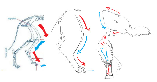
i dont even bother w the name of the bones or muscle or whatever, i just see that it goes forwards, backwards, forwards, feet and draw that, once u know how it goes u can try moving it or drawing in diff angles🙌🙌

goes like that for everything... do i know what these muscles are called? fuck no, dont ask me😭😭 but i can see the bumps and stuff

then u can adapt it however u want, like always its up to u what to add, omit, exaggerate, etc etc🙌🙌
tbh im not the person to ask ab proper anatomy advice, still i hope u find it useful!!!
35 notes
·
View notes
Note
If you want a genuine critique, I think your grasp on anatomy is still wonky and part of the reason may be because you kind of go out of your way to avoid panels with full body shots. Your most recent pages are genuinely creative and have a fun composition, but it’s kinda hard not to notice that a lot of them framed around just seeing the upper torso of a character. Its kinda like how artists would just cover up feet with mysterious smoke or debris to avoid drawing them
this response is so long but only bc i agree with this a lot. human anatomy has always been a huge struggle. don't worry, i have eyes and can see how bad it is most of the time. i have one thing to say in my defense: sometimes i have really scenes in my head i would like to execute, but my artistic skill levels are not there. which means i have to make a decision on how to re-frame or execute the panel before my deadline hits. this sometimes means taking the shortest path from a-b if i've already wasted too much time trying to make this work. i've been trying to record these failed attempts more on patreon just bc. idk they're confessional and might be helpful for people to see how much behind the scenes hemming and hawwing there is before the page finally gets made.
last year this problem was especially bad too; when i was really sick i was drawing soooooooooo many "talking heads" pages (this is what i've always thought of them as lol) because they were easier to do (obviously) and it was so bad and i knew it lol. it was making me miserable to the sole responsible party for churning out really really bad low-energy/effort pages and, at the time, not really having an excuse for it.
i tend to direct my art improvement energy on one specific thing at a time, for a while it was making a point to incorporate more backgrounds or foregrounds into pages, then for a while it was getting WAY less shitty at speech bubbles/paneling (still struggling with panels tbh). maybe now that im feeling better i can try to focus harder on anatomy. ty for giving me a direction to head in!!

23 notes
·
View notes
Text
For some reason, I decided to check out my old deviantart account that I haven't touched since 2007, and my main two thoughts were (a) obviously, nothing is professional artist quality, but a lot of this isn't that bad, and in some cases, even p good, minus some wonky anatomy and proportions, and (b) gdammit, the way I draw faces has not progressed at all in almost twenty years, even though I have been making an active effort to change that 💀
2 notes
·
View notes
Note
🕴️- Is there are s specific character you really enjoy drawing? Why that one?
{NOW THAT I’VE GOTTEN PERCY’S IMPOSSIBLE HAIR DOWN I like doodling her aghdsfklasgm XD AND MERYL. MERYL’S FUN TO DOODLE. Percy is especially fun in contrast between Meryl or Zora bc I draw Percy with, like, shorter/stockier lines and both of the others with longer flowy lines so you get that Nice Contrast [tm]}
#{I don't mind drawing Ramsey and his cute wonky mouth is fun to draw but mostly it's just neutral with him}#{I don't like trying to draw the museum trio b/c there are so many details and aside from Molly their designs are just kinda meh for me}#{I've never tried Mera and I REFUSE to try Indus ahgaskdlfasghsdf}#{...even if it would probably be good for me to practice anatomy}#[ off the clock - OOC ]#[ I hope my answer suffices - answered ask ]#[ happy munday! ]#stardemon39
7 notes
·
View notes
Text

What a sexy morning it is to support transfem lesbian rights uwu
#anatomy HARD#left shoulder is a bit wonky but whatevs lol#anyway!#gender euphoria time B)#trans tag#my art#bonnie.txt#but this time also with art ajdjsjdjjd
13 notes
·
View notes
Photo


a few drawesome doodles with @luciana-rg !!
#lol my wonky anatomy skills at their worst#anyways this is the most fun expect more in the future B^)#my art#again this is a collab!!!!!! but this is the art tag so im using it so i wont forget what tag i used askdjfh#collab art#ok this is the tag now i hope i will remember
5 notes
·
View notes
Text
Yeah B)

Zer0 isnt human... so uh that's my excuse for wonky anatomy B)
I'm starting to transfer to a new art program so here's to hoping i dont perish learning it lmao
#art#digital art#fanart#borderlands fanart#borderlands 2#borderlands zer0#bl2 zer0#zer0 fanart#zer0#zer0 the assassin#metr0art
300 notes
·
View notes
Photo


re-watermarked reuploads of a 2019 Min and Jun b-day piece from my inactive twitter (the last batch yaay) two versions cuz i couldn’t decide lol.
this one still holds up pretty well! anatomy’s a little wonky but i really love the color/shading style here. idk if i can replicate it again, its one of those things i did In The Zone...Alas. perhaps i will try to one day.
Min’s shirt template by hamki
220 notes
·
View notes
Text
Grey’s Anatomy Has a Toxic Workplace Problem in Season 18 - aka why everyone keeps bullying Meredith into staying in Seattle
(Why is no one talking about this???)
Read my grey’s anatomy meta on ao3! Same format but I would love hear your thoughts
I can’t believe my biggest gripe with Grey’s season 18 is… fair labor practices? I mean, it’s usually more soap-opera stuff. Dead fiances come to life, disappearing girlfriends, surprise pregnancies, etc. etc.
But I keep seeing the same subtle problems arise. I’m going to call this the Webber-Bailey-Fox problem, because it seems that the ‘leaders’ of Grey Sloan Memorial are the most egregious and at fault. In short, why on earth do Webber, Bailey, and Catherine act as if the entire fate of this hospital hinges upon Meredith? Why won’t they let her leave for Minnesota?
She’s a famous surgeon who works there, not a goddess. The hospital isn’t going to magically disappear into dust and shadows if she moves to another state with her kids. If other key characters who are part of the Grey’s universe (Cristina, Alex, Jackson, Arizona, April, Callie, etc.) are allowed to move away and find new jobs, why do her bosses keep guilt-tripping Meredith into staying?
In general I’d give Season 18 a B+. In general my rule about TV is ‘keep watching if you’re having fun. Quit if you’re not!’ and I enjoy spending each Friday morning watching last night’s episode of Grey’s. I thought that many parts of S18 (like the introduction of Kai! Or letting us explore Bailey’s burnout and Maggie’s marriage to Winston!) were handled delicately. But at the same time, Webber, Bailey, and Catherine 一 mostly Webber and Bailey, obviously, since they’re series regulars 一 are just being manipulative toward Meredith.
Again and again on Grey’s, we see management whining whenever people don’t agree with them. In season 2ish, when Bailey considered switching from general to pediatric surgery, Webber was consistently whiny and cruel to her. He acted like she was throwing her career down the drain for changing. Bailey also sort of did this when Jo switched to OBGYN, and when Ben decided to become a firefighter instead of continuing his residency.
The Grey’s timeline is a bit wonky since seasons 1-3 take place during intern year (which I assume is 12 months), but I’d wager Meredith’s literally been working at this hospital for 16 years, give or take. She had her children here. She lost her husband. She dated and re-realized what it means to find love after loss. Is it so wicked and awful that she might want to move to Mayo Clinic instead of growing old and (pardon my pun) grey in Seattle?
During all of season 18, Webber and Bailey are just awful to Meredith. They treat her like a traitor and whine that she isn’t being ‘loyal’ to the hospital where she grew up (reminder: Meredith literally grew up here. Ellis trained at Seattle Grace and there are flashbacks of Meredith as a 6-year-old walking the halls.) If it’s indeed true that Meredith has lived much of her entire life in this one building, why on earth do her bosses keep manipulating her into staying? This is a textbook hostile work environment and it’s so puzzling that no characters in the Grey’s universe are acknowledging it.
A workplace culture where your bosses call you ‘disloyal’ for wanting to submit your 2 weeks’ notice is… not good. No wonder Meredith wants to leave if Webber and Bailey, who are supposedly her old friends and mentors, are so willing to turn on a dime and snarl insults at her.
Don’t even get me started on this Accreditation Council Lady in the finale, who acts as if Meredith’s departure is a key reason why the hospital is unstable. Sure, I assume Mer is good at bringing in fundraising money and good PR (and I know Council Lady feels that she’s been lied to so she’s lashing out), but Mer’s just the chief of general surgery. There are plenty of good general surgeons who can take her place.
And I know, the show is called Grey’s, not Pierce’s or Shepherd’s Anatomy. We all know Meredith is important. But it feels cruel to tell Meredith that she matters so that we can guilt-trip her into staying at Grey Sloan instead of moving away. When does it end? Will Meredith be tied in one place and forced to work at the hospital forever just because they can’t afford to lose her? What kind of awful workplace is this, where you aren’t allowed to leave because people seem to need you too badly? It’s kind of like a desperate boyfriend or girlfriend who refuses to let you break up with them because “they’ll fall apart without you.”
This is an incredibly toxic position from Webber and Bailey, and it makes me dislike them. They’ve been written so oddly this season, acting as if they’re gods who are above criticism and flaw. Their inability to recognize their own flaws is actually the reason they keep hurting the people around them.
So the Minnesota plotline may have its flaws (I’ll get to that later! What on Earth does Mer actually do at Mayo?) but it’s Meredith’s right to leave if she wants to. It’s not like she’s signed some lifetime contract or a blood oath tying her to one place. She’s successful, she’s excited to travel and spend more time with Nick, and the city of Seattle is always going to be haunted in some part because of Derek’s death. Why shouldn’t she get to leave? Why are Webber, Bailey, and Catherine allowed to intimidate and jeer at Meredith? Why do they feel entitled to her time and work? It’s starting to feel like Bailey and Webber are just bad bosses. If you can’t handle the fact that your employees may get a better offer and leave you, you shouldn’t be an employer.
#grey’s anatomy#meredith grey#grey’s anatomy meta#grey’s anatomy fic#miranda bailey#richard webber#amelia shepherd#Maggie pierce#catherine avery#greys abc#greys anatomy#grey’s#sorry for the weird formatting! I’m on mobile :/#benwvatt
70 notes
·
View notes
Note
hi your art is so freaking cool oh my goodness, the fact that you are using my color palettes makes me very happy!!!! do you have any advice for making cool compositions? i feel like i want to practice that more
oh my GOD hi there!!!!!! wowow i was not expecting this. and here i was almost worried i was clogging your tag?
gosh okay i hardly consider myself the expert on composition. i am still pushing myself to get better at it. but uhHHH let me list a couple tricks ive picked up on!
1. i like to look at my artwork from far away sometimes, especially when im at the stage where im blocking out color, or when ive stared at something for so long its kinda turned to mush in my eyes. detailwork is good! but i find i get a better sense of how the piece as a whole is balanced if i stand back a bit or zoom out.
2.it helps to check how it looks in black and white sometimes? the key with compositions is always contrast, you’re looking for ways to make your subject stand out against the background. sometimes thats making them really bright against a dark background! or even having a highly B&W character against a contrast-less, grey background.
4. alternatively, ive noticed a trend in the eyestrain brigade in picking two highly contrasting colors without changing the values- for example, drawing a blue subject against a red background? this is a cool example of “cheating” while still utilizing contrast! its all about figuring out how to make things pop against eachother.
5. the second piece of advice i have is to go more on.... feeling instead of logic? a strong sense of anatomy is good, and should not be overlooked! but sometimes i find it helpful to, jsjusute, go loose and boneless, and instead of being like "realistically, this is where an arm goes," think more in the realm of "a dark/light shape needs to go here". and i then try and conspire with the elements that are already on the page to see if i can make that work.
6. push your poses! tilt em! go full wonky with it! play! with! motion! some people approach composition as an extension of motion. take your motion lines, and have them dictate where you put everything. a character crashing into the wall? make everything smooth until the hit, and then have as many random bits to help accentuate the impact as possible. let the motion shape the environment
7. finally it is criminally easy to put down a border. if youre more used to drawing characters and dont know where to start on backgrounds or compositions, just try putting down colored borders or adding one (1) shape in the back somewhere. its a good way to get started in thinking with composition! branch out one step at a time, y’all!
#sorry i didnt add any pictures to illustrate my points better#if enough people are interested i might go back and do that??#not sure if anything i said got lost in translation yknow :P#[bugg chitters]#chicken-mc-nuggets
20 notes
·
View notes
Note
Hey I'm Fred's fourth daddy anon! I sent that to you, and what felt like five minutes later you came in with that gorgeous sketch. Do you have any art tips or videos that have taught you cause I've been stuck draw trying to draw anything not resembling a lump for two years. Also yeah it was whirlwind episode, f*ck Rose, and Fred should have turned that loon in.
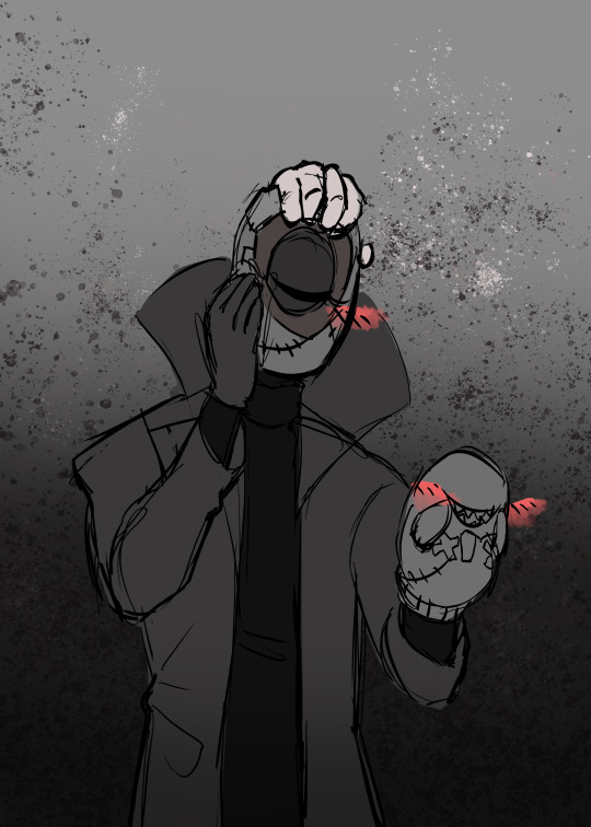
Hey FD Anon, thanks so much! I don’t draw a lot of “horror” art so I’m really happy with it’s progress so far!
While I do agree with you that Rose is The Worst, I think she added in an interesting dynamic and I’d be happy if she became a recurring character in the Scooby mythos at large. As for Fred not turning his dad in... I agree, but I also understand why he didn’t.
The episode went out of it’s way to show off how frightening and weird he is but Fred made it very clear that when he wasn’t wearing the mask he was a good parent, and that all of his crimes were shown as nonviolent. He didn’t seem to steal anything (unless I missed that line?) he just liked messing with people by confusing them.
As for art tips, I... honestly never expected anybody to ask for advice from me? That’s super flattering wow.
Okay, so I’m still pretty much a novice, but lemme give you some of my best tips and tricks:
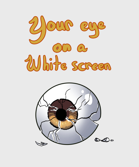
1) Notice how my last sketch had a grey background? This wasn’t just for that sketch, this is how I use ALL of my digital canvases. I do this because the grey causes less strain to my eyes, and allows me to work longer and more easily. Being so close to a screen, especially a blue or white one, can make it harder to work for long periods of time.

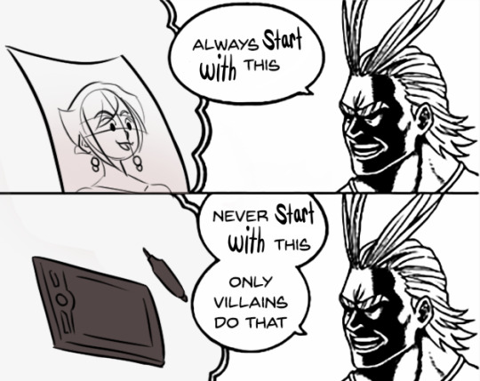
2) If you want to do digital art, you need to learn “traditional art” (pencil and paper) first. It makes transitioning to digital more easy and it’s pretty much what any art teacher would recommend, for good reason.
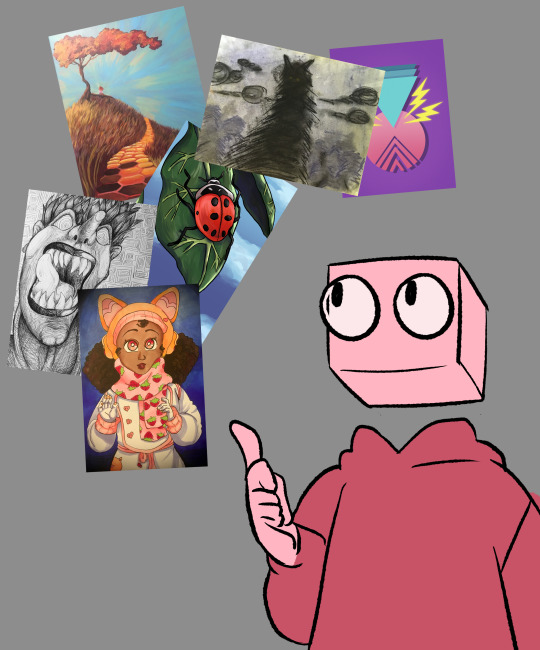
3) Using one method of art not only limits you, but stops you from learning other techniques which can be incorporated into what you typically prefer. Not only that, but you can also discover a medium you really love that you never would have thought of before!
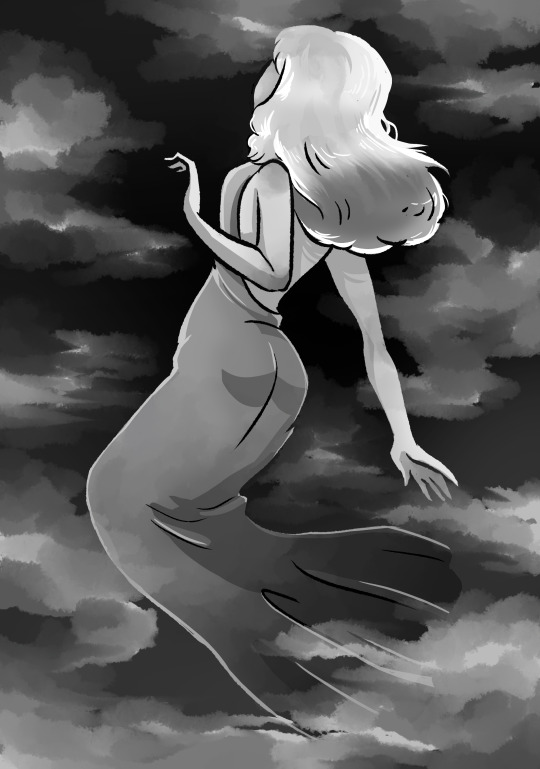
4) Whenever you get the chance, work in black and white or monochrome. This is a great way to help yourself learn about values and intensity, and just looks cool in general.
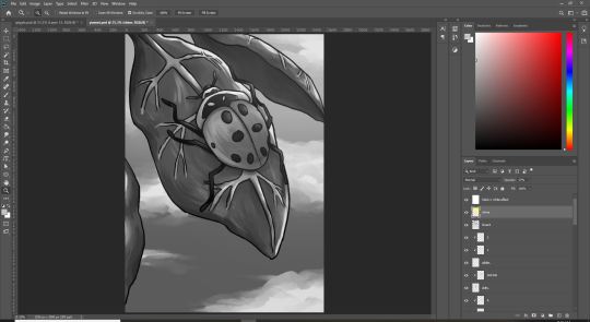
5) Piggybacking on that last point, if you’re ever worried about your shading, values, etc becoming muddled either A] take a picture and use a filter to make it black and white, or B] create another, pure white layer on top of the others and change it from “Normal” to “Hue”. Doing this can really help change your approach to coloring (black and white effect may be different for every art program).
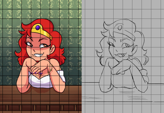
6) If you want to get better at realistic faces, I was taught using the grid system. You have squares on your reference picture, squares on your paper, and then match up the body parts to the squares. I personally didn’t like this method, but it’s a really solid style of learning.
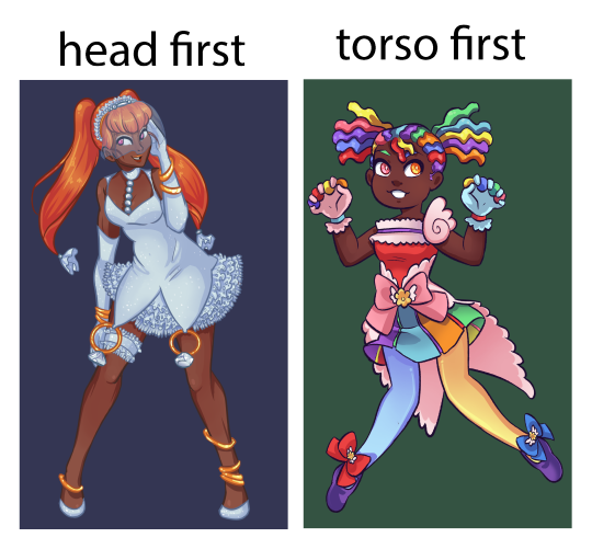
7) Start with the torso instead of the head. what you start with the head, the body may end up becoming wonky and having the neck stretched out at an odd angle or having a too small cranium. This is easier to fix in digital art but I suggest just remembering the importance of that rib cage (this is something I’m still training myself out of).
8) Asking for feedback can be an invaluable tool. For example, last year I had this really weird thing where I drew my eyes way too close together- I never noticed until I had it pointed out to me, and it took MONTHS to break this habit.
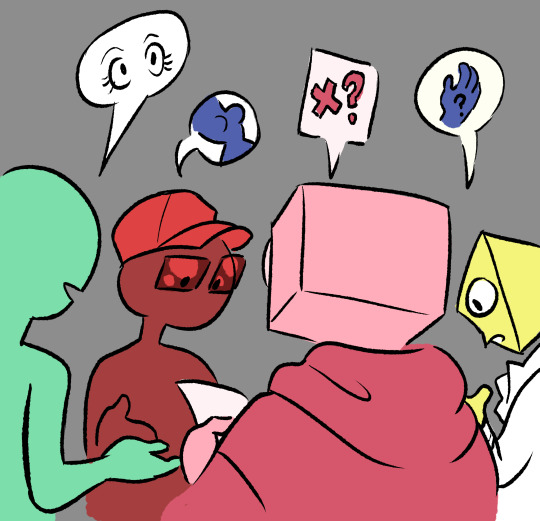
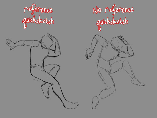
9) References are very useful, and one fun technique I’ve found great use in is to draw a pose, first with no reference, and then following that reference very strictly. This can be helpful when you want to see where you are developmentally.
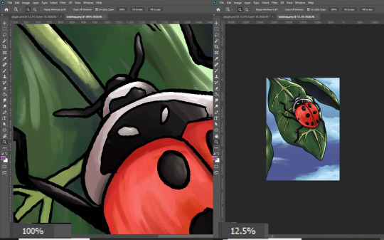
10) Every now and then while drawing, you want to put the pencil down, prop up your paper, and walk away so that you can see the full image from a distance. If you’re working digitally, you zoom out a great deal so that the image appears smaller. This is a GREAT tool for seeing which sections of the piece need the most attention and how those smaller details hold up.
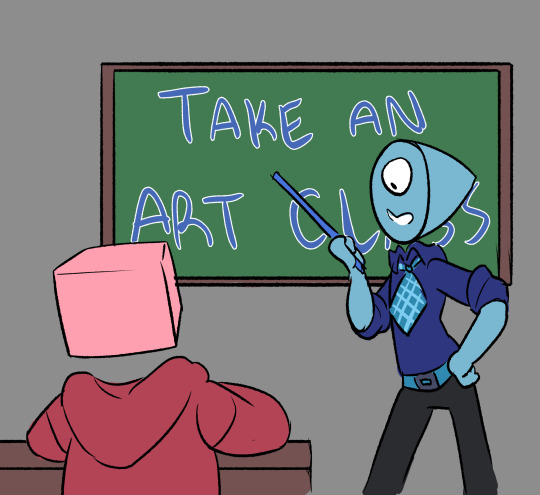
11) If you have the opportunity, you REALLY want to participate in an actual art class. Having a teacher that can see what you’re doing in real time and knows where you’re at skill-wise is an INVALUABLE thing to have- these people were specifically taught how to teach you these skills, recognize your problems and how to fix them. Don’t be afraid to talk to them and ask for advice about non-classwork art, either! You can’t receive help if you don’t ask for it.
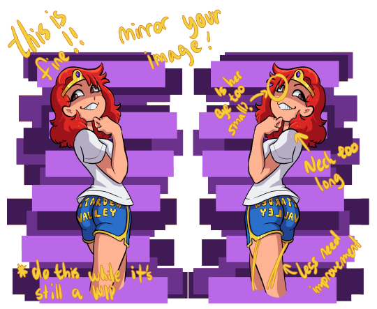
12) Flip your canvas! I know you’ve probably heard this before, but this is one of the best ways to check for anatomy inconsistencies.
13) When it comes to youtube artists, I don’t really actively follow any, but I do know of some!
Mark Crilley: While I don’t watch his videos much now, I used to follow his videos RELIGIOUSLY. He’s got some really solid advice on how to map out comics and mangas, and he taught me the importance of silent scenes and keeping your work from getting too wordy. He mostly does the soft anime look, but he also does some pretty stellar realism.
mikeymegamega: I’m not going to lie to you, anon- this man likes his cheesecake. This guy is all about the cute anime girls, so if you’re not looking for that, skip him, but I really can’t recommend his videos on hands, feet, and faces enough.
Proko: Has a video about best drawing exorcises and is the guy you turn to when you want to know about figure drawing. He tends to focus on the more realistic anatomy, and while his videos may be long he’s got some good advice. I’d say to check out his studying anatomy correctly video, and then just kinda scroll through his pages.
Ethan Becker: THE KNIFE MAN. The first time I clicked on him I thought he was making a troll video- but then he Got Into It and my dudes, my guys, he has some CRAZY good advice. The way he words things and shows you examples in his videos are amazing and I really can’t recommend him enough. He did a video called “Fixing PROKO's LAZY Drawings“ and while you’d think it would be a bash fest his advice on shading in it is just so incredibly useful. Click on pretty much any of his videos and you’ll be entertained and learning.
I'd also suggest watching speedpaints. Even if it was unintentional, I’ve learned several really solid art hacks from speedpaint and storytime videos- so always be aware that you have an option for that.
…. Oh! And also, practice! I know you’ve probably been given this advice from everyone already, but it’s worth remembering.
Sorry if this got a bit long, I just figured I’d try to give you some good hacks- and even if you have already heard of most of these, I hope I could at the very least entertain!
120 notes
·
View notes
Text

Rest With Me (Sheva Alomar x Chris Redfield)
Sheva: 😳 What are you doing? We still have a few boxes left to unpack.
Chris : 🤗 I know just... Relax with me for a sec
D O M E S T I C B L I S S featuring my fav pairing since 2010! I just love how gentle and soft the coloring looks😖
(I originally made this art piece on paper around 2017 after reading a really cute and kind of steamy fanfic for them (which is why the anatomy is still a little wonky even after hours of editing and I'm still not good at drawing facial hair on men so it was kind of learning curve to give him a five o'clock shadow)
#sheva alomar#chris/sheva#chris redfield#biohazard 5#resident evil 5#resident evil#artists of color#artists on tumblr
20 notes
·
View notes
Photo
every fic that left a lasting impression with me this year. sorted in order of when i read them!!
buckle up lads, it’s a long one
nicotine by krisstylinson 32k
"We're two different types of people, Liam. He likes sex and drugs, I like theater and tea. Trust me, we'd never date." Except they would, they do, and neither of them plans on letting go anytime soon.
"Just because you can get me hard doesn't mean I like you," Louis whispered. The fact was, he didn't like Harry right now, not at all. Not even a bit.
"Yeah, yeah," Harry murmured, his breath fanning over Louis' cock as he spoke. "You done telling me how much you hate me so I can suck you off?"
like candy in my veins by littlelouishiccups 31k @littlelouishiccups
Basically the A/B/O, enemies to lovers, fake relationship, Christmas AU that nobody asked for
worth dying for by whoknows
“You’ve got to be kidding me,” Louis says, leaning back in his chair and crossing his arms over his chest. In the center of the table, a set of three glossy photos stares up at him, mocking him.
“A security detail is non-negotiable, Louis, you know this,” his mum reminds him, tapping the middle photo with two fingers.
Louis doesn’t look back down at the pictures, gesturing towards them wildly, over-dramatically. “This is not a security detail!” he protests. “This is a lanky college student. In what world do you hire someone like this kid to protect me?”
damn your love, damn your lies by ifthat
“Of course you’d use your free time to go to the gym.”
“Your idea of the best way to spend your free time is annoying your neighbors,” he laughs, dimples carved into his cheeks like marble.
No, Louis likes to annoy Harry. Everyone else on this floor is just an unfortunate casualty.
“No one has complained except for you,” Louis informs him smartly. Which is actually a good thing. If someone other than Harry had complained to him long ago, he would have unfortunately had to stop.
you came into my life by disgruntledkittenface @disgruntledkittenface
When the Queer Eye cast and crew sweep into Louis’ small town and fire station to make over his best friend and coworker Liam, Louis’ carefully constructed walls start to fall down and he has to face his fears – and the only guy he’s ever been able to see a future with.
a thousand miles from comfort by littlelouishiccups
In which Louis is a closeted gay actor and a recovering addict with a troubled past. Harry is the personal trainer who helps him get his life back in shape.
smaller than me by checkthemargins
Harry's just finished his first year of uni on his way to becoming Dr. Harry Styles, Neurosurgeon. He's young, he has endless potential, three amazing best mates, a new love and the world at his fingertips. The fact that his new boyfriend may or may not be a sex-worker, of course, throws a wrench into the works. But it's not true. Really.
Probably.
It most definitely might not be entirely true. And that's all Harry needs to know.
escapade (i was late to the game shut up) by dolce_piccante
In the grand scheme of things, finding a date for a wedding should be no problem for Louis Tomlinson. He's rich. He's handsome. He's reasonably well behaved. But when the wedding is for his lifelong best friend (and former boyfriend), and is happening in under a month, finding a date for the ceremony and accompanying festivities becomes more of an adventure than he ever could have planned for.
soft hands, fast feet, can’t lose by dolce_piccante
American Uni AU. Harry Styles is a frat boy football star from the wealthy Styles Family athletic dynasty. A celebrity among football fans, he knows how to play, he knows how to party, and he knows how to fuck (all of which is well known among his legion of admirers).
Louis Tomlinson is a student and an athlete, but his similarities to Harry end there. Intelligent, focused, independent, and completely uninterested in Harry’s charms, Louis is an anomaly in a world ruled by football.
A bet about the pair, who might be more similar than they originally thought, brings them together. Shakespeare, ballet, Disney, football, library chats, running, accidental spooning, Daredevil and Domino’s Pizza all blend into one big friendship Frappucino, but who will win in the end?
oh glory by alivingfire @alivingfire
Harry Styles is Team Great Britain's newest swimmer, and has spent his whole life training for this moment, a chance at the gold medal in the Rio 2016 Olympics. All his training, hard work, and dedication to no distractions is tested when he's assigned to the same Rio apartment as Louis Tomlinson, British gymnast and Harry's childhood crush.
it’s all brand new because of you by supernope
AKA, Louis starts a new job as a summer camp counselor at the local aquarium and Harry is a biologist who really likes teaching people about the ocean.
this wicked game by cherrystreet @cherrystreet
An AU in which The Bachelor is gay, Louis is a contestant, Harry is the bachelor, everyone drinks a lot of champagne, the entire world gets to watch them fall in love, and no one plays by the rules.
do not go gentle by afirethatcannotdie @afirethatcannotdie
When Harry Styles starts his first day as a surgical intern, he expects a lot of things: to treat patients, to observe a surgery, to feel a bit overwhelmed. What he definitely doesn't expect, however, is that the handsome guy he kicked out of his bed this morning is also an intern.
A Grey’s Anatomy AU where tensions are high, Harry and Louis are hooking up in secret, and no one has time for love. Or do they?
to brim with fright by hereforlou @hereforlou
The only reason he’s here is because it’s tradition. And also, Harry said it’d be fun to make Liam wet himself in fear and Louis agreed. It’ll be hilarious. He’s not an insecure new transfer anymore, thank you very much. It took him no more than a week to insert himself into a group, to get invited to his first party, and to start crushing on someone—he’s not what anyone would call socially impaired. He doesn’t need validation.
have you coming back again by whoknows
It’s five o’clock in the morning. Louis has a lecture at half eight. He could be using this time to study or to do his readings or to go to the gym, but - well. He doesn’t have any exams coming up, he’s not going to his seminar today anyway and he hates the gym.
Instead he’s using this time to fuck with Harry Styles’ poor little brain.
Louis jogs across the street and jabs the key into the car door. It opens easily, not that he was expecting anything else. He copied the key for a reason, after all.
He’s got Harry’s schedule memorized, more because the guy keeps following him around than anything, so he doesn’t bother looking around before climbing behind the wheel and setting his bag on the passenger seat. It’s a Monday, which means that Harry doesn’t even get out of bed before noon unless he’s planning on harassing Louis.
i put a spell on you by bethaboo @bethaboolou
A BBC/Secret Santa mashup featuring Captain Niall, our intrepid weatherman/amateur matchmaker, rather clueless sports reporter Liam, charming political analyst Zayn, and cheeky entertainment reporter Louis. Harry is the new fashion correspondent who prefers to dress like a flamingo. And pining. There’s a lot of pining.
naked & proud by kiwikero
In which Harry runs an organic store, not a nudist colony, and Louis doesn't know whether to be relieved or disappointed.
take me under the blue by objectlesson
Louis hasn’t even seen his legs yet. He doesn’t know how they work or how long they’ll be. Maybe they won’t suit the rest of Harry at all, and he’ll have to grow into them or something. It doesn’t matter; Louis has loved Harry for a year with scales, so he can’t imagine wonky legs putting a damper on his attraction.
He supposes he’ll just have to find out. In the meantime, he wonders how the fuck he got here, in his squelching wellies about to save the love of his life from the sea and take him to bed and bang him for the very first time.
It’s sort of a long story.
paint the sky with stars by kiwikero
the historically accurate Titanic AU with a happy ending.
truth be told i never was yours by justfortommo
(or the one where Louis and Harry have a complicated past, Louis is getting married to someone that’s not Harry, and the universe has decided to have a laugh and make Harry the wedding planner.)
into the badlands
Louis is Q. Harry is a double-oh agent who thinks that making knock-knock jokes around foreign embassy delegates mid-mission is a good idea.
swim in the smoke by whoknows
“What about this, Captain?” Liam asks, nudging the boy kneeling between their feet with the toe of his boot. The boy hisses and swipes at him, slurring out something unintelligible around the makeshift gag Niall had to stuff in his mouth. He misses by a mile and tries again, just as ineffectively.
Harry looks down at him, at the way the sun streams over his face and shoulders, at the way the gag stretches his mouth, lips pink and chapped. He’s lithe and pretty, smudged all over with dirt. They had found him tied up below deck, mostly unconscious, next to a barrel full of gold. He’s clearly a prisoner, but there’s something familiar about him, something that niggles at Harry’s brain. Something he can’t quite put his finger on.
“Put him in my cabin,” Harry decides, turning back to deal with the rest of the loot. The boys screams out jumbled curse words at Harry’s back, muffled by the gag, and Harry can’t understand any of it.
resist everything except temptation by domesticharry @domestic-harry
The one where Louis is the commodore's son who is forced to become a part of Harry's crew when he is captured.
pray till i go blind by el_em_en_oh_pee
Louis is (kind of) a preacher. Harry is (probably) a demon. Of course, nothing's as simple as that.
This is not a love story.
(your heartbeat) rang true inside my bones by flimsy @flimsi
Harry goes as Louis' date for a weekend wedding. He ends up taking the role a bit too seriously.
i love your demons (like devils can) by ariadne_odair
Harry didn’t plan to join the football team. She didn’t plan to sleep with the captain of the football team. She definitely didn’t plan to sleep with the closeted captain of the football team, who promptly acted as if nothing happened and left Harry a pathetic, pining mess.
alien roadtrip! by helloamhere @helloamhere
roadtrip with desert feelings, too much snack food, and empty motels. Harry is definitely absolutely not an alien. That would be ridiculous.
treat mothman with kindness by flowercrownfemme @lesbianiconharrystyles
In which Louis, Liam, Niall and Zayn are amateur cryptozoologists and Harry is the creature they find in the woods of a small north-western town. ft. lots of glitter and shrieking and a whole shed full of lesbian cats.
just me, you, and this box of matches by tomlinsunshine
Louis is fairly sure that his new neighbour is going to destroy him. And also their apartment building, and the dumpsters outside, and all the forests within a thirty mile radius. But. Mostly him.
close to nowhere by angelichl @angelichl
Louis and Harry are psychics who kind of hate each other. They go to Tennessee to investigate a haunting.
magical soup by gloria_andrews
Slytherin prefect Louis Tomlinson's seventh year at Hogwarts takes an immediate turn for the worse when he's made to be potions partners with Harry Styles, Hufflepuff's resident heartthrob and class clown. Louis has always considered Styles to be a terrible show-off who coasts by on his charm and good looks, but the more they work together, the more he questions that idea. As term goes on, will Louis be able to admit to himself that he might actually like Harry Styles after all... and maybe, just maybe, as more than a friend?
sainted taints and velvet vices by toomanytears
A self-fulfilling Hogwarts AU in which Louis is new to seventh year and Harry is the resident devil-may-care Slytherin set to make his entire experience a living misery. Due to less than favourable circumstances they're forced to forge an unwilling, tentative relationship for their own survival. Repressed emotions, decidedly unromantic ballroom dancing, Triwizard Tournament tasks, creative jinxes and twilight flying above the Forbidden Forest ensue.
run like the devil by benzos
Supernatural AU. Louis hunts demons; Harry's the strangest demon he's ever met, and he keeps fucking meeting him.
be with me so happily by briamaria
[aka Louis is the director of the Styles Elephant Sanctuary and really doesn't want to babysit his funder's spoiled lay-about son for two months]
come together by bottomlinsons @bottomlinsons
Harry and Louis slept together three weeks ago, and haven't talked.
Their coming group project is gonna change that.
what this world is about by isntrio @bloubird
An eighties American high school AU; there are first times, football games, and feelings.
Alternatively titled: the beginning.
once upon a dream by thedeathchamber
Louis is psychic and gets caught in the middle of a murder investigation led by FBI Special Agent Harry Styles.
aka. the Medium/Criminal Minds-inspired AU no one ever asked for.
led by your beating heart by missandrogyny @missandrogyny
(Or: AU where Harry's in One Direction, Louis isn't, and they reconnect over a game of 'Call or Delete'.)
forever and always by jacaranda_bloom @jacaranda-bloom (again, thank you!!!!!!!)
OR the one where Harry’s neighbour is a crotchety old witch who hates vampires, Niall is the unsuspecting human who ends up inhabiting Harry’s body, and Louis is the caseworker who is assigned to swap them back. How it ends up a love story is anyone’s guess.
sail your sea, meet your storm by kiwikero
The strangers to enemies to friends to pining to lovers fic where Louis is cynical, Harry is charming, and they have seven days to get their shit together.
tangled up in you by missandrogyny
Harry blinks once. And blinks again. And says, his voice dangerous: “Niall, did you get me a mail-order bride?”
Because what the actual fuck. It kind of looks like Niall’s just purchased a person. For Harry.
Niall blinks back at him for a few moments, before throwing his head back and howling with laughter. Harry throws a pillow at him. Hard. “No, what the fuck, Harry.”
“A prostitute then?” Harry also doesn't want a prostitute.
“Of course not!”
“A stripper?”
“No!”
Damn, he’s running out of ideas. He settles for launching another pillow at Niall’s head. Niall bats it away easily, still laughing. “Stop!”
“What did you get me, then?!” Niall must hear the tinge of hysteria in his voice, because he’s pulling himself together, trying to stop himself from laughing.
There’s still a big grin on his face, though, when he says, “I got you a professional cuddler.”
A professional…what. “What?”
i’d burn this city down to show you the light by you_explode
Harry's a sheltered rich kid and Louis's a punk with a heart of gold. They meet when Louis breaks into Harry's house, Harry obtains an instant and all-encompassing crush, and they spend the summer falling into a whirlwind romance.
sail your sea, meet your storm by kiwikero
Louis is thirty, single, and a bit of a workaholic. He's happy with his life, but then his mother decides to buy him tickets for a Singles Cruise. Appalled that his family thinks he can't handle his own love life, he steps aboard the ship determined to have a terrible time.
That is, of course, until a persistent brunet keeps offering him drinks.
The strangers to enemies to friends to pining to lovers fic where Louis is cynical, Harry is charming, and they have seven days to get their shit together.
bring out feelings in me i never show
“I really think you should stop reading,” Liam says, having moved to hover behind Louis’ back at some point. “I can already see the cogs turning in your head, Louis, and I don’t like this.”
“Shut up,” Louis waves him off and continues reading.
I can do these things, at your request: openly hit on other female guests while you act like you don’t notice; start instigative discussions about politics and/or religion; propose to you in front of everyone; pretend to be really drunk as the evening goes on (sorry I don’t drink, but I used to); start an actual, physical fight with a family member, either inside or on the front lawn for all the neighbors to see.
remember you well by fondleeds @fondleeds
“Um,” Harry starts. He looks out of place. Louis can’t really believe he’s seeing Harry like this, so unsettled, so unlike himself. He holds out his hands. “Should we–. Should I, um. Did you wanna, like, cuff me to the bed or something?”
Louis raises his eyebrows. “I don’t know. Do I need to?”
i love you most by stylinsoncity
friends with benefits has always been enough for louis. until, of course, it isn't.
ready to fall by whoknows
“Ninety and rising,” Nick says triumphantly, as though making Harry’s heartbeat pick up by thrusting an obscenely attractive person in front of his face is any kind of success. “Louis Tomlinson has just walked into our control room and suddenly our dear Harry Styles has lost all ability to speak. Could this be some kind of strange coincidence?”
“I hate you,” Harry hisses, forcing his eyes back into Nick’s direction, uncaring that the mic must have picked it up. “I thought we agreed that you were going to play fair.”
“I’m sure I have no idea what you’re talking about,” Nick denies, except he’s holding up a picture of Louis’ face now, sharp cheekbones prominent, soft lashes nearly sweeping against his cheeks as he looks down, and his fucking mouth –
“A hundred and two!” Nick crows, all but clapping his hands together in glee. “The highest it’s ever been!”
“To be fair, I did bend over the desk on purpose,” Louis’ voice comes crackling in the headphones. Harry practically breaks his neck whipping his head around at the sound of it, gaping at him through the glass panel. “You can’t really blame him for getting a little excited about that, can you?”
46 notes
·
View notes