#id below cut and in alt text
Explore tagged Tumblr posts
Text


So carry me from these walls, brother of mine, Show me the world outside. It has to be true, I'm counting on you To be my wings and my eyes.
Fish in a Birdcage - Rule #4, Fish Inside a Birdcage (2022)
Image ID:
First image - A messy, sketchy quality drawing of Ol' Jericho Sticks from Legends of Avantris: Edge of Midnight. Well, technically this is Virgil in Jericho's body. He stands at the far left side of the canvas, with his back to the camera and his head turned over his shoulder to stare a beady four-pointed eye at the audience. Their arms hang loosely at their sides. Four massive black wings sprout from Jericho/Virgil's shoulderblades and from below his "ribcage," the two farther from the camera extending over the rest of the canvas. The two in proximity to the camera curve over Jericho/Virgil's body, obscuring parts of them, and framing emphasis around their eye. Seven orange eyes with four-pointed star pupils, drawn even more messily than the figure, float in space and stare out at the audience from between the feathers of the extended wings. Scribbles in jagged strokes frame the piece and reach towards the figure. The whole piece is in a duotone greyish/orange color scheme. Words, the lyrics to Fish in a Birdcage's Rule #4 - Fish Inside a Birdcage, are written messily, following the contours of the eyes and the wings. The words write: "YOU GAVE ME MORE THAN I COULD ASK FOR... INDISTINGUISHABILITY"
Second Image - A zoomed in version of the first image, to give a more detailed view of Jericho/Virgil's face and body. Only the figure, the two closest wings, and a quarter of the other two wings are shown. No words are in view, but two of the eyes are visible.
#legends of avantris#edge of midnight#ol jericho sticks#fish in a birdcage#tw scopophobia#possible spoilers#id below cut and in alt text#obligatory click for better quality#my art#lyrics parallels#lyrics posting#im insane okay#lads i could go on for an obscenely long time why i think fish inside a birdcage is a perfect jericho & virgil song#they are both simultaneously the fish the birdcage and the bird#fun fact:#i was working on this while watching episode 30 and i can pinpoint the exact spots i was working on while certain events were happening#do i know how wings work? no not really#am i going to draw them anyway? absolutely.#this (the id) is they/he jericho sticks propaganda is it working#spoiler alert#i ALSO drew this before virgil took over jericho towards the end of the session#so you can imagine my insanity once that happened.#anyways#hows your day been
33 notes
·
View notes
Text
NHH PROMPTOBER 2023
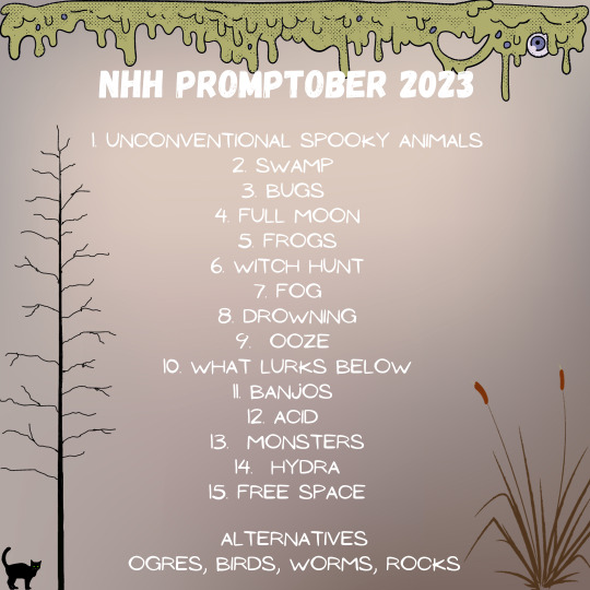
We hope you are interested in this swamp themed challenge.
Alt format for prompts below the cut.
The prompts read.
unconventional spooky animals
Swamp
Bugs
Full Moon
Frogs
Witch hunt
Fog
Drowning
Ooze
What Lurks Bellow
Banjos
Acid
Monsters
Hydra
Free space Alternatives Ogres, Birds, Worms, Rock
A prompt challenge flyer. Green slime oozes form the top with the text. "NHH PROMPTOBER 2023" There is a Black cat with green eyes in the lower left corner next to a dead tree. on the right a cattail plant.
32 notes
·
View notes
Text
I've been going back and forth about alt text for image descriptions for my art.
On the one hand! Tumblr finally seems to have it fully functional. You can see it even without a screenreader, it's easy to click on, the character limit is generous, it's visible on both mobile and desktop, etc.
On the other hand, I do not even slightly trust tumblr to keep all of that. For all I know, the functionality will break in less than a year.
And if it breaks in a way that completely gets rid of the alt text, that's going to be a lot of re-writing in my future. >_>;
#...maybe if I put the ID below a cut as well as a backup? idk.#accessibility#alt text#image descriptions#life flails#art flails#my stuff
3 notes
·
View notes
Text
Description copied from below the cut for accessibility
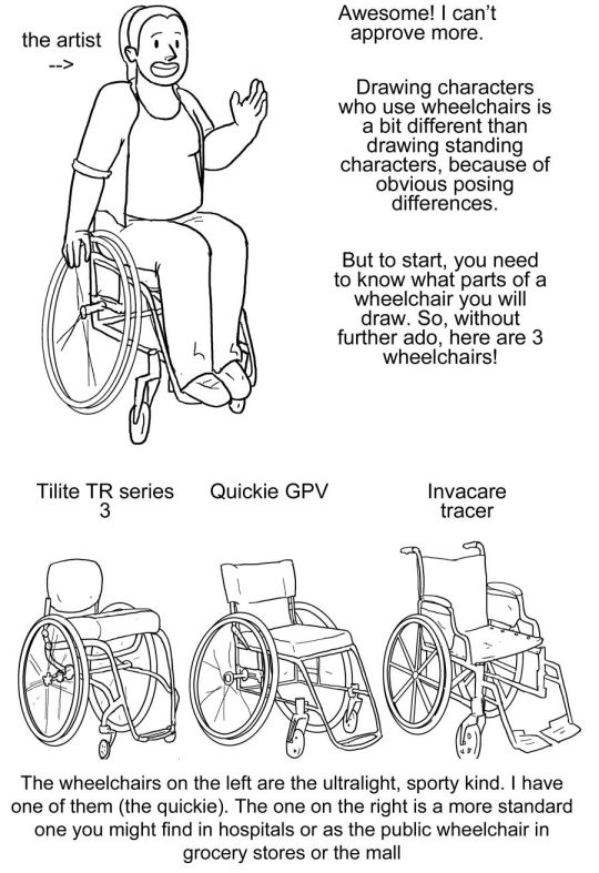
[image description: a 4 picture long wheelchair tutorial. the background is white and the text, when it appears, is black and in calibri. each step will be labeled with "Step #" and a description of the drawing next to it, and "text" and then the text that is written to explain it to follow.
Step one text: So, you want to draw a character who uses a manual wheelchair? Awesome! I can't approve more. Drawing characters who use wheelchairs is a bit different than drawing standing characters, because of obvious posing differences. But to start, you need to know what parts of a wheelchair you will draw. So, without further ado, here are 3 wheelchairs!
Step one image: a simplified drawing of a chubby woman sitting in a quickie GPV manual wheelchair and resting her hand on the handrim of one of the wheels. this is labeled "the artist"
step two: next there is a lineart drawing of three wheelchairs. one is a tilite TR series 3. this is an ultralight wheelchair with a bucket seat (the back is lower than the front), a big cushion and a short backrest that kind of contours to the back of the person who would sit in it. the caster wheels (front wheels) are very small and the footrest is just two little metal bars. next image is a quickie GPV. this is also an ultralight wheelchair with a low back, but its caster wheels are slightly larger, the back has regular upholstery (it does not look like it was made to conform to the back of the person who sits there) and the frame is boxier -- there is no bar underneath the seat where the wheels would attach, rather each wheel is attached to the side of the chair. the next wheelchair is an invacare tracer. it is how most people imagine wheelchairs when they hear 'wheelchair'. it has no cushion and it has a high backrest with handles. it has high armrests that would be comfortable to rest your elbows on if you were just sitting. the wheels are not bicycle wheels like the previous two but are rather plastic. it has big footrests and big caster wheels.
text: the wheelchairs on the left are the ultralight, sporty kind. I have one of them (the quickie). the one on the right is a more standard one you might find in hospitals or as the public wheelchair in grocery stores or the mall.
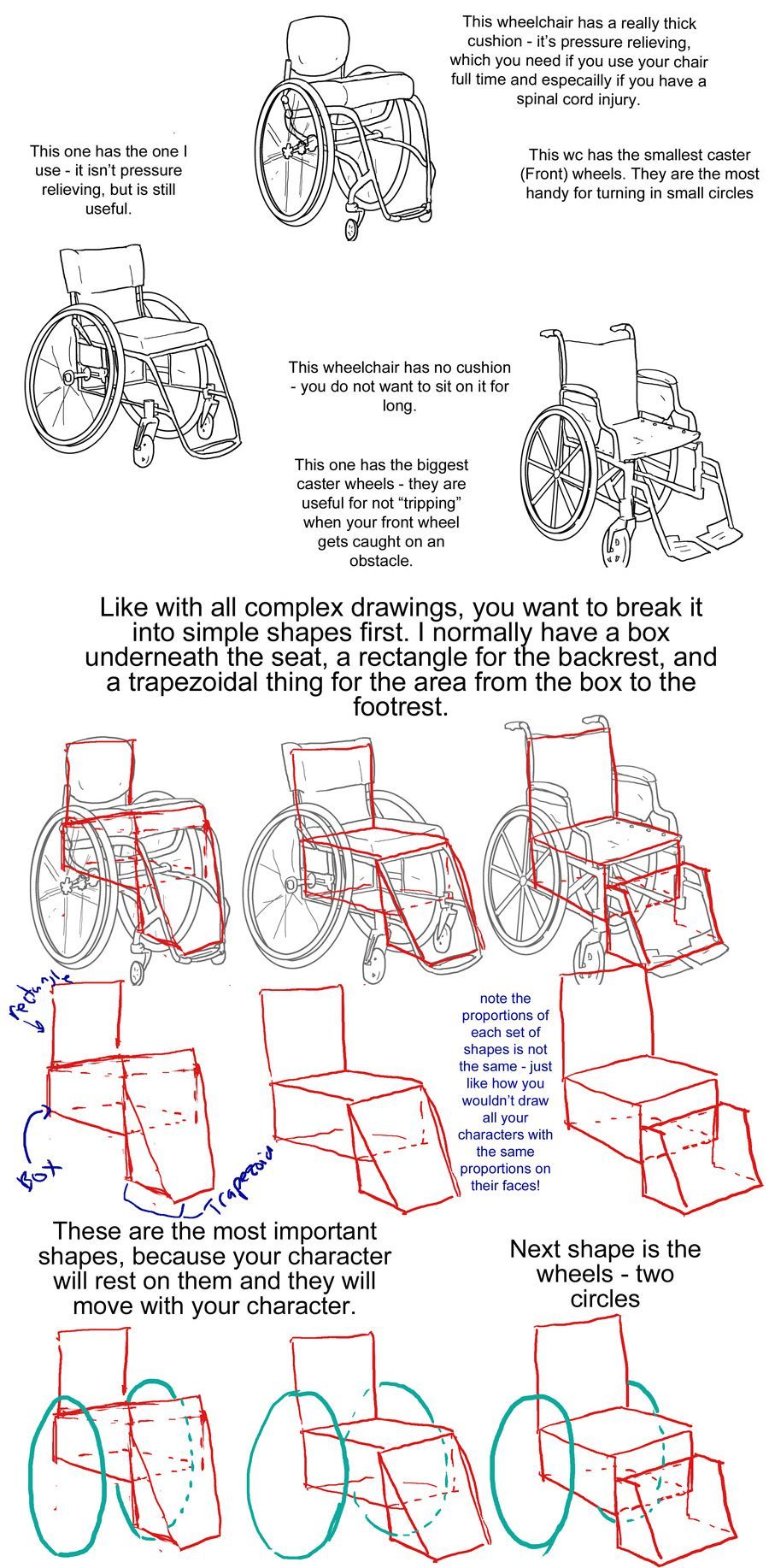
step three: first is text to accompany the tilite. "This wheelchair has a really thick cushion - it's pressure relieving, which you need if you use your chair ufll tiem and especially if you have a spinal cord injury. This wc has the smallest caster (front) wheels. They are hte most handy for turning in small circles." next there is text to accompany the quickie gpv: "This one has the one I use -- it isn't pressure relieving, but is still useful." next is text to accompany the invacare: "this wheelchair has no cushion - you do not want to sit on it for long. This one has the biggest caster wheels - they are useful for not 'tripping' when your front wheel gets caught on an obstacle.”
step four text: like with all complex drawings, you want to break it into simple shapes first. I normally have a box underneath the seat, a rectangle for the backrest, and a trapezoidal thing for hte area from the box to the footrest. these are the most important shapes, because your character will rest on them and they will move with your character.
step four image: the lineart of each wheelchair has been put on reduced opacity, so we can see the square representing the backrest of each seat (the square is the smallest for the tilite and biggest for the invacare), the box for each seat and area underneath it, and the trapezoid for the footrests. the next step labels the images of these simplified shapes as the lineart is removed. "Note the proportions of each set of shapes is not the same - just like how you wouldn't draw all your characters with the same proportions on their faces!"
step 5: we see the same shapes to form the wheelchair, but now with blue circles drawn where the back wheels would be.
text: next shape is the wheels - two circles
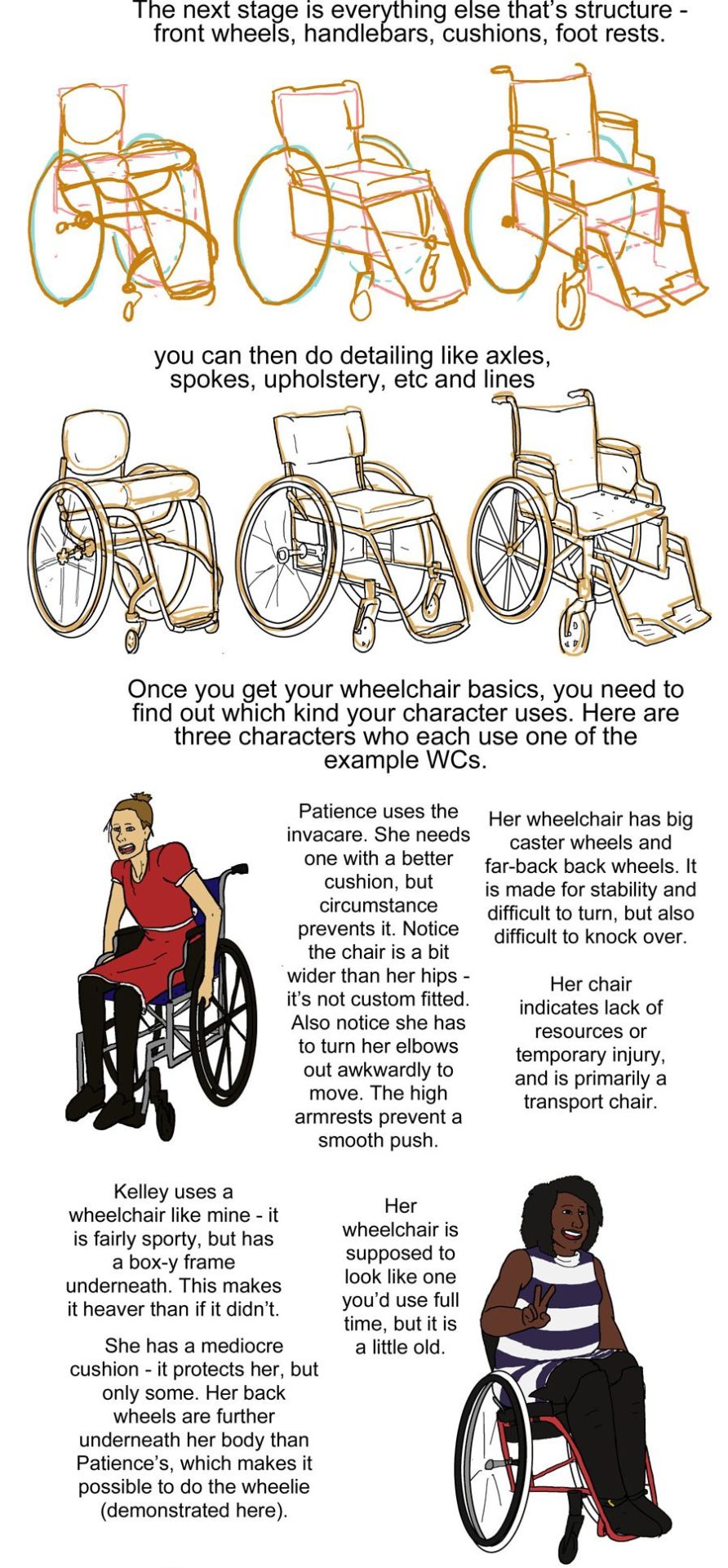
step six: next we see the wheels and shapes have been reduced in opacity and the basic structure of everything about each wheelchair: footrests, caster wheels, upholstery details, axles has been drawn on in orange.
text: the next stage is everything else that's structure - front wheels, handlebars, cushions, footrests.
Step seven: we see the lineart on top of the lowered opacity sketch.
text: you can then do detailing like axles, spokes, upholstery, etc and lines
step eight: next we see three drawings of different characters. there is patience, a skinny white woman sitting in a blue invacare wheelchair. kelley, a slightly chubby black woman wearing a stripey dress sitting in a red quickie gpv wheelchair and doing a wheelie while smiling. then luke, a white man with short blond hair wearing khaki pants. he is sitting in a tilite chair.
text: once you get your wheelchair basics, you need to find out which kind your character uses. here are three characters who each use one of the example WCs. patience uses the invacare. she needs one with a better cushion, but circumstance prevents it. Notice the chair is a bit wider than her hips - it's not custom fitted. Also notice she has to turn her elbows out awkwardly to move. the high armrests prevent a smooth push. her wheelchair has big caster wheels and far-back back wheels. it is made for stability and difficult to turn,but also difficult to knock over. Her chair indicates a lack of resources or temporary injury, and is primarily a transport chair
kelley uses a wheelchair like mine - it is fairly sporty, but has a box-y frame underneath. this makes it heaver than if it didn't.she has a mediocre cushion - it protects her, but only some. her back wheels are further underneath her body than Patience's, which makes it possible to do the wheelie (demonstrated here). her wheelchair is supposed to look line one you'd use full time, but it is a little old.
luke has a spinal cord injury. he has a very thick pressure relieving cushion for medical reasons. his chair is also ultralight, with no boxyness under the frame. his chair is the newest and lightest - it indicates his wealth/resources, but also that he needs to use on full time.
step nine: just a drawing of me sitting in my wheelchair holding my hands up to show fingerless wheelchair gloves. we're looking at me from above.
text: when you're choosing what wheelchair to give your character, think of both their disability and their resources and go from there. questions to ask yourself: is it made specifically for them or is it mass-produced or a hand-me-down (if it's custom, the seat will not be too wide or narrow in comparison to their body and their feet will rest on the footplate naturally). do they want more stability (further back back wheels, big caster wheels) or maneuverability (the inverse). do they need a pressure relieving cushion? how long are they using their wheelchair per day? how long have they needed a wheelchair? Do they have health insurance? do they have access to a lot of spending money? How much can they spend on their wheelchair? are they athletic etc etc
posing steps:
step one: a sketch of two people standing up. one just shows the outline of a person's body, with legs that are ind of triangle shaped, the other shows a sketched pelvis and rib cage to go along with the bones of the legs and arm. text: step one: Most people have this sketch anatomy they put before drawing their characters for real. I kind of scribble around like on the left, but some people use skeletons on the right.
step two: there are now too sketched pictures of people in wheelchairs. one shows lightly traced human form (arms articulated, curve for a stomach, legs that are kind of triangle shaped and pointing down) sitting in a wheelchair that is just the sketch of footrests and wheels. the other sketch shows the sketch of a body with a circle for hips and an oval for a rib cage and the person doing a wheelie (lifting the front end of the wheelchair off the ground and leaning back). their wheelchair is also sketched out and defined by a circle for their wheels and 2 lines, 1 of the seat and 1 for the backrest. text: you need one of those for your wheelchair character. important: they should have both the person's main anatomy features (Usually upper body and at least hips) and the wheelchair's. for me, these are the back wheels, footrest, and seat. why simplify to just those features? Take a look at this incredibly quickly drawn wheelchair.
step three: there is a lineart drawing of a manual wheelchair with slightly cambered (angled towards the seat) wheels, a backrest, and a footrest. the frame is light and there are no handlebars. there are labels pointing to different parts of the wheelchair: Backrest, handrims, wheel, axle, seat, footrest, and caster wheels (the ones in front). text: there are a lot of parts, and not all of them are essential to your pose. trying to draw the whole thing straight out of the gate will frustrate you.'
step four text: take a character in heavy armor: if you draw her pose without taking her armor into account, her armor will clip through her body. if you draw a wheelchair using character without keeping her wheelchair in mind from the beginning, the pose won't make sense.
step four image: next we see two lineart drawings of different characters. one is a bulky woman wearing plate armor. her hand is on her hip and she is trying to scratch her back with the other hand. there is the label "shoudlerpad clips through face" and "thumb clips through chestplate." the next drawing shows a woman in a wheelchair with one foot rested on her knee and her arms rested back, such that they would be rested on the back of a regular chair, but the back of her wheelchair is not wide enough for them to actually be resting on anything. the text here reads "elbows not resting on anything" and "foot not on footplate"
step five: there are two images, one is lineart on top of a 3d modelled apartment with sketchup, the other is a colored in version of that lineart with the background also colored in and no longer a 3d modelled screencap two characters, one old woman wearing a green jacket and one younger woman wearing a white shirt and blue undershirt, are sitting on a couch. the old woman is leaning forward and the young woman is resting her arm on the couch. behind the young woman is a bookshelf.
step five text: you may say you'll just draw the chair first and then the person, but while that works for regular furniture, it doesn't work as well for most manual wcs. take this comic panel with characters on a couch for example - I 3d modeled the room and then drew the characters on the furniture. it works because you don't move furniture in most poses - you rest on it. but your wheelchair needs to move with you, especially if it's an ultralight one.
step six image: there is a flat color drawing of barbara gordon in her wheelchair. she is wearing a black sportsbra and black shorts. in the first image we see she is doing tricks in her chair, zooming through the air (as if she has just launched herself off the ground in a skater park or somethign) while her left hand is resting on a structure and her right hand is heading towards the right handrim. the next image shows her right hand planted on the ground and her chair and body above her, such that she is briefly doing a one-handed handstand, but the motion line indicates that she is moving and this will not last. her left arm is near the handrim of her left wheel.
text: take exercise Oracle - she is doing tricks. Her WC is an extension of her body. That is crucial to getting natural looking manual wheelchair users after posing.
step seven: we see a lineart drawing of paula from young justice. she is sitting in a standard manual wheelchair with high armrests (goes up to the bottom of her ribs probably) and a high backrest (goes up to just below her shoulderblades). she is setting her hand on the armrest, leaning forward, and holding her other hand out.
text: of course, there are exceptions - if you have a clunky WC, it is harder to move with your body. Take Paula from young Justice - here, i drew her resting her hand on her armrest, because she has a clunker wheelchair. her pose is already mostly static - she's sitting down - and she poses around that.
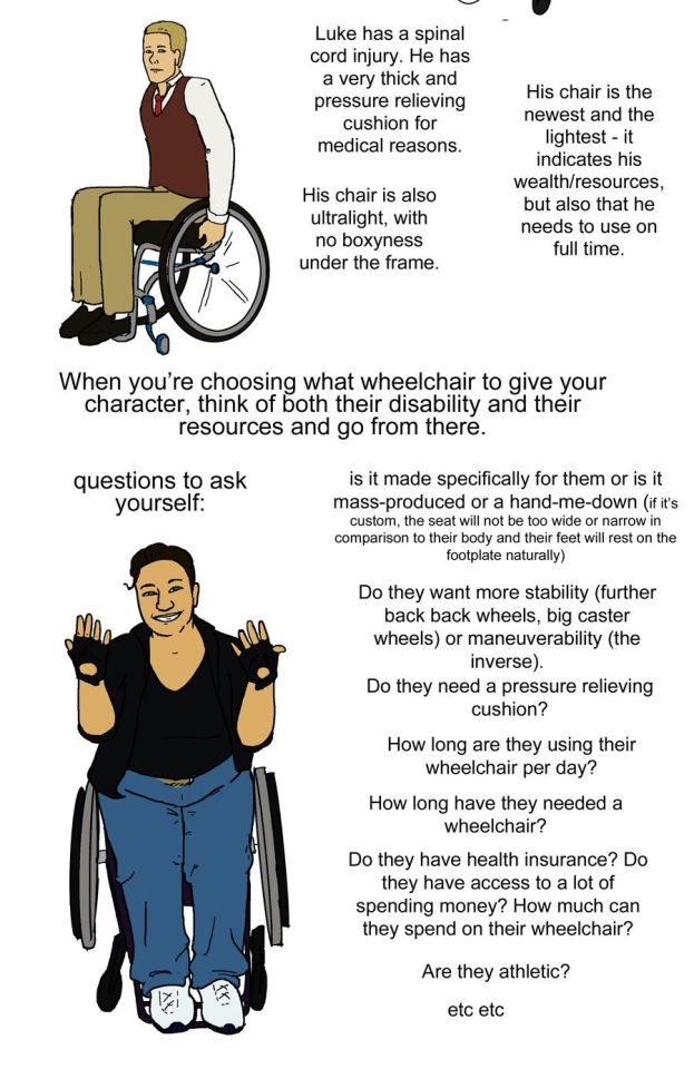
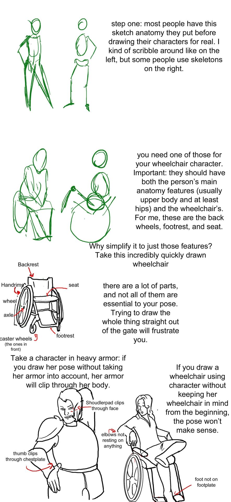
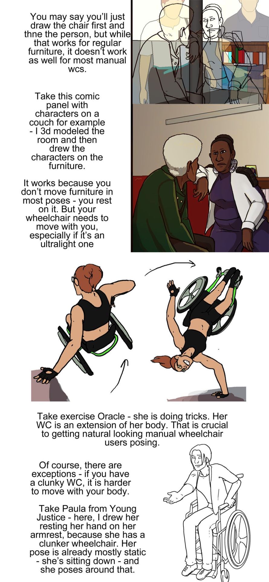
Manual Wheelchair Tutorial by Fade31415
So... I technically drew this 3 years ago but forgot to post it. I think I was going to clean up the end and make a nice recap, but I ran out of steam and then just left it as a wip for years. I got reminded of it because I was talking to a friend about how to draw wheelchairs today.
This covers most of what I view as the most common errors when it comes to drawing characters who use manual wheelchairs. I hope it helps you a lot.
Image description is in alt text, but there is a back up image description under the cut in case that does not work for some reason
[image description: a 4 picture long wheelchair tutorial. the background is white and the text, when it appears, is black and in calibri. each step will be labeled with "Step #" and a description of the drawing next to it, and "text" and then the text that is written to explain it to follow.
Step one text: So, you want to draw a character who uses a manual wheelchair? Awesome! I can't approve more. Drawing characters who use wheelchairs is a bit different than drawing standing characters, because of obvious posing differences. But to start, you need to know what parts of a wheelchair you will draw. So, without further ado, here are 3 wheelchairs!
Step one image: a simplified drawing of a chubby woman sitting in a quickie GPV manual wheelchair and resting her hand on the handrim of one of the wheels. this is labeled "the artist"
step two: next there is a lineart drawing of three wheelchairs. one is a tilite TR series 3. this is an ultralight wheelchair with a bucket seat (the back is lower than the front), a big cushion and a short backrest that kind of contours to the back of the person who would sit in it. the caster wheels (front wheels) are very small and the footrest is just two little metal bars. next image is a quickie GPV. this is also an ultralight wheelchair with a low back, but its caster wheels are slightly larger, the back has regular upholstery (it does not look like it was made to conform to the back of the person who sits there) and the frame is boxier -- there is no bar underneath the seat where the wheels would attach, rather each wheel is attached to the side of the chair. the next wheelchair is an invacare tracer. it is how most people imagine wheelchairs when they hear 'wheelchair'. it has no cushion and it has a high backrest with handles. it has high armrests that would be comfortable to rest your elbows on if you were just sitting. the wheels are not bicycle wheels like the previous two but are rather plastic. it has big footrests and big caster wheels.
text: the wheelchairs on the left are the ultralight, sporty kind. I have one of them (the quickie). the one on the right is a more standard one you might find in hospitals or as the public wheelchair in grocery stores or the mall.
step three: first is text to accompany the tilite. "This wheelchair has a really thick cushion - it's pressure relieving, which you need if you use your chair ufll tiem and especially if you have a spinal cord injury. This wc has the smallest caster (front) wheels. They are hte most handy for turning in small circles." next there is text to accompany the quickie gpv: "This one has the one I use -- it isn't pressure relieving, but is still useful." next is text to accompany the invacare: "this wheelchair has no cushion - you do not want to sit on it for long. This one has the biggest caster wheels - they are useful for not 'tripping' when your front wheel gets caught on an obstacle.”
step four text: like with all complex drawings, you want to break it into simple shapes first. I normally have a box underneath the seat, a rectangle for the backrest, and a trapezoidal thing for hte area from the box to the footrest. these are the most important shapes, because your character will rest on them and they will move with your character.
step four image: the lineart of each wheelchair has been put on reduced opacity, so we can see the square representing the backrest of each seat (the square is the smallest for the tilite and biggest for the invacare), the box for each seat and area underneath it, and the trapezoid for the footrests. the next step labels the images of these simplified shapes as the lineart is removed. "Note the proportions of each set of shapes is not the same - just like how you wouldn't draw all your characters with the same proportions on their faces!"
step 5: we see the same shapes to form the wheelchair, but now with blue circles drawn where the back wheels would be.
text: next shape is the wheels - two circles
step six: next we see the wheels and shapes have been reduced in opacity and the basic structure of everything about each wheelchair: footrests, caster wheels, upholstery details, axles has been drawn on in orange.
text: the next stage is everything else that's structure - front wheels, handlebars, cushions, footrests.
Step seven: we see the lineart on top of the lowered opacity sketch.
text: you can then do detailing like axles, spokes, upholstery, etc and lines
step eight: next we see three drawings of different characters. there is patience, a skinny white woman sitting in a blue invacare wheelchair. kelley, a slightly chubby black woman wearing a stripey dress sitting in a red quickie gpv wheelchair and doing a wheelie while smiling. then luke, a white man with short blond hair wearing khaki pants. he is sitting in a tilite chair.
text: once you get your wheelchair basics, you need to find out which kind your character uses. here are three characters who each use one of the example WCs. patience uses the invacare. she needs one with a better cushion, but circumstance prevents it. Notice the chair is a bit wider than her hips - it's not custom fitted. Also notice she has to turn her elbows out awkwardly to move. the high armrests prevent a smooth push. her wheelchair has big caster wheels and far-back back wheels. it is made for stability and difficult to turn,but also difficult to knock over. Her chair indicates a lack of resources or temporary injury, and is primarily a transport chair
kelley uses a wheelchair like mine - it is fairly sporty, but has a box-y frame underneath. this makes it heaver than if it didn't.she has a mediocre cushion - it protects her, but only some. her back wheels are further underneath her body than Patience's, which makes it possible to do the wheelie (demonstrated here). her wheelchair is supposed to look line one you'd use full time, but it is a little old.
luke has a spinal cord injury. he has a very thick pressure relieving cushion for medical reasons. his chair is also ultralight, with no boxyness under the frame. his chair is the newest and lightest - it indicates his wealth/resources, but also that he needs to use on full time.
step nine: just a drawing of me sitting in my wheelchair holding my hands up to show fingerless wheelchair gloves. we're looking at me from above.
text: when you're choosing what wheelchair to give your character, think of both their disability and their resources and go from there. questions to ask yourself: is it made specifically for them or is it mass-produced or a hand-me-down (if it's custom, the seat will not be too wide or narrow in comparison to their body and their feet will rest on the footplate naturally). do they want more stability (further back back wheels, big caster wheels) or maneuverability (the inverse). do they need a pressure relieving cushion? how long are they using their wheelchair per day? how long have they needed a wheelchair? Do they have health insurance? do they have access to a lot of spending money? How much can they spend on their wheelchair? are they athletic etc etc
posing steps:
step one: a sketch of two people standing up. one just shows the outline of a person's body, with legs that are ind of triangle shaped, the other shows a sketched pelvis and rib cage to go along with the bones of the legs and arm. text: step one: Most people have this sketch anatomy they put before drawing their characters for real. I kind of scribble around like on the left, but some people use skeletons on the right.
step two: there are now too sketched pictures of people in wheelchairs. one shows lightly traced human form (arms articulated, curve for a stomach, legs that are kind of triangle shaped and pointing down) sitting in a wheelchair that is just the sketch of footrests and wheels. the other sketch shows the sketch of a body with a circle for hips and an oval for a rib cage and the person doing a wheelie (lifting the front end of the wheelchair off the ground and leaning back). their wheelchair is also sketched out and defined by a circle for their wheels and 2 lines, 1 of the seat and 1 for the backrest. text: you need one of those for your wheelchair character. important: they should have both the person's main anatomy features (Usually upper body and at least hips) and the wheelchair's. for me, these are the back wheels, footrest, and seat. why simplify to just those features? Take a look at this incredibly quickly drawn wheelchair.
step three: there is a lineart drawing of a manual wheelchair with slightly cambered (angled towards the seat) wheels, a backrest, and a footrest. the frame is light and there are no handlebars. there are labels pointing to different parts of the wheelchair: Backrest, handrims, wheel, axle, seat, footrest, and caster wheels (the ones in front). text: there are a lot of parts, and not all of them are essential to your pose. trying to draw the whole thing straight out of the gate will frustrate you.'
step four text: take a character in heavy armor: if you draw her pose without taking her armor into account, her armor will clip through her body. if you draw a wheelchair using character without keeping her wheelchair in mind from the beginning, the pose won't make sense.
step four image: next we see two lineart drawings of different characters. one is a bulky woman wearing plate armor. her hand is on her hip and she is trying to scratch her back with the other hand. there is the label "shoudlerpad clips through face" and "thumb clips through chestplate." the next drawing shows a woman in a wheelchair with one foot rested on her knee and her arms rested back, such that they would be rested on the back of a regular chair, but the back of her wheelchair is not wide enough for them to actually be resting on anything. the text here reads "elbows not resting on anything" and "foot not on footplate"
step five: there are two images, one is lineart on top of a 3d modelled apartment with sketchup, the other is a colored in version of that lineart with the background also colored in and no longer a 3d modelled screencap two characters, one old woman wearing a green jacket and one younger woman wearing a white shirt and blue undershirt, are sitting on a couch. the old woman is leaning forward and the young woman is resting her arm on the couch. behind the young woman is a bookshelf.
step five text: you may say you'll just draw the chair first and then the person, but while that works for regular furniture, it doesn't work as well for most manual wcs. take this comic panel with characters on a couch for example - I 3d modeled the room and then drew the characters on the furniture. it works because you don't move furniture in most poses - you rest on it. but your wheelchair needs to move with you, especially if it's an ultralight one.
step six image: there is a flat color drawing of barbara gordon in her wheelchair. she is wearing a black sportsbra and black shorts. in the first image we see she is doing tricks in her chair, zooming through the air (as if she has just launched herself off the ground in a skater park or somethign) while her left hand is resting on a structure and her right hand is heading towards the right handrim. the next image shows her right hand planted on the ground and her chair and body above her, such that she is briefly doing a one-handed handstand, but the motion line indicates that she is moving and this will not last. her left arm is near the handrim of her left wheel.
text: take exercise Oracle - she is doing tricks. Her WC is an extension of her body. That is crucial to getting natural looking manual wheelchair users after posing.
step seven: we see a lineart drawing of paula from young justice. she is sitting in a standard manual wheelchair with high armrests (goes up to the bottom of her ribs probably) and a high backrest (goes up to just below her shoulderblades). she is setting her hand on the armrest, leaning forward, and holding her other hand out.
text: of course, there are exceptions - if you have a clunky WC, it is harder to move with your body. Take Paula from young Justice - here, i drew her resting her hand on her armrest, because she has a clunker wheelchair. her pose is already mostly static - she's sitting down - and she poses around that.
#so alt text is a great accessibility tool but not universally accessible to people who need it so thanks for the other description!#but putting it below a cut makes it harder to access for people who need it#and if your account deactivates then anything below a readmore is gone for good#i know it makes posts long but please dont put IDs under cuts thank you
51K notes
·
View notes
Text


headcanon that stan hates wearing glasses (for many reasons) and went without them for years until he really needed them
[Image Description: Comic of a younger Stanley Pines from "Gravity Falls." Alt text is provided and copied below the cut. End ID]
A younger Stan squints at his blurry reflection in the mirror, leaning in really close to see himself clearly. He sighs and grabs a pair of Ford's glasses on the dresser. Putting them on, he stares at his reflection. "Welp," he says, "this is unsettling."
He turns away from the mirror to adjust his tie, saying, "But it can't be helped." His reflection is now a disheveled Ford, mirroring Stan.
#gravity falls#stanley pines#stan pines#stanford pines#ford pines#digital art#artists on tumblr#doodleswithangie#500#1K#5K#10K#15K#20K#25K#30K#(from the flashback i'm pretty sure he used ford's glasses then got new ones)#(or at the very least i'm adopting that into my headcanon)
31K notes
·
View notes
Text
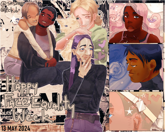
Happy Face Equality Week :-D
(short ID in alt text, longer below)
I really wanted to draw some happy people with facial differences for this week so:)
if you tag this as "tw scars" or some other "body horror" I'm killing u btw:D!!!
[Image description: digital drawing of 7 character with facial differences against a patterned background. The left side shows a gay couple sitting and hugging; one from them has a large bump on his forehead and widespread eyes, while the other has paralysis on one side of his face. In the middle is a teen girl cuddling with a cat, both of which are missing their left eye. Below her is a nonbinary person smoking a cigarette with heart-shaped smoke surrounding them; they have facial atrophy on one side of their face. The right side is split into three small panels; top one shows a Black girl with a cystic hygroma on her jaw on a pastel pink background, middle shows an Indian man with Crouzon syndrome from the side smiling, bottom is a zoom on the side of the head of a person with microtia; they're wearing a bone-anchored hearing aid and have a buzz cut with stars patterned in it. At the bottom, "Happy Face Equality Week" is written. End image description.]
#my art#disabled artist#artists on tumblr#digital art#disabled ocs#personal art#art#queer artist#described art#facial difference#face equality week#face equality#disabled art#disability positivity#disability pride#disabled characters#disability representation#digital artist#body positive art#small artist#original art#illustration
3K notes
·
View notes
Text
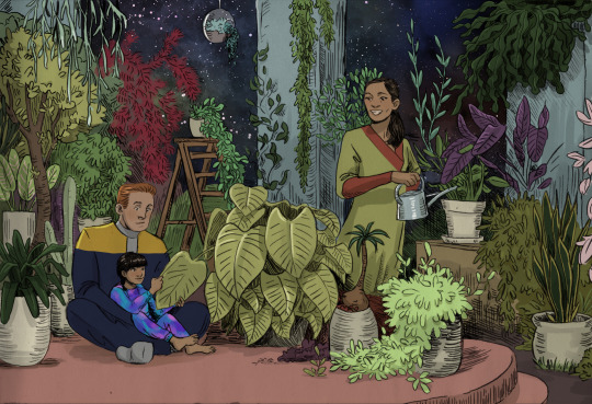


[ID in alt text]
I've been itching to colour this since I posted the uncoloured version last year. It's looks so much like a colouring picture :))
Time lapse below the cut:
#I didn't like Molly's face in the original post so I edited it#(again. the actual ink drawing was even worse - while I was so pleased with the rest of the drawing hahah)#Keiko O'Brien#Miles O'Brien#Molly O'Brien#Star Trek#star trek ds9#Deep Space nine#described#inktober2023#fanart#danikunst#4#day 11#2024
2K notes
·
View notes
Text
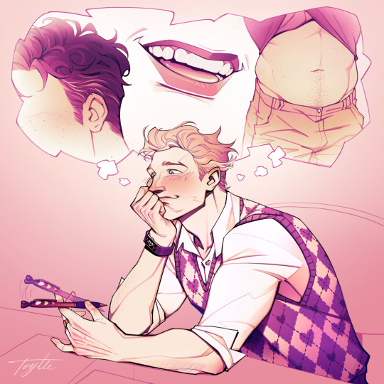
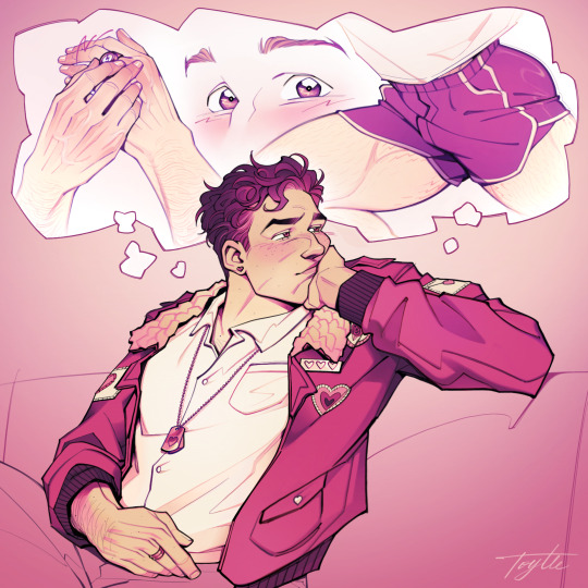
“Sorry, were you saying something?”
[alt text ID, close-ups + ID below cut]
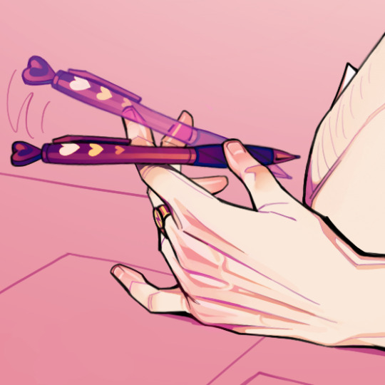

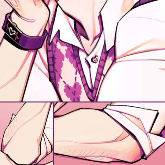
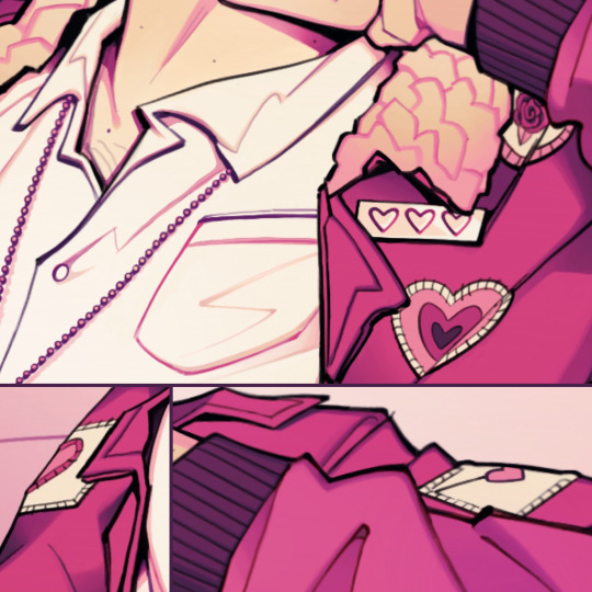
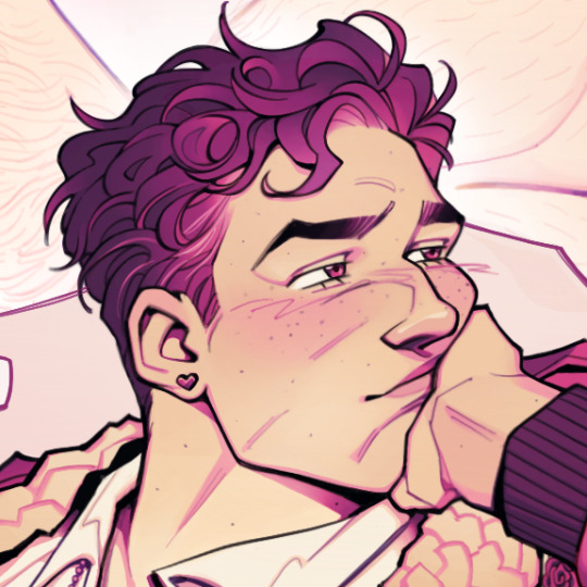
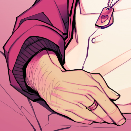
IMAGE 1: Lovecore-themed Halbarry fanart of Barry Allen daydreaming about Hal Jordan. Barry is in a dress shirt with heart buttons and rolled up sleeves underneath a heart-patterned argyle sweater vest. In his Flash ring-adorned left hand, he fidgets with a heart-themed pen. He rests his chin in the other hand, wearing a FitBit with a beating heart on its screen, as his blushing cheek is pressed up into his bright, distracted eyes and obscures an obvious smile. He looks distantly to the corner as a thought bubble floats above him, playing out a montage of his favorite Hal traits as follows: his freckles and budding graying hairs, his smile revealing a chipped tooth gap, and his tummy showcasing lovehandles and a happy trail as his shirt lifts up.
IMAGE 2: Lovecore-themed Halbarry fanart of Hal Jordan daydreaming about Barry Allen. Hal is in a dress shirt and pilot jacket, decorated in various heart patches. He’s also wearing heart stud earrings and heart dog tags. He sits back casually with one arm resting on his stomach and the other leaning back on a couch. He turns his head to the side into the palm of his hand, squishing his face and obscuring a slight smile, playing off his bashfulness for nonchalance. His eyes are half-lidded, looking away to the side, as a thought bubble floats above him, playing out a montage of his favorite Barry traits as follows: his strong yet slender hands fidgeting with his Flash ring, his beaming eyes glancing in Hal’s direction, and a running shot accentuating his ass and thighs in gym shorts.
IMAGES 3-8: Respective closeups of Barry and Hal’s faces, hands, and clothes/accessories.
#halbarry#barry allen#hal jordan#the flash#green lantern#detective comics#dc#dc comics#dc fanart#lovecore#danart#alt text#described#this was the thing i tried to finish for valentines day but got way too ambitious w the details#better late than never?
2K notes
·
View notes
Text
Survival costs are taking up most of the Haboub family's donations.
Please see my other promotion lists for the newest version of this post with different goals.
I am no longer focusing on promoting/updating this post. Thanks for everyone's contributions!!!
Update Aug 26: Help promote this family on Instagram. See here.
Updated: Aug 31
Member: @mohammedhaboubsblog (Mohammed Haboub)
Verification: link
Payment methods: Google Pay, credit/debit
Donation matches and drive: 50 SEK, $5 USD art raffle, 105 SEK (under cut)
Current progress:
SEK 78,861 133,838 / 130,000
I've set a short term goal of 130k SEK for rent, which is roughly $12.8k USD. This is URGENT, the family needs to make rent by early September. See post here. The actual goal is 300k SEK.
The currency may appear intimidating, but this is a small-medium evacuation goal of roughly $30k USD. I think it's achievable if we work together.
Please donate if you can and share.
Details about this campaign:
1/3 of their funds have went towards outrageously expensive rent, healthcare, and basic supplies.
Mohammed was shot in the leg.
Mohammed's twin sister was injured during the Khan Younis massacre and went through a surgery the family currently cannot afford. We paid this off!
Rent alone is 1/10 of their campaign goal and the family is struggling to afford it.
On Aug 30, we helped pay off yet another month of rent so they wouldn't get evicted!
Donations are sparse and amount to around $100 USD daily. At this rate, the Haboub family will not be able to evacuate.
Their campaign goal is reasonable: roughly $29k USD to evacuate 4 adults.
I've attached my conversation with Mohammed below. If I get more evidence, I will provide it there.
If the inability to donate with PayPal or confusion around conversion rates is holding you back from donating, I propose that you donate to my Kofi. For anything that you tip me, I will round it up to the nearest whole SEK and donate it to the Haboub family. I will publicly post the receipt. You can donate anonymously (still requires an account) and don't have to notify me of any donations on Tumblr but I would like having a record.
Am I scamming you? Who knows, I'm some random person and I have no way of proving that I'm not interested in running off with your money. But I want to do something that might help tangibly because publicity isn't enough so far. Donate to me at your own risk.
Proof:
Update Aug 29:

[ID in alt text]
Mohammed sent me his and his sister's IDs to prove his identity.
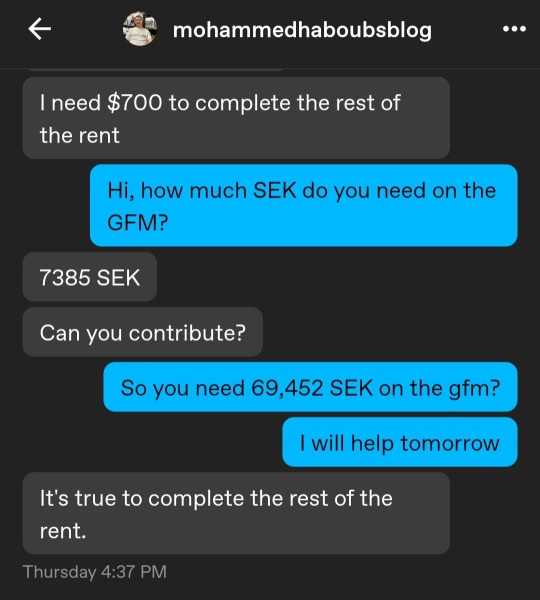
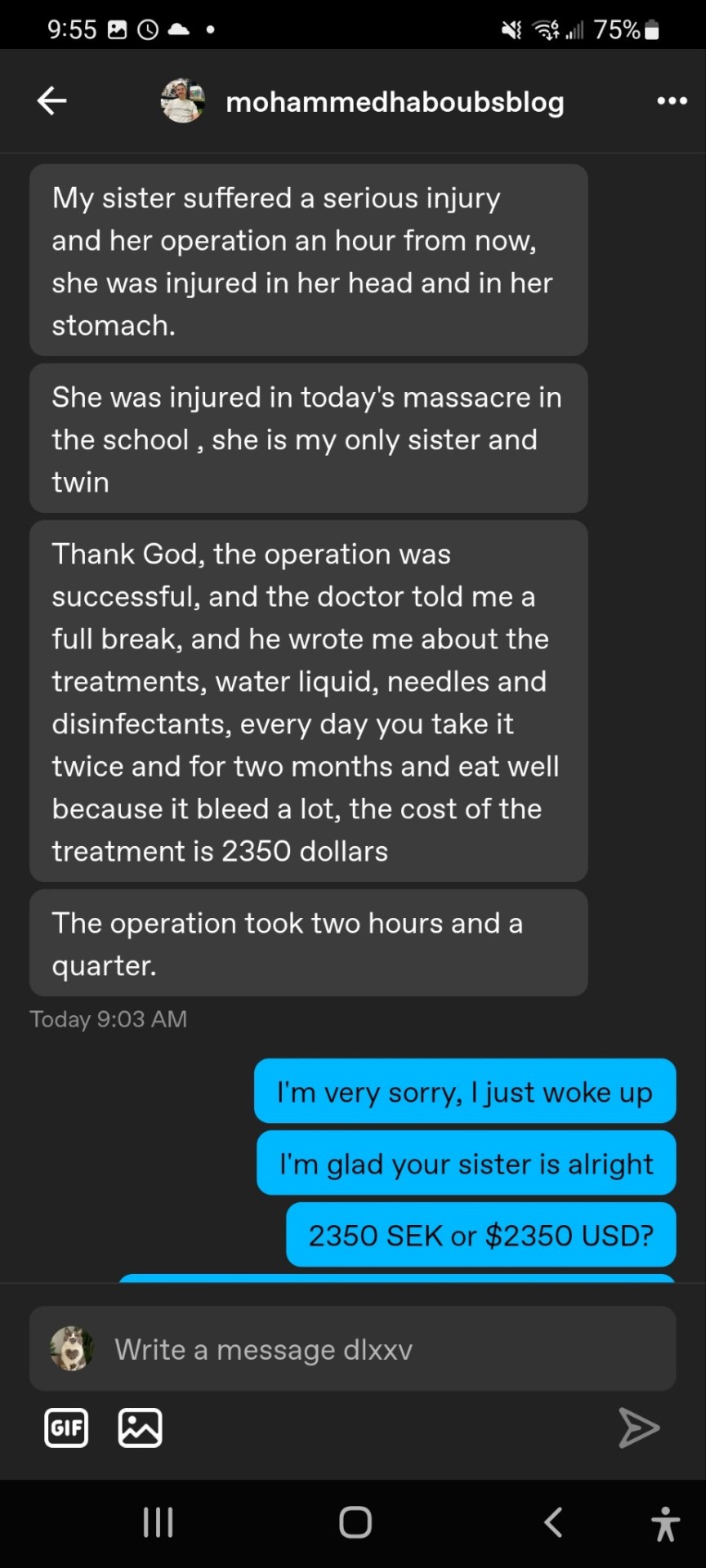


Aug 27: Donation match for 105 SEK ($10 USD)

612 notes
·
View notes
Text
The only thing I have to say for myself is: Songs in podcasts my beloveds <3


IDs in alt text and under the cut
[ID: Front cover of a zine. In the middle of the page there is big red heart with text in it: „Songs in podcasts my beloveds”.
Page 1. Text saying: „I love songs in podcasts! They are so cool and great and amazing and wonderful and fun and fabulous and excellent and brilliant”
Page 2. On the top of the page there is text: „Me when there is song in podcast:”. Below there are three doodles of a person. First is singing dramatically, other two are dancing. There are colourful musical notes around.
Page 3. Text saying: „Some of my fav songs from podcasts with honest and totally not biased rating:
„Die Berliner Luft” from The Amelia Project - 10/10
Songs from Roguemaker - 10/10
Theme song from Night Shift - 10/10
„Magistrate’s daughter” Travelling light - 10/10”
Page 4. Text saying: „Musical episode of Mission rejected - 10/10
Folks songs in Camlann - 10/10
Songs from The Strange Case of Starship Iris - 10/10
„It’s all made up!” from Victoriocity - 10/10
Musical episode of The Bright Sessions - 10/10
Song in the last episode of Trice Forgotten - 10/10”
Page 5. Text saying: „”Poisoning Pigeons in the Park” from Midnight Burger - 10/10
Songs from Re: Dracula - 10/10
Cabaret Night at Cosmic Lounge from Stellar Firma - 69/10
Theme song from Dark Ages - 10/10
Songs from Welcome to the Brass Eagle - 10/10
The Ballad of Anne & Mary 1000/10”
Page 6. At the top of the page there is text saying: „”To be an Undertaker” from Wooden Overcoats - 100000000000000000000000/10”. Below there is doodle of a person playing on a mandolin.
Page 7. There is a doodle of a person holding a big sign with text: „You should add song to your podcast!”. At the bottom of the page there is text saying: „#fiction podcast zine event”. End ID]
#I had to do it#songs in podcasts my beloveds#fiction podcast zine event#fiction podcast zine festival#the amelia project#roguemaker#night shift podcast#travelling light#mission rejected#camlann#tscosi#victoriocity#the bright sessions#trice forgotten#midnight burger#re: dracula#stellar firma#dark ages podcast#welcome to the brass eagle#the ballad of anne & mary#wooden overcoats
456 notes
·
View notes
Text
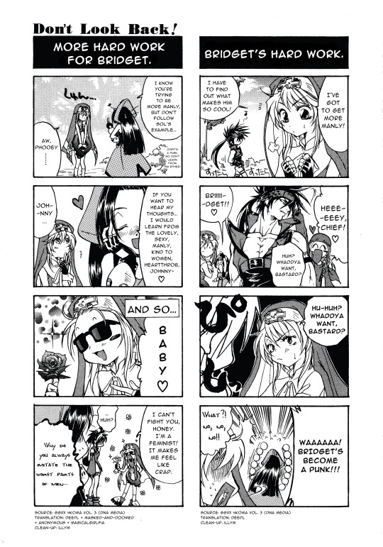
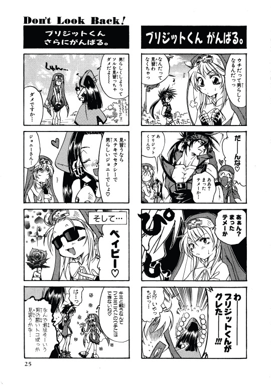
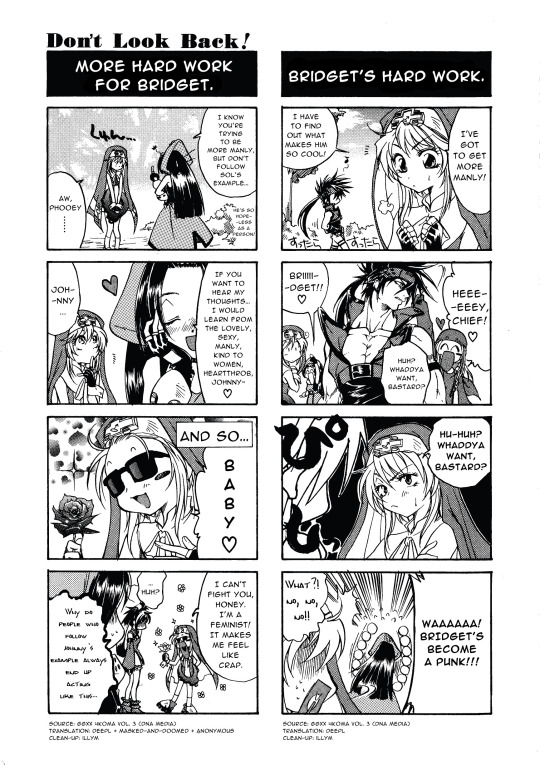
Double comic upload, since these two are tied together pretty tightly. I did the one on the left a few months ago, so the comments aren't very tied together.
Bridget might be the funniest girl alive. And so is May, for expecting anything else from Johnny's brand. Anyway, cutie patootie art style. Everyone looks adorable.
I'm experimenting with using more fonts to mirror the original fonts, but I'm worried they affect legibility too much. Let me know what you think of the fonts in the last panels.
Please if you understand Japanese go read what May says in the bush and tell me what it is that was such a pain in the ass.
Translation assistance: @masked-and-doomed + anonymous @magicalgirlfia
ID in alt.
Cleaned and original comics below the cut.
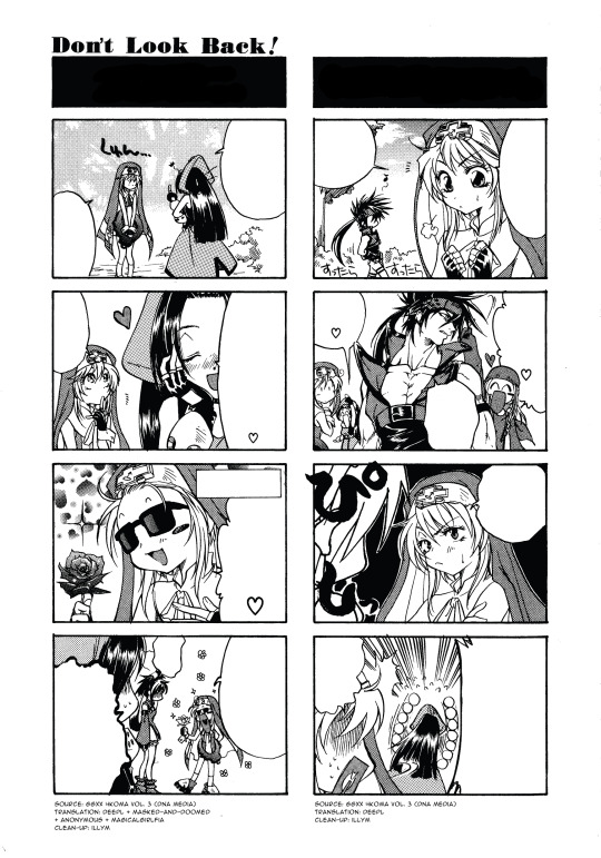
Specific assistances:
@.masked-and-doomed: Figuring out what the fuck was in the bush in the left comic, first panel.
anonymous: Figuring out what was in the bush in the left comic, first panel (again (x3)).
@.magicalgirlfia: Translated what was in the bush in the left comic, first panel (for the final time. I hope.).
I considered changing May's line to "I know you're trying to be [ stronger / cooler ], but don't follow Sol's example..." because I really didn't want to deal with irritating people on this post. On the other hand, this comic is about how Bridget was handling her gender in XX era, so changing it could be a bit disingenuous. And again, I don't like making changes beyond better understandability in English since I don't read Japanese.
Couple of transfem friends pushed me to use the more accurate one, since they felt it was pretty accurate to some of their experiences.
I wasn't going to not post this comic. It's genuinely hysterical.
All of these panels are so cute. I love them.
May, girl, I hope you trip and break your nose. Never use such tiny squiggly handwritten text again. I had to consult SO many people. I'm still not confident in it.
SHE DID HER HAIR LIKE JOHNNY. Bridget ur so cute.
"I'm a feminist" bridget saturday
Original comic uploaded, for clarity:
#guilty gear#bridget#bridget guilty gear#bridget ggst#may gg#may ggst#may guilty gear#jam kuradoberi#sol badguy#axl low#illym translation
552 notes
·
View notes
Text
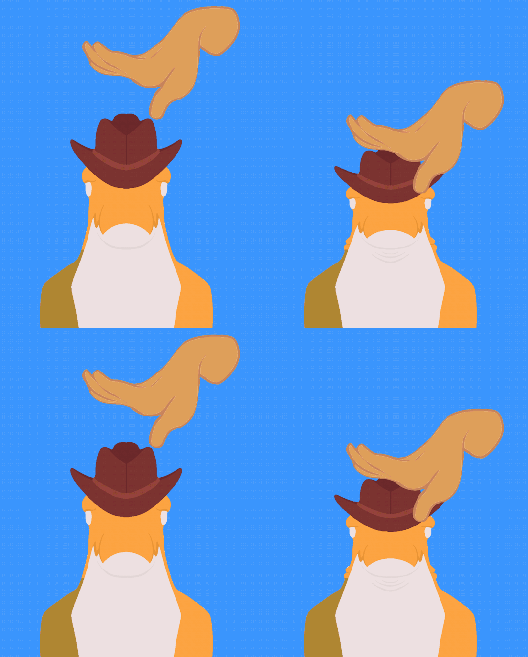
[ID copied from alt text: A digitally drawn GIF of Gummigoo from The Amazing Digital Circus, set against a sky blue background. Gummigoo, a green and yellow gummy crocodile person wearing a brown cowboy hat, is a seen from the chest up, while being repeatedly squished/pet by a pale complexion hand. End description.]
Pet pet pet pet pet
(Fast version below the cut!)

[ID copied from alt text: The same GIF as the one above the cut, with the motion of petting been sped up. End description.]
#Eli's Art#GIF#TADC#The Amazing Digital Circus#Gummigoo#pet the boy pet the boy pet the boy#I love him#and i loved the new ep!#hope he'll come back soon 💙#tadc spoilers#Gummigoo TADC
512 notes
·
View notes
Text

Happy New Year, everybody! :D
Support me on Patreon or send a tip on Kofi!
(ID in alt and under cut)
ID: 1. Waist up of Laszlo relaxing on a settee, one elbow draped on the back and the other holding up an unlit pipe. His brow is furrowed and he is frowning towards something below him on the floor. He says, in the form of a screenshot of a text post from @terramythos, "Prithee tell. What is 'ligma'?" 2. Close up of teenage Colin Robinson in a beige hoodie and hat, looking up at Laszlo from his seat on the floor. He pulls his headphones down to drape around his neck as he replies, in the form of a screenshot response by @pillowfriendly, "Such riddles can only be answered by the mind goblin." 3. Reverse shot of Laszlo as he leans forward with a glare and points toward Colin with his pipe. He snarls, via a screenshot response from terramythos, "Enough of your riddles! Who is the 'mind goblin'?" 4. Wide shot of them both as Colin sits up on the floor with a giant grin, fists splayed out behind him, and shouts at the top of his lungs "MIND GOBLIN THESE NUTS!" The screenshot response from pillowfriendly is in green shrek font and has been warped and sent through chromatic aberration for emphasis. Laszlo sits frozen on the settee, still pointing with his pipe, face blank. /end ID
#wwdits#baby colin robinson#teen colin robinson#colin robinson#laszlo cravensworth#dadszlo#dadzlo#what we do in the shadows#what we do in the shadows fx#my art#fanart#image described#shadowsart
896 notes
·
View notes
Text

[id in alt text]
here's my splatober 2024 art challenge prompt list!
i wasn't sure if the original creators of splatober were going to do it again, so i decided to make my own inspired by last years'! all prompts are meant to be interpreted as loosely as possible, just do whatever you want with them! and feel free to pick and choose or skip around the list and only do the prompts you want, just have fun with it!
also, feel free to @ me if you decide to use my prompt list, i'd be happy to see them :)
below the cut is some guidance for the more vague prompts:
7. hero mode: this can be about the hero mode stories from ANY of the games, but this is not meant to be inclusive of the dlc's since they have their own prompts (unless you want it to, of course). it can be a scene from hero mode, art of the characters, something inspired by hero mode, or even your own idea for a hero mode story!
11. amiibo: i was thinking this one would be either drawing an amiibo of one of your oc's, or drawing a character in amiibo gear
14. bring it back: anything you want brought back from splatoon 1 or 2! for example, exclusive gear, a splatfest you liked, the minigames, etc.
16. victory pose: i mainly had the emotes from splatoon 3 in mind for this one, but i wanted it to be inclusive of the victory poses from the first two games, or from hero mode! or you could create your own victory pose :)
18. an antagonist can be anyone who had an antagonistic role, so any of the octarians, dj octavio, brainwashed callie, commander tartar, deep cut, mr. grizz, marina agitando, the overlorder, and smollusk; but of course the prompt is as wide open as any of them :)
23. salmon run: also inclusive of splatoon 2 salmon run
24. species swap: mainly i had this in mind for oc's, but canon characters would be fun too! and they don't have to be existing species, feel free to make your own if you want!
27. splatband: this could be either drawing a splatband you like or making your own!
29. custom map idea: i was thinking just a concept for a custom map and not layout, so don't worry if you can't think of a layout for a custom map, but if you can that would be awesome!
#splatoon#splatoon art challenge#splatooon art#splatober#splatober 2024#splatober2024#art challenge#october art challenge#october art prompts#splatoon 2#splatoon 3#argo art
210 notes
·
View notes
Text
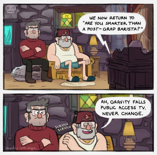
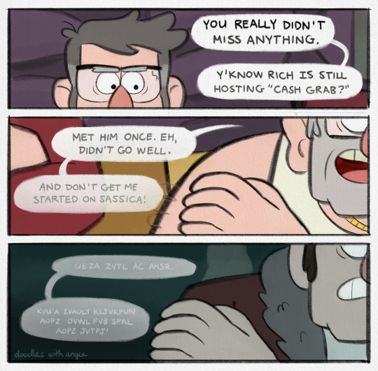
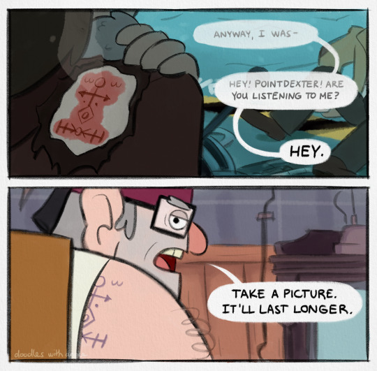
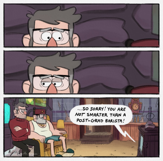
prime time
[Image Description: Comic of Ford and Stan Pines from "Gravity Falls" about Stan's tattoo. Alt text is provided and copied below the cut. End ID]
Copied Alt Text
Page one: Stan and Ford are sat in the living room watching TV. It blares, "We now return to 'Are You Smarter than a Post-Grad Barista?'"
Stan scratches at his shoulder and says, "Ah, Gravity Falls Public Access TV. Never change."
Page two: Ford glances at Stan's shoulder flashing back to a memory of younger Stan clutching his shoulder.
Stan's dialogue continues and fades out, "You really didn't miss anything. Y'know Rich is still hosting 'Cash Grab?' Met him once. Eh, didn't go so well. And don't get me started on Sassica! Qbza zvtl AC ahsr. Kvu'a ivaoly kljvkpun aopz. Ovwl fvb sprl aopz jvtpj!"
Page three: Ford is lost in the memory of their portal fight and Stan's injury, as Stan drones on, "Anyway I was- Hey! Pointdexter! Are you listing to me? Hey."
Ford snaps back to the present, where Stan's accidental brand mark has healed into his shoulder tattoo. Stan says, “Take a picture. It’ll last longer.”
Page four: After a beat, Ford looks away. They sink back into awkward silence. The TV drones on, "... So sorry! You are not smarter than a post-grad barista!"
End Copied Alt Text
#gravity falls#stan pines#stanley pines#ford pines#stanford pines#digital art#artists on tumblr#doodleswithangie#500#1K#does the caption have a double meaning maybe so#not sure where this fits in the timeline#except definitely before any apologies or thank yous are made
4K notes
·
View notes
Text
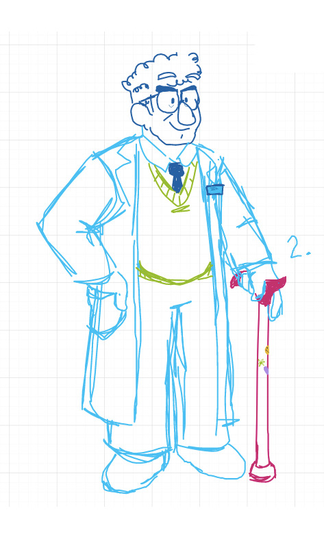
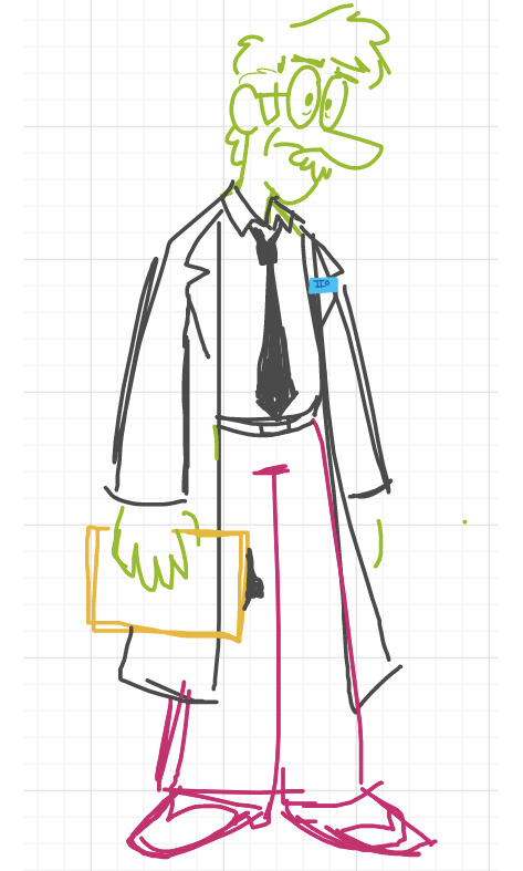
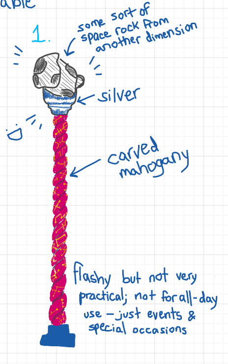
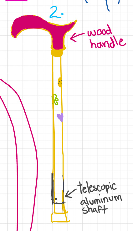
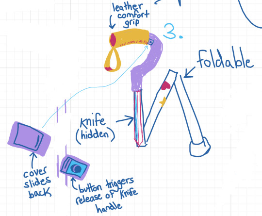
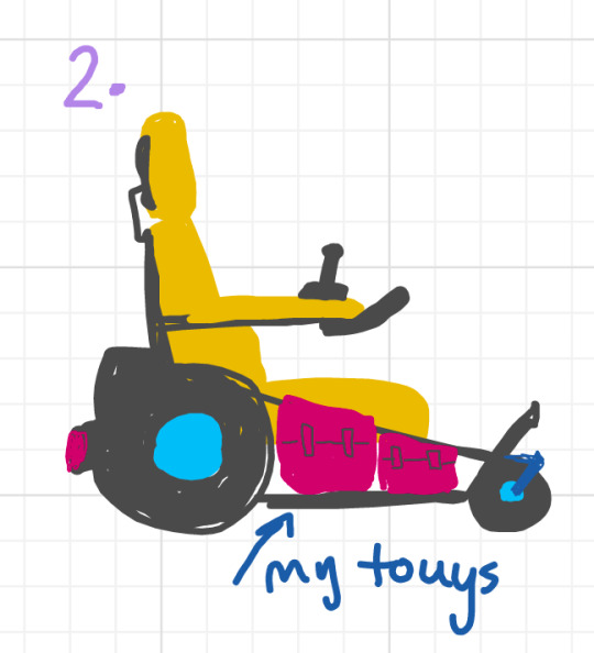
@tazmiilly and i talked for no fewer than six hours today about parallel ford and his mobility aids. here's some of what i came up with
you can barely see it but credit to @badwaves for the institute logo (link to a drawing he did with it)
image IDs are in alt text; design notes below the cut

Image ID: a screenshot of writing on a digital whiteboard. the text reads as follows:
wheelchairs - 2
foldable chair - easily transportable - designed for manoeuverability in high traffic/urban areas - mostly used at the end of a long day
motorized chair - for long treks/field missions - ridged metal frame - designed for rough terrain - souped up by fiddleford
two or three canes
fancy cane for formal events (mostly for fashion)
everyday cane (sturdy, classy)
field cane (collapsible, has a concealed weapon)
mabel puts stickers on all of them
end image ID.
#this is . merely a fraction of what we came up with LOL#i just mostly wanted to focus on the aids themselves#gravity falls#artwork of the damned#stanford pines#fiddleford mcgucket#journal 3#i'd love to write about all the hcs we came up with but idk how lmao#oh and of course it goes without saying but they are super married#i just happened to draw them both facing right so unfortunately you can't see the rings on their left hands. SAD
744 notes
·
View notes