#i'm not very happy with the coloring and rendering tbh
Explore tagged Tumblr posts
Text
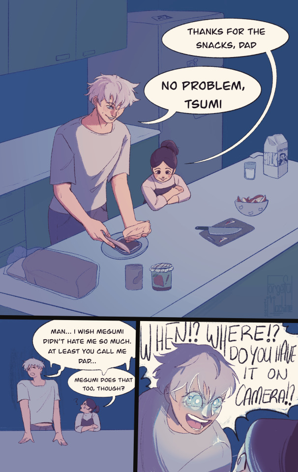
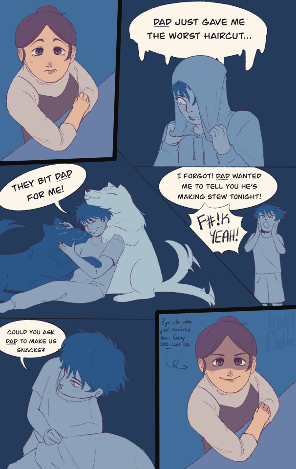
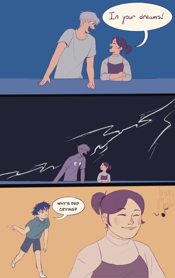
[ID: A mostly cool colored, digital three page comic of teen Gojo Satoru talking to young Tsumiki Fushiguro. Page one: Gojo makes a sandwich for Tsumiki who's leaning on the kitchen island. Tsumiki says "Thanks for the snacks, dad" and Gojo responds "No problem, Tsumi." In the next panel Gojo complains "Man... I wish Megumi didn't hate me so much. At least you call me dad..." Tsumiki comments "Megumi does that too, though?" In the third panel, Gojo activates his Six Eyes like a flashlight and yells "When!? Where!? Do you have it on camera!?" to a surprised Tsumiki. Page two: Tsumiki thinks about the various times Megumi has called Gojo 'dad,' including when Gojo gave them a bad hair cut, when the divine dogs bit Gojo, when Gojo made soup, and lastly when Megumi asked Tsumiki to ask Gojo to make snacks which is all represented in blue tinted drawings. In the last panel she has a devious smile and is labeled "8 yr old who just realized how funny she can be" Page three: Tsumiki cheerfully says to a gleeful Gojo "In your dreams!" The second panel shows them zoomed out with a lighting strike going through Gojo's shattered heart while Tsumiki has a cat like smile. In the third panel with a light orange background, Tsumiki is smiling while Megumi comes up behind her and asks "Why's dad crying?" /End ID]
Before this happened
Edit: It has kindly been brought to my attention that Tsumi means sin in Japanese I'm so sorry Tsumiki I should've taken five seconds to check I just wanted matching nicknames with Gumi 😭
#jjk#jujutsu kaisen#gojo satoru#tsumiki fushiguro#megumi fushiguro#fanart#art by this machine#daily doodle:#062#minigumi#dadjo#i'm not very happy with the coloring and rendering tbh#but i don't really make colored comics so you know what ? it's still a win cause making this was hard lmao#i struggled so hard with this lmaooooooo#i'm going ot go back to medibang i can't stand procreate for comics tbh#if you made it this far into my tags hello !#bonus context: tsumiki asked gojo for snacks cause megumi asked her to#FUCKING SOBBING#/light hearted#best of this machine#comic by this machine
2K notes
·
View notes
Note
your rendering is so good how do you do it
Thanks, I love your rendering too!! Gonna try and make a tutorial ^^
To start off, I'm on Clip Studio Paint and these are the brushes I use! First two for rendering characters (round brushes) and the other two for mostly backgrounds (square brushes)


I used to do lineart, but it takes too long >:( now I just make a sketch and sorta clean it up!

Next I fill it in with a gray color. For simpler pieces I just put in the flat colors, but for more paint-y pieces I do grayscale -> color! I'll be doing that here :)
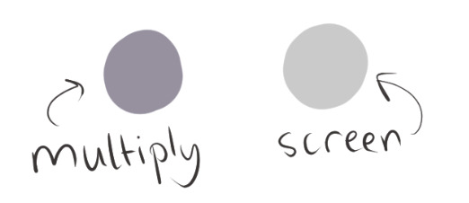
Also, I make 3 clipped layers on top of the gray - two are multiply, and the top one is screen. On the first multiply, I do a soft gradient using an airbrush
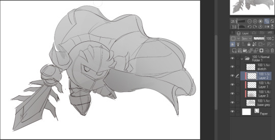
On the next multiply layer, I fill everything in with either a cool-ish or warm-ish gray, depending on the mood ^^
I also determine a light source, and use the lasso tool on the screen layer to block out where (I think) the light hits! Tbh I just do wherever feels right lmao, but I recommend having a reference! I like doing it in triangle patterns
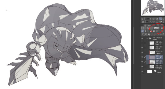
Then adjust the opacity of each layer to whatever feels right, and merge everything (I don't merge the sketch/lineart yet, I do it before adding colors in!)
Now... rendering. Some tips I have are color pick (greys) off of the canvas and use them to paint! Clean up the sketch more, erase edges, but I save details (like Galaxia's red gem, his eyes, etc.) for the end, or during coloring.
After I'm sorta happy with it, I merge the sketch layer, then duplicate it, and add a gradient map! I did this sunset-y one but changed the hue to yellow-ish, then lowered the layer's opacity ^^
Play around with the hue-saturation-luminosity setting!
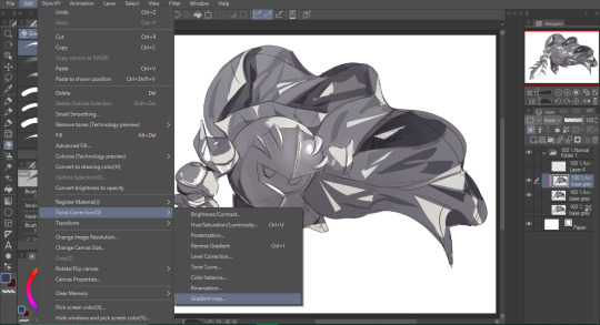
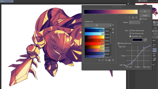

Now go crazy with blending modes! Multiply, overlay, color, glow/color dodge, etc. Feel free to layer them up on top of each other too, and this is to add the character/piece's actual colors in. For example, I used a white-blueish overlay layer for his mask and glove, blue for his cape, blah blah
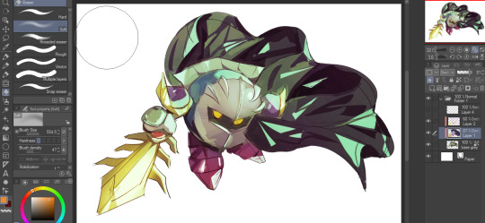
Now I clean the sketch up/refine it more. Also, to "harmonize" the color palette, you can add a colored gradient on top. Then set it to multiply, and add overlay/glow dodge layers with any colors you see fit! I like using teal and light/warm orange! Here is an example of a colored gradient:
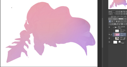
Another tip is to add saturated colors on the edges of both lighting and darker shadows, before blending it:

Also I usually add in a light blue/grey in shadowy areas, and lower the opacity for reflective light:

Also! You can lasso + use an airbush with a light blue to block out parts of the background (his cape here, for example). It helps with more depth!
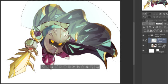
Finally, I like adding sparkles on low opacity :3 And gaussian blur to certain areas! I'm using radial blur on this piece though ^^

For the background, I like doing blocky shapes!! I use my square brush on 90% ish opacity, to color pick different hues from the piece. For lighting I use a glow dodge layer, here's a mini timelapse as well as the finished art!
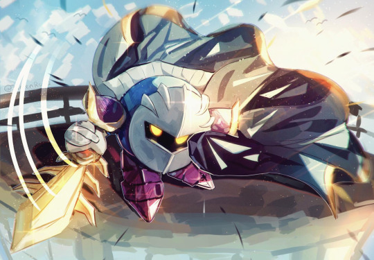
At the very end, play around with the hue/saturation and contrast tools to change the colors :)
#iiii hope this helped??#first time making a tutorial sorry!!#art tutorial#kirby meta knight#meta knight fanart#meta knight#nintendo kirby#kirby nintendo#kirby fanart#kirby series
584 notes
·
View notes
Text

connorkus wishing you a very happy 2025~! my art ramblings below the cut as per usual
so my goal was to finish this drawing before the end of jan 1st in my time zone and ehehe that certainly did NOT happen. it's like 10am jan 2nd here ahahahah. but hey it's still jan 1st somewhere!!!!
i spent like 15+ hours on this piece and like 70% of that time was redrawing markus. i swear i have the hardest time drawing that guy. i miss drawing ladies. i used to them all the time. maybe that's why i got north down in one try. connor took like three tries. and then markus... i went through like 8 renditions of him. i hope he turned out okay. i've been staring at this piece for so long i've lost all objectivity.
y'all it really is a new year because i actually put my clean line art in a separate layer instead of what i normally do and spend an abnormally long time cleaning up my rough sketch. this led to veryyyyyy thin line art which it is not my usual style. i think it turned out okay??? i think in future pieces might change up the line weight cause i love my tapers but i was just too lazy to rethicken all the lines on the clean line art layer jskdfjksdjfkdsjfl.
i wasn't planning on doing a full colored piece because of the time constraints but i decided to put in some matte colors cause i wanted them to be color coordinated and i was like oh it looks a bit weird and flat maybe i'll render just a litt-- oops i rendered the whole thing ehehehe. tbh, i'm still trying to figure how i want to render and color things. i feel like i always like the plain lineart more than the colored version. i think that will be a goal for this year is figuring out how to color. right now like 50% satisfied with the how i render so hoping to get it closer to 100% by year's end.
btw, no one is allowed to compliment my fabric textures bc i literally cheated cause i just got a picture of fabric texture, set the layer to grain merge, and then added highlights. i was not gonna render out norths sparkly dress by hand that's for fucking sure lmao.
also, idk what cosmic void they're standing in. i just wanted a really soft glowy background without having to render out anything detailed. so uhm let's just pretend that they're standing in front of some sort of light display.
for listening to my ramblings enjoy these rough sketch layers~


happy new year <333
#north is buff bc we appreciate strong women on this blog uwu#let's pretend the heights are accurate cause connor is leaning forward and north is wearing tall ass heels jskjskjskj#norkus pulling connor closer for the picture makes me think of my connorkus fic and now i kinda wanna write another chapter#dbh fanart#mine#connorkus#dbh connor#connor rk800#dbh north#north wr400#dbh markus#markus rk200#detroit become human#dbh#detroit: become human#d:bh
61 notes
·
View notes
Note
Hi ! I love your art style, it is so good ! I was wondering, how do you render the hair ? Because I draw too, and I would like to know, if you don't mind 😅
Hi !!! Sorry for the late reply, I've been very busy these past few months :'D I'm happy that you like my way of rendering hair omg !! Yes of course I can show how I do it ! Also, don't take it as an artistic fact, I'm only explaining my personal process of rendering !! Maybe this technique will suit you, or maybe it won't.
Forgive me in advance for my potential grammar mistakes, English isn't my native language :')
Okay, let's get started !!
Tbh, it's many trials and errors XD But something I've been doing for a year is playing with colors to set an ambiance you want to convey in your drawing. Look, I'm not a pro at color theory but I often do color combinations such as orange/blue, yellow/purple (one color for lightings, one color for shadows), they work super well together !
It's a lot to take in ;v; But hear me out, what I'm saying is important for the rendering !
The first step is to color the hair (the whole character in fact) with a base color. Here's what I did for this drawing (the quality is horrible sorry ;-;).

Then, I add a layer above the base colors and set this one to "multiply" (it's a fusion mod that will darken your drawing). You either choose a blue color or purple for the multiply layer (or any other color tbh but I'm still not too familiar with color theory). What's important is to make this color fit with the other color you'll choose for the lighting at a later step. Personally, I chose a dark blue for the multiply layer.

After that, I add another layer and set it to "overlay". Personally, I set the opacity quite low for this layer in order to give the drawing a softer look. Here comes the color combination ! If you chose blue as the shadows on the previous layer, you pick orange for this layer. Then, you pick a blurry brush (I don't know how it's named in English, maybe a soft brush...?) and brush the area where the light comes from. You can also erase some areas where it would be "logical" to have shadows, like what I did above Link's eyebrow, the back of his head, and his hair near his chin. The eraser step is there to add extra details and give your drawing a little more depth.

Then !!! You add yet another layer above the previous one and leave it at "normal" mod. It's on this layer that I start rendering ! So what I do is, I take a brush with soft edges, like this one. You can use any brush, really !

There are different colors between the shadow area and the light area as you can see on the previous pic. I color pick the different colors between those two areas and make strokes, just like this.

I pick a color on the drawing, I make a stroke, I pick another color, I make another stroke and so on.
Then, I add another layer which I set on "overlay" mod and use the color blue for the opposite area of the orange light from a previous layer.

Then, on the same "overlay" layer, I pick orange again and I use my soft brush on the area where it's the most likely to recieve the strongest light. The color orange will appear stronger and more vivid.

Then I add a last layer for adding details like strokes of hair with a flat brush. I'm adding so many layers at this point lol, forgive me :')

And TADAAA :D
Sorry for the blurry pictures, they are screen captures from my speedpaint video.
I don't know if I made it too complicated :') Hope it helps though !!!
Thank you for the ask, I had a blast to write :D
16 notes
·
View notes
Note
what's your process for coloring like? the look of that elendira is so textured and interesting, i can't figure out how you do it
AA THANK YOUU ^__^ !! textures & brushwork are my favorite things abt my art, so im happy you find it interesting hehe . its SOO cool to look at & so much fun to draw imo
i prefer to color by building in layers , if that makes sense 🤔!! hundreds of them !! such that i'm always drawing on Top of previous layers, working from big & messy blocks of color to, eventually, small and refined blocks of color until it feels processed enough. as a result, i rarely ever erase (!!) and i rarely ever draw lineart aside from the initial sketch
a rough, patchy textured brush is key here, as it'll give you dimension and variability w/ your colors. i recommend "Brush and various sets of fountain pen style (万年筆風ブラシと色々セット)" on Clip Studio (ID: 1679706) !! :3

im terrible with explanations though, so i'm going to show a step by step of that elendira drawing if you dont mind :3
sketch layer !! because i mostly render through color alone, i try to make this as close to the finished thing as possible . ^__^ i hateee drawing the same thing over and over and like the expressivity and movement of my sketches anyways , so the more i can preserve at this step, the better. if u were to look at a side by side of my sketches and finished pieces, youd notice a lot of those og lines are present in the final drawing :3

2. flats !! pretty self explanatory, but the solid background gives me an idea of where the figure begins & ends while the colors themselves help distinguish whats what . i stick to ambient lighting @ this point because im usually not sure what i want to do with the overall palette or lighting yet . having two tones (ex, dark and light in her hair or dark and light on her skin) can also help in identifying key features early on that u wanna preserve. as you build layer by layer, sometimes these areas will remain untouched and i think it makes for a rly lovely feel at the end

3. start blocking !!! to be totally honest with you, i dont really know what i do here HAHAHA. like i just scribble the shit out of it, usually focusing on what i might want to do with lighting (ex: grey areas to accentuate folds in her costume). i think i like to start "erasing" the sketch where possible by coloring on top of it .. like if you look at her hat or her arm , you can tell i'm starting to get a sense of the shapes i like vs the ones i dont. it's at this point that the final image starts to emerge in my mind , like im gradually pulling her from a tarpit of scribbles until shes recognizable lol. chipping away at the marble until i can free her. tbh.

4. keep blockingg...when u think u are done , block some more . as you can probably see, the brushwork becomes more intentional as i add more shape, with specific focus on line weight. this is also where the patchiness of that textured brush comes in - notice how none of the colors seem totally uniform (ex: the red cross or the original sketchlines for her waist). you can see bits and pieces of the layers underneath pushing through and i really like that !! ^__^ its very fun and sketchy to me, so i try to keep them around. those areas are also great to colorpick from, because it'll give you "new" colors to work w/ that are already part of your palette.

5. GRADIENTS & GRADIENT MAPS !! TONE CURVE !! COLOR PICKER !! this is the best stage tbh. flatten your image so its all on one layer and just go crazy with all the color settings in ur program. add gradient layers and set them to darken, or overlay, or subtract, orrr. lighten or dodge glow or divide or soft/hard light.! OR!! edit the hue, saturation, luminosity and contrast.and then color pick from these edits, block even more on top of ur image, flatten, color edit again, etc. etc. until u feel satisfied.
ANYWAYSS . i hope that makes sense @__@ sry i wrote this out and deleted it like 23 times trying to make it make More sense but thats what ive got HAHA i hope its useful though :3 !
#SRY I STRUGGLED 2 EXPLAIN THIS#dude its like my brain bcomes stuffed w/ cotton anytime i try 2 write#i hope it makes sense tho..#it also probably sounds so redundant to make new layer one after the other for just a few brushstrokes#but those brushes i linked have a multiply property so if you draw on top of prev lines they'll create dark patches#and so if im working over a large area ill generally need like . 5 layers each with one brushstroke :sob: if that makes sense#this one had . 84 i think. total. layers i mean. the merylvash one had 300+ HAHAH so it rly depends#like YEAAH i could just use a normal brush but i really like the way this looks#andd sometimes the multiply function works really well or will give me the proper shadow tone im looking for#anywas.wanywaysn anyways#asktag#anonymous#long post
60 notes
·
View notes
Note
Hello there! I'm Eden :D I LOVE your renders! I've been rendering for well over a year at this point, however I only stuck to the super basic stuff since it took me a year before that to even know how to do it at all. I've wanted to up my game and get to where you are now. I'm SO SORRY if this question was asked already (I haven't gotten too far in your posts yet), but;
How do you personally edit your renders? I understand you use photoshop, but how do you do it exactly? Your renders have that kind of digital art style, like you drew them yourself. Feel free to be as descriptive or brief as you'd like!
Hi Eden!!! Thank you so much! 🥹😍♥️
I've followed you back and glad we're moots! I'd love to see some of your work!
I'm not sure if I've answered this before but I'm happy to answer it again! Also I haven't advertised it in a while (and I really need to try to get up a new tut, maybe soon), but my alt account is a Render School where I post tutorials, with plans to post editing tutorials in the future!
But honestly as far as my editing, I really don't do much.
Actions are my secret weapon, and I have a few favorites/go-tos I'll link! A few are by simmers and a few are just action sets. I'm in a family of photographers, so I have access to a wealth of resources for my editing.
Sonder set by @intramoon
Cold Water set by @intramoon
Retro Prime photoshop actions
Indie camera photoshop actions
But my "secret weapon," as it were, and the set of actions that I think most helps me accomplish that digital art style is a set of actions that are sadly expensive and hard to find now.
My favorite set is by Totally Rad! and I think in recent years it's been folded in to this Pixel Sugar product on their website. I know that's a steep price point but it's possible you can find it around the corners of the Internet for less, or if you can't, you might be able to find "dupes" of the better ones, which imo are:
Technicolor dream world
Super Fun Happy
Bullet Tooth
Grandma's Tap Shoes
As for my method, I know a lot of simmers paint over their renders, and I've done that a few times but find I'm too impatient tbh. My goal is always to have to do only minor touchups over my renders and some color/vibe adjustments before the finished product. My "raw" files are always exactly what blender spits out for me, unaltered in any way except to resize them for Tumblr.
To get that digital art style, I'd recommend rendering with alpha details if you don't already. If your computer can't handle alpha cc in the game, DM me and I can give you some pointers (sneak peek info for a future tut lmao) on how to accomplish it without bogging down your game.
When I go into photoshop I adjust the brightness and contrast, as I tend to personally prefer high contrast pieces that contain dark subject matter but you can still see the details. Then I'll paint/blur/clone/adjust anything that needs it, then I'll "stack" and adjust a handful of actions before applying edge blur and vignette and any other color adjustments (levels, curves, etc).
That's a very oversimplified rundown of what I do, but really overall my editing process is simple. The bulk of my work happens in blender itself. I find that the more time I take to perfect the lighting and shadows and angles in blender, the less frustrating the editing process and the happier I am with the end result. So, that said, be sure you're spending a lot of time in blender getting the light and shadows to be exactly where you need/want them to be before running it.
I know this is a bit long I'm sorry! If any of it is super confusing or you'd like a more in-depth look at any of it please let me know! I do plan to do editing tutorials for my side blog, but the latter half of this year has kind of run over me like a train, and for now I'm just trying to get by day by day. But I'm happy to help if you have more specific questions!
& thank you again!! ♥️
#replies#thank you so much this literally made my day#I was having a bad one too ugh I needed this#mini blender tutorial#tutorial ish#sims 4 blender tutorial#sims 4 render tutorial#sims 4 editing tutorial#I can't tell yall how happy it makes me when yall love my work#legit holding back tears#♥️♥️♥️
39 notes
·
View notes
Note
would you ever post a progress timelapse/progress screenshots? you render in such a fascinating way i cant even wrap my head around how you get from sketch to final colored piece its fascinating!!! i don't think I've ever seen this technique and I'm really really curious how you go about it! love ur art<333
well sometimes i post speedpaints on youtube although theyre really shitty and old and i dont think i ever remember to include the sketch/lineart process.... but someday i will make a decent speedpaint 🤞🤞
anyways tbh i mostly use the airbrush + lasso tool LMAO and a pretty basic round brush for lineart/details. then its just a slow build up of texture/color until im happy with it i guess
oh yeah and i always finish off by redrawing parts of the lineart with like a highly saturated dark red.. if that makes sense
also this is the nicest thing ever im gonna cry ive been feeling so down about my art recently and i just hate everything i make so this is SO very lovely to hear 😖😖😖
9 notes
·
View notes
Note
Firstly, your Cyberpunk photography is fucking incredible. I love your characters and- as a side note away from my main question- absolutely need to know what mod you used for your V’s long hair. Plus seeing Kerry content is automatically a A in my book because he’s just the best character- what can I say? Anyways, I’m sure it’s been asked hundreds of times- but, how do you manage to get your photography’s so… perfect? I have a pretty beefy PC and run CP on the highest graphics but both with and without mods all my pictures always look so blurry and terrible- specifically around the faces. I’d love to know how you get them so clear and beautiful plus any tips and recommendations on your posing/composition.
This is so kind, thank you so much omg. Your message just made my week <3
For your first question, you can find the hair here!
As for my shots... Honestly it's mostly just me balling it haha. Mine used to be very blurry too but I can't for the life of me remember my settings when that happened, but I do know Path Tracing makes stuff look weird for me even tho my video card should be able to handle it. In general, ray tracing is always off for me, and I have Resolution Scaling on DLSS quality priority with max graphic settings (except for clouds, those are on medium(if that even matters)). Once in photomode tho, it's just a bunch of messing around and see what works. Most of the time I first press space for a quick render to fix the lighting/shadows, then I start messing with the exposure/contrast/filters a bit to enhance the colors of the overall composition, and sometimes I throw on a reshade that compliments the vanilla look further. My general FOV is around 20-30 with 70-80 on DOF cause I feel that makes the overall shot look most crisp and if necessary I'll clean up a bit in photoshop afterwards, but most of the time i just use it to slap on a filter and some grain and call it a day.

After I throw it into photoshop, the end result would be something like this:

As for tips on posing/composition; first and foremost, in-game lighting is your best friend. There are plenty of spots with neon signs and spotlights that give great lighting. If I found a great spot but aren't too sure about the lighting, I also tend to mess around with AMM and adjust the time of day for better (or no) sunlight. Or you found the perfect spot but the lighting is just a bit off? Spawn some spotlights or area lights with AMM to enhance your models! I usually just roam around, find a spot I like as background, and then go from there with setting up an outfit/color scheme/pose. Most of it for me really is just throwing shit at the screen and seeing what sticks tbh. I do use the photomode grid a bit especially for 16:9 shots to align my models a bit off-center cause that just looks better to me personally.

And that's all I can really think of right now.. Sorry if it's not much of a help or all over the place, I'm currently sick and my brain isn't functioning too well lmao. If you have any more questions, don't be afraid to ask! I'm more than happy to answer!
#ask#cyberpunk photomode#praying this answers your question#brain fog is severe rn hahaha#but thank you again for the kind words!!! ;w;
3 notes
·
View notes
Note
1 - 23 :3
cracks knuckles okay
1. how would you describe your art style? uhhhhhhhh, maybe "safe" is the word rn. whenever I think of my art style, what comes to mind is just how little I've been pushing things with it. I wanna change that ;D
2. what's your favorite thing about your style? I realize I like to use semi-realistic proportions, its cool how comfortable I've gotten with drawing faces and bodies
3. what's your least favorite thing about your style? It's so static man. same thing I said for the first question, I don't think anything really looks bad, but it just is lacking in creativity in comparison to the older art that should be looking worse than what I do now. I prefer my older stuff ;D (looking at you inktobertale2021.. where did it all go wrong)
4. favorite thing to draw? regular ol people. human characters are def more in my comfort zone, which explains why I keep hitting skeletons with the humanization ray (also I prefer to draw feminine characters)
5. least favorite thing to draw? I can't even say I rlly dislike it cuz of how rarely I even do it, but I am procrastinating so hard on learning backgrounds..
6. warm colors or cool colors? cool colors are my fav, but i find it easier to work with warm ones (I used to put a cool overlay over all my warm toned drawings hgdhfg)
7. show us a WIP behold, the wip ever. this drawing... was supposed to be posted on august 2022. and then, it was supposed to be posted on dec 21st, dream and nightmares birthday. (atp if I do end up wanting to finish this idea again, I'll probably just scrap it and start over)
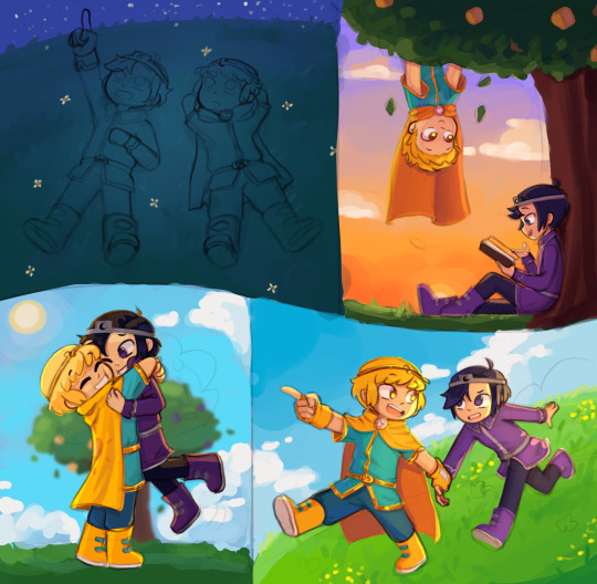
8. what's the most fun and least fun parts about your process? most fun is flat color and rendering. (though I rarely do the latter anymore) and for least fun, tbh a lot of the sketching part tends to be difficult for me, sometimes its cool tho
9. show us a finished piece alongside the original sketch example from when sketching was fun
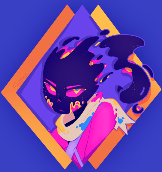

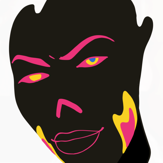
10. how many different sketches do you usually have until your piece is finished? I think I do need to make more of at least thumbnail sketches tbh.. I usually just make one and keep editing it, trusting the process. (and that fails like 70% of the time. woww wonder why sketching isnt fun for me-) 11. show us the last thing you drew, be it a finished piece or a small doodle can this count,,
12. show us an old drawing first deltarune drawing. here's the redraw I later made of this :3 (also old hsgdhgf)

13. how long do you usually take one a piece? depends. I'll have like 276478923 wips started, and then I get a random idea that I just have to do right at that moment, and I'll get it done in like 1-4 hours. meanwhile old sketches start to rot and maybe if its lucky I'll revisit it before my motivation dies and my style is too different to wanna continue from where I left off 14. digital or traditional? digital all the way, i've gotten too dependent on the transform tool + liquefy ;D (and many other things tbh but I'd be here all day if I tried comparing them more jhdjdf)
15. if digital, what program do you use? procreate, the layouts on other drawing programs scare me
16. favorite media to work with when drawing traditionally pen on paper (am I understanding this right wdym media-)
17. what do you love getting compliments about? I like when people enjoy the humanizations I come up with, and also original designs in general 18. are you satisfied with the attention your art usually gets? hmmm yeah
19. how often do you draw? very often, I just don't have finished things to share most days
20. a piece from this year that you're really proud of :3
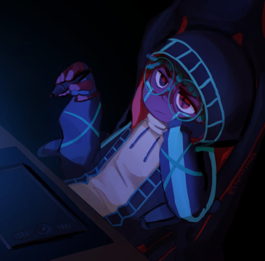
21. something you would like to improve on the dynamicness (well, the lack of it) of everything, as said before
22. what inspires you? Ink sans and a ton of creators in this fandom (also animated shows and movies, I love animation)
23. what's something you hope people notice when looking at your art? idk tbh, just notice it at all and I'm happy :>
#shy rambles#ask game#long post#twinribbonz#yaayyyyyyyyyyyyyyyyyyyyyyyyyyyyyyyyyyyyyyyyyy#another sign to look for more references#my problem may be going from imagination too often
8 notes
·
View notes
Text
Just saw Wish. I know it's getting hate, but... overall... I thought it was very... meh? Like literally meh.
(whinging)
The protag was likable, though a bit derivative in her motivations. The message was... ok, I suppose. The animation was fairly good in most places.
It does definitely have quite a few big issues, exacerbated by what it's trying so hard to be. All the pieces are there for a great movie, which is what's so frustrating about it.
For me, I felt that the textures and lighting in particular had some kind of issue. They look okay in some places, but the whole thing looked like it was un-rendered on purpose. Like it looked like the behind-the-scenes draft version before they do the final render on it. This was probably to give off a sense of "storybook" quality to the 3d models by rendering them all flat and matte but tbh it looks rather cheap for Disney. All the colors in the movie seem to also be quite muted. The color palette they chose is very cool and understated which made me want to take a nap. And since much of the movie takes place at night, that exacerbates matters a lot. There's also very little variation in setting, colors, or lighting, which makes things boring.
The songs are the biggest problem imo. I can't remember any of the songs at all, they're very forgettable to me. I'm sure there are kids who liked them and I'm not aiming to undercut that, but the fact of the matter is that these songs can't hold a candle to classic Disney songs. Classic Disney songs have a showtune quality. The melodies will stay in your mind for decades after hearing them once. The lyrics are perfectly suited to the characters and story. You want to sing along with them. And... these songs ain't that, sorry. It made sense when I learned that these songs were composed by musicians whose main background was writing Top 40 hits, not Broadway musicals. It sounds like the assignment was to try to be Lin Manuel-Miranda without paying for Lin Manuel-Miranda. They failed spectacularly at that. If there was one movie to get Lin Manuel-Miranda for, it would be this one. Had they done that and had a few absolute banger songs in this, it would have made a HUGE difference in this film's staying power.
As it is, I can't remember much about the music, so it's hard to comment on it. It wasn't offensively bad, just a very generic sound to it that didn't feel Disney-movie-esque (or at least, not major animated feature from Disney-esque. Certainly not 100-year anniversary material). The worst song is This Is The Thanks I Get because it had so much potential and they threw it away. The animation and staging during the song is great, it's actually the highlight of the film for me. They were clearly aiming for this to be the "Let it Go" of the movie, a huge hit that people talk about for a long time. And it's been a very long time since there's been a straight-up unapologetic villain song in a Disney movie, so I was excited for this one. Here's the problem. THE SONG IS NOT IN A MINOR KEY! Why? No, seriously, what were they thinking?? It has all the hallmarks of a big, grandiose megalomaniacal villain song AND IT'S NOT IN A MINOR KEY! The tone of the song is clearly meant to evoke fear as evidenced by the animation and clearly the storyboard artist was aiming for a big, frightening number. The song doesn't match that at all. Instead it's kinda happy? Playful? Like a Top 40 hit that your mom might play in the car? What the fuck? The lost potential is so sad because Maginifico could've been a great and funny villain. He's got the narcissism, comedic qualities, cartoonish mustache twirling and hot DILF-ness to carry the villain role. For some reason though, the big cartoon-y bad guy stuff feels a bit... restrained by the fact that he's trapped in a 3D model. Like the over-the-top maniacal 2D slasher faces that they keep trying so hard to give him just don't translate to 3D very well. He would've looked so much fucking better in 2D, I'm sorry. His voice work is done quite well, though - actually all the voice work in the movie is. (The goat was not that bad honestly)
Apparently one of the concept arts has Magnifico's wife (does she have a name) being evil as well. What the fuck, Disney, where was that?? They could've been an evil power couple, that would've ATE. They also whitewashed her, which... ok, interesting choice. It seems they were also going to have Star take the form of a boy and have a romantic arc with Asha which I'm glad they did NOT do, adding romance to a film like this probably would've served to make it even more generic.
As a movie for little tiny children I think this film is okay. For the Disney fans this was supposed to be a love letter to, let's all go watch Aladdin, Mulan, Lion King (THE ORIGINAL), Beauty and the Beast, and all the other films that weren't created in a boardroom lab. Wish has a generic look, a generic sound, a generic message, and as much as I support those who enjoyed it, I can't help but commiserate with the fans who are disappointed in the less-than-stellar Disney flicks of the past few years. It's like they are allergic to taking risks, hiring creatives and letting them work, or keeping greedy corporate hands out of their projects. Hopefully their revenues keep tanking until they get the message but it looks like Iger is still drinking pure copium based on his recent comments that "audiences don't want films with a message anymore". OK. Yeah, that's what you should take from this, Iger. Have fun continuing to censor your films, gotta get those bucks from the Russian and Chinese markets, pal.
2 notes
·
View notes
Note
happy birthday! I'd love to ask you a bit about your art. you have such a distinctive style, do you have anything specific that inspires it or how you came to develop it? when did you start drawing? what did you draw before ganqing? would you ever try one of those art challenges that are like "draw in the opposite of your style"? what taps into your muse (aside from ganqing haha)? would you ever try writing fic instead/alongside drawing? 😄
thanks! :)
i don't have a very specific inspiration, sometimes i kinda get overwhelmed by the amount of cool art and varied artstyles that are out there lmao! i'm like "ohh i wish i could draw like this" about one thing, then think the exact same abt a completely different style, over and over. i just keep trying out more or less different styles because it's fun to me, and my style develops through that ig as some aspects repeat. if one thing doesn't work out currently, i can always do something else. if there was one way to describe ALL of my art tho it'd be "pretty simplistic", i just don't have the energy for certain more complex styles so i draw in a way that's actually achievable for me i guess lol.
i started drawing as a kid as most kids do, and simply just never stopped i guess. always doodling something.
before ganqing i drew random furries, monsters, animals, some occasional fanart from games/anime i like (rain world, warframe, dark souls) stuff like that. i was terrible at drawing humans tbh lol, but some of the non-human stuff aged decently enough.
hm. i don't think i'd try the "draw in the opposite of your style" challenge bc 1. i'm confused what style exactly it'd be, but i guess a rendered painting with subtle lines and colors? and 2. like i said i don't think i have the energy or will for that kinda style LMAO. but maybe someday, who knows
i'm... unfortunately not sure what "taps into your muse" actually means, i'm sorry asdhgasjkhdlas. i assume ur asking about a source of inspiration for my art in general?? but i'm not exactly sure abt that either, i just draw things i like and want to see and get inspiration from literally anything. fanart, fanfic, convo with a friend, something i saw outside, games, movies etc etc.
and.... i dunno abt writing. it's soooo much harder than drawing to me, i've always struggled with writing longer texts or describing things ig. ofc it'd be better outside of the academics, since i'm not forced to write and abt things that don't interest me, but idk if that's enough. i know writing is a skill too, but idk if i'm made for it y'know. who knows lol
1 note
·
View note
Note
Hi! I actually am wondering about trying watercolors for the first time but feel a little anxious haha.. how you go about drawing on the paper with confidence? Like, watercolor paper isn’t exactly cheap. I think I got the cheapest one avaible from Canson but still the anxiety is real… do you pick very light pencils like 2B so you can sketch veryyy lightly, or before sketching on the paper itself you do a planning sketch in another paper?
Im asking this cos I really love your art and it’s so cool that it’s mostly traditional! And the way you draw Tails is too adorable and consistent while being in your style, it always feels like you have confidence when you draw him.
oh i think this is gonna be a long one
all in all?i have the same anxiety as you. but i've confidense that i can make something good sometimes, but not that i will get it right every time. So i keep trying, but heres some stuff that helped
a warning though, i keep going on and on in this reply and can get pretty negative at times
my watercolor paper i use costs 2 dollars and has 20 sheets so that's 10 cents per sheet. which i feel helps with my anxiety... it's the canson multimedia block too, 140 msg .....
watercolor sketchbooks i'd find online were around 80 or more BRL, and then 20 BRL shipping.... that's 20 USD in total...
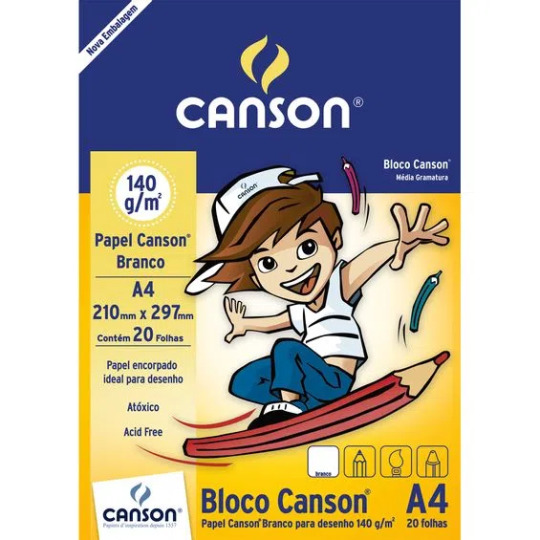
but a block of this plus getting it binded costs me 4 USD.....so i think that one [price] helps alot lol.....
as for the confidence.....

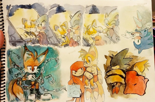
i've had enough time to do quite a bit of trad art, specifically ink and watercolors so im USED to the material and now quite as scared to "mess up" as when i first started it.... [hint, i still am] this is one example of a sketch page, they vary in size, and how "done" they are... i dont really worry too much about maintaining a rule of "everything in this sketchbook must be fully rendered " bc it ended up stunting my creativity

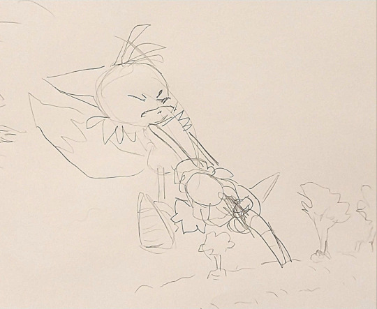
i did try the "sketch it onto a sketchbook and then pass it to watercolor paper" approach and tbh...? not really my thing... i've found that to me the first sketch always end up being looser than when i pass it on... i'm always more focused on getting the flow, composition and pose there than i am getting the right details or right lines or colors etc....
like this one, im more happy with the sketch, it's mroe dynamic, mroe fun
i DO sketch stuff on cheaper paper first when it's for trad art commissions though, just bc there i HAVE to make sure the client is getting what they asked
and i do use 2b pencils AND a "soft lead" mechanical pencil, btu tbh it's mroe bc of the feeling of it on paper than for the look of it...
here for example you can see the circle i used to have a basis on where tails would be.. i didnt erase it as i continued painting bc tbh it was just the sketch. i ended up liking it tho
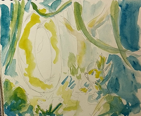
i actually got quite MAD and angry at myself recently bc i noticed how much my sketches were looser in the sketchbooks when i did try the passing onto watercolors thing and i had a full on discussion with a fellow artist about daring myself to be bolder in the future, it has been working well

I sadly have to say though, that figuring out how to build confidense is more of a personal journey, and i cant claim that what worked for me [trusting my first sketch] would work for you.....
It's time, practice, trial and error....
OH, one thing though that DID help me. is:
-There's no art wasted, even if it doesnt turn out how you wanted it, you still learned something.
-Makins these personal art/fanarts isn't some school paper you have to hand it to be graded and then not get it back. You can re-do a piece as many times as you want until you get it right! I have quite a queue of pieces i plan on re-doing in the future bc i didnt like the first ones i did. im not perfect on confidence and i get scared of fully committing to drawings alot, many of them are pale not for choice bc bc i got scared of making my art too saturated and overworking it
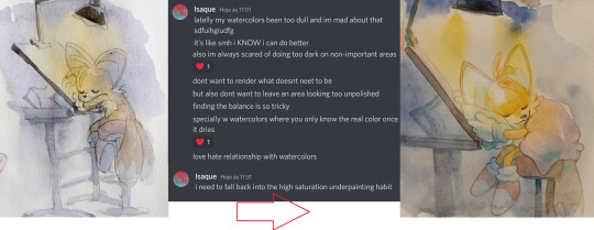
i am about to get negative now so stop reading if you dont want to see that.
HERE NOW i's a alot of pieces i made that im unsatisfied with and plan on re-doing one day: too dull, simply way too watered
which led me to make THIS piece and do better colors
i hATE the way i did the lineart here. it's boring, the anatomies are wonky. it's a good concept but i didnt excecuted it as well as i wanted. but this piece has made me just go and try inking MORE so i could make up for it
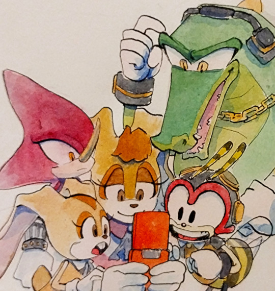
which lead to this piece here eventually
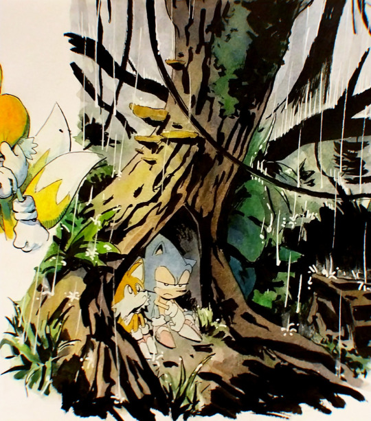
This one here.... the colors look so muddy it just makes me SAD, bc i had been so scared to use high saturation that i went with the muddier colors by choice, if i had allowed myself to experiment i wonder how happier i'd be about it
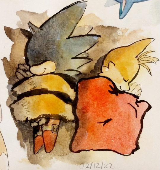
which led me to make THIS piece with softer in value and more saturated colors
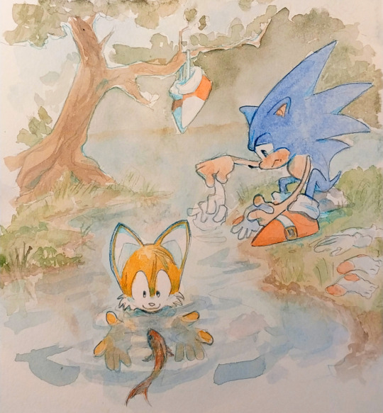
The colors and blending of this one are too soft and not bold enough for what i had envisioned it, i made it as fanart of a friends fic and it made me feel like i failed my friend and insulted her fic when i finished this. I dont think the piece looks bAD, mind you. i know it looks cute. and good even. But i had such high hopes for it.

which led me to make this one
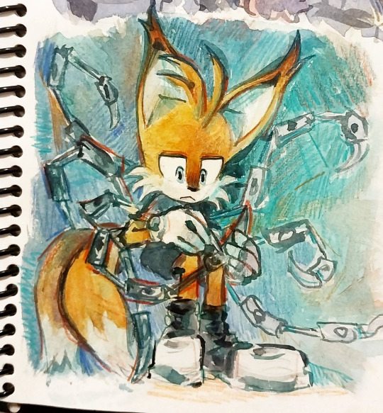
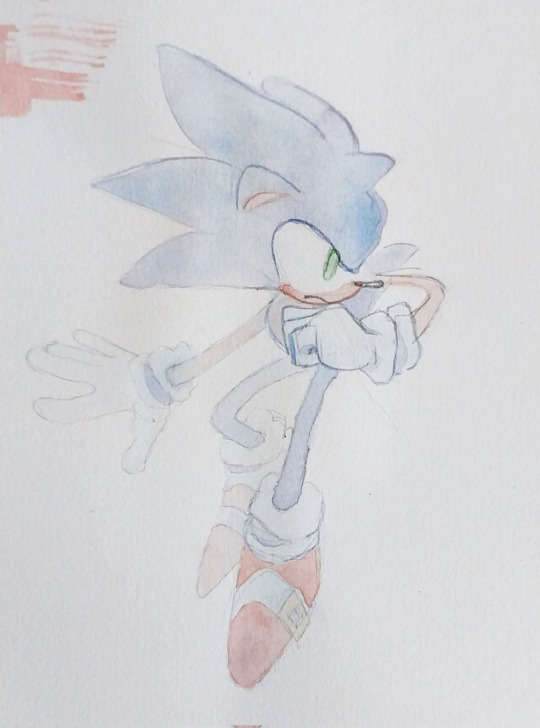
THIS ONE OH MY GOD HOW I HATE IT. sonics expression is SO creepy hes like a horror movie weirdo , honestly not my best work when it comes to anatomy

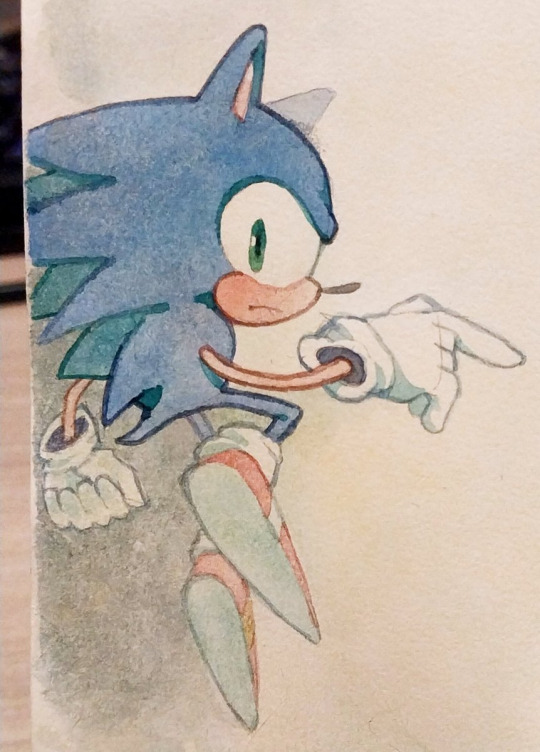
so i've been doodlin sonic now and then as practice so that i could make this one eventually

The perspective on knuckles could be better and the characters look out of place on this scene, the background is ok

but in this piece here i was able to get a better harmony between colors, background and whatever sparse linework i threw in

Theres so many more haha but i'll stop for now....
Dont get me wrong i dont ACTUALLY think those pieces are HORRIBLE horrible,,,, i see the flaws in them yes, but theres always something i like too, and i know people like them, and that people wont throw away a whole piece over one small detail that in the end doesnt even affect the overall thing....
i've just been getting into the headspace of "ok. at least this one is done, onto the next"
plus the whole thing i told you of realising my first sketches are looser....
sorry im not too good at talking about this and my points arent very clear, i dont think this is going to be quite the help you expected it to be because the truth is that the struggle with your art is soemthign that doesnt go away no matter what skill you have...
at times to me it feels more like a mentality practice than skill, reasurring myself that it's ok to get it wrong and try again, etc etc....
i used to go to therapy and one of the things we talked about was my perfectionism, how i used to be so scared to mess up a piece. that i wouldnt even start, and wouldnt draw for months. this has been going for years now and hey i've gotten better.
but..... yeah im in the same boat as you.... except mine is no longer just about the paper quality!
Sorry this got so personal now, i hope that this hasnt killed your hopes on getting better at the anxiety. it does get way better haha... trying to force your brain to not judge yourself so harshly is half the battle in my opinion, the practice of drawing is the other half....
good luck i hope you have fun painting, i know i do, i love the process even when i dont like the result, good night and thank you for the question
23 notes
·
View notes
Note
For the artist ask game! #10, 11 and 16, if I can be bold enough to ask three things? Love your work so much 🥰
Certainly!! And thank you! :3
10. What’s that one thing that inspired you to make drawing your consistent hobby?
I wanted to git gud at drawing things I liked! It all started with animals of all kinds (tbh it was mostly warrior cats haha) then as a teen I wanted to draw fanart for video games (l4d2, it's still out there.. in the depths of deviantArt) so I forced myself to draw people and now we're here lmao
11. Favorite comment you’ve ever received on your work?
I get so many wonderful comments and I read them all. Some of them are hilarious. I love rereading the funny ones! Thank you for making my day <3
One of my favorites is one about my sound editing deserving an Oscar for a silly animatic I did. I've never done sound editing before but I think I nailed the comedic timing so I was really happy people enjoyed it!
Drawing related favorite comment: "do you ever see some art that just captures the quintessence of a character?" :') y'all are so kind!
16. What’s the most daunting part of your process? Ex, planning, sketching, lineart, rendering etc
My process is a little haphazard as I don't always plan things, it probably shows in my work. I love sketching! The most daunting part is coloring and rendering. I have a very short attention span so anything beyond a sketch it difficult for me to focus on, but I'm trying to pace myself to get better about that! I'm always in a rush to get to the next idea I want to draw!
7 notes
·
View notes
Note
do you have any favorite aot artists? or ones you gain inspiration from?
god YES i follow so many but they're all on instagram fnsdjg and tbh a lot of them are multifandom and no longer focus on aot specifically but...
sonagee_ -> i fucking love the way they draw people in general but especially levi and erwin. ive fallen in love with all their eruri pieces especially the college au ones
solarfry -> they capture levi and erwin so well omg. they have a tumblr too and im subbed on their patreon and just the way they draw intimacy and anatomy is so..pheeeew its very nice :')
tnxgodimginger -> they have a tumblr too. i'm sure you''ve seen their work. again, capture eruri SO FUCKING WELL just jksdhfdk
thisuserisalive -> please if yuou have not seen columbos aot art your are truly missing out. their compositions are fucking beautiful and im SO happy theyre drawing aot again im l i v i n g for their work
mereyzhm -> i LOVE how she colors/renders things? she makes them so pretty and it feels like her colors literally glow ahh
theres SO many more i just cant remember off the top of my head but my art is def influenced by these ppl the most
8 notes
·
View notes
Note
Could I get a matchup for marvel? I'm a hetrosexual female with freckles, green eyes and blue/green hair (that is currently shaved into a Mohawk). My hobbies include but are not limited to: Drawing, writing, sewing, reading, and baking. I like to joke around alot and can be quite sarcastic. I am slightly introverted but I crave attention. 1/2

Yes ofc! Thank you for requesting dear! Sorry for the wait!
I ship you with Thor!
Thor LOVES joking around
Admittedly you had to help him get the hang of sarcasm at first
But he definitely can take a joke and even before he knew you were being sarcastic he was like hm seems about right
Like he really doesn’t mind you messing with him as long as you don’t actually mean it
He’s EXTREMELY affectionate
Likes getting you things that remind him of you
Flowers, stuffed animals, candy that you guys once had at the movie theater
When you explain to him that you’re lowkey touch-starved he’s kinda confused
Asks you a lot of questions
He’s never heard of that in Asgard but he’s so respectful and wants to know what he can do to help
Very gentle when touching you, definitely starts out slow because he doesn’t want to overwhelm you !!
He likes snuggling with you best
Wrapping his arms around you and you burying your face in his chest
He doesn’t like when you’re upset
Spends time at home with you more when you are
Wants to show you that it’s okay and healthy to have emotions and express them
He’s hid his emotions before and it was pretty detrimental to his mental health, so he doesn’t want that to happen to you
Lots of affirmation that he’s here for you
He likes to show it more than to tell you
Lots of hugs, random romantic gestures
Date-nights in, impromptu picnics in the living room
Spends a lot of time at home with you or visiting you when you’re out for the day
He’s very very affectionate and clearly head over heels for you
Uhm random but he loves your hair
It’s so cool
The color brings out your eyes
And he loves staring into your eyes, would all day if he could
The style tho
He wants to try a Mohawk bc it looks so good on you but you recommend against it thank goodness
A Mohawk would not be a look on him tbh
Agh and he loves your freckles !!!
When he’s feeling extra domestic in the mornings he tries to kiss all of them
You can’t stop laughing
LIVES for the days when you bake
He likes when you cook in general but
Man LOVES sweets what can I say
Not very good at showing off his creative side
But he tries his best because he knows how much you like things as writing and drawing
He tries to do one of those wine and paint nights... yikes.
You now have a red abstract blob hanging up that was supposed to be a pumpkin haha
Next to yours which is actually probably good
The avengers find it hysterical
Which by the way
They really like you
Especially bc Thor is just... happier now that he’s with you
But you’ve definitely stood up to Tony before when he was being an ass to the others
And he was SHOOK
Like speechless
And he was like “oh.”
Could not get words out
“I’m sorry”
And he meant it
Because he knew if you spoke up then it must’ve been a big deal
Thor thought it was HYSTERICAL that you rendered him speechless for so long
But overall tony really likes and respects you
It makes Thor happy that you get along so well with his friends
Eventually he wants you to meet Loki
But with all the horrible pranks Loki has pulled on Thor he’s kinda nervous you’ll go off on him
Not that Loki would care but he wants to make sure everyone really likes you
Loki would like you all the more if you went off on him tbh
Thor just doesn’t want to pressure you with meeting his family until you’re absolutely ready
He’s a gentleman like that :)
But it’s mainly because he kinda wants you to himself
And if Loki flirted with you he would die for like the 300th time
Because nobody touches Thor’s girl
1 note
·
View note