#i'm not looking at the final results
Explore tagged Tumblr posts
Text

NEW YORK, NEW YORK - APRIL 07: Nick Suzuki #14 and Cole Caufield #22 of the Montreal Canadiens celebrate Caufield's first period goal against the New York Rangers at Madison Square Garden on April 07, 2024 in New York City. (Photo by Bruce Bennett/Getty Images)
#i'm sorry. look at his FACE#look at COLE's face you can't even see it but you can SEE it#nick suzuki#cole caufield#habs#i'm not looking at the final results
33 notes
·
View notes
Text

1930s Horror Film Posters
This was a huge project, and now they're finally all together: A collection of 10 posters for horror movies from the 1930s - with a personal, legally distinct twist! Having my legacy feature actors in the 1930s gave me the perfect idea for Simblreen. Horror movies (especially monster movies) were a huge genre in that decade, so I just had to make my characters star in some of the most famous ones. The text is entirely in Simlish, but the (main) actor names have been changed to the ones of the sims shown on the respective poster, while the others names are the same. Also, whenever a studio is credited, I've changed it to the Plumbob Studio.
bgc
4 swatches each (bg poster frame colours)
custom thumbnails
merged, zipped and separate files to pick and choose from
DOWNLOAD [sfs] (alt. link [gdrive])
Disclaimer: If you've previously found and downloaded the Mummy poster, please redownload, as I've noticed an editing mistake, which has been fixed now.
Comparisons between the original posters vs. mine below.


#ts4#sims 4#simblreen#ts4cc#ts4 cc#my cc#i've personally only seen frankenstein and vampyr btw but i recommend#and i just checked and looks like the internet archive my beloved is back babyyy so i can finally watch the rest as well#anyways this was probably my biggest cc project yet#and it was worth it imo it was a lot of fun and i'm really proud of the results#also taught me some stuff about background painting (and painting in photoshop in general) and posemaking i was too scared of before
834 notes
·
View notes
Text

day 1765
#amphibian#frog#self#frogsona#thanks everyone for the congrats and well wishes!!!#genuinely meant a lot :)#healing is going super well!! i was expecting it to be a lot worse tbh but i'm mostly just tired#the post op binder SUCKS though i understand why it's useful but i can't wait to be out of it#today (day of posting) i FINALLY got to see the results for the first time though!! after getting the big bandaids and stitches removed#they didn't take any pictures of the results before taping me up so i've had to be sooo patient#actually seeing it felt unreal im so happy?? it already looks amazing and it's healing so well#i keep looking back at the pictures i took holy fuck that's me!!! it feels so right i have never felt this good about my body wow
446 notes
·
View notes
Text
councilor 3D model
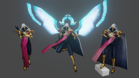
i learnt 3d modelling from the ground up to bring him to life. he's yours now. do whatever you want with him
[link]
please credit me if you make something using the model (or even ping/link me to it, i would love to see what you made!)
currently available as a .blend, .fbx and an SFM port.
#hello councilnation i'm finally releasing him to the wild#have fun playing toys with him#ultrakill#councilor#councilor ultrakill#3d stuff#obviously with the councilor having just 1 full body image of him means that some stuff i had to improvise on#so you get to enjoy my headcanons on how he looks#(like obviously the wings & halo)#(but also the chestplate design)#but did you know that the councilor's canon design has subtle engravings on his forearm armor pieces?#i only barely noticed them when painting textures and i was floored#i had to add them#to the sfm anon and whoever else wants to use this for sfm stuff-#i did my best with a port for sfm and i'm quite proud of the result#but please be aware i have never used it before so if you find that something doesn't work as it should please please let me know!!#gonna pour my heart out in tags as always so close your eyes if you don't wanna see me being sentimental but#i'm not kidding when i say i learnt 3d modelling from the ground up for this#i have meddled with blender before but never actually came close to finishing a project#and i don't know how i did it and how i kept going#(i do know) (it was my friend encouraging me every time i showed him progress)#this was like 1 entire month in the making#but i'm so fucking proud of this and how it turned out and people's tags in my act 2 render genuinely were such a huge confidence boost#so thank you guys for liking it <3#i'm still very much thinking of doing a version with just his bloodied head#but it might take a while because i want a break and i want to play warframe
561 notes
·
View notes
Text
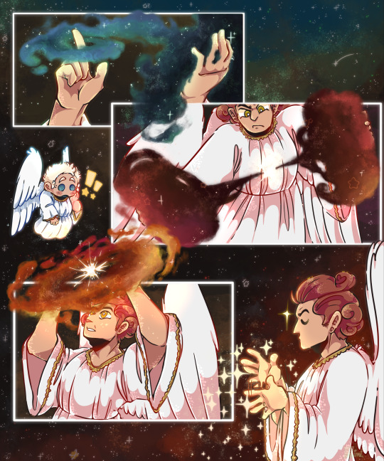
[creates nebulae as if i'm making pizza]
#my art#good omens#gomens#good omens 2#go 2#good omens season 2#angel crowley#crowley#aziraphale#minidrawz#AAA I FINALLY FINISHED THIS I'M SO SO HAPPY WITH THE FINAL RESULT!!!#I LOVE drawing stars i LOVE drawing galaxies i LOVE drawing nebulae#i am OBSESSED with the Before the Beggining scene it looks super pretty#also i hid a little kirby cameo somewhere in the background :]c#click for better quality!!
644 notes
·
View notes
Text
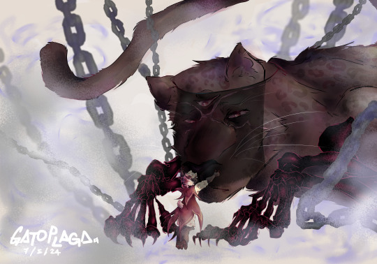
"But beyond all my pain, there was you"
Narilamb designs: @runningwithscizzorz
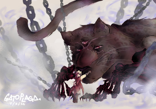
here's an alt version of Narinder without the veil!! :D
#I added that detail last minute and my poor government laptop was about to explode from the amount of layers that I was using–#it wasn't even that much! just uhh 95 I think?? I normally use like. 150+. But this poor laptop is not built for that#The tools were starting to lag and the program froze for a couple of seconds before starting to work again and it was a whole mess so#I couldn't put a lot of detail into it#but I'm still pretty happy with the result!!#I love Lisey's design so much specially Narinder's#I really wanted to make fanart for them and I finally got to finish it!! there was a lot of trusting the process in this fjhsd but it was#definitely worth it. I think I exceeded myself. Very proud of this one.#even though I couldn't put the amount of detail I would have wanted to because of the laptop's limitations.. I did the best I could with#what I had and I think it looks good! so. yeah. hehe.#I hope Likey likes it if they see it heh (*´ω`*)#cotl#cult of the lamb#cotl Narinder#cotl Lamb#cotl the one who waits#cotl narilamb#cotl fanart#narinder x lamb#gpart
247 notes
·
View notes
Text
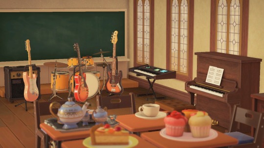


🎸☕🍰 - After School Tea Time
#i've been rewatching k-on lately so i was like uuuuh why not#i tried doing the clubroom in my main house before hhp was a thing and i didn't like how it turned out#but in hhp and with the 2.0 items it looks SO NICE i'm very happy with the final result!!#animal crossing#acnh#acnh interior#acnh inspo#acnh hhp#acnh happy home paradise#hhp#acnh screenshots#animal crosing new horizons#acnh design#acnh community#k on#i guess?#my post
601 notes
·
View notes
Text
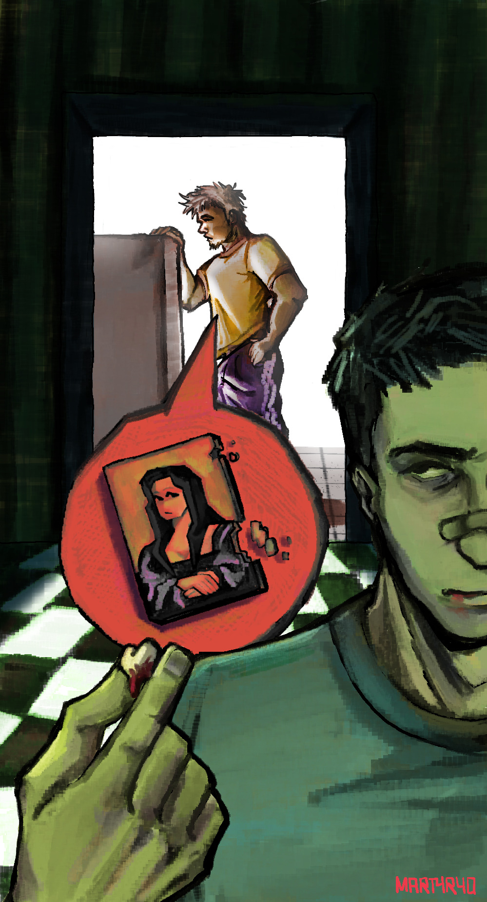
*posts and crawls back in hell*
#artists on tumblr#fight club#digital art#illustration#the narrator fight club#tyler durden#art#fight club 1999#soapshipping#oh my look who's back#so#I'm living hell rn cause I'm full of assignments and gotta pull full nighters til like sunday#this is the only thing I've drawn since the last time I posted. yeah#this is also an assignment for tomorrow (at this point today#I've been raw dogging this drawing from start to finish since 4 pm and now it's like midnight and a half#also I got a test tomorrow I studied nothing about#crying and throwing up#tyler looks fried in that bg but ayw#love the rest#this was supposed to be the scene where jack loses a tooth and tyler says that even the mona lisa falls apart#pretty much only inspirational cause I changed the whole thing to get a nicer result#I'll also post the final thing once I finish it at school#alright bye babes#can't wait to start dtage next week so I'll have drawing time once I get home#yippee#love yall I'll check the notes when I have time 😭#martyryo
262 notes
·
View notes
Text

Names revealed and returned. (context)
[First] Prev <--> Next
#poorly drawn mdzs#mdzs#red vs green saga#ouyang zizhen#jin ling#lan sizhui#lan jingyi#Nameless red disciple#*Tin can crumpling sounds*#[The Nameless Red Disciple] has forfeited their name. Ouyang Zizhen is green now.#Thank you to everyone who participated in the poll! Everyone campaigned very hard! I am glad to see the final result was rather close B'*)#Nameless red disciple is sticking around still but to a lesser extent. They need to go on a gender quest now#I hope most people saw the red vs green poll. Or else this is even more wild and wacky than intended#This comic changed so many times and I'm still not sure it's as funny as I hoped it would be...oh well.#Jin Ling may one day need to go on his own gender quest but thats many years in the future#for now JL is so out of the loop on everything. He is aware gay people exist and thats it#I was looking back at old comics and noticed that LSZ and LJY were frequently standing drawn very small in the bg reacting to things#so heres a little throwback to that era B*)#This fills in for the part where the juniors fight the living corpse hoard. So there's at least a sliver of canon timeline going on#We're getting so close to the end of season 1! In retrospect I have spent too much time on this arc *even with* cutting out several comics#it's all a learning process!
933 notes
·
View notes
Text
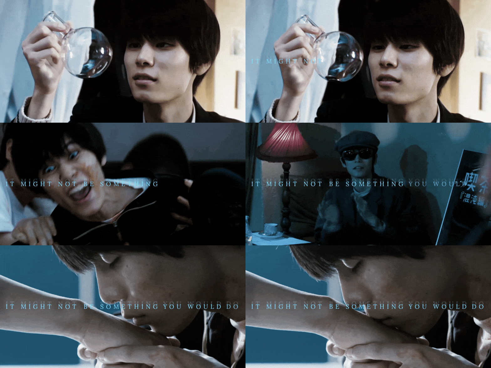

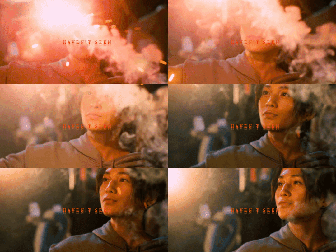

he's got the fire and he walks with it
#utsukushii kare#my beautiful man#hira kazunari#kiyoi sou#hira x kiyoi#gifset#*#//#not the first not the second not even the third nor the fourth person to associate hirakiyo to this song#but god am I the most annoying about it#this was made on a whim but I spent the whole night working on the coloring so I hope it doesn't look awful#I also had Hira's spirit hovering over me as a manifestation of my fear of not making Kiyoi justice. wanted to quit gifmaking forever#but now that is done I think it actually looks above my skill level so I'm very happy with the result#also!! especially for this occasion I finally learned how to make gradient text 😃😃#I got confused a few times and it took me an embarrassing length of time but look!! I did it!!#(for the theme of the set itself there is not much I wanna comment except ^*!!:-@*£shxbs@^& what a beautiful man what the hell)
232 notes
·
View notes
Text
🎀✨

heheheee had the silly idea to draw ceroba in mew mew's outfit,,, i thought it'd be cute :D
#sugart#digital art#undertale yellow#ceroba#ceroba ketsukane#ceroba uty#ouugh put way more effort into this than i originally intended but heyy#at least i finally posted some art with full effort put into it :p whaddya know#this was really tedious but fun to draw!!!!!#proud of how the end result came out tbhh <3 didn't expect it to actually look good lol#but yeah i'm done rambling sdfbjkhsdh
137 notes
·
View notes
Note
two questions.
one, HOW DOES ONE COMIC/STORY BOARD??
IM OBSESSED WITH HOW YOU DO IT ITS SO BEAUTIFUL
two, HOW DO YOU SO IT SO FAST( that’s question is more just me being super impressed oh my goodness)
you’re very good😳
Aw, sweet, a board question *puts on serious glasses*
Ok, bring it on anon.
So, the first thing to ask yourself when starting a comic, as I see it, is what type of board are you dealing with. Webtoon? A4 pages? 4 panels? There are many ways to go about it, and each involves different processes. For example, pages will allow for more superfluous scenes, whereas the webtoon format has to be super succinct because of the reading direction. I personally think that's the main reason I do pages, among other advantages: •narrative density •variety •Tumblr-friendly format
There are quite a few disadvantages too but you have to go through the process of trials and errors to really find out what suits you best!
Then there's the ambition of the sequence you're boarding for. And it goes from 1. how used I am to boarding this kind of sequence/drawing these characters/setting and backgrounds, to 2. is it an emotional sequence? Dialogue-heavy? Or more contemplative?
It changes the way you work and how you should approach your board! For example, in TMS, the very wordy chapters (4 and 5 for ex) generally called for simple and narrow framing. Of course, you don't want to bore the reader so you can spice things up to match the characters mood and reactions once in a while, but you have to bear in mind that the sequence aims to provide dialogue and information = the text bubbles are key and WILL take a lot of place. So let them.
( then again, it's all about pacing and balance. A page full of dialogue and one with too much happening are equally hard to read and boring to do)
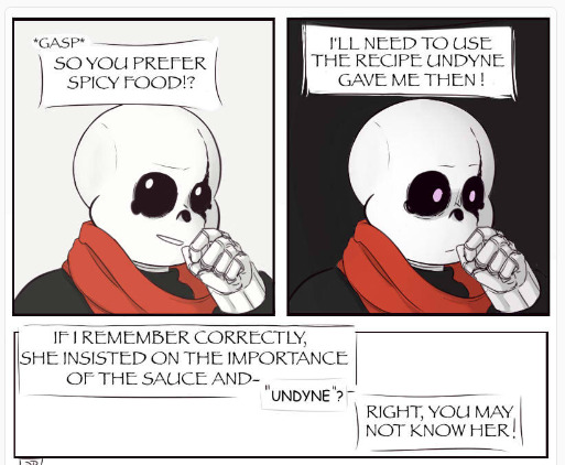
Only dialogue, simple squares, no compostion, the focus is on Mel's reaction
On the other hand, parts 7 and 8 are all about action and atmosphere! This makes for wider and more varied shots!
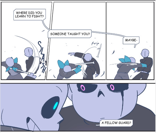
They're fighting, things are going fast so why not use a single line to show many actions! They're still basically squares and rectangles but the pacing is totally different!
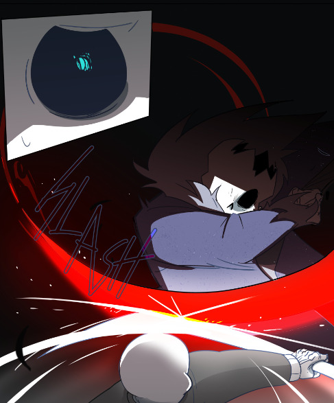
Or why not give the action a full page to really show its sheer impact
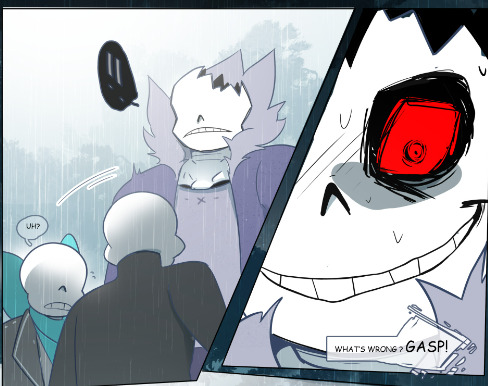
You can also split things, with a zoom or small time gap, depending on if it's a gag or if you want to put the focus on a reaction. Here, the asymmetry helps reinforce the unstable, jerky aspect of the scene. The situation is getting out of hand, and visually, the pages are affected too.
Now, these are case-by-case examples. And I never work on my pages separately.
For context, this-

-is the "first" board I did for part 8.
The drawings are very small and frankly difficult to make out, but the intention is what matters at this point lol I have the script (very important) next to my canvas, and I scribble the pages one after the ither. This allows me to see if the actions flow well, if the compositions are varied and also whether certain passages are too long or too short in regard to their importance. Which scenes can be merged? Removed? Toned down or if they deserve more bite?
This is a really fun and creative part but, I'll say it again, made a lot easier with a solid scipt. And I'm talking about a text document with clearly defined dialogues (or at least outlines) and actions.
I can't really explain how to write a script, it really depends on your work flow and how confortable you are with writing, but it's too important to just rush through it. No matter how much it changes before, during or after your finish boarding (cuz you gotta break your own rules sometimes and you'll often realize some things don't work as well once you put them on paper/sometimes art block can be resolved by writing the scene and just taking the time to imagine) but it's still your one guideline.
Aaaand, that's about it.
Other than that, I can only highly recommend reading lots of comics, Webtoon, books, watching movies, paintings, illustrations, animatics or listening to music, to inspire you and expand your own "personal library of references". Professional or not, anything your find inspiring and well executed. Boarding is at its core, telling stories. No art skill involved, just pure subjectivity. At the end of the day, it's all about squares, rectangles and bubbles so you gotta work on your creativity. The rest is gut feeling!
Constantly ask yourself how to tell this story, and how you want to tell it. How this sequence should be perceived? What do you need to show to make pages and pages of words appealing and interesting.
Be patient, be bold. Start with easy stuff to get some confidence if you need to. Accept that "boring" pages are smt necessary and that it's up to you to build up tension for a scene to really pop. Try new ideas and be ready to scrap many of them, the result will be worth all the work!
Now, concerning the "fast" part, I'm flattered but I personally think I'm super slow xD You prbly get that impression bc I finish the whole chapter before posting it, but behind the scene, I'm just working at a very regular pace.
Thank youuu anon ♡( ◡‿◡ )
#ask#ask me#forgot the tag I use for those errr#tuto#boarding is so much fun *sigh* unlike this *looking at the pile of pages waiting for lineart*#I personnaly prefer boarding for animatic but comics are fun cuz I know I'll get to actually see the final result haha#I know some artists love to do intricate shots with lots of details and pers (big flex here) but I'm more about the vibe really xD
59 notes
·
View notes
Text


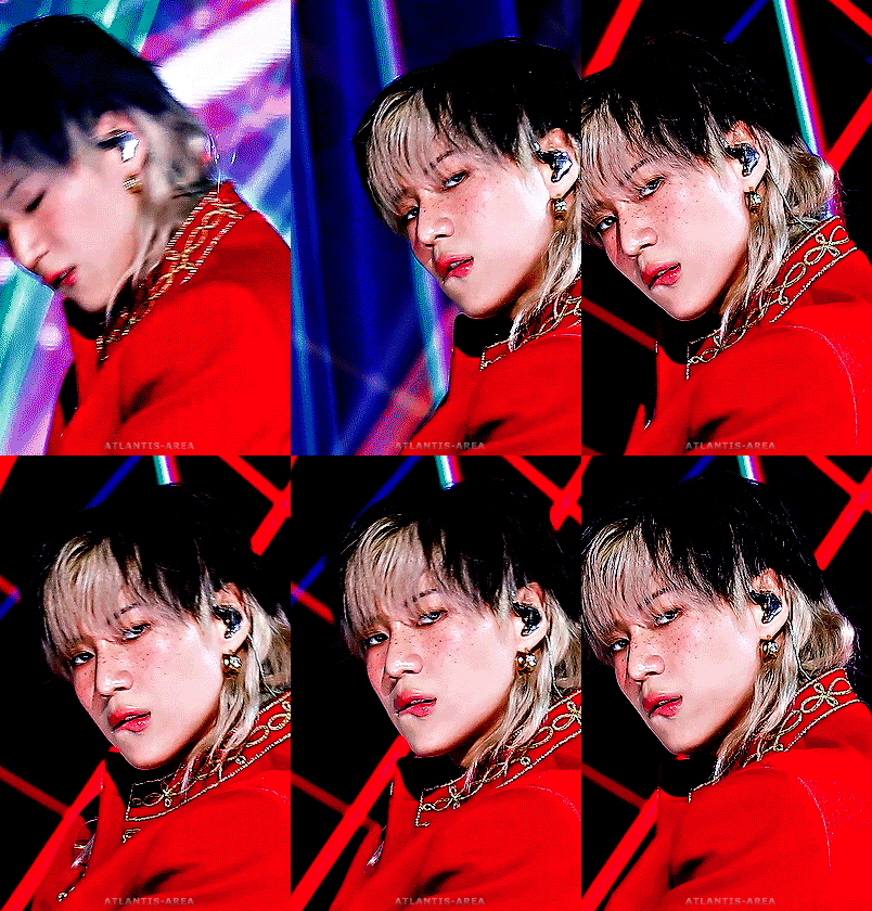

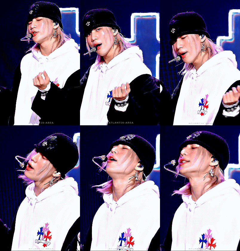
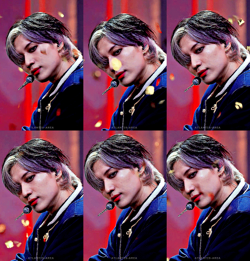
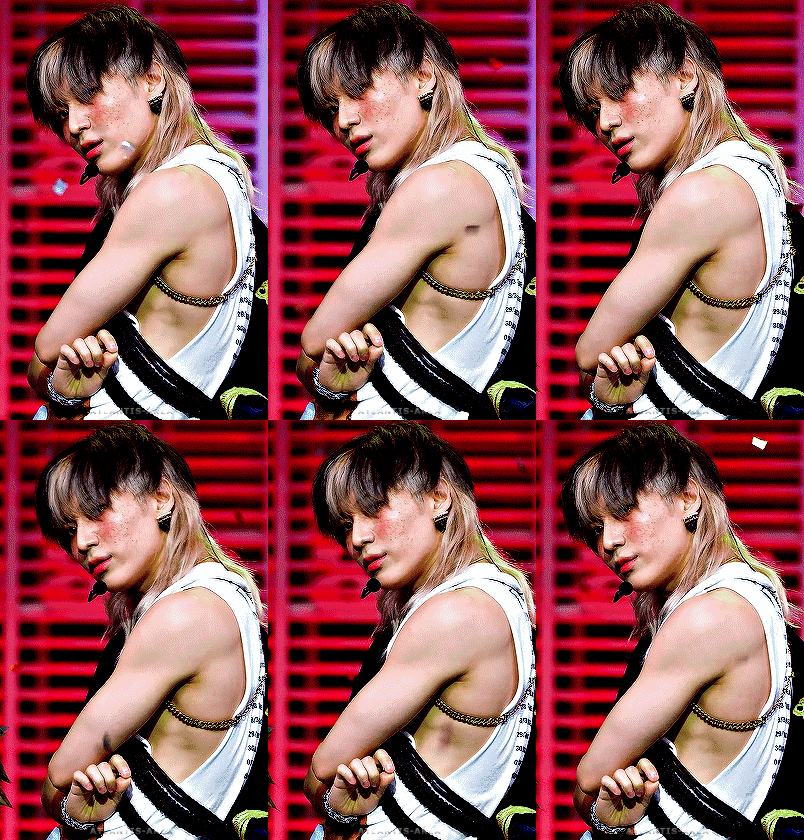
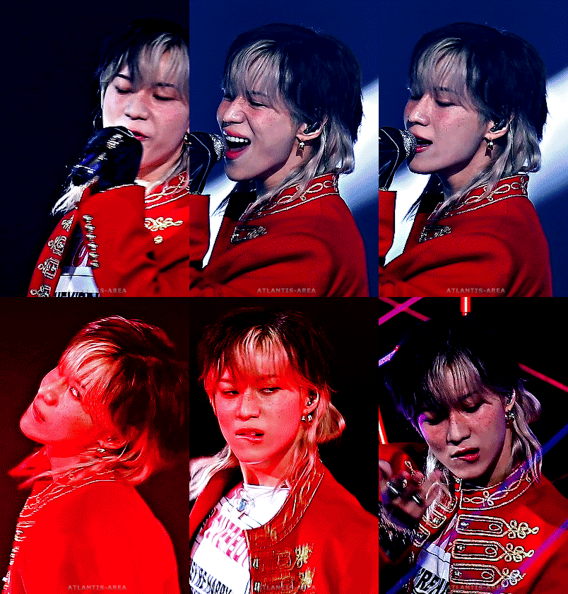

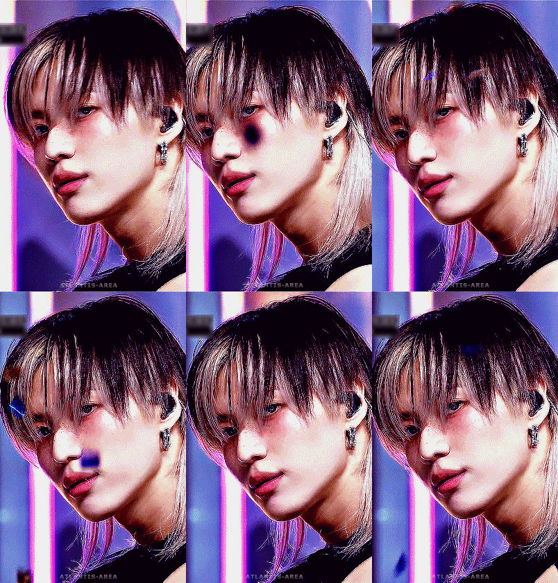
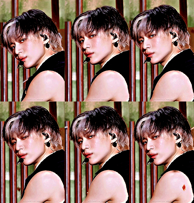
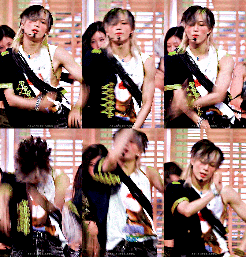
HARD TAEMIN ✨for @atlantis-area
#SHINee#Taemin#Lee Taemin#giffedbyme#analook#skyehi#dailyshinee#kpopccc#kpopstages#malegroupsnet#ksoloists#dailybg#ultkpopnetwork#Hard#Well this has been in my mind for months#And I finally did it!!!#This will be pinned on my blog for months to come#It took a while but I'm happy with the result#This look is one of my very favourites of his :)#That's why I made 12 gifs :D#Yeah#Dedicated the gifset to myself :))
136 notes
·
View notes
Text
Loved that Jenson reassured Esteban that "we've all been there", when Este was explaining himself on the team order situation.
#finally found this video clip#saw someone mention it so I just had to look for it hehehe#i'm still upset that the team choose that moment to give the order which has now resulted in additional hate (as if he needed more 🤦♀️)#how do you expect your driver to hear the full message when he was in the middle of overtaking#esteban ocon#eo31#jenson button#las vegas gp 2023#formula 1#f1
151 notes
·
View notes
Text
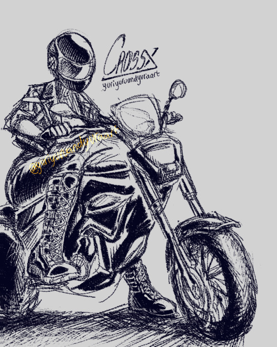

motorcycle sketch featuring cross!! >:)
#art#illustration#utmv#xtale#xtale sans#cross sans#cross!sans#cross#sorry about the empty space at the side hh xD that's where my references were#i mixed so many different motorcycle poses and parts and honestly? i'm so happy with this!!!#i got inspired by a guy riding his (full leather jacket- sleek black helmet and leather pants) in the city and idk it looked so PRETTY!!!#it was the type you see in movies it was so impressive! but he also stood out cause who wears black (LEATHER) jackets in SUMMER??#i was dying in my t-shirt and jeans but i guess the wind blowing while driving would negate the stifling warmth hhh x)#so when i decided to make it i knew i didn't wanna color the piece- nor spend ungodly amounts of time drawing clean-ish lineart#for a machine with sooo many details like damn xD so i went the sketch-y route! comic book style hehehe >;)#if alex sees this then i was also inspired by your killer drawing!! i finally understand how satisfying your sketching method is waa<3333#i would tag you but i'm always unsure if i should unless the au belongs to them/it's fanart so aaa hope you read the tags? muah ty again!!#(btw cross is human here- fem or not is up to interpretation; but then i realized it could kinda be interpreted as a skeleton too soo#just forget the skele knuckles and you have all versions in one piece!! >B)#i couldn't pick which one of the two end results was my fav so you get both versions >;) <333#and not using blurs or effects this times makes me love it even more waa >:'D the only thing i used a layer option for was the watermark!!#like goshh this was so fun to draw hhh hopefully you guys like it too :D <3333
190 notes
·
View notes
Text

I speedrunned a cute Liet chibi! Happy bday to the pretty boy!
you can commission me on ko-fi <3
#I also finally figured how my chibi are supposed to look like#I'm very satisfied with the result#hetalia#hws lithuania#aurum draws stuff
73 notes
·
View notes