#i'm honestly wondering if there was something on an old website that has more detail or if it was translator's choice
Explore tagged Tumblr posts
Text

Jackle's bio done! HUGE shoutout to @spyroid101 for the picture of Jackle's bio from the PS2 remake manual.
Disclaimer that I do not actually know Japanese and am putting these translations together through a mix of jisho.org and two different translation software (google translate and deepl) and referencing various websites about the meanings of words.
Original Japanese:
ジャックル
大きな��ントで身を包む、 最もクレイジーなセカンドレベル。奇想天外な手段を使って、何が何でもビヅターを恐がらせようとする。彼まとう大きなマント には、どんな攻撃もはね返す無敵の力が宿っている。ウワサでは、ワイズマンがファーストレベルを創り出し際失敗作だとか...?
My translation:
[Jackle]
The most chaotic Second Level, shrouded in a huge cloak (mantle). He uses bizarre ways to frighten Visitors by any means necessary. The huge mantle he wears holds an invincible force that repels any attack. Rumor has it that he was a failed attempt by Wizeman to create a First Level...?
Translation notes:
Interestingly, unlike NiGHTS and Reala, Jackle is actually referred to by a gendered pronoun! Kare (彼) meaning he/him. This is only used once, but I elected to use the gendered pronoun thing throughout for consistency.
The katakana for 'crazy' once again shows up like it did in NiGHTS' bio, so I kept with the consistent use of it meaning 'chaotic' as I found on a website while working on that bio.
Jackle being a failed First level is 100% canon! That's so neat.
#unofficial nid jpn translation project;#nights into dreams#tagging into the tag for the benefit of those that saw my frustration post about not being able to find the manual lol#do not expect regular updates for this project if you do follow me#i have college and this is mainly a fic blog but i have a little extra free time rn#and i am stubborn and NEED TO KNOW THINGS#relatedly i went and looked back up the translation we do have access to#the translation on the nid fansite is more verbose compared to the original language#the translation on the nid fansite is accurate it's just more detailed#i'm honestly wondering if there was something on an old website that has more detail or if it was translator's choice#or there's implications of words i'm missing because i don't actually speak japanese lol#could be any of them! i don't know#but seriously HUGE shoutout to spyroid101 i was expecting to scream into the void but instead i got the exact picture i wanted#thank you so much again ;u;
8 notes
·
View notes
Text
So, when Danganronpa S was released (and V3's UTDP but I'll get to that later...) Hinata and Komaeda were given noticeably different versions of their pre-existing sprites for their swimsuit versions:
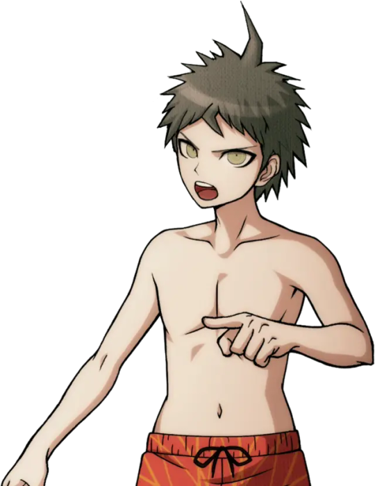
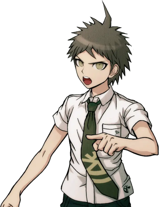
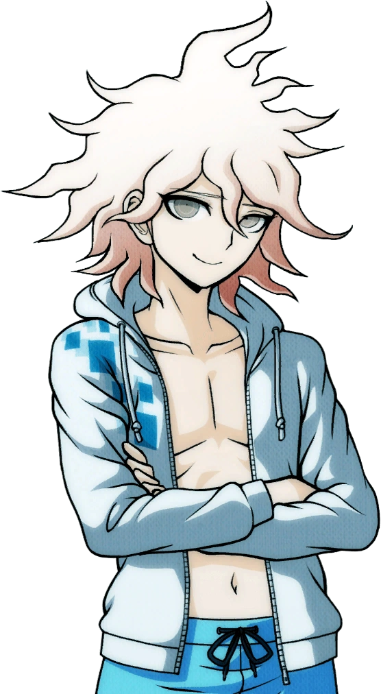
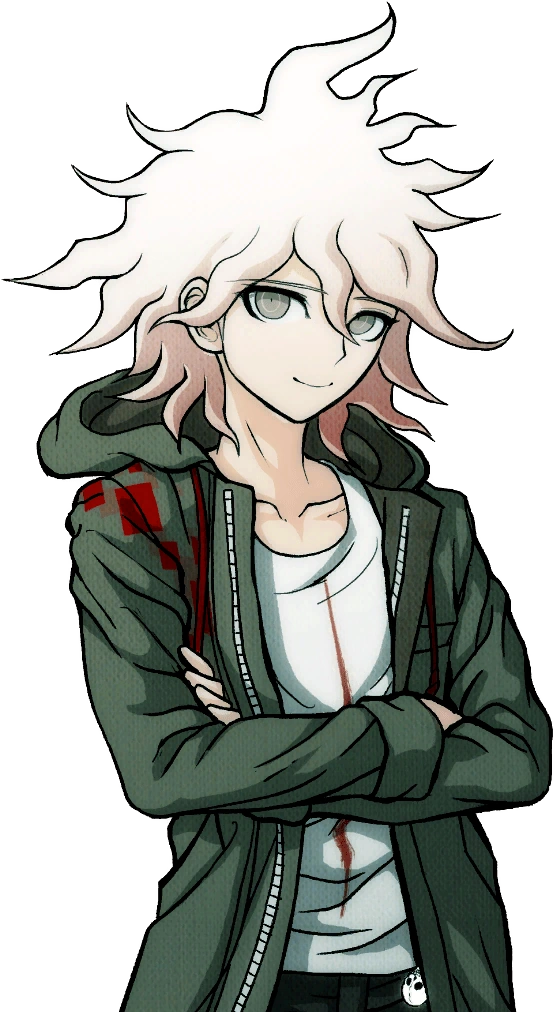
If you struggle to see a difference, note Hinata's wider mouth in the swimsuit ver., and Komaeda's narrower eyes and more outlined smirk in his swimsuit ver.
I, along with many people, always wondered, why? Why change these already perfectly fine sprites and, honestly, make them worse? What gives?
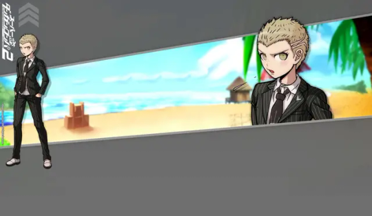
Then, I stumbled across something. Back in 2012, before the Japanese release of Super Danganronpa 2, you could play an online monomono machine to win little goodies like desktop backgrounds and profile pictures. Please note these pre-release desktop backgrounds for Hinata and Komaeda:
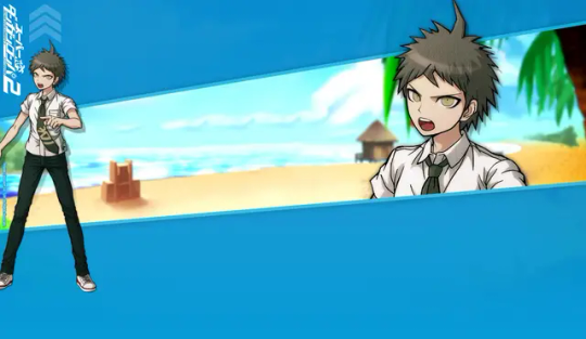
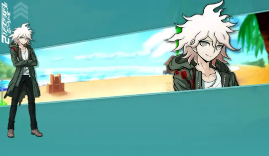
...So, wait a minute. The sprites used in Danganronpa S aren't new edits, but beta sprites? Older than the ones featured in the original SDR2? Turns out, this website features desktop backgrounds using beta sprites for nearly every character that otherwise never saw the light of day.*
I'm going to go through them one by one, gif comparisons included. This won't be the only post, either! UTDP also has some very interesting likely beta art used in it, too. As well, some of the other sprites featured in Danganronpa S may also be reused beta sprites!
As such, this log will be broken into three parts. This is part 1.
[Part 2 - UTDP (not made yet!)] [Part 3 - DRS (not made yet!)] [Part 4 - Dangan Island (not made yet!)]
*with the exception of UTDP in some cases, as well as some other things I will get to in Part 4.
As said, semi-flashing gifs will be included in this post. They are meant to swap between the beta and final sprites at a fast pace to illustrate the differences (2 frame, half a second each). Be cautious if you have epilepsy.
Also, because of Tumblr's stupid image limit, this post will have a reblog with the rest of the sprites! So please check this post's reblogs, it should be the first one!
Firstly, how do we know these are actually beta sprites? These images are sourced from the Danganronpa fandom wiki, and while I generally trust the wiki's credibility, it's always imperative to fact-check. So, I went ahead and searched Danganronpa's old website on the Wayback Machine and uncovered this:

A character intro page for Hinata, using this same beta sprite. Now, granted, the only capture of this page is from 2015. Still a year before V3 and a few more before S, but still, it's not the 2012 original. That said, a character intro page for Mioda circa early 2014 looks exactly the same, including the usage of her beta sprite.
And, when you click on the button that says スクリーンショット(Screenshot)...
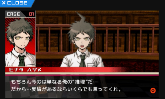
You're offered a very obviously beta trial shot. As is common with Danganronpa trials, in development, the actual character portraits are not put in until later, and to substitute, their art reference photos are used, as seen on the left.
With that out of the way, I think it's safe to say these sprite we are about to look at are indeed betas.
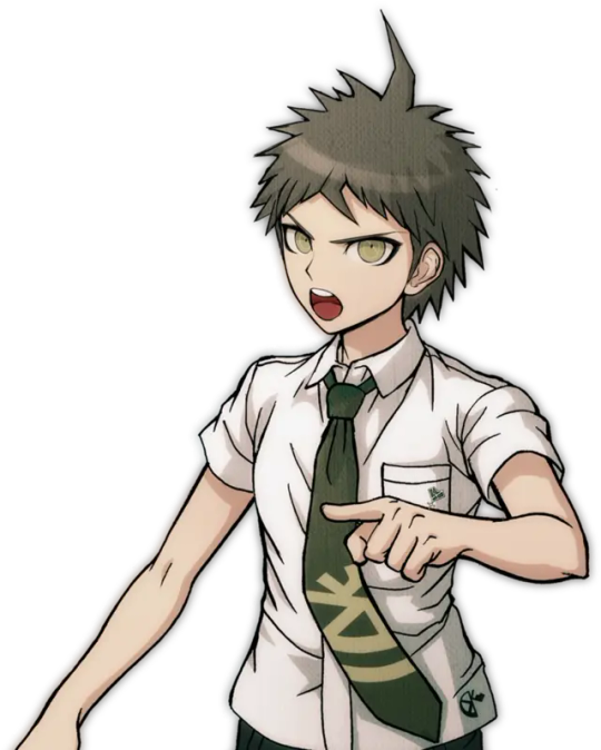

It's only fair, then, we focus on Hinata first.
(Please note for all the comparison gifs I had to manually size the final sprites to get them as close as possible in aspect ratio. Very minor size difference between sprites is likely a result of this and not an actual detail change.)

A lot is revealed with a simple gif. Hinata's entire face shape was changed (including ears), not just his mouth. In fact, not just the shape of his face, but the face itself is drawn very differently in the end. The neck of his shirt was raised, as well as tie being redrawn (you can actually see where the new part begins somewhat sloppily). Less notable but still apparent are his bangs being redrawn and shaded differently.
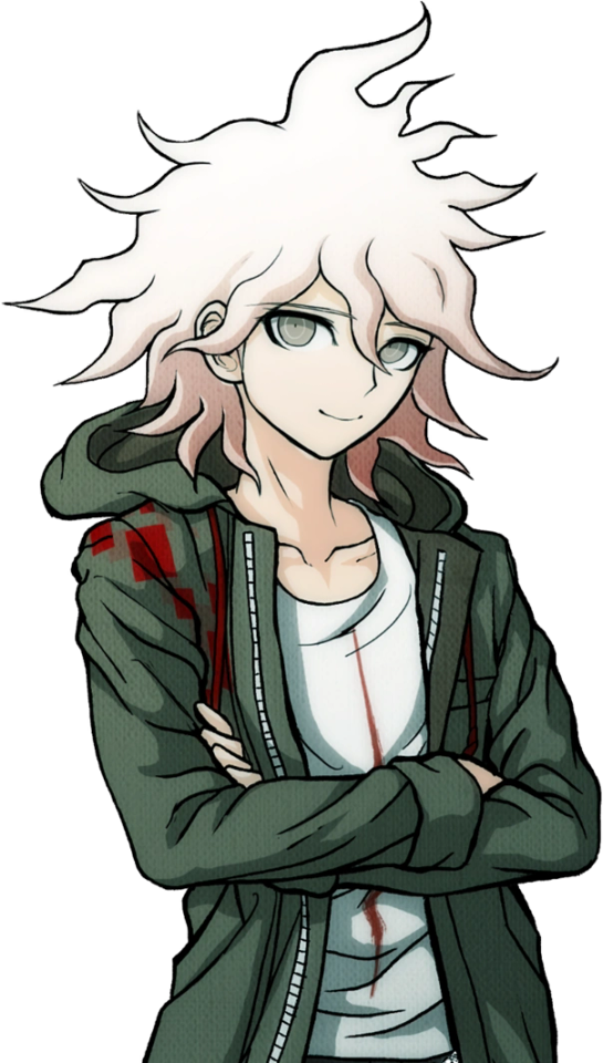

Keeping with consistency, let's check out Komaeda next.
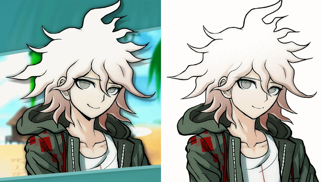
Yet again, the differences are striking when flipped back and forth. Komaeda's face shape and ear was redone much like Hinata, but not to nearly the same dramatic extent. As well, his entire face was redrawn, notably erasing the black shading under his chin and shortening his eyelashes. Less noticeable, the hair touching his neck is shortened a bit, and the crease line on his hood is more well-defined. They also slightly changed the line art for the first fold in his shirt, the neck at the back of his shirt, as well as his leftmost bang. Interestingly, they either forgot or didn't care to fix the shading to reflect the new placement of these lines. His jacket also has some changes in line art weight.
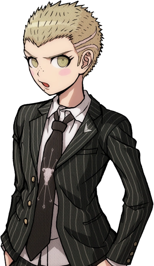
With Hinata and Komaeda out of the way, let's touch on Kuzuryuu.

This one honestly shocked me. Besides the added detail of him spitting, I didn't notice any difference right off the bat until I overlayed the images, but the differences are night and day. His eyes are made to be less mean and more skeptical. His mole was shrunk and his nose is more 3-dimensional. Extra detail is added to his ear while his hair is redrawn in whole, including it being slightly shorter. What's most interesting is the fact the body was sized up and moved down several pixels, I imagine to change the perspective. Some minor line changes are made to the white undershirt of his suit.
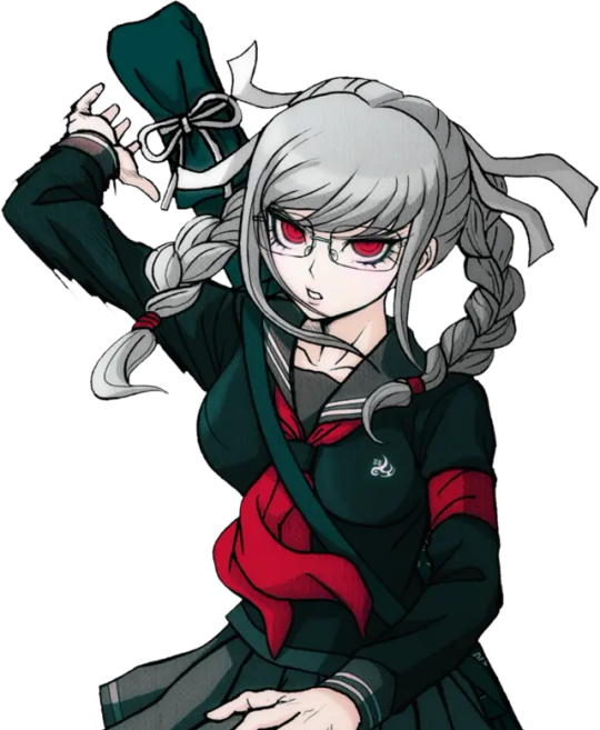
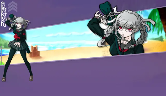
It would be improper not to do Pekoyama next.

Again, just like Kuzuryuu, I didn't notice half of these changes at first. Pekoyama's whole face is slimmed. The outer outline of her hair remains the same, but almost every outline inside of it, including her bangs, changes. (Although, her right twin-tail has a slightly longer end to it.) Her outfit receives minor touch-ups, including a clothes fold on her breast and darker shading by her collarbone. Speaking of, her neck muscles and such have been redrawn. Most interesting to me is the fact Pekoyama's outline is noticeably thicker with action lines in the original beta sprite, but lack them in the final sprite as if somebody used the magic wand tool to edit the background out, editing away some of the jagged black lines in the process. She is the only character where this happens.
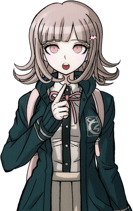
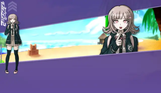
Since she is a major character, let's do Nanami now.

I wasn't surprised to find Nanami has virtually no difference about her. Her design was pretty much set in stone early on. That said, it's not entirely the same. Though very minor, the thickness of her left eye was increased at the top. As well, shading across her pinky finger was removed. There is also a chance her body is slightly bigger, but that's more likely to be a result of me failing to perfectly match up the two images.
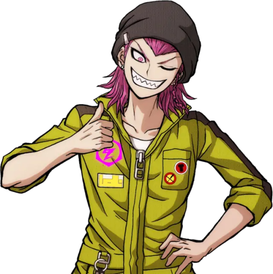
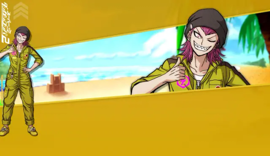
I want to focus on Souda now as he was the first one I did this test with.

You know, when I first played SDR2, I thought Souda looked kind of scary. His beta is even scarier looking! I can see why they changed it...Every detail on his face is redrawn including his chin, notably his pupil was enlarged and his eyebrows were quirked. Funnily, it seems the clip on his beanie was redrawn, but like Komaeda, they didn't edit the color layer to match the new outline. Some minor line art changes were made to his back hair. The lines for his neck and collarbone were lessened, and the jacket zipper is made more three dimensional. His thumb was fixed too, as well as the lines on his hand.
Also, here's a fun little thing I noticed while replaying SDR2 just a few days ago!

The sprite used for Souda in the Dangan Island opening is the exact same as the beta sprite! This would be the only time Westerners would catch a glimpse of some beta sprites until UTDP, as keep in mind, these wallpapers were exclusive to the Japanese Danganronpa website.
In fact, Souda isn't the only one with a beta sprite in the Dangan Island opening. I will also be covering that in part 4.
Moving on...
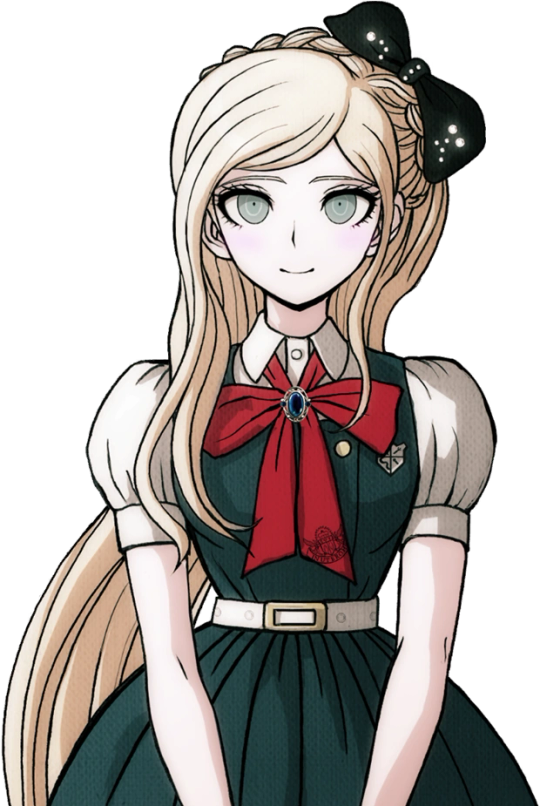
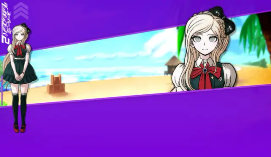
I guess it's only natural we look at Sonia's sprite next.

Changes like these ones are very interesting to me, because if you did not do a side-by-side like this, you may never see how many minor details were changed. A lot of Sonia's line art was redrawn to be more detailed, such as more lines in her hair, thinner outlines for her braid, and redrawn creases in her shoulders and bow (as well as a redrawn button). Her face is interesting as some very minor changes were made. Some detail is added to both ears (thicker outline on the right, changed line art on the left) and her left eyebrow is slightly edited. She was also given extra eyelashes on both sides. When it comes to such minor changes, it makes you wonder why they bothered at all. I wonder what the development looked like.
Anyways, please check the reblog for the second part! That's where the rest of the characters will be!
#hajime hinata#nagito komaeda#fuyuhiko kuzuryu#peko pekoyama#chiaki nanami#kazuichi souda#sonia nevermind#akane owari#gundham tanaka#nekomaru nidai#mahiru koizumi#hiyoko saionji#mikan tsumiki#byakuya twogami#teruteru hanamura#ibuki mioda#danganronpa#sdr2#;noxiatalksia#dr#;resource
111 notes
·
View notes
Note
which character do you think is the most sus and why
honestly i think everyone has at least one trait that makes me Wonder about them, so. i'm just gonna list those under the cut instead. i've gone over some of these in more detail in previous speculation posts, but i don't wanna just link to them for the 48545674567456th time, so consider this a spiritual sequel to that old ass conspiracy board i made. any links are to stuff that isn't readily available on the actual website. anyways:
wally:
do i really need to explain this one
okay i'm just gonna pick one of the less obvious things: have you ever noticed that his bio uses present tense the most? like after the little introductory blurb it introduces him as "wally is" as opposed to everyone else's "(x) was"? someone in my discord server pointed that out once and i haven't been able to stop thinking about it.
barnaby:
what little we learn about his relationship to wally from the website is Odd; both of their bios mention not only that they were best friends, but that this was stated Multiple times throughout illustrated pages and the like, as if someone was really desperate to impress upon people that These Two Are Totally Besties, We Swear. you'd think this would be a poor attempt to disguise there being some animosity between the two, but that doesn't seem be the case, either.
other than that, though, barnaby actually seems pretty normal - perhaps deceptively so...
frank:
has a first name that ends in a consonant and a surname that ends in a long "-ee" sound, as opposed to everyone else having a first name that ends in a long "-ee" sound and a surname that ends in a consonant.
is noted to have no canonical backstory; the only other character who falls into this camp is wally.
is an entomologist/lepidopterist (or at least an Enthusiast about those subjects) in a town where the only wildlife present seems to be bugs. this was first mentioned in an ask from 2020, so normally i would hesitate to put this here, but post-website launch concept art never shows there being any non-insect (or at least non-arthropod) wildlife, so i think it is Likely that this still applies.
there are Conveniently little to no notes regarding the construction of his physical puppet - all that the WHRP seems to have been able to confirm is that it did actually have a head-spinning mechanism.
julie:
hails from a cave in what is Explicitly noted to be the same forest that surrounds home; post-website launch concept art definitely seems to allude to there being something in those woods, or at least the general idea of julie wandering "out of bounds."
has the most detailed family background by way of her siblings having actual designs and names. her bio clarifies that they didn't live in Home, but no other characters with family members seem to need this clarification. is the implication that This level of detail for side characters is unheard of? then again, barnaby's mom also has a name and design...
can speak to flowers/plants, which definitely sheds a new light on whatever might be going on in this may 2021 concept art. i've seen a lot of people interpret the title of this piece - "liar!" - as an accusation from julie towards someone else (most commonly frank) but given that that the script linked in the february 2023 audition post establishes that julie is capable of lying about what a plant tells her for her own convenience, albeit in a far more playful context... who's to say that she isn't the liar?
sally:
her puppet is all but outright stated to have required more puppeteers than any other character.
having a character who's a playwright/director and whose house is built to resemble a mini theater in a story that relies so heavily on the fourth wall (or lack thereof) as a source of horror feels like a very... Dangerous combination.
some people have tried to draw parallels between her backstory and that of old testament satan, buuuut i'm not entirely sold on this. it feels a bit too outlandish even for me, considering that any remaining christian imagery seems to have been relegated Solely to wally and/or home.
her introductory blurb seems to have a nod towards poppy? "She’s a fire-cracker who is willing to let her imagination run wild in the name of a new adventure, albeit at the occasional expense of her more cautious neighbors." that aforementioned audition script Also all but outright confirms that this is about poppy, given her and sally's interactions there, i.e. sally trying to get poppy to come out of her shell by casting her as the lead in her next play and Clearly thinking very highly of her, but pushing her past her limits just a bit too far too fast. again, much like julie and lying, it's all in a playful context, but i wonder... sally, are you paying enough attention to your friends?
i could also make a joke about my sally/poppy agenda, but. i will refrain. for now.
poppy:
is the only walk-around puppet to not have a live-hand variant.
her puppet also apparently has no surviving photos of it? or at least not any photos of it in its entire eight feet of glory.
in a similar vein to the possible relationship between sally being a playwright and welcome home fiddling with the fourth wall so much, i feel like poppy being a recluse in a series where one of the Main Themes is supposed to be "what happens when a Home becomes just a House/what it's like to live in a decaying home" is a very convenient setup for horror - one that Excites me as much as it scares me. if something happened to her, i wonder, how long do you think it would take for someone to notice?
eddie:
his theme color, purple, is used very sparingly in his actual design compared to the rest of the cast and their colors - it only shows up on his eyelids and maybe the inside of his bag? even designs like poppy and howdy's make more use of their respective theme colors than eddie's. it being on the eyelids is an interesting choice, too, given the eye motif that's been present throughout so far. eyes are the windows to the soul and all that.
purple also makes an appearance just outside of his post office, in the form of a sprig of lavender with a butterfly on it - and, well. something about purple signifying secrecy/hidden truths, perhaps?
according to this post-website launch concept art, the only two clocks in the entire neighborhood are: A) the street clock between howdy's shop and eddie's post office, and B) the watch upon eddie's wrist. both also seem to share some design elements with him (and maybe sally?) - namely, the eyes.
and of course, his backstory. or rather, the fact that his backstory is so half-assed that it's a running gag that he can't remember his hometown and the most we know about his mom is that she has the same job and She Exists, Probably. like that's fucked up in the context of welcome home, right? we can agree on that?
howdy:
howdy is an adult and yet Not a butterfly. he never actually pupated he just got Bigger. this is never explained or addressed in-universe as far as we are aware.
and also this is in the presence of a lepidopterist, aka a guy who should Definitely be aware of the fact that howdy should have pupated by now. foreshadowing for a future point of contention? a future alliance, even?
howdy. the shipments. where are your shipments coming from howdy.
home:
much like wally, this one is so obvious that i feel stupid for even dedicating a bullet point here. just fucking look at anything on the website talking about or involving them. this house is All Unsettling Trivia.
imagine i am beaming this brian david gilbert clip directly into your brain whenever i discuss their relationship with wally until further notice
like i've said before, i don't think they're evil evil (or at least, not evil without reason) but i do think whatever they and wally have going on is, like, Not Healthy. they have codependent swag imo.
154 notes
·
View notes
Text
Underrated Vocaloid Events: Real Dreams 2015 and that Time Ko Shibasaki and her Vocaloid, Galaco Sung Together
Actually, in a response to this last post I made talking about more obscure vocal synth musical events, I'm in the mood to share that one time where I found clips of a Galaco holographic event and then went full Inspector Gadget Sherlock Holmes complete なネギ誠 for like an hour GHGHGHGHGH—
Disclaimer: Looong deep dive post under the cut! :O
https://youtu.be/cEc6B-r2wr8
It all started with me just looking for Galaco covers out of boredom on Youtube, when I came across this particular video which, up until this point, I hadn't heard a single person mention. Knowing the community's general opinions on Galaco and just how hard her popularity fell once people stopped talking about the whole limited edition aspect and "bland" cadence to her voice, my interest was piqued. This was a Vocaloid not only having a holographic concert (a big rarity for Vocaloids that aren't Crypton) but one of seemignly professional quailty too as it appeared to feature a human singer alongside her.
What also got me raising brows was the fact the video, at the time, was uploaded just last year with the uploader stating they thought "no one else posted this yet". With the old LAT model (which honestly has a super cute and flowy animation in the video as a side note LMAO) and the fact this concert didn't appear to have been posted anywhere else on Youtube despite it being years got me scrambling at this point.
I decided to dig some more. Soon, I found another concert video. I initially assumed to be from the same concert, since I thought something like this would be a one-and-done-thing considering Galaco's reception, at least in the West. But then I noticed something apparent in that the second video had an entirely different model. There was more than one.
youtube
Dude, you may as well could've called me a new FNAF fan because I was boutta go deep with researching what's going on.
I think I started with the second video, as it makes sense starting with the video that actually had a concert title in English one would be a lot easier in narrowing down the search.
Upon Googling the name, I stumbled upon a Japanese blog that appeared to document the event. According to the blog post, [Real Dreams 2015] was a concert both in collaboration and sponsored by the Nihon Kogakuin College, an integrated vocational school in Tokyo's special wards. Students from both the Music and Manga/Animation department worked to create the live performance and song, titled Prologue.
I honestly think this is really well-made! Especially considering the live performance timing; it's impressive what these people were able to do so cohesively together on something many argue is probably incredibly difficult and stressful even for people who clearly have done it for years now. The song and animation is just really nice, too. It just has this super chill, melancholic vibe. ;v; Honestly, it's a bop.
With one answer to the question solved, I returned to the first video that started the whole search. I decided to evoke some advanced detective skills by mollywhoppin the song name from the video, "トリノアイウタ(galaco ver )" straight into Google like I just gave it the most reality TV bitch-slap of the century before Sonic speed-dashing over to VocaDB to run it through there. I eventually came across a page which lists this song as the first track of an album, galaco SUPER BEST (2013). In the comments, someone by the name of STERN mentions a live performance, which, in translating some of the Japanese, reveals the name Ko Shibasaki (柴咲コウ). She is Galaco’s voice provider, which gave some confirmation that the woman may have been Shibasaki herself.
My next step was me deciding to Google both their Japanese names together. This led me to another website in Japanese that details the event.
Turns out, the event wasn't for Galaco, but more so to celebrate Shikasaki's 10th anniversary of her musical career and release of her sixth original album, Lyrical*Wonder. I'm assuming Galaco was featured as another landmark to acknowledge for the celebration. Either way, I translated the entire name of the performance into English, which came out as Ko Shibasaki Live Tour 2013 ~neko's live Neko Ko Ongakukai~.
Zoo wee mama!!! That’s a fuckin’ name drop!!! I did one last search with the concert name, and soon, finally, found a bilibili link showing the entire performance! You can watch the show here. For anyone curious, Galaco shows up 36:55 minutes in. :> The whole shows looks great, though!
Honestly though, it's super wholesome to see Galaco acknowledged somewhere, especially by her own voice provider with something as intimate as a 10th anniversary and a duet. ;v; With how many VOCALOIDs we got from the V3 lineup whose voice providers seem to just not mention them anymore (although please correct me if I'm wrong; I know some do but it seems the majority doesn't), this is a heartwarming exception. ;v; Especially since Galaco seems to have shouldered a lot of mixed to downright negative opinions from some people. And while they obviously have all the right to not like her voice for any reason, the fact that she seems to have been so dearly given some attention somewhere is cute, lol. 3v3
And, all Galaco rambling aside, Shibasaki herself is a good singer. She has a unique cadence that can carry both powerful and soft, souful tones while still retaining all those good qualities of her voice. If you want, I'd definitely suggesting checking into some of her songs. :0c
Man. My search was over. Holy shit. We did it boys. Smooth brain is no more. I have slaughtered Jimmy Neutron, Megamind, and Eggman with my sheer IQ alone.
I know this is the most niche thing and took me like 500 paragraphs to explain it, but I just love talking about these sorts of things, lmao. If anyone wants to see me talk about more things like that, I'll definitely keep that in the back of my noggin so I don't like, get embarrassed and back out by some chance in the future, lol.
Thank you so so so much for reading this huge explanation post! I really appreciate your time to read all this!!! \3v3/ It means a lot, haha.
7 notes
·
View notes
Note
I follow you on twitter and from what I've seen you like Latin? And I just wonder why? My four years of Latin class were absolute hell but I love languages so maybe I'm too biased and I'm actually missing out on a cool language
Dear anonymous,
I do not like Latin. I adore Latin with the passion of Catullus’ poems and the same pathetic pining.
Latin is not easy fall in love with, but when you learn to adore it, it brings you more than just one new world.
I am not an expert in Latin considering the historical side, since my teacher that taught me from sixth until tenth grade did not touch ancient history much, while my teacher in eleventh and twelfth grade was a radical catholic priest that preferred to criticise Roman authors on our curriculum for their stories about orgies, openness about sexuality and general indulgence in life (honestly, we are talking about Latin. Come on. You really shouldn’t be surprised) and hated me for being the only atheist in class. So for any information on history, I’d recommend you one of the excellent ancient history blogs on this website. Also, look up Greek history as well because as far as I know, linguistic and cultural kleptomania of all things Greek was about as hip in ancient Rome as were ideas of conquering the entire world (and the word is Greek, too).
That being said, English is also not my only language, so I had an idea about what more extended grammar was expecting me. And that was a blessing. Now, I’m not saying that English doesn’t have difficult grammar at times - I learned it as my second language, and the start is always rough. But let’s face it: English has one article (the), nouns barely change when put through different cases, the list of irregular verbs is short and even with an at times confusing syntax, tenses are built on a few existing verb forms, and your verbs only have two different suffixes to mark person and singular/plural (-s for he, she, it or none at all). English is also the mad scientist trying to attain immortality of languages because it has puzzled itself together from parts of other languages and a huge part of it (at least one leg, the jawline and probably the nose that it keeps putting into other languages’ businesses) is rooted in Latin.
Latin... has a different word ending for nouns in every different case. It has five cases compared to English’s four, and if you add in prepositions, the real fun starts. I can’t go into detail here because I’m here to convince you and not deter you from the language, but Latin means memorizing and sometimes more so than in English. Skipping the grammar or not learning all of it? Not an option. And let me tell you, I was a tutor for Latin for a little while, and nothing - no translation - will yield to you and open up under your fingers if you do not know your grammar.
But here’s the thing, my friend.
Latin is not only beautiful and brutal with its ancient works going from light-hearted shenanigans to heartbreaking love to gods so grand and wars so terrible that we still shiver before them today.
Latin feels like home.
If you can read this post, then you know English. I don’t know what other languages you speak, dear anonymous. But our world is veined with Latin. It flows in our science, in art and literature and I cannot imagine an earth where Latin has never been because history, culture, nothing would be the same. Learning Latin is coming home because it’s always been around you, waiting for your call, for you to reach out for it, back in centuries and across time.
They say Latin is dead. I say, you can’t kill something that’s immortal and has more than eighteen different words for “to kill”, but never bothered to create something that means “yes” or “no”. Latin is not one old god but many at once and nothing can kill an army of old gods.
And then, its literature and art, its entire heritage, is so varied.
Latin can be sophisticated. It can be scientific, poetic, funny, witty, short or long, and you can have it because it’s probably already in your life.
Not to mention how many other languages will whisper your name as soon as Latin walks by your side. Spanish, Italian, French, Romanian, Portuguese, and don’t get me started on all the loanwords in English, German, Dutch...
I can write about Latin for eternities, because I burn for this language more than I do for real people, but let me show you how much Latin you already know, and how lovely it is.
You know audax because you know what brave means. You know bellum because you too have waged war and been a rebel. Maybe you’re afraid of beasts, but you know that they are all only beastiae, only animals inside. You care, so the word carus comes to you as naturally as those dear to you do. You’re not always strong, but fortis waits for you in comfort and effort and fortitude, so choose what you need. With ignis, you become fire. With mors, you take death out of immortality.
In conclusion: Learn Latin and be the the warrior of art, science, literature, culture, history and languages you want to be.
256 notes
·
View notes
Note
Hey! I'm going to start my programming job (entry level software engineer) in the summer and I'm honestly nervous. From your post I think you're also a computer science related career? and I was wondering how is a programming job as oppose to school?
Hey anon! Yep, I took computer science in college and I’m currently in a software engineering job. I’m not sure how school is where you’re from; my university (I’m from the Philippines) focused on a lot more theory/math than practical programming skills back in college, so for me there was a big difference when it came to a programming job.
I freelance and delve in web development for a company product so I’m not familiar with other programming options (there’s game dev, embedded systems, etc) so I can only share my experiences on that.
If you ever freelanced and made websites for people, it’s pretty much the same but with better benefits and, hopefully, better people and better workflow. If you can work on a small project on your own, just imagine doing the same but on a bigger scale and with a team.
I find that the biggest variable would be the type of company you’re in. If you’re starting out as a junior developer and you’re in a good company, your team should be able to mentor you. It can be intimidating at first, but remember: these guys know they hired you as a junior developer. They know your skill level so don’t get caught up with expectations. Just learn everything you can from them. If there’s an onboarding process, great! Otherwise, they will probably give you small tasks/bug tickets first so you get familiar with everything, then you’ll eventually work on bigger stuff.
Unlike in college where you would have the specifications down to a T, the specs you’re working on in a company can change very easily so you have to be a bit more flexible. Again, if you’re in a good company, they should have an established workflow that will help you be more organized and get around these changes better (we use kanban but some use scrum, depends on what agile buzzword your team likes). If there’s one valuable thing you’ll learn working with people, it’s how to be more productive and organized.
There is no “perfect“ program. Programming is just a tool to build the right product for the users, and sometimes those user needs change, which means your code needs to change, and that’s okay. Sometimes there will be bugs or new features, and sometimes those new features mean making changes to old ones. You’re always doing something new.
You’ll most likely work with a team, which means half the time you’re reading someone else’s code. Again, if you’re in a good company, there should be company coding standards to follow so not everything looks like shit. If you’re in an older company, be prepared to touch legacy code. Don’t be intimidated if it takes a while to understand everything - I don’t even understand 10% of our codebase (it’s just so massive). You really just need to understand what you need for the moment. Learning the codebase takes a lot of time. It’s normal.
If your company has a code review system in place, you’re in luck. Your code will get a lot of comments for improvement, and you won’t be able to comment on other code for a while since you’re working on improving your own code sense. And that’s okay. It will feel like criticism - and it is - but eventually those comments will lessen and you will come out a better programmer. If you’re interested in improving how you code, I suggest reading Clean Code by Robert Martin.
And because you’re working with a team, it really helps if you: take an interest in the product you’re building, and work on communication. I cannot stress this enough: programmers are not that great at communicating. You need to be able to communicate tech stuff with fellow developers, but you also need to abstract the tech details and talk product with your PM or client. The latter usually isn’t a major concern at an entry level job, but it really helps if you ever find yourself negotiating your specs (like if the deadline for the engineering work is unreasonable, you have to be able to explain it in a way a non-tech person can understand). This goes the other way as well; sometimes other people will have trouble communicating with you, so keep that in mind.
Still, even if you’re working with other people, you will mostly spend time coding alone. So work on those self management skills!
My biggest advice would be to always keep learning! So many things change in the technology landscape, so learning is really part of the job. Those theoretical things you learned in college may or may not help you depending on the nature of your work, though personally I think that solid theoretical foundation really helps with the learning part of the job.
There are probably other stuff, but this is getting too long. Software engineering is really about making a great product that will benefit people, and even though it requires technical know-how, it’s still about working with people, for people (and capitalism, unfortunately).
If you’re in a company that doesn’t have that good of a work environment (I’ve been there) just learn all the don’ts and you’ll have a better idea of what kind of work environment you’re looking for in your next job. There’s a good book on this for software devs called Peopleware by Timothy Lister and Tom DeMarco.
At the end of the day, it’s still coding, and coding is the easy part. If you’re already good at it, you’re golden. Otherwise, it’s okay; learning how to code well is part of the job. Learning, being part of a team, managing product specs to better fit the needs of clients/users, and reacting to change is really what you should take away from your first programming job. You can easily learn how to code in C on your own, but those other skills are invaluable, and surprisingly not a lot of devs are good with soft skills. My last book recommendation on this aspect is Clean Coder by Robert Martin.
(My book recommendations aren’t mandatory obviously, but I found them helpful if you really want to pursue software engineering as a career and want to work on your soft skills).
I really hope this was helpful in any way anon! This ended up longer than I expected. If you have any questions, I’m happy to answer them!
1 note
·
View note
Note
Hi Guppy! I'm May, an Admin for CHVRCHESrp. Would you be willing to give us an opinion? Thank you for your consideration!
I’d be glad to give you an opinion, May! DISCLAIMER - everything said in this is just an opinion, if something seems insensitive I’m just trying to give my opinion honestly. Alright, let’s start with the icon (which I can see as the favicon on the blog). From what I can make out it is a wing with text over it. I think that you could take out the overlaying bar of text, and just write the initial of “churches” as a “C” in a dark colored, bold text over the wing. This would make icon much more simple and clear up what it is. Now for the main theme, I like how simple it is, but the detail of the church in the header, and the white, gray, red color scheme makes it feel heavenly or even hellish with the red. The only thing that bothers me is the embossed stroke effect and the transparent red. I would prefer, personally, for it to be a darker, straight, non-embossed stroke that is closer to the maroon you have set as an incorporation of you color scheme already. Red is such a difficult color to work with in graphics, and it looks a lot more professional and beautiful (to me at least) when it is a darker maroon/deep red, and when it is not embossed out. Otherwise, the theme is very organized, I think you could shorten your timeline (even though it does show each of the milestones of the story, maybe there could be a better location where they’re listed?), this also applies for the event dates, because it goes all the way back to 2016, which it’s always nice to update and keep things tidy with spring cleaning. You could always create an archive sideblog that has a page of events and what occured, the progression of the storyline, and leave the main to the most current updates and upcoming/past events?
For now I’ll be talking more about the plot of the rp, the organization of information, and pages that contribute to that. Your navigation is very well put together, and I think all the links are very fitting. It allows players to click through links for every step of the rp. Now to touch on the plot, which I love that you’ve separated it into seasons. It gives a full detail of what has happened, and lets new players in on what’s happened in the past. While the plot is very interesting and full of details, it does feel a bit diluted. By that, I mean that there are so many details and characters to keep track of that by the end I had more questions than answers. I think maybe before the plot (in another tab section) you could have a list of terms, people, and character information that is important to understand the plot. For example, it would’ve helped to clear up if Lucifer and Satan were the same person because I did not understand that well. And also, because the characters were very specific to the group, it would have been helpful to add their descriptions beforehand so I wouldn’t have to go searching through the blog for their information/bios/players. Another question I had was about the Church of Saints and Sinners. I’m guessing from the names that the Saints revere the God that died from illness/angels and that the Sinners revere Satan/Lucifer/demons, but this is something that is not made clear in the plot. Or if it was made clear I missed it. You have something really good going for yourself because the plot is very original, but I feel like it was a little confusing to follow or understand some points that are not gone over in much depth. I should be able to understand most if not all the rps components without having to go onto several different pages. However, your powers page helped me gain a lot more understanding with each of the character types and how they fit into the story line. I still think it would be worth it to add short summaries at the beginning of the plot, so if you happen to click the plot first, like I did, you won’t be confused continuing to go through the links. Similar to the power types page, the churches page gives more information, but still I want to know if they worship a specific deity in each of the churches, that is still unclear to me at least. Continuing on, I love this unique style of Events and Tasks you’ve created, as well as the way you’ve developed your point system. I’ve never seen this done before, and I applaud the admins on this idea. Nothing bad to say there. Your page for characters is also very organized and easy to get around. I like the way the page is set up so that the players will have plenty of open opportunity to develop their character because there is no full restricting bio, but the characters still have pieces that make them standout! I can say nothing bad about the characters. I like your use of diversity in faceclaims, both underused and frequently used.
Let’s talk about the rules and the application. I’ll start with the application, which . For your rules, I think that you should move this rule “Once accepted, please adhere to game canon, including bios, posted information, and your accepted application,” into it’s own bullet point. It doesn’t quite relate to the section before about the OOC blog. I also think it would be nice to move the OOC rules you have on the checklist over to the main rules page anyways (that way it’s note broken up and if it’s left in the checklist it’s just an important restatement of the rules). If more of the OOC rules were on the main rule page, I think it would feel a lot more complete, otherwise all your rules are very clear and helpful to players. I think the application is fine, too, it’s in basic form!
I’ll wrap this up with the other pages and sidenotes. As for the checklist, it was very nice to include all the needed links. It’s also very organized, but I still think that the OOC rules (and even maybe the IC rules) should just be on the main rule page. That way it keeps everything a bit more organized and, unless you’re restating important information to the players, makes it feel like less information to sort through. This is more of a sidenote, but I see that your main tag to track is just “chvrchesrp”, which makes sense to keep everything in one place, but it’s a personal thought that it might get cluttered with starters, tasks, activities, admin posts, etc., and therefore get very hard to sort through. So, it might be nice and more organized to develop separate tags for specific information. And let me know if I just missed the other tracked tags, but I swear I went through your navigation several times for a page! Otherwise, checklist looks good. I really love the cohesive themes from each of the pages, I think that the locations page is really lovely, the way you set up your masterlist is wonderful, too, and I like the admins page which gives us more detail into you as admins. The only page that I take issue with is the weather page, which while an important detail seems insignificant and like something I, as a player, wouldn’t want to have to go into the navigation to look for it. I’d suggest replacing that page with something else, and just adding another sidebar place with widgets you can just incorporate into your theme. If you end up going through with this idea of moving the widget to another section of the main theme, I can suggest a few websites for that. Otherwise, the worldbuilding you’ve created is relevant (especially with the other blogs of the radio, the musing blog, and so on). This is just another personal sidenote, I think you should call the “customs” tab on the navigation “custom roles”, take it off when the roles are all filled, move the link to the top of the application/rules, or possibly something else? When I first read it I thought it might be some kind of etiquette or traditions section of the blog, but I was surprised to find out that it was actually targeted towards player-created characters.
So, before signing off, I’ll give my final thoughts. I think that this roleplay is fixed up with extremely dedicated admins who have most likely spent days and restless hours trying to formulate each piece of this roleplay. For that, I commend you and congratulate you for keeping a roleplay open for this long and for creating a unique property. The main points I struggled with when going through the blog is just how complicated it seemed and how much information there was. I am the kind of person who gets overwhelmed as a new player if I join in the game a bit late, or it there is already a lot that has happened. So, I think that the plot and the terms and keeping track of all the pages did become a bit engulfing and overpowering. So, I think it would be very, very helpful, if you as admins kept the main page as organized and tidy as possible, it would help new players feel more comforted in joining and allow old players to more easily look through past accomplishments. I had so much that I really didn’t get to talk about in this opinion, but I hope what I focused on helped to organize my thoughts a bit more and got through to the admins.
1 note
·
View note
Note
I feel bad for repeating that other anon, but if you could do the exact same in-depth detail for monster high, that would be "clawsome". Also, no pressure, but if you have free time, I'm sure literally everyone in the monster high fandom would love it
don’t feel bad, i love infodumping about my special interests!! if i can help more people get into them then i feel accomplished
monster high was created by garrett sander, and introduced in 2010! it’s probably pretty obvious but all the characters are the children of different iconic/legendary monsters, and they all go to high school together and have slice of life adventures. and there’s lots and lots and lots of terrible monster puns so if you dont like puns then just give up now
these are the main 6 characters + a few more core people and some backstory if they have any! (bc some of them do not have backstory but thats ok it just means more headcanoning)
frankie stein - frankenstein’s daughter, and also the MAIN main character, and usually one of the two faces that people think of when they think “monster high”. she is probably one of the sweetest characters in the entire show and has relentless optimism, and would die (and has died) for her friends before. she had only been alive for 15 days before MH canon started, and thus hasn’t been exposed to many things yet, so she loves trying new things. she’s adorable and i cannot believe some people don’t like her/call her boring, because she is a ray of sunshine
draculaura - dracula’s daughter, and is the OTHER face ppl think of. she wears almost exclusively the colors pink and black (with some exceptions for blue or yellow sometimes). she’s very peppy and uses a lot of words like “totes!” in speech. she’s 1600 years old and her biological parents are both dead now, she was adopted + turned to a vampire by dracula himself because he was in love with her mother. she is the main character in the reboot instead of frankie
clawdeen wolf - a werewolf and the resident fashionista (well, they all kind of are but she’s the one that wants to go into the fashion industry). she’s got SEVERAL siblings, and we only saw 3 of them in the preboot but we know there are many more; growing up with them has made her develop an attitude. but she’s SUPER loyal and would do anything for the people she loves. she’s ride or die and i love her
lagoona blue - a sea monster, BEYOND chill and friendly, seriously she is the kind of person to make you feel like you’ve been friends with her for years even if you’ve only known her a couple days. she’s on the swim team and she got way way too many bad plots with her boyfriend gil later on in the series so i feel like she didn’t get as well-rounded as the other mains, but i still love her to bits
cleo de nile - a mummy and also the HBIC of monster high. she’s the fearleading captain and she takes a little bit to warm up to, but once you get on her good side she is a wonderful friend. and it doesn’t take much to get on her good side, just be a decent person to her. she’s been through a LOT like her dad is straight-up abusive and manipulative, and her sister terrorizes her and her friends, and she was separated from her loving mother for most of her life so honestly i cannot blame her for being a rude person. she’s my favorite i love her so much
ghoulia yelps - a zombie and the brains of the group (ha ha), she is literally a superhero or something i think because she can do anything, she literally hacked the mh version of youtube a few times. she doesn’t speak english, only zombie (which sounds like a series of groans), her favorite thing in the world is the comic series called Dead Fast, and the whole fandom loves her and for good reason. she doesn’t get enough screentime OR dolls, and she hasn’t shown up in the reboot media yet. she deserves so much
deuce gorgon - medusa’s son, and one of the most popular dudes at school, cause he’s super friendly and nice. he’s quiet sometimes but when he does talk his sentences usually have the word “dude” in them. he sees good in everyone, and he was dating cleo before canon began and she had developed as a character/became less mean, so to me that shows how genuine both of them are with their feelings. i love him too but people often write him wrong, they write him as all stoic/annoyed by everything but he’s honestly a dork and probably the most genuinely nice boy in the series
abbey bominable - a yeti who has trouble understanding non-yeti societal norms. she can come across as cold (ha ha) but she doesn’t mean to, she’s just not good at emoting or communicating, and speaks very literally. the others understand this after getting to know her and accept her and love her just as she is, which is part of why i love monster high so much. she is also very strong and can lift a car. i thought that was worth mentioning
heath burns - a fire elemental and very, very impulsive and reckless. he gets himself injured a lot; the hospital even has a seat in the waiting room with his name on it. he’s also super flirty and speaks without thinking, but honestly? he means well. i love him and also at one point he wore a skirt/heels and OWNED it and nobody laughed at him
there are several more characters that i could write more paragraphs on, but this is getting long enough as it is so if you wanna know more about more characters shoot me another ask and i’ll be glad to tell you!
this IS a merch-driven franchise, but that isn’t a bad thing! the dolls themselves are SO cute. just look them up (i dont wanna include images in this long post) but they’re so cute oh my god. there’s nearly 700 of them now i think? and you can use this website to help you get started on your collection/help you keep track of it! i honestly use it like…every single day https://mh-merch.com/
as for the media itself, i have already written a big thing about it and how to go about watching it in [this post], but i will now talk about my favorite movies in chronological order in case you want recommendations. these wont be in-depth analysises
new ghoul at school - this 20min special gets a lot of flack but honestly? the plot itself is so so good. it avoids the typical “protag girl steals jock bf from mean girl” cliche and turns it on its HEAD. REVOLUTIONARY. this special is on youtube but not netflix i dont think!
scaris: city of frights - i think part of why i like this one is that most of the core characters are present for it, and it’s centered around clawdeen and she is SO good in this movie
13 wishes - everyone pretty much agrees this is the best mh movie period. it also has a lot of core people, the plot itself is SO beyond clever and unique, and i can’t think of anything bad about it?? this is what i always recc to people for their 1st mh movie
boo york, boo york - ok listen this movie is OBJECTIVELY a mess because there are 2 entire singing voices and the pacing is weird but i love it anyway it holds a very special place in my heart. also i think this is the preboot movie with the best animation, it’s gorgeous and please watch it and embrace its campiness and jam to pharaoh’s (w)rapping
the reboot does merit mentioning; it started in 2016 and began with the movie welcome to monster high, and the two movies out for it so far are honestly fun but they are nothing like the pre-reboot. you have to watch the reboot with the mindset that it is an alternate timeline to the preboot universe, instead of having it completely erase the preboot! they exist in side-by-side universes in my head
in the reboot, instead of monster high being an already-established school/having monsters live in big communities and towns, monsters are in hiding because the humans are scared of them. draculaura and dracula lived in their mansion for several years to hide, but through a series of events which i will not summarize here bc its a lot, they build monster high in their mansion, and get other monsters there to be students!
but that’s all the basic stuff i can think to mention right now, there is SO much more to talk about since there are 70+ characters and SEVERAL plots and also my numerous headcanons. if you have any more questions about anything, don’t be afraid to ask me!! i love talking about monster high so much
#deuces paragraph got cl.eucey but what did you expect#its ME#long post -#text heavy -#Anonymous#mh reference#reference
29 notes
·
View notes
Note
Help. I'm an Army. I get there's tension or something between Armys and Exo fans (I'm sorry, I don't know the fandom name), but I'm beginning to want to get into Exo and I have no idea where to start, honestly. Do you mind giving me a little run down on the members of Exo and their personalities? The websites I've looked at give me all pretty generic information. Do they have a show or any good interviews you recommend? Thank you so much, I hope you have a wonderful day! ^^
i started replying to this and accidentally exited out of the page :,) so i gotta start over l m a o
welcome to exo!! the fandom name is exo-l. i would honestly just ignore the tension between armys and exo-ls, cause it’s dumb and fandom wars are a waste of time. but most of us are pretty nice and like bts as well (including myself)! ❤️ i’ll put some info under a read more!!
i do have a p lame exo powerpoint that i made ages ago here, it has all the members and yes, it is old and outdated. but it’s a decent place to start if you want some basic info about the members. i would go into details here about the members, but honestly, you learn best just by watching their interviews and videos. there are some video compilations here and here, and most (if not all) of them should work and have eng subs (if they don’t, just google the name of the show and there should hopefully be some links that work). there should also be a playlist in the first compilation that has all of their music videos!! as for specific videos, i do recommend watching exo’s showtime (that’s a link to the first episode, there are 12 of them), since it’s just full of Iconic Moments™ and a lot of the jokes in the fandom are based off that, and ask in a box (even though it’s kind of old, it’s still cute). i also encourage you to check out their solo releases, such as lose control, curtain, and hey mama! (which is from the first exo subunit, exo-cbx). and finally, check out these performances!!
el dorado in seoul
sabor a mi
thank you for coming to me and asking me about this, it’s honestly kind of flattering?? i know i’m probably forgetting a lot of stuff and i’m sure that if you look around on tumblr, you can probably find a better post than this (since i’m lazy and still haven’t watched everything myself lmao), but i hope that this was at least a little helpful!! ❤️
3 notes
·
View notes