#i'm calm i'm calm
Explore tagged Tumblr posts
Text
FOR HEAVEN'S SAKE IF YOU DECIDE TO BE CRITICAL OF A FIC IN YOUR BOOKMARKS THEN MAKE THAT SHIT PRIVATE, NO ONE WANTS TO SEE IT
#i swear#the number of times i went into the bookmarks of a fic#and saw some smartass decided their critique and their unsolicited opinion is SO IMPORTANT AND IRREPROACHABLE#that they decided to plaster it on a fic where the author can see it but can't remove it or reply#TAKE THAT SHIT INTO THE COMMENTS IF YOU HAVE THE BALLS FOR IT#like do whatever you want in the bookmarks but make. it. private.#the author who writes for fun doesn't want to see you shit all over their hard work#the readers don't want to see you shit all over the story they adore#what makes these people think THEIR opinion is this important oh my god#BUT IF YOU DO THIS SHIT FUCK YOU AND YOUR ENTIRE BLOODLINE#IF YOU THINK YOU HAVE ANY RIGHT TO SHIT ON SOMETHING MADE BY AMATEURS OUT OF PASSION#AND SHARED WITH YOU FOR FREE OUT OF THE GOODNESS OF THEIR HEART#TAKE THE SPATULA AND DO IT YOURSELF IF YOU WANT SOMETHING DIFFERENT SPONGEBOB#oh my god#i'm calm i'm calm#anyway#i have started leaving nice little comments in my bookmarks so that there's an easter egg waiting for the author when they take a look#and it's for this exact reason#because there are assholes out there convinced they're the main character of life#ella originals
7 notes
·
View notes
Text

A WILDCARD IS ACTIVE!
#skizzleman#mumbo jumbo#wild life smp#wlsmp#life series#trafficblr#dapper duo#mcyt#(I'M NORMAL I'M CALM I'M FINE)#fanart#digital art#waveleoart#scopophobia tw
8K notes
·
View notes
Text


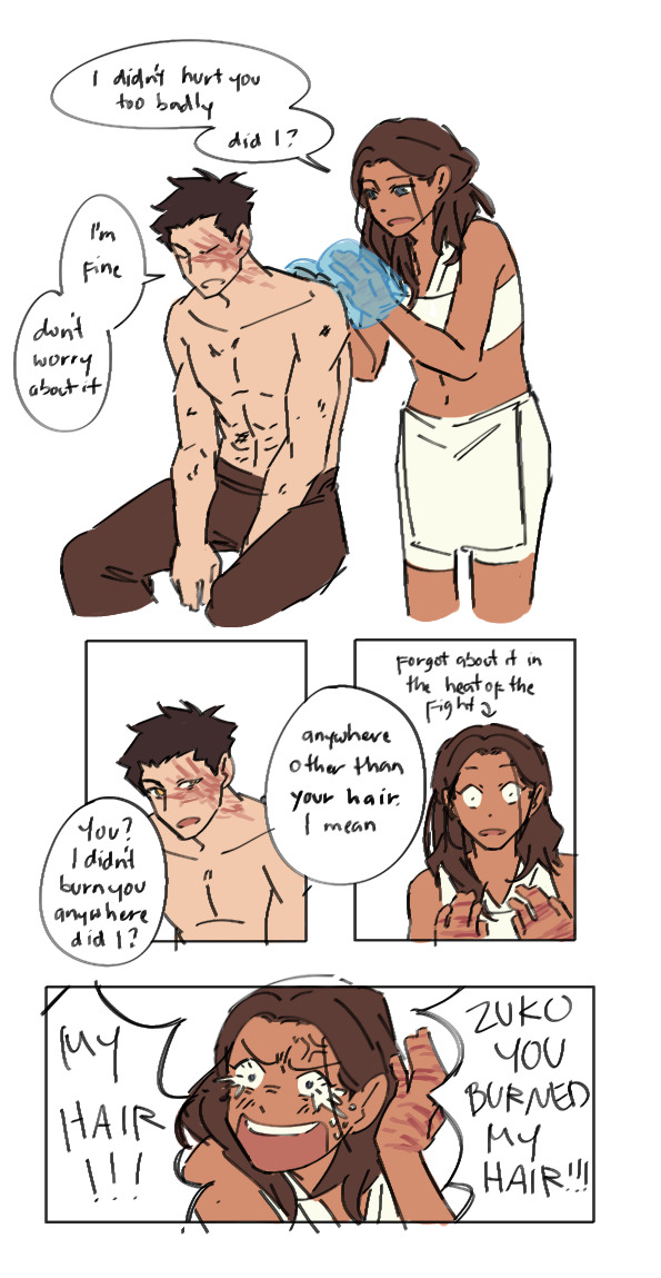
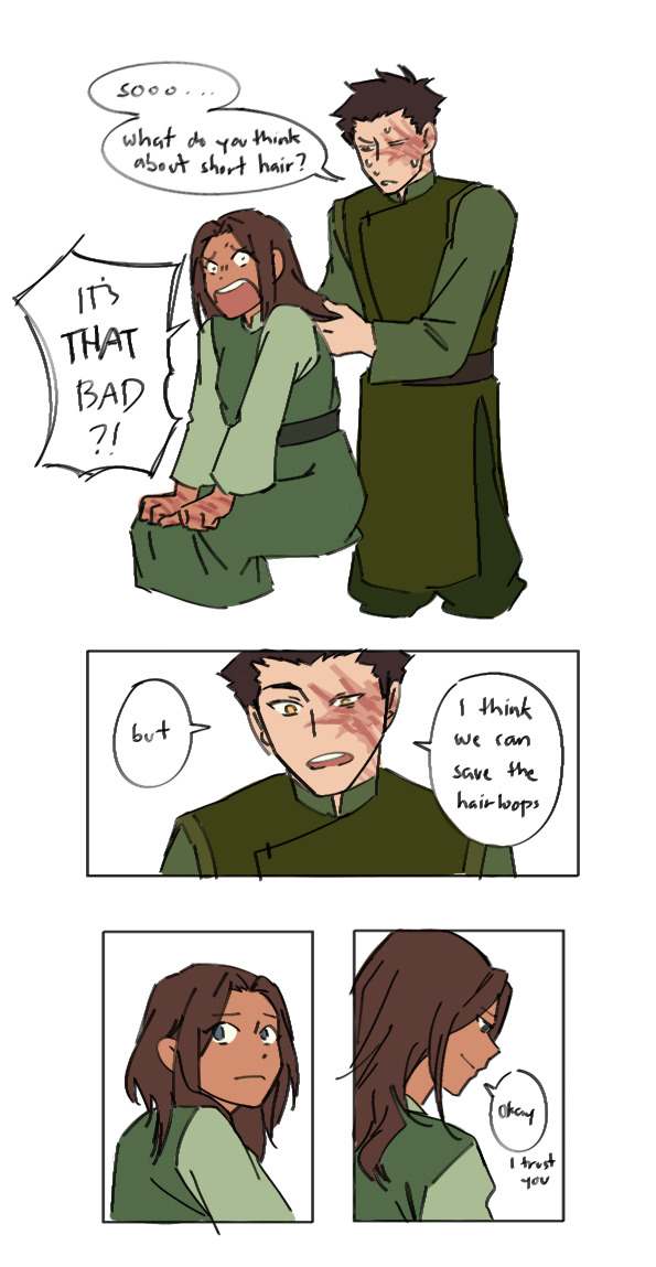
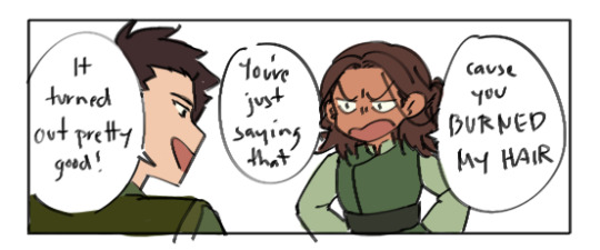
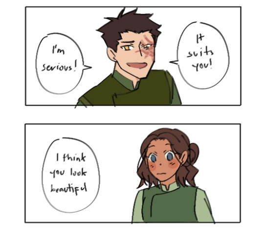
Book 2 au: sparring sessions and short hair katara
They like to have sparring sessions in order to keep their bending skills sharp. They allow themselves to go all out and not hold back at all cause they know if anyone got hurt, Katara could just heal them
But anyways, wouldn't it be kinda funny if Zuko accidentally burned Katara's hair tho? Aofkqldkkajfjd
The "I think we can save the hairloops" line is from @linnoya-writes thank you for that!! :>>
#zutara#zuko#katara#atla#book 2 au#my art#i mentioned in my last book 2 au post that i wanted to include short hair katara into it and y'all were so supportive of it!! 😭😭😭#so this is how i think it would go#it would happen as katara is trying to evade one of zuko's fire balls#she manages to avoid it but since her hair is long it still caught on fire#she'd be pissed so she water whips the hell out of zuko#and then promptly forgets about it akfhkakdkakdj#even after the sparring session she still hasn't remembered cause 'oh no zuko's in pain i have to help him!'#it isn't until zuko even mentions it that she remembers#zuko thinks she's more calm than i thought she would be after burning her hair so he mentions it to her#little did he know katara just forgor aldjlakdkaljd#n e ways zuko does feel bad so she offers to help fix it up for her#i think after the haircut katara would find herself looking in mirrors when there are any around cause 'zuko thinks i'm beautiful?? really?#zuko doesn't know this tho and he thinks katara is till sad about the unwanted haircut so he keeps telling her that she looks beautiful#and katara just keeps losing it aldjlakdlald#in conclusion they are idiots your honor
7K notes
·
View notes
Text
"Hey does anyone here watch FCGBDX? I can't recommend it enough you should watch it! I really love what they did with HS and MPS, if you ship Gasbutt we've got to talk" WHAT IS THE FUCKING SHOW. DO YOU HAVE ANY IDEA HOW MANY GODDAMN ACRONYMS AND INITIALISMS THERE ARE?
WHAT THE GODDAMN FUCK ARE YOU TALKING ABOUT!?
#BIGGEST GODDAMN PET PEEVE OF THE FUCKING CENTURY#ENOUGH ACRONYMS#IF YOU DONT PUT THE NAME OF THE SHOW AT LEAST IN THE TAGS I SWEAR TO GOD I WILL COME INTO YOUR ASK BOX AND STRANGLE YOU THROUGH MY KEYBOARD#HOW HARD IS IT TO JUST LET PEOPLE KNOW WHAT THE FUCK YOU'RE TALKING ABOUT??#TELLING PEOPLE THEY SHOULD WATCH THE SHOW BUT NOT ACTUALLY TELLING ANYONE WHAT THE SHOWS CALLED IS VIOLENCE#rant#I'm calm I'm calm
0 notes
Note

I kidnapped ur long-nosed cat for a sec
.
#last year you said that “dude looks like he's been betrayed in all past lives and is to be betrayed in all lives to come”#and it has become one of the defining descriptions of Machete in my head#I think about it frequently#you captured him so delicately here#almost like an old oil painting#or weirdly enough the color palette also reminds me of chalk on a blackboard#and I appreciate the big angular pink-tinted goblin ears#and the smooth gradient of his snout#I like the nuance of his expression he seems calm but kind of melancholic#thank you! your rendition of him looks so classy and refined ;-;#gift art#awkwardosthe3rd#Machete#own characters#I can't paint digitally at all so whenever I see someone making it seem so natural and correct and right I'm like#floored#people are making such nice art of my goobers I have no choice but to curl on the floor like a dead bug
2K notes
·
View notes
Text
Sometimes at work it's not my place to tell people the things I want to say, and I find I often go home at the end of the rougher days to stand blankly in my shower and tell myself over and over what I wish I could pass on.
This accomplishes very little, and mostly just gives me a tension headache, but through it all I think I've narrowed myself down to a few solid things I'd like to tell people the most.
You can't change people. Not permanently, not for anythig. You can support them, encourage them, love them, give them tools and opportunities and resources, but you can't make them change. They can change themselves if they want to, but they have to want to, and they have to want it for themselves, because they're the only one that's certain to be with them forever.
For better or worse, you make your own choices, and blaming bad choices on others doesn't only work to absolve you of responsibility- it also robs you of control. Because if you say you only did something because I did something, then you arent only shifting blame- you're admitting that you cannot control yourself, that you cannot truly make choices for yourself, that other people can control you- and as long as you truly beleive that, you'll keep facing the same problems over and over. You'll keep letting others dictate your choices, because you'll beleive that they can, and you'll never be free.
White knights on horseback are from fairytales. Nobody can help you if ou're not willing to help yourself. To try, to put the dirty work in, to belive you're worth that effort- Act as though nobody is coming to save you. From a struggle, from pain, from bad relationships, from yourself. And when you do save yourself, because you will, because failure here isn't an option if you want to survive, you'll never find another dragon that can keep you prisoner.
Don't say anything to anyone that you wouldn't want them remembering forever.
Doing the right thing in bad circumstances is hard. It's the hardest thing. But if you make the choice to do that hard thing anyways, despite your fear, you'll go on the rest of your like knowing that you're the sort of person who did something.
The present only seems the hardest because the past I over and the future hasn't happened.
There's so much joy ahead of you, the kind you can't possibly understand until you see it yourself.
The responsibility of consequences is often disguised as the power of permission. "I won't do this if you help me", "I'll work on my anger if you do this for me", "I promised you I'd quit, but can I have just one?". The unspoken question is, "Can it be your fault if this goes badly?"
You cant make someone love you the way you need to be loved. Someone can love you very much and still be bad for you, even if you love them very much in return. Two people can love each other very, very much, and try their very best, and still be wrong for each other.
Sometimes being near to someone changes you, even in good ways, and the people you become don't fit together as well as the people you were.
Caring takes work. Even if it's real. Especially if it's real. And the most important gestures aren't the grand, poetic, songs-and-flowers-and-tears moments; they're getting out of bed even though you don't want to. Paying attention to things you don't enjoy. Scrubbing pans, or opening a window, saying "thank-you", or helping carry groceries into the house. The small things fill the big things- without the small, boring, mediocre things, big things feel hollow.
Thrre is honour and dignity in humble work.
If you are a cruel and spiteful person, then you will find every place you visit to be full of the same cruel, spiteful people. This is not because the world is as cruel as you, but because everywhere you are, you will be disliked. This is the curse that comes with being persistently cruel and spiteful.
If you are a kind and ppsitive person, you will repeatedly encounter kind and positive people, because as they grow familiar with you, they will be happier to have you near. This is the reward of being a kind and positive person.
When splitting paths with loved ones, briefly or forever, aim for your last words to always be "I love you".
#I'm still so young and ignorant#but I wish someone had told ME these things before I had to learn them#And now when shit goes south and everything is over and calm again the same things just roll though my head#Over and over and over#It's like everyone I meet has the same 3 problems and its ruining their lives#I just want to take everyone I meet by the shoulders and shake them#I KNOW why this is happening to you#Do you realize you can be better?#Do you realize you can do it?#Aren't you terrified of wasting your life like this?#*I* want to be happier#*I* used to be so much worse than I am#And I don't have it all figured out#But if we all decide to help ourselves then it'll be that much easier to help each other#Right?#It's so hard to lift dead weight#You need to kick against the waves with me#You need to WANT to float#Do you understand#Ugh it's 6am#This has been your overdramatic midnight ramble#Imma grill me a cheese and go back to bed#Blaurfhgh
1K notes
·
View notes
Text

(You make me wanna) Go dancing (You make me wanna) Try on feminine (You make me wanna) Go buy a new dress (You make me wanna) Slip off a new dress – Juna by Clairo
#SO CALM AND SO CHILL ABOUT THIS#every time i go on pinterest to find references those old 60s and 70s paintings just have That Vibe™ the twiyor VIBE#anyway hi i'm super happy with this!#spy x family#spy family#sxf#twiyor#loid forger#yor forger#yor briar#agent twilight#thorn princess#loid x yor#loid x yor art#spy x family fanart#spy x family loid#loid yor#loid x yor fic#idk what else to tag lol#pjseveryday#illustration#anime art#fanart#art#twiyor month#twiyor fic#twiyor art#twiyor week
1K notes
·
View notes
Text
I do think Blazing Saddles handled its one depiction of native americans very poorly, and the full extent of its representation of chinese workers on the railroad is they were literally just there. not even one single speaking line. unclear if this is worse or better than the redface.
it's fucking phenomenal at lampooning antiblack racism though. extremely blatant, extremely funny satire, which is constantly and loudly saying "racism is the philosophy of the terminally stupid at best and morally depraved at worst, and we should all be pointing and laughing at them 24/7"
plus the main character is a heroic black man who has to navigate a whole lot of bullshit but is constantly smirking at the extraordinarily stupid racists and inviting the audience into the joke. the one heroic white character is a guy who was suicidally depressed until he met the protagonist and they just instantly became buds, and he's firmly in a supporting role the whole time and happy to be there. the protagonist saves the day with the help of his black friends from the railroad, and uses the position of power he was given to uplift not only those friends, but all the railroad workers of other minorities too, in an explicit show of solidarity.
anyone saying "Blazing Saddles is racist" had better be talking about its treatment of non-black minorities. it had better not be such superficial takes as "oh but they say the n-word all the time" or "they have nazis and the kkk in there!" because goddamn if that's the full extent of your critique I very seriously suggest you read up on media analysis. there is too much going over your head, you need to learn to recognize satire.
#blazing saddles#finx watches tv#finx rambles#I recognize that I'm saying all this as someone who's not black#but I am also saying it as someone with a basic understanding of race relations in the usa#and a basic understanding of sarcasm#bc it really does not take more than that to recognize what they're doing in this movie#it is NOT subtle#and it is very funny#mel brooks movies are kinda hit or miss for me ngl#men in tights is great if a bit too crass for my taste#spaceballs has great jokes but the central story lacks any real heart so it doesn't grab me#history of the world was just kind of unpleasant and then I switched it off#but blazing saddles? phenomenal#I could not stop laughing the whole way through#and the central story DOES have heart bc it's the friendship between bart and#whassisname#jim#the Kid#plus bart working out how to succeed at an impossible task#also frankly cleavon little just grounds the comedy really well even before gene wilder shows up and we get their chemistry#bc he's cool calm collected and constantly inviting the audience into the joke#but the character's not too cool to ever mess up or ever be silly#he makes bad choices and gets into bad situations and then has to get himself out of them#but it's.....oh wait duh there's a term for this already#he's the straight man#he grounds all the zany nonsense by being in strong contrast to it#and he does a great job of it!#anyway#point is I deeply enjoyed this movie and I'm glad I finally watched it
1K notes
·
View notes
Text
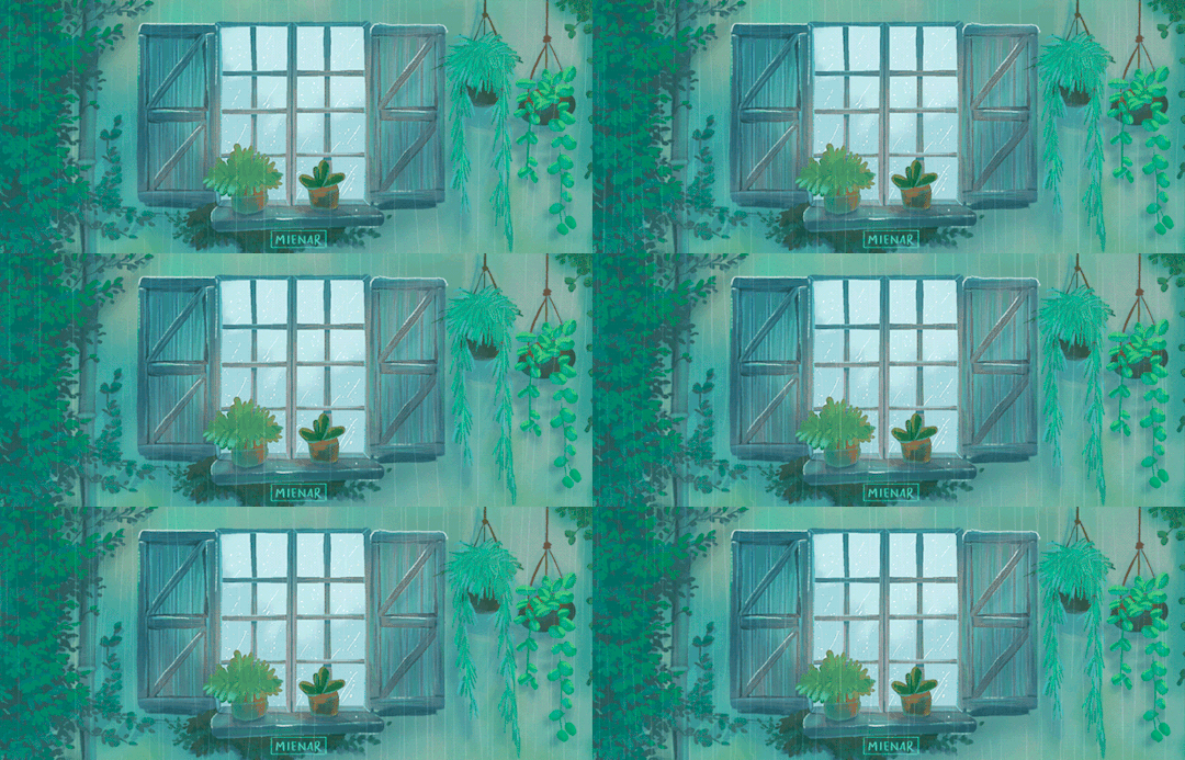
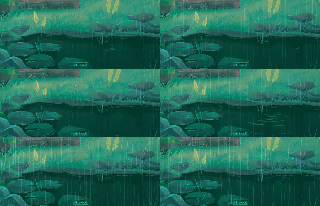
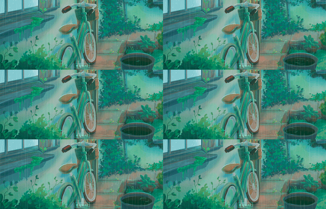
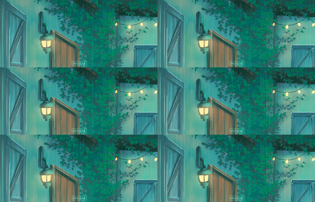
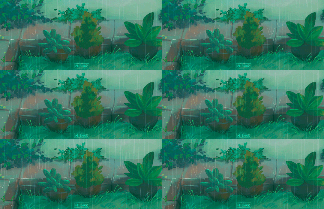
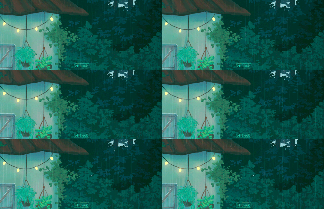
close-ups of a commission i did a while back! 🌱
instagram | shop | commission info
#artists on tumblr#animated illustration#animated gif#digital art#2d animation#backgrounds#environment art#environment illustration#myillust#cozy#rainy days#there were so many details in this commission that i rmb thinking to myself that they could be like b-rolls in a film heh#so i cropped it to 21:9 to get that ✨cinematic look��� and it turned out so cool!!#i'm sorry for being so inactive for so long ;-; i really havent had the time to make new art#things are calming down for me now that i can get back to making more art#thank you so much for sticking around all this while ;; please know that i really appreciate it like really really really!#i hope you'll like this! :D
11K notes
·
View notes
Text

'Strong opinions about femininity and masculinity' moment
#kazuichi souda#mahiru koizumi#Kazukoi#What's their name...?#sdr2#super danganronpa 2#an art#Anyway. Mahiru stans women and Kaz is....not NOT a woman maybe he doesn't know it's kind of a huge mountain to scale#Mahiru is like. Aw jeez. Calm down I'll do your makeup and dress you up maybe then you'll feel better#I think! Mahiru is just a big sis in general to everyone. If you're a MAN she refuses to be your servant#But if you're anything else or if you're just generally nice. She likes the role. Patron saint of women-in-progress#Like washing Hiyoko. Girl has a problem literally taking a shower? No problem I'm on it. Dress her? Sure.#Never really GOT mahiru thanks a lot to her dying first. But I like the her alright#All this to say: I hate gender i don't get any of it it's intriguing but it doesn't grab me i wish it wasn't so huge
776 notes
·
View notes
Text
So y'all have seen the Williams F1 Logo before, yeah?
well get ready, becaues I am about to ruin your day!
where does one even begin with this. i am sorry in advance. -just a poor learning graphic design student, who simply tried to enjoy their saturday evening
The Logo
For anyone that doesn't know, here's the Williams F1 Logo. Entirely unedited, copied straight from Wikipedia:

Now like many fans, I actually quite enjoy this logo. I like the modern, sharp edges of it and it's simple yet intriguiging design. It's memorable, while also easily recognizable as a W. I also really enjoy the colour choice (this, however, is entirely a personal preference.)
(entire rant under the cut. please keep reading this took years off my life span.)
How did we even get here?
Let's start at the beginning. How did we even get here? Well I, a poor poor learning graphic designer, was watching this lovely video from Mr. V's Garage about bad F1 Logo's over the past 35 or so seasons. Very interesting, I can only recommend it (but you don't need to watch the video to understand this post)!
Now, to cleanse the palette at the end of the video, Mr. V included a top 10 GOOD logos from this time span, it was very kind of him.
On P4 of this "Good List," Mr. V placed the current Williams F1 Logo, as pictured above. At first I vaguely agreed with this, believing that he probably simply hadn't noticed one of the things that's been bothering me about that Logo since the first time I saw it up close.
The first sign of Trouble
So, what is this mystery issue, you might ask?
It's simple really. You don't necessarily notice it at a first glance, but something about that logo seems off. Taking a second longer, you may notice it yourself.
No, I mean it, take a minute and go look at the logo. It looks wonky as hell, doesn't it?
Well I can tell you the first thing that I personally noticed. The arms of the W aren't in line with the bottom half, see:

(Graphic by @girlrussell who was so kind to let me use it, as it is way prettier than the one I made)
It's a crooked W. There is no good explanation for this. The rest of the font is perfectly fine, geometrical shapes.

Anyway, the good person that I am I went to point this out to my partner ( @leftneb ) who proceeded to inform me that he, infact, was not aware about this and was, quote, "never going to unsee that."
Now, the good FRIEND that I am, I, of course, proceeded to rush into our broader F1 friendgroup to make them suffer for eternity.
What's the logical next step to take? Of course, fix the logo in Adobe Photoshop, you know, as a joke.
(Disclaimer at this point, I am not necessarily the biggest fan of Williams Management Team. I enjoy ALL their drivers this season. I do NOT enjoy James Vowels. Be warned.)(Also I am aware that he probably did not have an influence on the logo)
Trying to fix it. Oh god, I was so innocent back then
Trying to fix the logo in Photoshop is the worst mistake I could've made. THE worst path to take. I could've just giggled about making my friends suffer (which I succeeded in, by the way) and moved on. Instead I ruined a perfectly good Saturday evening, and for what? I don't know anymore.
Anyway, how was I gonna go about fixing the logo in the simplest way possible? Simplest way I could come up with: slap the thing in Photoshop and put two, mirrored boxes at each side to make the sides line up. Small issue, how do I make the thing actually even? Fix: line them up at the intersecting point with the bottom tips of the W.
Here's the result:

Hey, anyone care to explain to me why in THE LORDS NAME the arms are different sized? I mean, surely they weren't before. Surely, certainly, I must've messed up.
I double, I tripple checked. I made sure everything was lined up and made sense. But no.
It just couldn't be. Something was uneven in this logo, something even deeper. Something I could not have predicted when first taking a closer look. It was at this point I realized I had messed up. What rabbit hole had I stumbled across? Certainly, it couldn't get much worse.
And that's when I noticed.

(pictured above; my genuine reaction)
There's MORE? (oh god, the top isn't lined up)

I couldn't believe my eyes. This is the PINNACLE of the sport, and THIS was the logo of one of the competing teams? I mean, yeah, we have a Visa Cash App RB or a Kick Sauber or even a MoneyGram Haas which are all terrible logos, but at least they're CLEAN. (this has not been checked. If anyone wishes to ruin a nice Saturday evening, feel free to check them and tell me how wrong I was in the previous statement!)
But you can see that there is no end in sight for this post. I'm sure you're as scared as I was at this point. By now we were sitting in VC, discussing the horribleness of this logo. I had long informed my irl's about this, who take said design classes with me. And it was one of them who pointed out the next thing that had been bothering me, but I had not been able to put a finger on up to this point.
thE DISTANCE, HOW DID THEY FUCK IT?

I'm afraid I have to confirm your fears.
Yes, those lines are the same length. According to Photoshop, they're on the same level as well, so no flunking with angles.
The gaps of the arms to the main W are not the same. They're differently sized gaps.
It was clear to us, this logo is inherintely flawed. They're subtle issues, but once you pay attention you start to notice things. It all looks slightly wonky and off centre. And eventually, you get paranoid, and start comparing other angles and sizes. And you will keep finding things. This has ruined my life.
HOOOOOW

Honestly, I don't even know what to say. Yes, yes sadly those lines, too, are the same length. Just copied over from one side to the other and layed over on the same height. I admit, they're not layed over perfectly. I was honestly holding back tears at this point. But the point still stands, you can clearly see a difference in width.
Honestly, the only way I can explain it is that at some point there was a mess up of distance or proportions and whoever was designing the logo couldn't pin it down and tried to restore the visual balance by making manual adjustments. And in all honesty? They kinda did a good job, if that's what's happened. I mean, you notice the crookedness of the arms, and then maybe the difference in height, but the rest you probably will not notice if you don't spend too much time staring at it. (like some of us) And even those issues clearly aren't noticeable to the vast majority, considering I had to go point it out to a group chat for my friends at least to notice.
what the fuck is THAT?
Now, the thing about doing this investigative work of prooving a team you dislike is worse in more aspects than you previously thought, is that you do a lot of zooming in. And zooming in means you might notice bits that yours eyes simply overlooked before, because they were too small.

Here you can witness the top of the middle point, that, for whatever reason, really wants to touch the top border of the Logo. I'm relatively certain that's the highest few pixel in the entire graphic, considering earlier chapter "There's MORE?" I have no idea why it looks like that or why they thought it was necessary for it to not end in a clean point.

I just actually have no idea how to even describe what is going on on the top of the left arm. That left hand side, again, touches the side and is therefore the most-left-pixel in the graphic. I, once again, have no idea the purpose of this. However the RIGHT hand side also makes no sense, as it is the most prominent corner in the whole logo. There's pointed corners, and rounded OF corners, but nothing that is trying to form it's own colony in a distant land that hopefully isn't this god awful logo. I hope that blob gets away. I really do. You go king.
i'm loosing my mind
Anyway, the only reason I could come UP with those weird "reachy-outy-bits" was to establish the dimensions of the logo? But if that was the case, I don't understand why they managed to keep all the other potentially border touching corners clean?


Like, look. Those are clean, sharp corners with some clearance off the borders. I have no clue why they managed it here but not with the others.
guys. please.
Backtrackig a little bit, going back to the positioning of the arms.

Do I need to mention that those lines are both the same length and the same (mirrored) angle? I really hope I don't, because I don't think I could be making this shit up. Like, once you roughly know what you need to look for it just kinda becomes easy to find.
As said before, I genuinely do think that most of these issues happened in a chain-reaction. For example, the distances between the main part and the W wouldn't be as noticeable (and they do get noticeable once you start looking at it) if the angle wasn't fucked. And guess what, there's more fucked angles here! Which ALSO influence this specific area of the logo!
this is just embarrasing for you.

something something same line copied over and mirrored etc etc
It's not as visible but the angles defintely don't line up here as well. As mentioned before, these issues for the most part all influence each other. It doesn't really excuse the issues, in my opinion as a designer, because a big company like this shouldn't have these sort of issues in their logo.
So let's review;
to sum it up,

i cannot even BEGIN to explain to you how big of a fucking JOKE this FUCKING logo is. because, i thought to myself, to round the post out, hey, why not show ALL the issues i pointed out in one picture? that would round it out quite nicely, wouldn't it?
Yeah well, this logo sent STRAIGHT FROM HELL just could NOT let me rest. I had only done the lines visualizing the crooked arms in PAINT up until this point, i.e. I had only pulled both up individually. To make a nice "rounding out" picture I still had to add them into PHOTOSHOP. so i did. i pulled up the line. i mirrored the line.
THE ANGLE IS FUCKING DIFFERENT
none. and i mean NONE of my friends had noticed this before. i need you to understand that we looked at this thing with FIVE pair of eyes, and NONE of us noticed that until i thought to myself "Oh I still need to add these specific lines to have ALL the issues I pointed out in my SILLY TUMBLR POST in ONE image" and i get THAT FUCKING SURPRISE
I was PLANNING to round the post out with a statement on how obviously this isn't a serious post. Here, I even had it all written out already because I accidentally started writing it in the last paragraph:
Of course, this is nitpicking, and it's not that serious. I'm aware of that. AS MENTIONED most of these would not be noticeable if we hadn't gone specifically looking for them.
yeah, well, fuck that. i just spent two hours seething about this logo. i'm ending the post on this instead.

#i am ENRAGED#i managed to actually calm down about it#yk. just typing away#and then i just try to ROUND OUT THE POST#for fucks sake#anyway i know i'm posting this at an hourrendous hour#if you read all the way. reblog? maybe#pretty please#williams f1#williams formula 1#williams racing#formula 1#f1#also apologies for any spelling mistakes i do NOT have the nerve to go back and proofread this
938 notes
·
View notes
Text
A Wild Battinson (Social Media AU)
Part 43 (Masterlist)
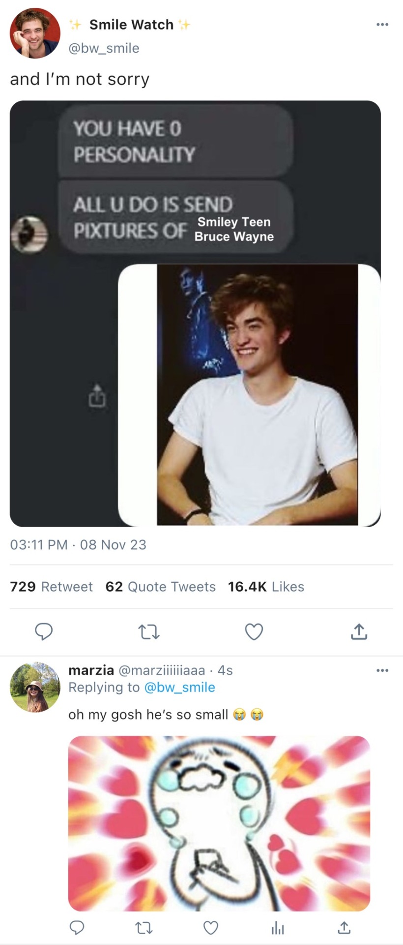
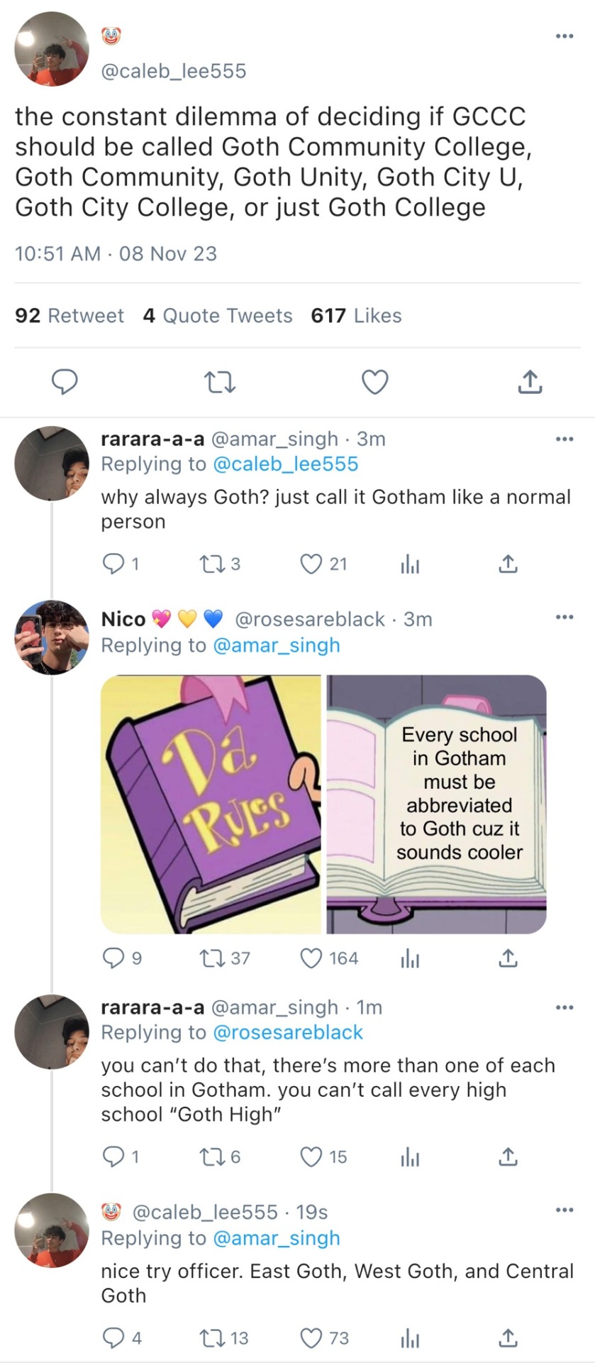
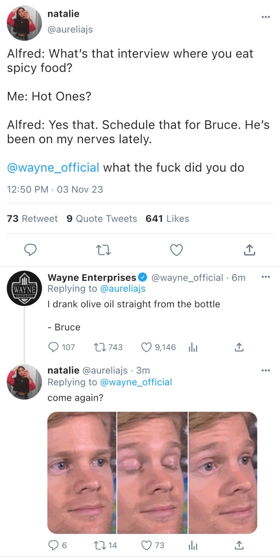
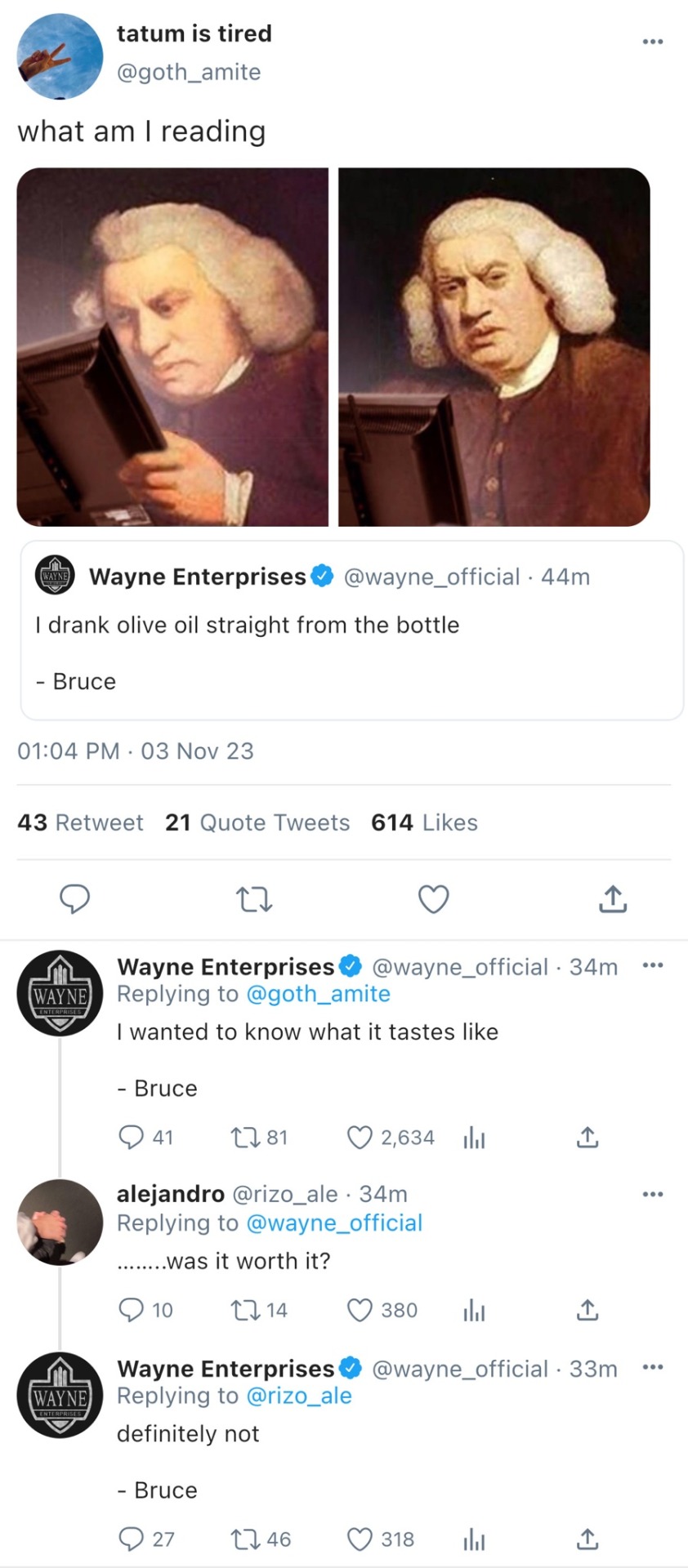
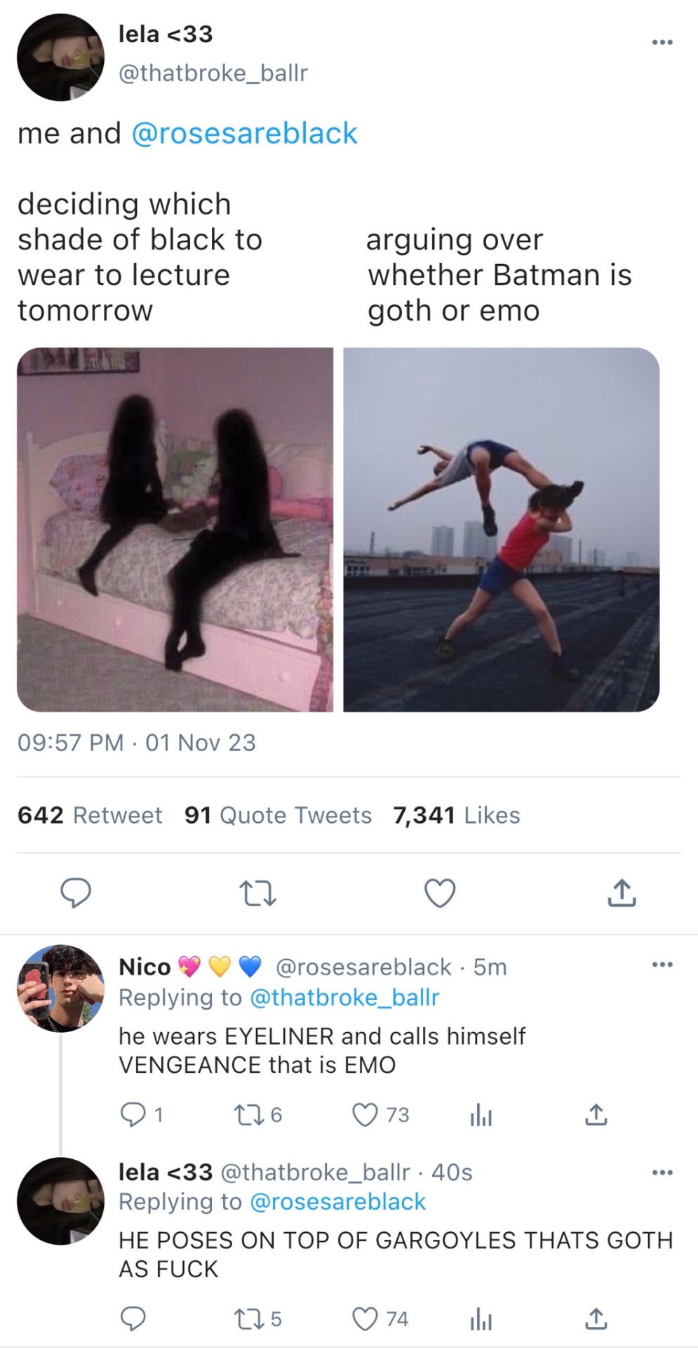
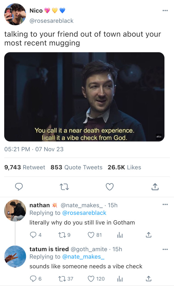
(Part 44)
Me, to myself: I just think the series was better when I posted several times a week because the pacing felt more natural, and it translates better when people binge it.
Also Me, holding two jobs and a bat: If you try to post once a day again, I will disconnect your head from your shoulders—
@bruciemilf guess who’s back
Anyways, folks! :D So I'm thinking of a new upload schedule where I spend a bit preparing the next ten or so parts then post it all in two weeks? I think that would be fun (and much better for my creative process.)
I’ll be posting the next part very soon :) But it's going to be drastically different from what I've done before. Let’s see if anyone can guess why.
Yada yada don’t die LOVE Y’ALL
#also since I posted so much more I felt less guilty putting filler stuff in because you'd get more tomorrow#but NOW that feels like cheating because you waited a whole week (or three months whoopsie) even though when I look back at the older parts#-the filler bits were always the best#also the lore is just exhausting sometimes#I'm not writing the MCU here I need to calm down#I'm literally rereading my own series five times trying to think of more cute filler because that's CLEARLY what I'm missing#and pictures of him#I'm running out of pictures of Robert Pattinson it's finally happening#pray for me#a wild battinson#battinson#bruce wayne#batman#the batman 2022#batman 2022#the batman#dc universe#dc#battinson needs a hug#gotham#soft bruce wayne#gotham city#only in gotham#gothamite#social media au#social media
3K notes
·
View notes
Note
During the post dark cream arc where Cross was pregnant with Aim, is it possible for Aim to mive and kick while in the soul…? And if so is it painful for Cross+
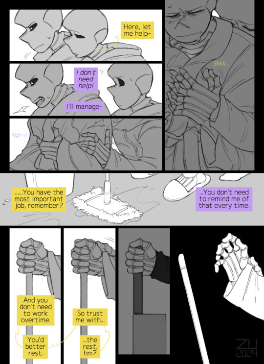
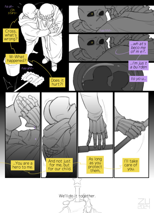
continuing @clownyclowns' comic's topic <3
#zu art#comic#post dark cream#cross!sans#preg!cross#dream!sans#undertale#undertale au#utmv#''I'm no longer who I used to be'' [pregnancy edition]#my defensive reaction to Cross' ex-crush was to draw more of him being pregnant with Dream's child /jjj#if I had a nickel for every time I drew a multi-page comic about the issue of roles & self-esteem in a same-sex family I'd have two nickels#which isn't a lot but omg it happened twice :'D#well I love me some preg!Cross with nesting syndrome & emotional swings ;w;#(or is this also a midlife crisis? >:/ gotta learn—)#little Aim in Cross' soul be like: dad is mad at papa?? not on my watch— *kicks*#a lil defender <33#I really like how their love languages work cause Dream's is an act if service and he tries to show his love the same way by offering help#but Cross' is physical touches so he reacts sharply to the help but relaxes (breaks :'3) after hugs (Dream does to calm them both down)#men... ;w;☆#be back soon! ;3
476 notes
·
View notes
Text
charles pitting for the fastest lap after norris did and taking it away from him

#at least. this.#had to fold laundry to calm down I'm still a bit angry but whatever#charles leclerc#max verstappen#lestappen#mexican gp 2024
629 notes
·
View notes
Text

When bae is angry at you
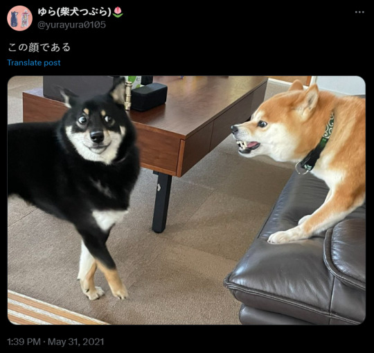
#godzilla x kong: the new empire#godzilla#mothra#kong#godzilla x mothra#mothzilla#mosugoji#when the love of your life your queen your bae your wife is PISSED#whoa Goji you gon done it my dude#mothra would be like:#WTF ARE YOU DOING?!?!#I WAS GONE FOR 5MIN (in kaiju time ig?) AND THIS IS WHAT I SEE THE FIRST THING I WAKE UP?!?!#YOU ABSOLUTE BUFFOON!!!#I love you and I missed you tons#BUT THAT DOESN'T MEAN I'M NOT ANGRY!!#And Goji would be like: “Babe im sorry pls calm down my love pls i can explain”#anyway Goji was HELLA HAPPY TO SEE HER HHHHHHH#Mothzilla is canon ya'll#it's canon....#do not repost#my art
3K notes
·
View notes
Text

I started drawing this next day after I finished Act 6
13 or so days and it's finished!
Main things are traditional and Loop's body was edited digitally after
Unedited it looks like this

I've been torn on how to do Loop's body for the entirety of lining, also

A bit sad the main lines are visible only as a wip, most of this thing is literally just a ton of sharp lines
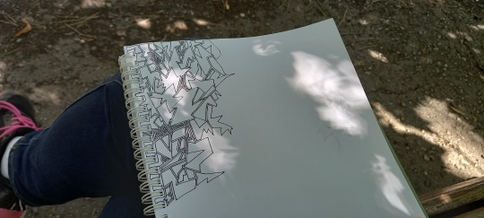
I think it's also my first day of drawing, Loop is just a sketch here (feat. my leg)

I even finished the beans before it so they were a moral support, because if you let me things like this take a year
#fanart#my art#isat#isat fanart#in stars and time#isat loop#loop#traditional art#artists on tumblr#Phew#So anyway this was my way of figuring out my thoughts after finishing the game#I didn't even actually finish it with credits playing at that moment#This type of art is my therapy#And in a way literally how my personality works from big figures to small details of thinking about anything#It's really calming!#I won't tag paper figures but they're here#Like special guests#In any case the funniest thing was showing this to my English teacher and she was like 'wow this looks stressed' or something#Like she immediately looked at the lines and after I showed her my old Flowey drawing like this she was like#'oh it makes sense! This one looks calm but this one is clearly you not feeling good'#Because I was kinda#Like sitting there in the semi-park and feeling sick since morning before I started drawing this and slowly I got better#I already talked about this on my first 'big' isat thing - I needed to think a bit#And not think at the same time just literally letting myself sort stuff out#Like. I fell asleep at 6 am that day and woke up at 10 4 hours of sleep after playing full Act 5 and two hats stuff IS STRESSFUL#SUPER STRESSFUL! Like I felt like I was playing for 4 hours while sleeping#Anyway by the time I finished it aka today I'm feeling way better and I'm literally talking a walk right now#Touching grass as we speak#Anyway phew!#Now to that animatic that's plaguing my mind to draw it nowww
887 notes
·
View notes