#i'll definitely redraw this at some point
Explore tagged Tumblr posts
Visit Tumblr Blog
Explore Tumblr blogs with no restrictions, modern design and the best experience.
Last Seen Tumblr Blogs


Fun Fact
When “GIF” was named word of the year in 2012, Oxford Dictionaries U.S.A. credited Tumblr for pushing the word.
Text

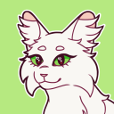
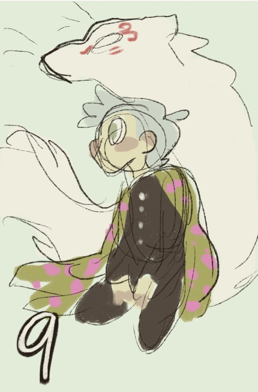
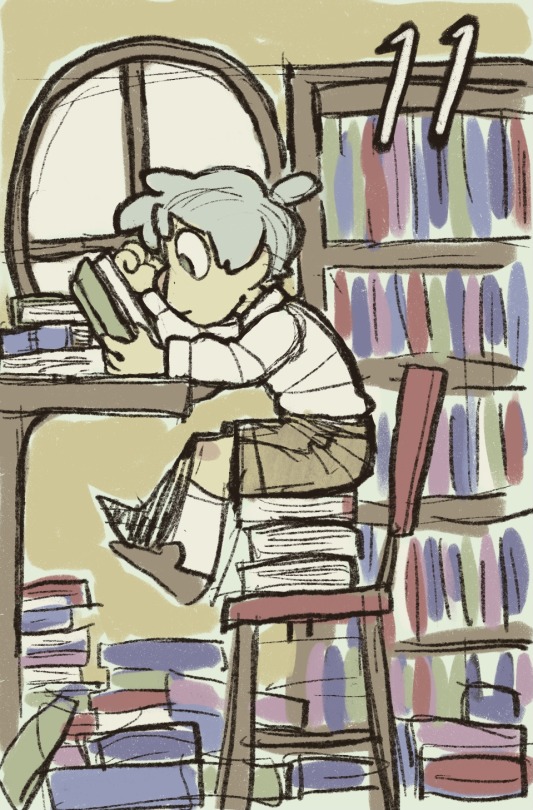
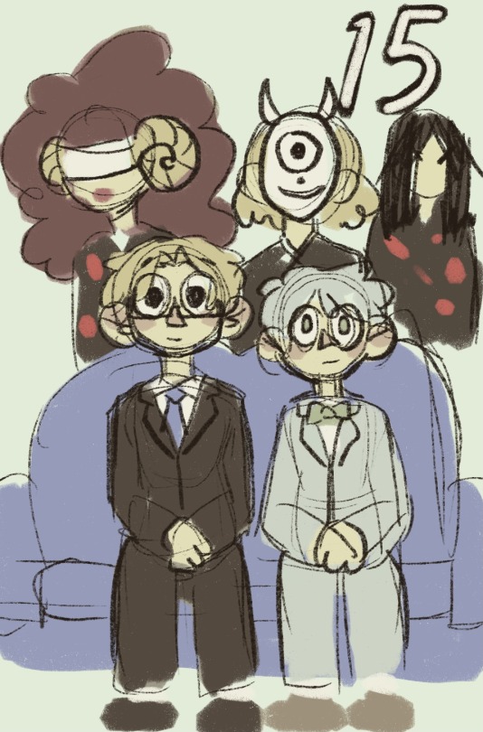
[Modern + Werewolf Au] Quick Bingyuan from Halloween 2024!!
#svsss#scum villain's self saving system#bingyuan#bingpup#mxtx fanart#my art#don't love how this came out ;-;#i'll definitely redraw this at some point#“binghe as a werewolf... but pomeranian based instead of wolf...”#werepomeranian???#I REALLY HATE HOW SY'S HAIR CAME OUT I NEEEED TO REDRAW THIS#I tried using honorifics after i researched them but if it's wrong feel free to correct!!
37 notes
·
View notes
Text

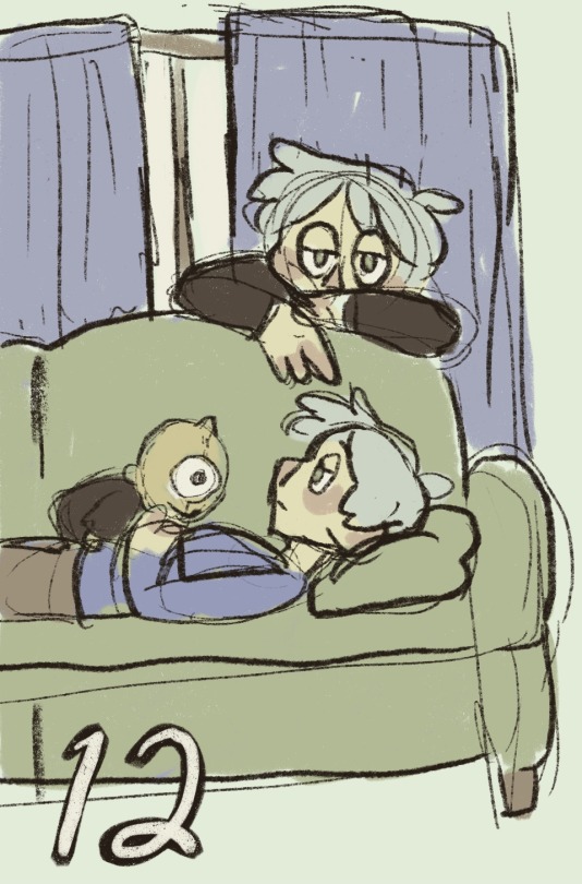
HAPPY KLAPOLLO DAY!!! I'm so insane about them...
#i'll definitely redraw this at some point in the future#i really struggled with klavs face here for some reason?#ace attorney#gyakutensaiban#apollo justice ace attorney#apollo justice#klavier gavin#klapollo#art#digital art#digital illustration#fanart#artists on tumblr
164 notes
·
View notes
Note
a humble request: men in women's one-piece swimsuits
Already did that. twice in fact
1 note
·
View note
Text
(SPOILERS FOR TNM6!)
Holy fucking shit. Two years of waiting was so worth it. I'm not even kidding I have been sobbing and shaking for the past half an hour.
I have way too many screenshots so I'll try to condense it but FIRST OFF LOOK AT THESE CUTIE PATOOTIES??? Oh my god realising that this was a year onward from the murders was like a knife to the chest; seeing Tophat and Sketchpad living together and ACTUALLY HAPPY FOR ONCE?? AUGHHH I LOVE THEM 💔
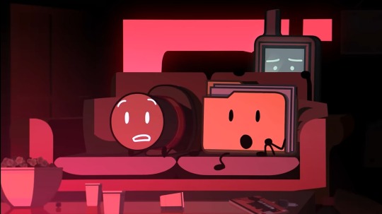
I'm not joking when I say I went back and screenshotted almost every scene GPS was in, but I'll include this one when talking about the memories because GPS hiding behind the couch is SO damn cute 💙
And. Oh. Oh my god. My fucking heart. They care SO much about Tophat and Folder, and the new song?? PEAK. Average TNM W. Seeing all of the adorable moments of these three together?? Heals the soul, but it's SO bittersweet knowing they'll never see eachother again. I'm ABSOLUTELY redrawing some of these, they're too cute not to :,3
Okay but THEY ARE SO IN LOVE?? THEY. AJDJFJFJFJ THEY ARE SO IN LOVE. I. WORDS CANNOT EXPRESS. HOW IN LOVE THEY ARE. GOD. PLEASE ALLEN JUST. LET THEM BE HAPPY FOR ONCE. P L E A S E.
"You just.. wouldn't get the full picture. It's the same with memories for me. Would it still be me.. even if I was missing a few bad ones?"
This is.. genuinely such a fantastic line. GPS has always been my favourite character, but.. damn. The idea that even bad memories hold value because they're still memories; still a part of you, and still might contain the people you love most? They're genuinely such a well-written character, and it's plain to see just how much they care for their friends. And they have a point! Memories shape you, good and bad. As much as the bad ones hurt, it can also help to learn from them in order to make more good ones in the future. And it seems Sketchpad and Tophat did just that.
God. Codey's betrayal was definitely forseeable, but it still hurts. The "I'm just following my programming" line gives me similar vibes to Speech Bubble and Spraypaint in a way; everyone has their part to play, even if (in Codey and Binary's case) it's a harmful one. I'm glad they did the right thing in the end, though. And Binary for SURE gives me Airy vibes, I both adore and despise them and to be honest that's EXACTLY what I could've hoped for in an antagonist. They're GREAT.
Wait a sec..
Binary..
OH I GET THE JOKE IT'S BECAUSE GPS IS NONBI-
Oh.
OH.
Hear that sound? That's the sound of me wailing in agony as my heart shatters into a million pieces.
"This is.. really it.. huh?" THEY SOUND SO SCARED?? God this entire episode I wanted to give them a huge hug and a slice of cake and to tell them that everything would be okay, my hEART. This entire scene broke me, the fear in their eyes and voice hurt so much to hear, my BABY HE'S BEEN THROUGH SO MUCH 💔
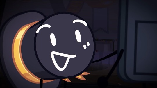
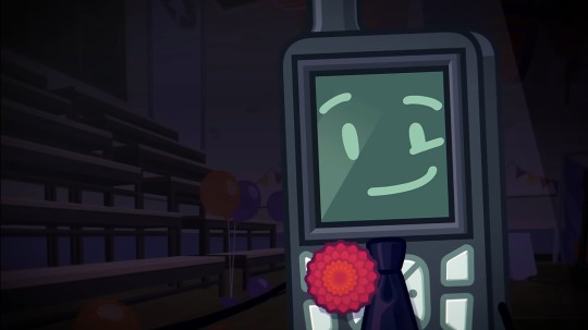
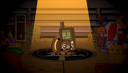
And just. This. Entire scene. I cannot tell you how fucking PERFECT of an ending this was. The fact that Tophat was the last thing GPS thought of before he died? The happiest moment they could think of was their high school prom dance, spending it with the person they love most? One final memory to end it all, and it was the most important one in their life. I've said this before but god. They're so in love. It's genuinely gutwrenching watching this scene; they're so happy yet this moment is so fleeting. Knowing how temporary it was and how everything ended makes it worse. Tophat moved on, maybe not fully but at least he's happier. GPS on the other hand? They're stuck reliving memories of people they can NEVER see again; people they hurt.
It's bittersweet as hell, and honestly kind of a perfect juxtaposition to the puzzle scene. Then, they relived bad memories, yet still seemed happy. Now, they're re-experiencing a moment that should fill them with joy, and yet...
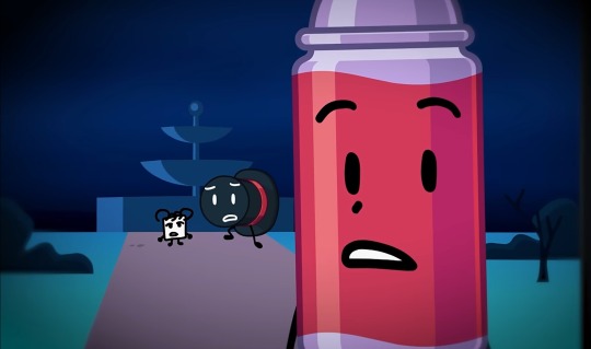
Nothing lasts forever.
The ending song being a response to Imaginary Friend, too? Perfection. 💙
Thank you, Nightly Manor. Thank you, Allen. This series was fucking phenominal, and the wait was worth every second. My heart is in tatters but good lord I wouldn't have it any other way. Now it's time to redraw some scenes and try not to cry any harder than I already am! :,D 👍💙
#the nightly manor#the nightly manor spoilers#tophat tnm#gps tnm#sketchpad tnm#folder tnm#spraypaint tnm#codey tnm#binary tnm#rei rambles
94 notes
·
View notes
Text

SPOILERS FOR AMALGAMATE CHAPTER 20 BELOW ‼️ CW FOR MEDICAL/BODY HORROR AND BRIGHT COLORS
Please please please please, BEGGING AND WAILING read this fanfiction by DoctorHaifisch on Ao3, it's SOOOO GOOD !! 😭 Words cannot describe what did I just experienced while reading the whole thing but I can surely say that it made it to my favorite fic top.
First of I was just immediatly enthralled by how well Kokichi was characterized (I'm a simple woman, I see good Kokichi content, I click).
But then I quickly realised everyone else was super well written ? Even Kaito who's a character at the very beggining of my Danganronpa V3 journey I didn't really like at all because idk I guess I couldn't see clear through him and I would just label him as the hothead guy with a hero complex...
But omg with this fic you opened my eyes and unraveled something in my brain, even if it sounds dumb I think I never realised before the potential Kokichi/Kaito had together and the undeniable bound there must be between these two after what they experienced in the hangar in Chap. 5.
So just for that, thank you for making me appreciate and love Kaito where the game apparently couldn't and thank you for making me love Kokichi even more if that was even possible.
Now these two purple guys are very very dear to me and I want them and their classmates to have their happy ending after all they've endured 🥹

As for the art here, I had to redraw that beautiful art piece the author made for Chap. 20 because I'm a sucker for angsty stuff and also I was captured by how emotional and impactful it was displaying the sheer horror Kokichi experienced at some point of that chapter.
I'll definitively make more art for this fanfiction later, the only reason I've never done that before being that I didn't like how I drew Kaito but now I think I got a design I'm happy with, so be warned there will be content >:)
@amalgamateofficial
309 notes
·
View notes
Text

I think this was like my 5th try😭I'll probably redraw it at some point and definitely on a bigger scale cause fitting in those small details was so hard
34 notes
·
View notes
Note
How do you draw so freely? Its beautiful
Thank you very much!!
Assuming you're referring to how loose my sketches are, I think it boils down to mileage. Alongside the classic recommendation of reference + study, usually when I get really into a piece of media I'll draw characters I like a whole lot and it builds muscle memory, and the ones that end up in my posts usually have already been through that process to some extent.
Studying references + going through a couple dozens rounds of extra wonky proportions and nonsensical physics (definitely visible on my own posts lmao) will help with both your brain and muscle and once you've stacked up enough of that it'll become easier to intuit certain things and keep stuff looser.
(hey this got really long, so just scroll to the bottom to see my current sketch process if you'd prefer that)
In my personal experience as a hobbyist, I spent roughly 3 years butchering the loomis method until things looked even remotely to my liking. And by that I mean "layering bullshit guidelines so thick and heavy that by the time I'm done lightening it via eraser there was barely any paper left." Drawing has been and still is really frustrating sometimes but for most of it I have a lot of fun and honestly as long as you have that it doesn't really matter whatever else (again, hobbyist here. my stakes are low). Switching up medium every once in a while if you can helps keep things interesting, and drawing with a pen is good for building both line confidence and tolerance for your own mistakes.
Honestly for all of that this stuff is still RNG to me lol. Every once in a while things just Will Not Work Out, but the rates definitely gets better the more experience you have. I only post about, say, 20% of what I draw probably. The rest includes but is not limited to practice sketches, personal art, stuff too nonsensical for even tumblr, or sketches I just plain don't like.
Uhhhhh now for what you actually asked. I've grown really lax, if not a little lazy, regarding guidelines (when you've drawn a specific thing often enough it just kinda gets tedious) so now i just do these very thin and light lines vaguely hinting at a character's pose and position. The only thing I consistently do is probably the little circle to indicate the head. For more heavily stylised proportions I'll go into more details at the outline stage, mostly aiming for the feeling of it (usually how goofy it looks since thats what I use them for). For more complex poses/ones I'm not familiar with I'll do multiple iterations.
Unearthed some stuff that I probably wouldn't post otherwise (the proportions are a bit off from what i'd prefer and the lineart isn't that confident). Here i am redrawing this for demonstration purposes


gonna go in order of the photos. everything shown was done with a 0.5 mechanical pencil.
usually i start with these very thin, light lines, just getting a very rough ideas of where everything is - head, torso, pose (spine, arms, legs). i sketch largely with approximations and landmarks, keeping in mind some bullet points for the relative distance among certain body parts (e.g. make sure the elbow is always a little past the rib cage. i'll write more out at the end) rather than any precise guidelines. i often don't even clean these up - at the end the main lineart is harsh enough that they override these, and though they're visible they do not interfere with the image as a whole. you can look at any of my sketches prior to this and find them.
then i go in with hard, dark lines, once again noting the respective distance among facial features (i'm using the loomis proportions, thinking about the face in thirds)
this is so unhelpful when i just say it, but genuinely at this stage i rely on muscle memory and mileage. if you've drawn the same anime girl for a bajillion times you can probably intuit the proportions. remember that 3d things have volume and interact. ("yes, see, her bangs and eyes round out like this, two locks of hair (they're thick and well kept, so they should have a solid cylinder shape...) against the side plane of her face - split that plane of the skull in half, and the ear should be somewhere around there...")
ok for the parts where a lot of things happen (clothes, tie, the pose interfering with them etc) i just go ham. make a mess! draw everything out even if they overlap each other. so you can keep track of them. here i also bring in some light shading to make out the form of her torso.
i lighten the whole thing with eraser, but the previous lines are harsh enough that the residue can act as a new base of sorts. i think this is comparable to having a sketch layer with lowered opacity in a digital piece
i go over the whole thing again now that i've got a better idea of the form
rinse and repeat. go all in, adjust, blow the whole thing up if it looks off and then build on the remains
for the last photo, you can see that I've adjusted the right leg, since now im taking into account perspective. I uhhhhh still am not particularly confident in drawing her shoes (or any other shoes for that matter) in 3d space so once again I'm bullshitting the form with trying to wrap around its shape and to visualize the shadows. usually for these I pull up references and pray
a side note for the hands: against an earlier ask, I've mostly switched to using silhouettes and then sectioning the fingers after. here the slight shading approach also help in blocking out and making them readable without you having to stress over the minutiae of what joint should bend where.
...I've hit the upload limit for photos, so I'll reblog with additions, but in essence:
• very thin lines to map out the pose and mark where certain body parts may go
• i draw everything in approximation, keeping a few bullet points in mind and adjust as i go (which does keep the sketches loose and make it easier to vary proportions for different characters, but also make floating features more likely (evident in some of my more recent posts as well):
loomis for the head and neck
rib cage (+collarbone), then elbow slightly below it
pelvis, crotch halfway point of the whole body
legs, knees their halfway point
feet are about as long as the forearm usually
(Disclaimer: i must stress again that I'm not a professional, and cannot guarantee that these bullet points are entirely correct. This is just how i draw at the time of writing - stylized with little regard for the intricacies of human anatomy)
• with the exception of the first stage, my lines are dark enough that the mistakes get reused as base for correction after they've been lightened with eraser a little bit.
• I also bring in some shading while doing lineart to make sense of form if I'm having trouble. I use this most often for noses, hands, legs, and breasts.
• if you encounter a sketch that Refuses To Work Out, leave it. No, listen to me, Leave It. Revisit it sometimes later, if you want (for mine they range from a week to 5 months, but my sketchbooks disorganization is another matter entirely). just leave it for a bit.
• do a bunch of pen sketches if you wanna get comfortable with mistakes/build muscle memory
• once more, all-time classic: reference the hell out of anything you don't know. 100000 google images. look up a human anatomy 3d model to see what muscles attach to which bone. practice copying 1:1 things that look good to you (practice!! don't post/claim anything as your own if it isn't - this applies to my own stuff btw, feel free to trace for practice at your own risk). note again that the only reason i can only bullshit my way out of these is because i've drawn them dozens of times - the moment you throw me more complex perspectives i'll need to start the learning process all over again
#anon ask#asks#hey sorry this got So long. if u dont wanna send me asks again i understand#remember when i said my last ask was long... haha... good times...#this thing has been in my drafts for what... a year now? sorry. i'm just not sure how to articulate all this#DoNT make bets on how long until im done writing the reblog also...#junko enoshima#danganronpa#sketch#traditional stuff
22 notes
·
View notes
Note
is it true that they removed mentions of tintin journaling/actually mentioning his job/etc when they redrew some of the older tintin comics? i swear i remember seeing examples of that once but i have no clue where to find them again
I definitely know which post you're talking about, but I can't find it either. I'll try to compile what I remember and/or know about offhand...
For the most part, the most references to Tintin being a reporter come early on in what are considered the "newsprint editions" of the comics. The first nine albums were serialized in Le Petit Vingtieme and Le Soir Jeunesse, and these pages were later re-collected and coloured (and occasionally cut down/rewritten) for what are now known as the "Casterman editions".
Tintin being a reporter is all over Land of the Soviets, and it's introduced as early as page 1. It's the silliest album, but it's also the only album thoroughly revolving around Tintin going on a reporting assignment.
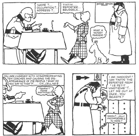
(Soviets pg. 4. By God, look at that guard in the upper right. He looks like the RESPECT! butler)
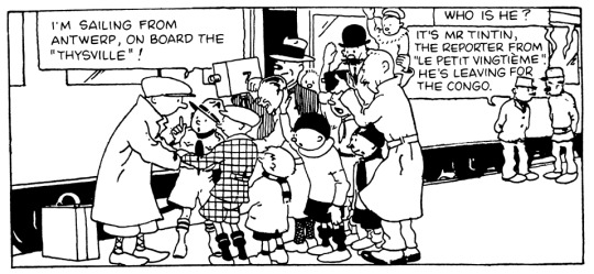
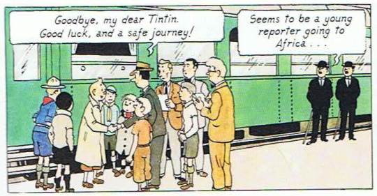
Tintin is still a reporter in Congo, but it's scaled far back in the redrawn Casterman edition. In the latter, it's kept to one mention in the very first panel, which was also turned into the first appearance of Dupont and Dupond:
(Congo pgs. 1)
Meanwhile, the newsprint edition has a scene where newspaper agents try to scout Tintin as a reporter, I guess because his stories are just that good. He ultimately declines, claiming Petit Vingtieme is paying him way more than what they offer.
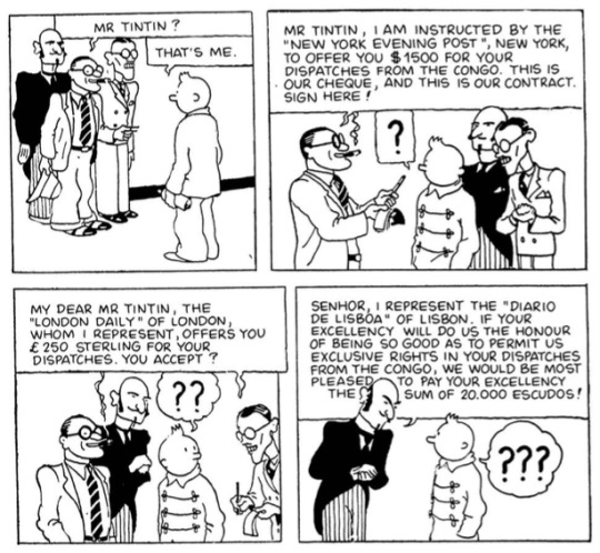
(Congo pg. 17)
Now, I'd had a theory that the series just became too plot-focused to keep pausing for references to Tintin's writing, but Reddit user XenophonOfAthens made a good point about Herge being forced to pause discussion of the press and current events after the nazis shut down Le Vingtieme, thus moving Hergé and many of the same staff to the nazi-overseen Le Soir and Le Soir Jeunesse. Tintin had been introduced as Le Petit Vingtieme's boy reporter who child readers could follow along with, but now with a new (heavily monitored) publication, mentions of the "boy reporter" slowly phased out.
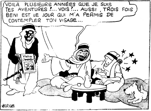
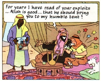
One of the more significant edits to Tintin's reporting comes in Cigars of the Pharaoh. Sheik Patrash Pasha originally says he's followed Tintin's adventures for "several years" and presents a then-new Vingtieme publishing of Tintin in America.
In the colour edition, he instead presents Destination Moon. This album was in production at the time of the redraws, and it was one of the first albums to be published outside of Europe...but now Tintin's reaction is especially visceral, since that album involves him going to the moon with two people he hasn't met yet.
(Cigars B&W pg. 39, Casterman pg. 15. I also gave the Sheik's servant in the latter a quick edit because it was somehow worse than the 1933 version)
The last reference to Tintin's reporting for a long while was in The Broken Ear. We are now in the Soir era:
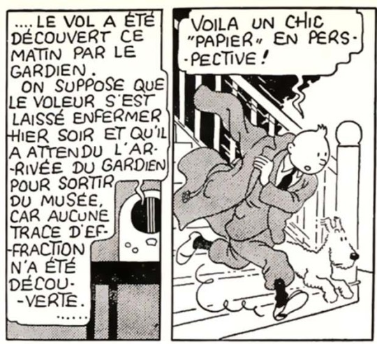
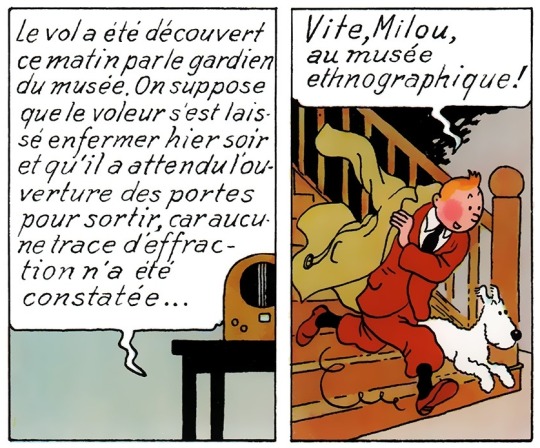
(Broken Ear pgs. 2)
This line never made it past the newsprint version. Tintin hears the news about the museum theft, and originally, he remarks that it'll make for a nice report...but in the reprint, he's just declaring that he'll go to the museum. I feel like the wording in the original could have referred to something specific about the comic's run in Le Soir Jeunesse, but it also could have been removed under the assumption that the reader would be going into this book knowing Tintin is a reporter. He does have a notepad with him through the rest of the page, but without that context, he just seems like a busybody.
I feel like there were a lot more references to his reporting in Le Journal Tintin, which is where the comic moved its publication to. This adds credence to the possibility that readers would be picking up these books knowing Tintin was a reporter, thus it being less of a focus within each album's plot. There do seem to be little hints throughout the albums about Tintin being a reporter...one of these is a moment in Explorers on the Moon where Tintin describes the moon's surface to ground control, and as a writer myself, this to me feels like him gathering his words for a future story:
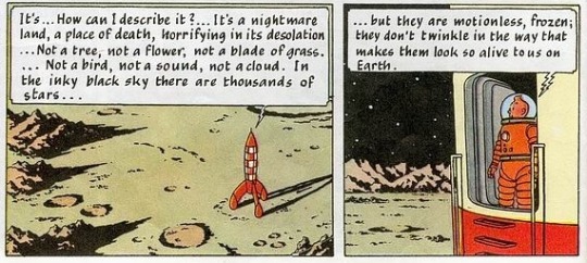
(Explorers pg. 24)
However, Tintin's reporting is brought up in an album one more time, decades later, in Picaros. Tintin is referred to as a reporter on televised news, so this is at least some confirmation that he does submit journalist work, at least off-camera or between albums:
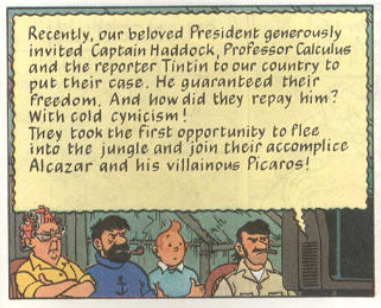
(pg. 47)
In short, Tintin's reporting started to fade off suspiciously during an era where nazis were breathing down Hergé's neck, then got a little lost in translation, and then ultimately came back.
My theory for Tintin's reporting slowly becoming less important in the albums happened either due to 1. Hergé and co. becoming more interested in writing about other things, 2. the series being moved to a vanity publication that discussed Tintin being a reporter outside of the canon comics, or 3. it got phased out during the Le Soir era because Hergé's supervisors didn't want to promote a gonzo journalist as a hero during a time with heavy political censorship and turmoil. It's completely up in the air.
80 notes
·
View notes
Text
So here's the thing.

I'm jealous of other creators. Surpassing me in likes, comments, follows... getting recognition, getting all kinds of kick ass fan projects... and I hate being jealous, because there's no reason to be. All of my issues boil down to 'I would be more popular if I tried with my art and posted more often.' That's 100% on me and has nothing to do with other creators!
That's it. That's all I have to do. And I would like to begin actually trying on this comic more after. But now we get to THE THING. The early comics are bad. Like, really bad. Because I didn't care! I just wanted to get the story out and move on. But the beginning comics are supposed to draw in your audience. Seeing just a bunch of blobs with no real effort put into them... that's a turn off. I wouldn't read a comic like that!
SO. I'm going to be redoing a lot of them. Maybe all of them, maybe not Mirror Gem and Desert Dance because those are both decent... We'll see. I'm still going to try to do actual story updates. If all goes to plan I will alternate between an actual new episode and redraws of the old ones. Of course some of the old ones are really small updates, so I can knock out more of those in a shorter amount of time.
I'm just asking that you all bare with me here. I know this is frustrating, waiting all this time between updates just for me to go back and redraw a bunch of stuff I already drew... but I think this is what I need to do to be happy with myself. Because right now, I'm not. I'm disappointed. I know I can do better, I've been proving that for years with various other works I've done. And Twiniverse deserves better.
So, yeah, that's the thing.
I hope you all keep sticking around, and I'll try to be more attentive and definitely try to update way more often. I know it doesn't seem like I've been working much, but I've actually been finishing the references for almost every major non-human character. Gonna do the humans, too, at some point. So I've been hardcore focusing on the designs. I know you don't get to see them yet, but I just need you to know I AM working on this comic all the time in various ways.
I'm also jealous of Chekhov's dog. I love Wensy so fucking much.
48 notes
·
View notes
Text
Star Wars Rebels is one of my favorite shows. I can still remember back when it was just a planned project I'd occasionally hear about either online or in a commercial on Disney XD. I found it a bit funny at the time, because I remembered wondering what they were gonna name the next show after The Clone Wars--because obviously there was gonna be a show after The Clone Wars--and lo and behold I got my answer; Star Wars Rebels (way better than Star Wars Galactic Civil War). I caught the trailers, interviews and the character profile videos online and even managed to catch the shorts during the months leading up to the premiere. Little eleven year old me was optimistic that somehow this show would help fill the Clone Wars shaped hole in my heart.
And boy did it. I remember watching the premiere sitting on the floor, loving every second of it. I especially felt connected to Ezra, who, at that point, was the Star Wars protagonist that I was the closest to in age. Next thing I knew, three and a half years had gone by and the Rebels finale ended up being one of the most emotionally distressing episodes of television that I had ever viewed. At first I didn't like the epilogue funnily enough, but soon came to realize that it was perfect.
This show means a lot to me. It was never the most popular in the fandom, honestly it felt like a good chunk of TCW fans just wish it didn't exist, still bitter about Clone War's cancellation and blaming Rebels for it. The show was chided as childish and silly (this is a Star Wars show we're talking about btw), the animation was cheaper than the later few seasons of Clone Wars, the lower rating meant that it couldn't get away with the same level of violence as Clone Wars and the only things about it that were universally praised were the elements and characters that related to Clone Wars. It felt like Rebels, like many of its own characters, just couldn't escape the shadow of The Clone Wars. But those of us who watched and kept up with it, grew to love its characters, its art, its music and its story--we knew that Rebels was special in its own way. I honestly believe now that Rebels surpasses The Clone Wars in many regards and it's been exceedingly vindicating to see Rebels increase in popularity and become well-respected by the community at large.
Rebels still one of the only pieces of media to really make me engage with fandom at a deeper level, for better or worse. I definitely wouldn't have made this tumblr account last year if it weren't for me rewatching the show with my family and getting back into the swing of things. And I probably wouldn't have found the courage to try and get into art earlier this year if it weren't for that either. So...I owe this show a lot and I got more to say but...I don't think I'll ever find the words that could properly convey what this show means to me.
Happy 10th anniversary Star Wars Rebels, I'm thankful for the decade we've had together. I wish I had more to show my appreciation, but for now I suppose this study/redraw of some concept art I did for art class will do.

Shoutouts to Rebels Recon, y'all were an indelible part of the experience that more of the newer fans need to check out.
Star Wars Rebels Appreciation Week: Day #1 - Favorite Character
Ezra Bridger
#my favorite piece of Star Wars#only Return of the Jedi and Visions come close#star wars#star wars rebels#star wars rebels 10th anniversary#rebelsweek 2024#rebelsweek2024#Ezra Bridger#Blueberry#swr fanart#I've been waiting to use this next tag for a very long time#my art#me rambles#REBELS 10th ANNIVERSARY
43 notes
·
View notes
Note
to be honest I’m quite used to some IF blogs going very off-topic, so before my replay, when I saw asks about kirby, my brain just accepted the fact that we’re talking about the lovely pink consumer making his way into the game
but I just saw the kirby art and checked out the other character art and your art style is so adorable and scrumptious! it’s so nice to see the characters looking alive and themselves in front of me after interacting with them and getting to know them in the story. (also I find it mildly funny that the two art pieces showing beck’s tattoo sleeve have the tattoo on different arms)
In all honesty I DO love Kirby (ball) because he's just like. A little guy. I've never played a Kirby game but he's small and round and pink so he's my best friend.
That being said IDK why I named Kirby (man) that haha. I should have predicted that talking about him would throw folks off. But when I name characters 99% of the time their names come to me in a vision and I give it no further thought.
Anyway tysm!!! I looooove drawing and there was no world in which I didn't draw the TLS characters. I've spent much more of my life trying to refine my drawing craft than my writing craft, and to this day it's one of my favorite ways to unwind <3
And lmao the tattoo haunts me. I'll redraw Beck's ref at some point because I don't like the current one, but I definitely flipped the canvas at one point for the Beck & Perri piece and then forgot to swap the tattoo to the correct arm 😔
#asks#kirby#i mostly only go off topic when i'm talking about my dnd games lmao#that and the lost boys#ty for the ask!!
19 notes
·
View notes
Text
Other Prime AU (Codex #0? ⇨ Beta Designs (Conjunx))
[Rest of my AU here!]
(⚠️If at any point some lines look unnaturally wobbly or uncanny, it's because I've used an editing tool to remove drawings that might be distracting! ...Which is also why there's a lot of empty space;;;⚠️)
(Satisfied with the concepts, not the designs of the characters, so I'll definitely redraw them 🥂 maybe adding more, who knows...)


In this AU, thanks to everyone who participated in this poll, conjuxes of important government figureheads have a subtle design embellishment to indicate that they are with said figurehead. Think of it as a betrothal gift!
Zeta was likely the one to start this tradition, since he gave Starscream handplates that were from his spare parts.
(I have the idea that spare parts are kinda akin to skin/fur/scale shedding, and bots keep them just in case. They’re used mostly to either repair or to create new life, though this isn’t the only way to make young. In any case, giving someone a spare part could be thought of as giving someone “a piece of you”.)
(Also because the second most voted answer was to make the embellishment significant, I've decided to give Starscream some formal wear, also given to him by Zeta)
The new Primes' gifts to each other are stickers of the figures that they both like; Optimus gave Other Prime another sticker to replace the one he had, and Other Prime gave Optimus a sticker of Primus.
Also hi. My secret is out--I'm a sucker for KnockBee/KOBB aksjkaldkf;;;; Part of why I'm glad this is now a separate AU so I can be as self indulgent as I want to be LMAO my excuse is that If we can have BreakBee thanks to ES, we can have KOBB;;;
I do understand that Bee has two hands though 👀
Anyway, since K.O.'s a medical bot in this AU, I bet the medical school was strict on how much you're allowed to decorate yourself (sort of like how nurse students aren't allowed to dye their hair;;; though I'm not sure if that's just a JPN thing), but I'd like to think that the Autobots are a little less strict with this rule.
To add, since K.O. needs to move both his body and hands a lot, Bee didn't want to give him something that obstructed his ability to tend to others even remotely, so [Bee] gave him something that doesn't get in the way--a design on his paint job.
#my art~#transformers#maccadam#transformers au#tf au#other prime au#optimus prime#megatron#megop#starscream#zetastar#<- propaganda#tf knockout#kobb#knockbee#wow this is a tag? ->#conjunx endura
17 notes
·
View notes
Text
i don't HATE the new units... necessarily... but they definitely fumbled this one. this is just for me to put my thoughts in writing because i'm ballin and i post all my fgo art stuff here. blabbing under the cut bc i am talking a lot
i will say PROUDLY though that i'm disappointed there wasn't more enkidu in the event. i didn't do any reading beforehand so i saw larval tiamat and was like OMG! I CAN'T WAIT FOR ENKIDU TO PLAY A (SMALL) ROLE IN THIS EVENT BECAUSE TIAMAT IS HERE AND FROM THE BABYLON SINGULARITY! nope... they want me to die... she only barely references the singularity and her design references are limited to what MIGHT be merlin's flowers on the floor (first and third ascension art) and the cliff of the pit you fought her in on the horizon (also in her third ascension art). which are both so vague i can barely tell if they were intentional.
draco i've already posted about and i'm reading everyone's tags and nodding regretfully. i might make a redesign concept to depict what i think would've been more interesting because character design is my #passion and this game makes me realize i'm actually way more competent than i give myself credit for. i feel like she could've been so cool but i have to cover half my screen whenever she's talking to me and that's still not enough ;_; this crosses over into my opinion on locusta too, in theory i LOVE her i love weird little freaks i think she and xu fu would be great friends. i just hate that every time they interact it's when draco is a child... there could've been perfectly good evil yuri here and they stole it from us i will never forgive them for this
i actually don't hate larva!tiamat surprisingly. i feel like if they're conna CALL her larva they should make her more bug-esque but i know i'm a minority there and i actually think her second ascension is pretty cute if i don't look at it too hard and just appreciate her scarf. i might make a sprite edit or something because it's like oo you were SO CLOSE!! to something actually cute and Then they have to have the obligatory huge boobs final ascension... and she's literally just dressed like beast tiamat can't she at least have some elements of her previous ascensions or SOMETHING i'm so tired. i don't hate the "mother" gimmick pretty much only because i personally can ignore any possible implications and at that point it's like playing pretend with your little cousin or something. yeah sure you can be the mother i'll be the dog whatever.
i'm pretty disappointed with both tbh. draco's final form is pretty cool and i like it, but we spend. so long. with the bikini. it's not nearly enough to make up for it. and tiamat feels so separated from the singularity she first appeared in, which i guess is fine? but it's still disappointing to me personally because i'm a symbolism guy. i might redraw her too but i feel like i'm not personally wronged by her design enough to bother... i like locusta but please for the love of god STOP taking your clothes off i'm so tired. everyone is just stripping all the time PUT A DAMN COAT ON! FUCK!! i need to go draw enkidu in bb dubai's dress to calm down
#fgo#fate grand order#larva tiamat#fgo draco#fgo locusta#fgo enkidu#fate enkidu#more art coming soon i prommy everyone i just need to bang my head against the wall for a bit#crow.txt
7 notes
·
View notes
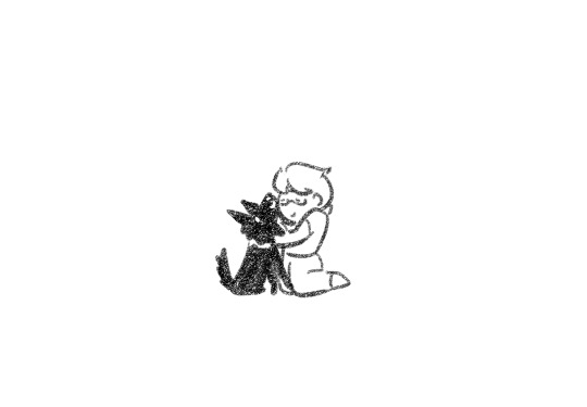
Text
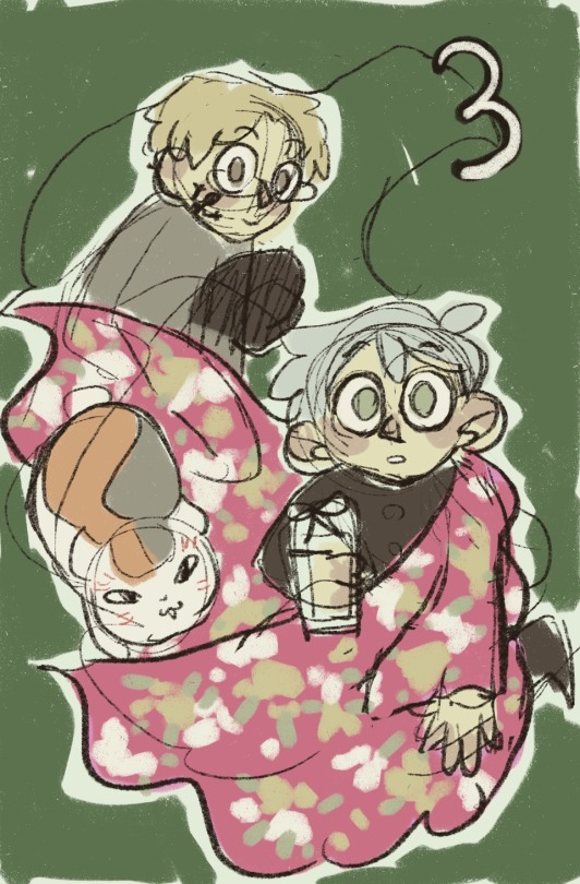
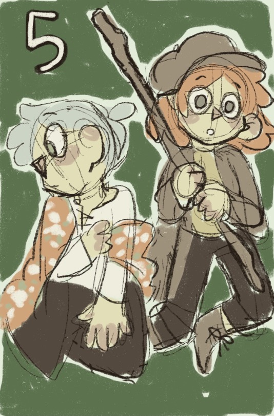
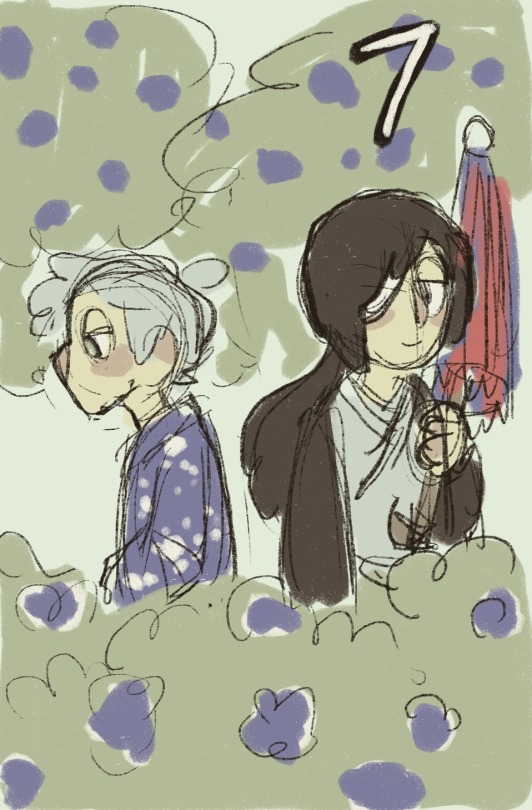
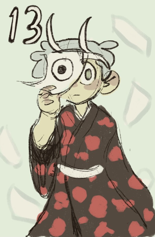
since i've spent the past few days essentially staring at nothing but natsuyuu volume covers i thought it'd be so fun and silly to try and redraw them all from memory tee hee. all 30 (thirty) (三十) of them!!! wheee!!!!
i haven't actually looked at them next to the originals yet so guess what time it is!!!! LET'S COMPARE
starting with volume 1. iconic. show stopping. masterpiece. the mona lisa of natsuyuu SURELY i reproduced every single detail perfectly such that it kickstarts my career as a forgery artist RIGHT
well feast ur eyes
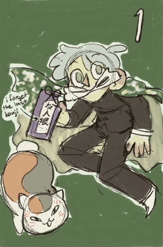
(im using the english volumes for comparison btw they have a good clear view of the art)
CAN U TELL WHICH IS WHICH OOO THEYRE SO ALIKE BET U CANT!!! SPOT THE DIFFERENCE LEVEL 1000 WHICH ONE DO U SHOOT
all i remembered for this one was GREEN and it's not even the right shade of green ajgosugdjfkdgj i even made the fuckin. what do u call it. i'll just say yukata??? I MADE IT GREEN AND ITS SUPPOSED TO BE RED i stg if u held a gun to my head & asked if there was any red on vol 1 i'd be DEAD
but i remembered the book of friends is like. weirdly purple? ok well in this pic it looks p gray BUT ON OTHER COPIES...... IF U UP THE SATURATION GKSJKDNFKDG
why is nyanko sensei smack dab in the middle HUH i couldve sworn he was bottom left this is so fucked up and scary. haunted manga volume??????? i bought it from a grarage sale idk you guys-
at least natsume's pose is like kind of right but also that's most definitely a complete accident i can ASSURE u (im rereading this the next day and the pose isnt even CLOSE what are u TALKING ABOUT)
anyway can i just fucking point out the kanji on the book of friends bc that is from MEMORY YEEHAW here's what it's Supposed to look like: 友人帳
LIKE even tho i got the last one wrong ITS LIKE STILL PRETTY CLOSE??? i think i deserve 100 points for this objectively
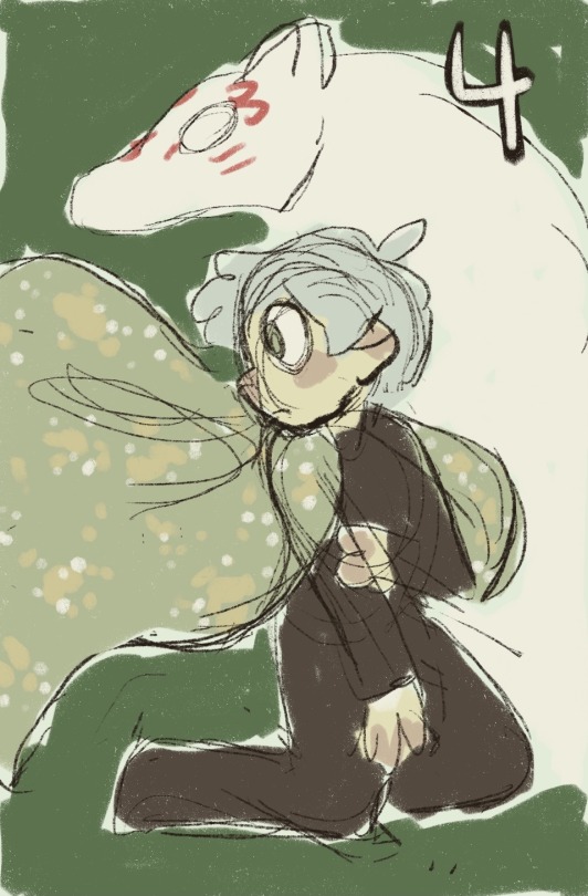
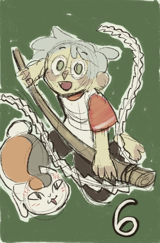
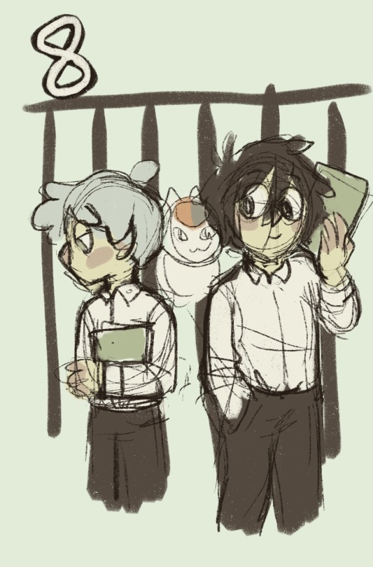
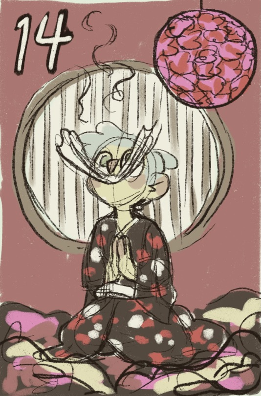
MOVING ON THO....

OK NOT AS BAD AS I THOUGHT SURPRISINGLY im actually like. i thought i bombed this one completely but liKE THE COMPOSITION??? KIND OF ON POINT. KIND OF GENIUS TBH
i remembered Blue and Madara and like what else do u need rly. butterflies are optional in all scenarios imo
also i NEVER have any idea what natsume's wearing in any of these so i always just like default throw him into his school uniform LMAO u will see a pattern
why is the book of friends burgundy in this one btw. it was GRAY i mean purple definitely purple aha
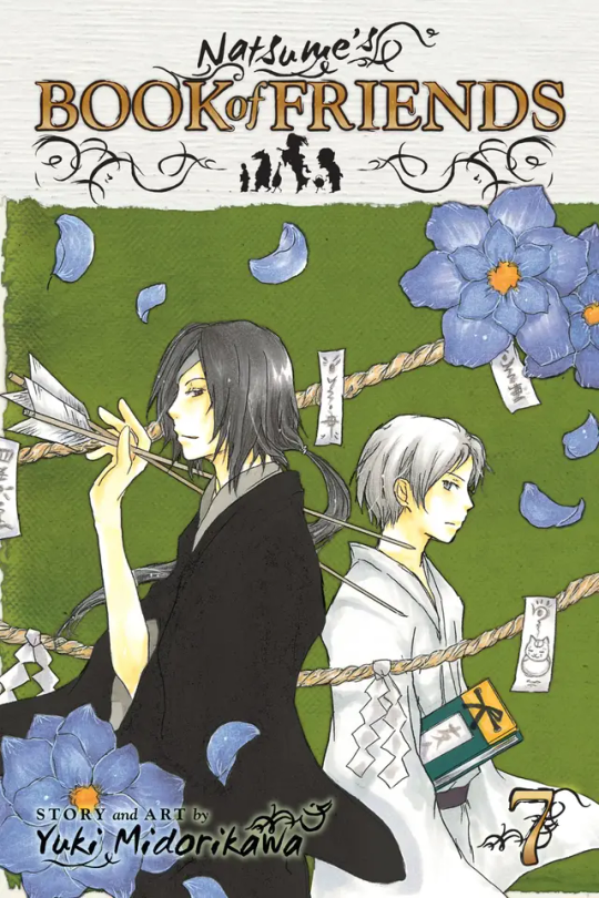
ok volume 3 im actually scared for i know i fucked up SOMETHING

HGLKFKGLKFKGFN OK!!!!! OK NOT SUPER AWFUL!!!! just noticed i forgor to color the book of friends fukg
main thing i remembered abt this one was the color of natsume's... attire.... and which characters were present. whats sensei doing all the way up in the top corner tho 0/10
return of the school uniform lmaooooo hm. irrelevant who cares plus didnt ask. all things considered this wasn't as bad as i thought. THE NEXT ONE HOWEVER,
hsngjfgnfjn okayyyyyyyyyyyyyyy
sensei's way cuter in this one than i realized wait wtf this cover's cute af how did i never notice. underrated cover -10 @ me. look at his lil BLEP >:O!!!!!!!
i knew there was some fuckshit going on w the yukata in this one ourhg i was just like hehe greeennnn also sensei's there. my work here is done
what is natsume's pose even hgnkg i was straight up making shit up at this point LIKE the first 6 or so covers are SO hard for me to distinguish in my head i should get a free pass for the poses in all of them like i can do whatever i want IM the artist now
oh god whats next vol 5
OK!!!! like a straight 5/10 TBH i literally forgot i was planning on rating these LMAO
i remembered the like white v-neck shirt thing and his pose kind of??? i had NO idea what to do for the yukata tho i just made it orange and u know what?? close enough. my rule of thumb is just like pick a color and then throw flowers all over it u cant go wrong
taki looks so much more mysterious on the original and also wearing a skirt. i gave her a big stick bc i thought i remembered her having one in general but i think i made that up tbh wouldn't put it past me. got her hat right tho hee haw
cant believe i didn't get natsume's beautiful artwork tho look at that little shit sensei up there god hes so ROUMD literally moma material
PROBABLY my best one yet uhhhh but i maybe cheated JUST a little for this one ITS LIKE BARELY CHEATING STOP BOOING ME
as i was toying w the idea of doing this redraw thing i was still working on collecting my Images and Pictures so i kinda started taking note of a few small things here & there and one of them was just. the general gist of this cover SO LIKE that's why it's so good LOL
forgor the flowers tho. i literally forget everything that isn't a character like immediately BUT OK CUT ME SOME SLACK like after a point the covers start being whole ass scenes which are SO much easier to remember shit abt than the fuckin Green Void (p sure this is the last green void cover tho)
8/10 composition is gr8 but details like the shirt & the yellow flowers are wrong, also the stick is backwards. i literally looked up what that thing is called and forgot already tee hee
OK WE'RE NOT DONE W THE GREEN VOID I REPEAT-
fuck dude. fuck. i rly thought vol 6 was the last one LOL not to spoil but as i was grabbing these images i saw a Preview of what's to come and the green void lasts until fuckign volume TEN LOL collapses onto the ground and dies
so erhermrm this is vol 7 lolllll i remembered the bg flowers this time can u believe hahaha distracts u from the fact that LITERALLY everything else is wrong auhghg
u know what the green void turned into bushes and i think that's beautiful.... like points for creativity on my part tbh. like to be completely honest. 3/10 i got the characters right
YO????? GATE CONFIRMED LET'S GO?????? it's definitely the school gate but i choose to believe natsume & tanuma r in jail for crimes and u should too
actually this is shockingly accurate for how much i goddamn struggled w this one gkjsldkg the CHARACTERS are right the OUTFITS are right SENSEI'S THERE urgh i knew one of these covers had tanuma holding sensei like that but i couldn't remember Which
i can't believe i actually got tanuma's pose that close i rly thought i was bullshitting w that one wtf. +5 points instantly
do u like how i just scribbled sensei wherever lmaoooo i drew natsume & tanuma & went like. i think sensei's in this one. PLOP
6/10 honestly closer than i thought
OK........ I SEE........ literally dies
this one i was getting MASSIVELY confused w vol 4 bc i could remember nothing distinct abt either of them except Green and natsume w Big Doggie
i remembered the BARE essentials of the composition but not much else... since i thought the green void was gone i put the green i remembered into natsume's yukata (and then put him in the school uniform again LOL) and went WELP. GUESS I'LL DIE NOW
2/10 honestly one of the worst fucking ones lskdjflsdkg
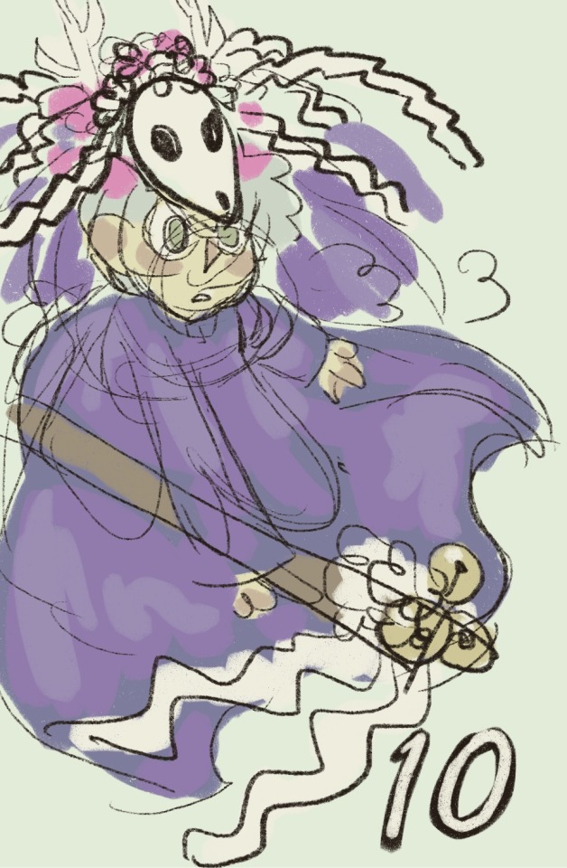
OK THIS ONE.... i almost died irl trying to remember this shit, even before i started and i was still viewing the covers i was like there is no way in HELL im remembering this shit for vol 10. and i was right
like. Purple. White Mask. Antlers. WILD layered clothing. at first i drew the mask as an actual deer skull but later had a straight up epiphany and redrew it like that which... still not correct but I MEAN.... IT'S PRETTY GOOD
i cant believe most of the purple is the bg oughgh his clothes are WHITE..... this is fucked up. i DID remember the stick tho, bells and everything!! actually bells and nothing else!!!
7/10 ok it might seem high but CONSIDERING this design..... i think i did shockingly well TBH
NOT...... the worst...... one....... i could've sworn he was sitting on a pile of books this is so sad that woulda been so cute 😭
for a second when i saw the real cover again i thought he was sitting ON the bookshelf and i was about to RIOT but its okay it's a step stool. still physically possible
my version of natsume here is so much more like Proper gksld he looks like a school boy... studying in the academy's library... hardworking student.... but no the real one is just sitting there like a wet puppy orz he's not even READING i rly thought he was reading. this is such a huge L
cannot fucking believe i was right abt the window tho. like wrong shape but the fact that it's even there.... giving myself a whole ass point for that one
5/10 i rly thought i nailed this one gksgndfkj
also RIP TO THE GREEN VOID U WILL NOT BE MISSED o7
ah shit ok. well one of them was in the school uniform at least fjgugjdkf
why is my natsume lying there like hes abt to start a therapy session, boy would NEVER-
also the plushie hmnmhnmhngnf i dont KNOW i knew there was some kind of prop there but like gun to my head i woulda died again. main colors that stood out to me for this were green and that bluish purple so i got those into mine but i mean. well u can see
once again a random window in the bg i got correct let's gooooo 5/10
LMAO SPITS OUT MY DRINK WHOOPSIE!!!!!!
this is so fucking bad im choking im gurgling LOLLLL i was SO sure natsume's paper had an eye on it i was POSITIVE this is so fucked up. i mean obvs i picked that up from sensei but like i didn't even KNOW sensei was there. or that there were bg characters at all uuuuuououohghh (matoba ignored +5)
i was like. black yukata red flowers CHECK piece of paper w eye CHECK horns CHECK i even went back and edited the horns to be more accurate i was so proud of myself sobs
ok but i knew it was shit trasjh when those were the ONLY details i could remember bc obviously there was gonna be more going on I JUST DIDN'T REALIZE HOW MUCH MORE.....
straight up dookie/10 no jk fr like 3/10 @ me u need to use ur EYES
OK..... I WAS VERY CONFIDENT ABT THIS ONE..... except for his outfit i knew i was bullshitting that BUT I THOUGHT I NAILED THIS ONE....... the one fucking time i didn't just default to his uniform LMFAO
even remembered the pink flower ball smh and for WHAT. i knew he was sitting in a pile of plushies & blankets or smth but no way in HELL was i even gonna attempt to draw them with a speck of detail. but HEY the plushie i drew for vol 12!!! i knew he existed Somewhere. he doesn't even have a horn tho thats so fucked up i thought he did
obviously the most striking thing abt this cover is the bg w that deep burgundy & the circular window so that was the main thing i nailed down right away (my palette was more muted tho). also natsume sitting there w paper in his mouth but i thought he was mid return when rly hes playing like keep-the-balloon-off-the-floor or whatever the fuck he's doing. i love u natsume
(if i thought he was in the middle of returning a name WHY didn't i include the actual book of friends flksglkd automatic fake fan/10)
8/10 this was like my ace in the hole i was like if i got nothing else i got U volume 14!!! and then
NOT THE FAMILY PHOTO......... FUCKING DIES
man idk shit just end me. whats even going on in this cover im gonna deck u natori. dont ask why this makes me want to commit violence hes just so. URHGHGHnH
i dont know whats happening to me rn looking at this im losing my fucking grip dude who let this happen im gonna hurl this volume into the sun??? i think???
why did i add the other two youkai i just thought they should be included but i played myself i had to draw them from memory and for WHAT. pls tell me i got them at least a little bit right i stg
it's the crossed legts dude if he was just sitting there like a board the way i drew him id be like ah shit it was just natori sitting not natsume too but he just HAS to cross his legs and the fucing elbow propped up holding the glasses im S MAD IM SO MADdestroy him
it's 1am i gotta go. i have to go. right now my mom is calling me i have to fukcng. 4/10 i got the couch colorr right. bye
---
tumglr...... only allows 30 pictures per post..... bc im not on desktop? or is that a site-wide thing now. in any case this is getting long so i think im gonna split it right down the middle into 2 posts so there u go, first 15 volumes. so far my score is ermmm
well i didn't rate the first few volumes.
vol 1: 6/10 decent
vol 2: 6/10 also decent
vol 3: 5/10 composition is Scramboled
vol 4: 2/10 it's SO BAD
so now my overall score is 74/150 fjggudjofjdkgjk doing gr8!!!!!!!!!
ok bye for real ✌️
#natsume yuujinchou#ny blogging#rieley doodles#retag later#this is me fighting my demons#why did i get so mad at natori at the end kgsndksjdfk#i say yukata a lot in this post but i think the piece of clothing im referring to might actually be haori in most of these cases#i think more ppl know what a yukata is than a haori tho so im just gonna leave it#(haori is the thing that u wear over the yukata. like a. cardigan)
28 notes
·
View notes
Text
Current digital art process!
Acting on @shkika 's request because making my redraw for this post actually ended up giving me more confidence in my digital art process! As such, I'm gonna use it as a reference. And if this walkthrough of sorts turns out nice, I might do it again as my process evolves!
I started off with a quick sketch of sorts, trying to focus both on movement and volume, and get the general idea of where each element is located. I edit the image dimensions and placement of things a lot in this phase, as my ideas often tend to change once I actually begin drawing them. In this case, as I got it down, I decided I wanted it to look like some cheesy animal motivational poster, so that influenced where the text was.
From there, I began to clean and sometimes edit the sketch, mainly by thickening the lines to make the shapes more definite, and erasing what wasn't necessary and interfered with other parts. Volume is one of my biggest focuses in my drawings, so I try my best to get the volume of each character at least hinted at with the lines. This is something that will probably remain in my process for a while, as I quite dislike doing separate lineart and like the messy, sketchy feel anyway.

I also wanna mention, in addition to having references and such in other windows, I've recently begun having a second mini window of my current drawing off to the side so I can see what it looks like overall more easily, regardless of how much I zoom in on and flip the main window. It's quite helpful!
For reference, this is what the final sketch looked like:
Then, I went on to add the flat colors. Another tip: I almost always set my sketch layer to "Lumi & Shade" because I think it makes the line colors a lot richer, but since it's based on what colors are underneath, it colors the lines a lot more individually than changing the sketch color as a whole. Here's some comparison to a version without the effect (left):

Then, I add some shading using a (really nice) marker brush. This is honestly one of my favorite parts of the process, just trying to carve out all the volumes, especially since I usually use a pretty blue color for shadows!
Sometimes, I honestly just leave drawings finished at this step, because I adore the sketchy look so much, and because I really don't like the tediousness of more realistic rendering in the painting process; from what I've seen/experienced, it often involves having to basically paint the entire image over again, which I've realized I find REALLY boring (and is also why I clean the sketch instead of making a new lineart layer). As such, one of my hopes is to reach a point where I could almost completely avoid having to clean up the image in a traditional painting method, instead being able to lay down lines and colors so well that they convey nearly all the volume necessary on their own, still have that sketchy appeal, yet also look finished and professional.
Alas, I did do a bit of clean up on this image, but I think it still turned out alright!

Here's the finished drawing! I'll have to practice with this process a bit more to truly solidify it as my digital go-to, but nonetheless, I think this came out adorable! Thanks again shkika for the ask, and thanks to @mintscampi for the sweet prompt! I hope you guys like it!
#art#artwork#artists on tumbr#digital#digital art#digital artwork#painting#digital painting#process#painting process#art process#tutorial#fanart#rain world#slugcat#rw slugcat#slugpup#artificer#rw artificer#quetzalli draws#quetzalli's notes
102 notes
·
View notes
Text
Ok ok so I had a quick thought and I really needed opinions, I wanna do artist alley at cons as soon as I get a tax registration and actually draw all the artwork and have stuff printed and manufactured, but I've really wanted to include Ninjago in my future con lineup (I'll be doing genshin, twisted wonderland, maybe some honkai star rail, and I'll sprinkle in a few extras and popular animes) BUT I've got Ninjago art that I actually really like that I think would look good as prints or buttons, I even wanna take as many photos from the show(my personal favorite, the photo of skylor Kai has hanging up in the destiny's bounty with a heart drawing around skylor) and redraw them and make a Ninjago photo collection, and I'm definitely still gonna do it for me and maybe print out the picture as actual photos to keep but I don't know if it'll sell or if anyone would actually be interested so that leads me to the point if anyone that goes to cons and all let me know if you would be interested or think that'd be an area of interest that maybe doesn't get sold often?? Just any(honest) feedback cause I don't have a large following on any of my art social medias, so I don't think I'd be able to sell any Ninjago merch I make online since nobody would see it but idk about conventions so any(please honest, my feelings won't be hurt if you tell me not a sjngle person would be interested in buying ninjago merch)feedback would be greatly appreciated
#ninjago lloyd#ninjago#lego ninjago#ninjago fanart#cole brookstone#ninjago dragons rising#twisted wonderland#disney twst#genshin impact#genshin fanart#artists on tumblr#artist alley#honkai star rail
23 notes
·
View notes