#i'd have to make more graphic design and or art
Explore tagged Tumblr posts
Text
lowkey how hard would it be to get a web store running
#i'd probably go through a print on demand company that can integrate into shopify#and probably use squarespace to actually design the website#i have some basic coding knowledge enough for aesthetics but not enough for functionality#i'd have to make more graphic design and or art#thatd probably be the biggest barrier#that and like promoting#i do not know how to grow social media
1 note
·
View note
Note
how do you consistently draw the same character without it looking weird or off every different time?? also how do i coordinate faces, i always make the eyes too far apart or too big or too small or make the mouth too close to the nose or chin edge. If you have any advice I'd really appreciate it since it looks like you have your art shit figured out 🙏
Oh man SO so much of it is just practice, and you're not alone! I honestly think everyone struggles with a sort of "generification" of their characters' features the more they draw them, even seasoned professionals. There's a tendency to just sort of average everything out into an unrecognizable mush over time, and it takes a lot of conscious effort to push back against that.
Here are a couple tips and tricks that I've found to be helpful over the years:
Make turnarounds and model sheets. There's a reason animation/game studios do this, and it is because we are all still bad at drawing a consistent face. Despite being gainfully employed. What are we, graphic novelists?? We wish. Anyway it's a great way to familiarize yourself with your character's face from multiple angles, and it gives you a single source of truth to return to anytime you need a refresher:
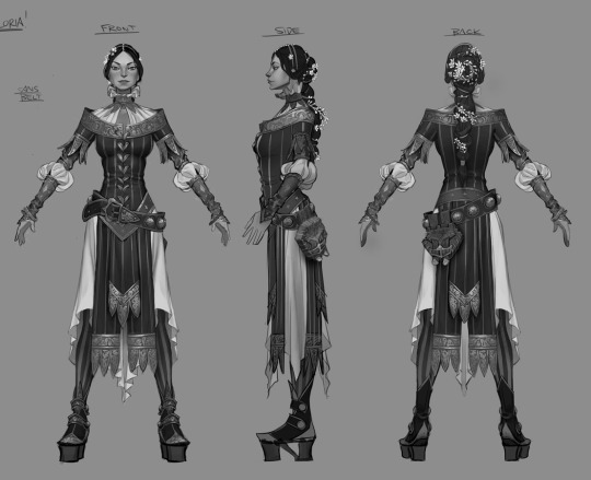
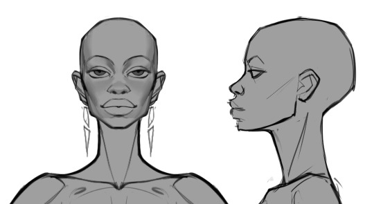
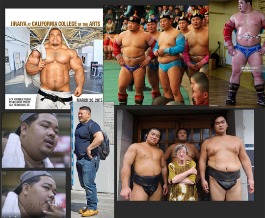
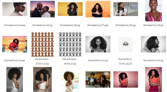
Gather real-life reference. Anytime I'm designing a character I'm pulling together a ton of reference of actual people who look, to some degree, like the character in my head. It's always a collection of analogues, never just a single person, but it can be a great cheat sheet for understanding how your character might move, emote, etc:
Make a 3D model. I know it seems daunting, but with the advent of programs like Blender and Nomad Sculpt it's becoming remarkably more accessible. Heck, even James Gurney was sculpting maquettes out of clay for Dinotopia back in the day! It doesn't have to be particularly detailed—just a sort of proportionate lump will do—but it's another great way to have dynamic reference that you can rotate and light accordingly:
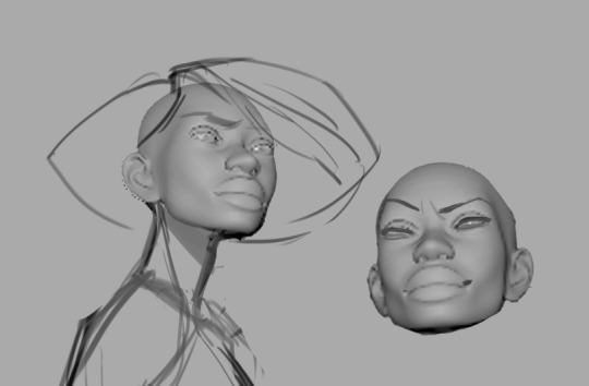
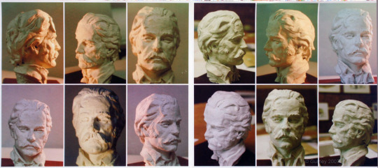
Practice, practice, practice. Make expression sheets for your character! Either right there on the spot, just start drawin' expressions, or you can slowly collect drawings of your character that you like, as you draw them, and compile them all in one place for your own reference. Need to draw your character's head from a weird angle? Maybe you've already drawn it before and you can copy your own homework! Doesn't count as stealing when the call's coming from inside the house 😎
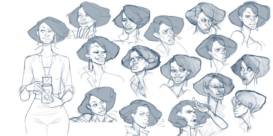
I'd love to pretend there's a magical point where you can just immediately rotate your character's head in your brain like some sort of photorealistic apple in a twitter meme, but a lot of the time it's reference, hard work, and whole lotta repetition. 😐👍🏼
6K notes
·
View notes
Text
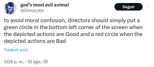
@theoutcastrogue posted this along with a video of a scene from Scarface that had been edited in this way (I'm reposting this and not reblogging it because that video was full of flashing lights and those hurt me physically)-- obviously in sarcasm
But that got me thinking that I'd love to see this as a game design mechanic, specifically for a game in the style of Loved or Papers Please...
For those uninitiated into the Deep Flash Game Mysteries, Loved is an art game that's designed to put you into the shoes of a person in an abusive relationship. You've got a GLaDoS style narrator who gives you commands, and you can choose to follow those commands or not. (They also misgender you.)
As the game progresses, the narrator starts to give you commands that harm or kill your character. "Jump into the spike pit", kinda deal. Obeying or defying gives you different endings, neither of which quite feel good. (I won't spoil them here.)
...I can easily imagine a game where you're in charge of the Black And White Old Lady Boring Movie Channel in a newly authoritarian state, and your job is to put the circles on the movies. And at first, the guidelines seem pretty reasonable.
A gangster threatens an unarmed woman. Red Circle. The square-jawed hero comes to rescue her. Green Circle. The villain ties the hero to the train tracks. Red Circle. The heroine calls the police to save him. Green Circle.
But as the days go on, the guidelines become crueler, more arbitrary, and more fashy.
A father graphically beats his child. Green Circle. Heroic resistance fighters stand up against the Nazis. Red Circle. The police shoot a man for a crime he didn't commit. Green Circle. A child kills their abusive parent in self-defense. Red Circle.
It's clear what they want you to do. But you still have a choice. You can "make mistakes" - but not too many. You can quietly change public opinion by what you choose to portray as 'right' or 'wrong'.
Or not. You do, in fact, have a choice. But neither of those choices will end well for you.
96 notes
·
View notes
Text
—BECAUSE KUNG FU PANDA 4 KILLED MY GRANDMA, OKAY?
To preface, I watched this movie and I'm genuinely tweaking right now so I had to write down a very brief (lie) criticism on this film — which you should boycott, by the way.
Starting with the things I liked, before briefing my primary points of criticism:
Po's Character Regression
Po and Zhen's Dynamic
The Chameleon
I'd also yap about Lord Shen and the death of the art style and the entire narrative and pacing and use of the staff of wisdom but my therapist says being such a hater is 'unhealthy' or something. My heart is full of hatred.
SPOILERS for the entirety KFP4 for the 2 people who care.
KFP4 undermines and ignores the previous three movies — Unwriting character developments, outright removing the Furious Five, straying from the character design philosophies and is completely inconsistent with the established lore.

Things I Liked About Kung Fu Panda 4
The Chameleon's character design
Visual gag in the Tavern where Po uses a recently thrown axe as a hat rack (made me laugh)
When Mr. Ping did this:

so cute! the little heart!

Po — Character Writing

Po, as established in the previous movies, is confident in his abilities and identity — he’s learnt inner peace, he’s matured as a character. However, in KFP4, his character has completely regressed. He’s immature again (such as KFP1, possibly worse) and says verbatim, “only knows kicking butt and taking names” — UNLEARNING inner peace and insisting that “…being the Dragon Warrior is all I know.”
It’s childish, and sort of Hotel Transylvania-esque.
Which isn’t helped by the comedy, the dialogue — a large chunk of which are jokes in the style of:
Master Shifu says something philosophical
Po quips off of it / doesn’t get it (i.e. Whoa!! beat I don’t know what that means.)
Oh, it’s great, yeah, very tolerable. Po’s shenanigans are normally reeled in by the presence of the Furious Five who are generally more serious in nature, creating a much needed balance in the dynamic — So without them, it’s just Po becoming increasingly obnoxious and insufferable with every consecutive quip throughout the screenplay.

Po and Zhen — Character Dynamics
[No more graphics sorry I'm too angry]
As if it wasn’t obvious that Zhen was going to be the next Dragon Warrior the second she was introduced.
Zhen, as a character, has no depth besides being a quippy thief. She quips, she steals. This character has no motives — it can be assumed that the writers intended on a ‘change of heart’ thing, but she isn’t established as evil, her working for the Chameleon is written as a (albeit poor) twist reveal.
By which point, her taking either side wouldn’t make sense, given that she has shown no loyalty or attachment to either Po nor the Chameleon.
The movie artificially strengthens their bond by having Zhen start opening up about her backstory out of nowhere for no reason but they have done nothing to grow closer to each other.
Small tangent, her backstory is exactly what you’d expect it to be with no subversions or even emotional weight. Woe is me I was so small and hungry I had to steal to survive. Glossed over in about a minute.
The majority of the dialogue between Zhen and Po is spoken exposition — explaining how powerful and badass the Chameleon is, explaining how ‘we have to go here to do that’ and ‘this place was cool until the Chameleon did such and such’, and the rest of their time together is spent engaging in filler chase sequences and fight scenes.

The Chameleon
Where do I even start…
This is where it becomes apparent that the movie relies heavily on telling rather than showing —
She is the weakest villain by far, not only in universe but as a written character; which is particularly disheartening because I genuinely adore her character design and feel as though a shapeshifting character has great potential.
The movie artificially inflates her power by insisting through exposition that this is the most capable antagonist thus far (lie).
The audience is TOLD by Zhen and various restaurant patrons that the Chameleon is a powerful shapeshifting sorceress and that she 'dominates the city' whilst the film does nothing to showcase this.
'Dominating the city' meaning letting her henchpeople run amock and bully the civilians just like Lord Shen's wolves in KFP2... uninspired.
I just realised they didn't even give her a NAME what the FUCK is going on
She describes HERSELF as ruthless, clever and unsentimental when comparing Zhen to herself.
She says HERSELF that she’s “Stronger than every opponent you’ve ever faced.”
Let’s see what vile reprehensible things she’s done, shall we?
Gently push someone down some stairs
Her first appearance is through Zhen’s exposition, as opposed to the dramatic and memorable entrances of the previous villains. Her motives or character aren’t established until the final third of the film. She doesn’t even FIGHT anybody until the final third of the film; and even then, her fight sequences are uninspired and she never really poses a real threat. (She goes down in two hits.)
That being said, WE CAN STILL SAVE HER GUYS WE CAN STILL GET HER OUTTA THERE I'M COMING FOR YOU CHAMELEON I'M GONNA DRAFT YOU A PROPER BACKSTORY AND MOTIVE AND YOU'RE GONNA BE THE MOST THREATENING VILLAIN THUS FAR

There's a scene after the climax of the film where all the kung fu masters and previous villains from the spirit realm bow to Po. I'm not going to provide my thoughts on this because I fear I may burst a blood vessel. Good day!

Closing Statements
To put it simply, Kung Fu Panda 4 was my Megamind 2.
The film rejects its predecessors in every way. It really feels as though they brought in somebody with no prior knowledge of the franchise to direct the movie.
It's a film that relies heavily on telling rather than showing — banking on the previous three movies to carry it through the box office.
It's just really disheartening to see studio execs turn one of the best franchises into a safe sequel cash grab and regress every character's development.
Nevertheless. I do adore the chameleon's character design so I might do my own take on her character.
As far as I'm concerned, there is no fairy godmother, there is no tooth fairy, and there is no kung fu panda 4.
#creaman talks to drywall#kung fu panda 4#spoilers#I'm actually tweaking#sorry I stopped drawing the graphics because the film crushed my soul#you drive me to drink kung fu panda 4#when the rantsona crosses their arms#hating on main#kfp#discussion#criticism#kfp4#technically a vent post#i've lost it#the chameleon#zhen#po
279 notes
·
View notes
Note
I wanted to vent, but also ask an honest question. Since I was a teenager, I always wanted to work on character design. And one thing that always caught my attention was how I always preferred male character designs over female ones. My first thought was that I was always more into androgynous fashion and more masculine styles. But time passed and I came to the conclusion that it wasn't just that, and it seems that male characters can always be different things: fat, thin, handsome, ugly, short, tall, young, old, etc. and female characters, for the most part, fall into two categories: cute or sexy. I wanted some tips on how I can make female characters with more interesting designs, without having to fall into those two categories. I love your work and you managed to make someone else like the three musketeers <3<3
Hello ! That's definitely a good question and something I think about a lot. The bias towards beauty is very strong in character design and it takes a conscious effort to diversify output in that regard.
That sort of advice might be a bit obvious, but one habit I picked up from the director on my first feature film gig was to actually "cast" characters. Without reference, we tend to go for the kind of symmetrical face and "average" features mostly out of stylistic habit. I like to look at character actors with distinct faces (I like this pinterest page that has a lot of faces in one place) but also just acquaintances or pictures of random crowds.
When designing a character, at first I'm always building a big reference board trying to decide what Type of Guy (gender neutral) I'm going for, trying use photos rather than other people's art, because I want to rely on automatics and graphic symbols as little as possible. Whether I'm designing a man or a woman or other, I use references of fashion styles and people across the board in terms of gender so I keep the scope open. Sometimes a character ref board for me will be a picture of one of my aunts next to a bunch of screenshots of Columbo. In my experience, a lot of the times, it's mostly about going with styles and archetypes the same way you would for a male character, and switching it up somewhere along the way by looking at real women in your life and beyond as a grounding mechanism. Sometimes that will mean changing almost nothing, because the borders between genders and how you characterize them is blurry and fluid, and sometimes it will mean using features that are uniquely tied to some sort of female experience.
I enjoy realism and I think getting more proficient at it did help me diversify my designs (I find that more difficult to do with more minimalistic styles). Still, I am mostly a fantasy artist and in my case that comes with some amount of stylization and idealization of shapes and looks. I'm far from perfect in my biases and I'm not going out of my way to draw "ugly" characters because that doesn't mean much to me ; I try to draw inspiration from the faces of every day people and I associate it with my love for fashion. It's also worth noting the work I post here for fun is a lot more hash tag aesthetic than the stuff I do professionally where diversity is much more important.
I don't know if any of that is relevant but that's definitely an interesting topic ! I'd love to know others' perspective and tips on the matter.
264 notes
·
View notes
Text
A vaporeon study
Vaporeon is one of my favorite Pokémon. my first introduction to it was in pokemon red, where it looked like this:
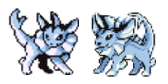
(sprites from Red,Green and Blue)
So in my head, vaporeon looked like this:

It was also somewhat like this in the card game too:
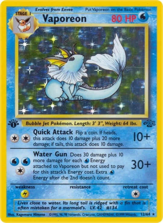
with the neck frill and tail looking like soft goldfish fins, with a long snout, very elegant.
But the game's graphics evolved and Vaporeon changed to look more like the Ken Sugimori art. And eventually making the transition to 3D.

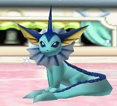
None of these redesigns are bad... but... the ear fins... oh the ear fins...
in the original sprite art, they actually looked like ears. and all my life I've been representing them in my art like this:

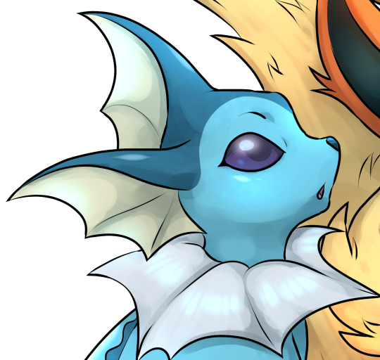
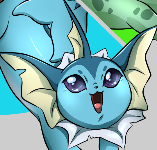
very pleasing to my eyes, but the reality is, they have never been represented to be like this in the games. That's fine, but what gen 6 did to its 3D model, to me, is murder!
Look at its ear!
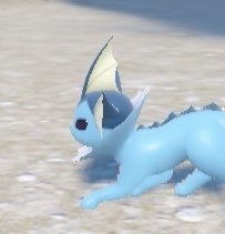
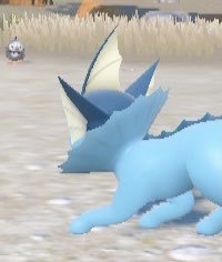
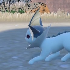
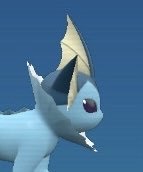
Not only is it just a polygon with a flat texture hanging like a flag, if it wanted to represent an ear, it should have been facing the other way!!! like so:
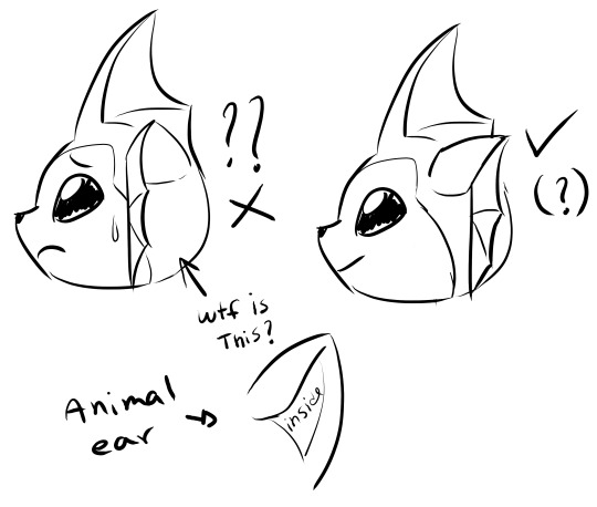
It shouldn't, but this design "flaw" bothers me a lot!
and if we're talking about design, the neck frill looks a lot more like a firm fin now and not as soft, so it really should look like this instead:
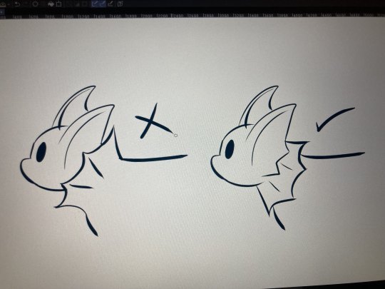
It's a water creature, it needs to be hydrodynamic!
IDK folks, this is just my silly opinion. Feel free to agree or disagree with me but I'd love to know if it's just me who is bothered by this.
thanks for reading.
635 notes
·
View notes
Text
I am literally a graphic designer for my career but I couldn't be fucked editing a template, so here's how my art has evolved in the last 12 months!

January - @meanbossart 's Dark Urge
This was the first digital thing I'd done in over a year at this point. I took an extended break from art because my (old) job was ruining my mental health. (Which is why I quit it :D !) And his Drow character is really well thought out and very unique so I had to draw him. (His art is also very inspiring to me so check out his page!)
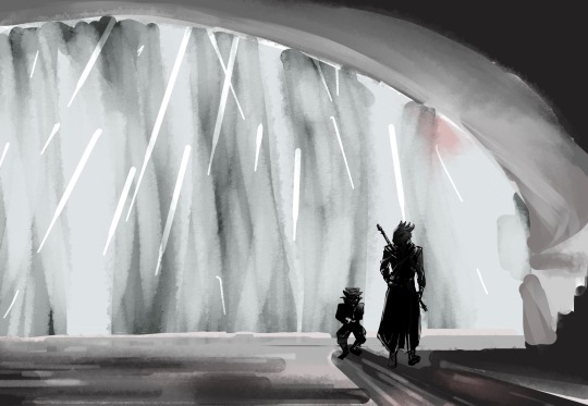
February - was still in my Baldur's Gate kick and loved that lizard (still do) and it was also my first time doing environmental art. I couldn't figure out how to do the "mood" I was imagining so I had to look up famous movie shots that were noir, dark and moody to figure out what the heck to do.
MORE UNDER THE CUT 👇😁
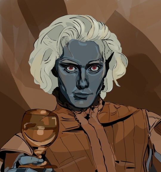
March - My D&D character Istdrin, a Drow sorcerer who was sexually attracted to spiders... And got eaten by spiders. (I had to make a new character after this 🤣) Rest in peace you sick fuck

April - Astarion, my fave BG3 companion (besides Wyll & Shadow heart!) I wanted to design a fancy suit for him and a modern haircut.

May - my first drawing of my V (Vicentije.) I had just bought Phantom Liberty at this point and was also trying to figure out how to draw him and how I imagine he would look. Alas I am a console player so I can't mod his tattoos in or his face sculpt etc. (but in a few months I'll finally have saved enough money for a PC haha!) he's gone through a few changes design-wise and I'm still tweaking him tbh

June - first art for my fanfic End Transmission
I just finished Phantom Liberty and had this idea brewing in my head. I'd also started writing my fic too! I'm not really happy with V:s face here and I've also since made more changes to his design, so he doesn't even have these tattoos anymore lol! (Except for the 13 on his forehead because he is unlucky)
July (??) (nothing)

August - Johnny Silverhand
I actually did this right before I went to America this year. I was drawing this at the Sydney airport and painting it on the flight to Los Angeles. I am still really happy with how this turned out.

September - I did this in my downtime while in the states. I started drawing the frames in my first week in America (while I was at my aunties house in Los Angeles) and finished it during hurricane Francine in New Orleans!
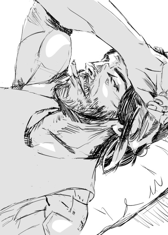
October - Johnny Silverhand again! I tried drawing a few comic panels of my fanfic End Transmission when I got back to Australia.

November - original character I'm working on. He's an ugly vampire who was an artist in his human life and made very beautiful things.
December (??)
Nothing really for December yet lol! Just lots of wips and ideas I'm still working on
Overall my art has made a HUGE improvement this year. I've been focusing on better quality lines the last two months but all year I've been working on more dynamic poses and colouring!!
53 notes
·
View notes
Text
ATTENTION KIRBY FANS!
Do you want to see a Kirby movie more than anything, but Nintendo keeps letting you down? Well, today's your lucky day! I'm in the process of creating my very own, fanmade Kirby movie based off of Star Allies - and I'd like your help. I believe that with the efforts of a community coming together to work on this passion project and give something that we love our all, it will turn out better than anything official that they could come out with. Overall, while this project is serious to me and something that I am very dedicated to, I also want it to be fun and for everybody to have a good time creating this art together. If you do decide to jump on and help, there's no need to worry about deadlines or stress or needing to have a ton of skill. But, without further ado....
Animators
I'm looking for people that have experience working in Blender here. Pretty much any skill level is okay, though I will still request that you show me some sort of example (just to verify that you know how the application works at all, basically). Ideally I'd like to have enough people working on this that I could step back from leading the animation, eventually, and focus fully on writing/storyboarding and other design aspects instead - but I understand that this might be unrealistic.
Storyboarding
The more the merrier! Regardless of the level of your art skill or your style, if you can sketch out scenes in a way that's decipherable to others, you're more than welcome here.
Voice Acting
The big one. Voice actors for Kirby, Meta Knight, King Dedede, and Bandana Waddle Dee would be very much appreciated. I also have a longer list of characters that need voices that includes many of the Dream Friends, Hyness, the Mage Sisters, and more. This is the one thing I will likely be a little picky on, and require you to audition for the role.
Writers
Honestly, I'm not looking for many other writers right now. I think I have it mostly under control, but I could possibly take one or two co-writers on with me.
Sound Effects/Miscellaneous
Do you think you have something to bring to the table that I didn't list before? Great, this is for you! Let me know what you want to do, and honestly, I doubt I'll have any reason to turn you away. Whether it's stitching music and effects together, editing extra graphics, or literally whatever you think will be helpful, tell me so that I can get you in.
Community
If none of that sounds like something you'd be interested in, well, you can still do something to help. Just stick around here! Throughout development I'll be posting updates, questions, and polls about decisions on this blog for you to influence. I want this to be something that the community creates together and can enjoy together. By us, for us, you know? And everyone who wants to deserves to be involved.
- Closing -
If you made it this far, thanks for reading! This blog will likely be changing a lot in the upcoming days as I update and personalize it to be more effective. I also now have a discord server! Anyways, though, the long and short of it is that I'd love to work on this with other people but I will complete it, no matter what. So this is your official guarantee - sometime, in the indiscriminate future, you will have a Kirby movie. And I hope you enjoy it just as much as I'll enjoy making it, because honestly, this is just my dream. I hope I see you around, and have a great day!
progress as of 8/15/24: trailer scripted and (mostly) storyboarded. possibly starting animation soon!
#kirby#kirby nintendo#nintendo#kirby movie#kirby of the stars#hoshi no kirby#hoshi no kaabii#help wanted#sorry ignore the tag spam I'm just a tad worried about not reaching anybody with this#that would be a little embarrassing#kirby series
93 notes
·
View notes
Note
Hello. I've seen some of your pists about Gaza. I'm unable to send money at the moment but I'd like to still help. How can I help? I was planning to reblog the link for the foundraiser but couldn't find it.
Thank you!
Hi! I am not sure which fundraiser you were trying to find so I will promote my friend Mohammed's. He has until Tuesday before his campaign organiser starts the next money transfer, so we're trying to raise as much as we can before then so it reaches his family ASAP!
As to your main question, I'm presuming you're asking specifically how to help with personal fundraisers (as opposed to, joining an organisation or activist group, which I would also recommend where possible). Here are a few ways you can help even when you are short on money yourself:
1. Boost and promote campaigns. Even having one person pay attention and post updates can help keep a campaign from entirely stagnating. Especially if you have a low follower count, you will want to use the tagging function to get some bigger blogs to reblog your posts and updates. It feels awkward but it can be a genuine lifeline for the person whose campaign might be going slowly or slipping through the cracks.
2. Consider 'spotlighting' a specific campaign. This is a great guide from @/feluka on how to do that. You might have seen me doing it with Mohammed's campaign and a few others. This involves keeping up with the campaign more closely and probably writing more of your own posts. It takes some time and effort but again, it can be invaluable for the person on the other end.
3. Even if you can't donate yourself, consider putting together a raffle, auction, or commission opportunity that can incentivise other people to donate. Visual art (digital or physical) is a common prize/commission I see offered on here; there are also raffles for handmade or rare items such as plushies, cross-stitch, hand-sewn clothing, knitted items, limited-edition books, fancy journals, writing requests, etc. Anything you can make, someone might be interested in. If you need help boosting a post about a raffle or commission, tag some users who reblog fundraisers! You can also send that kind of post to me and I will happily boost it for you :-)
4. Consider reaching out to anyone you see promoting a slow or stagnant campaign if you have the kinds of artistic or graphic design skills to create artwork or graphics for them to use. Visual aids, banners, etc can make a huge difference when you're trying to get people to read a post and click through to a donation link. Or, if you can't make graphics, could you learn how to write accessible image descriptions for any that you see, and offer to do that? It's easy for people promoting a campaign to get overwhelmed by alt text and image descriptions when a post might involve numerous visual elements, time-sensitive updates, and an urgent need for donations as soon as possible.
5. Some people contribute to Gazan fundraisers by raising the donation money through irl events like bakesales or charity drives. These may take a little more effort or upfront materials costs to set up, but they can also be a great opportunity to spread the word and connect with other people. If you have local activist groups or parties, this might be a good time to reach out to them and see if they can help facilitate such an event.
123 notes
·
View notes
Text
CHARACTER DEVELOPMENT ACTIVITIES FOR WHEN I FEEL STUCK OR BORED. most people, myself included, are prone to writer's block, and while this can be an extremely frustrating process to get to, i try to use this as an opportunity to approach it in a fun way. i thought i'd share some of my favourite activities that might be of use to other people.
create a movie library. if your muse is someone who likes movies, make a list of their favourites on letterboxd or imdb, or even serializd for those that prefer tv. you can make lists for ones they've seen and enjoyed or haven't seen but would like. i use letterboxd for this quite a bit and sometimes even add some notes within my lists detailing my muse's thoughts and reviews of the movies.
make a sideblog. i know that many people do this already, but aesthetic sideblog for your character can be extremely helpful and fun to maintain. you can build these however you like! i like to use mine to post photos that my muse would like, faceclaim content, playlists and songs, ships/dynamics inspo, headcanons, silly text posts, and a variety of other things. if you're unsure where to look for content you can post on your sideblogs, @museinspo has a variety of things for many types of characters and is a really helpful place to start. they have a great detailed tagging system to make it easier to find content best suited to your muse. some tags that you can also look through could be #character inspo, #ship inspo, and #muse inspo.
play a barbie dress up game. most people who know me can attest to how much i love this — building a closet for my characters' style. every muse is different, so this can be a fun exploration activity. pinterest is a frequently used resource, but what i like to do most often is browse resale websites like depop or poshmark because i like the variety of styles and the fact that you can find some things you might not see in every store! i have many muses who like to wear silly graphic t-shirts, handmade, vintage, and eclectic styles, so this tends to be the best place to search. you can also do this with any website that sells styles you like for your muse. i like to think of this as a dress up barbie game since that helps me maintain the fun aspect of it all.
build and decorate a barbie dreamhouse. on the topic of barbies, you can do the same activity with furniture, homewares, trinkets, toys, art and decor. build your muse their barbie dreamhouse, fill it with things they would collect and feel at home with. browse furniture websites. ikea, crate and barrel, pottery barn, anthropologie, and west elm are all great places to look for ideas. if you really want to get into it, architectural design (i particularly like this article listing recommendations for furniture retailers) and dezeen (has the added bonus of being able to search for things based on location, if you're looking for example of interior design specific to your muse's city of residence) have extensive articles on both exterior and interior design. etsy is also a great place to look for antiques, vintage style, and more eclectic items.
feed them. if your muse is a foodie or likes to cook, come up with a menu for them. read food blogs and restaurant menus, think of what they'd like if they went out for dinner or what they'd cook at home. i will sometimes make up an imaginary dinner party for muses when its applicable and plan out what they'd like to serve or be served in that situation. food can be a great way to get to know your muse because it can tell you so much about their personal tastes, their current lifestyle, and their cultural background. while food is something that is prevalent in everyone's life, different people will have different approaches to it. this can be especially fun if you look at the menus for restaurants and shops local to your muse's area! read about what's popular in their neighborhood, take the specifics of that culture into consideration.
consider history. think about the time and place in which your character was born and raised in. how would things like pop culture, trends, media, neighborhood, and society affect them? this will differ with every character's upbringing and background, so take all that into consideration as you explore resources. for example, say that your muse is inspired by something like punk subcultures in the 1990s. what music, movies, and clothing styles would have been prevalent at the time? try looking into the history of the underground scene, you can even look further back than that particular decade to understand its roots and how the subculture go to that present moment. how would current events of the time affect what's being put out there and how would the changes within the world cause your character to evolve in their mindset or interests?
study movement. often times we study physicality in terms of what the character looks like as a static image (their hair colour, face shape, clothing, etc) and less about what it looks like when they look like when they are in movement. consider things like their gait, posture, facial expressions, or even specific tics. how do they move when they're on the go and in a rush, compared to when they're confined to a room? how do they position themselves in a bed or on a couch? what does their face tell you about them when they speak? what does it not tell you? a lot of behavior and emotion is not limited to dialogue, but rather how a person composes themselves through body language. you can learn so much about someone by being observant of them even without dialogue. it can be helpful to watch videos or movies and study an actor's movements with all this in mind. i often find myself watching videos with the sound off, just to pay closer attention to body language and try to understand what they are saying without verbal communication.
feel free to reblog if any of this is helpful to you. i maintain the belief that roleplay should always be fun and the best way for me to do that is to treat it like a barbie game. remember that not all character development revolves solely around written words, but rather the environment and details you put into them.
#once again i dont know how to tag anything ever so lets just see what happens here#rp help#roleplay resources#rp resources#roleplay tips#writing tips#oc development#oc ideas#character development#rpc#rpc help#roleplay community#indie rp#rp advice#rp guide#*#tips
58 notes
·
View notes
Note
i really like how much depth your art has, do you think you could show how you break down bodies when sketching if that makes sense? it’s something i struggle with a lot in my art! 。゚(゚´ω`゚)��。
ok apologies in advance, this is probably going to be a really long and tangential rant about art that may or may not actually help you in learning how to construct bodies. im just gonna put it under a cut to save everyone from seeing this huge text wall.
i dont think its gonna be possible for you to replicate my methods here, because theyre mostly just really specific shortcuts for finding certain proportions and reference points for anatomy, which i'm fairly versed in, but not as much as i'd like to be. the shortcuts you'll need will be different from mine. im glad you think my art has depth, that is something i am trying to seek very intentionally right now, and i dont think im even close to the depth of form i am actually aiming for. so like. this makes making a tutorial kind of inherently hard. nevertheless, i threw this quick sketch together after like 3 failed attempts. (i was doing those attempts digitally, ended up giving up on that and going back to traditional because its what im most comfortable with rn)
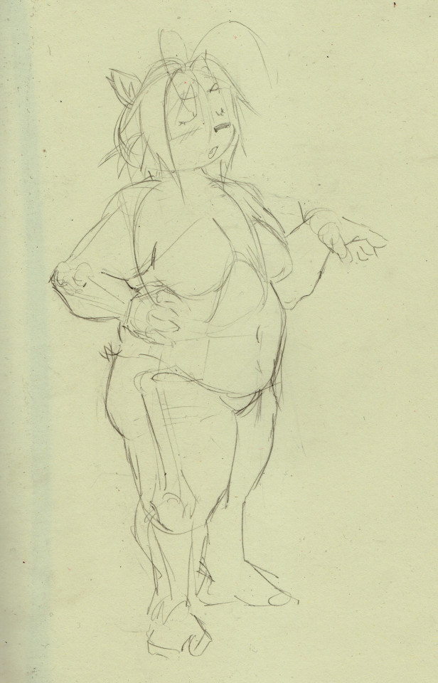
i didnt get all the steps i took to get here because scanning that much would be cumbersome but ill try to explain how i got here. i start with the head almost every time.

i use a lot of symbolic/graphic shapes when drawing heads and dont stick to using forms very often besides the circle at the center of the head, which i use as the base to form these graphic shapes around. think of it like "wrapping" the ball in various textures and masses. the eyes are usually "textured" onto the head, notice how the her left eye looks narrower then her right. of course i try to make sure her bangs sit along the curve of the sphere and her ears look like they sit on opposite sides of the head. its easy to forget that part, making the head look unsymmetrical. the particular masses of leica's head would be her snout, which is just a curve extended slightly outside the diameter of the ball, and her hair, which are two strange organic shapes that are quite hard to draw, two hair sprig anime antennae things (forgive me, i forgot the word for them,) and the back of the head, which i usually need to extend slightly. its a little too extended here, needs more on the top, i fix this in the final pass. this was a quick sketch, so i didnt focus too hard on the forms of the head beyond the most essential ones for her design, but i sometimes highlight the form of cheeks with curved hatching, or try to make the eyes appear more sunken-in as they are on human faces. i dont know how to proportion the neck and torso correctly until i draw the head, so i always do it first. next, i did the torso.
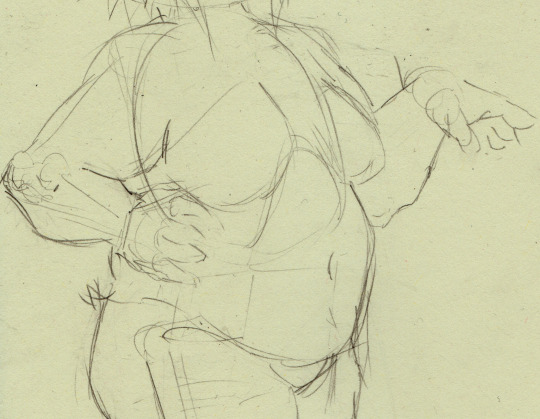
so heres why i said that you probably wont be able to replicate this approach. you do kind of just have to practice anatomy, i cant just make it make sense because im not very good at explaining this stuff, but ill try to go through what i did here. so, i generally use simplified bone shapes to find proportions and reference points, as well as more complicated shapes like those of elbows and knees. i try to study fairly often because im not satisfied with here im at with this stuff yet. of course, i dont think i'll ever be. so i'll usually start with the ribcage, add a shoulderblade out the back to find the shoulder, the armbones come out of that, the bone in the upper arm connects to the ulna with a sort of three-pronged attachment, one big knurl in the middle, which forms the thrust of the elbow, two little ones on the side. i think those are part of the ulna but i dont remember. see, you dont really have to know what exactly they do as long as you know what they look like. the ulna does some goofy rotation shit i dont understand, connects to the wrist, and then we have a hand, which, i mean, im not good enough at hands to even be telling you how to do it, but i just have a big squarish mass and some little hotdog fingers coming out of that. you can see on her left hand that ill have a big circle forming the the area on the hand where the thumb attaches... theres more depth to the hands, i think you can easily find better tutorials then i could offer. anyway, under the ribcage theres the pelvis, represented with a box. ill get into that when i talk about the legs. i wanna briefly talk about the way i add the flesh and fat to the bones.
so, i really can't give a comprehensive crash course on anatomy, but i can point you towards the morpho series, which is where i get most of this stuff from. you can get very far with the volumes Simplified Forms, Fat and Skin, and Skeleton and Bone Reference Points. moving on, i just kind of have a feel for where the masses attach by now. the important thing to remember when drawing fat characters like this is that the fat should "hang" from the bones and flesh, drooping down slightly. leicas fat hangs substantially, so she's not very wide despite her weight. this is important to her character design i feel. i almost always draw characters naked first when doing serious drawings because it will come in handy knowing where the forms of the body are when i add the clothing. by focusing on the way her body looks naked, i can modify the impression of those forms when adding clothes, and when i add them later on in this drawing, leica will take on the distinctive boxy look i try to draw her with.
if you look at the arm, youll see that the place the line of bone sits is very high compared to the whole mass of the arm, the flesh and fat of the arm "hang" from the bone, and then the upper arm squishes against the bent forearm too. even if the anatomy in the arm is indistinct, it can still look convincing when the forms act realistically against one another. the elbow has much less fat connected to it, so its more bony then the rest. this isnt actually consistent on all people so like, think about that kind of thing when designing characters, like i was talking about before, fat can sit in infinite different ways. maybe if i was doing a more objective anatomy lesson i'd draw cath, because i do have a sort of vague understanding of muscle placement that doesnt come through here, but probably would if i was drawing a scrawnier character. let me know if you want that.
a word on the breasts too: they hang a bit lower then you'd expect, keep that in mind. the attachment point is also angled, as the line shows. the line starts roughly in the middle of the torso and ends around the armpit, but the form of the breast can go underneath the armpit or even connect around the fold of fat in the back. many things to think about. i love boob shapes. ok lets finally get on with it and talk about the legs.
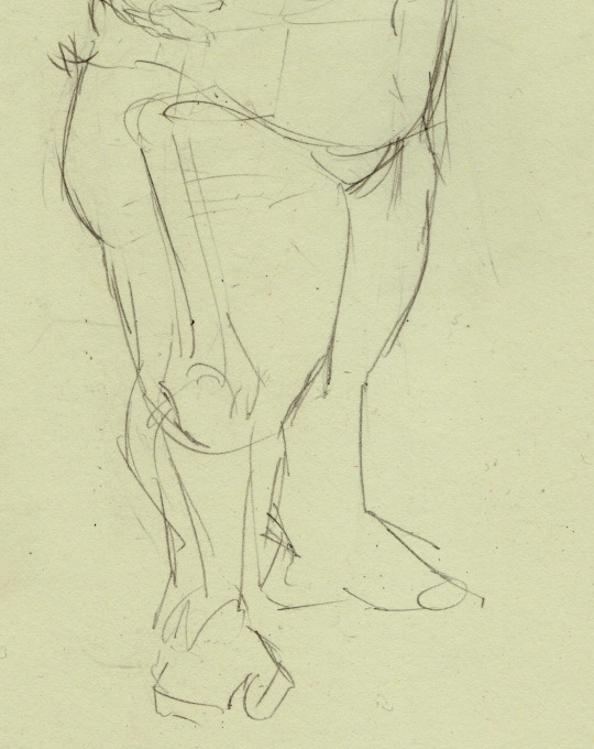
so, the really specific shape of the pelvis doesnt matter that much unless youre drawing a really thin character, so its just a box here. out from the sides of the pelvis, extending out more then you'd expect, is the femur, which ends in a similar joint to the arm. this shape helps me figure out the form of the knee. two masses on each side with a bunch of complex and weirdly shaped bones forming the kneecap, which i have omitted because i dont yet know shit enough to include them. i am learning though. so, obviously the feet are just scribbles here because im just gonna put her feet in socks anyway. you really dont have to do more then you have to. a few tips i can offer here, the butt should hang a bit too when drawing fat characters, i think the butt is supposed to start just below the pelvis if i remember, but take that with a grain of salt. i also didnt really do that here but its hard to tell because she's facing mostly forward. again, i dont think i can really communicate what's going on here. morpho has a lot of great drawings explaining the shapes and muscles of the legs, all things i might focus on more when drawing a scrawnier character. for this case, i regrettably don't go too hard on the legs. also i should note that legs would usually be much longer, leica is really short so ive exaggerated the proportions to communicate that. i may change my mind on that front in the future and give her more grounded proportions. the important thing to remember with legs is just getting a nice hierarchy of forms going. bigger thigh going into smaller calf going into smaller foot. it mostly comes automatically now.
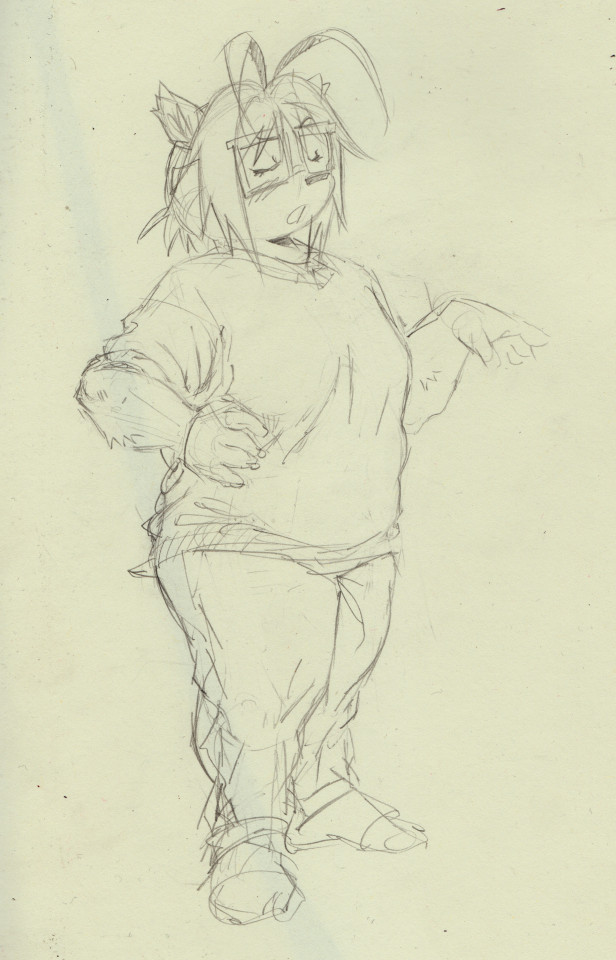
i added the clothing, shaped up her head a bit, added a bit of fur. i put her in her classic outfit, just a sweater and jeans. i enjoy the big thick folds that come out of these clothes, and big areas of white space too. its nice. i try my best to form all the folds around the forms of the body i drew earlier. thats one case where i really really have no idea what im doing and could never explain it in words. its just some fun intuitive play with loops and lines. this is at around the stage for a sketch where i'd do inks, or if it was going to be a finished pencil drawing i'd erase out parts piece by piece and replace them with nicer and more defined lines and tones.
i guess that's all i can offer , i hope that halped.
150 notes
·
View notes
Note
hey so i’m really wanting to make a book/field guide of my art and i was wondering what your process is from creating an art piece all the way to getting a zine-style physical copy of your work? i was inspired by your zines so i thought i’d ask you about it. what websites do you use? how do you like,,, talk to a business to get stuff from the digital illustration into a (relatively small) book?
also this is a personal project to fuel my hyperfixation so i’m not looking to like,,, produce in bulk or anything lol.
thanks :)
for my larger-quantity zines I used mixam.com! they're a print company that specializes in booklets and catalogs, and everything on the production side can be dealt with online. I've had very good experiences with their customer service (I was put through to a real person on their chat function almost instantly when i needed an answer to a more in-depth question) and their prices are really good imo, especially for bigger quantities! They also have pretty high customization options--you can choose the weight and type of your paper, multiple types of binding, etc.
if you go that route, though, all of the graphic design and layout is on you. I'd recommend getting indesign or a similar program to help you lay out your booklet, so you can keep all your pages in one easily-accessible, editable file. (and remember that in order to be printed as a booklet your page count MUST be a multiple of 4!) mixam (or whatever printer you use) will usually give you a template that lets you know exactly how much bleed and gutter space you're working with, and you can then input those numbers into indesign. (If you do this, make sure you export your final pdf WITHOUT CROP MARKS, because your printer will add their own crop marks later on.) once you've arranged your booklet the way you like in indesign, export it as a pdf (in single pages, not spreads, and make sure your pages are in sequential order rather than optimized for booklet printing; it's on your printer to do that step for you!) and upload that pdf to your printer. Mixam gives you a few days to check over your work and either confirm it's correct or cancel the order, and then once you've confirmed it goes into production. more pages and more complex printing will be more expensive, but i've had nothing but good experiences buying from mixam and if i ever selfpub again i'm definitely going to be using them!
#mixam does also technically let you upload straight jpegs to their site but i would not do that ever. use pdfs trust me#your image quality will thank you#asks#side note if you have your own home printer you can also look into binding your own work!! i do a lot of that for my smaller-quantity#projects for like school and stuff. because it's significantly cheaper lol#and it's not very hard especially with a lower page count like all you really need is a stapler a ruler and a razor blade
38 notes
·
View notes
Note
Your art is amazing and so cute! Do you have any drawing/anatomy tips you’re willing to share?
Oh man I don't know if I'm in any position to give ANATOMY tips specifically hgfdkh I feel I still have a LOT to learn in that regard!! I have a degree in Graphic Design but tbh a lot of those classes were based in - well graphic design and didn't cover a ton of drawing/illustration stuff, so much of what I know is self-taught!
I'd say just in general, draw as much as possible. Even if it didn't turn out exactly the way you want. I'm gonna post some Cringe Art of mine to show some examples


I Did not like how these turned out in the end. BUT they were requests from my Strawpage and this was super early on in me posting on twitter n gaining a little following, so I just pushed on, finished them, and posted them. Not letting myself get Obsessed with one drawing and making sure it turned out "perfect" helped me to just KEEP drawing, which sharpened my skills and gave me WAY more muscle memory! I used to have to check other drawings of Arkham Ed to make sure I was drawing him right, but now I could pop out an Origins, City, or Knight Riddler with one hand behind my back because I've drawn him. So many times now ghksfh
and I think this general advice applies to technical skills like anatomy, lighting, etc. too! The more you just force yourself to draw that janky hand and keep it moving, you'll learn what you DON'T want things to look like, and eventually you'll kind of Teach Yourself the way it's supposed to look. At least for you in your art style!!
AND OFC THANK YOU SM FOR THE COMPLIMENT YOU ARE TOO SWEET
#I know I didn't give much technical advice#but I truly don't feel I'm in a position too HGSDJKG#pls ask someone MUCH more qualified like a person with like#a character design background or something much more technical than me#I'm running on passion drive and a desire to DRAW#ALSO WARMING UP#IS SO IMPORTANT#NEVER TRY TO JUST SIT DOWN AND DRAW#fucking doodle fifty circles or draw twenty little flowers#anything to get your hands loose and flowy
48 notes
·
View notes
Text

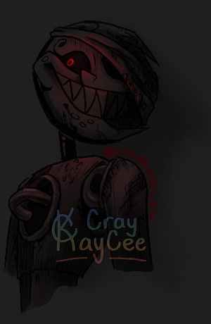
sneaks onto ur dash to talk ab one of my aus with these magma doodles------
This is a Street Artist AU I-- basically adopted from @starrspice (thank you, lovelyy!!) This is a post-fire AU where the DCA escapes the fire themselves and into the city. They're stripped of the proper prompts and triggers for their childcare and entertainment programming, but are able to find something their coding can latch onto: a group of children who need entertainment. They modified their performance and entertainment programming with their arts and crafts protocols to create art as a performance!
More details (so many details-- I went off xDD) and designs of the AU, of which I've titled "City Lights and Paint Water", under the cut :3c

They're pretty beat-up from the fire, and without proper access to maintenance, they've retained the burn marks, splattered paint, and other grime associated with being outdoors. Over the months as street artists, passersby donate their old paints and other supplies, hence the oversized trousers and worn apron! (P.S.: cloth placement is more accurate in the magma doodles)
Sun and Moon each have preferred mediums and styles!
Sun prefers acrylic paints and spray paint, his paintings a controlled chaos with loud, scattered colors, large brushstrokes, and splatters. His paintings always have a lot of movement due to his freeform painting style, splattering paint and getting a laugh from the kids.
Moon like to work with watercolors and colored pencil, the colors more muted with small pops of brighter colors (such as lights within windows). He likes to capture the lights of the streets, wondering what the true night sky looks like, his art giving a soft and ethereal mood.
Then we have our Main Character (MC), the viewer/reader! They're a graphic designer for a big corporate tech company, tasked with making pamphlets, brochures, posters, et cetera for the company. Though they do good work as a graphic designer, their true passion is fine arts, but their work isn't taken seriously due to its "childish" appearance despite the real-life deeper meanings. In the meantime, they create for themself, crafting and making trinkets for their apartment. They even make some of their own clothes, made up of several different garments to make something one-of-a-kind. Their outfits are fairly chaotic, typically accompanied by a hair accessory, but the patterns and colors compliment each other well.
MC grew up in a rural area, and still love the open and free areas it provides, but they had to move to an urban city for work and better opportunities. It's a big step up from their small town, overwhelmed by the activity. At the start of the story, they feel disconnected from their work, drained by the cookie-cutter bland work of their graphic designer job, but it's the only way they can reliably earn income.
The story starts with Sun spotting MC beyond the crowd, rushing somewhere. He continues to see them in the distance, unable to approach them due to their haste. He's mesmerized by their appearance, drawn to their creative expression just in their outfit. Moon catches a few glances of MC in the evenings, but doesn't have the same draw to them as Sun, figuring them as just another "everyman" in the crowd. One day, in MC's haste, they lose a paper from their portfolio. When Sun catches it, he sees a presentation sheet of several different designs meant for a business card or a t-shirt emblem. Sun is astounded by them, making MC more interesting than they already were.
It's not until about a week later that Sun takes an opportunity to return the paper and give his compliments. When he does this, however, MC's face falls before forcing a polite smile, thanking him. Before Sun could say anything more, they're gone.
There's so many small moments I'd like to explore, but that's the set-up :3cc I nearly have chapter one (1) completed, two (2) chapters after that already planned. The chapter length is pretty short right now, but I don't know if I wanna beef them up or keep them at this shorter length. We'll see! :D
Welp, these are my boios! I hold them gently in my hands and present them like a proud parent
#City Lights and Paint Water#sun x reader#moon x reader#fnaf au#street artist au#street artist!Sun#street artist!Moon#fnaf y/n#fnaf daycare attendant#cray kay art
443 notes
·
View notes
Note
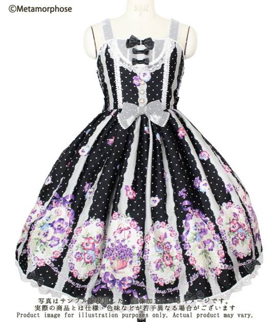
what are your thoughts on the AP showcased pieces? im so grateful you're posting them, by the way! I feel like the headpieces as always are stellar, but the dresses feel a bit uninspired; I wish they were making more complex compositions with their prints, like how Meta does.
I have feelings about the collection, and also about the show / photos. I want to preface this with saying that I like Maki's art style and her print designs more than any other brand's. So, I'm personally biased towards the AP collections a lot of the time. I also have some personal preferences when it comes to styling, trim, etc, and there are plenty of things that are perfectly decent that I just personally don't like / don't work with my personal aesteic. That said...
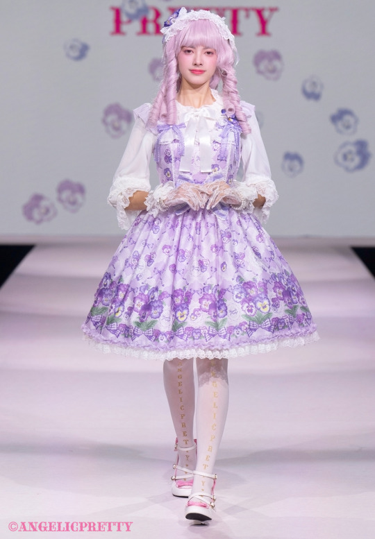
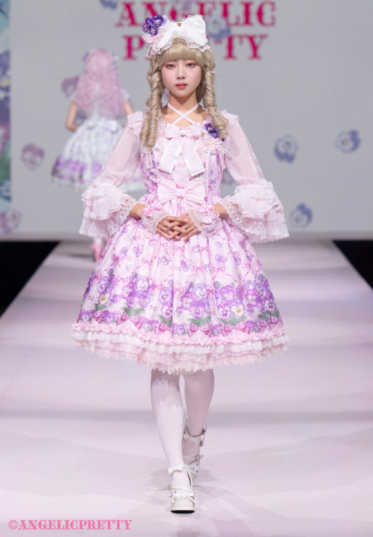
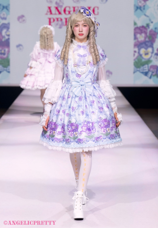
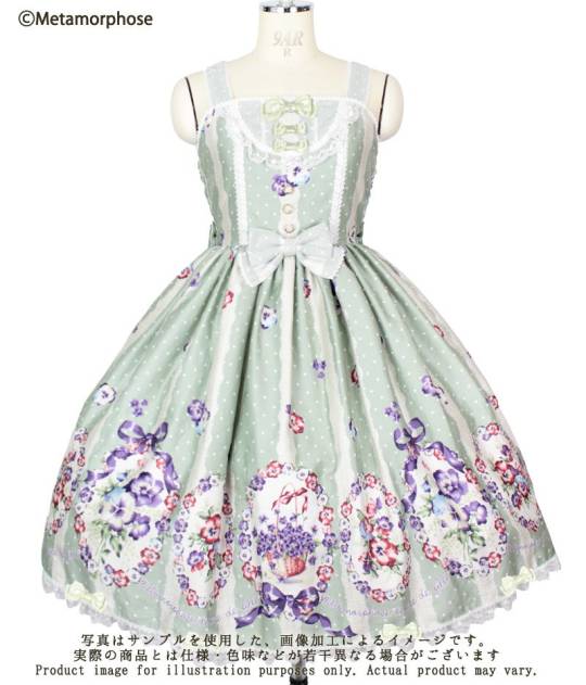
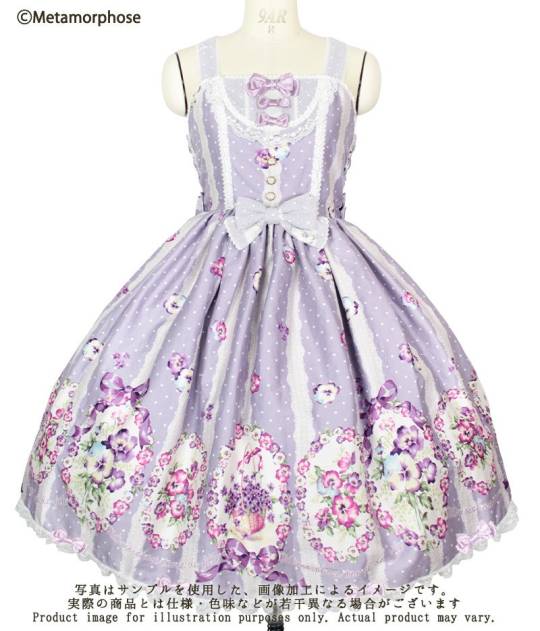
I like this violet print, though, honestly, I like meta violet's bouquet print better in some regards. The composition on the Meta print is better, but I like the art on the AP print. The bodice designs of the AP pieces are simple, but I personally don't have an issue with that because more detailed bodices from AP are frequently unflattering on me and I don't personally love some of the design choices Meta makes, so I'm happy when things have simple designs TBH. The meta piece has a decent bodice, I don't dislike it, except, I don't really like lace overlays, they tend to wash out the colors of the piece in a way that makes it harder to coordinate. I have this in lavender, and the overlay is less noticeable than it is on darker colors, but it does make the lavender a bit greyish. That said, the Meta dress doesn't fit me right now so I'm leaning towards trying to pick up the AP JSK if it's a better size for me.
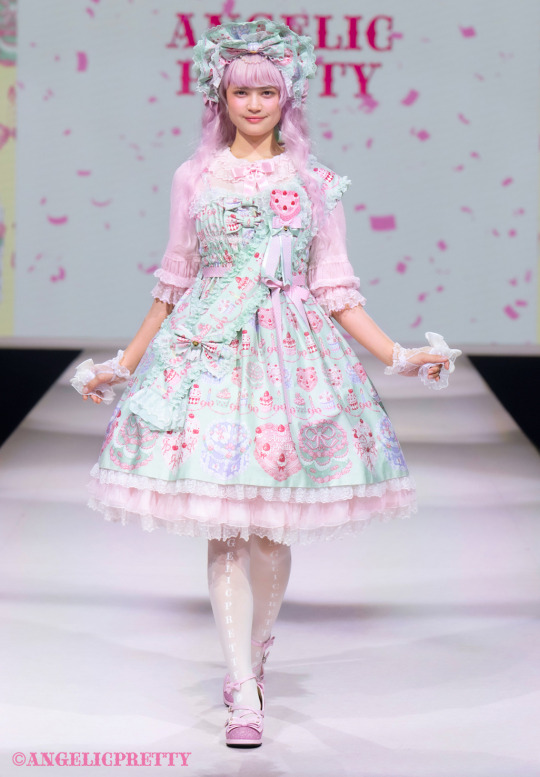
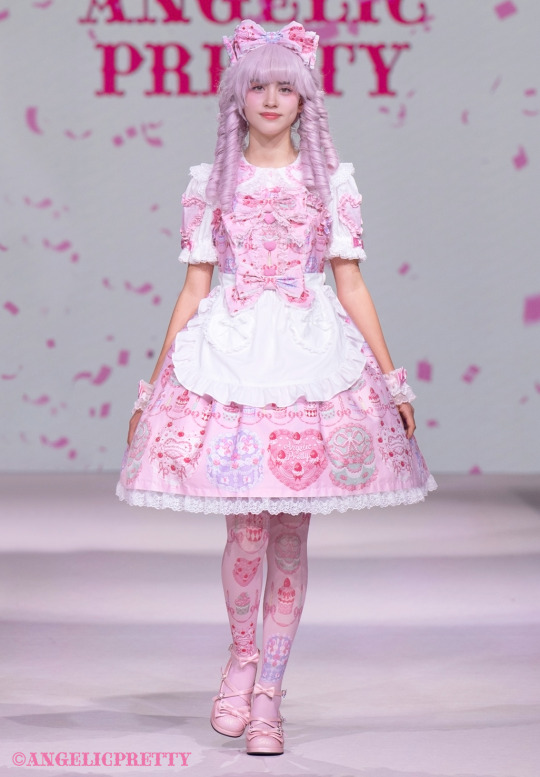
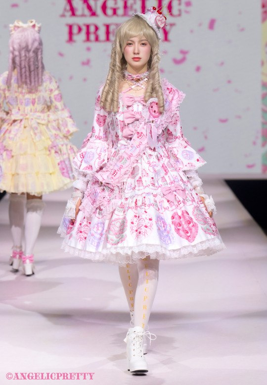
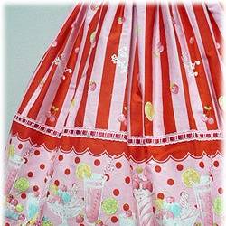
I like the happy cake print as well. I think the OTT princess cut is a weird choice for it, but the regular JSK and the shirring JSK are both nice.
But it is... I've noticed in the past few years that it feels like Maki is burnt out or something. She's been putting out prints with no background. And I don't know if they have someone else working with her who is following her style, but falling short or if she's rushed or burnt out or what, but there are more and more of these prints where she's drawn a few key images and then the layout is... lacking. From a graphic design / art standpoint, I'd compare to Shirley Temple. Here are two recent Shirley Temple prints. The first one is a very similar concept. The artist drew a collection of related sweets (in ST's case gingerbread cookies), but instead of slapping them flat on a solid background and repeating the same cookies up the dress, they have a contrasting panel around the hem, and a collection of stripes and other background filler, with a whole collection of simple cookies for the higher up toss print. While the second ST print shown here is very intentionally designed. Even though it's simple (it's really just cherries and icing), each element is placed specifically.
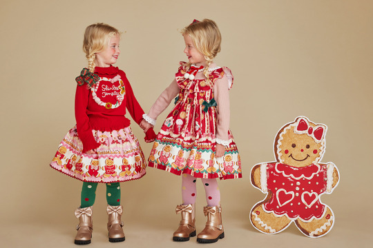
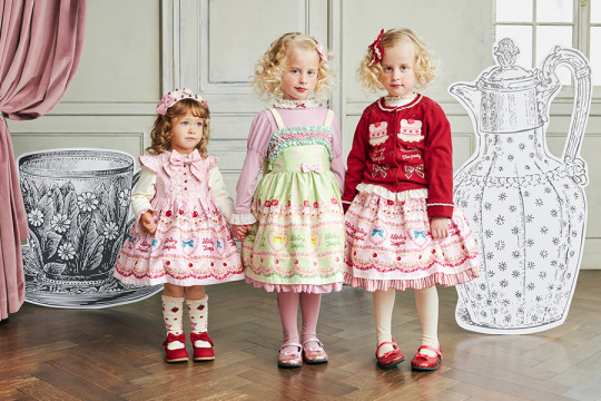
What is interesting to me is that a lot of older prints from AP look a lot more like the ST prints. Where as this AP cake print looks like Maki drew a few cakes and cupcakes seperately and then ran out of time and put them together as fast as possible. I'd expect to see, say, the cherries and strawberries, from the cakes mixed with cupcakes at the top more like these past prints, than just the whole border print scaled down, repeated.
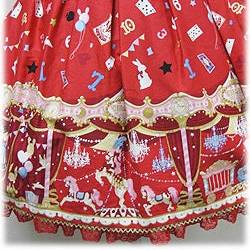
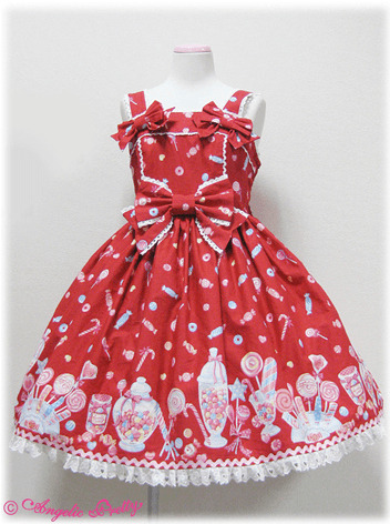
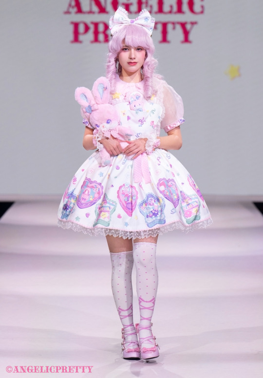
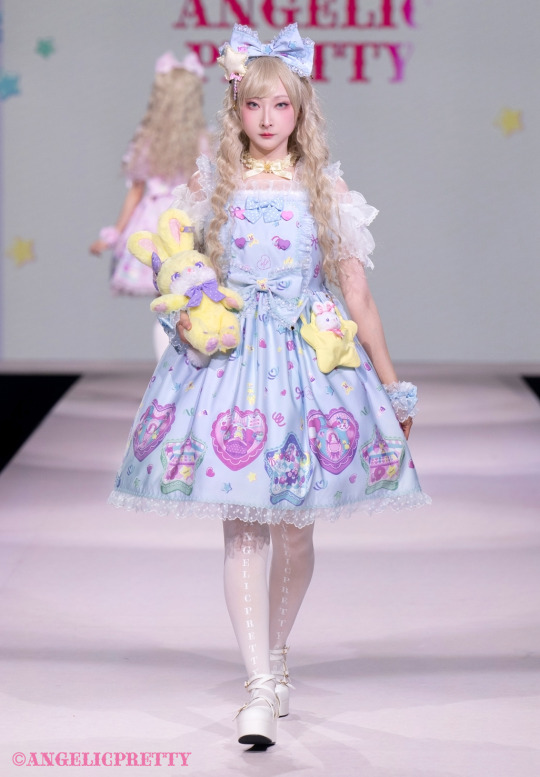
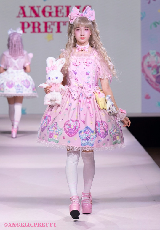
The polly pocket print is worse. While it has some shapes and ribbons at the top, the whole thing looks flat in a way that looks cheap. While I like the idea, it's not quite working for me, and the acccent buttons get lost in the toss print.
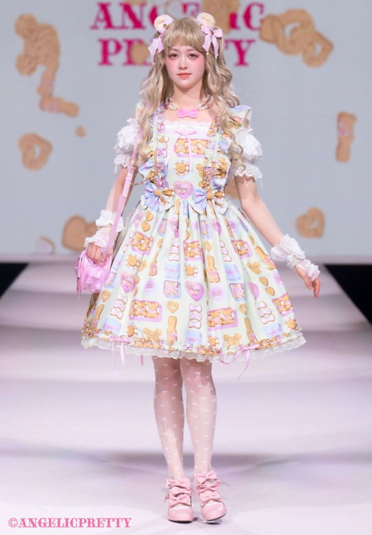
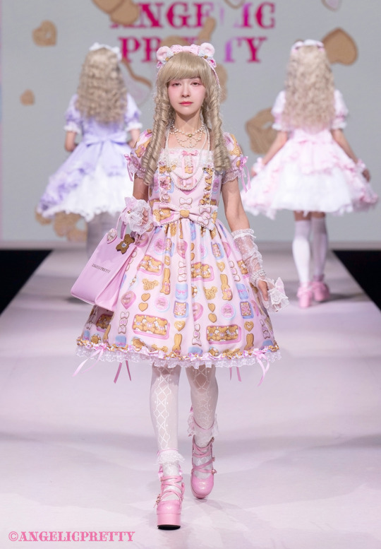
This cookie print looks like the typical all over AP print. I don't care for these, but as far as an AP-does-ETC print goes, it's fine? It's stronger than some of the recent few all over prints IMHO. The apron frill straps on the JSK feel a little over the top for a simple piece, as do the hem bows, but it's not bad.
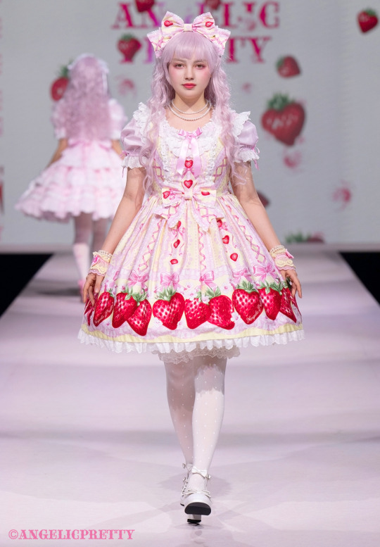
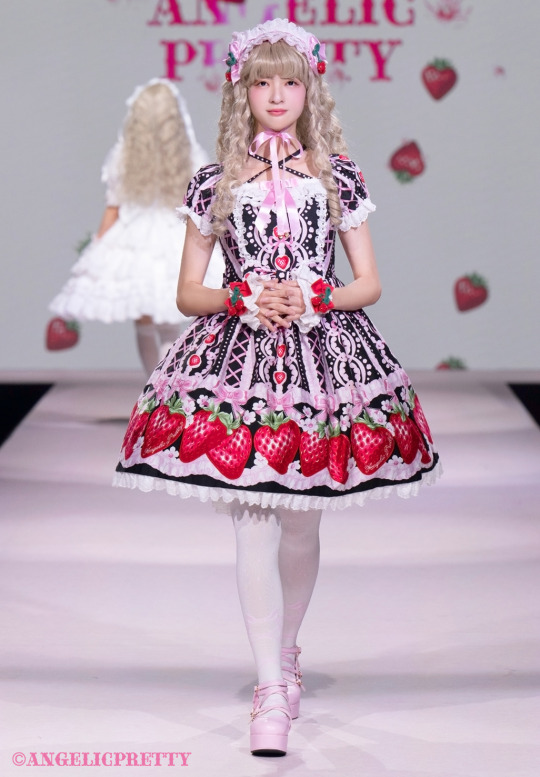
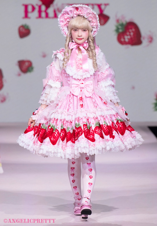
I like the strawberry print, I think the black colorway is rough, but I generally don't like black colorways of AP pastels. The JSK and the basic OP have a good design, the OTT OP is way too much for my tastes. I also don't care for the tights, they look like they have dye bleeding issues instead of ribbons from a distance. It's not the best strawberry print they have ever made, but it's also not the worst.
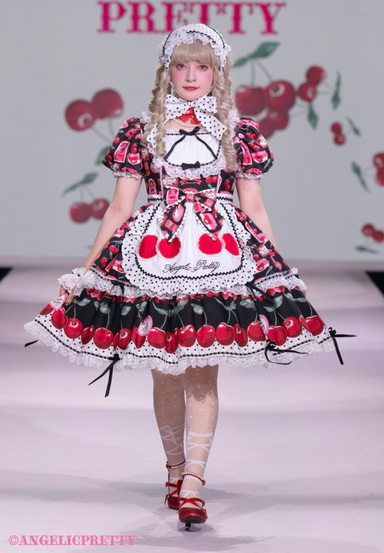
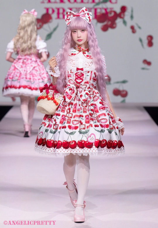
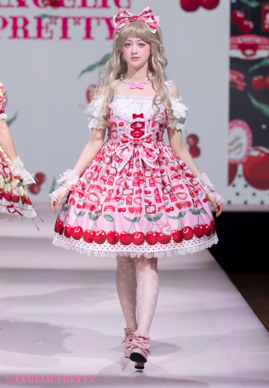
The cherry print JSK is on my list. I actually really like this in white, which I usually avoid. The pink and yellow are also pretty good. The black is not bad, but there are some high contrast details on the OP that I think I'd rather see in red than black. I love the little apron, and the removable bodice insert (I think?) in the JSK. The cherry collar on the blouse is also adorable. The top of the dress is quite well done, and it shows a lot more thought (IMHO) than a lot of the other prints in the collection.
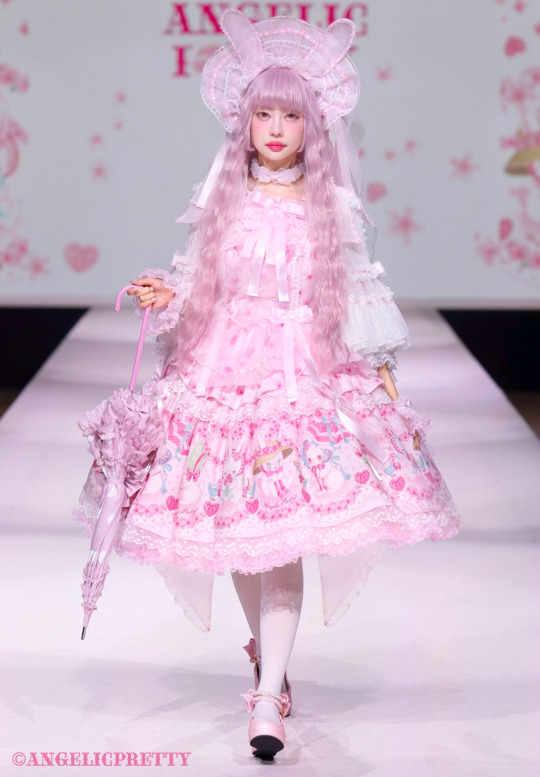
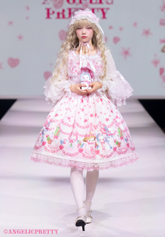
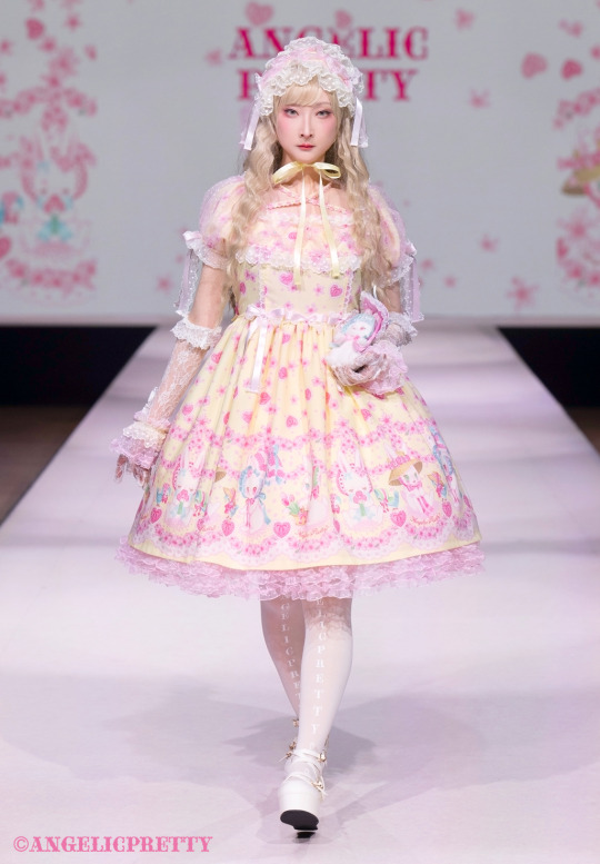
Ohanami Bunny is well done, but I don't like it. The rabbits are cute, and the toss print is good, it's just not my style. My partner who likes rabbits a ton also doesn't care for it, so there is that. I can't quite put my finger on it, but the rabbits don't look like vintage story book rabbits, or like kawaii plush rabbits. I do think the designs are nice for them, it just... isn't quite right for me. The bunny bonnet is fun.
Dolly cat is of course dolly cat. and a solid choice for a re-release (though I still want SNT, Miracle Candy or Fruits Parlor). I'm being told I can't add anymore images, so I'll have to post the solids seperate. That said I also want to add that I'm confused about some of the hair/makeup choices for this show. I don't mean this in a mean way and I don't mean this as a critism of the person or persons who did the hair / makeup, and I'm not looking at people on the street judging them like this, to be clear. It's hard to manage the hair / makeup for a show and I personally can't do it. I also think all of the models are gorgeous, but there are some models who had wigs and/or makeup that just weren't a great match for them. I can't quite explain, but a lot of the wigs are very ashy toned and then the eye make up was very... minimal? light? with heavy high blush and they gave a lot of them bold coral hot pink lips. Unless it's a trick of the light/photos, basically no one has eyeliner unless it's like... pastel or something. The effect is that the boldest things on many of them is their eyebrows, their pupils, their nostrils and their lips, but they all have pale wigs so they have tried to make their eyebrows pale as well, and this make up style just doesn't read as well as it could on some of the models. I feel like this is a really hard makeup look to pull off in general? I personally prefer when the hair/makeup is picked to match the model, versus a "show look" put on all the models. But that is a personal preference and I do understand why some designers try to make all the models match. I guess... when the hair and makeup doesn't fit the model, it feels dehumanizing to me, like the model is being used as a walking hanger. I prefer when the whole look is styled to suit the model or the model is picked for the styling, and this just didn't feel that way to me.
39 notes
·
View notes
Text
so, i had plans for this month. for next year. for the next four years. for my whole life. and, i still have plans. i want to focus more on graphic design. i want to open a little online shop. i want to finish my long list of friggin WIP fics !! (i told myself i'd write a little bit every day this month). i have art to make. i want to start painting again, and learn to sew. and try knitting once more. i want to make more edits and gifs. i have many fics to catch up on, and others to start. i have piles of books begging for my attention. i'm going to a show in a few weeks. i have to finish my spn rewatch. i have things to do.
37 notes
·
View notes