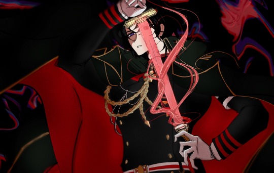
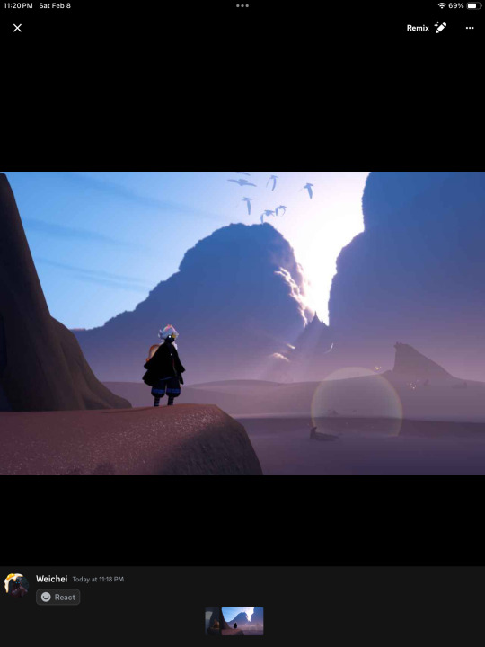
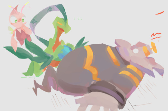
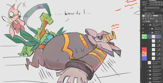
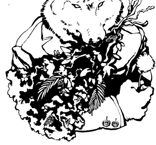
#i worked on this so hard my csp started to give up on me
Explore tagged Tumblr posts
Visit Tumblr Blog
Explore Tumblr blogs with no restrictions, modern design and the best experience.
Last Seen Tumblr Blogs


Fun Fact
Mobile Tumblr US users spend an average of 4.04 minutes per session on the app.
Text
beauty and violence
#i worked on this so hard my csp started to give up on me#like omfg jfc calm down gab#owari no seraph#seraph of the end#ichinose guren#guren ichinose#my art
50 notes
·
View notes
Note
hello! i've been following you for a while now and let me just say, your art is absolutely amazing. i especially love the way you draw bodies! could you give us some advices of how to improve anatomy skills?
Hello, thank you so much!
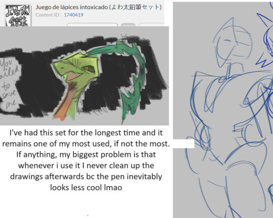
I struggle with anatomy very much and I have too little discipline to do studies often, so I'm implementing anatomy studies into my drawing process in the way the challenge is both not too great and not too low
For example If I feel too challenged by perspective and don't want to get too much stress I use dolls (these are inside csp), but instead of tracing them I make anatomy sketch on top in places i don't understand using variety of references to better understand what is happening (and in places I think understand I often just change some things):
But when I feel like It I try to assemble everything from the ground by myself, starting with boxes (or other primitive volumes, there are many different methods and i like trying new ones) in perspective
I cannot do anything regarding anatomy\figure drawing without perspective, I need at least to have horizon line (camera eye level, everything below line is something you look down on, everything above is something you look up to
When dolls (handmade or csp ones) are placed, i go for the references. For me learning bones and muscles is very hard, so I do it again and again and again and use it in practice. Here I recommend:
proko free anatomy course
anatomy-related videos of Mark Brunet
book "anatomy for sculptors"
book "anatomy for artists, drawing form and pose" by tomfoxdraws
making board on pinterest with muscles and bones and stuff
Main idea i got from anatomy struggle is that this stuff is hard, human body is hard, and If I want to draw here and now I need to realize my weaknesses here and work hard enough without loosing fun, because If I to lose fun I won't be making progress at all
Anatomy is hard subject but not in the scary way but like - I believe you need learn and practice (retrieving stuff from memory is important when you've learned it!!) same stuff many times to get something in your head. I'm still very bad at it and I don't remember most of the muscles although i look at them almost every day, but Im better than I was before and my shapes are looking better too
84 notes
·
View notes
Note
how'd you get good at environment art? i've been tossing around the idea of going into concept art, but i've been afraid of getting into environments. what would you suggest to start out with to someone new to it?
learn perspective!!
its not as hard as it may seem once you understand how vanishing points and horizon lines work. i was lucky enough to be taught perspective when i was young and now im trying to get good at doing it free hand. i never liked how Perfect using rulers and grids made things feel, and by doing it free hand i feel like it adds back that more organic feeling that a real environment has
sometimes the vanishing point isnt even in the frame. my trick is to put my scene in a box. the box itself gives the perspective lines for you to follow and you can still imagine where the vanishing points are or even draw them if you Can see it. something about the box method just really helps me visualize the space im working in. ground, sky, and depth. and put a grid on it! in perspective!! itll really help with visualizing depth. heres an example of what i mean:
straight lines!! i dont know why because it kind of contradicts my last statement about perfect vs organic 💀 but using a straight line tool changed the game for me. on CSP i just turn my post correction all the way up and it makes my lines straight which i prefer so i can still use the same pen and im not locked to a grid. i'll turn it off for organic things in the environment like plants and stuff, but for inorganic things i use straight lines and it always makes it feel Right to me. some people are good at drawing inorganic things freehanded and they still look Right (and leans into that organic environment feeling) but not me for some reason 💀 i love you post correction
UUHH hmm. another little note that isnt necessarily about backgrounds but definitely helps when i draw them is: draw the Effect of the detail, NOT the Exactness of it. especially when youre drawing an environment things are gonna get muddied as they get farther out of focus (hard edges and soft edges are important!! not everything needs to be crisply in focus and itll detract from where you Want people looking anyway if it is). dont think about what you Know the thing is supposed to look like, with all its details. its more about the Feeling of it. ie the Effect of it. with my sketchy style i have a lot of fun with this concept aha i love my scribbles :)
good luck anon!! i hope this helps you in some way!! 💕 also dont get too intimidated by actually drawing the objects in a scene. the box method works for individual objects too. i basically imagine everything as some kind of weird cube or cylinder 😂 break things down as simply as you can and work from there. AND USE REFERENCES
#also thank you for thinking im good at environments 😭#art tips#was that my tag?? i need to remember these things#incognito#replies with lexi
26 notes
·
View notes
Text
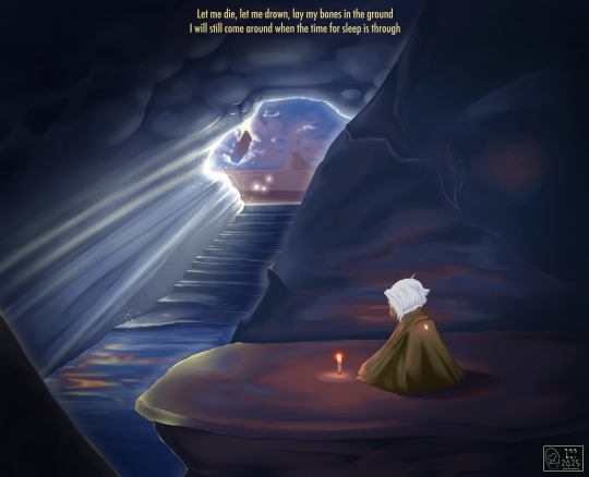
Hi, skykids and artists alike!
WARNING: THIS IS LONG. I can't stop yappin'.
I was taking a series of screenshots of my art process for my own reference (to review later, see how my process has changed, etc. I’m not much of a timelapser) and figured I’d share my process and show off how much the game Sky: COTL has DRAMATICALLY improved my art (and also have a post to show people in the very, hopefully, unlikely chance anyone ever doubts that I draw my own art). I also have seen a lack of written out with screenshots explanations of art, as video format becomes more popular across not only Youtube, but Instagram and Tiktok as well. This is not a learning style I jive with, so this is something for all the artists out there looking for this kinda thing.
For reference, here is my FIRST EVER Sky digital painting compared to my most recent (before the one used for this lil infodump). <3 This is CSP specific as far as brushes go, but I’ve seen people make amazing art in freaking PowerPoint, so if I can do it, you can do it.
F’real. This is the process of a VERY LAZY artist with hand tremors and hecked up wrist ligaments as a result of an autoimmune disease.. I’m talking, drawing in bed in a blanket nest watching vodcasts and cuddling cats.

(May 2024) -----> (January 2025)
Added info - the pic on the left is exactly why I wanted to do this. I'm even a little embarrassed by it, now, but when I had originally posted it on another platform, I was questioned and disbelieved that I was able to draw a background at all. This was the start of me taking digital painting seriously (versus general character/creature design) with lineart and a cell shading style. That disbelief from someone who knew me IRL hurt a lot, and I often have the concern of that happening again. This is me alleviating that anxiety once and for all, so I can finally move past it. YAH, FRIENDO, THIS IS MY THERAPY SESSION.
Anyway; I’m nowhere near new to art, but it’s always been a hobby for me so I never sought to actively improve with proper studies -- but wanting to create lore for my silly lil skydude forced my hand. With a semi-open world game that’s genuinely gorgeous made collecting references easy, and the Sky community here on Tumblr has not only inspired but encouraged me to keep going despite 2024 being a very rough year. This game has brought me joy, and I hope you find this lil doodad helpful. 🕯️
Now on with the show! This piece will be a part of a little series I’m working on that will include lyrics to a song that gives me the biggest Sky vibes (To Thus Onto Tyrants by The Oh Hellos).
The brush that did the heavy lifting (“spread pencil”) seems to be either very elusive or no longer available. Everything else is listed here :)
What I could find:
Turnip Pen - Default brush in CSP
“Crunchy” - Specifically the second to last one in this brushpack
“Hard Round V1”
“Hard Round V2”
“YN Soft Round” (Not free, sorry ): )
“Pecas” - for sparkleys
“Toothbrush” - For more sparkleys
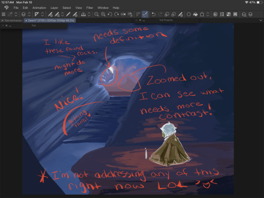
So the first step is to gather references. They’re a MUST HAVE and DON’T LET ANYONE ELSE TELL YOU OTHERWISE. Use references, redline, and yes - EVEN TRACE. I may make a lil thingy about how to do these things ethically, but for now, just art process. Let’s see what references I used: self harvested!
Shout out to the Skykid screaming in the background.
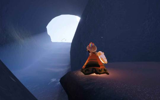
I also used this for a reference for the moth that I grabbed off the interwebs-
For this, I wanted to try and recreate what it felt like as a moth (but after getting at least one starboi lol). Isle of Dawn will always hold a very special place in my heart. The first impression was impactful, even though I was incredibly confused on what I was doing. I knew I wanted the temple, but there’s something so calming and melancholy about that first cave. Putting these references together, I got the most hot garbage sketch I’ve ever done - but it’s okay! We’re not doing any lineart, so we WANT messy. The more you work on a sketch at this stage, the harder and more intimidating it will be to get to the next step. You’ll become too attached to those details and things you sketched, that if you have to go over them later it will be devastating. Just using this to work out composition :)
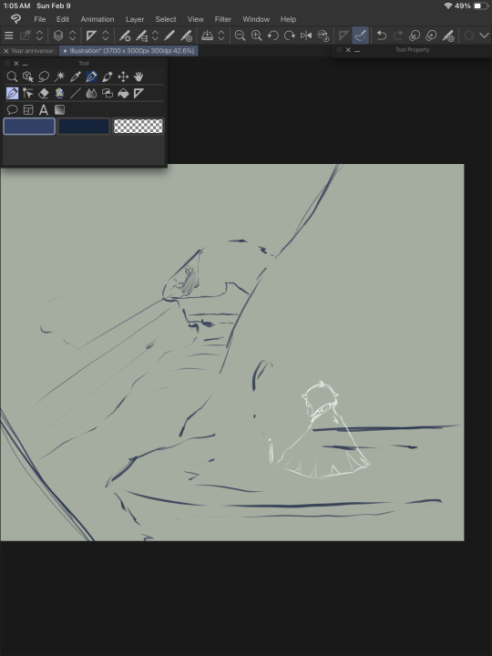
Currently, I have two main layers (CSP makes an automatic background and I just leave that one alone and do not count this as a layer)
Top - moth sketch
Bottom - everything else
Moving forward, we’re working in three main sections. Background, midground, and foreground. I show a screenshot of how I organized these layers later.
The next step is to block in colors. Layer styles are VALID and AMAZING, I do not use them much. They have their time and place, and I prefer to keep those for finishing touches. For now, I’m just doing my best to eyeball colors I like from the reference photos. Color picking is amazing and helpful too, but I’ll add a little note* at the end about why I try to avoid doing that too often from my reference.
I put the colors on their respective layers (Four to start with. One for each mentioned above, and another for the moth). I try to block out shading and lighting but I keep it sloppy because it’s likely to change a LOT. This is just planning and fiddling, seeing what colors look good together.
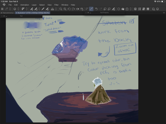
(Spread Pencil is the one brush I couldn’t find >: at this point, this is the ONLY brush I’ve used. Don’t be tempted by blending things yet. Be sloppy.)
Once I get the general idea of what I want, I WORK FROM THE BACK. I hid any layer that would be ‘blocking’ that section and allow myself to go ‘outside the lines’ a bit. The overlap is helpful when making changes to the ‘front’ elements later. Remember, we’re still being SUPER MESSY.
I kept the moth/foreground visible so I can still check that the general color theme was working.
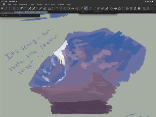
Hide the sketch layer. Do it. We’re painting, not doing lineart. You gotta. I believe in you. Look at this slop. Beautiful.

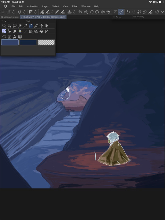
Alright, now we’re cooking! The layers are in the following order going from top (front) to bottom (back):
-Moth sketch (will be hidden later)
-Moth colors
-Background sketch (will be hidden later)
-The rock the moth is sitting on and that little rock section on the bottom left
-The rock behind the moth (hidden in this screenshot)
-The rest of the cave
-The temple
At some point around here I used “Crunchy” on the clouds to blend em a bit.
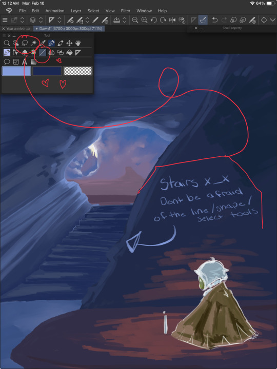
NOW IS THE FUN PART. RENDERIIINNNGGGGGG. I started with the stairs because they looked annoying. USE YOUR LINE/SHAPE AND SELECTION TOOLS. These will help you keep your lines straight and achieve crispiness if you desire. More on the stairs in a moment, but while you’re doing this, remember to
ZOOM THE HECKIE OUT. Make it thumbnail sized and squint. Can you still tell what you’re painting? Evaluate. Are the colors working well together? Is there enough contrast? How’s that composition doing? Zooming out rocks.
After taking a moment to zoom out and squint, I came up with the following notes:
Do this regularly throughout your process, even if you’re in the middle of something mundane like drawing stairs. A LOT more contrast is needed, and taking a moment to notate this will help prevent you from doing TOO much that you’ll regret later when you end up covering it up to fix these issues you missed earlier.
Back to the stairs.
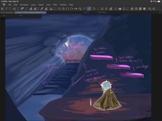
I blocked things in with the line tool and the turnip pen, then scribbled it around using ‘Hard Round V2”. When I say scribble, I mean literally. Scribble. It’s fun and freeing. We’re not trying to be precise or make anything hyper realistic. We just gotta get those colors down yknow.
Good luck.
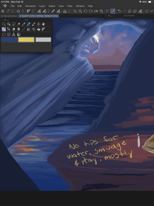
Water is weird, and I don’t understand it. We guess and hope for the best. Remember that water is clear, and for the most part you’ll be able to see through it, so unless you have a blue toned drawing (like this one), the water itself may not be blue. I generally color pick the areas around it and lighten/darken it based on those. I also knew there’d be a light beam in this area, and the reflection from the moth’s candle so some bright oranges and yellows were nice to add, as well. Don’t forget reflections/highlights if the scene calls for it!

Time for the part that actually requires a shred of skill. Thankfully, this pose is very simple and the moth’s design is, well, a moth. Don’t be afraid to toggle that sketch layer on and off for this. The moth is the main focus, and should be clear and easy to read as such - requiring a bit more work for colors and shape language.

Don’t work on one single thing for long. The moment your brain goes “im getting annoyed/frustrated/bored”, move to another piece of the painting. If you notice your character has a horrible tangent with a background piece and it’s just really bothering you - stop working on the character and fix that background area. Give it a bit more bulge (or less), shift things around. Paint over stuff.
“But I drew this really well, and it would be a shame to cover it up if I won’t be able to do it that well again!” You may ponder, anxiety filling your chest at the very thought of redrawing a hand or that one rock that just looks really, really good somehow.
And to that I ask - why won’t you be able to do it again? You did it once before, CLEARLY you have the skill and ability. If you’re worried, draw over it on a new layer so if you have to fall back on the old thing, you can. ART IS FUN. Don’t let it stress you out too much. The moment you look at that canvas and go “you know what, I CAN do it again”, you will be able to do it again.
Trust me.

With some more scribbling done, we can start detailing things that aren’t stairs. Yay! Let’s work from the back again.

LITERALLY. SCRIBBLE.
You can start blending around now, too, though. We’re getting there, and look at all we have to show for it! I tried to mimic the clouds as best I could from the screenshot because like water - they are weird and wonky and yah, hard. Cloud brushes can be helpful, but give you significantly less control IMO, but to each their own and whatever works for you, works.

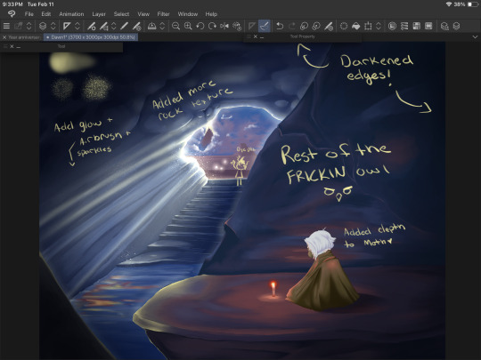
BG looking good, but remember ZOOM OUT. I can see the contrast of the temple/background elements looks a bit better now, and now that I’m bored with that, I wanna bounce to that midground area, and fix up the moth a bit more. I also used an ADD (GLOW) layer to messily test some different ways to paint light beams and to find a nice color. I settled on the same yellow I used on the candle flame. I didn’t work too hard on this just yet, since there’s a lot of elements that will hit that light that I haven’t even thought about yet.
I fiddle with the main cave texture a LOT. Painting over it entirely MULTIPLE TIMES to find something that sticks. What you see here is not it. I also added some details to the ‘moth rocks’ but this also changes a little as we go.
Painting/art is a lot of push and pull. You add some darkness, take away some. Add some light, take away some. Add an element, remove one. Go with the flow and trust yourself. Turn on an audiobook or a movie and turn off your brain while you plop colors here and there. An artist I VERY MUCH look up to (Julia Lepetit of Drawfee and Secret Sleepover Society) said, “Zoom in and zone out”. It’s time to turn off that brain and paint.
I zoned out too hard and stopped taking screenshots because oops. On the top left shows the YN Soft Round, Pecas, and Toothbrush, in that order going from the top and counter clockwise.
I darkened up the cave quite a bit and finally settled on a look for those upper rock formations. I used a MULTIPLY layer to darken up the moth’s shadow a bit, then merged the layers and used those same colors to blend it with the rest of the rock. I also deleted and added a new ADD (GLOW) layer and fixed up that lighting. This is where we get to darken shadows and add highlights and bounce light to things. Anything in bright, direct light has its original color showing through (from the original layer it’s colored on, that wonky light blue area by the stairs). Rim lighting is a great way to separate elements like this (the different rock edges) without having to use a gajillion different shades/values of the same boring blue to make it stand out.
Details on the moth are also done now - mostly in the hair. A few hair strands, ESPECIALLY in Sky with the white hair we all have - looks incredible in a painty style IMO. I also SHOULD HAVE added the star on the moth’s cape at this point, but BOIIS, GORLS, AND CRYPTIDS, i forgot until I saved/exported it and had to go back and fix it. But anyway, so you don’t have to scroll up, here’s the finished piece again:
Thank you for reading, if you did! I hope it was helpful, or at the very least served me in the future like this post is intended to do!
And I will leave you off with the promised note* about color picking -
Color picking from a reference can be really cool and easy and tempting, but you know what makes that NOT work? Color theory. When you blend your colors (this goes for real life, too), there's a LOT more grey and diluted tones than you'd expect. A lot of these bright colors aren't ACTUALLY bright, save for the details on the candle light and the ADD (GLOW) layers. The orange reflections on the rocks and water are actually quite dark and diluted, but because it contrasts so well with the darker blues - it looks a lot brighter. Blending these colors together allows for a more natural soft light. This is also why I try to work on so few layers for pieces like this that are relatively simple. I can easily take a bright color and use a softy kind of brush - the hard round v1 brush is GREAT for this, a little bit of pressure over the colors you already painted down will blend them together with some minor elbow grease and mindfulness. It gets a more natural transition between your lights and darks.
Where as if you zoom in on your reference and color pick - look at it. Look at it all zoomed up, I BEG you. Make it super pixely, and you will see how much that 'one' color varies in that entire area. Unless you're color picking pixel by pixel, which at that point you're not really drawing/painting at all, it's just not going to work out and help you recreate that reference.
My personal preference is to color pick for base colors to get me started with a vibe, and then once I have a few colors down, I'm eyeballing it all the way baybee.
#doodle#digital painting tutorial#digital art tutorial#tute#art tute#painting process#digital art#digital painting#sky children of the light#sky cotl#scotl#sky children fanart#a rambling mess that's mostly for me but maybe it will help someone idk#it's 3am#im throwing this in my queue and going to bed good night ilu tumblr <3
8 notes
·
View notes
Note
Hi, your art is stunning. May I ask what program you use to draw digitally, and if you have any tips on how to get the forms and colors as incredibly accurate as you do?
Aw, thank you! I still feel like very much an amateur at this; my first digital painting of this type was this one, a month ago, and I don't really know what I'm doing, so take my advice with a grain of salt.
I use Clip Studio Paint currently, though an older version from when it was a one-time purchase instead of a subscription. (Why is everything subscriptions these days.) In the past, I've used Krita, which was free, but I haven't used it for this kind of painting per se.
For these paintings I've been using the default "Dense watercolor" brush for laying out blobs of color and the "Transparent watercolor" brush for subtler shading and smoothing. I expect these are not the ideal tools for this or anything, just sort of the brushes I've gotten most used to working with in coloring in CSP, which I stumbled into kind of randomly while messing around.
To get the forms right: something I started doing for my Good, the Bad and the Ugly kick early when I'd started on that in September was to do a rough sketch with the screenshot on the canvas at the same size and every now and then drag the sketch layer over the screenshot to check myself off - see if I'd made some feature too small or positioned it weirdly, etc. This felt a little like cheating but it did also just kind of help give me a better sense for it and for the ways in which my initial eyeballing tends to be off so I can adjust for it, and then once I had the very rough sketch of where everything is, I could detail freehand on a second sketch layer from there which feels a lot less like cheating.
However, for the last three paintings I did, instead of doing that I have been using a trick I saw my dad using when doing traditional oil painting, namely using a grid: enable the grid option in the CSP view settings, line the reference up with the grid, and then focus on each individual 'tile' of the grid. While working on this latest one, my canvas looked like this, for example:

So when sketching and while working on it from there, I could look at the individual square on the grid that I was working on and try to match it to that individual bit of the reference, which is a lot easier than trying to eyeball the whole thing at once.
As you may be able to tell, the colors don't feel super accurate to me when I'm working on it and actually looking at the screenshot beside it; it's all a little off and less detailed, but then it looks a lot nicer once you crop the reference out of the canvas. For this one I actually experimented with using the color picker tool to pick out some of the extremes of the colors I worked with for each given area - some of the brightest highlights on the face, a nice midtone, some of the deepest shadow - but this isn't all that helpful because film grain means the overall impression of the color is different, and there are a lot of nuances. Something I did do, also for some of the previous paintings where I specifically didn't use the color picker as a challenge to myself, is try painting a brush stroke on top of the area in the screenshot whose color I'm trying to replicate and keep adjusting until it feels like it just about blends in. But even then color is very hard. There are so many subtle nuances and shades and it's hard to adjust the exact shade of some color I've already put down other than by just painting over it again and then redoing the details - unless, of course, I just put another layer on top and set it to Hue or something. I did that a little with the barbed wire around his neck on this one, to make it less blue after I'd first put it down.
Buuuut mainly I think the key to making these sorts of things look good, as far as I've felt, is just to be willing to spend a whole lot of time noodling on them. There's always more you can do with it to make it better.
I found the checking myself off by dragging the sketch on top of the screenshot trick very helpful, even if it does feel like cheating, just by virtue of the fact it makes the outcome look better, which makes me less likely to ultimately go "ugh, this isn't right" and just want to stop working on it and move on. And that's very helpful, at least to me.
Finally there's the general just draw a lot, etc. I have been posting art daily on this blog since the beginning of 2016, and it's been a slow journey of my very intermittent efforts at human portraits getting slightly, slightly, slightly better each time. Just these feel like a pretty massive level up in the space of a couple of months, though, and I think that's largely just because I got obsessed enough with a movie to want to spend the time to draw one million cowboys instead of doodling Pokémon, and also allowed myself to use whatever neat tricks would help me make them come out well enough to stay motivated on it.
7 notes
·
View notes
Note
Do you have a set process for coloring and rendering / adding texture to your art? If so, would it be alright for me to ask what goes into that process? I'd love to learn how an artist I admire goes about their work!
Omg I'm so flattered, I'll try my best to explain it!! ^^
Tho, okayyy, I apologize beforehand for how incoherent this might be, since I don't really have a set process at all and mostly I fake it 'til i make it haha. I'm the first to admit that I don't have a ver consistent method and that shows in how irregular in quality my art can look, even inside the general sketchy look.
(Btw sorry if some of the fanart i use for example doesn't make you comfortable but I've tried to find the best examples for each type of coloring haha)
I'll start with the brushes I rely on the most, tho I admit i made the mistake of downloading too many brushes and textures so I might use others on rare occassions xddd
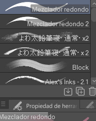
These are basically the brushes I use the most. The "mezclador redondo" is just CSP's default paintbrush and I only tweaked it to find sth I liked and felt comfortable with for both lining and painting
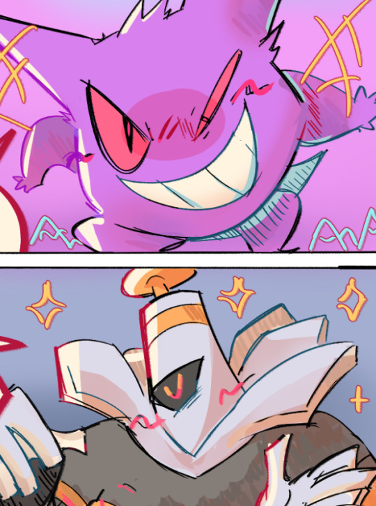
As you can see here I only used one layer for lines and other three for each of the guys' colors. I colored it all with the default brush (tho unfortunately I lost the settings I used for this drawing in particular and haven't found them again rip). In drawings like this I just do a sketch, clean the lines (no lineart) and then paint it. After the base color I start laying out different hues to make the coloring more interesting.
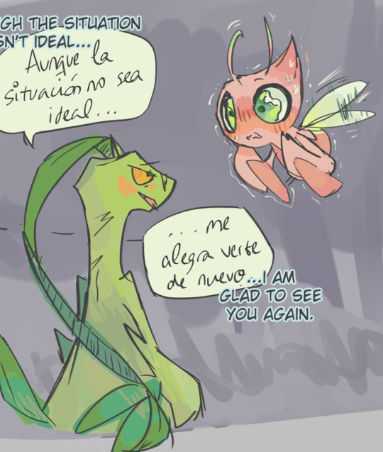
This one was the same. One layer for coloring, manually adding lighter hues (see the more light and yellowish color on grovyle's left leg compared to the shadow) or darker tones. I try to add color to the shadows as well to make them feel less flat, and an airbrush in overlay tends to help with that (tho here I just used a brush).
Here you can see that I often paint over the lines on another layer to correct mistakes in the "lineart" lol. I also applied an airbrush (layer mode overlay) over celebi to make her more bright. I wanted to put this one to show that coloring doesn't have to be detailed to look nice enough. Here Celebi basically has no shadows at all but the tone of the drawing makes her look cute anyways imo ^^
In these two you can see adjustements over the full image again (yellow layer), but I also wanted to show that I don't have a set number of layers either, it depends on how many I feel like using. Again, sorry for the lack of consistency but im too lazy to have a proper method lmao
I will also use harder brushes and tone changes sometimes, instead of blending them with less dense brushes. I am also fond of adding hard lighting in some drawings. You can experiments with it on a top layer and delete it if it doesn't fit, so it's always worth a try.
Another thing I recommend is studying and copying artists you admire or like. Add things from their styles into yours, see how they work with proportions and try to use that in your own art. It has helped me a lot and, without looking to fully copy anyone's style, it does give you some ideas of how you wish your drawing would look, which motivates me (when it doesn't depress me lol)
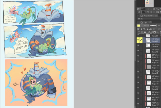
Finally, the texturing isn't consistent either. I use one of CSP's/Downloaded texture packs, put a grainy texture on the canvas, set it to overlay and adjust the opacity until I'm satisfied. In these two images you can see I am not consistent in coloring even in the same comic lmao. But we are doing this for fun, so I think experimentation is always sth worth exploring ^^
And I think that's all I have to say. I don't control color theory at all, so I can't really explain how I choose colors. I look up some tutorials on youtube and pretend I understand lol. Ig the one thing I tend to do a lot is changing hues in a base color to make it look less flat, the same as with shadows.
Anyways I hope this was helpful or that it at least waas what you asked for haha. Thank you for the interest!! :DD
#ask#art process#i guess???#anyways thank you for the ask sofie i hope this was helpful <333#I am KIND OF A BIG MESS IN ORGANIZATION#but hey we have fun hahaha
10 notes
·
View notes
Note
hi! do you happen to have any tips/advice for creating pixel art? i'm a huge fan of your work and have always wanted to do pixel art myself but i've found it pretty difficult to understand x_x
Hihi!!! Giving advice is hard because I kind of live by the "fuck it, we ball" way of life but I'll try my best!!!
Not necessary in all cases but I think page sizing is important!! I used to draw on like 3000x3000 canvases now I think I only reach that with refs... I think in general it's easier on smaller canvases, and if you need to size up for posting sake, Photoshop can do it [or I think there's sites that can as well?]. If you're wanting to do certain things [icons/icos, rpgm assets, whatever], they do tend to fit into certain constraints so thats important!! Similarly, there's nothing wrong with drawing something on a 1000x1000 canvas and then scaling down the image to 100x100 and lining over it!!
I tend to sketch with non-pixel brushes first unless I'm lazy, just because I feel it makes it easier!!
A small thing that I'm trying to take heed of too is going back over artwork and deleting some pixels to make the lines less "clumpy" (ofc, it depends on style too! I like thin lines usually though, especially on things that are 48x48 to maximize space!!)
I draw (mainly) in Sai and MediBang (for mobile). Things like MediBang and CSP also have downloadable brushes, which for things like screentoning I find important!! [Usually, I'll draw in MediBang or Sai, edit further in CSP]. For Sai, I just use the standard Binary brush and an edited version as an eraser:
For MediBang, I just go into settings and check "Turn off anti-aliasing" and use the normal pen brush and eraser; Only word of advice though it it does create some not fully solid pixels, but you can either go over them or duplicate the image a whole bunch and then combine the layers.
As for further stuff I think it's also just important to look at things you like!! What started me into pixel art was playing a lot of rpgmaker games [Ib, Yume Nikki, Mad Father, The Witch's House, ectect] Now I also like things like the art of older systems and games, like TokiMeki Memorial 1994 has some beautiful artwork:
And the pixel sprites in all the BlazBlue games has been really inspirational in the last couple of years for me as well!!!
I hope this helps in some capacity 'w'999!!! For me, I think experimenting and playing around with stuff is the most important and having fun!!! [Which is why I'm so inconsistent bc it's just fun to try new things n see what sticks, what you like, can improve on, ectect!!!]
#i know some ppl say theres a right n wrong way to do pixel art but to me u get the same result#brie rambles#non art#anonymous#brie replies
9 notes
·
View notes
Note
hi there!! i came across your art recently and love how you simplify forms for your style!! Do you have any tips on what you did to learn art and develop your current style? Did you take figure drawing lessons or just hyperfixate on an anime?? Any materials/exercises that were particularly helpful for learning how to draw humans? Thanks for your time!
thank u so much!!! i do have some handy info but im gonna put it under the cut so it doesnt clog up ppl's feeds bc it's gonna get a little long, hope this helps out!! ꉂ(ˊᗜˋ*)
ok so!! my top tip is to try out some life drawing classes! you'll often be expected to capture a full body gesture in 5-15 minutes which really helps you learn break the body down into its simplest forms since you wont have time to work on all the details. i only ever did a few sessions since they were part of a design course i was taking but even that alone definitely helped me streamline my process when it comes to planning out poses and making sure things arent looking too stiff
as for developing a style i honestly dont have a super clear answer bc i still find that i feel like my art is vERY very inconsistent, but even with that being said i do still have a few things that've helped personally!! easiest place to start is finding the tools you enjoy working with, for me i have a handful of brushes in csp that i tend to default to which helps form a little bit of consistency across my drawings (ofc dont be scared to branch out!! it's just handy to know what brushes work best for you). the other thing that's influenced my style is reading lots of comics and spending a lot of time looking at other artists' sketches, if you see a specific feature you like in their work try giving it a go yourself!! i remember noticing the contrast of soft and hard shadows in old oil paintings a few years ago n thinking 'ooh ive gotta try that' and ive been using it on my own art ever since. in the end your own style is greatly just a reflection of little things you've loved seeing in other peoples art and once you combine all those you end up with smth uniquely yours which i just think is awesome tbh
and as for shows n stuff that got me drawing, i dont have the coolest answer but as a kid i got super into drawing my friends as my little pony characters lmao i would spend every minute between classes drawing these stupid little rainbow horses and it actually really got me into picking out colour palettes and helped me build up that muscle memory which was what led into me drawing things that were a little more challenging. even if whatever motivates you to draw is considered kind childish or 'cringy' or whatever, dont stop drawing what you enjoy!! i wouldnt be drawing now without the years of pony doodles on homework as a kid and im glad i embraced it. i hope this can be helpful to you, so sorry for the long read but thanks for getting through it all!! good luck as dont be scared to dm me if you ever have any questions, i'll always do my best to help out :D
39 notes
·
View notes
Note
OK I have to know what program or brushes you use?? Whenever I try to paint digitally the edges look too soft if that makes sense??
Hello! i've a fair idea of what style specifically you mean, but let me know if I didnt cover what you're asking about!
I mainly use Clip Studio Paint (Pro 1.0?), on the side I use Rebelle 7 Pro. Rebelle is for the traditional looking stuff I occasionally do, and everything i used for that comes with the programme. If what youre looking at is traditional-mimicking, its that! Other than that, probably CSP youre here for so... for that:
Main brushes? I use a collection of Daub brushes! Pretty much exclusively this brush... like... outside my sketch brush I basically only use this one:


Rectangular, textured. This is how it came Im pretty sure, but just showing you the shape and stuff because the shape i find is key in cutting lines into paintings. I dont remember which daub pack its in, but I can try and figure it out if you want it!


You can see it here in these pieces, it gives that fuzzy frayed end to things. That's genuinely fine? I find it's good for making sure shadows and edges aren't too defined without giving the very artificial digital art feeling airbrushes give, like as an example I dont really notice it in this piece at full size but it's very distracting zoomed in:


I just. am not liking it personally, which... I tell you to let you know I actually kinda struggle to get it to work the job I want it to and ive been looking to replace it. Used it for years, but it has flaws. It's been decent for my recent couple years break from serious art because its loose and gets the job done, but its kinda tough to work with (as any traditional-mimicking brush would be)
I've recently started using it edited a little to get rid of the fuzzy texture, which really just involved taking away the texture in settings. Theres some places on the arms here where i was using the textured version, and... yeah this is roughly rendered bc it was a quick piece but you get the idea:

I find it really helpful because it has an edge - it can paint proper lines - but then can be smoothed

Rough textured vs untextured, and heres.. where you can see it falls apart for what i do. That was solid black I was painting on the grey and i was pushing hard (more so going over and over it), textured version's way better for painting and blending but texture gets in the way, uh, trade off
It's definitely... not actually ideal for my art, I can say that much. i took a detour into using this brush exclusively after losing my last muse, it's definitely.... how do i word this. its not good at laying down colours and blending - Ive been hoping i can even that out in settings so maybe if you grab it you can iron that out but. Thats what I use!
It's probably more helpful to tell you what works? Uh. given that the brush i use I struggle against so
For things getting back to the style I used before - which. unfortunately i dont think i have current (relatively) sfw examples, so time to dig up the literal at the time old style art.... - for example in this:

deviantarts quality is fucking abysmal holy shit. This is kinda... What my personal style is, which is blending stark lines and colours, juxtaposing textures and stuff. To do that? I recommend having two brushes, something like what I just showed you and then something like Clip Studio Paint's default watercolour brushes. Theyre like airbrushes blended with paint brushes

I also then go over things with my pen tool, which is my own brush. I dont know if i can properly share it in any capacity because I cant remember where I got the textures from, but you know, under the table passed along, its here, its meant to mimic how i draw with pens on paper (light and almost invisible if you go light and fast, proper linework if you slow down and purposely draw)
You can see the whole entourage (Daub brush, watercolour brushes, pen brushes, if watercolours were even used) here:


Didnt circle everything that was pen because Im sure you get the idea. Its basically just... that brush to paint, waters if i need to smooth something extra smooth, and then anything that needs contrast and oomf gets added in pen, if your brushes cant provide edges its probably best to mix them up, use your soft brush for blending, a harder painting brush for laying down colours and loose blending.
Something that lays down paints with an edge - I really do recommend a non-round brush head, and something built for painting - and then something to smooth it out.... honestly ideally thatd be the exact same brush, thats a key i used to like with the Daub square brush is that i could paint and blend with it, I think I maybe manipulated the settings too much and took it way too far out of what it was or something because i swear it used to be easier to work with but. whatever the issue is its never been ideal, honestly for a brush id say seek out something that: Is square/rectangular (probably rectangular is best); lays down paint without too much pressure on your wrist and blends smoothly so you're laying paint and blending in the same stroke; puts down colour when you're pressing down over a certain percentage of its pressure limit and then only blends when you're pressing under that percentage. CSP lets you do this. Best brush experiences Ive had ticked all of those boxes
uh. if youre shopping around (buying or getting for free) you dont need to look for the "paints over x blends under y" because in CSP and other programmes (do check) you can add that in yourself, but yeah Id suggest some kind of shaped brush that isnt shy with paint to combat the soft edges!
#god. i really have been on an art break for like 4 years now. bruh. i did not realise how long itd been til i put this together#Yeah my recent art doesnt really have good examples bc ive had 0 patience for art since 2020/2021 but back when i was really comfortable#with my brushes and stuff? yeah. insert what i said about the type of brush to look out for#not art#an ask //
3 notes
·
View notes
Text
Back with my full year end reflection :)
You wouldn't know by looking at this but I got snatched up in the grips of writing during the early months of this year. There was only one other choice for January! But I was determined to do Funguary again and made myself notes and a plan and actually stuck to it whilst churning out a good deal of writing. Wasn't planning on doing mARTch but it's so aligned with my art ethos I couldn't NOT do it, which turned out to be a great decision as I ended up focuing on Ziri and Talia and getting way deeper into their development.
April was back to writing a lot and making a lineup of the dnd party from the last game I played with my ttrpg group. They are a HUGE source of my inspiration for getting into all of this, in fact I took the plunge because I kept having great ideas for illustrations of scenes from our current game (vtm; #low kings) and I had to decide to either a) find someone to commission or b) learn to do it myself. And, well, my heart wanted option b more than I'd been willing to admit. Anywaaayyy, I made that lineup as a tribute to them and the two years we spent with those characters.
In May I actually started prep for Artfight, if you can believe it. Wanted at least a few Proper Refsheets, especially for the new ocs. Also this portrait at Ncuti Gatwa that still takes my breath away. June, more artfight prep, also a bunch of writing because my brain loooooves to jump tracks when I'm under pressure, even pressure I put on myself. If you've ever wondered why I seem so breezy, know it's because my nervous system is a feral cat my thinking brain is trying to tempt into a carrier. Less is more.
July!! Artfight!! Best month of the year :) I completed 20 works with 24 different ocs for 22 different artists, many of whom have become beloved mutuals! It's an honor to fight amongst you all for the love of art and ocs and our fellow artists. Also the month I started switching over to CSP anddd by the start of August I overclocked my touchscreen laptop to death and made the leap to a sturdier machine with a wacom tablet. Hello learning curve!!!
Okay okay then I caught Malevolent brainrot so hard, so so hard, and August and September were basically lost to that. Not complaining, I needed it when life/work got shaken up without warning in the fall, and having my brain hooked up to the feelings engine made dealing with the stress a little more manageable. And thus I mowed through 8 fiction horror podcasts chasing the Malevolent high and turning off the part of my brain that wanted to scream and jump off a pier and make adjusting to my new circumstances much, much harder. Thank you scifi/horror audiodrama for your service.
Thankfully I was stable enough to join in OC-tober, not as much as I would have liked, but enough to make some great new connections and again give some time to digging into Ziri and Talia's story. Actually brought an ambitious project for them to a close in November (point one on my list of accomplishments ^^). And this December I've been focused solely on two pieces for my siblings. They really are my masterpieces for the year though!
A little bummed I missed out on Huevember this year, I learned so much from it last time, but it just wasn't in the cards. After all, I got this feral cat inside me and I'm trying to teach it to relax and do things like ask for/accept help, not shutdown with the slightest demand, be niceys to itself and others... making progress, yanno, slow but sure, definitely not linear, unsure if talking about it here is just being vulnerable and real or if it's like, tmi, but. Fuck it we ball. Stay silly ;3
Alright closing statement time...
2024 was a year of transition, for me. In so many ways. I've let go of a few old anchors, taken some steps in exciting directions, weathered unexpected change surprisingly well. I hope 2025 brings more resilience, more surprises, more fellowship. I'm grateful to every person who made this year special simply by crossing my path. Your art, your vision, your imaginations sustain me, inspire me. Take my hand. Let's step into the future together.
I cant wait to see you there ❤️
All my love,
Wren

What a year 2024 has been!!!
Some accomplishments I'm proud of:
Conceived and executed a three page project for my favorite oc's :)
Completed 52 pieces for events throughout the year!!!
Converted to a drawing tablet and a new digital art program
Culminated all the learning and growth this year with two gift art pieces that I'm extremely proud of for my siblings ❤️
11 notes
·
View notes
Note
Hey Neyla! I hope it’s ok that I ask but is there a brush setting you prefer on procreate? I’ve been inspired by your art for eons but I can’t comprehend photoshop. You can totally disregard this if you don’t use procreate though!
Hello! I don't know how long this message's been sitting in my inbox because i didnt check in for a while 🥺 I hope you get to see this either way!
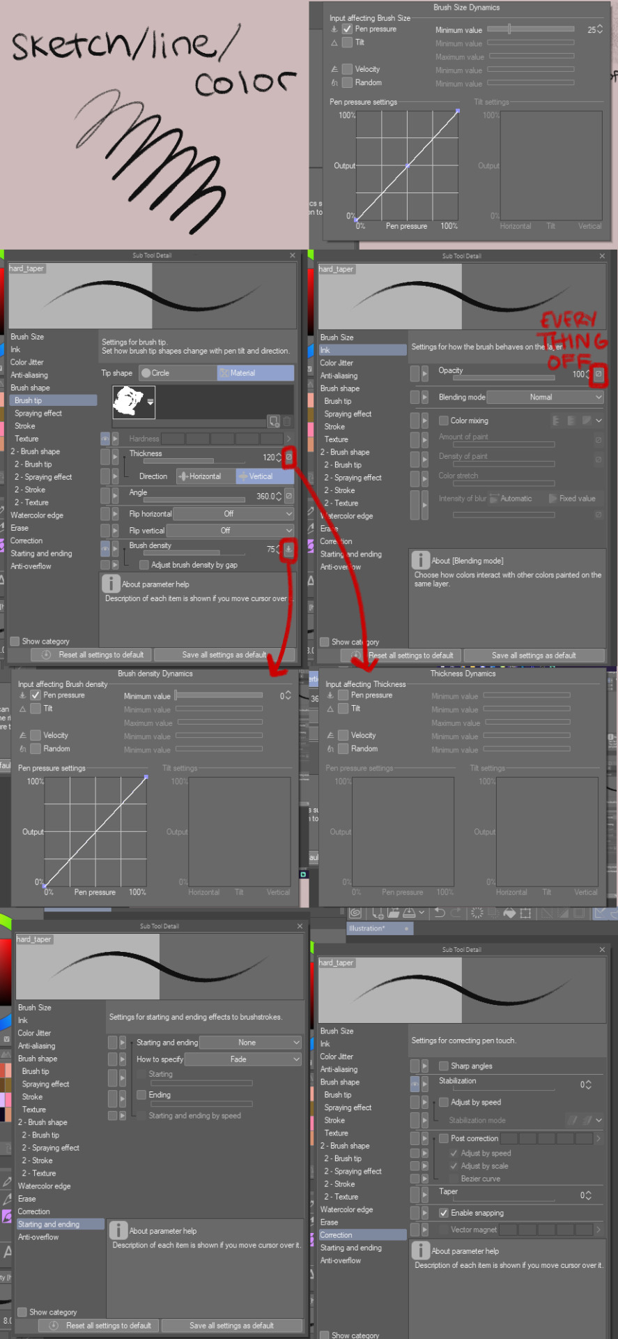
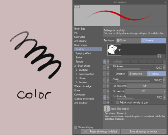
I don't use procreate unfortunately, but I can explain the settings I use for my brushes on CSP in general, and if it works like any other art software then you should have similar settings on procreate
for sketches/linework, I will very often use an opaque & slightly textured round brush. the most important for me is for the brush to have that fuzzy sort of texture that gives the impression of using a pen/marker on paper.

note that i am actually terrible when it comes to line weight, it's definitely not something i work on a lot other than in backgrounds, so I don't actually bother too much with pen pressure settings.
the only rule I abide to is to always set the minimum value above 0 (anywhere between 20-30 is what I use). this is because when I started drawing, I used to be very heavy-handed and would wear out my pens too quickly-- so setting a minimum can help you become more aware of how hard you're pressing on your pen and make gentler strokes.
another fun little setting i use is opacity: like I said, I use opaque brushes for lines, but I like to reduce a tiny bit of opacity when brushing very lightly to give that impression of pen on paper.
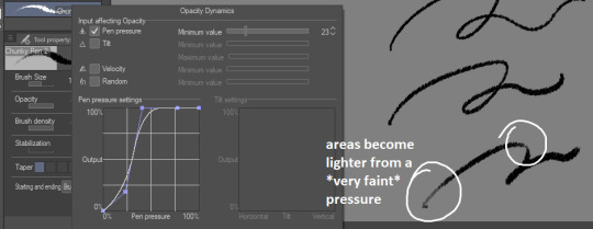
There's a couple more brushes I use for coloring or rendering; the major sticking point being that I don't use pen pressure to control brush size that much. If I want to make thinner/smaller strokes, I'll simply reduce the brush size because it's easier for me to control!
(also, opacity is something I'll use a lot more when I'm working on colors)

just know that this is my way of handling it, and it may not suit your style. pen pressure may be another artist's best friend, so please make sure you try out what works best for you :)
finally, some art softwares come with stabilization. I don't use it personally, unless i'm actually trying to do really smooth curves (which is practically never). stabilization can also make CSP lag a lot with higher values and large brushes. the use of stabilization doesn't make you a bad artist or a lazy one, and not using it can make your lines look a tiny bit wobbly if you're not used to doing quick strokes. use stabilization at your own leisure!
on a different note, i know this wasn't part of the question but I'm bringing this up since it's something I tend to hear from people who say they were inspired by my art (thank you by the way🥺💕!!) : don't be misled by artstyles that "make it look easy"! my sketches may look very simple and natural because i'm more adept at bringing out the essential and discarding details in a design. this is not necessarily what you want for your art style; maybe you like drawing details a lot, maybe you prefer the lazy way out going straight to the point. neither are good or bad, only what you like to do matters.
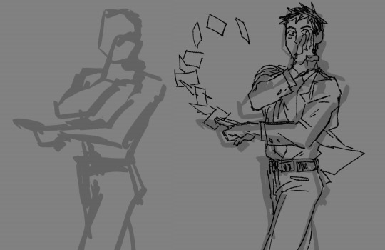
also, if you're frustrated by your work, don't be afraid to draw over it as many times as you want, adjusting things with the lasso tool or deform if something feels off then drawing over again. sometimes you'll be satisfied with your first take, and sometimes you'll need 3 bases before its acceptable (examples below)-- it all depends on your mood, energy, motivation, desired outcome, format, or even just randomness
oh and, sometimes the best way to enjoy drawing..is to find something to obsessively draw (,:
take care!
273 notes
·
View notes
Note
WHAT BRUSH DO YOU USE ITS SO FINE . please
hehe every time i get this question ive altered my brushes a bit so i gotta give the update
i use the su cream pencil specifically for its texture since making csp brushes from scratch is so annoying 😑 (tried multiple times. gave up)
ive started using a couple other brushes more frequently but theyre still just edited versions of the su pencil
this one is my main brush that i use for pretty much everything (open for better quality):
this one i use for soft blending/texture/soft light at really big sizes like 200-600(the settings are the same as the first one but these are the settings that are different):

and this one is just a softer version of my main one basically that i mostly use for softer coloring when i dont want such a hard brush. i'll usually combine them for a soft shading first then use the first one for darker/more prominent spots (again same settings except for this):
ive been messing with the base settings of the su pencil for a while now so i dont even remember what the base settings are. not sure how much of it ive changed but i know ive tweaked it here and there especially in the sub settings
i always start on a 3000px x 3000px 300 dpi canvas. i work at about 50%/66.7% zoom with a 8/7 sized brush (for sketches/lines)(the closer im zoomed the smaller the brush (if i remember to change the size))(i also usually sketch farther then zoom for detail/precision). i have a habit of drawing small so this helps me still keep the image large
this is a little cropped but its still 3000px wide. this is what my canvas' usually look like (with a neutral bg color to keep my eyes from burning. i also think it helps with making color choices. a lot of people use greys but i like mine just a little warmer)

aaand i think thats everything? brush settings in csp have so many more options than sai so sharing them is... a lot.. also i hope its all clear enough. dont forget to click the little tabs (highlighted) to get into the sub settings. also dont be afraid to mess with the settings yourself to whatevers most comfortable to you :)!! have fun!!
81 notes
·
View notes
Text
so ive been using window 7 since high school, right, first on my laptop, and i stuck with it for my desktop bc windows 10 had only come out pretty recently- windows 8 had been such a fucking mess that i wanted to make sure it was, yknow, functional. i continued not upgrading bc i found the format to be kind of irritating, and also bc im lazy and have a pretty firm "if it aint broke dont fix it" policy. i continued not upgrading after they discontinued support bc i have become increasingly bitter about how much corporate spyware is crammed onto every electronic on the face of the planet.
this was fine until last year, when i finally started running into programs i actually wanted to run flat not working on win7, and by programs i mean games, and by games i mean elden ring. so i dissected my old gaming laptop, removed the 2 500gb hard drives, shoved 'em my desktop, and used one of them to dual boot the thing to windows 10, which i had to spend enough energy on setting up in a way i was comfortable with that by the end i was just like "ill use this... later..." and then didn't. i still haven't played elden ring.
im now running into more programs that aren't compatible, including csp 2.0, and i want that align tool badly enough to bite the bullet and switch to using win10 full time. this means i have to swap which drive is running which- win10 needs to be on my main hard drive (2tb, runs faster) along with all my files, win7 needs to be on one of the 500gb drives with any older progams incompatible w/ win10 (the other 500gb drive is for overflow storage; i like to micromanage my file organization).
it doesn't appear to be possible to just switch them simultaneously, which tracks, that feels like a bit of a tall ask. so the gameplan then became to:
1) empty the storage drive and merge both the 500gb drives into one 1tb partition
2) shuffle files onto flash drives so my win7 side is under 1tb (~200gb, no i do not have any one device that fits that, i had to play data tetris on like 4 different ones, if someone wants to give me $100 to get a better external that would be great)
3) make a disc image of the win7 data on my 1tb external
4) wipe the 2tb drive, move the win10 data onto the clean disc (possibly by merging the partitions?)
5) restore the file data to win10
6) re-dual boot and restore all win7 data on the 1tb side
7) make sure all my shit got shuffled over properly; move anything fully win10 incompatible onto external storage (may involve wiping external hard drive, we'll see)
8) factory restore win7 to default settings, fully clearing file data
9) repartition the 500 gb storage unit; untetris all the overflow data back into place
10) manifest an extra hundred dollars or so and purchase an external drive with 4+ tb data as i should have done like 5 years ago ._.
im currently on: step 3! and have been for roughly 3 days now, bc large backups are Fucking Slow and it took me a hot second to find out that win7's native backup+disc image creator straight up won't process a 2tb disc, you need to download some other software. also because tech problems are bad for my blood pressure, and i have other shit to do in my life.
the backup software (it actually came with my external but i never actually installed, because i havent had to backup the entire drive and os for this pc before. the os backup was technically. like 7 years old. from my laptop. and i never thought to replace it, i just kept the files updated as needed) is currently like halfway through and if it gives me another error message before it finishes i will. i dont know. lay down and cry, probably.
did i ever actually post the tech saga. i havent been able to use my desktop properly in like a week.
5 notes
·
View notes
Note
Hello! I have often had the chance of admiring your work in different places, so you must imagine my happiness when I discovered your account here. After years of observing art, I have decided to try my hand at it, although rather to the dissatisfaction of my expectations. I was wondering:
1. What is your process for drawing comics, more specifically the steps you take and the tools you use?
2. Do you have any tips for how to draw the fabulous Lord Ghirahim? Please don't laugh at me, I am in quite a predicament and am unable to do him justice with my attempts..
I would be ever so grateful if you shared your wisdom and experience with me since I lack both in this field. Thank you for your time.
1. Comic process I use Clip Studio Paint EX for drawing comics. This version of Clip Studio I have is geared towards comic making and thus comes with features that help with comic making but the basic version of Clip Studio works perfectly fine as well.
As for my comic drawing process, my general process is as such:
Script - writing out the dialogue/general actions, pretty self-explanatory
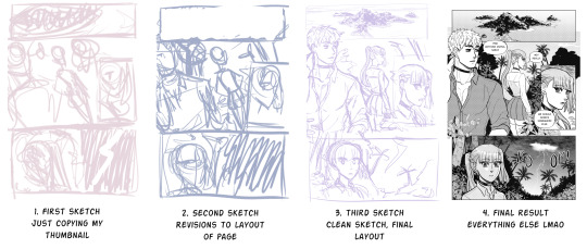
Thumbnails - based off the script, I draw thumbnails of all the pages for the comic. This step I focus more on pacing of the comic so everything is loose in terms of placement. I like to sketch these out traditionally on paper. Thumbnailing is useful for long comics but nowadays I do them even for single page comics as well
1st sketch - Initial sketches of all the pages based off of the thumbnails digitally
2nd sketch - heavy revisions for composition/panel layout. I also typically put in all the text that I know will go onto this page to layout word bubble placement. Sometimes I end up adding more pages to the whole comic if I think if it's necessary
3rd sketch - a clean-ish sketch, basically the final look of the page. I tend to already have the panels drawn out with the panel tool in CSP at this point
Line art - suffering
Background - also suffering but not too bad since nowadays I use 3D models/pre-drawn assets/brushes to do backgrounds
Screen tone - suffering x3
Blacks/shadows - Just adding shadows/anything solid black onto the characters, like clothing or black hair
Balloons - at this point I finally give the text word bubbles lol
Add any other special effects or whatever necessary (e.g. motion lines, sparkles, etc.)
Some random notes about my comic process:
For the writing step, I write the script and then beg my friends to help me edit it to be less dumb lol
My process is fluid so I go back and forth between the steps all the time
I work page-by-page, so instead of like finishing each step for each page all at the same time, I finish an entire page before moving onto the next one. This is probably a really bad idea
I rarely start work on the first page of the comic. I tend to start working on the page I think will be the most annoying (get the hard shit out of the way first lol)
Random tips:
Keep reading direction in mind when doing page layouts. Is it left to right? Right to left? Reading direction will have an effect on how a reader’s eyes travels across a page
Look at your favorite manga/comics/webtoons/etc. and observe what you like about their paneling/page layout
Just do it. You’re not gonna get any better unless you actually draw. Yes this means you will be producing some bad comics at first but that’s just a part of the whole process of improving and becoming a better artist. If you really hate your old comics you can always redraw them
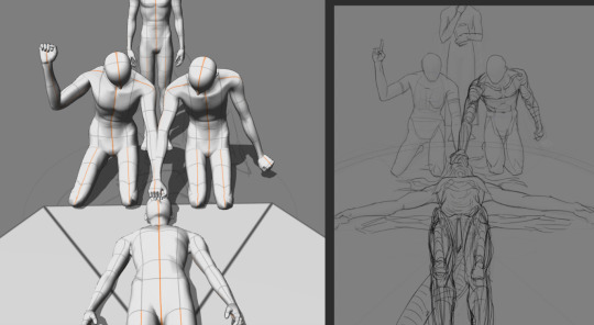
A really bad visual step-by-step of my comic process:
As for tools, I just use a textured brush for line art. I hate backgrounds so I use a lot of free assets to for backgrounds lol. Clip Studio Assets store is great and filled with a lot of free assets to boot.
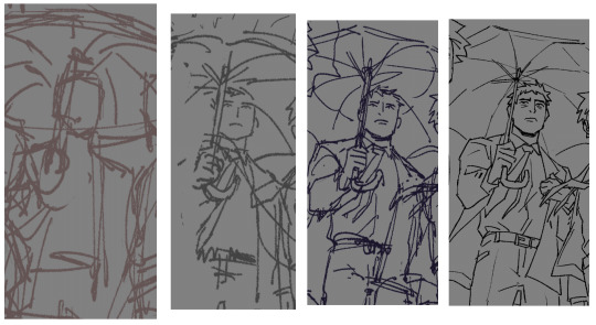
2. Drawing Ghirahim This thing I drew is still relevant to how I draw Ghirahim. It’s 4 years old but the way I draw this bastard hasn’t changed much, really.
92 notes
·
View notes
Text
Devlog #66
Hi-ho, Wudge here! Welcome to the weekly update.
As I mentioned about five days ago, I finally wrapped up the final code testing for Jade’s RNG minigame. I wrote the code itself about 2 months ago, but this week is the first time I used it with actual writing. I think it’s working pretty great personally, but we’ll see what my eventual playtesters think about it!
On that note, I wanted to take the opportunity to update the list I made in a previous devlog.
JADE SCENE
✔ 1. MC’s impression of Jade (descriptive): 100% - 338 words
✔ 2. Interacting with Jade (four conversation menus): 100% - 1390 words
✔ 3. Deciding to catch the bird (descriptive): 100% - 415 words
✔ 4. Catch the bird (large menu): 100%
• ✔ [Coding the RNG] 100%
• ✔ 4a. Make Jade use her powers forcibly on the bird: 100% - 260 words
•✔ 4b. Look up how to catch the bird safely: 100% - 528 words
• ✔ 4c. Catch the bird yourself: 100% - 401 words
•✔ 4d. Lure it out with treats/Chicken out: 100% - 196 words
✔ 5. Jade gives MC a brief tour: 90%
• ✔ 5a. Briefly showing off different locations - 395 words
• ✔ 5b. Bantering with Griffin in the conference room - 516 words
6. The rooftop: in-progress (drafted in VSCode)
•6a. Location description
•6b. Releasing the bird (variable check: if the bird was caught)
•6c. Jade jumps off the building to grab food
7. (missable) Stay for dinner (planned: handwrote part of the scene)
8. Jade takes you home (planned: took some notes in scrivener)
... Viola, 5/8 scenes just about all clear.
I also practiced drawing some birds in CSP to prepare for the eventual bird sprite, and... I think I really like drawing birds?? Such pleasantly simple shapes, look at these little guys.
I haven’t decided what kind of bird we’re gonna catch yet, but it’d be nice to have a colorful one!
And nowww that I’ve updated you guys on Herotome... I wanna admit that I made a bad call for my health recently. <_< Nothing serious, but uh.
When I worked on Ballads at Midnight with the intention of submitting it to a game jam, I was writing basically nonstop Monday-Friday for the month of March. As some of you may know, there’s going to be a secret ending update that expands some more about the story.
So going into April, I knew I wanted to:
Finish BaM’s secret ending.
Work on my client project (to pay the bills, y’know).
and of course, return to Herotome.
Not too daunting! I enjoy having more than one project, and am very used to juggling 2-3 at a time. However. I grossly underestimated how much juggling all three would take out of me after a full month writing sprint.
After inhaling tylenols to cope with eyestrain migraines last week, I started to realize that maaaaaybe I’m pushing myself too hard after all. I must contend that I paced myself extremely well in March, but completely failed to factor in rest and recovery to prevent burnout in April.
So now I’m vaguely aware that I need to schedule some rest at some point, but uhm... I don’t want to? I’m SO close to 100% wrapping up both BaM and the client project, so the idea of not finishing them this very minute is incredibly frustrating. And when I’m unwilling to rest because I’d prefer to work, it’s hard to feel remotely rested even if I schedule time off for myself. (Because I spend that rest-appointed session feeling mad and guilty and thinking about work the whole time.)
... I think I’ve mentioned multiple times that I’m a recovering workaholic. Haha.
Sooo tldr; for my health and my sanity, I’m gonna try to slow down... I love working on games, I love project work, I love working hard; nothing in life makes me happier. But if I keep pushing myself in the short-term then I’m not gonna get as much done as I’d want in the long-term.
After I finish the client project and/or the secret ending, I’m gonna take a break for at least a week - because I think I have to, even if the very idea makes me deeply unhappy. Rsm frsm. (Gosh Wudge, it’s only a week off, not the end of the world. You’ll be okay!)
Anyway. Thanks for sticking around y’all, you rock and don’t you ever forget it.
I hope you’re all staying safe and keeping warm.
Much love,
Wudge.
26 notes
·
View notes
Note
my friend may i ask what brushes you use 👁
sure! i use procreate and most of my brushes are super customized but i can describe them enough to recreate in any program (hopefully). this is gonna be a little bit long because i'm bored and i love talking about this stuff soooo
the brush i use most often is a medium hard airbrush. with lots of size pressure but very little opacity pressure. it's super versatile and i usually use it to sketch digitally (which i only do sometimes, most of the time i just scan in pencil drawings or go straight to paint)
my main brush for painting is a rectangle brush with a stamp hue jitter and a bit of texture on the sides. i love square brushes for blocking out shapes and it's good for making a base you can put more detail on top of, but it works on it own as well. the main thing with square brushes is i never turn on pressure settings for anything, i find they get in the way when working on the base of a painting so i keep the brush a consistent size and full opacity. the stranger painting only uses the hard airbrush and this square brush:
i also like using it to fill in space in more line-art heavy drawings
for lineart i sometimes use a very hard pencil brush with heavy line weight and no opacity settings. i'm not exactly sure how to make them but pencil brushes are really easy to find online for csp/photoshop/krita/etc. just grab any one and turn on a little bit of smudging and mess with the settings until it feels right. i use it to give my lineart a bit of texture, especially when there's not much else in the artwork for fill that role. here's an example where i used this pencil brush for most of the lineart, particularly on the figure:
the rest of it was either filled in with the lasso selection tool or a version of the square brush i mentioned earlier, you can see it pretty clearly on the border and around the speech bubbles.
this isn't really about a brush in particular but more about how i use them (i always got frustrated with brush packs that couldn't replicate what the artist did and i couldn't figure out why so i'm including this aside to try and avoid that because younger me would kill me if i didn't). i approach lineart more like painting: i first lay down a base layer which is usually overdone and then carve out my lines using an eraser with the same texture as my line brush. i've found when you do that it makes it easier to experiment and allows you to use textures in a more interesting way, as well as mess around with textures that might not be feasible with one-pass-lineart. nothing against it ofc but once i started doing this digital art fully clicked for me. the best example i can think of is this bouquet from my werewolf kiss drawing where i first went in with the black silhouette and then drew in some detail with white, then again went and refined the form with black
speaking of i have another lineart brush i used in the drawing above. it's called mercury on procreate and i don't really know how exactly it works but it's like a very hard airbrush with a lot of texture on the edge and i turned the size pressure settings to the max. it's a little similar to a watercolor brush with no opacity settings. i use it for drawings where i want a more rounded form on the lines and for details in my paintings sometimes
anyway the only other brush i use is just called "oil paint" on procreate. it's a little hard to describe but i'm fairly sure most art programs have a version of it. it's a heavily textured brush with a ton of smudge on it but very little opacity settings. in my paintings i like to lay down a base using an airbrush, build up texture and color using my square brush, and then finish everything off with the oil paint brush. here's a speedpaint that shows it
11 notes
·
View notes