#i wish they would remake the anime with this art style
Explore tagged Tumblr posts
Text
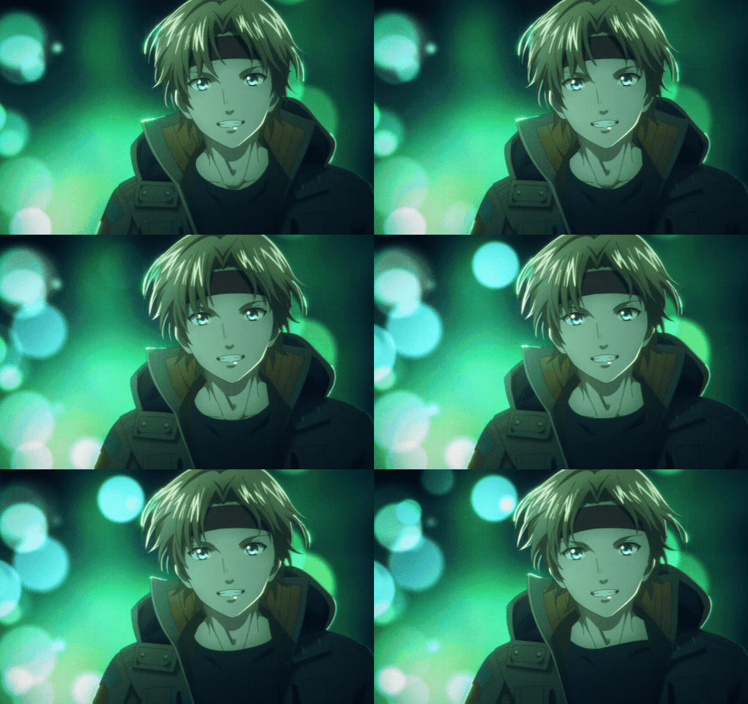

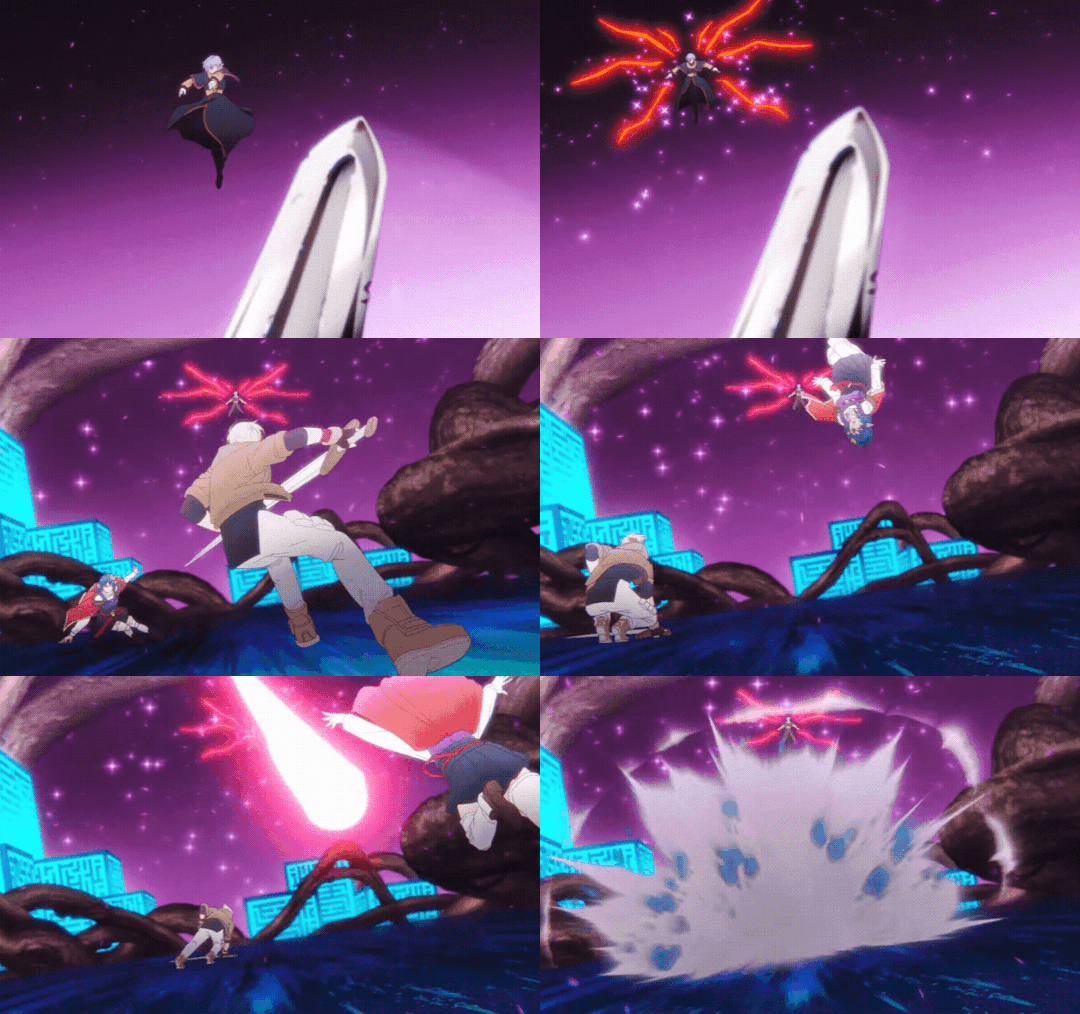


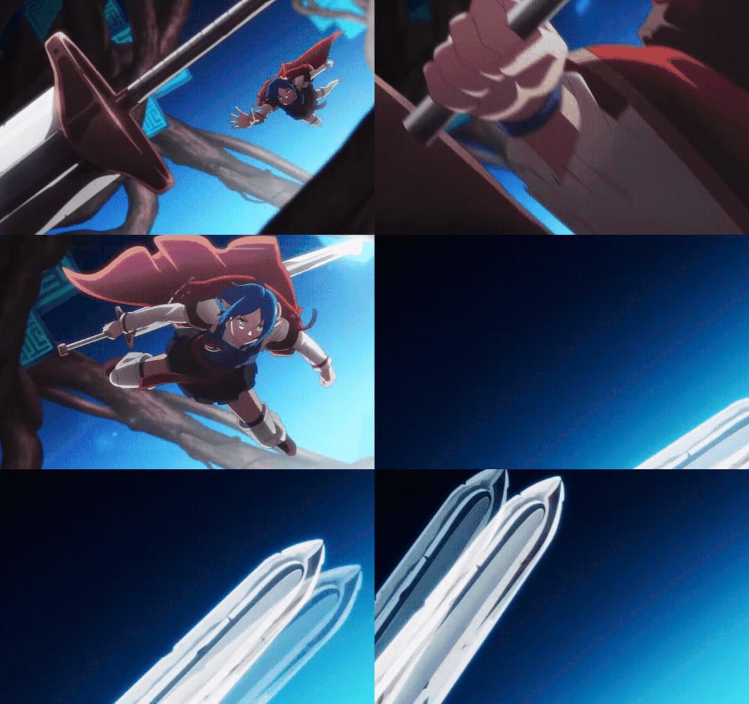
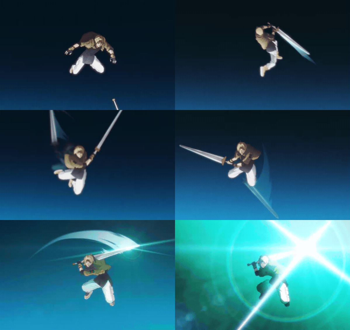
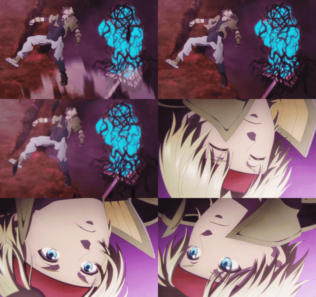
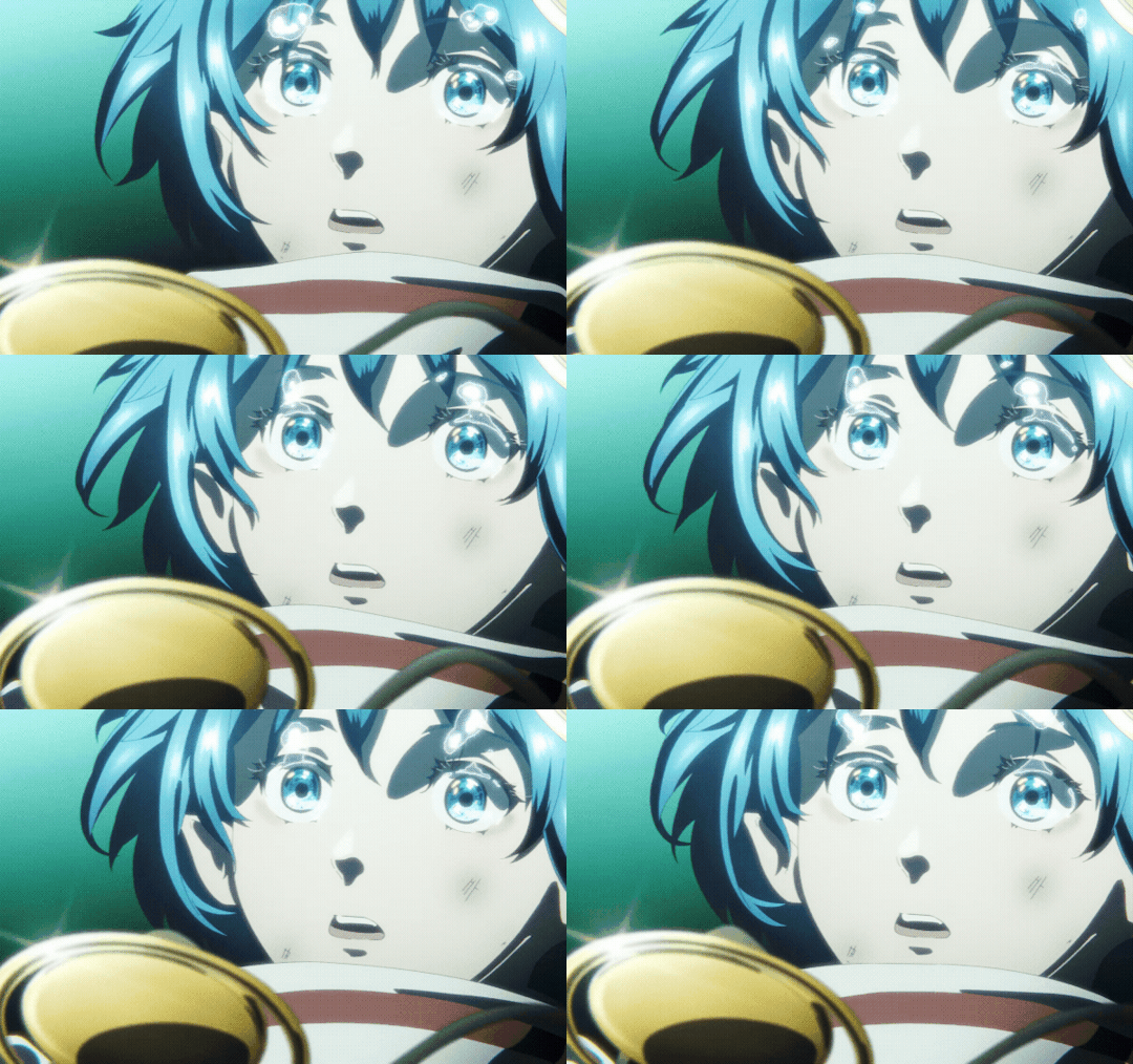
Claude & Rena fighting together
#star ocean#star ocean 2#atar ocean second story#star ocean second story r#claude#rena#i wish they would remake the anime with this art style#or just remake it in general#my stuff*#staroceanedit
25 notes
·
View notes
Text

Nightsong ❤️
#taking some time away from drawing to do 3d art!#i wish i was good enough to justify buying a 3d printer#you cant tell but the topology of this girlie would make a proper 3d artist cry#BUT HEY A PIPE DREAM#im gonna keep learning and then one day i will be able to make little figures for myself#finally i would satisfy my need for cute anime styled figurines that are NOT connected to any IPs#nightsong one day i will remake your ass with proper topology and then youll be on my desk i promise#3d art#3d render#blender#marcia
132 notes
·
View notes
Text
even if they were more shovelwarey i do miss the golden era of girly games during the ds era. tho tbh the one i really like are jpn ones that would get translated from time to time. like Rockin' Pretty(Happy Star Band) or like Princess Debut. i recently found out about Every Girls' Dream Job which is just the Imagine series here in the states, but with a cute anime style tho some of those,imagine series, are reskinned/"localized" jpn games with western box art and shit lmao. tbh i wish the art style would be cuter for some of the western games tho the western ones i feel are more likely to be shovelware than a legit game.
i feel like i make this same post like once a month lmao/ i really just want a cute lil game that i can take pics in and dress up my character and do cute lil tasks. i dunno im feeling my monthly nostalgia for my ds and miss being a kiddo playing rockin pretty in a fashion bug or pokemon pearl on the playground.
#sorry im still a weeb and love anime art styles > lmaoo like style savvy 1 still looks cute while some western ds fashion games look a lil#scary yknow i feel like we try so hard to have super details shit which then gets muddy on the shitty graphics#i feel like if they just simplified it it would be fine also i wish for some more pastel colors than the super sat colors but w/e#i think im gonna try and play pokemon pearl remake again i think ill restart it tho#hologram.txt
3 notes
·
View notes
Note
I was writing out a really long meta analysis piece on the og Beauty and the Beast on how music and lighting were used to tell a story and I tagged you in it because I thought it’d be fun to debate some of that stuff with you but now I can’t find it in my drafts at all! It’s all gone 😭 so I came to your blog to make myself feel better and found your post about Zazu in the Mufasa movie and seeing you draw the characters in the original Disney style really cheered me up. Their animation used to be so beautiful and had so much love in it (your art was gorgeous by the way, it actually looked like a real lion king film!)
Anyway! If it’s not too much on you, I’d like to hear some rambles on Disney, it could be about anything really, but I’ve just gotten some really awful news tonight and I need something to take my mind off it please
Oh I'm so sorry to hear that! I want to be there for you. You're so kind about my art, thank you; I wish I'd seen the post. I’ve had it eat my drafts before like thirty times; recently my phone is doing this fun thing where I can’t type more than two paragraphs without tumblr freezing up, so I’ve lost more that way.
Let’s see…let’s talk about Disney’s Sequels! In these trying times of remakes and prequels, the Direct-to-Vieo Sequels start to look pretty good right about now, don’t they? I think they actually got better as time went on and money went into Disney Toon studios, but I’ll list my top three and explain why!
Lilo and Stitch 2: Stitch Has a Glitch (no I’m not biased leemee alone)
‘The Lion King II: Simba’s Pride
Bambi II
I can explain myself.
Lilo and Stitch 2: Stitch Has a Glitch
This movie is amazing. It repeats the best things about the original Lilo & Stitch (tight focus on character-relationships, character-specific comedy, and a simple story) while still having its own vibe, as if these are the exact same characters you know and love, but they have a recently-new normal.
Stitch isn’t a destructive artificial-brain figuring out how to think outside his programming anymore—now thinking outside his programming is the new-normal, but he still has to learn how life with a family works. Lilo isn’t lonely anymore, but she is still stuck in her own little world, in a way. Nani isn’t struggling to keep her family together anymore, but she is still struggling to keep them all happy. And Jumba and Pleakley get character arcs, which is beautiful.
If you’ve never seen it, I don’t want to spoil it. It is a really good movie. They took this concept, which was originally from Chris Sanders’s early story ideas for the first movie, where Stitch is in danger of death but Lilo’s love revives him. And they made a movie out of that.
It’s great, because Lilo is still working through missing her parents. The movie doesn’t brush that aside, or act like having Stitch fixed everything for her. Instead, she’s become singlemindedly focused on winning the same competition at hula school that her mom did, because she wants to feel a connection with her mom, and because her peers are still treating her like she’s worthless.
The thing is, Lilo gets the confidence to try and win this because of Stitch. She’s downcast and believes that her bullies are right. You get the idea that this is how she would feel if she were still a lonely orphan. But this time, because this is the sequel, Stitch is there.
So he tells her they’ll win the competition together. And in this movie, while Lilo is struggling with getting her sense-of-worth from Stitch, or a hula competition, Stitch is struggling with his sense-of-worth, too. He’s glitching out and his programming is forcing him to act destructive all over again. He’s not sure if he’ll always be bad—he’s wrestling with the possibility that he’ll hurt Lilo and his new family.
And in the meantime, Jumba is trying to solve the problem, but he’s afraid he’ll fail, and lose his worth in the eyes of the family, as well as lose Stitch. And David, in a little side-story, is afraid he’s losing Nani, that she doesn’t value him.
All of which sounds really dark, but it’s really an interesting place to take the characters, and truthfully the whole film is so lighthearted where it needs to be, but not afraid to be earnest and emotional, either. And the point of it is really good. It’s “love is more powerful than death.” It’s powerful enough to overcome questions about self-worth, and it’s powerful enough to overcome the gaping hole that loss and failure and other forms of death leave. It’s gorgeous.
2. The Lion King II: Simba’s Pride

People take issue with this sequel because…I mean, look at it. There are parts of it that are animated really well, and the character designs are good, until you measure it up to the original Lion King, and then it’s just not even the same league. Besides, the writing is very dramatic, sometimes the sound editing for the characters’ dialogue is placed strangely or feels like the pacing is weird…
But I love it, and not just for nostalgia. I love it because it is about a new set of characters (like a sequel usually should be) but the previous set of characters still act in-character.
Not everybody agrees with me. Because Simba seems much less fun-loving, and so uptight and formal, that he doesn’t feel like the same character we knew and loved in the original Lion King, at all.
But it only takes like one second of thought to realize that, as a brand new king who’s uncle murdered his father and emotionally blackmailed him, and was able to do so easily because Simba himself was so self-centered and reckless as a child, and then Simba made big mistakes by running from his responsibility for so long…
…where we find him in this sequel makes total sense.
Of course he’s feeling like he has to overcompensate for abandoning the kingdom and getting fooled by Scar. Should he realize that not everyone is going to betray him, and he is the real King and can rule gently and fairly without being over-controlling? Should he? Yeah. But like. This is Simba. His major character flaw is thinking too much about himself—it used to be thinking he was awesome, then after his dad died it was thinking he was unable to be a good leader and everything was his own fault. Now, everything he ever dreamed about being a King, he dreamed when he was like the lion-equivalent of nine years old. And found out it was all wrong. He’s having to figure this out with only his father, whose very absence is a sore spot, as an example. Of course he’s suddenly obsessed with being just like his dad, and that makes him talk all formal, and pass strict judgement, and say things like “I’m seeking counsel from the Great Kings.”
Of course Simba would be protective of Kiara. Overprotective. Lying and controlling. Because as a child, he and Nala almost died over and over. And the worst of the worst things happened to him, as a cub.
Of course he wants to banish Kovu. It’s not because he’s racist. (What does that even mean?) It’s because he was betrayed and manipulated as a young, naive cub by someone who claimed to love him, then broke his heart and his life. So when a dark lion who literally looks like and claims connection to Scar waltzes in and appears to be manipulating his daughter and stealing her young heart? Yeah, no, it wouldn’t be Simba if he didn’t overreact.
But that’s enough about Simba. I think the movie’s real strength is symbolism and premise.
First off, it continues the symbolism of a reflection in its own unique way. The movie is very on-theme. Its point is “Hate divides us, but love completes us.” (Its not “We Are One,” that’s just Movie-Speak)
Kiara feels incomplete. Divided from a whole other half of who she is. She says so as a cub. She’s not just a princess; she feels like there’s a part of her that wants to be capable and bold and take action. But she can’t be that, she has no outlet for that, because as the Princess, everyone is always over-concerned for her safety and wrapping her in like, wild-animal-bubble-wrap. Then she meets Kovu, and he is capable, and bold, and takes-action—he seems independent. (He’s not, at first, but he has more control over his immediate actions than Kiara seems to.) And he gets her and loves her, and she loves him, despite their flaws, so that is her missing half.
And with him, he doesn’t know how to just enjoy life. He’s been trained his whole life to act out of passe-down hatred; he’s been run through drills, and there’s even a scene where Kiara has to teach him how to play…and then he goes back home to his sister, who clearly also wants to play, but just calls it “fighting.” That’s the world he comes from.
But he meets Kiara, who is all about trying to enjoy life and have fun, and it’s a whole new outlook for him. It’s what he had seeds of before his mother’s hate stamped it out, and Kiara completes it for him. So they really are each others’ other half. And they have that in common. Kiara could be independent and a capable leader, if her father’s hate (which manifests as paranoia and overprotectiveness against danger) weren’t stamping it out. Kovu could have fun and protect good things instead of killing, if his mother’s hate wasn’t stamping it out. Dividing the good parts of them. But then their love for one another overcomes all that and brings them together.
And they do that literally, with the reflections in the water. Simba needed to learn his father lives in him, he’s a part that can’t be separated. Kiara and Kovu needed to learn that love makes them part of one another—that’s the key to no longer being divided.
Just like how, in the end, love forgives—so the Outsiders are able to come back into the Pride. Instead of being divided, the prides literally merge into one, and are completed. Love all that.
If you think of it all as like, “how do we make Simba into a strong King when he has so much baggage to overcome?” And this adventure with his new family teaches him that? Then you can see it’s a really beautiful movie.
And I love, of course, that Mufasa appears to be orchestrating all these events. Like, there’s a Higher Power at work. It’s all good.
Bambi II
This movie has the same vibes as Lilo & Stitch 2, even though it’s a midquel.
I love that Bambi gets his own characterization and character arc in this movie, even though he’s pretty one-dimensional in the classic film. But yet, none of this feels out of character for Bambi. He’s sort of gentle and very young, but you can see glimpses of dreams and ambitions and even strength that show off what he’ll be like as an adult Great Prince of the Forest.
I think the animation is very good, soft and cute. It’s not so much about realistic-cartoon-animal movements, graceful and charming, like the classic was, obviously. This animation is more about emotion and appeal. Which I appreciate, because the story is, like most good Disney sequels, very relationship-based.
It’s about Bambi being cared for by the Great Prince, and how the relationship between a father and son is about more than duty; it’s about nurturing. I just love that. I love how carefully they build up Bambi as feeling distant and unsure of what’s going on in his father’s head, but wanting to please him nevertheless. I love that the Great Prince doesn’t know how, exactly, to care for or relate to Bambi, so he defaults to just telling him how to be dignified and Princely.
I especially love the scenes with Ronno or the Great Prince. I like the fact that those old Disney sequels can take a character that didn’t have a lot of dialogue or screen-time in the original, and build out a whole story around those characters, giving them personality and writing that somehow always feels true to those characters. The Great Prince might not know how to father, but even when he’s insecure he has a kind of put-on calm and reserve. He’s not made a fool-out-of, ever, or bumbling. I love that Ronno, on the other hand, is ridiculous and brutish, just a little-boy bully…but he’s also truly threatening, for Bambi and Faline and their friends.
I think the emotion in this movie hits really well. Because they’re so careful to interweave Bambi’s emotions about losing his mother and wanting to find the same feeling of safety he had with her in his father, with The Great Prince’s emotions about wanting to “do his duty” even if it hurts when he feels he’s not what’s best for Bambi…
Because they build that up believably and spend all their time on that instead of big, epic adventures or larger-than-life tales, the movies turn out really well.
Honorable mentions to Cinderella 3: A Twist in Time, The Little Mermaid: Ariel’s Beginning, Tarzan II, and Lady and the Tramp II: Scamp’s Adventure
I hope your day is better tomorrow, friend.
#Disney sequels#the lion king II#the lion king 2#Simba’s Pride#simba#Kovu#Kiara#we are one#Zira#Taka#nuka#Vitani#Lilo#stitch#stitch has a glitch#lilo and stitch 2#direct to video#sequels#Disney#Bambi#ronno#faline#Bambi II
15 notes
·
View notes
Note
I was thinking about Wish again. Would you want a short released on Disney Plus for the movie? I know I would. Also I am not a fan of Valentino's voice.
Oh, definitely. There's a lot of potential where the movie left off for a short, a series of shorts, or even a TV show. There's so many wishes for Asha to help, we could see more into how Queen Amaya works with the people to pursue their ambitions, how Rosas has changed since Magnifico's defeat, etc. (And unlike the weird animation of the Tangled TV series, Wish already has a precedence for a flatter, 2D animation style from a lot of the concept art!


And dare I say it... a series of short, etc. would also be a really cool opportunity to explore some of the concept content that didn't make the cut in the final movie. Like a hidden hamlet of folks who hid away from the kingdom so that Magnifico couldn't get to their wishes.
And the only reason I don't hate Valentino's voice is bc he's voiced by Alan Tudyk, who's been in every recent Disney film in some way (he's also the voice of King Candy, the Duke of Weselton, Alistair Krei, Duke Weaselton, Iago in the Aladdin remake, Tuk Tuk, and Hei Hei. Yes, the rooster.) But yeah, it overstayed it's welcome and brought nothing to the plot. The joke "I am talking! Who knew my voice would be this low?" in the trailer was funny, but almost all of Valentino's lines in the actual movie felt so awkward.
A lot like Dude in Descendants, except even Dude's new talking ability had a singular moment of plot importance in the second movie...
17 notes
·
View notes
Text
So I saw Home On the Range for the first time, and I have to get this out:
I genuinely 100% believe that the movie would be fixed if ⭐ Buck ⭐ the horse was the main character, instead of the stupid cows.

Here me out!!!
Throughout the years whenever I heard people criticize the film, it's really two things. And after watching it, I did find those to be the main issues:
The cows are annoying, and not great as main characters
The comedy is (mostly) obnoxious and childish
(Most Disney movies have jokes that are meant for a younger audience, but the majority of the jokes in each film never get to the point where any older people watching can roll their eyes and groan at them.)
But something that I noticed is that the obnoxious comedy really just comes from the cows. I didn't have a problem with any of the other characters in the film, I liked them fine, and the comedy from them was fine.
The only characters that I had a problem with were… the cows. You know… the main characters. And you know what? It's mostly just the main cow Maggie that was truly obnoxious and unlikable. I like the other two cows fine.

Also whenever people bring up the movie to trash on it, Maggie and the celebrity that voices her is always the #1 joke. It's like with Sisu and Awkwafina from Raya and the Last Dragon. Which leads me to believe that most people hate Maggie (and maybe the celebrity that voices her) in the same way. But at least Sisu isn't the main one.
I've also heard from a lot of people that they genuinely like Buck, and find him funny. Plus Buck has a more interesting character arc than whatever the heck Maggie had.

Basically all in all, the movie would've been good if Buck and his best friend Rusty were the main characters, and the stupid cows were the supporting characters (minus Maggie, if possible).

The way the cows are written, they come across more as the comedic supporting characters anyway. It's never a good thing when the main character(s) is the thing that brings a product down. And when I say that in reference to this movie, I'm just talking about Maggie. Grace and Mrs. Calloway were fine.
Maybe they can have Buck and Grace get together or something. Idk.

Anyway, Buck is great, he should've been the main one, spread the word
#ReleaseTheBuckAsTheMainCharacterCut
You know what Disney should do instead of their terrible live action remakes? How about instead they take their lesser received movies throughout the years (Black Cauldron, the movie I just talked about, Chicken Little, Strange World, WISH) and remake them, not in live action, but still animated. And with the same art style of their originals.
But no, that's too much work and artistic integrity for Disney now. Let's make Frozen 4.
#anyway screw maggie#buck shouldve been the main one spread the word#disney#disney analysis#home on the range#disney animation#buck the horse#maggie the cow#raya and the last dragon#the black cauldron#chicken little#disney chicken little#strange world#disney wish#poll#grace the cow#mrs. calloway
10 notes
·
View notes
Text
I'm probably gonna get crucified for this, but the new Harvest Moon game, Winds of Anthos, has thus far captivated me much more than the latest non-remake Story of Seasons, Pioneers of Olive Town.
The character designs in PoOT, especially for the bachelors, was just terrible. I don't even remember half the bachelors because almost all of them, save for Iori and the DLC bachelors, were designed like background- and filler characters, to the point where I struggle even remembering their names. And their personalities weren't much better than the designs, tbh. Everything was kinda bland and uninteresting.
The bachelor and bachelorette designs in WoA though? We can laugh about the art style being a rip-off of Pokémon all we want, but at least we get some interesting character designs, that actually show some damn personality.
The big, open world isn't everyone's cup of tea but I enjoy taking long rides over wide, green fields and just spending nights watching the stars quite a bit, while PoOT made me feel downright claustrophobic at times with how limited the area is.
The animal designs are also all cute without being overdone. Especially the horses, because the Story of Seasons horses mostly look like backyard breeding gone terribly, terribly wrong. There is such a thing as too stylized, you know.
Of course WoA does still have its issues, some of which are gonna be a dealbreaker to some people. The farming is still too simplistic, for one. And I wish they could bring back the ability to just buy seeds instead of having to chase down those damn sprites. And it would be nice for side-characters to have unique designs again too, instead of making them so cookie-cutter to make the bachelors and bachelorettes stand out more.
43 notes
·
View notes
Text
nearly all of the character designs from 'UNITRES Dreams'
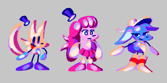
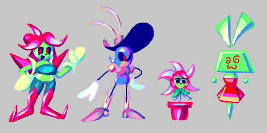
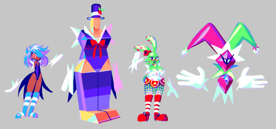

(once again, this post didnt have a “read more” part in da original cohost post, so im putting it here... click more if U Dare !!)
so, trying to get back into making art again, i decided to draw brand new references of all the character designs from my game, UNITRES Dreams. cus why not. anyways these references arent Perfect.. some of em ive made better reference sheets before (while for this i just wanted to draw em all together with a sort of consistent color style and their current, up-to-date designs) and also i didnt get to draw Every character as it is Too Much and i am Too Lazy to draw all of the enemies and boss designs ... so ive just included the enemy and boss sprites for now.. but ill probably draw new art for them sometime.
Anyways. let me tell ya a bit about making Character Designs for this game. as ive talked a bit about in my post about making Character Sprites , making stuff for the game is hard because i am pretty much the Only person working on the game and i have to split my time working on the sprites between working on Every Other Aspect Of The Game , meaning i dont get to spend as much time making the artwork as detailed and polished as id want to.
and the same thing goes for making the Character Designs. sadly, i didnt get to make as many Actual Characters as i wanted (you can tell which are the Actual Characters as theyre the ones i Actually Redrew Here). when the project started, i only really had the Main Three Playable Characters in mind.. in fact most of the other Actual Characters didnt even Exist until the Very Very End of development.. which is the part im sad about. i just didnt have enough time to think about adding any complex new characters or figure out how i would Make a new character design . Which leads me to the Other Characters... which includes Most (but not All) of the Bosses and Enemies. Their designs are well , Basic . their designs werent really thoughtout ;they were created to serve a single purpose: to be made quickly so that the game could Have enemies and bosses. if i were remaking this game now, id probably remove or even completely Redo a Ton of the enemy designs (except the post-UNITRES Dreams enemies ... im kind of proud of them Lol !!)
thats just how things were. i didnt have enough time to focus on making character designs, so i didnt get to make a Ton of them and i had to make them Fast . in fact, early on in development, i hadnt really had much experience making character designs (as , before UNITRES, i didnt really make too many Original Characters for my games before), so i struggled experimenting and making characters for a lot of its development. And The Designs themselves .. a lot of them (even the ones i like) are pretty simple. Most characters are comprised of simple shapes and details , making them easy to draw and animate. and a lot of the early designs used Very Few Colors , which made drawing them quicker.
Despite All Of This , However, i am actually pretty proud of a lot of the designs ive made for this game (Especially the ones with the fancy new drawings i made here ..). while theyre simple, and while i wish i couldve made More characters with more unique designs , i really like the designs i got to make for this game ,with some of em being my favorite to draw even when im bored .. and i just felt like id talk about em.
And Well , Im Gonna Talk About Em !! click da 'read more' thingy if u want to Read More ..
the Main three characterz
"trees"
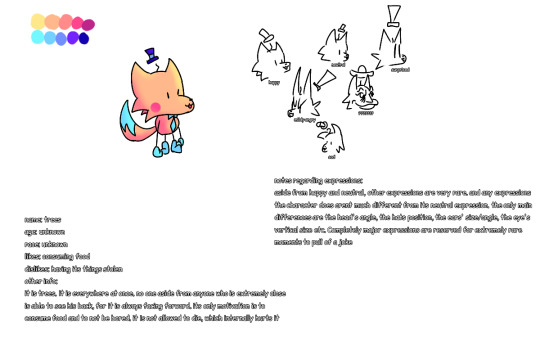
so first off , let me talk about "trees". before i can get into their Actual Design , let me tell u a bit of history so u can understand why theyre designed the way they are.
So . around November 6, 2018 , before UNITRES was really a thing , i designed the very first version of Trees that u can see above. while i didnt know what the game was going to Be , i had a Basic idea of what i wanted the Character to be from the very beginning. you see, Trees (the character) ,while having the same name as me , is Technically Not a self insert , Kind Of . I designed this character near the beginning of when i started entering a Very Low Point mentally in my life (which involves some personal stuff im not going to get into , Aswell as this point happening Around when Among the Others released) and i thought Very Negatively of myself . And So , this character is sort of an exaggerated version of the negative thoughts i had about myself at the time .
the main characteristics of the character was they Did Not Show Their True Emotions , instead bottling up their feelings and showing a very Fake , happy version of themself. theyre also kind of Fucked Up in the head and try to hide it . anyways theres more stuff going on with them that you can probably extract from both the games and the old descriptions in this concept art , but i wanna leave that as a surprise for when i get to make my next game. There Are some outdated things from the descriptions in the concept art , such as an idea where Trees would be Always Facing Forward , hiding away their backside. And Also , you may notice theyre referred to as "it" and "his" in this , which has well. Changed . teehee.
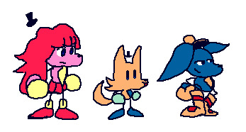
as for The Design Itself , i wasnt really sure what i wanted to go for at first. this character was actually one of the Few first Actual Character Designs i made at that point , so i didnt really have any idea on what to do. One day , i thought up of a Little Bear Looking character , and i tried drawing that character .. only for it to Sort Of look like a little fox-like character. and i imagined this character emoting mainly by very subtle details , such as the Hat and Ears changing shapes based on their emotions ..
Anyways , later that month , i drew the very first sprite of Trees , which ended up being used as the Idle sprite for the UNITRES tech demo. i wont be sharing What that sprite was originally for , as im saving it for Something , but i Will show you Trees' sprite evolution:
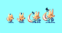
from left-to-right , it starts with the very first Trees sprite. Then there's the first revision, which was done when UNITRES Dreams started development. Then there's the second revision , done for the Newgrounds update in 2021. And finally, there's the TREES' ADVENTURE version, which is the current version of the sprite.
with the first version, the sprite is Pretty Close to the first concept art. However , iremoved the blue part in the tail as i couldnt get it to look good in sprite form (or i just forgot to include it.. idont remember). I also removed some details , such as the little hair and the red blush, as i couldnt really include them on such a small sprite.
Anyways , so how did the design mutate into the current design ? Well , over time , i ended up drawing their ears and tail Longer , and ended up giving them longer and longer limbs (as it was Hard to animate them with the tiny limbs they had). Eventually , it got to the point where i decided to just redo the sprites to make em consistent with how i was drawing them , and thats how i got the second revision.
But Then , i started consuming media Other Than Sonic ! i think the main thing that infected my brain was Spinel from Steven Universe ... while Trees' design Did have a bit of the sort of rubberhose , silly limbs before (along with a Bit of contorting their form , as u can see with the expressions in the original concept) , when i saw the steven universe movie , i saw spinel and was Immediately like " Oh My Goodness Gracious . I Need To Make My Character As Silly As Her". And so , I leaned more into the silly , stretchy limbs . You can see this in the following sprites:
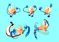
Anyways , as i kept drawing them and consuming more Non Sonic media , i ended up experimenting more with their design and adding some small elements from my inspirations .. one of the other main inspirations was Wander Over Yonder ,where i decided to draw Trees' hat to be more Silly and Big , like Wander's hat. i also ended up perfecting how i drew Trees , giving them more Sharp lines , Bigger and Sillier "hands" and "feet" , making their tail Huge , and just giving them a nice silhouette that i like . By the time of the Newgrounds update , i realized Trees' sprites were kind of Outdated , so i ended up redrawing Most of their sprites , and ended up with the version you can see in the current version of UNITRES Dreams ..
And well , Im Really Really proud of how their designed turned out . I Like to draw them a lot. and i think the way their design evolved has ended up fitting with their Actual Character really well .. the sort of Round , Soft elements such as their Big , Blobby hands/feet and their cute , silly face make them look , on the surface , cute and Silly . But then you have the more Sharp lines and elements , such as with their head and tail which i think makes their character have a bit of depth .. if that makes sense .
Idk . im not good at words or describing things . i just think their design now works really well with what i want to go for . and hey , a lot of my friends have drawn them and have drawn them Really Really Well .. i particularly like how people interpret their design .. with some people leaning into the more Soft , cute elements of their design , while some have drawn them Really Really accurately .. its really cool and im thankful for everyone whos drawn them before ..
Last Thing ill mention about their design (and i guess this goes for Most of the other designs) : Most of the characters in UNITRES aren't really supposed to be any Specific Species . Theyre all just sort of weird , ailen-like characters who do not abide to any sort of rules or reality or whatever. Trees is just Trees ; they're not supposed to be a Fox or any sort of Real animal or species or whatever, and that goes for every other character.
??????
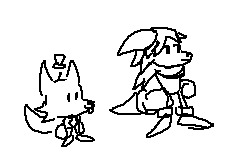
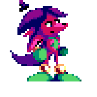
so here's the very first designs of ?????? , who for now ill unofficially refer to as The Pink Character. When i first started development on UNITRES , i Knew i wanted there to be Three main characters: Trees, and two mysterious characters. and when i started work on UNITRES Dreams (back when it was known as UNITRES - BRAND NEW WORLD Edition) , i needed to create designs for them .. However , at this point i was still learning how to Properly Make Character Designs , and so i created the first sketch above ,and then created their first sprites , which . Well. I Ended Up Not Liking Their Design Very Much !
So . The whole point of this character is that they dont really know their own identity , with them not even having a Real Name . Their design was Supposed to be sort of Ambiguous .. However i was Not Sure what to do for their design . i wanted to make it so you couldnt really tell what their gender was (as originally , they were a girl ... but they do not have No Gender anymore) . However , when people first started testing the game , they just . thought they were a guy.
anyways . i just Did Not Like This Design . they didnt really have a Clear Silhouette .. they just didnt look like an appealing or memorable design to me. and i also i didnt like their color palette. So . when the game became UNITRES Dreams , i decided to completely redo their design . And Well ..
This is the first drawing of the new design. At First , i wasnt sure about their design , with things such as them being Pink and Having A Skirt, i was worried about Some People immediately being like "Oh , Theyre A Girl !".. but you know what ? Ive grown Very Very Attached to this design .. i think theyre both Cute and Recognizable , while still fitting the sort of character i was going for . Their sillouette , while not as Recognizable as the other characters , has enough goin on to where i think it is a bit recogniable and easy to read while still giving them a sort of Mystery regarding their identity .. if that makes sense . And their more monochrome palette compared to every other character helps sell that , i think .
i think theres probably some people out there who see this character as a girl , but i think theyre a good Non Gender Having character design . just cus theyre pink doesnt mean they gotta have Gender ! anyways , i love them. theyre my silly little strange creature. i hope you love them too .. there is so much i want to explore with this character in a future game .. and i think their new design has really stuck with me.
???
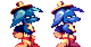
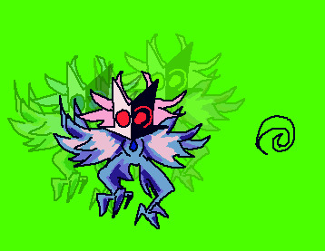
So , ??? , who i will refer to unofficially as The Blue Character, is supposed to Sort Of be the opposite of Trees (the character). they're Very Tired and Chill , not really too crazy or anythin. and i wanted their design to illustrate that, and well , out of every design ive made , theirs was pretty much perfect from the very moment i created them.
I dont know if i have any old concept of them on hand, but i Do have both the original sprites ,aswell as the newer ones which are pretty much the same as the old sprites , but more polished and with redone colors..
And, well. Yea . they didnt really change much ! The only aspects that changed was that i removed like , Two details that i felt cluttered up the sprites too much , that being the little Tired Eyebag/ whatever its called line beneath their eyes, along with the little Red Dot that was on their boots. Other than that , their design was pretty much Perfect. they were also pretty easy to make , as , with them being a sort of Opposite version of Trees , theyre pretty much based off Trees' design , except with a bunch of differences to make them feel like their own character (such as different body/head shape , a big silly hat , and Actual Boots).
there's nothing much for me to say about them. they're perfect.
the really gay ones
suzy, wavey, and their little Shine Catcher
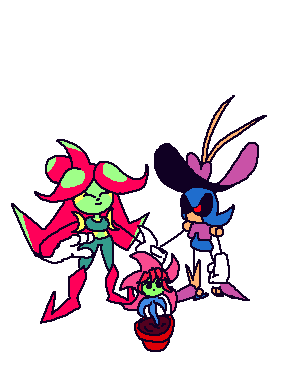
Alright . so before i can explain These characters , u need a little bit of History .
So. when UNITRES - BRAND NEW WORLD Edition was "finished" , i went on to help with RRThiel and his game, MEGA MAN PERFECT BLUE. as you can see here, i worked on various backgrounds and tilesets for the game. Anyways , at one point , ithought itd be cool to remake the Intro Stage in UNITRES , as a sort of tribute to the game and also as a little extra thing for the new update i was planning on making (which ended up becoming UNITRES Dreams).
at first, this was Just going to be two levels based off the Intro Stage from Perfect Blue , However , later in MMPB's development , one of the backgrounds I did for one of the levels ended up being Completely Redone by other people on the team ,as my background didnt really fit the game's style .. However , i still really liked this background .. so I decided to reuse it for a new level in UNITRES , with it also being a tribute to the level in MMPB (though its a lot more loose compared to the Intro Stage level , Lol).
This level ended up becoming Greenhouse Frenzy in UNITRES , and i ended up turning what once was just going to be a two level bonus into an entirely new campaign with its own story in UNITRES Dreams. and with it being a whole new campaign , i wanted there to be New Bosses and New Enemies ..
So , for Greenhouse Frenzy - Section 1 , I was planning on a new boss ... and this boss was going to be ... Mr. Sauceman !
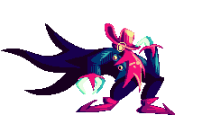
You See , for UNITRES Dreams i wanted to go Hard with including all sorts of little tributes to my friends and the people who helped with the game . Mr. Sauceman , being one of the composers of the game , let me use his character from the game hes working on as a boss in the game , and i thought itd be nice to have him be in Greenhouse Frenzy ,since that level is pretty much a big tribute anywayz.
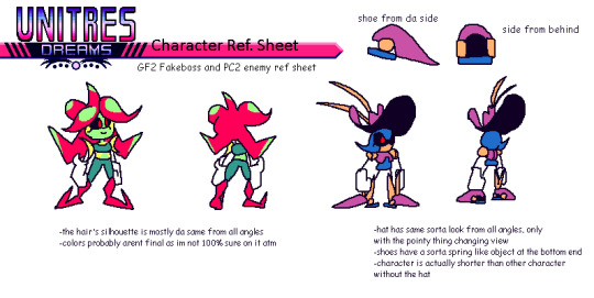
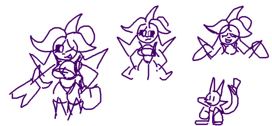
So , Originally , i wanted the Sauceman boss to start out with a little Fake Out . You See, the MMPB level that Greenhouse Frenzy is based off has a robot master that i asked RRThiel if i could use for the level , but he said no. So , I decided for this boss that i would create a silly character Inspired by the robot master from the MMPB as a silly little joke , but then Mr. Sauceman shows up and that character explodes . And So , I Designed Suzy , a character who , while inspired a bit by the character MMPB , was made to be a bit different and also to be used for a silly little fake-out intro and to die in 5 seconds . You can see this on the reference sheet , where she didnt even have a name and is just referred to as "GF2 Fakeboss".
However . Two Things Happened : 1) I Grew Kind Of Attached To This Little character I Designed , And 2) I Ran Out Of Time. i couldnt implement the fakeout that i had planned ... and i didnt have a boss fight for Greenhouse Frenzy - Section 1.... So. I decided to just. Make her the boss fight of GF1. it just made sense ! i Originally had planned a boss fight based on the Magik Master boss from Chaotic Carnival , but reusing the character design for the silly fakeout ended up being quicker , and so she ended up being an Actual Character in the game.
And Then There's Wavey . she is a robot. i originally designed her as an enemy for the Intro Stage tribute level (a.k.a , Perfect City) , as i wanted it to have its own enemy. Her design is also Some What inspired by one of the robot masters from MMPB , though not as much as Suzy's is.
Anyways , despite Suzy and Wavey being inspired by characters from MMPB , i wanted them to be different and have their own sort of Character . And well .. their actual Personalities are different to the ones from MMPB , at least . In UNITRES Dreams , there is a hidden "Storybook" mode , which contains various stories which add a bit of Worldbuilding into the game .. and one of the stories details Suzy and Wavey . Basically , Suzy is a lonely gardener , who lives alone on her own strange little planet , who then travels across the galaxy to the Perfect City , where she ends up meeting Wavey , a military robot who Suzy becomes fascinated with ..
Anyways . my writing aint exactly the best , and i Refuse to go and reread the stuff i wrote for the storybook mode in unitres . but i tried my best to make suzy and wavey their Own sort of characters , having their own identity compared to the characters theyre based on. Oh , and by the way , suzy and wavey are gay LOL !! and they have a little baby plant that they raise . this is also told in the storybook but i unfortuately didnt get to explore this Much outside of that in the game... though there Is a secret you can find in one of the levels.
So. what do i think of these characters and their designs ? Well. Honestly. Im Not Sure . when i designed them both , i still wasnt Totally comfortable with character designs as i am now , and honestly . theyre not my Favorite designs . Wavey in particular is just . Well . Shes Just Metal Sonic in A Hat . she has her own little differences , but i cant lie . i probably coulda done better with her design . and suzy i think hasnt aged as well either . Idk. Also. In Case You Cant Tell , I am BAD with coming up with names . I Genuinely cant do it. i came up with both of their names on a Whim . i justdidnt know what to call them and i was running out of time LOL !!
anyways. last things ill mention are : the plant is a species known as Shine Catchers, which appear as enemies in Greenhouse Frenzy. Oh , and also , here's some concept art of them Lol !!
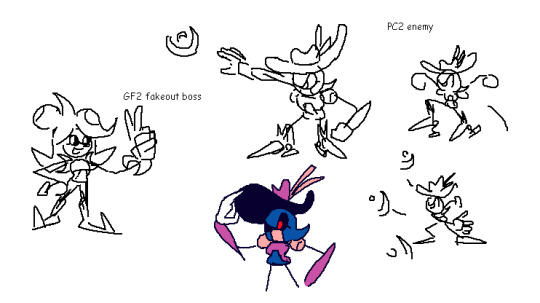
(oh , and i also forgot to mention: originally , suzy had green dots on her "hair", but i didnt know how to properly draw them on the sprites , so i left it out)
the Silly ones (a.k.a my favorite ones)
Millie
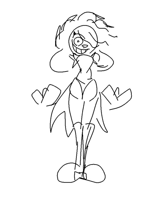
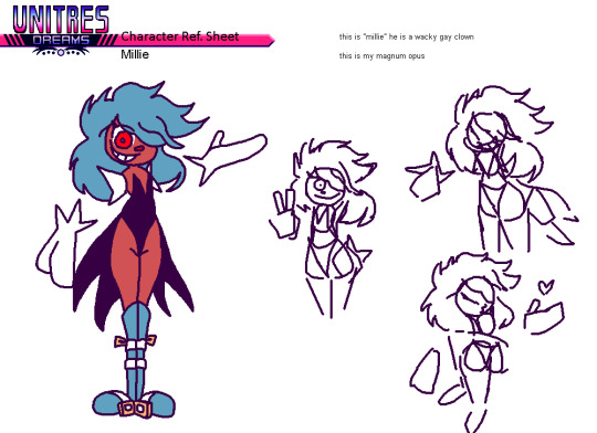
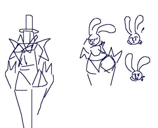
So . Millie is the most self-indulgent design Ive created .
Here's how it went: one December day in 2020 , I was sitting around bored as hell , when all of a sudden , the Silly Brained part of me Saw an idea pop up: A Tall , Hot , Cute Clown Man . And Instantly , I KNEW I had to draw him . But I Was in the middle of a Zoom call ... So . I opened up IbisPaint on my old Android phone , and drew the First sketch with my fingers that you can see above . And Instantly I Knew : I Had Done It . I Made Perfection .
More ideas grew , and i realized : I Could Do Something With This ! So , later , I came up with a whole reference sheet for him , and started planning on something: I was going to make More characters for UNITRES Dreams . You see , at the time , I was working on the v3.0.0 update for the game. This was Very Very late in development , before i even Planned there being a Newgrounds version (and before ninjamuffin convinced me to Make the newgrounds version LOL !!). Anyways. for so long , iwas disappointed that i didnt get to make a whole lot of original characters for the game .Most of the characters were either Enemies or Bosses. there was Barely any NPCs (aside from the guest character apperances).
i Also Realized: Chaotic Carnival , one of the most Important levels in the game , needed More love . So. I decided i was going to make new NPCs just for it , so that the level could feel even More alive and lived in. And that's when i created the Silly Trio , which started with Millie.
As for Millie's design , there isn't much for me to say. he is perfect. i love him and he is one of my favorite things ive designed. Yes , it Is self indulgent . Yes , i Do Want Him Carnally . teehee. Anyways , after designing Millie , i knew i had to design more characters .. which leads me to..
Goldian and Ellie
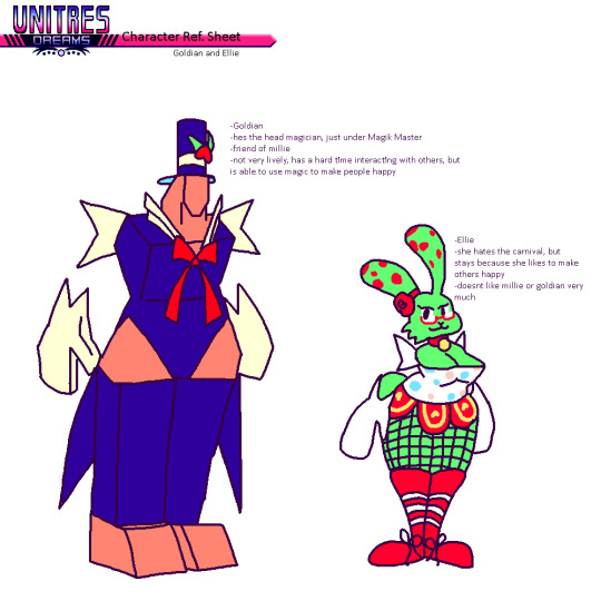
Goldian is a tall , polygonal magician man. He is in love with Millie. They are canonically dating.
Ellie is a bunny-like clown girl. She likes to entertain people with magic. I think she might be asexual , but i wasnt very sure when i created her.
Anyways. there isnt much for me to say. i Could get into some of the Character Lore perhaps . Millie , Goldian , and Ellie are all characters with troubled pasts.. they all had to run away from their homes due to circumstances , and they managed to find the mythical Chaotic Carnival, where they all met and decided to become entertainers. It gives them purpose , to see people happy. And they work under the Magik Master , a strange magician who has the ability to bend reality at will. They're all like a sort of Found Family .
that's all ill say about them. theres so much more i want to do with them in the future... i love these characters so much. theyre my favorite designs ever.
Oh ! Iforgot to mention . these characters (including millie) names also suck LOL ! Im not good with coming up with names !! all their names i came up with at the last minute
All The Other Characters I Forgot To Mention
the magik master
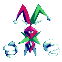
nothing much to say about them. theyre one of the first bosses i created, and i Kind Of like their design still , though i might consider redoing it so it fits with the rest of The Silly Ones ..
vie
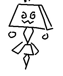

nothing much to say about Vie . she's a flower girl, who spreads flowers to every level in the game. she got the flowers from the Suzy's Greenhouse ..
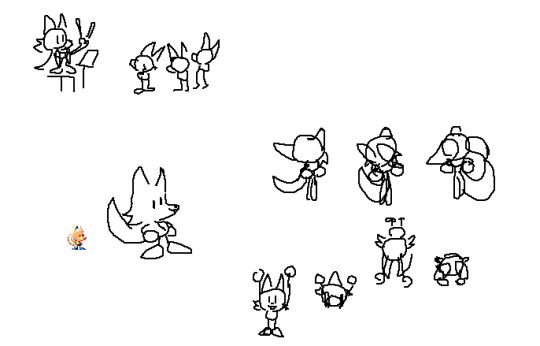
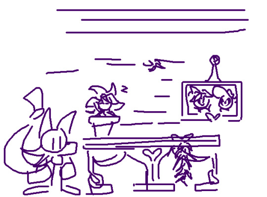
Misc. Concept Art
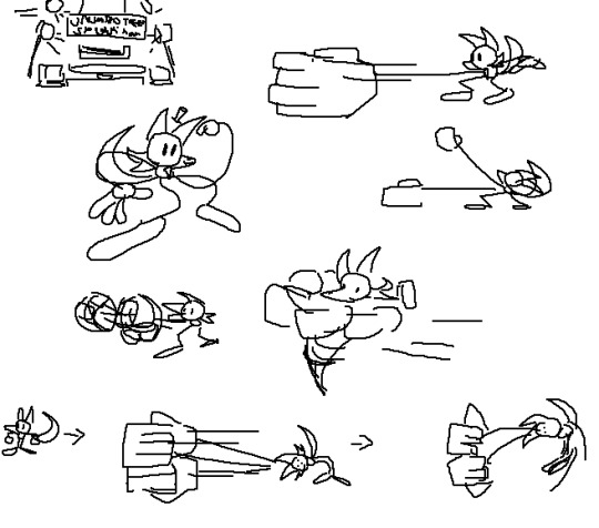
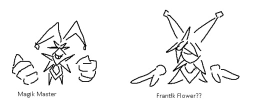
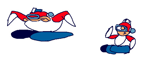
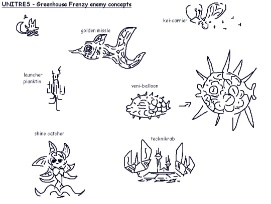
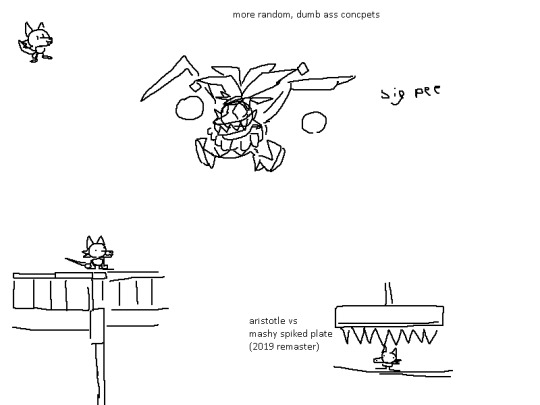
#TreesThinks#UNITRES#UNITRES Dreams#art#artists on tumblr#character design#characterdesign#gamedev#game dev#game development#indiegame#indie game#indie dev#indiedev#indie development
30 notes
·
View notes
Text
I’ve been hesitant to post this because I’m afraid of it becoming popular and blowing up my notifications but I just have to get it off my chest
Puss In Boots: The Last Wish, one of the most artistically beautiful films I’ve ever seen, would not be possible if it weren’t for the animation industry’s obsession with making CGI look “realistic”
You’re probably wondering what I mean. After all, when comparing the two movies in the Puss In Boots series, the first one definitely looks more realistic while the second looks more cartoonish
But a cartoonish art style is not a downgrade. A really bad art teacher once told me that “in order to draw good cartoons one has to first master realism.” While this advice did not help me in the slightest, I think I finally understand what she meant
Puss In Boots: The Last Wish isn’t in a realistic art style but it still feels real in its own universe thanks to the techniques the animation industry learned from realism. I’m struggling to properly put my thoughts into words so let me try an example
You know how people used to compare the dog from the first Toy Story to the cat from Toy Story 4? And how realistic the cat looked while the dog looked ugly and plastic? Imagine if those animators tried to remake the dog with their new techniques
If they aimed for total realism, it’d look realistic but unrecognizable from it’s original design. However, by taking the road to realism and then turning at the fork into cartoonism, the plastic looking dog can be both realistic and recognizable when art styles are merged properly
I think what my old art teacher was trying to say was that if I draw a cartoon nose without perfecting a realistic nose it’ll look off or something. That’s not really true, art styles are forged from the artist’s own experiences and efforts, but I understand that the physics of a sketch should match the physics of reality
Hair should move with the wind, a character’s weight should be consistent, arm length mustn’t change every frame, etc etc. The efforts of CGI animators to master these physics and then attribute them to fictional settings and scenarios is admirable. Ever see those behind the scenes videos for Tangled and how they animated Rapunzel’s hair? That’s so cool how they meticulously made sure it felt natural wherever it landed
Animation was not made to be a substitute for Live Action (looking at you Lion King remake). While it may be utilized as such, its true purpose was to be a medium for unachievable spectacles, such as a small mouse in red shorts piloting a steamship. Animation should be based on this divergence from what is unrealistically possible in our reality and what may be possible in another
That’s why Disney’s live-action remakes aren’t as good as their original films, because they change the context of the medium. If you suddenly introduce a world where Fairy Godmothers exist in live-action, what makes our world so special in comparison?
Anyway uh with how long this post is it probably won’t blow up, so my notes are safe for now. I hope those who do find this post learn something though
#muffin moments#I’m not tagging every film I talk about though#puss in boots: the last wish#puss in boots the last wish#puss in boots#puss in boots 2#disney#toy story#toy story 4
69 notes
·
View notes
Text


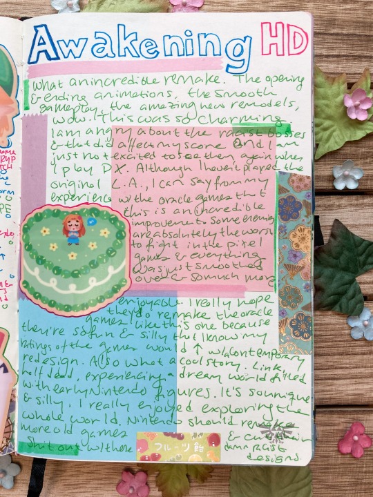
Link's Awakening HD!!! I love the art style of this game a lot and I hope the developers continue to make more HD remakes of the older games! As someone who played the oracle games before this one, this game improved a lot on playability and design so it was really nice breath of fresh air to not struggle against some of the rough aspects of those games (hardhat beetles). I wish I could've loved this game more, but as much as I enjoyed this game I still had issues with it (same with every Zelda game honestly :/).
The stickers are from the Homemade in Hyrule zine and were designed by Mirarasol
Writing typed below! (plus extra commentary in my summary)
Rating: 8.3 Played: Spr. 2023 Port: Switch
Comments:
GORGEOUS OPENING ANIMATION
omg Kaepora Gaebora
this is insanely cute
incredible sfx and animation
please that's a tanuki not a racoon T-T
the apples change color...??
omg it has the platforming
wtf the skeletons hanging??
Her name is SYRUP not WITCH
omg the classic moldorm
DAMPE
VIRE!!!
I really hate how racist Nintendo is
I like Marin and Tarin!!!
The drowning noise
the pegasus boots are so cute
color 3 up 4 right 5 up 2 left 1 down
Tarin why did you poke the nest with the stick T-T
animal village animal crossing?
oh marin and the others have round ears
FUCK SLIME EYE
i like the color dungeon but don't like choosing between offense and defense (other games let you have a reduced mix of both I usually choose)
passage ways of the egg left up left left up right up up
I like L-4
love the chess piece puzzle
omg spectacle rock
love the turtle rock head fight
nintendo PLEASE STOP WITH THE RACIST BOSSES
KIRBY!
ghastly?
love the ocarina songs
love the figurines
I really love the nightmare combo final boss
love the orchestra music
seagull marin?
love the whole dream concept
love the wind fish design
Summary:
What an incredible remake. The opening and ending animations, the smooth gameplay, the amazing new remodels, wow. This was so charming. I am angry about the racist bosses and that did affect my score and I am just not excited to see them again when I play DX. (I know this is an issue throughout the whole Zelda franchise and even in my favorite games like OOT it frustrates me, esp since later games made some of these problems worse. But the 2D games were a lot better about their designs so it was just upsetting to see this in Link's Awakening, especially since this is a remake from 2019 and no one on the developers team thought it was a good idea to change the racist designs). Although I haven't played the original LA, I can say from my experience with the oracle games that this is an incredible improvement. Some enemies are absolutely the worst to fight in the pixel games and everything was just smoothed over and so much more enjoyable. I really hope they do remake the oracle games like this one because they're so fun and silly that I know my ratings of the game would increase with a contemporary redesign. Also what a cool story. Link, half dead, experiencing a dream world filled with early Nintendo figures. It's so unique and silly, I really enjoyed exploring the whole world. Nintendo should remake more old games and cut their shit out with these damn racist designs.
#journalsouppe#bullet journal#journal#tloz#legend of zelda#loz#the legend of zelda#zelda journal#link's awakening#links awakening
18 notes
·
View notes
Text
I genuinely don’t care if Wish’s animation looks like crap in the final cut. Because at least Disney TRIED to do something new. It takes a lot of effort to create a new animation style, which is more than you can say about a lot if the live-action remakes.
I don’t think people quite understand that accusing Disney of only using this new animation style as a “ripoff” or “gimmick” is basically telling a huge company that trying to diversify their art style is bad. You really want Disney to be like, “oop- looks like new art styles lose money! Better go back to making every film have the same art style!”
Like, maybe please shut up about the art style for long enough to actually see if the movie itself utilizes it well or not? It would fucking suck if people didn’t watch it just because of the new art style.
2 notes
·
View notes
Text
Since I have no other place to go for this, I want to start out by saying that Nintendo needs a refresh. By doing a refresh with games and hardware, expectations can be thrown in a new direction, and speculation can be all the more fun. That said, what we want and need differs from how Nintendo views, so what I say should be taken lightly unless stated otherwise. I'm VERY open-minded, so I may go on and on, and I'm also open to criticism on the things I think about.
First off, the next console. I believe it'll stay relatively the same as the Switch but with the best internals they can get their hands on. They'll probably update the Joycons a bit and reintroduce the standard D-pad, or they may take the Steam Deck approach and glue them on. The standard will have a higher quality OLED screen to compete with others and possibly better sound. Not much more I could think of but it's enough to compete for next gen and try to bleed into the future gen. It opens up the possibility for more open first party games as well as more intricacy and design, increasing the odds for success (most of the time). Third party games will run better too.
Next, let's talk games. 2D Mario has been refreshed with Wonder, Zelda with TotK and BotW, Pikmin is still going, and Metroid... we don't know what's happening there, but it did have Dread. Mario Kart is still going strong, but there's only so much left they could do until they run out of options for one game. Smash is dead for now, but that's a topic for later with Mario Kart. Animal Crossing is iffy, as the player base has likely been halved since release; I know I don't play it anymore, and I've heard that it's got several issues that I agree with.
I want to go in depth about the state of Mario. Mario fans will be feasting soon with Wonder and RPG, and I'm one of them. Super Mario RPG is, if you couldn't tell, my favorite RPG, and I'm incredibly ecstatic for the remake. I have faith it'll sell well and be given the recognition it deserves. The music and graphics seem phenomenal in the remake, and everything seems like how we viewed it in the original; our minds were brought to life with this game.
Next is Wonder, which is an interesting beast I would love to tackle. The art style is amazing and a big step from New, just as much as the soundtrack is. It's all soft and colorful while remaining fast and enjoyable; such an appealing game hasn't happened for 2D Mario in over a decade. I love the new voice lines - despite Martinet possibly being replaced - and the new sound effects are great too. It's so experimental yet seems to be promising.
3D Mario games are pretty much due for a new game at this point. We haven't seen one since Bowser's Fury, which was only about half a game, if that. The last full game was Odyssey all the way back in 2017. It's understandable why it would take so long, but at least throw us a hint once the new system is revealed. It would be cool for it to be inspired by Wonder, but I could see it branching off of Odyssey or Galaxy too.
Super Smash Bros. should be getting a new game within the next 5 years. Whether it be a reboot, Ultimate Deluxe, or a continuation, I'm certain it'll be good. If they reboot the series, I imagine they'll keep a handful of characters and add a lot of new ones while also making completely new movesets for most fighters. Ones without new movesets would obviously have some changes though. The stages have a chance to be completely new. A continuation would likely cut some of the roster while adding new ones and do the same with stages. A continuation could be Deluxe but with different features and a new story. There are lots of debates about what characters would get in no matter what way they take, but I think the few that are locked in are Geno, Shantae, Sans, and possibly Cuphead. Personally, I wish Springtrap and Reimu would be in too, but sadly I don't believe they would. Same for Goku who will never be in.
Mario Kart is the only thing left on my mind, as it hasn't had a new game in about 10 years, less if you count Tour (but who would; it's a live service mobile game based on Mario Kart 7). It needs a new game very soon after the DLC is done, but there's one question that everyone has: where do they go next? I think they could take the Sonic R route and have it be more open world. Mix that up with all of the items in Tour and maybe some new stuff inspired by 2D and 3D Mario, and you've got something magical. Doing something like Double Dash and having two drivers per kart would be cool too. The roster needs an update as well, but Tour has added plenty of characters over time. They could bring back all characters, and if possible, add a separate menu for costumes and alternate colors. Tracks could be more based on games and even the recent movie. I would love to race around in something like Beach Bowl Galaxy or a fire flower field.
3 notes
·
View notes
Text
Nintendo Direct Thoughts
I just woke up and had a look, not expecting much given this is one of those "we're at the end of the Switch's life" Directs but honestly I was surprised.
We start with a brand new Mario and Luigi game... we've been getting lots of remakes for Mario RPGs but this is a new one and honestly was the one I expected to get a new game the least out of all of them. To tell the truth I would have preferred a continuation of SMRPG or a new traditional Paper Mario over this, cuz a party made up of just Mario and Luigi was novel when Luigi wasn't appearing in as many games but now it feels boring by comparison. I wish they would do more with the idea of adding on surprise guest party members, like how the 2nd game had the Baby Bros and the Third game had Bowser, then Paper Mario, but after that it just a weird version of Luigi? idk man. This looks neat, I'm glad the franchise isn't dead. I'll think about picking it up. Probably not a day 1 purchase. I do hope other Mario RPGs have a chance at continuing too though.
I still think the Nintendo World Championships is pointless.
Not interested in Fairy Tail, I only ever read a bit of the Manga, I'd like to check out the anime but lisenced anime games are a hard sell for me. Wish they'd just make another One Piece Grand Battle style game.
Don't care about Fantasian, Nintendo Switch Sports has a bad reputation and I don't care about sports anyway so that's a pass, pass on Mio, pass on Disney, pass on Hello Kitty, give me a sequel to the Keroppi platformer for the NES and then we'll talk, It's weird to see Loney Tunes in a video game. That Porky Pig voice was rough. I don't have hopes for it, Don't care about Among Us or Farmagia...
Donkey Kong Country Returns... not a new game, and they didn't announce any new playable characters or features aside from levels from the 3DS version, and I wish they gave DK and Diddy more of a facelift, but i'll take it, a way to play DKCR on the big screen, hopefully without the motion controls, is a win... but please Nintendo.... give us a new DK game...
Dragon Quest III 2DHD. I am very mixed about the whole 2D HD thing, I don't think it looks good. Never have. This looks a lot better than Octopath to me but I still don't like it. Also, I respectfully disagree with Mr. Horii. Playing the games in chronological order is not the best way to experience the Erdrick Trilogy, and that's a pretty dumb thing to say. That's like telling someone to read a Murder Mystery but start with the final chapter. The big twist in DQ3 will be meaningless to those who haven't played, at the very least, DQ1... I'm glad all 3 games are getting the treatment. I am a big fan of the trilogy so even though I don't care for the whole 2D HD thing, I'll pick it up, and who knows, maybe the style will grow on me.
Funko is a fucking joke. I'm ehh about Luigi's Mansion 2 but I might pick it up anyway if I have extra cash burning a hole in my pocket and I really want a new game. Don't care about Denpa Men, Would prefer Traditional Metal Slug, Don't care about Darkest Dungeon, Don't care about NSO but it's nice that those games are now available for people, Phantom Braves has a cute art style but i'm not interested in the gameplay, Marvsl and Capcom arcade collection might be worth a look but idk, I'm no good at fighting games, so i'd only be in it for the beat em ups.
I tried to like Mario Party but I just can't get into that style of game. I want to like it because I love the Mario series but it's just not fun for me, either with friends or going it alone, I hate board games irl, making them video games doesn't actually help, and I think the minigames are just not fun and over too quickly.
I wish I was excited about our first new 2D Zelda in a long time. But Link has always been...ugh... I guess you could call him a "comfort character" for me. I never liked Princess Zelda that much, and I enjoy the combat in Zelda games a lot, so a game without Link and without Combat.... I am apprehensive. The one thing that might save this game for me is that it has hints of monster taming. Not like... real monster taming, you're creating copies, so it's not like your bonding with monster companions, but it's still monster vs monster, and that's something I'd love to see expanded on. Give me a full on Zelda monster tamer.... I hope this isn't "The new direction for 2D Zelda" the way BOTW is for 3D Zelda though. I was kinda hoping 2D Zelda would keep traditional Zelda alive while 3D Zelda continued being open air.
More headlines, I don't care about just dance, never was a fan of legos, stray was interesting when it was first announced but the novelty wore off after watching ppl play it, there's a lot of games like lately. Don't care about the Hobbit, and i'm sorry, I'm sorry, I know I don't care about a lot of things and I know t he franchise has a lot of fans but I just don't care about Ace Attourney. And don't care about Hunted Line, looks edgy. I know SaGa has a legacy, but I'd prefer to try an older game before thinking about checking out a new one.
Metroid Prime 4 looks interesting. We have Sylux with some Metroids following him around. We have orchestral sounding music. It's definitely Metroid Prime alright. Can't wait to play it for myself.
Despite how often I said "don't care" I'd call this a good direct.
TLDR, Metroid is the most exciting thing there, I'm happy for the DKCR remake, I'm apprehensive about Zelda but I'm gonna try it. Mario and Luigi i'll probably pick up some day.
1 note
·
View note
Text
Man, what’s with all the bad news lately? I’m sorry today’s been such a downer, Sega fans. I’ve saved the saddest, most serious news for last though.
Beloved artist and character designer behind some of the Shining Force and Stalker games at Climax Entertainment, Yoshitaka Tamaki, unfortunately passed away from lung cancer on July 13th, 2023 at the still-too-young age of 55. He was just recently mourned in a private funeral service, according to a post from his own twitter that was translated by Gosokkyu.
Tamaki-san’s artwork was easily recognizable with its stylized merging of anime and Disney-esce visual styles. Sega fans will remember his art best from games like Shining in the Darkness, Shining Force, Landstalker, Time Stalkers, and Shining Soul I and II, each of the Sega games he worked on during his time at Climax Entertainment, the developers of all except for the two Shining Soul games. Before all that, he got his start in the video game industry working freelance at Enix until getting noticed by Climax and asked to design art for their first Genesis game, the aforementioned Shining in the Darkness. Besides those games, he would also illustrate for games like FEDA: The Emblem of Justice (both the Super Famicom original and its Sega Saturn remake), FEDA 2: White Surge, Alundra, and Assault Suits Vaiken. Unfortunately, photos of him are rare because he was rather camera shy in life.
We at Segabits humbly thank him for gracing us with his talent and wish the best for his friends and family. His stamp on Sega and video game history will remain long into his absence.
Feel free to take in some of his amazing art from the Sega games he worked on as well as leave some best wishes and fond memories in the comments after the break.


#sega#shining series#shining force#stalker#climax entertainment#yoshitaka tamaki#shining in the darkness#landstalker#time stalkers#shining soul#shining soul 2#segabits
1 note
·
View note
Text
What it’d be nice if they did do (but never would) is instead of turning every animated movie into live action, take the computer animated movies and remake them into traditionally hand drawn animated movies. They can still decide to either do the same thing scene for scene or change whatever as they wish and make it different enough, but the style would be so vastly different.
What Tangled did with the animated tv series, the style was incredible and done so well. It’d be nice to see something even remotely like that on a grander scale. And have you seen the Frozen merch in 2d? It. Is. GORGEOUS. Give us a movie that looks like that.
Yeah computer animation or even live action has some benefits. But there’s a magic behind classic hand drawn animation. Walt Disney even said Cinderella’s dress transformation was one of his favorite pieces of work. Show us Elsa’s transformations the same way. Yes the water in Moana was INCREDIBLE but also how would it translate to traditional animation? Can we see how adorable Antonio Madrigal would be in that style, too? Am i the only one who wants to see ANY of this and more?
(Side note is it even a live action remake if more than half of the characters/scenes/etc is all computer animated to look realistic?)
Hand drawn animation is unfortunately a dying art. But by the same token, you can’t have CGI without the basics. The peak of animation as a whole was when they brought hand drawn and computer animations together (the ballroom scene in Beauty and the Beast? The stampede in The Lion King?). And with how much technology has progressed since that time, imagine the feats that can be accomplished arrivals bringing them together now.
Just something i think about every time a live action remake does get announced or gives us a trailer. Sorry, venting over!
Every new disney live action trailer that drops I'm left with more and more questions about the (obviously coming one day) Frozen live action
Like how will it go. Will it be an exact retranscript, shot by shot? Because I may be a fan service slut, I still miss that time back in Tim Burton's Alice in Wonderland period when the movie took a total liberty on the original disney take
10 notes
·
View notes
Note
I discovered you recently and was scrolling through your stuff when I fell in love with your Joker redesign. It’s just so Good! Not only is your art style perfect (for all your art, really) but the thought you put into it was just wonderful. My favorite part were the horns, they just fit so well! I’d love to see any other ideas you have, but really I just wanted to gush about how much I loved it. Thank you!
Aw, that makes me so incredibly happy!!!! As much as I rag on P5's story execution, I do adore all the potential there is to the characters and the potential in redesigns that better fit the character's personalities. I'll repost all the ones I've finished for funsies, but I think now is actually a good time to mention that I'm going to be compiling all my p5 redesigns into a little zine (a re-de-zine haha) with more detailed thought process behind what I was thinking when redesigning them (there wasnt enough blank space for all my notes, or my sketches)! I'll add some blurbs from the document I have in [these] brackets! I actually focused heavily on his mask, so I'm super relieved and excited that it's what you liked most about it!
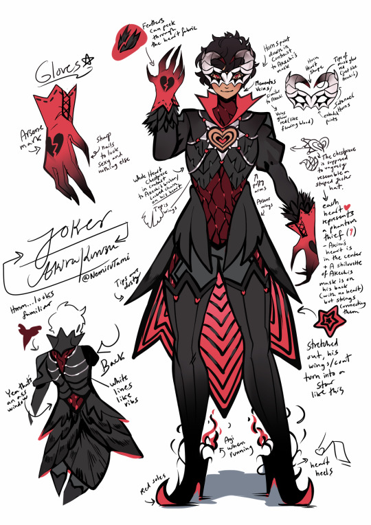
JOKER
[[Aside from Akechi’s prince outfit (which I think was flawlessly executed), I knew that I couldn’t allow myself to butcher Joker’s design- especially since I intended to remake his mask, despite his mask being perfect as it is (and was also my base for the Black Mask design before I decided to remake everyone else). // My main concern was to make the outfit represent all of PT’s, not just Joker, but I also wanted to highlight Akechi’s part in playing as his foil. As such, where Akira has a heart shape connecting all phantom thieves together by a silver string of fate, Akechi has a distorted red glow that extends chains to weigh him down as well as wings to show his ability to choose his own path.]]

AKECHI [[I wanted to keep his face obscured, but add an option to show himself if he wished. So, a hood helped cover him up for me. It helped me make it feel as though it’s a “lost” part of Robin Hood that still clings on to his Black Mask design- a desire (though weak and decaying) to be a good person underneath it all for someone he once cared about. //
Akechi's chains (from his heart) symbolize his outlook on bonds, and how they tie you down, whereas Jokers symbolize the strength he has with his teammates. I felt like this was a little too sad to write on the concept page. Reading “Goro Akechi has no friends and it manifests in his Black Mask outfit” isn’t the most uplifting sentence you want to stumble across.]] ANN [[Ann was often forced to hold her tongue around Kamoshida in order to protect Shiho, and Shiho in turn tried to do the same to protect Ann. The whip I created for her is a play on the phrase “hold your tongue” showing a lion with it’s mouth open and its tongue hanging out- filled with thorns and ready to be used as a weapon to protect those that she values. One of her biggest weaknesses now becomes her force for change and success, and she ultimately uses her power as a thief to open the maw of the man that told her to be quiet- revealing all his ugly secrets with his own words.]]


FUTABA [[This one doesn't have any notes I can share yet, but she took ages to design, so that's why, lmfao!]]

MORGANA
[[ I wanted to make him blend in more with a classic SMT demon such as Jack Frost, but still distinct enough to stand out as “more than a demon”.
//
Since Morgana is the collective human hope, I think he can take any shape or form. I only retained his cat persona because I wanted to stay true to the original design concept of it being an animal. If I was allowed complete creative form over a “guiding light” however, I think I would base Morgana’s design on Anubis or psychopomps- guides of souls (souls of human hope). The interesting thing about psychopomps is that while Anubis is also an example of one, commonly, so are crows. Meaning, I would have to design Morgana to fit a canine in order to imply Akechi himself could have perhaps had a guide similar to Mona if he was not used to bring about ruin. However, Morgana’s cat aesthetic is tied into Joker’s own traits (sometimes down to mannerisms), so getting rid of the cat persona was not something I really wanted. That, and the fact the last protagonist was based on a loyal dog made it hard for me to choose canine. I would have liked to pull something out of zoroastrianism if possible, but I was not sure how far I could take it before his design became entirely unrecognisable. And the point of a redesign was not to entirely change them to become different characters, but just to play around with different themes to better fit the character and their backstory/feelings/traits.
]]
I really hope this content was fun to read!!!! The next design I have in my WIPS is Yusuke. Honestly, I find Ryuji and Yusuke are going to be super challenging, since I ADORE their designs and I genuinely do not want to just touch them up randomly without purpose and happen to downgrade them. Morgana and Ann were my easiest targets haha.
213 notes
·
View notes