#i was just spelling it out
Explore tagged Tumblr posts
Text
DPxDC Prompt
Sam and Danny were messing around with some occult books she had gotten and to both their surprise Danny got the spell to work.
Turns out being saturated with ectoplasm during the portal incident lets danny tap into the mana that's all around, and he can do magic.
As an adult he moves out and becomes a traveling mage, mostly doing seances for people and letting them believe he is a scam or not. Usually he can actually get contact with the dead, death magic is his natural affinity after all, but skeptics will be skeptics ya know.
One day he had his whole spiel set up in Gotham, the people here lose loved ones all the time and would gladly pay him to hear their dear nana once again, or get their mothers secret recipe, or say one final goodbye to their spouse.
What danny didn't expect was a certain mr wayne showing up asking about his parents.
What he double didn't expect was one of his other customers of the day being John Constantine
What he triple didn't expect is The Batman inviting him to be a consult and detective for murder cases with his seances
Tldr; danny figures out he can do magic after the portal incident. Becomes a real mage who pretends to do fake seances, and is now hired as murder case consult by the batman, while hiding that he's a real magician, and also hiding he is dead himself
#dpxdc#i couldn't get magician danny out of my head#he is still phantom in this au just left that behind him when possible#his magic is real and his seances work#but he acts exactly the same as every sham seance person#idk much about how magic works in dc but he would be able to do spells just like constantine and other such mages#maybe even be semi friends with raven
2K notes
·
View notes
Text
not my partner trying eir absolute best to understand my signing even though i keep messing up, and doing a very very good job at deciphering my communications, but then being incredibly stumped when i just start signing "dig dug" for sillies and taking a VERY long time to figure out what the hell im saying
#i need to practice more...#asl#silly partner things#is there an actual sign for dig dug?#i was just spelling it out#but now i'll have to search the wide webs because i have to know#dig dug! dig dug! dig dug!#signs it fifteen times before u get it#what a sweetie for trying even when im not very good at communicating
1 note
·
View note
Text
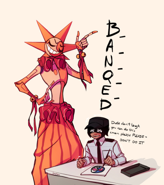
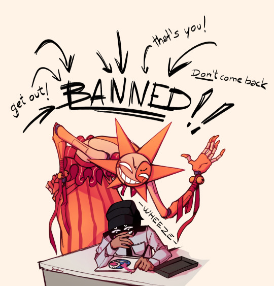
there's no way he said that so confidently
|| Bonus ||
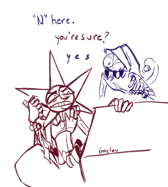
#i know he probably can't help it but dang#this is exactly the kind of thing that sends me#i just know i wouldn't be able to contain myself#i would laugh until i pass out#y/n should teach him how to spell#my art#fanart#fnaf daycare attendant#dca fandom#fnaf dca#fnaf security breach#fnaf#fnaf sb#dca fanart#fnaf sun#moon
4K notes
·
View notes
Text

i love the DLC man
#elden ring#miquella the unalloyed#promised consort radahn#I’ve been thinking about how despite all the talk of age of compassion… Miquella’s first spell as a god is an offensive incantation#with a wide af damage radius 💀💀💀#meanwhile Marika who built her age upon violence… her spells are all healing and defense buffs#and her first spell as a God is a little tree that heals a wide area#she was still trying to heal her ppl to the bitter end AND gunning for revenge. there’s a kind of heartbreaking honesty to it#the cruel irony in the DLC story is crazy#really show how badly Miq had strayed from his original path after forsaking Trina#then that meme pops in my head ajshsjhsjhs#now i do think the vow is two-way btw Radahn just got cold feet near the end#the only thing i dont like about the DLC is i cant draw jokes without explaining I LOVE THESE CHARACTERS i think their actions are valid !!#like having to pull up a whole lore presentation slide for this#yes i think it's funny as hell that Miq did show Radahn why he should not fuck around and find out
2K notes
·
View notes
Text
sorry i’m just thinking again about kaz brekker, perpetual cynic, and his surprisingly optimistic view of fathers and sons. just. kaz knowing that the one thing that would ruin pekka rollins, the man he hates more than anything, who he couldn’t think less of, would be to threaten the safety of his son. kaz telling jesper that his father cares more about him than any farm. kaz saying “call me sentimental, but i didn’t believe a father could be so callous.” kaz’s fatal misunderstanding of van eck being that he couldn’t conceive of a world in which fathers don’t love their sons. thinking about what all this says about kaz’s own father, and everything he lost before he and jordie ever stepped foot in ketterdam.
#grishaverse#six of crows#kaz brekker#i know papa rietveld was a certified Good Dad i know it in my heart#i just. the layers to these characters and the ways their current actions paint a picture of their upbringings#without ever needing to spell it out. s tier character depth
3K notes
·
View notes
Text
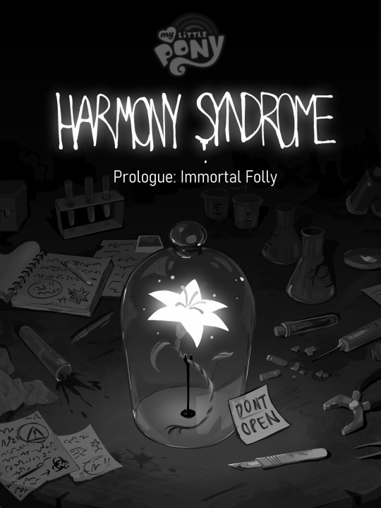
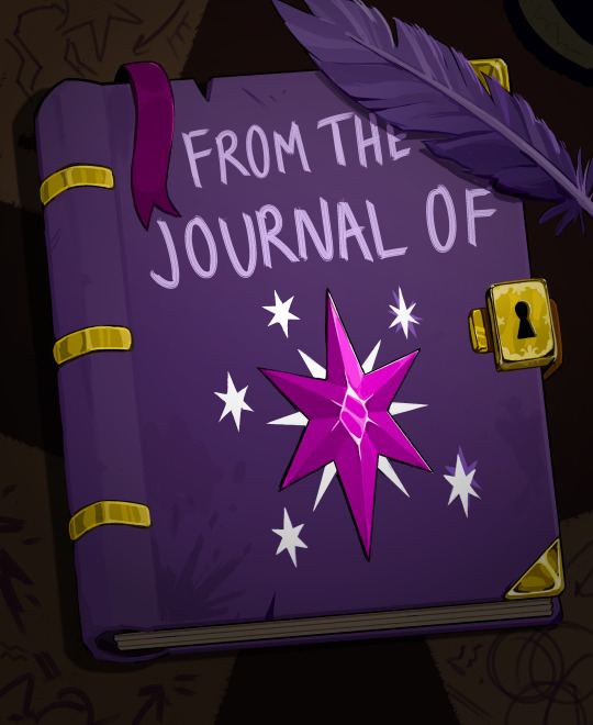
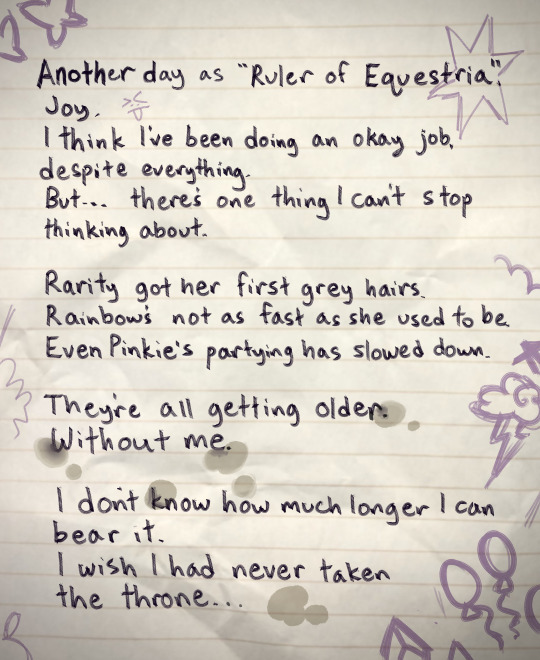
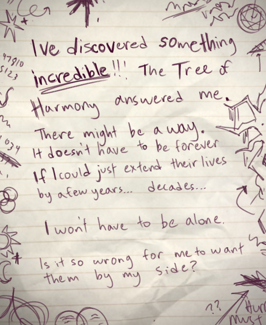
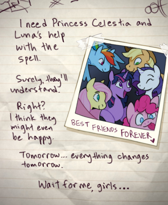
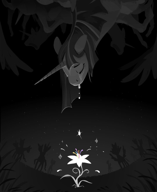
Harmony Syndrome Part 5/5
The last chapter of my mlp infection AU! Thank you to everyone who followed along. Some final thoughts on my twitter @cracklewink if anyone's interested : )
#mlp#my little pony#mlp infection au#mlp infection#twilight sparkle#Sorry for leaving the ending open ended but I genuinely couldnt decide on just one way for things to turn out and I liked the idea of#leaving it open the most#in my mind sunset's final message is like we found a recording from the later days of the infection and we dont know what happened in the#end because the recordings stopped/ended#In any case I think they were able to put twilight and the others to rest#but who knows who survived the “final battle” and who didnt#also yes Twilight created harmony syndrome but not on purpose lol#it was the result of her botched attempt to create a spell that makes ponies immortal#obviously it backfired lol#and the irony is that twilight ends up dying before any of her friends#if they didnt want me writing my little pony horse tragedy they shouldnt have left mlpfim off on the note that all of twilight's friends#were growing old without her#ending thats been haunting me for five years#if anyones seeing this this is an open au btw so feel free to adopt any of the ideas if you like! : )#tw thanatophobia#thanatophobia
3K notes
·
View notes
Text
tumblr users will have the most inaccessible, unreadable, low contrast, flashing carrd you can possibly imagine, with a dni full of insider acronyms with no translation and numerous link buttons labelled with cryptic captions, and then go ahead and put “ableists dni and kys!” on that carrd
#yeah i’m bitter about carrds becoming so hostile to disabled people#nobody with vision issues or photosensitivity or processing issues or epilepsy or memory issues could possibly read your carrd#small changes like proper colour contrast between background and text can make a world of difference in making your page accessible#even just spelling out the acronyms in your dni or mentioning WHERE a mysterious link will actually lead is so helpful#i see so many links that are just random literary quotes that turn out to lead to a mandatory dni. how would anyone know that??#txt#accessibility#1000
7K notes
·
View notes
Text
Slightly Crack Batfam AU
Duke, shortly after being adopted, finds an old demon summoning circle burned into the floor under a rug in one of the rooms.
That, combined with some of the literature he finds laying around, leads him to conclude that someone in his new family is secretly a demon and he starts trying to figure out who.
Could it be Bruce, the literal demon of the night?
Dick, who bends and flips effortlessly in ways no normal human could?
Jason seems the most likely, as he climbed out of his own grave, but to be fair, he'd never actually seen Tim sleep.
And then there was Damian.
He never would have guessed that the demon is actually Alfred, summoned by a desperate, distraught Bruce the night of his parents' deaths.
Originally, their deal was just for Alfred to help Bruce get his revenge.
The reason he stuck around, though?
He realized he needed to make sure that Bruce and his collection of equally crazy orphans stayed OUT of the afterlife (and therefore AWAY from the throne of hell, which he has no doubt someone would eventually take) and decided to stay on as their oddly perfect butler.
#batman#batfam#bruce wayne#dick grayson#jason todd#tim drake#damian wayne#duke thomas#nightwing#red hood#red robin#robin#signal#alfred pennyworth#i like coming up with new ways for Alfred to be immortal#he heals their life threatening injuries while playing them off as being lucky and scolding them for being reckless#'just a minor concussion master dick. be more careful next time'#meanwhile Duke had definitely seen Dick being brought in with his skull split open#Alfred gets calls from fellow demons#complaining about whichever bat is currently dead and causing problems#while Alfred just grumbles and pulls out a ressurection spell#Duke eventually just accepts this as yet another quirk of his new family
2K notes
·
View notes
Text
So y'all have seen the Williams F1 Logo before, yeah?
well get ready, becaues I am about to ruin your day!
where does one even begin with this. i am sorry in advance. -just a poor learning graphic design student, who simply tried to enjoy their saturday evening
The Logo
For anyone that doesn't know, here's the Williams F1 Logo. Entirely unedited, copied straight from Wikipedia:

Now like many fans, I actually quite enjoy this logo. I like the modern, sharp edges of it and it's simple yet intriguiging design. It's memorable, while also easily recognizable as a W. I also really enjoy the colour choice (this, however, is entirely a personal preference.)
(entire rant under the cut. please keep reading this took years off my life span.)
How did we even get here?
Let's start at the beginning. How did we even get here? Well I, a poor poor learning graphic designer, was watching this lovely video from Mr. V's Garage about bad F1 Logo's over the past 35 or so seasons. Very interesting, I can only recommend it (but you don't need to watch the video to understand this post)!
Now, to cleanse the palette at the end of the video, Mr. V included a top 10 GOOD logos from this time span, it was very kind of him.
On P4 of this "Good List," Mr. V placed the current Williams F1 Logo, as pictured above. At first I vaguely agreed with this, believing that he probably simply hadn't noticed one of the things that's been bothering me about that Logo since the first time I saw it up close.
The first sign of Trouble
So, what is this mystery issue, you might ask?
It's simple really. You don't necessarily notice it at a first glance, but something about that logo seems off. Taking a second longer, you may notice it yourself.
No, I mean it, take a minute and go look at the logo. It looks wonky as hell, doesn't it?
Well I can tell you the first thing that I personally noticed. The arms of the W aren't in line with the bottom half, see:

(Graphic by @girlrussell who was so kind to let me use it, as it is way prettier than the one I made)
It's a crooked W. There is no good explanation for this. The rest of the font is perfectly fine, geometrical shapes.

Anyway, the good person that I am I went to point this out to my partner ( @leftneb ) who proceeded to inform me that he, infact, was not aware about this and was, quote, "never going to unsee that."
Now, the good FRIEND that I am, I, of course, proceeded to rush into our broader F1 friendgroup to make them suffer for eternity.
What's the logical next step to take? Of course, fix the logo in Adobe Photoshop, you know, as a joke.
(Disclaimer at this point, I am not necessarily the biggest fan of Williams Management Team. I enjoy ALL their drivers this season. I do NOT enjoy James Vowels. Be warned.)(Also I am aware that he probably did not have an influence on the logo)
Trying to fix it. Oh god, I was so innocent back then
Trying to fix the logo in Photoshop is the worst mistake I could've made. THE worst path to take. I could've just giggled about making my friends suffer (which I succeeded in, by the way) and moved on. Instead I ruined a perfectly good Saturday evening, and for what? I don't know anymore.
Anyway, how was I gonna go about fixing the logo in the simplest way possible? Simplest way I could come up with: slap the thing in Photoshop and put two, mirrored boxes at each side to make the sides line up. Small issue, how do I make the thing actually even? Fix: line them up at the intersecting point with the bottom tips of the W.
Here's the result:

Hey, anyone care to explain to me why in THE LORDS NAME the arms are different sized? I mean, surely they weren't before. Surely, certainly, I must've messed up.
I double, I tripple checked. I made sure everything was lined up and made sense. But no.
It just couldn't be. Something was uneven in this logo, something even deeper. Something I could not have predicted when first taking a closer look. It was at this point I realized I had messed up. What rabbit hole had I stumbled across? Certainly, it couldn't get much worse.
And that's when I noticed.

(pictured above; my genuine reaction)
There's MORE? (oh god, the top isn't lined up)

I couldn't believe my eyes. This is the PINNACLE of the sport, and THIS was the logo of one of the competing teams? I mean, yeah, we have a Visa Cash App RB or a Kick Sauber or even a MoneyGram Haas which are all terrible logos, but at least they're CLEAN. (this has not been checked. If anyone wishes to ruin a nice Saturday evening, feel free to check them and tell me how wrong I was in the previous statement!)
But you can see that there is no end in sight for this post. I'm sure you're as scared as I was at this point. By now we were sitting in VC, discussing the horribleness of this logo. I had long informed my irl's about this, who take said design classes with me. And it was one of them who pointed out the next thing that had been bothering me, but I had not been able to put a finger on up to this point.
thE DISTANCE, HOW DID THEY FUCK IT?

I'm afraid I have to confirm your fears.
Yes, those lines are the same length. According to Photoshop, they're on the same level as well, so no flunking with angles.
The gaps of the arms to the main W are not the same. They're differently sized gaps.
It was clear to us, this logo is inherintely flawed. They're subtle issues, but once you pay attention you start to notice things. It all looks slightly wonky and off centre. And eventually, you get paranoid, and start comparing other angles and sizes. And you will keep finding things. This has ruined my life.
HOOOOOW

Honestly, I don't even know what to say. Yes, yes sadly those lines, too, are the same length. Just copied over from one side to the other and layed over on the same height. I admit, they're not layed over perfectly. I was honestly holding back tears at this point. But the point still stands, you can clearly see a difference in width.
Honestly, the only way I can explain it is that at some point there was a mess up of distance or proportions and whoever was designing the logo couldn't pin it down and tried to restore the visual balance by making manual adjustments. And in all honesty? They kinda did a good job, if that's what's happened. I mean, you notice the crookedness of the arms, and then maybe the difference in height, but the rest you probably will not notice if you don't spend too much time staring at it. (like some of us) And even those issues clearly aren't noticeable to the vast majority, considering I had to go point it out to a group chat for my friends at least to notice.
what the fuck is THAT?
Now, the thing about doing this investigative work of prooving a team you dislike is worse in more aspects than you previously thought, is that you do a lot of zooming in. And zooming in means you might notice bits that yours eyes simply overlooked before, because they were too small.

Here you can witness the top of the middle point, that, for whatever reason, really wants to touch the top border of the Logo. I'm relatively certain that's the highest few pixel in the entire graphic, considering earlier chapter "There's MORE?" I have no idea why it looks like that or why they thought it was necessary for it to not end in a clean point.

I just actually have no idea how to even describe what is going on on the top of the left arm. That left hand side, again, touches the side and is therefore the most-left-pixel in the graphic. I, once again, have no idea the purpose of this. However the RIGHT hand side also makes no sense, as it is the most prominent corner in the whole logo. There's pointed corners, and rounded OF corners, but nothing that is trying to form it's own colony in a distant land that hopefully isn't this god awful logo. I hope that blob gets away. I really do. You go king.
i'm loosing my mind
Anyway, the only reason I could come UP with those weird "reachy-outy-bits" was to establish the dimensions of the logo? But if that was the case, I don't understand why they managed to keep all the other potentially border touching corners clean?


Like, look. Those are clean, sharp corners with some clearance off the borders. I have no clue why they managed it here but not with the others.
guys. please.
Backtrackig a little bit, going back to the positioning of the arms.

Do I need to mention that those lines are both the same length and the same (mirrored) angle? I really hope I don't, because I don't think I could be making this shit up. Like, once you roughly know what you need to look for it just kinda becomes easy to find.
As said before, I genuinely do think that most of these issues happened in a chain-reaction. For example, the distances between the main part and the W wouldn't be as noticeable (and they do get noticeable once you start looking at it) if the angle wasn't fucked. And guess what, there's more fucked angles here! Which ALSO influence this specific area of the logo!
this is just embarrasing for you.

something something same line copied over and mirrored etc etc
It's not as visible but the angles defintely don't line up here as well. As mentioned before, these issues for the most part all influence each other. It doesn't really excuse the issues, in my opinion as a designer, because a big company like this shouldn't have these sort of issues in their logo.
So let's review;
to sum it up,

i cannot even BEGIN to explain to you how big of a fucking JOKE this FUCKING logo is. because, i thought to myself, to round the post out, hey, why not show ALL the issues i pointed out in one picture? that would round it out quite nicely, wouldn't it?
Yeah well, this logo sent STRAIGHT FROM HELL just could NOT let me rest. I had only done the lines visualizing the crooked arms in PAINT up until this point, i.e. I had only pulled both up individually. To make a nice "rounding out" picture I still had to add them into PHOTOSHOP. so i did. i pulled up the line. i mirrored the line.
THE ANGLE IS FUCKING DIFFERENT
none. and i mean NONE of my friends had noticed this before. i need you to understand that we looked at this thing with FIVE pair of eyes, and NONE of us noticed that until i thought to myself "Oh I still need to add these specific lines to have ALL the issues I pointed out in my SILLY TUMBLR POST in ONE image" and i get THAT FUCKING SURPRISE
I was PLANNING to round the post out with a statement on how obviously this isn't a serious post. Here, I even had it all written out already because I accidentally started writing it in the last paragraph:
Of course, this is nitpicking, and it's not that serious. I'm aware of that. AS MENTIONED most of these would not be noticeable if we hadn't gone specifically looking for them.
yeah, well, fuck that. i just spent two hours seething about this logo. i'm ending the post on this instead.

#i am ENRAGED#i managed to actually calm down about it#yk. just typing away#and then i just try to ROUND OUT THE POST#for fucks sake#anyway i know i'm posting this at an hourrendous hour#if you read all the way. reblog? maybe#pretty please#williams f1#williams formula 1#williams racing#formula 1#f1#also apologies for any spelling mistakes i do NOT have the nerve to go back and proofread this
932 notes
·
View notes
Text
“Luke’s a bad actor!”
No, Colin is a bad actor. Luke did a great job playing a character pretending to be someone they aren’t.
#it’s clearly spelled out in the show at this point I think some viewers are just adamant about hating the show no matter what#bridgerton s3#colin bridgerton#luke newton#bridgerton
2K notes
·
View notes
Text


maknae line + gestures of love 🫰🏼💋🫶🏼🌹🤟🏼 happy birthday @jkvjimin! ♡
#jungkook#jungkook*#tae#taehyung*#jimin#jimin*#btsedit#btsgif#dailybts#userpat#underbetelgeuse#trackofthesoul#usersevn#annietrack#usersky#usersan#usermaggie#*gifs#comp#happy birthday darling pat!!!#just a reminder that me and vminkook love you!#i hope you have the best day full of even more love than this bc you deserve it#you put so much of it out into the world yourself that it should only ever come back to you tenfold#i actually made something kinda cohesive?! at least in the first half...feels like it loses its steam a bit after the 10th gif lol#this was only supposed to be 12 gifs but i had more time to keep it going so it ended up being 18 whoops#this is scheduled so i hope it's posting at the proper time (zone ahem)#ALSO at first i arranged this in their age order but i switched jimin and jk's place so it would spell out jk + v + jimin like your url :)#i hope you like this! i'm kinda jealous even tho i made it lol it's quite pretty if i do say so myself#yes i put a heart overlay on the gifs against a white bg to keep the color scheme going..idk i TRIED#p.s. to anyone seeing this and thinking you can't rb it bc it's dedicated to pat for her bday....WRONG! PLEASE REBLOG IT IF YOU LIKE IT! ty
994 notes
·
View notes
Text
I’m begging people at this point to realize that hate towards intersex people isn’t just. Fucking misdirected transphobia. Please for fucks sake learn that intersexism is a thing and that while transphobia and intersexism often go hand in hand and are used to reenforce the other, intersexism is not collateral damage from transphobia. They don’t just hate us because of a perceived proximity to transness, they hate us because we’re intersex. And will go about acting on this hate as such
#my post about Kansas’s anti trans and intersex bill is getting more notes again#and so many people just seem like this is just a byproduct of transphobia#so many people just. Dont seem to understand that we’re explicitly being targeted too#I shouldn’t have to spell out to people#That actually they want us to not exist too#intersex#intersexism
7K notes
·
View notes
Text


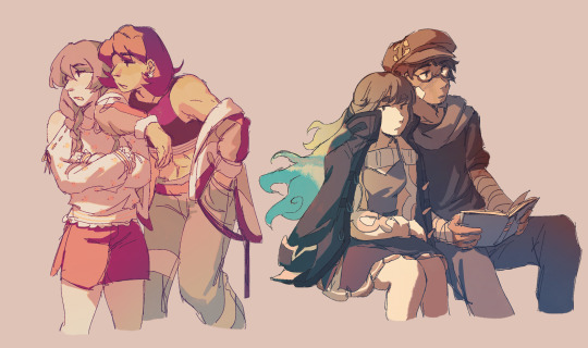


been thinking about the sinnohtrio lately......plus misc other stuff
also, casual ko-fi drop!! get something in this sketchy style starting at $10 woop woop
#finally decided to do a commission test run u_u#pokemon#trainer lyra#trainer kris#trainer dawn#trainer lucas#rival barry#rival silver#ayalumi#hisuian zorua#luxio#timeskip tag#rkgk#anyway it's sinnoh time !!!#still figuring out their designs and lore but this works for now#god's specialest little guys & their very normal bestfriend who they would kill/die for. up to interpretation who is killing/dying#dawn is the platinum protag who meets giratina and becomes champion#distortion world affected her way more than compared to cynthia and cyrus since she's still a developing kid. but hey cool ghost hair!#4-5 yrs later lucas gets blasted to hisui..lost his memory for the three years he's there and when arceus sends him back he's just like Man#the entire time barry is CHILLING PLAYING HAVING FUN#and forever worried abt his friends ): dawn & lucas are soo nonchalant about what happened to them it's a bit concerning to everyone else#design comments umm the only thing that matters is that they still have their og scarves 👍#and i guesss these are spring/summer outfits. winter dawn gets leggings and big coat ok. she already has too much yin energy#btw i use the cleanse tag as the direct opposition to the spell tag even tho that's probably not a real thing LOL)#oh yea barry wears the tower master ribbon 24/7. tower tycoon in training and won't shut up about it (i love him)#character dynamics i will talk abt that in another post if i feel like it... these days i just want to go replay pla aughh
1K notes
·
View notes
Text

i loeve you dai gyakuten saiban
#ace attorney#the great ace attorney#dai gyakuten saiban#dgs#tgaa#this is my valentines day post <3 i love you little game#the dancing men do spell something out but i won’t tell what#dgs 2 spoilers#tgaa 2 spoilers#just to b clear the hand reaching for stronghart is the professor#hopefully thats clear though lmao#well. the person who was in the professor’s grave anyhow#i tried to match these to the cases but i had to take liberties with some lol#like gina having Toby#and the legendary pair segment technically happens is 2-5 but they’re introduced in 2-4 so
1K notes
·
View notes
Text


give this angle another tri
#doctorsiren#gravity falls#the book of bill#bill cipher#scalene cipher#euclid cipher#stanford pines#theraprism#gravity falls fanart#digital art#my art#procreate#yeah I finally checked out thisisnotawebsitedotcom hooray!#don’t ask what everything on the second page says#I don’t even remember at this point LMAO#I just wanted to make it look neat but now my hand hurts from all that coded writing#there also may be some spelling errors in there bc that always seems to happen with me HAHUIHS#by merely messing up the cipher lmao#I based Scalene and Euclid off of old cartoon parents#Scalene is based around just like…50s cartoon mom#and Euclid has that 50s cartoon dad thing but also Professor Utonium#little billy….he’s just my young Miles Edgeworth…he’s Astro Miles real…#when I think of his home world I envision it all 50s styled#like cartoon depictions of that time with bright colours and bold geometry#in my head it’s idealistic but done so on purpose so that destroying such a place would be an even more absurd thing to do#destruction caused by his hubris and thirst for wanting something MORE wihtout appreciating what it was he already had#and now he has nothing in the end and it’s his fault and he knows it#thinking about him missing his parents and regretting that decision every single day hurts me 😭
661 notes
·
View notes
Text
Can we talk about Maglor for a second? Because I love this idiot. He canonically takes the most difficult territory to defend against Morgoth, and places himself in between the forces of evil and his brothers. He commanded the cavalry. He was probably a horse girl. He was said to be most like his mother in temperament. He is so loyal he immediately kills the man who was about to backstab Maedhros. He killed a bunch of Teleri, and then wrote a song about how it was the Noldor who truly fell that day. He burnt the ships. He was glad that Eärendil could be seen by all and everyone could share in the Silmaril's beauty. (He probably would have broken them to save Aman, too). He loves Elrond and Elros. He fights against his last brother in an attempt to return to the Valar he had defied. His loyalty leads him to defer. He chooses to live on. His voice was said to be like the ocean that he wanders beside. The last son of fire was lost to the sea.
#maglor#maglor appreciation post#I'm not going anywhere with this#I just wanted to point out that he's my favorite character#silmarillion#the silmarillion#maedhros#tolkien#feanorians#fëanorians#sons of feanor#makalaure#kanafinwe#edit: I fixed the spelling of cavalry#someone pointed out I misspelled it#I’d like to say I was trying to spark a shibboleth#but no I was just being stupid#my post
987 notes
·
View notes