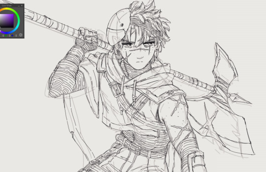
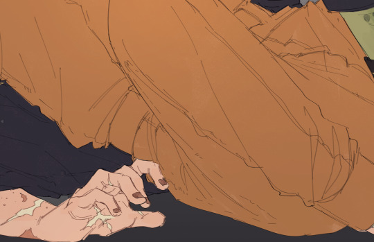
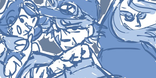
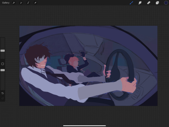
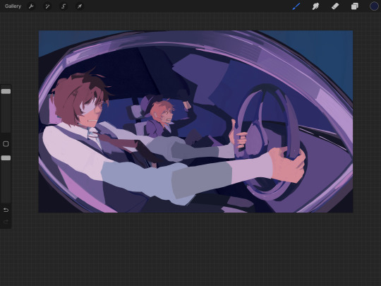
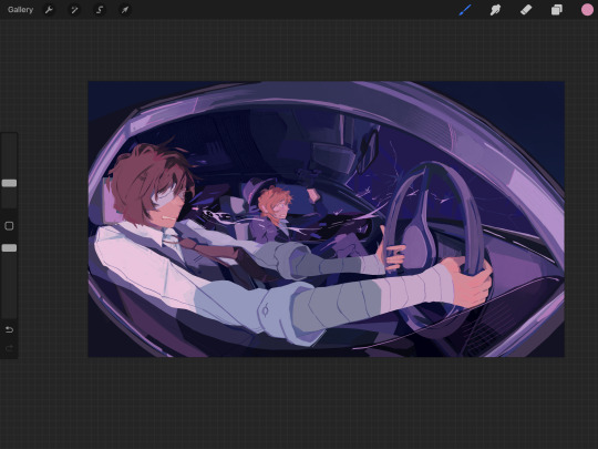
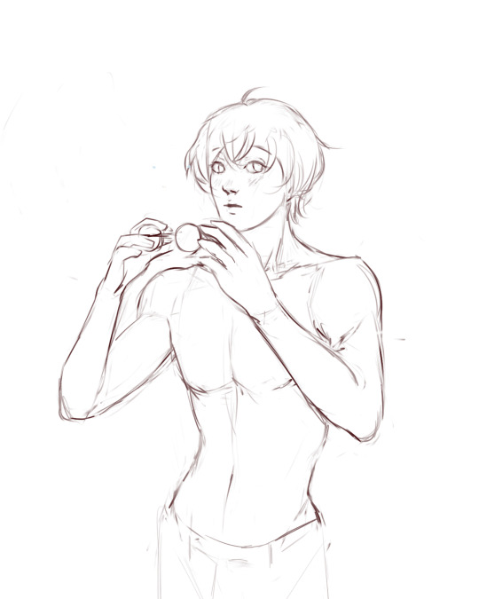
#i wanted to colour them first and then put the linearts out there
Explore tagged Tumblr posts
Visit Tumblr Blog
Explore Tumblr blogs with no restrictions, modern design and the best experience.
Last Seen Tumblr Blogs


Fun Fact
US Tumblr user growth rate is estimated to slow down to 4.1%.
Text

the Hex Treasures series is going a bit slower right now, so I decided to put the Arthur, Aoi, and Eleanor linearts on my Ko-fi for free, instead of a pack of all 6 as originally planned
I will add the others as soon as they are done, thank you for your patience 🙇♂️
[link]
#warframe#warframe fanart#tennocreate#warframe arthur#warframe eleanor#warframe aoi#arthur nightingale#eleanor nightingale#aoi morohoshi#the hex warframe#my stuff#ms:warframe#i wanted to colour them first and then put the linearts out there#but there's a ridiculous amount of other things i want to draw#and since this is a series of 6 drawings they would have to be rendered in the same style#which doesn't fit my current experimenting phase#anyway. enjoy
9 notes
·
View notes
Text
The God of Health


As Shamura planned their conquest and the re-arranging of the Pantheon, they thought they calculated every outcome, strategized every single move and spun a thick sturdy web of plots around the chessboard, so that each little piece would fall exactly as they envisioned. But as time passed, they were put in front of the chilly realisation that they couldn’t, in fact, foresee everything. The boy had come of age, growing into a skilled strategist, a formidable warrior, competent in every weapon he had been trained with. Yet, the power hidden within his Crown remained locked, still beyond his reach! At his age, Shamura had already slain their first god. A disappointing outcome for one with such potential, but that wasn’t what troubled the spider most. He had grown to be beautiful, disarmingly so. His cult was gaining plenty of followers each day passing, a good trait, but the young God of Health had caught the attention of many, mortals and gods alike. And with attention comes trouble, with such beauty the peril of objectification, with enchanting blue eyes the risk of meeting the wrong gaze. Shamura dragged Kallamar with them on the battlefield and saw him hurt more times than they could count, but they had never felt so concerned. A young god coming to age, a juicy apple ripe for the taking, how could they shield him from the rest of the world? He wanted to be independent, the stubborn boy, but didn’t know traps lay in waiting, hungry maws ready to snap at his first weakness. The God of War was ready to face the odds on a battlefield with weapons, armies and war machines, but was unarmed against this. For the first time, Shamura was afraid. That was their little brother… No one must ever touch him.
A little HC in my AU about a very toxic sibling relationship.
Ofc, in the end, Kallamar did go ahead and slay gods, using weapons Shamura had no idea how to use. That made the two of them practically unstoppable. But Kall became the one laying traps and ensnaring prey... so much that one would ponder: who is the spider?
Thank you for reading all my ramblings about my AU... I have so much stuff cooking. This idiot is in the middle of the cauldron! Story aside, I finally finished his design and I am pretty proud of how it turned out, mostly that face and jewellery omg. I have never coloured so much gold. Ever. Lineart here!
#cult of the lamb#cotl#cotl kallamar#cotl fanfic#cotl fanart#kallamar#kallamar fanart#bishop kallamar#cult of the lamb kallamar#cotl au#cult of the lamb fanart#my artwrok#my art#Kallamar please release me#he is my doom#i'm gonna go die over there#please stop smiling like that#that smile#that damn smile
155 notes
·
View notes
Note
⭐
ALRIGHT! I told myself I would write this as a reward for finishing today's tasks, so lets go!
Here There Be - Director's Commentary :D!!
Starting with Chapter 1 part 1 (pages 1-4)
First of all, everyone say a big thank you to my friend and editor OurLadyOfCoffee for double checking the spelling and grammar for this comic.
Any mistakes in the writing are my own fault for making last minute changes and not showing her before posting. If she had gotten her hands on this page "missing in all the time in this city" would never have happened ( u_u)... I'll go back and fix the page eventually.

Pages 1 & 2 (and 20) did not exist in the original draft of the chapter. I made it to the lineart/inking stage and the page flow was not working. April's narration felt too cramped and boring. I completely redid the whole 4 page section, and the end the final result is so much better!
Page 1 - Panel 1 had two purposes! One, the establishing shot, introducing our setting. Two, to show that NYC is rebuilding after the Krang. Its been a few months and thanks to cartoon logic, they have made significant progress fixing everything.

I love to experiment with colour as a storytelling device. I use red/orange multiple times at specific points throughout the chapter. It simply morning in NYC or is there something dangerous on the horizon... (figuratively)? The good ol' "Red sky at morning, sailors take warning."
Page 1. Panel 2 has a little 1987 April reference with the lady in the jumpsuit on the right. I was really excited to see a few folks point it out, even if it's not quite the iconic yellow jumpsuit. The colour had to be muted or the bold yellow would pull attention away from April (the focus of the panel).

Hello Junior, what do you have there? Something that won't get context for a while? These panels almost didn't make it into the final cut due to page/panel limits. I was very happy that the added pages gave space for it.
Page 2 - someone sent an ask a while back confused about what April was saying, so to explain the text in a more straightforward way: "the mutants that started out as humans have been going missing, but no one knows how long it has been happening or who has taken them. April has figured out that the non-human based mutations disappeared first."

that orange again, this time over the spots where the now missing mutants used to be :)<. I have no idea if this sort of thing is too subtle or not subtle enough, but it makes me go eheehehee and rub my hands together like an evil mastermind.
Page 3 - I debated whether or not to have them move after the movie. How much structural damage did the Krang do on their way through? What are the chances of the lair being discovered because of this? Would the city be too focused on cleanup elsewhere to bother finding it? Do I really want to design a whole new lair when this one is cool and we barely got to see it? In the end I decided that it was more important to have a familiar visual that the readers can instantly identify as the turtle's home. We'll see if there are consequences for remaining in a potentially compromised lair. :)
Despite only showing two rooms in the page, I spent several hours gathering references and building a layout for the entire station lair. I do not control the hyperfocus, it controls me.

Did you know that there are two different designs for this one archway in the main room? I love seeing stuff like this! If an animation studio with multiple background artists can have small inconsequential inconsistencies like this, then it's completely ok if it happens in my own work. It's relieving in a weird way.

PAGE 3 - panel 5 is another way I tried to show that a few months have passed since the movie. They have put some work into unpacking some of those boxes stacked in the back.
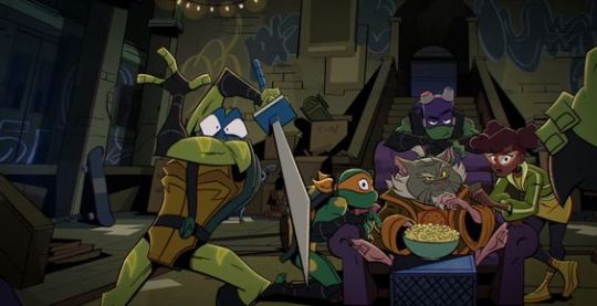

Page 4 - Hello Two Phones Jones <3
The Jones Duo! They both have a little outfit change :D! CJ has a rough edged jean vest calling back to the 1990 movie with 03 colours. Casey has a base outfit colour change to match and a cropped hoodie reminiscent of 1987, in pink ofc.

I do not yet have the skills to show the fight that happened in that shipping yard, so I decided that this comic would begin in the tense quiet after it. This also starts us closer to the actual plot instead of dilly dallying. Maybe I'll eventually make a prelude comic to show what all went down.
Aaand that's pretty much it for April's 03 style narrated opening sequence! This is where the intro theme would start playing~
Thank you for the star, I hope this was interesting! I make so many small decisions per page, it's nice to share some of my thoughts. :)
162 notes
·
View notes
Note
Your AweSamDream art has given me so many brain worms how do you make your lines so thin and smooth??? Any time I try ultra thin lineart it always looks very... first time digital artist.
For me it was first i found a brush i liked and then I slowly just kept making it smaller or the canvas bigger. It's a gradual thing and I honestly don't really know what I do or don't do to make the lineart look good. I think maybe part of it is me doing alot of detailing?
I'll put some examples under the cut!
I don't know if these examples will help because I have no idea what im actually doing and can only guess based on what i think i might be doing æsldkjfælksd I colour my lineart which kinda hides(?) the mess a bit sometimes, smooths it out.
I think its important to note that my lineart isn't actually that smooth, it's kinda messy and sketchy alot because i don't put alot of details on my sketches (comparatively) and i dont follow the sketch perfectly when i line. my lineart would probably count as a detailed sketch for many. (the colouring helps alot!)
For an example c!dreams leather armour! in sketches or older arts its more flat where i draw more dimension to it now which also lets me add damage to the leather which i like doing because otherwise i end up feeling the lineart is "empty?" if theres too much space with no lines

I also paint on top of lineart when i don't like how it looked! (link to timelapse of this art)

In the second example i used a round brush for a new way i like with drawing hair! which is why as i wanted to use my favourite brush in this art, i made the lines so small so i could have more lines in the hair! as my favourite bush is fixed in a flat 20 degrees!
My sketches are generally pretty thick lined compared to what i end up lining so many times one line in the sketch becomes two lines in the lineart! i also draw pretty quickly which I'm happy with for the loser energy it gives the lineart (even tho colouring in the lineart can be a pain when i cant just select it all because of so many goddamn holes) But ultimately when you zoom in you can tell its not that smooth, its just smooth-sketchy but throughout it all which makes it conhesive! (i think) (maybe)
the fact c!dream is my own design i know basically on the back of my hand also helps! it means i can just slap it out without really thinking that hard about it because im so practiced ! (which is why i draw him alot lmaoooo) when i dont know a character as well i stuggle more with thinner lineart because i keep refrencing back instead of just doing what i want. when i draw new characters i usually start thicker and then slowly get thinner lines as i figure out how i want them to be drawn.
52 notes
·
View notes
Text

(Click the image for better quality)
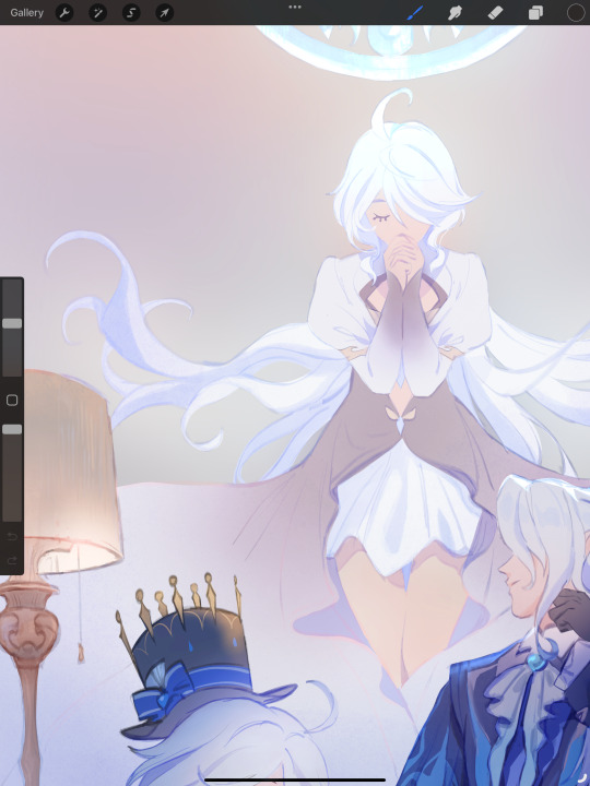
Yipeeee that Keiki and Mayumi fanart I posted the WIP of is finally done woooo- This piece was a very experimental one that I'm kind of OK on. Maybe because I've just gone insane looking at it for so long and I'm my own worst critic lol.
Artist's Notes;
So I've once again been playing around with my rendering style, mainly because I have been wanting to improve my lighting for a while now and as I was just scrolling through Tumblr, I saw some of the official art for that one webcomic-turned-animated-TV-Show Lackadaisy and was immediately inspired. I also have seen a technique a few times in the past where the lineart and shading are merged together, so I've been meaning to try that for a little while.

I did some experimentation on this one sketch of Keiki I posted in my sketch dump and I really liked the results of it, so I carried those over to this piece.
I ended up scaling up Keiki and Mayumi from the original WIP because I felt like they were both getting lost in the composition, and I'm glad for that because I think it works a lot better. I'm not a fan of how Mayumi's sword turned out at all, but it's not really meant to be the focus of the piece so eh. Overall, I think I could do better with my colours, probably because with Keiki and Mayumi's colours, I did them flat in greyscale and then used a brush on the overlay blend mode to colour all of them over, after which I changed the base layer for their colours from white to yellow and then lowered the opacity so it all went together better. I also decided to use gradient maps for a lot of the background elements, mainly to experiment with getting in my values first to make them pop out more. I ended up finding a really nice sky gradient on Clip Studio Paint that I really liked, and that kinda helped to establish the colour scheme of the background a lot. I think the whole "start in greyscale then colour" thing really works better with painterly styles rather than more illustrative ones, and while it is good at making sure your values are more readable, I honestly don't think I have the skill level to pull that off yet. Honestly, I think I've been looking at this drawing too long or maybe I added too much to it, but I wish I could've made the colours less monochromatic, but I'll just save that for the next piece I do.
I do love how the flame (...well it's more of a weird space rift than anything in this piece) and the lighting turned out, those were fun to do. I was initially struggling with the flame and how Mayumi is positioned in front of it before realizing "Oh wait! This is a weird abstraction of a weird creature! I don't have to follow the laws of anatomy!" and just dislocated it's flamey bottom jaw from the main body. I also changed the colours of it since I was really not liking how incredibly bright it was when it had lighter colours. Again, the gradient maps served the more painterly style of the flames well.
I also love how Mayumi turned out. I could do her sleeves better but that's more of just me needing to study how those types of sleeves fold in that position more. I'm also very happy with the posing, the technique I used for that was taking photos of myself in the positions I wanted, blocking in the silhouette and then modifying that by adjusting it to my lines of action that I drew on top of the original photos, and then sketching over the silhouettes and drawing in the shapes of the hands overtop of the photo if I needed to get the fine details right. As for what I do to take the pictures myself, I use a tall chair I have, prop up my phone with a phone stand, put on a ten second timer and scramble to get in position. Yes, I did have to use a bunch of thin markers I had to try and get the hand positioning on Keiki's pose right, yes I do have a fake sword that I used to get the positioning of Mayumi's arms and hand right, the sword was for an old Halloween costume from several years ago. I really like how both Keiki and Mayumi turned out in this drawing, I'll have to play around with these designs for them more in future drawings.
Also, if you wanna know why I draw buildings like that, when I watched Fantasia 2000 as a kid (One of the Disney movies where they make really beautiful animations to classical music) the way they drew the buildings in the first few sections Rhapsody in Blue segment (the jazz one with the cities) changed my brain chemistry and now whenever I need to draw buildings really quickly, I refer back to that. Since the buildings aren't really the main subject, I didn't put much thought into them.
As you can tell I am very tired of this piece, mainly because I made things harder for myself by overcomplicating the process compared to what I usually do, mainly with the whole "starting in grayscale then adding colour." I'd honestly just prefer having a black layer set to colour that I can just toggle on and off when I need to see the values, but it was good to experiment. And that was mainly the point of this whole drawing, to experiment. I'm definitely going to have to play around with this new style I'm going for, mainly because I liked how it turned out a lot in the augmented Keiki sketch, and also because I want to find ways of making it suit my style more. I also really want to keep experimenting with my lighting like this, it's very fun. Last but not least I am never starting in greyscale again because dear god I do not like the workflow it forced me into. I don't have a problem with the method itself it's mainly just a skill issue lol.
If you wanna read my headcanons for these two, I put them in my WIP post, so you can read them there if you want to. The more I look at this the more I prefer the simplicity of my WIP. I might go back to this and just take away the fancy colours and effects to see what it looks like without all of that stuff and reblog this post with that drawing, but for now, I don't think I can look at this drawing again for a while.
#touhou project#art#fanart#touhou fanart#touhou 17#wily beast and weakest creature#keiki haniyasushin#mayumi joutougu#haniyasushin keiki
116 notes
·
View notes
Note
Hi, I'm sure you get this often but I really love your recent genshin artwork, do you think you could explain your painting process? I love the colouring effect in that piece especially. Thank you.
Thank you so much! I got a few messages like this from my previous piece (thank you guys for the staff pick & blaze btw, I really didn't expect all the support😭) so I thought I'd share a bit of my process below as thanks.
I always do my lineart first because it feels less daunting to me when applying colours. I will do some rough colours first so I can easily adjust it to my liking.

Next, I make sure to separate each character into different layers when I clean it up. I like to work one character or object at a time, it's less overwhelming for me that way, and I can use clipping masks for ease of rendering.

I'll usually apply some adjustment layers on top of the base layer for shadows and highlights. When I say base layer, I just mean a layer of the colour without any effects.
I like using 'hard light' for shadows, and 'screen' for highlights, but you can really use whatever clicks with you.
Rinse & repeat this process for every character in the illustration. Note that I make Furina the focus so everything behind her will be less rendered than the elements in front of them (Neuvillette is a lot less rendered compared to Furina, and the painting in the back barely has much shading).
Once I render out each asset in the illustration and add shadows & highlights to my liking, I then to merge foreground/ midground/ background elements so I can make the overall illustration clearer to read. I don't want it to feel messy or overcrowded, and I think it's easy to get tunnel-visioned in small details and lose the clarity of the entire illustration.
Make sure to zoom out constantly and make your illustration B&W to check the values to see if the drawing is clear.

I created a simple S curve with the values for readability, and have the foreground elements have darker values & contrasts.
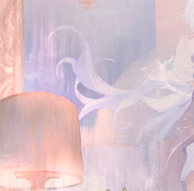
As for the BG, I wanted to add more textures into the drawing, particularly the painting in the back. Here's an image of it when I only added in the base colours.
I use the smudge tool to create more texture once I fill in the base colours. Since I don't really 'paint' anything with the textures in, I just put in the base colours and take a textured brush to smudge it. However, over-smudging can lose the painterly texture I want, so I usually smudge vertically or horizontally in a single stroke to create a sense of movement.
Another thing to note is that I only textured the BG, I thought it would help it blend into the background a bit better. I usually wouldn't do this for the foreground because I want those elements to be clearer.
At the very end, I tend to spend a fair bit of time just fiddling with more adjustment layers, various filters (such as blur, or noise), or liquify small details to really finalize the piece. Just vibes...basically this is me

Anyway, I hope that was helpful & it made sense!! Feel free to message me if you have any other questions & I'll try my best to answer! I might've glazed over a lot since I didn't wanna make this too long.
237 notes
·
View notes
Text
Commission Advice? (pls help)
Hey heyy
I wanna start doing commissions, but I've never done it before, and have no idea where to start. So I thought I'd make this post and ask any artist, that would like to share how they go about commissions, for advice.
I've summed up some of the questions that came to mind below the cut. I would want to take requests outside of Tumblr as well, just fyi. I'm well aware that most of what I ask depends on the individual artist and their works, and that there won't be a single formula to follow - I'd just like to gain a bit of perspective and see how different people go about these things, so that I can get an idea for myself.
Any helpful links to other posts or websites on this topic are much appreciated 💚
Replies to this in DMs are fine too ☺️
Questions below ⬇️
Communication?
Do you text with the client entirely through Tumblr (etc.) DMs, or do you use a different platform (like Discord, WhatsApp)?
Pricing?
My biggest issue is how much to charge for an art piece. I know it depends on multiple factors, like what type of drawing it is, is it lineart only, is it in colour, etc. Then there's also taxes. I've looked at a couple artists, but the prices vary so widely, and I have no idea where to put myself on that spectrum. I also have a huge problem knowing my worth, which definitely doesn't help.
Payment?
Which payment method do you use? My first thought was PayPal, I also read that many people use Stripe (that I never heard of before my research). And when do you ask for the transaction to be made? I've seen 50% upfront, the other 50% once it's done a lot. Some say to not give the customer the finished piece until you've received 100% of the money.
Slots?
How do you decide on how many you have available? Do have a fixed number or just take requests until you think you can't take any more?
Time?
How long does it take you to finish a request? Again, I know it depends on many many things. A couple examples would already help a lot.
Updates? Previews?
Do you give the client in-between updates on your progress? Do you send a preview before sending the finished piece? I've read that, before sending the final file, you should always have the images in low quality and with a watermark over it.
Changes?
If the client is dissatisfied with the final piece, do you allow changes? If yes, how many, where do you draw the line? Do you charge extra? Also, what do you do if the client doesn't like the entire thing?
Licensing
I absolutely suck at this, my brain just doesn't want to comprehend legal language. So most I've read on this, I still don't fully understand, but probably because I've never put it to practice. Is there a specific type of licensing you use? What do you tell your client on what they can do, but more importantly, can't do, with the art you create for them?
Final files?
In which file format do you send the finished art piece to the client? I was thinking pdf, maybe jpg and png? Also, how do you send it? In DMs? Per email?
Scams?
Also one of the more important questions for me, since I get paranoid about these things easily (and turn out to be right most of the time). Any advice on scams? I've read Instagram is filled with them, and to best avoid requests over Insta alltogether. Any experiences you've had, anything I should definitely look out for?
Any other advice?
Anything at all. I'm probably definitely overthinking this and it's most likely really not that complicated, but I'm a very anxious, insecure and paranoid person. 🙈 So I'll take any and all advice I can get.
Thank you 🤗💚
#art advice#art#commission#art commisions#please help#advice#ask#commission advice#advice request#art requests#request#help pls#what i do#any help is appreciated
25 notes
·
View notes
Text
mutuals appreciation post! i've been feeling sentimental about the fact that i met so many wonderful skillfull artists and just great people here in such a short time so i want to tell each one of you a couple of nice words
@miaumiaoumao it amazes me how many art styles you can pull off. that's a very rare skill in my experience and you absolutely slay every time. your silly cartoony comics are always a joy to see, and the way you do lineart in the more realistic styles is asolutely wonderful. im staring at the "peer into the darkness" piece (the second one) while im writing this and i cant stop. the way how it's all pencil-y, grainy and textured scratches some deep itch of mine
@fanaroff i love how squishy and soft you draw your characters. your style is so interesting to me, you push the proportions yet it still looks balanced and right. also your characters often feel very grounded in their environment and space, they feel solid. like i know how they would feel if i could touch them yk? i guess that's what i mean as squishy and soft aha
@myballsitchaurghouchie my god where do i begin. your character designs? immaculate. so eccentric and bold and full of character, i love all of the wiskers-ear tufts-fly aways you give your narinder, and the way you stylise your lamb's wool and goat's hair looks insanely cool. you know how to pull off both extremely soft and gentle atmosphere and extremely dynamic one. i see your art quite infrequently but each time it's a joy to behold
@aniimoni i fell in love with your art from the first glance. despite the fact that the majority of your works that i see are digital ones, they all feel so... tactile? sensory? as if i can feel non existent grafite under my fingers, trace the brush strokes. the art that you do is so very gentle, the care you put into it is obvious even through the screen. also i love your lamb's design so very much. and narinder's penis ears. what can i do
@sriibble don't know if i should tag you since you're not in our weird cultist club and you already know all im about to say but hey, no harm in some praise, is there. i've seen you skills evolve over these years, but honestly each time i see your new drawings i feel like im awestruck for the very first time. the way you work with colour sometimes looks like magic to me, you can take the palette that makes no sense and bend and mold and twist it into something absolutely beautiful. i know you draw without lines or contours but each time i actually see im in awe. maybe i sound cheesy but it feels like you actually create art, like it runs from your fingers and molds in your palms like clay. жесть меня понесло конечно но и ладно. люблю тебя моя радость, чмаф
@greedykrab the way you work with colour is insane omg. your drawings have such pure raw energy to them, the way you draw, messy and confident, is mesmorising amd so so expressive. you convey atmosphere masterfully, that black and red drawing of narinder in the window still scares the shit out of me. i adore your dark warm kinda dirty paletts, i feel like you know very well how colour and lighting behave, your pieces always feel so real
@midia666 your bishop designs are so unique and striking, i feel like they do an absolutely awesome job at being, well, character designs -- conveying personalities through the way character looks. you have such a good grasp on human (and human-ish) anatomy, your linework is so confident yet so gentle when it needs to be. и я всегда радуюсь видя крутых русскоговорящих художников тут. спасибо за ваши труды <3
@donutfloats it's maybe a strangely specific way to start but i love how you draw wide open maws full of teeth <3 you understand anthro facial (muzzle? snout?) structure so well at such level which i strive towards. the clothes you give your charactes are always amazing and i wish i could wear them, and the diverse body types are so pleasing to look at. also mephis is my fav i love them sm
@teruuu i scroll through all of you guy's art tags so i can formulate my thoughts better and oh god ru i forgot how absolutely batshit insane your art can be in the bestestest of ways. all those scribbly lines and sharp teeth and broken colours, absolutely wild amazing and so so vivid. your designs are a delight to look at and even more a delight to draw, your characters are so expressive and fun and your lineless artstyle is so polished and pleasing and nice, it's amazing in a whole different way <3
@linvxtheghost your art lately been such an interesting middle point between lineless and line..full? and your colours are vibrant yet very balanced, it's like you draw with acrilic markers but in didgital, yk?? it's such a cool look! your more soft colouring stule is also so so nice and gentle and glowy i adore it sm. and your sketches are so dynamic and fun!! твои рисунки всегда будут близки моему сердцу леша и вообще ты крутой художник блин. (бтв если ты таки запостишь мои комишки я зареблогаю the shit out of them)
woooow that was a lot but a fun lot! i hope i didn't leave anyone out?? i double checked. you guys are all so wonderfull and skilled im so glad we're mutuals!!! have a great day and take care <3
#ada ramblings#thank you to my r key that desided to stop behaving the moment i sat down to write a post that has dozens of “art” and “draw” in it#do i need to tag anything else??#i think not
22 notes
·
View notes
Note
hihihi your arts VERY pretty!!! i wanted to ask how you would usually colour one of your pieces, they’re always so colourful but in a way that’s nice to look at
I'm not very good at explaining, but I'll try to explain my process!

First, I finish the lineart. Usually when I'm done with the lineart I already have sorta an idea of what color palette I'll use, either a single color or a color combo I'll use. If you have no idea, you could always pick a random bg color and build from there!

With the color bg chosen, you usually want to make it so the base colors and the bg don't clash (your eyes don't go owie at looking). You could put base colors and then lower the opacity to reach the same effect, whatever is easiest for you! I usually do it by eye picking, being careful of the color wheel


Here, Ink's main colors are orange, reddish, white and yellow. What I do to make them look more harmonious to the bg is to choose the colors by first choosing the "raw" color (for example, the orange), and then "drag" it until it's closer to the bg color (the pink, here). This will make it so the orange while technically stopped being yellowish orange (since it's now more of reddish tone) will look kinda orange in context and won't clash too strongly with the bg. I do this with all the colors following the same logic...! The more desaturated they are, the more "draggable" they are. Which is why the white I do usually ends up the hue of the bg color but lighter


I follow the same principle when uhh shadowing...!!! Usually I make it so the lightning and the shadows aren't the same "temperature" (warm base colors wont have warm shadows UNLESS i make them have cold lightning) so they usually end up purplish since I don't mess with the greens usually (they're evil and they scare me)
You choose the base colors, choose a lightning color (here it's a blue) and drag the colors accordingly. If the colors are too different, when choosing the shadow color, lowering the saturation will help so it doesn't come out too strong of a contrast...!


From there you can put the lightning using the same logic...!! Drag it to the other side if you want them to be complementary! (Orange here has a yellowish lightning for example)
Color the darks to imply lightning...!! (I like to do it in the eyes and ink's splotch) And voilà! It is done...!!
Most of my fanart follow that logic! See it very closely and learn my secrets!

Ink here is pinkish, and, as you see, most of his shadowing is pink leaning, while his lightning is more bluish leaning.
The reflective shadows (see Nm's tentacle being kind of pink) follow the same "drag" logic! Just try not to shift the values too much or itll look like a shadow/light (lowering the saturation is your best friend here)
Anddd that'd be all!! I put some airbrush on the base colors that follow the color of the lightning, but I forgot to put it in the examples! Oof!
48 notes
·
View notes
Text
ALL OF MY UNFINISHED DOODLES FROM PURGATORY (digital edition because I have a lot more traditionally)
Starting off strong is this Thumbnail of the Soulfire leaders that I never finished!! The original one is a lot sketchier than this, but I cleaned it so you could actually tell what was going on

Next is my first drafts for Badboy Halo, because I had never drawn him before. Wanted for him to look "shadowy", creepy and demon-like! A lot of the art I made is design work for my soulfire designs (you can see them here)
This one was, again figuring out character designs (but not purgatory themed). From left to right, Tina, Tubbo, Bagi, Baghera and Fit. Baghera is my favourite out of these <3
This one is Niki, Lenay and Pierre, characters that I hadnt drawn before also (I had a lot of fun with qNiki)

You can see here that my initial concept for Soulfire wwas having matching jumpsuits! I was also debating Niki's colours and having fun with Bad's demon form (dont mind the random ppl on the left)

Last design is here with Lenay, adorning the Iconic soulfire bomber jacket, and me trying and failing to figure out clothes for bbh </3
Last but not least we have this MASSIVE soulfire ilustration that I wwas drawing since the FIRST SOULFIRE STREAM. I was having trouble because I was originally going to do only the members who logged in, but then Mariana logged in which really put a spanner in the works. This ilustration was based around the idea of the blue team encapsulating what SoulFire meant. The people who worked around the farming being the team's SOUL while the fighters who wwere out for blood being the FIRE. Im thinking of maybe revisiting this piece and finishing it, really all Id do is balance out the colouring, shade and highlight it and write Soul Fire on it. (Also make the lineart blue, why tf did I make it red😭😭😭)


+Bonus pose that was going to be Roier I think? (or Etoiles. maybe all of ggninjas) and a Pac doodle that I just thought was really cute
Anyways thanks for bearing with me and my yapping. If you'd like to see the traditional doodles let me know!!!
@ultra-raging-ghost @thesmpisonfire this ones for you💪💪
#qsmp#qsmp fanart#qsmp tubbo#qsmp soulfire#qsmp tina#qsmp badboyhalo#team soulfire#qsmp niki#qsmp lenay#qsmp polispol#qsmp pierre#im not tagging all that#my art tm
61 notes
·
View notes
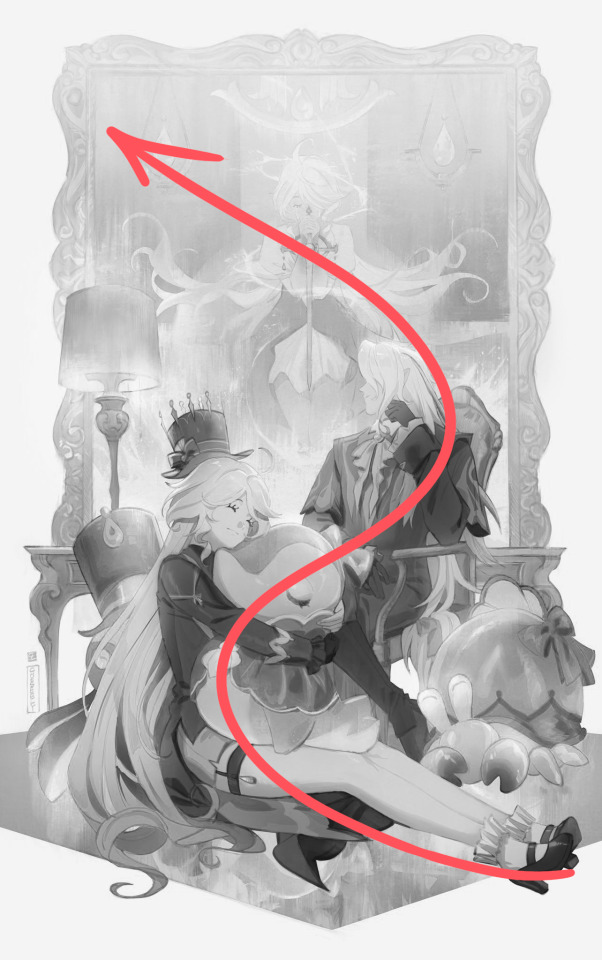
Text
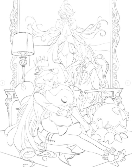
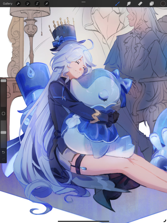
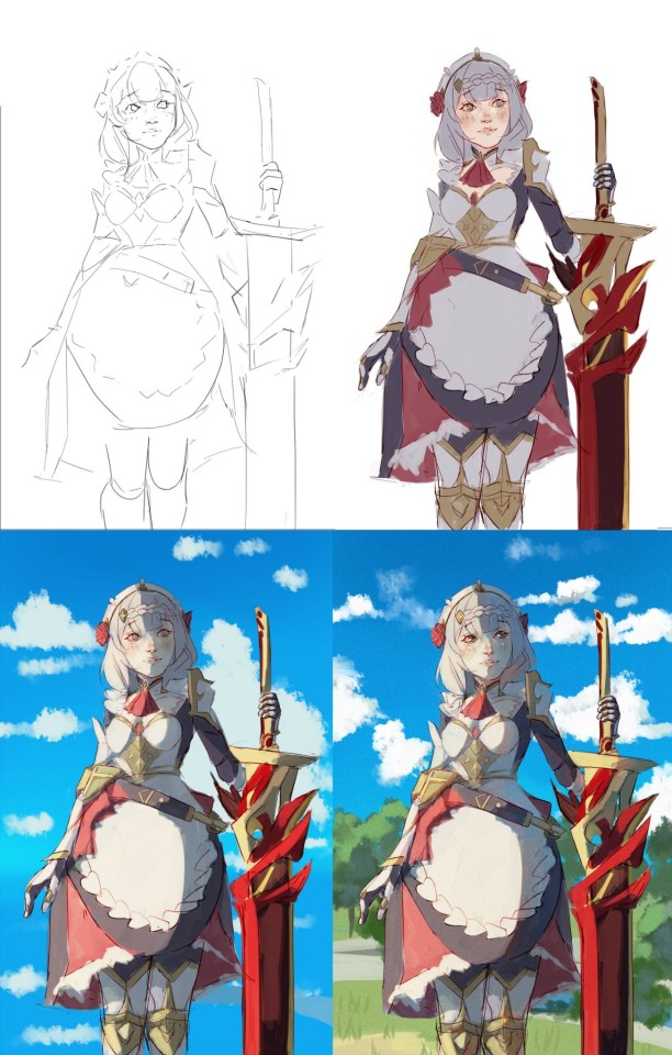
Abbeyofcyn Colour in your style
Painting the lineart for this was really fun, and I really enjoyed doing it, even if I feel like I bit a bit more than I could chew at first, what with me wanting to do two different light sources XD
I also wanted to colour the lineart of this, however the results that I got aren't that good, so I'll be uploading two pieces, one without the lineart painted (the one I like more), and the one with the coloured lineart. Hope you like it everyone and @abbeyofcyn

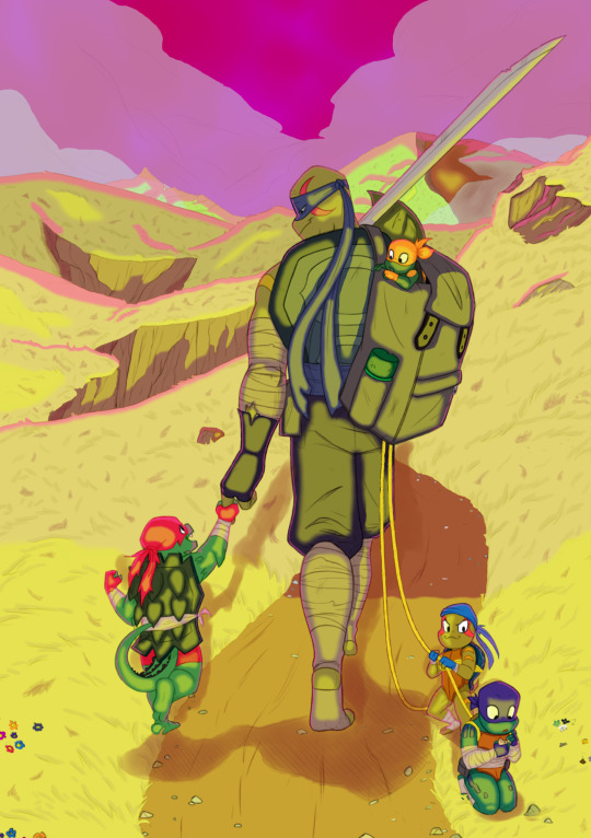
Ok, now that the art is done, I have a lot to say about how I chose to color everything, but that could get long so I'll leave all of that under a read more, expand at your own risk XD
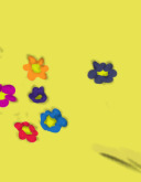
Allright, so first of all, a detail that I'm not sure many people will be able to catch in the first place. The flowers, I colored them in a specific way, because each of them represents a different person.
In here I added the flowers to represent each of the beings present on the art, Red for Raph, Light Blue for Leo, Purple for Donnie, Orange for Mickey, Dark blue for F!Leo, and finally Pink for the Krang; because the latest might not be present literally, but the sky and pink light clearly indicate that they're still a presence to be felt in the world.

In here we have the four turtles again, with the flowers being their respective colors. However, since all but one of them are cut, I chose to color them in what I believe the order they died in the bad future is. First is Raph, I doubt he'd let anyone die before him, so the single corner of a red petal goes to him, then Donnie goes next, hence why a petal and a bit of the center is the only thing that can be seen of him; and now we come to the first scene of the movie, which makes it so that Mikey is the next flower that's cut off, and finally Leo gets the only not cutt off flower, because he's still living here.

This are the last patch of flowers, and the reason why I colored them that way is because each of them represent a different person that's important for the turtles. The Green represent April's Ninpo, I wanted to add her and ther ninpo was the only way I could think of, and on the same vein, the white and black next to her are Splinter when he's on his Ninpo state at their final fight against Shredder. Below them there's the gray and sorta orange flowers, this time they both represent Splinter in his normal form, and yes I know I put him twice in there, he's their father, he deserves it XD
Finally there's the dark brown and gray flowers, these one represent Cassandra Jones and Cassey Junior, you can't argue that they end up being pretty important to the turtles, the first one helped them in the fight against Shredder, and the second one literally kickstarted the movie XD
Next thing to discuss is why I chose to have two different lightning sources and why they are what they are.
First is the Krang sky at the front, I chose this because I got inspired by this idea for the AU behind this lineart from Abbeyofcyn and wanted to continue said AU idea. My take and continuation is that even after the Magic Tie Portal that Mickey did to send Casey Jr. to the past exploded and send the Krang at the battlefield away (and considering how big the battlefield it was, it most likely killed or pushed away every single Krang at New York) and F!Leo got the Tots!Turtles, there were still enough living Krang around the world that are still ravaging the world, this time more out of spite than anything since they know the won and simply want to kick down a dead horse. F!Leo is going in that direction because he's aware that there are Krang still left, and the sad reality is that he can't shield the Tots!Turtles forever, but at least he should be able to train them and teach them everything he can, while also giving them the chance to have a childhood as well, similar to Casey Jr. but more chill.
F!Leo and Tots!Raph are the only ones facing the Krang light, and that's on purpose, the former because obviously he'll be the main force against the remnants of the Krang that are still on Earth, and the latter because no matter the form, Raph will always want to protect his siblings, and he ain't afraid to punch a few f them in the face to do so. Tots!Mikey meanwhile is in the backpack, being shielded from the Krang light, with it barely reaching him, and again, that's on purpose, everyone will want to protect him since he's the youngest, and the fact that he also will become the strongest Mystical Warrior the world will ever see again, and so F!Leo will try to teach him whatever he knows about Ninpo and the Mystic Powers, doing his best to shield him from the horrors of the Krang so that he can focus on learning Mystical Powers.
Tots!Leo and Tots!Donnie are giving their back to the Krang light, but that's not because they'll ignore the menace they represent, but rather because they're focusing on what's more important to them at the moment, for Tots!Leo is his twin brother and the shenanigans/drama he can get with him, while for Tots!Donnie is his curiosity and need to learn about the world around him (Also he's autistic and likes rocks, fight me XD). Leo here is shielding Donnie from the Krang's light, agan made on purpose, because he loves his twin too much and wants to protect him from the horrors, while also pulling his rope to bring him back to the present; Donnie meanwhile only has a little bit of Krang light on him, which is their looming threat that they represent for a great while, however they aren't the biggest thing occuping his mind, and thanks to his twin, he's able to not focus on them for a while to concentrate on more things that'll help everyone in the future; which brings me to...
The yellow light, which comes from the sun that's behind them, and considering how it's a yellow and not an orange one, the current time is morning and it's Dawn, the rise of a new day, new begginings and start for a new hope. It might seem like they're walking away from the light and into the Krang's side, however with this idea I had it's less that they're getting further away from the light, but rather bringing the light with them, illuminating everyone's path and pushing back against the Krang.
As you can see, everyone is bathed in the sun's light glow, however Tots!Donnie, Tots!Raph and Tots!Leo are the ones that are literally bathed in it, while F!Leo has his legs covered in it and Tots!Mikey only has sunlight on his head. Once again this is all on purpose, and I'll explain everyone's light position now :3
Tots!Raph, The sunlight is mostly on his shell, tail and arms, which is because he'll be in charge of protecting everyone's uture, and that sadly also means that he'll be bearing the heaviest burden out of his brothers, but that'll also means that when the burden is eventually lifted, he'll be the one that looks forwards the most.
F!Leo's future is uncertain, the sunlight covers only his legs completly because even if he's the guiding light of everyone's future, and no matter how much light he has on his back, shell, legs and arms; he's not covered in any of it beyond his role as a guide, so still uncertainty envelops him.
Tots!Mikey is literally being carried in a bag to the future, which again is because he's the youngest and the strongest mystical warior out of them, but he's also somewhat of a backup plan, his role will be less to guide anyone to the bright future and more ensure that no one gets left behind under the looming threat of the Krang, hence why he only has the sunlight on his face and he's not covered in it like his brothers.
Tots!Leo and Tots!donnie, the disaster twins, they both are encased in light because both of them will help create the brightest future as well, however Donnie is covering a half of Leo, not letting him be truly fully under the sunlight, and again, that's because while he protects his twin from the Krang, Leo is sacrificing part of his abilities to guide everyone else but his brother. Donnie meanwhile is literally encased in light, his face fully iluminated, and that's because with his smarts and creativity, he'll be the biggest reason that a brighter future will be created for Earth, his inventions carrying everyone towards it.
Finally, why I started with dry grass on the foreground and ended with green grass at the mountains on the horizon, and that's because even with their uncertain future, even though they are the guiding light that'll bring a new brighter future to the world, that doesn't mean that the world is at such a critical state that they literally can't be saved. There are still people out there, living in hiding, no matter how it seems from the start point, there's still life out there.
And that's all I wanted to say about how I painted it and why I did so, I had so much I wanted to say and, to anyone who bothers to read all of this, thanks for doing so, I put way too much thoughts into this ambitious for me painting, and I loved writing all of this down as well. See y'all in the future n.n
#abbeyofctiys#RotTMNT#rottmnt movie#future leonardo#baby leo#baby donnie#baby raph#baby mikey#rottmnt krang#long post#lineart painting#fanart#Unnamed AU#DTIYS#Painted this in Sai with a mouse#not sure if it's a flex or not :V
92 notes
·
View notes
Note
sorry if youve talked about this before, but do you have any tips relating to your coloring process? i ADOREE the way you render things and it looks soso cool and once i saw a post where you said your art typically only took a couple hours and i was in SHOCK. cuz ive been working on a yuji piece that has a similarish (not really but idk how to describe it…) coloring style and ive been working at it for. about a month now…sorry this is rambly i hope u have a good day!!!
hi!!! first of all thank you so much I'm happy you like the way I render! honestly it Is still the aspect of drawing that takes the longest for me, I've only recently started to come up with ways to streamline my process (mainly through keeping my layers/brushes limited and overall being less anal about details) . these days my average drawing does take about 2.5-4 hours I'd say, with Big Illustrations obviously being the exception
i wouldn't beat yourself up too much about taking longer to finish a drawing tho ! it took me. a While to learn how to speed up and honestly my biggest piece of advice is loosen up and let certain things look imperfect or unfinished ! and if you're like i was and want to work at getting faster then i would recommend practicing churning out sketchy/rough pieces and see what tricks and habits you can implement or adjust to save time
all that being said I realize haven't done an updated overview of my colouring/rendering process so I guess this can be that ! I'll put it under the cut because i too like to ramble and this Will get long
lineart and base colour/underpainting


my lineart is nearly Always on multiply. it helps the lines stand out less starkly against the colours and makes it so that I don't have to change the colour of as many sections of lines later on
the base colour layer is honestly completely optional, tbh i sometimes skip it so you don't Have to have one but i like it for a few reasons: - I like to keep all my colours on the same layer so if i'm going for a painterly style this serves as an underpaint layer of sorts . having this means that when i paint, whatever colour i have here will blend with all the other colours i use and help them look cohesive - even if I'm not painting, i still like to work with all my colours on the same layer and it helps me make sure I'm not missing any spots, which helps when it comes time to section individual areas off in the next steps
2. flats

lock transparency button my beloved . this makes it so that you're only able to paint on areas where there is Already colour (which is where having an underpaint layer comes in handy)
not much else to say about this step, just choosing colours rly !
3. shading
here's where the fun starts ! since i'm working all on one layer, i use the wand or lasso tool to section off whatever area I want to work on, then go in with (usually) one of the three brushes below: from left to right 1. my favourite dry brush that i use to cover large areas, it has an amazing dry paint stroke-y texture and i use it in everything. great for skin/clothes/hair/fur/organic material...she does it all 2. smaller, blendier/smoother brush that I use to soften out the rougher edges left by the first brush. I find it's really good for hair and small clothing creases 3. rough pen brush that I use to add little bits of flavour in the form of crosshatches or stray lines, usually to hint at individual hair strands! I also use it to line sometimes but I'm using it less for that recently
also, since the lineart layer is set to multiply, it's super easy to colour directly under the lines on my colour layer and use that as a way to make certain lines Darker . it's most obvious at the eyelashes and under the jaw but I do it everywhere

4. finishing touches and texture overlay
here I add another layer above the multiply/lineart layer and use it to add highlights and other details! this is also the layer i use to paint directly on top of any areas that got messy or need extra definition
my texture overlay of choice is just a rough monochrome static file that I got on the csp assets page but use whatever you'd like tbh ! set the layer mode to overlay and adjust the opacity to your liking (I also like to rasterize the layer to make it easier to work with but it's not too consequential if you skip that step since you're basically done by this point anyway)
And done ! slap a signature on that bad boy and send it <3

#answered#flowingredscale#art advice#my art#i rly hope this was helpful!!!#best of luck with your yuuji piece <3
34 notes
·
View notes
Text
ottaburas crossed my dash again and i couldn't resist making some of my own this time, since i saw the lineart that @sundownsquad provided. i decided to give these guys to the ghost squad in their post-war/sanctuary era!
Chestnut, a young male belonging to Harlow. Harlow's first reaction to seeing ottas was to borrow a local saying and call them 'an odd chestnut'. The name stuck (and became much more affectionate). He's old enough to have finished training but his steady nature is what's really responsible for his 'bombproof' reputation. He has yet to be bothered by anyhting, as far as they can tell, and is far more likely to explore a new thing with his mouth than feel any fear. Patterned after a bay roan with a badger face and I used kumuology on dA's roan brush for his coat.

Ruusaan is a female a few months old that Tally's been hand-raising (aka spoiling her rotten). She's too smart for her own good, which is mostly expressed through her general disinterest in training. Getting her to obey relies heavily on her wanting to go along with the idea, and there's no such thing as making her carry cargo. Despite that, she's generally a very calm individual who reserves trouble-making for when she's bored. I was going to give some spots to Chestnut but then I thought they'd look much better on a dark coat!

Liberty is the sweetest and most affectionate of the bunch. She'd be happy to quite literally be in Boom's pocket, and if not given sufficient attention, will try to put herself there so he has to look at her. He lets her get away with more than he should and they both know it. She was bought to help with plowing the fields and hauling the produce from them, but ended up mostly being there as a companion for Boom. He's trained her to help him get up if his prosthetic leg breaks, and she's happy to fetch him things (even if they all end up with teeth marks). She's also the favourite of Sanctuary's kids, and she's quite happy to let them feed her treats all day long and use her as a jungle gym (as long as they don't pull at her whiskers or ears, and they know to be polite).

Snack, short for Snack Sized, was originally thought to be a baby otta, like Ruusaan. When he didn't grow up any bigger, though, the Ghosts realised that he was fully grown at half the size of the others. One of the shinies quipped that he was snack sized and the name stuck. He decides early on that Cav is his human and they're not to be separated under any circumstances. Cav isn't convinced about that (neither is his wife for that matter) until he realises just how comforting Snack's presence can be, and trains him as a service dog. Taking Snack to the store can be a real adventure due to his size, but he's polite, and the locals are both familiar with ottas and rather fond of Sanctuary's citizens, so he's welcome in most places.

Ceru, short for Cerulean due to his blue colour, is Ray's BFF. She thinks he's the coolest otta ever, and who's to tell her otherwise? They go hiking a lot, exploring the area around Sanctuary, and occasionally fishing, foraging, or packing back hunted meat. Ceru's gotten very good at fishing from the river nearby, and Ray couldn't be prouder of him. The only trouble is getting him out of the water... and keeping him from shaking water all over anybody in the vicinity. They're the unofficial lifeguards when others are at the river, as Ceru is faster and more manuverable in the water than human swimmers or boats. He's got a sixth sense for digging up mushrooms.

Nox never does anything halfway, and that includes their choice (and decoration) of otta, Regina. She's by far the fastest in the area, which combined with an innate surefootedness and responsiveness to scent training, makes them a crack team when it comes to tracking and search-and-rescue. She'll only work with Nox, though, and bites anyone else who touches her without offering a treat first. Nox has done nothing to curb this behaviour. When SAR help isn't needed, she's winning races, being an animal ambassador to people who have never seen an otta before, herding livestock, and generally having the run of the lake in her downtime. She's painted with a mangōpare on her back leg for strength and courage, and a puhoro on her front leg for speed and agility.

Alor is the largest of Sanctuary's ottas, and the most protective. His primary role is a guardian of both livestock and people. Karla takes him on all the long-distance trips the other Ghosts take, and the rest of the time, he wanders about as he pleases between the livestock areas. He learned to open the gates he couldn't jump over, and at least he's polite enough to nudge them closed after he's through. Affectionate bites are nothing out of the ordinary, and tend to draw some blood even when he doesn't mean them to, so it's fortunate that aggressive biting isn't so much a thing - he flings the offender halfway across Sanctuary instead. He's partially deaf so people learn to make sure that he knows they're approaching him.

Quantum was named before she came to them, and nobody's really sure how she got that name. Shay sometimes takes after Nox and paints his own wave-pattern tattoos on her legs, but she does tend to roll in whatever water or mud she comes across, so he reserves the paint for special occasions. She's the strongest otta and also the most stubborn. Shay is the only one who can get her to do anything. He says it's because he's best at scratching her favourite spot under her chin and evidently she agrees. Even though she would do anything for him (and vice versa), other humans are none of her concern. She's a one-guy type of otta. She's got the smallest bit of white around her toes and the edges of her ears, at the tip of her tail, and a heart-shaped spot on her nose.

Ladybird belongs to Cav's wife, Seku. They're a pair of easygoing older ladies who enjoy taking it slow. She's also the otta responsible for guarding the daycare! When she's not napping with her head in Seku's lap, anyway, because they both very much enjoy that. Neither of them would let anyone but Seku ride her, that only occasionally, and they always take it slow. Seku loves her as a companion and needs nothing more from her. I couldn't draw her brindle stripes to my satisfaction so I used a tiger stripe brush from critelli on dA!

16 notes
·
View notes
Note
hiii! okay i have a few questions lol so bear with me. first off, how do you make lineart in ibispaint? i cant figure it out. second, could you provide the transparents of gumi and the swirly background png thingie you used in those graphics? sorry if thats a lot lol. i cant find good gumi transparents anywhere and its driving me CRAZY (she's my fav vocaloid)

hello anon!! i don't mind any questions asked!! you can always ask as many questions as you like :D anyway,
a1: how i make lineart in ibispaint is just i duplicate my layer and then i put alpha lock on!! and then i colour it in with the colour i want and move it in the place i want it to be! :) i never use the lineart that ibispaint does for you since it makes my things look all chunky for some reason.. (i think its because my phone is stupid but oh well)
and for your otherrrr question; of course! you can have all of my gumi transparents right here! :)


i don't have the swirly thing you're talking about anymore though, since i already deleted the gumi graphics on ibispaint..... but i do know that i made those on my own, so that's why i don't have them anymore!! :') im sorry about thatt! im sure there are other masks you can find that are similar!
hope i was of help!!!


14 notes
·
View notes
Note
Would you ever consider doing a colouring tutorial?
Heyooooooo
I've done a coloring post before (a few months prior), but somehow, my coloring/painting process has changed a lot since then lol. I'll give a breakdown of my process (and go into specifics on coloring) here, but please do take it with a grain (or a spoonful) of salt... I'm still very much learning, and though you can use my process as a guide, experiment on your own to find what works for you! This post got a little long I'm ngl so. open at ur own risk. it's really just me rambling and being a bit too pretentious for my own good
using my recent post as an example, my process is basically just:
first i get a clean sketch (after many hours of pain finding detailed references lol), not gonna go into that since you asked abt coloring
then i immediately go to block out shapes over the sketch. For big paintings, I don't do lineart (because i find that it eliminates a lot of depth that can be achieved with shapes and shading) — for smaller sketches and pieces, i'll do lineart tho.
I started darker to lighter in this painting because I knew I wanted harsh light. For me, it's a lot easier to project "additions" onto a surface — ie, if there's a harsh light, that's the addition vs. a shadow in neutral lighting as the addition. dunno if that makes sense, but breaking tones down like that helps me understand how i want to chronologically color smth and choose my bases:
for example, since I knew I was gonna have harsh light here, I felt comfortable with just getting the tones for my shadows down immediately. There won't be many midtones due to how extreme I saw it to be, so there was no point in finding a neutral base tone.
how i choose colors varies from painting to painting, but for this one, I decided to lean purple-blue because skk are just one of many red and blue gays (same reason why most of my other skk works lean red-blue-purple), and also because I knew I wanted my light to be on the warmer side — thus, the shadows and unlit areas will be cooler.
i also wanted it to recede (to emphasize the perspective and for depth), so for the base colors, i made them cooler + darker as they went back. This wasn't as clear in the finished product, but i think it did a good job at reminding me the vibe i wanted as i rendered
By how much I've written for this step, I guess you can assume that it's the step I put the most consideration into — and you'd be right. I think base colors really determine the vibe, and it sets you up for the rest of the painting. Sometimes I have to color adjust my bases over and over (with hue adjustments, color balance, curves) until I'm satisfied. I think that satisfaction is obtained w/ more ease as I've painted more and more. Alongside the sketch, this step takes me quite a while. Sometimes it's fun to mess with really wild color combos, but that's another topic.
Then I block out the lighting, which is probably the most drastic step but also somehow the quickest for me. Once you understand how light affects color (warmth, tone, etc) and you gain confidence with it, blocking out values in relation to base tones isn't too hard. That ofc takes practice and a lot of fundamental understanding of Shapes & Colors but there's a lot of stuff online abt the theory specifically from professionals, so I'm not gonna lecture y'all as a fanartist for glorified literary author rpf

then i just start rendering, layer by layer. above is a screenshot i took mid-rendering; at this point, dazai's clothes were basically done but I later worked on the face + hair more and textured the tie.
I try to do the stuff I want people to focus on first, because at least for me, that's when I have the most energy to make smth detailed — the more detailed an area is, the more naturally drawn you eye is to it (this is because the brain likes areas of high contrast, and details are entirely founded on the placement of contrast).
My art has never been too extremely detailed — I enjoy flatter + bigger shapes, styled texturing and silly patterns, but I find that "detail" still translates into "effort". When I look at paintings, it's very clear where someone put most of their effort — and when I can't tell, then I know I have a very confident + experienced artist who can effectively distribute their workflow (goalz). So yeah, I render in my very silly poly style but still keep that in mind.
eventually, I finish rendering. This part is kinda a blur tbh, and it always varies from artist to artist. I'd say the things I keep in mind are:
shape + form (making sure my rendering doesn't mess up gesture or vibes, and that it keeps things loose)
composition (making sure i don't overdo areas where i don't want people to focus on)
and tone (ensuring that the depth and believability of the scene stays intact so that my non-realistic style can work)
I added the bullet because i wanted a reason for the goofy expressions, just a bit more pizazz so that skk's drama was also believable lol. also visual storytelling or whtv (but that's not something i usually prioritize, it mostly comes with the concept and sketch).
I also added the bullet for some compositional spice. the dark shadow on dazai's arms was there to also emphasize the warped perspective, but it also left a weirdly empty vibe that I didn't enjoy lol. So yeah, bullet! and ofc my favorite, weird flowy line pattern thing that doesn't adhere to the laws of physics
I think a lot of my traditional painting experience leaks into my digital painting practice. I don't like lineart too much, and since I mainly work with acrylic, I rely on opaque color blocks, layering, and "carving out" shapes. probably explains my affinity for solid flat brushes in Procreate,,,,, but yeah. It's a little all over the place, but at its core, it's a lot of technical stuff mixed with habits after finding what works for me.
Dunno if this helps at all, or if it was interesting lolol. Thank you for reading until the end if you're still here! I appreciate it. I'm still learning but I've definitely learned a lot since I started this blog so it's exciting to track my progress. I'm sure I'll see this in a few years and laugh lolol.
#pleuart#pleucas#casasks#sorry it got a little long#i did Not proofread this so there will prolly be a bunch of typos. just shout at me i'll fix it
73 notes
·
View notes
Note
Hello! I am a beginner artist and I love ur art!! Super pretty and the colors are very tasty. Do you have some tips? I'd love to see your art process!
HELLO ANON!! first of all i am very honoured that u would ask me this because 90% of the time i feel like i have no idea what i am doing and like im still a beginner artist myself DSDSJDF. i would love to share some stuff i learnt and some stuff about my process (regardless of how messy it is sdfhsj)
(final piece)
here's an old example of my process i found! while the steps sometimes look different for other pieces, i feel like this is a good demonstration of how the basic structure looks.
1. the sketch - this is where i'm mainly figuring out how i want the piece to look. i was redrawing a screenshot for this piece so it looks a LOT neater than what a lot of my other sketches look like, for example, here's the process of me figuring out my recent drawing of haise:


(final piece)
in the first two steps, i was mainly working with showing myself what the piece was going to be. the last one was where i used references/technical knowledge to try and show whoever will be looking at it what the piece was
2. cleaning up the sketch + base colours. these two usually occur simultaneously because i will get bored cleaning up the sketch midway through and want to start adding colour LMAO. on a more practical note, sometimes putting down the base colours and having a better idea of what the finished product will look like might make it easier to refine things.
a note: cleaning up for me doesn't mean doing lineart. it mostly means erasing any overly messy lines on the sketch and redrawing small parts to make it look tidier where needed. i often leave it 'messy' at this stage, too. like here:

(final piece)
3. light/shadow. this is my FAVOURITE part because it's where the piece starts pulling together. the method i used in the current piece was putting a multiply layer over the colours folder and filling in where light would be obstructed. after that, i used a luminosity layer to put in some bright sunlight. marc brunet has a great way of explaining it by advising to pretend that the light is the camera and you're behind the lens. this is such a good way to block in average light/shadow values! sometimes this looks a bit crazy because everything is still so messy but that is why we have...
4. rendering. this is where i fit all the remaining pieces of the puzzle together. i'll refine the colours a bit more -- e.g. colouring in the eyes, -- and fiddle a bit with the shadows to add some more variation to the hues/value. this is where i think a lot about light and shadow theory and try and make it look more realistic. marco bucci saved my LIFE with his videos about ambient occlusion and ambient light (part 1 / part 2) -- essentially, what i keep in mind the most is that if a plane in shadow is facing the sky (or is open to any other form of light that isn't the direct light source) it will contain ambient light. it is SUCH a game changer when you add it to your pieces, trust me, even if youre lazy about it. if needed i'll pull up some references to make everything look good!
5. rendering... part 2? honestly this step kind of blends with the last one as i tend to do it simultaneously. i basically clean up all the messy lines from before by painting over them! with the majority of the colours i need put down, i can just eyedrop them and paint over anything that's needed. this also comes in with the light/shadow, where, if i need a more subtle hue for either/or, i will eyedrop it and brush it in.
some further notes:
i very rarely use references during the first stages of my sketch. i think it tends to look quite stiff and unnatural if i rely too hard on the. and i personally prefer the creative room when the idea is still being conceived. references come in when i can look at what i have down on the canvas and have a fairly decent idea of what i want, including pose, composition, etc. it's essentially a first draft to guide me to where i want to go with the piece. it's when i'm done with this that i bring out references, and even then, they don't necessarily have to be the exact pose -- i'll usually get a couple of pics which show what i need to double check and keep them up as a guide. by the end of the 'sketch', i usually have a basic construction of what i need to continue, even if it's messy.
i use very soft brushes when putting down colour because it allows for more hue variation. like i said, i enjoy eyedropping and brushing in colours afterwards, so this really helps!
layer modes are ur friend! i try not to rely on them too hard during rendering because i like the freedom of painting over but they're very useful when you're blocking in your initial colours
sometimes, when i feel like i want to try something new with my art, i'll keep pieces that inspire me up in front of me. i have two of sui ishida's art books and sometimes i'll just flick to a page that oils the Art Gears in my brain and keep it open while i draw. i don't necessarily reference it, but i like having it there so i can glance over every once in a while. i don't usually make a conscious choice where i'm like "ok i want to render skin the way he does" but it's more like. my brain knows what it likes in his art and it'll try and push that part of my art in a similar direction.
honestly the best advice i have is that art is very much based on vibes. everytime i've tried to think too much about it, to do things 'correctly', to rigidly stick to art theory, my art has not come out nicely. i think the technical parts of art are important to know and understand but i also think it's important to let your knowledge come through naturally when it is needed instead of pressuring yourself to do things 'right'. tbh you probably already know that but it's something i forget a lot so maybe it serves as a helpful reminder?? sedsfhsl
ANYWAY SORRY THIS WAS SO LONG! i hope i covered what you needed and if you need anything else/want me to expand on anything feel free to drop me another ask ! <3
make sure to look after yourself and trust yourself and ENJOY!!! art is about having fun!
81 notes
·
View notes