#i want to focus more on graphic design layout
Explore tagged Tumblr posts
Visit Tumblr Blog
Explore Tumblr blogs with no restrictions, modern design and the best experience.
Last Seen Tumblr Blogs


Fun Fact
Forty percent of Tumblr users are between the ages of 18 to 25.
Text

neocities guide - why you should build your own html website
do you miss the charm of the 90s/00s web where sites had actual personality instead of the same minimalistic theme? are you feeling drained by social media and the constant corporate monopoly of your data and time? do you want to be excited about the internet again? try neocities!!
what is neocities?
neocities is a free hosting website that lets you build your own html website from scratch, with total creative control. in their own words: "we are tired of living in an online world where people are isolated from each other on boring, generic social networks that don't let us truly express ourselves. it's time we took back our personalities from these sterilized, lifeless, monetized, data mined, monitored addiction machines and let our creativity flourish again."
why should I make my own website?
web3 has been overtaken by capitalism & conformity. websites that once were meant to be fun online social spaces now exist solely to steal your data and sell you things. it sucks!! building a personal site is a great way to express yourself and take control of your online experience.
what would I even put on a website?
the best part about making your own site is that you can do literally whatever the hell you want! focus on a specific subject or make it a wild collection of all your interests. share your art! make a shrine for one of your interests! post a picture of every bird you see when you step outside! make a collection of your favorite blinkies! the world is your oyster !! here are some cool example sites to inspire you: recently updated neocities sites | it can be fun to just look through these and browse people's content! space bar | local interstellar dive bar creature feature | halloween & monsters big gulp supreme peanutbuttaz | personal site dragodiluna linwood | personal site patho grove | personal site
getting started: neocities/html guide
sound interesting? here are some guides to help you get started, especially if you aren't familiar with html/css sadgrl.online webmastery | a fantastic resource for getting started with html & web revival. also has a layout builder that you can use to start with in case starting from scratch is too intimidating web design in 4 minutes | good for learning coding basics w3schools | html tutorials templaterr | demo & html for basic web elements eggramen test pages | css page templates to get started with sadgrl background tiles | bg tiles rivendell background tiles | more free bg tiles
fun stuff to add to your site
want your site to be cool? here's some fun stuff that i've found blinkies-cafe | fantastic blinkie maker! (run by @transbro & @graphics-cafe) gificities | internet archive of 90s/00s web gifs internet bumper stickers | web bumper stickers momg | gif gallery 99 gif shop | 3d gifs 123 guestbook | add a guestbook for people to leave messages cbox | add a live chat box moon phases | track the phases of the moon gifypet | a little clickable page pet adopt a shroom | mushroom page pet tamaNOTchi | virtual pet crossword puzzle | daily crossword imood | track your mood neko | cute cat that chases your mouse pollcode | custom poll maker website hit counter | track how many visitors you have
web revival manifestos & communities
also, there's actually a pretty cool community of people out there who want to bring joy back to the web! melonland project | web project/community celebrating individual & joyful online experiences. Also has an online forum melonland intro to web revival | what is web revival? melonking manifesto | status cafe | share your current status nightfall city | online community onio.cafe | leave a message and enjoy the ambiance sadgrl internet manifesto | yesterweb internet manifesto | sadly defunct, still a great resource reclaiming online social spaces | great manifesto on cultivating your online experience
in conclusion
i want everyone to make a neocities site because it's fun af and i love seeing everyone's weird personal sites that they made outside of the control of capitalism :) say hi to me on neocities
EDIT: part 2!!
#neocities#old web#webcore#old internet#web revival#indie web#html#website#recource#guide#can you tell that i've gotten REALLY into neocities this month!!!!!#but its so FUN i love seeing everyones weird af websites#its amazing#i love celebrating the old web#ANYWAYS MAKE A NEOCITIES HERES A GUIDE#i haven't touched html in like a decade#and i've been having a great time relearning#:)#share your sites with me!!!!!!#oh and share resources if you have them!
85K notes
·
View notes
Text

Jealousy, Jealousy
Cheerleader Wanda x Nerd Fem Reader Short Stories
Pietro has consulted his friend Christine who's into graphic design to help improve the layout of the school's newspaper. And that means afterclass meetings with the group, especially between the two of you.
Through time spent together, you and Christine turn into somewhat friends but she only talks to you often even if Pietro is around. You don't put much thought into it, until one afternoon when she asks you out on a date.
"Oh," is all you can reply at first, reasoning afterwards that you have no plans to date for the meantime and to focus on studies first. Although, in your heart, there's already a reserved space for the one and only Wanda. And she's still occupying that space.
Christine however is not sad when you turn her down. It only spurs her determination.
The relentless flirting from Christine does not stop, and even Pietro has noticed it during meetings.
He brings it up by mistake one Saturday night to Wanda when they two have dinner alone together, not knowing Wanda likes you that way.
"What do you mean?" Wanda snaps.
Pietro wonders why his sister's mood suddenly changes. She was just happy narrating earlier about her walk home with you.
"Christine has been flirting with Y/n during our afterclass meetings and it's bothering me whether I made the right decision inviting her to the group. I don't want Y/n to be uncomfortable and all."
Wanda falls silent, thinking about you. No, she totally does not accept this. You are hers and only hers.
"And how did she react?"
Pietro purses his lips. "I can never tell with Y/n. Maybe, I'm just the one bothered. I just want this month's issue to be great, you know. And if my staff is not one hundred percent focused, I might even lose the next month's budget increase."
And her brother's answer doesn't sit well in Wanda's stomach.
She has to know from you. That's why on Monday, she dashes towards the school's darkroom with the "Do Not Enter" sign on the door to look for you.
"Piet?" you call into the darkness, looking behind you only to find his sister. "Oh, hi, Wanda."
"Are you and Christine going out?" Wanda asks, fuming.
You stutter, "No, why would you think that?"
"Do you like her?" she asks, now avoiding your gaze.
You shake your head no. "No, I don't."
Your answer softens Wanda's composure, making her look at you. Her heart soars with delight. "That's. . . That's good."
"Why do you ask?" You approach her.
"Nothing," she hurriedly replies. "I got to go. I have an 8am Biology class."
Confused, you find yourself nodding back. "Okay."
Wanda smiles as she brushes a strand of hair over your ear, making you blush. "You look more beautiful with your hair down like this."
You are thankful the darkness hides your red cheeks.
Then she leaves you there frozen. It isn't until Pietro arrives when you realize you still have work to do.
Author's note: I truly appreciate your continued support in reading my stories. You can help me create more stories by supporting my writing thru this link. Thank you so much. ❤
279 notes
·
View notes
Text
Shopify has a blog problem, this creates a really simple and straightforward opportunity for freelance designers/programmers
Earlier this year I settled the editorial decisions I needed for a lot of blogging going forward, and recently I've experimented (repeatedly) with the idea of having a blog on a separate platform, or using Shopify's system.
Having two sites would allow me to blog on a WordPress site, but creates... two sites, therefore complicates everything more. More maintenance, design, etc. etc.
I am actively seeking to make my life easier so I am foregoing two sites and learning to live with the limitations.
A personal struggle to the surprise of no one.

You can use WordPress and thread Shopify through it via the "buy" button, which is a shortcut for small stores and/or larger stores where you are very comfortable in WordPress.
You cannot use Shopify and thread WordPress through it.
Which is a shame.
Because Shopify's native blog platform is fucking horrible.

An independent graphic designer who can program, or a programmer who can design, cannot solve Shopify's problems.
They are inherent to the system and likely built on legacy code Shopify doesn't want to update because it'll cost a fortune.
I'll just be mad about this until the market forces them to address this opportunity and they revamp their blogging platform. That's fine.
Or maybe decades will pass and they won't. That's... fine too. I guess.

I am rambling this out because if I were in the business of freelance graphic design and/or programming I would jump on this immediately. I used to be and always shared opportunities with friends and it was fun and I kinda miss that aspect of the life.
I'm not in that business, and I have in-house programming, please don't pitch me, but do consider pitching... pretty much everyone with a Shopify site and a blog as Phase 01 of your plan, and everyone who has a Shopify site and does not have a blog as Phase 02 of your plan.
Here is what I would tackle:
Shopify blogs have two structures: "blog" and "blog post".
A blog in Shopify is essentially a category in WordPress, with more limitations, such as, a blog post can only be in a single "blog". That sucks but it means your life as a designer/developer gets more interesting.
Most Shopify themes come out of the box with 1 "blog" and 1 "blog post" template. They are exceptionally simple, usually. I would build a few test templates and offer them to clients "these will be modified to fit your direct style."
For some reason -- I'm guessing focus -- most blogs in Shopify have the image on top. If you structure "image on the left, image on the right" as options you can offer clients, you've just tripled their layout capabilities.
For another reason, I don't know why, but almost all shopify blog post templates I've seen do not have sidebars. Which is insane?! You can control that from the fucking "blog post" template so it would be an easy win.
You could work around the "a post can only be in one blog on Shopify" issue by having a sidebar that pulls the latest 3 (or 5 or whatever) posts as links for other blogs on the site: TEST SITE has 3 blogs. When you're looking at a post on BLOG 01, in the sidebar, you see a link to the latest post on BLOG 02 and BLOG 03. Similarly, when you're looking at a post on BLOG 02, the sidebar has the latest post from BLOG 01 and BLOG 03 (and so on)
The template I use, off the shelf, uses the Shopify's user name and details for the author of the blog. Once a blog post is created, in Shopify, you cannot alter the author. This is dumb as fucking rock salt on slug popcorn. But, again, systematic, I'm pitching ideas on ways around it -- exclude this and just use a CUSTOM DATA field to allow the Shopify owner to pick the relevant author. This cuts down on the need for extra Shopify users, tremendously, and builds in the opportunity for WordPress-style author footers on blog posts.
Emulate the very common filtering on products -- dropdowns, sorting mechanisms -- with tags on a sidebar on BLOG templates. This will be tricky because you cannot hook into the Search & Discovery function, but it's absolutely no where near impossible. And would be amazingly useful.

Overall Shopify is a decent platform with significant advantages.
There blogger apps but holy shit that is so unnecessary. If they were a one-time-fee, it would be fine, but they aren't, they're generally $20+/month.
I'm not interested in paying for a service that ties me into another tech system that I am fucked if they go out of business, jack up their prices, introduce a feature I don't like, or remove a feature I do like.
For something like a blog system.
Which relies HEAVILY on very structured, single-built, near-infinitely-reused templates.

A low effort, high yield opportunity exists for independent designer/programmers to come up with a suite of designs and say "hey with some very simple modifications, we can take 1 of the following, apply it to your store, and dramatically increase your in-site blogging opportunities."
You start with a base "blog post" template and a base "blog" template and then every time someone hires you to add a feature to theirs, using Shopify's core tech -- you're just applying paint -- you now have a second set of templates.
Recycle forward.
One time fee per client -- likely low, but again effort is low since 90% of the code is re-used -- and each time you secure a client, you have opened a networking door.

Just make sure you include instructions and/or a premium service for when the customer upgrades their theme version -- "occasionally your theme author will upgrade, and this may get lost... so do the following to bring it back and/or we'll handle it for you for $X and Y-days notice."
Business opportunities are everywhere.
Good luck!
I repeat don't add me to your pitch list, I have a programmer in-house, but use this idea to make a business or extend yours!
This isn't financial advice, it is annoyed rambling!
#shopify#small ecommerce#small business#web design#ecommerce design#blogging#shopify blogging#graphic design#blog design
21 notes
·
View notes
Note
How do you decide what compositions you want to use in your work? Do you have layout inspiration? Or does it just come naturally? I would like to improve how I use composition and placement in my work and would love some tips. Essentially… how do you determine what goes where? What shapes would make the whole piece come together… that kinda thing. I’d appreciate any advice you may have!!! (: thank you!!
honestly i usually have a very vague idea in mind of what i want to do and then just play around with it/change the positioning/add or remove stuff as i go! i am a pretty messy and impatient person so some of my layouts are definitely rushed and could be improved if i payed more attention to detail/slowed down but oh WELL hahah
i do recommend pinterest + instagram for inspo though! especially looking at graphic design and traditional collage pieces — these can be super helpful and after a while you’ll be able to pick up on artists’ patterns and habits and steal a little bit of what you like 👀 no but honestly don’t be afraid to get inspired by the work you love — as long as you focus on implementing stuff that makes your brain go brrr instead of blindly copying it without putting much thought into it you’re all good!
#vic.txt#vic answers#i hope that makes sense hahah i’ve had a very busy couple of days and my brain is running l#on like 10% power
17 notes
·
View notes
Text
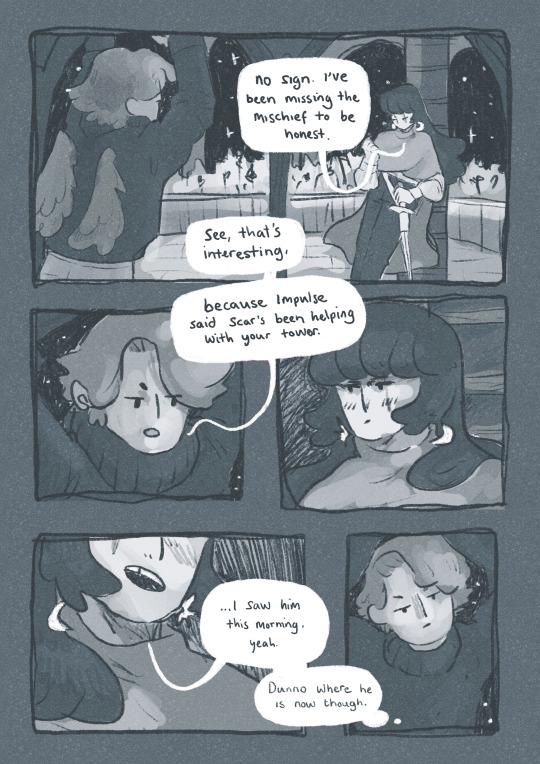
9th feb '24 - [arch] characters, interactions and emotion - making a mini webcomic
Gahhhh Shri this has been an absolutely crazy couple of weeks!!!! Hope you are doing well :)) First of all, WOW! You have a lot of goals, and I’m sure you’ll get them done! I’ve worked a lot on my graphic design during the process of making Winter Wellbeing. If you wanna see a blog post dedicated just to that, I can do so! It would be cool to compare notes on the approaches we take for graphic layouts. If you wanna share your knowledge of camera skills when you build that up that would be awesome 😭😭
It’s been a tough few weeks, art wise. I have been reflecting on my process, motivations to create, the ego and all the baggage that’s lumped into the creative process for me. It turns out there’s a lot. I took some space from my illustration practise (literally for a weekend!) and began to realise how dysfunctional it is. I’ve been writing a lot about that so there may be a larger piece of writing coming about that at some point (no promises!!)
But for now, let's talk about little successes!
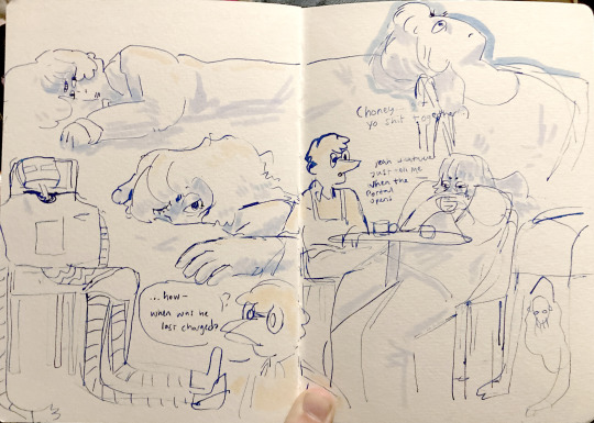
I’ve been playing with some characters for a while but I’d hit a bit of a block with the plot. I realised the expectation of having a finished project of high quality soon is unrealistic, and an unhealthy expectation to put on myself. I rarely give myself time to play with concepts for a long time and let the characters, plot and interactions evolve naturally. Maybe this in part came from sticking to the short university module turnaround. I noticed that that short turnaround was causing a lot of block, so I have decided to bench it as a comic for now and focus on using it as a playground - falling in love with the characters, creating stories and drawing them for fun. Maybe years down the line I’ll make them into a comic - we shall see!
I *tried* to do hourly comics day this year and it didn’t quite work for me. I think I made 3 comics? And then got distracted with a bigger project that ended up taking a week or so to complete. Let’s have a look at it, shall we?
[you can find the full version here]
First of all, it’s based on an unfinished fanfiction I started a couple of months ago, which was mostly bad, but there was one nice scene that I liked and wanted to expand on. I started by having a look at the script I wrote and thumbnailing on the iPad. I’m away from home at the mo and usually would prefer to do most of my artwork traditionally, but because I don’t have access to a scanner, the whole process was digital this time. A lot of the pages got scrapped because the dialogue wasn’t necessary, and I’m not drawing pages that aren’t necessary.

some more development screenshots

I thought a lot about posing during the process, acting the scenes out in my mind and sometimes physically, really understanding the emotions of the characters, why they’re saying what they’re saying, their tone and how to convey that though their body language and expression (i find grian really annoying normally [affectionate] but I want this grian to step on me).

Pearl was hard with this because she’s quite erratic and unpredictable in this series, so I wanted her to switch from raw explodey anger to playful jabs at Grian. I’m hoping this comes across as somewhat insane, rather than tonally off and inconsistent. I did super enjoy drawing her and her explosive nature though, especially in comparison to Grian’s coldness.


I played with levels and monotone colour too - I’m not working with multiple colours much at the moment so I’m able to focus on things like values composition, characters and backgrounds. My skills limit the kind of stories I can tell currently, so I’m working to improve those foundations. Maybe when I’m back in the riso studio I can play with colours a little more.
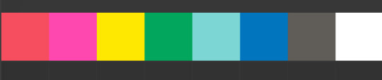
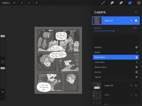
Colours - despite the simple pallete it gets a bit nerdy here.I stuck to specific flat percentages for most of it - Pearl’s hair and Grians jumper are 60%, Grian’s hair and Pearl’s cloak are 20%. Then I added a 14% layer for shadows, using a ahrd blend eraser tool for highlights, making the images quite dark. I fill a layer with texture from Forystr’s riso brush for procreate, and turn it into a 40% opacity colour dodge layer. This gives it some much needed texture and makes the lighting feel low and nighttimecore. It also pushes the values to look really nice - I tend to be too scared to push them by myself.
I tried a few different colour layers to get a *vibe* but settled on a low percentage riso blue in a colour layer. All layers besides the riso blue are in a riso black, colour picked from a riso colour pallete. I learnt these tools - using percentages to get good values - from working with risograph. I really recommend having a look at these techniques and doing some monotone work. It's really improved by character designs, page layouts and compositions.


That's all from me today, though I have had MANY other thoughts over the past two weeks about creating, but perhaps we'll dive into them another time. If you (or anyone else) has any questions, hit me up with a reblog or an ask and I will get right to it. Lovely to hear from you! Hope your art is going great too :)) Arch :)
#archillustrates#arch is learning#project development#art#art process#art resource#process#artists on tumblr#illustration#comic#picture book#small art blog#art blog#illustration blog#female artists on tumblr#queer artists on tumblr#illustrator#book illustrator#female illustrator#queer illustrator#comic artist#comic art#female artists on instagram#artists on instagram#procreate#digital artwork#digital artist#artist blog#artist on tumblr#web comics
29 notes
·
View notes
Text
Current WIPs
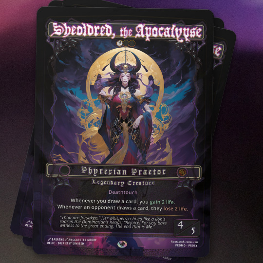
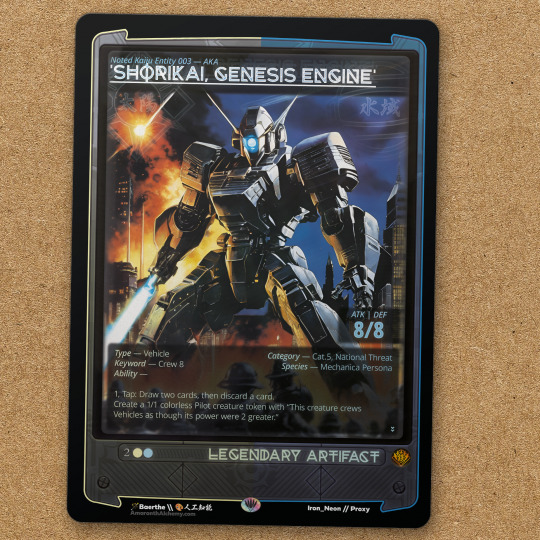
Some of the Work in Progress(es) that I am progressing work on (lol) for upcoming magic content. Much more time is spent working on the frames, layout, and UX because my time has been freed up with art editing (versus art illustration). Some proxies >:) Want to ideally do a few sets, conceptually thinking an 80s anime kaiju set (like a secret lair? I guess) and then unique "commander pack" sets that are little collections of cards (with the commander) relevant to a specific commander, like Atraxa (or Vilis is my other post). The Sheoldred here, conceptually, would be some sort of promo given out when I ship anything this year, but it's not satisfactory of a design yet for me.
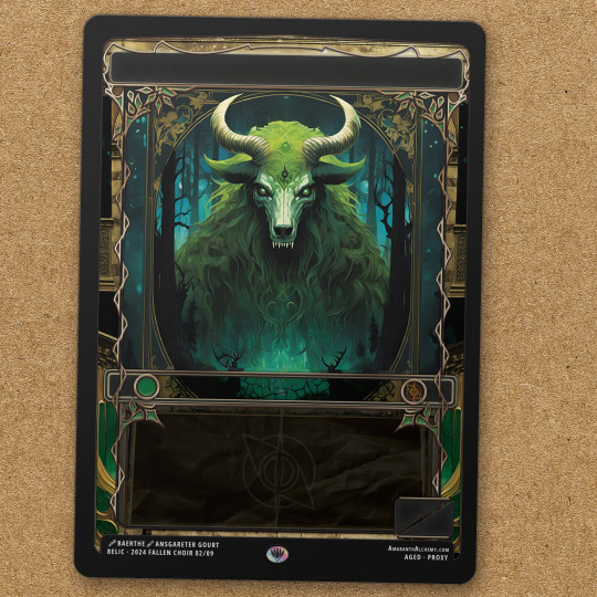

Also have more tokens wrapped up, but those are less fancy aren't they?

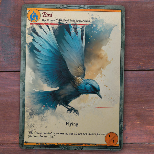


Been using Adobe Firefly as the Art base for the card illustrations (everything besides the base art is made from scratch by me, since my focus is being a graphic designer and art director). This has been going well, but requires a lot of repainting, which at first seemed daunting, but now is getting pretty straight forward.
#magicthegathering#graphicdesign#edh#mtg#tcg#art#mtgtokens#tokens#magic the gathering#magic proxies#adobe photoshop#adobe illustrator#graphic design
23 notes
·
View notes
Text
Games Like Sinister | Aesthetics
youtube
Quake is a classic; a fast and brutal shooter from id's glory days, and massively influential as a 3D first-person shooter. The story of its development is interesting - it was originally conceptualized as a high fantasy game, but development was grinding to a halt, and so the team literally said "Let's just make it like Doom" and scrapped the fantasy elements in favour of guns and sci fi trappings. They kept the original maps, however, which gives the finished game an interesting vibe. You start off in a grimy tech-base before heading into dismal worlds filled with castles and dungeons. The enemies are all a fusion of this too, like the Ogre, a hulking monster pulled straight from a fantasy setting, but brandishing a bloodied chainsaw and grenade launcher. This unapologetic smashing-together of the futuristic and the medieval gives Quake a look that's hard as nails, and it's the sort of thing I want to do with Sinister, but more surreal too.
youtube
I love Cruelty Squad. Yes, it's a mess of vibrant colours, leering faces and questionable design decisions that makes my retinas bubble like eggs in a pan, but it's a uniquely-designed tactical shooter and immersive sim with some of the most interesting themes I've seen out of a game. As stated by the Steam page, it takes place in a "sewer infused garbage world", a biopunk dystopia where hypercapitalism is rife and corporations rule like gods. It is undeniably surreal, but there are some distinguishable elements; even basic locations like a shipyard or police station are ominous and Gothic, with arches, spires, and wooden columns. Maps like Paradise have strange buildings with spinning towers, and faces are on every other surface, many appearing like medieval gargoyles or grotesques. This weirdness vaguely ties in with the story as well. In the most basic (read: comprehensible by the human mind) terms, death no longer exists - people can be brought back to life, and so the value of life plummets, both economically and philosophically. In the last non-secret level, Archon Grid, you have to kill Abraxas, essentially Death. The reason that level is so surreal, floating pillars and a nonsensical layout, is because it's the point where life and death break down. It's not just weird and off-putting ironically, there's nuance behind it, and it's definitely relevant to Sinister.
youtube
I've spoken about Thief before; mostly about cognitive processing, and how its mechanical complexity makes any modern AAA game look about as deep as a trough of pigswill in comparison. This time I want to focus on the aesthetic. I think the best way to describe it is Gaslamp Fantasy. It's clearly medieval on the surface; castles, stonework, nightwatchmen, bows, but there's a more technological aspect to it. The main villains, the religious fanatic Hammerites, bring more steampunk technology, with electric lights, gears, gauges, even security cameras. However, it doesn't dip its toes directly into steampunk, and the more Victorian associations of that genre; the society is still medieval in architecture and sensibilities, but people have access to steam engines and Tesla coils. If it's not obvious so far, I love strange machinery and moving components in level geometry, and to combine this with a medieval look that I already had planned is pretty viable for Sinister.
youtube
NecroVisioN is an interesting game; a World War 1 shooter, that's unique enough, but with a combo system, and zombies, and vampires... and mechs... and demons... and dragons... It's a super-edgy mess of a game, and I can't help but love it. The most relevant part of it is the aesthetic when you enter the vampires' realm, miles below No Man's Land. It's very Gothic, ornate stonework et cetera, but there's a strange mechanical vibe to it as well. Generators, cisterns, and pipes, but still in that Gothic style; they're attached to walls with ribbed vaults and flying buttresses. This game is also more relevant graphically; it retains the 2000s fantasy aesthetic I talked about previously, with its stone corridors steeped in bloom and anti-aliasing, lit up with strong coloured lighting.
youtube
I love Ultrakill; while I'm not very good at it, I feel the vibe it gives out and I LOVE it. Fast-paced combo-based retro-styled bloody mayhem, using the Divine Comedy as a metatext like all good combo-based video games. Beyond it using Greek mythology as a basis, which is already quite relevant for the project, every area has a very strong aesthetic. The Prelude is a bloodstained mining facility, Limbo is fake gardens and cathedrals, Lust is a blue-n-purple city in the sky, Gluttony is a massive digestive system, Greed is a desert of golden sand, Wrath is an ocean (the River Styx after mankind's souls caused it to flood), Heresy is a city raining blood, and I'm keeping myself blind to Violence and Fraud, but they seem to be a grey labyrinth and a massive judicial building respectively. The game is super varied with environments, but it manages to tread the line of mechanical and futuristic imagery versus Gothic and religious imagery very well, with my closest comparison being Warhammer. The most salient example of this is the Heresy layer, where liars and false prophets endure eternal torture in crypts of boiling blood; stained-glass tracery is visible alongside gigantic industrial chains, hauling weights and pulleys into unseen chambers. The fact that it also takes place in Hell is also pretty usable for Sinister.
#devlog#gamedev#indiegamedev#indiedev#indie games#indie game dev#indie game#nitrosodium#indie dev#Youtube
2 notes
·
View notes
Text
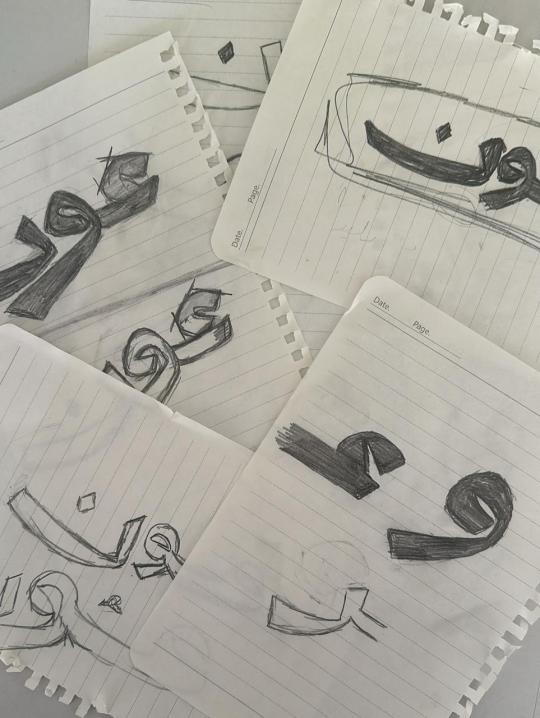
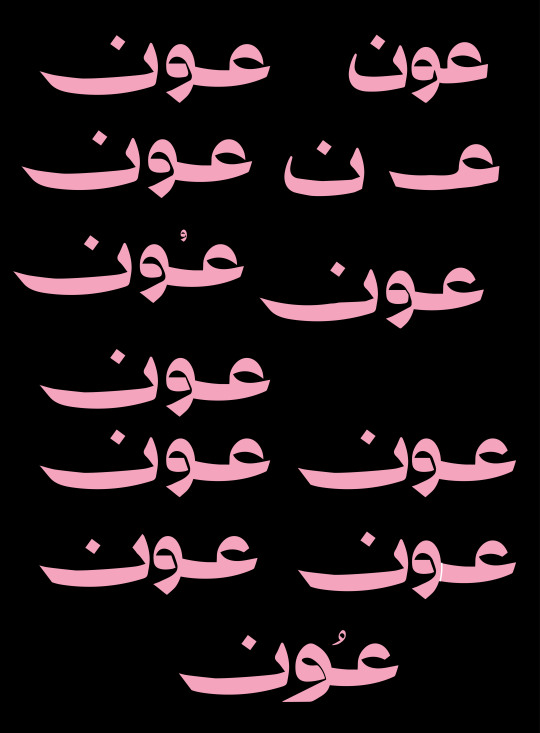
Week 03 - 02-01-2024
What was planned this week:
Work in Identity - logo - Digital
Work in Identity - color scheme - typography
Work in Identity – start work on the graphic element
What actually happened:
I have drawn more sketches of the logo
I collected more materials for inspiration for the graphic elements.
I chose different color schemes and typefaces that matched the tone of voice for my project.
I started to design the graphic elements and chose the style that I aimed for
I'm still experimenting with the logo, but I've roughly decided what I want to do with it.


Reflection:
This week, I concentrated on figuring out how the identity will look. I drew some logo ideas and sketches, picked colours and fonts, and started planning the overall visual style.
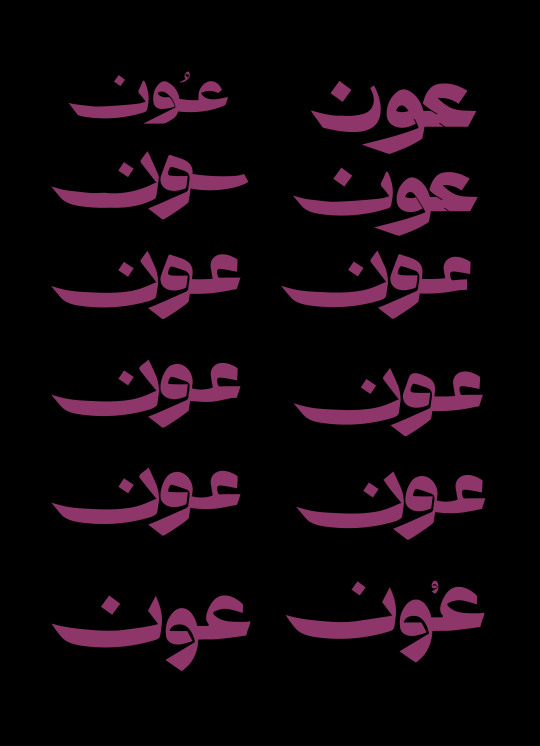
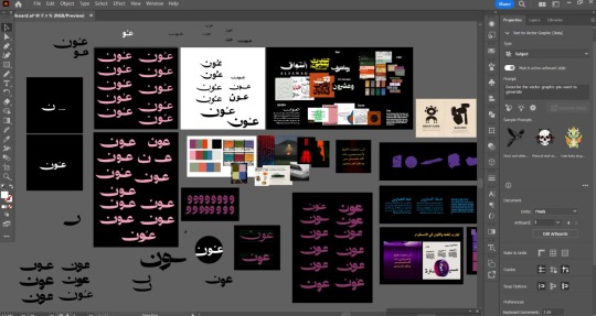
Regarding the logo, I redrew it by hand to give it more character. I made several adjustments to the letters until I got the desired result. I think I'm satisfied with the direction, but I'm still unhappy with the logo. I struggled with drawing the letter "ع" and making it cohesive with the other letters, so I believe I'll need more time.
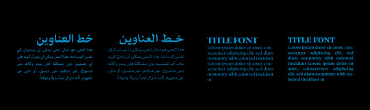
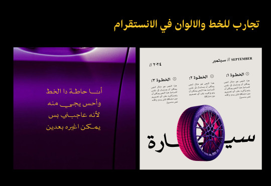
To save time, I chose the colours I wanted to use. Since my identity relies on photography, I selected two colour palettes with the possibility of adjusting shades when using images. Both palettes convey the same feeling I want to express.
I did the same for the font. I have a main font that suits the identity tone, and as a backup, I chose a similar font that is clearer if needed. I experimented with placing the font on the colours and created mock layouts for posts to see if the fonts and colours complemented each other.
Finally, I started sketching some graphic elements to save time and focus more on the logo. I think I succeeded to some extent; however, it needs adjustments. It's somewhat similar to the desired result, but I know there's still work to be done.
3 notes
·
View notes
Text
How do you generate and evaluate new ideas?
Personally, it depends on what sort of work I am doing. In terms of graphic design, I start with research. I delve into all the different areas that are relevant to the topic, create mood boards, mind maps. From here it progresses into development.
I start off with simple, designs and concepts, to get designs down on the pages and ideas flowing. The first idea does not need to be perfect. It needs time to grow as I discover what does and doesn’t work.
For personal artwork, I spend time developing traits, discovering what style I like. There is less focus on producing as many ideas as possible, and more of just exploring, trying new things and drawing what I fancy. If I decided I wanted to sell any of these designs then I would use the approach I stated earlier, coming up with different layout options etc.
In terms of evaluation, I note the areas I do and do not like and what I want to include in further designs.
How are you influenced by others work?
My style is always influenced by others work. Over the years I have picked up different traits that I have liked in artists/designers’ work.
Recently I have been influenced by an individual’s artistic study I saw on YouTube. He filled a sketchbook by only drawing in a blue pen. I have never considered drawing like this and have always struggled to fill a book. It has encouraged me to draw regardless, no matter the subject, no matter what the final thing looks like. I am currently completing a black and orange study.
What are your inspirational sources?
I am inspired by a lot of different things and look to different areas.
Debut Art – Through this site I find a artists and designers all with wildly different styles. This is often the starting block for a brief and creating artists studies and mood boards.
Artbooks – I like to collect things, one of those collections are art books (often about other things I collect). When I am stuck for ideas or a spark of inspiration, I will look through them. These include “The Gorillaz art book”, “Spider-man into the spiderverse: the art of the movie”, “The art of Horizon Zero Dawn” and “Anime Architecture”. They are often good inspiration for layouts.
Social Media – I am not overly active on social media, but sometimes they can be a true spark of inspiration. I do not actively search these sites, but when they I am influenced by something I see on them its pure coincidence.
What are your methods of work?
Throughout my degree I have discovered I am more visual in my research. I like mood boards and mind maps, with simple and to the point evaluations and analysis. The reason for this is that it is easier for me to refer to my research, I do not need to skim large pieces of text to find the bit I need.
In a professional scenario you have far less time for research, so have a quick but well understood research is important.
How do you evaluate them?
When I am evaluating, I like to break it down into categories, layout, colour, texture, typography, description etc. From there I then explore the pros and cons of each section. This allows me to narrow down what elements I want to take forward into development and what I want to avoid.
3 notes
·
View notes
Text
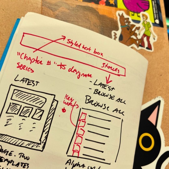
Designing Engaging Infographics in PowerPoint: A Step-by-Step Guide
Data To Creative Infographic in PowerPoint: Common Questions Answered
1.How to create an infographic presentation in PowerPoint?
To create an infographic presentation in PowerPoint, start by selecting a suitable template or a blank slide. Use SmartArt graphics to represent data visually and incorporate icons and images to enhance your points. Choose a cohesive color scheme and fonts for consistency. Use charts to display statistics and timelines for processes. Ensure each slide is not overcrowded focus on clarity and readability. Incorporate engaging elements like animations and transitions. Finally, review the presentation for flow and adjust as needed before presenting.
2. How do I make my infographic more creative?
To enhance your infographic's creativity, start by choosing a unique layout that breaks traditional formats. Incorporate eye-catching visuals like illustrations or custom icons instead of standard images. Use a bold color palette that reflects your message and evokes emotion. Experiment with typography by mixing fonts for emphasis while ensuring readability. Include storytelling elements, such as a clear narrative flow or engaging statistics. Finally, add interactive elements, if possible, like animations or clickable sections, to invite user engagement. Always keep your audience in mind to ensure the design resonates with them.
3. How do I edit an infographic in PowerPoint?
To edit an infographic in PowerPoint, select the infographic slide, then click on the elements you want to change. You can modify text by double-clicking it, adjust shapes or icons by using the format options in the toolbar, and change colors or styles via the "Format" tab. To rearrange elements, simply click and drag them. For more complex edits, right-click the infographic and select "Edit Data" if applicable. Once done, save your changes to preserve the updated infographic.
4. How do your present data in an infographic?
To present data in an infographic, start by defining your objective and target audience. Select relevant data and organize it into clear categories. Use visual elements like charts, graphs, and icons to represent data points effectively. Choose a cohesive color palette and font style to enhance readability and appeal. Incorporate concise text to explain the visuals without overwhelming the viewer. Ensure a logical flow by structuring the infographic in sections, guiding the audience through the information. Finally, include sources for credibility and ensure it’s optimized for both digital and print formats.
5. How to create a timeline infographic in PowerPoint?
To create a timeline infographic in PowerPoint, start by opening a new slide. Use the "Insert" tab to add shapes or SmartArt. Choose "Process" under SmartArt to select a timeline layout. Customize the timeline by adding text, dates, and icons to each point. Adjust colors and styles using the "Format" tab to enhance visual appeal. You can also add images or graphics to support your information. Finally, review and refine your infographic for clarity and coherence before saving or presenting.

Visit: VS Website See: VS Portfolio
0 notes
Text
Movement and Storyboarding
youtube
As stupid as the thumbnail looks, it's this video which helped shape the new direction of my film. I used to watch a lot of Source Film Maker animations when I was younger and this SFM tutorial reminded me of the stupid 3D animations that I used to love. They never make a lot of sense, things just happen but they happen in an unpredictable nonsensical way. I want to focus on that more than any defined narrative, I want to try and let my instincts guide this process and do whatever I enjoy not what looks flashy or technically difficult.
youtube
I grew up watching a lot of animations using Valve assets in SFM and this youtuber stuck out in my mind as an animator who enjoyed animating because of how improvisational they are as they hop between actions which they thought would be fun to animate. I want to try and do the same by flipping assets from sketchfab and other places to build my scene into a miniature world with lots of crap to make the spaces feel lived in where applicable.
youtube
This is a much more polished animation in SFM with great editing, animation and special effects which I saw last year and I want to try and emulate the fast cuts and closeups alongside the lower framerate and added 2D graphics as a way to cut the render time in half so it doesn't limit me giving me more time to experiment.
youtube
The characters in this animation feel like they're made of rubber because of how much the faces change from shot to shot, expressions are exagerrated to the point of caricatures and again the premise is stupid and unimportant. Its another animation where things just happen which is a little different from the guard duty premise I'm working with but I really want to bring this expressiveness into my film because its these outlandish unpredictable movements which I know that I'd enjoy making.
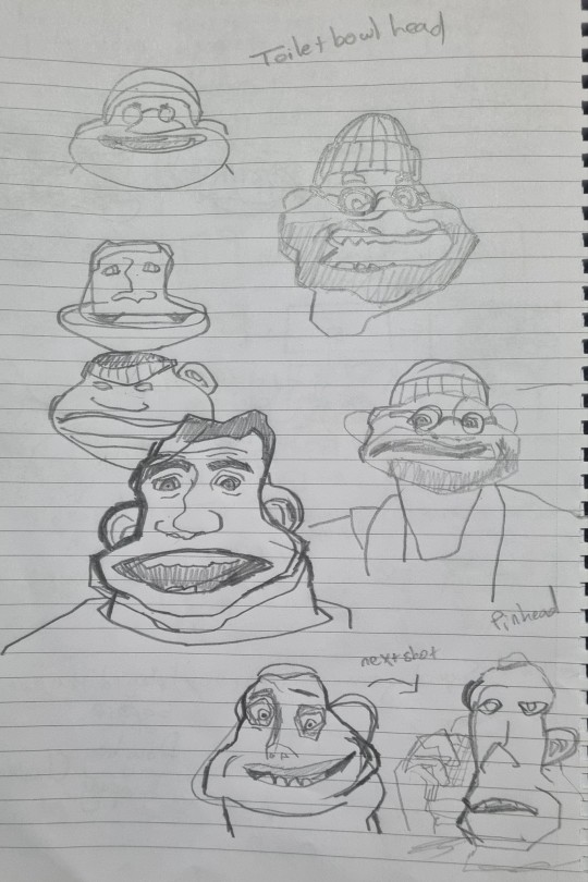
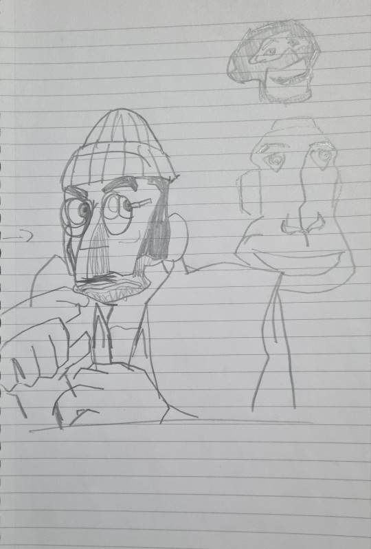
I sketched some of the faces to get an idea how the faces contort throughout looking almost unrecognisable if not for the voice and clothing. I want to bring this into the characters emphasising these expressions above making sure to include a walk cycle or other generic technical displays.
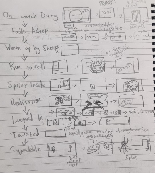
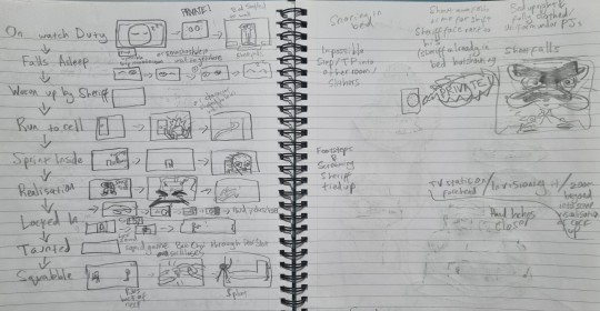
This is the roughest storyboard I've ever made and I don't expect it to make sense to anyone who isn't me but it's this layout which I want to develop and tidy up for the animatic, hopefully with some experiments with facial expressions in the process.


I tried messing around with the Ray Rig to see how difficult it would be to push facial expressions and shape to suit caricature the pose and action and after messing around for just a few minutes I found that it was actually really easy. It'll probably be much harder with my own rig because it wont be nearly as complex and versatile but I'll do my best to push the boundaries of the facial and mould it like clay.

This type of caricature was used in a lot of great animated shows I watched growing up where the shift in design would happen for a single frame. It's this sort of this which is similarly exaggerated in 3D in these SFM animations, I don't want to overdo it but I rarely see 3D characters moving in a stretchy cartoonish manner as realism is more often favoured.
0 notes
Text
CTS_ Question 2

Refining My Artistic Vision Through Simplicity and Social Engagement
In Week 10, I crafted an artistic vision statement outlining my design strengths, aspirations, actions, and guiding values. I identified typography and layout as my core strengths, aspiring to achieve financial independence. My action plan centers on people's perspective-first approach, satisfying people first to cultivate mutual success. My guiding value emphasizes continuous learning from real-world practice, focusing on purposeful growth.
After reflecting on my vision and considering feedback from classmates, I see room for refinement. While financial goals are important, I realize that true fulfillment in design lies in balancing client satisfaction with meaningful social engagement. This shift in focus from profit to addressing real-world issues makes my vision more grounded and purposeful.
The Influence of Dieter Rams on Social Engagement

A design philosophy that resonates with me is Dieter Rams’ principle of simplicity, captured by his statement, “Good design is as little design as possible.” Rams’ work emphasizes functional, need-driven design, which aligns with the Week 3 concept of *context*, where we explored the social impact of the housing market in Singapore (our group chosen topic). His philosophy is exemplified in his work with Braun, where everyday products are crafted with simplicity and purpose. This connection between design and function mirrors the themes in CTS B, week 11 discussion like “Design with Care” and “Take Users into Consideration,” encouraging us to think critically about design’s impact on society. (Domingo, 2024)

Rams' approach inspires me to create designs that not only look appealing but also address core needs, similar to how his Braun products prioritize practicality. A modern example of this is the “One Laptop per Child” (OLPC) project, which aims to make education accessible through low-cost, durable laptops designed for children in underserved communities. OLPC embodies Rams’ philosophy of “less, but better,” allowing for improved accessibility without unnecessary features. (About OLPC – OLPC, n.d.)

Another example is *Project H Design*, founded by Emily Pilloton, which emphasizes socially engaged design. This initiative creates meaningful impact through practical design solutions like sustainable school furniture and public structures for low-income communities. Project H illustrates how design can transcend aesthetics, serving a greater purpose in society, aligning perfectly with Rams' belief in design as a tool for social betterment. (Emily Pilloton and Project H in the LimeLight - Core77, n.d.)
Aspiration for Purpose-Driven Design
Inspired by Rams and contemporary projects like OLPC and Project H, I want my design work to embody simplicity while serving real-world needs, especially in areas like housing accessibility and public space design. Edward Tufte’s idea of “Simple design, intense content” resonates with me, as it values depth without distraction. (Edward Tufte & Graphics Press, 2024)

As I refine my vision, I see my goal as not just financial success but also creating designs that engage meaningfully with people’s lives. By following Rams’ principles of function and simplicity, I hope to contribute to solutions that resonate with clients while fostering a broader social impact, achieving both satisfaction and significance in my work.
(499 words)
References:
Q, F. &. (n.d.). What is “Good” Design? A quick look at Dieter Rams’ Ten Principles. Design Museum. https://designmuseum.org/discover-design/all-stories/what-is-good-design-a-quick-look-at-dieter-rams-ten-principles
Domingo, M. G. (2024b, November 2). Dieter Rams: 10 Timeless Commandments for Good Design. The Interaction Design Foundation. https://www.interaction-design.org/literature/article/dieter-rams-10-timeless-commandments-for-good-design
About OLPC – OLPC. (n.d.). https://laptop.org/aboutolpc/
Emily Pilloton and Project H in the LimeLight - Core77. (n.d.). Core77. https://www.core77.com/posts/11552/Emily-Pilloton-and-Project-H-in-the-LimeLight#:~:text=To%20set%20things%20on%20track%20to%20where%20they,learning%20in%20both%20the%20US%20and%20developing%20markets.
Edward Tufte & Graphics Press. (2024, January 17). Feynman-Tufte principle | Edward Tufte. Edward Tufte. https://www.edwardtufte.com/notebook/feynman-tufte-principle/
0 notes
Text
Do you know that 93% of business decisions begin with a search engine query? If you don't have a website, you're only reaching 7% of your target market. That's true; you're decreasing your company's prospective size by 93%. We understand that maintaining a website is extremely important for any company. But how can we do that? There are thousands of ways to build a website. However, all of them are not for the tech novice. In this article, I will show you how you make a website most easily. Are you ready for that? Let's start. How To Create A Website In 5 Simple Steps There are five key elements to remember if you want to develop a website fast and efficiently. Step 1: Plan the layout and structure of your website. Step 2: Select a Website Platform Step 3: Select a domain name and web hosting services. Step 4: Create a Website and Begin Designing Let's look at them in detail. Step 1: Plan The Layout And Structure Of Your Website. Planning is crucial when you design a company website. It decides how your potential customers interact with you and increase sales. Your strategy will assist you in deciding on the layout of your website and what content, graphics, and features you would need to create. Step 2: Select a Website Platform The second step is to decide on the platform you will create your website. There are several methods for creating a website. However, the two most straightforward ways are website builder and WordPress. Some popular website builders are Wix, Squarespace, Drupal, and Joomla. A large number of people utilize website builders to create their websites. Wix alone has more than 100 million users, and Shopify recently exceeded 1.2 million. Website builders imply that anybody can create a website. Why is this the case? Making a website in the early days of the internet necessitated a solid knowledge of HTML (Hypertext Markup Language). Then CSS (Cascading Style Sheets) arrived to complicate matters further. Website builders handle the technical language, allowing you to focus on design and content. Some achieve this using template, while others use drag-and-drop interfaces that make creating a website as simple as putting together a PowerPoint presentation. On the other hand, WordPress gives you flexibility. WordPress is used by approximately half of all websites on the internet. Unlike website builders, WordPress is free to download, install, and use. It's very customizable and simple to use. The website you create will be responsive right away, appearing impressive on any mobile device, smartphone, or tablet. There's no need to pay a web developer for this. Step 3: Select A Domain Name And Web Hosting Services There are two things you'll need to get a new website up and running: a domain name and a hosting place. To launch your website online, you must select a simple domain name and a reputable web hosting service. A domain name is a portion of a URL that recognizes a web page. A domain name should fully portray your company as it is the first thing website visitors and consumers connect with you. It might be your name or the name of your company. Here are some general guidelines to follow while selecting a domain name: Keep it meaningful: Check that the domain reflects what visitors see when they come to your website. Keep it brief: If you want visitors to remember your website, don't choose a domain with hundreds of characters. It will appear ridiculous, and no one will memorize it. Avoid using numerals: It is better to avoid using numerals in domain names. It appears unprofessional. Also, it provides another factor for people to remember. Check the availability: There are already thousands of web pages on the internet. This implies there are already thousands of domains in use. Before you commit, make sure yours is unique. Step 4: Create a Website and Begin Designing We've arrived at the exciting part — it's time to design your website. 1 - Design with a website builder
You've decided to sign up for a plan of the website builder. You're all set to start building a website. Instead of leaving you to figure it out on your own, website builders provide you with templates to help you along the way. Templates give a solid framework for your website. You can easily design your website with just drag and drop. Regardless of which website builder you pick, you'll have a wide range of templates to choose from. The more templates you can use, the better your plan. The best builders give an extensive collection of templates in many categories, including - Restaurants, Photography, Blogs, eCommerce, etc. 2 - Design with WordPress If you want more flexibility and have some IT skills, you should choose WordPress without any doubt. To develop a website in WordPress, first install WordPress in your hosting. There are two ways to install WordPress. One is a one-click installation, and the other is a manual installation. Nowadays, almost all well-known and reputable web hosting providers offer one-click WordPress installations. You can install WordPress easily in this way. Otherwise, you have to install it manually. In the following phase, we'll look at WordPress themes and how to edit them. You can edit these themes and customize them as per your need. Fortunately, WordPress provides a plethora of themes to select from. The official WordPress theme library alone has over 8,000 themes that are entirely free to use. Navigate to Appearance > Themes and click on the huge + symbol labeled Add New Theme. The most crucial component of beginning a new website, like many other things in life, is getting started! The solution you choose to design your website is a matter of personal choice and ability level. So don't worry, if you're not convinced about either choice yet — you can try them both. Have you created your website? Let us know in the comments.
0 notes
Text
How to Get a Custom-Looking Website on a Budget

Have you ever visited a sleek, professional website and thought, I wish my website looked like that, but I don’t have the budget for it? If that sounds familiar, you’re not alone. Many small business owners and entrepreneurs assume that custom-looking websites come with a sky-high price tag. But here’s the good news—you don’t need a fortune to build a site that looks great and works like a charm.
With a bit of planning, creativity, and the right resources, you can create a stunning website that looks far from “cheap.” In fact, working with a cheap website designer who knows their stuff can be one of the smartest decisions you make. Let’s dive into how you can get the most out of your budget while building a site that truly stands out.
Start with a Plan: What Do You Really Need?
Before you even think about hiring someone, sit down and get clear on what you need—and what you don’t need. Do you need a fancy animation on your homepage? Maybe not. Do you need a contact form that works? Absolutely.
A common mistake people make is overloading their site with features that drive up costs without adding much value. Focus on the essentials:
Homepage: Introduces your brand and what you do.
About Page: Tells visitors who you are and what you stand for.
Services or Products Page: Showcases what you offer.
Contact Page: Makes it easy for people to reach you.
By cutting out unnecessary extras, you can save money and keep the design simple, clean, and effective.
Use Templates—but Customize Them Wisely
One of the easiest ways to get a professional look on a budget is by starting with a template. Platforms like WordPress, Wix, and Squarespace offer plenty of templates designed by professionals. These templates provide a solid foundation—you just need to tweak them to make them your own.
The trick to making a template feel custom? Personalization. Use your brand’s colors, fonts, and unique images to give it that tailored touch. A cheap web design approach doesn’t mean cutting corners—it means working smarter by using tools that are already available.
The Magic of Minimalism: Less Can Be More
When you’re working with a budget, embracing minimalism can be your best friend. A website with a simple layout can look far more elegant than one cluttered with unnecessary elements. Think about brands like Apple—they thrive on clean, minimalist design.
A skilled cheap website designer will know how to make a minimalist design work in your favor. With the right spacing, typography, and visuals, your site can look high-end even without complex design features.
Leverage Free (or Affordable) Resources
You don’t need a professional photographer to fill your site with great images. Websites like Pexels, Unsplash, and Canva offer high-quality stock photos and design templates that won’t cost you a dime. Canva even lets you create custom graphics, banners, and social media posts with drag-and-drop tools.
Need extra functionality, like SEO tools or a contact form? WordPress offers free plugins that can do the job. And if you want a little more power, many plugins have affordable premium versions that are still budget-friendly.
Find the Right Cheap Website Designer
Now, let’s talk about finding the right person to help you bring your vision to life. A cheap website designer doesn’t mean someone who delivers poor-quality work. It means finding someone who offers fair rates and understands how to work within your budget.
Freelance platforms like Fiverr and Upwork are great places to find affordable designers. Many freelancers offer packages tailored to small businesses, so you can pick and choose the services that fit your needs. Be sure to read reviews and look at portfolios—this will give you a good idea of what to expect.
Also, don’t be afraid to ask for recommendations. If you know other business owners with great websites, ask who they worked with. Sometimes the best deals come from personal referrals.
DIY Where You Can, Delegate Where You Can’t
If you’re comfortable with technology, you can save a lot by handling some parts of the process yourself. For example, platforms like WordPress let you set up your site with minimal technical skills. You can even learn some basic SEO to improve your site’s visibility on search engines.
However, if design isn’t your strength, don’t stress. This is where a cheap web design service can help. Hiring a professional for the trickier parts, like layouts or integrating custom features, ensures that your site not only looks good but also functions smoothly.
A Real-Life Example: John’s Café Website
Let me tell you about a friend of mine, John, who runs a cozy little café. When he first thought about creating a website, he was overwhelmed by the high quotes he got from big design firms. But instead of giving up, he decided to work with a cheap website designer he found online.
Together, they chose a simple WordPress template and customized it with photos of his café, a contact form for reservations, and a menu page. John even learned how to update the blog section himself to post café news. The total cost? Less than half of what he’d been quoted originally. And now, his website looks polished and professional—exactly what he needed to attract more customers.
The Bottom Line: You Can Build a Great Website on a Budget
Creating a custom-looking website doesn’t have to drain your savings. By focusing on essentials, using templates wisely, and working with a cheap website designer, you can get a site that looks polished and professional without breaking the bank.
So, what’s holding you back from launching your dream website? With a little creativity and the right strategy, you’ll be amazed at what you can achieve on a budget. Have any tips for building a website affordably? Share them in the comments—we’d love to hear your thoughts!
And remember, whether you’re starting fresh or looking to revamp your current site, there’s always a way to build something beautiful without blowing your budget. The key is to work smart, not hard!
0 notes
Text
MSI Stealth A16 AI+ Copilot+ PC’s Most Powerful Capabilities
The most powerful Copilot+ PC available is the new MSI Stealth A16 AI+, a performance laptop that is lightweight and thin. For those looking for elite performance combined with the soon-to-be Copilot+ capabilities, this is ideal.
MSI Stealth A16 AI+ Features
The Discreet Legacy: A Lightweight, Potent Dedicated Laptop
MSI’s Stealth series consistently balanced power and maneuverability. Despite its 19.9 mm thickness and 2.1 kg weight, the Stealth A16’s magnesium-aluminum alloy chassis houses high-performance electronics. The small size belies its might. The 12-core Ryzen AI 9 HX 370 CPU, 105W RTX 4070 graphics, and lightning-fast LPDDR5x-7500 memory make the Stealth A16 the most powerful Copilot+ PC. It offers outstanding performance for AI applications as well as gaming.
Its sophisticated cooling system is the secret to its domination in the Copilot+ PC market. The powerful HX 370 CPU and RTX 4070 graphics are kept cool by MSI’s unique Cooler Boost 5 technology, which includes two fans, five heat pipes, and a phase-change thermal pad. This allows the laptop to retain peak performance.
RTX 40 + XDNA 2: A Real AI Powerhouse
The need for high-performance AI PCs is rising as AI-driven software becomes more common, and the Stealth A16 is prepared for the future. The HX 370 processor’s XDNA 2-based NPU (Neural Processing Unit) can produce up to 50 TOPS, which is more than what is needed for Copilot+ PCs. A real AI computing beast, this laptop has an RTX 40 series GPU with up to 321 TOPS. The Stealth A16’s remarkable specifications guarantee that it can effortlessly manage any AI-powered application, providing a seamless and responsive user interface.
Conveniently designed with full-size keyboard and versatile I/O
Professionals who require a strong, portable laptop for demanding activities are the target audience for the Stealth A16. It has a wide range of connectors, including as HDMI, USB-A, USB-C, and an RJ-45 LAN port a feature that is becoming uncommon in thin laptops. Recognizing the value of this functionality for people working with spreadsheets or mathematical applications like Excel and MATLAB, MSI has also incorporated a full-size keyboard with a numpad. Because of this, the Stealth A16 is one of the few thin 16-inch laptops with such a practical layout.
All-Day Productivity with a 99.9Wh Battery
Strong laptops often raise concerns about battery life, but the Stealth A16 allays such fears. It has a gigantic 99.9Wh battery, which is the greatest size permitted for flying. When paired with the effective Ryzen 9 AI CPU, it offers an amazing 12 hours of 1080p movie playback or 14 hours of work on a single charge, making it both very powerful and incredibly portable.
The Ultimate Copilot+: Stealth A16 AI+ Computer
In conclusion, the new MSI Stealth A16 AI+ is the ideal option if you’re looking for a powerful, portable, and long-lasting PC that excels at AI tasks and offers excellent performance for work, entertainment, and gaming. It’s the most powerful and adaptable Copilot+ PC available right now.
A New Era Of AI Begins
Realize your creative ideas: Copilot collaborates with you to write, edit, summarize, produce content, and even provide advice. Your laptop is automatically adjusted to the best possible settings by the MSI AI Engine. Use AI’s strength whenever and whenever you want.
Copilot+ Computer
Copilot will be there to assist you with any task, whether you’re writing, chatting, coding, creating, or just surfing. With a simple right-click, chat, or hello, you may be inspired, transform ideas into material, and enhance your talents.
MSI AI Engine
MSI AI Engine monitors user behavior and adjusts hardware settings to optimize performance. You can focus on creating, working, and having fun with simple AI-tuned settings and resources.
Read more on Govindhtech.com
#Copilot+PC#RTX4070graphics#RyzenAI#LPDDR5x#MSIStealthseries#StealthA16#StealthA16+#Laptop#News#Technews#Technology#Technologynews#Technologytrends#govindhtech
0 notes