#i want something cartoony but still good clear quality
Explore tagged Tumblr posts
Text
I really want a TMNT tattoo this year. Thinking about going back to the guy who did my banana sticker piece but also wondering if I should look around more for other artists in the area because I do like variety
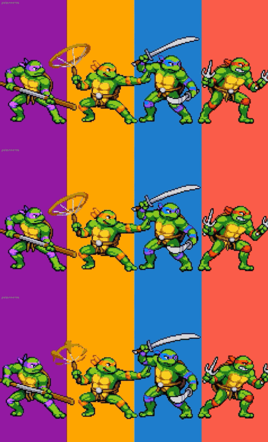
Does anybody know of any high quality, fun cartoony/fandom enthusiast tattoo artists in the PDX area??
#on the lookout for good local tattoo artists#tattoo ideas#tmnt tattoo#i want something cartoony but still good clear quality#in my head it's the phrase 'cowabunga dude!' in the classic font with like iconic character items scattered around/on the letters#tattoos de faye#it would go on the side of my right thigh (plenty of space)#also would cement my right leg as my fandom leg#already have my Harley Quinn pinup on the calf and banana sticker above my knee
6 notes
·
View notes
Text
Tkachuky Derby & Hughesapalooza - 2024
*click for better detail- apologies for the lighting and general quality of the pics 😓!!*
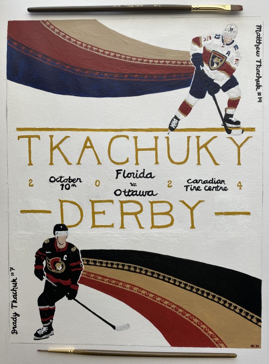
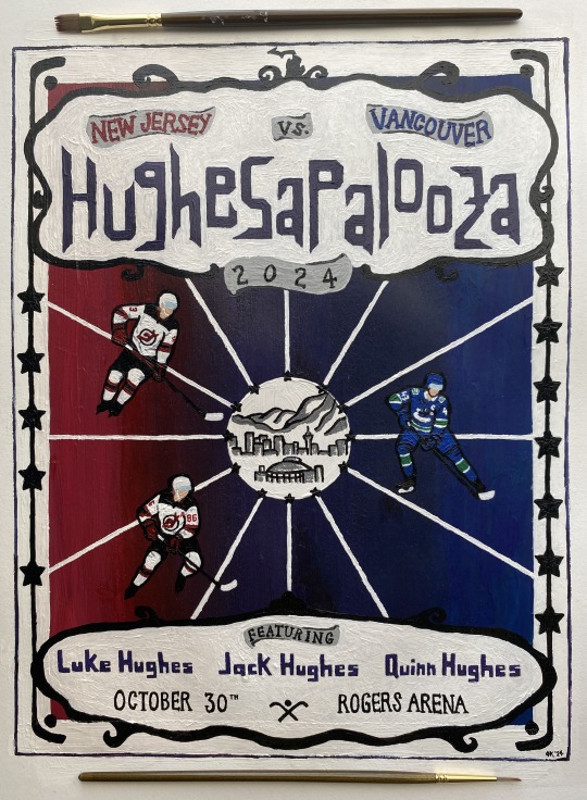
acrylic on paper
please don't steal or repost 💚
inspired by this tweet specifically (plus credit to the earliest twitter mentions i could find):

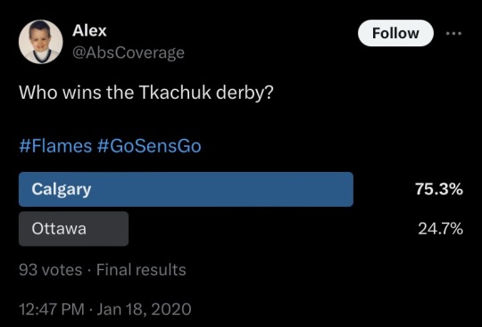
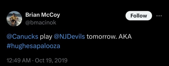
Made these for my fellow brothers bowls enthusiasts!! Especially those who know it’s all about the intricate webs of familial narratives in athletics. and the concepts of destiny and talent. and brothers as both allies and adversaries. and the bonds between siblings. and…
links to inspo, reference images, and other thoughts below the cut!
THEY'RE DONEEEEEE!! 😭🙌 i spent probably 2-3 full days' worth of time from concept sketches to final products. so much paint. so much frustration. they're still not perfect - there's little issues on both (if you notice something, i promise i'm aware of it!!) but 'fixing' stuff in acrylic often leads down a rabbit hole and i just had to call it and be done.
there's intentional little details on both - let me know what you catch! hopefully you can see them okay 😅
*i know they play each other more than once per season but i only wanted to make these for their first '24-'25 meetings)*
Let's get some whimsy up in here now, boys!
Derby:
team colors - Panthers Senators
matthew reference
brady reference
Kentucky Derby posters inspo
I wanted to keep the derby poster more 'clean' graphically. lots of derby posters have sharp lines of color and lots of movement, so i knew i wanted large swaths of the team colors somehow (thanks to the ppl that voted on my poll for what the team color shaping should be! i did follow the winning choice lol) chose poses where they look like they are moving in the direction of the 'flow.' generally wanted to keep focus on the idea of matthew vs brady, so i have them 'looking' across the way. was originally going to put in outlines of skylines for cities relevant to them, but that proved to be way too big of an undertaking so i scrapped that idea and came up with some different references. put some detailing for each of them that i'm reallyyyyy hoping you can see when you like zoom into it, but here’s some closer pics:
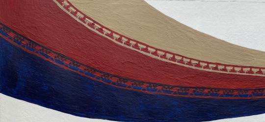
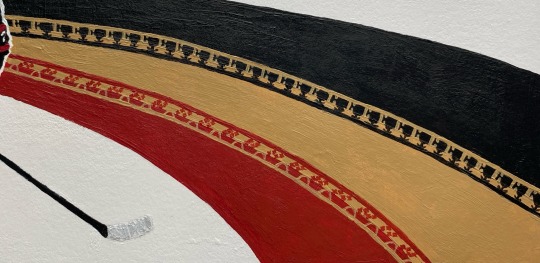
their last name is ukrainian for weaver, so i wanted to put a little nod to that somehow. not sure it will translate/be clear to viewers, but i limited myself by making the poster so damn small...*I* know they're there and can see them lol if it's not clear to ppl i will come back here and explicitly say what they are lol
Palooza:
team colors - Devils Canucks
luke reference
jack reference
quinn reference
Music posters inspo
inspired by lolla/music posters. wanted a more 'fun' vibe overall. while the derby poster would be more for say like, putting on a wall or hypothetically used for marketing purposes, palooza was more marketing poster and maybe on a t-shirt, too. definitely wanted a calligraphy type font for the name - just felt it out and came up with that shaping. tried to reference lolla a bit. used the devils and canucks coloring - and combo of those (did you notice?) - for the palette. wanted it to be a bit more pop graphic-ish (and hopefully not too cartoony). used some hockey/venue shapes and references, as well as some little hugheses-specific easter eggs...fun fact: the reference pic i used for jack is the EXACT SAME as his nhl25 cover. they just edited it to have the devils' home jersey colors. (i was like wait a second....i know that pose. bc i've been staring at it trying to paint it for hours!!!)
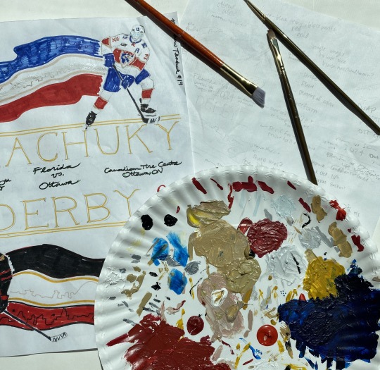
some pics of the palettes and initial sketches:
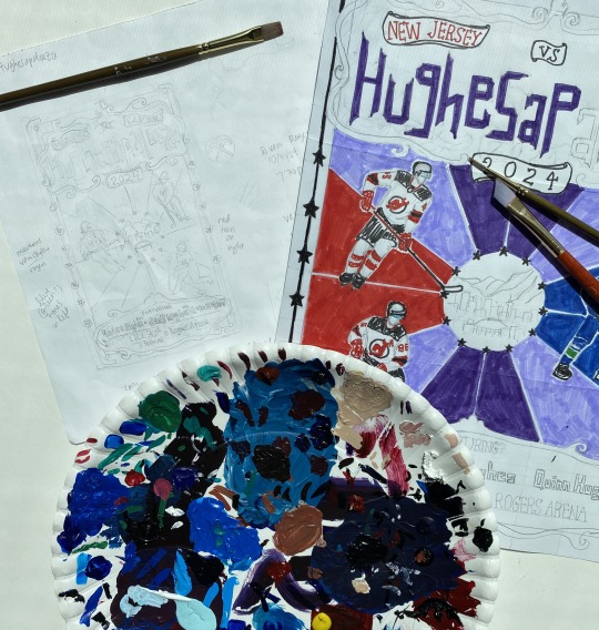
If anyone has fun nicknames for other nhl brothers bowls, i’d be open to making more posters! Lmk!
If u read all this just know i love u and hope you have a good day 🫶
#AHHHHH i'm scared but here they are#hope y’all like them 🫣#lmk what details you notice 👀 (me praying i painted them good enough and that they’re even visible/noticeable)#me#tkachuky derby#hughesapalooza#hockey art#tkachuk brothers#hughes brothers#matthew tkachuk#brady tkachuk#luke hughes#jack hughes#quinn hughes#panthers#senators#devils#canucks#nhl art#blue.art
123 notes
·
View notes
Text
Top 20 BEST Animated Series of the 2010s-4th Place
To anyone who plans on making a reboot of their favorite show in the future, you might want to take notes on this next pick. Because if you ask me, this next series that I'm going to talk about is the best example of how to do a reboot properly.
#4-Ducktales (2017-2021)
The Plot: Scrooge McDuck is the richest duck in the world, who made it big by also being one of the greatest adventurers of all time...ten years ago. Sadly, after an unfortunate accident with the family, Scrooge is forced to live the life of a normal businessman-er-duck. Up until Donald Duck asks Scrooge to watch over his nephews: Huey, Dewey, and Louie. What starts off as a single day of babysitting soon turns into a life of adventure as Scrooge gets back into the adventuring spirit to show his new family what the world really has to offer.
Now I want to make one thing clear: As of the moment of me writing this review, I have seen a total of zero episodes of the original Ducktales. That being said, despite my limited knowledge of the series, I still think it’s fair of me to point out how this is hands down the best reboot as of late (and I’ll explain more as to why that is later). And besides, from what I’ve heard from fans who have watched the original, Ducktales (2017) is a pretty faithful adaptation of the beloved franchise. The reason is that I believe this show remembers the two most important rules of making a reboot.
The first rule of a reboot is to try something new while still being faithful to the source material. Doing something like that is simple as a writer just needs to keep what the fans love and change what they hated. And trust me when I say that the writers of Ducktales (2017) knows how to do just that. For the most part, the show is about a family going on crazy globe-trotting adventures while still learning that family is the best adventure of all, much like the original. As for the characters, most of them keep their fun personalities. Scrooge is still a stingy miser with the heart for adventure, Launchpad is still the lovable idiot who can’t fly a plane, and Donald Duck still remains the one who gets stuck with all the bad luck. Then some characters have their personalities/roles revamped into something that improves upon the original. The best example is Fenton, who is still the wannabe superhero but is now a scientist in this show, wherein the old one was just Scrooge’s accountant. This way, both the hero and the man-DUCK-who’s behind the mask are equally capable of saving the day. There’s also Mrs. Beakley, who was originally a nanny that nagged Scrooge’s ear off for putting the kids in danger. In the reboot, she’s treated more as the anchor of reality to the more oddball characters, who also used to be a kick-butt super spy in her younger years. It is still the same role, but a different interpretation.
Now, some characters receive grand changes to their original personalities. But from what I’ve heard, those changes are made for the better. And there are no characters that need it more than the children. More specifically, Huey, Dewey, and Louie. This show does something that I’m eternally grateful for, and that’s giving each of these three their own distinct personalities and quirks. For years I couldn’t for the life of me tell the triplets apart. They had the same design, the same voice, the same personality, and the only difference people had to go off of are their different colors (which really didn’t do much to help). Here, they have different designs, voices, and now defining character traits for each of them. Huey is the smart and responsible boy scout, Dewey is the annoying attention seeker, and Louie is the best character in the entire show, and I WILL FREAKING FIGHT YOU ON THAT! And let us not forget the most appreciated change: Webby. From what I’ve heard, fans hated the original Webby, as she was nothing more than just the stereotypical girl of the group. Here, she’s given an actual personality and a fun one to boot. Webby is the ecstatic thrill-seeking adventurer who is skilled in combat training (thanks to her grandma) and is (of course) a socially awkward girl who wants to make friends. Like I said, this show took the idea that the fans hated and changed it into something that they’ll love. Which makes sense why the writers mastered this because they themselves are real fans of the show.
It is clear how much the writers are fans of the Ducktales franchise as they filled Ducktales (2017) with many references. And not just references to the original series but also references to the classic comics by Carl Barks and even the NES video game from the 1980s (seriously, this show will make you feel things about the “Moon Theme” you wouldn’t think was possible!). Even the show’s animation seems to be a homage to both the cartoon and comics. Not only do the characters and backgrounds have a more comic book style to them, but the characters also work on a mix of realistic and cartoony logic. And let me just say, it is refreshing to see characters in a Disney show have cartoon logic to them since Wander Over Yonder got canceled. And it’s not just Ducktales that the series reference, but even classic Disney movies (of course) and other shows in the Disney Afternoon lineup. And when it comes to these references, it’s more than just a subtle wink to the fans. The writers actually go out of their way to write a story around these beloved characters, so people who don’t get the joke won’t be one-hundred percent lost. For instance, without giving anything away, the writers found a brilliant way to reintroduce Darkwing Duck in this universe that feels right for this famous character. And if you ask me personally, these are the best ways to handle references for a reboot. Make them work within the story, even if you don’t fully get the joke.
This brings me to the second most important rule of a reboot: Make a quality product even though it is based on something else. Let us pretend that the original never existed. Would Ducktales (2017) still be as good as it is now? Personally, as a person who has never seen the original, I think it is.
This is another show that mixes slice of life episodes with adventure ones, similar to My Little Pony: Friendship is Magic. And just like Friendship is Magic, both are equally interesting because the characters themselves make them so. No matter what situation the Duck Family are in, the audience will care about it because the characters care about it. In fact, I think Ducktales (2017) handles the mix of slice of life and adventure much better than Friendship is Magic. In MLP: FiM, the adventure-based episodes force the characters to stick to their simple personality traits to move the story forward, and character-based ones help them grow. In Ducktales (2017), because the characters regularly go on adventures, they grow as characters no matter the situation. For example, my favorite episode is “The Great Dime Chase” where the main plot is Louie finding Scrooge’s #1 dime after accidentally spending it. While in that same episode, Dewey and Webby try to solve a mystery around the boys’ mom. We get a great lesson about the importance of hard work and a fascinating plot of an overarching mystery within the season, all taking place within the same episode. Both are interesting, neither feels as though it overshadows the other, and the characters develop along the way.
Another thing this show mixes well is comedy and drama. A lot of shows recently tried way too hard to find that perfect mix. Ducktales (2017) is one of the few examples that nails it. The comedy is hilarious, the drama is endearing, and neither feels like it’s prioritized over the other. The show starts off with this mix as well, where others that I’ve talked about seem to start off as purely comedic only to take themselves more seriously later on. That isn’t entirely a bad thing, but I feel as though Ducktales (2017) is the best way to go about the method. That way, fans won’t be complaining about how much “better” the show used to be in its first batch of episodes, much like Star V.S. the Forces of Evil.
Unfortunately, while I recommend this show, it’s not without its fair share of issues. Or rather, issue, as there really is only one problem I have with it. And that problem can be summed up with one name: Dewey Duck. For the most part, I dislike Dewy. Because he’s nothing more than a Ben Schwarts character. No disrespect to Ben Schwarts himself, but lately, it feels as though he only plays the one character from time to time: The egotistical attention seeker slowly and surely learning to be a better person who realizes that not everything is about him. That’s the character he plays in both Rise of the Teenage Mutant Ninja Turtles and Sonic the Hedgehog (2020), and it’s the character he plays here. And the thing about these characters is that they’re not as lovable as Ben Schwarts thinks they sound. In fact (and, again, I mean no disrespect to the actor. I’m sure he’s a lovely person in real life), every single one of these characters comes off as kind of annoying rather than as the lovable rapscallions I’m sure they’re meant to be. However, there is one thing worth mentioning about Dewey. While he’s portrayed as annoying when used for comedy, Dewey is surprisingly a compelling character when used for drama. The thing is, he’s rarely used for dramatic moments and is meant as a source of comedy. Hence why I said I disliked him for the most part.
Other than that, there aren’t really that many problems with the show. Well, there are, but they’re mostly nitpicks that the series more than makes up for. Is it weird that the kids are voiced by adults? Yes, but the actors do a great job at being sincere and have great comedic timing than any kid could have. Are there changes to characters that fans might not enjoy? Probably, but I have yet to have seen anyone that has annoyed me as much as Dewey has. Are the villains just evil for the sake of being evil? Yes, but that’s not really a big deal. In fact, a villain doesn’t need a heartbreaking backstory as to why they’ve become so evil. They just need to have a great personality that’s fun to watch, which every villain in the show has (aside from season two’s antagonist who’s basically a Disney surprise villain. And I hate them with a fiery passion). Does it feel as though the show suffers from “too many characters” syndrome? It sometimes does, but each character has such a fun and unique personality that I find it hard to forget most of them.
So really, Ducktales (2017) is the best reboot in recent memory. This is crazy, seeing as how lately it feels as though Disney doesn’t even know how to properly reboot their own movies to save their lives. This is why I feel as though people should take notes on what Ducktales (2017) does if they ever feel like rebooting something they loved as a kid. Because this is more than just a retelling of the same story that people know by heart. This is a fantastic show with even better characters, stories, and tone. Whether you’ve been a fan since the beginning, or a part of the new generation of viewers, odds are you’ll be screaming Whoo-Ooo with every episode.
(Also, a word of warning to those who haven’t watched the show yet: Beware the theme song. Trust me when I say it’ll be stuck in your head until the day you die)
13 notes
·
View notes
Text
Fazbear Frights 1-9 review.
Into The Pit:
Slow and meandering during the first half but picks up speed after Spring Bonnie shows up. Good message and good idea, but the execution could be better. 6/10
To Be Beautiful:
This story is so full of fluff, you can cut out like 60% of it and lose nothing. I know it's going for a fairy tale thing with the repetition and all, but fairy tales do that because it's made for children. Repetition is to train a child's brain to remember better. These books are aimed at teenagers, so this narrative device is not needed. On top of that, it has unfortunate implications of "Not like other girls" memes that we don't need to revisit. Only saved by its creepy af ending. 3/10
Count The Ways:
Legitimately my favorite story out of FNAF and one of my favorites of all time. It fixed the previous story's Not Like Other Girls problems by having the goth main character hate the pretty blonde and being called out for not even knowing her and being shallow. It is actually surprising to have these two stories be back to back.
The narrative device of switching back and forth between the MC facing her death and how she got up to that point means it keeps your interest throughout that the previous two stories had problems with. It makes for great drama and tension.
The main reason I love this story in particular is because of this exchange near the end:
“Silly Millie, for someone who doesn’t want to die you sure spent a lot of time talking about it,” the voice surrounding her said. “But that’s the way of things, isn’t it? Talk is always easier than action.”
“I think,” Millie said, sniffling, “that when I said I wanted to die, what I really wanted was to escape. I didn’t want death. I just wanted my life to be different.”
“Oh, but that really takes action, doesn’t it?”
And, if I can be real for a minute: I feel like that kinda changed my life. Or very least, my point of view.
As someone who has made attempts on his life before and frequently battles depression- It made my problems so much less overwhelming. Of course I didn't want to die. I wanted my life my life to improve. And now whenever the thought of suicide passes through my head, I just remember this phrase and it helps me keep it together and calm down.
And also F.Freddy's follow up with having to work for happiness is spot on too. Misery is comfortable, that's why so many people prefer it. Happiness takes effort. 10/10
Fetch:
I'm in the minority for not caring for this one. I felt like there wasn't any direction or character arc, I didn't find Fetch particularly scary or interesting, and the MC makes a lot of dumb decisions in it.
That being said, I love how it jumps right into the action instead of taking awhile to get to it like the other stories did. The stories tend to play out like a different book and then FNAF characters are slapped in at the end. This one gets right to it and makes it integral to its plot. 6/10
Lonely Freddy:
Another one I really love. The Frights series has a good traction with its tragedies and this one is no exception. I really connected with the feeling of being pitted against your siblings, usually by accident and circumstance with your parents. Particularly this line:
“Maybe you’ve made them what they are,” Aunt Gigi said, pausing for a moment before adding: “Hazel’s the easy one. Alec is the hard one. It’s like you put them on their own little islands.”
I wasn't Alec, but Hazel in this situation. And it made me realize what my sibling went through because of it.
And this is another story where Freddy's is more integral to the plot too, and one of the few times it's not already abandoned.
I really like how well done Alec's back and forth he had with himself whether to befriend his sister or not. It's a believable character arc when he realizes his mistake at the end unlike another story that we'll get to.
And the fact they made a God damn teddy bear legitimately creepy is a mastery of horror writing that I can only ever hope to strive for. Definitely the scariest in Frights 2. 9/10
Out Of Stock:
I agree with Dawko that this one feels best to make a 30 minute special out of. It feels like a Halloween special or creepypasta you would watch/read as a preteen. Old enough to want to explore more mature stuff, but young enough to still have more cartoony stuff be familiar. And I mean that as 100% a positive.
I also like how this one is a bit more comedy based. Like the scene where the MC gets thrown across the room after electrocuting himself and his friends dont even notice. I can picture that bit so clearly.
The climax is the best part of having a dire game of Red Light, Green Light with the Plushtrap Chaser. It's very energized and exciting that the other stories don't have as often because the subject matter doesn't lend itself to it.
The trend in these stories of kids learning to appreciate their parents, and they're parents realizing they have to sacrifice some stuff to make their child happy is very sweet. And it's no different here. 8/10
1:35 AM
What I like about this series is that you never know where its gonna go from story to story. I though for certain this story was about how the doll was gonna have an evil spirit possessing it.
But no, what actually happened is that it's never made clear if the MC is losing her mind, being haunted, or just seeing stuff because she's sleep deprived. That ambiguity makes the book a lot creepier and sadder because you don't know how this poor woman should be helped. And it ends without any clarification. That's great and a perfect idea for horror story.
That being said, Scott's writing quirks (and it's definitely Scott doing it, I can tell) of front loading info, constantly stopping the flow to have backstory and over explaining things that don't need makes it frustrating to read after several books of it. And we're not done with that either. 9/10
Room For One More:
I skipped over all the dream sequences because it adds nothing to the story. Its great you remember Sister Location, but it feels like you don't trust your audience to read a FNAF story if there isn't animatronics every couple pages. And honestly? Understandable.
I do know based on my own FNAF comic, pages featuring humans is a lot less popular than the ones featuring animatronics. And I get it, you're a bunch of furries it's more interesting to visualize. And you can go in the opposite direction and have very little FNAF stuff when they're needs to be more. The New Kid doesn't even bring it up til the last third.
But I digress. The strongest qualities in Room For One More is three points.
The location is very vividly described. The underground security office with steel walls, the radiation disposals, the musky scent. It paints a clear and unique picture.
The main character's fallen arc of self care and distrust of others is a well done cautionary tale. It goes hand in hand with the speech before of having to work for happiness, and the difficulties there are from even trying. But you still need to do it.
The body horror is not as visually disgusting as it could've been, and more conceptually horrifying. But if you have a fear of bugs in your skin or crawling in your mouth, prepare for something so much worse! And no, that's not a spoiler, it's pretty obvious where its going from the beginning. 7/10
The New Kid:
This one was disappointing. This is not the way to do a tragedy, because I don't care about the MC.
Throughout the entire story, the main character has literal sociopath tendencies. He is controlling of other people, he doesn't have any empathy, he sees other people as tools to use, he kills a bird and doesn't care- So at the end when he accidentally kills someone, I don't believe him feeling bad about it. And I sure as shit don't care about his death after him leaving his victim to die, while he was still breathing, and not coming back for a week.
Also the twist at the end makes no God damn sense and I'm not even gonna dignify it.
A better tragedy would've been his friend, Mick, getting into trouble for the murder after refusing to ever stand up to the MC. Or even the MC being betrayed by him last minute for him to learn how his shit behavior really screwed him over. But the end result ended up being an unsatisfying mess. 2/10
I'll review the 4th's books with 5 and 6, since I'm sticking with a three at a time theme and because I haven't read 4 yet.
24 notes
·
View notes
Note
Re the BTD recap: "the prose is still incredibly messy in places" "To be frank, it’s not that I think this is all particularly good… just not particularly bad either." If it's not too much trouble, can I get some concrete examples for why? I feel like I often don't notice this sort of thing, so I want to know what I'm missing. Might help me to be a better writer.
Challenging request, anon! :D I feel like I need a few disclaimers here:
The book is serviceable. It’s just not going to be winning any awards. Talking about how the prose and dialogue can be better isn’t meant to translate to, “This is the worst thing ever written.” Because it’s not.
This is very much a pot calling the kettle black situation. Anyone here has the capability of hopping onto AO3, finding a horribly written passage of my own, and shaking it in my virtual face. So this is likewise not intended to be me standing atop a pedestal going, “Anyone - myself included - could do better.” I often can’t do better because writing is hard.
I’m not a creative writing instructor, thus it’s often difficult for me to articulate why I think a piece of literature doesn’t read well. If you’ve ever, say, come out of a movie with a strong sense of it not being “good” but can’t easily explain why it failed? It’s similar to that. By consuming lots of media we get a sense of “quality” over “badly written” that then informs our reactions to new texts, but that doesn’t mean it’s easy to boil that response down to, “See here on page 3? They shouldn’t have done this. Fix that and it’s ‘good’ now.”
Nevertheless, let’s try. I’ll take a passage from the prologue where Sun is facing off against these “goons”
Two glowing clones of Sun flared into existence, one facing Pink and the second squaring off against Green. That left Brown—whom he figured was both the leader of the group and the most dangerous. Why? Because he was hiding the most.
Brown slashed a hand toward Sun. “Take him.”
“Which one?” Green asked.
“The real one,” Pink said. “These are just flashy illusions.”
Sun directed one of his clones to punch Pink in the face.
She blinked and looked more annoyed than hurt.
“That’s no illusion!” Green reached for clone Two.
Sun’s clones were physical manifestations of his Aura, every bit as capable of inflicting damage as he was. But it could be difficult to control them, especially while he was fighting. They were better suited to giving him the element of surprise, extra pairs of hands, or emergency backup when he needed it.
Unfortunately, he couldn’t sustain them long, and they couldn’t take much damage, as they drew Aura from Sun himself. If he kept them going too long, or tried to create too many clones, it usually weakened the Aura shield protecting him. But he’d improved a lot with training, and his Semblance was a lot stronger than it used to be.
Sun whipped out his gunchucks, Ruyi Bang and Jingu Bang, spinning them as he and Brown circled each other slowly. At the same time, Sun was fighting Pink and Green through his clones. Pink was some kind of boxer, dancing around and jabbing with her fists, which One was managing to block. Meanwhile, Green was trying to grab Two and wrestle him to the ground.
Brown had some kind of martial arts training similar to Sun’s—but he wasn’t nearly as good. Sun leaned back as Brown did a high roundhouse kick; he felt a breeze as his opponent’s booted foot swept past his nose with a lot of power behind it. Sun flicked his right gunchuck to loop it around Brown’s ankle and pulled him out of his stance, hitting him with the closed gunchuck in his left hand. The man took the full blow, but it didn’t even faze him.
Now let’s break down some of the reasons why this passage doesn’t work for me. I’ll work chronologically.
As mentioned in the recap, it’s rather awkward for a PoV character to ask and answer their own questions. Especially when they’re not presented as literal thoughts. The “Why? Because...” takes me right out of the story. It suddenly sounds like I’m attending a lecture or reading an article. Sun believes X. Why does he believe this? Because of Y evidence.
The dialogue is clunky. This problem is admittedly more obvious at other points, but there are a lot of moments where it doesn’t feel like this is a natural thing someone would think or say. Which again, is really hard to write. How people speak is quite different from how we think they speak and finding a balance between that (eliminating most pauses like “um” or “like” that would be too frustrating to read, giving characters more flowery language to serve the story’s goals even if it’s not realistic, etc.) is hard to nail. Here, Sun is often thinking things that don’t sound l like an actual thought in a panicked teen’s head.
Oh crap, Sun thought. I’m losing. How am I actually losing?
It just sounds like exposition. The reader needs to know that Sun is losing! So Sun will tell them that.
The villains, so far, are a bit too cartoony for me.
“You got lucky, monkeyboy,” Green said as he walked off, his companions following him through the cloud of foul vapor. “This time.”
Which is admittedly a matter of taste and does have some justification given RWBY’s early writing (think Roman). Still, it’s hard to take lines like this seriously, especially when we just had the group making fun of Velvet for cheesy quips. But the villain’s quips are supposed to read as daunting?
Connected to Sun’s thought above, there is a lot of telling rather than showing throughout. For example: “She blinked and looked more annoyed than hurt.” There are ways of showing the reader that Pink is annoyed (indeed, just leaving it at “She blinked” would have gotten the point across) rather than resorting to, “She looked ___”. Another good example would be “ Sun leaned back as Brown did a high roundhouse kick; he felt a breeze as his opponent’s booted foot swept past his nose with a lot of power behind it.” You don’t need to reassure the reader that there was “a lot of power behind it.” The action itself - feeling a breeze, his boot passing close to his nose - conveys that on its own.
To be clear, telling isn’t something you can’t ever do (break those writing rules!!) especially when sometimes you just want to be clear/convey something succinctly, but it is something to keep in mind. It’s another balancing act. Too much telling and the reader feels like they’re just being told a list of things to believe. Too much showing and it feels like the writer is trying too hard to make everything detailed, exciting, etc. Still, a good writer is going to be able to convey everything (Sun losing a fight, annoyance, a powerful kick) without feeling the need to remind the reader of things every few lines, “This is what’s happening. Don’t get confused!”
After the fight starts we immediately get a two paragraph info-dump about Sun’s semblance. How it works, what his limitations are, and what that means for this fight. Again, show that! We’ve just started an action sequence. The fight is underway. The reader doesn’t want to get pulled out of the action for another lecture. Rather than hitting pause on the fun stuff to explain things, create scenarios where these details become relevant and can be shown to the reader. Right now we don’t care what Sun’s limitations are unless those limitations become important.
We get another announcement in the form of “[Brown] wasn’t nearly as good [as Sun]” instead of (again) showing us that. Indeed, as I mention in the recap all the action that comes next contradicts this. So where did this assertion come from? If Sun knows that Brown uses a martial arts style similar to his then theoretically they’ve been fighting for at least a few seconds... but the reader doesn’t get to see that. Meyers was too busy telling us about Sun’s semblance.
Finally, there are pockets of Meyer’s writing that are all roughly the same. Meaning, sentences have little variety to them. This isn’t a consistent problem (and it’s certainly not the worst example I’ve seen of this) but on the whole he could use a more engaging flow to his work, both in terms of sentence length and balance among actions, dialogue, descriptions, and thoughts. Otherwise you get prose that reads, “This happened. Then this happened. This happened next. See the length? It’s all the same. Very little changes. And the reader gets bored.” Again, not a consistent problem, but one he should keep working on.
There are a number of other, smaller issues that are beginning to pop up. Such as the in parentheses pronunciation of the teams’ names, or the overuse of “he sent” whenever Fox communicates telepathically. In contrast, there are things about the writing that I’ve enjoyed. There are moments of dialogue - such as Fox’s joke in Chapter One, or how Sun’s instructions to “find Shade” literally refer to the school but also remind the reader that shade, in such a hot environment, is crucial - that I think are worth pointing to and going, “Yeah. That was a nice touch.” Overall though? It’s that, “I just came out of a bad movie” feeling. There’s too much clunkiness throughout. The writing often lacks variety or feels absurd. I’m taken out of the story more often than I fall into it. Is it the worst thing I’ve ever read? Far from it, but fans aren’t wrong when they say things like, “I’ve read better fic than this professional story.”
23 notes
·
View notes
Text
Let’s Talk about Secret Lair
Now that we’ve had a week to stew and they’re coming out tomorrow, I’d like to take the time to give my full thoughts on each Secret Lair line and give them something resembling a grade of my own. I gave them initial thoughts on reveal, but now I’d like to speak a bit more structured. This might get a bit long, so... After the Break!
THE BOX: I don’t have the box. I can’t judge the box. If the box is good quality, it could be worth like $10 of the price. If the box is bad quality, it’s trash. For my discussion here I’m going to be ignoring the box. The box looks sturdy enough, and pretty alright, so keep in mind that they each come with a special box.
Bitterblossom Dreams:
Value: Bitterblossom alone costs more than Bitterblossom Dreams. Certainly it’ll drop after this comes out, but Bitterblossom Dreams’ raw value is undeniable. It’s a cheap Bitterblossom, plus tokens. Style: Extended Art cards are always cool, especially on well-known permanents. it’s clearly Bitterblossom, but still has the text there for those who need it. The four tokens are each extended art as well, have different but matching art, and create a lovely panorama. My only complaint is that, for gameplay purposes, I think the panorama should’ve put the Bitterblossom itself either on the far right or the far left so that the cards would line up properly on the battlefield. As is, during gameplay the Bitterblossom will be to the saide and the tokens all together, creating an odd effect. Still, this is a relatively minor complaint. Usability: Bitterblossom is super usable. Very popular card in Legacy and Commander that sometimes sees real Modern play.
Overall: Do you want a Bitterblossom? Bitterblossom Dreams is the most cost effective way to get it, and it’s super cool. Pretty straightforward. This is a good product, and yet...
Something feels off about the whole thing to me. Magic’s always been about selling cards and often including cool alt art versions for sale, but somehow the idea of a $30 product that’s just ONE playable card, even with the four tokens, feels very... off to me. I can’t complain about it because it’s a great deal, it just feels... so weird. Eldraine Wonderland:
Value: It’s five basic snow lands. Yeah, these are like $8 each in foil for the Modern versions, but they’re still five basic lands in foil. Modern Horizons just gave us FULL ART foil snow lands. And regular full-art snow lands are 50 cents each now. The value here is terrible. Style: It’s... a foil land. Sure, the art is nice, but not ‘different’ or ‘special.’ It’s just nice art. In a normal frame. I award this no points.
Usability: Very low. I like the Snow-Covered Swamp... but a playset of Snow-Covered Swamps is not 1, nor is it 4. It’s 20-30, depending on format. And this set is all five. I don’t need Snow-Covered Islands, Mountains, or Forests. I need Swamps and Plains, and only if I can get two dozen of each. A set of one of each foil snow land does nothing for me. Even if I was willing to spend the price of $6 per foil snow land (which, to be fair, I might be- I’ve been amassing foil Zendikar and BFZ forests for one of my decks at about that price), I don’t want to have to buy all five at once and then go through the effort of trading/selling the ones I’m not using. Overall: This is bad and feels bad. Basic lands should not be $6 a pop for foils, even if they’re snow-lands, and buying them in separate sets of five instead of, say, getting to buy each in sets of five on their own, just means if I do want enough for a deck, it’s a pain in the butt. I award this product no points. Restless in Peace:
Value: Non-foil versions of these cards are at about the $20 range combined, and these ones are alt-art but... not foil. So the value here isn’t great.
Style: The art here is good, and I certainly think it’s better than the previous arts for Golgari Thug and Bloodghast. The style isn’t TOO far out there for modern magic, but it’s still abnormal, especially with Bloodghast. Once again, the panorama has a non-permanent in the middle, which means it can’t be assembled on the battlefield.
Usability: It’s Modern Dredge. Do you play Modern Dredge? Are you interested in Modern Dredge? Consider buying four of these. Otherwise, you might want a suite for a commander deck, but they’re pretty narrow cards. That’s good, though: they all have a shared home. This is a niche product with a clear, obvious usability that basically guarantees that if you want any of them, you want all of them. Overall: ...Why aren’t these foil? Okay, I get it, not everybody wants foil, especially for a tournament deck because foils can bend, but they’re asking premium prices for printings with new art that’s... good, but not really out there. Feels like a waste of time. At the very least they could’ve been foil. That Bloodghast would look great in foil. Seeing Visions:
Value: Serum Visions is a $2.50 card and foil versions can be gotten for under $4 thanks to the admittedly-icky-looking FNM promo. The value in Seeing Visions is godawful.
Style: I love these cards. They’re so weird and cool and freaky and abstract and unique. Sure, the frame is normal, but the arts are all stuff we basically never get on Magic cards anymore. Usability: It’s a playset of Serum Visions. You can find a use for it easily. Some people don’t like to have different arts of their cards in their deck because it gives the opponent ‘information’ but screw that. This is perfect. Just put them into a blue deck and you’re good to go. Overall: This is cool and beautiful and really neat and interesting and $30 just seems so high for them, but if you’re already running a playset of Serum Visions in Modern, they’re just soooo cooool that maybe they’re worth it as a pure pimp factor. Unlike with Bitterblossom Dreams and Restless in Peace, this wouldn’t be your way to get the cards to begin with. It’s not a ‘hey, if you want Serum Visions maybe get this version.’ It’s pure pimping. ...And I like that.
<EXPLOSION SOUNDS>:
Value: These cards in normal printing total about $20. I’m not impressed. If these were foil, well, Sharpshooter’s only foil printing is over $40, but no, they’re not. So there’s no real value in here. Style: This is a nice, unique, cartoony style the likes of which we haven’t seen outside of Un-sets since Phil Foglio in the earlier days of Magic. I’m not positive that I LIKE this art, but I do like that it’s unique and I appreciate that a lot. I also love the flavor text setting them up as a team. Usability: I’m not actually sure what I’m supposed to do with these goblins. At $30 for the five they’re clearly for the more engaged player, but two of them aren’t modern legal, and the ones that are don’t really see play in Legacy goblins. I want to put all five of these in a deck, but the only deck I can think to do so is in a Commander deck using either Krenko at the helm. This set would be a lot better if, like Restless in Peace, they had made sure all the cards were part of a single deck that was decent in at least one format. Hell, if a Krenko had been printed in this set, at least it would’ve been clear what to do with them. Overall: I want to like this set, but I have no idea who it’s for and what should be done with it. It’s a panorama that clearly all wants to be used together, but only in a goblin tribal commander deck or a kitchen table deck, the art is interesting but I’m not sure it’s actually GOOD (it makes me think of cheap mobile games), Goblin Lackey’s the only card that really needed a reprint, and they’re not even foil. I’m disappointed.
Kaleidoscope Killers:
Value: Non-Foil Sliver Overlord is currently $33. This set costs $40. This has value. The other two aren’t slouches.
Style: I really, really like the style on these, but style is subjective so what really matters is that the art is very non-standard and the sort of thing you don’t see much on regular magic cards these days. And all three of them are there to be Commanders, so if you use them they’ll be front and center the whole time. Usability: Let’s face it, you only want one of the three. Look, they’re all great, but five color decks are expensive mana bases so unless you’re rich or one of those weirdos who reassembles their decks on the fly, you’re only building one, and they’re all tribal lords so they don’t go into the same deck at all. This is the sort of thing where you buy it for the one you want and then try to trade the other two... And they’re all really cool and worthwhile cards so you’ll probably have an easier time with this than with Eldraine Dreams, but it’s still inconvenient that you have to buy them as a unit. If the value weren’t so good here, I’d be complaining more, but I’m seriously tempted to buy this just for the Reaper King (normally a $70 foil) and trading the other two. Because seriously. SO GOOD value. And I don’t even have a Reaper King deck... yet. Overall: So tempted. They look really cool (especially the Ur-Dragon), it’s a great value, and of all the cards to have in alt-art foil, Commanders are the coolest because of how they’re front and center of your deck. Very niche- the purpose of these is to have one of these specific cards as your commander- but very good.
OMG KITTIES!
Value: Even in foil, most of these cards aren’t worth much. The value in this as far as actual cards go is less than the $40. If you’re talking about raw financial incentive to get these cards, this set is not worth your time. That said...
Style: OMG KITTIES! They’re so cute and fluffy and snuggable and like nothing that normally gets printed on Magic cards. They’re unique art, with unique tokens, and cute flavor text, and they’re just so cuuuuute! This style is really something SPECIAL on a Magic card.
Usability: This... is for an Arahbo deck. Hell, Arahbo’s even here. But there’s nothing else to be done with these cards. At all. Here’s the thing, though, Feline Ferocity is currently bouncing around $90. If you don’t have that deck, you’re probably going to have a hard time using these cards... but if you DO have that deck, you’re only getting two new cards that are pretty cheap to get in the normal version.. Also, there’s two cats that each make two cat tokens, and each has a matching cat token, but only one matching cat token. This set should have two of each of the cat tokens. Overall: This is a supplemental product to a supplemental product. Yes, you can buy it without owning Feline Ferocity, and two of the cards will be new to it, but you know what’d be totally awesome? If instead of selling this OMG Kitties as a set of five cards and two tokens, they sold it alongside a reprint of the Arahbo deck so that people who hadn’t gotten it the first time could get it now with this upgrade? Maybe even offer it in both “Upgrade pack” version of just the new cards AND a version where you got the whole deck, plus these cards as a bundle. And another of each token.
I really like OMG Kitties overall as an option to upgrade an Arahbo deck, but I don’t have an Arahbo deck and literally the only thing to do with any of the cards in this set is to make one.
Final Thoughts:
If the foils curl too easily, most of these are a waste of money. Assuming they don’t, Bitterblossom Dreams and Kaleidoscope Killers are great purchases, OMG Kitties!, Restless in peace, and Seeing Visions are very much niche products that are pretty cool if you’re that particular niche, and Eldraine Wonderland and <explosion sounds> are both outright failures as unified products.
89 notes
·
View notes
Text
RWBY and the Shades of EEEEEEVIL!
Villains aren’t exactly uncommon, in fact, you could say they’re a constant thorn in the side of reality that only exist to make a story complicated. They hurt our favorite characters, monologue a second too long, spout threatening one-liners they probably spent weeks in front of the mirror preparing, and sometimes they even have the audacity to have sympathetic qualities just to mess with us even more. In short, they’re a bit rude. However, we’re not here to talk about the sympathetic and redeemable qualities of our nefarious opposition. No comebacks here. No, we’re here to discuss the bushy mustache twirlers, the little Hitler youths, whiny brats and the candy thieves who have a pronounced hatred of puppies.
With pure evil characters who are there to break the story over their knees and practice their maniacal laughter, it’s often that writers forget to incorporate the character’s motivation, or at least fear the mention of that motivation. See, I find that many people find it hard to recognize that even for the most insane and cartoony of bastards, there is a reasoning, however twisted, behind their actions. The Joker commits crimes to spark chaos, push Batman to question his moral code and prove life is just one big joke. Darth Sidious wants to control the entire Galaxy and believe that nothing can be allowed to surpass him, not even his legacy. Zamasu wants to fulfill his image of a perfect universe and see’s Mortals as a stain upon reality. Prince Lacroix wants a bigger dick... Oh yeah, and something about fearing super powered Asians and the apocalypse, but I think he’s just racist. They have motivations and their actions are fueled by how they reason they can achieve their goals.
In RWBY, we have our fair share of evil ice cream flavors. Power hungry Fem Fatal? Darwin’s Edgy Fangirl? Sinster Overlord shrouded in mystery? Extremist swallowed by his hatred? Mustaches? We have them all, so feel free to choose your poison. But the one I want to talk about to illustrate this trend is the most pure evil of the bunch: Jac-ass Schnee.
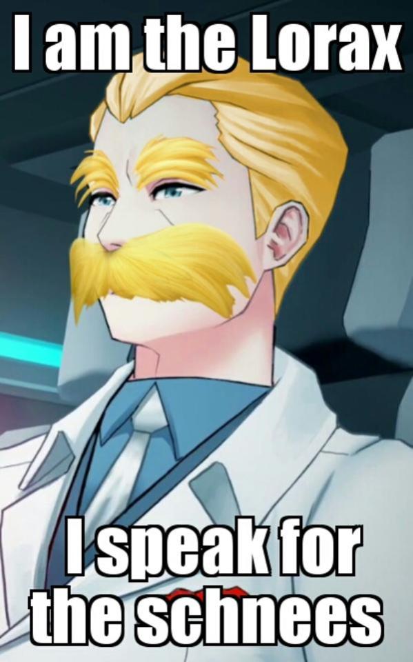
This blight upon the good name of a bitching stache has been a point of apathy for me in the show, both as a character who always managed to feel like a background character forced to be an antagonist and as poorly done part of Weiss’s arc. He’s the best example of what happen when you need a character to always be a villain, no matter the scene, no matter the context, he always has to be hatable and pathetic to make sure you still hate him. This leads to a rather inconsistent character.
There’s a previous point of contention the fandom had with his post-volume 3 portrayal, where both in the way Weiss acts and how he’s mentioned prior to volume 4, there seems to be a disconnect to the abusive corporate worm we’d eventually meet. In the first three seasons, he and his company is something that Weiss clearly tried to emulate, something Weiss seemed to take enough pride in to be such a snob about it, something that Weiss goes out of her way to defend against accusations from Blake. You get the idea that Weiss’s father is harsh, distant and negligent, but that he’s still someone Weiss seems to hold a little affection for. Go to volume 4 and the way the two interact make it suddenly makes prior Weiss moments rather questionable, she seems suddenly very clear about how much she doesn’t like him, he’s very obvious with how much of a dirt bag he is and the everything we learn about the SDC and Atlas elite in general make it hard to think Weiss wouldn’t have agreed with Blake back in volume 1. Hell, I found it odd how Winter back in volume 3 cared about Weiss not returning her abusive father’s calls, you’d think Winter would be like “Yeah, fuck ‘em.”
But okay, maybe it’s just some subtleties missed, Jacques is the straight up corporate sleazebag, doing anything he can to get that payday. He has money, and he knows how to use it, dominating the market and knowing which shortcuts to take to move things in his favor. Now, let’s strip away these elements to the concrete core of the the type of evil Jac is. His evil is one of apathy towards morals in the face of greed. He wants money and power, and doesn’t care what he has to do to get it. He’s a good business man who’s worked his way up the ladder. This worked for volume 4, he uses Weiss as a symbol of sympathy towards future buyers at a party, he pretends to care about the fall of Beacon to look good and slaps Weiss when she starts to threaten that with her antics.
And then here comes volume 7 to take him down in the lamest way possible. We have the build up: Weiss running away, the songs about her wanting to break free, the whole motivation of bringing the SDC back to it’s former glory, the fear of having to return to Atlas on her own, ect. He’s her personal villain and as such you’d expect her returning home after he’s had two volumes to build up his already substantial power during a crisis where his business is needed more than ever, he’d take on a rather daunting role as secondary antagonist to Watts and Tyrian. Our first scene with him in volume 7 tells us the answer.
He storms in, easily loses his cool, is revealed that no one really likes him, Ironwood makes it clear he has very little power here, he’s unable to do anything other than throw petty insults at Weiss and immediately he’s stopped being the corporate bastard he’s supposed to be. This continues with the rest of the volume with him, where the writing seems to make him multiple villains at the same time and reduce him to Watts’s mindless flunkie who could have been replaced by any character. His actions don’t connect to his motivation and situation, there’s nothing that makes me believe that he actually reasoned that this would advance his goals.
He’s a ruthless business man who brought the SDC from poultry earnings to a global monopoly. But he doesn’t have one lick of charisma or cunning to the point he thinks taking away people’s jobs will get them to support him rather than hate him.
His company is constantly facing controversies, accusations and attacks with apparently everyone hating him. But he has shit security and isn’t the least bit paranoid of bugs from potential journalists in his house.
He wants money, power and security. But goes along with Watt’s plans that clearly weaken Atlas’s defenses and isn’t suspicious at all at Watts wanting admin access to Mantle’s entire system with no attempt at insurance in case the clearly suspicious mad man doesn’t stab him in the back.
He doesn’t care about Weiss at all, she’s simply a means to an end, even disowning Winter for joining the military. But he still let Weiss attend Beacon, went back to get Weiss from Beacon when he had Jac 2.0 on standby to be his heir.
He’s a man who’s been in the game of feeding people bullshit for years to justify his bad deeds. But he immediately crumbles the moment he’s accused of anything.
He wants to sweep all accusations of unfair labor practices under the rug so they don’t damage his business. But apparently he allowed faunus to get branded with his logo.
On and on it goes, where his motivation is thrown away because “He’s evil, he doesn’t need a reason to do bad things.”. Joker wants to push Batman over the edge, thus he creates a situation that fucks with Batman’s moral code. Sidious wants to crush the Galaxy’s hope, so he constructs a symbol of fear big enough that it can be seen looming overhead from the planet below. Zamasu wants to purge the universe, so he takes the body of the man who embodies the ‘sins’ of mortals and travels to another timeline to make sure the much more powerful Gods and Zeno can’t interfere with his plans. La Fuckwad knows that everyone is looking for an excuse to get rid of him and knows the apocalypse might be coming, so he manipulates a fledgling vampire to get him the sarcophagus of an ancient vampire so he can absorb that refine ‘87 vintage blood wine and become powerful enough to survive.
You can see how they reason they need to do the things they do to achieve their goal. What connects A to B. The only way Jac’s action sync up with his motivation is if he is such a profound moron that Weiss besting him means nothing. “Wow, you beat the illiterate kid at reading, well done.”
As I stated earlier, Jac is viewed strictly as a bastard, strictly as Weiss’s antagonist, in every scene the show has to push in our faces that he’s the bad guy and that Weiss is superior to him. He never gains an advantage over Weiss, or puts Weiss in a difficult situation, he never has a real chance in this story. He is there to be arrested by Weiss. Every scene changes him to be the villain it needs for him to be for us to hate him the most. So, in some he will be calm and composed to frustrate us, while others he’ll be made to yell like a petulant child to make him pathetic and other’s he’ll just be stroking his mustache. His first confrontation with her ends with him getting slapped down and humiliated, then he’s just a yes man who does what Watts tells him to do with no thought or agency, then Weiss just walks into his party, get’s handed victory on a silver platter and arrests him.
That’s it. You got your ice cream flavors, and all of them can be pretty good on their own. However, if you get a bunch of them, stick them in a bowl and then just take a few bites and leave ‘em out in the sun, all you’re gonna get is regular intervals of a muddy looking puddle that eventually becomes grey sludge.
8 notes
·
View notes
Text
@onepartbrave
Huh. You really did learn something new every day—who knew? Squall blinked at the newfound information freely given. Considerately given? Crownsguard were different to the Glaives but held similar roles—just to different people? The name was a given, he supposed, Kingsglaives. A random thought of being sworn to one person was awkward but wasn’t he in the same position as SeeD? A grimace began down turning his lips and folding his brow as further unanswered questions joined the pile already growing. As often as he did it, he hated overthinking. Too much noise drove him insane as it was, but inside his cranium was far worse.
Still… he couldn’t deny the perks. Summoning a weapon of choice at a whim? Yeah, he could get behind that. Though he liked the reassuring weight of a gunblade at his side, they were far too notable and bulky to sneak anywhere. ‘Pretty cool’ indeed… Knowing he didn’t need to voice the sentiment for it to be understood, he bypassed a verbal answer and completely skipped Seifer’s playful taunting concerning Squall’s unintentional staring. Imagine addressing the blond’s ridiculous statements about his physique? Squall’d never hear the end of it. Plus, with all the admiring stares from all walks of gender, he needn’t one more from him.
Although, he mused Seifer deserved a little effort on his behalf to keep a conversation and weaponry was something Squall could blabber on about for ages. “At my hotel,” he explained simply, noting more wouldn’t kill him. “…Still in top condition all these years later. Just as quick too.”
Clearing his throat lightly, his mind wandered to Hyperion and its current status. Assuming the imposing blade to be within the disappearing roster Seifer had, he couldn’t help but desire a gander. Weapons were something he could do. They didn’t require sentiment, emotional outbursts or persistent company. When something went wrong or broke, his intimate knowledge on the model meant it was fixed in a matter of hours so long as he had the pieces. If he pissed off a person, it’d sometimes taken days to remedy it. Days. There were exceptions to every cause, of course, and those were the companions he’d gotten much better at reading and contending with. But in general… hand him sharp objects used for maiming over interpersonal relationships any day.
Strolling along in silence, clearly having given up already on the chatting part, he matched Seifer’s stride and kept up with ease. Inquisitive eyes darted this way and that as he navigated unfamiliar streets with the blond as his guide. Architecture was unlike any he’d seen before, inspiring both a modern and regal image simultaneously. Not as in your face with technology as Esthar yet not as old timey and ‘we refuse to accept change’ as Deling City. A refreshing alteration. Hell, even the air felt cleaner… until Seifer decided to pollute both it and his system with a cigarette.
Keeping that remark to himself, Squall nodded concurringly and bypassed the blond to enter the building. A fleeting inspection of the sigh plastered to the door—‘The Last Resort’? How fitting—he pushed inside and was greeted with unexpected warmth. Blinking the abrupt dryness from his eyes, he gave them an irritable rub with the back of one sleeve. Vision clearer, he performed a once-over check of the establishment, noting any escape routes other than the obvious entrance. Not that he’d remember later if his plan to get irresponsibly wasted went through without a hitch.
Falling back on his anointed assignment, he sought out a cosy, cushioned booth in the corner that had a large curve of seat. Good, should he fall over at any point, he’d fall on something soft. He just needed to stay central. Seifer could take one side and risk toppling to the floor, he was hard-headed enough to not succumb to an injury. Shimmying his way onto the designated seat, he butt-shuffled around with slight awkwardness, grunting in mild pain when his knee collided with an unfortunate low beam in the middle.
Shrugging off the spark of irritation, he snagged one of the menus showcased on the tabletop. The front page displayed a cartoony version of the pub’s exterior, well drawn and admirable work, and recited the basic information of address and contact information. Storing the titbits away for a later date (if it was decent food and a good atmosphere, he might venture there again during his mandatory vacation), he opened the first of two pages inside. A list of delectable looking starters glared back at him and he scowled faintly when his stomach rumbled in pre-emptive appreciation. His own fault, he hadn’t eaten anything substantial since breakfast.
Deciding then he was going to get some food alongside his future binge, impatient grey-blue eyes peered toward the entranceway, praying silently Seifer hurried his ass along because Squall was hungry and he didn’t want to give up the perfect perch he’d gained.
Staying behind as Squall entered the pub, Seifer let himself sink against the stonewall behind him, feeling the rough quality of the bricks press through his shirt. His gaze unfocused, he made a mental note to pull himself together. When he had come here, to the Crown City, it had been to escape his past and not look back anymore. People here had their own problems and he was allowed to banish the shadows of his inglorious attempts at playing the hero in favor of doing the one thing he knew how to do right - fighting. If nothing else. And yet here he was, running into his former rival like it was just another day at Garden, after ten fucking years of successfully pushing down his guilt, far enough he could pretend all of this didn't happen. When he had firmly believed he would never see him again. Not just that but he had been stupid enough to tag along, to fall right back into his old behavioral patterns and even end up protecting the guy he once.... tried to kill. Flip the switch and it's like nothing has changed at all... Throwing himself in front of Squall to protect him the night before stemmed from two evils. One being his recklessness which had only worsened over the years when it came to getting wounded because he simply did not care. The other was deep, shame-filled guilt.
Dragging one last time on his cigarette, he huffed the smoke out with bitterness underlying the amused tone as he realized he acted like Squall in his prime with all this brooding. Eyes closing so he could regain composure, he took a deep breath, then pushed off the wall and made for the entrance. One hand pushing the door open, the tall blond stepped inside the warmth that was just a tinge too much for the still lingering warmth outside but would be most pleasant once the nightly cold set in. Emerald gaze brushed over the room, much quicker than Squall's had since he knew the place, but still following old patterns to survey the place and locate possible threats or anything conspicuous which was, given the fact they had been practically child soldiers, simply branded into his being. Soon his eyes flicked over where the brunet had made himself comfortable, another small twinge of his six-bedamned guilt tightening his chest for the briefest moment as he saw how deeply focused the other seemed to be on the menu. It reminded him acutely of simpler days, when he had spotted the man sitting around with his nose in a Weapons Monthly magazine. Shaking his head briefly to end this futile train of thoughts that continuously tried to pull him in, he made for the bar counter and knocked on it, smiling his most charming smile at the woman manning it. "Hi, could you bring us the usual? Also two shots of your best Leiden whiskey, we've got something to celebrate." Leaning back as the woman busied herself with a smile, Seifer slid one hand into his coat still draped over his shoulder and procured his phone, unlocking it with a slide and checking his messages.
Kerr had sent him about fifty messages, most of which consisted of funny images meant to cheer him up since he'd heard about his suspension. A fond smile tugged at his lips as he quickly filed through them, taking a moment to reply so the guy wouldn't worry himself sick. After pocketing his phone again, he found the two shots standing on the counter already, taking them with him as he made for the corner Squall was sitting in. Placing one of the small glasses filled with golden liquid in front of him, he quirked a brow at the irritated look on the brunet's face before throwing his uniform coat unceremoniously on the bench where it would stay until way later tonight. Movement and all had the sleeves of his shirt slide up a bit, exposing part of the tattoo on his left biceps - the likeness of the blood-red cross he had stitched on his old trenchcoat, now displayed in black ink with small red embellishments. If one was to pay closer attention to his skin due to this, they would likely also notice the fine webs of scars riddling the tall blond’s skin, marring arms and even parts of his neck, definite signs of not applying healing properly - or in time. Lifting the glass in Squall's direction now, still standing, he shot him a lopsided smile. "Well then, to unexpected run-ins that get me suspended," he toasted before downing the shot in one go, grimacing slightly at the strong burn in his throat.
"So, what's your poison, Leonhart?", he then asked, nodding briefly to the bar to signal he'd get the order. "Also don't bother with that," finger now pointing at the menu, "I ordered us a plate with their specialties." On the occasions when he came here with fellow Glaives they'd to the same, just snack away all evening while getting drunk. It was more convenient than plastering the entire table with gazillion dishes. Once the brunet would let him know what he wanted to drink, Seifer would turn and go back to the counter to place their order.
1 note
·
View note
Text
The Old Guard: A (Disappointed) Spoilertastic Review

I hate 2020.
For many reasons, of course, but there is this particular nastiness it seems to have, like it’s getting revenge on us for our past and current sins.
And the Old Guard feels like part of that revenge.
I haven’t read the graphic novel, so please understand the following review is based on the film alone. I was on board with getting to see my queen and girl crush Charlize Theron kick some ass and rock that bangin’ brunette pageboy haircut that only she can and yet what this movie gave me is a raging case of 2020. This concept isn’t anything new or original, but it should have been a walk in the park. It has solid actors and a simple premise.
So why was it total bullshit?
I’m so angry. I’ve said before how certain movies feel like someone had all the ingredients to make a hot, delicious pizza and yet when they combined them, they came up with Brussel sprouts somehow. This movie is a lazy mess. It has about a handful of decent moments, but overall, it’s negligent. It doesn’t care. It doesn’t care to show you its potential. It’s just a tired, by the numbers, dull action movie that’s wasting the talent that it managed to gather together. Maybe that’s why I’m so mad. It’s clear that this could have been fantastic, but the apathy in the writing turned into a grey, flavorless bore.
Sigh. Let’s swing the ax already and get this over with.
Overall Grade: C-/D+
Spoilers ahead.
Pros:
· I signed on for Charlize Theron and at least I got what I wanted, which was her kicking ass but still giving us a few soft moments of vulnerability. This is why I will follow this woman to the grave. Charlize Theron is one of my favorite actresses because she’s so good at showing what women are capable of as characters. She has such a wide range of acting skills, giving us a cold, bitter woman but at the same time showing hints of inner kindness and strength and love. This movie barely has many redeeming qualities, but she’s by far one of the best parts. The movie knows it, as she is the only one we really get to “know” over the course of the film.
· Joe and Nicky are the only other characters providing any warmth or emotion in the film. It’s badly needed. I was so let down that they didn’t show Nile’s introduction to the team because, to me, I got the sense that Joe and Nicky are the heart. They seem in touch with their emotions and not as cynical and hardened by their “immortality” as Andy. They seem to still care about helping people, even at the cost of themselves, and they could have been such a strong anchor if the movie invested more time in them. Both actors are solid and believable in the roles and it’s a pity they weren’t given more to do than to be the victims who needed rescuing.
· The action, for the most part, is solid. It’s pretty average, though. Nothing surprising. It’s the moves you’ve seen if you watched John Wick or Atomic Blonde, so keep that in mind.
· The effects are solid, particularly for their healing factor. It’s smooth and polished looking.
· What little bits and pieces we see between teammates is likable. They seem genuinely fond and protective of each other and it’s not in focus enough, but when it is, it’s nice.
· �� The soundtrack is pretty good.
Cons:
· Lack of explanation. Look, I get it. You don’t want to load your entire movie up with exposition, but it’s very simple and easy to pace it out. You don’t have to dump it all in one spot, or if you do, then you can simply be strategic about it. Most good movies also know how and where to integrate the exposition and story into sequences where the characters are performing an action so that you don’t notice the exposition as you have something visual to distract you and keep your attention while you’re watching the movie. The Old Guard doesn’t care about all your questions. It just thinks you should accept whatever it jams down your throat, no matter how goddamn unbelievable it is. They explain so little of what’s going on to Nile that after the halfway point, you might as well throw up your arms and forget everything you wanted to know about the group. They answer nothing at all, yet expect Nile to throw in her lot with them for however long she’ll be alive. What’s frustrating is that you have solid actors who could pull off the emotional angles of the hard decisions they chose to make as semi-immortal beings. It pisses me off that they don’t explain anything because the motivations are what make us all care about the characters. For instance, why become soldiers? No one said they had to fight for humanity, especially since they JUST heal wounds. They aren’t super fast or super strong. They could have very easily simply acquired wealth over the centuries and used that wealth to invest in things that help people. Why do they have to be fighters? Oh, right, because it’s cooler.
· Lazy writing. The number of plotholes in this thing, due in part to lack of explanation, is stunning. I mean, it’s just so goddamn fucking lazy. It doesn’t care about its own material. It just needs to get from Point A to Point B by taking the most shortcuts possible. I can’t handle how little the movie cares about its own content. I can go point by point for laziness. We can start with how no one wanted to ask Nile ANYTHING after she came back from the dead. They just got mad and scared, but they didn’t say anything when she was still on the military base. What the actual fuck is that? And they just left her alone afterward, expecting her to follow orders? Uh, that’s not how that works. Her friends would be asking her a billion questions and the medics would have asked her even more questions than that. She wouldn’t just be walking around of her own free will, especially not in this day and age where science is obsessed with figuring out the why of humanity. They’d have kept her locked up and started examining her the second she healed the neck wound. And that’s just right off the cuff. Don’t get me started on her five second “I don’t want to march in your parade” bullshit that is just so clearly the second act breakdown moment to have the hero come back and save them in the third act schtick. How is Nile somehow calling out Andy for killing those men in the church when she was LITERALLY a Marine, who is TRAINED TO KILL BAD PEOPLE???? That made NO sense. But again, this movie doesn’t care. It doesn’t care about fucking anything. Booker’s betrayal was painfully telegraphed and it was also another plothole, as Andy has been alive for thousands of years and would have felt that the weight of her gun would be off without its ammo. She also would’ve checked her rounds before going in hot. Then there’s even smaller details, like it being broad daylight when they’re brought into that lab and then they have a shootout but there’s NO ONE on the streets when they leave, but then they leave and THEN all the people magically reappear. Go fuck yourself. This movie is an insult to average intelligence. It just expects you to open up and swallow every bit of its bullshit over and over again, squandering its own potential. It’s so infuriating.
· Cliché placeholder dialogue. The dialogue is so unimaginative that I’m pretty sure a bot wrote it. You can tell beat for beat what’s going to happen fifteen minutes before it happens on-screen. The movie really does not think much of its audience. It doesn’t have a unique take on pretty much anything at all, which is a crying shame, really. There are plenty of juicy angles for character and action that they could have gone for and didn’t.
· Not enough time is spent getting to know anyone except for Andy, and even she is given drive-by characterization. Nile is a huge loss. As a black woman, I am always dying to see black women in science fiction/fantasy stories because there is a severe lack of representation. I was hoping Nile would get a bigger stake in everything, but she’s just a chess piece. The movie doesn’t delve into her life, her wants, her needs, basically anything at all. They mention her family repeatedly, but they don’t go into detail to make you care and understand what a loss it is to leave them behind. It’s especially shitty when her bonding with Booker could have been a great emotional moment. Their origins line up well. She could have had conversations with him, arguing that she should be allowed to tell her family or at least say goodbye, and Booker could share his own tragic backstory with her to explain why it’s better for them to remain solitary. Then his betrayal would have hit even harder. Then Nile would have felt personally betrayed. It’s so ridiculous that there is all this set up of pain and interesting backstories that the movie just flatout ignores. Especially Quynh. Quynh ’s story will haunt me for the rest of my days, personally, but even that was left as an untied thread. It’s clear from that pompous ending that there’s either already a sequel planned or in progress, but personally, this movie let me down so hard I hope it doesn’t happen. Not unless a much better filmmaker and writing team comes along. Quynh’s untied thread is a blatant show of how they still think they deserve your time after showing you how little they care about their own material. They introduced the idea and then abandoned it without fully exploring what it meant. It’s clear that her horrible fate is painful to them all, so not giving it the adequate time to be explored is just even more insulting to the audience.
· Lack of imagination. For instance, we have some Mark Zuckerberg-looking villain spouting the same tired dialogue from the idiot villain in the Venom movie. There also is no creativity in the action. We could have done some fun things utilizing their healing factors during fight sequences, but there’s not much to them. Just standard punches and kicks and headshots. Then there’s the boring dead wife betrayer guy who is inexplicably left alive after accusing said cartoony villain of murdering them. He has ALL the information to take to the CIA or FBI or just ANYONE IN GENERAL IN INTELLIGENCE AGENCIES and they just bop him on the head and leave him there??? This movie doesn’t have a single original thought. It’s just regurgitating other clichés from much better movies.
I wanted this to be good. I wanted a break from 2020, but it’s clear that this year is unprecedented in how terrible it can get and how it doesn’t want us to enjoy anything. I wish I didn’t have to say these things about this movie, but I do. I honestly don’t think it’s worth a watch and that people should avoid it. It’ll inevitably do well because people don’t have anything better to do, but that’s still a shame. I’m so disappointed in all its wasted potential and I always will be.
Kyo out.
#The Old Guard#movie review#film review#spoilers#spoiler alert#Charlize Theron#new movie#new release#Netflix
2 notes
·
View notes
Photo
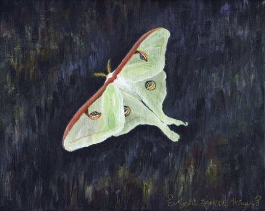
Fly By Moon
I guess I'm a painter now? I've been kind of on a roll with the painting stuff in general lately, but in particular diligent Sparklers of mine may remember I recently posted Starfall Mountains, where I tried out some super cheap acrylic paints after the "Acrylic Paint Itch" started up in my brain. After that experience, I was pretty eager to find some better quality paints and hopefully have a much better time with it. I ultimately ended up with a set of Liquitex Basics paints, after having an internal turmoil between getting those or the Arteza Acrylic paints. (Since for my purposes and circumstances both sets would've worked out to about the same price.) Ultimately, I went with Liquitex because I've seen a lot of people say that the Arteza acrylics dry really quickly, even for acrylic paint which is known for drying fast anyway. So in order to use them, I would've most likely needed to also purchase a blending medium to mix with them so I'd have more time to blend things properly, and at the time I was making the paint purchase I didn't really feel like making the additional investment when I could just get another set of paints that I could, in theory, use straight out of the tube. And admittedly when going to purchase a set of "beginner" but since nice quality acrylics, I was already a little biased towards the Liquitex Basics line because I've heard it recommended by a couple of art Youtubers that I follow that have greater knowledge of acrylic painting than I. Either way, I may still end up with the Arteza acrylics at some point yet since I unexpectedly ended up getting both a bottle of blending medium and an airtight/keep-your-paints-wet-longer palette anyway so them drying quickly now wouldn't be the problem it originally would've been. (And if my experiences with their products have taught me anything it's that sometimes you just have to test them out yourself to see if they're going to work for you or not, regardless of what everyone else is saying) But we'll see. But back to the here and now. Shortly after I got the paints, we were visited by a Luna Moth, and overnight she attracted a mate. They stayed together for a day, and then the next morning he was gone but she was not. Another night and she had laid her eggs, and then she was gone. It is a simple story, but I thought it was cute. And it gave me some references photos to use for my first painting! I've had some 8"x10" canvases laying around waiting to be used for the last half of forever, and so I grabbed one of those and got to work. Originally I had to figure out what I was going to do as far as a few logistics go; For one thing, acrylics are much easier to work with if you do the background first and work your way forward so that you can blend the bigger areas without having to work around your subject. So I had to figure out what I was going to do for transfer paper to get my sketch of Mrs. Luna Moth on top of A. Canvas and B. mostly Black paint. In the end, I ended up using some graph paper with a pale green Faber Castell gelato scribbled on the back of it, which actually worked really well, so if you have some gelatos and thin paper but not proper transfer paper, that might be something worth trying sometime. I did the background with a mixture of the two blacks in the set (Mars black which is more opaque and Lamp black which is more transparent), a light purple color, and a muted yellow kind of color. I was trying to go for the illusion of texture without having to actually commit to painting out individual sections of the black tarp the moth was sitting on in my reference photo. I wanted to get to the fun part of painting the moth, not spend an eternity trying to get a semi-realistic tarp background texture when it's not even the main focus. And to some extent, I think that's one of my bigger problems with acrylics paints, in general, is that you often have to commit way more time to small details or normally less important features like the background and textures and stuff because at this point it's more or less expected of the medium. And it's just that it's highly uncommon to do a subject on canvas and leave the background largely blank, unlike more traditional paper or digital drawings. Acrylic painting, by comparison, is a much bigger commitment as to how far you're willing to go to flesh out the piece and bring up to "acrylic painting standards." And I'm usually really not into that idea. But I can ponder with myself on that issue and potential ways to remedy it later. Anyway, once I was mostly satisfied with what I'd accomplished with the background, which consisted of a lot of "put paint on, cover it up, blend it out," repeated several times over (and yes I know this is not a very tarp-like end result but I was tired of messing with it), I used my faux-transfer paper to get my moth lines up there and then began the more satisfying part of the painting. In this instance, I was able to use the more transparent qualities of certain colors to my advantage, since when you really study the reference photo I was using, it's clear that the Luna Moth's wings aren't fully opaque, especially over the black. So I went in with varying mixtures of this pale bright green color, white, and using some of the light purple I'd used in the background to make a very pale gray color for some dimension on the wings. I also used some water to keep the paint fluid and to thin it out to be more transparent on occasion when I needed to. My process for most areas was to decide on what the base color seemed to be in the photo, get that down and some of the larger/more notable areas of shading, and then go back and start to fill in the shading on top. Which I feel like is the standard way of working with acrylics, but I could be wrong. The hardest part (minus the background, which I did end up touching up a bit after the moth herself was finished) was actually the little eyelets on her wings, mostly just because of how much tiny detail there is to them in comparison to the rest of the painting. But with a very thin paintbrush, much patience, and a few back-and-forth layers of certain colors, I did mostly manage it. The shapes for the top wing eyelets are a little wonky, though even in my reference photo (because of the angle) they are noticeably asymmetrical from each other. Also, the partial eyelet on the bottom I tried to add a bit of shading to, but it's such a small space I'm sure it's still not quite right. I blocked out her top wings and did them and her body peaking between the wings first, then waited for that to dry down some before moving to her bottom wings, then went back to do some details and shading on the top. While they were drying, I did her head and that rust-colored bar along the top of her wings. Then I did the shading and details on her bottom wings, then shading and details on the wing bar & head. I saved the eyelets for last and mostly covered up their original placement markings in the process since I knew that was going to be a lot of tiny detail I didn't want to have to try and work around so I wouldn't mess them up. And at the very end, I added the faint yellowish lines near the edges of her wings with the metallic gold that came in the set, as the metallics are all a little on the transparent side and that seemed like a better, more subtle choice than trying layer on or mix exactly the right color with the non-metallic paints. Plus, it adds a nice little bit of interest when you move the painting in the light; and I added a thin layer to her antennae since they're roughly the same color as the pure gold anyway. I tried my best in both sketch and paint to stay true to my little moth friend's form, but her bottom wings did come out a little short both times and some details either had to be adjusted or lost due to my inexperience with acrylics (for example, I did the best I could with the shape of her antennae since I only had a paintbrush so small to work with and it still wasn't quite small enough for the teeny tiny fluffy bits). Despite that, I still think she came out really nicely. She's not super realistic, but she's not super cartoony either, and I think I like that look. Also if you decide to look really closely there may be spots of not-great canvas coverage of places where the canvas texture sticks out too much or something; This would be because I couldn't find it in me to wait until I could get a bottle of gesso (especially because gesso is often some expensive stuff), I couldn't find my bigger bottle of cheap white acrylic to do a stand-in base coat with that, and my internet research turned up no good alternatives I already had on hand. So I just forgoed the priming and went right to painting, which allegedly from what I've seen is a viable option, at least for acrylics and better quality level paints. It seems to be the priming is more "necessary" for oils and/or really cheap paints that may not have great consistency in the first place. (Although I've mentioned before that even then I've seen a lot of stuff that presents the idea of priming with gesso as more optional when you're working on canvas anyway, so...) I will also say that these Liquitex paints seemed to dry slower than I expected on the canvas; I didn't have to use one single drop of that blending medium I mentioned earlier, or spray the canvas with water to slow it down. I actually spent more time than I thought I would waiting around for layers to dry because I've been too chicken to bother with a hairdryer or heat gun to speed these or my watercolor paints up just yet. I don't know if I've had a skewed perception of acrylics all this time or the drying time is similar to cheap watercolors so I'm used to it already or if these particular paints just dry a little more slowly or what, but I'm beginning to regret one of my counts against acrylics having perpetually been that they dry too quickly. So far at least, that's seeming to not be that big of a deal. (Also, if oils dry as infinitely more slowly as I've been led to believe then I need to never oil paint because I will be so ridiculously impatient by the end of it from waiting for things to dry!) I'm not terribly sure how often I'm going to be acrylic painting from now on or even what my next one is going to be, but I have the supplies and intend on getting my money's worth out of them, and I definitely want to experience more with acrylics in general after these new experiences and realizations I've had with them. So we'll see how that turns out in the long-run for me in due time, I suppose. ____ Artwork © me, MysticSparkleWings ____ Where to find me & my artwork: My Website | Commission Info + Prices | Ko-Fi | dA Print Shop | RedBubble | Twitter | Tumblr | Instagram
2 notes
·
View notes
Text
So, I just binged the new She-Ra, and I thought I'd give a few initial thoughts based on the complaints that I remember from the conversation here about the designs.
First, to those worried about it being an "SJW show" - it's not. Unless you call every single magical girl show SJW, then I don't see how you could call this one that. It has the same feel as things like Winx on the surface, y'know? A frilly, girly cartoon with magical stuff.
Beneath that it has some interesting characters and plots - I think that the backstories, the workings of the Hoard, and so on tended to be quite a bit more interesting than the actual main plot and main characters at times. Like, I was a lot more intrigued by the dynamic between Catra and Shadow Weaver, and by Entrapta in general, than whatever Adora was doing.
A lot of stuff did seem put there for an older audience - not that it was too mature for kids or anything, just that I feel like the pretty flowers and friendship stuff was there for the kids, while the child abuse and manipulation was probably meant to be spooky but mostly go over their heads.
As for the designs, the stills make them look a lot worse than they are - stylistically, the main world looks quite smooth and, I guess, pretty. There's some nice contrast between that style and the sharper and darker style of the Hoard and of Entrapta's home, and the angular but still "pretty" style of the old tech. The atmosphere of the show was captured pretty well by each setting, by the use of colour and light, and so on.
Some people felt that the stills made characters look overweight, and worried about the impacts of various changes like that and race changes. Firstly, again, the cartoony style looks better when it's all in motion rather than still and stood next to the more detailed older designs. I wouldn't say any of the characters look "fat" - Glimmer, for example, has chunky legs but she looks muscular, not overweight. The changes to race didn't have any impact on the show... it isn't the "Look how inclusive we are!" move that people worried it would be, at least within the show (I haven't looked into the creators to know how they act about it). It's also not unrealistic for them to have different skin colours to each other, given that it's set on an entire planet and they come from kingdoms all over said planet.
The animation is good but it isn't anything to rave about - it's got the same size issue as Voltron and especially Steven Universe seem to have on occasion, and it makes me wonder how much time these teams actually spend on like... just making scale models or cut-outs and standing them next to each other or something. It doesn't ruin the show or anything, and you don't really notice it unless you're looking for it.
If this show was written by SJWs, then I get the impression that they didn't want the show to be a preachy political thing, and they actually know how to laugh at preachy political stuff - there's a joke with a talking horse who wants equality and justice for horses.
All of the characters have flaws and strengths. There's a character who's basically a pyromaniac Jack Sparrow, and he has a pretty interesting relationship with the one princess (she's portrayed as kind of detached and... a typical "Yeah, whatever." kind of person, while he displays a more overt affection for her, and at first the show had the opportunity to portray that as him being creepy/obsessive, but instead of doing that the show took it in a more interesting "that's just how their relationship is" direction). Oh, I'm not necessarily using "relationship" as romantic there - that much is left up to some interpretation.
My main complaint is actually something that I've been paying more attention to since I heard it mentioned in a review of Sky High, which is that the majority of the characters are special because they were born special. I feel like this show makes even less of an effort than Sky High to say "Okay, the plot is that s/he's special, but look other people can be too without being born that way!"
There's the character of Bow, who seems to lack powers - he encourages three other characters without powers to engage in a brief fight in one episode... and I don't recall seeing those three come back after that episode. A couple of background characters do things in the background, but... all of the important characters besides Bow either have powers by the circumstances of their birth/destiny, or are part of the Evil Hoard. The pursuit/acquisition of power is also painted as the motivating factor for the Evil Hoard's evil, and is often painted as an evil thing.
I'm not the biggest fan of the message that specific people are just born good and powerful, destined to be the good guy and all that... I mean, it's made clear that there's no way that Catra could have been the one who became She-Ra, not because she wasn't kind or wasn't strong or because of any actual qualities of her character, but just because Adora was born to be She-Ra. That's a trope that I was hoping they would subvert.
Anyway, I'll link that Sky High video here, I don't agree with every word of it (I still like Sky High, and I think the review does understate some of the good qualities of that film... I also still like She-Ra) but it is an interesting dissection of some of the issues with this trope: https://youtu.be/iIdbLUm-ez8
So no, the show isn't full to the brim of real world politics (in fact, there isn't really any), and the politics of the fictitious world are actually pretty interesting. It's worth watching if you enjoy these kinds of cartoons - it's no masterpiece, but the characters are pretty good, the story is sufficiently intriguing, and I like Entrapta and Catra.
~ Vape
18 notes
·
View notes
Text
Top 20 BEST Animated Series of the 2010s-13th place
What happens when you mix Looney Tunes' quality of animation with Spongebob Squarepants' weirdness and the creativity of a Dr. Suess book?
You get yet another underrated cartoon in the last decade. That’s what.
#13-Wander Over Yonder (2013-2016)
The Plot: A wandering weirdo named Wander and his best friend/protector/noble steed Sylvia travels the galaxy, sharing kindness and spreading the message that it never hurts to help everywhere they go. But in their quest, they must face dangerous villains such as Lord Hater and his army of watchdogs (The watchdogs aren’t what you think they are). Will the villainous Lord Hater destroy Wander and his attempts to spread happiness, or will Wonder make Hater his new pal? I don’t know. The show got canceled after a second season. Still, I think it’s the best bet on it being a yes.
The one thing about a show like Wander Over Yonder is that it is nothing like most shows you will find on this list. And I can sum up those reasons into four categories: story, comedy, characters, and animation.
Let’s start with the story because, until season two, there really isn’t one. It remains as a somewhat episodic show where the continuity is nearly non-existent. Occasionally a character will bring up an old event, or an old villain will reappear. But a viewer doesn’t need a full understanding of every episode to watch a single episode. Even when the show begins to have a story arc in season two, knowledge of previous events isn’t entirely essential to enjoy the episode you’re currently watching. Because while the prior information may add to the enjoyment, it never takes it away. In fact, Wander Over Yonder may just be the first show to change its technique of storytelling while still remaining true to its roots. Mainly since its roots focused more on comedy than anything else.
Let me make one thing clear: Wander Over Yonder, above anything else, is a comedy. It’s not a comedy that slowly becomes a drama. It’s a show that balances comedy and drama, and it is certainly not a show that will take itself too seriously. Even in the more “serious” episodes, Wander Over Yonder makes a point to have people laugh first and make them cry later. In fact, the drama has more of an impact because viewers can build a connection through laughing with the characters, thus caring when they meet a moment that’s tragic and heartbreaking. And laugh they will because this show can be pretty funny at times. Keep in mind that it has a very random sense of humor, so maybe don’t get too excited if that isn’t your cup of tea. And even if it is, there is a small problem you need to be aware of about the show’s comedy. When a joke isn’t funny, there will be another joke not far behind to make up for the lack. However, there are times when the show lingers on a specific gag or even repeats the same exact one throughout the entire episode. And it is always painful to watch. This doesn’t happen often, and it isn’t that bad when done well, but even then, it can get a little annoying to fans of the show.
Speaking of a little annoying, let’s talk about our main character Wander. Wander is a character who strives to do the right thing no matter what the cost. When done well, a personality like that is admirable but can come across as annoying when done wrong. Wander is no exception. On the one hand, I honestly find his determination to do the right thing makes him a good role model for kids. And it’s not like he doesn’t have a reason for why he goes out of his way to help others. He genuinely does the right thing because it actually makes him feel good to help. However, that doesn’t change when Wander’s kind attitude can get a little out of hand. There are moments when he actually puts friends and civilizations in danger to do a good deed. Everything all works out in the end, but that doesn’t change how close things can get. Even worse, Wander rarely changes his approach to doing good deeds because the writers goes out of their way to prove him right. Whenever Wander has his good nature challenged or even taken advantage of, he still does the exact same thing a couple episodes later. Thankfully, he at least has a couple of good characters to bounce off of in his antics.
There are two characters in the show that Wander interacts with the most: Sylvia and Hater. Sylvia is Wander’s best friend and acts as the muscle/voice of reason to his Wanderness. Their overall interactions are either hilarious or downright heartwarming to watch. I especially love how Sylvia goes out of her way to keep Wander safe, as it shows a friendship that goes beyond farther than other best buddies in most shows on this list. In fact, they're more like a family that’s a mix between mother and son/brother and sister dynamic. However, while I love seeing Wander and Sylvia interact, that is nothing compared to seeing Wander and Hater together. These two have a rivalry that seems to be Spongebob and Squidward’s dynamic, treated as Bugs Bunny and Elmer Fudd's. It is funny to watch these two whenever they share a screen together, and it’s this interaction that brings out the best of Wander. He doesn’t ever want to hurt Hater, but it’s just Hater who mostly hurts himself. Wander also fully understands that Lord Hater is a villain but is driven by the belief that there’s some good inside those bones. But what surprises me is the fact that Lord Hater works well as a character even without Wander.
Wander Over Yonder does something I rarely see in which it has episodes that star both the heroes and the villains. Lord Hater is up there as one of the funniest incompetent villains within animated shows. His attempts to become the greatest in the galaxy never fails to make me laugh, as it pretty much lines up with Wile E Coyote's attempts to get the Road Runner. He will lose, and you know he’s going to no matter what, but it’s still hilarious to watch how. Hater gets even funnier when you compare him to Commander Peepers, who acts as Hater’s second in comand. Peepers is the logic to Hater’s fury and childishness, which presents a dynamic similar yet different to Wander and Sylvia’s. Which is another reason why I like how the show focuses on both the heroes and villains, as it makes the villains seem more like dynamic characters than most foes in other shows.
But none of this praise holds a candle to the show’s animation. Not only is it fluid and expressive, but the show has the underrated rubber hose style of animation that needs more love. Characters can pull random objects out of nowhere, survive the craziest of things, and seem to have their own form of gravity around them. In fact, it is Wander Over Yonder that showed me how rare this type of animation is. Most animated shows in the last decade seem to focus on looking realistic rather than looking like a cartoon. This is weird because one would think that more cartoons would aim to actually be more, well, cartoony. This is why Wander Over Yonder has some of the best animations out of most shows in the last decade, all because of it being unique. Even when the show goes through a noticeable downgrade in its second season, it is nowhere near as bad as Star V.S. the Forces of Evil. It’s still expressive and cartoony, but not just as fluid as it once was in season one.
However, despite all the praise I can give this show, you should remember it still got canceled. Was it because of bad writing? No. Was it because the animation was too expensive? Understandably so if it was, but no. Was it because of bad ratings? Well, it did get bad ratings, but apparently, that wasn’t the reason. Apparently, the reason was that Disney thought that only two seasons were enough. This is a shame because not only did it seem like the show was gaining ground by season two, but season three even promised to reveal some long-awaited backstories for the characters. Regardless, Disney still owns the show, and the decision to bring it back (that is, to say, if they’ll ever bring it back) is entirely up to them.
Wander Over Yonder is not a perfect show. Compared to everything else in the last decade, I can see how most people won’t be as invested as others. But if you love episodic storytelling, random comedy, great dynamic characters, and some fantastic animation, then trust me when I say that it wouldn’t hurt to help to give this show a chance.
(Also, is it weird to anybody else that this isn’t on Disney+, yet? It’s on Hulu, but not Disney+ for some reason. It’s starting to get to the point where I think Disney’s ashamed of this show, which I don’t understand.)
5 notes
·
View notes
Text
OUAT 3X05 - Good Form
I remember loving this episode, but it will be GOOD to FORMulate an opinion on it once and for all!
...Thank you, thank you! I’ll be here all week!
But really, this episode has a ton going on from character work to backstories to points made about toxic masculinity. And if you want to hear more about all that, go right under that cut!
Press Release
With the deadly Dreamshade coursing through David’s body and close to death, Hook takes him on one last journey to find a sextant that could help them decipher a map that would lead them off Neverland. Meanwhile, in the Fairy Tale Land that was, Killian Jones - aka Hook - and his brother, Captain Liam, sail off under orders of the King to find a powerful indigenous plant on an uncharted land that could help heal any injury.
Main Thoughts - Characters/Stories/Themes and Their Effectiveness
Past
The story in the past segment is incredibly simple, but as I’ve said before, simple is good. It’s the finer details of the story that come together and turn it from serviceable to truly great and fortunately, this episode has that in spades.
”If this is a poison, it won’t just end a war, it will obliterate an entire race.” I do like that throughout this story, the villainy is kept with those that truly deserve it: The King and Pan. It would’ve been easy to villainize Liam for not listening to Killian and overestimating his own abilities against Pan, but the writers understood that he just made a mistake. He wasn’t a bad person, but made a bad decision and didn’t deserve his death (I mean, he probably deserved some type of bad death because of what happened with his last crew, but that episode wasn’t written yet). Liam’s death is framed correctly as a tragedy and something that a young man would do, especially when exposed to the “magic” of Useless Machismo Island (My new name for Neverland because holy fuck, there’s so much freakin’ machismo).
I love how literally all of Killian’s men stay by his side. It’s an amazing show of Killian’s leadership abilities, as he displays qualities like charisma and passion in ways that people listen to. It also shows a lot about Liam. Liam may have screwed over the last crew he worked with, but he definitely cared for his own.
Killian’s ending speech works so well. Throughout the entire flashback, it really looked to me like ending of Killian becoming a pirate for noble reasons and “good form” was going to lack the character consistency between the Killian we see at the end of the flashback and the suave sort of jerkass we see in “The Crocodile” and “Devil’s Due.” And that was nagging me throughout the segment as I watched it (As I’ve mentioned before, my Season 3 memories are not that hot apart from some select scenes and the broad strokes of the stories and arcs). But Killian’s speech does a great job of showing his hotheadedness. It’s not just enough to fuck over the king. Killian is taking his rage over Liam’s death on the whole realm, or at least the lands ruled by that same monarchy. I’m so glad that this was included because it reasserts Killian’s character that he has going forward -- noble, hotheaded, dramatic, and a leader.
Present
”You’re not here out of any nobility. You’re here for Emma.” I like how the theme of this segment is somewhat disproving this. By that, I mean that while Killian’s motivation for helping IS ultimately Emma, we see the form that his helping takes shape and it is in fact one of nobility (I know this gets a smidgen into shipping and I usually save that for the bottom and it is mostly there, but just indulge me here because I’ve thought on this for a while). Killian’s efforts, as he believes, will not help his chances with Emma. As far as he knows, David, if kept alive, will continue to keep pushing them apart. This is evidenced by Killian’s clear surprise when David gives him the credit and subsequent toast following their return to the campsite. He helps David for her, but so that she will have a father and a better shot at her son, not so that he will have a better shot at her.
The narrative makes a good point of differentiating Pan and Killian from each other. Unlike Pan who spoke in riddles while mentioning the effects of the Dreamshade, Killian was specific. Before giving David the water, he explicitly laid out the consequences of drinking it, demonstrating actual honor.
I also like how David points out that a lot of their current situation is in fact the result of Killian’s assholery. It allows for David to be granted more nuance then “I don’t like you because you’re a pirate” since it’s honestly been a while since these events occurred. Like, I remember it, but the current story trajectory has made some of Season 2’s events somewhat distant and bringing that back up is appreciated. Without that, this segment would’ve felt way too on Killian’s side but because it’s here, David’s distrust of Killian is not as frustrating for the viewer to sit through.
I am so glad that Emma sides with Regina over whether to remove the Lost Boy’s heart or not and it is framed as an ultimate positive. It falls in line with her rage and dismisses Snow’s shitty ass platitudes. All of the frustration that’s been building in Regina has been building in Emma too and she’s not about to let a tangible means of results in getting at the very least a message out to Henry go away. And it is honestly so worth it. The mirror call is beautiful and energetic and the smiles that the scene leaves off on after the it’s completed is one of the most satisfying moments in the entire arc. When people talk about how dark magic can be used for good, this is one of the better examples of this.
All Encompassing
I know that this is probably one hell of a stretch, but I can’t help but feel like this episode as a whole is taking a sledgehammer to toxic masculinity. Men (David and Liam) not listening to other men (Killian and Pan) is what puts them in their shitty situations but clear communication (Killian being upfront about the water and Liam telling Killian his plans for the king) are resolutions. Neverland really is a land of toxic masculinity. In addition to so many men not listening to each other, we see with the Lost Boys that they have no problems getting violent with each other, using each other, and not apologizing for it afterwards, with Henry acting as a contrast for their behavior because of how he was brought up in Storybrooke.
Insights - Stream of Consciousness
-Opening shots in this series that start with the moon are incredible!
-”Not bad.” My thoughts exactly! Neal did a good job with those wooden swords!
-”Don’t you know the best thing about being a Lost Boy? You never apologize.” Then you guys are just flat out rude! Fucking toxic masculinity. Neverland SERIOUSLY needs to rename itself Useless Machismo Island.
-”I also know what it’s like to lose hope.” Okay look, the way this line was delivered really didn’t work for me. For one thing, it IS wasting time and Killian is usually not one to do that. For another, I didn’t like him stepping in her way. Look, you know I love CS and I’ll be having fun down below by the end of the episode, but that didn’t do it and part of this rewatch is emotional honesty. Part of me thinks that that works because Killian’s almost manufactured attempt to bond fails whereas the more natural one at the end of the episode succeeds, but I still didn’t like the moment as a whole.
-Damn, I love shots of the Jolly Roger that show off its impressive length (Innuendo somewhat intended). It really is a magnificent beast of a ship. And listen to the score in the background. The brass section beautifully plays this triumphant sea-themed melody!
-Wow! I think this is the most crewmates in terms of numbers that we’ve ever seen on The Jolly Roger! I don’t know if they just wanted a lot of navy men/pirates for this episode or because they wanted to show the dangers of being a pirate. I counted during Killian’s ending speech and there were at least 15 guys there!
-”And drunkenness leads to bad form.” This line is great because we see Killian trying so hard to be good (To an almost comedic and cartoony degree for me personally) and is especially made more effective because of our insight into Killian’s adolescence as a slave.
-Anyone notice the extra-as-fuck drop of the rum bottle into the harbor? XD
-”My little brother.” “Perhaps you mean younger brother.” Okay, I LOVE this line in canon, but the fandom has utterly RUINED it for me through its sheer OVERUSE in fanworks. I can’t read a single Brothers Jones or CS fic featuring Liam and NOT see this exchange. It’s not like there aren’t other overused quotes I see, but just that one seriously needs a rotation. *Ahem* Pardon the tangent.
-”A Hero’s journey.” I’m just picturing Killian thinking about how he and Liam started off at the bottom of the world and are now so close to heroes.
-”You’re never gonna get her. I’ll see to that.” David, Emma is a grown woman. Fuck off with the machismo!
-Okay, Killian is my favorite character at this moment purely because he is not having ANY of the machismo bullshit David keeps throwing his way. He’s playing caretaker and nurse proudly!
-I like how literally EVERYONE on that ship besides the lieutenant knew what the fuck the Pegasus was. Like literally EVERYONE! The fuck?
-Damn, when you look at the Roger from the bottom, it’s even bigger. No wonder it’s a pirate ship! It’s got such a big booty!
-There’s something so awe-inducing about a pirate (Or navy, at the time) ship soaring through the sky and I’m so glad that this comes back during “Save Henry.” The contrast of the clouds and the ship is so whimsical and childlike and wonderful because of that.
-Can you even see stars during the day, even with a sextant?
-”Tell him grandpa loves him.” You should probably specify which one, David. After all, “you can have more than one [grandfather].”
-*Watches Daddy Charming hug* I’ve read it before, but Josh Dallas is in fact, dad shaped.
-*Watches that Lost Boy hunt a pig and then remembers how that went in “Lord of the Flies”* Thank you, Snow!
-”Henry did [Nicked the kid’s cheek].” I love how the second he says that, Emma and Regina go into this “What the FUCK did Pan do to our little boy?” mode.
-”At least you got to say goodbye. Most people don’t get that much.” Damn, that line is powerful with hindsight. Even David drops his machismo because he knows something is up.
-”He was a thief and a liar.” To be fair, David, at the moment, you’re the one lying. I normally don’t subscribe to the “heroes are hypocrites” mentality, but this is a rare hiccup in that.
-*Killian steps up in the present and down in the past* Have I ever mentioned how much I love the segues on this show? Well...here’s another great one. See also: Unconscious bodies segue!
-Wow. The first daytime shots of Neverland are so breathtaking. The way the sun shines through the clouds and the jungle/mountains lurk in the distance is stunning! And the beach is just flawless! Fantastic camera work!
-Killian, I love you, but you just can’t rock the ponytail, bro. Short hair is your friend.
-You know, something I realize: Killian’s pretty freakin great at reading people! He can immediately tell that Pan isn’t full of shit in the past.
-I like how Killian puts up no rebellion at the idea of talking to Pan. Even though they’re on opposing sides, he knows Pan can kill them all with the snap of a finger and he’s not about to risk that.
-”Emma would never leave her son.” “She did once before.” FUCK. YOU. PAN.
-”Have a drink. You know it always helps you think.” Pan is just savage af in this episode. He’s pulling no punches!
-Liam, no! Don’t succumb to the machismo! Not like this!
-I’m not sure about how I feel about Emma tipping so close to the edge of strangling a Lost Boy, but this “What the FUCK did Pan do to Henry?”-induced rage is really well acted!
-Fuck yeah, Regina!!! Mirror magic used for good! *High fives*
-I would hardly call that goading, Pan!
-Operation Cobra Rescue. I liked the innocence of Operation Henry because Regina made it, but I like that Emma has her own name for it too.
-Killian really rocks that face mask. Someone make a sexy dark doctor/serial killer Killian fic, a’ight?
-”That you were stubborn, yes. I gathered that rather quickly.” I LOVE the Captain Charming banter here.
-I love Killian’s smile. So much. And his little wink.
-Mama Swan’s got some convictions when it comes to Henry!
-Damn, the ladies were ready for one hell of a fight before David and Killian showed up! Just look at those battle poses!
-That little nod Killian gives David after David tells everyone “what happened.” Awww! THE BROMANCE IS ALIVE! CAPTAIN CHARMING IS ALIVE!
-”Mates.” Emma, you are too fucking adorable.
-I love how immediately following the kiss, Emma has a plan developed to stop them from getting questioned by everyone! Smart as a whip!
-Killian! I know Neverland sucked, but a flying ship is never a bad thing!
-I love that Killian gets hyper defensive when Pan mentions Neal’s name. Like “don’t mention his name, you little shit!”
-I don’t know whether to praise this final scene for being a great fake out of Killian potentially abandoning the goodwill he built up or annoyed because once again, this ending means nothing. It’s literally just exposition. That said, I like the expedience, so I’m willing to forgive it.
Arcs - How Are These Storylines Progressing?
The Mission to Save Henry - We finally get a message out to Henry!
Henry Not Believing in His Family - This storyline frankly sucked and I am so glad it’s over. Henry’s belief in his family and the question of whether or not it would hold (Besides having an obvious answer) was in no way engaging. The circumstances that brought on any possibilities of him not believing in his family were contrived and hardly related to his character. Additionally, the writing for it as a whole was inconsistent. One scene has Henry towing the line of losing faith in his family and the next has his steadfast. One scene has him fighting or dancing and having a good time and the next has him apologizing and being a pacifist. This isn’t character complexity. It’s weak character writing. I know I didn’t bring up this segment before, tough that’s only because it’s so freakin’ short and yet it’s given this huge amount of emphasis. Watching it again, I can’t fathom why the time wasn’t spent focused on Henry and Wendy meeting and becoming friends with Pan pulling the strings on both sides, like we get soon afterwards. That would’ve been much more focused and served as an effective story that played into Henry wanting to be a hero and showed more of Pan being an evil bastard. Hell, there could even be a connection made between Neal and Henry because of Neal’s friendship with Wendy. It actually baffles me. Did they just not have Wendy available for the first six or seven episodes? Did they not want to pay the actress?
Killian’s Redemption - Killian takes his first big step forward into redemption here. He risks his life to help a man who dislikes him. It feels like a very good build up that’s been happening with him since the Season 2 finale. Also, ”You’re good at surviving.” I like how Killian takes this concept that Pan presents to him and thoroughly flips it throughout the rest of the series.
Regina’s Redemption - This is a relatively smaller instance, but it means so much. At the end of the call with Henry, Regina says “We love you.” Call it a hunch, but just a season back and she would’ve said “I” and not “We.” And Emma actually returns that, calling Henry “our” son in their next scene. That’s a far cry from the “my son” arguments of Seasons 1 and 2 and it fits perfectly.
Favorite Dynamic
David and Killian. David and Killian’s bonding feels very natural to me and as that’s the heart of the episode, it was one of the two most important things that they get right. And thankfully, they did! Killian is put into a position where he’s in the right, but it is made clear why the respect that comes with that needs to be earned. Killian and David works together to do what they each think is their own greater good in their own way creates this really engaging friction that is fun to watch. Their banter has a good rhythm to it and can be funny at times, particularly when they’re talking about their brothers.
Writer
Christine Boylan and Daniel Thomsen take their first whacks at Season 3, and it’s really good! Like many of the best OUAT episodes, the past and present segments act as a bit of a mirror in regards to the broad strokes of the story. It’s not super subtle or anything, but what it is is concise. Additionally, the dialogue was great, with only Snow having lines that are intentionally trite. Everything else feels natural for the individual characters.
Rating
Golden Apple. What a wonderful episode! It really is. Just like “Nasty Habits,” the story and character work is incredibly tight. The nuance of who Killian is and was gets delved into and challenged, doing a great job of fleshing the character out. Additionally, for an episode that did little to further the story of saving Henry in the grand scheme of things, it did an incredible job in not making that feel like that was the situation with its character progression and a good ending to an arc that didn’t deserve such dignity.
Flip My Ship - The Home of All Things “Shippy Goodness”
Captain Swan - While not off to the strongest start IMHO, this episode’s CS goodness grows fast! First, while David attempts to ward off Killian from his attempts at courtship, Killian remarks that she’s a grown woman who can take care of herself. Second, even though it was a lie to keep the truth about David’s condition at bay, Killian is very genuine about his concerns over Henry’s mental state. Third, Killian IMMEDIATELY responds to Pan’s offer to let he and Emma escape the island by pointing out that Emma would never leave Henry. Fourth, Emma actually stays behind to chat up Killian after the rest of the group has gone their separate ways and I was grinning like an utter buffoon here! Fifth, Emma makes the mood playful with the “mates” line. Sixth, THE KISS! Killian looks blown away by it, the frozen state of his hand showing how unexpected it was! But when he catches up, BOY does he catch up! And Emma’s so passionate with it too! Not only does she initiate it, but just like her father with her mother, her lips are like a heat-seeking missile of love! It’s incredible!!! And that kiss LASTS for a good few seconds! It gets a wonderful score to it! They almost look like they’ll continue it! Even when it ends, they’re both fuckstruck by it. The feelings consume them!
Snowing - If you’ve ever needed to be convinced of Snow and David’s love (And you very likely haven’t), look no further than the way David kisses and talks to his wife in this episode. Knowing that he’s gonna die, he leaves as much on the table with her as possible, kissing her forehead as well as lips AND telling her he loves her. And when he recovers, David’s lips are like fucking heat-seeking missiles, going right for his wife’s lips and putting EVERYTHING into that kiss. AND the one afterwards! It’s romantic and sexy as hell!
-----
Thank you for reading this and to the fine folks at @watchingfairytales! Just one more day before NJ OUAT CON! Woo-hoo!!! I’m going to try to get the last review for the week (“Ariel”) out tomorrow (Or queue it up for Friday), but if not, you’ll get FOUR reviews next week!
Damn, I’m seeing Gil (Prince Eric) soon. I can’t wait to be...part of his world.
Season 3 Total (39/220)
Writer’s Scores: Adam and Eddy (9/60) Kalinda Vazquez (10/40) Andrew Chambliss (10/50) Jane Espenson (10/30) David Goodman (10/40) Robert Hull (10/40) Christine Boylan (10/20) Daniel Thomsen (10/30)
Operation Rewatch Archives
16 notes
·
View notes
Text
Diablo 2 Resurrected PC Download
SPOILS CONNECTED WITH SESCHERON The Autotrophic Gamer
Blizzard last but not least announces their Diablo 2 rebuilding, a complete 3d images remaster. General, if you're a aficionado of Diablo III and have absolutely the overall game regarding Nintendo Transition, Documents around the Loot Goblin Amiibo is a good acquire for making. While the loot take via sweeping up the entrance for the Burial container isn't precisely a thing to publish house as regards, the cartoony appearing Goblin can be a part that may glimpse good about present within before out from the pack.

Join regarding time to get function inside the upcoming laptop or computer specialized alpha examination by simply staying Resurrected leak and also let go time??!! There's nevertheless not any defined broadcast, and also we're even now uponing a free meeting, however here's anything could up to now on diablo 2: It is foresaw for delivery with nintendo switch, playstation 4, playstation 5, windows, xbox just one. 14 945 просмотров 14 тыс.
Which usually conducts us to Diablo II. Very long rumored, a few of the team via Blizzard Northern, which made the experience, have got derided the appreciation, leveling available that they, by means of Diablo 2 Resurrected Download his or her incompetence, shed a lot of the origin system for the wild animals and also was required to create that since neighborhood makes with dev systems in addition to compiled binaries.
The idea glimpses fabulous up to now along with they appear to be live all around an original air without the item exist to pixel-y ever again, naturally. Certain modifies occur spoke about, but absolutely nothing that may fundamentally modify the method that you enjoy the game. Seemingly, you'll Diablo 2 Resurrected Full Download have the capacity to perform with added even though you're in numerous spot (US in addition to WESTERN EUROPEAN). I in addition such as written about stash! That end up being in the new version, but thises an incredibly fine in addition to handy supplement also a thing I've received helpful to through today with additional ARPGs.
Start off off within the Charlatan camp inhabited through the Cousins on the Sightless Attention, and that is a provisional address to the displaced Charlatan via Diablo. You've no platinum, simply no guns and even garments - so, no shield anyway. The idea in the same way effectively not any foes can interfere with villages or perhaps harmed anyone either. There are many personalities or even NPCs standing around with that you just may communicate, chat with, be given pursuits from and also trade with. Particular want possibly be capable of heal a person among others just like the henderson could repair Diablo 2 Resurrected PC Download your current armour with weapons, which degrade as time passes by means of gone on worked with - of which survives as long as they can be repaired. Many systems and also armour, called up ethereal, could end up being mended. You can't attract ones guns with this situation as well as any village, as well as helped bad and possibly still many protective secret spells. Down the road, Warriv can also bring you to definitely various other Take action. You possibly can just move in between Achievement you've unlocked, meaning you've got to finish each of the missions in the Do something to step forwards.
Will absolutely Diablo 2 Resurrected Private computer system Download At any time Restrain the globe?
Blizzard includes designated some fresh quality lifestyle improvements, entering a cut item hide for those your characters in order to remove through then auto-looting. Although Fergusson strained in which its counts within Diablo 2: Resurrected end up being elective toggles—if anyone yet need to grab silver and also plunder physically, people certainly can certainly.
Blizzard certainly not centering on creating brand new periods to Diablo 4 is usually a quite considerable end through history. Usually the Diablo online game do pretty well during creating brand new, one of a kind designs for gambler sessions of which lead a whole lot towards knowledge. The reason why, therefore, makes Blizzard feel the have to fun the item safe with all the classes? It may take anything Diablo 2 Resurrected PC Download to accomplish with different customization degrees. For illustration, it's possible Blizzard would like to concentrate on the Rune and also Runeword recipes of which players may render instead of trimming to a great extent at exclusive classes. That'd cause a few significance; very flashy along with elaborate courses may perhaps clash while using the Rune organism also put together intended for a big understanding curve.
The sport UI has experienced an repair for you to get bigger as well as alter about characteristics. The phone number one particular improvement isn't hesitation the bigger (10 obstructs by simply 10 prohibits) personal deposit with brand new written about hide. While on the net persons could possibly "mule" objects simply by creating an exclusive lobby in addition to putting gear and incapacitated to pick up by the another character, the treat wasn't always perfect. A lot of high-level merchandises were exhausted. For offline players, there was really no chance to be able to relocate gear between persons. It's occurred cleared up while using the discussed page.
Alongside the Fire involving Ambition” DLC, the authors of The Parent Scrolls On the internet” become introducing update 29. This adds huge alter to the present Champion System that can customize the spirits then their particular abilities good gamers' playstyle. The badge furthermore holds a champion pub that'll support the latest level of versatility with customisation for the personas.
0 notes
Note
Do you think RWBY's issues are just the reality of a web company trying their hand on something beyond their scope? Wanting to please the more casual "Hell Yeah go RWBY!" crowd with a basic good vs evil story. While also trying to tell a morally grey complex story and just kind of failing completely. RWBY's mistakes honestly are what make it fascinating still. How is it fucking up this badly and can it even be fixed?
It’s really hard to say, both as general outsiders to their writing process and for me as an individual since I don’t track Rooster Teeth much, just their productions. Some things that do stand out to me though are the fact that we lost our original visionary with Monty, it’s unclear who RWBY’s target audience was/is (assumptions about ‘cartoony’ styles vs. fairy tales for kids vs. the adults into anime, etc.), and the fact that, as a business, they probably want RWBY to go on as long as possible. Because that way lies more money. But it also often leads to muddled storytelling too, a la something like Supernatural that was suddenly catapulted past its five season run time with no clear direction about where it was going. Which isn’t to say that you can’t get good stories this way, especially with talented writers on board, just that it’s much, much harder. In my experience the best shows are those with a clear figurehead running things from beginning to end, a clear sense of what kind of story this is/who it’s for, and a set end for the story—even if fans think they want it to go on indefinitely (because they’re hoping the quality stays consistent), they’re getting a defined narrative. And that’s a good thing.
Despite talk of the team knowing what Monty wanted, that’s not the same thing as having Monty there. Volumes 1-3, Volumes 4-5, and Volume 6 all read as rather different kinds of stories to me, aimed at different audiences. And it doesn’t look to me as if RT has a set plan ahead of them in the vein of, “We’re planning for ten volumes with these arcs, this ending, and will only expand if we find that 12-14 episodes per volume isn’t enough to cover each of these plot points. But the overall structure is there, flexible, but guiding us.” RWBY doesn’t feel like it has that. The gang is just out there hitting on new conflicts and working under the expectation that they’ll eventually fight Salem and that doesn’t allow for very consistent plot or characterization. As I’ve mentioned before, time is another big problem with the series and that ties directly into the rest of this. Viewers expect a certain amount of content each volume, so it can be jarring when after a year of waiting all you really get is “We have other relics to find but aren’t searching for them yet because we need this one safe. So we’ll spend 13 episodes mostly trying and failing to do that.” It allows for that much needed character growth—for Ozpin, Qrow, Blake and Yang, etc.—but at the expense of the story really moving forward. Because there just isn’t time for both in such a short web-series. And even then, when you do make that sacrifice, we’re still left with “Well what about all those other characters you introduced and then dropped? How did you possibly think you could tackle this issue in just a couple of episodes? This needs hours worth of material to be dealt with decently.” See: Yang and Blake reconciling their different perspectives sometime off screen, Qrow hinting that he’s pushing against his alcoholism despite having no motivation to do so, Ruby suddenly full-on rejecting Ozpin despite it going against her character, etc. You get a LOT of “This character is now ___!” without seeing how they got there because again, no time. It’s just a really limiting form for the kind of complex show RWBY is trying to be. (And all of this doesn’t even touch on how much the creators are already overworked.)
There’s nothing that can be done about Monty, but you can get some of those other writing ducks in order. Settle on the tone of the series (Are we completely letting the generic Good vs. Evil go in exchange for a morally gray story? How do we show that then? What are the repercussions for all the characters? Our heroes can no longer be the good guys Just Because and our antagonists can’t be supremely evil Just Because) and settle on an outline for the whole shebang. Again, I don’t know what goes on behind closed doors so maybe there is an outline and a set tone and ideas about how to use the web-series’ structure to their advantage… but if that’s the case I don’t think it’s been coming through very clearly in recent volumes.
9 notes
·
View notes
Text

This question’s been sitting in my askbox for WEEKS now, apologies for taking so long to respond to this!
To preface this post it’s important to note: I’m not a professional, and don’t have professional experience. All thoughts are based on personal opinion, preference, and prior experience designing characters for personal projects!
Click the jump for a big post with me rambling about character designs I do and don’t like, and why I do/don’t like them!
So several months ago I went on a tirade about character designs in all these big multiplayer games coming out. You know the ones! Overwatch, Battleborn, Battlerite, Gigantic, Splatoon, etc. etc., there’s a thousand of these released every few months it feels like. At any rate, one of the big draws for all of these titles are the characters you control in them obviously. Partially thanks to the success of MOBAs like League of Legends and DOTA 2 we’ve seen more and more focus on games with these characters referred to as “heroes” and “champions”. While this should be really exciting for a lot of those who are interested in the character design aspect of titles such as these (like me!), I feel as though a lot of them miss the mark for one reason or another.
There’s several important aspects to designing a character, I believe the most important are all tied to their shape/silhouette. Ornate details and color are important, but in terms of character design hierarchy, a good shape will trump all other details. A silhouette is what you’re gonna see first always, you might acknowledge decorations or color choice first, but your brain is focused on the outline they’ve got. This is where my problem lies with a lot of these games (which stems from my love of diverse shapes and sizes in these rosters.). Most of these games feature characters with proportions that don’t stray too far from reality as to not scare people away with stuff that’s too unfamiliar, or in some cases “too cartoony”.
For example, let’s take a look at some Overwatch’s characters for a moment.

Here we’ve got a small sampling of characters from 2016′s GAME OF THE YEARRRRR: Overwatch. Notice something with these 5? They’re a bunch of people in fancy costumes, coupled with some stock personalities. This isn’t a diss at the art itself (courtesy of Blizzard artist Arnold Tsang), the art itself is great. These characters are the result of focus testing to reach as broad of an audience as possible. They are played as safely as possible as to not offend with their depictions of race, and are shaped in ways that are very safe to people who don’t typically play video games too much, let alone first person shooters. I think this is boring. They didn’t play around with the different characters shapes to identify them better, instead we’ve got a few very similar body types dressed and animated differently (the in-game animations are actually really good, and I don’t want to discredit Blizzards work on a lot of the character animations).
Now, that’s not to say Overwatch is riddled with designs I perceive as boring, I think there’s a couple strong, unique designs in the game that actually look good, one of which stands above the rest. Look at this big asshole:
This is Roadhog. This is a character with a clear, concise concept and idea that’s executed as perfectly as they could within the constraints they have with the characters. He has an immediately recognizable shape, he’s decorated appropriately, every aspect of him visually conveys what he is and who he is. He’s big, he’s bad, and he’s ugly (in the best possible way). They really went all out with this particular design, and it saddens me a lot of the other characters feel under-cooked compared to him thanks to how safe they played it with most of the cast. SHOUTOUTS TO Reinhardt, Reaper, Torbjorn and Zenyatta for doing their best to break the mold as well.
With Overwatch out of the way let me gush for a minute about Gigantic.
This is a game that gets it, the people at Motiga have created a colorful, diverse cast of characters in terms of shape and size and they’re each immediately recognizable from just their silhouettes. They’ve gone with more stylized and unconventional shapes not typically seen in MOBAs (LoL, DOTA, etc) or games like Overwatch, Paladins or Battleborn. Let’s get a sample of Gigantic’s characters.
Look at this! Look at how much they’ve stylized the proportions, how unafraid they are to make characters with these shapes. The little round man, the hulking armored juggernaut, the top-heavy bull, the short and squat witch, and the elegant and mysterious masked warrior: all with completely unique bodies. Not only are they shapes unique, the colors used throughout either support aspects of the character, or are used masterfully to break up the color in ways ideal for 3D character animations. The animations in-game are incredible as well, every single character oozes personality through just their movements and designs!
Unfortunately, characters like these don’t appeal to everyone. They aren’t as immediately appealing as the Overwatch cast due to their unorthodox shapes and stylized bodies. Some will deem them “too cartoony”, others will insist the characters are “ugly” because they aren’t familiar with characters stylized like this.
Overwatch and Gigantic are going for two completely different looks overall, and especially with their characters. But there’s one comparison I want to make that demonstrates the philosophies behind both, but more importantly shows why Gigantic’s direction is so strong.
These are Zarya, and Zandora, respectively

Zarya is the absolute weakest design in Overwatch. She’s an awkward mashup of shapes that convey absolutely nothing. She’s got big arms and a short haircut to clue players in on how powerful she is. She totes around a big gun too, ain’t that somethin’?
Zandora is what Zarya’s design should have been in several ways. Her power isn’t overstated with a bevy of cheap visual cues slapped onto something that’s just “large”. Her power is communicated through the strong shapes that make up Zandora: the top heavy armor, the overall wider build, big in-your-face hair, and a sword that was crafted to compliment her. What might be most notable is her star-shaped silhouette. It’s handled so tastefully and executed perfectly. I want to say that her design is by Devon Cady-Lee, who also did these illustrations below that show how good that idea looks on paper as well:
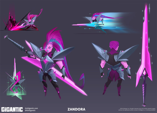
Gigantic is paragon of quality among a sea of games full of safe, boring marketable designs made to attract the largest possible crowds. It pains me knowing this game won’t reach the same success Overwatch will partly because of how visually distinct this title is.
While I clearly have a bias towards Gigantic, I will admit Overwatch as a whole is mostly competent. The character designs serve their purposes, even if I happen to think they’re boring.
What about those other games? Here’s a game that I’ve enjoyed playing recently: Battlerite.
Battlerite is a top-down arena brawler. One might call it a MOBA, but it’s a team deathmatch game sort of. Your goal is to defeat the enemy team in a first to 3, 2v2/3v3 match. You moved with WASD and you’ve got keys for abilities, vaguely similar to games like LoL or DOTA 2 in a way.
Battlerites case is very much “we want the MOBA crowd”. This sounds like a really lazy descriptor that lacks any value, but hear me out: Battlerite is the spiritual success to a game just like it called Bloodline Champions that came out a few years ago. Here’s a sampling of characters from Bloodline Champions:

Bloodline Champions is a game with a unique, clear visual identity. Whether or not you like it, it’s clearly something wholly unique in terms of color and how they’ve decorated their characters. Weird shapes (top left, top right) as well as familiar ones with distinct ornate details (bottom two). They all adhere to colors that the games overall aesthetics thrive from, it’s very gritty and twisted.
SO WHAT DO YOU MEAN “WE WANT THE MOBA CROWD”??? JERK
This is what I mean. The first character showed off that wasn’t a direct adaptation of a bloodline champions character was Pearl. Here’s Pearl:
Pearl is the epitome of the differences between Bloodline Champions and Battlerite’s character designs. Half-baked ornate details because without them, the characters would end up more generic than they already are. Battlerite’s cast is comprised of archetypal MOBA character stand-ins. They’re boring, and hollow uninspired renditions of characters that had a lot more style in a previous life. Here’s some really boring Battlerite characters:
BLAH. They’ve got the Overwatch “problem” but even worse. These guys really just look like cosplayers doing characters that don’t exist. Staff man. Sickle man. Gun woman. These designs convey nothing beyond what you see. I don’t mind cool characters for the sake of cool characters, I’m the last person to complain about it, but Battlerite really tests that for me. The in-game camera doesn’t do these designs or models any favors too, unfortunately. There’s a single very standout design among the roster.
This is Pestilus.
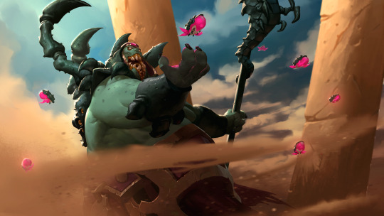
He’s shaped strange. He’s round, he’s got really stubby limbs, and he’s got these big bug legs on his back. Pestilus is cool! Lookit’ his gnarly teeth, wowie. Unfortunately the in-game model doesn’t do him justice:
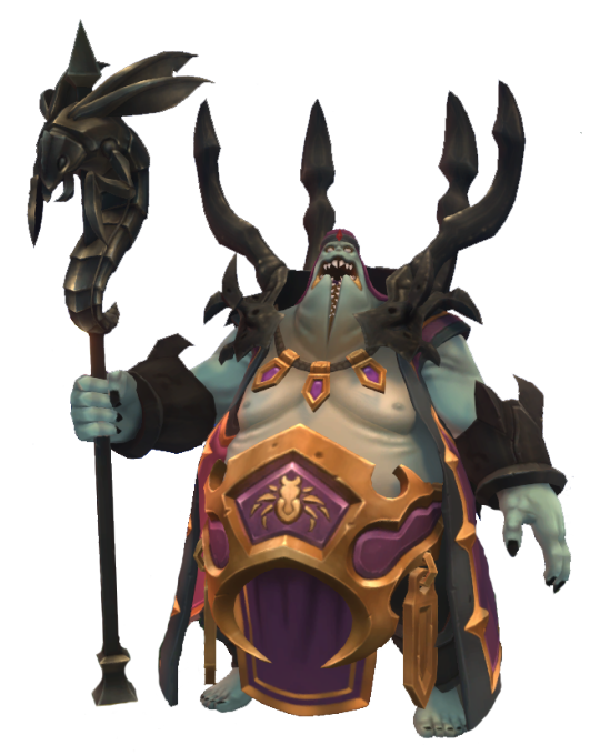
He’s paler, his teeth are simplified and lack the character his chompers had in the above illustration. I still like this one, he’s in a league of his own compared to most of the rest of the cast. HONORABLE MENTIONS GO TO RUH KAAN AND ASHKA:

I’ve said that the worst thing a character design can be is mediocre. Not good enough, not bad enough. Battlerite rides slightly above that line. There’s a few interesting characters here and there. Some have unique silhouettes (Ashka, Ruh Kaan, Pestilus and Rook) and most server their purpose. They’re boring, but they’re not aggressively boring/mediocre. That line of design goes to a little game called. . .
Paladins: Wizards of the Coast or whatever the fuck the subtitle is
Chinese bootleg overwatch. A game that was trying to be a bit unique before a lot of changes were made to match a similar, “hero”-based shooter game where you push payloads and capture points. This is a game with aggressively boring characters. The characters are in this game because if you had none, you wouldn’t have anything to play as. They’re crude facsimiles of better looking, more thought-out characters and designs. Here’s a sampling of these lot of losers.
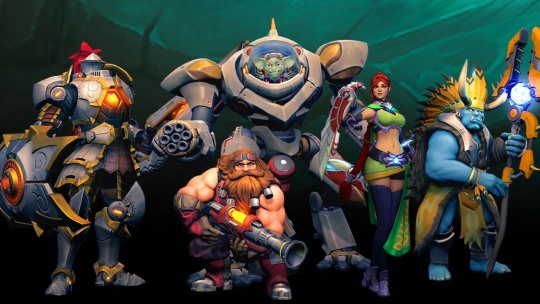
These characters are nothing. Their silhouettes are bland. You’re either big, small or medium with no rhyme or reason. You have a gimmick. Your colors don’t serve much purpose beyond “we needs color-keys to recolor for skins”. Very rarely are they in service of the shapes in question, or to break up monotony in big stretches of solid color. The knight on the left is dull as dull can be. Sure, knights are done to death but good lord they’ve really found a way to try and make him exciting but failed miserably thanks to:
A silhouette that is nothing beyond “TALL MAN”
Colors that are gray all over, his armor is supposed to be metallic but the textures and shading do it no favors. The yellow in there doesn’t do enough in breaking it up because they’re only along the trim of each armor piece.
His shield doesn’t compliment him, it’s an obligation. He has a lance, he needs a shield, and not one that works in conjunction with anything solid.
There’s a single design in Paladins that I don’t think is the absolute most mediocre thing in the industry: Bomb King.
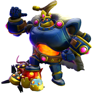
He’s big and loud both visually and personality wise. He’s got a standout silhouette, and colors used mostly tastefully to break up his main blue coat. Bomb King doesn’t look like he belongs in this game, and is strangely. . . Toyetic. I kind of like Bomb King.
Paladins is mediocre. Paladins is very unimaginative and dull, the most recent characters are some of the most unmemorable I’ve seen in recent times, when it comes to these games. While Paladins is mediocre, at the very least it isn’t. . .
COMPLETE, IRREDEEMABLE SHIT.
ENTER: BATTLEBORN-

Battleborn is a game that isn’t aggressively boring, it’s aggressively ugly. It’s annoying. It’s messy, it’s loud, it’s busy. Battleborn is garbage. This game is rife with characters that convey nothing, silhouettes that are awkward and make no sense who are modeled in one of the most unappealing looking games of the past 5 years. This one is so bad I really don’t want to post a sample of characters because I hate looking at 99% of the roster, but I have to. . . I have to. . . Here’s a sampling of Battleborns characters. . . eugh. . .

Do you like any of these designs? Legitimately curious. Unnappealing shapes, ugly facial features, completely mangled details that are hard to make out, poorly balanced silhouettes. . . There’s so much wrong with all of these designs. Some of the ones in the game wildly stylize proportions, mostly very poorly, some are very restrained and more realistic, some are complete abominations like the monster in the upper left: Attikus.
It’s worth singling out Attikus because his concept art has something very interesting behind it: He didn’t look like complete fucking shit, his shapes were solid and his silhouette would’ve worked perfectly, but they seemingly went out of their way to get the ugliest possible outcome they could achieve. See below, Attikus thumbnails:

These are all so much more sound than the final product. Why didn’t they go with any of these four beyond “We gotta make it uglier to fit in with everything else!”. While still asymmetrical, the shapes here tell you he’s powerful and ready to rip and tear through every living thing in his path to victory. That final Attikus looks like it tried to go with something weirdly proportioned like some of the Gigantic characters, but with a fresh coat of grime.
At no point has this stream-of-conscious post has been about nitty gritty things like facial features but Thorn looks vile:
There are no honorable mentions for Battleborn. The very best of the bunch is still very boring and half baked. They’re plain, and that’s really it. They don’t assault your eyeballs with how putrid and gaudy they are, which, by default, makes them the best.
One thing worth nothing is that there are piece of concept art here and there that actually look great, but are put through Battleborns poor “World of Warcraft” + “Disney Infinity” + GREASE filter don’t look nearly as good. The one I like most is this rendition of one of the first DLC characters, Pendles. Here’s the piece in question:
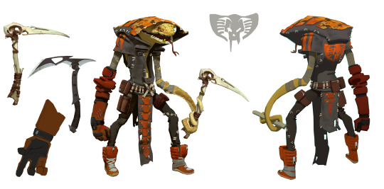
Very lovingly rendered. I don’t want to talk about Battleborn any more. I’m sick of looking at it.
Anyways, there’s some insight on what I think does and doesn’t work in the form of this weird stream-of-consciousness, giant post. Feel free to ask more and I’ll weigh in on it as poorly as I did here! I’d love to hear what everyone has to say about these games and their character designs, and what you like most about the, as well as what you like least about them!
399 notes
·
View notes