#i used caran d'ache crayons for this
Explore tagged Tumblr posts
Text
I'm classifying this as experimentation, because I'm not sure how to feel about it •3•
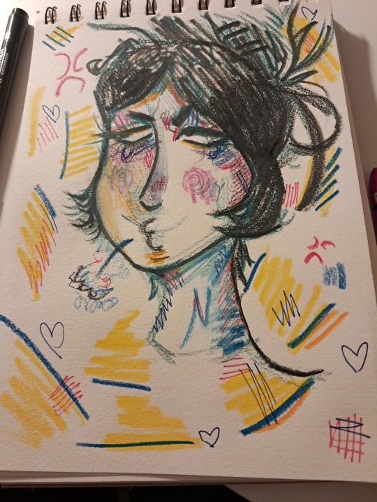
#jujutsu kaisen#jjk#art#jjk fanart#yorozu#jjk yorozu#messy art#i used caran d'ache crayons for this#as well as a twohands pigment liner brush pen and papermate flexgrip gel pens in red and blue#i'm gonna start listing art supplies i use#they're fairly cheap and work well for me so it seems right to share ☆
19 notes
·
View notes
Note
Hey, I'm sure you get asked this all of the time, but whatmedium do you work in? I love, love, love the playful, free feeling nature of your illustrations, and would love to hear more about your process, if you are willing to dish!
Thank you<3
Thank you so much! It depends on the piece, but for most of my pet portraits I work in caran d'ache crayons (their watercolour set but I don't use the water lol), with occassional sennelier oil pastel added on. For my coloured pencil pieces, I use polymer chromos faber-castell pencils. I also tend to use them on cartridge paper. Hope this helps :)
Hannah
29 notes
·
View notes
Note
Hello, those colourful sketchbook drawings you posted are so vibrant and beautiful! I was wondering if you have any favourite crayon/pencils to use for sketching?
Also wanted to say that your art in general is very inspiring. I love how fluid it is.
Hello! Thank you for your kind comment. I'm always touched if someone feels inspired!
Those were done with Caran d'ache Neocolor II, and the gold (which just looks plain yellow in the photo oops) is a marubu crayon. I really like them because they're not crumbly like oil pastels, but look similar. I want to use them more often but I suffer from "I struggle to justify using my nice art supplies" syndrome
I can't think of any specific stand out favorites, but lately the things that I grab for often are: - random ballpoint pens - gel pen or felt pen - fountain pens (not pictured because they're in my work bag) - kaweco clutch pencil (which I named "bananecil") - blackwing matte pencil - pentel brush pen EF - zig clearcolor brush pens - misc colored pencils or markers for some pops of color - I was gifted these random clearance zebra metallic brush markers that kind of suck but I also kind of like them? Complicated relationship

Here's the stuff in my bedside pencil bag
I want to try one of those multi-colored lead pencils someday soon
#asks#text#faq#i think most of these supplies were used in the last sketchbook dump i just posted#the pencil bag in question is actually just a recycled plastic sushi tray
46 notes
·
View notes
Note
How did you do the drypoint process with crayon? It looks great! I want to try it out with my classroom
Thanks, yeah it was really fun and easy! You do it the same as you would with regular ink really - go over your etched lines with a crayon, and then wipe the plate to get rid of the excess colour. Then print on a good paper that's been soaked and patted dry.
We used Caran d'Ache crayons, not sure exactly what type it was but I'd guess they were oil based and water resistant, I'll see if I can find out what it was. We noticed after a while that if the plate wasn't wiped very well and there was a lot of crayon on it, that tended to get the plate stuck on the paper and would sometimes be really hard to peel off without ripping off chunks of paper. The image I posted is actually a bad example because I went back over my wiped plate with more crayon (the blue, yellow and orange) and bits of that did get stuck to the paper so it's a little torn in places.
Good luck, hope it goes well if you try it!
8 notes
·
View notes
Text
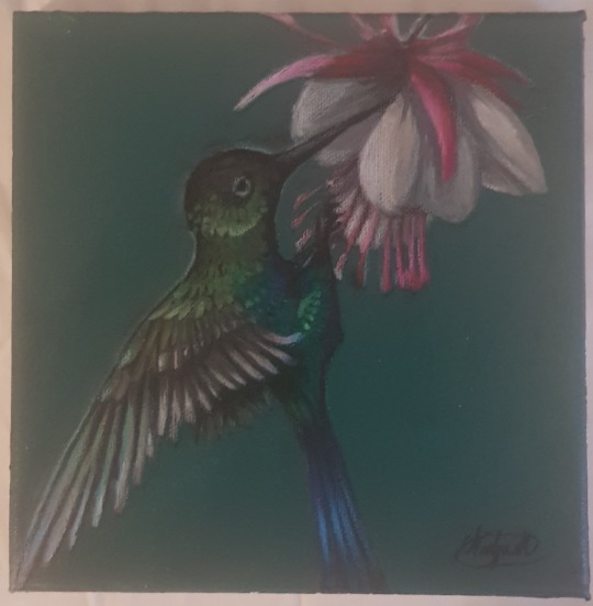

I got indpired by @mcromwell 's heron paintings and wanted wanted to try my own hand at painting birds. (Check out their art! It's beautiful!)
It took me a bit of digging to figure out what sorts of painting media they were using, but the colours for the birds seems to be Caran d'ache neo colour II, with a mix of acrylic for background and such.
It's really fun! And the Caran d'ache colours are great to work with! You can use the crayon-like colours as is or paint with them using water and a brush.
Anyways, just wanted to show off my results and say thank you to @mcromwell for the inspiration. c:
It's been years since last I actually sat down and painted.
37 notes
·
View notes
Note
Your art is wonderful! Am I correct in assuming you work in pastel? If so, what pastels do you use? What got you started as an artist, and what drew you to your medium? Also thanks for the love on my intro post <3
thank you!! I’m so grateful! and you��re quite right, my non-digital art is almost always done in mixed media, and pastel is one of my favourite art supply to work with but it’s always pastel plus something else. f. e. it could be oil pastel + pastel pencils + markers / or crayons / or coloured pencils / or ink / or something else / or everything in the same time.
I use soft pastels set from Faber-Castell and I l o v e pastel pencils (and h a t e to sharpen them lol) which I have from very different brands: my favourite are from Caran d'Ache but they aren’t very cheap, so mostly there are Derwent pastel pencils in my pencil case. As for oil pastel, I prefer Sennelier’s. I know that they’re hated by some artists for being too soft but I personally adore them for that. And of course they aren’t very cheap either, so if I need more colors I just go to the nearest children’s art supply store and buy Van Gogh oil pastel from Royal talents.
I’ve been drawing all my life, but I’ve had kind of huge hiatus for 4-5 or even more years because I thought that if I’m a poet I can only write, that is to say I need to concentrate only on one thing and can’t waste my energy on other stuff (I was mistaken). But then something’s happened (many things actually) and I felt a drive to make visual art again and ever since (for 1-2 years now) I paint, I draw every day. I’m still a poet first but now I can procrastinate from poetry through visual art (」°ロ°)」((´ ∀ ` *)
Mixed media is boundless, lack of boundaries is a constant freedom, that’s something that I was always looking for. If you’re talking about pastel, I had a set of soft pastels when I was a child — was making pretty dummy sunsets and tried to copy ballerinas of Degas (((¬‿¬ )
And you’re very welcome! Thanks again for an interesting question.
10 notes
·
View notes
Text

♡ Inky Cap ♡
Inky Cap Mushroom fae for #funguary week 1 ^^ I found the #funguary2022 prompt list by feefal on Instagram (www.instagram.com/feefal/) and just had to jump on the mushroom train. Here's my first finished piece for the challenge See the progress of making it here: https://www.tiktok.com/@shaiyeh_/video/7060905313985252614?is_from_webapp=1&sender_device=pc&web_id7018079469500302854 I used fineliners, brush liner, FC Polychromos and Caran d'Ache watercolour crayons for this one
#original art#original character#oc#my art#shaiyeh art#funguary#inky cap#funguary 2022#art challenge#drawing#drawing challenge#drawing prompt#art prompts#artwork#artist#artists on tumblr#art#traditional art#fae#faerie#mushroom fae#mushroom fairy#corpse paint#black metal#mushroom art#fungus#polychromos#coloredpencil#fabercastell#caran d'ache
17 notes
·
View notes
Note
What art supplies do you use specifically? Like what coloured pencil brands etc etc, I love your art :)
hi there! thank you!! for my traditional art i use:
- Caran D'Ache water-resistant wax pastels (set of 10)
- Crayola crayons
- Prismacolor colored pencils (set of 48)
- Prang watercolor set (16 cells)
- Winsor & Newton Designers Gouache (Cadmium Yellow, Ultramarine, Alizarin Crimson, Prussian Blue, Cadmium Red, Ivory Black, Permanent White. these are enough to make all colors other than fluorescents!)
- Posca markers
Pens I use most (let me know if u want more specifics):
- Pentel Arts Hybrid Technica pens (sizes 0.3 and 0.4)(my favorite pens!)
- various Kuretake brushes
- Frixion ball slim erasable pens
- white uni-ball signo pen
- Muji pens
- Pentel waterbrushes
there's others i use too but these are probably the things i use most frequently! let me know if you want to know more or see pictures of tools! :)
1 note
·
View note
Photo
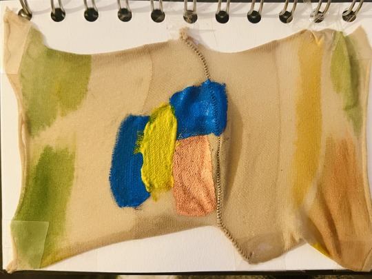
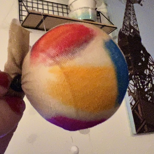
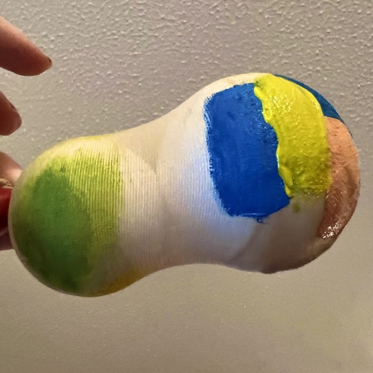
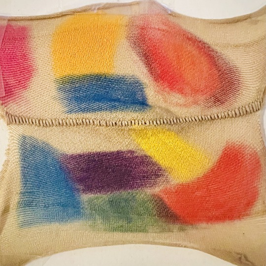
An experiment for a developmental piece I have in mind. Left was done with Caran D'ache crayon which lays on smoothly and not rubbery like Crayola crayon or cheaper alternatives, right was done in acrylic. I prefer the vividness of the acrylic but it doesn't allow from much stretch when being stretched out, I think stretching it out whilst wet will work though. The crayon work best from stretching as it doesn’t alter the structure of the elastic material of the stockings. I used styrofoam balls because I would like to stretch this material over a styrofoam head to paint on and stretch out. I find the makeup and fashion in new romanticism fascinating and would like to do a little piece about the makeup and the gender fluidity of it all. In conclusion I'll experiment with both on a larger scale as planned, perhaps alternating materials could have a nice effect if the pieces are installed together.
0 notes
Photo
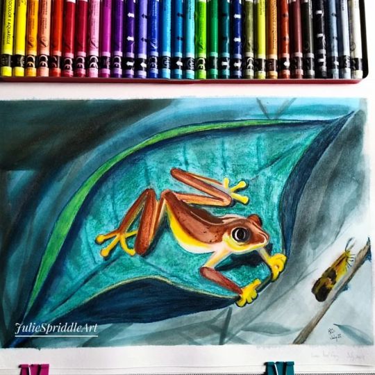
A lemur leaf frog for prompt 15 of the @wildlifewednesdaychallenge This tiny frog was once common but saw a drastic 80% decline in its numbers over 10 years, which means it is now closely monitored. The drop in population is thought to be due to a combination of habitat loss through deforestation and fungal infection. Native to Central America, this frog lives in the tree tops and the males are just 3 to 3.5cm long, while the females are larger at 4 to 4.5cm. These frogs change colour and are greenish yellow during day to camouflage them while they sleep, then becoming brown at night when they hunt. I decided to paint this using my Neocolor II water soluble crayons from Caran d'Ache. I painted this frog in my Arteza cloth covered sketchbook which I've used for watercolour/gouache and usually paint on both sides of the page without issues. This proved to be a mistake with this media, as the activated paint soaked through the page and reactivated the gouache on the page beneath it which transferred to the opposite painting as well, while sticking the sheets together as it redried. I am not impressed! @ecowarrior8888 @lizzywatercolor #WildlifeWednesdayChallenge #LemurTreeFrog #LemurLeafFrog #frog #FrogIllustration #illustration #IllustrationArt #WildlifeIllustration #AnimalIllustration #AnimalArtist #MixedMediaIllustration https://www.instagram.com/p/CgfUwRVrN2V/?igshid=NGJjMDIxMWI=
#wildlifewednesdaychallenge#lemurtreefrog#lemurleaffrog#frog#frogillustration#illustration#illustrationart#wildlifeillustration#animalillustration#animalartist#mixedmediaillustration
0 notes
Note
what kind of pencils are you using? I thought you were using oil pastelles because of their soft thick texture before I read on patreon they're actually pencils!
Hello! I use polychromos faber castell pencils for my colour pencil work on cartridge paper (not smooth cartridge), and I use caran d'ache crayons for my crayon work : ) I do occassionally use oil pastels now and again. Many thanks, Hannah : )
37 notes
·
View notes
Link
Check out this listing I just added to my Poshmark closet: Caran d'Ache NEOCOLOR I Wax Oil 15 Assorted Colors Water-resistant Crayon Swiss.
0 notes
Text
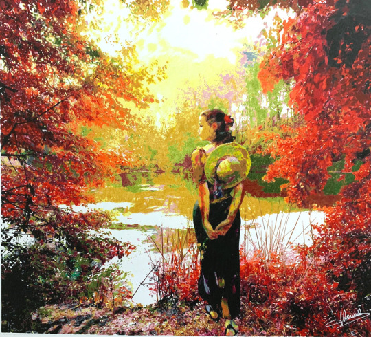
The UKCPS featured artist for July is Jaques Dominé. Read on to see how he produces his beautiful work.
Jaques Dominé
My main activity is black and white graphite portraits.
It is at the age of 17 that this passion for portraits came to me it has never left me. I have never taken any sort of studies or courses for arts/painting.
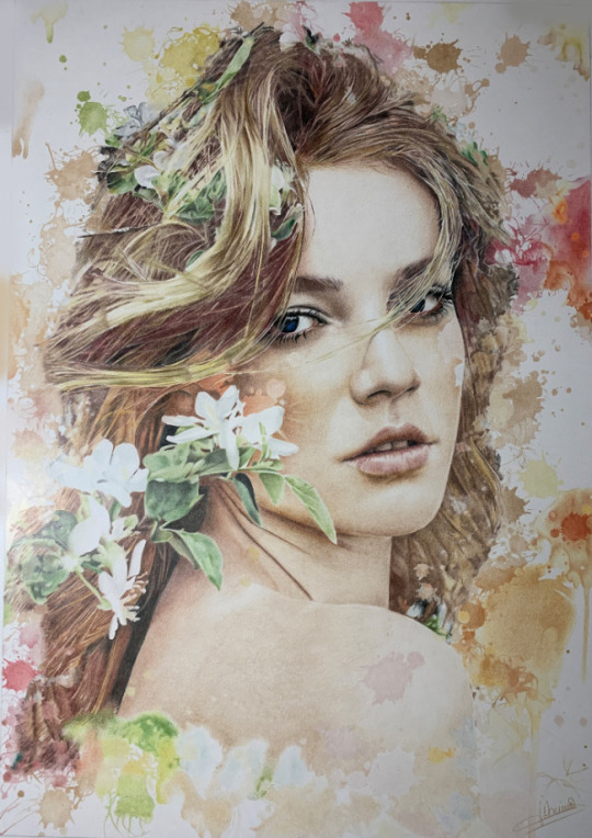
From 1999, I widened my gift by producing paintings of people, nudes, drapery and clothes etc. I became known by winning numerous Jury and Public Prizes at several Regional Exhibitions and Painting Salons in France.
Then from 2010, I started adding a few touches of colours to my paintings, using pastel crayons and rudimentary colored pencils.
In 2017 I realized my first portrait executed entirely in crayons (Tristesse colorée) (coloured sadness).
This desire for colour came to me by chance, when visiting the UKCPS website on the web.
When I saw the beauties that could be achieved with colored pencils, I was amazed and surprised. I didn't think one could achieve such level of realism.
So I looked out for the UKCPS publications on WEB, to know which equipment should be used, and j started.
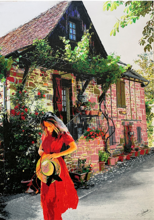
My main activity of portraits in graphite pencil takes most of my time, so I have only done about ten colour paintings, including two landscapes so far : la dame de l'étang (The Lady of the Lake) and la dame Collonges (Lady Collonges).
It's so exiting to give birth to a landscape, but it takes me a lot of time (about 150 hours) because I like to reproduce the slightest details.
Now the technical side:
For each work I use the Prismacolor Premier, the Luminance from Caran d'Ache, the Polychromos from Faber Castell, the Castle Arts and some Derwent. Each brand has its specificity; the first two are thicker, but at the same time more fragile, while the Pylychromos and CastleArts are drier. Thus, I have 510 crayons. This allows me to always find the desired shade, since I very rarely superimpose the colours.
My favourite papers are Stonehenge, Strathmore 500 and Caballo 109. These papers show almost no grain and they are pleasant to use. The lead of the pencil glides and the colours spread out perfectly.
I do not often use the traditional eraser but more often an electric eraser to clarify a specific point.
When I choose a landscape, I like to add a fictional character to give a soul to the painting, to spark (suggest) a story in people's imagination.
I start by making a light pencil sketch that I can erase as the work progresses. Then I start the colour by zone like a puzzle, always from top to bottom and from left to right.
I have my own colour charts for each brand, so that (most of time) I quickly find the desired colour. For a landscape I don't need to set the exact tone. On the opposite, I like to engage bright or warmer colours. As I said before, I very rarely layer colors.
Then, I dissolve the colours separately, or between them, to make blends using Blender crayons and colourless alcohol markers.
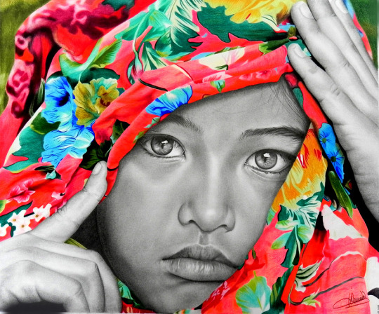
To make a colour portrait, the principle is the same, except for the shading that I only do with a blender pencil, as it is easier to soften the blendings of the nuances of the skin, without leaving any trace. I always start with the left eye, then the right one, the nose, the mouth, and I end with the hair. If the hair is dark, I finish with the background. If it is clear, I do the background first, before I start the portrait.
The practice of crayons has given me a real satisfaction using this technique. Last month, I participated in a Plastic Arts Fair that brought together all the techniques (oil, acrylic, watercolour, pastel, drawing, etc.) and I had the pleasure of winning the Public Prize.
It was a great satisfaction to see that crayons can compete with all the other more recognized techniques.
For me, drawing is above all a pleasure, a passion. I choose my subjects, my themes, listening to my tastes, my wishes and my mood. Beauty, tenderness, sensitivity and sensuality inspire me, and I am delighted when such emotions can be felt through my art.
0 notes
Photo
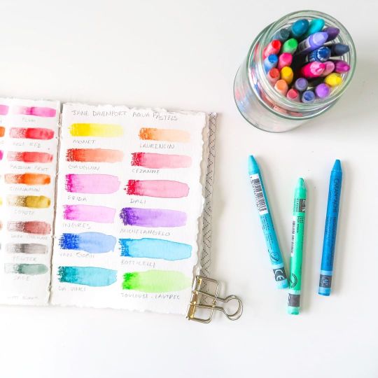
Color swatches. I've been swatching all of the art supplies I've accumulated recently in order to have them all in this little book for quick reference. Recently got the @janedavenport Aquapastels from Michaels. So I swatched them along with a few Caran D'ache Neocolors I bought from Blick like...two months ago. First time ever using water-soluble crayons!⠀⠀⠀⠀⠀⠀⠀⠀⠀ ⠀⠀⠀⠀⠀⠀⠀⠀⠀ #aerialovelyblog #craftroom #craftroominspo #craftroominspiration #craftspace #craftspaceinspo #homedecor #craftymintroom #mintroom #shabbychic #deskspace #workspace #jdmm #janedavenport https://www.instagram.com/p/B9ms9Q8pGJS/?utm_medium=tumblr
#aerialovelyblog#craftroom#craftroominspo#craftroominspiration#craftspace#craftspaceinspo#homedecor#craftymintroom#mintroom#shabbychic#deskspace#workspace#jdmm#janedavenport#personal
0 notes
Photo
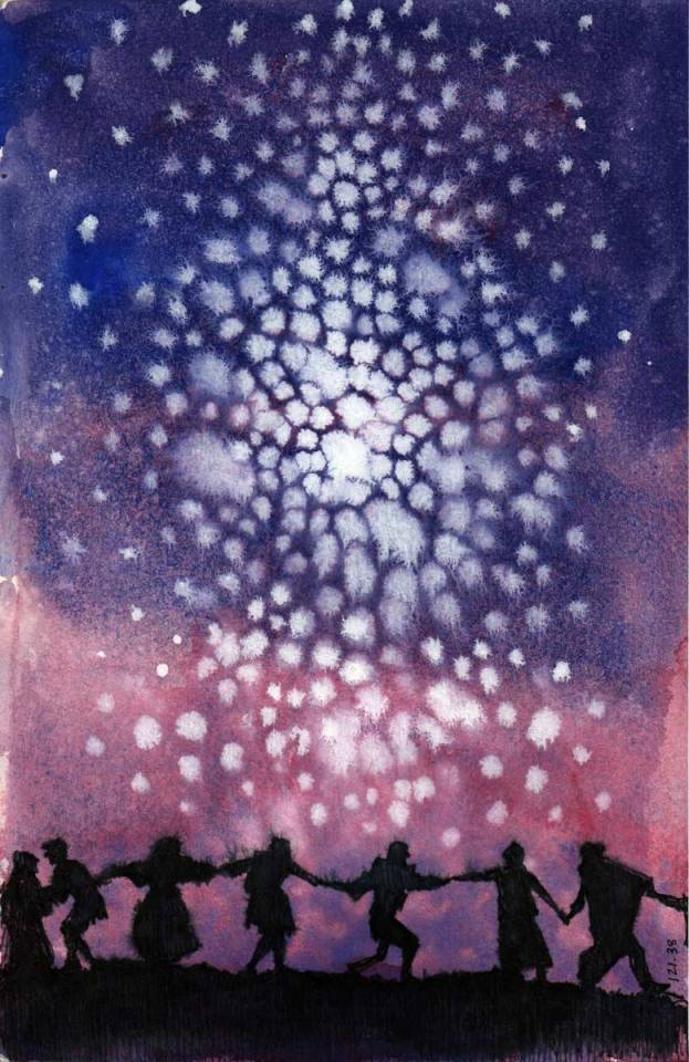
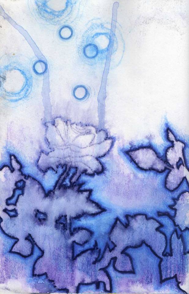
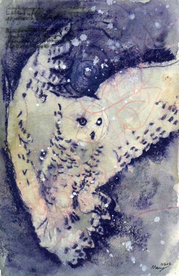
Blog guest: Artist Marcus McAllister
See also: https://www.marcusmcallister.com
Many thanks for the great interview ✨✨! PART 1
Which materials are your favorite ones to work with?
Some of my favorite materials are the water media techniques I use in my Sketchbooks. I love using watercolors for the freedom and spontaneity they provide--particularly since I use watercolors to draw freely and not to "classic" watercolor works. I've also finally found some richly pigmented watercolor pencils that I just love, so that I can do more intricate drawing that I can then cause to bleed a bit by using a water mister. I love to use the same spray technique on Pilot pen ink drawings too. One of my all time favorite drawing materials are Caran D'ache Neocolor II watersoluble wax crayons. They give a wonderful density to watercolor drawing, and using a water and a brush they can create rich washes. Oh and another technique that I love to use is white gouache in wet color washes.
Interview: Anna Ulsenheimer
#art#artist#fineart#watercolor#illustration#painting#drawing#animals#owl#nature#flowers#night#artistinterview#interview#marcusmcallister#ink#kunst#zeichnung#malerei#tiere#eule#blumen#nacht#mischtechnik#mixedmedia#stars#universe#sketchbook
1 note
·
View note
Photo

On today's blog (Kellykilmer.blogspot.com) Unexpected Places. Supplies used: Journal I made from hardcover book and 100 lb Accent Opaque cardstock size 13 1/4 x 20" opened Acrylics: Holbein, Sennelier, Utrecht and Golden Stabilo All in One water soluble pencil black, blue, brown, orange Caran d'ache Water Soluble Crayons Neo Art (discontinued) and Neo Color II's Painting knife Brushes #womenwhopaint #acrylicpainting #acrylics #newwork #color #ilovepainting #artistslife https://www.instagram.com/p/CGQumfNgO1c/?igshid=1aokw0rijg2x8
0 notes