#i read that some screen readers work better with alt text and some do better with post description so i went with both
Explore tagged Tumblr posts
Visit Tumblr Blog
Explore Tumblr blogs with no restrictions, modern design and the best experience.
Last Seen Tumblr Blogs


Fun Fact
The most popular pages on Tumblr are about Minecraft, GIFs, and David J. Peterson.
Text

image ID: a digital painting made to mimic an oil paint style of Eddie Munson in a range of brown, orange, and cyan blue colours, playing his guitar and throwing his head back.
#eddie munson#stranger things fanart#stranger things#stranger things art#stranger things Eddie#amboolents originals#amboolents art#i read that some screen readers work better with alt text and some do better with post description so i went with both
51 notes
·
View notes
Text
Code Lyoko Chronicles 2.0
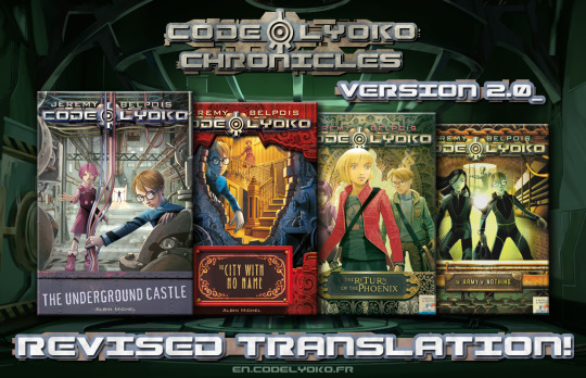
The Code Lyoko Chronicles are a series of 4 sequel books originally released in Italian in around 2010. Set a short while after the season 4 finale, parts of book 1 recap a story similar to the TV series but with a number of small changes (there's no RTTP for example) while the gang uncover some new secrets in the Hermitage that set them on the path to finding Aelita's mother, Anthea. But XANA survived and is coming back for revenge, and the gang's investigation into the secret history of Franz Hopper, Project Carthage and the Supercomputer puts the men in black on their trail as well, not to mention the shady Green Phoenix organisation who funded Hopper's work.
The books were published in a number of languages, but not in English - so that's where the fans come in. As one of the first translation projects we did for CodeLyoko.fr, finishing in 2014, the original completed English release was pretty rough. 10 years later, armed with more translation sources, better resources and many years of translation experience, I decided to take another crack at it. And after many months of hard work and procrastination, I've produced a version 2.0 that I'm pretty happy with.
Links and notes on the various changes under the cut!
New translations!
My co-translator Kelsey and I didn't have a lot of serious translation experience when we picked up where Rhys Davies left off in his English translation project, and we were definitely prone to making mistakes. And it didn't help that for books 3 and 4, a few things got lost somewhere in the process of the text being translated from Italian > Spanish > French > English. I revised our original translation and this time I referenced multiple sources to try and make sure I got the interpretation right. It won't be perfect, but it's definitely better than our original attempt!
The second half of book 2 was based on the official French version, which I discovered was slightly condensed and abridged to lower the page count. The new English translation expands the text to restore the parts that were omitted. I also changed the title from The Nameless City to The City with No Name - there was never an official English translation, but I did find a marketing document with the titles listed in English, and that was the only one that differed.
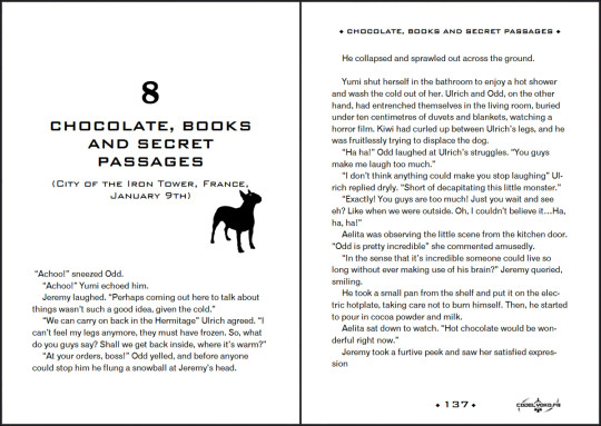
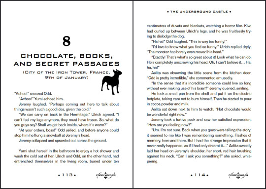
Here's a page comparison with a few changes, mostly minor, but one big change to the context of Odd and Ulrich's conversation. With my apologies to Kiwi for the original mistranslation.
New formatting!
I got better at formatting Word docs and realised I should have the text alignment set to justify. The books look a lot neater now!
Accessibility!
I added alt text descriptions to all the images, and the PDFs all have a proper table of contents now so you don't have to scroll to the end of the book to find the navigation.
(Note I don't have a lot of experience with detailed image descriptions and I haven't done much testing with a screen reader - feedback is welcome from people who know more about it!)
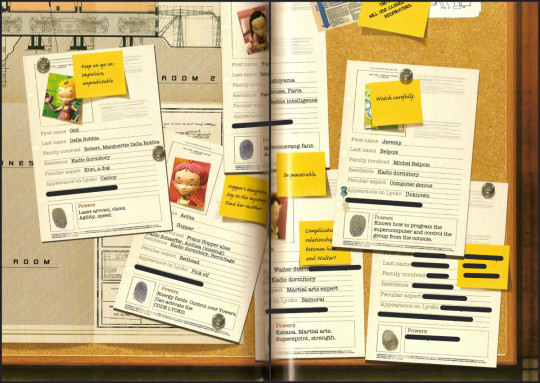
New scans!
The centre of each book has several colour pages with images and text to supplement the story, and some of the original scans were quite small or had part of the image disappearing into the spine of the book. And the only way to fix it seemed to be to obtain physical copies of the books (probably in Spanish), pull the pages out and scan them flat. So I did. And I think they look great. (Black lines added to hide spoilers.)
My original intention was to upload these to CodeLyoko.fr, but I haven't been able to do that yet, so for now they'll just be available on Google Drive. This translation wouldn't have been possible if not for the other people on the fanslation team - not just my fellow translators, but also all the people who worked on scanning, formatting and editing. Special thanks also to Rhys Davies for kicking off the English translation. You can read more about the Chronicles and the fanslation project here on the website. (Yes I still need to revise the translation of those pages too. Someday.)
So yeah, it's taken a while, but I'm glad I can finally put out a better version of these books for people to discover. Enjoy!
Version 2.0 PDFs here! (Google Drive) ePub versions coming soon.
83 notes
·
View notes
Note
In what way does alt text serve as an accessibility tool for blind people? Do you use text to speech? I'm having trouble imagining that. I suppose I'm in general not understanding how a blind person might use Tumblr, but I'm particularly interested in the function of alt text.
In short, yes. We use text to speech (among other access technology like braille displays) very frequently to navigate online spaces. Text to speech software specifically designed for blind people are called screen readers, and when use on computers, they enable us to navigate the entire interface using the keyboard instead of the mouse And hear everything on screen, as long as those things are accessible. The same applies for touchscreens on smart phones and tablets, just instead of using keyboard commands, it alters the way touch affect the screen so we hear what we touch before anything actually gets activated. That part is hard to explain via text, but you should be able to find many videos online of blind people demonstrating how they use their phones.
As you may be able to guess, images are not exactly going to be accessible for text to speech software. Blindness screen readers are getting better and better at incorporating OCR (optical character recognition) software to help pick up text in images, and rudimentary AI driven Image descriptions, but they are still nowhere near enough for us to get an accurate understanding of what is in an image the majority of the time without a human made description.
Now I’m not exactly a programmer so the terminology I use might get kind of wonky here, but when you use the alt text feature, the text you write as an image description effectively gets sort of embedded onto the image itself. That way, when a screen reader lands on that image, Instead of having to employ artificial intelligences to make mediocre guesses, it will read out exactly the text you wrote in the alt text section.
Not only that, but the majority of blind people are not completely blind, and usually still have at least some amount of residual vision. So there are many blind people who may not have access to a screen reader, but who may struggle to visually interpret what is in an image without being able to click the alt text button and read a description. Plus, it benefits folks with visual processing disorders as well, where their visual acuity might be fine, but their brain’s ability to interpret what they are seeing is not. Being able to click the alt text icon in the corner of an image and read a text description Can help that person better interpret what they are seeing in the image, too.
Granted, in most cases, typing out an image description in the body of the post instead of in the alt text section often works just as well, so that is also an option. But there are many other posts in my image descriptions tag that go over the pros and cons of that, so I won’t digress into it here.
Utilizing alt text or any kind of image description on all of your social media posts that contain images is single-handedly one of the simplest and most effective things you can do to directly help blind people, even if you don’t know any blind people, and even if you think no blind people would be following you. There are more of us than you might think, and we have just as many varied interests and hobbies and beliefs as everyone else, so where there are people, there will also be blind people. We don’t only hang out in spaces to talk exclusively about blindness, we also hang out in fashion Facebook groups and tech subreddits and political Twitter hashtags and gaming related discord servers and on and on and on. Even if you don’t think a blind person would follow you, You can’t know that for sure, and adding image descriptions is one of the most effective ways to accommodate us even if you don’t know we’re there.
I hope this helps give you a clearer understanding of just how important alt text and image descriptions as a whole are for blind accessibility, and how we make use of those tools when they are available.
391 notes
·
View notes
Text
This is my online accessibility (especially image description) masterpost, which I update periodically whenever I find a new resource or guide. I worry this has the side effect of looking overwhelming in scope, so if you're learning about IDs and/or Tumblr-specific accessibility for the first time, I recommend you start with the first six posts, under "The Basics". All post titles are clickable links!
The Basics
[Plain text: "The Basics". End PT]
Why and how to write image descriptions
Accessibility on Tumblr for new users (has templates, also talks about how to tag for flashing lights to accommodate photosensitive folks)
I see an image and want to describe it: a step by step guide
Fanart-specific and Tumblr-specific advice for image descriptions
How to describe screenshots of tags
IDs versus Alt Text, from a visually impaired Tumblr user (spoiler alert: sometimes it makes sense to use both)
Level of Detail
[Plain text: "Level of Detail?" End PT]
Why a short ID is always better than no ID
Blind people discuss the level of detail to include in IDs
The key word for writing IDs: "Relevancy"
Helpful Communities, Tips, and Tools
[Plain text: "Helpful Communities, Tips, and Tools." End PT]
I want to make my posts more accessible, but can’t write IDs myself: a guide
The People's Accessibility Discord sever (also mentioned in the previous link. It's a friendly server for crowdsourcing image descriptions, with description requests and feedback requests both welcomed)
Google Doc full of template descriptions for memes
Online image to text converter
Describing skin tone and describing hair (heads up that the posts themselves are undescribed and were written with fiction writers in mind; potentially still very useful)
How to remember to write descriptions (spoiler: by putting yourself in situations where you see descriptions more often)
Related, a Google doc of described blogs (almost all the blogs linked earlier in this post have tons of described posts and resources too)
(In my opinion, writing IDs is easiest to learn by doing — but especially if combined with watching other people do so. So follow some described blogs!)
Miscellaneous
[Plain text: "Miscellaneous". End PT]
Alt text vs IDs vs Captions with examples
Why not to put image descriptions in small fonts/italics (also, some non-definitive thoughts on IDs vs alt text)
Special characters read by all screen readers
Brief Intro to Transcripts/Video Descriptions
Myths That Harm Blind People
How to make your blog's colors visually accessible - one of the easiest thing on this list!
Other easy things: show love to artists who describe their work, edit descriptions into your original post when someone provides one in the notes, and copy-paste inaccessible (eg, small text or italicized) descriptions as plain text when you reblog!
Lastly, and maybe most importantly, how to continue writing image descriptions while avoiding burnout.
Let me know if any of these links break! I personally don't describe nearly as much audio/video (got those audio processing issues), so this list is sparse on those resources, but if anyone has good guides/blog recommendations for that too, feel free to add on!
715 notes
·
View notes
Note
Do you happen to have any resources regarding accessibility in ttrpg design? About design, colours, phrasing of text or anything else that could be helpful!
I spent wayyyyy too long compiling all this - but it's important, and I appreciate you asking!!
Accessibility is a subject near and dear to my heart, and I will say up front that I'm not sure universal (aka accessible to everyone) design is possible, because people's needs can vary even within the same subset of similar disabilities (such as limited vision or blindness). BUT that doesn't mean we don't try to design for and make our games available to as many people as possible. Mismatch by Kat Holmes is a great read on design for accessibility in general, as is Invisible Women by Caroline Criado Perez. You might also check out literally anything Alice Wong has ever done.
To start, I recommend this article on the Lenses of Accessibility.
(for reference, this article is about web/graphic design, so I'm going to try and distill the most salient points for game design)
We are going to primarily focus on a few of these lenses:
Color
Font
Images & Icons
Layout
Readability
Structure
Keyboard
More details under the cut.
Color
Why does color matter? Well, for starters, there's a lot of colorblind people out there. Contrast affects readability. Autistic people and people who suffer from occular migraines might be affected by particular vivid colors. There's lots of reasons to consider color and the work it is doing in your piece, but in general you can provide a black and white, high contrast version of your game to help users.
There are tools out there to figure out if your contrast meets certain readability standards, such as this one.
Font
Dyslexia and other visual processing issues can make font choice really important. Plus, some fonts really affect readability. Additionally, line height, justification, and size of text can affect readability.
Best practice would be to provide a plain-text version of your game (and beware of "dyslexia-friendly" fonts which may or may not actually help - sticking to a basic readability font like Arial, Tahoma, or Verdana, is safest). I like this style guide for reference.
Images & Icons
For visually-impaired people, it's important to use alt-text, descriptions, and/or captions to help screenreaders properly translate images. Tons and tons of details that could go into this, but there are better people than me to describe it.
Layout
We've talked about this a bit, but there's tons of resources for this. There was recently a great writeup about Yazeba's Bed and Breakfast in terms of layout that I highly recommend.
Readability
More of the thing we've already talked about - it really is a combination of all the other lenses that comes down to readability. Audio versions of your game are always a good way to avoid the restrictions of screen readers, but can be expensive to produce.
Structure
This is tables. Tables are a nightmare for screenreaders, but including them as images can also be a problem. The short solution is "don't use tables" but that's not necessarily great for seeing people. The section in this blog is really great when talking about options for structure.
Keyboard
Debated on whether to include this, but given how many games are being read as purely digital files, I think it's important to have workable interactive elements that can be navigated through without a mouse. Some of that is going to come down to the programs being used to open your files. But if there are things you can do on your end (such as labeling form fillable fields on an interactive character sheet), they're worth doing!
Please understand that this isn't an exhaustive list. There's tons of resources out there and technology and standards are constantly changing.
It's also is important to note that even doing one of these things is helpful. You might look at this list and go "wow that's too hard" but I promise you, it's worth it. My games do not all have accessible versions! That's something I'm trying to rectify. The biggest part of that for me is thinking about accessibility from the start instead of at the end! But we can start today, and that's better than not starting.
The most important thing to remember are that disabled people are NOT a monolith - needs will differ from person to person. Accessible design makes gaming better for everyone!
Final Resources:
Accessibility in InDesign
Accessible-RPG
A11Y
Accessible Design for Teams
317 notes
·
View notes
Text
Please, if possible, add alt text to your images. (Describe every image, please.)
I've seen people post before about how every image posted, ideally ought to have an image description. They generally get a lot of support from people already doing it, but also some objections, questions and even anger.
So let me first say: I understand that not everyone can add image descriptions for a variety of reasons. But, if i grab 100 random posts with images here it's lucky if one or two have a description. Now I know that not that many of you have some serious reason why you can't describe the damn images.
This simply isn't the case on other social platforms I frequent. Mastodon would be well above 60% described. Even twitter (before I left that hell-hole) had like 20% of the images described. Now both of these platforms have popular tools that will remind you if you forget a description, and frankly it's easier to edit descriptions there... so some of this is Tumblr's Fault. Tumblr make image descriptions easier and make a reminder!
But it's also about user culture. People here just don't think image descriptions matter. But they do!
I WILL NOT reblog posts if they don't have image descriptions. So I end up adding them myself, and frankly I pass over MANY posts that I would have quickly reblogged but I don't have the time to be everyone's mom and describe everything. So, I just do that for the really great posts I can't pass up. But having a description will make more people share your work since you aren't making work for us if we want to share it.
Why do I need to describe images? Because many people use screen readers and if a post makes no sense unless you know what's in the image your post is useless to all of those people.
Why do I need to describe art? Because people who are blind, and people with vision impairments also like art. My brother's kid loves my ant drawings. They're legally blind, but they can see if they enlarge an image and look close up, the description give them the context they need to understand what they are looking at. Frankly, I read image descriptions all the time myself when I find a post confusing, so it's helpful to... literal minded people too. And it just makes your post seem more complete and exciting. Why miss out on putting a neat description.
I don't know what to write! Imagine you are reading the post over the phone to a friend. What would you say "And then there is that meme with the guys in the hot tub, sitting five feet apart" put that. Even something short is better than nothing. Just explain the post for everyone. Since it's YOUR post you know best what matters most about the image. When I add descriptions after the fact they can get a little long since it's not my post and I don't know what matters most. OP's description in the alt text is the best description.
If you have other questions you can ask me. I'll find out if I don't know.
(Did you know you can add alt text to your images by clicking the "…" symbol in the lower-left corner of an image when writing a post? Having the description attached to the image is the best way and only the OP can do this, but I also often add descriptions in brackets [ ] when I reblog cool art, cats and ant stuff. So, if you can't add a description yourself, it's OK, there are people who will help.)
165 notes
·
View notes
Text
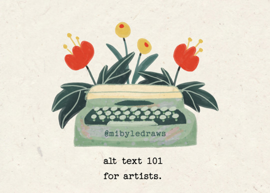
alt text 101 for artists
I’m not an accessibilty expert, but I gathered these tips here and there, and it has really been helping me writing better alt texts - and I hope they will help others too!
Alternative text is a description of an image that can be read by a screen reader. It also can help the understanding of an image for people who don't use screen readers.
What do you write?
It all goes down to including what is relevant to give the user an accurate idea of your artwork:
the medium you used to make the artwork (is it a digital illustration? a traditional oil painting? a graphite pencil sketchbook doodle?)
the subject of the artwork
anything that is relevant for understanding the meaning of the artwork. For instance, is the lighting important, or does it bring a particular meaning or mood?
Write sentences - don’t just throw away key words. EDIT: don't write full sentences, but phrases and fragments to keep your description concise
adding one more thing after getting feedback: keep it concise! Under 125 characters (even 100 is best)
Where/how do I add it?
The alt text feature is more or less obvious on the apps we usually post on. In doubt, please just search for it on a web browser, you’ll find how to add it in the blink of an eye :)
On Twitter
enable the alt text reminder! Everytime you post an image, it will remind you to add alt text if you forgot it. Go in your settings, then “accessibility, display and languages”. Then “accessibility”, and in the media section, check the “receive image description reminder” box.
on web browser: once you’ve uploaded your image, click on “add description” under it.
on the app: once you’ve uploaded your image, click on the “+alt” bubble in the right bottom corner that appeared on your image.
On Instagram
at the bottom of the posting page, go in “advanced settings”, then “accessibility”, then “write the alt text”.
On Tumblr
once you’ve uploaded your image, click on the three dots icon that appears when your mouse is on the image, then click on “update the description”.
On Mastodon
once you’ve uploaded your image, click on the “description missing” message that appears on it.
On your website (portfolio, shops, etc)
Where and how you can add it depends on the platforms but there’s always a way! My tip for this would be to schedule yourself an alt text audit of your website to take a moment when you would search how to do it and when you would add all the necessary alt texts! I’d also encourage you to pay attention to some other accessibility features - for instance contrast between background and text. There are lots of ressources out there and I admit it can sound overwhelming: digital accessibility is an expertise, a job field in itself after all. In my opinion, taking it a few steps at a time is a good way to go! For instance I like to do little accessibility audits of my portfolio every once in a while and check a new area that I might have missed before.
I forgot to add it, what should I do?
On some platforms, you can add it after posting if needed - it’s the case on the Instagram app for instance. Always try to see if you can add it afterwards. If you can’t, add it in the replies (if it’s on twitter for instance) or edit the body/caption of your post if you can change this but can’t change the alt text.
Adding it as a “simple description” instead of an alt text that will be read by a screen reader in lieu of the image isn’t perfect, but having it somewhere very close to the image in plain text that will get to be read by screen readers is way better than nothing to my knowledge :)
It's Disability Pride Month (July, when I'm writing this)
I wanted to take some time to encourage you to take some time and energy this month, and at anytime of the year, when you can, to learn about Disability Justice. I’m not the best at explaining what it is, and how much there is at stake. I’m better at this, making small guides about what fellow artists can do to make their work more welcoming to disabled people. But it doesn’t mean Disability Justice isn’t close to my heart and that I shouldn’t even mention it.
There’s a documentary about the Disability Rights movement that I can only highly recommend - it’s Crip Camp. It’s on netflix, and even watchable in full on Youtube.
youtube
Pay attention to us, disabled people, to what we have to say. ”Nothing about us without us”: our perspectives and opinions are those you must focus on when it comes to disability and to our lives.
#disabled artist#disability pride month#disability community#artists on tumblr#art community#illustration#artist on tumblr#illustrators on tumblr#cute art#accessiblity#art resources#art tips#tips for artists#Youtube
181 notes
·
View notes
Note
May I ask why you do image descriptions?
Yes, of course! You asked so nicely, how could I not
I write image descriptions mainly for blind/visually impaired people. Many of them use screen readers, which, when faced with an image, will just say "image", so they need some text describing the image, and then the screen reader will read that text and then they'll know what the image shows
That's not the only thing image descriptions are useful for! There are other people that benefit from them, I remember hearing about some people with ADHD who finds image descriptions helpful as well, or just people who have slow internet that won't let images load. There are also blind people that don't use screen readers but still benefit from image descriptions, and I'm sure there are more examples I'm forgetting about here!
There are many sites that have alternative text options, which work similarly to image descriptions, but some sites' alt text options aren't very good/accessible (like Tumblr's), so image descriptions can be a better alternative in those situations. Whether someone prefers image descriptions or alt text tends to vary from person to person. But since most images I see/reblog don't even have alt text, I tend to write image descriptions for those. Just a way to help make this site/my blog more accessible for everyone!
I hope that helps explain! You can ask more questions if you need to. I also have a tag in which I reblog posts about accessibility, including tips and reasons to write image descriptions! Feel free to look through it ("#accessibility tag"). Have a nice day!
21 notes
·
View notes
Text
On the topic of inclusivity there’s something I’ve been wondering!
I’m here, we have an option to do different colors for the words. In the past, I’ve used it to highlight something, to go with aesthetic (like green for IYWBW or red blessed be the fruit) or in Moon knight stories, I do bold for Marc’s thoughts, italics for Steven and red for Jake, something I started since sssb
But idk if it makes it hard to read
So, anyone with any sort of issues seeing or reading or whatever, whether blindness, dyslexia or any disability, please answer
Just to keep this clearer, if you don’t have a disability or anything that could effect reading, please just hit see results as I’m largely looking for disabled voices
If it causes issues with screen reader, please elaborate! If there’s a work around I’d love to keep the colored words but I’m not gonna if someone can’t read
Additionally if there’s something we can do in fanfiction to help accessibility, like something that impairs a screen reader we can change, let me know. I’m trying to do some research on the topic.
I know alt text is something I have GOT to get better about and I’m going to make an effort on that
Anything else?
17 notes
·
View notes
Text
(This post is mostly me thinking out loud)
Lately I've been trying to be better about cross-posting my stuff to Mastodon (and by "lately" I mean "just today") and some thoughts about a particular process.
For context: On Mastodon, you are encouraged to write descriptions for images you upload to help the low-visioned or the blind. It's not required, but I've done this on Mastodon without much fail, and it may be a practice I'll carry over to Tumblr if I can help it.
The thing is, Mastodon doesn't really offer a great option for describing comics (which is what I've been working on cross-posting today) (this may also only apply to the web app). The issue I'm running into is that apparently it is a bad idea to include line breaks in alt text. According to an article from 2015, it can cause some awkward read-outs from screen readers. Things might have changed by then, but so far I haven't found any sources that refute this idea.
What I could do then, is just describe the comic without inserting line breaks, but then that feels very awkward from both a sighted and non-sighted point of view. Sighted people will be greeted with a wall of text should the image load slowly, and non-sighted people may have to listen to that wall of text with no distinction of where some content starts or stops (like with different panels).
I looked around for solutions and came across this article (How To Write Alt Text For Digital Comics), which I may recommend if you're also thinking about doing webcomics someday, and I found mention of what the comic XKCD does (or at least what Explain XKCD does). Basically instead of putting a comic description in the alt attribute of an image, it's hosted on a different website.
If I ever get around to doing a more narrative-focused webcomic, I won't include image transcripts on a different website. I'll probably include it on the same page as the comic itself somewhere, but not within the image as an attribute. This should give me more room to explain/describe things without hurting everybody. I may still use the alt attribute to give a *very* broad summary of what a comic page is about, but the real meat and potatoes will be in a transcript separate from the image.
#not a photo from the album#the contents of this post relate to no fandom whatsoever in particular#but i was writing it with the mufopiri comics collection in mind#so onto this blog it goes!
5 notes
·
View notes
Note
Hi! Do you have ressources or ideas about describing images in another language? Notably: being bilingual, I might post in either of the two languages I speak. How can I write alt text in a way that won't be confusing to my readers whose screen readers are in either language? (I'm assuming screen readers can't switch from one language to the other just by guessing.) [1/2]
And in the case that my image contains text in one language, but my post is in the other. Is it okay to translate the text in my alt? And if I don't have the time or spoons to do so, is it better to write the text in the language that it is on the picture, or to just write "text in [language]"? [2/2]
What a great question! Generally speaking, screen readers can't switch between languages on their own; that's why you need language properties. While a page has an overall main language property, you can set certain parts of the text to different languages with the right coding! I've never tried that with alt text though, so I'm unsure if that works.
In any case, unfortunately, I don't think you can do any of that on individual posts or images on Tumblr (I've tried adding the HTML coding to a text post and got no results on my screen reader, though it's been a little while since I've tested).
Now, some screen readers, such as VoiceOver, are able to switch between languages that have different alphabets even if the change happens mid-sentence. So if you wrote the alt text in Japanese, mine would read it just fine even though it's set to English. But if you aren't lucky enough to be using a language with that unique of a writing system, each person's screen reader is probably going to read the text and alt text as best it can using its default language rules, whatever those are set to for that user.
I'd say your best bet would be to provide both, though that might be easier to do via image description that alt text.
Do my followers have any other suggestions?
14 notes
·
View notes
Text
if you do want "reach" on Ao3 consider: (source: I've published over 40 fics since 2014, and I believe it's is why the ones that I consider popular are popular)
posting your fic in multiple places. not everyone is on ao3, consider other fanfic specific webbed sights -some of the best fics I have read were exclusive through personal connections on google docs. You could also consider opening things like a kofi for sharing writing if you want. (altho its important you don't link any commerce avenues to Ao3. it's against policy and will get your account deleted, for legal reasons)
joining/making community of people who share your passion for fan works or a certain fandom. and then working to make it a Nice place to share these things, by supporting other artist. the most engagement I ever got on ao3 was due to the fact that I had joined discords specifically focused on my fandom, and all of us would wait with bated breath for fics to be written and shared. so we could go read comment and share them in other places.
supporting other fan works in general! comments and kudos often contain a link back to your profile! if you give a thoughtful comment (or a comment at all on a obscure work). and I often check the profiles of comments from like-minded people to see if they have any works that might fit my tastes.
Share your fics in public spaces. things like a tumblr post with a copy of your description and an image of your tags can help people who aren't constantly on Ao3 remember that there are cool fics out there.
work on your writing skills in general. people are more likely to share writing that is well crafted. and while it's completely valid, (and honestly joyful for me personally) to post or read something that isn't completely polished. refining your skills can help make you stand out.
making your fics Acessable! more people will enjoy your fan works if they Can actually consume them! Ao3 supports alt text for images. and that's a great start to making more people Able to enjoy your works. but consider also looking into HOw to write alt tex in ways that are actually helpful to screen readers. along with how to break your text up visually so dyslexic readers can better read your works. (there are tags for these things too! and people who need/prefer these accommodations Will use those!)
Working to slow pace of fandom. i hear time and again from fandom elders (elders lol, I mean anyone like 30 and above and that is NOt elderly) that the immidancy of media in the modern age has shortened the amount of time people are doing fandom things. (which hurts fanfiction culture hard because it takes so much energy and time to write!). things like competing Streaming services, time crunches at media corporations, algorithmic fandom spaces, and the push to commodify of hobbies All affect the way the public interacts with fanworks. staying educated and vocal about what you think is right, and ways we can stop profit from being the main driver in creative works can and will help all of us get more time to write and share and read fics. (without feeling left behind) - see also: letting yourself be behind in fandom, if you publish a moving work on a piece of media that's not currently being aired it is likely that people will read it and get re-excited about it. hell I watched all of M*A*S*H (1972) and devoured whole swaths of the fanfics available because of gifs I saw on tumbr in 2020. and I probably would have started writing my own fics there, if it hadn't been for that meddling pandemic, and the seasonal depression too.
having a schedule! this one can be tricky exspeishaly on ao3 where you are not (And Should NOT) be getting any financial compensation for posting. but if you can manage to have a regular posting routine it means that people who enjoy your fics can know when to come check for them. I've only done this twice. one I had mostly written out (through the support of friends) and just decided that posting a chapter a week would be reasonable and motivating. the other time I had a strong outline and idea of what I wanted and had the luxury of working on them daily. but those remain the most commented on fics I've ever done!
nothing pisses me off more than when i see a fic on ao3 talking about reach. "this ship isn't here but i added them for reach" "this fandom tag isn't necessary but i'm adding it for reach" "reposting for reach" STOP IT!!!! this is not tiktok this is not twitter this is an ARCHIVE this is not how it works!!!
90K notes
·
View notes
Note
Hey, I'm trying to be more conscientious about putting image descriptions on the things I'm posting and I was wondering if it's better to have them as a separate text or in the alt text embedded in the image? Thanks for your help!
thank you so much for asking! I'm always happy to talk about this — so happy that my replies get pretty long, in fact — so skip to the bottom if you just want some examples.
short answer: either is better than none, but using both is actually the most accessible to people with different needs.
long answer: there's pros and cons to each. a lot of people who use primarily screen readers like alt text because it's read out immediately, and don't have to hear "image image image" for comics or whatnot before getting to the description, nor mistakenly skip a post because they can't tell yet that it's described. however, tumblr in particular has two problems:
glitch where alt text occasionally fails to save in a draft or gets deleted on reblogs
bad options for displaying alt text directly, which impacts (among others) low-vision people who would want to read alt text with enlarged font, in order to take in details of the image they can't make out by sight. (on desktop, they can use XKit Rewritten's AccessKit, which I will always recommend, but that's not an option for mobile users)
there's also an argument that alt text being invisible to most sighted people doesn't do much to encourage, educate, or remind people to include them, TBH. I consider that all pretty secondary to directly accommodating people, but I agree with where it's coming from.
so, what can you do? option 1 is to include the same alt text as image description (placing the ID directly under the image, because remember, flow for screen readers is important). I like to lead with "ID from alt," in order to clarify to screen reader users that they can skip the ID, and help differentiate it from the other option I'm about to describe.
this should be intuitive, but here's a random example where I did this for a single-image meme (link), and another for a multi-image meme (link).
option 2 is to include a short description in the alt text, and a more detailed explanation in-post. this can let screen reader users instantly know that the post is described, and decide whether they're interested in it, but it maintains an in-post description for others to benefit from too.
here's an example of me doing this in a post about IDs (link), and here's an example of my mutual describing art like this (link).
are either of these options objectively perfectly correct? no, but few guidelines for IDs really are. the only things I'll add are to not use small text, italics, colored text, etc in image descriptions, since those can induce readability issues for low vision folks. no read mores either, for obvious reasons (annoying and glitchy). as far as I know, indents are fine, and some people like those to make the IDs more visually differentiable.
with the emphasis on the fact that all blind people have different needs, you can hear several blind and visually impaired people talk about IDs versus alt text in this post and the notes (link). also, that thread has another example of the "option 1"/"both places" compromise, this time as a description for a screenshotted reply.
again, thank you so much for asking! I hope this helps, and it means a lot that you're working on writing more IDs!
33 notes
·
View notes
Text
Alt Text and Habituation
I’ve been trying to consistently put alt text on images here on my blog.
I don’t, if you’re curious. I mean I didn’t. I have, for basically two months now, been trying to comprehensively add alt text to things. If you go back to just November last year, I think you might find images just don’t have alt text.
A part of this was bad advice, from the actual system for adding alt text. If you check the media library for wordpress, it includes a note about alt text that says something to the effect of ‘if this image is not necessary for the article, don’t put alt text.’ And I thought that yeah, actually, largely, my images aren’t. That doesn’t excuse the times I show cards, or make the image the subject of the paragraph, and certainly not the times I just dump a graph in there, but the bad advice made me think by default I didn’t need to do it, so I wouldn’t do it.
The other thing was I just didn’t think of it. It was a habit I didn’t have. And honestly, there are a lot of habits that add a few seconds to things that you can think maybe are easy to do, but you had to build those habits. Using Mastodon regularly on kind.social and posting on cohost. My daily magic cards became part of it – I think it might have been a whole year of typing out alt text every day that got me in that habit. But I was only doing that because I had an image I wanted to post every day in the form of my custom magic posts, and those I could determine an alt text for them very easily.
That meant the habit got built a little at a time and a lot of the alt text I use now is stuff like ‘an icon of a thing.’ Sometimes I take to giving the vibe of an image. Sometimes I’ve tried making a joke.
Understand that with this habit came a lot of discouragement. The way people talk about alt text on mastodon makes me not post pictures there aside from the once-a-day custom magic card. The kind of people who get very mad about alt text and accessibility features enough to yell at me, a stranger, about it, are the kind of people I read once, then mute because I can’t address structural concerns while they yell at me about them and all I can do is my best. Haranguing strangers doesn’t help me build the habit. The environment is volatile, and honestly, kind of cruel about alt text. It’s not enough to post it, you have to do it right, and you can’t discuss its limitations or difficulties without being attacked.
Consider: If the only way to do alt text would be to go back through my blog of ten years and have to alt text everything as the first thing I did, it’d never happen. It just wouldn’t! There’s an enormous archive that doesn’t necessarily load reliably, it’s a huge pain in the ass and probably a full time job’s worth of work for some time to go do that, and with no practice at alt text, it’d probably look bad and be unhelpful. Taking the current (bad) situation and making it overwhelmingly hard to make it not much better is not helpful.
I want to build better habits, I want to do a better job of the things I do. I don’t avoid alt text because I want the internet to be a worse experience for people who use screen readers.
You build good habits a day at a time but part of that means that there’s got to be a version of the habit you can do every day.
It’s now been a month or two of dedicatedly doing it, and I’m writing about it now because one of the biggest hurdles in the whole process was alt-texting all 380+ cards for my daily Magic: The Gathering custom cards. This was a single huge task, but it was also a new task. It presented to me a puzzle, and I had to find a way to solve it that worked. I’m just going to list what I did, roughly, and show you what it took to get that project set up, and then what that led to.
That was not a small task! I’m glad I did it, I feel good about having done it, but wew lord it was not easy! And now, bonus, to complicate it further? If I want to edit a card – or worse a handful of cards – I have to delete that file, upload a new version, then go through and replace all the times that card gets referenced!
This is a big task, but doing it made all smaller permutations feel easier. Alt text feels easier to remember because hey: I don’t have to do that again.
Check it out on PRESS.exe to see it with images and links!
0 notes
Text
Do I keep trying for accessibility?
I know this isn’t gonna go anyplace, I don’t really have followers here and although I follow people here, since there is no way for me to read my dashboard I don’t think anyone will read this. I started trying to use this site again about a year ago, but there is no way to make it readable for me. I can’t read posts. Something about the site coding means I have to restart a screen reader for each line brake.
like this
and this
I have been asking for and suggesting reasonable accommodations since March - with not much in the was of response from the staff - depending on how you count it early March, second attempt first week of September, and the last update was 11-9 (basically ‘give us what phone you are using and we will see what we can do about the app. I gave them the info and they haven’t said anything to me since) I posted to humans asking how long I should wait to hear back - nothing, I tried to blaze it (hoping a mod would look at it and reach out, I didn’t expect them to actually let it blaze. Them letting something less than positive out there? LOL) also nothing.
So here is the thing, accessibility is hard. It takes time and money, and the staff is overburdened with everyone coming here. But here’s the thing, if they had starting addressing it in March this wouldn’t be an issue at this point. They could have been working on it for months before we got here.
Here are my suggestions as someone who is working on accessibility at her job:
Accessibility NEEDS to be part of your FAQs and a choice for your service tickets. I searched the FAQ and could only turn up a short thing about alt text - for tickets there is “Customize your blog” and “something else”
on the app serif fonts should be an option, with both light and dark background.
look into a accessible fonts there are tons of them out there (I know sans have been sold as more accessible and for some they are, but not for everyone.
There needs to be a way to make your dashboard have a dark serif font on a light background. I can make my blog look like that - so I can post but I can’t read my dashboard (guess what 4th person to touch my service ticket, low contrast doesn't have a serif font, so the wait for that answer was not productive)
Also, from my reading of the case law around websites, you need to be offering different sized fonts.
Twitter is going away, so basically I’ll be out there looking for a place that, or without social. I guess I will have a ton of spare time.
The TOG fandom is here, so I will never really be a part of it. Once twitter is gone I will have some affinity groups on discord - but the over arching fandom? So much of it comes back to this site and without pulling whole posts off into Word to change the font I can’t even know if it is something I want to read (also I use likes to denote the posts I want to try to read and culturally this site is super shitty about that)
One last thing - every bit of accessibility added helps non disabled people as well.
For my fandom friends from twitter and discord, how many of you had issues when dark mode was taken away? Think about how you would feel if the staff response was “you never needed that, you just need to try harder” and then they ghost you. And then every time you try harder your fellow fans are talking about how shitty it is for people to do the only thing that, ironically, is allowing you to read that post.
Do I care enough about this site to fight to make it better? Because I think that is what the staff isn’t understanding - I am trying to help them make this site better.
OK this really is the last thing, have some song lyrics: (from Working In A Coal Mine by Lee Dorsey)
workin' in a coal mine Goin' down, down, down Workin' in a coal mine Oops, about to slip down Workin' in a coal mine Goin' down, down, down Workin' in a coal mine Oops, about to slip down'Course I make a little money Haulin' coal by the ton But when Saturday rolls around I'm too tired for havin' funToo tired for havin' I'm just workin' in a coal mine Goin' down, down, down Workin' in a coal mine Oops, about to slip down Workin' in a coal mine Goin' down, down, down Workin' in a coal mine Oops, about to slip downLord, I'm so tired
#TOG fandom#accessibility#accessibility helps everyone#disability#learning disability#I think I will miss social media
79 notes
·
View notes
Text
Well, I've (for my own amusement and personal use) formatted a few epistolary fanfictions, so in general I'd say don't worry too much about the readers who essentially curate their ebook appearance. They know they're missing out on fancy formatting and for one reason or another prefer it that way.
Think more about things like readability, both visually and for people using text-to-speech (TTS) engines (I'm one of them - apart from a couple years of cataracts a while back my vision is fine, I just really like being able to have anything at all read aloud to me while I do other things). Because keeping TTS in mind has overlap with formatting for flowability.
(Have a break for dashboard sanity)
For TTS friendliness it mostly comes down to remembering that things will be read out in the way they're presented. Say you had a parallel poem that was broken into two columns and was meant to be read down the column. If you formatted that as individual lines it'd be read left-right-left-right-left-right all the way down. But if you format that as a table the left text will be one block followed by the right text as a second block and would be read the way you wanted.
Avoid text that must be read from an image; even alt text entries that contains the actual text are ignored by some screen readers (though absolutely include alt text for all images, because the people who really need it will most likely be using readers that can handle that). Be aware of the trade-off between "things that look good" and "things that will sound good"; if you're formatting something like tweets, emails, or texts and making them reasonably true to life that's probably going to include a lot of extraneous information like timestamps or blue checkmarks or whatever that visual readers can, again, elide right over, but TTS users will be forced to listen to (again and again and again).
Also, many special characters (including emoticons) will be read aloud by their official or descriptive name, so you need to be cautious about the use of things that involve them, such as in ASCII art or in having characters texting. Like having someone post a wall of ❤️ is all well and good visually because the reader will just elide past it at a glance, but listening to redheartredheartredheartredheart unto infinity gets old fast. Be aware that some characters and emoticons have really long descriptive names if the TTS engine doesn't know how to otherwise handle it. Such as black left lens bracket or medium brown hand with thumb up.
When in doubt, throw your roughed in work at a TTS engine (there are many web interfaces for various engines, plus ereader software that has it as a feature) and give it a listen.
And, for the hatred of all that is unholy, avoid using so-called glitched or cursed text, because when a TTS looks at c̵̡̺̱̘̱͇̤͙͔͆̔̅̏̀͐͌̚ͅư̸̜̤̳͚͋͂̈́́́̄̓̕r̸͎̖͇̊́̽̒̀̽̆͒̔́͠s̴͚̈̾̍̄͋̆̇̀̈́̒̕e̷̡̘̘͎̘̖̻̻͑̑͆̅͌͜d̸̛̘͈̟̫̓̆̍̍̇͝ ̷̜͔̾t̷̥͔̼͔̅̇̚e̸̬̖̜̒͋̆͂͋̂͑̿x̵͓̼̺͉̜̔̅͐̔̐͛͂̍̈́̕͘͝t̷͉̺͖͕̬̞͍͕̠̖͑͗̅̂͘͝ it will not see nor read that as "cursed text". It will attempt that as a loooooong list of the descriptive names of every character it recognizes. Why yes, I have encountered a fanfiction where the author was using that for a demonic character. I had to go in and decipher and re-type every line they'd done that to before I could actually listen to the fic. And it's not much better for visual readers either.
All of that said, you can do a lot with things like class elements that include outer frames and have background colours, such as this simple example where I took a very basic "letter" CSS format and assigned different background colours to each writer (by making class definitions for letter_harry, letter_eggsy, etc), so it has easy visual shorthand for who each letter is coming from:

It would be comparatively easy to fancy that up by also assigning different fonts or text colours to the writers, such as having someone who usually writes in purple cursive on pale pink paper.
Also be aware of how well different formatting does (or doesn't) translate to software that eliminates a lot of CSS. For example, this author did a lovely work skin for the texting in their fic and it looks pretty good fully formatted against a white background:

But this is how it appears on my phone screen, with a lot of the formatting disallowed:
They've used some things like a translucent background in the overall texting window that doesn't translate well, and whatever code they used to make the speech bubbles is entirely gone. But the different background colours are still slowing up. Though those timestamps are going to get annoying after a while
On the other hand, in this example there was a bunch of character-specific group chat/texting going on so I had a very lengthy set of character-specific texting definitions. This is how it looks in Calibre (and one of these days I'll get around to tweaking it to a more sensible "everything is a left-aligned chat bubble" so it's not quite so chaotic):

Thankfully only Deadpool has something going on with his chat handle that's annoying for TTS. The formatting for this also translates a lot more neatly to less formatted ereaders, since it has opaque rather than translucent backgrounds and keeps more of the text bubble code:
And of course you can also play around with things like various font faces and font sizes or colours, and a judicious use of images. Again this is a place where keeping in mind that readers may have entirely different background colours (or even a background image) with white and black being the two most common options is something you need to keep in mind. If you're designing entirely for a white background you're going to end up with things that don't look as good, or disappear entirely.
One common example: using a graphic image for a horizontal rule. If you give it a white background it'll only look good on readers also using a white background. But if it's, say, an entirely black stylized arrow with a translucent background, it'll disappear on screens with a black background (except for possibly a faint fuzzy outline). There are various ways to deal with that; one obvious one is to not use pure white or pure black for single colour graphics with translucent backgrounds; make them an at least slightly greyed value instead, which will still show up on opposite-end-of-the-spectrum screens unless the reader randomly has that exact shade chosen (much less likely than a white or black screen). Here's an example of that being done, again in Calibre vs on my phone:

(Kudos to the artist I had for that exchange for making the arrow in grey and not black.)
Basically it comes down to a YMMV choice as to how you'd like to approach issues like that, and you should always test your draft ideas with both of the most common background colours.
Also, when assigning font faces in your CSS definitions, remember you can assign a list of fallback options, not just a specific font, so if someones settings for their reader strips out custom fonts it may at least notice that some definitions specify font families ending in "serif" vs "sanserif" vs "monospace" vs "cursive" and display at least that minimal difference, which can go surprisingly far in formatting (emails formatted to use monospace font vs tweets that use sanserif and sticky notes in cursive, for example).
I don't know what specific issues you're worried about with flowable vs fixed formatting, though given you're a graphic artist I'm guessing a lot of them have to do with image placement and how poorly something like an image that's supposed to stretch across the bottom of two pages works when instead it's appearing plunked randomly down in the middle somewhere. There's a certain amount of accepting that it just won't work that way and doing something else instead; for example displaying the image as two sequential images with a forced page break before each, so the reader is still getting the visual impact of the split image without them being buried in text and separated from each other.
How does one make an ebook for an epistolary novel, and still have it be reflowable? 🤔 Because very specific formatting, font choices, etc. is sort of the point of an epistolary novel, but that doesn't really work with a reflowable ebook because the point of reflowable is that readers can essentially reformat it to their preference.
Hmm.
#Ebooks#Formatting#Epistolary Works#I'm probably covering stuff you already know but I like to be thorough#I have a CSS stylesheet called texting.css with my basic definitions for a whole bunch of things#So I can just append it to ebooks that it'll be useful for and then do any fic-specific changes and additions#It gets a real workout for some fics
34 notes
·
View notes