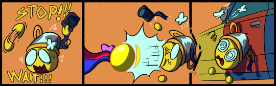
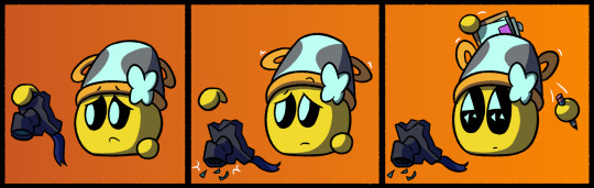
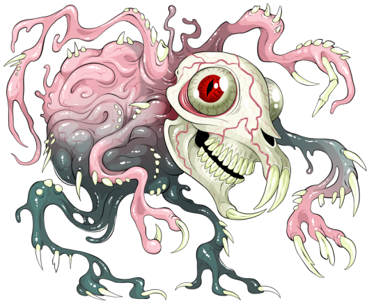
#i never do lineart and basic shading
Explore tagged Tumblr posts
Visit Tumblr Blog
Explore Tumblr blogs with no restrictions, modern design and the best experience.
Last Seen Tumblr Blogs


Fun Fact
Hackers stole 65M passwords from Tumblr in 2013.
Text


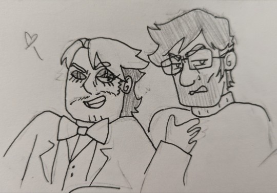
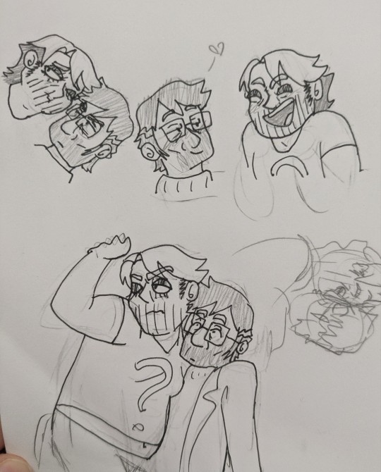
Asked and answered. @1spooky2me
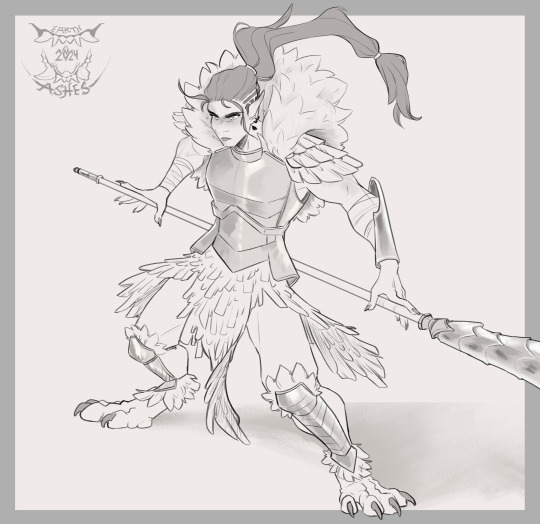
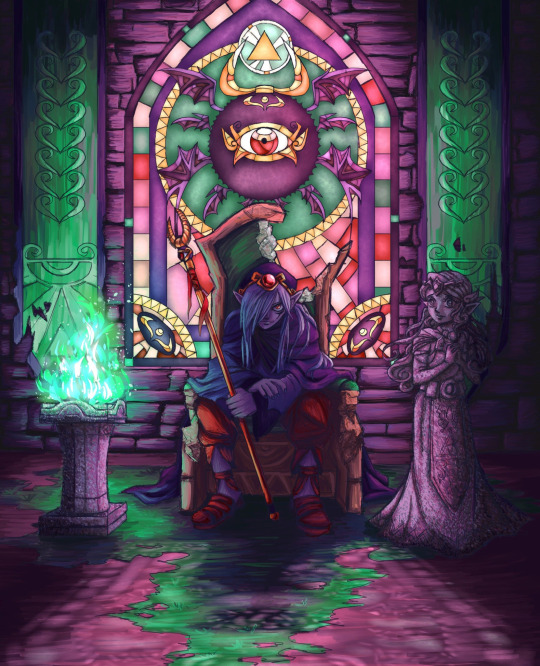
#billford#bill cipher#human bill cipher#ford pines#gravity falls#actually kinda proud of this#i never do lineart and basic shading#such a good design that i accidentally sketch him with two eyes lol
771 notes
·
View notes
Text
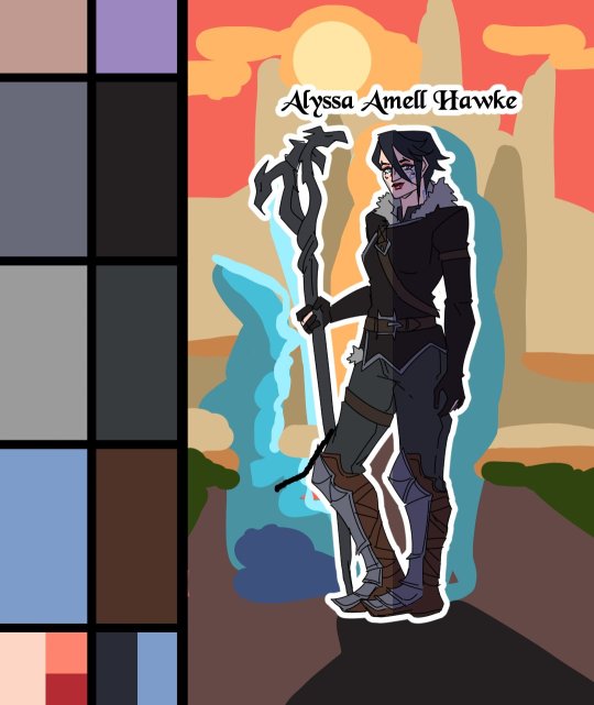
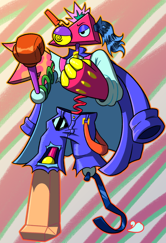
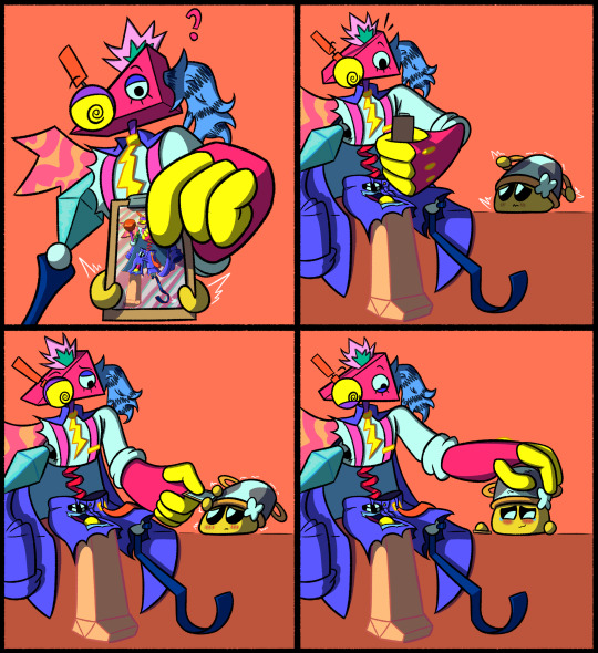
Heroes of the Dragon Age
An animation I've made for Dragon Age Day 2023, featuring my main Warden (Alyssa Cousland-Theirin), Hawke (Eleena Amell Hawke) and Inquisitor (Sulevin Lavellan)!
It's to this day one of my best artwork and I thought I should share it here too! 90+ hours between the original sketch, outfit design, the rough animation, rotoscope, inking, flat-colours, background shading and even the audio :')
Interested in the process? I detailed it below since it was my first time doing something like that:
I would like to start by saying I'm not a professional animator!Everything you've seen here is the result of experimentation and a lot of practice to learn and understand how 2D animation works.

My first idea started in May 2023. I just finished rewatching DA Absolution for the X time, and wanted to analyse why I loved the intro so much. (Even after countless rewatch, I never skipped it once.) I was inspired to study it with my main three protagonists!


Then came the first test with Alyssa Cousland-Theirin, my Hero of Ferelden! I tried to understand which part to separate for the animation. Mainly the hair and cape because it flows a lot more than the rest! If I recall, my first idea here was to make her counter flame attacks (?). Then, as the camera turns around her, I tried to add a grid to know how the camera would work around it.
I ended up making the clip longer, so she could position herself to the further left and leave space to the two other protagonists.

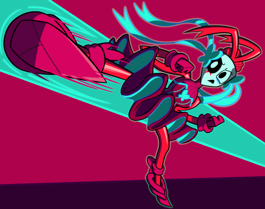
Now it was time to try to animate Sulevin Lavellan, my Inquisitor. I really kept that quick doodling style just to capture the vibe without putting too much time/effort into it! The background would be static to contrast with Alyssa's. I also loved the idea of a rogue sneaking!

Instead of working on Eleena Amell Hawke, my Champion of Kirkwall, I went back to Alyssa and started working with Clip Studio Paint 3D models (this entire animation has been done on the EX version of the software!) It helped for rotoscope animation and maintaining likeness! That's when I got the idea to make the background swirl around the character to let the eyes be guided by the rest of the screen!

After a couple more hours, I planned the entire animatic with 3D models and quick doodles! I finally found a cool pose for Eleena Hawke, which was honestly the hardest of the three to imagine for some reason? I tried many other poses but ended up picking an animation from the game!


This whole time, I was studying a bunch of background ideas and how studio Red Dog Culture House (who made Absolution) work! Thankfully, they have a YouTube Channel where they shared some BTS content so I could analyse it!


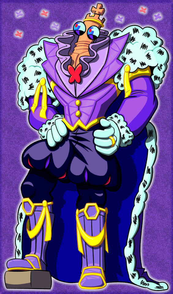
Then, I simplified my character and their original designs in the style of the studio! These outfits are how I imagine them after Trespasser. Alyssa as the Queen of Ferelden, looking for a cure to the Calling, Hawke following Fenris to Tevinter & Sully as a Red Jenny Inquisitor!


The idea for Sulevin's animation actually came from a piece I doodled on a live stream, when I was drawing pose studies and turning them into finished artworks haha As for Alyssa, I wanted to draw the fight that got her facial scars!

Once their designs were ready and the background ideas too, I made the rough version of the animation! Basically a sketch done on top of the 3D models to add the details, staying pretty rough just to capture the idea and movements.


Then it was time to start the lines! I decided make a folder per frame, so I could separate all he main elements and draw them one by one. It helps keeping the likeness of a character in the different frames without having big "jumps" between frames! In fact, every parts were coloured differently to recognize them, and then I used vector erasers and masks (Ah yes, the entire lineart is done in vectors of course! It's easier to adjust and save time when working on similar frames!)


At first of course, everything overlaps! But I find it easier to draw too much and erase after, just to make sure everything is coherent in each frames! The cool thing about CSP is how you can change the colour of the layers in one click! So all the coloured lines turned into black in one second, and I could reverse it just as quickly to double check!

Then I started working on Sulevin! I made a blue line to mark where her feet were, as the sketch in the background wasn't perfectly straight! (Like Sulevin's sexuality 🤭😂) The silhouettes were very quick to do, but I had fun adding more & more details as she came closer to the foreground!

I really wanted to add that little dagger trick, but I remember it required me to change the pacing of Eleena's apparition, as it was recovering her arm too quickly! I had to change the pace of multiple frames quite a lot during the project, to make sure the flow was right! For Eleena, most of her animation remained around her arms and the staff itself, as magic would be the most difficult part! That way each character has their own focus: Alyssa has a very animated background, Sulevin got the grappling hook and Eleena the ice!

Then it was time to start adding colours! Just like for the lineart, I separated every colour on it's own layer, so I could easily adjust the colours later if needed. I added one colour at the time, going through all the frames, and then another colour!
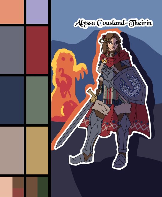
I made full palette tests with the colours I would use for their background at this point, checking if the details remained readable! Alyssa was the most challenging in terms of clothes, because I made her a very detailled armour! I had to simplify the Theirin heraldry, vectorize/redraw the Cousland, and make a brush for her cape's pattern!

Once I was done adding the flatcolours, I started the background, and oh boy it was a wild ride. For the cave, I painted multiple tests. I imagine was to use CSP panorama tools, which transform a texture into a 3D sphere, so each corners must match to look good. Sadly, it made the background very blurry, so after hours of testing, I changed ideas. Instead of the random fire balls (?) I originally imagined for Alyssa, I made three simple frames of a Rage Demon to attack her.


I ended up using the cave as a repeated pattern to make it turn 360° around the character. For Eleena, I mixed inspiration from the comics, Dreadwolf & Absolution, using warm colours matching Hawke's signature red. Just like I made the cave very grey/blue to match Grey Wardens. For Val Royeaux, it was more complex because I wanted to make it green, matching the Inquisitor's signature green. But bright green couldn't work, and the original colour during day time was blue/white/gold. So I added more leaves, played around the design a bit! After adding the rage demon, I made the shading! It was surprisingly easy and quick to do now!

I clipped a white layer on the flatcolours to not be distracted by the colours, and made thin lines to separate the light/shadows, then simply filled everything with the bucket tool! Then you set the layer to multiply and remove the white layer, and you have celshading shadows! Now the character looks out of the picture, so I added layers of blue in color burn, saturation and substract blending modes to make her look like she's in the right setting! Of course, I did the same with the other two, giving Hawke a red overlay and Sulevin green shadows!

Then I added the details, it went from white irises, to sword/staff smears to earrings and smaller finition that goes on top of these layers. To add the lights, I simply selected the shadows and reversed the selection! Using warm and cold tones to create contrast with the purple/bluish shadows! I also added more ambient light layers for Alyssa to reflect the Rage Demon fire. Now it was time to add ice magic! My first attempt had too many frames, making it look weird! Sometimes it's better to lower the frame rate to make things less bumpy!

Then I downloaded some cool ice brushes on CSP assets that made it look less like blue magical flames! But when I covered the screen in ice, I realized "Oh wait, I could make a cool transition from the ice, to blue lyrium turning red?"Red Lyrium truly links these three games and The Veilguard somehow! I spent the next hour painting over the idol and putting it in a black background, with lyrium and then the golden Dragon Age title text.
For the SFX, I used free youtube libraries sounds & "Darkspawn!" comes from the violent human female voice set (iconic for ""Can I get you a ladder? So you can get off my back!"😂🤭) After editing all that, the animation was finally done!

Here's the final math:
About 15 hours for the sketching/rough/animatic phase, 30h for the lineart, 25h for colours, 10h for backgrounds, 5h for details & 5h for music & SFX, for a total of 90 hours. Aka the same amount of time it took me to finish Baldur's Gate 3 the first time lol
If you have any question regarding the animation or the softwares etc. do not hesitate to ask, I'll do my best to answer!
#dragon age#dragon age origins#dao#dragon age 2#da2#dragon age inquisition#dai#da4#dragon age dreadwolf#dragon age the veilguard#animation 2d#original character#tutorial#warden#grey warden#warden cousland#alistair x cousland#alistair x warden#ferelden#hero of ferelden#queen of ferelden#hawke#fem hawke#eleena amell hawke#mage#warrior#rogue#lavellan#inquisitor lavellan#solavellan
318 notes
·
View notes
Text
Another Amazing AU
I never know what to write here… so let's get straight to the point then. A while back I found another amazing AU that belongs to @chez-cinnamon and I liked it … a lot.
And as always, If I liked something, I can't just be normal about it and comment something nice, I had to draw something. Long story short, first sketches were terrible, that took me on a long trip of re-learning some things and learning a couple new things. Overall, making these drawings was one looong roller coaster.
And as always . . . THAT LITTLE YELLOW SON OF A GUN WAS PUSHING ME TO DRAW THE MAIN 6 HE LIKES SO MUCH. So this time I gave him a camera and made HIM do all the work. Let's see how it went.

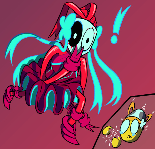
Well, the camera experienced Mach 1 speed, so I think that's all
.
.
.
Now, that's all.
In the end I want to say that I love what you did with these characters and I'm sorry if i messed up any of them.
And now off I go cause honestly I'm a bit stressed about posting this. So I'm pressing the publish button and I'm signing off. I'll be back soon.
As always have a Good Night/Day!
And If you want to read a bit of my rambling about this whole drawing process It's all down there. Just be aware that I write these things mostly for myself.
When I did the first sketch I realized that my old method of drawing poses (which was just sticks and orbs) won't work here. So i started to learn and re-learn some basics, and I tried to remake those sketches at the same time.
In the end there were like 5 different sketches for each character and to be honest, I was really close to just throwing it all out the window because it felt like i was going nowhere. But I found the problem.
My brain just couldn't comprehend that REFERENCE is just a REFERENCE not a fucking guideline that you have to hold on to for your dear life. It's okay to mess up here and there and that no-one is going to kill me for that. And when that thought clicked in, it felt amazing. I finished sketches, then lineart, heck I even drew all these in-betweens with Valdi (that yellow potat).
And then there was time for coloring . . . and that fear of messing up came back. That's why there's not much going on in that department. I'll keep working on fixing that, but it might take a while. And these backgrounds were a complete experiment. I'm not even sure myself if they're any good.
All of this felt like I threw myself in the deep water, but somehow I did it and I'm really glad all of this happened. Comparing these to my previous ones, I really see some improvement, and I did these MUCH faster. Even counting in all the learning i did. (plus building up courage to post these)
I still wish these drawings turned out better, the lines feel stiff, there's nothing to interesting in terms of colors or shading, but even with all that, for the first time in a while I think that these drawings aren't that bad.
And now for the AU. Why this one? I just stumbled upon it one day and I really liked the idea of switching up the one who controls the whole circus. And all those changes to the characters, their style, the clothes, colors and all those little details, I just love everything about that AU. All these characters feel really calming/relaxing to draw If these are the right words to use. (I really hope it doesn't sound too weird) I don't know if I would've learnt the things I did if I didn't find that AU.
So I want to say THANK YOU @chez-cinnamon for creating an Awesome AU and all these Beautiful drawings, and for giving me that bit of inspiration I needed.
If anyone decided to read all that and somehow survived, know that I'm sorry if all of that looks like bunch of random thoughts cobbled together (I bet that my english didn't make this any easier) As I said earlier, I write these thing mostly for myself so I can come back and read them in the future (It just helps me sometimes).
And I just want YOU to know, whoever you are, I'm really glad that YOU are here, reading this.
Thank You for being here!
110 notes
·
View notes
Note
Hello :D
I have been following you for the last year or so (a few days after I got my Tumblr lmao) and I absolutely love your art!
I have been wanting to study your art style for a while but don't really know where to start,,,
Could you please show me a small portion of your art process, if it isn't too much trouble of course. Thank you and have a nice day!
hello. oh my god. this took forever to find.
im sorry it took 2 WHOLE FUCKING MONTHS for me to respond to this but i wanted to put it off until i felt happy with my art process again, so here it is
my fall 2024 rendering tutorial!
(this will be very very long)

FLATS AND WHATEVER YOU WANNA DO WITH LINES GIRL. then make sure to recolor the lineart to better match your base. trust me it helps, bold dark lines are Not your best friend when rendering. wait for that post-rendering
i start off with a doodle or a sketch, and then filling it in with flats and other details such as blush

FIGURE OUT YOUR LIGHT SOURCE. FIGURE IT OUT GIRL YOU CAN DO IT you can make it as simple as possible, make it as big as possible, dont even THINK about the details.........just make it really fucking big so you at least know where the shadows and the light goes THEN add smaller shading details LISTEN TO ME. LISTEN TO ME OKAY!!!!!!!!
my key point with this is for you to learn lighting fundamentals.
it's SOOO ANNOYING but alas......they are all correct. it helps a lot.
one thing i also really want to point out is that i like creating a big shadow shape first before fixing up the little details (such as folds and whatever) because it helps me focus on the way the lighting actually works instead of tunnel vision-ing into making the shading make sense on the clothing.

contact shadows (i dont remember if thats what theyre called okay) theyre fucking ugly because im not actually thinking sorry 💔
okay so basically:
contact shadows (if that's what they're called) are the spots in shading and lighting where light will NEVER hit.
shadows are still influenced by the colors and lights around it (it's why a blue shadow and a yellow shadow feel completely different, despite both being shadows) so it's not always COMPLETELY dark.
BUT! there are small points in shadows where light never hits, and they're almost always super dark or pitch black.
it's hard to explain shadow and light so briefly for a tutorial, but you'll notice it when watching fundamental studies and when trying it out for yourself


YES i unclipped the multiply layer YES its ugly and terrifying but it makes coloring the multiply layer easier okay the colors merged w multiply so now it looks cool and has depth overlaying colors that actually make sense
so basically what i did was color the multiply layer that i used to shade the overall drawing
adding a band of red/orange/yellow around where the light hits, and blue where the shadows get big and wide, gives it a fake ambient occlusion effect in the way that a person would get if they stood under the sun with a clear blue sky
the colors don't have to make sense, especially because i never draw backgrounds, but coloring the shadows really help it give a sense of depth and extra subtle detail and effect that just helps make the painting look nicer
around the end, i also put in colors (in an overlay layer with a low opacity brush) that actually make sense in context of the drawing, which is the lit cigarette and the yellow eyelights
mostly because none of the colors were making sense and i needed to actually make use of the lighting that DOES exist in the drawing lol

adding a muddy golden yellow pin light layer (opacity turned down to like 40-50%) to make the light colors less ugly lol
i SWEAR by the fucking pin light layer style. it's so useful and so so underrated.
i used an almost brown-ish gold color on stop of all the layers, and with the pin light layer, it helped make the bright (almost blue-ish) white colors more warm and more yellow. it just helps make things more warm (something i prefer)
i could probably show what it looks like without adjusting the layer opacity to truly show off what i mean (like in the coming section) but i sadly forgot to do that lol


make a layer on top of your drawing with this color in these ranges YES the drawing is fully merged NO don't be afraid, the base was fucking ugly anyway 💔 make this layer into an exclude/exclusion layer style TRUST turn down your exclusion layer opacity from a range of 10% to 40% literally until you're happy with the contrast and the way the color over the drawing. use your eyeballs. i know you can do it im so proud of you
this is pretty self-explanatory instruction-wise, so i'll go into why i do this instead
i really like art that seems like it has low contrast, with almost mid-gray shading and lines. i don't personally use dark and bold lines and shading, unless i find it necessary for the tone of the piece, so using this method helps lower the contrast of the art and make it look "pleasantly muddy" in the way that it's easier and softer on the eyes.
the inverted blue color also helps makes things warmer!
the exclusion layer style is still a bit of a mystery to me but i really like the effect it gives, even if i don't completely get how it works lol
if you want an alternative method to this, and if you have access to it (because i primarily use sai and sai only),
i absolutely encourage you to play around and experiment with gradient maps.
there are so many out there you can make yourself or even get from others that just give the painting an extra amount of depth and color variation. they're SO fun.
personally, if sai2 gets a gradient map update, it's over for y'all it will literally be so over no one will be able to stop me


then i merged everything and actually adjusted the contrast back up because it was looking too muddy for me 💔 but the color adjustments are still there so all hope is not lost here's a comparison of the adjusted contrast in black and white (adjusted on the left) (newly merged layer without adjusting the contrast on the right)
as you can see, i actually turned the contrast back up (despite talking all about how i liked things with less contrast lol)
i wanted to demonstrate that doing adjustments should be done in moderation, and is why i adjust layer opacity often when making color effects
you are free to play around with colors to help your style, but don't lose your initial idea and colors along the way.
you still need to trust your own colors and intuition!
along with that, i just want to say that it's completely okay to change your mind mid-painting, and it's okay to make somewhat drastic changes.
don't be afraid to change things you don't like or change your mind about certain aspects way later on
that's basically the whole thing of this!!! don't be scared!!!

now im gonna hold your hand when i say this..........but you need to learn how to render by yourself. it seems like i can teach you but i literally can't, because rendering is different on every piece and depending on how clean your base is. i have to render A LOT because of how fucking ugly my sketches are LMAO to simplify it, think of it as obsessively cleaning up every detail you can see, but with a color picker and a clean, hard edged brush. if you have shit lineart, you don't have to redraw it cleanly over and over, just paint over it. that's basically what rendering is
THIS especially is where you need to be brave and stop being scared.
like i said, i can't teach you how to render, and it's something you have to discover yourself because rendering is something that will always be personal to every single piece you make. the way you render on every piece is different.
on one piece, you will barely need to render, and on another, rendering is more than half of your ENTIRE process.
don't be afraid to paint over your old art.
rendering is a process that's both very perfectionist yet also very careless.
find your balance and just go for it.

and then that's it……..u did it………..now yuo know how to paint and render. it's literally just layering shading and lighting knowledge until you think it makes sense and looks okay lol additional note: since i render in only one layer (you don't HAVE to do this, but it'll be harder for you…), i also made slight adjustments with the transform (and liquify, if you have it) tool to make things more proportionate. (i drew the head too big lol)

if you compare the finished piece to the final unrendered base, you can see that a LOT changed, including a bit of subtle proportion adjustment.
particularly, the sleeves changed A LOT (because i really didn't like them)
but it's also over all cleaner and more coherent, instead of having haphazard colors and shading just thrown about.
rendering is when you finally use all 100% of your brain to finalize and figure out where the shading should go, where to clean up your lines, where to ERASE or ADD BACK in lines, and make sure all your colors look coherent.
it's not as intimidating as it seems, i only use a hard edged brush with a little bit of color mixing and my color picker.
it's like dragging and dropping colors to cover up mistakes, it's really quite fun when you get used to it
i wish i could explain it clearer but it's hard to describe without visuals!
i hope this helped, and i hope all my yapping isn't annoying (art as a special interest beloved)
have fun studying and trying to render in my art style!
#long post#art tutorial#rendering tutorial#art help#art tips#tutorial#kia doodles shit#artxstic-scr1bbles#tutoriel
200 notes
·
View notes
Text
I needed examples for a new commission type bracket I'm adding to my website, so these brave souls stepped forth and allowed me to experiment/test them out with their characters! The owners of these lovely ladies, in order, are: PyritKyrit, ChibiCreates, BoxofFoxes, and Daughteromega! Thank you all so much for being my test subjects! ;w;
I do these "EXAMPLES NEEDED" commissions on occasion to answer following questions: -How long will this take me from start to finish? -How do I want them to look across the board? -Is the test price an appropriate price for the piece, or should it be lower/higher?
It's basically my form of quality control to make sure I'm offering something that looks good/has a consistent baseline look, is fun for me to draw, and is priced fairly for both myself and the potential client based on the hours worked. It also gives me the perfect excuse to experiment with new potential commission types! :)
As you can clearly see, this time the test was for Lineart commissions. I've done them in the past, but they never felt uniform enough to properly gauge a price as well as give an acceptable example to really show folks what they'll get from me. So this was me sitting down and giving myself specific parameters to stick to when I do these commissions, and those parameters are "toned lineart". Lineart with some flat toning/shaded added for extra sauce.
BUT YE! I had a fuckin blast working on these. My August commissions will be opening within the next couple of weeks, in which these badboys will make their debut! Keep your peepers open for more info on that later, and until then I hope ya'll enjoy the art! More to come soon! :)
212 notes
·
View notes
Note
I've been wanting to ask for a while but never was brave enough to. I'm not a very good artist myself but whenever I try to do a comic by the second panel; my art, mind and hand are all worn out from doing one panel.
How do you keep your panels and art style so consistent throughout the comic?
hi!! thank you for being brave to talk to me! I really enjoy discussing technique!
I think comics seem simple and easy to make, but they're a looong process.
👉First of all: start small. like, ONE page small. TWO pages, etc. just tell one joke, or one kiss, etc. it'll make the entire process less daunting. but do think of the beats of the story like...
1- character A is doing a thing 2- character B makes a comment 3- character A gets embarrassed
/ end
something simple, but you can cut up each little beat into two panels if you like, or just keep it at 3 and explain more with the dialogue.
👉for the drawing part, you should really start with a really ugly basic sketch to outline what kind of dialogue and story progression you want to make on each page.

this is a sketch of page 11 of my Bunny Crossing comic:
as you can see, I put a lot of focus on drawing the more delicate moment where Bilbo notices Thorin remembered the comment, so I just actually drew his face in detail there. But the rest was just enough for me to know later where each character is, or if I needed to draw a background, where the dialogue should go, and such.
👉divide your work into days. if it makes you exhausted, you can take one entire day to draw the rough sketch. Then, another day for the dialogue and speech bubbles. Then, another day to actually draw the panels and the more polished sketches of each character. Then, another day for the lineart. Then, shading. etc.
👉try drawing grayscale first. Don't add colors until you're sure you'll have the energy to finish it! It'll get you used to the process, you'll iron out any errors easier.
👉consistency comes from the process itself. I try to be careful while drawing the sketches for my panels, because a good sketch can help you so much in the long run!
👉look for reference on other people's work! manga artists and western artists have loads of footage of themselves drawing online, you'll get inspired for sure!
I hope this helped a little bit! Do respect your own rhythm! 💖 also, if it doesn't help, not everyone likes to draw comics, and that's ok! It IS a very repetitive process. static illustrations are amazing too, and I envy the skill!
135 notes
·
View notes
Note
How exactly do you color your artwork? Since whenever I see it, I feel like I’m looking a painting (that’s a complement btw)
Hi! Sorry, for taking so long to respond. I’ve been swamped with work this semester. But anyways, I usually use one of two brushes to color my stuff: the opaque watercolor brush or the smooth oil paint brush. Although recently I’ve been experimenting with one called flat oil paint brush. I do all my digital work in ClipStudio and I’ve never actually downloaded anything beyond what came with the program lol. So those are just some basic brushes from the base kit. This is an example of the watercolor brushes:
And this is a good example of the oil paint brushes:
As a basic rundown of how I make my digital art: I do all my lineart with the design pencil tool and then I fill in a base layer of color underneath. Since my lineart is usually pretty sloppy I don’t really use the bucket tool at all lol. I usually just fill in color with the mapping pen tool. I don’t really use a lot of layers either. So usually on top of my base layer I add one more and that’s where I do all of my shading/rendering. I just kinda slap a whole lot of colors together and let the brush naturally blend them as I go. I don’t feel like I do anything particular fancy.
Really there are only two “tricks” I can think of that I use. Sometimes after I’ve finished all of my coloring I’ll go in and use an effect that’s just called “artistic.” This basically simplifies and exaggerates the blocks of color. It works really well with the watercolor brushes to give stuff that extra layered watercolor look. Usually, I reduce the layer opacity anywhere from 10-20% and make it an overlay on my color layer. A good example of this technique:
The only other thing I sometimes do is blow up the design pencil tool to its biggest sizes and use it to texturize my colors or lineart. This kinda makes a blotchy/pixelated look that I really like. I feel like this one shows it pretty clearly:

And that’s it really! I’m sorry if this is too long but I wanted to be thorough! I hope it makes sense! Thanks for asking and for being such a supportive follower! I really appreciate it! If you have any other questions on how I make stuff, I’d be happy to answer but this is all I can think of right now. Thanks again and take care! :)
34 notes
·
View notes
Text
1000 kudos/100 Follower Special!
wow so um, there’s a LOT of you now

👀👀👀
WHERE DID Y'ALL EVEN COME FROM LIKE?? HI!! 👋👋👋
AND ALSO

THIS???? CRAZY, incredibly appreciated <3 but also wild
anyway, I think that deserves celebrating! So, here’s a couple ideas I came up with for y’all to vote on, with the option of sharing other ideas in the comments, I’ll do the top two and save the others for the next milestone :)
If the 'other' option gets the most/second most votes, I'll do another poll with ideas that people suggested and we'll go from there. You can scroll down and click the read more if you'd like more info on each option! SO, having said all that:
Letting you guys make the call with this one! I have stuff prepped for all of it, just a matter of people voting since this is ME showing my appreciation to YOU. And again, next milestone will have the opportunity for the other choices :)
Also, this isn't just for followers/the moots either! Anyone is welcome to vote and participate if they'd like to 💙💙
Please also feel free to ask questions in the comments if that helps you with voting! Can't wait to see what you guys pick :D
I will expand on each option here for clarity in your decision making:
CS one-shot: I will write a one-shot (3,000-5,000 words prob) based in the CS universe. It will be canon to the fic but will never be mentioned/referenced in the fic itself so stand alone to read. It may be a future scene, may be based somewhere in the current timeline. Open to ideas on the POV and such (though I have some floating around that I can do ;))
Q&A/Ask the Cast: a classic, I know my ask box is open but here's also a clear chance to ask something that you've been really curious about! I won't share spoilers for the story, but everything else is on the table, including stuff about me, writing etc. Just no super personal questions is all! Additionally, you can ask the cast questions and answers will be in character, perhaps with a little doodle as well ^-^
Finished refs/busts for the cast of CS: I'll post the finished versions of the rough sketches I shared a few months ago, along with the remainder of the cast! This includes the rest of the engineering team, the division heads, the glamrocks, and the DCA! I also will include little blurbs for all the characters as well. This will probably happen eventually anyway BUT if you want them sooner rather than later this is you're chance if you're curious :)
Spooky Season one-shot: something halloween-related that again I'm open to ideas for! Would also be about 3,000-5,000 words in length, could be related to CS or not
Writing Requests: similar to the requests I did for reveal day, same rules apply (no nsfw, suggestive is fine, be specific if you want specific) but a little longer in length (500-1000 words)
Doodle requests: I provide you with a little drawing I made with tender love and care (would be lined, colored, shaded, etc.)
A peek into the drafts: I do in fact have a couple other fic ideas floating around in my brain that I simply haven't started so that I don't get bogged down/focus on CS. I would share those and a little bit of concept art
Other: explained above
#sorry if the color and word emphasis bothers people#trying to highlight the main points of things#and also I enjoy color lmao#also if you see this you don't have to decide now#that's why it's open for a week :)#very excited about this ^-^#I know people are here for the fic (and you will get a chapter next week)#but also this has been a lot of fun overall and I want to show my appreciation for all the love and support#fnaf dca#dca fandom#dca community#milestone celebration#Confused Spirit#technically
35 notes
·
View notes
Note
How to do Q-Lia/Kamio Japan fanart like you? :3
omg ty for asking :3 tis actually super easy my friend!!! this is basically what many of the oldschool kawaii adoptable makers wld do (so pwease dont get mad at me for tracing T_T i can often tell exactly what memo theyd used lol). i use paint.net cuz its super duper simple n if i ever need to do something more specific like blurring (not v applicable to pixeling) i jst open clip studio paint for a minute. its much preferable to me to do most my drawing on paint thx to the super simple ui ^_^ this method is only for official art never trace over original art of course!!! anyway i start with a memosheet that ill brighten n desaturate like this. then on a new layer i trace the lineart

this is optional if u dont have super duper bad tremors like moi, but i make lines exclusively with the curve tool! (1px with aliasing off) its probably quicker if u can jst do it by hand, but i must use my workaround. another tip for my tremor bros is turning ur mouse sensitivity all the way down. i keep it pretty low all of the time n just got used to it but u can turn it back up after ur finished. thats how i manage to color nicely :3

as for coloing i rly dont have much advice, i just keep the original memo at a glance to reference. one cool thing u can do is go to make ur subject super tiny then going to effects>color>quantize, this will make it way easier to colorpick n have a consistant palette!!!

this is my litte tremor friendly shading hack, turning aliasing back on, making the brush huge n using just the edges of it to shade specific sections that ill select with the wand c: if this is actually a hack or jst a regular method of shading idk i dont watch art tutorials myself x3

if anyone uses this tutorial pweeeeeeeaaase lemme kno so i can see ur art cuz i looooooooove these stationery characters to death n love art based off of thm ^_^
34 notes
·
View notes
Note
SAVVY!! do you have any art tips to share with us? ^^ /nf
btw I LOVEEE ur art sm it's amazing!!1!1!!11!
TYY I APPRECIATE IT <3
Idk what specific tips ur asking for like whether its for lineart, coloring, shading etc so im just giving u a list of tips i wish i knew when i was first starting out with digital art (under the cut cuz i yap a lot in this post)
(Also srry if this is a little scuffed feel free to ask me for any questions)

Number 1: brushes
Okay soo first dont just stick with the basic brushes on the application, different imported brushes can rlly help u with experimenting with ur style(s) and have more variety to choose from!


Number 2: Layer modes
If ur character's colors dont rlly match with the bg try using a multiply layer to blend it together! (Also make sure that the colors align with the background for example: u have a pink background and yellow lighting so use a pink color and a lighter yellow color to where the light is hitting the character)
(Also also feel free to experiment with other layer modes too! I personally use multiply, vivid light, and divide the most lol)

Number 3: Shading
Okay i see a lot of beginners make this mistake with using the airbrush tool to shade. I personally prefer other options since the airbrush can make things look rlly blurry and muddy (also it makes the viewer have a harder time knowing where the light source is coming from since theres no hard edges)

Instead i prefer cell shading or using a blending brush! Cell shading works rlly well with more cartoony art styles but if u wanna go with the realistic route i suggest u use a blending brush rather than an airbush. I just feel like it has more charm to it with it giving off a more stylistic look while still being able to look realistic. The lines are more sharper as well which makes it not look muddy like the airbrush
But keep in mind this doesnt mean airbrush can never be used!! No, i actually use it pretty often but only for backgrounds or gradients in a characters design like in their clothes or hair
Remember that art is subjective and these are all just my preferences so if u wanna do something different more power to you!
(srry for the yap session lol bai bai)
15 notes
·
View notes
Note
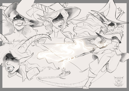
Ive always really admired your ability to draw just like super grotesque shit and I was wondering if you had any tips? grotesque not that its like "oh thats a spleen guy gross" but more the amount of pain and tension at the coffee shop, or any of the mortasheen creatures that involve maggots and moisture. I have tried several times to draw things that are rotting, or lumpy, or suffering, etc, and I can never finish those pieces.
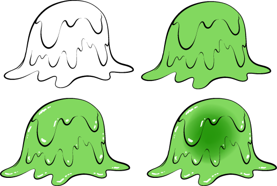
If you mean it's just arduous designwise, I start with a huge canvas size (like 3000 pixels across), sketch it all out within that size and then zoom way in to draw little details with a normal size pen, or lately the "hard-edged" pixel pen so even the tiniest lines are fairly sharp. White highlights (even simple little white dots) make things look very moist and a dark blot of blurred colors, underneath the lineart and white highlight layers, can make them look translucent, here's what those quick steps do to a simple doodle of a slime:
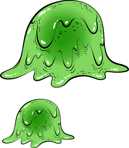
Additional wrinkle lines and simple messy speckles make a design look even more detailed and grungy. As an aside, these little details look best when they're clustering near solid lines and leaving some open space towards the center:
If you mean how I can just "stomach" it though, I guess I just don't draw any gore or grime that really bothers me! Even when I drew Awful Hospital creatures based on revolting disease symptoms that I can't stand looking at in real life, it wasn't a problem because it was just natural to those creatures. A human eating a rotten smelly corpse would be horribly unpleasant but the video of the hyena rolling around in a maggoty wildebeest guts is cute because that's healthy normal hyena behavior. I do have a hard time allowing a creature to "suffer" even fictionally, and all my monsters end up being basically happy the way they are unless it's just a really crucial plot point that they aren't.
virtually everything in mortasheen likes being whatever it is (you can also see that this design just has the same couple things applied as the slime doodle but with a couple more layers of shading)
330 notes
·
View notes
Text
TNBC Shower Thought: Comparing the worst to best TNBC posters
((OOC:
I know how much you love my pedanticy-pedantics about unimportant TNBC details and reviews. Or, at least, I think you like em and none of you have told me to can it yet...
So I figured in the spirit of that and Christmas season, why not compare some of Nightmare Before Christmas's movie posters? Comparing posters and covers is a fun activity for me. There different kinds of posters and cover art throughout the years for all sorts of things that are great at subtly, creativity, minimalism or just being a good cover overall. One day I hope to compare some of the Walt Disney features' many fantastic poser art for their films, but for now lets stick to Nightmare.
I'm starting from the bottom to work my way up into the GREAT stuff. Lets not waste anymore time...

This is easily the worst cover for the film and what I hate is that it's the most current cover. I already hate when they try to make the clipart we're used to all shaded and three dimensional-like, but just...LOOK AT THIS?!?!
Who thought THIS looked good? Honestly?!? The characters are all way too colorful and smooth and it's plastered on top of the film cel like it fits together...it DOESN'T!!!
Next we have the 2008 DVD cover.
I'll try not too be too harsh on this one in case anyone here grew up with it...but I'm sorry I am so not a fan. It tells you nothing about the film and is more of that '3D-ish take on the og lineart that looks ugly to me.

The 2023 30th anniversary art is...fine?
Like there's nothing WRONG with it, but it feels incrediblly lackluster compared to some of the screen-capped and colored up artwork I've seen on things like T-Shirts and even fan made posters.
Also, and I hope this ISN'T true, it's so basic I worry that it at some point was made by or with AI or at least with an artist who wasn't paid that much in a short amount of time. Like, the composition is all there: Sally and Jack in the forground, Lock, Shock and Barrel under them and above the title, Oogie in the moon behind them all...but I don't know why they didn't do something really cool like make all the intricate purple and blue-shapes into silhouettes of the other characters and other iconic imagery or scenes?

Look at how...ALONE Zero feels off the side there!!
This is another older image I remember on the back of my VHS growing up, though I never knew it was used for an actual cover of the movie.
It does INFINITELY look better than the first shaded-lineart image (this was done in the 90s...how...) but while I love the composition of Jack and Sally and them walking around in Christmas Town, I never liked the colors of the image at all.

I also never got why Lock, Shock and Barrel are there, chillin and watching them like they're Belle and Beast and they're Beasts' servants trying to wingman for him...Where's Zero? Everyone knows HE'S jack's wingman.
This is an image I found on IMDB that took my by surprise. To be honest I have no clue if it's an actual film poster or a fan poster, but I like the composition of it all as a Universal Horror film poster. Doesn't work as well as Frankenweenie, but still...

And now, the classic. The one you most certainly grew up seeing everywhere or around the place regarding this movie in the 90s or 20s. It's the cover to the soundtrack and VHS I had. This is obviously the most famous version.

But there's also this slightly different version with Jack's arms in a different pose 'to receipt Shakespearean quotation'. This is the same version of the cover used on our "The Film, the Art and the Vision" book as well.

But, for my own PERSONAL favorite cover of the film (even if it's just a simple photoshop), I have to go with the original 'special edition' DVD my sister and I still have.
Somehow Sally just being on the spiral hill next to Jack and holding his hand is so sweet and doesn't feel like the cheap and quick edit it is. I think it's because, despite being a reference to the scene I never saw this cover as directly portraying "Jack's Lament", that this was Jack having a nice moment of peace after the events of the films somehow and waxing his poetics in reference to the film...so somehow the idea of Sally coming up to join him in that with his other arm let out to her is ADORABLE.

Here's a different version on a French DVD.

Lastly, since it does technically count as a poster for the movie itself, I'd be remissed not to mention Nightmare Before Christmas 3D's poster. This this was great back in the day and it's still great now. I'm fairly certain they just photoshopped stills and photos of puppets themselves but y'see kids- THIS vvvv

This is how you photoshop. Everyone has a unique face and pose. Everyone's doing something you think that character would be doing if they were going to MT3K their own film (Sally that's rude!) and they're all drenched in theater accurate lighting. That's more like it!! Besides Oogie being smol, this is the perfect poster to catch the eye of a rerelease!
Hope you enjoyed!
))
#nightmare before christmas#the nightmare before christmas#the nightmare before xmas#movie poster#movie poster art#sally the ragdoll#lock shock and barrel#mayor nightmare before christmas#tnbc shower thought#tnbc analysis#nitpicking#fan criticism
18 notes
·
View notes
Note
while you're talking process, any tips on doing color fast? just if you have any things that streamline flatting, etc? comics always take me foreverrr to color
i'm very sorry if your art style has open or textured lines because really the only way to color something fast is if the lines are all closed and you can use the fill tool. like i can never make a comic with the textured brush pen i actually really like using Because it doesn't work with the fill tool.
i also don't do shading, my character art remains flat, the colors just get adjusted for the lighting and unless it's Dramatic, there's no shadows. and my backgrounds (in hunger's bite at least) are generally just a solid color with some loose lineart overtop to imply the space.
basically do less, is how i do it fast. as long as it's harmonious you can get away with doing very little
49 notes
·
View notes
Note
I couldn't help but notice you color your line art sometimes. Do you have any tips on colored line art?
hiii there! thank you for asking!!
just a heads up that i'm notoriously bad at "teaching", and i'm assuming an amount of general knowledge of art programs + layer modes!
i actually don't often "colour" my lineart, at least not in the way a lot of other folks do! i'm used to working as streamlined as possible and developed quick-fire workarounds for most steps during my time in webcomics!
i also have multiple lineart styles! a more textured one with thin lines which i typically use for more polished pieces, and a soft-brush sketch style (inspired by my pal @moonverc3x's lovely lines) that i generally use for less detailed works, though i sometimes get carried away 😅💦
my textured lines don't lend themselves well to those nice and thoughtful coloured lines most folks do. but here's a quick breakdown of my techniques using the soft-brush style!
lines and flats 1) make lineart + flat colour it. my lines are never at 100% opacity, so already some of the colour shows through them anyway! 2) set the lines to multiply mode. because my lines are typically in a colour and not black, this usually works well enough for me, as you can see in the second image! i frequently just call it done here!


hand coloured lines a) if i do want to take the time to colour the lines individually- often things like metals, especially warm golds, require this added detail to really help them pop- i'd just lock the layer opacity and pick a colour that suited and apply where needed. this is fairly standard! b) a second version of the same technique, with higher contrast/more saturation to suit my tastes and a little extra finessing (especially around the eyes). this is very much a "to taste and time/energy" thing! sometimes at this stage i'll add high contrast slaps of colour such as bright purple or blue

my overlay-lines technique a) the second technique that i use is actually very fast and usually gives an okay-enough look. it's what i use for high-speed professional webcomic work (with my textured lines) to give the illusion of individually coloured lines for basically zero effort. so starting with the base lines set to multiply, as seen in (2), then, b) duplicate both the lines and the colours (with shading, if you have it). clip the colours to the duplicated lineart layer, ostensibly "colouring" the copied lines the exact same colour as the colours. set this duplicated layer to overlay, and adjust opacity as needed

you can kinda see that the overlay lines method is not as specific in colour as the hand-picked ones above, and it will suffer from overlap based on where your flats come to underneath the lines. but i find it helps especially when you have high contrast light colours in the work (ie starstruck's face mask) as the lighter colours brighten up the linework in those places significantly.
for highly polished works i would come back and still pick out areas to finesse individually. there's ultimately no quick substitute for spending more time on your work!
there's about a thousand and one other combinations of these effects you can do, such as using the duplicated lines on multiply instead, or further painting over the top, etc etc. but duplicating the colour layer and clipping it to the lineart is one of the techniques i developed that sped up my work process most significantly over the years!
#starflungs process tag#my art#starstruck dee#asks#i don't typically talk about my method because it's pretty sloppy and i really am just not good at teaching!#been told it repeatedly over the years so you get what you get sorry! 😅💦#fwiw i'm working in paint tool sai. most programs should have these kinds of features and layer modes.#if yours doesn't i'm sorry but i don't know how to help!#starstruck is also a somewhat biased example for this sort of thing due to the fact she's quite monochromatic in colour#if you put pink lineart on her she looks good because she's basically just pink all over. when you have high contrast designs-#it's harder to make these quick techniques work and you have to spend a bit more time fiddling around at the end to fix edges.#anyhow! hope this helps some folks!! lmk if it helps you out!
19 notes
·
View notes
Text
Y'know I'm really hoping that someday we'll get a version of generative AI that's actually, like, useful and ethical. Imagine a future where you could do a lineart pass in your favourite pen, then waffle about in an lineart editor that uses a model trained on different styles of lineart to let you modify it in post to say, a scratchy pencil or charcoal or adjust the thickness or whatever. That would be pretty cool. Or imagine an addon for Blender that could analyze a photo and recreate the lighting setup. Sick.
The problem is that in this capitalistic hellscape we've sort of lost the ability to use new technology to better humanity. A lot of people compare it to traditional art and photographs, but like... photography added new ways for traditional artists to work. We developed new methods to increase the ease of certain tasks, like rotoscoping animation or tracing photos. Somebody looked at a part of the artists' workflow, said "that could be made more efficient," and then built it.
And we're not really getting that with this wave of generative AI. We were getting it before the tech bro invasion- like for example I remember AI powered vocal synths way before the explosion of generative AI and they were awesome, using machine learning to improve the output of programs like Vocaloid and SynthV and make them sound more realistically human. Where is that for art? Hell, who is making that for music or anything now?
It's like in the past the typical flow was design new technology -> research the market -> come up with ways to implement the tech in the market -> perfect the implementations -> profit, but now it's design new technology -> put the unfinished technology into everything -> profit (?) At no point in the process is anybody actually stopping to think of interesting ways to implement machine learning into the real workflows of professional artists because they're all skipping like 15 steps in the product development pipeline to make max amounts of money.
If these companies were doing things the normal, traditional, useful way and trying to actually develop high quality products, all of the backlash and hostility would never have developed. If you got a focus group full of senior artist directors into a room and asked them about ways to implement AI into their workflows you would immediately come up with a better product.
Just off the top of my head...
Program that can take a 3D scene and convert it into a sketch. Immediately cuts down on workload for comic layout artists and storyboard artists
Tool that analyzes your lineart and generates basic cell shading. Pretty sure the new version of CSP has this but idk if it uses machine learning or if it's good. Makes shading way more efficient
Tool that can take basic airbrush blending and change it to different blending presets. Imagine being able to just hit a button and switch your blending to use different brushes.
Post-proces colour jitter, higher quality colour blending, easier posing for 3D rigs, all sorts of small shit
But we aren't getting any of those things because the people designing these programs fundamentally don't care about making a good or useful product
11 notes
·
View notes
Note
As someone who loves to work on lineart but struggles with details, it was really inspiring seeing the progress of the hawke/sebastian drawing!! Thanks for sharing~ I would love to see more in the future if you’re up for it ^^
.Tysm!!!! I do love making timelapses and rewatching them myself to figure out if I’m going wrong somewhere, it’s like resetting your eyes mid picture. I do also love seeing other people’s processes too. I realised the other day why I like digital art and drawing in ink traditionally, it’s because I get to keep the actual process of the image, in 99% of my sketches traditionally I’ve drawn messily in pink, and drawn cleanly over it in black, and with digital art it’s just there on another layer. I am such a huge fan of process that it outweighs that final piece of art for me.
.I also think there’s a lot that can be learned from an artist’s process over idk a tutorial they make; I remember a while ago I asked another artist (I cannot remember who girlie mb ✋😬🤚) about drawing hands, and they made this nice little post that did help me but probably not how it would be expected, because with that post I realised my issue was with the foundation shapes I was drawing weren’t blocky enough for what I wanted. A simple “this is my process” from someone else helped me figure that out.
.For detailing! I find that not actually initially sketching everything helps a lot, (in my Sebhawke I actually add in Sebastian as an afterthought lmao it was just going to be Hawke on his own 😂) both in the fact that if you think of something mid picture you can just fit it in with little problem, and sketching loosely helps to free up and relax the hand if you’re getting a bit stiff drawing solely lineart. Also, I don’t know if this applies to anyone else but sometimes I’ll get a bit stuck on drawing a certain part of the image (maybe it’s a hand or idk how the clothes are supposed to lay) and it’s a really simply solution to just sketch it over the basic sketch, so it’s a bit more detailed and easier to lineart. Like idk what part of my brain was like “once the sketch is finished you can NEVER go back to it” because that’s stupid as hell; I’ll be on shading and realise that I could wedge something in somewhere and just go straight back to sketching.
.I do think that heavy detail is something that has to be built up to though, it’s not like something that can be done instantly without probably burning out or ending up hating detailing work. It’s also mental to look back on my stuff from like 2020 that I thought was so detailed for my skill at the time, and then comparing it to what I was making in 2023 which has as much detail in as I could manage; like that is progress and there’s no way I could have made that level of detail before I’d built myself up to it. And that compared to what I’m making now 😭 ……bro… I think my main issue is that I don’t know exactly how to flesh out medieval / fantasy stuff in a way that looks proper, just from like actual lack of knowledge about the time period even though I’m 👀🥴😩👌 about it, whereas cyberpunk was considerably easier because just slap a bunch of fans and wires and boxes and you’re good to go 👌.
.As an added note, detailing can literally just be drawing like a 3d shoelace instead of just a single line to represent a shoelace. Then you start drawing the eyelets in another picture, and then you do the proper stitching on the shoes, or maybe a distinctive tread, then maybe there’s buckles or velcro or a designer label on them. It’s not something to hyper fixate on all in one go. Literally just drawing the seams on clothing adds a layer of detail, (and also shows form!) and now I’m like rarely ever not drawing them because it’s just subconscious for me to add them in.
.Realistically I’d like to make proper timelapses that are actual screen recordings as opposed to what CSP shows because there’s probably a bunch of times where I’m just sitting there thinking about stuff or getting distracted by research, and that doesn’t show in my current timelapses; I don’t just one bomb these pictures!!! I faff for a fair bit of it!!! Also rotation and zoom on the canvas, the CSP recordings are kind of deceptive in omitting those.
.Anyway I have a timelapse tag for all my timelapse stuff, which is…. not a lot but STILL!! Also there’s this timelapse of my zevwarden picture from a bit ago that I never uploaded whoopsie 😘💕.
#owlito#answer#timelapse#video#.detail is wonderful but you must understand I am a cluttered maximalist.#.i am a hater of negative space.#.why empty!!! why not full!!!! put something there!!!!!! AHHHHH!!!!!!!!.
16 notes
·
View notes