#i need to update this since my coloring style has changed a bit + still gotta make seasonal variants
Text
howdy!

#completely forgot to finish posting this i guess??? bc i'm a dingus#i need to update this since my coloring style has changed a bit + still gotta make seasonal variants#l.... later tho.......#emmie arts#artists on tumblr#digital art#clip studio paint#sona
31 notes
·
View notes
Note
sorry if youve talked about this before, but do you have any tips relating to your coloring process? i ADOREE the way you render things and it looks soso cool and once i saw a post where you said your art typically only took a couple hours and i was in SHOCK. cuz ive been working on a yuji piece that has a similarish (not really but idk how to describe it…) coloring style and ive been working at it for. about a month now…sorry this is rambly i hope u have a good day!!!
hi!!! first of all thank you so much I'm happy you like the way I render! honestly it Is still the aspect of drawing that takes the longest for me, I've only recently started to come up with ways to streamline my process (mainly through keeping my layers/brushes limited and overall being less anal about details) . these days my average drawing does take about 2.5-4 hours I'd say, with Big Illustrations obviously being the exception
i wouldn't beat yourself up too much about taking longer to finish a drawing tho ! it took me. a While to learn how to speed up and honestly my biggest piece of advice is loosen up and let certain things look imperfect or unfinished ! and if you're like i was and want to work at getting faster then i would recommend practicing churning out sketchy/rough pieces and see what tricks and habits you can implement or adjust to save time
all that being said I realize haven't done an updated overview of my colouring/rendering process so I guess this can be that ! I'll put it under the cut because i too like to ramble and this Will get long
lineart and base colour/underpainting


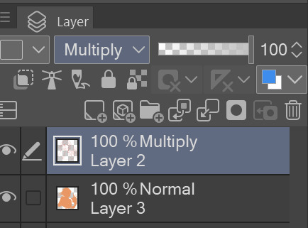
my lineart is nearly Always on multiply. it helps the lines stand out less starkly against the colours and makes it so that I don't have to change the colour of as many sections of lines later on
the base colour layer is honestly completely optional, tbh i sometimes skip it so you don't Have to have one but i like it for a few reasons:
- I like to keep all my colours on the same layer so if i'm going for a painterly style this serves as an underpaint layer of sorts . having this means that when i paint, whatever colour i have here will blend with all the other colours i use and help them look cohesive
- even if I'm not painting, i still like to work with all my colours on the same layer and it helps me make sure I'm not missing any spots, which helps when it comes time to section individual areas off in the next steps
2. flats
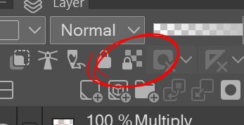

lock transparency button my beloved . this makes it so that you're only able to paint on areas where there is Already colour (which is where having an underpaint layer comes in handy)
not much else to say about this step, just choosing colours rly !
3. shading
here's where the fun starts ! since i'm working all on one layer, i use the wand or lasso tool to section off whatever area I want to work on, then go in with (usually) one of the three brushes below: from left to right
1. my favourite dry brush that i use to cover large areas, it has an amazing dry paint stroke-y texture and i use it in everything. great for skin/clothes/hair/fur/organic material...she does it all
2. smaller, blendier/smoother brush that I use to soften out the rougher edges left by the first brush. I find it's really good for hair and small clothing creases
3. rough pen brush that I use to add little bits of flavour in the form of crosshatches or stray lines, usually to hint at individual hair strands! I also use it to line sometimes but I'm using it less for that recently
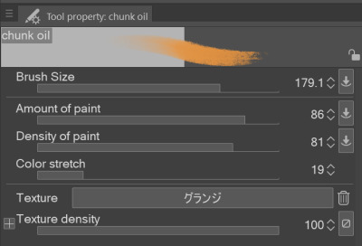
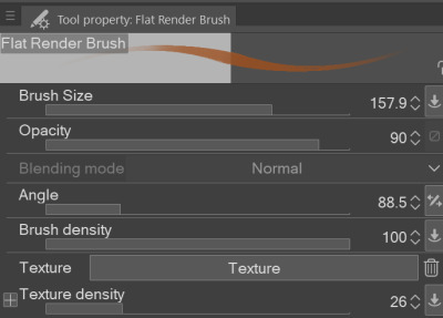
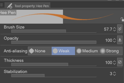
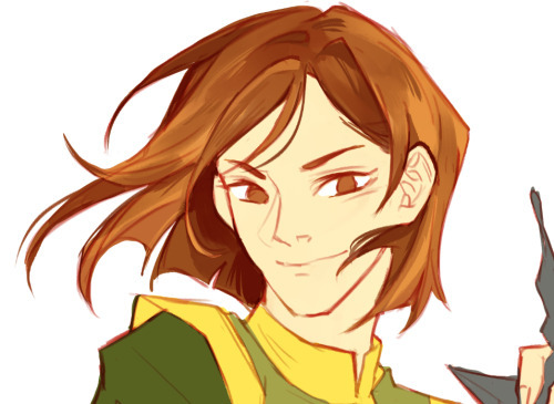
also, since the lineart layer is set to multiply, it's super easy to colour directly under the lines on my colour layer and use that as a way to make certain lines Darker . it's most obvious at the eyelashes and under the jaw but I do it everywhere

4. finishing touches and texture overlay
here I add another layer above the multiply/lineart layer and use it to add highlights and other details! this is also the layer i use to paint directly on top of any areas that got messy or need extra definition
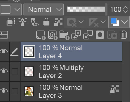
my texture overlay of choice is just a rough monochrome static file that I got on the csp assets page but use whatever you'd like tbh ! set the layer mode to overlay and adjust the opacity to your liking (I also like to rasterize the layer to make it easier to work with but it's not too consequential if you skip that step since you're basically done by this point anyway)
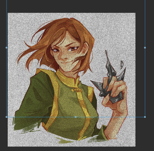
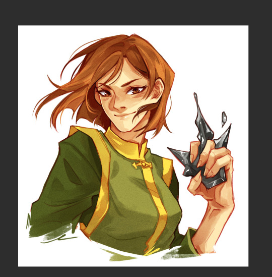
And done ! slap a signature on that bad boy and send it <3

#answered#flowingredscale#art advice#my art#i rly hope this was helpful!!!#best of luck with your yuuji piece <3
32 notes
·
View notes
Text

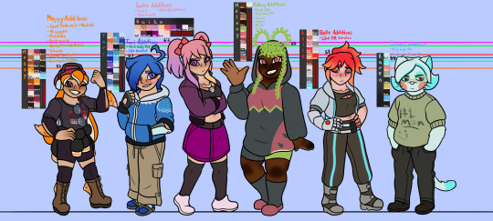
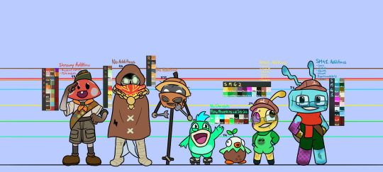
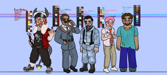
These are my personal designs/references for SMG4 because of how much I draw fan art for it. You can tell which ones are my absolute favorites to draw based on how much I’ve changed them basically. It’s organized by Recolors, The Girls, Non-Human, and Excess (sorry Kaizo)
Mario: I gave him stitches on his outfit because of how often he explodes and gets hurt (Luigi fixes his clothes since that’s less expensive than constantly replacing them), and those dark marks on his face from when Zero grabbed him and did that weird crap during the 10 year anniversary video. I also gave him a star pin on his overalls too.
SMG4: There’s so much. I made him shorter, changed his body type, gave him darker skin, scars from when he was possessed by the TV Adware dude (and other various scars), eyebags, a jacket, IV on his gloves, and the arrow from the USBs. He also has the arrow on the back of his jacket, but I haven’t drawn his back view before with this design so that’s never been visible in my art yet.
SMG3: I made him even shorter than SMG4, gave him longer hair, matching scars to SMG4, darker skin, a cape, black gloves, platformer boots, the USB arrow, and I changed his body type. The back of his cape has the same skull design that’s on his hat and boots too.
Luigi: I didn’t change too much to him, just his shirt, a flower pin, and some scars. Also he’s round like Mario but not the “skinny brother” because I don’t personally believe in that. (Though whenever he takes off his shirt he immediately becomes a buff man because SMG4 logic)
X: This one was fun. He already has dark skin on his recolor self, so I also went ahead and gave him curly hair, a beard, eye bags, a beanie, hoodie, changed his height, and gave him a cool weird eye thing because why not. He and FM also have similar eye colorings to 3 and 4
FM: He’s the only recolor I decided to make not chubby but instead kinda fit since he’s a police officer. I also gave him a police styled hat, badge, different shirt and gloves, longer hair, a bunch of scars, piercings, and steel toed boots. He looks pretty cool :D
Minion: Parts of her design I did out of pure spite. Her body type matches SMG4’s but she’s a bit shorter, an overalls skirt thing, matching hat, pink gloves, some long socks, and I kept her mustache but just made it smaller. Why? Well, I haven’t headcanoned SMG4 as trans (unlike what a lot of my friends and mutual have done), but I did do that for Minion, because in my mind, she basically has SMG4’s exact body type, including the reproductive organs. But she’s still a woman. And I also believe that women (cis and trans) shouldn’t have to feel shame for having facial hair or body hair, so I kept that there, again, out of spite for people who really feminize her body in a stereotypical way in their personal designs for her.
Meggy: I’m not an extremist for Inkling Meggy or anything, I do like her as a human, but I’m still not sure why they chose to make her a human and not just a squid that’s not Nintendo styled. So instead I just gave her some other squid attributes, like the typical tentacle hair thing, but also some fins on her arms and legs. Her skin is a little darker and she has freckles now. I made her outfit more black and orange themed because I personally hate the dull whites and browns on her outfit. To reference two of her other outfits, I had her keep her college jacket tied around her waist, and her glasses on her shirt since I feel she probably needs them for reading still. I also gave her more sports styled clothes like her shorts and the knee pads. And I removed her goggles because I despise drawing them, she has too much accessories on her head and that one section is so annoying to draw. Lastly, I made her a bit muscular because there’s no way every single one of the girls has the exact same body type.
Tari: Her design just got updated when I was in the middle of working on this, and it’s really good so I only changed her body type by making her chubby and added a gradient to her hair.
Saiko: Her outfit is cool minus the colors, so I gave her a more pink and black theme for her outfit colors. I also made her more muscular and gave her some scars since she’s known as the more violent one in SMG4 who carries that massive ass hammer just casually.
Melony: I looked up where watermelons came from, and they came from Africa apparently, so I made her black (also because all the human characters are white/light skinned so I changed that) and I think it makes sense with her hair too because of the thingies that come down over her ears. It also makes the pointy things behind her hood make sense too. I changed her body to have more body fat and gave her some stretch marks and cellulite to go with it. I like her hoodie, but you can’t tell me that’s all she has on, so I also gave her some shorts, since she gets sexualized so much.. She also has shoes too, those socks would be so nasty otherwise. Her diety form is gonna have actual armour because that makes more sense than just a different colored hoodie.
Belle: I changed nothing about her, not because I don’t like her or think her design is perfect or anything, (she’s great and I miss her ;-;), but I actually chose to keep her as is just because people who look like her and have her body type still exist, they’re just not the only one or the main one. Humans vary a lot.
Karen: I didn’t change much, but since she’s a single mother, I made her body look a little more like a middle aged woman, and gave her a sweater her kids made for her too that she wears proudly.
Shroomy: I know there are multiple characters that are technically naked, but I felt that Shroomy should at least have a Boy Scouts outfit on, he lives in a world with Toads which do have clothes so it didn’t feel right to have just the badge thing over him
Bob, Rob, Boopkins, and Jub Jub: I kept them as is because there’s not much to their appearances anyway, minus a few rips and tears for Bob’s outfit.
SMG2: I made his body a little more proportional so that his head was at least not larger than the rest of his whole fucking body, and I gave him some excess scars since he and SMG1 have been around for the longest, and have probably been through a lot together. I also gave him sleeves, shoes, glasses, and matching gloves that all the SMGs now have. His antenna thing is also thicker because I don’t wanna make it too thin.
SMG1: His body is also more proportional, but that’s mainly because I didn’t like making his torso long. I also gave him clothes to match 2 a little more but darker. He’s got excess scars as well, and his gloves are opposite to 2’s similar to how I made 3 and 4’s gloves opposite of each other. He’s also got glasses like 2, and they match their head shapes.
Kaizo: I fucking love Kaizo, he looks so damn cool to me, so I kept his outfit the same, just changed up his body. He’s more muscular and has more demonic features (pointed pupils and ears, tail, more sharp teeth, forked tongue, claw-like nails), as well as a bunch of scars everywhere on his body. Plus more body hair, and based on a Kaizo design I saw elsewhere (I forgot who made it) but I made the ends of his hair dyed red because it looks cool. And piercings.
Swag and Chris: I love these two, but I couldn’t think of how to change Swag and Chris besides making them a buff and old. (To me, they’re at least in their 30’s or 40’s). I do believe in dilf Chris tho, so make whatever assumptions you want from that.
Whimpu: I actually really don’t like Whimpu, mainly for his personality, but also because of the Waifu Factory episode, it just really made me uncomfortable with how objectified and dehumanized the anime girls were in it, and he was a big part of that. Still, I wanted to change him a bit since his design is a little plain. He’s still plain, but a bit less. I added acne, buttons on the tie, and a shirt pocket with a pen in it.
Steve: I hate how I end up drawing Steve, but I didn’t want him to look too human in a normal way, because a part of his charm is being this weird block dude. So he just looks like a more blocky human with dirty clothes, a lot of scars, and a beard.
#smg4#smg4 fanart#smg4 art#smg4 mario#smg4 characters#smg4 luigi#smg4 swag#smg4 saiko#smg4 smg3#smg4 meggy#smg4 melony#smg4 tari#smg4 karen#smg4 bob#smg4 boopkins#smg4 shroomy#smg4 smg1#smg4 smg2#smg4 chris#art#digital arwork#digital fanart#procreate#character reference#character ref sheet
128 notes
·
View notes
Text
im so happy other people have the headcanon of “qsmp eggs look like their parents + start looking like the people they hang most around” because i’ve had that idea since like. day one of the eggs lmao
i’ve only drawn dapper, but! i have many design ideas that i wanna write out (bc i might forget them lol), if you have any questions, feel free to ask them, I love talking about my designs, they are weird and silly and i love them all, i promise i will not be upset if you ask something i will instead by very happy
first, each egg started off basically as a blank slate (this is all with human designs in mind), just whatever is their defining detail but also pure white clothes, white hair, etc. but the more they hang around their parent(s), they go through a transformation and then look like their parent(s), typically after an emotional/impactful moment, like how pokemon evolve in the anime
second, to be more specific, every egg has different “Styles” that match each of their parents, as well as a few having mixes of parents (the beginning 8 [except Tilin and Dapper] and Richas w/ TazerCraft) called Duo Styles. All these Styles represent and resemble their parents in some way.
Still, these Styles can change over time, fading when a parent is absent, or warping to fit the people (not their parents) that are around them the most. This came from the idea that BBH takes care of a lot of the eggs very often, even being referred to as another parent. but what if he hangs around them so much they start to look like him,,, as an example, now that Tallulah sees Phil as her father figure and wants him to refer to her as his daughter, she technically has two Styles, Wilbur and Phil, but since Bad takes care of her so often, tiny details start to change. most obvious, her eyes are becoming lighter, like Bad’s pure white eyes, as well as the tips of her fingers and fingernails creepily starting to turn into the charcoal black that Bad’s skin is.
Warping to Styles can be stopped if the egg accepts the person as their parent, in that case, a new Style would be made, and the previous Styles revert to being not affected.
Negative relationships with eggs or even between egg partners will reflect in the egg’s Style, for example, Mariana and Slime’s... thing they had going on? It showed in JuanaFlippas Duo Style
---------------
this is gonna be an entire essay, i’m sorry, but now its full on ramble time of each egg, some things will be vague, i’m just too lazy to try and describe it fully, while others i have more specific ideas that i wanna talk about ok lets get on with this mess:
-----
Bobby - Since he had such a close, positive relationship with both parents, Bobby has fully defined Styles of Jaiden and Roier, both having full patterns and even a bit of color in his hair. He also has a Duo Style, again, very developed, comfy, and stylish. As for any particular warping, he wore fingerless gloves (Cellbit), had yellow and green accents in his clothing (Mariana and Slime), and had slightly light eyes but nearly had his hands fully black (BBH)
-----
Chayanne - Fully defined Style of Philza, even to the point of having small crown shaped arm bands from his stories of Techno. As for Missa, his Style is less defined from not being around very often, but still very Missa, lots of bones and purples/blues. His Duo Style is more leaning towards Phil, but noticeably different from Phil’s Style. His clothing has soft yellow accents (Wilbur), a leather holster for his sword and one shoulder pad (Fit), and lately, his eyes are pure white (Missa Style already had pretty light colored eyes, but they’re now pure white from Bad)
-----
Dapper - He’s basically Bad’s mini self, I’ve already made a design for him a while back, but it needs to be updated. After Baghera, he now has a second style! Lots of soft, fluffy colors and textures. Owns a pair of sunglasses that he wears every now and then (Max), has some brown accents in his clothing and a dark grey glove on his left hand (Fit), horns have bright yellow tips, his shoes have purple accents, and his hair is braided back in Baghera’s Style (Forever), and his clothes have gold and diamond details (Foolish and Skeppy respectively)
-----
JuanaFlippa - With Slime’s Style, the ends of her limbs and hair were slime-like and green, and even had one of the slime creatures (?) that Slime has on his head and shoulder. Mariana’s Style wasn’t as defined, but still had the same colors and generally shapes. Her Duo Style was messy and vague, kinda like if you took the two main Styles and mushed them together, instead of being a third new one.
-----
Leo - Very defined Styles of Foolish, Vegetta, and Duo. Foolish’s Style has many gold and emerald details, and is comfortable to even swim in (because shark). Vegetta’s Style resembles Trunks/Bulla from Dragon Ball because haha funny. While not being a parental figure, Leo does have a Roier Style, with heavy details of Cellbit. They have semi-red horns (Bad), black accents in their clothes (Bad and Max), and fingerless gloves (Cellbit)
-----
Ramon - Duo and Spreen Style has nearly fully faded, but Fit’s Style, similar to Bad and Dapper, is very much like Fit himself. Lot’s of warping from Bad, charcoal skin goes up past his knees and elbows, horns are almost fully red, and eyes are also nearly fully white. He wears fingerless gloves and has a white streak in his hair (White streak earlier resembled Spreen, but is now closer to Cellbit’s hair)
-----
Tilin - Never formed a Luzu or Duo Style, and his Quackity style barely resembled Quackity. Bright purple eyes and accents in clothing (Jaiden), bright red accents and spider web details (Roier), red/white shoes and green under shirt (Slimcicle)
-----
Trumpet - Dan and Duo Styles vaguely resemble Dan at all, but it was still noticeable. On the other hand, Maximus’ Style was very defined. Had pure white eyes and red horns (Bad)
-----
Tallulah - Again, Wilbur’s Style resembles Wilbur exactly, even after all this time. She doesn’t use his Style since he left, but it’s still exactly how it was since then (aside from warping). She had HEAVY warping from Phil, but since asking him to refer to her as his daughter, she now has a Philza Style. She has a lot of colors in her clothing, im gonna have fun designing her (i say, through gritted teeth) Her hair is now a lighter brown, nearly a dirty blond, and is braided back (Forever), eyes are fully white, hands are becoming that pure black, and she has many black accents in her clothing (Bad), a white streak in her hair and some dark brown accents in clothing (Cellbit), previously had dark brown eyes, still has light brown/blue accents (Fit), previously had dark blue accents(Quackity, not anymore tho), and her horns are purple (Jaiden). I’m gonna regret doing this once I get to drawing her design but its ok i’ll survive. maybe.
-----
Richarlyson - Style for all five parents, Felps is the least defined but still there, and TazerCraft does have a Duo Style. He also has a Quackity Style, but that has been slowly fading since the arrival of El Quackity. Red horns and black accents (Bad), yellow accents (Baghera), and a few emerald details (Foolish)
-----
Pomme - Has five Styles, but Kameto’s is basically just a dark blue dress since he was barely there, all others are very defined. Consistently has bright blond hair in all Styles (Forever), red accents in clothing (Forever and Bad), and has some black accents (Bad)
-----
This is gonna be the death of me but I just needed to get these ideas and designs out of my head, I draw so slowly and I didn’t wanna forget anything so spitting them out in text form was my best bet, once i finish this kirakira precure drawings, i’ll start drawing these out, some of the wording might be confusing, i apologize, but it’ll all make sense once i draw them out
#qsmp#fs qsmp headcanons#qsmp eggs#qsmp tilin#qsmp tilín#qsmp tallulah#qsmp trump#qsmp dapper#qsmp ramón#qsmp ramon#qsmp richarlyson#qsmp bobby#qsmp chayanne#qsmp juanaflippa#qsmp leo#qsmp pomme
63 notes
·
View notes
Text
Here we go again talking about "Mine" and explaining my absence. For the past month or two I've been questioning myself if I want to put Mine on a hiatus(Which I didn't feel was surprising considering that I've vented about the game so much on this blog, I'm sorry for that). I wouldn't be getting rid of it and I would be heading back to it eventually, but I just needed to step away and really think about what I wanted to do. At this point in time I'm still questioning what I want to do. Long story short Mine won't be getting released any time soon and it needs a lot of work to be done on it, in every way.
I think my biggest issue was rushing into this project. I was so SO excited to just get my story out and talk about my characters and ideas, but I had almost nothing set in stone or planned out. Some of my favorite story aspects I created after I made this blog, granted it wasn't a obvious change since it had to do with spoilers, and story aspect kind of just fit together to make a bigger plot twist. I still love what I've created thus far, but it needs so much work, and it feels weird and off to have changes just happen with the characters and story.
I was getting bored of certain characters and the art style. I won't be getting rid of any characters because even the ones who don't seem that important to the overall plot are still important, but I'll be changing/upgrading character designs. And especially changing the art style. I was really disliking my style for Mine and even more so after the Halloween drawing. I did practice around a bit and I found a style I like, but it's still not set in stone.
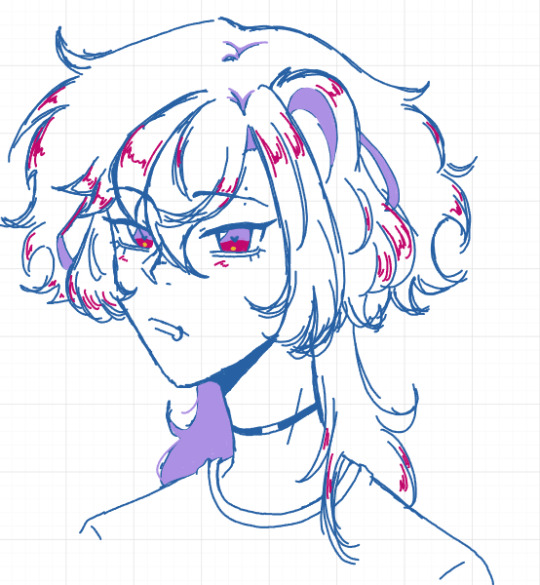
This is kind of what I was thinking. The eyes have a more defined shape, the nose is different, the hair is more detailed. I've also been wanted to mess around with coloring and shading. And once again this style is not set in stone, but this is what I'm leaning towards as of now. I want the game to have an anime style for reasons, but I did also try a style that's more mine I guess? Like I drew Yani in the style I draw in the most, the style that's most consistent to me. I mainly did this because one my bestfriends has been helping me sort out my own feelings and she said to at least try a more cartoon style even if the anime style is what I'm aiming for in the end.
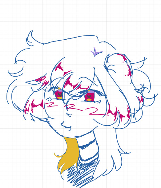
I obviously I do like the style, but it's just not what I'm going for, so I was going to try drawing different eyes styles and then I would build a face to match that.
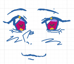
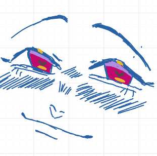
I did like these, but it didn't inspire me and I didn't want these for Mine. So this is what I've been working on for now, I'm trying t build my interest in this story again. I know I've talked about it before, but Yani and Jun's designs are the ones I'm most proud about(maybe Aki as well, if I change anything it wouldn't be too extreme), but the other characters will be getting an upgrade, in design, story, and personality.
Minato in particular. I feel so bad because as much as I like Minato, he feels so plain to me. Like I don't have fun writing him or drawing him. There are things I do really enjoy about him, like his hair style, and his yellow eyes. But I'm bored with pretty much everything else about him, and that's not a good sign, he's the first route, the first character to be released. he needs something to draw in the player, but I don't feel like he has that. I don't know where to really go with him though. I think the fact that he's the least yandere is charming and important, like to lure the player into a false sense of security, almost as if they were just playing a normal visual novel/dating sim with routes, and then the creepy stuff starts mainly happening with the other routes, but obviously I need something to make his route exciting.
In the meantime asks will most likely not be answered until I've figured the characters out more. When I figure out the characters as well, I want to go back and slowly work on updating previous asks to fit the new personality and stories. I'll probably make a poll on how to go about that just in case people want the old answered asks or something. Maybe I could just do something like-
Old: bhjdhsvjagjhasgd
New: VHJDhfdjgshdf
I don't know as of now. I also want to go back and update my 100 followers event drawings, and obviously finish that. Which by the way I am so sorry to everyone who sent in requests, for that event and just in general. Me struggling with Mine's art style has been a thing, even with the refs, there were some refs that I just hated how they turned out(cough cough Hoshi). I also have been practicing with more cartoon(?) styles, so working on a game with an anime style reminds me of my past styles, which I hated because I got those feeling of hating my style or falling behind my peers who were finding their style. I'm a lot better with it now, but I felt like I was falling back into old habits/styles, and it was upsetting.
While I was planning my hiatus, I kept thinking about some of my other game ideas because if I was going to go on hiatus I would focus on another one of my games with a more simple style(Since I wondered if complexity of the style was also an issue for my lack of motivation with Mine), and I do like my other games and ideas and characters, but none of hem were appealing to me like how Mine did. I went into Mine so excited and ready to talk and share my characters, but with my other stories I was just feeling more unmotivated with them, other then "The Magi Academy" which makes sense since that is my comfort story but also I'm gonna work on this in the background since the game is huge.
Another thing I thought about doing while on hiatus was making a test game, where I get used to making games, where I practice. Cause Mine is my first game, but I'm not sure I want it to actually be my first game, but I have no interest in my other games as of now so this game would be simple, a little test to get used to everything that comes with making a game. I'll probably work on this while I'm working on the art style for Mine and the character designs. It will have multiple routes and characters. I wouldn't really call it a dating sim, there will be romance elements but I think more then anything it will be a little "get to know my oc's" type story. Maybe I'll talk about it more if anyone if interested. Although when I make games in the future I'll either make the blogs later, when the game is almost finished or if finished, or at least claim the name and work on them later.
I'd say that Mine is going on a hiatus, at least with this blog, but I will be working on it! Mine won't be getting released soon and when I made this blog I didn't expect Mine to come out this year. Another thing I want to end up doing is dev logs, maybe weekly or monthly, it won't happen soon, but eventually I want to do dev logs. As of now though, I have a lot to think about with the characters and the story/stories. I'll probably work on character personalities and stories before their actual design so I can get back to writing asks, and then I'll be redoing refs and any bigger drawings I've done so far. I also want to have a schedule for answering asks, so I'll probably spend the weekends answering asks and then the weekdays I'll be working on the game, but this is for the future. My ask box and messages will be open though if anyone has any questions :3 I hope that this will help me regain the passion and excitement that I hold for this story, have a great day/night, and thank you for you continued support🩵
#Sorry for my absence#it will happen again#Jun and Yani will stay pretty much the same#their designs are more what I'm used to#more detailed I guess#if they do get any change it wouldn't be too extreme#Although I do want to work on writing Yani better#really amplifying those yandere tendencies#esp the identity theft since that was a really interesting topic to write!!#I don't plan on changing everything about the other characters either though just things that I think could use some changing and updating#id like to keep you guys updated with character designs and art style ideas though!#sorry to come back with some negative news but i wanted to come clean and be honest about my feelings with mine
24 notes
·
View notes
Text
Trembling Essence:💙Cleaning up the game.💙

Hi guys and welcome new followers! This update post is fairly late and might be a little short but here's how the game is going so far! Enjoy this lighthearted thumbnail now that I can draw again! :,]
I also want to clarify this but when I said that "the pathing won't play out the same from the [Extended Demo] anymore" I mean the endings specifically not the way to figure out how to get to Noah, I like it the way it is.** :,]

"Cleaning up the game? What happened?":
Yes! Unfortunately I wasn't able to do much of anything and didn't have access to drawing until recently. I was going to wait until the following week to post but I really want to get this out of the way since it's still fresh on my mind! :]
While this was going on it gave me a lot of time to just think about the games progression and what I would like to do and change moving forward.
It's not much but once I was able to get back to working on the game, the main thing I did was clean up more of the pathing for the choices you can make leading up to the cabin. I really took my time with this and made sure the dialog flowed correctly and corresponds with how the player(Y/N) is feeling during parts where time passes wondering around. There were a couple of misplaced sentences and grammar I missed that got fixed too.
Big quality of life change:
A path in the game where you can run into Noah again has been adjusted, this is from the [Extended Demo] and not new content. I want to keep it vague for those who haven't gotten this 'Neutral Ending' but the 'Endings Guide' is available! I noticed it took a long time to get through this so I cut one of the two exploration sections so it stays balanced with the other parts of the game. One thing I really want to add is a unique CG here. I have an idea on how I want it to look but I'd have to adjust the wording to make it fit. I might do a perspective pose but since I haven't had much time to draw my style is going to fluctuate again. :,]
I also added more parts where Noah talks to you a bit more but I still have to go back and fix some of it because some of the writing isn't where I want it to be and this was while I was brainstorming. :[]

Kept the progress bar the same since only a small amount of stuff was done. Right now I want to continue fixing up stuff and most of what my play testers recommended already.

If you like what I create, please consider supporting what I do on kofi! All donations and tips help tremendously while I continue to work on the game. Thank you to those that optionally bought the [Extended Demo] and the March 2023 demo on itch.io. :,]
Q&A / Ask box is open:
I'm going to get to a couple of them this week! I need to practice drawing/coloring again. :]
If you have any questions about Trembling Essence/Noah feel free to ask here or on itch.io please. This makes it easier for me to see and answer accordingly! I enjoy hearing from you guys!
Overall, thank you everyone for the continued support, the progress has been small but I appreciate the uplifting words and the recent influx of interest in the game! :,]
#male yandere#visual novel#dating sim#yandere#itch.io#indie developer#illustration#drawing#interactive fiction#vndev#yandere vn#artists on tumblr#horror games#te updates#indie games#otome#vn#otome game#art#anime drawing
19 notes
·
View notes
Text

March version drawn by @estellardreams
With my tumblrversary (and new sona design 👀) coming tomorrow, I thought it would be fun to look back at all the different versions of my sona throughout the years!
July 2023 version
December 2023 Version
March 2024 Version
Closeups and breakdown under the cut! :D

Version 1! This was the original drawing of my sona that I made for a story I was writing with my friends wherein we ourselves were the main characters. This drawing has the same straight cut bangs that I had back then. I designed the dress to be simple and not overly flashy. It's supposed to be white with gold borders. Then we have the wings, which have always been my favorite part of my sona, the gold feather necklace, and the gold band hidden under my bangs which was supposed to act as a crown. I also hid my hands behind my back because I didn't want to draw them. XD This design was supposed to mimic my irl appearance and it did fairly good job! The only thing missing is my glasses from back then.

Version 2! This one was an updated take on the first version. My art style had changed a bit, so I wanted to draw a better looking picture of my sona. Other than the art style, not much has changed here. The design is still essentially exactly the same. My hair got longer though.


Version [????] I didn't include these in the history pic because I forgot them, but these were two iterations that I did in between version 2 and 3 for thumbnails on my YT channel. They're both once again trying to be an accurate representation off my irl appearance (though once again my glasses weren't included. The first one was an attempt at a chibi art style which I never did again. The second one sat unfinished in my sketchbook for a while before my cousin visited one day and offered to help me color it. We took a picture of it on her ipad and then traced and colored it in whatever drawing program she was using. I played around a bit with the shirt, making it a white into black gradient and brought back in the feather motif because I've always liked feathers. This one stayed my profile pic on yt for a long time.


Version 3! Massive skip in time and drawing style here! This one was designed specifically so I could have an updated sona for when I joined tumblr. (I planned getting my account for months before I finally worked up enough courage to actually do it.) Once again, I wanted this sona to be an accurate representation of what I look like irl. Though THIS time I'd finally gotten contacts so the lack of glasses finally made sense! I'd also gotten a new style of bangs so I incorporated that into the design as well. I brought back the feather as a necklace because I've always liked it. Though for whatever reason I got rid of the wings???? Why. Why did I do that. I love them so much! I shortened the length of my hair back to something closer to version 1 as well. And fun fact about this one! By this point I'd gotten decently good at drawing Sonic characters, so I used my knowledge of how to draw them to draw this version of my sona. XD I wasn't concerned anymore about drawing in a realistic way and leaned into a more cartoony artystyle.

Version 4! honestly, this one was just me wanting to do a Christmas version of my sona. XD Gave myself a cozy Christmas sweater and a Santa hat! I also took my favorite golden feather and tucked it behind my ear. I honestly really like how it looks! (I also messed up the shade of brown for my hair, but oh well.)

Version 5!! Estelle drew this for me and I still love it so much!!!!! I didn't request this of her, she just drew it! I mentioned in a post that I needed a new icon since it was MARCH and I was still using my Christmas pic. XD Next thing I know Estelle is kicking down my door asking me if I wanted her to draw me a new icon. I made sure to specifically request that she include my wings since I'd finally realized how dumb it was that I'd taken them out. But other than that, I let Estelle do what she wanted and I'm SO happy with how it came out!! I really wish I'd used this one for longer, but then April Fools came along and I hopped on the pointing Sonic icon bandwagon. XD But anyway, I'm still very happy and thankful to Estelle for drawing this for me. :D
Annnnnd that catches us up to the present! What will the new version look like? You'll have to wait for tomorrow. :D
7 notes
·
View notes
Text
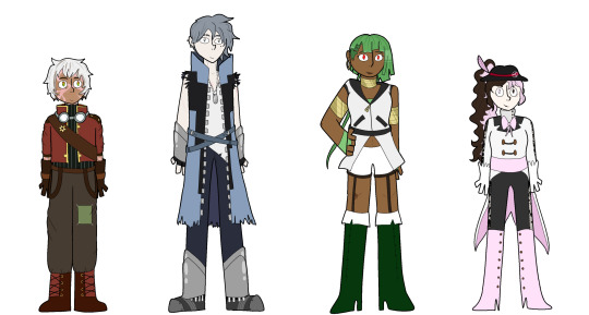
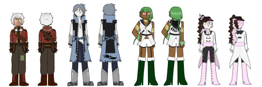
Behold, the updated team OMEN lineup! (click for better quality)
I ended up revamping the designs pretty much completely because, if I'm being honest, I feel like the originals were too boring, especially for the world of RWBY, not to mention my character design skills have improved a lot since I first designed them.
I'm super happy with how all of these have turned out, and I think they're finally starting to look like a semi-cohesive unit (as much as these dysfunctional dorks can anyways)
individual designs/design notes under the cut!
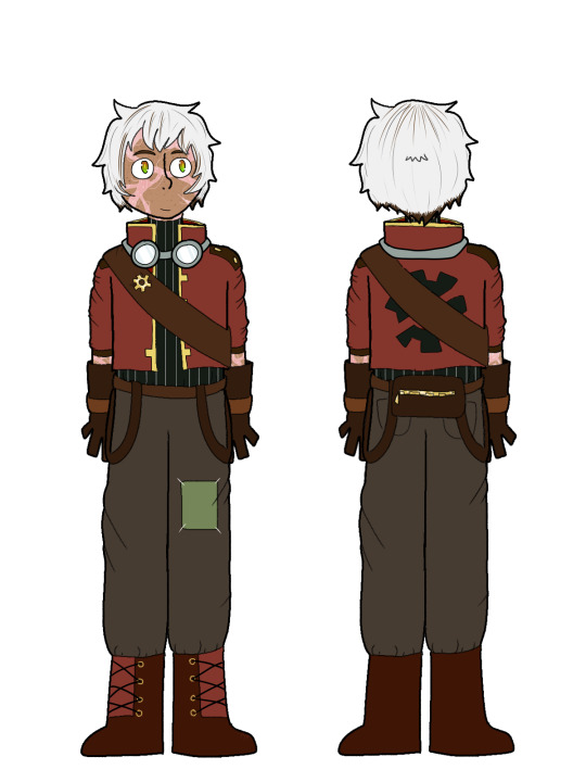
Oscar's obviously undergone the most change in this AU, so it makes sense for his outfit to be the most radically different. However, I still wanted you to be able to tell this was still Oscar, if that makes any sense. As such, I wanted to incorporate some elements of his other outfits into this one.
I leaned WAY more into the steampunky vibes with this design, and I ended up using the shade of red that's on his Atlas jacket.
Since he tends to associate green with Ozpin (he barely had any green on his v4 design, and only started wearing it after he started coming to terms with the merge) I wanted to incorporate the autumn colors of his v4 design in. Lots of dark reds and browns, though with a much more muted color palate than before.
He's still got that pop of green w/ the patch on his leg tho
The goggles are to hide when the grimm starts to show in his eyes.
The gear pin is actually a gear he took from Long Memory as a memento!
The bag on the back of his belt is for carrying Dust rounds.
He tends to have most of his body covered, as to hide the scars he got from the grimm and his time with Salem
The whole team have their emblems slashed for symbolic reasons (and also b/c merc thought it looked cool.) his is on the back of his jacket!
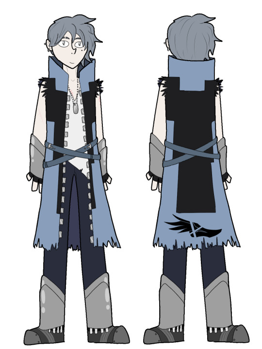
Mercury is arguably the character who's design went through the biggest changes over the years. Truth be told, I had a lot of trouble designing him when I first started, considering his Vale outfit was so bland and didn't give me much to work off of. Thankfully, V8 picked up the slack and gave me a better idea of what to go for.
I designed him to invoke a sort of beat up vigilante kind of feel - someone who's roughing it most of the time, and doesn't really have the time to care about appearances.
His coat is SUPER torn up due to his fighting style, being incredibly close quarters. The rips on the bottom are unintentional, but I imagine that when they got to Vacuo, he just cut the sleeves off it himself.
I wanted to turn the saturation of his colors WAY UP, not only because it looks more interesting this way, but because it's also indicative of the headspace he's in by the time he gets this outfit, which is to say, a lot brighter.
I also wanted to make his face a LITTLE bit more distinct, so I gave him an eyebrow slit and a mole on his cheek, along with a lot of scars from all the fighting he’s done over the years. I imagine Neo helped him with the eyebrow.
The jacket actually has ice Dust woven on the inside, to keep him cool. Nevertheless, he loves to fling it off dramatically during battle, Edward Elric style.
Emerald gifted him the dog tag - it was one of the first pieces of jewelry she ever made.
His emblem is on the back of his coat - he wanted it to stand out from everyone else's, so he slashed it twice.
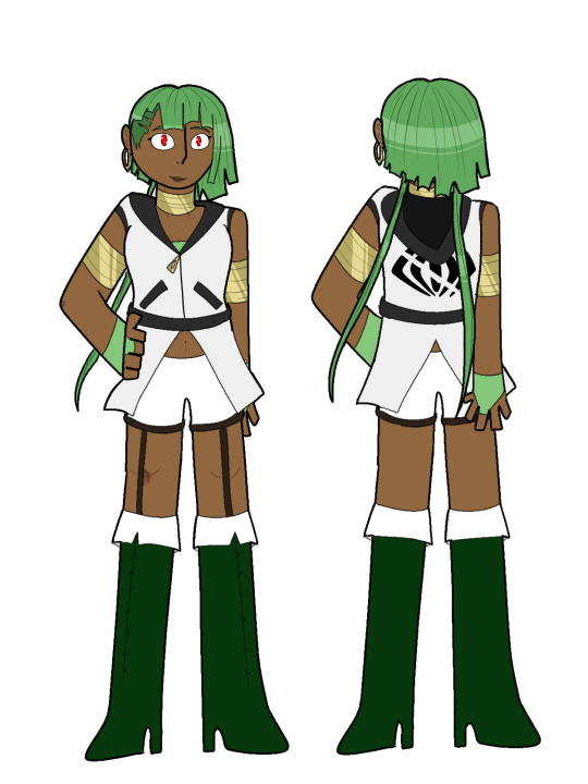
And on the other hand, Emerald's design is probably the one that's changed the least. I kinda struck gold with the mark 2 outfit, so I didn’t really feel the need to deviate all that much.
I wanted her design to be one that gives the impression of mobility - light, simple enough, with lots of arm and leg room to maneuver around (and yes I know the heels aren't practical for that, let me have this)
I changed the black color to have a hood on her top instead because I thought it fit the character better. Em is a thief after all - hoods are good for stealth.
The biggest change is, of course, the undercut. Out of everyone in the group, Emerald's the most accustomed to the heat, so she'd probably cut it a bit to keep her head a bit cooler.
All the bracelets and earings she's wearing are handmade, probably out of scrap metal she’s found while on the streets. I imagine that Emerald is pretty crafty, and likes making stuff like this in her spare time.
The red accents in her previous outfits were there to match with Cinder (who, noticeably never had any green accents in return) As such, this design lacks any red accents, as she's trying to move on from that toxic relationship.
Her pockets are actually pretty deep, and hold things like bandages and emergency mini smoke grenades.
Her emblem is also on the back of her jacket, matching Oscar's.

And finally, best girl Neo. TBH, I VASTLY prefer her Vale design to her Atlas ones (it's my fave in the whole show) so I drew more from that than the other one.
I was kinda trying to go for a magician's assistant vibe with this outfit, with the bowtie and gloves and all that.
Neo's not very experienced with the heat, being Atlesian, so she didn't really dress properly. As such, she ended up putting her hair in a ponytail.
A fun idea I got right away were slits in her sleeves and pants, but then I one-upped myself, and thought; what if they were lace?
The original design had way too much black and not enough brown, so I tried to incorporate more of that into this design, since, y'know - Neapolitan ice cream and all that.
She's changed the band of her hat to be a more reddish shade, in remembrance of Torchwick, and she's also swapped out the feather to match the rest of her outfit.
And yes, she swapped the sides of her hair each color was on to see if anyone would notice. (No one has said anything yet.)
Her emblem is a pin on the side of her hat. Neo didn't strike me as the type of character to wear an emblem, but I still wanted to incorporate it, so I figured something subtle like a pin would work.
#rwby#rwby omen au#omen au#rwby omen#oscar pine#rwby oscar#rwby mercury#mercury black#rwby emerald#emerald sustrai#rwby neo#rwby neopolitan#neopolitian (rwby)#neo rwby#rwby au#rwby fanart#rwby fan designs#emerald city siblings#emercury#the tales of team omen#team omen#sophi screeches#rwby fanfic#greenlight volume 10
38 notes
·
View notes
Text
I'm not sure how to make this post, because I know that Valerie is very much active on this site and very well may see it.
So, uh, hi. If you're reading this, I want you to know that you're an amazing person. Genuinely a big inspiration in my life. I'm going to express a bit of disappointment and sadness in this post, but I want to make it explicitly clear: I am not disappointed with you. This isn't your fault, and I need to make sure you know that. In all fairness, I DO know you know that. I read the confession. I just want to make sure that you REALLY know. Progressing a story that's hurting you more than its inspiring you is not worth it. Nobody deserves that. Emotions are messy and complicated and I'll be over it eventually. C/K/C looks amazing, and I cannot wait to see what you do next.
With that in mind, we get to the heart of this post. An incredible comic, only 1 and 1/2 chapters long, called Goodbye to Halos.
I discovered the comic right after I discovered I was trans. Literally the first thing I did after my egg cracked was look up: "trans webcomics", and there it was. Safe to say I didn't know that I was getting into SO much more.
I was instantly hooked by the worldbuilding. Even before it started to branch out, the visual contrast between skyport and lionsbridge was so striking. And as a developing artist, I got to see firsthand things I didn't know were possible to do with color. It was about at the time that I got to the "Why can't love just be a matter of fact?" page that I understood I was truly reading something special.
While reading I discovered parts of myself that I didn't know were there, like the often repeated philosophy that refusing to care about people is, in the words of the comic, "just so boring". The complexities of gender expression. Body positivity and the concept of non-sexual nudity.
I binge read the entire comic up to until Fenic waking up under the dragonfly. From that point I was glued to the page every day, constantly checking for updates.
The future of the comic has changed a number of times since that point. Including art style changes, hiatuses, video entries, and reboots. Until yesterday, the last I had heard was that the world of GtH would continue in a reboot-esque way with Unsave the World, a story developed in the same engine as C/K/C, focusing on Clarissa and Selin.
As, anyone interested in my blog will note, I am very new to Tumblr. Only joined recently. Yesterday, I had the idea to seek out Goodbye to Halos content, and Valerie Halla, which is where I got the confirmation that lead to this post.
"[Goodbye to Halos] was a hiatus when it went on hiatus. it took me a long, long time to come to terms with saying that it’s probably not just a hiatus, though. i will always love that story and those characters, and their spirits will live on in what’s to come, just like portside stories before it."
I... slept on it. I was distressed at the time. Honestly, I think writing this right now is still me working through it. Like I said before, emotions are messy.
But. That's it. Part of me is fixated on the word "probably", but the rest of me understands that thinking like that is only going to hurt my views on it over time. Not worth it to poison the past.
I've spent the time between that and now thinking, as much as it seems I've only done sulking that whole time. And from my thinking, I've come to a decision. I've figured out how to come to my own "don't be sad because it ended, be happy because it happened":
I'm going to make
So Much
FUCKING FANART
You're not gonna believe it. If I feel inspired by this story, and my brain's not satisfied with how the characters/worldbuilding/themes have been explored, I'm gonna do what everybody's done before me since renaissance painters after reading the Bible.
I'm going to make a frankly ridiculous amount of unofficial fan content, and when my brain finally burns out, I'll be over it and I can finally move on.
Look out Tumblr, I'm about to start chopping onions
2 notes
·
View notes
Text
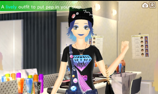
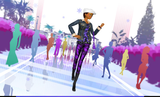
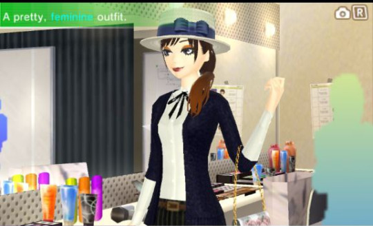
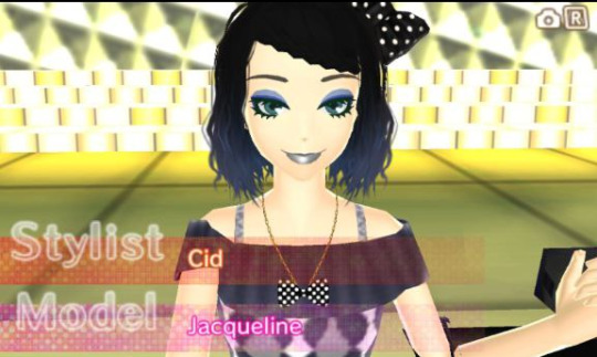
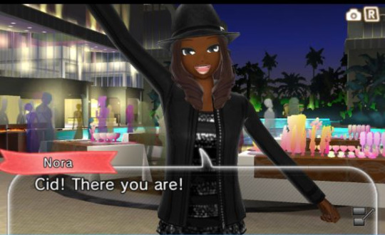
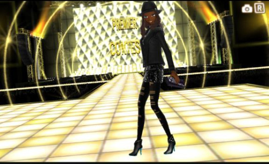
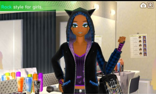
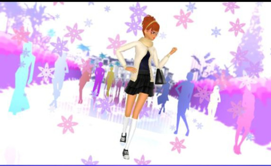
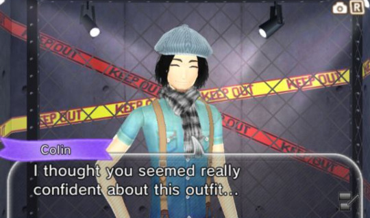
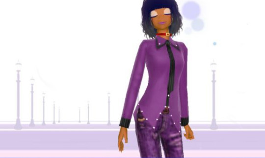
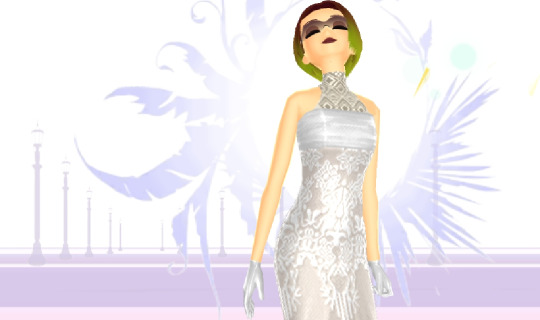
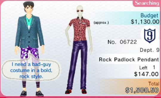
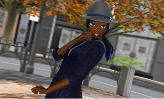
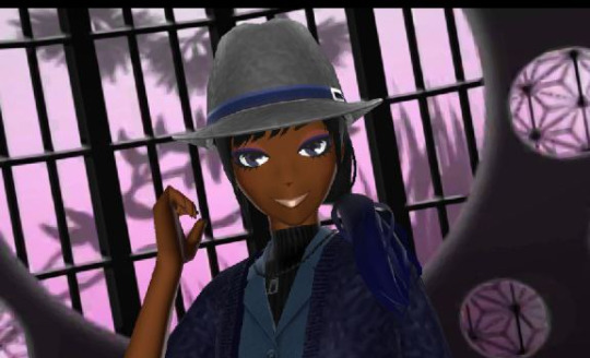
Blog Update +Style Savvy: Trendsetter Extra Photos
[Previous Post] [First Post] [Next Post]
Hello all! As previously mentioned, I plan to start playing "Style Savvy: Styling Star" Sometime in June!
Along with starting the new game, I'm thinking about making some changes to how I write my blog entries. No huge changes, but'll give a more detailed update after the photos.

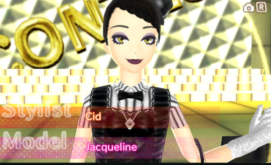
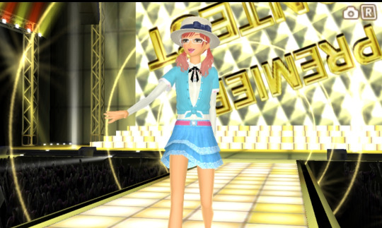
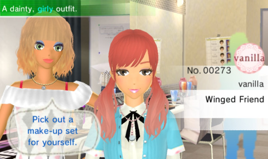
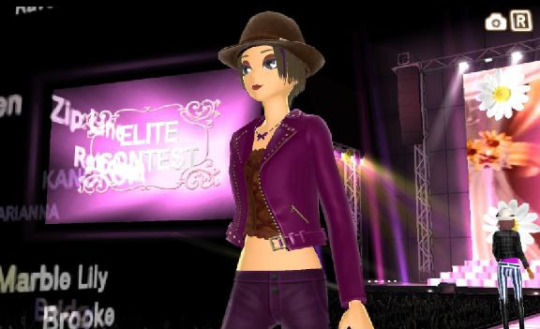
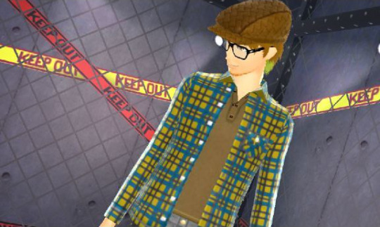
(I forgot just how much fun this game can be! Finally Got Elite too!
I played an extra hour today just to take a few more screenshots)
-_-_-_-_-_-_-_-_-_-_-_-_-_-_-_-_-_-_-_-_-_-_-_-_-_-_-_-_-_-_-_-_-_-_-
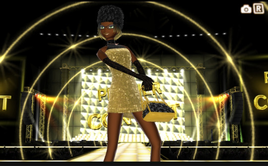
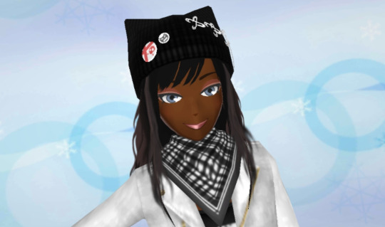

-_-_-_-_-_-_-_-_-_-_-_-_-_-_-_-_-_-_-_-_-_-_-_-_-_-_-_-_-_-_-_-_-_-_-

-_-_-_-_-_-_-_-_-_-_-_-_-_-_-_-_-_-_-_-_-_-_-_-_-_-_-_-_-_-_-_-_-_-_-

-_-_-_-_-_-_-_-_-_-_-_-_-_-_-_-_-_-_-_-_-_-_-_-_-_-_-_-_-_-_-_-_-_-_-
Ok, so updates/changes:
I'll be keeping this a bit short, as I injured my arm recently, so typing is a bit difficult.
This may also delay my first post for styling star a bit, But I still do plan to start playing it in early June.
I mainly play Style Savvy on my phone via an emulator, and since the games can be played almost entirely using the touch screen, it should be still fairly comfortable to play:
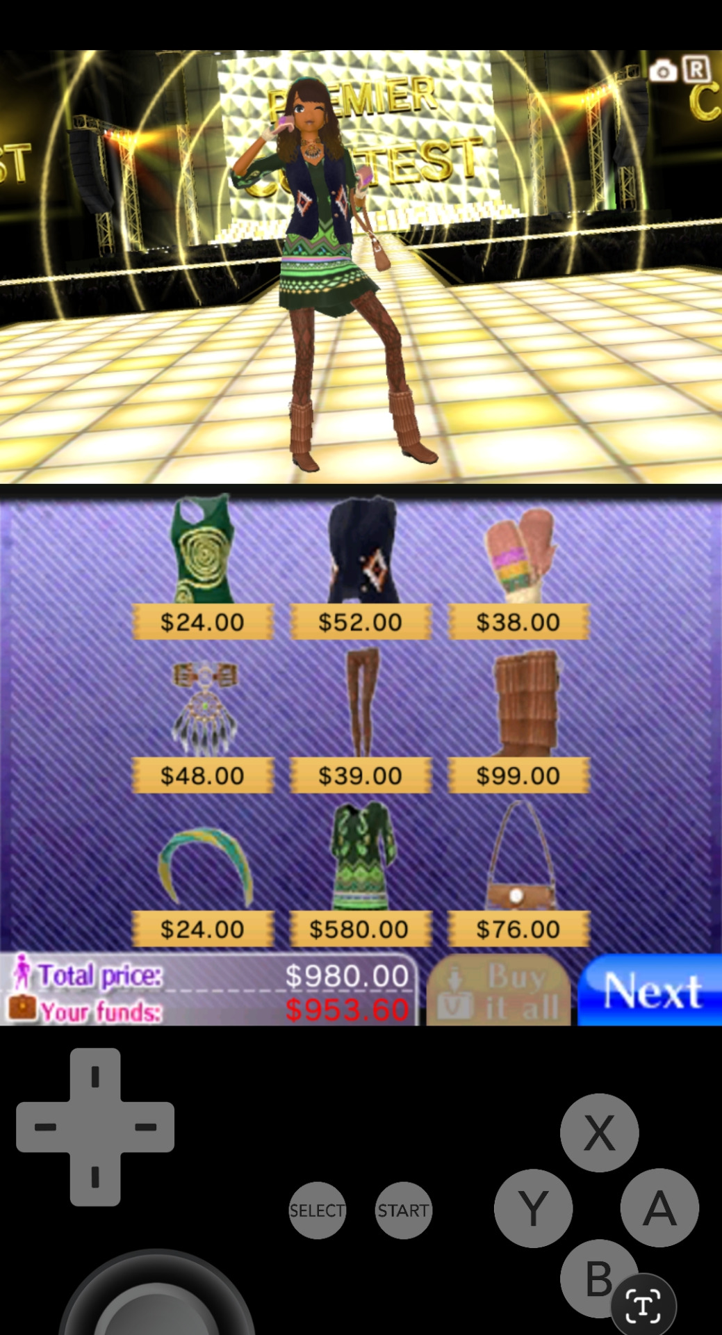
(And I'll still be able to use the onscreen buttons for other actions)
As for changes to the blog's content, again the base format will remain the same.
A mix of fun screenshots, my thoughts on the game up to that point, and some personal stories that I feel are relevant.
But after I recently had some tests done that gave me confirmation on a few things including an anxiety disorder, it's become clean that some of the issues I've mentioned in the past may be unresolved issued fueled by that, and until I can find a resolution for the core issues, the area's it branches off into can't really be solved.
Sorry if this sounds a bit vague, but in short, No, I won't stop sharing personal stories in these blogs. But in an attempt to keep the tone a bit lighter and upbeat. (Always my original intention) I'll likely start only sharing things that are more relevant to what's happening in the game, or what it reminded me of, and I'll also try to only share topics that I've already worked through, or at least understand to a meaningful degree.
I personally think this will be a better balance for everyone, but it's by no means set in stone, it's just the plan going forward.
-_-_-_-_-_-_-_-_-_-_-_-_-_-_-_-_-_-_-_-_-_-_-_-_-_-_-_-_-_-_-_-_-_-_-
Here's a (real) example how the 'new style' of sharing could be handled:
For a while I've been thinking about trying to 'get better' at designing outfits, style savvy has taught me some of the basics when it comes to clothing styles, and I've been trying some really early color matching.
But I still feel there's so much I don't understand, such as accent colors, how pattern are used, layering amounts, seasonal colors, etc.
On one hand, learning about all this could help me make way more dynamic designs, But on the other, adding all these extra 'rules' may remove some of the 'fun' I have when just throwing together an outfit.
It can also be a bit difficult to tell if I feel I need to improve my designs, because I actually 'want to', or if it's some felt obligation, because "that's what you're supposed to do". As everyone else, naturally gets better at something by just doing it a lot. But my 'natural progress' is generally much slower (and less noticeable) so it may be time to supplement that.
I've been having quite a bit of fun with my 'fairly basic' outfits/designs, just looking for fun yet expected/traditional pairings, and fairly monochromatic color matches.
(it may sounds silly, but it;s more like a science than an art to me)
...I don't think there's anything 'wrong' with my current approch, (even if it may not always feel that way) ..but I've decided to at least be 'open' to the idea of advancing, even if it's not as natural to me, as it is to others.
So the plan will be to start slow, research, and try applying a few ideas at a time, to see how i feel about the results.
By taking it slow, I think I'll be able to learn what I actually want!
-_-_-_-_-_-_-_-_-_-_-_-_-_-_-_-_-_-_-_-_-_-_-_-_-_-_-_-_-_-_-_-_-_-_-
But anyway, Thanks for reading! I had a lot of fun making this, so I hope you had fun reading it as well.
[Next Post]
As always, all comments, questions, and suggestions are welcome!
You literally can't bother me, (unless you go out of your way to be a jerk), so post whatever you need to say!
#syn sophia#fashion game#style savvy#style boutique#3ds#new style boutique#trend setter#trendsetters#stylesavvy
5 notes
·
View notes
Text
Tattoo Refs: The Erdennian Characters
Last month I was working on ideas for my characters' updated tattoos, since some of them were in a big need for updates lol. Starting with the Erdennian characters, both because of Erdennia's big tattoo culture but also because the original post was from over 3 years ago, so a lot has changed since then. I also added in Idalia and Ren(whose tattoo was first shared here), since they are half-Erdennian too. A lot of the new ideas are kind of vague in their designs since I still need to figure those out, so they are mostly location ideas but I also expanded upon the ones from the original post a little bit too. But yeah, I hope you enjoy!
================================================
- The Royal Family
. Demeter: Has her family's traditional ruling tattoos across her chest and collarbones, with her motif being suns, and another sun tattoo between her shoulder-blades. She has a small and simple lotus design by her left ear, and a small and simple daffodil by her right ear, these being her mothers' favorite flowers. A small one on her right ankle, of her husband and children's names in the shape of the infinity symbol. A piece of orchid and camellia flowers on her left thigh(the flowers that her mothers' names mean), and her husband's + children's favorite flowers on her right thigh.
. Enki: The same as before, has a giant back piece of a tree(a connection to his magic and dryad status) that has the names of his wife + children and parents + siblings on the branches. He would now have either one or two forearm half-sleeves in addition, but I don't know what of yet.
. Gaia: Has her family's traditional ruling tattoos across her chest and collarbones, with her motif being hearts. She also has a rose between her shoulder-blades(being dedicated to Rosia), one on her left lower-leg of her and her family's birth flowers, and symmetrical ones of vines starting from her hips and curling around her mid-thighs. In the future she would get something on her right lower-leg dedicated to her other friends(incorporating something that reminds her of each one), water lilies on her left forearm for Ren, and aster flowers + a forest tree on her right forearm for her future children.
. Avani: Still has a year before she can get one, but her first would be a daisy on the back of her neck. She would also eventually get her other favorite flowers scattered across her body(with a possible half-sleeve, thigh piece, and/or lower-leg sleeve), and once she is older in her 20's, she would also get something dedicated to Vernon, her closest friend in life.
. Beaumont: Still too young to get one as he is only a child, nor does he have any ideas, but he does find the concept of them cool enough.
- The Other Characters
. Rosia: Has full-color roses going down the entire length of her back/spine. Also has a hip/thigh one, this one also being of roses(but in a different style) as she is a little extra in that department. In the future she would also get a big tattoo dedicated to her spouse and future children, this either being on her arm or leg(of their favorite flowers).
. Carmelo: Has full-color tattoos ranging across his back of many different plants and flowers, with the main focus being of roses. Would also get tattoos dedicated to both the family he grew up in and the one he wants to start with his wife, these possibly being full sleeves(one of herbs and plants for his kids).
. Vernon: Like Avani, he doesn't have any currently as he still has to wait a couple of years before he could get one. Not super focused on getting one, but he would get a piece of wheat on his forearm as a nod to farming(coming from a farmer family), and when he is in his 20's, he would get something dedicated to Avani.
- The Half-Erdennian Characters
. Idalia: Doesn't get any till she is in her 30's, since she never lived in Erdennia and didn't learn about the culture till she met and got to know Gaia more. Once she does she would get quite a few, these including full sleeves that spill out onto her shoulders/back, a half-back piece, and a giant hip/thigh piece. These are mostly witch-related, but a few would be in honor of her late caretaker that took her in after her parents died.
. Ren: Currently has one, of water lilies blossoming down his back. Chose them as a silent nod to his chosen name(since he was not out about being trans yet at his ceremony), and had them ‘blossom’ as a symbol of his hope to blossom and grow from his life at the time. Does not get any more for a super long time for many different reasons, but after he meets and eventually marries Gaia in the future he would get vines along his arm, as a dedication and 'thank you' to her. He would also get something dedicated to his future children too, as he always had a secret soft spot for children.
#the lost rainbow#erdennia#character-building#tattoos#demeter erdmann#enki erdmann#gaia erdmann#avani erdmann#beaumont erdmann#rosia belmonte#carmelo belmonte#vernon george#idalia eld#ren plaskett#demeter#enki#gaia#avani#beaumont#beau#rosia#carmelo#vernon#idalia#ren
3 notes
·
View notes
Note
glance for Ry ; motion for Jay ; armor for Thyjs ; texture for Vijay 💗

glance: At first glance, what stands out most about your OC's appearance? What's their distinguishing feature?
What stands out the most on Ryder? He's wearing all black (you and I know he's got a few colors but these are rare and special :P). Other than that it might as well be his tattoo sleeve. Night City is full off tattooed people but it's still rare to have a lot of black inked tattoo only especially with geomtreic design. Majority of tattoos you will find are probably Valentino style or Japanese.
Idk if it is only me, but I rarely see his eye cyberware on other ocs as most use the other face cyberware. Tbh this eye cyberware doesn't fit everyone (this is only my opinion). I too didn't want to use it at first, but I selected his dark smokey eyes make up first, then went to the cyberware and it just fit. And ever sicne then it added something to Ryders face that makes it stand out the most on him together with his white rings eye mod. The other day I was just noticing, Ryder will never look overly tired as he never happens to have eye bags thanks to his eye c-ware because the part around his eyes is always darker than his skin is.

motion: How does your OC move? How does their clothing help or hinder their range of motion? Are they flexible, coordinated, clumsy?
I'm not good in describing "how someone walks". But I will try and add a few lines:
It's no surprise that Jaysen and Vijay do have a similar walk. Jay's happens to be often more aggressive and show spride. He's got a fairly good stance for a netrunner (so no nerd that spend his day sitting around). He's got a fairly chill posture as well when he's not stressed and is quite flexible. Sometiems he happens to be a bit clumsy (Vijay too), like walking a bit uncoordinated and happens to ram the door fram with one shoulder.

armor: What kind of armor does your OC wear? Is it well kept? Bonus: where does it come from? Is there a story behind it?
For armored cyberware, Thyjs has installed*:
Optical Camo (armor 15–30) (20 HL)
makes it more difficult to detect him outside of combat and hit him during combat
Shock-n-Awe (armor 44–92) (25 HL)
taken damage has a 10% chance to release a large electroshock that deals 135-500 damage to nearby enemies
Painducer (armor 114–138) (30 HL)
Converts 25-30% of damage taken into damage-over-time
In addition to that he's got an hardened chrome abdominal plate for better protection of the most vulerable part of the human body. Since it is all Militech tech and he sort of tested a lot of new tech as well, he also was allowed to receive some extra custom cyberware he wished for. He definitely got some of the best chrome you can get your hands on. He frequently checks if it needs updates and keeps it running in good condition through basic medtech visits.
For clothing, his Militech uniform and additional things such as gloves, helmet, scharf, glasses etc are all high quality functional chlothes with mostly protection mods installed. He doesn't wear heavy armor plates as he needs to be more agile than other soliders since he was mostly deplyed as an assault using sandevistaon on the battlefield.
*this is at least what I selected for his build for now, maybe it might change. I'll only see with leveling him up.

texture: Does your OC favor any specific kinds of cloth or textures? Is there anything they can't wear or don't like? What sort of fabrics do they prefer?
Vijay likes (vegan) leather for pants mostly but any kind of tight fitting pants will do for him. He's also pretty much into shorts.
#oc asks#about: ryder von scharfenberg#about: jaysen steyr#about: thyjs de wit#about: vijay steyr#brudi how long did this sit in my drafts even?#thank you for asking <3
5 notes
·
View notes
Text
Since I have no other place to go for this, I want to start out by saying that Nintendo needs a refresh. By doing a refresh with games and hardware, expectations can be thrown in a new direction, and speculation can be all the more fun. That said, what we want and need differs from how Nintendo views, so what I say should be taken lightly unless stated otherwise. I'm VERY open-minded, so I may go on and on, and I'm also open to criticism on the things I think about.
First off, the next console. I believe it'll stay relatively the same as the Switch but with the best internals they can get their hands on. They'll probably update the Joycons a bit and reintroduce the standard D-pad, or they may take the Steam Deck approach and glue them on. The standard will have a higher quality OLED screen to compete with others and possibly better sound. Not much more I could think of but it's enough to compete for next gen and try to bleed into the future gen. It opens up the possibility for more open first party games as well as more intricacy and design, increasing the odds for success (most of the time). Third party games will run better too.
Next, let's talk games. 2D Mario has been refreshed with Wonder, Zelda with TotK and BotW, Pikmin is still going, and Metroid... we don't know what's happening there, but it did have Dread. Mario Kart is still going strong, but there's only so much left they could do until they run out of options for one game. Smash is dead for now, but that's a topic for later with Mario Kart. Animal Crossing is iffy, as the player base has likely been halved since release; I know I don't play it anymore, and I've heard that it's got several issues that I agree with.
I want to go in depth about the state of Mario. Mario fans will be feasting soon with Wonder and RPG, and I'm one of them. Super Mario RPG is, if you couldn't tell, my favorite RPG, and I'm incredibly ecstatic for the remake. I have faith it'll sell well and be given the recognition it deserves. The music and graphics seem phenomenal in the remake, and everything seems like how we viewed it in the original; our minds were brought to life with this game.
Next is Wonder, which is an interesting beast I would love to tackle. The art style is amazing and a big step from New, just as much as the soundtrack is. It's all soft and colorful while remaining fast and enjoyable; such an appealing game hasn't happened for 2D Mario in over a decade. I love the new voice lines - despite Martinet possibly being replaced - and the new sound effects are great too. It's so experimental yet seems to be promising.
3D Mario games are pretty much due for a new game at this point. We haven't seen one since Bowser's Fury, which was only about half a game, if that. The last full game was Odyssey all the way back in 2017. It's understandable why it would take so long, but at least throw us a hint once the new system is revealed. It would be cool for it to be inspired by Wonder, but I could see it branching off of Odyssey or Galaxy too.
Super Smash Bros. should be getting a new game within the next 5 years. Whether it be a reboot, Ultimate Deluxe, or a continuation, I'm certain it'll be good. If they reboot the series, I imagine they'll keep a handful of characters and add a lot of new ones while also making completely new movesets for most fighters. Ones without new movesets would obviously have some changes though. The stages have a chance to be completely new. A continuation would likely cut some of the roster while adding new ones and do the same with stages. A continuation could be Deluxe but with different features and a new story. There are lots of debates about what characters would get in no matter what way they take, but I think the few that are locked in are Geno, Shantae, Sans, and possibly Cuphead. Personally, I wish Springtrap and Reimu would be in too, but sadly I don't believe they would. Same for Goku who will never be in.
Mario Kart is the only thing left on my mind, as it hasn't had a new game in about 10 years, less if you count Tour (but who would; it's a live service mobile game based on Mario Kart 7). It needs a new game very soon after the DLC is done, but there's one question that everyone has: where do they go next? I think they could take the Sonic R route and have it be more open world. Mix that up with all of the items in Tour and maybe some new stuff inspired by 2D and 3D Mario, and you've got something magical. Doing something like Double Dash and having two drivers per kart would be cool too. The roster needs an update as well, but Tour has added plenty of characters over time. They could bring back all characters, and if possible, add a separate menu for costumes and alternate colors. Tracks could be more based on games and even the recent movie. I would love to race around in something like Beach Bowl Galaxy or a fire flower field.
3 notes
·
View notes
Text
website update log #7 (April 14th, 2023)
Note: all changes in the site are documented in github now :D
the only reason i havent actually worked on /index is because i cant think of any ideas of what it should actually look like..
my creative juices arent spewing out of my brain and into the site, so i gotta look for inspiration.
and what better site to look for inspiration than... neocities!
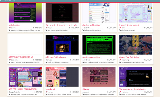
i know that i wont be using this site anymore for site hosting, but i realized that there are so much creative websites in neocities that are just out in the wild so i decided, why not use those sites for my struggling brain to figure out what my website index is supposed to look like :shrug:
when i was browsing the site for a bit, i came across this site called NOT FOR HUMAN CONSUMPTION by sugarforbrains...

besides the colorful artstyle that i love so much, it made me contemplate some things about this site and mine.
well first, ive seen that same chatbox (the box on the right with the text “WEB SITE DO NOT EAT”) a couple of times now, and im thinking if i should add one as well, but like, there wont be activity for a while since only like 3 people know about this blog and website aghaha
second, im seriously thinking if i should replace the top navbar with a sidebar, as it appears here, since there has been a problem i havent been documenting as much...
...and it was centering the damn top navbar.
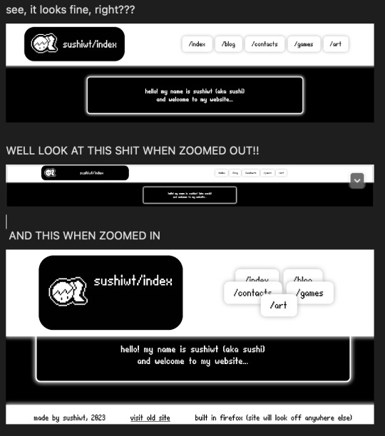
ok now that im actually looking at this it doesnt really look like its a problem since no one is going to use the site at 6400x3200 but it still makes me angry.
but even if i wanted to change the top navbar, thats not what im in neocities in the first place.
i wanted to find inspiration for replacing the “hello” textbox youre seeing now, but now im just getting pissed at something i already finished creating, which was the top navbar!!!
now, back to finding inspiration.
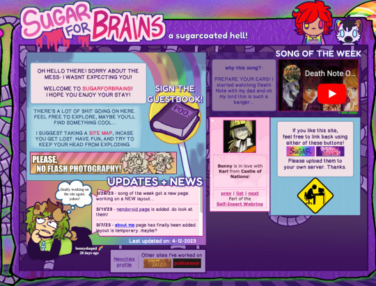
im not a fan of the grid lookin look, because of how inconsistent it looks, but ill think about it!!
oh btw if you have time, please visit the site!! it looks so visually stimulating its great!!! here
now, onto more exploration!
i found some sites by neoratz and keyzklubhouse (neo's HEAVENWURLD ଘ(ˊ_ˋ) and Key's Klubhouse) that piqued my interest ‘cause of one thing.. can you guess what it is?
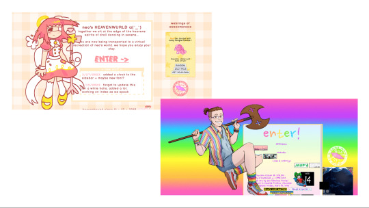
if it wasnt obvious enough, its the characters on the side of the boxes!!! I wanted this thing to be the first thing you see when you enter the site! it felt good that i was actually making progress on this for once, but then i realized that...
i already did this already!!!
on my old site!!!
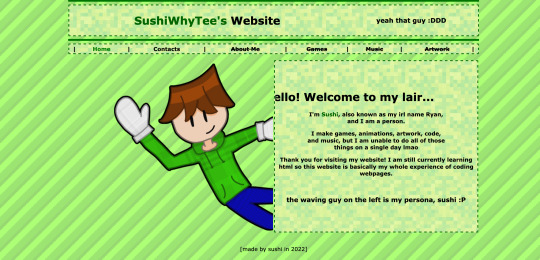
its the old me on the old site, on the side of the menu screen! what im planning to do here is that instead of giving one half of the home screen to the image and another half for the text box (which is shown here) im going to make it so that the box is going to be centered, and the character is going to be layered in a way where its still beside the textbox, but its layered!!
this is a visual representation of what i am talking about:
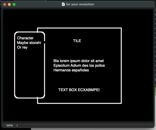
actually, ill throw another character while im at it:
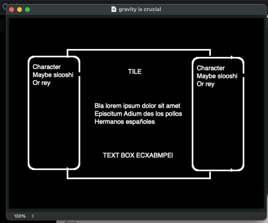
probably add one more here just to fill some space:
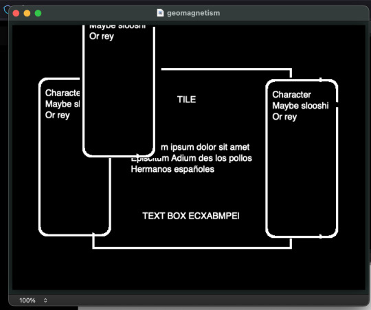
ok this should be enough characters:
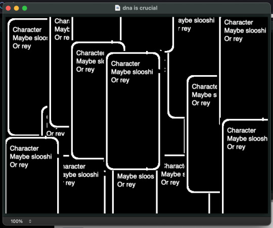
now that the overall concept of the first thing you see when you enter the site is finished, i was going to figure out what i wanted to show when yall scroll on the site, but then something just hit me.
i need a way to show the characters. how do i do that.
im actually planning to show one of my characters, slooshi (the icon of the website and my internet persona in general) but how do i present it to you??
this can go two ways. i can either 3d model the character, or draw it. the catch is that they both have to be pixel art as to match the theme of my site...
i could totally go for 3d modelling, with a more low poly 3d look, kinda like the style of pico-cad by Johan Peitz:
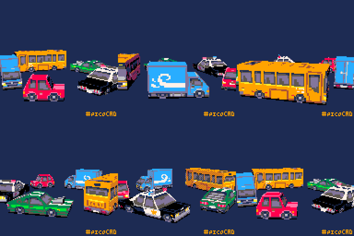
but i want to step outside my comfort zone, which brings me to my second choice, drawing.
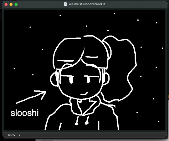
its not like i forgot how to draw people, its just way harder now since i havent drawn actual people in a while. ive been focusing more on 3d modelling, game development, and school that i havent really been practicing on my drawing skills more, which sucks but its what happens...
ill think more about it, but for now i finally figured out what im going to do with the site! (atleast the first part of it...)
- sushiwt <3
4 notes
·
View notes
Note
alright it's cookie popularity contest time in cookie run and i spend a lot of time on that lol. if you had to pick, who are your top 5 or 10 cookies?
Oh my goodness has It been a looong time since I've played Cookie Run. Love the style of the game though! So I'm gonna pick based on the designs I like best and why! Which is difficult! There are soooo many cookies now!!
Here we got top 5 faves! #1 being my Favorite!
-#5 Lychee Dragon Cookie

I'm a huge sucker for gremlin characters. The single little fang! Love it! I do think the mostly monochromatic color scheme does make everything blur together a bit though. I also love the jester hat and great eye shape! Good Design feels like it needs a bit more to break things up a bit. Maybe I'll do a redesign challenge at some point!
-#4 Moonlight Cookie
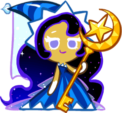
Moonlight Cookie is a very pretty cookie! Her base design has a great use of gradients, sparkles, color variation and sheer fabric.
But I have to say as much as I love her base design...Moonlight's costumes go HARD!! They may not quite even look like the same cookie anymore but they are GORGEOUS!!

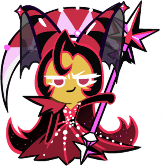
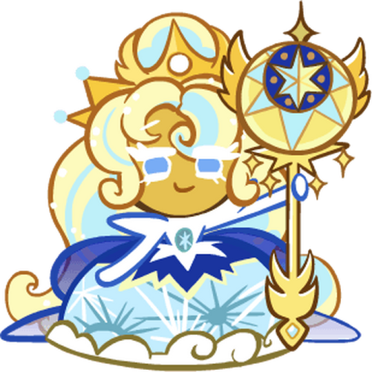
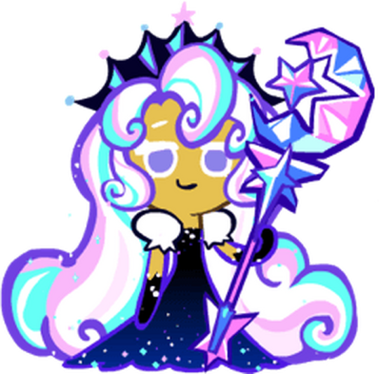
Even Proto-Moonlight from the Concept art is pretty!

-#3 Eggnog cookie
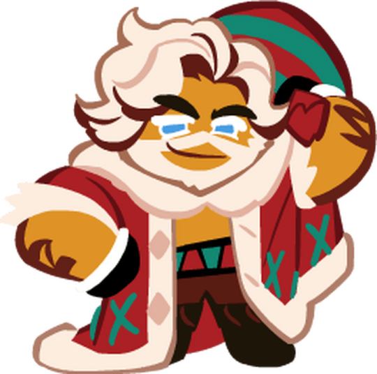
I mean look at him, but really what I think is so great about Eggnog cookie is usually in series that have a more cute aesthetic they refrain from bearded characters pretty often? I always love a body type change up too! I also just love Christmas. Not the religious stuff. I love decorating and gift giving and the aesthetics! Warm fuzzy feelings. I will admit to not being an actual eggnog fan though. I don't hate it but I would rather have Hot Cocoa!
-#2 Birthday Cookie
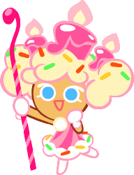
Birthday Cookie looks like a cookie I would design! Bright colors, sprinkles, big candles! Looooove it. Pretty simple explanation here, she's just aesthetics I adore!!
-#5 Devil Cookie
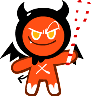
I already mentioned I love little single fang gremlin energy (I'm not smol but I am myself a gremlin).
But Devil Cookie also just has such a cute deaign. Love the shade of red orange used! The little hood and bits of white. I just really love it! He screams Mascot! Put him on merch! He is an older cookie though and only a rare so he doesn't get as much love but he did get a costume update! It's cool but not as charming. Still love it though!
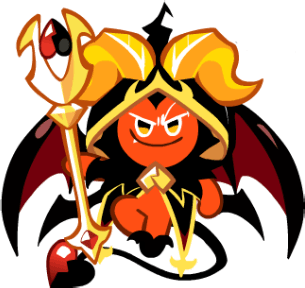
Man talking about Cookie Run again makes me wanna draw my ocs and create more!
Thank you for the Ask!
3 notes
·
View notes
Text
1888
A Question of Threes.
Three things you loved as a child but hate as an adult:
1. Shopping. Haaated it when my mom would enter a store and spend a good 20-30 minutes in each looking at the options. I always asked for a chair because I couldn't be bothered. Now I'm pretty much like her, if not worse haha.
2. Champorado. I had it regularly for breakfast, but after trying it again not too long ago I realized my tastebuds for it have changed.
3. Swimming. I used to find it a really fun activity (in fact in preschool we had a Swimming Day toward the end of the school year haha where we just swam and watched a movie after) that I looked forward to, but the older I've gotten the more I realized that the hassle before and after it is just not worth it haha. I don't want to think about more things to pack, to deal with the stress if I forget something like slippers or sunblock, to face the freezing air when getting out of the water, or to deal with removing sand or chlorine.
Three things you love as an adult but hated as a child:
1. Chicken curry. Dreaded it whenever that was the lunch or dinner my grandma prepared. Now it's all I ask for, apart from her kare-kare.
2. Plane rides. During my first few I was terrified of them, always thinking I had an unlucky bug and that my flight would crash. I get very excited about riding in planes now, especially when they take off.
3. K-pop. I mean tbf I still find a lot of the 2nd gen stuff to be a bit cringe, especially the hair and outfits. It's a generation thing. When the 3rd and 4th gens pivoted their styles and approaches, that's where I started to see the appeal.
Three things you would do if you won the lottery:
1. Give back to my parents. That's a given.
2. Donate to animal shelters. I donate as much as I can, but it's always nice to be able to give more.
3. Savings. Because I want to be able to get back to the remaining monies once I'm older, and I want to avoid the trap of becoming reckless ever again with my money.
Three pets you would own given the chance:
1. Aspin. I'd love to be able to take care of a rescued aspin and let it feel the comfort of a loving and warm home.
2. Aspin #2
3. Aspin #3, hahaha
Three non-essential things you do every day:
1. Play Rhythm Hive. It's a K-pop rhythm game I've been playing since 2021 and have consistently remained hooked on, save for taking a break from it the first half of 2023. What I like most about it is how its gameplay has an always-on quest to it, so you're always playing for something and you're never on just studio mode.
2. Check IG reels. It's how I know I'm getting older because I hate TikTok, but ugh Reels are the best to bingewatch lmao. They're bite-sized, they're funny, and IG is great at detecting your interests and adjusting their recommended videos accordingly.
3. Make a cup of coffee. I need it to start every day; it helps me focus. My performance at work visibly differs if I've had coffee or not.
Three non-essential things you wish you could afford to do everyday:
1. Have meal subscriptions. I can't cook and even if I learn how to I feel like I'll still be lazy...? lol so a subscription would definitely help.
2. Travel. Maybe not everyday, but it'd be nice if I can be like one of my co-workers who goes to another country every month lmao.
3. Shop. I'd love it if I can get to update my closet more frequently.
Three favourite scents:
1. Vanilla. Basic, but a no-fail. I love the sweet, subtle scent of it.
2. Seafood. It's the Asian in me and definitely the archipelago-an in me, but I love the smell of fish. The fishier and more wet market-y, the better.
3. Anything being baked! The smell just evokes super homey and comforting vibes for me.
Three books on your “to-read” list:
1. Bret Hart's memoir. To be fair I started on it already, but the copy I found was missing pages so I just stopped reading because I want to read through his stories in full. He's had such an accomplished life and career – very colorful too, at that – and he is for sure one of the very few wrestlers who'd have the most interesting tales to tell.
2. Kafka on the Shore. It's been a book recommended by Namjoon, who is generally also a fan of Murakami.
I can't think of anything else; I'm not into reading much.
Three authors you’ve read all the works of:
None. See last point.
Three TV shows you wish had never been discontinued:
Can I name my top shows instead? In theory I don't wish for any one show to go on forever, because as we've seen time and time again shows either continue until they turn to shit (see: Friends, TBBT); or end early while still critically-acclaimed (see: Breaking Bad), ha.
1. Friends. This is my favorite sitcom ever and I still find it endearing how fast I grew in love with the show. Normally it's hard to catch my interest when it comes to series, but with Friends I quickly found myself flying from one episode and one season onto the next.
2. Descendants of the Sun. This is still my favorite K-drama I've ever seen; my only gripe with it was the superhero comeback of the male lead. It's your typical unrealistic, unpredictable K-drama plot twist (the guy was presumed dead!! and should have stayed dead!!) but naturally he had to come back so that we could get a happy ending.
3. Breaking Bad. Cliche, but it's my favorite show ever. Across all genres, across countries, across storylines. This is a show you could tell was someone's fucking baby, one that was given the utmost attention and priority from start to finish.
Three vegetables you love:
1. Broccoli. It just tastes so so good and I love its crunchiness.
2. Spinach. It's soooooo versatile and tastes great too. I love it best as a dip.
3. Green beans. Another one with a good crunch. It's perfect in kare-kare.
Three vegetables you hate:
1. Lettuce. It tastes like nothing and feels like eating wet paper or hair, lol. I always feel like I'm not getting my money's worth when I eat something that comes with so much of it.
2. Kangkong (I think y'all call it water spinach)? Too earthy for my taste.
3. Beets. The purple is very off-putting, haha.
Three snacks you’d pick for a road-trip:
1. Fries. Easy to eat, and won't make me too full so as to skip my actual meals when I get to the destination. Best if it's from Potato Corner, McDonald's, or Jollibee haha.
2. Burgers. It's great to eat-on-the go and is filling enough.
3. Siomai. Ugh, just an all-around go-to comfort food. I can have 20 of these in one sitting haha, possibly even more if I'm hungry enough.
Three favourite brands of soda:
I don't drink soda. Can I list my favorite drinks instead? Haha
1. Water. Basic, but I do like water more than the average person if you can even measure that?? Haha I'll look for iced water everywhere.
2. Coffee. I used to like hot coffee, then I discovered iced coffee and there was no turning back. I can have it for literally any situation.
3. Milkshakes. Now I have these a lot less frequently than the other two since they are very sweet + usually expensive, but I can enjoy a good milkshake from time to time.
Three things that absolutely terrify you:
1. Insects. For a country that has a lot of them, they still freak me out. Especially if they either fly or have lots of legs.
2. Death. Not my own, but of loved ones. I've never seen or touched a newly-dead person (my experience has been limited to funerals) and I don't know how long I can keep avoiding it. I'm absolutely terrified for the first time I'll ever have to deal with such a situation.
3. Catastrophic situations, like if an elevator shoots all the way down to the very bottom, drowning, getting stuck in a cave, being swallowed by a sinkhole...situations where there's basically low to zero chance of survival and no allowance time to react either.
Three typically “scary” things that you love/like:
1. Heights. One of the things on my bucket list is to go to one of those skyscrapers that have glass flooring on the top floor.
2. Snakes. As long as they're not venomous, of course. I've been to one or two spots where they let guests hold snakes, and I definitely didn't let the opportunity pass.
3. Seafood. Okay this is not fit the "scary" category per se lol, but it is a polarizing choice. A lot of people hate it or are grossed out by it.
Three places you’d love to visit:
1. Seoul. It's definitely a goal but considering they're racist toward Filipinos I'm really hoping my future trip/s there go/es well.
2. Da Nang. I've been there, and I love my stay so much and want so badly to return. I was there for only 3 days there, and if I had the money I'd try staying there much longer. I know there's so much I have yet to see and visit there, and I just really really loved the slow pace they have over there.
3. India, although I'm not sure about which city yet. I'd love to try out their street food. I know I need to go with a guy though, as sad as it sounds.
Three places you’ve visited but wouldn’t visit again:
1. Shanghai. Don't get me wrong, my trip was great – the whole cruise ship itinerary was an 18th birthday gift from my dad. I just do not have plans to go back to China for as long as I live.
2. Manila. I know "wouldn't visit again" is virtually impossible because it's literally the capital and we have events there from time to time. I just don't and won't go there willingly. Super polluted, dangerous, and end-to-end it just reeks of sketchiness lol.
I dunno honestly, all the places I've been to have been great! All in all Shanghai was still a lot of fun and thankfully no one was all up in my business; and Manila does have our country's best museums, so even these two are a stretch.
0 notes