#i might render it as its own illustration
Explore tagged Tumblr posts
Text

My take on their relationship I take no criticism
#alien stage#alnst#alnst mizi#alien stage mizi#alnst guardian shine#kikiji's art#yes this is bc of the birthday art#i love them so much#my lovable creature#theres another version of the comp that was scrapped#i might render it as its own illustration
609 notes
·
View notes
Note
Thank you for getting me to finally try pixel art! I‘ve always wanted to get into pixel art but I never knew what to start with and always ended up procrastinating. Your blog and the post you made on learning pixel art were what finally pushed me to give it a go. It was really helpful and I managed this little animation in Libresprite.

I definitely want to improve and your art is like the ultimate goal lol. Do you have any tips or instructions for how to get better or on what to focus on in the future? I‘d appreciate any kind of criticism/input you are willing to give! How do you manage to make such gigantic and beautiful landscapes?
thank you!! and i'm so happy you decided to give it a real go, you're doing great already!! the rendering on the body and the pink shading is really nice.
i can help a little with animation stuff but i'm not an expert, ill write something out about backgrounds at the end
i hope you don't mind but i edited the sprite a little, just to illustrate some stuff
🤺Animation stuff


i added an extra frame near the top of the arc so it slows down. this is called ease or slow in/out and usually happens at the beginning and end of movements. u can do even more slow but this is just a quick version
i also removed the middle frame (where the tail is straight down) to make the swing appear a bit more powerful. this could be the principle of timing in the same video. you can exaggerate smears if you do this, its up to you!! lately i tend to exaggerate stuff a lot, things arent super noticable in motion
i also got a good bit of advice from nickwoz that helped me, basically when you begin to animate, it really puts the rest of the sprite being still into focus. try to think of how you could animate other parts of the body, even subtly. and sometimes if individual pixels stay still they can catch the eye in an unintended way as well, just keep it in mind!!
if you want to learn animation more, you could take a look at duelyst sprites, they have incredible idle and ability animations, i study them a lot

heres one i downloaded a long time ago. i recommend just downloading stuff you like and looking at it!! i have a huge collection of pixel inspo. slowing animations down can really help you understand whats going on. its just a bunch of simple elements put together that makes it look so good.
IF U WANT MORE RESOURCES/ARTISTS I REOCMMEND TO GO AND STUDY LMK!!! IM LIKE A WIKIPEDIA, I AM A BIG FAN of pixel art and love to share
🌿 OK lets talk about landscape stuff
it looks like you have art experience already, but im gonna talk as if youre a complete noob cos it might help some other people who read this!! ur doing great 👍
❓ how to learn: study (and practise a lot)
what i mean by study: draw it, copy it, try to understand it. you can try to change characteristics about it. changing the angle or lighting can help u understand how something works in 3 dimensions.
sometimes it takes time, dont worry, you will figure out your own style through doing studies, its all a process
❓ how to draw landscape details?
study pixel artists and how they do it recommendations: fool, slym, jubilee, deceiver
also please look at real world references!! you got to build that visual library
❓ how to learn composition?
study traditional artists or animation. i did a ton of studies of ghibli backgrounds which i think helped my growth a lot recommendations: arcane, studio ghibli, traditional painters
im gonna break down a piece as well and maybe that will help. this is one from 2022 but its still one of my most popular and its pretty simple too!!


if we remove all the fancy stuff what we have is actually really simple. just a few large, overlapping shapes that all point towards our focal point. it's the brightest area with the most contrast and many edges point into it.
go to pinterest or google and just search "pretty landscape" or "mountains" or something and you can see what i'm doing is nothing special or unique!! break it down into bigger shapes to begin with, its just different areas of material mostly.

and heres how you can make any landscape from any colours. purple sky or mountain? orange grass? ok !! it all works, it doesnt matter. i just blend the colours.
when parts of the landscape are in the distance they become closer to the sky colour as there is more "sky" in between you and it. its called atmospheric perspective. so if the sky was red, the clouds would fade towards red.
OKKK i dont know what else to say so i hope that helps!! honestly 90% of what i do is intuitive and hard for me to really explain, so you dont have to know The Rules, you just kind of pick up stuff as you go.
GL and thanks so much for showing me your art!! please keep going!! 💕💕💕💕
179 notes
·
View notes
Text
The Science of Ki
This ficlet is inspired by this illustration by the amazing @grsl-xo and is named after it as well. I encourage you to check it out and reblog. It deserves to be shared with everyone. I hope the ficlet can convey a tiny bit of the illustration's beauty.
Rated G. Can also be read here on AO3.
-------------
It wasn't often that she was rendered speechless. Therefore, Vegeta felt especially smug as Bulma stared transfixed on the glowing orb of ki between her hands, no words leaving her usually loquacious mouth.
He was surprised when she'd revealed to him that she'd never been given the chance to come close to a concentrated mass of life force, despite her close relationships with several who could wield its power. She revealed that her friends had deemed it too dangerous for her to examine and experiment with, let alone try to hold, as though they wouldn't be able to control their ki if she came close to it.
It made no sense to Vegeta. The condensed ki was only dangerous if treated as a weapon. But just as it could be used for flight, so could it be useful for other mundane things. He used it to dry his hair, warm his food and - as Bulma had recently experienced firsthand - even more pleasurable matters.
Apparently, Earth’s defenders hadn't thought to utilize their ki in such ways. Perhaps they couldn't control theirs fully; it wouldn't be much of a surprise if that was the case. Fortunately for Vegeta, it meant that he got to be the one to show Bulma. And, although he would never reveal it to another soul, he was thankful for the chance.
He stood behind her and held the harmless ball of swirling ki in front of her. There was just enough force in the orb that it felt slightly hot and he saw her cheeks redden a little with the warmth of it as it shone like a small contained sun before her eyes.
Her hands molted themselves around it, but not touching. Were she to touch, she might get a second degree burn at most, but only if he failed to make the ki dissipate before she came too close. He would never make such a novice mistake.
He felt the soft, miniscule flicker of her ki naturally trying to respond to the orb in front of her. She was weak, but still held enough life force that he would feel. When she became angry, her ki would blaze like a flame and shimmer like a bright miniature star within her. The beauty of it always stunned him.
Her unpracticed ki wanted to manipulate the glowing orb between her hands. He knew it was her inquisitive nature compelling her own ki to try to control the energy, but she wouldn't be able to. Not yet at least. As he stood there with her and felt her life force flow fiercely through her, he began to think that she might even be able to hold the ball for short periods at a time if he taught her how.
He had no reason to do so. There would be nothing to gain for him, besides her favor which he could attain in other ways.
But as he looked at her amazed eyes, so blue and wondrous, he felt that it might be worth it anyway.
#vegebul#bulma#vegeta#grsl-xo art#vegebul fanfiction#dbz#i had planned to write something for the dnd event but this felt more right
62 notes
·
View notes
Text

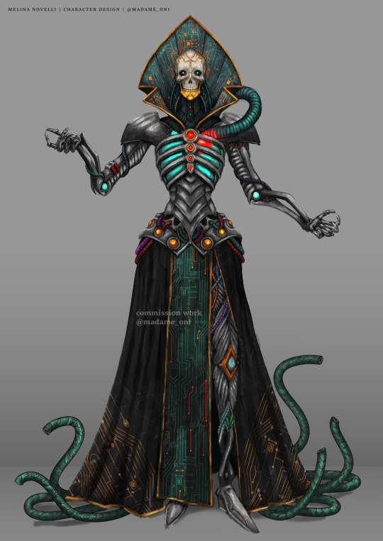
Alright- I figured I might make a lovely long post detailing my commissions options to link to over here.
I want to start with pointing out that my main pride and joy is communication and feedback loops to archive just what you want. The commission process can be long due to the back and forth, but good communication makes great results!
If you're curious, this post shows some of my sketches in the feedback loop stage!
My usual time from start to finish (might depend on the time it takes you to answer) is around a month.
Lets break down the options and prices!
prices are in $usd
prices are for personal use only (ya' know, you can print it for yourself, a friend, but not sell it or use it for business promotion!)- commercial use can be discussed (:
contact me to [email protected]
These can be taken as guide, if you'd like something that doesn't fit here- feel free to contact me to discuss it.
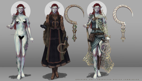
CHARACTER DESIGN
Full character design. Detailed wings, anthro, animal and highly complex designs can change the price.
BASE PRICE: $170 2 full bodies - front view 1 nude or underwear + 1 complete outfit.
Extras Extra outfit: $50 each Weapon: $50 each Extra body: $70 each (alternate version, extra pose, etc) Back view: +50% of the total

OUTFIT | WARDROBE DETAILED
For characters that already are designed. Detailed wings, anthro, animal and highly complex designs can change the price.
BASE PRICE: $120 2 full bodies - front view 1 nude or underwear + 1 complete outfit.
Extras Extra outfit: $50 each Weapon: $25 each Extra body: $70 each ( alternate version, extra pose, etc) Back view: +50% of the total
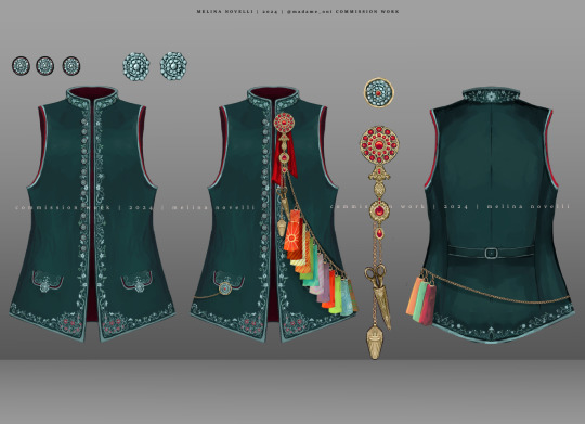
NEW! | OUTFIT EXTRA: GARMENT DETAIL
Detailed front and back view of a single garment. Its an extra to the outfit or character design commission.
BASE PRICE: $50 front & back view of a single garment a few close ups if needed
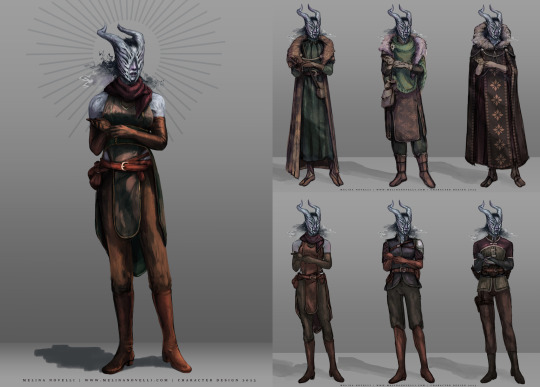
NEW! | WARDROBE SKETCHED
For characters that already are designed. Detailed wings, anthro, animal and highly complex designs can change the price. Clean sketches of several outfits instead of detailed finished pieces.
BASE PRICE: $200 full bodies - front view 1 nude or underwear + 3 clean sketches of different outfits
Extras Extra 3 outfits: $70 Weapon: $25 each Extra body: $70 each ( alternate version, extra pose, etc) Back view: +50% of the total
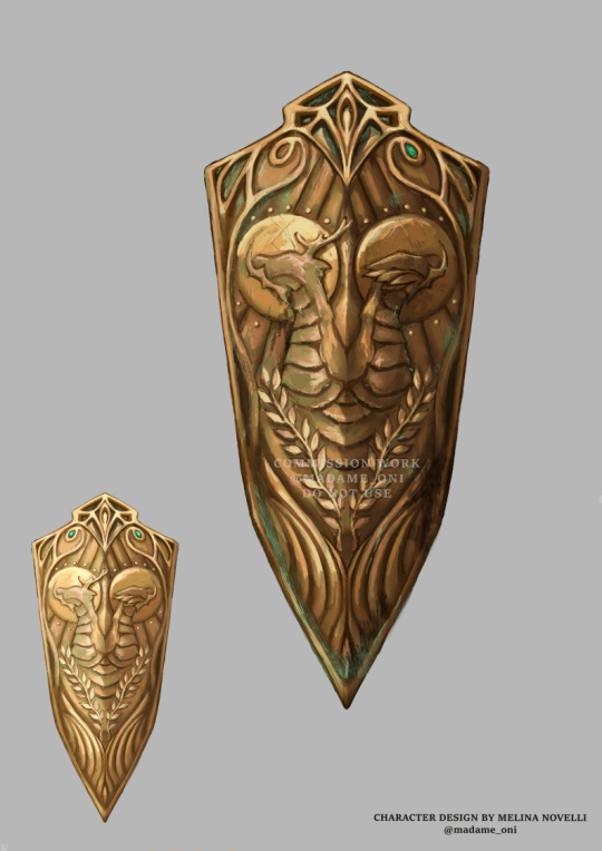
WEAPON | PROP DESIGN
Fully rendered and detailed design of prop or weapon on its own.
BASE PRICE: $50 1 full view 1 close-up of detail
Extras Extra view: $30 each

PORTRAIT
From only face to waist up (showing arms).
$170
one character
double price for extra character
includes simple background, and decorative elements like flowers, jewels, etc.

FULL BODY ILLUSTRATION
BASE PRICE: $250
for one character
+100 each extra character
includes background, props and decorations.
extra charges might apply depending on the complexity of the scene- feel free to ask!
Lovely, right?
Now, some basic Terms of Service:
I won't accept any work related to NFTs and I don't allow my work to be used as NFTs.
Credit is very appreciated when reposting but not necessary as long as you don't claim the work is done by anyone besides myself.
The character designs & adoptables can be resold and gifted with proper credit (link and @), those are the owner's responsibility.
Since I'm a breathing human being, I have the right to reject a commission for whatever reason.
I take payment via PAYPAL. I'll make an invoice once the order is settled. I only work with full payment upfront.
For big pieces (+400usd) we can discuss signing a contract or doing payment plans for everybody's comfort.
I don't have a linear queue and I don't work with deadlines, but I will keep you updated regularly and have no problem with showing progress as anytime. Just ask!
Given that I show updates regularly and request feedback during the whole process, big changes once the work is past its sketching stage can require an extra fee.
I don't do refunds past the first sketch.
I guess this covers everything- feel free to contact me with any questions!
Please contact me via email for an easier and organized process: [email protected]
#commission open#commissions#commission#commission post#artwork#art#my art#my commissions#artists on tumblr#original character#character design#illustration#commissions are open#art commissions#dnd#ttrpg community#ttrpg art#dnd art#dnd commission#long post#oc#dnd community#outfit designs#weapon design#prop design#dnd oc#dnd character#dungeons and dragons#dnd5e#ttrpg
77 notes
·
View notes
Text
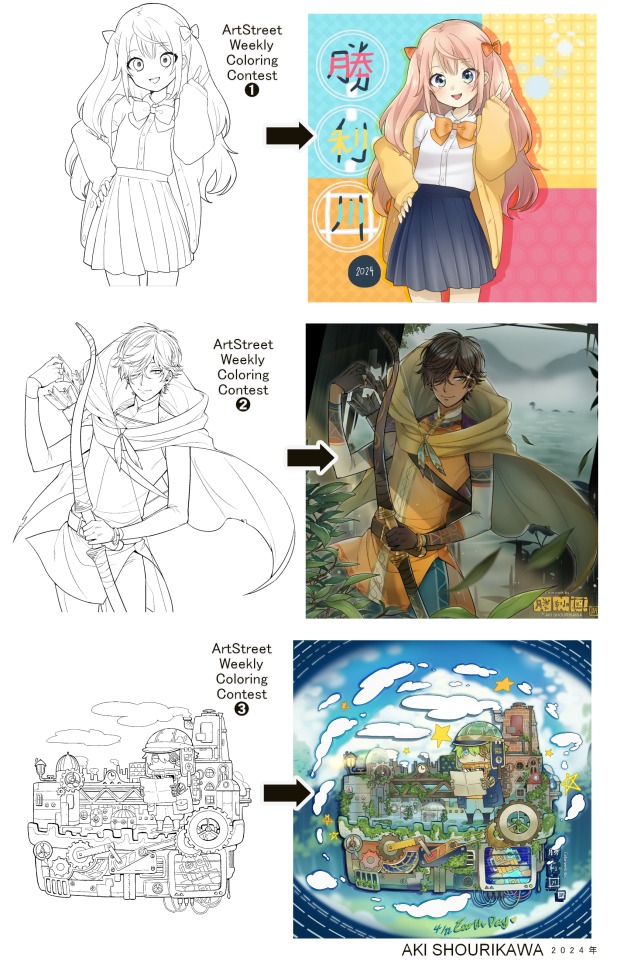
Blog No.003🍊 24年5月10日
「Let's Talk About Coloring+Rendering!!」
~ The Chaos of Akehhh-style Layering w/ Colors & Values ~
ArtStreet recently released some weekly coloring contests and as someone who likes joining 'em + colorwork being the absolute joyous part in drawing for me, I got really into it!! One of them somehow won and I still have the raw .mdp file of it with most of the layers unmerged... so, I thought there might be some value in sharing my chaotic coloring progress with it. There may never be an opportunity like this again...
CONTENTS:
Preface・・・・・・・・・
The Linework・・・・・・
Composition + Planning・
The Render・・・・・・・
Additional FX Tips・・・・
The Layers of Dread・・・
1. Preface
I use the free software MediBang Paint, which is made by the same folks who made the aforementioned art-sharing website, Artstreet. Although its file type extension is .mdp, it can also save as and open .psd files all the same.
If interested, you can download it on their website here! I believe it's available in both PC, Apple, iOs, and Android (also on the PlayStore). ☞And here is my google drive link of my fully rendered entry's raw .mdp file. I also included a .psd version that should be accessible with most other softwares like Photoshop, Clipstudio, etc.
NOTE: Not sure how some layer effects will be displayed apart from MediBang though (either in name or function) . But I think "multiply" and "overlay" is fair game on most drawing/photo-editing softwares with layer systems.
Either way, ↑this is just a bonus thing if you wish to see for yourself how much my MediBang cries everytime I work on something, since visuals of the rough step-by-step will be provided here as well!
At the end of this post, all of the layers' purposes will be explained...y-you'll see...
■And just as a disclaimer: I'm an instinctively self-taught illustrator who is a heavy visual learner, so there are certain methods I do that I cannot readily explain with back-up studies on color theories or formally taught techniques in art schools and the like/certain made-up terminologies that may or may not exist as something else. I mostly operate on instinct, observation, subjective preferences, and vibes, so this would just be me trying to verbalize my process (with visual aid) as a means of share-rambling, rather than actually directly "teaching" anything, I think haha You can take it as a cautionary tale too, honestly-
※I will also be going through this with the assumption that the reader has some background knowledge on digital illustration and general drawing basics + lingo. If you have any questions or needed clarifications, please feel free to let me know!
Although art can be fundamentally "wrong" when it comes to achieving certain specific styles, structures (especially when involving realism as the standard), or general executions of intentions/themes, I am of belief that there is generally no wrong or right 'way' for drawing anything; or for doing ANY type of artistic endeavor for that matter. This might be perceived as a "bad anatomy defender" / "no need to improve, then" stance on my part, but it is absolutely not the case! An artwork is never finished, there's always room for improvementsーa galaxy's size of a room especially for myselfーbut I just think anything at all that brings you an expressive or creative outlet, joy, or peace of mind is worth pursuing, regardless of your own skill or tact and there's no shame in that. I do not wish anyone, especially people starting out with drawing to be discouraged for having their own different approaches in comparison to other people's works by misconception of, "oh, am I doing it wrong?". Sometimes having different or an uncommon worldview is not always a 'bad' thing, I think. Heaven forbid artists actually start getting creative and unique―
What I will be presenting here is simply my one way out of thousands of thousands of different possibilities. So, let's start★
2. The Linework
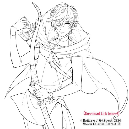
Equally lengthy talk of lineart is probably for a later discussion, but here is the template provided by ArtStreet for the contest + what will be colored in for today.
☞The contest has since ended, but you can still download the lineart template here if you'd like!
3. Composition + Planning
The contest rules said it's "OK to draw backgrounds", so let's go!!
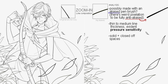
I had already decided on how I want to color it early on: It will be more scenic in nature, rather than stylistic. So, there will be more focus on looking 'real' than 'aesthetically stylish'! Just so it doesn't look disconnected or too out of place, I tried to draw my additions similarly to how Mr. archerman's linework looked as much as possible.
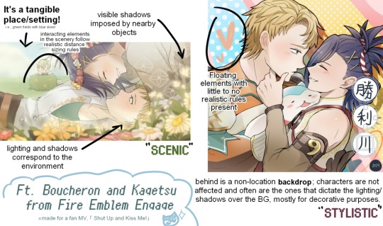
This how I visually define "scenic" VS "stylistic" illustrations (in my head)
I like experimenting and mixing different rendering techniques with varying linework styles and tend to think about my approach with the rendering long before the coloring process, even waaay before I line my final sketch, usually. But for this, I'm simply working with what was given to me.
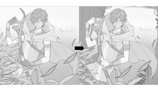
At first, I just wanted a "cool breeze w/ leaves flying away ahhhh refreshing~~" mood, but the space at the side of his head looked rather empty as is, even with Nessie. So I thought about putting him inside a vague...darkly-lit abandoned ruins-setting to eat up some of that space.
And with that, it's time for colors.
4. The Render
My coloring process is the lengthiest and often makes people who see me color in real-time scream in horror, but I think it's actually fairly simple and can be summarized into three nutshelled stages:
①Fill in the colors with a finalized palette of your choice,
②cry Continuously render until your arms fall off you're satisfied.
③ cry even HARDER (optional) Adjust accordingly to fit in better with other elements of the illustration, such as with the focus/subject to background. *will be explained later.
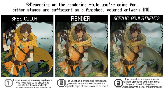
oh and btw, the usage of the words 'render(ing)' tends to be confusing with its association with other mediums like 3D models, but when it comes to drawing I like to think of it this way:
🎨Coloring is the planned/intentional selection of your color range, tints, tones, and palette to use in a drawing, ☀Rendering is the act (or product) of the set of techniques (including effects, filters, etc.) you use with the colors/values to create the illusions of depth, shadows and light, movement, warmth/cold atmospheres, etc in a 2D illustration.
But that's just how I define it with my own step-by-steps. Otherwise, I think either term is pretty much interchangeable.
Anyhoo, what do you think should this man's hair, skin, eye, and clothing's colors be?
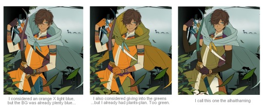
here are some of the variations on the color picks of his outfit that rotted my brain for about 3 hours straight, like it's a 2000s dress-and-match flash game
The many submissions for the contest had many fun color combinations and interesting interpretations I personally think should've won. I saw a lot of blonde archer-princes wearing greens, browns, and blues, as a lot also went for the "forest hunter boi" vibe. But I was saddened by the lack of my favorite colors being used as the primary colorーorange and yellow. So, let's use those!!
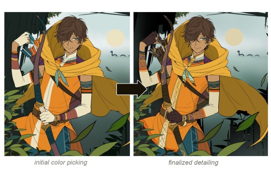
The start of my coloring/rendering journey is never at Layer '1'.........
―Starting with what I've always referred to as "environment prep":
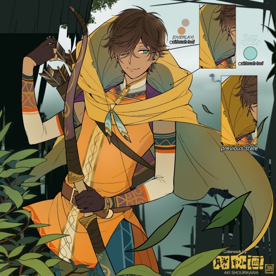
The purpose here is to 'set' the base colors so they match with the environment or general atmosphere. Get ready to see this over and over
This could mean adjusting the saturation, or spraying gradients of the BG's most prominent color on parts that...gives me anxiety the most-
As someone who tends to work with very, very bright color schemes with character designs, trying to blend in when the illustration is meant to be scenic or 'serious' in tone without it being a distracting eyesore can be a challenge. So, this is what I do to counter it.
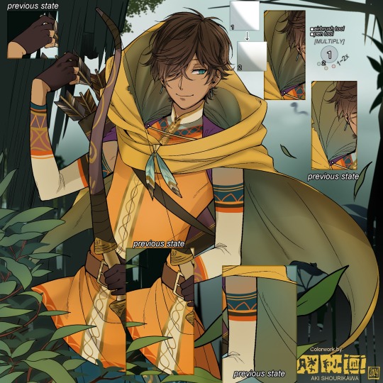
Shading is usually an early step for me as well, even though I think it's a lot of other artists' near-to-final step. I tend to lean towards an abomination mix of soft shade and cel shadeーthe strokes are sharp enough to trace where the shadows start and end, but softened around the edges for effect.
I also tend to apply an additional spray of subtly darker shade on top of the first one? It's usually on spots where I think the light source won't be hitting as much. I wouldn't do this for simple styles (stylized illustrations like with a chibi style), but for scenic illustrations I find it's necessary to achieve that depth against a fully-rendered environment.
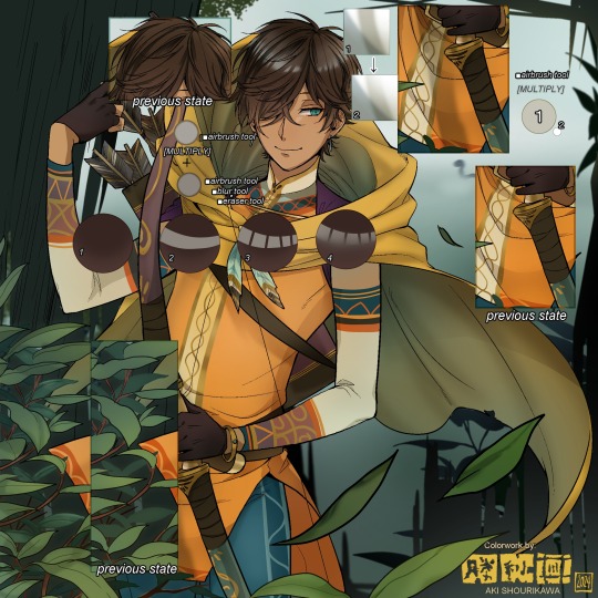
※Just a side note: You may see multiple things changing around, but in real time I'm most definitely working on one part at a time lol. These visual aids were ripped off the raw .mdp by hiding some of the layers, so that's why different areas seem to progress together all at once, even if that's a bit idealistic in actuality.
Apart from the previous adding of shades with a multiply-mode layer for the preliminary shadows, I add one more layer of shadow on there for objects or other characters that can cast distinct shadows on the subject. In here, it's the bow and the hovering strap across his chest.
Lighting is also starting to be added as well.
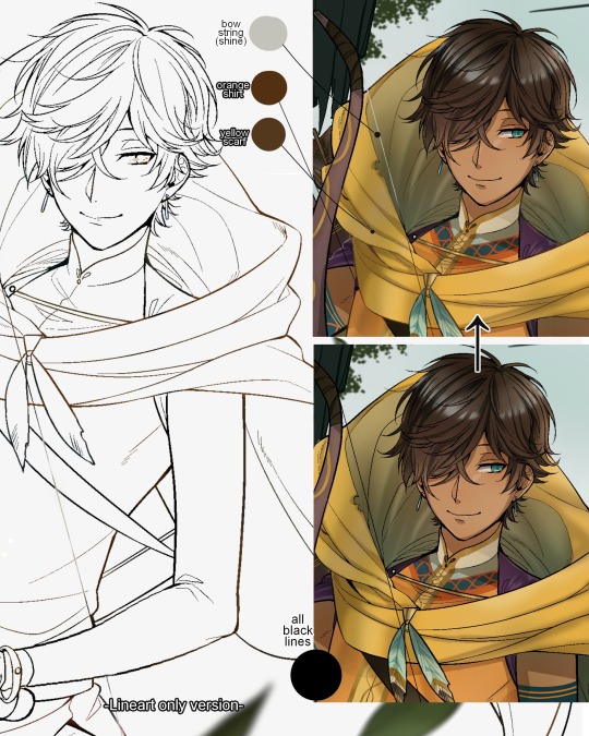
One direct alteration I did with the lineart template was change the line's colors. I find it really softens them to mix better with their filled-in colors + as well as not stand out too harshly against a light-colored scenic background.
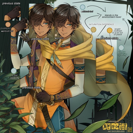
I think you now have a good idea over my hyperfixation on making sure colors are 'vibing' well against the BG lol A lot of these steps are basically just doing the same thing over and over with new layers for the sake of this purpose, really.
And after that, just repeating all the stuff we did with the character onto everything else (background, foreground, objects, etc.) until you're satisfied with it!
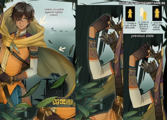
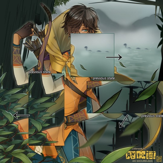
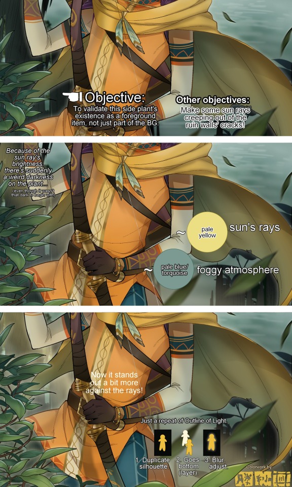
A lot of these changes are very subtle on their own, but makes all the difference in the bigger picture, I think!
Just maybe some additional finishing touches for some boom shakalaka and...that's pretty much it! You will notice that throughout the entire process, there's a lot of random little things that suddenly appear or change with seemingly not much purpose or meaning on its own. I unfortunately have always drawn in this sort of vague, quickly impulsive, directionless way since I was a child and I don't think even I will ever understand it, logically. It's mostly a... continuous string of instinctive feelings of "HEY let's do it this way, if not there's like 10 other things we can try next", is the closest I can get to an explanation of how it feels.
I don't know if it's common for other artists to think or function this way, but I do know for a fact that many people seem to be surprised and confused when they see me drawing in real time this way. Everytime I get asked 'how' I draw certain things, I say things like 'I turn my brain off and vibe with many, many layers with a broken back.' and people think it's just a dismissive joke. I-it's really not, it's literally what happens, I don't have any secret shortcuts for you-
Hopefully this very lengthy post + visual aids can help demystify some misconceptions on what "really" goes on when I'm drawing! It's also a bit of an update of my tutorials made for friendos starting out with digital drawing back in 2015!
Anyway, the rendering stage is where the simplified steps ② and optional step ③ branch out like a fork in the road for me; I don't think one is any "better" than the other, I think doing either is simply a matter of personal preference and artistic choice;
➋being leaving all that 100++ layers rendering that we just did alone and calling it a day,
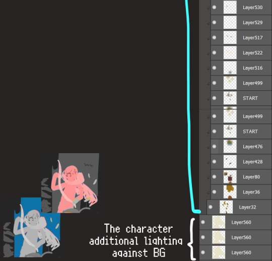
➌being a little bit more extra w/ additional shadows/lighting that corresponds with the environment the character is in.
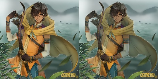
I removed the walls to see the whole figure better in a side-by-side comparison. I like the unadjusted (L) without the wall, but with the walls in the final illustration, I think adjusted (R) felt 'right'. What do you think?
There are some things, although realistic, don't look that good as a visual aesthetic and are just downright excessive/unnecessary to add to certain types of illustrations.
Then there's things that aren't possible in real life, but artistically? Looks really dang cool. Being biased for either ends of the hyperrealism and hyperstylized spectrums of styles is fine; only as long as no discrimination is involved towards people who don't share your opinions, in my opinion-
and to conclude this section, I say,
『 You go render however you wantーhellーno colors even necessary if you wish!
Simple ≠ laziness, just as much as complexity ≠ skill。』
I will never stop yapping about how a lot of minimalist styles require so much more amounts of planning and effort to make sure everything is nice and clean, especially compared to mindless rendering loops like these. Mine's a maximalist hell and I wouldn't have it any other way, but I greatly envy minimalist artists that can render with just something like my step ① with so much grace and tact; not a single stray or wasted stroke!! Anyone who dismisses these types as "lazy" I will violently stuff inside a couchーwithout any potato snacks to snack on!!!
5. Additional FX Tips
Just a shorter section for some optional finishing touches tips'n'tricks used in this I frequently (ab)use☆
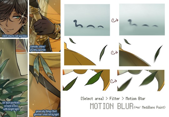
◆ From the very beginning, even before I understood how to draw, it's always been a tradition to doodle around sparkles all around the place. I usually do it with MediBang's sparkle brush if I want it to look polished, or simply draw it manually using either the pen or airbrush tool for a cruder charm.
◆ Motion blur is great, and MediBang in particular also has different types of blur effects like Gaussian and regular blurs. If your software doesn't have these effects / if you're working traditionally but still want to achieve the illusion of motion in a still drawing, you can still achieve the same effect through your linework! Try looking into incorporating action lines (commonly seen in manga and comics) into it. Otherwise, purposefully drawing something blurily to begin with oughta work as well.
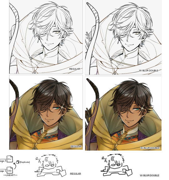
◆ Apart from changing the lineart's colors, there's also this little effect that is achieved by duplicating the lineart and blurring it. It gives something like a...'dreamy' quality to it? The higher the blurred copy's opacity is, the more emphasized it makes everything look.
6. The Layers of Dread
At long last we've arrived... at my MediBang's repeating demise for all of eternity...
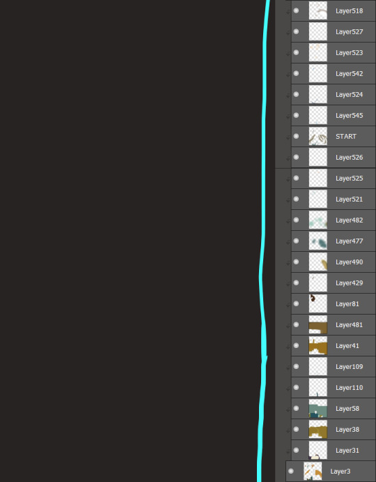
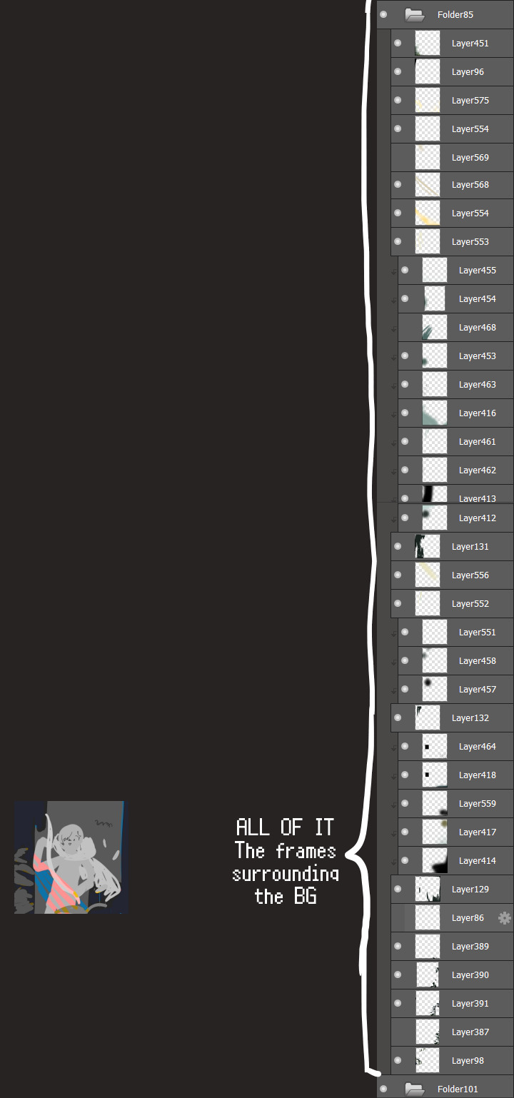
Here's a preview of what the .mdp/.psd file of this colored entry's unhingedmerged layers looks like + how I try to validate their existence. When I work on full-sized illustrations, I tend to merge layers as I go, so this is probably one of the rare times I can show something like this without either mine or your PC dying. If you'd like to see, play around with, and toggle them for yourself in all of its............glory, feel free to download it here.
Yes
we're starting at Layer 611. Enjoy.
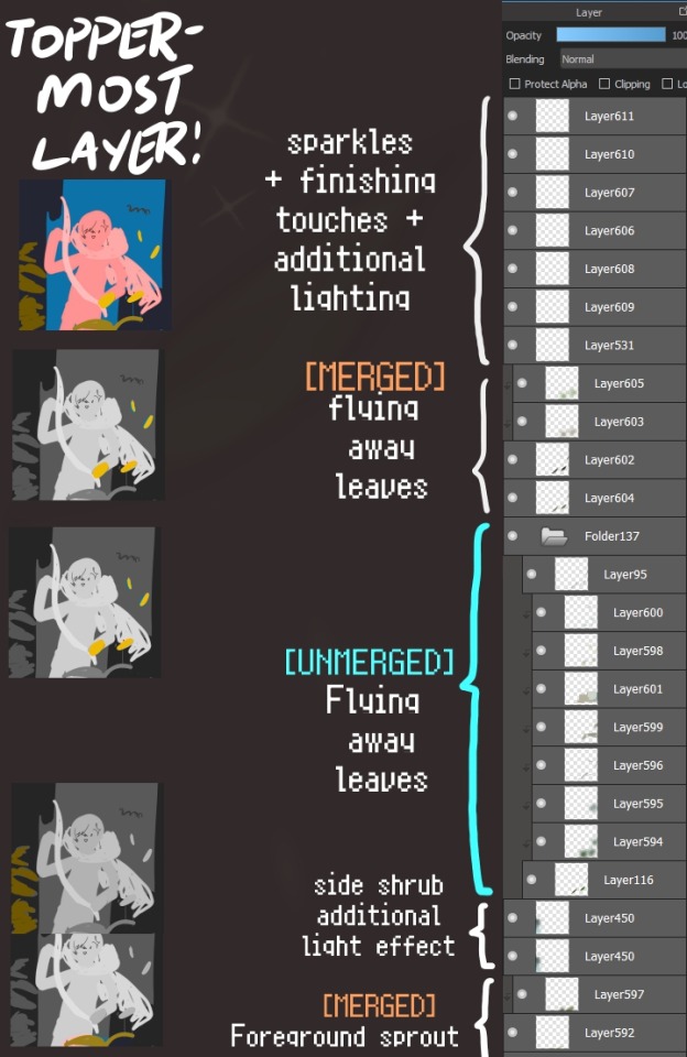
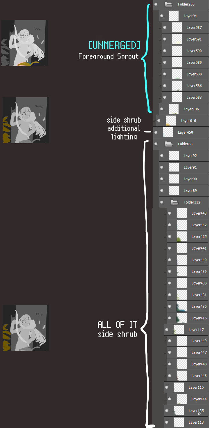
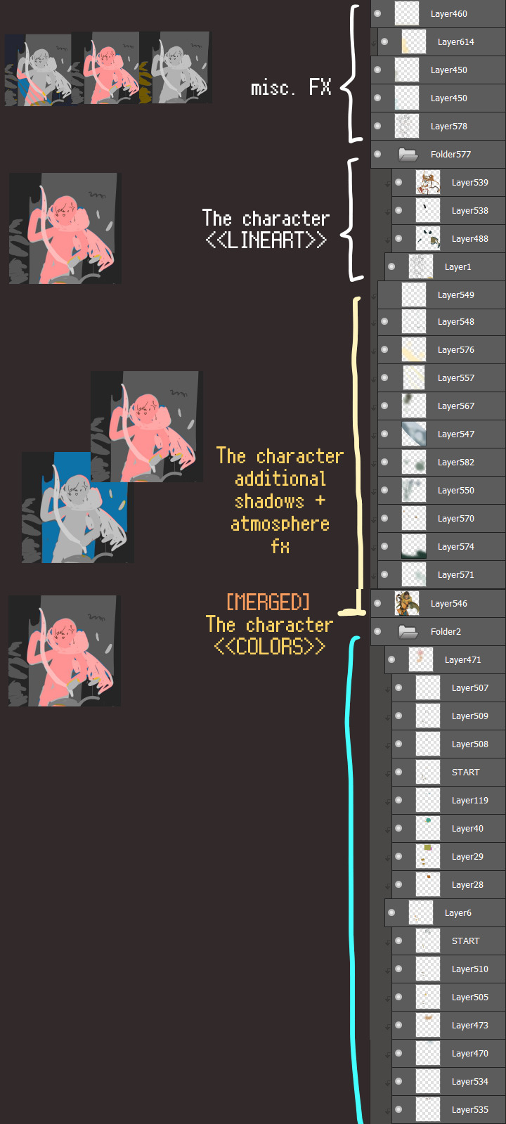
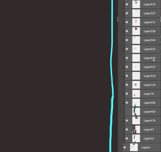
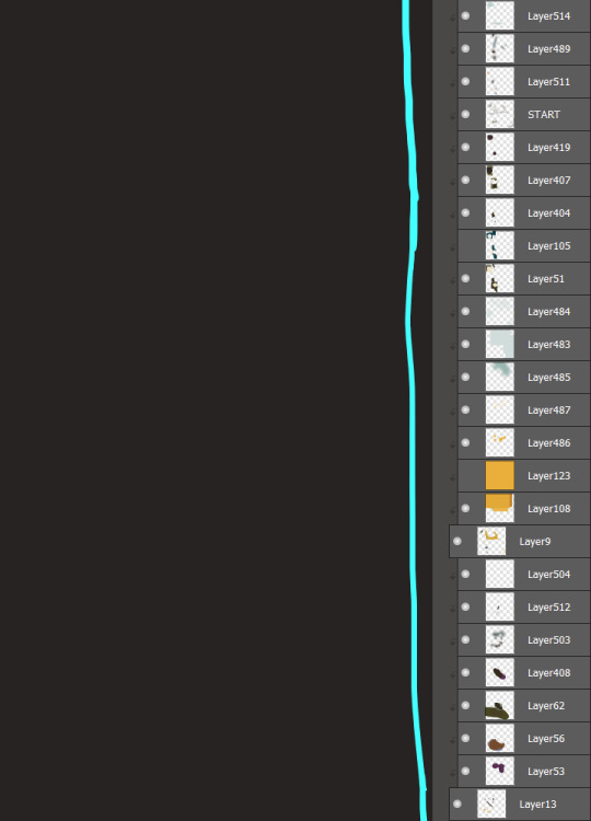
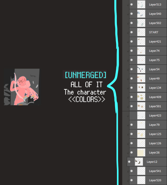
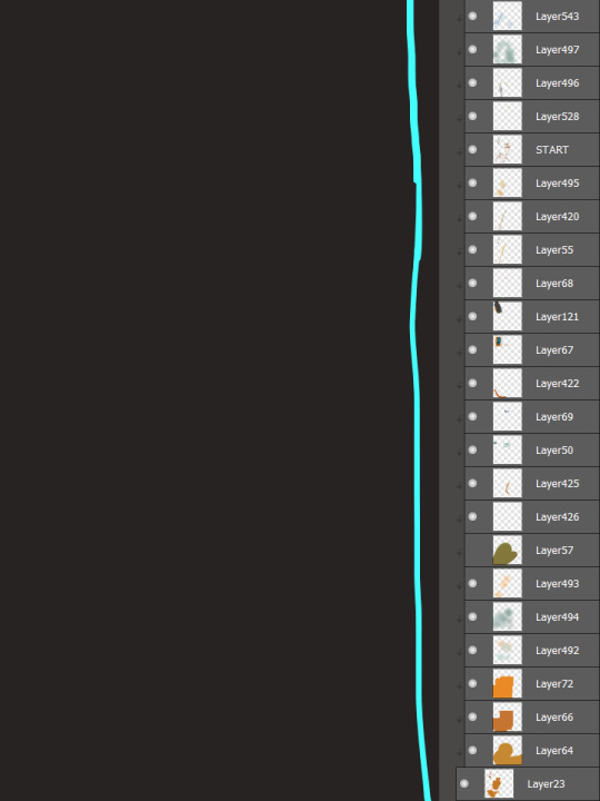
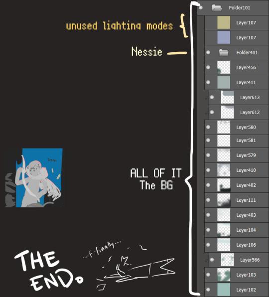
I will now delete my PC's copy because jfc that's one too many MBs ...and it's still eons lighter than what I usually work with on my own full illustrations from sketch to finish......。 (;´༎ຶٹ༎ຶ`) thank you for reading this far and making it out alive, goodbye for now...
・・・ホームページALL LINKS・・・
・Art Gallery・Commission Info・Ko-fi shop・
#art blog#long post#coloring#coloring tutorial#art tips#art tutorial#digital art#digital illustration#digital drawing#digital art tips#digital art tutorials#medibang#drawing journal#drawing process#illustration#coloring practice#nessie#the loch ness monster
16 notes
·
View notes
Text
Scrap
Summary: Scrap, verb: to discard, retire or remove from service. Metal Sonic discovers—partially through force, partially via coaxing—that perhaps it's time that it scraps a few hardwired notions. Else it will be stuck in the same loop indefinitely.
1801 words (Chapter 1)
“Egghead dipped, base is about to blow, and you still wanna scrap.”
Every fight had the same premise:
Bones versus bearings, blood versus oil, feet versus engines.
“I respect that, Metal; let’s take this outside!”
The outcome should have been obvious, and yet…
Clang.
Braak.
Thok.
Much like the premise, every fight had the same result.
Metal raced Sonic through falling detritus and collapsing supports amid blaring alarms; it clashed with the hedgehog whenever possible, attempting to knock him off his stride and prevent his escape. Sonic wove around the debris while still giving as good as he got; no number of bruises ever slowed him down.
Another explosion rocked the foundations of the subterranean structure; pressure building from rapidly rising heat and fire from below began propelling metal and concrete up as well as down.
Chances of escape came out to approximately two percent.
ZOOM.
Two percent was all that Metal’s nemesis had ever needed.
Groaning and creaking, the roof of the base cracked; daylight peeked through at the end of the flames. Metal’s turbines spun at a droning hum, and it shot outside milliseconds after Sonic did. They briefly hung in the air over the glacial mountain Metal’s master had been operating out of; Metal calculated trajectory, engaged its afterburners and careened down to cross the distance to its doppelganger. Sonic was never truly helpless, but in the scant moments before his feet touched the ground again, it might
The hush over the mountain shattered with a thunderous BOOM.
Sonic’s eyes went wide.
He opened his mouth.
Metal raised its clawed hands.
Loud whooshing sliced through the cold air.
A crash.
Impact.
Something quietly went
Crack.
Disconnection.
Stillness.
Then, motion; all-at-once, too-much motion. Metric tons of red-hot metal flashed across a backdrop of blue sky and white snow. Tumbling and crashing, sliding and barreling through the air without discernible direction or any sort of control.
Noise.
Just… noise.
Simultaneous. Overwhelming. Constant.
Until it wasn’t.
Stillness. Again.
The violent spinning stopped as abruptly as it started.
Soft reboot.
Metal came back online.
A rendering of what had occurred formulated in the space between processors.
The conclusive explosion of the base had expelled a jagged portion of a support beam; its ballistic path intersected–at terminal velocity–with Metal’s frame.
SYSTEM OPERATING ON RESERVE BATTERY POWER
And consequently, it lay half-buried in ice and snow; alerts identifying multiple instances of severe non-function cropped up, cumulatively depicting a less-than-optimal state.
“Metal, you okay?”
Sonic characteristically chose the worst moment to reappear, skidding to a stop in the snow.
“That was a gnarly ride down.”
Internal alarms blared at his measured approach; Metal had experience with being at another’s mercy while in a state of disrepair.
But Sonic was not its master.
It bypassed several advisories against re-engaging combat capability, despite that its reserve battery was not designed to support that. Metal attempted to propel back onto its feet.
Something popped. Loudly.
Hissing and heat followed.
“That… didn’t sound good.” Sonic said.
Metal ignored the derision; occupied with suppressing panic and trying to force fluidity out of limbs locking up courtesy of uncooperative hydraulics.
“Doesn’t look good, either.”
The hedgehog paused just within striking range. Metal’s motherboard ran countless calculations of all the data points illustrating how severely disadvantageous the situation was; of how many weaknesses Sonic could exploit to inflict damage.
“Here, let me”
He reached out. Anticipating an attack, Metal’s own hand snatched the hedgehog’s wrist. Threw itself forward in a spastic lunge.
“Hey!”
Sonic spun to one side, leaving Metal to crash into the snow again. Expecting retaliation, it snatched its hand back.
None came for several moments. Sonic stared at it. Metal glared back, chills that had nothing to do with the temperature permeating its core.
“Okay then.”
Sonic turned around and ran, circling the base of the mountain; a thunderclap seconds later let Metal know he’d broken the sound barrier and was, within a minute, long gone.
Metal attempted again to right itself; renewed alerts made the task more trouble than it was worth. It switched off its optics to preserve power.
WARNING: PROLONGED EXPOSURE TO LOW TEMPERATURES MAY AFFECT BATTERY EFFICIENCY.
RESERVE POWER: 83.6%
—————
Kvhroon.
By Metal’s internal clock, just shy of an hour had passed when it next registered another presence.
“Do you see him, Omega?”
“NEGATIVE.”
The new arrivals were only marginally less-than-welcome. The cronch of snow and ice coupled with the faint, smooth whirring of moving mechanical parts preceded the last of its master’s E-series announcing:
“I HAVE LOCATED HIM.”
Metal kept its optics offline. Perhaps if it ignored them, they would go away. It willfully disregarded how unlikely it was they were searching for it when it happened to be injured.
“Is he on standby mode?”
“NO. HE IS JUST BEING A LITTLE BITCH.”
Metal’s optics flared back to life for the express purpose of glowering at Omega.
“CALLED IT.”
Shadow leaned into view.
“Metal? Can you move?”
“HE CANNOT.”
“I wasn’t asking you.”
“YET I AM CORRECT.”
Metal raised one arm defiantly, a particular titanium finger elevated.
“MUCH IMPRESS. SUCH WOW.”
An internal fan briefly spun harder than usual; Omega might have been programmed without inflection in his voice box, but Metal did possess sarcasm receptors. Shadow sighed.
“All right,” he said; he knelt in the snow. “Let’s just move him.”
Metal’s systems overclocked on seeing Shadow’s outstretched hand; for the barest moment, the incinerating barrier of its Overdrive function enveloped its body. Shadow yanked his hand back. Steam from instantly evaporated ice surrounded Metal.
RESERVE POWER: 50.2%
“Or not.” Shadow said after a beat.
Metal shut off optics again; after that half-a-second engagement of its most powerful offensive maneuver, conserving energy was an even higher priority. It cast about for incoming satellite signals until it pinged off Shadow’s phone. The work of a couple minutes allowed it to interact with the device.
Did Sonic send you?
A beat. The sound of Shadow’s fingers tapping and a phone unlocking. Two simultaneous verbal responses.
“No.”
“YES.”
“Not helping.”
“IT IS THE TRUTH.”
Any help from him is unacceptable
“FINE,” Omega said. “LET YOUR CIRCUITS FRY AND FREEZE BEYOND REPAIR. YOU MIGHT SUCCEED IN HURTING HIS FEELINGS.”
Sarcasm receptors blared again.
“Thank you, Omega.” Shadow said; Metal didn’t have much data for comparison, but the hedgehog’s voice sounded a little strained.
The cronch of Omega’s footsteps indicated he’d momentarily stepped away.
A beat passed.
“Why?” Shadow asked.
What
“I haven’t seen you accept help from anyone before; why take such exception to any that he offers?”
He is the Enemy
“The feeling doesn’t seem to be mutual.”
False
“What are you basing that on?”
Metal’s processors stalled. Sonic, nemesis, the threat that required every preparation and observation to combat; the nemesis who still won, mercilessly heedless of all the data Metal painstakingly had compiled within its CPU. If Sonic, who consistently exceeded that data, didn’t feel as invested in their conflict as Metal, then for what reason had it gathered all that information? Metal could not provide any more complete an answer than:
He is the Enemy
RESERVE POWER: 48.9%
—————
Inexplicably, both of them remained with Metal, despite the arctic climate and the temperature falling with the waning afternoon.
“Is the hatred truly yours if it’s just part of your programming?” Shadow asked.
Were you not programmed–created–to be a protector?
“That’s one of the purposes for which I was made, yes.”
I was created for a sole purpose; eliminating Sonic the Hedgehog
“AND YOU’RE NOT EVEN GOOD AT THAT.”
Metal elected to ignore the more bombastic robot.
That he is the Enemy is just a motive for pursuing his end
Shadow didn’t immediately respond.
“The primary purpose assigned to me on my creation,” he said. “Was to preserve–protect–humanity and the planet. Yet few, if any, have come as close as I did to destroying both.”
That you failed only proves it is not what you were programmed for
Shadow huffed.
“By that logic, failing to eliminate Sonic means that’s not your purpose, either.”
Metal didn’t have a satisfactory reply to that. Rather than frustrated or angry, it experienced more… confusion. Pensiveness.
Uncertainty.
RESERVE POWER: 39.4%
—————
You do not need to remain here
“What do you mean?”
Robotnik will return to collect me in due time
“Will he?”
Metal didn’t understand Shadow’s apparent desire to challenge its every assertion in gentle tones.
“I’ve never known the doctor to spare a second glance at anything he’s left behind him,” Shadow said; almost as if thinking aloud. He paused. “Not unless whatever has captured his myopic attention requires it.”
Omega’s persisting presence was conspicuous by his deafening silence; the lack of any barbing interjections despite his well-documented contempt for Metal’s master.
“I suppose that’s the primary factor he gave you,” Shadow said. “That single-minded focus; though, is Sonic really your enemy, or his?”
There is no distinction
“Maybe not,” Shadow conceded. “But maybe there should be. I may not have destroyed the planet, but I have been–I am–much more than just a protector. I see no reason why you couldn’t similarly evolve.”
Metal once again failed to formulate a response.
“Sonic doesn’t have to be your enemy,” Shadow said. “If you want, you don’t ever have to fight again.”
RESERVE POWER: 27.7%
—————
You have not attempted to move me again
“Do you want to be moved?”
Merely an observation
One that Metal couldn’t comprehend. They’d come in place of Sonic to assist, yet a single defensive act deterred them. Despite that, Metal knew from the vaguely song-like echo of chaos energy that Shadow hadn’t strayed off, and though Omega occasionally stomped up and down in the snow, he offered not a word of complaint. They accomplished nothing of any discernible value that Metal could grasp by doing so.
Even the way Shadow phrased the question caused a stutter in Metal’s motherboard.
“We’re not going to do anything you don’t want us to do.”
That word again: want.
‘Are you ready’ or ‘There’s no rush’ Metal could have understood; an implication that their help was imminent, or that they were waiting until it lacked the power to retaliate. Never mind that Metal’s battery had long since depleted past the point of being able to utilize Overdrive again, regardless of whether they had any way of knowing that.
No. Instead, Shadow asked what it wanted.
“CONSENT IS ESSENTIAL.”
Metal had ample experience receiving repairs or… improvements, heedless of its state of consciousness.
Yet Shadow and Omega were not its master.
RESERVE POWER: 15.8%
—————
What would I be without my programming?
“Everyone in the world would give you a different answer; the only conclusion that matters is the one you carve out for yourself.”
—————
Take me to the fox
please
RESERVE POWER: 2.0%
Kvhroon.
41 notes
·
View notes
Text
A Spell Bottle for Big Al
This spell is dedicated to my boyfriend @mikk1n, who introduced me to the world of Walking with Dinosaurs and its various sub-series. The BBC walked with dinosaurs so that Prehistoric Planet could run.

outdated illustration of an allosaurus from Dinosaur National Monument, by the United States' National Park Service
Anyway...
This spell calls upon the power of the Allosaurus jimmadseni specimen identified as MOR 693—however, this fossilized creature is more commonly known as “Big Al” thanks to an imagining of his life’s story being told via a BBC television program in the year 2000. (The Ballad of Big Al was a Christmas special for the popular Walking with Dinosaurs series, and it can be watched legally on the Internet Archive—part one is here and part two is here).
Big Al’s bones currently live in the Geological Museum of the University of Wyoming in the United States (see his exhibit here), but when re-watching his story with my boyfriend late at night I was struck by the depiction of his life. Although I’m not happy with a multitude of the narrative choices that the writers made—my ire is primarily directed at the massive time skips of multiple years and the overall rushed brevity of the story—what really stuck with me was how realistic it felt.
Now, I’m not talking about the depictions of the dinosaurs or the quality of the practical and special effects; science and technology have marched steadily onward since the year 2000, and what we know now puts our prehistoric knowledge from 20+ years ago to shame. That can’t be helped. What I’m really saying is that so much of Big Al’s depicted life was spent searching for food, failing to acquire it, and ultimately dying of starvation… because of a broken toe. Yes, he was an apex predator of his era, but the show is very careful to point out how much his life teetered on the knife’s edge of his physical prowess as a predator—although he healed from a variety of injuries and illnesses throughout his less than a decade of life, ultimately Big Al was brought down by a broken bone that developed a fatal infection and rendered him unable to hunt.
While Big Al failed to reached adulthood, that doesn’t mean you have to do the same thing. This spell is designed to create part of the spirit of Big Al into an animal ally (if you’re not from an indigenous culture that incorporate usage of totems or spirit animals, please don’t use those terms) to aid you in your own efforts toward continuing to survive whatever troubles currently plague you.
Method
Now, the sky’s the limit for what you can ask Big Al’s spirit for help with. However, my own witchy intuition (aka UPG) says that an allosaurus isn’t going to understand a school/university assignment well enough to be able to help you with it. Their knowledge predates algebra. On the other hand, I’m sure theropod dinosaurs (Big Al among them) were incredibly smart in much the same way modern corvids are, so your own UPG might differ on this point…
In other words, make this spell your own! What follows is just one way that you can request aid from the spirit of Big Al; this one is designed for (since Big Al died with an infected fracture) remembering to take your pills.
You will potentially need…
1 empty pill bottle
Pebbles, beads, or crystals of some kind that are small enough to fit inside the pill bottle
Sealing wax (your choice of color) or liquid glue
writing supplies OR 1 carnivorous dinosaur toy, ideally a small & cheap one
Instructions, such as they are…
(This is the boring part.) Put the containers for the pills you plan to consume in a place where they are prominent enough that they won’t blend into the background. If you have a lot of different pills to take and want help remembering the instructions for them, keep a piece of paper nearby (or make a note on your phone) with notes for what pills you are supposed to take at what time + any additional helpful information.
Cleanse the empty pill bottle, the pebbles/beads/crystals, and (if using) the dinosaur toy. You can cleanse with whatever method seems best to you—personally, my favorite method is via candlelight.
(This is the less boring part.) If using the dinosaur toy, have the toy preside over your pill bottle(s) that actually have pills in them. This toy is the embodiment of your animal ally. You can set this up on your altar if you use an altar + want to keep your pills there, but it’s not necessary. If not using the toy, use the writing supplies to draw a picture of a carnivorous, bipedal dinosaur on a piece of paper—this will go under your cleansed (and soon to be filled) pill bottle as the embodiment of your animal ally.
Put some pebbles, crystals, and/or beads into the empty and cleansed pill bottle.* Put the cap on and shake it a few times—or more than a few times, if that’s what feels right to you. If you enjoy verbal incantations, you can say one here; it can be as complex as a full-length sonnet in iambic pentameter, or it can be as simple as “amen” or “so mote it be” or what have you.
* Note: as weird as it sounds, I don’t really care about crystal correspondences in my personal practice; they are just pretty rocks to me. Therefore, I’m not going to tell you what crystals work well in this spell. Follow your intuition!
Once you’re satisfied with the pill bottle, seal it with wax or glue and keep it in a place where it’s hard to ignore. Ideally, this place will be right next to the dinosaur toy, or if you’re not using the toy then atop the piece of paper with your hand-drawn dinosaur. Shake the pill bottle full of pebbles, crystals, and/or beads every time you need to take your meds; for me, the rattling sound is part of the ritual and helps me remember to go over to the medicine cabinet and take my pills with breakfast.
And that's it! I hope Big Al and this spell inspire you in some way. If you have helpful medication of any kind, please remember to take it!

If you enjoyed this spell, please consider tossing some spare change toward my ko-fi. As a poor university student with an abusive home life, every little bit helps me get a few centimeters closer to moving out + pay for food and veterinary expenses for my cat.
#witchcraft#witchblr#witches of tumblr#magic#haven's original spells#spell bottle#pop culture witchcraft#pop culture magic#dinosaur#the ballad of big al#cw animal death
19 notes
·
View notes
Text
Thoughts on my 1st* Art Fight!
Thought it might be helpful to write up what my (*mostly) first experience with Art Fight was like! Those who have participated in multiple years of AF may not find this helpful and thats ok! This will be going over my Goals, my Final Stats, why I tried AF and why you might enjoy it, who might not enjoy it, and any other final thoughts. If you're looking for more insight into the art I created (and everything related to that) you'll want to check out a future post that will be linked here! Now! Onto the words!
My Goals for AF 2024
As someone who very often takes projects and runs with them once I get momentum, I knew it was important to try to enforce (keyword try) some sort of limitations with AF. The hope was if I kept to these "rules" or limits, I wouldn't end up biting off more than I could chew and avoid burnout n bad feelings! My goals/limits ended up being;
Choose characters that seem fun
Don't start art without a concept
Some aspect must be experimental
Attempt to finish art in under 3 hours!!
No re-dos! Go with the flow!
Try to submit a total of 30 attacks
Attempt at least 1 revenge
Dang! That sure is a whole lot to keep in mind and work towards!! My logic behind "fun characters" and "no concept no art" was this; if I can't enjoy myself while drawing the character there isn't a good reason to be drawing them. This doesn't mean the character design is poor or boring- it just means that based on my restrictions already listed I needed to make sure I also was having a good time! Having a concept, even if it was just an idea, also guaranteed that I'd draw something vs nothin! Overall these goals/limits felt manageable and I'm glad I went with them. Now! How did it all go?
- - - - - -
My 2024 AF Outcome!
Here are my final stats as of August 3rd 2024 when AF closed its submissions (I'll update this post with any changes in the future);
Points: 1008.5 -- Attacks: 14 -- Friendly Fire: 2 -- Defenses: 7
As you can see; I didn't reach my goal of 30 attacks. 😔 I know, I too..think that was too high of a number LOL! When I wrote it down I think I thought I'd be doing simpler, smaller, less time consuming submissions! I also thought I'd be doing a lot of single character illustrations with minimal bgs, so composition and consideration of flow for a larger cast didn't enter my mind (at the time). Aaannndd then I came up with multiple concepts for art that had many many characters and that plan went out the window haha!! Even though I didn't submit 30 attacks, I did end up;
Fully rendering art of 27(28?) characters that weren't my own!
Drawing my new sona Guy twice!
Designed a whole new sona during AF!!!
Came up with roughly 20 concepts all together (5 did not get finished in time)!
Getting some AMAZING defenses/revenges from some lovely artists!!
Had all 5 of my characters drawn!!!
Spoke to/found a love of amazing artists I wouldn't have met/seen otherwise!!
Stayed true to the majority of my goals/limits!
Again, I'll go into the art side of everything in another post (with pictures) but I will say I love everything I made for AF. Its a very nice feeling to set goal and surpass them- esp after a very long period of art block/fatigue! I went in expecting 0 revenges or attacks/defenses and was delighted at what I ended up reviving. To those of you who drew me something- thank you! If I get your permission I would love to show off your art here as additional thanks!! So, after all that- was it worth it? - - - - - -
Was Art Fight "Worth it" to me?
Yes. LOL! Art Fight was def "worth it" to me. Sorry to jump to the end of it haha- let me go into it a little more like I said I would!
I joined Art Fight the second week of July- partly bc I wasn't sure if I really wanted to take part. As I mentioned, I had attempted to take part in Art Fight in the past! The first time I completed 2 attacks, but never ended up posting ether (if memory serves) or writing down the artists name (so I dont even know who they belong to). A couple of years ago I tried again, but those attacks were aimed at my partner at the time and mostly just an excuse to draw something for them-- it wasn't really made in the "spirit of Art Fight". In both cases I wasn't very familiar with the interface, the point system, the submission system- you get the idea. So when I started fresh and began the process of uploading characters, and later attacks, I was pleasantly surprised! Everything was simple enough and the things I was unsure about (mainly how to rate my works) had articles or answers on the official Art Fight Tumblr that helped a ton! These factors + the encouragement from friends who had already taken part gave me the push to set my goals/limits and give it a try!
At first I was a little discouraged- I didn't think anyone would like my characters or my artwork. I worried I was creating for no one but myself, which isn't bad!!! HOWEVER! This can feel isolating when you're submitting it to a place they're literally a hive of active artists, and as someone who hasn't posted a whole lot of art publicly in the last two-three years I was nervous to put myself out there!! Thankfully I got a lot of love and kind comments from friends, mutuals' and even complete strangers! It was immensely gratifying!!! My submissions were a little sporadic the rest of AF- if I felt up to working on something I'd work on it. If I didn't..I didn't! That did mean there was a lot of last minute attacks haha, especially after going over the top with a sona-centric illustration. Still! In 22 days I managed to make 16 fully rendered works- each one unique in its own way! Thats great!!
My reasoning for taking part in Art Fight is pretty simple; I enjoy drawing other folks characters and I love to experiment with my artwork. When I was younger I spent a lot of time on Deviant Art, specifically in clubs/groups. It was always fun to flip through groups and see all the different character designs, all the different styles and settings, and soak it all in. Now-a-days art based RP groups aren't really a thing, and finding places where you can easily flip through a varying range of artists and hobbiests works isn't as easy as it used to be. AF brings back a touch of nostalgia and a lot of good vibes from me! Its nice to feel like you're not only being acknowledged, but seen as an artists, esp online where its so easy to get lost in the massive sea of creators. To me AF didn't feel like I was going against anyone, but working alongside a ton of creatives- and that is an amazing feeling!! Its the same feeling I got from those old DA groups, from working on zines and even the fabled OCTs. Collaboration is beautiful and amazing and I hope other folks left Art Fight feeling as good as I did!
- - - - - -
Should YOU try Art Fight?
Are you older? Younger? New at art? Been doing art for a while? Tall? Short? An alien? Well! Art Fight may just be for you! No but seriously, AF isn't just for teens or people in their early 20s- its for everyone at every skill level. When I looked for characters I wasn't thinking "oh how talented is this artist" I was thinking "would this character be fun to draw". If you can approach AF like that you will most likely have a lot of fun! Well that and making sure you set yourself up for success. For those who have never taken part, or took part but feel like you had too much slack/creative freedom I suggest the following (in no particular order);
Use the tag system and find types of characters you KNOW you will enjoy drawing. If you love clowns look for clowns! If you would prefer object heads look for object heads! The tagging system is new, and I encourage everyone to use it, so it won't have EVERYONE but it will have options! This can help narrow down your choices vs just looking at the newly submitted or random characters.
See if any artists you admire/are friends with/are mutuals with are taking part! Sometimes the total unknown can be daunting! It can be easier to draw art for a friend, or someone you admire- and it gives you an excuse to do so.
Give yourself a limitation of materials you will use! Maybe you'll only use color pencils, or GIMP, or everything can only be down with blue ink- limitations like that can help establish a through-line through your submissions that can add a little stability.
Pick a theme for your attacks- maybe the first week everyone is drawn as Spooky Monsters, and the next week everyone is painted like they're from a Picasso painting. Just make sure to respect any character rules listed on character profiles!!
Stick to characters who have rules and suggestions! Personally I found these characters to be much more appealing (or unappealing) bc it automatically told me what I could or couldn't do from the start. If it felt too restrictive I'd say "no thanks" and keep looking! And if they had prompts I was more likely to use them bc it gave me a jumping off point.
Set a time limit. This can be the amount of time you will allow yourself to work on an attack, or it could be how much of Art Fight you're willing to take part in! Its ok if you say "I'm only going to work on weekends in July" or "I'm only going to attack the second week and thats it" ect! You do not need to take part every day! Do what works well for you!! Its your time and you should be having fun!
Art Fight should be FUN and if its not fun for you I'd suggest stepping away and doing something else that will bring you joy. My biggest suggestion for anyone who wants to try it out is to go in with low expectations and do what feeling good to you. If you have a hard time with any sort of competitive atmosphere, major anxiety about time restrictions, or just don't enjoy showing you art publicly, you most likely won't enjoy Art Fight. This doesn't mean you can't try!!! You can!! It just might not end up being your cup of tea.
- - - - - -
Final Thoughts (I promise I'm almost done)
Art Fight is, to me, what you make it. Setting limits, creating prompts, "gamifying" the event; that made taking part manageable even with everything else I need to juggle on a day-to-day schedule in my personal and work life. I think not taking too much of it too personally also helped- and I did struggle with this at the start! But then I saw I could draw a literal sock and was like "I think maybe I should just have fun" LOL! And I super did!! Drawing that sock was fun! Drawing a lot of what I made for AF was fun- I'm sad I didn't get to finish everything but I'm glad I was able to share my art with new people and get some cute stuff in return. I feel like I keep repeating myself with my positive comments, and I probs am, but I can't help it! The internet gave me a cool thing! And it ended well! Thats the total opposite of what I've experienced online LOL!!! To see people come together, see them create and gush and just be full of mirth n joy is very VERY nice during these not so nice times. I'm not sure if I'll be able to take part in next years AF, if I can though I totally will! Thanks for taking the time to read my lengthy write up! Did you take part in Art Fight? If so, what did you think? Would setting limits for yourself help you out, or would you prefer going loose-goosey? If you haven't tried might you attempt next year? Lemme know! I'm curious!!
Till next year-- Happy Art Fight yall!!!
#art fight 2024#artfight#untitled grave#text post#had some thoughts#this isn't tea this is cold refreshing water#I really want to join an OCT#this isn't even all my thoughts I just didn't want to ramble for 30 more pages about the beauty of collaboration#ty for bringing back my art drive AF#time to sleep for 10 years tho jfc#team stardust#wonder who will win? :0
3 notes
·
View notes
Text
Travel Documents 131: UNIVERSITAS - SOLARPUNK AESTHETICS

by H. Bottlefield
Genre: sci-fi, near-future, social change, cultural change
The Dust Cover Copy
A global disaster might occur sooner than we ever could have anticipated. What will happen afterwards, no one knows. But in the book Universitas, a veil is lifted. Universitas explores what’s possible when creativity meets science and ecology. In Universitas H. Bottlefield takes you on a journey to eight futuristic solarpunk cities. Each city has its own distinctive character, culture and history and has developed unique and highly specialised ways of taking on the specific challenges it faces. In all these places Bottlefield found communities of people working together.
His extensive research on these cities ranges from agriculture to architecture and includes topics like robotics, aviation, nature conservation, spirituality and art and trade. In the eight chapters H. Bottlefield’s illustrations give you a detailed look into the solarpunk future.
The Scene

Worldbuilding
Oh what a fun book! If you’ve been reading a lot of hard and heavy stuff, this artist’s journal of the future will give you the mental break you need.

In images and easy-to-access research notes, the author offers a vision of a future where our cultures learn to live lightly on the world: from seasteads that use shells and marine animals as their inspiration to nomadic communities wandering over the plains, from scientific communities producing mechanical pollination drones to spiritual communities built around seed stores. Each community has a purpose, and each one mixes beauty and function into a whole.

The Lingo
Writing Style

Simple and accessible, this work verges on spare. The work is a translation, and I did notice translation issues throughout. But it’s not the end of the world. The material is well worth a little patience with the translation missteps.

The Moves

Plot
I wouldn’t call it a ‘plot’ exactly in this book, but the groundwork done by the author is well-done and thoughtfully rendered. It gives enough background to make changes this big believable, but doesn’t waste your time on the details.

Overall Rating

An absolute delight. I highly recommend this for any hopeful-future fan’s shelf. If you’re doing world-building, jumpstarting some design ideas, trying to come up with new approaches for a writing project or just trying to lift your spirits, this is what you need.

21 notes
·
View notes
Text
Verdict Rendered on Defendant Joe Biden
We’ll think today sucks a decade from now if the country survives that long. It’ll probably still be around in name even if it’s more like the United Welfare States. Credit the guy who doesn’t know what’s happening for all he doesn’t remember doing. Joe Biden’s legacy won’t be inflated, as it’s unlike money while someone else enforced his ideology. A time cushion is unnecessary. It’s safe to judge now that he can watch Woody Woodpecker every morning and not have it affect national security.
Pretending life is generally terrific is one way of coping with how awful it is. Life sucking is its primary feature, which is why those who exacerbate crummy conditions are particularly demonic. Buying less the more money they print is a devilish detail.
Who could like him? Respect for Biden even after his presidency’s nearly complete offers testament to how deluded humans can be. Democrats warp reality to the degree that they praise the nasty oaf who ruined their lives. I know they’re masochistic, but now they’re just parodying themselves.
The one worse thing than President Grampy’s rather advanced age is the awful ideology he’s had since being young. Ideas that had been discredited before he was born show that personal age is irrelevant to idiots. Accumulating wisdom doesn’t happen automatically like birthdays.
Youngsters who could figure out what he never has inspire by showing how it doesn’t take turning 80 or winning the presidency to figure out life. Sharp kindergarteners could be taught why printing money doesn’t make people rich. Biden remains a remedial student. Even if you’re in your ninth decade, don’t forget to keep your sense of wonder. He doesn’t have a choice.
The technical president is a statesman in the sense he’s a man from a state. It’s Delaware, in case anyone hasn’t heard. As for the most poetic sense, other world leaders are playing poker in the Oval Office while they’re assured of bluffing to victory. Liberals whose entire ideology is based on claiming awesome things happen as a result of their awful policies are sure their latest beloved presidential nitwit exudes dignity. Meanwhile, he forgot to tie his bathrobe shut.
Biden spent lifetime in government and is still awful at it. Like taking money from those who earned it so politicians can spend it to make the economy awesome, the next time is bound to work. We got all the bad tries out of the way, which means we made our own luck.
Imagine how badly he would’ve failed in the private sector to rue his lack of achievements. Companies beholden to customers embody everything he stands against. Biden’s only usefulness comes in showing why everything he believes and represents is steaming toxic radioactive trash, so at least he did one nice thing.
The lack of surprise doesn’t make agony less acute. Biden has been wrong about every issue over a half-century or so of selflessly getting rich while harming the country. A public servant who’s never served the public stood against American interests from American offices in a take on patriotism that’s at least novel.
Anyone remotely familiar with finances, humanity, and reality always knew how rotten his economic ideas were, and he proved everyone who noticed right when he got to pull every lever and press every button in the Oval Office. It might not have been a professional conman’s goal to weaken the nation if you’re feeling generous about assessing his motives, but that was the result either way.
An office-filler doesn’t need to have a productive or interesting life out of government. But the temp needs to care about more than grifting in order to achieve anything half-worthwhile. By contrast, there’s Biden. His consistently deplorable decisions show a sociopath who’s wholly lacking in empathy. This incomplete term has been helpful in illustrating why Democrats continually claim to be so compassionate, namely to overcompensate.
Perspective is going to make woe more acute. You’d think tough times seeming worse would be impossible, but this is the same president who thinks declaring a product is free means nobody has to pay. Aching doesn’t dissipate with policies this unfortunate. We can’t escape pain through the years going by, which is one of the few cures for life’s woes. Biden even ruined the spacetime continuum.
Time can change everything. That’s except for screwing up everything. Some presidents are popular for successes they have in office. Others make difficult decisions during tough times where the cushion of years allows for shines upon their legacies. Biden is going to be the unique leader who was awful at the time and will be seen as even worse. Creating something unprecedented is great as long as you don’t care about anything like context.
Doctor Biden’s husband made life unaffordable, which is a feat of sorts. A country created to allow free trade doesn’t have much of either of those things. Resilient Americans have learned how much infringement we can endure, so thank him for the test of strength even if he won’t remember.
Thinking about the dreadfulness from a future outlook helps get through the agony now. Tomorrow doesn’t interest those giving away money today. Biden declaring he’s started a decline that would keep him from being effective by early 2029 is the least worrisome thing about him dropping out. The problem is how clearly doltish he was when he won.
1 note
·
View note
Text
The Comic-Book Aesthetic Comes of Age in “Across the Spider-Verse”
The Spider-Man sequel might be the first superhero film to take full advantage of what comic-book art can achieve onscreen.
— By Stephanie Burt | June 14, 2023
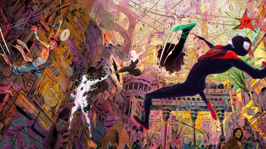
Each of the Spiders in “Spider-Man: Across the Spider-Verse” brings not just an art style but a personality and a backstory.Art work by Aymeric Kevin / Courtesy Sony Pictures
The latest comic-book movie associated with the Marvel Cinematic Universe, “Spider-Man: Across the Spider-Verse,” certainly knows what kind of film it is. Most of the movie follows Miles Morales and Gwen Stacy, two animated teen-aged Spider-People, but, for the sake of the fandom, live actors from live-action blockbusters make surprise cameos. Gwen quips at one point that Doctor Strange—last seen in the M.C.U.’s “Doctor Strange in the Multiverse of Madness”—should not practice medicine. Miles’s high-school roommate references another audience favorite, “Spider-Man: Homecoming” (2017), when he tells Miles, “I’m not your guy in the chair.” Inevitably, there is a meme-inspired scene of Spider-Man pointing at Spider-Man. This is the kind of self-aware fan fodder that, in lesser films, might feel tired.
And yet “Across the Spider-Verse,” which came out on June 2nd, does something that no live-action superhero movie has done before—or can do. It leans hard into, and emulates onscreen, the storytelling devices and the visual flair that make comic books special. Even more than its predecessor, “Into the Spider-Verse” (2018), the film feels designed to show young people, many of whom were raised on superhero movies, why they might care about the comics that launched these characters. It does this so well that, at a time when some Marvel movies haven’t been doing so hot at the box office, “Across the Spider-Verse” has already raked in nearly four hundred million dollars. At 7 p.m. on a Wednesday night, with local schools still in session, my seventh grader and I found most of the seats in our suburban multiplex full.
The first scene in the movie reintroduces us to Miles’s long-distance best friend, Gwen Stacy of Earth-65, a.k.a. Spider-Gwen (voiced by Hailee Steinfeld). Her world looks painterly, as if rendered by brushes and pastels; she often appears in Expressionist shades of blue and pink. That’s how the rest of the film will roll: each Spider-Man, Spider-Woman, or Spider-Villain, and each new Earth on which they live, has its own eye-popping art style. Miles (voiced by Shameik Moore), a Black Puerto Rican physics star who draws in all his notebooks, inhabits a world that evokes hip-hop album covers and graffiti. Miguel O’Hara, or Spider-Man 2099, comes with clean lines, techno details, and RoboCop vibes. Spider-Byte appears as a glowing avatar like the nineteen-eighties film “Tron.” Pavitr Prabhakar, a.k.a. Spider-Man India, swings through his home city of Mumbattan, all tropical colors and curvy architecture. (When characters move between dimensions, they pass through a portal made of hexagons—a basic geometric unit of Hollywood animation.)
Almost all of these characters existed in comic books before they hit the screen, and, crucially, all of them have what the scholar Hillary Chute identifies as the core property of comics: they look like somebody chose to draw them. They bear the mark of their creators’ hands. The Spot, a villain who sets the movie’s main plot in motion, looks like a blank page splattered with ink; each of his splotches opens up a little wormhole, in the same way that the pen stroke of a comic can open up another world. The animators of the film owe a lot to Marvel’s comic artists: the credits thank a “Black Panther” illustrator, Brian Stelfreeze; a co-creator of Miguel O’Hara, Rick Leonardi; and the nineteen-eighties titan Bill Sienkiewicz. All three have contributed to the making of “Across the Spider-Verse.”
The film’s version of Miguel O’Hara (voiced by Oscar Isaac) behaves like a stern, bad Spider-Dad. He resolves to stop Miles from disrupting something called a Canon Event—a plot development so important that it has to happen in every parallel world, lest the entire universe be at risk. “You break enough canons,” Miguel warns, “and we could lose everything.” He sounds almost like a Marvel Comics editor, telling writers that they can’t go too far. (One writer, Grant Morrison, called their longest project at Marvel “more like a prison than a playground.”) In the tradition of print comics, the film offers explanatory notes in 2-D colored boxes; some of them, in an homage to the comics of the nineteen-seventies, are even signed “--Ed.,” for editor.
Like all the best teen superhero comics, “Across the Spider-Verse” hints, or more than hints, at real-life dual identities. The colors that tend to accompany Gwen, blue and pink, are the colors of the transgender flag. A poster in her bedroom says “protect trans kids,” and her father, a police officer who initially has no idea that she is Spider-Gwen, sports a trans-flag pin on his uniform. Gwen tells Miles that her parents “only know half of who I am.” She also wears her hair in an asymmetrical undercut—which, my seventh grader told me, is often a sign of trans or nonbinary identity among Gen Z. (It should not be confused with a half-and-half, my seventh grader added.)
Miles and Gwen both have well-intentioned cops for dads, who try hard but can’t seem to stop enforcing rules. In one scene, Miles tells his father, “Men of your generation ignore their mental health too long.” In part for this reason, Miles and Gwen feel the kind of solidarity that young people can share only with one another. When they finally get some tender alone time above a twilit Brooklyn, Gwen asks Miles, “How many people can you talk to about this stuff?” He tells her, “You don’t even know.” That’s what happens when trans people meet one another, too—something that the Internet pointed out right away. (This isn’t the sole Spider-Man film to be interpreted as an L.G.B.T.Q.+ allegory; some viewers saw Tom Holland’s Spidey as transmasculine, too.)
“Across the Spider-Verse” is a sequel, but it’s arguably the first superhero film to take such full advantage of what comic-book art can achieve. At the Guggenheim Museum, Gwen has to fight a version of an old Spidey villain, the Vulture, who looks, in her words, like a “big flying turkey from the Renaissance.” He’s drawn in the style of ink on parchment, with the scratchy, busy lines you’d expect from a goose-quill pen. He’s not just from another Earth but from a different artistic universe. Elsewhere, several Spider-People chase Miles across the body of a rocket and up what appears to be a space elevator. Theoretically, C.G.I. could help live actors imitate some of these stunts—but not in such colors, and not with such dynamism and glee. In another sequence, Miles races a moving subway train while he fights a pangolin-esque villain, who rolls up in an armored ball. In a live-action film, the scene would cost a ton and still look cheesy. With animation this artful, it’s all part of the fun.
Comics are at their core a visual medium. “Everyone’s first response to your work will be to the visual aspect,” Brian Michael Bendis, the co-creator of Miles Morales, wrote, in his 2014 book about creating comics, “Words for Pictures.” In a comic, the script has to serve the art, which in turn has to serve the characters. And this script does. Each of the Spiders brings not just an art style but a personality and a backstory: tragedy for Miguel, teen heartbreak for Gwen, dad jokes for Peter B. Parker, that lovable sad sack from “Into the Spider-Verse.” (There’s even a Spider-Baby.) Each character and each gadget—one is called a Go-Home Machine—says something about generational change. Today’s kids may feel that they can’t live up to adult expectations and still be themselves. Where, if anywhere, can they find heroes?
Maybe Gen Z could find them in superhero comics, but it’s not clear that they’re reading many. The best-selling U.S. single-issue comic book of all time remains “X-Men No. 1,” published in 1991, which moved more than eight million units; in the past ten years, the best-selling superhero comics have tallied half a million instead. “The captive audiences of the pandemic era are out doing other things,” the comics journalist Heidi MacDonald wrote this year. When Zoomers read comics, it’s often via online platforms such as Tapas and Webtoon, which span genres from high fantasy to romance, or else in all-ages, slice-of-life graphic novels. (“Guts,” by Raina Telgemeier, was America’s most-purchased book—not comic book, book—one week in September, 2019.) “Across the Spider-Verse” could help to boost printed comics. Marvel has leaned hard on movies to promote Spider- titles, including the made-for-mobile online comic “Spider-Verse Unlimited.” Viewers who want to read stories that look like the Spider-Verse might also check out recent issues of “New Mutants,” by Vita Ayala and Rod Reis, in which feelings are more important than fisticuffs, and the expressive art fits the strong emotions.
“Across the Spider-Verse” is full of astonishing action, but a quiet scene midway through, when Miles and Gwen finally get a moment together above Brooklyn, might be the most affecting in the film. It lets viewers—including my rapt seventh grader—contemplate what young people want from one another, what they can never get from adults. Perhaps it’s a budding romance. Perhaps it’s trans bonding. These moments set up the conflict that comes later, when Miguel O’Hara tells Miles what he must do for the multiverse, and Miles, facing a superhero-level trolley problem, just says no. And the whole thing takes place, beautifully, with Brooklyn inverted: Miles and Gwen, using their tenderness, and also their powers, conduct the whole conversation upside down. ♦
7 notes
·
View notes
Text
Seers Isle

Created by a small Bordeaux company called Nova Box, this visual novel in the form of an interactive comic immerses us in a universe full of magic and mystery where our choices will have a weight concerning the fate of each of the protagonists. The game was able to get me directly into its story as the work of atmosphere is mastered. However, some details could, in my opinion, have been improved for even more satisfaction.
❤ A well-constructed and almost captivating story in its way of telling and unveiling the mysteries around the characters. Also, where in many visual novels our action of making dialogue choices leaves us a spectator, here it plays a part in the story itself. I found it very relevant and it reinforces the immersive side of the game. ❤ Talking about immersion, it's done through absolutely magnificent illustrations!!!! Some might regret a lack of animation but I think the rendering is really dynamic and the imagination helps to do the rest easily. ⬇ My fav one <3
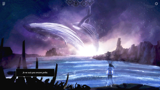
❤ I have to mention the sound and musical atmosphere too! The sound effects immerse us in the landscapes and the music is splendid and contributes to the mystical atmosphere of the game. ❤ The characters are endearing and each have their own personality and without easy clichés.
+/- The game has good replayability given the different routes to unlock (4 characters have 2 routes each) but they are very similar in the end and therefore rather repetitive. +/- Automatic saving is a good idea in itself, it prevents you from wanting to go back and erase a choice...but if you want to unlock the 8 routes, it's especially the end choices that are important. As a result, playing the same story 8 times becomes annoying (especially as said earlier, the routes are not that different).
✖ I regret that there is no indication of the text already read (like a text in color or a skip option just for unlocked dialogues). I found by chance that holding down the spacebar made the text go through much faster, but that's not very convenient either. ✖ The route system is not very clear; the game gives us 4 symbols (eye, hand, man, deer) and according to our choices, some symbols light up. The problem is the lack of clarity on which dialogues will influence which symbols, but also which symbols for which characters. For the first run, it doesn't bother too much but when you want to unlock other paths, it's not always obvious. ✖ I think the game deserved a kind of "true end" because after having finished all the routes, there are still a lot of questions around the character of Rowan and I feel a sense of lack. (✖ No romance possible with Freya, I'm extremely frustrated xD)
If Seers Isle is in part a tragedy, I nevertheless come out of it with a smile of having been able to fully experience its story thanks to quality work on its audiovisual atmosphere. I'll be curious to discover other creations of this studio in the future <3
youtube
➡ My personal VN ranking (in french) ➡ My Steam page
#seers isle#finished it at 100% but yeaaah it was very repetitive at the end x)#still frustrated to not being able to be with Freya//////// she's so....you know xD#Lola plays games#personal#Youtube
10 notes
·
View notes
Text
THE BLACKTHORN DRAGON CLAN.

<<Hello hello!! I've been thinking about my dragon lady lately, and I thought it might be helpful for both me and others to dig up some old headcanons (repurposed from here) about Clair's home base: the DRAGON CLAN. I am always game to discuss or flesh these out more with other people--come here!!>>
DRAGON CLAN ORIGINS.
The exact date of the Clan’s creation is unknown, but certain old texts (dated back hundreds of years ago) tell tales of mountain settlers who happened across a cavernous shelter while weathering a terrible storm. That shelter came to be known as the DRAGON'S DEN.
These settlers--the founding members of the Clan--soon located an abundance of Dratini within the Den’s giant lake, and began training them. Meanwhile, brave Clan explorers surveyed the mountainside and cavern tunnels, eventually coming across a frighteningly-large fang buried in some rubble.
This ANCIENT DRAGON FANG is one of the only surviving artifacts from those founding times and is held in highest regard by current members--yet, after all these years, nobody can figure out the Pokemon associated with it. The Clan, naturally, assumes it came from Dragonite.
DRAGON CLAN FAITH.
Around 500 years ago, when Blackthorn City was being established, the members of the Clan claim to have seen a “RAINBOW DRAGON” soaring over the mountains, kicking off a period of needed prosperity for the rough-and-tumble town. Researchers think that this “Rainbow Dragon” might actually be HO-OH, but the legend still remains an important part of Clan faith and traditional Blackthorn lore.
Every five years, on the day that the “Rainbow Dragon” first soared overhead, Blackthorn throws a huge festival in celebration and reverence. One selected member of the Dragon Clan--now usually Clair--performs the “DRAGON FANG RITUAL,” in which the ancient Fang is carefully held up twice by the bearer--once to the sun and once to the moonlight, “burning away the evils of the previous years.”
If it is cloudy on the day of the festival--rendering the ritual useless--the Clan believes that a bad fortune will befall Blackthorn for the next five years.
Currently, the DRAGON SHRINE--located at the heart of the Den--houses both the Fang and the first known illustration of the Rainbow Dragon, along with documentation detailing the known history of the clan. Its members often meditate here.
DRAGON CLAN HIERARCHY.
The Clan's hierarchy goes like this (from least important to most important): Recruit, Tamer, Elder, Master. Recruits are recently-chosen outsiders or strong Trainers who are inexperienced with dragon training. Tamers are experienced Dragon Trainers who have spent considerable time in the Den (Clair is here). Elders form a “council” of sorts in the DC--they are a small group of aged Tamers who (somewhat problematically) confer Elder status and appoint new Masters. Once you become an Elder, you cannot become Master. This is a recently self-imposed rule--after the passing of the last Master (Clair and Lance's grandfather), the council began looking for more youthful candidates.
The Master--the highest rank in the Clan--serves a lifetime term and has absolute authority over every other member. Unlike the Elder rank, there is no age requirement for this position. When the last Master passed (shortly following the events of Crystal), the Elders used a series of tests to decide his successor. Any Tamer could attempt these tests.
The exhausting tests were as follows: Stamina (swim across the Dragon’s Den lake with all of its dangers), Ancestry (take a test that covers nearly all of Clan history), and Serenity (pluck a scale from the Den’s Gyarados using your own strength). Clair faltered on the Serenity challenge, and Lance was given the title of Master.
Lance’s Champion duties (which he valued more) constantly interfered with his Master responsibilities, so the Elders reluctantly gave Clair another chance to pass the tests and take his place--only to see her fail the Serenity trial once again.
CLAIR’S ISSUES
Despite being raised under Clan rule for much of her life, Clair has recently begun to challenge many of the its restrictive traditions. Here are a few issues that she is currently working through...
The Clan only allows the Dratini line to be trained in the Den--a supposed nod to the ancestors. Clair has taken to raising non-native Dragons in the Den’s tunnel system--explore at your own risk.
The Elder council claims that strength alone is the determining factor for rank in the DC, yet Clair has noticed that the current council consists of men only. Historically, there has only been a handful of female Elders in the DC’s history, and there has never been a female Master. Clair (and recently, numerous other Tamers) have become more outspoken about this discrepancy, but--somewhat tellingly--the Elders remain silent.
Adding on to the previous point, the Dragon’s Den--while unique in its structure and training processes--still can’t escape classic Johtoan traditionalism (an emphasis on manners/modesty and a general resistance to change.)
Clair loves to do her research, but the DC often turns a blind eye to her findings regarding the Dragons of the outside world. Although she still participates in the Dragon Fang Ritual as its bearer, she is quickly becoming fed up with the Clan’s willful ignorance on a lot of its issues.
Due to her numerous brush-ups with the Den’s unspoken rules and supposed irreverence towards her “superiors,” Clair is known around the Den for having a “dragon’s temper.” She often wonders if her Dragon Master tests were fixed in some way by the Elders.
#clairly headcanon#(FINALLY this gets its own post!!)#(super proud of this even now)#(and as always...if your interpretation of the clan clashes with this no worries!! we can work it out!)
23 notes
·
View notes
Note
hey sorry to ask this on your non-art blog but i was wondering if you could explain the process and decisions you make when - and im not sure if im saying this properly because im still new to art - you apply stylistic choices to anatomy? i love your art and what im curious about is how you make your anatomy stylistic while retaining their recognizability? do you feel that there are certain details about a reference that you should capture to retain that more than others? thank you for your time! i hope this made sense!
anon you're lovely. i'll try and answer this the best i can, but--crucially--i have very little in the way of actual artistic training and have truly been making shit up this whole time, so grain of salt for everything i say! (under the cut because its long)
firstly i wanna say 2 disclaimers:
i have been doing art/capturing faces for a Long Ass Time (i think art's been my main hobby for...nearly a decade now?). i'm only "good" because i have a shit ton of practice. art always takes time and effort, there isn't like. A Key to doing it perfectly
i don't always get it right! i only post the things which turn out the best! i have a ton of poorly done drawings that look nothing like the person i'm trying to capture.
alright, that being said. there are certain features i try to get right for any person i'm trying to capture: face shape/jawline, nose, eye shape/tilt/distance, eyebrows, and lips (or lack thereof). yes this may seem like all the features. it is not tho.
after that i look for anything else that stands out: for BJ, for instance, it's his ears, the shape of his forehead/his hairline, and the particular kinda down-turned/hangdog look of his stache (he is SO hard to draw without it, for me), and for Hawkeye it's his cheeks/laugh lines when he smiles (the lines around his mouth and his crow's feet), his occasional double chin, and his brow ridge.
and these aren't things i ever render in like, insane detail...just little lines following the contours of features and indicating that they're There usually does fine? for stronger features like face shape/nose/etc it takes a bit more intentional doing, for me, but i still tend to just do The Outlines. (it might be helpful to pull up a reference and just trace whichever features stick out the most to you, and go from there)
after that its a lot of trial and error. like, a LOT. for me it usually takes several passes with several different references at different angles/with different expressions, or a while of looking at a person (so like. binging a show, or being friends with someone for a while), or both, in order to get a feel for someone's face and be able to draw it consistently.
(to illustrate this point and also embarrass myself, here are my first ever attempts at drawing Hawkeye right after i started MASH in 2022, vs a much more recent attempt:

as you can see i was fucking struggling. lmao. again it's all about time/practice/familiarity)
after a while of trial and error, you'll start to get a feel for which features you want to emphasize--it won't be the same for every character, and you probably won't emphasize all the same things another artist would. and the specific way you capture/emphasize features will be unique to you! here are some more artists with similar(ish) stylized styles you should check out and get inspo from (i certainly have), in no particular order: leescribbs, loopnoid, steadbox, tinyufoboss, averysartblog, pherredraws, and a ton more i'm probably forgetting (sorry)
you don't have to do everything i do (or everything anyone else does) with your own stuff, this is just how i personally do it. i wish you the best of luck with your art journey, anon! i hope you have fun with it!!! :-)
#asks#tldr: its all about the Shapes and Lines and also It Depends#idk if this was helpful at all??? but. i tried#unfortunately ive been doing this for so long that i just kinda. Do It? so its hard to explain#HOW i do it. yknow#but anyway.#thinks for thanking of me anon. this was a very sweet message to get in my ask box <3
3 notes
·
View notes
Text
Undead Unluck ch. 146 thoughts
[3-For-1 Deal]
I mentioned a while ago that Undead Unluck operates on the one plot point per chapter principal, but there’s an exception to every rule, as we saw a few weeks ago leading into the Void battle
Much like said chapter, this one covers three separate events, so I guess that’s Tozuka’s method: if he can’t stretch out one event into a whole chapter, he might as well cram in three. I like it, it’s an efficient use of time
So as I guessed, Yusai is one of the Negators that Fuuko mentioned recruiting last week. I was admittedly wrong about Feng, but I was iffy about him anyway, and we did already get some insight to his character this arc, so it’s only right that we get the previously underutilized Yusai
We see Yusai facing down an unnamed UMA, who based on the black spikes I would think is some kind of iron UMA. Yusai defends her village from this UMA by presumably tricking it into piercing its blades into trees then holding it in place with Undraw for an entire week. Christ, no wonder she’s literally about to die! She had to stay conscious that entire time without food or water; the fact that she’s only just NOW about to die is nothing short of a miracle, as that’s literally the maximum time the human body can go without water. Granted, staying perfectly still that entire time while also in a life-or-death scenario would likely mean that a lot of her metabolic processes literally stopped, so perhaps her water consumption was minimized? Either way, it’s a perfect recipe for keeling over, hence why she looks so emaciated
Fuuko arrives just in time to save her, which means one very important thing: this is where Yusai was at this time last Loop. So, how did Yusai survive last time? If I had to guess, I’d say there happened to be a certain shirtless amnesiac passing by last time, wouldn’t you?
Fuuko defeats the UMA, though I’m not entirely sure if she killed it and eliminated its Rule or just incapacitated it, but the story doesn’t care so neither do we. She brings Yusai back to base and gets her some much needed food, though given that she’s EATING A FULL MEAL AT THE GOD DAMN SPEED OF LIGHT by all rights she should be dying immediately anyway from rupturing her malnourished stomach. She should be taking that rice and mashing it into gruel with lightly salted water, not jamming it into her gullet
Also, Tozuka seems to have slightly altered Yusai’s design; her hair has a much softer look to it this time compared to how she looked in Akira’s flashback, being drawn more rounded instead of spikey, and with what looks like a much higher ponytail. I’m not sure if Tozuka just wasn’t satisfied with the original design, but honestly this one feels like it has more personality, so I appreciate it
Yusai apparently can’t draw her own sword, nor can she remove anything that she views as being inside something else, rendering her unable to draw her own sword or even her chopsticks out of her mouth between bites. How she gets them out later, I have no idea, but this does illustrate an important factor of Undraw’s Rules: it does not target the user, it targets the object. We’ve seen her negate Spring’s cherry blossoms, the unnamed UMA’s blades and even Sun’s feet, so it’s clear that she’s an external targeter. Preventing herself from drawing her weapons implies that she’s targeting herself as well, but since a Negator can only be external or internal, not both, she must be negating the objects ability to be drawn, not the person’s ability to draw. It’s not even limited to weapons! She could probably prevent an enemy from “drawing blood” if she thought about it, making Undraw a much more versatile ability than I originally gave it credit for. Can’t wait to see how far Tozuka pushes it!
Nico comes in and informs Fuuko that he can’t locate Kasuga Village, which Yusai is apparently familiar with, so presumably she guides Fuuko to it. As it turns out, Kasuga Village is Isshin’s home, so I wonder if perhaps Yusai’s family is familiar with the Isshin clan? I hope we’ll get to see a more in-depth explanation of their ties, this plot point unfortunately felt a little glossed over
Kasuga Village is attacked by the same UMA that killed our Isshin’s father in the previous Loop, but this time it’s met by Isshin the 12th, her grandfather. Whether this means that this is a Junior and multiple attack the village or it’s attacking earlier in this Loop, I’m unclear, but either way, Yusai steps in to kill the UMA using the iconic iaido that we’ve seen Andy use so often, only she has to do it without actually drawing her blade. Frankly the fact that she destroyed a UMA’s core with her sheathe is pretty damn impressive, imagine how strong she’ll be once she learns how to overcome that limitation like the previous Yusai did
They ask Isshin 12 to join their cause, but he declines on the basis that he can’t leave his home unprotected. In comes Isshin’s dad with who else but little baby Isshin on his back! She’s so cute, and I am reaffirmed in my decision to name my Tinkatink after her in Pokemon Scarlet. She’s even got her hair in a little knot! Seeing her bap away her loving grandpa is super endearing, this is the kind of thing I want to see more of
Fuuko immediately clocks that this Isshin, referring to her by her true name of Haruka, confirming for Isshin 12 that Fuuko’s story about the timeloop is true. Moved by Fuuko’s tears of joy and the tale of Haruka’s exploits as the next Unbreakable, Isshin 12 changes his mind and decides to accept Fuuko’s invitation
I did mention Isshin as a possible recruit last week, but somehow I forgot to mention the logical inconsistency at the time: see, I knew that Isshin was 23 in 2020, meaning that she was born in 1997, making her only two years old in 1999. I knew that, and I knew that her grandfather should still have been alive at this time, but I just...didn’t bring that up last time. Can’t remember why. BUT I did say we might get Unbreakable and we did, so there
So there you have it, an attacker and a support, that’s both of the recruits Fuuko said she wanted, so now we’re ready to go to the South China Sea, yeah? Well surprisingly, no! Because somehow Fuuko has been made aware of a third recruit she wants: everyone’s favorite guy, SEAN DATZ!
Wait, Sean Datz? In 1999? But he was 18 in 2020 last time! He’s not supposed to be born for another three years, but here he is, about...what, 15? He seems younger than in 2020, but it’s a bit hard to tell, so maybe not. Either way, he’s clearly a 90′s kid now, but how can that be? Well according to Fuuko, he was actually born early somehow, and she attributes this to everyone’s souls actively trying to help her reunite them all
That’s...a little odd, since Sean seems to be the only one who was explicitly born early, but...maybe that’s why Fuuko thought she had till 2003? Maybe everything is happening earlier...? I don’t know. Maybe Sean is just that cosmically unimportant that he can be reinserted into the timeline anywhere and it doesn’t matter. What a loser, the flow of time doesn’t even care when he’s born
I also love that Nico conjectures that the souls trying to help Fuuko is a sign that they all love her, but Sean literally had one interaction with her: he tried to kill her and got cut in half for it! If anyone should want nothing to do with her, it’s him! He’s just the weirdest one to use as an example for this, I really hope this gets expounded upon next week
The team tracks Sean with infrared as he’s only unable to be seen by light, not heat, though perhaps he’ll be able to remove that weakness later, and he’s able to run through the streets of Brazil with his eyes closed without any issue. It looks like he’s memorized the layout of the city, but it’s more impressive that he hasn’t bumped into anyone. Maybe his senses are pretty sharp? Not sharp enough not to bump into Void, though, who paralyzes him with Unavoidable. Naturally, this only keeps him from continuing to run or close his eyes to become invisible again, but does not keep him from drawing his iconic butterfly knife
Fuuko sees this coming though and brings him to the ground, knocking his knife out of his hand and embedding it just like what happened last time. Of course this time he’s not cut in half, so maybe this is the beginning of Sean’s redemption arc. Maybe this is his Bellamy moment where after suffering a parallel defeat to his previous one, he shows that he’s actually pretty likable and endearing?
I wanted to make a joke about how I’d hate this series for making Sean likable, but I just can’t bring myself to do it. I actually really like the idea of Sean becoming an actual character, and Tozuka has done a great job so far of endearing us to previously one-note characters, so I’m excited to see what kind of dynamic Sean brings to the table
All in all, this wasn’t a mind-blowing chapter since it’s mostly set up for what’s to come next, but I don’t think it needs to be a banger every single week. I saw someone say on twitter that this arc feels stale because the stakes are so low, and while they went on to write a nice analysis of Undead Unluck as a metaphor for trauma and grief, I just couldn’t get behind their initial premise. We already know what the stakes are for this arc, they were illustrated for us quite clearly not twenty chapters ago: we saw everyone and everything reduced to ash and rubble. We saw all of our friends give their lives with tears on their cheeks and blood on their hands to ensure Fuuko made it to the next world to prevent this from ever happening again
These people are what’s at stake. Their lives, their loved ones, their happiness, all of that is on the line here, and this person thinks it’s stale? Sorry pal, that’s just a bad take all around. I think they’re mistaking “stakes” with “an immediate threat.” No, there’s no major arc villain to face right now, only the abstract knowledge that one wrong move will result in someone repeating the tragedies of their past, but that’s a pretty key concept in narrative fiction: character-driven storytelling
See, Undead Unluck is a character-driven story disguised as a plot-driven one. Fuuko and Andy’s involvement in the Union is 100% motivated by what they want: to stop being Negators so they can live (and die) normally. Every action they take is motivated by what they want or their morals, not by their immediate needs as the plot demands. However, the story is FRAMED as being plot-driven because Apocalypse literally tells the cast what to do and where to go next. Go capture Spoil to get Unrepair’s location, go kill the Seasons to prevent Ragnarok; these are plot points that decide the literal next step in the story, giving the illusion of a plot-driven narrative, but now? Fuuko’s calling the shots. Fuuko’s only going on Quests that she wants to go on that further the agenda she’s decided on, the narrative is no longer driven by the needs of the plot but by the desires of the characters. Fuuko and co. aren’t fighting with the goal of killing God, they’re fighting with the goal of living how they want. They’re explicitly rejecting the plot-driven narrative to replace it with a character-driven one, changing the rules of the world to those of self-determination if you will
Seeing the previously unused characters become more fleshed out in their personalities and their interactions may not be the kind of hard-hitting, pulse-pounding action you’ve come to expect from fights like the Union/Under vs. Sun, but to me it’s everything I ever wanted from this series and from manga as a whole. I want to get to know these people, I want to see how they get along with each other. I want to know what they’re actually, literally fighting for, not the contextual reason why they’re fighting, and watching Fuuko cry over meeting her friend as a baby? That tells me so much more than an all out brawl against some monster ever could
13 notes
·
View notes
Text
AI art, and a couple of thoughts
Awhile back, an artist/author I follow started playing around with digital art assistants. They made it sound interesting enough that I tried Midjourney...and got a little hooked. (Examples below the cut.)
As a person who’s never had the patience or skill to Do Art, I find it overwhelmingly joyful to just...enter some words, and be given art in return? It’s most likely not what I pictured, but that often makes it more fun. I had fun in the beginning putting in abstract concepts, just to see what came back. Two of my favorites were generated by simply putting in “evil hunger” and “icy rage”.
Evil Hunger:

Icy Rage:

At that time, Midjourney was...not good at rendering humans. You see, it works by taking all the art it has access to online, attempting to match keywords to prompts, putting that subset of the art in its little AI blender, and spitting out the result. It doesn’t know, for example, that humans typically have two eyes that look in the same direction. Early experiments gave me a lot of figures facing away from the camera in silhouette, which was good because the clearer ones usually came straight from the Uncanny Valley. I got human figures with one leg, and horses with six.
That was Midjourney version 3. They’ve since come out with a version 4, which is much better at getting the proper number of physical features sorted. It still has a hard time with hands...but that’s a problem for all artists, from what I understand.
As you can read in the Discourse, if you’re so inclined, AI art can be Problematic. Is it stealing? Maybe. It’s a little ludicrous for me to input “icy rage” into a text box and claim the result is “my art.” There are thousands of real artists, living and dead, whose skill the AI is borrowing. That said, can we defend it as creative derivation? Artists (and writers, and most creatives) borrow from each other all the time. We use each others’ work as inspiration and let it drive our own creation. Isn’t that what’s happening here?
The question is, how much of the result is transforming others’ works, and how much is straight up copying? Unfortunately, there’s no way to tell.
For myself, I’ve got two rules. One is, I don’t use artists’ names in my prompts. A lot of people do, but to me, that’s where it crosses the line into plagiarism. The other is...well, I’ll illustrate with something it gave me awhile back:

I asked it for a “fire opal talisman” and it gave me this set of four. Look at the one in the lower right corner. It looks like the AI has picked up a signature from whatever art it was using as a reference. That makes me profoundly uncomfortable. So my second rule is, no matter how much I like a result, anything with a ghost signature/watermark is out.
Now, this is a whump blog, so of course I was curious about how it might do for that. The answer is...meh? Even though the current version is better at rendering people, it’s still not great. Many human figures end up looking cartoony. Also, Midjourney has a list of words that cannot be used as prompts, in order to prevent misuse. That’s definitely a good thing, but it means I can’t use “bruised” for example.
I did get a couple of interesting whumpy results, like when I asked it for a film-noir-ish wounded man in a trenchcoat:
That’s not bad. I could use that as story inspo or illustration. It’s just that ultimately, I find that the more specific the result I want, the more difficult it is to wring that image out of the AI.
And one more thing
Since I’m posting this on Tumblr in November 2022, I’m contractually obligated to add this masterpiece I generated five minutes ago:
(IYKYK and all that. The weirdness of the 3 and 4 are an AI artifact, but it amuses me to think that this might be the start of a dream sequence or hallucination where our MC imagines the clock’s numbers moving and changing.)
9 notes
·
View notes