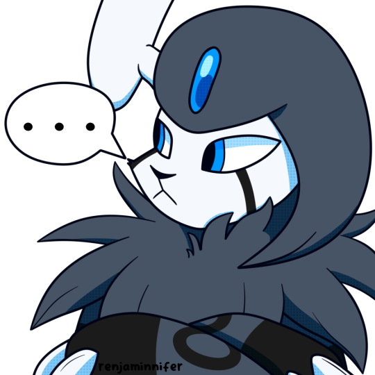
#i mean the icons get lineart but i do the lines differently
Explore tagged Tumblr posts
Visit Tumblr Blog
Explore Tumblr blogs with no restrictions, modern design and the best experience.
Last Seen Tumblr Blogs


Fun Fact
After the announcement of the deal with Yahoo!, there were 170K signatures of unhappy Tumblr users petitioning to prevent the sale in 2013.
Text

hey gang its a brand new commission post! i'm changing up what i offer!
Colored Sketches!
Options include flat colors or more fuzzy soft ones. Half - $20 | Full - $30

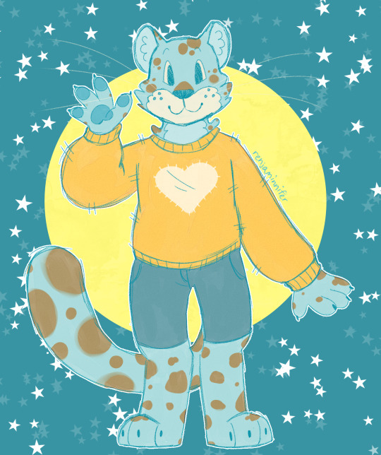
Icons
I'm keeping these around! They're $25 each

Meme Redraws
exactly what it looks like. $15 but varies based on complexity

Extra Details
i primarily draw furries but WILL draw people, fandom stuff (ask), and age regression content. if you're curious about something, just ask!
extra characters are half the base price, complex designs might also add to the price. shading is plus 5! i accept p*ypal and kofi.
Contact
DM me here or on discord (renjaminnifer)
#good lird. sorry if this is kinda long#but yeah yaaay#i dont do lineart anymore unless its like. for me. or a friend maybe#bc i dont enjoy it very much#i mean the icons get lineart but i do the lines differently#so its a lil more fun#furry#sfw furry#furry artist#furry art#furry commissions#commissions open#commissions#ren does the doodle#commission sheet#furry fandom
229 notes
·
View notes
Text
Info Page: Personas, Asks, Requests, Art Trades, and WIPs!
Hello! Hello! I'm an Indigenous/Native/Cree artist who very much enjoys making art for the fandoms I love!
[Last Updated: February 2nd]
Personas:
Skellinore! The face and soul of this blog!
She's closest to my personality and what I'd want to look like! A cool skeleton.
I used my usual art style to make this drawing, which is just simple shading on the edges of the lineart!
She's also an OC, but that version of her is vastly different from the persona version of her; in intellect, personality, and whatnot.
She was originally made to be an Underfell OC! But never got fully realized until my Amino days.
She's made to be paired up with Splendor.

River! My anti/opposite persona!
River, she's everything I hope not to be; full of hate, bitterness, and bad choices.
I guess she's the closest to what I look like? Besides her being more lean, but that's because she just wanders bar to bar and ends up in endless fights.
Her arm can change into various things, mainly used for combat, she however was not born with it. It's slowly eating away at her the more she uses it.
Her design was supposed to based off a Hunter from Left 4 Dead, but she kinda looks like Alex Mercer.
My other art style of more detailed shading and lighting you see will be made by her.
She's made to be paired up with Markus.

CE-BE3! A very busy and tired robotic bee!
My hard-working, focused, and perfectionist side of me, which usually means I become tired more.
This busy robotic bee is based off a carpenter bee! Which means she's a lonely bee who makes her home in wood.
She's the one who makes sure everything gets done on time and tries to make this blog look presentable.
Her art style is one without lineart! Which takes a bit longer than the other art styles.
She's made to be business partners/friends with Slender.
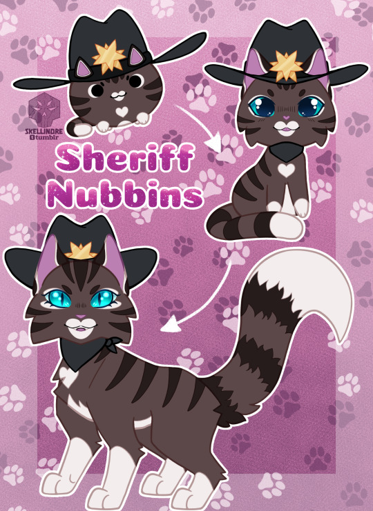
Mr. Nubbins, AKA: Sheriff Nubbins! My chaotic and weird side!
Don't be fooled by the name, Nubbins is a 100% a female, she just likes how Mr. Nubbins slides off the tongue.
Anything this cat says is random and most times, doesn't make sense. She's a little ball of chaotic energy.
She's not actually a sheriff, but don’t tell her that.
She's my simple and cute style? Or whatever my art needs to be.
Made to be the pet of Trender.

Asks: [OPEN]
Send in an ask about the fandoms you see me draw for!
Ask questions about my AUs!
Ask questions of the characters I draw!
Either of your asks/questions will be come attached with a drawing alongside the information, or just information and no drawing. Depending on my energy level.
As for NSFW asks, it'll be a 10/90 if I answer it or not, who knows, take a gamble.
Asking the characters directly is something you can do, but once again, it'll probably be a 20/80 if I answer that one.
Fandoms for Asks currently:
Creepypasta [No Humans AU]
Requests: [OPEN]
Requests are drawings only, there may be a chance I add fun facts to it.
Send in requests of characters you want to see me draw from the fandoms I'm in!
Fandoms for Requests currently:
Creepypasta [No Humans AU]
Creepypasta [Only "Him" AU]
Castle Cats

Art Trades: [OPEN]
Capacity: [0/3]
I'll work with anybody of any skill level, I'm just happy to draw something in exchange for yummy art of what I like.
The basics for this is that if you ask for two characters, then I'll ask you for two characters back and other things along those lines.
I'll also do another type of trade! This one if for writers! I'll draw you something if you write me something. >:3c
The bare minimum for this would be 3000 words. I don't mind if it's a couple words short of this minimum.
Just send a DM my way and we'll be in business. 😎👍
Works in Progress:
SCPs Redesigns [3/10]
Slender Brothers + Cabadath Icons [Sketching]
Castle Cats Fandom Challenge: Day Three [Sketching]
Final Words:
Anyways, that's about it! I'll be updating this regularly on new updates and what not! So feel free to check it out from time to time.
I also have to remind everyone that I'm a slow updating artist. I wish I was as fast as most of you, but then again. I'm a cool artist who knows how to take breaks and take care of themselves. 😎💅
Have a wonderful day/night! 💛💛💛
9 notes
·
View notes
Text
【KHR AU】 XanLena Chibi Commission by Hika ❤️💜🔥🪷


XanLena (Xanxus/Selena) Chibi Icon Commission by Hika (@/onigiwi2namayo)
Hika's Twitter: (X)
Hika's VGen: (X)
In accordance with Hika's Terms of Service (TOS), editing, using, or reposting these arts, in any way, is prohibited without explicit permission from Hika, and me, the commissioner.
Intro
I commissioned Hika to draw my beloved XanLena ❤️💜🔥🪷
Selena is my beloved KHR OC and wife 💜🪷
Her name is Nguyễn Selena, and her Vietnamese name is Nguyễn Nguyệt Vân Liên. Her Viet name, Liên, means "lotus" in Sino-Viet 🪷
She is a Viet NB assassin with a calm and aloof personality, who's reserved and mainly keeps to herself, but cheerful around people she's close to. Her design is NB flag colours 💜🖤🤍💛
She has an interest in gardening (collecting flowers, plants, learning about different types of poisons), and fashion (collecting clothes, including traditional clothes) 💐👗
Xanxus/Selena matching cheebs ❤️💜 The little Xanxus and Selena... I'm SOOOO happy!!!
My friend Snow and I used Hika's XanLena chibi icons as matching PFPs on Discord for a bit 🥰 They're just that cute 💘
Rambles
WAHHHH THE XANLENA CHIBI ICONS ❤️💜🫶 OH MY GOD THEY'RE SO CUTEEE MY BABIES!!! 🥺💗
THEY'RE SO CUTE IN HIKA'S STYLE… REALLY ADORABLE OMG I LOVE THEIR EXPRESSIONS 🥰💞💘🫶
Selena's smiley :D and Xanxus' grumpy pouty >:|
The round lines and shapes... OMGGG ✨ I love the colours too!
I love how Hika drew Selena's eyelashes and underlashes with the dots...
I asked Hika to draw TYL Xanxus' design since I felt like his TYL (Ten Years Later) design would be easier to draw.
Hika originally chose a dark blue BG colour for the both of them, but changed it to yellow and red respectively to make them stand out more!
The blue ones were nice, but omg the final versions Hika went with, do reflect their actual colours better. These fit them better! Matching eye colors (plus it makes their hair stand out from the BG more)
Since Selena and Xanxus are toned with blue/purple in Hika's colours, the new BGs have more visual contrast!
Hika was very accommodating with minor colour edits and revisions as well! 🙏
I wanna commission Hika to draw JuAli and IdaTatsu with my headcanon designs of them in the future 🥰💘✨
My Message
This was the message I left for Hika!
The finished commission arts are wonderful! Selena and Xanxus look so cute in your art style ❤️💜🥺 Really adorable~ I'm very happy with how it turned out!
I love their expressions 🥰🫶 The thick round lines and shapes in your chibi style are great. I love how you draw dot eyelashes in your chibi style!
The colours are amazing! The orange~ish red and blue tones you chose for Xanxus has such nice visual contrast!
I love how the background colours you chose match their eye colours too~ It really brings out their designs' overall colour schemes and hair ❤️💛
Thank you for being very quick and accommodating with colour revisions as well! I look forward to commissioning you again sometime in the future! 🙏 👍
Read more under the cut if you're curious!
Misc Rambles


XanLena doodles by Sen (@/stepswordsen)
I feel like the KHR ani style goes for a much more generic art style, compared to Amano's unique art style.
For Xanxus' late manga design (Rainbow arc Xanxus), Amano improves the shape of his hair and makes it more wavy and easier to draw.
Amano has an amazing art style, and really detailed lineart and inking. She's one of the biggest inspirations for me. Her style was honestly very inspirational for me...
I started drawing everyday as a kid (at 11) BECAUSE of KHR, so KHR is very important and personal to me. I first watched KHR and read the manga at 11.
Amano's style is honestly defining to my style - It shows in the way I draw faces and eyes.
I'm not big on the KHR ani's art style, but I do appreciate what it gave us with the chibi interviews, character songs, etc. It's also cuz of the KHR ani that we (somehow) get endless KHR merch.
I prefer the manga designs, but I prefer the ani's colours for the charas because the KHR ani generally gave the KHR cast more skintone variety (when everyone was pasty in the original manga)
The KHR ani did such a great job by giving the KHR charas more skintone variety... Even pale charas in the KHR ani have different skin tones from each other.


Original vs. My Edit
I headcanon Xanxus to have tanner/warmer skin.
Xanxus with darker skin (olive skin in the KHR ani, and either olive or tan skin in certain KHR ani merch arts), literally just looks better from a character design perspective, imo. That's just facts 📠
His design has much better colour contrast with the ani colours. Like the black and red colours in his design contrast better with darker skin. Also against his blood/wine red eyes. It has more colour harmony and cohesiveness in terms of the colours
Xanxus with pale skin has less cohesiveness in terms of the colours
Xanxus, Yamamoto, and Ryouhei's designs just look so much more boring, pale, imo.
For KHR, I go manga design + ani colours + my own take on the ani colours.
Since I have a tendency to saturate colours with my own arts.
As a personal HC, I think Xanxus has a very mixed ethnicity.
My Italian American friend Feuri said Southern Italy and namely Sicily has a more mixed population.
The ani colours provide a good base for me to work off of for me to improve the colours :3
I do colour edits for fun. I like playing around with colours (editing official arts to see how the colours work together) to help guide my arts. I either do colour edits first or just immediately start picking colours for my arts
...
I usually hand artists a Drive folder filled with XanLena's art refs (including my own doodles) and write some notes on their design details since this makes things easier for the artists I'm commissioning.
Selena is Vietnamese/SEAsian with light tanned skin. She has black hair with a long ponytail that goes down to around the same length as her long front hair strands, and wears a white blouse with frills and a black seam with white buttons. She wears a black pleated skirt with a white line near the ends, and black thigh highs with horizontal white diamonds, and black doll-like shoes.
Since Xanxus wears a brown fluffy accessory, red feathers (that may be dyed red -> orange -> yellow), green strings with red beads, I don't mind if the artists I comm simplify these details.
So, whenever I commission artists, I ask for them to draw my HC versions! I'm very glad that all the artists I've commissioned have been very accommodating! 🙏💖
The XanLena chibis Hika made are being used for Hika's Chibi Icon samples 🥺 Wahhhh
...
The modern remakes of old 90s - 2000s animes have such boring and bland dull colours to me.
I seriously fear that if they ever do a KHR remake or reboot, that they're gonna take away the OG KHR ani's better colours and make everyone look pasty pale (just like in the manga) just for "manga authenticity" and "loyalty to the source material" even though everyone looks so much more boring pasty pale!!! 🧍
#khr#katekyo hitman reborn#katekyo home tutor#xanxus#khr oc#khr au#khr au oc#selena#nguyen selena#nguyen nguyet van lien#xanxus x selena#xanlena#xanlien#xanxus x lien#nguyễn selena#nguyễn nguyệt vân liên#xanliên#stepswordsen khr au#canon x oc#oc x canon#yume#yumeship#yumejin#yumejoshi#stepswordsen varia au#commission#commission art#other people's art#stepswordsen oc#oc
12 notes
·
View notes
Note
im bored
Wanna arttrade or something
Can do ^-^ let me know what sort of art trade you wanna do, and I can do different levels of stuff. e.g. if your just wanting to do doodles, or fully rendered stuff.
I can put some examples below to explain lol (this also goes for anyone else who is interested in doing an art trade) Basically this is my way of saying to anyone what effort we want to put into the art trade so we both feel like we put the same amount of effort in ^-^
Doodle (with colour, I'd obviously do better coloring than this lol but its the first example I could find) -sketchy lineart, and some guide lines sometimes -no shade or lighting

Doodle with shade/lighting -similar to the doodle above, sketchy lines and stuff, just I add shade/lighting

Clean lineart + Colour -instead of a sketch I do clean lineart and do flat colour

Clean lineart + colour + Shade -basically like the drawing above but with shade added

Clean lineart + colour + shade/lighting (fully rendered) -same as above, just fully rendered with lighting as well.

Icons -I work on a small canvas can go from sizes 150-150 to 400-400 (could go to 500-500 as well) -since I'm working with such a small canvas I can fully render a drawing quickly and easily so I am more lenient in what I get in return

OR I could do an oc trade (both make ocs for each other), you can look at any of my oc designs if you want examples of that lol
Sorry if this comes across as mean, I don't mean for it to be lol! It's basically I will put in the same amount of effort, e.g. fully rendered drawing for a fully rendered drawing
If your still wanting to do one you can send a dm (No pressure lmao after this post you can decide if you want to or not X'D) and we can talk about what we're wanting to do for the art trade ^-^
5 notes
·
View notes
Photo

so i do a lot of shading like this in my art (or try to) and i asked if anyone in my discord server wanted a tutorial.... and they said yes!
so im gonna do my best to explain how i shade things under the cut....
(i use clip studio paint but honestly this should work in any art program i think)

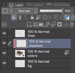
1. FIRST- have your drawing. have Layer. I usually have three layers at LEAST when im doing this- and i keep them stacked in this order: top is lineart, middle is flat colors, and bottom is the background.
the purple circle shows the icon for making a layer into a clipping layer- IMPORTANT
the pink circle shows the icon for locking transparent pixels- helpful! it makes sure you don’t “go outside the lines”

(in case you’re curious this is my csp layout)
2. create a new layer above your flat colors, and press the two little squares. this makes a clipping layer! it basically makes a mask of the layer below it, and you can draw whatever (in this case shadows) and it only follows the filled in areas of the layer below it. so if i drew a bunch of yellow stripes on the clipping/shadow layer, it would only follow the form of the werewolf flat colors and not anything else. i hope that makes sense!
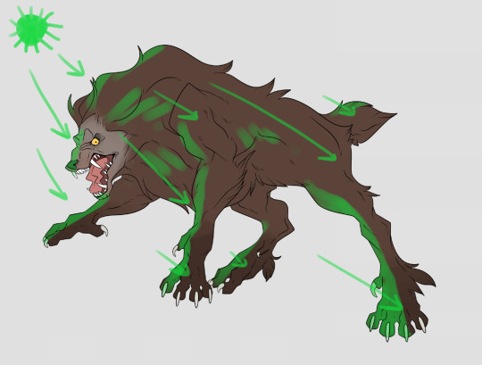
3. decide where your light source is coming from! ngl i totally draw a little sun to remind myself where the light is coming from in a piece.... in this case the green shows where i think the light would be hitting the werewolf, and therefore i would draw shadows opposite/adjacent to that. im not the best at explaining lighting though, so heres a good reference.
heres another.

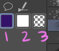
4. SHADING TIME..... so for my shading i just use the default pen tool in clip studio. g-pen, i believe. Stabilisation!!! between the two pink stars!!! use it. its so good for lineart, and for drawing smooth, non trash lines and shapes. it has Saved my life. the higher the number, the ‘slower’ your brush moves, and the smoother your lines become. i tend to keep mine around 60-70 but play around with it....
i usually shade with a bright annoying color so i can tell what im doing. (purple usually), as shown in box one. thats your foreground color. 2 is your secondary (background) color, i dont usually mess with it and leave it white. hitting box three turns your current pen into an eraser version of itself... i use it a lot! dont forget about this box

i usually tend to think of shadows as shapes.... in the werewolf’s eyebrow/spot/thing you can see where ive drawn a line.....
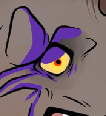
and then filled it in! i dont normally use the paint bucket to fill in areas... just the pen. it gets too hard
hair/tufts are the fun part!!! you can see that ive drawn solid chunks of shadow in the werewolf’s mane....

...then i click square three to turn my brush into an eraser and carve out little details


here are some more examples of that... i use it a lot. A LOT.
go wild. go crazy. sometimes i dont think my shading follows like TRADITIONAL physical rules of the laws of light but just. dewit

5. SO YOURE DONE SHADING..... if you refer back to your Layers window, you’ll see a drop down box that usually says normal and a slider.... knock that slider down to like. 50, or 30 (what i usually do). this lowers the opacity on the shadows layer so you can see through it kinda. the drop down box is the layer styles... play around with it!! you can do some really cool stuff with overlay/multiply/etc and make your shading layer super funky.....
if you hit the lock transparent pixels button, you can color your shadows differently if you want! sometimes ill duplicate the shadow layer and color it differently and run it through the gaussian blur filter... it can make it look a little softer and less hard.
usually in my art, when im done i merge all the layers together so you just have one layer left. i duplicate that layer, run it through the gaussian blur filter and drop the opacity down to like.... 20 maybe so everything looks soft. on this picture, i duplicated the werewolf layer (without the bg) and did a motion blur on it to make it look like he was moving....

.... and here he is after dropping the shadow opacity/adding other little details and running it through 5000 filters
i really hope that gave you some kind of idea on how cel shading works!! i am by no means the master, but if you have questions or tips please don’t hesitate to ask me ;a; im really not good at explaining things lol
thank you for reading!!! <3
30 notes
·
View notes
Photo

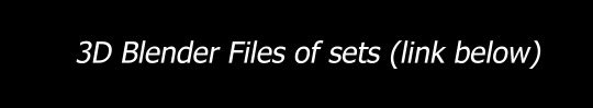

Download 3D Files and more textures here
Blender (a free 3D program) can be downloaded here
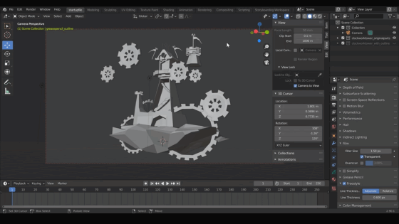
HOW TO USE THE BLENDER FILE:
Overall Purpose
These Blender files are pretty basic, so they are mostly shapes used to export to JPEG images and trace over. Smaller details are best added in the drawing process.
Feel free to use any of these files and textures!
Below is a guide on how to use them ⬇⬇⬇
The blender file by default has the outline ready in the model for rendering. This is called "Freestyle" and it can be found in the RENDER PROPERTIES tab. This, however, is only visible after the file has been rendered. Meaning that you won't see the outline in the viewport while you are working with it. So, I made a collection to make it easier to view the lines.

I used grease pencil to do so and made it a separate collection (aka a layer).
The purpose of this is to help see smaller details and lineart within the viewport, but they also have artifacts that might be annoying to the eye, so I turned it off by default using the icon next to the layer that looks like an eye.
There are two "collections" total. One is for the original, and other is for the grease pencil.
Changing the Angle
While you can freely look around the 3D file using scroll and pressing the scroll to change the angle, to have it rendered at a certain angle you must be in the CAMERA.
To go to the camera, press 0. It will automatically take you to the camera and you can view the image through the camera's lens. There will be a TAB on the side called VIEW LOCK. Check the box called “Camera to View.”
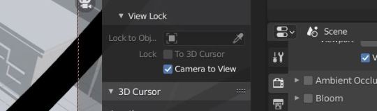
Use the scroll on your mouse to view the 3D model up close. Press down on the scroll of your mouse to change the camera's view of your model to different angles.
If you want to lock onto an object, press the period key on the numpad. It will help you focus on the object without moving the camera too far away from it.
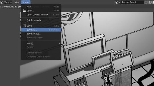
Exporting

To export to a JPEG, go to the RENDER tab at the top of the screen.
Press “Render Image.”
A new screen will pop up and it will begin rendering.
The lines will show up last, so if you don't see the lineart right away, just wait a few moments.
When it's finished rendering, go to the IMAGE tab-->Save As....-->Select a place where you want the image to be saved.
If it doesn't look exactly like you want, or the shadows get in the way, then what I do (instead of playing with the file since it's a little time consuming) is going to an image editor, bump up the light values, and the lineart should be unaffected.
Using Levels and Contrast in my art program, I was able to get rid of the shadows. Now it’s ready for details!

81 notes
·
View notes
Text
New mspaint tutorial

You wanna make art like this? Course ya do here’s how ya make some fuckin pixels in mspaint look good

Step one; Dont use the brushes - The default brush icon is ‘fuzzy’, and when you magnify the brush strokes you can see that it has pixels of grays and blacks around the edges. This means that the fill tool will leave gaps in the lines you make. Gross!
Instead use the pencil icon.

Why the pencil is superior - It’s a pixel brush! It doesn’t have wierd fuzz attached, you can get super detailed and precise, & its just so much better in every form.
As a bonus note; keep zoom at 100% or higher (200, 300, ect ) when you are doing lineart - The further the zoom out ( 50% 25% ) the more fucked your lines are going to be. This is good for sketching on a large canvas, but not good for making clean lines.

ACTUALLY DRAWING THE ART. Sketch in a colour that is not your lineart colour. This is important; as the way clean-up is done means that if the lineart and sketch are the same colour, they will both be erased. For this i would reccomend red or the light gray to sketch in, and lineart in black. This makes it easier to see what is where.
Once you have your sketch in red, blue, gray or whatever; line that sucker - I use the size 4 pixel brush because i like chunky lines; any size works for this.
When you are done with your lines; grab the fill tool - You’ll want to select the same colour as the sketch. This is so you can flood-fill the canvas and remove the sketch - Alternate between two colours to clean up.

Once the sketch colour is gone; you can colour! Be mindful of gaps - It’s pretty straightforward from there me thinks. Bonus! You can use the eraser tool to replace colours or erase certain colours. By holding right click with the eraser tool; Colour one will be replaced with colour two. In the example i made black into a grayed out purple. The eraser will only replace colour one, so you can go out the lines and be okay! It will not colour over anything else while holding right click down.
Actual colour-picking and shading is a whole different thing and i dont want to get into it just yet - if you find this helpful feel free to share it around or repost it i dont care. If you have questions you can always leave a reblog or reply; or message me directly o—O hope it helps the 3 people who sees it lmao
12 notes
·
View notes
Note
you’re a big inspiration to me! I idolize both your line art and shape language in your characters. If it’s not too much to ask, what’s your process for constructing/drawing a character? shapes n stuff? your style is very simple yet conveys forms with fluidity!
thank u so much omg !!!! ;u;
uhhh my process is kind a like... like using Fast Pen Strokes and Shape as a main thing kinda? like one sec lemme show u a step by step drawing of tommy n that basically encapsulates how draw stuff.
step 1: shapes!!! u kno em u see em!
ok get a shape in ur mind and sketch it out REAL fast its ok if its messy as long as its the shape u want it to be ur GOOD i draw tommy w long head long face syndrome so i sketched out ths bean shape. one of the things i learned from taking Drawing Naked People Class is that getting the basic sketch OUT super fast, disregarding messiness and mistakes, is th best way 2 keep ur art lookin dynamic n shit. its all about the movement babey!!!! im still struggling w that tho but m getting there! drawing tommy def helps tho hes like a tall noodle boy. but yeah like stay loose w ur drawing in those first steps bc u can get some realy nice fluidity there.
step 2: details n other shit
ok yeah self explanatory add details remember being messy being fast is a-ok bc being fast means ur getting all those good less controlled shapes that make drawing FUN remember: loosey goosey arms babey!!! u dont gotta be super restricted to these details if u dont want to be, this is like a Vague Concept of where u want to put the things. sometimes i’ll start this EXACT process again on different parts of the drawing just to get it right. its all trial n error n stuf.
step 3: LINEART or at least a version of lineart i like 2 do like sketch lineart idk

so w this instead of drawing onto another layer i actually erased all the messy lines to create like, a nice messy lineart kinda look where its solid enough that its lineart but because it wasnt drawn on another layer, tracing over ur super fast shape concept, the drawing stil retains the shape it had in the sketch process and retains its fluidity. if u do this and the lines art still too light for ur liking just copy the layer and put the opacity at any percent u like so then u end up w the same lines but darker ig. an example of cleaner lineart would look kinda like this

which, YES the lines are cleaner and thicker which is good for certain times of drawings but i find it looks a lot more flat and its not exactly my preferred go to kinda thing (altho it is sometimes easier!) i dont typically LIKE doing actual lineart w a separate later bc it RLLY stiffens up my style, BUT i like to do it for like comics or Specific Illustrations or, in one case, th animatic, bc its just a lot cleaner of a Look. w both versions i basically fixed a couple things wrong with the basic sketch, added more detail, slapped on some color for aesthetic purposes and added everyones favorite iconic tommy quote from hlvrai act 5 icarly edition: )
ANYWAY YEA thats like essentially it! im gonna do another art stream this saturday (and since im not working on animatic it’l actually be fun to watch and epic!!! requests n stuff maybe!!) nd u can seehow i make cartoons REAL!!! anyway ya thank u hope this isnt completely nonsensical n make sense n stuff!!!!
167 notes
·
View notes
Text
thank you teresa and soph for tagging me for 2020 Creator Wrap: Favorite Works
Rules: it’s time to love yourselves! Choose your 5 (or so) favorite works you created in the past year (fics, art, edits, etc.) and link them below to reflect on the amazing things you brought to the world in 2020. Tag as many writers/artists/etc. as you want (fan or original) so we can spread love and link each other to awesome works!
no particular order lol. wait also i didn’t quite follow “favorite” i suppose, i like, judged by Significance. but in a way that was still plenty subjective, so
tayston kiss on the Mouth - self-explanatory like of course it was crucial to draw a Tayston Kiss and i finally got around to it. also when i opened it now it was like “oh nice that’s cuter than i was remembering it even” lol. rly enjoy taylor here too like them in a tee and i like that they’re leaning back a bit but w/drawing their forearms/hands where i did it feels like they’re pulling winston in and i’m just overall like “nice that turned out well” @ drawing them here. i also personally enjoy the Blush Patch drawn in one linear stroke between them. it’s fun to try to have that essential detail be both Soft enough but also have some geometry to it b/c i’m always On That
riawin kiss on the Mouth - same thing all over again lol of course i had to draw it. and it started with several different failed attempts which was annoying but then i got this one in one night and it works well enough. also has a fun clothing detail in rian w/a hoodie (of winston’s) and once again i draw the hand-on-jaw l’intimacy and i think it Works Well again b/c why wouldn’t it, classic. also i’d been intending to draw the Lines detailing rian’s hair curls rather than silhouette and that was pretty fun to just jump into. oh i did the same thing with the Blush also, s/o to that. and the fact that there Is that height diff as depicted here....hopefully artistically successful in having you Think About It
tayston embrayston Cuddling - i think the first proper Fanart Of Fic? so that’s crucial. helping put the essential tayston ideas into the world and hopefully helping put People into Reading Said Fic, i’m glad this turned out to have enough of a relaxed vibe to do the concept’s written execution some justice....this was also just a success of “the colors i put down originally managed to be really Incongruous palette-wise” and i had to wrangle that situation with some added Layers lol but now they’re soft and nice i think, a much more Congruous pink-purple and i’m now remembering i struggled a lot picking a Solid Bg Color even though now a pale yellow seems like an obvious choice, s/o to the little border highlight around them i like that too....things turned out solidly here....enjoying the Geometry going on re: winston’s sleeve lol
agtikbi reprise - again i think it was Important to have done something for this absolutely iconic bit of media, thank you so much obcr for including this track. did a bunch of coloring for it (ft. many purple overlays as usual lol but that was always the plan) and the lineart i knocked out pretty fast w/o worrying about editing it super hard but it turned out solidly which is always a gift. really this was one of those “yeah it takes a while but i make pretty consistent progress and just knock it out in a couple of days” works ft. a decent amount of detail and that’s always an Epic Win and again i love agtikbi reprise so much so it was Very Good to have officially done something for it. also i’d been meaning to draw jeremy again for eons so that accomplished that goal too
monthlong riawinning - the opposite experience but also I Guess its own kind of win, where drawing is not quite as cooperative and one thing takes me A Month where it’s v much not consistent progress and i Do edit a lot which has pros (looks kinda fancy i guess) and cons (sweating details unnecessarily / overthinking or second guessing stuff / forest for trees or whatever / it takes ages and was it worth it....) like when i started with the Lineart Layer i was like “uh oh i’ve Cleaned This Up a lot but there’s already stuff i like too much to Restart this even though i’m not even close to halfway done yet” and yeah it took me ages to finish with lineart that’s been entirely Cleaned Up but then hey, you get this one thing with Completely Exhaustively Edited Lineart....i’m very Particular about like these self-imposed geometry rules re: lineart / shapes according to my own ~aesthetic sensibilities~ and stuff so like, it’s not even just a matter of Are The Lines Fairly Uniform Width / erasing stray marks / making sure the lines are all Closed and stuff, and even w/ the finished product it’s like “oh i could’ve connected some lines in rian’s hair for more Flow or moved this thing over by a few pixels or w/e,” isn’t that always the way though....it’s fun to have 1 Thing from this year v polished though. and i like the riawin contribution of “what if winston went down on rian and then there was this Snapshot Of Affection afterwards ft. an embrace and a kiss and the love language of tenderly feeling him up in the process” i was like “is this all Obvious or am i being too coy” and i was being too coy but here come opportunities like this one right here to make the meaning clearer i hope. that’s part of this pic’s Importance as well lmfao. the content of it and all
(everyone is tagged i think lol)
#now the cheating zone of Honorable Menchies#Winston Looking Sadly At His Phone. implied benston! colors! lighting 4 once! composition notebook! his Expression is good i think!#winston the autistic quant bicon moodboard! further Self Explanatory Importance. s/o to having a usable Winston Pic now/like other pix used#Dollar Bill Harassing Winston Video: what could be more transformative than getting some fun out if that. handful of well timed moments lol#Are You Bi(lingual). jokes. prescience (cassandra). bisexuality. my 1st formal attempt drawing rian & turned out well. love Tiny Winston#Riawin(ston Billions Gets Pegged): obviously! a lot of care put into it obviously! i am V happy w/a lot of the details around winston's Head#and then of course for similar reasons Tay(win)ston Billions Gets Pegged. the colors there are Chefs Kiss & again love how tay turned out
4 notes
·
View notes
Photo
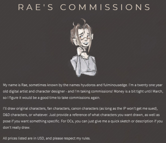

hi, my name is rae, and i’m back with a revamped commissions post!
further examples of my style + what i’m offering, paypal link, and more can be found in this link
text version of all pages of my carrd link are under the read more
-------------------------------------------
(first page - introduction)
RAE'S COMMISSIONS
My name is Rae, sometimes known by the names hyudoros and fulminousedge. I'm a twenty one year old digital artist and character designer - and I'm taking commissions! Money is a bit tight until March, so I figure it would be a good time to take commissions again. I'll draw original characters, fan characters, canon characters (as long as the IP won't get me sued), D&D characters, or whatever. Just provide a reference of what characters you want drawn, as well as pose if you want something specific. For OCs, you can just give me a quick sketch or description if you don't really draw. All prices listed are in USD, and please respect my rules.
-------------------------------------------
(second page - rules)
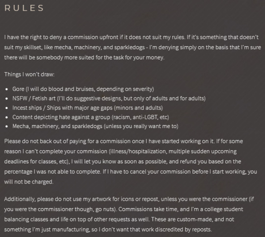
RULES
I have the right to deny a commission upfront if it does not suit my rules. If it's something that doesn't suit my skillset, like mecha, machinery, and sparkledogs - I'm denying simply on the basis that I'm sure there will be somebody more suited for the task for your money. Things I won't draw:
Gore (I will do blood and bruises, depending on severity)
NSFW / Fetish art (I'll do suggestive designs, but only of adults and for adults)
Incest ships / Ships with major age gaps (minors and adults)
Content depicting hate against a group (racism, anti-LGBT, etc)
Mecha, machinery, and sparkledogs (unless you really want me to)
Please do not back out of paying for a commission once I have started working on it. If for some reason I can't complete your commission (illness/hospitalization, multiple sudden upcoming deadlines for classes, etc), I will let you know as soon as possible, and refund you based on the percentage I was not able to complete. If I have to cancel your commission before I start working, you will not be charged. Additionally, please do not use my artwork for icons or repost, unless you were the commissioner (if you were the commissioner though, go nuts). Commissions take time, and I'm a college student balancing classes and life on top of other requests as well. These are custom-made, and not something I'm just manufacturing, so I don't want that work discredited by reposts.
-------------------------------------------
(third page - commission styles)
COMMISSION STYLES
These are the different categories of what I'm offering, sorted by price and complexity. If you don't see what you're after, but it's within my rules, let me know and we can discuss. Additionally, let me know if you need more examples. If you can't afford my prices, please let me know and we can work something out, such as icons.
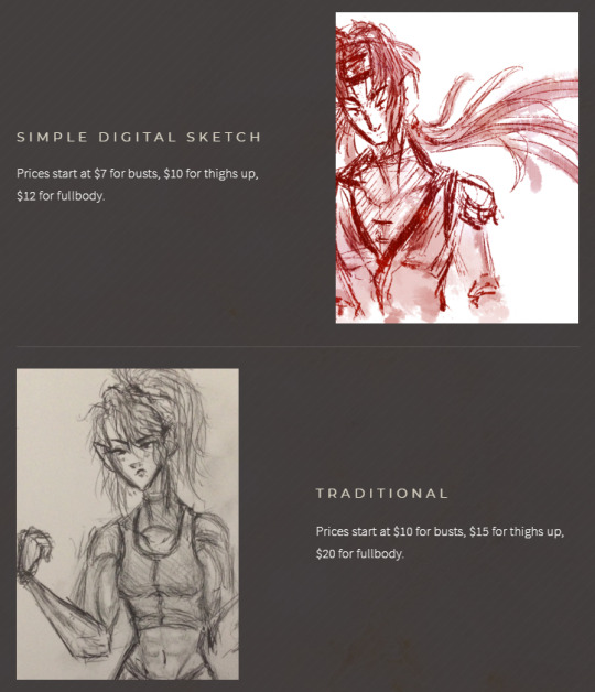
SIMPLE DIGITAL SKETCH
Prices start at $7 for busts, $10 for thighs up, $12 for fullbody. (link to examples here)
TRADITIONAL
Prices start at $10 for busts, $15 for thighs up, $20 for fullbody (link to examples here)
FLAT COLOR SKETCH
Prices start at $15 for busts, $20 for thighs up, and $25 for fullbody. (link to examples here)
SMOOTH SHADED SKETCH
Prices start at $20 for busts, $25 for thighs up, and $30 for full body. (link to examples here)
-------------------------------------------
(fourth page - simple digital sketch description)
SIMPLE DIGITAL SKETCH
These are simple, monochromatic sketches in 1-2 colors. Busts start at $7, thighs up for $10, full body for $12. Can come with simplistic shading and without, specify what you prefer. Additional characters start at $3 per.
-------------------------------------------
(fifth page - traditional description)
TRADITIONAL SKETCHES
All drawings will be on white sketchbook paper, and will come with simple crosshatching shading, unless requested otherwise. Busts start at $10, thighs up start at $15, fullbody starts at $20. Please understand that I don't have a scanner or a means of mailing drawings, so all drawings will be phone pictures. If the drawings aren't clear enough in the photo, let me know immediately, and I'll adjust them the best I can. Additional characters start at $5 per.
-------------------------------------------
(sixth page - flat color digital sketch description)
FLAT COLOR DIGITAL SKETCH
These are flat colored sketches, using my sketch layer as a lineart layer. Busts start at $15, thighs up starts at $20, and fullbody starts at $25, and go up by complexity of the design requested. Due to the fact these are sketches, and not fully lined pieces, if I draw something and you want it cleaned up more, please let me know immediately. Also, let me know if you want simple shading/highlights (2-3 colors), and what color background you want. I'm only offering flat color and gradient backgrounds for these. Additional characters start at $7 per.
-------------------------------------------
(seventh page - smooth shaded sketch description)
SMOOTH SHADED DIGITAL SKETCH
These are more complex shaded pieces using my sketch layer as a lineart layer. Busts start at $20, thighs up starts at $25, and fullbody start at $30, and go up by the complexity of the design requested. Due to the fact these are technically sketches, not fully lined pieces, if I draw something and you want it cleaned up more, please let me know immediately. These will come with smoother shading than what's available for the flat color sketches, as well as more detailed lighting effects. I'll also offer backgrounds with texture effects and so forth, but not anything more complicated than that. I can also offer doing the drawing in (mostly) MS Paint, feel free to ask if interested! Additional characters start at $10 per.
-------------------------------------------
(eighth page - past commissions)
PAST COMMISSIONS
Completed commissions will be added here once the recipient and I are satisfied by the end result. Don't repost or use unless you are the commissioner. If you are the commissioner, feel free to do whatever, as long as you don't resell or use as merch - unless discussed beforehand.
22 notes
·
View notes
Note
Hi siins :) I noticed that some of your line art is gradient and the effect is amazing… Can I ask you how you do that? I hope I explained it well but english is not my first language, have a great day :)
Hi! I hope I this is what you mean!

As you have noticed, I like to colour my lineart! Usually I do it once I’ve added flat colour and shading to the drawing as well but for this example’s purposes it’s just some quick lines I whipped up lol. Point is, once I’m ready to colour in my lines I lock the layer. I work in SAI and it looks like this there. Other programs also have this, it could be a little lock or checkerboard icon somewhere in the Layers panel.
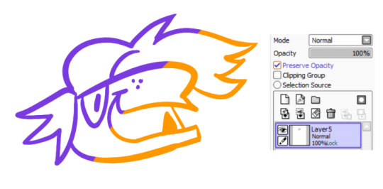
Now, you could do this on a separate layer on top and make it a clipping mask or something, but I usually make a copy of my black lines as a backup if anything goes wrong somehow and just work directly on the line layer. Now that the layer is locked you can just go over the lines with a big brush and it all stays within the confines of your lines! I very crudely blotched some purple and orange here.
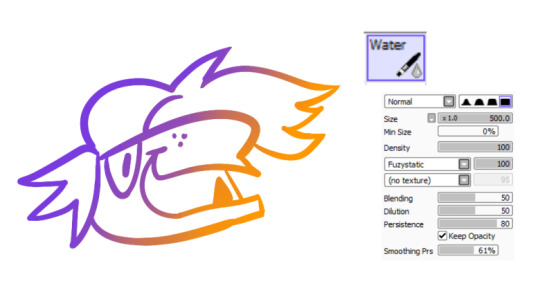
Then I grab the water tool and gently blend it together! This is what the settings on my beloved water tool looks like lol. I find you get the best results if you blend over the areas where different colours connect and avoid over-blending because then the result is either muddy or just a new solid colour. I suppose in photoshop or in other programs where there is a gradient tool you could just use that but I don’t really put a ‘’gradient’’ on my lines from colour a to colour b, I usually colour the lineart depending on the flat colour it surrounds, and then blend it slightly together so it looks a bit softer.
I hope this is somewhat helpful!
161 notes
·
View notes
Note
Would you consider darkening the lineart of your icons, in the future? I have trouble processing things that are too similar in color or not clearly broken by a different color, and especially the most recent bright yellow Guzma set strained my eyes a little!! I hope this isn't a problem or inconvenience, just a suggestion!
thanks for bringing this to my attention! i didnt consider this being a problem for people, i’m sorry for that. do you know anywhere i could read about this or get more information about this so i could make my edits more accessible? like learn how to know if something i make would cause strain? if you get what i mean?
is it all the lineart on all my icons or is it just the ones with brighter backgrounds? i dont tend to do brighter ones often becuase i dont think they look as good so darker lines would be a good fix, i just didnt know if that would make them look odd compared to all the others with white lines.
would it be better if i tagged some with somehing like “tw eyestrain” or something? or when doing request like that i could do 2 posts, one with darkened lines and one without and tagged, or put the more strain-y ones under a read more. which would be better?
sorry for all the questions i just want to know how i can help this.
if anyone else has this same issue or any suggestions then i’d love to hear them all!
#thank you for phrasing this so nicely as well#and sorry if it feels like im interroragting you with all the questions#i just want to help#.ask#Anonymous
5 notes
·
View notes
Photo
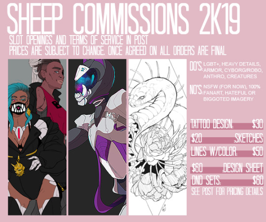

YOU HEARD RIGHT. I’M TAKING COMMISSIONS. IT’S A MIRACLE. I’ve been wary to take commissions as in the past juggling a long list and a 40~50+ hour work week wasn’t a possibility. But at this point in my employment situation when it seems even the slightest misstep is treated as an offense against god and country, I have to make it work. So read on for terms, conditions, slots, and info! It’s a bit of a read but I’m attempting to put terms in place to protect both me and you as a possible future client. Please read carefully!
So for prices: These are set rates, I have a hard limit of two characters per illustration and I’m not offering backgrounds at this time. These are all priced as fullbody illustrations. Prices will only increase when multiple additions are asked for (such as extra outfits, etc.) These prices are subject to change as my situation fluctuates (An increase will happen if I ever have to 100% rely on this as my income), but will never affect any active commission. Please send all inquires to ssmith.comms @ gmail . com
Options!:
Tattoo Design: I have designed my own tattoos and I’ve provided an example of both the arm tat I have on my body (the snake) that my own artist worked with to adjust, and the clean linework, ready for transfer, I intend to get. My designs all include blackwork or detailed linework and if color is your thing I would recommend taking it to your artist to work on or finding a different person. I am not a strong enough colorist to feel comfortable taking them. If you want rough color blocking for an artist to work with I can do that to better define shapes, but I can’t do complete tattoo-ready colors.
Sketches/Lines: Details are my thing. Want a character illustration? You got it. I do prefer to work with visual references, even if it’s just a pinterest board for character inspiration/design details. If you have a 100% creature character I would please ask for ideas on how a character moves or what real-world animals would be best to pull anatomical reference from. (A big magical cat will look different if based on a cheetah compared to a tiger)
Design Sheet: Got a character you want outfits for? You got it. This isn’t a full front/back and portrait sort of thing but “Outfit Set Designs” didn’t fit very well on my template. Each design sheet will have 2 outfit designs. lined and colored, and the paper-doll base I make for it. Want more than one? +5$ for each extra outfit.
D&D Sets: A fullbody lineart with flat colors of your D&D/TTRPG character for a character sheet, and 2 circle OR square (your choice) icons to use for your tabletop needs. Want one default and one injured? A special masquerade second icon? One happy, one sad? You got it. +3$ for each extra icon. +7
A note on what I will and won’t do: I won’t do nsfw content that includes nudity, gore, etc, but I will do slight stuff, like scantily clad fantasy armor. I won’t do commissions that’re 100% fanart, meaning I won’t just draw you Naruto. I will however draw your OC ninja holding hands with Naruto.
TERMS OF SERVICE! (For everyone’s benefit)
These commissions, unless agreed upon before hand, are meant for personal use only and may not be used for production or profit. If the commission is going to be used as an asset for a monetized production I must be notified before hand and agree to separate terms in regards to credit and possible changes to pricing.
All payment will be made through paypal. I will work up a draft and once that is sent (it will be watermarked) and agreed on I will then send an invoice. I don’t like holding onto money for projects I have not started and I want to protect any prospective clients who may be in a slot and end up waiting an unsual amount of time as my workload/life situation changes with nothing, so please do not pay in advance. Payments sent without an invoice ahead of schedule without a draft forfeit the right to approve the draft before finals are started. Clients who do not receive art within 90 days of payment date and can provide proof are eligible for a complete refund of purchase price. (Those that pay ahead of time without invoice forfeit this refund clause.)
I reserve the right to decline a commission I do not feel comfortable taking or ones I know I will do poorly on. I reserve the right to cancel a commission outright if a client decides to attempt to force blocked content into the piece that’s already been accepted.
Complaining about my prices will not make me change them. Too much? Find a different artist. Too little? Tip me.
SLOTS!
Slots are taken in a rolling set of two. I do not have a waiting list at present but if it becomes something people really want I’ll look into what’s believable for me to handle.
Slot One: @kc5rings
Slot Two: Taken!
60 notes
·
View notes
Text
Devlog #34 - Status Update, Character Design, and UI
Hello! It's time for another update on the development status of Brassica. It’s also our first actual devlog purely about Brassica!
After working on separate projects for a while, we are now in the process of getting back on track working on the same game again. Because of that we're happy to announce that the rest of Brassica's Act 2 will be released in March!
It grew a bit in size from what we originally planned but that just means more game for you~
The exact date will be announced when we can more clearly estimate how long the remaining tasks will take but we're in the process of finishing everything up so it shouldn't be too long.
As for Act 3, our current plan is to release it in April. From now on development should be a lot faster but because we mainly worked on it on the side until now, that is still only a rough estimate. We'll definitely keep you updated on any developments regarding the release dates though!
Well, and that's about it for the status update. Because it's been a while since our devlogs actually described much of our development process (and we haven't shared much about our thought processes behind Brassica), we decided to bring that back with today's devlog.
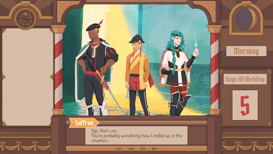
PECTIN will tell you a bit about Saffron and his design while eZombo describes the development of the UI. So without further ado, here we go:
Art - PECTIN
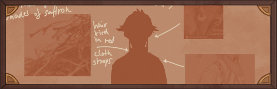
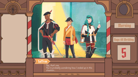
Saffron is the curious prince the player takes control of in Brassica. Before I began concepting him Felix and I defined his character. At this point we already knew he would be one of the princes Sappho tricks into going on the journey. (And would then fall in love with another prince because YaoiJam'18). We soon agreed on naming him Saffron. So I already associated the colours of the spice "saffron" with him here. We also wanted to make him a protagonist with his own personality. Thinking of the player who role-plays him we thought it would be cool to have his character split into three separate personalities he could have: - the cunning and a bit wild prince - the typical goody two-shoes type of hero - and the soft boi who's overwhelmed by the whole predicament and really needs a hug Another external influence was, my intention to try and fuse traditional things with modern sportswear. Brassica is a fairytale but it's told in a contemporary voice. That's where the idea came from. ...Okay. So I had his name, colours I could associate with him, the three archetypes and my goal to fuse sportswear with traditional clothing. Having all of these "pointers" I began looking for reference pictures. I browsed through online stores of popular sports brands to find things that would fit the character. Due to Saffron's character ranging from cute to rather untamed (in the sense that he would climb a tree without hesitation) I thought that wearing shorts would be most suitable and comfy. But for the top and the overall outfit I wanted to let myself get inspired by traditional elements. The name "Saffron" reminded me of the spice and then its use in Indian culture. I never designed a character with Indian influences before and thought researching into that would be interesting. I found a lot of stuff I could translate into the design. Even the leggings Saffron wears were intially inspired by my findings about Indian culture. Here's a visual breakdown of what inspired what (excuse my srawly handwriting >-<):

During the process of drawing out his design, as I always do, I thought about how each component of the outfit would "flow". There're lot's of lines and intersections in his outfit that guide the eyes along the his body:

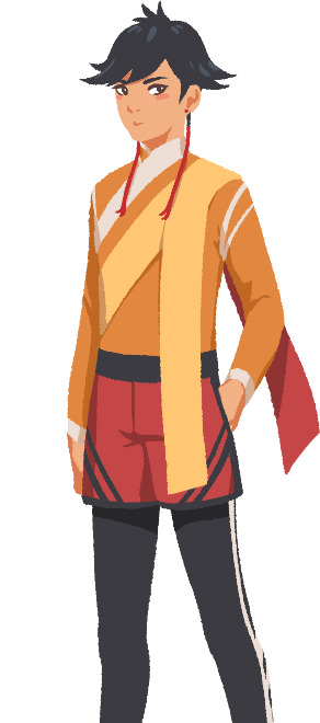
And here is our boy again as a sprite. Not much different right? Here I put one of his hands in his shorts' pocket, because I think it would suit someone who is either unsure and does that or feels liking hiding something.
That's it about Saffron! I could go on about his colours but I'll save that for when I explain the general artstyle of Brassica! :3
UI - eZombo
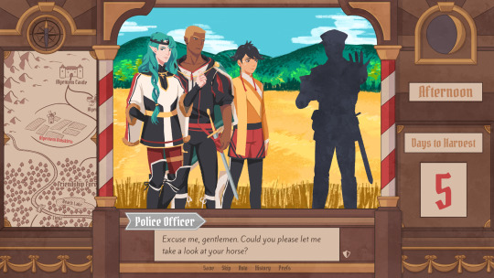
Because Brassica was planned as an entry for Yaoi Jam 2018, we thought about ways to keep the scope small. One idea we came up with was to reduce the size of the screen that shows backgrounds and characters so producing the art is a bit faster than filling a full HD 16:9 canvas. One inspiration for that was Sticky Zeitgeist by Porpentine & Rook but something like the Undertale console version where the graphics at the border of the screen change based on the in-game location was also something we considered.
When it came to actually planning the screen, Undertale's influence came through again, because the main area of the screen actually has an aspect ratio of 4:3. This obviously leaves a lot of unused screen space but one thing we knew we could definitely use to fill this was the text box. Having it separate from the main screen also made sure that it didn't overlap with the characters or backgrounds so the space that was reserved for that could be used to its full potential.
With two elements already on the screen, we still had the sides to fill with content. Just using graphics as borders definitely was an option but because Brassica's story plays out a bit like a road movie, we thought having a map of the game world would definitely add to the feeling of that. And to make the UI visually more balanced again, the last bit of free space was then filled with some information on the time of day and how many days were left for the quest of the princes which basically added all the important context for what is going on in the center of the screen.
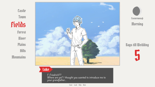
A first mock-up of the UI featuring a familiar face and St. Bernard...
Around that time, we also developed the idea of presenting the whole game screen like a paper or puppet theater. This seemed like a good way to bring all these different elements together while still supporting the colorful fantasy-ish look of the game art.
I did a quick sketch of how this could look, which turned the mock-up into this:
Aside from adding some more purely graphical elements, I adjusted the text box and the flag that showed the name of the character that is currently speaking. The map was graphical now instead of just a list (which would have given away future locations) and I was overall fairly happy with the direction the UI was going in. A few of the border elements overlapped with the main screen now but I tried to make sure it only happens in areas where we wouldn't put any focus.
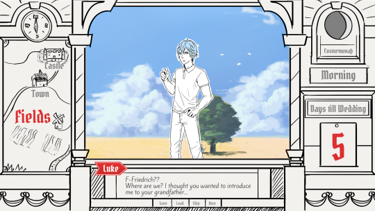
After getting some feedback from PECTIN I then went on to work on the final lineart while also trying to simplify all the shapes. By then, the characters were also being concepted so instead of Luke I could put Ode into the mock-up (along with a reference for a possible background style).

As you can see, some unnecessary lines, elements, and text were removed to simplify the look of the UI and make sure that the important elements aren't overshadowed by anything else. Overall I tried to keep the lines clean without making them look overly sterile, so any round shapes are generally drawn freehand instead of using any vector shapes. Except for the compass, moon, and their enclosing arcs. Those just looked sloppy when they weren't exact. Not using fixed line widths was another way to make the lines more organic even when they were perfectly straight. The idea to use different colored flags for each character also came into play now, although Ode's color here is actually used by Hans now…
Colors were next on the agenda. First a basic pass, followed by some adjustments and line colors to make the lines fade more into the background. Having the concepts for the three princes was very helpful for this step because it was important that the UI colors fit into the overall color scheme while keeping the focus on the actual game art. That's why red is only used close to the center and for important UI elements (the current location on the map is also marked in red). The rest of the colors are rather muted and monochrome on purpose with only a little bit of gold to break it up.
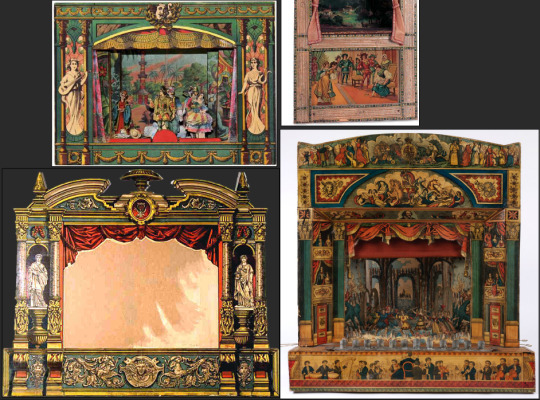
Throughout the whole process my main references were old paper theaters but especially during the coloring process I deviated from these references in favor of using colors that would match with most backgrounds.
Once we were happy with the colors, I did a relatively quick shading pass, just adding shadows with a fairly abstract light source to keep most shadows parallel to the lines. I also added some subtle noise to make everything look a bit more organic.
For the most part it still looked too clean though, so PECTIN suggested overlaying the UI with some watercolor textures.

Which lead to this final mock-up and not only solved the problem but also gave the UI a more painterly look that didn't interfere as much with the general artstyle.
Well, but as always, there are still a few things that changed on the way into the engine.
The map was obviously added (which could probably fill a devlog by itself), the text on the side was changed to better reflect the current quest of the princes (although the other sign may or may not return in future acts...), I added a CTC icon and updated the quick menu (although I can't remember why "Load" was removed so maybe that will return again), but most importantly: The text box was reduced from three to two lines of text. This wasn't as much an active decision as it was caused by the fact that small line spacing in Ren'Py cuts of parts of some letters until all lines of text are displayed. There are some games that still do this but personally I don't really like how it looks while the text appears. Increasing the textbox would have caused a lot of work because I would have had to shift around more elements of the UI to keep a balanced layout so it was simply easier to remove a line of text and increase the line spacing.
This had a pretty strong effect on the writing because sentences have to be fairly short now or if that doesn't work, broken up into multiple lines. Even if it wasn't exactly planned, it still influenced the writing style of Brassica and further distinguished it from our other games (although there's more to say on that one) and in hindsight, only two lines of text also look a lot cleaner in this layout.
I could go on about the actual implementation of the UI but this has already been a pretty lengthy post so maybe I'll save it for another devlog.
But that's it for now! We'll be back in two weeks with some more development insights and our current status. We also plan to start posting these devlogs regularly again, so stay tuned for that! As always, thank you so much for reading and we hope you could find a few things of interest in this devlog.
#brassica#fairytale#devlog#gamedev#game#development#otome game#romance#tutorial#visual novel#indiedev#indie#okay
8 notes
·
View notes
Text
Jailbreak
In roughly 2006, Andrew Hussie started an adventure game styled comic, using inputs from the Gangbunch Fora (later renamed to MSPA Forums) and featuring a couple of prisoners trying to break out of jail.
It was not very good.
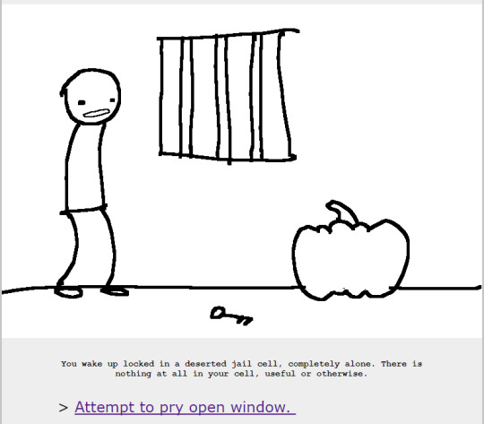
As someone who’s read the entire Andrew Hussie bibliography, reading Jailbreak is like tracking down the first LP your favorite band ever released, settling in to listen to it, and realizing it’s just the lead singing about poopy dicks. Sure, it’s amusing but something’s missing. All the demos and EPs released prior to this were fantastic if unpolished, and all the recent stuff is just amazing. You’re having a good time regardless, but you’re still listening to a dude in his mom’s basement whispering about shat upon penises into the microphone.
(Notes on chronology: I’m having trouble finding the original Andrew Hussie website with all the old comics and shit. I’m not even sure if I could find proper dates for everything, and there’s only so much research I’m willing to do. When referring to stuff prior to MSPA, I’m talking about things like Whistles, And It Don’t Stop and Neon Ice Cream Headache, even though some of these things might have been concurrent or even newer than Jailbreak. It’s a bit of a mess, honestly)
Anyway, despite how underwhelming the actual adventure is, it’s still familiar.
A lot of the running gags you’re already familiar with started with Jailbreak.

Despite how crude the artwork and story is, it still displays a lot of Hussieisms.

There’s a focus on interesting lineart (which would later disappear from Homestuck as hussie started using more color blocking) and there’s rarely any actually straight lines.
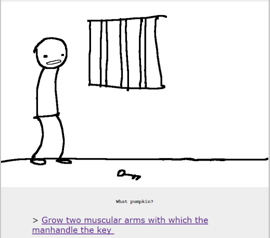
Here’s a fun bit.
Without knowing any better, I have to assume betelgeuse was a forum user who did particularly dumb inputs. Which would have been of much greater importance in Jailbreak, because instead of picking the best option, Hussie would pick the first. This is important.
One of the particular problems Jailbreak has is that it’s characters are completely indistinguishable, which makes the reader rely on context clues to know who’s who. As the plot complicates, it becomes increasingly difficult to keep track of all the characters. Later on, Arrows are used to point out the character you’re controlling, but it’s easy to forget who the character you’re controlling was in the first place.
Remember my metaphor about poopy dicks?

Yeah, that wasn’t just me being crass, the comic itself has a weird scatologic better. Although, to be fair, this was 2006. The entire internet had a weird scatologic bent.

It’s still pretty funny.
It also gets a bit gory but the fact that the entire comic is black and white makes it a little better. I wonder if this has anything to do with the multicolored blood in Homestuck.
(It probably does not.)
Things like this makes me think of all the dumb arguments I had with people about the quality of Hussie’s artwork. Look at that. it’s literally a stick figure and it’s more emotive and dynamic than anything I’ve drawn in the past year.
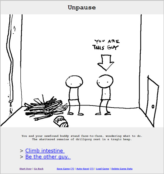
Interestingly enough, Jailbreak is also the first sighting of divergent paths. This only lasts for a short while. Being the other guy just goes on a little tangent and soon branches back into the main plotline.
There’s a weird formatting issue with Jailbreak. Each art panel is posted consecutively and then all the text is at the bottom for each update. Which means that if you have several images with things happening, you’re not going to be reading the corresponding text until you reach the bottom, which ends up with you scrolling up and down a bunch of times so you can composite the images with the text in your mind. It’s weird and I don’t know why it’s setup this way.
I want anyone who’s ever called Homestuck weird to read Jailbreak. It’s such a bizarre narrative and a lot of times it’s not even the inputs fault. You can see how Hussie’s ideas seem to go down random routes without rhyme or reason besides it being funny. And it is really funny, but in a 2006 way, It’s kind of making me nostalgic, even. While random humor still exists today, it’s delivered in a much different manner. Jailbreak has such a familiar yet bizarre delivery of jokes that harkens me back to Newgrounds and old sprite comics (The good ones, mind you), but it’s still something different. It reads as far less dated than something like Bob and George or old Penny Arcade. Not that Penny Arcade was ever good. Yeah, I said it. What are you going to do about it?
(Note for future readers, this post was written late 2017.)

I have nothing to say, this panel is just fucking gorgeous. I might even make an icon out of it.
This path eventually ends with death by suicide, and then turns into a fresh continue from the start, invoking elves and such.

Classic.
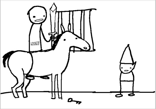
Horses and ponies also make an appearance for the first time. it’s pretty amusing to me how similar this pony looks to Maplehoof.
See. I once wrote an entire presentation (for school) about Hussie’s art style, and I find it fascinating how it’s evolved over the years while still being recognizable as Hussie. If I ever got a chance to chat with Hussie and pick his brains, I really just want to know what his influences were.
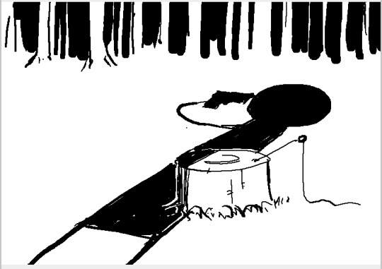
As an amusing point, the elf path leads to the same situation as the death path, reusing the same artwork, including the harpoon from the original path still stuck in the stump. However, with the harpoon not showing up in any other panel, I think it’s safe to say this means nothing and Hussie was just too lazy to edit it out.
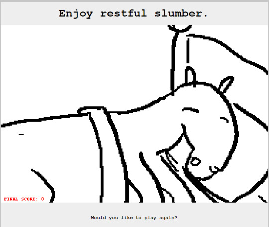
The elf path then ends with no other resolution but the pony having a resting slumber. This final page was posted in 2011, after Jailbreak being on hiatus/dropped since 2007. Good on ya, Hussie.
So, what does Jailbreak mean for the Greater Hussie Canon?

It’s alright. It’s funny but I wouldn’t call it good by any means, and I’m someone who loves Hussie’s old work. Due to the way Hussie was handling inputs at the time, there’s not much of a line of plot whatsoever. If you read Jailbreak expecting proto-Homestuck, you’re going to be disappointed. If you read Jailbreak expected a bridge between Whistles/And It Don’t Stop/Neon Ice Cream Headache and Problem Sleuth/Homestuck, you’re also gonna be disappointed. It’s very much it’s own thing and more of a product of it’s time than something like Hussie’s non-input comics (which are separate from any real world influence) and something like Homestuck (which mirroring the time it’s produced is more of the point.)
it doesn’t really fit anywhere with the rest of Hussie’s work, besides being very prototypical for the standard MSPaint Adventure.
But should you read Jailbreak?
Probably not, unless you want a quick chuckle. It’s weird and gross and gory so if you’re used to the more dramatic tone of Homestuck, it might come across as crass.
Next time we either read Bard Quest or one of the non-input comics. I haven’t decided yet.
357 notes
·
View notes
Note
You know how there's artists where you see their art and it makes you want to draw? I just want you to know that you're one of those people for me. You have such great shapes in your art, very pleasing compositions, nice color choices, and these very smooth consistent lines that I love looking at. Line art is something I struggle with, because it seems like I can never get it to look as nice and consistent as I want it to. I can only imagine the work involved. How do you get yours so nice?
Omg this makes me so happy tbh?????????? Thank you so much!!!
I said something about this a while ago but I also wanna add that, practice aside, it also has to do with your natural disposition!
I started drawing digitally when I was 13 and my linearts have mostly been very thin and very anime-inspired until I was…19 I guess? So that’s a lot of years. And while I’ve always had a decent flow in my lines, my linearts have always been kind of sloppy in the end. Due to my art generally lacking details (since it’s fairly graphic-looking) the varying line width in the same line didn’t look good.
And at some point I decided to experiment a bit, varying thickness, pressure sensibility and so on, until I decided to settle with a flat brush (the first one) and made my lineart much thicker than it used to be. I still got a long way to go, but I haven’t changed brush or way of tracing lines in years, so that’s already something! And it all comes very naturally too after so much time so that’s a bonus point in my book!
And that’s what I mean with natural disposition! For some people it’s easy to line their drawings with thin, light linearts leaving gaps all around, while others find it easier to go for cartoony, bold lines! And there’s endless possibilities so experiment!!
If you don’t like the way you do your lineart now, it doesn’t necessarily mean that it doesn’t fit your style, or that it’s not good, it just means that it could not be what you’re striving for! I am absolutely in awe when I see the thin anime linearts I mentioned earlier, but I know I don’t have fun doing them! So I settled for something different. Find your perfect lineart if you’re not comfortable with the way you do it now!
I’m publishing this because I wanna keep your sweet ask and also for future reference, but if it makes you uncomfortable let me know and I’ll take it down!
(also I love your icon!!! Smiling Madara is best Madara)
6 notes
·
View notes