#i love fun cool greens and blues with some yellow highlights color scheme!
Explore tagged Tumblr posts
Text
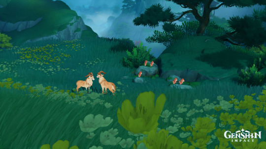
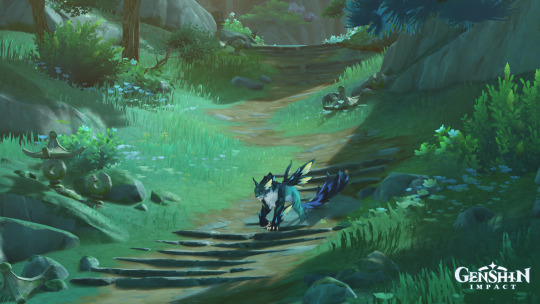
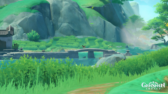

chenyu vale wildlife photography
#does a hilichurl count as wildlife? hmm#dude was just fishin i didn't wanna disturb lol#chenyu vale is soooooooooooooo swagacious its like the devs heard me getting tired of fontaine#and decided to give me a region designed specifically to my personal tastes#i love fun cool greens and blues with some yellow highlights color scheme!#i love rocky mountainous terrain and green tea! i love the fun shaped architecture! i love goats! and fish!#yay! yay! yay!#having sooooooooooooo much fun on my hiking vacation#congrats to those goats on getting married also#love the random little scenes in the wild. other favorite is the snake and fox standoff somewhere in the sumeru desert
11 notes
·
View notes
Text
My Concepts For A TMNT 2012 Themed Makeup Collection
First off: Individual small eyeshadow palettes for each character. And I mean small, like, probably just 3 or 4 shades each.
So like, one shade the same color as their masks, one the color of their eye colors, and one the shade of green their skintone is. And I don't mean "Eh purple but like any shade of purple" I mean EXACT SHADE MATCH. So that gives us these nice little trio palettes, I would have them all be All Matte No Shimmers/Glitters, because...
Companion Palatte: Out The Sewers Like Lazer Beams
This is a larger palette, probably around 15 shades, 18 at the very most. It's made of colors taken from scene backgrounds, enemies color schemes, and other characters. Like a more saturated pinky-purple than Donnie's is named "Irmabot Highlights" and a neon pink named "Kick Some Kraang" and such. Obviously some dark navy blues and such to represent the common background color.
Other Companion Palette: Lean Green Ninja Team
This one is 15-18 shades as well and is based around the non-turtle main/ally characters. "Hajime" being a brown shade taken from Splinter's coat, for example, "Hey There Red" being a shade of orange like April's hair with a yellow shimmer to it like her shirt, "GOONGALA" being a high-inpact shimmer with a gunmetal gray base and lots of white shimmer (not just to match with his color scheme but also like, He Hits People Hard Enough To Make Them See TV Static As They Go Down). Things like that. This is a slightly more neutral based palette so it also includes like, the color of their shells and wrappings and such (we could also put these into the 4 palettes based on The Boys specifically, I just wanted to keep those as small and no-repeat-shades as possible).
Turtle Power Cream Color Corrector Palette/Wheel In A Shell Shape
Dude their colors are LITERALLY perfect for color correction. Orange/peachy tones cancel out blue tones like undereye darkness/dark spots left by bad breakouts, purple/lavender tones help brighten, green cancels out redness in the skin like angry breakouts or rosacea, blue is less of a color corrector though and more of a Shade Adjuster however including it means you could still mix it with a foundation that's too Warm to cool down the shade, just might work best with a cream foundation father than a liquid since you need to mix it in directly, not just apply product over it.
Anyway.
MAN I LOVE BEING A TURTLE! Blush
Same shade as those little amine-style blushy bits they get on their faces, and kind of that pattern? Like the little shape/style it is, in the actual pan. I just think it's be cute.
Makeup Tools Shaped Like Their Weapons
Brush with a Bo style handle and the actual bristles are gray and angled like the blade at the end. One of those things people use to block their crease from getting eyeshadow fallout shaped like Mikey's bladed part (I tried looking up the name but there were a few variations of that and I wasn't sure which was right), angled eyeliner/brow brush like Leo's blades, eyeliner pens shaped like Raph's Sai, and I'm thinking an actual hand fan that looks like April's tessan to help dry the face is you use setting spray during makeup.
I've been trying to come up with fun lipsticks but I can't think of anything rn I'll update later though if I come up with anything.
21 notes
·
View notes
Text
The Critique of Manners Part VI
~Or~
An Attempt at an Objective Review of Emma (2009)... VOLUME TWO
Haha, bitches you didn't think I could wait a whole week did you? Nah, not me. and guys, I added to it--all total, it's 9,023 words now. this half of the review is 5,214. HOW DO I HAVE SO MANY WORDS FOR THIS THING? I'm not gonna split it into a third part, because I don't need to for picture limit purposes, but buckle in.
If you didn't catch it, read part 1 here
Here it is, the stunning conclusion to my Emma Adaptation Review series (but this isn't really the end because I plan on doing some rankings later). In this half of my review of BBC'S Emma (2009) we'll discuss Costumes and all the very specific things that I love about this version, and some things I don't like, and some things I'm here to defend.
Let's dive in!
Costumes
Generally I liked these costumes pretty well. They were designed and facilitated by Rosalind Ebbutt, also known for her work on PBS’s Victoria and Vanity Fair (1998). And her work is, as her filmography would suggest, by turns, great and so-so.
These costumes are definitely in line with the adaptation’s general aesthetic: warm pinks and golds, with mints emeralds and blues to cool it off a little, are the order of the day. I really appreciate that every character has a definite color palette. The tradeoff is that this adaptation is the WORST EVER offender for the Jane Fairfax Blue™ trope.
Daywear
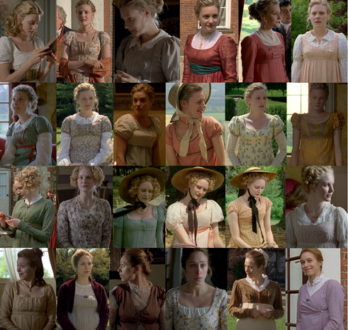
Emma’s daywear is full of warm and muted colors. Salmon and magenta are commonly seen. I love that most of Emma’s daywear consists of sleeveless or short-sleeved gowns with wide-sleeved linen blouses underneath. It’s not a commonly seen aesthetic so it feels light and fresh. My favorite of Emma’s daywear dresses is the pale yellow with purple floral print.
There’s one other in particular that I love.
Emma’s blue, sleeveless dress. I love this because of HOW OBVIOUSLY it’s a reference to this portrait of Charlotte, Princess of Wales. I mean...
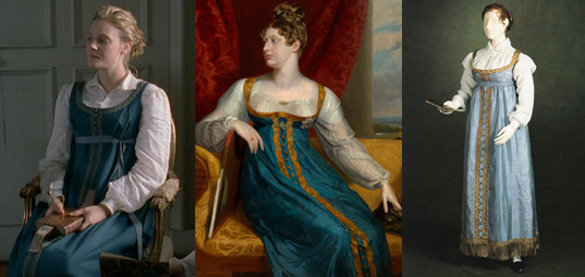
I’M NOT IMAGINING THIS, RIGHT? WHY DOES NO ONE TALK ABOUT THIS? This is a REAL dress. They still have this exact gown of Princess Charlotte’s. It’s on display. It’s faded, but it’s the same dress.
Harriet has a fresh and innocent green, white and purple color scheme with healthy doses of peach and pink showing. I particularly like her white and purple floral print dress.
Mrs. Weston’s color palette varies, but leans heavily on tans and purples, which is very flattering, I must say, to Johdi May’s coloring and is really refreshing for Mrs. Weston who seems to get stuck in pinks and yellows a lot. No idea what’s going on with the laced-front dress though? This doesn’t quite read as authentic to me, but I do like that her first dress seems to be an apron-front.
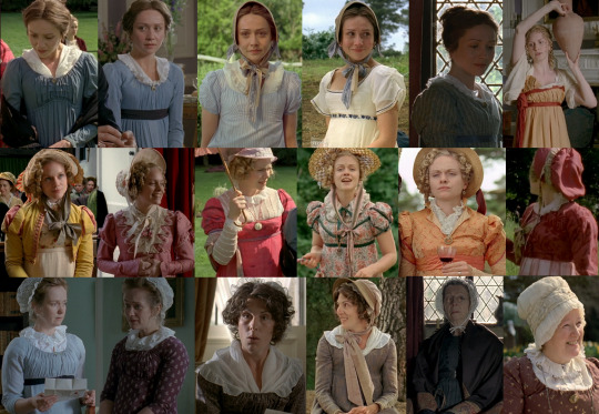
I know I already said that this is the worst Jane Fairfax Blue™ offender, but guys I can’t stress it enough. WE ARE 5/5 ON DAYWEAR HERE. LOOK AT THAT. (Also of note, Jane 5 is one of Gwyneth Paltrow’s dresses from the '96 Emma.)
Mrs. Elton seems, at all times, to be wearing some form of pink, but I think I’m right in saying that the white day dress with the rose patterned bodice under the yellow and pink spencer is one of Jane’s dresses from P&P ’80. Can anyone confirm that? They did sneak in some Mrs. Elton Orange™ though, for Box Hill, and it’s worth noting that Mrs. Elton is the only lady who’s appropriately dressed on that occasion.
Isabella gets some understated day gowns that are very nice and also VERY “Jane Austen” in the sense that I feel like Jane Austen herself might have worn them.
Miss Bates, unfortunately is slapped with brown at just about every turn, but at least her “Nice” day outfit has some subtle leaf patterns, which is refreshing. Also Mrs. Goddard has a slappin’ cap. Love that.
Also, Harriet’s Grecian costume for the painting (upper right hand corner). What can I say, but that I love it. I love that it hints at the neoclassical influences on Regency fashion too. This is my favorite interpretation of the painting too.
Evening Wear

You know what I love about this version? It’s the first version of Emma where her gown for the Crown in Ball isn’t WHITE. I know, I know white was fashionable, but it’s just… it’s nice for not EVERY gown in a ball scene to be plain white friggin muslin and also, it’s not one she’s ever worn before, which is great.
Harriet does have only white evening gowns but that’s okay. My only complaint is that, specifically on her Crown Inn dress and in a lot of her costumes in general, the waistline seems just a little low. Hmm. I really like the pale blue pattern on her first evening dress though.
Mrs. Weston though. Woo. Look at those. She has a dark chartreuse gown with black lace trim that any other version would have put on Mrs. Elton, so you know from the dark tones that she’s a bitch. Not so with Emma '09, and that’s good. And her teal dinner number is a favorite of mine. I never paid much attention to her green and gold ball gown but it has some really beautiful, subtle leaf or maybe peacock feather patterns on it and I love that. My only problem is that there seem to be some fit issues. She’s got muffin top way too often. Her orange evening dress is a bit of a dud though, firstly, because it has long sleeves (which is an evening gown no-no) and the fabric slaps a bit too much of sari fabric for my tastes.
Jane, not only is put in blue with both of her evening gowns (although one is so pale it borders on white), ONE of them is another Emma ’96 repeat and not only that, it’s one of Jane Fairfax’s dresses in that film! Perhaps that’s enough to make it an homage, and I have to say, I think Laura Pyper wore it better.
Miss Bates only has one evening wear ensemble, but at least it’s cream and not brown.
Mrs. Elton’s gowns are surprisingly understated, and yet still seem to be annoyingly fussy and, what’s better? They’re not sickly green. One of them is actually a very pleasant mint.
Outerwear
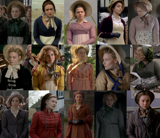
Outerwear is roundly pretty great here. Emma’s primary choice of color for spencers is emerald/evergreen and one of them is Elizabeth’s Bennet’s from the 1995 P&P (though to be honest, I think Jennifer Ehle filled it out better.) I do love Mrs. Elton’s pink and yellow number with the slashed sleeves. Jane Fairfax’s only spencer is, you guessed it, blue, but her friend Miss Campbell has a rather fun mauve one.
There’s no shortage of pelisses and redingotes either. Harriet can be seen in one borrowed from Elinor Dashwood in the '08 S&S, Mrs. Weston has a rather fabulous purple one which she wears with the most delicious looking hat I’ve ever seen.
Emma has two. The first one is a great magenta number with military braiding (and I think she wears with it one of the brown slouch hats that Kate Beckinsale wore in the same role) and while the other pelisse is brown, they had the sense not to make her wear a hat with it that was also brown. Instead, they gave her a contrasting color. Good on ya, Rosalind!
Speaking of hats, I don't often single them out for commentary, but I want to here because… the hat authenticity is… kinda spotty. Let me show you.
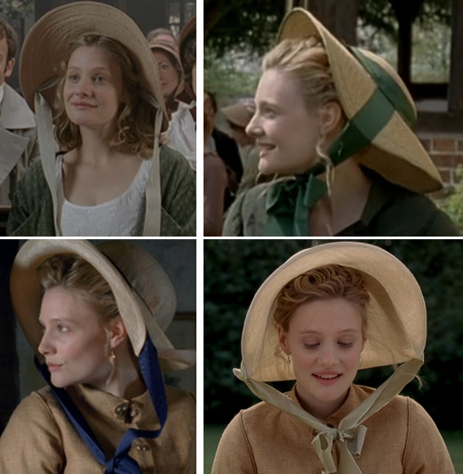
Okay first of all, Emma may be a teenager in this pic on the upper left, but she is not dressed formally enough for her sister’s wedding (which is what’s going on in this scene) but at least her hat is pretty good. You can see the ribbons are on the inside of the hat here, which is as it should be… but she never wears this hat again. At any point in the series. Instead, we next see her in the one on the upper right and ye gads this is atrocious. WHY IS HER HAT NOT PINNED ON? IT’S SLIDING DOWN THE BACK OF HER HEAD. SOMONE FIX IT. PLEASE. But wait, there’s more. This kills me because these bottom two are so similar to the one she wore earlier (the correct one) but crappier looking. Jeez.
This is not a hat. It’s a peanut. You know who doesn’t have this problem? Harriet. She only has one sun hat but at least it’s correct.
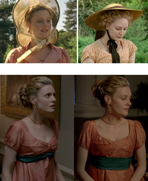
I also wanna touch briefly on this ^ costume continuity issue.
WTF is this? She’s in the hall, her ribbon is contoured to the line of her dress; she goes into the drawing room and… it isn’t anymore? Wha happun?
I took more menswear screencaps for this version than any other version. And that’s because the men just have more outfits that are, y’know, different from each other.
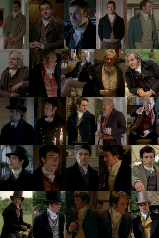
Mr. Knightley is as understated as ever, but I wanna highlight the first pic there and why I love it. This is Knightley’s first appearance in the series and it’s the perfect establishing shot that shows the viewer everything they need to know about Emma and Knightley’s relationship and how it has always been. He sort of materializes, out of focus in the background, but Emma immediately knows he’s there. And to accentuate how much Knightley is part of her home and scenery, his clothes (similar shades of pale tan, white and minty green to the wall behind him) almost camouflage him and make him seem at one with the moulding.
He also has a rather lovely blue evening waistcoat that I WISH I could have gotten better shot of (although I do believe it’s also worn by Henry Crawford in the '07 Mansfield Park, so for further reading…)
Mr. Weston finally gets to wear clothes that aren’t all brown! He only has ONE brown outfit. He gets PATTERNED waistcoats, one of them a rather spiffing blue and brown striped number. And he wears TROUSERS! Because he’s a gentleman, and he’s not that old and trousers are worn by fashionable gentlemen in this period!
You know who else gets to wear trousers and at least one fun waistcoat? Mr. Woodhouse. Check out that lovely Sunday Best™ waistcoat. The red striped one. That’s delightful.
John Knightley’s evening wear intrigues me. That’s a double-breasted jacket, and you know I’m not totally sure that’s very authentic for evening-wear of this period, but it is different. Unfortunately he also has a flared top hat and that is definitely not on for this period.
One of my favorite things about this version is that they don’t dress Mr. Elton as a clergyman all the time. Yes, he may be the vicar, but he’s also allowed to dress like a fashionable, handsome young man. So I’m really happy that he gets to flex his fashion muscles here.
And speaking of fashionable young men, FINALLY frank gets to be COLORFUL and his trousers are even tight enough. Both he AND Elton are often seen wearing TWO waistcoats, as I would expect them to, and even though Frank’s a dandy, he knows that flashiness is gauche so his pops of color are bright, but not in your face. His green and red waistcoats are always worn under more muted colors, and I just love it.
The only problems are… what’s with the turned-down waistcoat collars? There’s no precedent for this, in fact I think it’s directly contradictory to the style at the time, and also it makes the cravats look a bit unruly.
A Critique of Manners
A lot has been said about the manners in this adaption. Like, the actual manners, body language and facial expressions, specifically vis-à-vis Romola Garai.
And, oh yeah, there’s a lot to pick at here, but first I’d like to talk about the facial expressions.
I'm mostly gonna be talking out of my ass here, but this is my take, so if anyone can make a better argument against my points, I am listening, because I don't really like talking out of my ass and I like to be informed. That said...
I tend to be lenient on the… exaggerated facial expressions because, something I’ve noticed reading Austen’s works through the last several months is that Austen is very descriptive when it comes to facial expressions and I just find it hard to believe that people in the Regency Era never made exaggerated expressions like this.
I’ve heard a lot about how Garai’s Emma is not dignified or lady-like. But let’s think about the context of Emma Woodhouse – she’s never been in society. She’s only had a governess to teach her, and we know Emma’s always been sort of averse to being told what she can and can’t do. Emma is the highest ranking woman in her social circle (barring Isabella’s occasional presence). Emma doesn’t have to be ladylike. At 21, she’s already her local Lady Catherine. She puts a lot of stock in her position in society but, as Mrs. Elton will be the first to hypocritically point out, she’s very poorly behaved. I'd be very curious to see what would happen if Emma went to London for the season. Probably, she'd be seen, comparatively, as a country bumpkin. Can you imagine how she might get on in a sea of accomplished young ladies? She can barely handle having ONE rival with any kind of grace.
Austen never describes bodily movements of the kind we’re looking at when we watch adaptations, so why not have Emma’s body-language be un-ladylike in the conventional sense of the time? I’m not saying this to excuse the absolutely inexcusable (Frank’s head in her lap, kneeling on the sofa backwards etc.), but while Emma’s mannerisms aren’t exactly ladylike for her time, they’re not overtly masculine either (which was one of my biggest problem with Death Comes to Pemberly for example.)
Yes, there’s an ideal for manners. But we know real people didn’t always follow those ideals. In dancing for example, many dancing guidebooks of the day were full of repeated instructions not to be too loud or rambunctious when dancing. What this tells us is that people were doing just that, and probably quite a bit, too. I think that, while taking societal strictures into account, we shouldn’t totally discount the idea that people in the Regency weren’t really that different from us, and young people especially.
Now I’ve already mentioned some of the inexcusable aspects of interaction in this adaptation and they’re so notorious at this point, I don’t think that I really need to go over them much here. Although I will say: is it ridiculous to have Frank Churchill put his head in Emma’s lap? Yes. Did it make me more viscerally uncomfortable with the situation on Box Hill than any other version? Yes.
I was like, 14 when I watched this the first time. This was an effective way to telegraph to young people like me that Emma is being extremely inappropriate here in a way that no other version really managed to, even when I watched them when I was older and understood the period more. I’m far more acquainted with Regency manners than I was then, but to be honest – if they had been accurate with the manners here, when I was 14 I would not have understood what the big deal was. Is there merit in circumventing historical accuracy in favor of reaching a less-informed but still-interested audience? Yes, I think so. There were three other versions of this, at that point, that did this scene with more or less pristine manners. Not every version has to follow the manners of the time to-the-letter to be good. That’s my feeling on the matter.
There are things that do really bother me though. Like the idea that Harriet Smith doesn’t know how to spoon soup, for instance. As I said in my review for the Miramax version, table manners are pretty basic, there’s no reason Mrs. Goddard wouldn’t have taught Harriet this. It does provide a good moment to show Emma tacitly coaching Harriet and showing the trajectory in which this relationship will go, but personally I don’t think it was necessary—there are plenty of other ways that could be done.
Also: kids at the dinner table? I know this is part of building the familial atmosphere but it really does annoy me, because apart from building the familial atmosphere (which they do very well and frequently in other ways) it really didn’t need to happen, and it doesn’t add anything.
The Heart of Highbury
So, as I’ve hinted at throughout this review, the bread and butter of this adaptation of Emma is emotion. This version goes hard and heavy on showingthe relationships – Emma’s relationships with Mrs. Weston, Mr. Knightley, her father, her sister, her brother-in-law, Miss Bates; Jane’s relationship with Frank; Frank’s relationship with his father; The John Knightleys’ home life – and it illustrates things that can be surmised from just reading the story, but really draws your attention to them in ways that other adaptations just don’t.
It does this from the very beginning with the prologue which explains in detail (not just in quick exposition between characters) how Jane and Frank were separated from their families at young ages. We know now, from psychological study, that being taken away from their primary caretakers during their formative years is one of the most psychologically traumatizing things for a child. This is deeply important context which is explained in detail by the narrator in 2-3 large pages (in my Barnes & Noble anthology) in the book.
In the featurette on the houses, they talk particularly about Hartfield and the Woodhouses being the heart of Highbury and how they particularly wanted it to feel homey because Hartfield is Emma’s house and they wanted the audience to feel why everyone is so drawn to it, and to Emma; to me that is what they did with the whole adaptation in microcosm.
I usually talk a bit about the dancing and I'm going to here as well because this is maybe the most special dance scene in any Austen for me. Of course I'm going to link to Tea with Cassiane as usual because she knows what she's talking about and I don't. But I wanna add some comments. She gives this a pretty low rating in spite of a generally favorable commentary because of two big oopsies, the circle dance formation is one, and the other is I believe, an issue with the style of dance not matching the tune in Emma's dance with Knightley. Throwing out any objective technical analysis though, this is my favorite Ball in any Austen and it all comes down to the cornerstone of this adaptation--emotion.
All of the songs and dances were original compositions and choreography made for this adaptation. So they're not period per se, but the tunes at least are representative of how Regency dance music should sound. These dances are upbeat, and lively and, damn they look like fun. Everyone is excited here and it makes me understand why dancing was such a big thing. Best of all that excitement adds to the emotional charge of the scene. "The Ship's Cook" is the most fast paced dance and I'm glad they made this the dance where Elton snubs Harriet because it really hits for me just what Harriet would be missing out on if Knightley wasn't so fucking aptly named. In all other versions you get the insult, but the dance that's taking place is usually a Baroque walker so it doesn't seem terribly like she's missing out on much. Here, this is like not getting picked for kickball-- not only is it a slight that no one wants you on their team, but you miss out on even playing the game. Harriet looks so lonely, and her feeling of being out of place rolls off of Louise Dylan so forcefully it chokes me up just thinking about it because I've been there, man. I feel this shit. *dabs eyes*. Ahem. So, yes, when Knightley engages her for the dance the excitement the viewer feels is that much more forceful and Harriet's exuberantly starting to jump in when the timing is off and Knightley gently pulling her back, it just hits me in the feels center, guys. (I wanna take a moment to give a shout out to every camp counselor who ever partnered with me for any game at summer camp.) Emma's reaction too, is gold. Her genuine relief at Knightley swooping in is one of those great reminders that Emma is Harriet's friend, and she does care about her.
Finally on the dancing front, I wanna talk about Emma's dance with Knightley and why I prefer it to the one in the 2020 version. I already talked about this a bit in the 2020 review, so I'm gonna try and keep it brief. That shouldn't be too hard, because I'm probably mostly going to repeat a lot of what I've already said about Emma and Knightley in this version as a whole.
The big thing everyone loves about the Crown Inn dance in the 2020 is the yearning, the sexual tension, the quivering touches etc. Don't get me wrong, I LOVE all of those things but... not all the time. Not in everything, and definitely not in Emma. Because Emma, to me, isn't about repressed sexuality or heated tension or seething passion. Emma and Knightley are the opposite of that, to me, really. One of my mutuals put it best, I think: "Emma and Knightley are more suited to stolen glances than hot touches."
In Part 1 I talked about how Knightley is Emma's comfort object. When Emma is out of sorts, Knightley re-centers her. It helps set up, and puts emphasis on, the crisis of the story in the last act--Emma not knowing what she has until [she thinks] she's lost it. Emma and Knightley are Friends to Lovers done as it should be. She is already so comfortable with him she doesn't even realize her own feelings. She just feels right with Knightley and that's what this dance is here to show you--a foreshadowing of matrimonial harmony.
The dance itself, of course, is always up to interpretation, because Austen never describes how it goes, just that Knightley asks Emma to dance and Knightley doesn't dance (barring charitable causes). If you prefer the sexual tension take, if that, to you is an improvement on Austen's story and gives you what you've always felt was missing, I'm glad that there is a version now that gives you what you've been looking for, but for me, I think the 09 approach hits closer their dynamic in the book.
Now do I do think the Emphasis on emotion maybe went a little too earnest in some places in this adaptation? Maybe. Just a little.
In my last review (1972) I went on a rather lengthy tirade about the scene where they turn Emma’s appeals to Harriet to exert herself and move on following Mr. Elton’s marriage into Emma guilting Harriet into thinking she’s a bad friend for being heartbroken and then throwing her into the situation most likely to rub salt in that particular wound.
In this version, while I love the emphasis they put on the stress Emma puts on her own guilt for being the reason for Harriet’s situation in the first place, I think it’s maybe a little too… much.
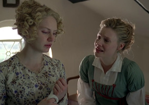
That’s the only way I can put it. I know I’ve just said that I think there should be a bit more expressiveness in period drama, but this doesn’t quite match the way I read it (Emma’s a bit less desperate in Austen’s prose. Very dedicated to helping Harriet feel better, but just a skosh more composed). I think she’s even crying in this scene.
While we’re here let’s go over to Box Hill ONE. MORE. TIME.
First of all, this is where this screenplay shines, in my opinion. This is the big turning point in the story and as such, should be a touchstone for the judgment of any adaptation. This sequence in the 2009 version is a perfect crystallization of everything I love about this version—namely that this is the version that, to me, most feels like someone read the book thoroughly, paid attention to what Austen was describing and then actually tried to convey it on screen. A lot of other versions sort of feel (to me), like the director glanced at the page and said “here’s what I want to convey in my version”. Insofar as making a piece of art goes, that’s good. Directors are artists as much as painters are and movies are their canvass, but it’s seldom that you find a director who honestly wants to hit as close to the author intent as possible and this Box Hill sequence makes me feel like that’s what Jim O’Hanlon was going for. I have the book open next to me as I write this and it’s shocking to me how minutely the atmosphere described in the book is conveyed here. Most of all, the fact that Emma’s insulting Miss Bates is not the only thing faux pas she makes here. Box Hill as a whole is a disaster, and it’s largely because of Frank.
“When they all sat down it was better; to [Emma’s] taste, a great deal better, for Frank Churchill grew talkative and gay, making her his first object. To amuse her, and to be agreeable in her eyes, seemed to be all that he cared for—and Emma, glad to be enlivened, and not sorry to be flattered, was gay and easy too, and gave him all the friendly encouragement, the admission to be gallant, which she had ever given in the first and most animating period of their acquaintance; but which now, in her own estimation, meant nothing, though in the judgment of most people looking on it must have had such an appearance as no English word but flirtation could very well describe. “Mr. Frank Churchill and Miss Woodhouse flirted excessively.” They were laying themselves open to that very phrase—and to having it sent off in a letter to Maple Grove by one lady, to Ireland by another. Not that Emma was gay and thoughtless from any real felicity; it was rather because she felt less happy than she expected. She laughed because she was disappointed…” --Emma, Chapter 43
Most other versions rush through Frank’s “excessive” flirting with Emma (Right in front of Jane) to get to “Three Things Very Dull Indeed” as fast as possible, and yes that’s the crowning horror of Box Hill, but there’s a very intricate setting here, too, and this version has the time to lay back and let it all unfold in the oppressive discomfort of an English summer day.
Even better than all of that though is Knightley confronting Emma after it all goes down. This treatment is neither plaintive, nor aggressive as it was in ‘96 and ‘97 respectively. I’ve already extolled the virtues of Johnny Flynn’s Box Hill rebuke, but for a change I’m not going to zero in on Miller’s performance which is, at least as good as Flynn’s, but on Romola Garai’s, which I find superior to Anya Taylor Joy’s. Specifically, her reaction once she’s alone.
ATJ in the 2020 version immediately breaks down sobbing and it’s hard for me to feel that she’s sobbing for “anger against herself, mortification, and deep concern” or that there’s much self-reflection going on there. To me it rather just feels like she’s crying because she got shouted at. The theatrics of it, to me, feel childish and self-centered.
I don’t feel that with Garai’s performance.
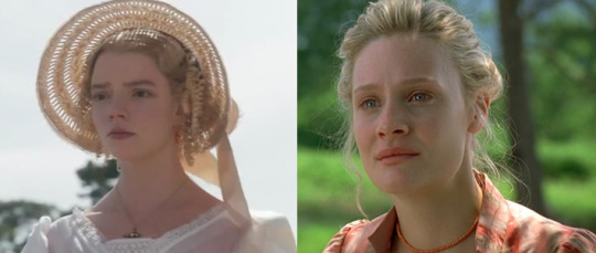
“She was vexed beyond what could have been expressed—almost beyond what she could conceal. Never had she felt so agitated, mortified, grieved, at any circumstance in her life. She was most forcibly struck . . . How could she have exposed herself to such ill opinion in anyone she valued! And how to suffer him to leave her without saying one word of gratitude, of concurrence, of common kindness!
Time did not compose her…” --Emma, Chapter 43
Of course one can make the case that Emma's reaction should be a bit childish because Emma is an immature character, but that's the thing--I can agree with you anywhere else in this story but this is Emma's maturing moment. This is her turning point as a character. It's where we should see her reactions shift from the same childish denial we're used to seeing when Knightley scolds her, because this is different. It's not the usual brushing off of big brother Knightley, this is a young woman reacting to an esteemed friend pointing out how abhorrently inappropriate she's been and her having to admit that to herself.
I didn't really want to drag comparisons to the 2020 film into this, not on this scale at least, but this just jumped out at me the last time I watched the new film and I have to express it somewhere.
What I see in Garai’s performance is desolation and mortification. That shocked tearfulness of knowing you’ve been justly reproached for wrongdoing, but being too frozen in a pretense of composure to actually cry about it until you’re quite sure that no one will see you. And especially when it’s someone you esteem rebuking you, the horror of them leaving before you can admit that they’re right. There’s so much more depth here, I think, and I can’t even quite express what it makes me feel.
The aspect of time not composing her is another thing that they decided to put stress on in this version. Emma looks fucked up in the following scenes. When she goes to see Miss Bates, she clearly either hasn’t slept or has slept very badly. I feel like this is maybe an anticlimactic conclusion to this section but I’m afraid I’m very close to reaching incoherence, so I’m just gonna leave it here.
My absolute favoritest thing about this version though—something that sets it apart from ALL other versions and even adaptations of other Austen stories—is the inclusion of the post-confession conversation.
This is something of a trope in Austen books but it very rarely finds its way into adaptations: confessions of love are out of the way, the hero and heroine settle into an easy an comfortable conversation, glowing with happiness as they explain and laugh over their actions and misinterpretations of each other’s choices. It happens in Pride and Prejudice, in Persuasion, and yes, in Emma. This is the only Austen adaptation, that I've seen, to include this kind of conversation in any kind of detail. The 1995 Pride and Prejudice alludes to the corresponding scene in it its source material, but the lines pulled from it get tossed into the confession scene itself and then it flies through to get to the obligatory wedding—a side effect of rushing through endings, a convention I’m rather tired of.
Emma (2009) takes its time with this, as with all other aspects of this adaptation. For a version that’s so full of energy, its pacing is extremely laid back and comfortable, without dragging. When you hear the gentle musical swell and Emma and Knightley have their kiss (this whole confession sequence is so sweet and wonderful in its own right), you expect that to be it. But no, we cut to them, the picture of contented happiness, sitting together on a bench overlooking Hartfield’s garden, just talking and enjoying being together, with no teasing, no pretense. If Jane Austen stories emphasize anything, it’s the importance of communication in relationships, and I think that’s maybe why she made it a point in almost every story to show her characters communicating their feelings in words, even after all the conflict has been resolved. This is my favorite scene in the whole series (In case it being my header image didn’t make that obvious.)
This is followed rather promptly by a cut to the next day, with Emma bursting in to Donwell in hysterics about how they can’t be married because she won’t leave her father alone.
This is one of those maybe over-the-top choices that a lot of people don’t like, but guys, it was so funny to me when I was fourteen and it still makes me laugh. It might seem outlandish, but to me it’s just the emphasis on personal relationships and emotion coming through again and it always makes me smile.
Final Thoughts
It’s hard for me to give a proper round up of my feelings for this section because I think I’ve poured just about all of my feelings on each aspect into its dedicated sections.
At the end of the day, the only thing that really disappoints me about this version is the number of missed opportunities there are here. One of my favorite parts of reading Austen is when I run across a line in dialogue or narrative that just… slaps. But they never make it into the adaptations. Emma is full of them and I just wish that Sandy Welch could have taken an opportunity to slip a few of them in.
In summary, I think this is a wonderful, heartfelt adaptation aimed at getting to the emotional heart of a story that often gets caught up in the Mean Girl-ness of its main character than the coming of age story that it is. It's one of my favorite period dramas because it's one of the few that really captures the spirit of the source material as it's always felt to me. There's really only two other period dramas that I esteem on the same level as this, and they're North & South (2004) and Jane Eyre (2011) and it's for the same reasons; because they impact me deeply on an emotional level--which is what art is supposed to do--because of how well it captures the essence of the story that I know and love.
So did I succeed in a more objective review of Emma 2009? I' feel like probably not. But I tried my best. It’s so hard to be objective about something that makes you as happy as this adaptation makes me.
Ribbon Rating: Most Agreeable (83 Ribbons)
Tone: 10
Casting: 9
Acting: 9
Scripting: 7
Pacing: 10
Cinematography: 7
Setting: 9
Costumes: 6
Music: 8
Book Accuracy: 8
#emma 2009#emma woodhouse#mr. knightley#jane austen#jane austen emma#romola garai#jonny lee miller#period dramas#regency
40 notes
·
View notes
Note
Hi Al! I'm a big fan of you and your art and I have to ask, how do you go about picking colour palettes for your pieces? Everything you do is so consistently cool and interesting to look at - is it just a ton of trial and error or do you have a secret method (eyesemoji jpg). Hope you're having a nice day!
Hiiii and thanks so much 😳
I think my process is pretty simple?
I base my color schemes around 3 colors: colder one, warmer one and a neutral one (your black and white and gray). For the cold and warm one I usually go with complimentary colors (ex. blue and yellow, green and red), but analogous combination (ex. pink and orange) can also be really fun!!
Important things to figure out at the beginning are:
1. Is the ambient lighting warm or cold in color -> this will tint your lit areas, neutrals, and will help you figure out the shadows (they basically go the opposite direction on the warm/cold spectrum). The light can be neutral as well, feel free to try that out as well, but I don’t use it very often since it complicates the process and looks a little soulless as the result... it’s great for concept art though!!
2. Which of the colors will carry the saturation -> to avoid complementary color scheme from clashing, I usually choose one of them as the dominant and bring another one down in saturation, usually depending on what I want people to pay attention to. Ex. if I want people to focus on the character I’m drawing, I keep the saturation high on their clothes and/or face and hair. If I’m going for more atmospheric and emotional picture, I love make the sky and greenery more saturated.
With that in mind, it should be pretty easy to find right colors for your art just by varying brightness and saturation and sometimes hue! I don’t plan the palettes separately from drawing but I develop them on composition stage, to actively support the message and emotion. I think that’s why they work so well :)
.....But I do also have a a shortcut I always use to make my art more fun to look at, and that’s a sharp contrast point, usually in a form of highlight or a small but very saturated element. They often arise from the drawing itself (like, over-saturated eye color, glint on a sword, magic spell, whatever) and if they don’t, well, not every drawing needs them. BUT if I look at my art and see something lacking in it I never hesitate to add some random stars, speckles of dust or bright red geometrical figures. Like, it’s ART they don’t have to make sense if they work visually!! That’s my golden rule for colors :)
I hope it helps!
#I wanted to include more little tips but the post would get truly endless lol#in the end it's all just my process#experiment; learn; looks for inspiration irl and in others people art and you'll find your own soon enough :)
12 notes
·
View notes
Text
GGStrive Redesign Analysis: Ramlethal Valentine
Welcome to the continuation of the redesign analysis series! This time, the returning character is Ramlethal Valentine, who was first introduced in GG XRD Sign. This will be another long post, so I hope you enjoy reading! RAMLETHAL VALENTINE ------------------------------------- There’s been many positive and shocked reactions when she was revealed. “Whoa! I didn’t think she would make it!” “Yes! She’s here! She looks cute, yet commanding at the same time.” and etc. was said(the best reaction is seeing my friend @valentinecult reaction~). I think it was a nice surprise seeing her after most of the legacy characters were revealed. Next is examining her previous look.
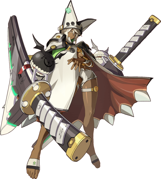
Out of all the characters introduced in Xrd Sign, Ramlethal’s design perfectly fits the mixture of cool and unorthodox in Guilty Gear. First is her black and white hat in shape of a wide V or “cat ears”. It has four black buttons in pairs of 2 on the frontal sides while there’s a mint-green, four-leaf clover on the upper right side. There’s a white buckle strap around the lower sides of the hat, and the cap has a wide, circular shape instead of a narrow one. Next is her sentient cape with the inside akin to gums and the helms with razor-sharp teeth. The high shoulder pads shares the color scheme of white with black trim and yellow buttons. While the cape it mainly white, there is lime-green within the collar and the upper part with black trim. Underneath her cape is a white leather, tube strap top with a round, golden yellow buckle in the center between her boobs. Similarly designed straps are on her upper thighs, and the wrist straps close to her elbows. On her lower body is short-shorts akin to swimwear and on her feat is just foot guards colored in white with thick, black trim with a hint of green in the middle. What I think is amazing about this design is how it perfectly conveys what she is; unique. There’s the essence of a powerful, commanding presence and intimidating(you can see it in her animations like her entrance, in Story Mode, and some of her winning poses). While there’s some sex appeal from what she’s wearing underneath her cape, the aspect of it is really about athleticism. It conveys how Ramlethal is capable of fighting hand-to-hand, even if it isn’t the main way she fights. There’s a hint of cuteness too with the four-leaf clover and focusing on Ramlethal’s facial features. Since her main colors are white, green, and black, it’s time to examine how it relates to her personality! Color Personality and Meaning of White: https://www.empower-yourself-with-color-psychology.com/personality-color-white.html You are well-balanced, sensible, discreet and wise. You tend to have a great deal of self control. You are confident, poised and self-assured when at your most positive, but can also be very choosy and fastidious when the mood strikes. You can be very critical of yourself and others (in your need for perfection) - but you try to be fair and impartial as well. The challenge for you is to be open-minded and flexible and to communicate your needs and desires. White is totally reflective, awakening openness, growth and creativity. You can't hide behind it as it amplifies everything in its way. While there are very few negative connotations to white, particularly in western culture, too much white can be cold, isolating and empty. It implies a feeling of sterility, detachment and disinterest, providing little stimulation for the senses. White may indicate the completion of a cycle in your life - you may find you have a desire for white clothing or white in your surroundings at a time when you are moving in a new direction in your life - for example, planning an overseas trip for the first time, or moving house after a long time in one place, or in seeking a new relationship or a new career direction. Many people use white as a recall of their youth and innocence. It reminds them of a time when their lives were easier and less complicated. Too much white can cause feelings of isolation and emptiness Color Personality and Meaning of Green: https://www.empower-yourself-with-color-psychology.com/personality-color-green.html You are stable and well balanced or are striving for balance - in seeking this balance, you can at times become unsettled and anxious. Having a personality color green means you are kind, generous and compassionate - good to have around during a crisis as you remain calm and take control of the situation until it is resolved. You are intelligent and love to learn - you are quick to understand new concepts. You have high moral standards and doing the right thing is important to you. You like to be accepted, appreciated and admired for the good you do in the community as well as in your family life. You are a loyal friend and a faithful partner, gentle but not passionate. Having a personality color green means you are strong-willed and do not like to be told what to do by others. The color green relates to balance and harmony. From a color psychology perspective, it is the great balancer of the heart and the emotions, creating equilibrium between the head and the heart. From a meaning of colors perspective, green is also the color of growth, the color of spring, of renewal and rebirth. It renews and restores depleted energy. It is the sanctuary away from the stresses of modern living, restoring us back to a sense of well being. This is why there is so much of this relaxing color on the earth, and why we need to keep it that way. Being a combination of yellow and blue, green encompasses the mental clarity and optimism of yellow with the emotional calm and insight of blue, inspiring hope and a generosity of spirit not available from other colors. This is a color that has a strong sense of right or wrong, inviting good judgment. It sees both sides of the equation, weighs them up, and then usually takes the moral stand in making appropriate decisions. On the negative side, it can be judgmental and over-cautious. This color relates to stability and endurance, giving us persistence and the strength to cope with adversity. Color Personality and Meaning of Black: https://www.empower-yourself-with-color-psychology.com/personality-color-black.html You are independent, strong-willed and determined and like to be in control of yourself and situations. With black as your personality color, you may be too serious for your own good - bring some colour into your life to lighten you up - life should be fun. You like to keep people at a distance, guarding your emotions and creating an impenetrable barrier between yourself and others. With a personality color black, you may be looking for protection from any negativity that surrounds you. You may be going through a stage of self-denial, not allowing pleasure and joy into your life. You hold things inside and are not good at sharing yourself with others, possibly out of fear. You are methodical in your work, making sure everything is completed as required, down to the last detail .It may be a color of comfort to you, allowing you to retreat and hide from the real world. You may be a teenager or young adult hiding behind black while searching for your own identity or your own true colors. You may be rebelling against society or your family. You may have lost sight of your direction in life and are going through a very negative phase. You may be suppressing your own desires and aspirations. The color black relates to the hidden, the secretive and the unknown, and as a result it creates an air of mystery. It keeps things bottled up inside, hidden from the world .In color psychology this color gives protection from external emotional stress. It creates a barrier between itself and the outside world, providing comfort while protecting its emotions and feelings, and hiding its vulnerabilities, insecurities and lack of self confidence. Black implies self-control and discipline, independence and a strong will, and giving an impression of authority and power. Teenagers often have a psychological need to wear black during the stage of transition from the innocence of childhood to the sophistication of adulthood. It signifies the ending of one part of their life and the beginning of another, allowing them to hide from the world while they discover their own unique identity. In beginning, Ramlethal is seemingly just a stoic person who’s structured to following the orders of her mother(Ariels a.k.a. Universal Will) and seeing herself as just a tool. But throughout the story of XRD Sign, there’s glimpses of her having emotions and her own thoughts, which is highlighted more due to interacting with Sin and Bedman. The colors of white, green, and black definitely shows this aspect along with how she developed. Even though she is a Valentine, I notice she doesn’t fully follow the convention of being based on Aria like Elphelt, Jack-O, and the original Valentine. Ramlethal is more based on Justice; one of the things is observing how Sol reacts to her in comparison. Ramlethal not only gained emotions, but understanding and accepting her own identity; giving her the needed confidence to follow her own path. This leads to her being redesigned for GG Strive!
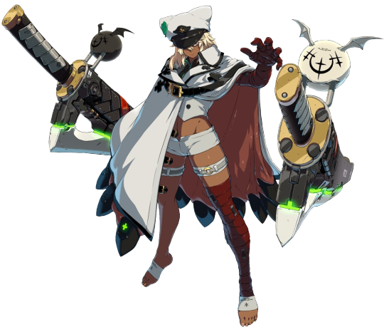
The general concept of Ramlethal’s design is kept while also being new. First is examining the aspects that are the same or similar to her previous look. Her sentient cape is mostly the same, except it seems to look a bit more polished. There’s no lime-green detail on the upper part of her cape, and the yellow buttons on its high-color is gone. Black button-like detail are within the second part of the collar and around the chest area. There’s also a large, leather buckle strap wrapped around her along with little ones that are left unfasten. And lastly, the teeth at the helms of the cape, but this time it’s covered with black, metal guards with a green cross. The straps around her upper thighs has extra detail with light gray buckle within it. Her foot guards are also the same, but there’s no black trim or green color on it. Her white short-shorts is another thing kept from her previous design. The interesting part is adding the bandages to her from when she survived the explosion(Raven healed her). In Revelator, the bandages were gray, but for Strive, they’re red. Time to look at what this color means for Ramlethal~ Meaning of Red: https://www.empower-yourself-with-color-psychology.com/color-red.html Red is energizing. It excites the emotions and motivates us to take action. It signifies a pioneering spirit and leadership qualities, promoting ambition and determination. It is also strong-willed and can give confidence to those who are shy or lacking in will power. Being the color of physical movement, the color red awakens our physical life force. Next is looking at what’s different starting with her hat. The shape and style is obviously of a military general, which makes sense due to it’s stated Ramlethal is a brigadier now. Let’s take a closer look!
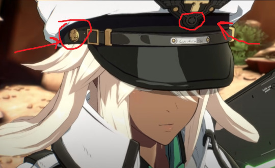
On lower sides of her hat and center, there’s the detail of four-leaf clovers, which I circled. There’s also something written on the silver plating part in the front, but unfortunately it’s hard to tell at the moment. And now for the rest of the hat.

Other Guilty Gear fans have already mentioned this, but the frontal part of Ramlethal’s hat the golden cross; the same one seen from Illyrian government such as the army, the 3 Kings(like Leo Whitefang), etc. The aspect of the four-leaf clover on her hat is kept, but the shade of green is different. It’s a vibrant shade of emerald, symbolizing her growth and likely feeling more inspired. The second biggest change is she no longer has a tube-strap underneath her cape. Instead, she has a sleeveless, white vest with a layered black shirt with emerald green trim. It’s more formal, but still her own style because of how it exposes her midriff. And the last new part of her design...
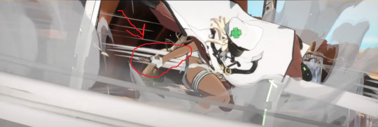
Is the white fingerless glove with black trim on her right hand. It adds to Ramlethal’s toughness and accentuates the essence of the design. I really love the upgrade from the previous design, which I thought her older look was cool enough. It emphasizes the commanding presence she has, but also the essence of someone who others can depend on. It does make curious if the bandages are even the same ones from Revelator, or are they new ones put on her? This is another design that I think is done well! Rating: S++++++++++(Join the Army!XD)
#guilty gear#guilty gear strive#ramlethal valentine#character analysis#character redesign#Captain Ram!
37 notes
·
View notes
Note
How hard is it to choose colours for your (and my favourite) art style?
Eheh, well I canonly speak for myself, not for whoever you’re flattering by callingyour favorite, so I’ll stick to that! ;)
I suppose theliteral answer is “Usually not too hard?” but that’s boring solets see what I can ramble about color choice and such! Also I’ll put some links to James Gurney’s stuff because he is amazing and I cannot recommend his books enough!
(This’ll be in 3 sections - Color schemes, Contrast and leading the eye, and picking colors for shadows~ from longest to shortest too)
Part 1: COLOR SCHEMES
So I used to bereally bad at this until I got really into pixel art where I learneda few important lessons. First, the entire color palette workingtogether is what’s most important, not any single color, and second,colors work together in surprising ways COMPLETELY dependent on what’s around them!
For example, this isthe color palette for the Commedore 64 from back in the day. All whopping 16 colors the system could possibly display:

Individually thosecolors look pretty muddy, muted, and dull. But when you put them alltogether in an image they actually work pretty well together, because none of them completely break from the others. Usingmy own stuff as an example, I used the C64 palette to challengemyself with remaking a very colorful, very saturated screenshot from the Nintendo 64game Mischief Makers (because I love that game and both systems have“64” in the name so why not~)
So I turned this: (Nintendo 64 version, with waaay more colors available)
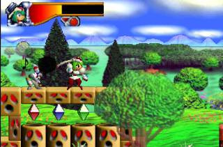
Into this:

Now, there’s clearly a BIG difference in the colors used, but I feel like everything still looks fine on its own. The muddy colors look a lot more harmonious when seen in an image than individually, with the brighter colors, such as the gems, even popping quite a bit.
For that second point I mentioned about colors working differently based on the colors around them, look at the character’s green hair, the green gem, and the green on the top of the blocks. They are all the exact same color. The green gem and hair, though, are shaded with a deeper, more saturated green and contrasted with a bright white, making it appear more saturated than the exact same green on the platforms, because the platforms’ green is surrounded by duller colors.
So it’s important to keep in mind that not only is each color important in the context of the whole, but also that what’s immediately around a color will massively impact how they appear, even when they are the exact same!
Important things to consider when picking colors is how close/far they are to each other in hue (the color itself, represented by the outer wheel in the image below), the saturation (how much gray is in the color, which effects how vibrant it is, which is the left->right in the box) and value (how much black is in the color, which is the top->bottom in the box).

Essentially the further away two colors are from the each other in any of these 3 directions the more they will stand out from each other. I’m not much of a teacher for color theory in general, so the best advice I can give is just to practice and to check out limited palettes other people have made and see how they handle it. In general, though, I try to keep most of the colors relatively close to each other in saturation and warm/cool colors, and then use one accent color that stands out in small amounts to make certain bits pop~
Links time!
Gurney’s post/video on Color Gamut, or manually limiting colors and how surrounding colors alters our perception of them (check out what appears as yellow in the cool colored image as opposed to the warm)
Gurney’s post on color in context and how many colors still register as bright yellow
Fun little tidbit about old cartoons made with limited palettes
Part 2: Contrast, and leading the eye!
Okay, so these other two might be a bit shorter. Basically, when you’re picking colors you want some to stand out and some to fall back. If everything is competing for attention it can be really hard to look at and the eye doesn’t know what’s important! One of the main things to look out for with this is contrast, as the eye is easily drawn to areas that are different than their surroundings.
Let me use two designs I’d had for my character Caelia - the left is her old color scheme and outfit and the right the new one:
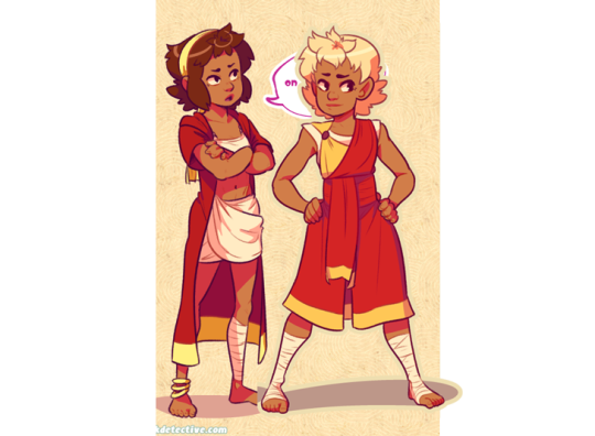
Now, aside from minor differences in saturation, they’re actually pretty similar, but the one on the right I think works a lot better. In both of them the yellow acts as a strong accent color that can pull the eye, but on the old design on the left it pulls your eye in two directions - towards the headband and the coat trim, neither of which are actually important. Almost the entire rest of the design lacks that yellow so your eyes are actually drawn -away- from the character’s face and body. Imagine the coat being blown behind her as she’s doing an action pose and, yeah, the accent color doesn’t actually help anything.
The new design, I think, fixes that. Even though it remains an accent color the yellow now appears throughout the design. Her hair is now a lighter shade of yellow which is distinguished from the yellow on the clothing while also framing her face. Her torso now has a yellow accent on it so it draws the eye and, combined with the hair, has a strong distinction between her upper half (which is more yellow) and her lower half (which is mostly red). And finally what was the coat now wraps around her with an additional little strip on a waist sash. Now the yellow trim can easily allow the eye to figure out how her legs are positioned by how they wrap around them, instead of just hanging behind them.
It’s also important to point out that the hair is less saturated along with being lighter than the rest of the yellow - it both looks a bit more natural, blends with her skin color more, and also doesn’t compete with the high saturation in the clothing.
None of this is to say the left one is necessarily a bad design or conveys information poorly, just that the right one is a more unified design that is easier to understand at a glance. It’s something to keep in mind, but not a hard rule or anything. But remember that if EVERYTHING tries to stand out you’ll just end up with a mess.
LINKS!
Gurney on leading the eye with contrast and why what everything I just said might be bunk but might not be and also I think what I said applies better to simplified, cartoon forms as opposed to realism, since lines and blocks of color read differently than natural forms and lighting.
Spokewheeling - a composition technique that can be applied to character design as well.
Shapewhelding - another composition technique to think about, and can be important to AVOID at times (happens a lot in pixel art - dont want things melding together accidentally)
Gurney on why all of that might be bunk for general art composition anyway but might not be, but again I believe is still important for more stylized art
Part 3: SHADOWS!
Okay, so it’s nearing 1am as I write this and I’ll be honest I have the absolute least technical knowledge on this part, so I’ll tell you how I go about it but I STRONGLY suggest reading Gurney’s information on it (Again, seriously, I love his books, and “Color and Light” in particular is amazing and contains many of these posts and more)
When it comes to shading I have a pretty quick and dirty way to figure out what to do:

in case the text isn’t legible:
Choose a color for all shadows to move towards (usually a purple or blue)
Grab the base color for the thing I’m adding shadow to
Shift the color towards the direction of the shadow color I chose, and then make it darker and more saturated
And I do the exact opposite for highlights - I move away from the shadow color and then make it lighter and less saturated
Usually, anyway. And this method works best on the kind of color wheel I have there, but it can be adapted to most anything. And how far you move towards the shadow color and how dark/saturated you make the shadows will change the mood of the piece a lot. The colors in the screenshots are for a pretty light colored, low contrast piece.
I would go on more about it but I don’t actually have solid reasoning behind it other than it tends to look alright and I don’t want to spread incorrect thinking. Just… for the love of all that is colorful, DONT just shift the color towards black or white. It looks muddy and gross. Please. I beg you~
ON THE PLUS SIDE, Here’s a slew of awesome links!
Gurney and Chromatic Shadows Part 1!
Chromatic Shadows Part 2!
Relative color on skin tones!
Complementary shadows!
Induced colors! (or how our eyes can make highlights appear as different colors)
And I cant stress enough how great Gurney’s Color and Light book is for this stuff. I just can’t explain much ‘cuz I’m bad at actually studying this stuff well enough to talk about it!
Anyway, that about does it for my waaay longer than I thought and hella reply to a single sentence question! Hope that helped you, or SOMEONE at least! It was fun to ramble on about regardless~ (oh geeze yeah maybe rambling after midnight was a bad plan? Hopefuly this actually makes sense lol. If anyone needs any clarification just let me know!)
Cheers! (ノ◕ヮ◕)ノ*:・゚✧
132 notes
·
View notes
Text
Hello Beauty Babes!
Happy September! Not only is September my birthday month and Sickle Cell Awareness month (which i’ll get into in another post), AND Beyonce’s Birthday, BUT it also lines up with some of the hottest makeup releases for the upcoming Fall season!
NYX cosmetics is a BIG favorite of mine. They always come out with such amazing products for an affordable price!
On Labor Day/Bey Day (9/4), NYX is dropping their new Elements collection on their website! (in Ulta Stores 9/24) This collection, based on 6 different elements, Fire, Earth, Water, Air, Wind, & Metal. Each element has a coinciding palette with 12 shades in a variety of finishes. Also, each element will have 3 lipsticks. All in all, that’s 6 new palettes, and 12 new lipstick shades!
Personally, I love the entire concept and product idea. Each element gives a different feel, and there is seriously something for everybody. Warm to cool, matte to metallic, soft to bold, bright to dark, NYX definitely covered their bases!
I’m not sure how much these will be, but I expect them to be in the $20-25 range, and I also expect the lipsticks to be no more than $10 each.
Photo Courtesy of IG Account @BudgetBeautyGuru
Let me show you guys each Elements palette, swatches, and some looks created by some of our favorite beauty influencers!
The Fire Palette is probably the palette I’m most excited for. We saw a quick glimpse of this palette on their IG story a few weeks back, and I instantly was drawn to the warm tones. With all the warm toned palettes coming out, NYX really picked great shades for their Fire palette. from yellows, reds, browns, etc. It really stands out on its own.
NYX decided to partner with 6 influencers, one for each element. @ILuvSarahii is #TeamFire, and she has been giving us serious FOMO with how she’s been slaying in this palette.
DO YOU SEE THESE SWATCHES??? I love how the color scheme of this palette. You can really do so much with this palette.
Next, is the Earth palette. As a Virgo (earth sign) I was also really excited about this palette. Especially for the upcoming fall season!
This palette is full of earthy fall tones. I love that bold green shade! The influencer for #TeamEarth is @Ssssamantha
Next up is Air. This shade is a colorful pastel dream!
I was kind of worried that some of these shades are too light for women of color, and that it might not allow for alot of use out of this palette. However, the #TeamAir influencer is a favorite of mine, @AlissaAshley! She has the same skintone as me, and this palette looks amazing on her!
She even did a makeup look on her Youtube channel using the Air palette, and wore two of the #TeamAir lipsticks as well.
Alissa created this gorgeous cotton candy themed eye look with the Air palette. You get to see how pigmented the shadows are, but they don’t have crazy amounts of fallout.
Up next, Metals! This palette is straight up METALLIC. You get 12 metallic shadows in a range of neutral true metal shades. There are bronzes, silvers, coppers, etc. Again, I love how well they paired the shadows for each palette. It goes with the theme, but it’s a unique pairing.
The #TeamMetal Influencer is @JaimeGenevieve, who is known not only for her adorable accent, but for her ability to slay edgy looks. Look at how she pulls off this metallic look! From the bronze eye and bold brows, to the matching metallic lip! (BTW, I haven’t seen the lipsticks for #TeamMetal yet, but I really hope they’re in a metallic finish. I mean, wouldn’t that make sense?)
Next up, is Water! This palette is full of a range of blue and green shades, from sky blue, to turquoise and navy.
The face of #TeamWater is @Chrisspy! who is a big favorite of mine. She did this amazing winged out blue eye look using this palette, and swatched the shades!
The shadows look so much brighter in the swatches. I don’t wear a lot of cool tones or blues, but I do like this palette and would think about buying it.
Last but not least is the Wind palette! If you love smokey cool toned looks, this Elements palette is for you!
I never knew there were so many different grays! This would be a good dupe for the Urban Decay Naked Smokey palette.
The face of #TeamWind is @PromiseTamang, who is a makeup master. Have you seen all her transformation videos??
These palettes launch TODAY on Bey Day (aka Labor Day) Sept. 4th
I’m not sure on the time specifically, but I expect it would be sometime in the afternoon around 12-1pm. There also isn’t any info. on pricing, but I’m gonna assume it’s $20-25, like their other palettes.
NYX is also having a HUGE sale on their website that brings a lot of their popular products down in price, so if you are planning to order the Elements palettes, make sure to check out the items on sale!
These aren’t the only new products from NYX coming!
A few days ago, NYX cosmetics gave us a sneak peak on their IG story showing us their Holographic Shimmer Sticks, that will be coming soon (not sure exactly when though). These look like holographic highlighter sticks that are really in right now. Very Unicorn, Mermaid Fantasy like.
They come in 3 shades.
NYX also dropped some other sneak peeks! We can expect new shades of their Liquid Suede Liquid Lipsticks, which are one of my favorite liquid lipstick formulas.
Also, new shades of the Soft Matte Lip Creams! These will be launching on September 5th, according to their IG story.
That’s not all! They also showed us swatches of a mystery product that hasn’t been fully revealed yet. It looks like a glitter lip (or possibly eyelid) gloss product that comes in a variety of fun shades.
Alright you guys! That’s all for this post!
Make sure to keep up with me on social media:
Instagram: @SageSlays_ Snapchat: @SageCatherineXO Twitter: @SageSlays
Stay Fierce, & Stay Elemental! (Get it? Because of the new palettes?)
XOXO, Sage Slays
New NYX Products! Including the New Elements Palettes Launching TODAY!!! 🔥🌎💧🌬🌪⭐️ Hello Beauty Babes! Happy September! Not only is September my birthday month and Sickle Cell Awareness month (which i'll get into in another post), AND Beyonce's Birthday, BUT it also lines up with some of the hottest makeup releases for the upcoming Fall season!
#art#article#beautiful#beauty#beauty blog#beauty blogger#beauty news#beyonce#blog#blogger#cosmetics#current#cute#eyes#eyeshadow#eyeshadow palette#favorites#fun#funny#girl#girly#inspiration#interesting#lifestyle#lip gloss#lipgloss#lips#lipstick#liquid lipstick#makeup
0 notes