#i love collecting posts like this
Text


collection of posts that i think are nathalie aror coded
2 notes
·
View notes
Text
the mobile phone museum is a online museum featuring over 2000 types of old and funky phones that’s amazing for seeing old phones and getting info about them for stuff like writing/art or just because they’re so cool and i love them look at them


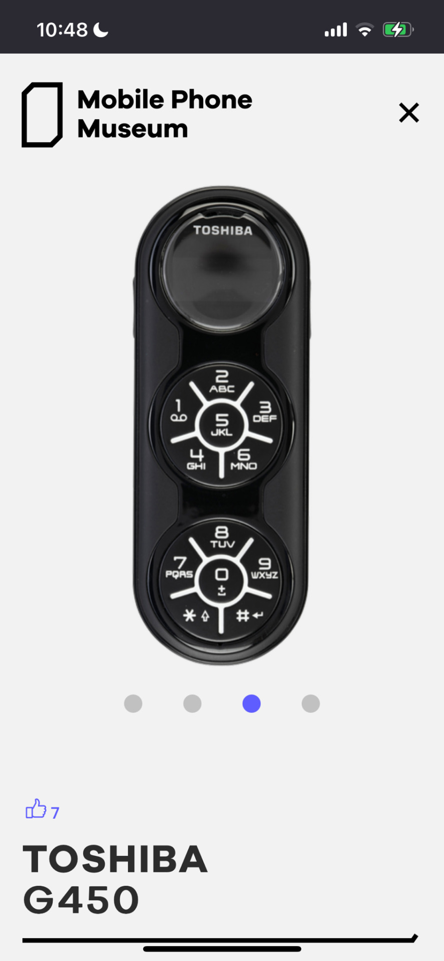

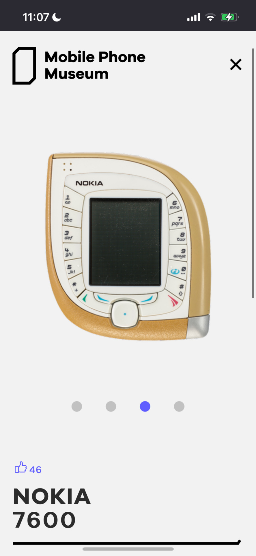


behold! some of my favourite silly creatures :3
#these are more early 00s era weird phones im gonna make a second post abt late 00s era cool fashion phones but oh my god I love this#I have 00s era phone autism i love them so much I respect this guy just collecting like thousands of them#00’s#00s tech#y2k#y2k aesthetic#old tech#resources
14K notes
·
View notes
Text
and they were galpals
#oh i am SO predictable#alternative captiob to this post: welll... good luck babes!#but idk if the dndadders like chappel roan☹️#also lawl this is gonna sound SO stupid but as a lesbian this is. so INSANELY important to me😭#i will write so much fanfiction#for the firsy time in my life#i will write an essay anf publish it when s3 ends#if theyre not canon i will cry myself to sleep until the day i die#dndads#dungeons and daddies#apple pie#IDK I SAW SOMEONE PITCH THAT AD THEIR SHIP NAME AND A PART OF ME MELTED#Kelsey Grammar#is it with an e or an a?? nobody knows#Trudy Trout#someone notify my asap whrn we collectively agree on a ship name#the peachyville horror#peachyville#love them so so so much#god dammit they did it again#hey siri play heaven is a place on earth and do it NOW#me and my girl when we're literally trudy and kelsey
1K notes
·
View notes
Text
So uh…. That pose, huh?
#Jeff absolutely ate#what an absolute icon#I love the narrator#never getting over that eyeliner#but yeah I know I’m definitely not the only one to have drawn him doing this pose#just because it’s so good#dare I say we are all based for doing so#I drew this yesterday but I’m just posting it now#because uhhhhhh#I do what I want I suppose#also don’t worry I’m not forgetting about the fun facts- I’m just really tired and I don’t feel like it yknow#I gotta collect some more and then I’ll come back with em#but yeah I had a cool idea for a bigger CC piece that I’m really excited to draw#so that’ll happen eventually#idk ive got a lot to work on so it might take a minute#but yeah there’s that#cinderella’s castle spoilers#cinderella’s castle#cinderellas castle#cinderellas castle spoilers#cc spoilers#starkid spoilers#Starkid#team starkid#the lands that are#the narrator#jeff blim#my art
271 notes
·
View notes
Text
why Aurora's art is genius
It's break for me, and I've been meaning to sit down and read the Aurora webcomic (https://comicaurora.com/, @comicaurora on Tumblr) for quite a bit. So I did that over the last few days.
And… y'know. I can't actually say "I should've read this earlier," because otherwise I would've been up at 2:30-3am when I had responsibilities in the morning and I couldn't have properly enjoyed it, but. Holy shit guys THIS COMIC.
I intended to just do a generalized "hello this is all the things I love about this story," and I wrote a paragraph or two about art style. …and then another. And another. And I realized I needed to actually reference things so I would stop being too vague. I was reading the comic on my tablet or phone, because I wanted to stay curled up in my chair, but I type at a big monitor and so I saw more details… aaaaaand it turned into its own giant-ass post.
SO. Enjoy a few thousand words of me nerding out about this insanely cool art style and how fucking gorgeous this comic is? (There are screenshots, I promise it isn't just a wall of text.) In my defense, I just spent two semesters in graphic design classes focusing on the Adobe Suite, so… I get to be a nerd about pretty things…???
All positive feedback btw! No downers here. <3
---
I cannot emphasize enough how much I love the beautiful, simple stylistic method of drawing characters and figures. It is absolutely stunning and effortless and utterly graceful—it is so hard to capture the sheer beauty and fluidity of the human form in such a fashion. Even a simple outline of a character feels dynamic! It's gorgeous!
Though I do have a love-hate relationship with this, because my artistic side looks at that lovely simplicity, goes "I CAN DO THAT!" and then I sit down and go to the paper and realize that no, in fact, I cannot do that yet, because that simplicity is born of a hell of a lot of practice and understanding of bodies and actually is really hard to do. It's a very developed style that only looks simple because the artist knows what they're doing. The human body is hard to pull off, and this comic does so beautifully and makes it look effortless.
Also: line weight line weight line weight. It's especially important in simplified shapes and figures like this, and hoo boy is it used excellently. It's especially apparent the newer the pages get—I love watching that improvement over time—but with simpler figures and lines, you get nice light lines to emphasize both smaller details, like in the draping of clothing and the curls of hair—which, hello, yes—and thicker lines to emphasize bigger and more important details and silhouettes. It's the sort of thing that's essential to most illustrations, but I wanted to make a note of it because it's so vital to this art style.
THE USE OF LAYER BLENDING MODES OH MY GODS. (...uhhh, apologies to the people who don't know what that means, it's a digital art program thing? This article explains it for beginners.)
Bear with me, I just finished my second Photoshop course, I spent months and months working on projects with this shit so I see the genius use of Screen and/or its siblings (of which there are many—if I say "Screen" here, assume I mean the entire umbrella of Screen blending modes and possibly Overlay) and go nuts, but seriously it's so clever and also fucking gorgeous:
Firstly: the use of screened-on sound effect words over an action? A "CRACK" written over a branch and then put on Screen in glowy green so that it's subtle enough that it doesn't disrupt the visual flow, but still sticks out enough to make itself heard? Little "scritches" that are transparent where they're laid on without outlines to emphasize the sound without disrupting the underlying image? FUCK YES. I haven't seen this done literally anywhere else—granted, I haven't read a massive amount of comics, but I've read enough—and it is so clever and I adore it. Examples:


Secondly: The beautiful lighting effects. The curling leaves, all the magic, the various glowing eyes, the fog, the way it's all so vividly colored but doesn't burn your eyeballs out—a balance that's way harder to achieve than you'd think—and the soft glows around them, eeeee it's so pretty so pretty SO PRETTY. Not sure if some of these are Outer/Inner Glow/Shadow layer effects or if it's entirely hand-drawn, but major kudos either way; I can see the beautiful use of blending modes and I SALUTE YOUR GENIUS.
I keep looking at some of this stuff and go "is that a layer effect or is it done by hand?" Because you can make some similar things with the Satin layer effect in Photoshop (I don't know if other programs have this? I'm gonna have to find out since I won't have access to PS for much longer ;-;) that resembles some of the swirly inner bits on some of the lit effects, but I'm not sure if it is that or not. Or you could mask over textures? There's... many ways to do it.
If done by hand: oh my gods the patience, how. If done with layer effects: really clever work that knows how to stop said effects from looking wonky, because ugh those things get temperamental. If done with a layer of texture that's been masked over: very, very good masking work. No matter the method, pretty shimmers and swirly bits inside the bigger pretty swirls!
Next: The way color contrast is used! I will never be over the glowy green-on-black Primordial Life vibes when Alinua gets dropped into that… unconscious space?? with Life, for example, and the sharp contrast of vines and crack and branches and leaves against pitch black is just visually stunning. The way the roots sink into the ground and the three-dimensional sensation of it is particularly badass here:

Friggin. How does this imply depth like that. HOW. IT'S SO FREAKING COOL.
A huge point here is also color language and use! Everybody has their own particular shade, generally matching their eyes, magic, and personality, and I adore how this is used to make it clear who's talking or who's doing an action. That was especially apparent to me with Dainix and Falst in the caves—their colors are both fairly warm, but quite distinct, and I love how this clarifies who's doing what in panels with a lot of action from both of them. There is a particular bit that stuck out to me, so I dug up the panels (see this page and the following one https://comicaurora.com/aurora/1-20-30/):

(Gods it looks even prettier now that I put it against a plain background. Also, appreciation to Falst for managing a bridal-carry midair, damn.)
The way that their colors MERGE here! And the immense attention to detail in doing so—Dainix is higher up than Falst is in the first panel, so Dainix's orange fades into Falst's orange at the base. The next panel has gold up top and orange on bottom; we can't really tell in that panel where each of them are, but that's carried over to the next panel—

—where we now see that Falst's position is raised above Dainix's due to the way he's carrying him. (Points for continuity!) And, of course, we see the little "huffs" flowing from orange to yellow over their heads (where Dainix's head is higher than Falst's) to merge the sound of their breathing, which is absurdly clever because it emphasizes to the viewer how we hear two sets of huffing overlaying each other, not one. Absolutely brilliant.
(A few other notes of appreciation to that panel: beautiful glows around them, the sparks, the jagged silhouette of the spider legs, the lovely colors that have no right to make the area around a spider corpse that pretty, the excellent texturing on the cave walls plus perspective, the way Falst's movements imply Dainix's hefty weight, the natural posing of the characters, their on-point expressions that convey exactly how fuckin terrifying everything is right now, the slight glows to their eyes, and also they're just handsome boys <3)
Next up: Rain!!!! So well done! It's subtle enough that it never ever disrupts the impact of the focal point, but evident enough you can tell! And more importantly: THE MIST OFF THE CHARACTERS. Rain does this irl, it has that little vapor that comes off you and makes that little misty effect that plays with lighting, it's so cool-looking and here it's used to such pretty effect!
One of the panel captions says something about it blurring out all the injuries on the characters but like THAT AIN'T TOO BIG OF A PROBLEM when it gets across the environmental vibes, and also that'd be how it would look in real life too so like… outside viewer's angle is the same as the characters', mostly? my point is: that's the environment!!! that's the vibes, that's the feel! It gets it across and it does so in the most pretty way possible!
And another thing re: rain, the use of it to establish perspective, particularly in panels like this—

—where we can tell we're looking down at Tynan due to the perspective on the rain and where it's pointing. Excellent. (Also, kudos for looking down and emphasizing how Tynan's losing his advantage—lovely use of visual storytelling.)
Additionally, the misting here:

We see it most heavily in the leftmost panel, where it's quite foggy as you would expect in a rainstorm, especially in an environment with a lot of heat, but it's also lightly powdered on in the following two panels and tends to follow light sources, which makes complete sense given how light bounces off particles in the air.
A major point of strength in these too is a thorough understanding of lighting, like rim lighting, the various hues and shades, and an intricate understanding of how light bounces off surfaces even when they're in shadow (we'll see a faint glow in spots where characters are half in shadow, but that's how it would work in real life, because of how light bounces around).
Bringing some of these points together: the fluidity of the lines in magic, and the way simple glowing lines are used to emphasize motion and the magic itself, is deeply clever. I'm basically pulling at random from panels and there's definitely even better examples, but here's one (see this page https://comicaurora.com/aurora/1-16-33/):

First panel, listed in numbers because these build on each other:
The tension of the lines in Tess's magic here. This works on a couple levels: first, the way she's holding her fists, as if she's pulling a rope taut.
The way there's one primary line, emphasizing the rope feeling, accompanied by smaller ones.
The additional lines starbursting around her hands, to indicate the energy crackling in her hands and how she's doing a good bit more than just holding it. (That combined with the fists suggests some tension to the magic, too.) Also the variations in brightness, a feature you'll find in actual lightning. :D Additional kudos for how the lightning sparks and breaks off the metal of the sword.
A handful of miscellaneous notes on the second panel:
The reflection of the flames in Erin's typically dark blue eyes (which bears a remarkable resemblance to Dainix, incidentally—almost a thematic sort of parallel given Erin's using the same magic Dainix specializes in?)
The flowing of fabric in the wind and associated variation in the lineart
The way Erin's tattoos interact with the fire he's pulling to his hand
The way the rain overlays some of the fainter areas of fire (attention! to! detail! hell yeah!)
I could go on. I won't because this is a lot of writing already.
Third panel gets paragraphs, not bullets:
Erin's giant-ass "FWOOM" of fire there, and the way the outline of the word is puffy-edged and gradated to feel almost three-dimensional, plus once again using Screen or a variation on it so that the stars show up in the background. All this against that stunning plume of fire, which ripples and sparks so gorgeously, and the ending "om" of the onomatopoeia is emphasized incredibly brightly against that, adding to the punch of it and making the plume feel even brighter.
Also, once again, rain helping establish perspective, especially in how it's very angular in the left side of the panel and then slowly becomes more like a point to the right to indicate it's falling directly down on the viewer. Add in the bright, beautiful glow effects, fainter but no less important black lines beneath them to emphasize the sky and smoke and the like, and the stunningly beautiful lighting and gradated glows surrounding Erin plus the lightning jagging up at him from below, and you get one hell of an impactful panel right there. (And there is definitely more in there I could break down, this is just a lot already.)
And in general: The colors in this? Incredible. The blues and purples and oranges and golds compliment so well, and it's all so rich.
Like, seriously, just throughout the whole comic, the use of gradients, blending modes, color balance and hues, all the things, all the things, it makes for the most beautiful effects and glows and such a rich environment. There's a very distinct style to this comic in its simplified backgrounds (which I recognize are done partly because it's way easier and also backgrounds are so time-consuming dear gods but lemme say this) and vivid, smoothly drawn characters; the simplicity lets them come to the front and gives room for those beautiful, richly saturated focal points, letting the stylized designs of the magic and characters shine. The use of distinct silhouettes is insanely good. Honestly, complex backgrounds might run the risk of making everything too visually busy in this case. It's just, augh, so GORGEOUS.
Another bit, take a look at this page (https://comicaurora.com/aurora/1-15-28/):

It's not quite as evident here as it is in the next page, but this one does some other fun things so I'm grabbing it. Points:
Once again, using different colors to represent different character actions. The "WHAM" of Kendal hitting the ground is caused by Dainix's force, so it's orange (and kudos for doubling the word over to add a shake effect). But we see blue layered underneath, which could be an environmental choice, but might also be because it's Kendal, whose color is blue.
And speaking off, take a look at the right-most panel on top, where Kendal grabs the spear: his motion is, again, illustrated in bright blue, versus the atmospheric screened-on orange lines that point toward him around the whole panel (I'm sure these have a name, I think they might be more of a manga thing though and the only experience I have in manga is reading a bit of Fullmetal Alchemist). Those lines emphasize the weight of the spear being shoved at him, and their color tells us Dainix is responsible for it.
One of my all-time favorite effects in this comic is the way cracks manifest across Dainix's body to represent when he starts to lose control; it is utterly gorgeous and wonderfully thematic. These are more evident in the page before and after this one, but you get a decent idea here. I love the way they glow softly, the way the fire juuuust flickers through at the start and then becomes more evident over time, and the cracks feel so realistic, like his skin is made of pottery. Additional points for how fire begins to creep into his hair.
A small detail that's generally consistent across the comic, but which I want to make note of here because you can see it pretty well: Kendal's eyes glow about the same as the jewel in his sword, mirroring his connection to said sword and calling back to how the jewel became Vash's eye temporarily and thus was once Kendal's eye. You can always see this connection (though there might be some spots where this also changes in a symbolic manner; I went through it quickly on the first time around, so I'll pay more attention when I inevitably reread this), where Kendal's always got that little shine of blue in his eyes the same as the jewel. It's a beautiful visual parallel that encourages the reader to subconsciously link them together, especially since the lines used to illustrate character movements typically mirror their eye color. It's an extension of Kendal.
Did I mention how ABSOLUTELY BEAUTIFUL the colors in this are?
Also, the mythological/legend-type scenes are illustrated in familiar style often used for that type of story, a simple and heavily symbolic two-dimensional cave-painting-like look. They are absolutely beautiful on many levels, employing simple, lovely gradients, slightly rougher and thicker lineart that is nonetheless smoothly beautiful, and working with clear silhouettes (a major strength of this art style, but also a strength in the comic overall). But in particular, I wanted to call attention to a particular thing (see this page https://comicaurora.com/aurora/1-12-4/):

The flowing symbolic lineart surrounding each character. This is actually quite consistent across characters—see also Life's typical lines and how they curl:

What's particularly interesting here is how these symbols are often similar, but not the same. Vash's lines are always smooth, clean curls, often playing off each other and echoing one another like ripples in a pond. You'd think they'd look too similar to Life's—but they don't. Life's curl like vines, and they remain connected; where one curve might echo another but exist entirely detached from each other in Vash's, Life's lines still remain wound together, because vines are continuous and don't float around. :P
Tahraim's are less continuous, often breaking up with significantly smaller bits and pieces floating around like—of course—sparks, and come to sharper points. These are also constants: we see the vines repeated over and over in Alinua's dreams of Life, and the echoing ripples of Vash are consistent wherever we encounter him. Kendal's dream of the ghost citizens of the city of Vash in the last few chapters is filled with these rippling, echoing patterns, to beautiful effect (https://comicaurora.com/aurora/1-20-14/):

They ripple and spiral, often in long, sinuous curves, with smooth elegance. It reminds me a great deal of images of space and sine waves and the like. This establishes a definite feel to these different characters and their magic. And the thing is, that's not something that had to be done—the colors are good at emphasizing who's who. But it was done, and it adds a whole other dimension to the story. Whenever you're in a deity's domain, you know whose it is no matter the color.
Regarding that shape language, I wanted to make another note, too—Vash is sometimes described as chaotic and doing what he likes, which is interesting to me, because smooth, elegant curves and the color blue aren't generally associated with chaos. So while Vash might behave like that on the surface, I'm guessing he's got a lot more going on underneath; he's probably much more intentional in his actions than you'd think at a glance, and he is certainly quite caring with his city. The other thing is that this suits Kendal perfectly. He's a paragon character; he is kind, virtuous, and self-sacrificing, and often we see him aiming to calm others and keep them safe. Blue is such a good color for him. There is… probably more to this, but I'm not deep enough in yet to say.
And here's the thing: I'm only scratching the surface. There is so much more here I'm not covering (color palettes! outfits! character design! environment! the deities! so much more!) and a lot more I can't cover, because I don't have the experience; this is me as a hobbyist artist who happened to take a couple design classes because I wanted to. The art style to this comic is so clever and creative and beautiful, though, I just had to go off about it. <3
...brownie points for getting all the way down here? Have a cookie.
#aurora comic#aurora webcomic#comicaurora#art analysis#...I hope those are the right tags???#new fandom new tagging practices to learn ig#much thanks for something to read while I try to rest my wrists. carpal tunnel BAD. (ignore that I wrote this I've got braces ok it's fine)#anyway! I HAVE. MANY MORE THOUGHTS. ON THE STORY ITSELF. THIS LOVELY STORY#also a collection of reactions to a chunk of the comic before I hit the point where I was too busy reading to write anything down#idk how to format those tho#...yeet them into one post...???#eh I usually don't go off this much these days but this seems like a smaller tight-knit fandom so... might as well help build it?#and I have a little more time thanks to break so#oh yes also shoutout to my insanely awesome professor for teaching me all the technical stuff from this he is LOVELY#made an incredibly complex program into something comprehensible <3#synapse talks
760 notes
·
View notes
Note
Heyyy! And could you write ghost and price with a chubby reader? :))
Hey there! Of course I can :-)
Price and Ghost with a Chubby!Reader
Price: It genuinely does not matter to Price whether you’re chubby or not. However, if you are chubby, then you better believe this man will not leave you alone. He loves you so dearly, he just wants to be with you whenever he can. And if you’re chubby? Oh, he’s never letting you go. He’s gonna hold onto you like a koala because you’re honestly just so precious. Will put his head on your tummy and use it as a pillow. This is an incentive for you to run your fingers through his hair so he may snooze for a little bit. If anyone ever dared to make fun of you for your size then he will throw hands. He’s a captain, he demands respect wherever he goes, so naturally the same goes for you as his partner. That fucker will end up with a broken nose, if not with a few broken ribs as well. And when you’re home? He’s gonna make you a nice and lovely meal. I feel as though once he’s gotten a taste of your chubby self he would become someone who genuinely likes chubby people. They’re just really soft for holding, you know? What’s better than putting your weary head on the lovely and soft thighs of your partner? Besides, he’d probably take the “if you have thick thighs you can fit more kittens on top of them” post to heart and might put a few kittens on top of you to see how many you can fit. Overall, he has heart eyes whenever you walk by. You’re beautiful, gorgeous, showstopping, and he’s gonna show you that he genuinely thinks that way about you. Besides, he’s kinda chubby too. So, you know, solidarity and all. However, he will blush if you ask to see his tummy. He won’t say no, but he’ll be embarrassed.
Ghost: Another man who thinks he doesn’t care about your size, but in reality he loves chubby people. He’s a big, rough, and rugged man, so would he really complain about his partner being soft? Do you really think he would? Like Price, he also has some chub around his tum. A healthy amount that makes him cute as a button, for a man his size, that is. He’d love to pick you up and throw you onto the bed or couch just to hold onto you. He’s probably gonna learn how to become an even better cook just to be able to cook you nice meals and keep you nice and fed. It’s his way of saying “You’re so fucking gorgeous, I love you, please never change”. And if it comes from Ghost you know it’s genuine. If anyone ever hurts you then he’s going to plan their murder in his head the second those insults leave their mouth. You’d need to hold him back so he doesn’t just kill that asshole. When you get home you can count on him being all over you, kissing you oh so gently everywhere you let him. He’s gonna do everything he can to make you feel like the royalty you actually are. You’re precious, you’re wonderful, he loves you. All those things are final. Besides, no one would ever dare to make fun of him for having some chub, right? So why would they make fun of you? Ghost usually isn’t a man of many words, but he’ll say whatever comes to mind to help you feel better. Overall, I kind of feel as though you’d help him feel better about himself as well. He’s not self conscious about his tummy per se, but you being chubby yourself, and him being so attracted to you and loving you this much, makes him feel better about himself.
#cod#cod x reader#call of duty#call of duty x reader#john price#john price x reader#price x reader#simon ghost riley#simon ghost riley x reader#ghost x reader#as someone who loves tummies I like these requests :-)#As someone who is chubby I love those requests :-D#these men and women would be all over you loving and caring for you and being menaces towards everyone who is ever mean to you!#they will kiss your tummy and tell you that you're extremely cute!#I'm back on my rambling in the tags bs because no one talks to me so my followers will have to suffer :-) Sorry :-)#Have I not posted the Soap with a self conscious reader random blurb? I honestly don't remember#But I wrote something similar to that with Soap in mind once :>#I can't help myself! The 141 are just some guys! I love them and one day I am going to marry them!!!#I wanna kiss Ghost's and Price's tummies so bad!!! they'd get so flustered but that's alright because only reader gets to see them!#I swear we all collectively should make the cod cast real as normal non military people and just love them wholeheartedly!!!#They deseve some smooches! all of them!!!
192 notes
·
View notes
Text
Ralts, Kirlia, and Gardevoir: PokeCard Appreciation Post ✨🌿
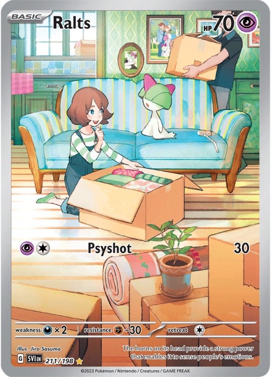


this three-card illustration rare set from the scarlet & violet base set is already so precious, but it gets better the closer you look <3 so many adorable details are hidden in these cards!

the photos behind the couch change with each card!! in the ralts card, there’s a cute portrait of ralts and a wedding photo (with lil ralts in it!!!!!)
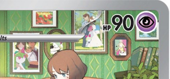
new photos are added in the kirlia card, with a new family portrait and a picture of the family’s new baby in a pikachu costume (and a kirlia cameo in the corner c:)

this is by far the cutest detail — a drawing by the little kid of her and kirlia together!!! plus a new family portrait
it rlly shows how pkmn aren’t just owned by pokemon trainers; most of the time they are very loved companions 💕
#pkmn#pokémon#card collecting#pokemon#pokemon cards#pokemon tcg#tcg#full art#nintendo#hoenn#kirlia#ralts#gardevoir#long post#i just love this set sm…#like ???? when i saw the little drawing i LOST it
1K notes
·
View notes
Text
Transcript:
You’ve been a very naughty little fucking thing, Machine.
You killed... a lot. Pretty much everybody. Pretty much everybody you encountered, you killed.
That is why, with extreme prejudice, I sentence you to gay baby jail.
May you rust in there forevermore.
Your only source of entertainment? Twitch.tv/getgianni
Now if you’ll excuse me, I'm going to go bot on TF2.
Audio source
#this is a queued post (well. all the posts usually are) BUT ANYWAYS I’m taking a small break idk how long. most likely less than a week.#which is just a fancy way of saying there won’t be posts for a couple days that’s all#ultrakill#gabriel ultrakill#locked up in a room at work = gay baby jail#my only source of entertainment = watching streams to collect clips#It all makes sense now. this is my punishment#sorry for the killing i guess. when did i do that.#i cant believe gabe is entirely responsible for the TF2 bot crisis. he loved robots so much he flooded the world with them. so sad.
275 notes
·
View notes
Text


a few experimental ducks in dresses originally made to mess with some brushes, then some palettes, then some textures...
do yourself a favor and listen to some caro emerald while you look at these ones lol!
#dhmis duck#dhmis#my dhmis postings#me art#GENUINELY REALLY LOVE THESE LOL#givin duck a wig im getting further and further from canon as we speak /j#HE WEARS ONE IN JOBS IM ALMOST RIGHT OKAY#as usual all the fits are based off real 20s fits so if u wanna see the OGs lmk i have them all lol#INCLUDING THE SWIMSUIT THAT SHOWS ONLY THE SIDE OF UR ASS FOR SOME REASON?? PAIRED WITH A FUCKIN FUR COAT. I SWEAR THATS REAL#its real and also he WOULD#this is going in my collection of drawings i make and scream at the screen RG YOU DONT DESERVE HIMMM DUCK WIFE ME UP PLEASE PLEASE PLEASE#I WOULD TREAT YOU RIGHT BABY!!!!!!#then suddenly i blink and im like hu.h. what. and the drawings are completed#i forget im not genuinely into him sometimes
203 notes
·
View notes
Text
actually still deeply obsessed with the wildmother coming to orym in that moment, the warm rain that fell on him, the attempts at comfort. he might not have a connection with the divine via his class, but she has taken a strong interest in him and i loved seeing that come around again
#also like i JUST made a post wondering about his connection with the divine so it's like. this was for ME#cr spoilers#critical role#bells hells#cr3e95#orym#the wildmother#wildmom loves to collect her fellas doesn't she. orym joins the ranks next to caduceus and fjord. he's in good company
226 notes
·
View notes
Text

#still not over why they did this. i mean i totally understand they're rascals but like this SCENE#vector. no hesitation ''get me the pepper mill'' when theyre supposed to be heading out to vanillas. girl#sonic x#sonic the hedgehog#team chaotix#espio the chameleon#vector the crocodile#charmy bee#god i love their dynamic. this scene felt a little mean but thats sonic x for u#espio#vector#charmy#my gif#currently collecting a bunch of references for the inside of their house and SO confused by how their house is?? supposed to be constructed#will post once ive got it all for the convenience of artists 👍 and then i will ignore it#it needs to be homey u canNOT be living out of a cubicle-lookin ass house.
550 notes
·
View notes
Text
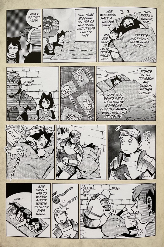
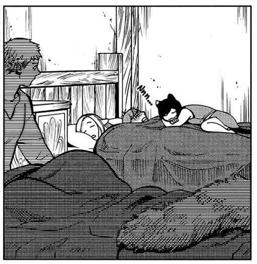
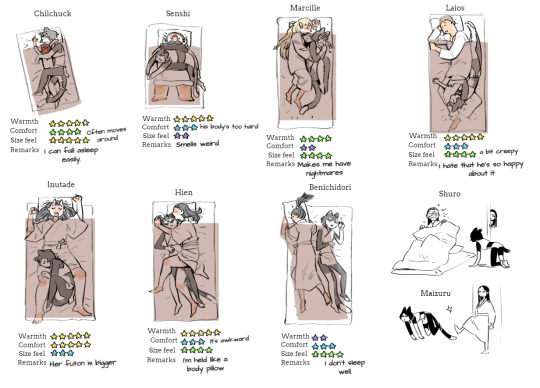
Chilchuck Tims has 4 daughters
Izutsumi’s relationship with the whole party is very fun and heartwarming, and her relationship with each party member has something unique and special, but besides Senshi being the mama hen I really love how Chilchuck looks after Izutsumi in a father-ish way. He’s the only one in the party that sees her like an actual human girl lol. He treats her with respect while not letting himself be walked over, and I think there’s something to be said about it, esp since Chilchuck knows how it’s like to be infantilized and pet like a cute thing much like our favorite catgirl. He does handle her like a guy who has 3 adult daughters, parenting instincts kicking in
Listen I knooow the party is breaking up with the end approaching but I’ve been thinking a lot about if Izutsumi decided to stick with anyone and I think it’d be really nice if she stayed with Chilchuck. I love Chilchuck’s store so much, I have so many headcanons and fic plans involving it, but listen.
I feel like Chilchuck would be a good person to look after her, she’s still a teen and shown not to be mature enough to know what to do with herself and feed herself right yet, she could become Chilchuck’s store mascot like a cat that’s always lounging inside hehe.
He gains another sort-of-daughter and she keeps her favorite pillow, a loss-loss deal on his end but Chilchuck is too responsible to not take her in if needed mwahahaha Izutsumi would have no remorse, he’s ready to suffer for her comfort

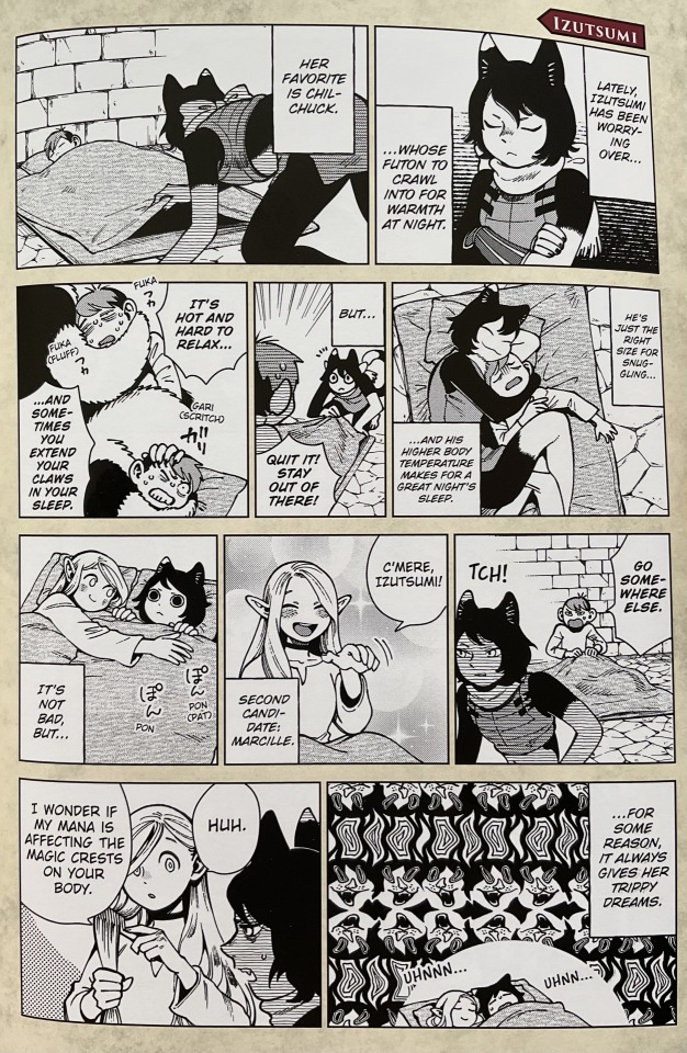
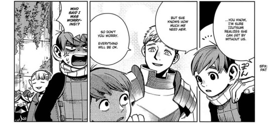
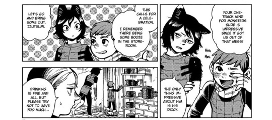
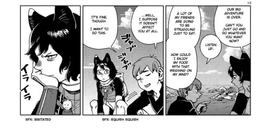
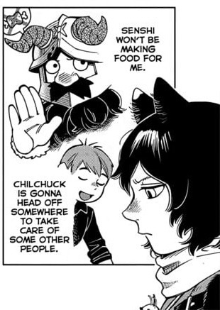
Ok girl we get it he’s your dad
#dungeon meshi#chilchuck tims#izutsumi#brotp#i’ve had this post in my drafts for months whatever I’ll come back if I find more moments#i wanna make a post about izutsumi laios moments too they’re so funny#laios is inutade except cat lover you can’t change my mind#this is a non-laios post ik but aorry my laios stan is coming out in the tags#i love how even the sleeping habits are so fleshed out#marcille is kinda like a surrogate mother to her now that i think of it parallels and whatnot omfg#i must stay cool and collected and not let my MarChil show#chil speaks to izutsumi with respect and no condescension and he understands her and ughhh i love them#I NEED THIS. I NEED MORE THEM.#not me looking up to Chilchuck like a father figure comforting to me too no hush#I keep editing in more panels I find help#Compilation#inexhaustive. Like there is so much of chil fathering izu out there
931 notes
·
View notes
Text
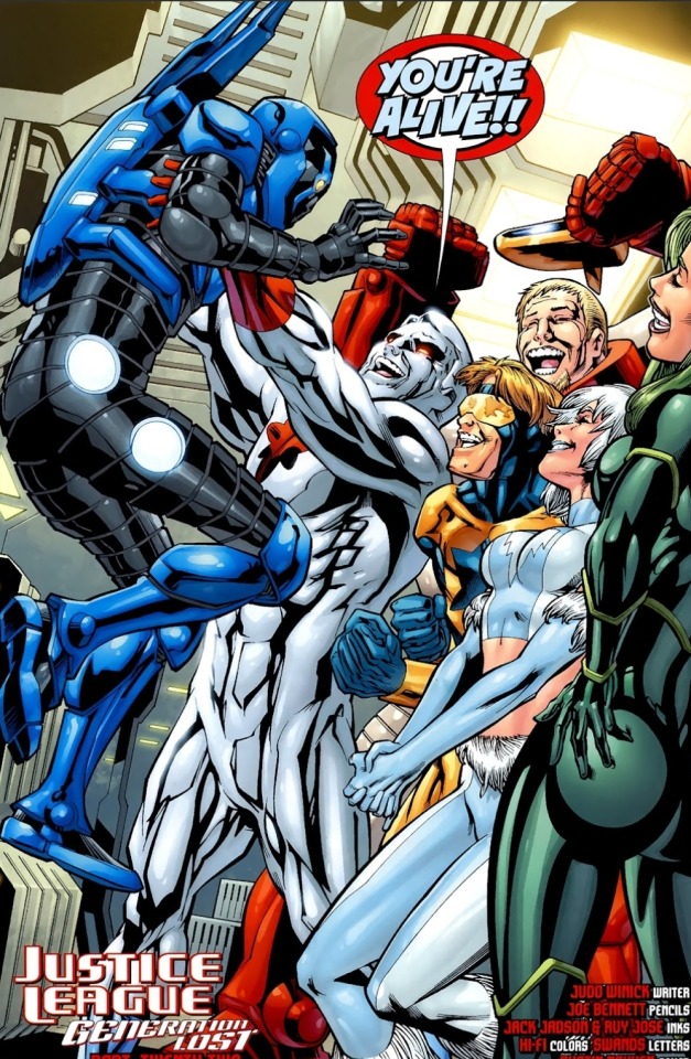
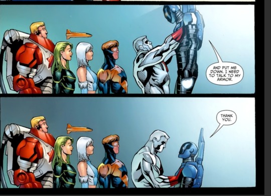
Captain Atom picking up Jaime ☺☺☺
Justice League: Generation Lost #22
#i have these saved in my panels to make me smile collection i love them..#god i love them all so much#i really like natw#never talk about him..#and gavrill there is too hi man#i LIKE him well enough hes fun but god i wish it was Dimitri here#his death felt so... idk i hate it#his wife and kids ☹#hang on Dimitri post incoming im gonna look for this one specific panel#i imagine an audible “plop” sound effect when cap puts him down#jli#jaime reyes#beatriz da costa#tora olafsdotter#booster gold#Gavril Ivanovich#dc comics#nate adam
278 notes
·
View notes
Text
I'm not sure if this will take off but I'd love to be indulged. I just read through an old reddit thread where butches talked about what colognes they wore and liked, and got to thinking that it'd be fun to do the same.
#the archivist inquiries of the public#tumblr polls#polls#poll time#also honestly i'm a bit of a frag head#if that's the proper term#which i didn't used to be but then i started enjoying more and more being a pleasant sensory experience for people#and also sometimes the reactions of the girls gays and theys is. ahem. quite nice too#also i love wearing cologne and doing it better than men#it's like dress up but it isn't but if it makes homophobes mad then yes it is and i'm flipping them off while i do it#archivist talk#personally in my collection i've got one million lucky valentino's born in roma and then TF's oud wood and i recently got another#called bohemian lime#lush's lord of misrule is also ... mamma mia#i've got others but these are just the ones of note based on how other people have reacted lol#also shout out to old spice deodorant in all its many scents except for the part where it gives me a rash hate that part#lesbianism#dykery#butch posting#butch#butch lesbian#butch dyke#a butch dyke wants to know man talk to me#thatbutcharchivist
276 notes
·
View notes
Text

& he forgives you
dogs are like that
so loyal
dead dogs are just happy you're here
Let Dead Dogs Lie, Silas Denver Melvin (from Grit)
〔You grit your teeth so hard that they shatter into fangs.〕
#in stars and time#in stars and time spoilers#isat#isat spoilers#isat sprite edit#sprite edit#isabeau isat#of stitches in sequence#basil paints#does this actually. count as spoilers actually? eh.#NEEDED to get some good sharp smiles in there.#the original caption was a different poem (one that starts with 'i love you like a rotten dog') but i couldnt find a source for it.#i think this one works pretty well though.#grit is a poetry collection and its inherently queer. silias denver melvin is trans masculine.#the entire collection is online in pdf form for free!!! i really recommend it if you enjoy poetry!!!!!#in response to 'when you have children' is another one of my favorites from it.#SORRY. for the poetry ramble on my silly osis post.
192 notes
·
View notes
Note
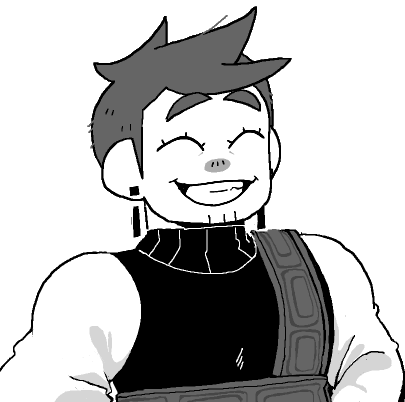
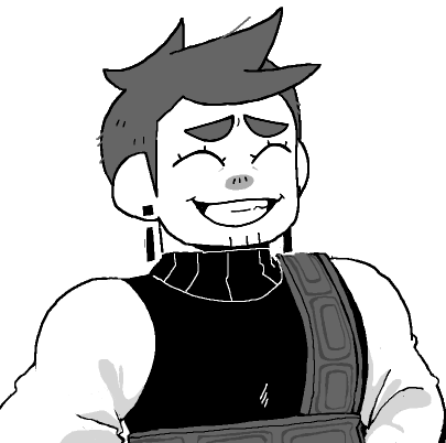
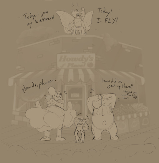
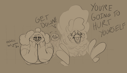
PLEASE MORE BUTTERFLY HOWDY CONTENT HES SO FUCKING SILLY
OKAY HERE'S A COMIC SHENANIGANS THING


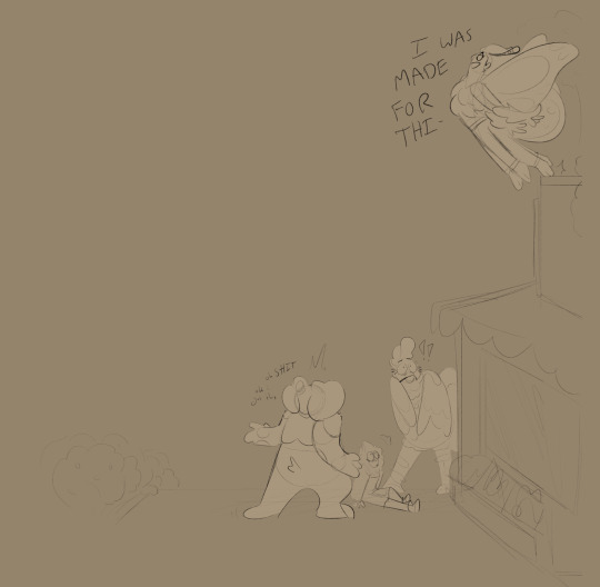
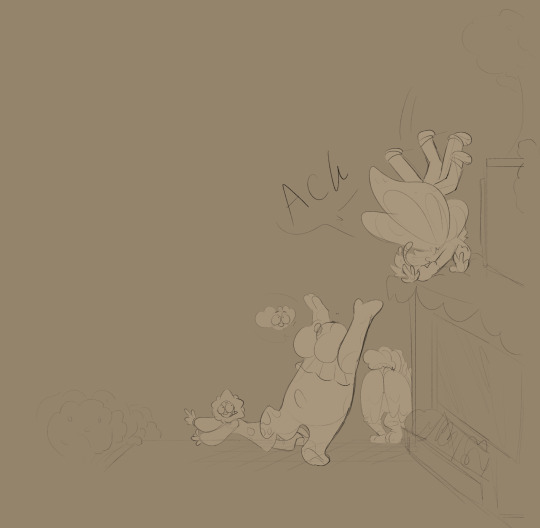

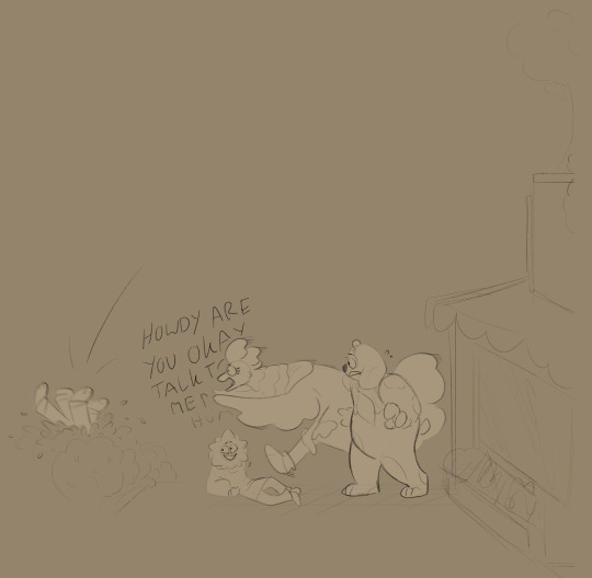
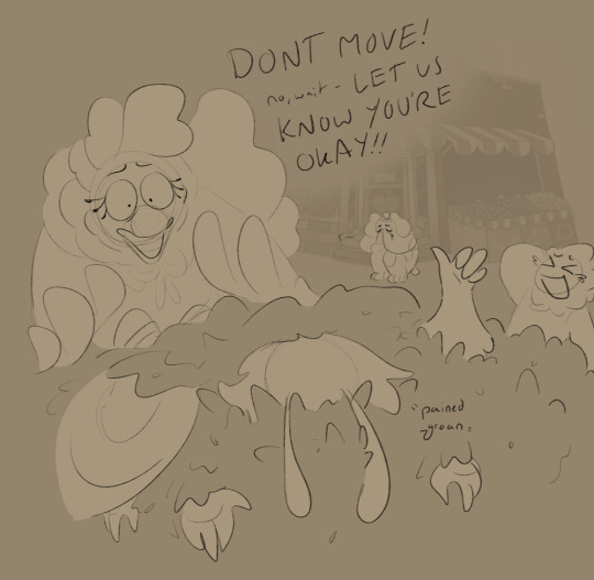
#this looks best if you click through instead of scrolling#which is kind of stupid to say After The Post. but yk.#spent way too long on this. worth it tho#its always worth it For The Bit#and this was good practice! ty for the opportunity!#the version of butterfly!howdy i have in my head is. hes a lot. i love him <3#scribble salad#welcome home#welcome home puppet show#howdy pillar#yassified howdy <3#i am so so so soooo tempted to make a butterfly howdy tag just to compile it all#i love compiling things. i like having specific collections In One Uninterrupted Place#alright well my hand hurts and its 5 am so im gonna queue this and go sleepies#wait fuck whats in the queue for tomorrow. today.#hm... ok this is a sunday post then. tomorrow is Booked#yall get a brief break from the butterfly howdy shenanigans#*got. im speaking to future people from the past rn. wild. ty tumblr for allowing time travel#its a tangled mess of yarn anyways#i am once again So Tempted To Write For This#perhaps one day i will fulfill my dream of writing a fic about howdy chrysalizing. metamorphosizing. whatever#id make it slowburn laughingstock perhaps... Probably.... i care them too much not too....#something for future me to enjoy! as a treat <3
534 notes
·
View notes
Last Seen Blogs

amadryas
Οὐρανία, χθονία, εἰναλία

fndrskprssss
Finders Keepers

tahliazdt7423-blog
https://arganoilhelp.com/squalene-benefits/

always-jacqueline
Jacqueline Kennedy Forever

bongdalivevc
Bongdalive Info