#i like to experiment with colors and monochromatic shading
Explore tagged Tumblr posts
Text

linktober and inktober prompt day 3: Companion and Path! decided to go more sketchy for this one, since its kid link and his memories of this time may not be super clear!!
#my art#linktober#inktober#path#companion#loz navi#navi#link#oot link#ocarina of time#legend of zelda#sketch style#i use this sometimes for practice drawings#idk if i posted some of them but they're very easy on my wrist and very fun#i like to experiment with colors and monochromatic shading#i use the pen and pencil pens for it cuz it fills better than the watercolor but they both overlap with shading#i wanna try different styles of coloring and stuff for this too#so ye!
23 notes
·
View notes
Text
HAVE YOU READ THE ANGEL IN THE FRONT ROW??
@itsscottiesstark wrote it for @gribouli bday (and it's absolutely PERFECT) and it has some accompanying art by me!

(Timelapse and ramblings under the cut)
This one is quite straightforward! I just followed Angie’s descriptions of the photo in the fic... tho I couldn't resist and make it colorful. Sorry not sorry. I thought of making their silhouettes darker, like the camera was having a hard time balancing out the light because of the sunset but... colours... I had to. Maybe in the next ones I should experiment more with a limited colour pallet, or try to make something black and white again. Idk I feel like it's a shortcoming that I apparently can't get away from the colours. Monochromatic and more restrictive colour pallets are so so useful for drama and draw more attention to the shapes...
I also discovered a very very nice native brush on ibis paint. I did all the colourong with it and it HAS TEXTURE. it's a nice texture if you use different colours or shades, it adds a certain depth to it that I enjoyed so much!! Besides that I also experimented a little with other tools, to distort the drawings to make the reflections in the river. I never used them before, but now that I know more how they work I feel I can do some interesting stuff 👀
Anyways HAPPY BDAY LI YOU ARE AMAZING I LOVE U 💛💛💛💛💛
23 notes
·
View notes
Note
hii!! your soft spot post is gorgeous!! if it's not too much trouble, could you share how you edited it? thank you in adavance?? <333
thank you that's so sweet!! this is going to be really long, so i'll put it under the cut
resources: preset, gradient, clean and sharp action, letters and topaz clean
left is the unedited screenshot taken with srwe and right is after placing the gradient and setting the blending mode to color dodge and opacity to 7%


on the original layer i ran my personal action, then the clean and sharp action again, uniform monochromatic noise (not sure what percentage though) and two filters from the filter gallery i haven't tried before. it's been a while since my last edit, so i wanted to experiment more, especially with neon lights and colored highlights since i have very little experience with those, but i'll get to that later. i also fixed the glitch on talia's neck and some clipping on her forearm. using the liquify tool and the smile bar i gave eden and talia more pronounced smiles and otis a subtler one on a duplicated layer. then i erased the right sides of eden and talia's mouths to make it look more like a smirk


left is after the actions and filters and right is after i filled in the sims skins and eden's hair (erasing the clothes, eyes, teeth and jewelry) with a black brush on a new layer and set it to soft light 10%. the diffuse glow filter already lightened their skintones a bit and i wanted a base to stop it and the highlights i'll add on later from washing them out


now the fun part, shadows and highlights! i made a folder with two subfolders, one for shadows and one for highlights. it helps me keep it organized and for something i'll mention later on. i draw shadows with the basic soft brush in black, changing the size depending on how big the surface i'm shading is. then i use gaussian blur to soften the effect and erase the excess. the quick select tool leaves harsh lines, so i manually erase. usually i set the layer to soft light, but depending on the shadow sometimes it can be multiply or even normal. for this edit every shadow i mention will be soft light unless i specify otherwise. i try to keep shadows on separate layers to avoid accidentally blurring ones i'm already done with. usually i (try to) pay attention to the light source and add shadows and highlights depending on the angles, but since there are so many light sources in this one i just casually eyeballed it. besides the shadows on the sims themselves i also darkened the store window behind otis to bring more focus to his face with a black brush and layer set to normal and added shadows to the sides of the edit to create a subtle vignette effect. for the eyes i draw a thicker black line following the upper lash line, blur it, erase everything apart from the whites of the eye and set it to soft light. a subtle shadow on the upper eyelid crease also help the eyes pop

the process for highlights is almost the same as for shadows, i draw with a slightly smaller white brush, blur it, set blending mode to overlay (sometimes soft light, i'll specify when). i also tend to make the highlights softer than shadows and really focus on the layering. usually i'll draw a highlight, blur it, set to overlay, then on a new layer do the same thing with a smaller brush and less blur. for the eyes i focused on the middle of the eyelid, inner eye corner and just under the lash line. for the iris i drew a highlight on the brightest part (a half circle on the bottom part), blur slightly and set to overlay with low opacity to make the colors stand out. for the catchlights i drew over them with a really small brush, used no or very little blur and duplicated the layer two or three times, merged them, set blending to normal and opacity to 90% and then erased the excess. if the catchlights aren't visible i add them anyways, the bigger they are the effect will be more cartoony, but i personally like that to keep with the style of my default eyes. here's the difference with the highlights added and a close up of eden's eye before and after both shadows and highlights


now the light sources. usually i take a big brush in a light beige color and click twice on the light source instead of drawing, blur heavily and set the layer to overlay, then on a new layer do the same with a smaller brush and less blur. repeat that for a more intense look or lower the opacity for a subtler one. i did that for the lamp between eden and talia. the colored pixels and harsh look was intentional since i was going for a grainy, cluttered vibe for this whole edit, but if you want to avoid that, don't use the filters from the beginning, make less duplicates of the light source highlights and avoid having a light source right behind a very dark color (talia's hair). here's a before and after for that light


now the neon lights and colored highlights were a lot of trial and error, but overall i'm pretty happy with the results. hopefully i'm feel more confident in them after more practice. the process is different than the one for the lamp, not just because of the colors, but because i also wanted to give them that sharp intense led glow. i'll use the sign next to otis as the example, but the process was almost exactly the same for the fake neon sign and light between talia and otis. first i started by drawing over the sign with a white brush staying inside the lines of the sign, not blurring it and setting it to overlay and 50% opacity. duplicated that layer, set it to normal and blur it. then i made a new layer, drew over the sign with an orange brush and made that layer a clipping mask, both set to normal and 100%. then i duplicated that second white layer and blurred it even more and set it to vivid light, made another orange clipping mask and set it to normal. repeated that but instead of vivid light i set the white layer to hard light. duplicate that last white layer and clipping mask and set the white layer to 60%. do one blurred white vivid light layer with a red clipping mask for the red circle above it. then i drew a highlight on the side of otis' head and shoulder the way i did all the sim highlights, duplicate it and add a clipping mask with the matching colors


the colored highlights are very similar, (white brush, blur, overlay, duplicate layer) i just add a blue clipping mask to the top white layer and if there are spots missing a blue hue that aren't edges (of an arm in this case) i use a blue brush and draw it in changing the mode to overlay. this latter way will show the color, but won't be brighter than the background, so i used it for the area where the arm casts a shadow on the shirt under it. here's a comparison of the version without any highlights, plain highlights and with the clipping masks


i added some bits here and there like the lights from the openings in the door, the blue light above the sign left of the door, shadows under talia's breasts since the shirt was pretty flat, made the little circles by otis' hand fake lights... now that all the shadows and highlights are done i duplicated the folder containing both subfolders, hid the layers that were too dark/bright and played with the opacity of the folder until i was satisfied with how it looked. i settled at 20%. here's the before and after all the shadows and highlights


now i picked the letters i needed from the pack i linked in the beginning and spelled out their names with them. i used invert on some of them (switching black to white, white to black) and added a lot of clipping masks with colors and splatter. i played around with a lot of different blending modes for the clipping masks (color burn, subtract, exclusion, darken, multiply, difference and normal). then i merged all the letters without the clipping masks, put them under the original letters, inverted them and moved them slightly to the lower left creating a sort of shadow. then i merged all the letters and clipping masks together, ran the clean and sharp action and added a lot of noise

and that's everything! hopefully this was helpful, i in no way consider myself an expert in editing, i just fuck around until i find something i like, but if there's any other question i can answer don't hesitate to ask. again, thank you so much for this ask and all the love i've gotten on this edit <33
#i wrote 90% of this and then my pc crashed and i didn't save it as a draft so i had to do it all over again 🙃#hope this wasn't too rambly and i didn't miss anything writing this the second time#ask#*mina.txt#tutorial
10 notes
·
View notes
Note
hi tamelee!
I'm here to ask for a little bit of advice if that's okay (: about a month ago I bought a Wacom drawing pad so I could start experimenting with digital art. artists like you here on tumblr have really inspired me to start making art. but I feel kinda.. lost. I've been mostly drawing naruto manga caps and I'm getting better but I guess I don't know where to go from here. coloring and shading scares me lol. I'm using clip studio paint and it's just a little.. intimidating. I feel discouraged, like I won't be able to do it. how did you do it tamelee? did you watch a lot of tutorials, or did you experiment until you figured things out? any advice you'd have for a beginner artist I'd really appreciate.
thank you veryvery much for your time ^^
Hi Nonee! 🧡 Sure!
Oh I think that’s a very good place to start. As well as drawing subjects you like ^^! Hmm, tbh I’ve just experimented a lot, but I don’t think my way of having done things was the most efficient. You might want to follow tutorials step by step? You can try coloring only with flat colors until you feel a bit more confident with that as well as cell-shading (toon-shading/non-realistic, like in anime) instead of rendering further as that can all be confusing at first. I personally never truly understood shading until I studied cell-shading and made my art a lot more readable. A lot of Anime uses this;
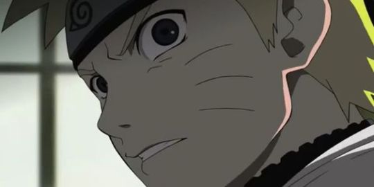
You see how there is a base color, a darker color for shadows and highlights? (Sometimes not even highlights.)
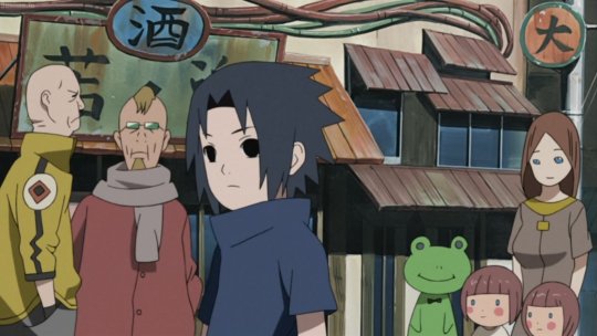
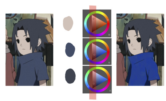
When you start to study it from existing work you’ll start to notice things like color always being in the same area of saturation and when you suddenly have a color that is way more saturated than the other it can look off. (See example.) But this is a guideline, not a rule. In your own art you can especially use saturation and brightness to help aid you to direct a viewer's focus and even tell a story.
I LOVE ‘How to train you dragon’ and ‘Kung Fu Panda’ for this because their coloring is so inspiring and if you truly want to learn from professionals... well those are the type of media to look for of course! I have an entire folder to inspire me just based on those.
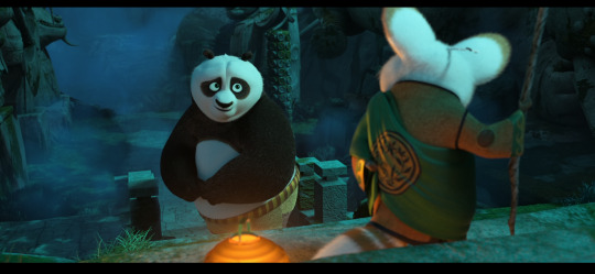
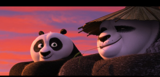
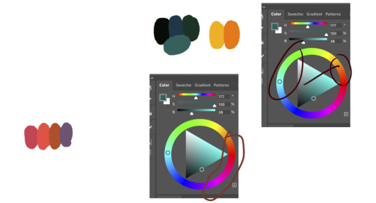
Do you see how calculated those color combo’s are?!?! Here you see both analogous and complementary schemes and it is actually through looking at the things I like that I learned it >< The orangey colors stand out and are bright which helps you to focus on that area whereas the complimentary scheme is used to bring characters together.
If drawing Manga-caps is something you love to do, then maybe for coloring you can study screen-caps from Anime or even other animated films. I’d recommend to take it step by step, though I haven’t really applied it myself, from the video’s I’ve seen and artists I’ve followed it is always advised to have an art-goal that you can work toward. Maybe you first want to focus on lineart and then laying down a base color where the colors are harmonious and next would be cell-shading maybe and then you can start adding another light-source etc- eventually you can decide to create more depth or practice with monochromatic coloring, maybe even greyscale to learn values. But right away that can all sound a bit intimidating doesn't it? Find things that you like and then maybe you can open them in your program and just study. Find a brush you like, put on some music or a show on the background and for a moment play around with it without needing to create a finished piece. This is also how I learned how things like adjustment layers work or what all the different kinds of tools do. I have to agree with you, CSP is intimidating for me as well >< so this is kinda how I approach it as there are so many add-ons and additions within it but I try to only learn what I need for that moment so I don't overwhelm myself. I definitely try to find video’s that can help me with creating Manga though! ^^ There are plenty! It'll get easier eventually, you'll learn the program and you start to recognize placements for shadows and you will get a feel for the coloring- no worries 💪 Learning something new will always stay intimidating, every time I open up a new document I feel it too. It's not easy at all, but you kinda have to allow yourself to experiment and even make mistakes because practice is never perfect. I have some beginner tips written here- I hope any of this is somewhat helpful 🌷🫶
15 notes
·
View notes
Note
your colors are alwasy SO GOOD.... do u have any advice for how u pick them
thank you! for advice, i have a few tips:
the first is to always keep in mind what color palette you are using. as you become more experienced this will likely become something you do subconsciously, but when i was starting out with drawing i would usually deliberately choose a color palette and reference that while coloring in my drawing.
i'll go into some basic color theory (ha ha) but feel free to skip this if you're already familiar with it.
there are many different types of palettes to choose from, but the most common ones are:
monochromatic
analogous
complementary
split complementary
triadic
square
tetradic
for example, the drawing i just posted follows a split complementary palette (which is favorite scheme btw)
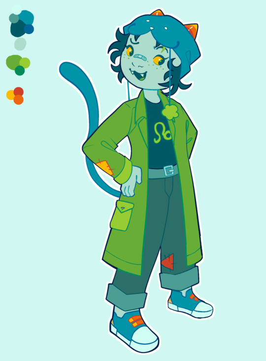
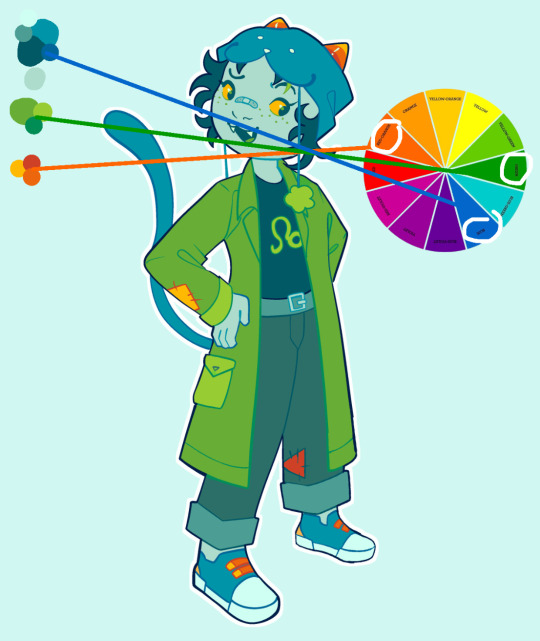
i can explain this more in-depth if anyone want me to but for the sake of brevity i'll leave it at that. the only other thing that i think is important to note if you're following a color palette is that it's important to balance out the values of the colors that you are using (how light and dark they are) as well as use it as a guide but you don't have to strictly adhere to your pallete 100% if the time within your piece. for example, the my drawing uses MAINLY blue, green, and red-orange, but there is also some orange, yellow-orange, yellow-green, blue-green etc. in there as well
my second tip is to experiment! i hear the phrase "learn the rules before you break them" a lot when people are giving advice to beginner artists, which i don't always agree with because i think experimenting and finding out what you like and what you think works is very valuable (especially when you are drawing for fun and not professionally!) have fun with it, do the opposite of what people tell you to do just to see how it looks, etc. i remember getting the advice to always shade warm tones with a warmer tone and cool tones with a cooler tone (this is only a rule of thumb btw) and one day i started doing the opposite and found that it can look cool in certain circumstances
my third tip is to use references! i joke a lot about colorpicking from the most random images but i think that looking at other images and asking yourself "how is the artist/photographer using the colors to make it look this way? how do i recreate that?" and using that as a way to study their use of colors can be really helpful. i you find a drawing that has cool colors, try using those colors in your own drawings and see how they look!
the fourth tip is to play around with contrast. some drawings will look better with LOTS of contrast (where the darkest points are black and the brightest points are white), while others will look better with low contrast. stylistically, i prefer using low contrast. going back to the drawing above, there is no true #000000 or #ffffff used anywhere (except the white outline). i find that in certain situations this can help colors stand out. but like i said, it's more of a personal preference
the fifth tip is more for digital art, but it's to play around with blending layers, adjustment layers, and gradient maps if you don't like your colors but have no idea how to fix it. some programs don't have this feature but using blending layers/adjustment layers/gradient maps is sort of like using a filter to change the hue/value/saturation of your art in different ways
hope that helps! if there's anything i need to explain further please lmk!
44 notes
·
View notes
Text
Cel Shader
After my visual style research I concluded that I wanted to use cel-shading/colour banding because I thought it would reinforce the goal of our idea: to make a relaxing experience.
To create my cel-shader I used the same tutorial I used for last year's FMP:
youtube
Here is the shader graph for the completed cel-shader:

While I don't completely understand what each component of it does, I can make a guess based off what the tutorial states and what happens when I remove aspects of the shader. For example:

I believe this part desaturates the scene so that the shader can apply the colour banding effect.

The main bulk of the code here essentially takes different shades between white and black and band/clamp the scenes lighting.

This last section allows me to use non-monochromatic lighting (coloured lights).

However while developing this shader I encountered the above issue where everything was toned down and not accurate to the lights I was placing (on top of that there was a massive strobing skybox, which I won't post here in the interest of not killing people who suffer with photosensitive epilepsy). The fix to this was simple however, with it being that I changed the "Scene color after tonemapping" to "Scene color before DOF"

This is what the finished shader looks like in game.
0 notes
Text
light.
For a moment, it was like nothing had changed.
The cold, unrelenting presence of death still surrounded her. She could still catch sight of the dead and their ever-wandering souls that always seemed to cling to her. For a moment - and moment only, not a second more -, Callith felt like she was still at home.
The place where she had landed looked like some sort of old, forgotten battlefield. The dead bodies that kept her company - fallen soldiers, she assumed - were adorned with corroded weapons embedded in their armor, now nothing more than hollow, decaying shells. From the positioning of the bodies and the differences displayed in their armor, Callith had the sinking feeling that both sides of this combat lay lifeless on the ground, now contaminated with bloodstains. A war with no winners - a type of tragedy that suited her Queen's predilections almost perfectly.
She moved her gaze from the battlefield to the sky. Instead of the endless abyss in shades of gray, her eyes met a deep shade of blue filled with sparkling white specks. On the horizon, the deep blue shifted into a warm, dark orange tone. It was unlike anything Callith has ever seen before. She hated it.
First, the saturation and intensity of all these colors were a lot to take in at once, considering how monochromatic and dull her homeland was. But more importantly, Callith felt an overwhelming sense of novelty that was not meant for her to experience alone.
Alone.
She was still alone.
Callith closed her eyes and took a deep breath, fighting for control over her own body - trying to suppress the ache of the lump in her throat and the sting of tears in her eyes. She could not recall how long she spent there, battling her own oppressive reaction to the recent events, but Callith did not care to remember.
When Callith finally opened her eyes, she fell to the ground with a gasp.
The horizon was now painted with a light shade of yellow that began to dispel the deep blue above her. It wasn't, however, the color change that made Callith's knees falter (her pride would never recover if that was the case); it was the colossal golden sphere beaming in front of her. She tried to hide behind the fallen soldiers as best as she could; her heart was pounding in her chest as her trained eyes scanned her surroundings for a way to escape. "Please", she whispered to herself, "not yet".
The seconds seemed to stretch to infinity as she was crouched behind the corpses on the abandoned battlefield. The blinding sphere was as still as Callith, yet appeared oblivious - or uncaring - toward her despair. It kept on spreading the light yellow tone all around her, indifferent to her existence. Like it had done this same movement countless times before and would keep doing it long after she was gone.
When Callith's legs felt stable enough to hold her weight (and it looked like the giant sphere was not about to obliterate her), she sought refuge in a small cluster of trees surrounding the battlefield. Under the shadow of the trees, where she always reigned supreme, she felt like she could breathe again. Callith allowed herself a few minutes to recover, sitting down with her back against the trunk of a tree. Although everything felt like it was too bright and intense for her to bear, she had no choice but to endure it. All of it. Alone.
She sighed. "You're going to pay for this when I find you, you know."
0 notes
Text
Fall 2024 Makeup Trends: Lipstick Shades You Can’t Miss
Fall 2024 Makeup Trends: The Bold and Beautiful Lipstick Shades to Wear
Introduction to Fall 2024 Makeup Trends
Are you excited for fall? I am shamelessly “basic” – pumpkin spice lattes, boots with fur, cozy blankets and books, I love it all. That doesn’t mean we have to look basic. As the leaves begin to change, we too have the opportunity to transform our beauty looks. Fall 2024 make up trends celebrate a whole spectrum of colors that complement diverse skin tones. Everyone has the chance to stand out! TikTok has opened an entire world of art and cosmetics. In reality, however you want to express yourself is the best way to do fall. Be a trendsetter! All we know is, BOLD is BETTER. See for yourself and look at New York Fashion week at its peak. Get inspired! The Evolution of Fall Makeup

The best fall makeup trends used to be Autumn “basic”. The fashion and beauty industry loved muted and beige colors as the seasons shifted. Gone are those days! New beauty includes vampy hues, bold reds, and moody plums. These deeper tones and lip colors are taking the limelight in fall 2024. Remember how the smokey eye took the world by storm? This is now the case with lip colors, and it isn't going anywhere. You can thank makeup artist Pat McGrath who is known for her innovative artistic approach to makeup. We are seeing a more expressive approach to how we apply our makeup. This means incredible lip shades and luminous skin. We continue to love a smokey eye, but we want to incorporate defined brows and natural lashes. By combining classic and contemporary, you will nail autumn 2024. Key Features of This Season's Trends Red lipstick is heading the charge this season. A blend of matte and glossy finishes is the ideal look. To achieve this look, we want to incorporate bright hues with monochromatic eyeshadows. Use an eyeliner pencil and false lashes to add to vogue appearance. For the face, make sure to use softer powder blush to illuminate the skin. This will lead to a no-makeup makeup look. Really lean into maximalism and express yourself! Think about what really defines you and what kind of personalized beauty routine works for your lifestyle. It will help give you a foundation for what to look for. Importance of Lipstick in Fall Makeup This is such an easy and fun way to transform your look. Think about what it means to sport a bold red lip – it’s a declaration of confidence. This look is iconic, and you can definitely pull it off. Make sure to experiment with different textures and hues! Try to see how a glossy lip and matte or a combination looks for you. Every hue is going to give off a specific vibe. For instance, a dark blood red feels moodier than a cute coral pink. Bold color lipsticks are back in full force! You can easily create a stunning fall makeup look for everyone.
Exploring the Hottest Lipstick Colors

Be sure to read this whole section! One of the biggest Fall makeup trends of 2024 is stunning lip color. The trick is to find something that supplements your skin tone. Colors like chocolate browns for deep complexions and earth tones for fair skin are perfect. We are here to guide you when picking out the best lip color. Classic Red Lips: A Timeless Choice This look has transcended time and is quintessential. Most of us think courage and elegance when someone wears a red lipstick. For me, I think of Marilyn Monroe, Elizabeth Taylor, and Betty Boop. Dare to be brave! This color is for everyone. In addition, celebrity makeup artists recommend using a soft, rosy blush and subtle highlighter with red lips for a doll-like complexion. Red is so versatile that it is great for all skin types. It’s a universal favorite and always has a place in the beauty world. Here are a few of our favorite red lipsticks that might appeal to you! Lipstick Queen Sinner -.12 oz - Fire Red Youngblood Mineral Crème Lipstick Sothys Rouge Intense Sothys Satin Lipstick - 240 Rouge Drouot Moody Hues for a Dramatic Look

Personally, I am feeling the dramatic look this fall 2024. This includes a deep plum, charcoal, or burgundy color. I like the aesthetic, especially paired with a smoky eye or simple eye liner. You can soften the look with a muted blush. It looks sophisticated, bold, and screams HBIC. Make sure your lips are the primary focus for your makeup routine if drama is for you! Here’s a good starting point for different skin tones and different autumnal vibes. Fair Skin Tones – Sophisticated, soft drama, and elegance for everyday wear: Deep Plum - Lipstick Queen Big Bang Illusion Gloss - .37 oz - Black Hole Berry Red - Lipstick Queen Vesuvius Liquid Lipstick - 0.08 oz - Vesuvian Fuchsia Muted Mauve - Cool Skin Undertones – Think romantic, warm, earthy Rich Burgundy - Lipstick Queen Seven Deadly Sins - 0.12 oz Dark Rose - Sothys Rouge Intense Sothys Satin Lipstick - 233 Rose Auteuil Spiced Cinnamon - A warm, earthy tone that flatters beautifully. Warm Skin Undertones – Drop Dead Gorgeous! Rich, drama, enhance golden tones. Wine Red - Complements the green undertones of olive skin. Dark Chocolate Brown - Sothys Rouge Doux Sothys Sheer Lipstick - 120 Prune Alexandre III Rusty Brick - Lipstick Queen Seven Deadly Sins - 0.12 oz - Anger Dark Skin Tones – Luminous, striking, adventurous, and unique Black Cherry - Lipstick Queen Bete-Noire Lipstick 0.12 oz - Possessed Sheer Cranberry Lipstick Queen Seven Deadly Sins - 0.12 oz - Lust Midnight Blue - Lipstick Queen Seven Deadly Sins - 0.12 oz - Envy Vampy Shades that Make a Statement Have you experimented with vampy lip shades yet? There's a good chance you will see more of this style as the chill in the air grows. It's edgier and more dramatic than moody hues. Think rich tones like red and black. It’s inspired by a grunge aesthetic – perfect for Halloween time. One thing to keep in mind is to have a matte finish. Refine the look by adding defined brows and fluttery false lashes. Work black eyeliner around the corners of the eyes for a pronounced face. If you’re daring, try using a lip pencil for a more pristine lip. Gothic glam Maybe it’s the resurgence of gothic classics, but this look is also in style. If you’re looking for an edgier and darker style, this is the place to go. It’s very similar to the vampy look but has more emphasis on the drama. For instance, you want to go with a dark shade, but also a very dramatic eye look. I recommend putting black eyeliner on your eyelid and take your finger to smudge it a little. My favorite beauty trend is cat-eye style line which is another thing I'd add to my look. If you want to go further don’t use any blush or highlighter! You may want to contour a little bit to make your cheekbones more prominent. Gothic glam is back and truly, this is just counterculture – Siouxie Sioux would be proud!
Textural Trends: Matte vs. Glossy
The Rise of Matte Lipsticks Can you believe that matte is making a comeback? A flat matte pigment usually stays on longer and has a distinct look. It doesn’t fade over time as much as glossy lipsticks which dominates the other seasons. Using a matte finish will guarantee that your lips will be the focal point of your whole ensemble. You can also express your own unique style with confidence! Glossy Finishes for a Fresh Appeal I get it, sometimes the texture of matte isn’t for everyone. Not only that, but if you want to have a dewier look then glossy finishes are the way to go. Balms are nice to keep your lips hydrated and youthful. Makeup artists tend to use glosses to add dimension to the lips. It’s also perfect for reaching the natural makeup style. There’s a lot of great ways of using lip gloss that may be better for the style you’re going for. How to Choose the Right Texture for Your Look We recommend experimenting with various textures. This can make or break your overall vibe or appearance. It also depends on how you express yourself. For example, are you wanting to daring look for a wedding or a night out with friends? A glossy finish is great for daytime events because it brightens and lifts your makeup. On the other hand, a matte finish looks mysterious and elegant during the evening. It’s important to consider your skin tone and texture. Ultimately, we want you to feel beautiful and empowered with this season's beauty trends! Tips for a Flawless Application You want to look perfect when striding in with a bold color of lipstick. Let's breakdown the proper steps of application. First, make sure to use a hydrating balm on your lips. This will smoothen your lips when applying whatever lipstick. Think of your lips like a canvas to paint on! Next choose a lipliner that complements your chosen shade. If you aren’t looking for a feathered look, the lip liner will keep the color within the confines of the lip! Next, use a brush to apply your lipstick ��� believe it or not you will have more control over a brush and won’t go outside the lines. For a 3D look, add gloss on top. Your lips will stay vibrant and keep their shape throughout the day.
Complementary Makeup Elements

Matching Eyeliner for a Cohesive Look It’s important to have a cohesive makeup look this Fall 2024. One of the best ways to do this is finding the right eyeliner. Honestly, it really depends on what kind of look you’re going for. A dramatic look would benefit from a black or dark plum pencil eyeliner. Something a little more natural are different shades of brown. Both will make your eyes pop! Look naturally luminous for autumn. Highlighter and Blush to Enhance Features Believe it or not, highlighters and blush are extremely trendy right now. Maintaining that naturally bold makeup style is one of the biggest Fall 2024 makeup trends. If you use a gentle highlighter, it will illuminate your cheekbones. This pairs well with the season’s dramatic lips. For deeper lip colors you will want to add a small amount of warmth on your cheeks. Pay attention to different pigments of blush, this shouldn’t be dramatic and very subdued. If want to spruce up the look a bit further, just add a little glitter to your cheeks! A small amount of each is enough to make a basic makeup look transform into effortlessly glamorous! Sometimes adding bronzer will give you a touch of a sun-kissed face. I try to give my face a little sparkle even as the days get darker. Contour and diffuse for more depth and sophisticated appearance. Creating a Monochromatic Makeup Look The monochromatic style is gaining traction this fall 2024. This is the perfect balance to the pop of color from your lips. It is also a classic look across the entire globe. The goal is to see how far we can stretch one color. This requires some skill, but it’s easy to maintain and portable. Get the look you need with this secret beauty hack. Find a natural eyeshadow beauty palette and a pencil to match. For fair skin, you should try soft earth tones or seek rich chocolate browns for deeper complexions.
Final Touches: Accessories and Application Tips
The Role of Eyelash Enhancements For the perfect fall makeup look, make sure to check out some false lashes. This is such an easy way to elevate your makeup routine. It’s your choice, you can grab long luxurious lashes or something a little more natural and fuller. This will easily go with your lip look! In addition, you can always find an easy mascara to use daily. This will help lengthen your lashes and enhance your eye makeup. Your eyes will captivate and awe whoever is in your presence. Glo Skin Beauty Volumizing Mascara Black - 0.57 oz (111-1) Jane Iredale Purelash Lengthening Mascara, 0.25 oz Using the Right Tools: Eyeliner Pencils and Brushes Lastly, you want to grab pencils and brushes. There are so many ways to apply a lip or eye pencil. First, eyeliner pencils will help with creating defined lines for an intense or effortless makeup look. For your lips, you can have a solid line or even feather the color onto your lips. You will standout with both pencil liners in your arsenal. Make sure you have a set of great makeup brushes to use for eyes and or lips. For eyeshadow, a nice brush will help you achieve that smokey eye look. Brushes will help you achieve that precise and sophisticated look. Plus, it’s less messy! It makes a big difference having both brushes and pencils in your makeup bag. Look at these fantastic fall colors to celebrate the changing of the seasons. Don’t be afraid to stand out. Check out Fall 2024's biggest makeup trends in other places for more inspiration. Stay tuned for more skin and beauty tips on our blog! Read the full article
0 notes
Text
How to Create 2D Graphics for Games?

Introduction
If you have a question like “How to Create 2D Graphics for Games?” then this article is for you. 2D game graphics are visuals used in video games that exist on a two-dimensional plane. Unlike 3D graphics, which have depth and perspective, 2D graphics are flat and lack depth perception. Importance of Quality 2D Graphics in Games Quality 2D graphics play a crucial role in enhancing the visual appeal and overall gaming experience. They help convey the game's narrative, evoke emotions, and immerse players in captivating virtual worlds. Overview of Popular 2D Game Art Styles - Monochromatic: Uses a single color or shades of a single color for the entire artwork. - Pixel Art: Utilizes small, square pixels to create intricate designs and characters. - Vector Art: Relies on mathematical equations to render smooth, scalable graphics. - Cutout Art: Features flat, stylized artwork with visible cutout edges. - Doodle Art: Characterized by hand-drawn, whimsical sketches and illustrations.
Different 2D Game Art Styles
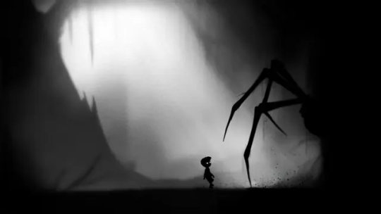
Monochromatic Art Monochromatic art employs a single color palette to create visually striking compositions. Games like "Limbo" and "Badland" showcase the atmospheric and minimalist appeal of monochromatic art.
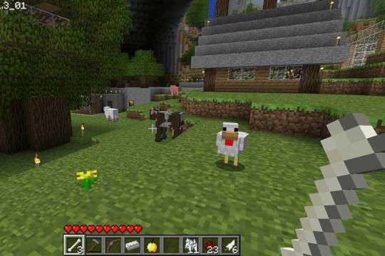
Pixel Art Pixel art utilizes tiny square pixels to form detailed images and animations. Popularized by games like "Minecraft" and "Stardew Valley" pixel art exudes retro charm and nostalgia.
Vector Art Vector art comprises geometric shapes and lines that can be resized without losing quality. Games such as "Angry Birds" and "Monument Valley" leverage vector graphics for their clean and scalable visuals.

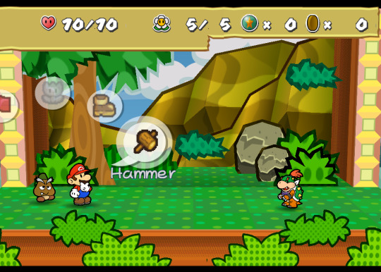
Cutout Art Cutout art features flat, paper-like characters and environments with distinct outlines. Titles like "Paper Mario" and "Cuphead" showcase the vibrant and stylized nature of cutout art.
Doodle Art Doodle art embraces a free-form and whimsical drawing style, often resembling sketches in a notebook. Games like "Doodle Jump" and "Scribblenauts" exhibit the playful and imaginative essence of doodle art.

Step-by-Step Guide to Creating 2D Game Graphics
- Preparing for Artwork Creation: Before diving into artwork creation, it's essential to understand the game's requirements and the preferences of the target audience. Selecting a suitable art style based on the game's theme and genre is paramount for cohesive visual storytelling. - Conceptualizing and Sketching: Start by developing concept art for characters, environments, and props through iterative sketching and feedback loops. This process allows for the exploration of various design ideas and ensures alignment with the game's artistic vision. - Digital Art Creation: Utilize tools and software tailored for 2D game artwork, such as Adobe Photoshop, Procreate, or Aseprite. Create characters, backgrounds, and objects with attention to detail and consistency in art style. - Optimization and Integration: Optimize artwork for performance by adhering to file size limitations and resolution requirements. Ensure seamless integration of art assets into game engines, maintaining compatibility across different platforms and devices.
Common Mistakes to Avoid in 2D Game Graphics
- Lack of Understanding of Target Audience: Failing to grasp the preferences and expectations of the target audience can result in mismatched visuals that fail to resonate with players. - Inconsistency in Art Style: Inconsistencies in art style can disrupt immersion and cohesion within the game world, detracting from the overall player experience. - Inaccuracy in Artwork: Artwork that lacks attention to detail or realism may fail to convey the intended aesthetic or narrative, diminishing its impact on players. - Poor Optimization for Performance: Overly complex or unoptimized artwork can lead to performance issues such as lag or stuttering, negatively impacting gameplay. - Rushing Artwork Creation Process: Rushing the artwork creation process can result in subpar quality and missed opportunities for creativity and refinement.
Hiring 2D Artists for Creating 2D Graphics
Options for Hiring 2D Artists - Freelance Platforms: Use platforms like Upwork or Fiverr for project-based collaborations. - Outsourcing Companies: Partner with firms specializing in game development services. - Game Industry Events: Attend conferences to network with professionals. - Social Media: Engage with artists on platforms like LinkedIn or Twitter. Criteria for Selecting 2D Artists - Portfolio: Look for diversity, style consistency, and relevance to your project. - Experience: Prioritize artists with gaming industry experience or similar projects. - Professionalism: Consider communication skills, responsiveness, and meeting deadlines. - Adherence to Deadlines: Ensure artists can deliver on time.
Conclusion
In summary, mastering the creation of quality 2D graphics is crucial for enhancing the visual appeal and immersive experience of video games. By understanding different art styles, avoiding common pitfalls, and selecting the right talent, developers can bring their game worlds to life. Whether you're a seasoned artist or just starting out, continuous learning and experimentation are key to creating captivating 2D game graphics that resonate with players. Join our community to stay updated and connected, and let's continue to elevate the game industry together.
FAQs
1. What software is best for creating 2D graphics for games? Popular software options for creating 2D graphics for games include Adobe Photoshop, GIMP, and Aseprite. Choose the software that best fits your workflow and skill level. 2. Do I need artistic talent to create 2D graphics for games? While artistic talent certainly helps, anyone can learn to create 2D graphics with practice and dedication. Start with the basics and experiment with different techniques to develop your skills. 3. Can I use pre-made assets for my game? Yes, you can use pre-made assets for your game, but be mindful of licensing restrictions and ensure that the assets fit the style and theme of your game. 4. How can I learn more about creating 2D graphics for games? There are many online resources available for learning about creating 2D graphics for games, including tutorials, forums, and online courses. Start by exploring beginner-friendly tutorials and gradually expand your skills. 5. What are some common mistakes to avoid when creating 2D graphics for games? Common mistakes to avoid include using too many layers, overcomplicating designs, neglecting optimization, and ignoring feedback from playtesting. Keep your designs simple, optimize for performance, and iterate based on feedback from players.
Join Our Community
Stay connected with us and become a part of our vibrant community on social media: - Facebook - Linkedin - X
Get In Touch
Have questions, suggestions, or feedback? We’d love to hear from you! Reach out to us through our contact page. At Universe 2.0, we provide information, tutorials, guides, etc., to grow the game industry. Visit us at: universe-2.com Read the full article
1 note
·
View note
Text
The Art of Converting Images to Grayscale Online: A Complete Guide
In the world of digital photography and image editing, grayscale conversion adds a classic and artistic dimension to photos. Whether you're aiming for a vintage aesthetic or emphasizing texture and contrast, learning how to convert images to grayscale online opens up a realm of creative possibilities. Join us as we explore the process of grayscale conversion using convenient online tools like "Convert Image to Grayscale Online" and "Grayscale Photo Online."
Understanding Grayscale Conversion
Grayscale is a range of shades of gray without any color saturation. Converting an image to grayscale removes the color information, leaving behind a monochromatic representation that focuses on brightness and contrast. This technique can evoke a timeless and sophisticated feel, making it popular in photography and design.
Why Use Online Grayscale Conversion Tools?
Online grayscale conversion tools offer several advantages:
Accessibility: Access tools from any device with an internet connection, eliminating the need for software downloads.
Convenience: Convert images to grayscale quickly and easily without extensive technical knowledge.
Cost-Free: Many online tools are available at no cost, making them accessible to hobbyists and professionals alike.
How to Convert Images to Grayscale Online
Follow these simple steps to convert your images to grayscale using an online tool like "Convert Image to Grayscale Online" or "Grayscale Photo Online":
Upload Your Image: Begin by uploading the image you want to convert to grayscale. Most tools support popular formats like JPEG, PNG, and GIF.
Select Grayscale Conversion Option: Look for the grayscale conversion feature within the tool's editing options. It may be labeled as "Convert to Grayscale" or "Black and White."
Adjust Settings (if available): Some tools allow you to adjust brightness, contrast, or other parameters to fine-tune the grayscale effect. Experiment with these settings to achieve the desired look.
Preview the Grayscale Image: After applying the conversion, preview the grayscale image to assess the results. Make any necessary adjustments to optimize the appearance.
Save Your Grayscale Image: Once satisfied with the grayscale conversion, save the image to your device or cloud storage.
Tips for Effective Grayscale Conversion
Consider Image Composition: Grayscale can highlight textures and shapes. Choose images with strong contrast and interesting compositions for impactful results.
Adjust Contrast: Enhance the grayscale effect by adjusting contrast settings. Higher contrast can create more dramatic grayscale images.
Experiment with Filters: Some tools offer filter options that simulate film types or artistic effects. Explore these filters to add character to your grayscale images.
Keep a Copy of the Original: Always keep a copy of the original color image before applying grayscale conversion. This allows you to revert back or make additional edits if needed.
Applications of Grayscale Photography
Grayscale photography has a wide range of applications:
Fine Art: Create striking black and white photographs that emphasize light, shadow, and texture.
Portraiture: Grayscale portraits can evoke a sense of intimacy and timelessness.
Documentary Photography: Use grayscale to capture the raw essence of subjects without distraction from color.
Graphic Design: Incorporate grayscale images into design projects for a sophisticated and elegant look.
Embracing the Art of Grayscale Conversion
Grayscale conversion is more than just removing color—it's a creative process that transforms the mood and narrative of an image. Whether you're a photographer, designer, or enthusiast, mastering grayscale conversion using online tools like "Convert Image to Grayscale Online" or "Grayscale Photo Online" allows you to explore new artistic directions and express your vision in monochrome
Conclusion
In conclusion, converting images to grayscale online is a versatile and accessible technique that adds depth and character to your visual creations. Whether you're seeking to evoke nostalgia, highlight textures, or experiment with artistic expression, online grayscale conversion tools empower you to transform ordinary images into compelling monochrome masterpieces. Embrace the art of grayscale photography and unleash your creativity with the click of a button!
0 notes
Text
Color Therapy in Home Design: A Journey to Well-Being
Introduction:
The relationship between colors and human emotions has been explored for centuries, and in recent years, color therapy has gained attention for its potential to positively impact mental well-being. This article delves into the therapeutic effects of colors and provides practical tips on incorporating color therapy into home decor, creating a positive and uplifting environment rooted in scientific understanding.
Understanding Color Therapy:
Color therapy, also known as chromotherapy, is based on the idea that colors can influence our emotions, mood, and overall well-being. While the concept of color psychology has ancient roots, contemporary research, such as studies in the "Journal of Environmental Psychology" (Ou et al., 2016), has shed light on the complex interplay between colors and human perception.

The Emotional Impact of Colors:
Colors evoke emotional responses, and different hues are associated with distinct feelings. For example:
Warm colors like red and orange can stimulate energy and passion.
Cool colors like blue and green are often linked to calmness and tranquility.
Color Therapy in Mental Health:
Scientific studies, including research in the "Journal of Applied Psychology" (Kwallek et al., 1997), suggest that exposure to certain colors can have measurable effects on mood, stress levels, and even cognitive performance.
Practical Tips for Incorporating Color Therapy into Home Decor:
Create a Calming Retreat with Blues and Greens:
Consider incorporating shades of blue or green in spaces intended for relaxation, such as bedrooms or reading nooks. These colors are associated with calmness and tranquility, promoting a sense of serenity.
Energize Spaces with Warm Tones:
Use warm colors like reds, oranges, or yellows in areas where energy and vibrancy are desired, such as the kitchen or home office. These colors can stimulate enthusiasm and creativity.
Balance Yin and Yang in Common Areas:
Achieve a balance of yin (calm) and yang (energy) in shared spaces. A harmonious blend of cool and warm colors can create an atmosphere that caters to various activities and moods.
Incorporate Nature-Inspired Hues:
Nature-inspired colors, such as earthy browns and leafy greens, connect us to the outdoors and can contribute to a sense of grounding and well-being. This aligns with findings from the "Journal of Environmental Psychology" (Ou et al., 2016).
Experiment with Accent Colors:
Introduce accent colors strategically to highlight specific elements in a room. A well-placed burst of color can draw attention and contribute to a dynamic and visually appealing environment.
Scientific Sources:
Ou, L. C., Luo, M. R., Woodcock, A., & Wright, A. (2016). A study of color emotion and color preference. Part I: Color emotions for single colors. Color Research & Application, 41(6), 582–595.
Kwallek, N., Lewis, C. M., Lin-Hsiao, J. W., & Woodson, H. (1997). Effects of nine monochromatic office interior colors on clerical tasks and worker mood. Color Research & Application, 22(6), 448–458.
Conclusion:
Color therapy in home design is a tangible and scientifically grounded approach to enhancing mental well-being. By understanding the emotional impact of colors and strategically incorporating them into home decor, individuals can embark on a journey to well-being, creating spaces that uplift the spirit and contribute to a positive and harmonious living environment.
Checkout sush dopamine decor products
0 notes
Text
DIGITAL MEDIA: SOURCES AND SIGNIFICANCE
BLOG POST 8
Lighting in Video Games -
I worked as a lighting artist before and had the opportunity to work on various projects and use different lighting. Lighting in video games goes far beyond simply illuminating the environment. It's a powerful tool that shapes everything from the game's visual aesthetics to the player's emotional experience.
Lighting process in Video Games -
The lighting in video games will offer artists greater freedom to create the atmosphere and lighting style. However, we must adhere to the game's theme or primary aesthetic initially. It will be necessary for lighting artists to engage in more communication with directors or concept designers due to the increased area available for lighting design of the environment.
1. Block out lighting pass: just basic support for gameplay. Make sure players can see all the assets in the environment. No dark areas. You don't need to perfectly match the mood of the concept.
2. Proxy lighting pass: start matching and designing the look of the environment lighting, bake reflection maps, add indirect bounce.
3. Beta lighting pass (final lighting pass): fully address the notes from directors on lighting, check lighting performance, make sure lighting is under the budget, and keep testing the game in modules.
4. Lighting bug fix: keep working on the lighting bugs assigned by directors or gameplay artists.
3D Lighting Tools and Software - A multitude of techniques and software are crucial for attaining optimal 3D lighting in digital environments. Autodesk Maya, Unreal Engine, Blender, and Cinema 4D are widely used applications for 3D modelling and animation. These programs include powerful lighting features that enable artists to position, customize, and animate light sources within their environments. Rendering engines like Arnold, V-Ray, and Unreal Engine include sophisticated lighting algorithms, global illumination, and real-time rendering capabilities, which improve the visual quality of 3D projects. Moreover, advanced software such as HDR Light Studio assists in the development of high dynamic range (HDR) lighting configurations, allowing artists to manipulate and explore lighting situations accurately to attain specific moods and atmospheres in their 3D scenarios.
Types of Lighting -
There are two types of lighting styles.
1) 2D lighting style -

In the past, the graphic capabilities of software and hardware were so limited that games had simple shapes and a poor level of detail.
As technology advanced, designers could express more imagination and variation in their 2D game art. As a result, a wide variety of 2D art styles are now common in video games.
Example -
2D Pixel Art
Pixel art is among the most well-known of the many forms of video game art. In digital images, each little detail is represented by a pixel, which is essentially a square or other fundamental shape. Minecraft is a game made with a modern 2D Pixel Art style.
Monochromatic Art
There is no universal definition of monochrome art. But monochromatic art usually has 1 or 2 colors.
If black is the only chosen colour, the artist designs most elements in black and differentiates the rest through white or shades of grey. Limbo is the best example of a Monochromatic art style.
2) 3D Lighting Style -

Ten years following the debut of 2D games, 3D games were released. Their meteoric rise to fame led many to believe that 2D games had finally reached their zenith. While 2D games continue to have fans, 3D game art has seen explosive growth due to the unexpected success of 3D games.
Some examples of 3d Lighting styles are
Realistic Lighting -
While creating realistic art, the artist tries to make graphics look like reality as much as possible. All top projects are made in this style. Realism is mainly used in horror and survival games. One of the popular Game, Red Dead Redemption 2” uses a more realistic lighting style.
Fantasy Realism Lighting -
This style encompasses all science fiction, steampunk, and fantasy settings that the game developer aspires to appear realistic, even though they cannot be realized in reality.
The Witcher 3: Wild Hunt is a game made in the fantasy realism style.
My Perspective - I must follow the industry lighting workflow and keep up with lighting technology as a game designer who wants to be a lighting artist. Understanding lighting techniques can help me in a new and growing game sector.
CONCLUSION- To summarize, 3D lighting is a crucial element in the creation of video games, significantly influencing the level of immersion and visual accuracy of virtual environments. The advancement of real-time rendering technology, global illumination approaches, and physically based rendering has increased the complexity of lighting in video games. Including dynamic day-night cycles, high-dynamic range imagery, and real-time ray tracing integration has introduced a new era of unparalleled realism, empowering developers to create visually impressive and ever-changing settings. The artistic direction of a game combines with sophisticated lighting technologies to direct and influence the emotions and focus of the players. Developers can utilize industry-standard tools and graphics engines to effectively use elaborate lighting settings, ranging from complex global illumination to subtle shadowing. With the continuous advancement of technology, the future holds the promise of ever more stunning visual experiences. This will solidify the importance of 3D lighting as a fundamental element in developing fascinating and immersive video game worlds.
REFERENCE -
https://pixune.com/blog/game-art-styles/ ( ACCESSED ON 8th DEC)
Is Video Game Lighting Actually Important?-https://blog.vertexschool.com/is-video-game-lighting-actually-important/ ( ACCESSED ON 8th DEC)
https://80.lv/articles/general-pipeline-and-lighting-study-video-games-vs-vfx-commercial/ ( ACCESSED ON 8th DEC)
0 notes
Text
Outdoor Chair & Sofa Cushions: How to Pick the Best Colors

Introduction:
Your outdoor space is an extension of your home, and choosing the right colour combinations for your outdoor chair & sofa cushions is essential to create an inviting and harmonious environment. Whether you have a cosy balcony, a sprawling deck, or a beautiful garden, selecting the right colours can transform your outdoor seating area into a place of relaxation, entertainment, and style. In this guide, we will walk you through the process of choosing the perfect colour combinations for your outdoor cushions, ensuring your outdoor space becomes an oasis of comfort and aesthetics.
I. Assessing Your Outdoor Space: Consider the Surroundings
Before selecting colours for your outdoor pillows, it's crucial to assess your outdoor space and its surroundings.
1.1 Natural Elements: Consider the natural elements that surround your outdoor space, such as greenery, the colour of your house, and the sky. These elements can inspire your colour choices.
1.2 Existing Furniture: Take a look at your existing outdoor furniture, like the colour of your chairs, tables, and the frames of your sofas. Coordinating with these elements is a smart move.
1.3 Sun Exposure: Assess the amount of sunlight your outdoor space receives. Intense sunlight can fade bright colours over time, so it's important to choose fade-resistant fabrics and muted tones for cushions in these areas.
II. Color Ideas for Outdoor Chair & Sofa Cushions
Let's explore some colour combinations and ideas for your outdoor made to measure cushions:
2.1 Nautical Blues and Whites: Create a coastal vibe with navy blue and crisp white cushions. Add striped patterns for a timeless and fresh look.
2.2 Earthy Tones: Choose earthy colours like sandy beige, forest green, and deep brown to blend seamlessly with your natural surroundings.
2.3 Tropical Paradise: Infuse your outdoor space with the vibrancy of the tropics by using bright and bold colours like turquoise, coral, and sunny yellow.
2.4 Modern Monochromatic: Embrace a sleek and modern aesthetic with grey, black, and white protectors. This sophisticated look is timeless and versatile.
2.5 Zen Retreat: Create a peaceful retreat with soft, muted colours like light grey, sage green, and pale blue. These colours promote relaxation and tranquillity.
III. Testing and Visualizing: Samples and Mood Boards
Before committing to a particular colour combination, it's wise to test and visualize how your pillows will look in your space.
3.1 Fabric Samples: Many retailers offer fabric samples, allowing you to see how a specific colour and material will look in your outdoor area. Take advantage of this option to make an informed choice.
3.2 Mood Boards: Create a mood board with fabric swatches, paint chips, and images of your outdoor space. This visual representation will help you see how the colours work together.
IV. Mixing and Matching: Creating Depth and Interest
Don't feel constrained by a single colour for your protectors. Mixing and matching colours can create depth and visual interest in your space.
4.1 Coordinated Patterns: Mix solids with coordinating patterns or textures to add depth to your outdoor furniture.
4.2 Color Blocks: Experiment with colour blocking by using different hues on separate buffers, creating a playful and modern look.
4.3 Accent Colors: Introduce small pops of a contrasting or accent colour to draw the eye and add a touch of personality.
VI. Staying Seasonal: Adapting Your Outdoor Cushion Colors
Your outdoor space isn't static, and neither should your cushion colours be. Consider adapting your colours to the seasons or special occasions.
6.1 Spring Refresh: Welcome spring with pastel shades like soft pink, light green, and pale blue. These colours complement the blooming flowers and rejuvenate your outdoor space.
6.2 Summer Brights: Embrace the energy of summer with bold and vibrant colours like orange, turquoise, and lemon yellow. These shades evoke the spirit of the season.
6.3 Fall Warmth: As the leaves change, opt for warm tones like terracotta, burnt orange, and rich brown. These colours create a cosy atmosphere.
6.4 Winter Coziness: During the colder months, incorporate deeper colours like deep red, navy, and charcoal to add warmth and comfort to your outdoor space.
Conclusion
Selecting the perfect colour combinations for your best custom outdoor cushions is an art that blends aesthetics, practicality, and style. By considering your outdoor space, understanding colour theory, and testing your choices, you can create an outdoor haven that reflects your personality and welcomes friends and family year-round.
Whether you prefer a soothing coastal look, a vibrant tropical paradise, or a sleek modern aesthetic, your buffers can set the tone for your outdoor oasis. So, take your time, explore your options, and let your creativity shine as you transform your outdoor space into a colourful and inviting haven of relaxation and style.
#online outdoor cushions#replacement cushions for metal outdoor furniture#best custom outdoor cushions#order custom cushions
0 notes
Text
Reverie Noir - AI Recipe For Fujifilm X-Series

A Timeless B&W Film-Look Recipe for Captivating Street Photography Strolls
Mood: B&W, Timeless, Street, Moody I'm excited to introduce one of my Fujifilm AI recipes called 'Reverie Noir', which was initially generated using AI and then refined to enhance its quality. I understand that AI recipes for Fujifilm can be a topic of debate within the Fujifilm recipes community. It's important to note that AI-generated recipes should be used as a guide, and while it has the potential to work exceptionally well if it is fine-tuned and adjusted to our personal preferences and shooting conditions. This really helps when you're out of ideas to add new Fujifilm recipes to the list.
Understanding the Reverie Noir AI Recipe
The 'Reverie Noir' recipe is designed to bring forth the essence of timeless street photography with a noir-inspired twist. By utilizing the Acros film simulation, this recipe accentuates the monochromatic allure, rendering images with deep blacks, rich tones, and exquisite details. The carefully balanced settings heighten contrast and evoke a moody ambiance, allowing your photographs to tell captivating stories that transcend time. It has been a while since I was out for a photo walk with my vintage hot lens. It does bring back the mood to shoot again although I was out for a few hours only. Most of the sample photos were shot with the Asahi Pentax SMC Takumar 50mm f1.4 vintage lens. I was shooting in the shade but I think this recipe will shine when shooting harsh sunlight with shade. Setting the dynamic range to DR400 preserves highlight and shadow details while maintaining a balanced tonal range, adding depth and dimension to your images. The clarity setting is increased by +1 adding subtle mid-tone contrast, and enhancing the overall definition and depth of your monochrome images. The Clarity might add a little delay whenever you press the shutter button but you won't noticed it if you shooting slowly with a peace of mind, just like shooting with film camera. Pairing Vintage Lenses with 'Reverie Noir' Indeed, every lens possesses its distinct characteristics, which can contribute to the timeless film look you desire. If you happen to own vintage lenses, I highly recommend incorporating them into your photography process alongside the "Reverie Noir" Fujifilm AI recipe. Vintage lenses often impart a unique and nostalgic rendering, further enhancing the timeless aesthetic of your images. Experimenting with different lenses allows you to explore the interplay between modern technology and vintage charm, resulting in truly captivating photographs that evoke the spirit of classic film. Embrace the fusion of old and new, and let your creativity flourish through the marriage of the "Reverie Noir" recipe and your vintage lenses.
Reverie Noir: AI Recipe for Fujifilm X-Series Cameras
In conclusion, "Reverie Noir" emerges as a captivating AI recipe designed to unlock the timeless allure of monochrome photography on Fujifilm cameras of all kinds. With its carefully crafted settings, this recipe embraces the essence of noir aesthetics, allowing photographers to embark on a creative journey through the streets, capturing the depth, contrast, and captivating ambiance of the urban landscape. If you need to add some color to your photographs instead of B&W, you can check out the Timeless Provia or Ethereal Street recipe, which is one of my 2023 favorite Fujifilm SOOC recipes. Whether you're an avid Fujifilm enthusiast or a newcomer to the world of photography, "Reverie Noir" opens up a world of possibilities, enabling you to create stunning imagery that transcends time and leaves a lasting impression. So grab your Fujifilm camera whether it's old or new, dive into the noir reverie, and unleash your artistic vision with this extraordinary recipe.
Reverie Noir AI Recipe Custom Settings
Film Simulation Acros Highlight -1 Shadow +1 Color - Sharpness +2 Noise Reduction -2 Grain Effect / Grain Size On Color Chrome Effect / FX Blue Strong / Strong WB / Color Temperature Auto, Red 0 & Blue -0 Exposure Compensation Up -1/3 to +1/3 ISO Auto up to ISO 6400 Clarity +1 Dynamic Range DR400
Sample Photos

Fujifilm X-T4, Asahi Pentax SMC Takumar 50mm f1.4

Fujifilm X-T4, Asahi Pentax SMC Takumar 50mm f1.4

Fujifilm X-T4, Asahi Pentax SMC Takumar 50mm f1.4

Fujifilm X-T4, Asahi Pentax SMC Takumar 50mm f1.4

Fujifilm X-T4, Asahi Pentax SMC Takumar 50mm f1.4

Fujifilm X-T4, Asahi Pentax SMC Takumar 50mm f1.4

Fujifilm X-T4, Asahi Pentax SMC Takumar 50mm f1.4

Fujifilm X-T4, Asahi Pentax SMC Takumar 50mm f1.4
Looking for more Fujifilm SOOC Recipes?
Select a Fujifilm recipe Boudoir Chrome Carbon Obscura Cine Obscura Classy Glow Cine 2046 Cine Matte Cira 800 Film Dark Diary Dark Matter Downtown Bloom Ethereal Street Fujicolor Pro 400H Film ( Street Version) Fujicolor Pro 400H Film ( Portrait Version) Fujicolor Superia X-Tra 400 Film Fujicolor C200 Expired Film High Fashion Hue Obscure Kodachrome 64 Kodak Portra 400 Film LomoChrome Metropolis Film Natura Classic Noir Bloom Nomadic Mood Nordic Bliss One for the Road papurudorimu Summer Wanderer Timeless Provia Tokyo Dream True Chroma Urban Dream Vision Obscura Yashica Golden 80s Share This:

Subscribe Newsletter
Receive latest news about photography projects, Fujifilm recipes releases, and blog updates. Sign up today! You Might Also Like Related Posts Read the full article
0 notes
Text
Book covers final


This project required a lot of mental focus and time to complete. I chose the centipede for this because it is my favorite animal. For my Bezold color scheme, I have three centipedes, 2 of which are yellow and one which is red. The background is different shades of green. I chose these colors because green and red are contrasting colors and I wanted the red to stand out against the background. For my triad colors scheme I used the colors orange, pink, and blue. I did this because I think that the colors compliment each other very well and are unique in a way where they are not usually seen together. I wanted to experiment with brighter colors and i think that was very successful for the orange and blue, however the pink did not take on darker pigments very well and became much too dark. It works well with the piece but I worry that it may be too purple and less pink in color. For my monochromatic scheme I used the color pink, I used pink because I felt that I could get a large variety of shades. I was right and I feel like this translated onto paper very well and was an overall success. These pieces were very difficult for me to focus on. It was a lot of repetition and not in a way where I could just space out and not think about what I was doing. It required a lot of mental focus to make sure that everything was going in the right place and was the right size. Cutting stuff out was very difficult as well, I had to be very careful to make sure that the paper wouldn't rip or tear. Overall, this assignment was difficult for me, not because it was a challenge of my skills but because it was a challenge of my mental focus.
Outside Influence:


0 notes
Text


Mono
My first idea is taking photos in a variety of colors using a monochromatic theme. This will allow me to experiment with subtle differences and shading to make images rather than relying on strong contrast like the last project.
I will use all 6 primary and secondary colors aswell as white and black. This means I will have 8 colors to run though. Each with a short portiture shoot and with a still life shoot.
The sequence will be done in chapters, each color given a section. This will communicate the different meanings in color and how the color reflects the tone, subject and mood of the image. This work will mostly be done in studio but it would be great to get some real life examples of monochrome aswell.
0 notes