#i like the idea of all of them being unique but i prefer cohesion in my designs
Explore tagged Tumblr posts
Text


Oh naw ladybug hit the shinji pose shit just got serious
Anyways have some bug girls
#arggghhhh i still cant figure out how to add a sheer element to qbs design#the little ruffles r supposed to be that but im not too sure#but if you haven’t noticed#im keeping a few design elements that stay for miraculouses that r similar animals#for example the insect miraculouses (ladybug/bee/butterfly) all if them will have antenna and little spikes on their limbs#i like the idea of all of them being unique but i prefer cohesion in my designs#i like them looking a lil similar#ladybug#ml ladybug#queen bee#ml queen bee#enhanced mlb au#ml redesign#miraculous ladybug#mlb#miraculous tales of ladybug and cat noir#my art#artists on tumblr
105 notes
·
View notes
Text
so i got ideas about mr haneumann and the local murder elf being compatible so. this is with the tone of them getting together as a couple, though theyre both insane enough they would never call eachother boyfriend yknow??
reminder ive not played the game so if i characterise them wrong or whatever please forgive that. im running off my partner's discussions and screenshots, one video of the party members chatting to eachother, and then just my own pure undiluted mental illness.
idk if this needs warning tags, like. theres some details where wow these two are freaks but all pretty par for the course with tech priests and drukhari yknow? if you're interested in that lot youre used to them being a bit fucked in the head, theres nothing startling i dont think. let me know if otherwise
wibbly wobbly keep reading link time
It was a slow discovery of his- that perhaps flesh may yeild some purpose in this life beyond being a target to strive against. Soft, squishy bits of pale meat interspersed between severing masses of silver… it was clear which he preferred.
Despite what may be presumed were he to word such observations, this was not a statement contradictory to his faith. Rather… one that coexisted, within his personal classification of it. While some permitted their metalwork to rust or tarnish, some polished it to a bright shine. He personally had tended to a delicate patina over many years- a cultivated, gentle age that took time and life to create, and became a point of pride. There was purpose to his cleaved respirator, scarred as it might be, remaining his, rather than being replaced as another might insist upon.
His skin bore the same scar as it. For weeks his reflections had considered that perhaps, by logic of his own fondness in that unique mark, his skin should be cultivated in the same tender way. Where he desired it be kept, at least. There was at least a small list he intended to act upon yet.
Leaning further into the mirror, he squinted. Then opened his eye wide. Blinking once, then looking left, then right. The lens of his optic allowed him to observe the function in entirety, not drifting in the same manner as the organ embedded in his skull. In tandem, it was optimal- a demonstration of his latest discovery. Manifestation and observation within one unit. Flesh and machine working cohesively.
A trilogy of satisfyingly tuned clicks permitted him to see closer in increasing magnification, the creases settling heavy around his eye seeming cavernous with the observational closeness. It downturned from the central point, practically heavy with itself and lending to a sadness or dismissiveness that had been inquired of cause from him numerous times- often followd by frustrated statements noting how his expressions were little showing even within the expanse of his face that remained uncovered. More recently, the frustration was instead an apparent care, expressed by a Rogue Trader keen to know his emotional wellbeing and not satisfied with the statement that his emotions could be vaulted and were already minimal in days before then.
Sparse, fine hairs darkened the border of each eyelid- he had forgotten the term for such hairs, likely so obscurely referenced and commonly known he had purged the record of it to provide space for another. Web-like blood vessels sprawled across the white of his sclera, and with the soothing touch of metallic fingers he prised away the lower lid to see where they stemmed from. With it gapping away, he could see closer inside himself than he'd found possible without wounding, a mass of veins and a… squishy casement.
Everything about flesh was squishy. There was no better word that contained both the textural description and the inherent desire to poke or squeeze. It… was gradually losing the sickening revulsion that it had previously held for him. Fascination at the intricacy distracted from the goreless yet undeniably visceral sight.
A slight pain, weak enough to be felt purely by his original nervous system rather than entering the network of alerts, appeared in his cheek. Permitting it the focus it meekly requested from him, he looked to the staples still decoratively lacing his scar, and the slight soreness between the two that had pinched together with his inspection. Pressing the cool fingerpad of the fourth digit between them, a cascade of neural connections expressed themselves in a marginally deeper, relaxing exhale through his respirator. A fascinating cause and effect.
Perhaps the Omnissiah would impart news of his yeilding to the Biologis who once argued so feverently to her cause.
Of course, there was reason to these new contemplations beyond the practically ancient conversation with a Magos of whom he could scarcely recall. A reason that he had long believed was rejected through petty ignorance, now more than ever, yet endlessly unnerved some part of him aware of repercussion.
It was no longer enough to deter him. Were he to be challenged, he would have argument enough to any wise Magos and the protections of the intriguingly considerate Rogue Trader to excuse him- a feral devout would brand him for any number of more minor transgressions, and he cared little for their opinion as a result. There was no need to justify himself to anyone lesser. With no sign from the Machine God to the contrary, he held confidence in their mutual safety.
If a threat were to emerge against those odds, Marazhai was certainly capable of defending them both. Getting him to cease and retreat when was wise instead of following the delighted urge to create more bloodshed would be the issue.
Depicted in a bloodstained memory was his smile. A sharp, taunting thing that even on recall brought a small flutter to the complicated systems that comprised his vastly spanning heart. The sensation made him feel somewhat queasy with awareness of his internals and their movements, yet… he decided to settle with that awareness, rather than seek to avoid it.
Marazhai had often mentioned such things, talking about it more casually and knowledgably than any other. Enjoyment seemed not just in tandem with the concept for him, but directly tied to it- within it, inherently part of it. The internal sensation of a pulsating circulatory organ rotating the order of contractions within its chambers at an elevated rate was apparently part of what was thrilling to him. Particularly in unison with one of said circulatory organ held in his hand. Whether it was somebody else's or his own seemed open for discussion.
Hand raising to his chest, he felt the bulky plating that simultaneously served as armour and external structural support to keep the sheer weight of his own body from punching clean through the select parts of his ribcage he had kept. Aware that concealed beneath the plate and gently threaded into it's supports was a structure of spokes of different lengths throughout his torso, at least three requiring openings be constructed through the artificial lungs that connected directly to his respirator. The various extended chambers, sub-chambers and adjoining injectors that marked the core of his circulation laced between it all like vines about a trellis, cables threading into the thick plating encasing his spine to relay fuel and power back and forth.
Slim, prising fingers had already forced their way through that casing once, nails scraping along the brittle vertibrae without the reasonable fear of the metal clamping down and crushing the spindly, intruding digits. Perhaps- 80% chance- even enjoying the thrill of the threat. One that had never manifested- it had taken diverting and shutting down a number of automatic systems, but he had remained curled up on himself for the curious touch, head bowed to the floor and back curved to keep the spacing as wide as possible without permenant damage. The most he had moved was to constrict a mechadendrite around the skinny figure looming over him, squeezing his waist in need for a grounding touch that earned shallow, gasped breaths and nails raked down the patches of skin at his sides. In sheer overwhelm, he'd forgotten himself, beginning a binharic trilling that concisely conveyed every alert, sensation of panic and pain that he'd felt. Not once had he requested cessation, and enjoyment had been interspersed far more frequently than he'd anticipated- the recall could never be misinterpreted as begging.
Marazhai's feelings on the matter required no clarification. Prising through the tubation of his respirator to grip his throat and draw his head close, hissing praise and encouragement for the sounds. Nails finding the seam where his skin had been tucked in against the metal, splitting it away slowly, sinking in to his knuckles with audible desire in his voice at the distorted screech it earned. Encouraging him, taunting him, urging him for more-
There were things that needed to be done. Recalling this before doing them was unwise.
The first step he took was with weak enough legs to sway, instinctively driving his mechadendrites into the ground to stabilise himself.
Certainly unwise.
-
It was rare to see pure, untainted anger in the Drukhari- an expression of unenjoyed frustration. The matter brought an ominous intensity to him, intimidating between his towering stature and the unusual shuffling clicks of his armour.
Turning his back, he began finalising his prayer to the machine spirit, raising a hand in a request for a moment he hoped would be respected.
With the wrenching snap of two metallic digits and the firing of a spring into some distant corner of the voidship, it was not.
"Iron mon-keigh!" his voice boomed, spinning the unit away from his task to hook a fist around the collar of his chest plating, weaponising knowledge of his precarious balance to lean him back and force him to stagger into the wall and be pinned. The snarl on his face was one of hatred, yet by that uncomplicated existence openly proclaimed vulnerability. The fact he had taken to petty name calling and careless damage only reinforced that fact.
"What am I to you?"
Hesitant to provoke him with misinterpretation, the list of potential answers was kept aside for a moment. "This unit requests clarification."
"Well, let us see. The teachings you devote yourself to demand my eradication, and yet here you are- pliant in my hands. You are taught to deafen yourself to the words of the xenos, and yet we have had any number of conversations to date. I am keen to know- am I a curiosity to you? A thing to observe while you have the chance, to prod and poke with no intention of indulging anything to completion, let alone satisfaction? Or am I perhaps here to prove to your fellow mon-keigh that their path is correct, informed by our inevitable- mutual- destruction in your idiocy." A snarled smile then crossed his face, the taunting look hollow compared to its usual enthusiasm even as his fingers flexed in a dramatic display of squeezing the main intake line of his respirator. "Or am I perhaps a contradiction that you are oblivious to, unable to differentiate between the feelings of your meat from the determination of your metal…"
Feeling his lungs seize as the automation attempted to cycle air that never came, he latched on for stability, staring into his eyes with an unchanging expression. Marazhai's pupils had contracted somewhat, revealing more of his iris colouration than could usually be witnessed.
"Remove the obstruction of the air intake and this unit will provide an answer."
With a hiss, he squeezed tighter, presumably then seeing the flaw in demanding answers while inducing a loss of consciousness. Sighing, he released the pipe, permitting a few seconds for him to recalibrate before snatching his hood. Leaning in close, sharp elbows resting on his shoulders in a way that no doubt tore into his robes, flicking the magnification lenses over his optic idly with a sickly tone to his voice. "Now, indulge me. Explain."
Briefly reducing the function of the optic to ignore the irritating distraction, he turned his head enough to compensate and maintain a direct visual contact. "The observation of the x-" he stalled, refiling the name allocation in a way that only seemed fair given context of his impending argument, noting the curiosity masked behind impatience in the face looming close to his own. "-of the unit Marazhai lends to new observational data of the unit Pasqal."
It had captured his focus, if not his approval yet- with a twitch to his eye that eluded to a smirk, he continued his infuriating assault on the magnifiers. "An unusual statement. Elaborate on… 'the unit Pasqal's' observations."
It was hard not to be irritated by the accumilating taunts, encouraging him to employ the division of such emotions from himself. Automatically announcing, "This unit has employed emotional vaulting procedures due to persistent irritating behaviour."
Had he not already removed such feelings, he'd have been annoyed further at the fact Marazhai stopped his fidgeting in response. He could've at least had the courtesy to continue after that effort. "Summary: this unit has taken note of numerous observations contradictory to it's prior stance."
"So-"
Clamping his hand over the impatient Drukhari's mouth to prevent him speaking further, he was consequently reminded of the damage dealt as the two damaged digits hung slack. Despite the damage preventing proper silencing, it enabled the same result with apparent compliance. "The prior stance concluded the teachings of the Biologis to be inferior and misguided, and that of the common attachment to the flesh to be deluded. Flesh could not be refined and moulded in the manner of metal- an inherent degredation and deterioration that cannot hope to compare. With observation…"
Despite his emotional containment, he felt dread. A combination of truth and fear combining to form an abomination assaulting his being, an internal conflict spanning a lifetime that had been entertaining to contemplate until now. Until offering it to a location it may be witnessed. The increasingly bored eyes watching him pressed him to proceed. Taking granular comfort from the nature of the man recieving the discussion and the near impossible threat of a betrayal from him, he continued.
"This unit has observed xenos processes that warrant the maintenance of flesh. Through the application of Drukhari cultural phenomena, there is merit to the study of the flesh."
"What does this mean, iron-"
Snapping, he allowed a static hiss to briefly distort his communication. "Name-calling is beneath you. Demand for cessation, communication will resume once applied." On being met with an exhausted silence that made his pulse deafening, he continued. "The statement was intended to notify an observation of compatibility in practices. This statement is not to be relayed further."
"My, my…" his voice practically purred, "your fear… Is your conviction truly so fragile in such an obscure statement?"
Allowing his eye to close, he bowed his head in a way that caused his hood to slip and obscure Marazhai from his vision. Rapidly, the fear melded into hollowness- if nothing more, he had hoped for the statement to yeild a conversation of interest to merit the risk it posed. Instead, it seemed…
"No- no! What is happening within you? This-" he trailed off in frustration, seeming to struggle articulating his feelings. "Why does your fear retreat in such a manner? Surely you had not hoped I would be pleased with this wittering-"
"It was this unit's belief that, by communicating an alteration in perception of practices, it would convey a keenness for discussion. Academically or recreationally. It would seem this statement is false, it will be logged-"
"You speak in such riddles. If I am forced to to entertain myself in the midst of further droning I will prise those sweet, shrill sounds from you once again-"
"Compliance with will identified. This will be satisfactory."
Somewhat taken aback, he allowed his weight to sway to one hip. "Satisfactory? Do you wish for me to make you scream once again?"
"Keenness to experience, observe and analyse expressed."
"…do you wish to learn from me?"
Taking his broken fingers in the opposite hand, he began inspecting the damage for repair. "An exchange. To learn and to educate."
Scoffing, the Drukhari settled his hands on his hips with an aggressive sneer. "And what could you possibly teach me?"
Extending his hand forward abruptly, he insisted plainly, "Repair." On recieving a confused look and hesitation to comply, he insisted again, "Repair."
"You mistake my intentions and my skill, I-"
"This is the education this unit will provide."
"And why would I allow a creature such as you to learn from me, let alone indulge the concept you could educate me? The nuances of my lifestyle would be lost on a mon-keigh, and there is no knowledge of value that you possess which I do not already know."
Allowing silence and contempt to build, he began the process of repair, returning his hand to primarily functional use- the loss of the spring prevented the flexing of the last knuckle on his index finger, and he mentally logged to locate a replacement for later. By the time he was done, Marazhai was leaning in to watch, some depraved concept visibly concocting in his mind.
"This is the education the unit will provide. Relay, edited: 'The nuances of my lifestyle would be lost on a xenos'. Relay end." Grasping his face with the now repaired digits, he squeezed, pressing the metal into the hollow of his cheek. "Magos is a title and knowledge bestowed to few. Unit Marazhai has previously identified and expressed keenness toward this unit's persistent suffering under the rites of augmentation. Unit Marazhai would learn to better utilise the blessed machine within his… lifestyle."
"If you intend to express yourself as my equal-"
"Equal to or greater than," he hissed, squeezing tightly enough to make him decide: part his jaw or grit his teeth and permit them to be broken. The former was selected, adjoined with a rough shake to pull free- hooking his fingers in Marazhai's mouth, he pinched behind his lower teeth and under his chin to create a steel loop that all but pierced him. Watching his attempts to wrench free at the indignity, biting fruitlessly into metal that would not yeild to mere bone and drooling as he was held, snarling as it was used to pull him down to an even height. "My lifestyle has been earned through the blessings of the Machine God and precise augmentation to craft the body into a unit even the great Marazhai has expressed appreciation and desire for," he spat, allowing a sarcasm protocol to emphasise the 'great'. "To aspire to perfection through agony is to aspire to this unit. You have much to learn. Proposal to begin education: a more satisfying purpose for that ignorant, sharp tongue."
The wording held a significantly more sexual implication than he had intended. Marazhai's eyes lit up on it being expressed- in both desire and amusement, all encapsulated in a desire to taunt. He refused to correct the implication for the risk it would be misconstrude as yeilding. A swift redirection back to the point at hand.
"The proposition is one of equal exchange. It requires mutual cessation of ignorance and mutual acceptance of equal role in varied manner or expression. It requires unit Marazhai learn to repair and maintain this unit in proper fashion and timeliness. It requires unit Pasqal learn to repair and maintain unit Marazhai in proper fashion and timeliness." Leaning closer, he used his free hand to tenderly wipe the line of drool from where it threatened to drip from his sharp jaw. "It includes a bond that, on severing, revokes all access to each unit beyond baseline social protocol. Is the proposition understood?"
Head held still by the grip on his jaw and pride, the resulting nod was felt rather than seen, followed promptly by a tongue openly dragged along the fingers in his mouth in some convoluted statement of… presumably an oddly expressed approval. Perhaps a request to speak. Withdrawing his hand before there was risk of drool seeping between the joints, he offered the opportunity, noting how Marazhai rubbed his jaw and almost hesitantly straightened- not through fear, but through something else. An unusual submissiveness.
"I will say, that was quite the experience. An intriguing proposition too, much akin to arrangements I have had before, although… I retain one question."
"Ask."
"You have not clarified what I am to you in satisfying enough terms."
Nodding, he pressed his fingertips together as he considered the best way to conclude what he had struggled to articulate. "You inspire curiosity for this unit's flesh, in ways that had been previously unrealised. In this way, in the parallells to the state of xenos, you are my flesh. A thing containing many marvels and yet neglected for a not insigificant quantity of time, now entering a period of research where it may be better enjoyed and appreciated. …does this satisfy your question?"
Seeming lost in contemplation for a moment, he finally returned to the conversation with a smirk. "Only if I am permitted to truly indulge us in our mutual education, Magos."
#uhhhhh im not tagging this. too nervous for it to be seen by wider world.#listen marazhai and pasqal both think theyre better than everyone else by merits of being freaks. i think they should do stuff about that#im gunna post this now before i can regret it
26 notes
·
View notes
Note
Aah, I'm so curious about your OC! I love the name Mosaic -- it's so interesting, and I wonder what made you pick it. You mentioned that she was created in the Haltmann laboratories, so I wonder if the name is a hint to her being a "patchwork" of parts and aspects, like a bundle of tiles making a cohesive picture.
For the Kirby OC ask game, I'm curious about:
⚔️ (Crossed Swords) - What weapon(s) do they wield or specialize in, if any in particular? Any special properties? Do their weapons have names or epithets? [e.g. MK’s Galaxia, Morpho’s Doomblade]
💌 (Love Letter) - How easy are they to befriend? Are they more of a social butterfly or a lone wolf?
🪞 (Mirror) - What would their Mirror World counterpart be like? If they are a Mirror World counterpart, what traits of theirs are reflected? Do the two of them get along?
💜 (Purple Heart) - If they were corrupted by the Jamba Heart, which negative traits of theirs would be amplified?
🛡️ (Shield) - Which Clash role would your OC pick - Sword Hero, Hammer Lord, Beam Mage, or Doctor Healmore?
If you don't mind, of course -- I realize that this is a lot of questions (exactly the kind of ask that I, personally, would need a while to write up an answer to ^^;), so please take your time and don't feel pressured to answer them all!
Best of luck with Mosaic! I hope you have a great time fleshing her out, and that you have a great day! <3
AHHHHHH OH MY CROW SO MANY GOOD QUESTIONS!!!! (and no spoilers, but your mind is sharp and attentive to little details! Hehe! I can't wait to build more of her) Alright... here we go... ⚔️ (Crossed Swords) - What weapon(s) do they wield or specialize in, if any in particular? Any special properties? Do their weapons have names or epithets? [e.g. MK’s Galaxia, Morpho’s Doomblade]
Mosaic does indeed have two short daggers that can become her "Signature weapon", but she prefers not to use it much. Its final form becomes a bident. It doesn't have a name yet, so if you have any ideas I will take them!!! It can shoot purple lightning, and can generate a small field around her to give her time to regenerate.
💌 (Love Letter) - How easy are they to befriend? Are they more of a social butterfly or a lone wolf?
She is a social butterfly at heart, though very nervous and jumpy when meeting new people. (Lab life will do that to you.) Once you gain her trust she will destroy entire planets for you if they so much as look at you funny. Just takes her a minute to trust, but loyal with her entire heart. Will give you small gifts and trinkety things.
🪞 (Mirror) - What would their Mirror World counterpart be like? If they are a Mirror World counterpart, what traits of theirs are reflected? Do the two of them get along?
She would be a world destroying megaweapon bent on razing the entire known multiverse till all that is left is a pile of smoldering ash and/or twisted into amalgamations beyond recognition from any being or dimension. They would NEVER get along. Good thing she doesn't have a mirror version... anymore.
💜 (Purple Heart) - If they were corrupted by the Jamba Heart, which negative traits of theirs would be amplified?
Anger and fear. Full on feral caged animal mode.
🛡️ (Shield) - Which Clash role would your OC pick - Sword Hero, Hammer Lord, Beam Mage, or Doctor Healmore?
Oh she would for SURE be a beam mage! The bident plus her added abilities makes her a shoe-in for the role! THANK YOU SO MUCH FOR THE QUESTIONS!!!! If you have any questions in addition to these, (Or even unique ones from your own mind!) feel free to ask!!! I LOVE THE LORE QUESTIONS
#asks#kirby#kirby series#kirby right back at ya#kirby oc#original character#oc#ocs#my ocs#question game#AU#alternate universe
5 notes
·
View notes
Text
Pride Month Fairy Tail AU Day 1
This is something I wanted to do at the beginning of the month but I had caught a fucking cold and couldn't do it but now I feel all better, I'm going to finally start doing it.
Day 1: Falling in Love.
Ship: Laxus X Mystogan
(I am lowkey shipping them hard at the moment, leave me be)
Warning: Swearing and I have no idea what I am doing anymore.
Also I will be getting characters personalities wrong. I mean AU is in my name so you will have to deal with it.

Mystogan had just recently joined Fairy Tail but he was not an extrovert like everyone else in the guild, in fact, he prefers not to speak to anyone.
He was currently hiding out in Fairy Tail's storage room, having a break from his mission but away from the guild. Makarov had tried to get the runaway Prince to communicate on multiple occasions but Mystogan refused. However, Makarov respected his decision and offered every-now-and-then.
Mystogan was sipping on his hot-chocolate as he read a book, listening to the faint sounds of the loud and energetic guild members. They were so loud but welcoming, it makes Mystogan feel at home but also uncomfortable at the same time.
Mystogan froze when he heard footsteps coming to the storage room. He didn't have time to put his mask or hood on when the door swung open.
Laxus was having a shit day. First, the lacrima was causing pain in his chest again. Then, he keeps hearing about the comparrison between him and Makarov and keeps being called 'Makarov's grandson'. Finally, he was still pissed off that his father was excommunicationed a few weeks ago.
He walked into the storage room to get a break from everything when he spotted a blue-haired teenager, someone he never met or seen before, sitting on the floor with an empty cup beside him and a book in his lap. However, it is his appearance captured Laxus' attention:
The teenage boy stands 5'5 with spiky, soft and silky blue hair. His bright green eyes, like shimmering emeralds, are strikingly beautiful. A birthmark-like tattoo covers the right side of his pale face, adding to his unique appearance. He wears a dark blue hoodie, black turtleneck under the hoodie, black pants and black boots, and covering his hands are black fingerless gloves, creating a cohesive and stylish look. In Laxus' eyes, he is an adorable and captivating teenager.
-----
The two teenagers stared at each other. Mystogan's eyes took in Laxus' appearance:
The teenage boy stands at 5'8" with spiky blonde hair that appears electrified. His eyes, a captivating mix of orange and yellow, sparkle with life and energy. A distinctive lightning bolt-shaped scar runs across his right eye, adding to his striking appearance. He wears magical headphones, a dull yellow short-sleeved t-shirt over a black long-sleeved t-shirt, dull brown pants, and grey boots. His demeanor is a blend of relaxed and intimidating, making him an intriguing and unforgettable presence.
Green and orange eyes locked before the two blushed and looked away after realising they were staring at each other.
"S-Sorry." Laxus said, rubbing the back of his neck in an awkward way.
"I-It's okay." Mystogan mumbled, bringing his knees to his chest, making the book slip onto the floor.
Laxus glanced at Mystogan before looking away and sat down on a wooden crate. "Looks like I'm not the only one who needed peace and quiet from the guild." He said.
Mystogan just nodded and picked his book back up to read it once again.
The two sat in silence, occupying themselves without interrupting each other's peace. Mystogan reading and Laxus listening to his classic rock '& roll music.
#fairy tail#fairy tail au#laxus dreyar#mystogan#laxus x mystogan#fairy tail fanfiction#mystaxus#pride month#yaoi#fairy tail fanart
6 notes
·
View notes
Note
Ng Poppin looks NOTHING like a ladybug outside his spotted shell. I'm honestly more curious how you came up with his design and maybe what type of ladybug he is? (Happy new years and btw massive fan of your work.)
Usually when I design characters, I focus more on what looks more appealing to me (and easier to draw) rather than making sure they perfectly represent what species they're based on. There's no real deeper reason for it other than preference, especially if it's what I consider a main/hero character, something I would have to draw constantly.
I think the best example of this is Sonic. I seriously doubt anyone would associate his design with a hedgehog as their first guess but what's more important is he has an appealing, recognizable silhouette that's able to express different poses and emotions (he himself was influenced by Felix the Cat's design, but that's getting off topic).
Another example is my waitress character Carrie. Her only crab-like feature is her claws, so she often gets mistaken for a cat or a dragon.

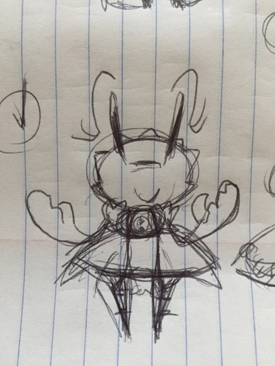
While I could (and have tried, for fun) to make her more crab-like, I like how she looks already and people find her cute, so I stick with that.
I don't have Poppin's original drawing anymore, but I recall he was originally made to be a side-character, and the initial idea was his "shell" would act as a coat.
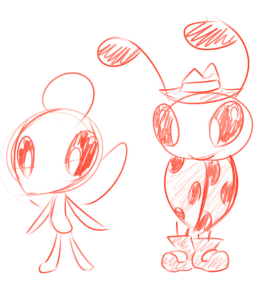
(he's on the right, left is an older fairy-based Jupa)
As I was fleshing out that story and fleshing out these two, I started molding them into being a pair similar to Banjo-Kazooie, and wanted to make them more expressive. So Poppin's fake wing-coat turned into an actual coat, with his wings taking on a reduced shape similar to a backpack.
While not consciously intended, you can definitely notice a similarity to Invader Zim, which was one of my favorite shows and an early influence on my artwork from way back then. So older stuff used to have big heads and thin bodies, shapes that were more abstract and sharp, the eyes. His wings being small and round are similar to Zim's PAK.
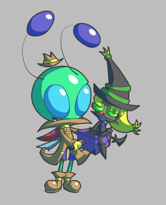
(though here, I was trying to distinguish them before not really liking it)
I played around with their colors a lot. He was green originally, I think I just didn't want to go with black-red ladybug colors because it was too dark? At one point I decided to try white because it was opposite of black, and because pure white didn't look good I tried out different off-whites, starting with gray, gray-blue, and then settled on a purple tint.
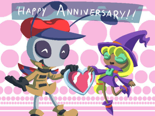
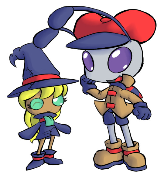
There's been a bit of history with Poppin and Jupa's color changes, but I settled on them sharing 3 colors (red, blue, orange) to represent their partnership and cohesion, while possessing unique ones (poppin = purple, jupa = green and yellow) to distinguish them while like, representing the full colors of the rainbow when you put them all together. It seemed like a cute idea to me. It's difficult to talk about just one of them cause they're designed as a pair.
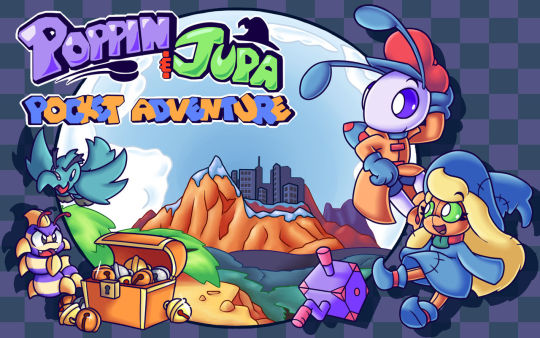
Canonically, Poppin's colors are considered unusual for a ladybug, so it is acknowledged in universe and he's often mistaken for other stuff (ant, alien). His father looks more like a normal ladybug, so he likely gets it from his mom, who is a butterfly. He's definitely not based on a specific species of ladybug.
4 notes
·
View notes
Note
I think TNA and Surrender are the worst written attempts at problematic tropes/darkfic from PB.
TCH at least had a cohesive story. WB too, as annoying and tropey as Bastien was. Haven't read Queen B yet but as far as I'm concerned that story was well aware of MC having shitty behaviors and even tried to have her develop from that.
But Surrender and TNA fail because they somewhat try to use serious themes but only end up contradicting them.
TNA for instance revolves entirely around Sam and MC having an affair, yet they're always criticizing Robin and Sofia for doing the exact same shit. And to add salt to the wound, they force us to support Jenny and Aditya's affair (despite them being 100000× less sympathetic than Sofia and Robin). It's like one of those lampshadey self-aware jokes, except worse because they're forcing me to take everything seriously this time.
And it's not just in the aspect of cheating. MC and Jenny criticize Addi for being petty to "one up" MC then proceed to have options where MC can be petty and "one up" Addi.
It's like PB maybe wanted to say that they don't condone cheating but they couldn't be assed to just say so in a damn content warning because they wanted to have their cake and eat it too.
And Surrender... what else is there to say? The story revolves around MC escaping a toxic spouse and supposedly finding herself through kink. But she's doing so with someone who basically preys on her while she's still vulnerable and tries to coerce her into BDSM no less than 10 minutes after they first meet. Granted Pat and Reagan are both toxic in completely different ways (whereas MC/Sam amd Sofia/Robin did the exact same thing) but STILL. It's like going from drinking dysentery-inducing mudwater to drinking some super toxic chemical, where said super toxic chemical is made all bright and pretty-looking to make it seem better than the dysentery-inducing mudwater.
And it leaves both of them feeling like wasted potential.
I vastly prefer TCH to Wolf Bride, and I vastly prefer Wolf Bride to TNA and Surrender, which are really stiff competition for each other.
TCH’s strong suit was its cohesiveness. Kieran never grew on me because they left a really awful taste in my mouth and didn’t seem to grow realistically. Wolf Bride was…well, it had its own…unique…problems. And the Queen B MC did grow at one point, but still reverted right back into her old catty, needlessly cruel ways, and didn’t really receive any consequences for it.
The Nanny Affair was really just a series where everyone had this holier than thou attitude and it did not suit any of them well. The MC and Sam, forgetting about their toxic relationship for a minute, are both so hypocritical it’s laughable. You’re really going to shame Sofia for doing the exact thing you’re doing? And the Addison thing was a whole mess. Hey kids, your new soon-to-be stepmother bought you this really cool gift! Not because she thought you’d really like it or anything, just to one-up your mom!
Also a side note: Sam was so similar to my abusive ex that it was frightening at times. Like, some of the things they did and said were absolutely uncanny. It was jarring.
As for Surrender, that one’s just a toxic cesspool from the get go. The roots are rotten to the core so just uproot that whole tree. I feel bad for the MC. She seems like a genuinely good person and doesn’t deserve any of the shit Reagan and Pat give/gave her.
Every book and idea has potential, but as you said, the potential was wasted.
6 notes
·
View notes
Text
Obviously not a critique but I do really prefer datv combat set up compared to bg3’s. Or bg1’s. I feel like the turn based combat takes way too long and kills the entire mood of a situation (like the needless ambush in the morphic pools). And it’s nice to only have to focus on what I’m doing rather than the entire party.
Also love that companions will warn you about enemies and things actively happening in combat, even if it is a little agitating to hear Davrin go “They’re shooting at us!” For the 20th time while I charge the enemy.
I’ve also been really liking the dragon age world building so far, it feels like such a fresh breath of air from many other fantasy games.
As for some actual comparisons with critique in mind because people love forcing the two into the same room for some fucking reason…
I feel like the companion stories in bg3 are way better, but drown out the actual story of the game. Only a few characters get to have the whole character arch however, and that’s really disappointing. You can compeltely skip over some companion’s stories and the game just lets it slide? I really don’t want bg3 to normalize having companion stories completely eclipse the actual game’s story, even if they were well done and enjoyable. It’s a double edged sword that I can sing praise for Shadowheart’s specific story, but not do the same for the entire plot.
While datv’s companion stories have been more normal length if not quite lackluster, but it makes up for it with the main story being so focused on. They feel like they lack build up and connection to the companions in datv, companions who’s stories are far more personal feel like they come at you with it out of no where. While companions whose stories are meant to be more personal can falter because of it. Overall it does let the story flow at a more reasonable pace, and while the writing in the entire game can feel a little janky at times I feel like it lends to the charm of the entire game.
The environments of datv feel way more stunning and controlled than bg3. It feels less like many environments were more focused on realism in bg3, rather than emotional or environmental cohesiveness. I’m not saying bg3 compeltely lacked that, it just was way less present. Rosymorn however, and some of the shadowlands, did great at that. I think my favorite datv area that did this is definitely the Hosberg Wetlands. The Monastery looked like it was made with the sunlight and stunning environment in mind, which allows it to stand out much more. Similarly the Wetlands’ overall color pallet lets the blight stand out alongside emphasizing many smaller details (Lavendell flowers & the red hue of the water).
Similarly with design I feel like bg3 had more ideas, but datv did better. Companions have completely unique looks to them in datv, while in bg3 all they have unique to some of them is hair and faces. It does allow for more leeway and allows gear to be shared throughout the party, but it lacks giving character’s a strong unique look. I do like the fact that all the companions in datv have unique body types as well as the smaller detail of Neve and Lace’s hair changing between the lighthouse and being out. I think bg3 however allows smaller details of companions’ looks stay small and still matter. Gale’s earring, Shads Wyll Lae’zel & Karlach’s scarring, the symbol of Minthara’s noble house on her neck, etc. I wish datv had some more details on companions like that.
Back onto the writing point, datv’s writing so far has been way better than bg3’s even if it has moments of being more comedic. The humor derived from Varric’s narration while still letting it add to the tension of the story is well done. The game also knows when to drop that and have genuine moments of emotion. It strikes emotional moments way better and, while still having its jankiness, it hasn’t taken me out of the game at all. Really my biggest complaints with it so far wouldn’t actually make the game that much better, and are more “that’d be neat.” The companions are actually written to be queer as well as feeling very distinct, and this isn’t a note on the writing but I do like that it has several companions who aren’t just white people.
Bg3 on the other hand wasn’t written that well. The main story crashes and burns actively, many things it tries to make serious fail to hit (either because companions comment on the situation with no need to, or just because it doesn’t let there be any build up at all and prefers to vague it’s way into it). The game doesn’t make defeating the elder brain feel like half the accomplishment of rescuing Aylin. There are quest lines that come back and continue for way too long, only to have an ending that’s basically “here’s a gift, you helped us.” And the game isn’t built around any main character to make room for the origins. Tav has no personal connection to the story, and the dark urge despite being the best origin gets so little it’s upsetting for a game series about Bhaalspawn.
I think datv’s soundtrack is better than bg3’s. But that’s more personal preference. Datv hasn’t been repeating the same music leitmotifs, but I do like the small additions of vocals bg3’s had. Datv’s blends more into the background only to pick up during combat and important moments, while bg3’s stays pretty consistent. Which probably has to do with them having different styles of combat. I really prefer when parts of a soundtrack blend away into the environment rather than tries to stand out.
Honestly I feel kinda bad for people “comparing” datv to bg3, when in reality they’re just upset datv isn’t doing things like bg3 does things. I like that romance is less of a focus in datv and I do like the companions actually bonding and growing with eachother. I do wish some relationships didn’t get resolved in one conversation, but it doesn’t drag down the game that much since the companions aren’t the focal point of the game. I really don’t want every fantasy rpg to have to be bg3 or someone’s favorite game of all time to be a decent game. You don’t have to be madly in love with every game you play, and I’ve found it’s very normal to just like a few companions (or just one) and not have to love the entire cast.
Idk this is a ramble. I could probably format this as an actual review, but I’m tired right now. And I still need to finish datv, which I think I’m getting pretty close to doing.
1 note
·
View note
Text
Pixel Art: The Basics
By playing pixel art games, I can get a better idea of what type of styles can be achieved and what styles I want to use for my game.
Castlevania: Vampire's Kiss

3-D WorldRunner

A Boy and His Blob

We can also get a better idea of how to make pixel sprites by researching other pixel artists.
Army Of Trolls:
Army Of Trolls is the site of Gary J Lucken's portfolio where his designs for games, YouTube and festival banners and commissions. His work features very bright and bold colours and focuses on 2D settings such as his London Games Fest art and his GDC 2018 brochure art. Specifically, his settings our done in the isometric pixel art style.


Octavi Navarro:
Octavi Navarro Art & Games is a studio based in Barcelona. Octavi Navarro himself is a pixel artist and game developer who creates narrative driven games. A lot of his colour palettes are more muted and he uses a lot of clean angles in the settings of his art pieces. His art also has a strong use of dynamic lighting with the use of spotlights and smaller light sources that blend nicely in the environment. These unique light sources also create strong shadows across some of his pieces.

Derek Yu:
Derek Yu is the creator of many popular games such as Spelunky, and Aquaria. He has a site called 'Make Games With Derek' where he has tutorials on how to do pixel art as well as examples of his own and other's work.

Both Spelunky and Aquaria have pixel artstyles, making them good examples to look at.

Spelunky is mostly underground and so has a limited colour palette. This, however, does not stop the game from being colourful. From gold ore scattered about to brightly coloured enemies and characters, Spelunky is made visually engaging by its use of colour.

Aquaria is a lot less pixel-based. It takes place underwater, meaning its much more visually cluttered than Spelunky. The colours are still bright, but a more dynamic use of lighting makes the colours have more depth.
Johan Vinet:
Johan Vinet is a pixel artist who recently released a mini-game called Castaway. Castaway is a pixel game with bright graphics, smooth animation and a fun mixture of puzzles and action.


After testing out some pixel art games and doing my own research on other pixel artists, I moved onto making my own character in pixel art form.
64x64:

I personally really like the level of detail that 64x64 allows me to put into the sprite. This, however, comes at the cost of time which means 64x64 will likely be unsustainable for this project (1 1/2 roughly).
32x32:

I first did not like 32x32 but as I kept at drawing my character I began to prefer this to the 64x64 version. The 32x32 both is detailed enough to keep my character distinguishable but also can be done a lot quicker than the 64x64 version (15 minutes).
16x16:

16x16 is too small for my character. Because of her limited colour palette and her requiring an outline to be distinguishable, this option is not viable. The time save was also not worth it (5 minutes).
8x8:

Definitely not using 8x8. My character is requires some form of gradient as well as enough room for an outline to be distinguishable. Animating this would also be a very difficult task. (45 seconds max).
4x4:

4x4 becomes a colour palette rather than a sprite. 4x4 is mostly used just to find the main key colours of a character. This doesn't effect my character particularly as, due to her limited colour palette, all of her colours (even the gradient and outlines) fit cohesively on the 4x4 canvas. (15 seconds).
After choosing the type of resolution for my character, I decided to upgrade the sprite itself. I wanted to give my sprite a more dynamic pose that felt more alive than the previous one. I also wanted to add some darker colours to the parts of the character that were further back for more depth.

0 notes
Text
5 Character Design Tips for Creating a Winning Game Character
Are you an aspiring artist looking to make your mark in the world of character design? Or maybe you're a writer who wants to add a little pizzazz to your latest story by creating some amazing characters?
Either way, this guide is for you! Character design can be incredibly rewarding, allowing you to bring your unique vision to life. Let's dive into the steps involved in designing a character that is used by top game concept art services.
Step 1 - Brainstorming
The first step in character design is brainstorming. To begin, ask yourself questions like "What kind of character do I want to create?" and "What sort of qualities should my character have?" After you've come up with some ideas, start sketching out potential designs.
Don't worry if they don't look great at first – the goal here is just to get your imagination flowing and get a rough idea of what your character will look like in the end.
Step 2 - Refining Your Design
Once you've got a few sketches on paper, it's time to do the fun part – refining! This is where you'll really start bringing your character to life. Think about how each design element interacts with one another and how that contributes to their overall look.
Consider elements such as facial expressions, clothing choice, posture and more to give them depth and personality. As you refine your design, remember that every detail matters – even seemingly small things like hairstyle or accessories can go a long way toward creating an interesting and unique character.
Step 3 - Find the Right Tools
When it comes to creating artwork, the tools you use don’t necessarily make or break your success. In most cases, you can accomplish the same outcomes utilizing both traditional and digital mediums – the only difference is the production speed.
It is possible to replicate certain art styles like watercolors on a computer, but they often look best in their original luster. Ultimately, your aesthetic preference and that of your client will heavily influence what tools you decide on.
That being said, no matter how advanced your equipment may be, it cannot compensate for poor concept development or fundamental shortcomings in your artistic skill set. So it is important to hone those skills first and foremost!
Step 4 - Do not underestimate thumbnails
Thumbnails are an important babbling point for creatives. From small previews of images or videos on the internet to sketches in the traditional illustration world, they are useful tools for professionals and hobbyists alike.
Thumbnail sketches allow a video game concept artist to draw out several ideas without committing to a finished piece of artwork. This ensures flexibility when moving through creative processes.
Step 3 - Creating Your Final Piece
Now that you've refined your design, it's time to create your piece! Start by drawing out each individual element of your character (such as clothing items or facial features) separately before putting them together into one cohesive image.
If needed, use reference images to help perfect certain details or get inspiration from other artists' work. When you're done, take a step back and admire all the hard work that went into creating your very own unique character!
Conclusion
Congratulations on completing this guide on how to design a character! You now have all the tools necessary to create any type of character imaginable – so what are you waiting for? Get creative and show off those skills!
Whether it's for a comic book series or just for fun, designing characters can be incredibly rewarding when done right. So go ahead – get designing! Who knows? Maybe someday we'll see your characters featured in their own stories! Good luck!
Try us now if you are looking for the best concept art services. We have the dream team of artists for game art services that can put your concept to life. Trust us; we are the best among video game outsourcing companies.
0 notes
Text

( Transcript: The 5 Principles of Design For Entertainment )
INTRODUCTION
Before I get to giving feedback to your submissions I would like to make it perfectly clear from which kind of design philosophy I come from when addressing your designs. That way you can decide if the BuildGuild's approach fits into your preferences or not. As I'm currently the only Mod active on the blog currently, I will of course only be able to argue for my approach and not for Chekhov's or any future mods, who will most likely publish a post about their own methods later. For now however, you're stuck with me for the time being. As I come from a background in academia and with a focus on creating designs fit for the entertainment industry ( and the indie-industry subsequently ), I work on a basis of principles. I'll delve more into these at a later date ( or you can google them if you feel so inclined ), but for now I'll simply introduce you to the broader ideas so we're on the same page from the beginning!
"So, what's a design-principle?"
Almost no matter where you go in the world of design you'll be bound by the fact that your design must solve the problem it is supposed to adress to some capacity. In entertainment design, more specifically, for concept art and storytelling; that means that your design must be effective in communicating its desired purpose to the audience. That might sound obvious to some. But you'd be surprised just how often even big and trusted film-companies or game-developers fail to make their designs effectively communicate their designated purpose to their audience.
To the rest of us, who need things explained more concretely, here's an example. " A character that is set out to be a villain in a story, must be effectively be presented as one" Similarly " A plot revolving around a mysterious disappearance of a character, must be presented as mysterious"
Duh? You might be thinking. Of course I need to present my character's as their intended purpose in the story. That's the whole point of having characters! But how do you ensure that you present your characters effectively? How do you make sure that everyone understands that your villain is a villain, and that your mystery is mysterious. Sure you could write it all into your script. The villain could be the most evil villain that ever did evil. But often, good storytelling is in the subtleties. Maybe you even want to hint that your villain is a bad guy before they even turn to their evil deeds?
Principles of design help us ensure that we communicate the intent of our ideas clearly to the audience. Principles are recurring patterns in design which popularity have been re-enforced by their continuous effectiveness in communicating the intent of its subject ( a character design, environment, or plot-point).
That might all sound very abstract but to put it as simple as possible: Principles are continuously proven methods designers use to make their designs work with their audience. Note: Principles are subject to change. Even variation across time and culture. So one designer might apply themselves to one principle, while others apply to another. Ultimately, it doesn't matter which principles you use, as long as they fit the audience and the purpose of your design. If you follow a design principle that states that the colour white symbolizes purity. Then you can only make a successful design with this in mind, if your audience also agrees, that white represents purity. Principles must also stay consistent throughout the entire design in order to be effective.
This blog will try its best to be open to the principles of other cultures and time-periods when presented with it. But until we get moderators or contributors from other cultures or generations, we'll be relying primarily on the current set of principles that the design industry in the west uses.
CURLS design principles

( Transcript: CURLS. Cohesiveness, Uniqueness, Recognizeability, Story )
Much to my regret, I do not have a methodology named after me yet. But I guess now is a good time as ever to shoot my shot. When I work with reviewing and giving feedback to any design, from an Art Director's perspetive, I work from a model I've come to refer to as CURLS throughout the years. This is also the model which I will be using when reviewing designs through our submissions.
CURLS is a set of parameters which encompasses parts of a design. Some of these parameters contains a number of principles, whilst others stand on their own. When using CURLS, I'll be considering the proposed design and try to figure out if it successfully completes the parameters in my experience. The more parameters a design can adhere to, the stronger the design. There's a number of ways for a design to fulfill a parameter. We'll get into some of them down the line, but keep in mind that design is all about trying all matter of ideas and combinations out and seeing if they work. Sometimes you'll run risks and they pay off, sometimes they don't. It's all part of the procedure. Getting things wrong happens just as much to professionals as it does to amateurs.
Here are some of the more common methods designers apply to their process when trying to make for strong designs ( and some that I consider to be viable ways to make a good design )
COHISIVENESS - Stylistic cohesiveness Stylistic cohesiveness is pretty self-explanatory. It is important that your design looks like it applies the same style across its entire self ( unless of course the point of the design is to straddle multiple styles, but even then - it must still look somewhat put together so that it makes it absolutely clear that the difference in stylistic choices is intentional)
A design that doesn't work to maintain stylistic cohesion can easily come off as unfinished or sloppy, so make sure everything looks like it belongs together. - Viewer comprehension Your design should be easy for your audience to read. You need to guide their eyes intentionally through the design by using shapes, colours and contrasts to provide a clear and understandable path through it. This doesn't mean that you have to make your designs overly simple or static. You can still make a design complex and readable by studying ways to compose your design ( such as grouping certain colors together, having patterns face certain directions or recognizing the flow of volumes, more on these methods in a later essay). - Design cohesion Lastly for Cohesiveness, your design needs to stay true to its own principles. If you've used shape language in parts of your design to indicate some kind of function or feeling, then you must use shape language throughout the rest of the design as well. Otherwise, the shape language used can be nullified by the parts that do not apply to that principle.
Similarly, if you use a certain pallette to indicate wealth and sophistication ( say, green and black ), and suddenly switch halfway through the design to another pallette that does not consider colour symbolism, you will have damaged the integrity of your first pallette.
UNIQUENESS Uniqueness; it is in the name. There's a million stories out there and even more designs to accompany them. Standing out from the crowd is important if the design is to be noticed and remembered. Though, sometimes you don't have to re-invent a whole fantasy race for your design to look unique. Sometimes it is simply the combination of little things. A blue orc with excessive amounts of fine jewelry. An alien at the Rio Carnival. Even something as novel as using different shapes in combination with obscure pallettes can be enough to make your design stand out!
RECOGNIZABILITYH - Sihlouette If you have ever heard anyone talk about concept art before, you probably know that for character design, sihlouette is incredibly important. Though it is also very important when it comes to prop design or even environmental design. Making something recognizeable by its outline alone helps make the character read much better when you start designing it in detail. It also means your audience can remember your design's iconic shape from a distance or perhaps even when hinted at through other designs. - Pallette Just like the silhouette, a strong and recognizable palette can help make your characters memorable, even when out of the context of your universe, story, game, etc. You can combine this with color symbolism to enhance your audience's connection to the character's palette.
LINE MILEAGE - Format / purpose vs complexity A term coined by the animation industry back when the films were drawn frame by frame. Line Mileage refers to the total amount of time it takes for an artist to fully draw a character or element. They used this term to define whether or not an idea was properly designed to fit the production and its deadlines. A character design loaded with details and props would probably have a very high Line Mileage, which meant it would take a lot of time to draw it, which in turn could slow the process and risk running out the deadlines. A character design with a Low Mileage however would be quick to draw and could safely be introduced to the animation team without any worries about whether or not they could make it to release date.
When using CURLS, I consider Line Mileage a little broader than just animation. But the idea stays the same. A measure as to how long you need in order to be able to draw the character. You're allotted mileage differs from medium to medium. If you're using the design for sporadic illustrations or a low-volume storybook, then you can probably get away with higher mileage than with a design that would be meant for a comic. Scaling the level of details on your character is a huge challenge even for professionals occasionally. It often takes multiple edits before you've narrowed your design down to something that's appropriate for your medium and your deadlines.
STORY - Shape Language Another principle some designers subscribe to is the impact of Shape Language in their design. Shape Language proposes that basic shapes: the square, the circle, and the triangle all invoke certain feelings in the audience when they see them integrated into a design. Particularly character designs.
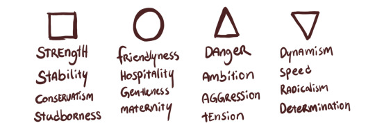
Square: Strength, Stability, Conservatism, Studborness. Circle: Friendlyness, Hospitality, Gentleness, Maternity. Triangle (pointing up): Danger, Ambition, Aggression, Tension. Triangle (pointing down): Dynamism, Speed, Radicalism, Determination.
Using these shapes consciously to communicate the feeling your audience should get for the character without having to hear their motivations spoken outright can leverage your design from 'functional' to 'effective'. Optionally: designers have also used Shape Language to defy the principle and provide a twist to their characters. - Colour palette Similarly to how shapes can invoke a sense of a character or an object, so can colours. Depending on which culture you're from, colours will symbolize a variety of things. In the west, we often refer to red as the colour of love. But it is also the colour of war. Blue is often associated with the tranquillity of the sea, but it can just as well lead our minds to large corporate billboards. Colours and their meaning are often impacted by the context they're in, so keep this in mind when you design with them. Using a green similar to the dollar-bill invokes a sense of wealth, while using the green from blooming flowers pulls the imagination to a flower field in spring.

Red: Passion, Violence, Vigor, Life. Blue: Calm, Trust, Intelligence, Stability. Green: Nature, Energy, Hope, Greed. Yellow: Optimism, Creativity, Cowardice, Sickness.
- Details Certain details on a design can provide hints to its story and purpose. A specific scar somewhere or a unique prop in the hands of a character gives us information about the design without any exposition being needed. This should be used somewhat in moderation. Particularly in character design: too many important details can clutter up your design. This makes it hard for the audience to know which detail is important for them to notice and which they can ignore on first glance. So select only details that you deem are integral to the character and pour your love into that.
These are the parameters that I will be referencing when providing feedback for your pieces and answering your questions. As previously mentioned, it is only my personal approach and not the only or 'right' way to do it, nor is it any kind of industry standard. But I hope by following CURLS I can provide at least, thought-provoking and consistent feedback, that you may be able to take with you in your future creative works. I look forward to seeing your designs and talking to you all about design! Mod Wackart ( Donate ) Portfolio
110 notes
·
View notes
Note
hey red, I wanted you to know that Aurora is a huge inspiration for me and my webcomic that I'm working on, it's really incredible. On the flipside I got really into reading this blog and the worldbuilding that's in it yesterday and now I'm doing worldbuilding for the world of my comic that is very fun but frankly NOT important to the actual story. Any tips on cultural worldbuilding that both makes sense and also remains relevant to your story?
That's great to hear!
Worldbuilding is a delightfully inescapable vortex. It's like putting together a puzzle you're drawing yourself and also there aren't any edge pieces because the ride never stops. Essentially, you have to decide which approach is better for you personally: to build a world that serves the story, or to write a story that explores that world?
If you're building a world around the story, you basically just need to focus on worldbuilding the parts that engage with the story and making sure there's enough connective tissue that the cohesive whole kinda holds together. If you just need a setting for a really cool swordfight that advances the plot from point A to point B, you can worldbuild a towering ancient ruin or a floating sky-fortress or whatever to have the fight in without having to go too in-depth on who built it and why, but you also can go more in-depth with those things if you want to make the setting more than just "place where swordfight happens." Maybe the sky-fortress is a Laputa-style ancient superweapon or the ancient ruin was abandoned after being overrun by sentient skeletons or something. Maybe you decide that an ancient group you've already worldbuilt for other plot reasons was responsible for building this too, so you can loop in whatever lore you've already made for them. The possibilities are pretty close to endless, as is always the case with fiction you're writing yourself - in this approach, the challenge is mostly making sure that the disparate chunks of worldbuilding you're shaping around the plot actually fit together cleanly, rather than clashing or leaving plothole gaps between them. For this reason, it's good to have a base skeleton of Things You Know For Sure About The World so that there's consistency between worldbuilding chunks - fundamental principles of reality, magic systems, major historical events, stuff like that. They don't need to be super detailed, they just need to serve as anchor points to hold all the story-centric worldbuilding together.
This is why some people prefer the other approach - building the whole world and then writing a story to explore it. This is a favorite of sci-fi, spec-fic in general, magical otherworld stories and almost every TTRPG ever made, as the whole premise of those genres is "what would it be like if the world looked like this instead?" In these stories you can worldbuild to your heart's content with no regard for plot or characters, since the plot and characters will arise from the exploration of that world once you've got it fleshed out. This is a great idea if the world is probably the most interesting part of the story, and a less-than-great idea if you really want the plot and characters to shine as the stars of the show. Larry Niven, prolific hard-SF writer, took this approach almost exclusively and came up with some incredibly unique settings and alien races - my favorite being Ringworld, a book entirely about exploring an ancient alien megastructure rotating around a star. It has characters, but, like, barely. They're just a vehicle to explore the worldbuilding, and it is some very cool worldbuilding.
This approach is a good way to get a very cohesive world that fits together well, but it also runs the risk of getting away from you. Anchoring the worldbuilding into a linear plot or single region or relatively small cast of main characters lets you stay focused on what actually matters for the story you want to tell, rather than burning years or even decades building out the tiny fractalized details of what exactly this long-extinct civilization wore on their second-best festival days. Coherent large-scale worldbuilding is fantastic if you're designing an open-world game or setting - Breath of the Wild's worldbuilding is a standout example of this, as the entire map and the items/creatures in it paint a very beautifully detailed picture of this environment and what happened in it, from ancient ruins with several very visually distinct architectural styles, to a fireball-slinging wizzrobe hanging out in a burned-out village, to a massive tree that collapsed down the side of a hill, to a huge fuckoff hole carved through a whole-ass mountain, to the battlefield Link later finds out he died in being absolutely carpeted in an army of completely destroyed inert Guardians, cluing us in that whatever battle went down here was rather more crazy than what went down in the other battlefields we pass through, where only a few guardians are scattered around and some sneaky ones are actually still active. The world isn't just there to serve the linear narrative of the main questline, it's there to present the player with a very big picture and let them piece it together themselves.
For a game as freeform as Breath of the Wild, this is a great call. For a linear written narrative with only one plot, it's completely unnecessary. It's best to find what balance works well for you so you can stay focused on the point of the story without getting bogged down in the stuff that ultimately won't matter. Worldbuilding can also be super fun, though, so like - do whatever makes you happy, really.
120 notes
·
View notes
Note
I know you’ve talked about wurmple, but what about your thoughts about the rest of its evo line (and settle the eternal debate: beautifly or dustox 😤😤)
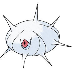
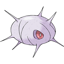
I'm not gonna lie, I never really got the point of Cascoon and Silcoon. Like, why do they look so similar? If the idea was that you still don't know what final evo you're getting... well, no, because these are still two separate Pokemon with two separate names and differences in eyes, colors, etc. But if they're supposed to be separate, then why do they look so similar?
I point this out because Silcoon was one of only four Pokemon to not get any votes during a popularity poll, but Cascoon did. There's just no point in having two designs that are technically separate when you could just have one evolution at this stage that doesn't split until it evolves, you know?
And if you want them separate that badly, why not give them different designs? Butterflies make chrysalises while moths spin silk cocoons to pupate in; leave Cascoon as-is and make Silcoon more like Metapod or something so the two feel more unique.

(Also, I mentioned this in the Wurmple review, but I'll mention it again here: it's really crappy to not be able to influence what Wurmple evolves into, especially if you have something rare like a shiny. Having it evolve into Cascoon at night and Silcoon during the day would make logical sense and would be much preferred).
Anyway, with all that said, the designs of these two are fine for what they are, if not a little bland. I like the eyes poking out, which adds personality. Between the two, I'd say I like Cascoon more; the eye shape looks better and having a bit of color is nice.
However, I do have to say that the tendrils coming out of them are supposed to be anchors connection to tree branches and whatnot, so in most of the games and other media they're just?? dumplings??
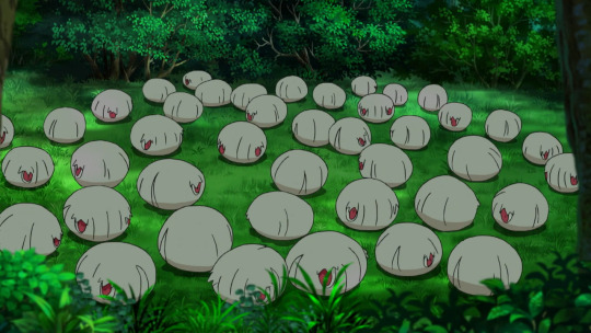
Give them some weird tentacle appendages they can manipulate, cowards.
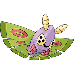
I'm probably not settling any debates on Dustox/Beautifly because neither are really my favorite moth/butterfly Pokemon (that honor goes to Volcarona and Vivillion). But with that said, Dustox is the more fun of the two. Beautifly is well-designed, but it's a fairly standard butterfly, all things considered. Dustox's funky face and stylized body and wings are much more unique. Plus the purple and green make for a good poison-type combo, complete with false eyespots.
However, there are a few things I don't quite jive with. The way the mouth connects directly to the eyes is... weird, and the way the body is one entire segment with the face underneath is also awkward (how does it see in front of it when it's flying?). It's got the right idea, but there's just one too many awkward things going on with it.
Also, this applies to Beautifly as well, but it's always bugged me that these two look nothing alike; the bodies are handled differently, the wings are completely different, the mouths are different, the colors are different... it honestly feels like one of the two (probably Dustox, Beautifly has Wurmple's eyes and underbelly) was a separate line that they just stapled together at one point during production. Just something minor, like them being the same color or sharing the same wing markings, would've made the line much more cohesive.

Beautifly is probably the most anatomically-accurate butterfly we've gotten (relatively speaking), even having the standard proboscis that IRL butterflies have. Even better, this cute little butterfly drinks blood, which is great and adds a lot of personality to it. I just wish it worked its way into the design a bit more; maybe it has the red rings that Dustox has, but they only flush red after it has drunk blood or something like that.

However, it's maybe a bit too accurate? Like I was saying with Dustox, there's not a lot that really sticks out about it. The wings are nice, but it's basically just a Pokemon-ified butterfly and there's not much else going on with it. If you look at, say, Butterfree, it at least has a funky mouth that makes it feel a little more monster-y. I definitely don't mind it and the design is perfectly nice, but it ultimately doesn't stick out in my mind as much because of it.
So as a whole, this line is pretty solid. However, I think I would've preferred a single cocoon stage to streamline things, and then have Dustox and Beautifly match each other a bit more (at least in colors and wing patterns, if nothing else) to help with coherency. Also at gamefreak please make it so we can pick our evolutions in the future, please and thank you.
36 notes
·
View notes
Text
I have many thoughts on the weird phenomena in the DC fandom and the Batfam fandom specifically where probably the majority of people just straight up. haven’t interacted with the source material. and almost all of those thoughts can be summarized as ‘lmao that’s weird and mildly concerning’.
and because I’m annoying I will list them all here right now <3
1. To preface this post, I mean, obviously, comics are inaccessible as all hell, both in the disability kind of way and the ‘you need to understand the concept of hypertime to fully comprehend the DC timeline’ kind of way. Because of this, even if you don’t have a disability that prevents you from reading comics, I don’t think it’s unreasonable to look at the amount of comics you need to read to have even a base understanding of a character and go ‘no thanks <3′ and just enjoy fanart and fanfic in a vacuum. Ultimately, this is fandom, this is supposed to be fun, it doesn’t really matter.
2. That said, it’s VERY weird to me that the majority of this fandom just straight up hasn’t interacted with the source material, and moreover, that it’s considered rude to tell people that they should do so. It’s especially weird considering the amount of fanon-only fans I’ve seen who straight up have a superiority complex over canon. The idea that it’s gatekeeping to tell fans of something to actually interact with canon is just. so weird, and a fundamental misunderstanding of what ‘gatekeeping’ actually entails.
3. But honestly I’m less interested in discussing the ways in which canon and fanon fans should interact with each other (personally, I think it would be helpful to create separate tags of some kind, but that’d require quite a big overhaul of the current fandom state) than in figuring out how this actually happened in the first place. On the one hand, it’s obvious; long-running superhero comics the way DC writes them have made themselves so thoroughly inaccessible that most people are simply too daunted to even try. Most media has a cohesive beginning and end (or at least, a planned end somewhere). Comics just... don’t.
But I do think it says something that, even among people who are clearly interested in the characters (since they have, you know, entire blogs about them), the effort to get into comics just seems to be too much to even bother. This really doesn’t bode well for the future of DC Comics. Obviously, I am no expert on anything at all ever, but I’d personally be surprised if DC survives beyond the few decades, at least in its current form/without a big overhaul.
4. But on the other hand, I don’t think the confusing state of DC Comics is the only thing to blame here. Fandom has a well-known problem with reducing any character down to archetypes to more easily ship and write fic/make content with. This problem is particularly prominent in fanfic, which, if you read enough of it, you’ll eventually start seeing not just the same tropes and trends, but essentially the same fics over and over again. And not just within the same fandom; everywhere, or every large fandom, at least.
Fanon Batfam is entirely built on a bunch of those tropes; insecure/depressed sadboy Tim, team mom with optional hidden trauma/emotional problems Dick, bad boy with a heart of gold + sadboy combo Jason, abused sadboy Damian/angry easily-villified-for-fic-reasons monster Damian, good dad Bruce for found family fic and bad dad Bruce for angst fic, etc. This all culminates in a found family dynamic that’s generic and malleable to whatever fic the writer wants to write.
(This isn’t getting into the ship fic, which I avoid like the plague because the vast majority of it is incest, but I’d bet real actual money that the tropes in those fics fall under what is often preferred by the Migratory Slash Fandom.)
By having a decent excuse not to get into canon (the inaccessibility of comics) and a, by now, well-established fanon fandom, many fans feel free to use the batfam fandom as essentially an excuse to write whatever fic with reduced archetypes and tropes they personally feel the itch to write, without having to bother with even consuming a canon. This is compounded by the fact that canon itself is often contradictory and frankly bad, meaning that whatever interpretation of a character you want/need to go for your fic is at least theoretically backed up by canon (for example, you can just as easily cast Bruce as an abusive shithole dad who his kids need to get away from as a loving father figure who cares deeply for his children), which you can always use as a defense if people question your characterization.
5. This focus on fandom trends and tropes over actual creativity or care for the characters is also visible in the way bigotry manifests in this fandom; namely, in literally the exact way you’d expect. The female characters and characters of colour are shuffled to the side, non-existent, vilified, and/or reduced to harmful stereotypes.
Barbara is probably the one I saw the most often in fanfic, but usually just as ‘Dick’s girlfriend’, and even then, she was often vilified for Dick angst (especially in fics about examining Dick’s trauma from his canon sexual assault; Kori also often gets the short end of the stick in those). After that, probably Stephanie, who fanon fans don’t really seem to know what to do with, so she’s basically just there as comic relief waffle girl, most of the time, though sometimes she can be used to either further Tim angst or further vilify Tim, whatever the fic calls for. Cass has gotten included more in batfam fics as of late, likely in response to critiques of fandom racism for leaving her out, but again, it’s clear people don’t actually know what to do with her. She’s often reduced to a racist stereotype of a quite, stoic therapist for whatever guy du jour needs it. That, or she’s in Hong Kong and just not there. Duke especially gets left in the dust in fandom, usually just being non-existent, but when he’s there, he’s almost always nothing more than the straight man for the actual fun characters to play off of. Talia probably has it the worst, though, and almost universally gets vilified by fanon stans in order to write sadboy Damian.
All of this is extremely predictable behaviour and falls entirely in line with general fandom misogyny and racism; ignoring or vilifying women and characters of colour, or using them as very minor characters at best. The only two characters of colour who aren’t regularly left out of fic are Dick and Damian, who are both also conveniently the two characters most often drawn and written in a whitewashed manner. In addition, there’s a real trend of demonizing Damian in fanon fics where he isn’t written as an abused sadboy, which I’d argue is in no small part due to fandom racism, considering Damian’s behaviour is in no way as bad as Jason’s, who doesn’t get anywhere close to the same demonization and gets woobiefied instead. I also find it convenient that Damian is probably the batboy who receives the most vilification in fic, when he’s the most obviously non-white of the batboys they’re willing to acknowledge.
Fandom often cries for more diversity in canon, only to ignore the diversity already there and focus on the same generic white guys. The batfam fandom is a brilliant example of this.
Which is not to say that fandom racism and misogyny isn’t present in the canon parts of the fandom (and canon itself); it absolutely 100% is. But I’ve found that canon fans are also more likely to like and care about at least one of the characters I’ve listed as ignored/vilified, and are willing to create and consume content for them, whereas fanon fans... aren’t, really. I’ve never seen a fan of fanon Cass the way I’ve seen fans of fanon Dick, for example. Obviously, this could just be by coincidence, or I’ve just surrounded myself with people like that, but it’s been a trend I noticed. Racism and misogyny is present in every part of this fandom and should be addressed as such, but I feel like it manifests the most blatantly in the fanon parts of this fandom.
(I’d also recommend the articles Migratory Slash Fandom’s Focus and Beige Blank Slates, which expand more on the type of fandom racism I think is especially prominent in the batfam fandom, as well as literally every article in the What Fandom Racism Looks Like series.)
6. All this leads me to conclude that the majority of fanon fans don’t actually like the characters all that much; they’re convenient excuses for them to participate in fandom. Which I also think is, in no small part, a reason why so many of them react so negatively to being told to pick up a comic; they came to this fandom specifically to consume it as a fandom, because they wanted the fandom experience without having to consume a canon.
This is not a phenomena unique to the batfam fandom (again, see the Migratory Slash Fandom), but it does fascinate me. While fandom is often said to be an experience focusing on transformative art, I think it’s also safe to say that, especially as fandom has become more mainstream, an increasing amount of people are looking to it less as a way to engage with their favourite pieces of media, and more as a type of media in and of itself. I think the reasons for this are similar to the reasons mass media entertainment like the MCU are so popular; you gain a lot of enjoyment out of it with very little risk involved.
By consuming the same fics of the same characters (or the same archetypes) over and over again, you are rarely at risk of being challenged or even disappointed. It’s often very clear right from the start whether or not a fic will appeal to you, and if it isn’t, it’s easy to just look for another one. It requires less emotional investment than most other types of media, even ‘popcorn media’ like the MCU - or, yes, DC Comics. It’s safe, it’s enjoyable, it’s comforting, like McDonalds, but just like McDonalds, it’s ultimately bland and unsubstantial.
7, TL;DR. Ultimately, I don’t think it’s like, wrong to enjoy the fanon version of the batfam without wanting to engage with canon, and I certainly don’t think it’s okay to harrass people over it. But I do think it’s in large part based on a desire to interact with fandom rather than other pieces of media because people are scared of being let down by those pieces of media (or worse, just uninterested in actually thinking), which is mildly concerning.
#long post#my posts#infodumping#btw i say this as someone who also has trouble consuming much more than popcorn media/fanfic due to emotional exhaustion#but it's not a healthy habit and it's something people can and should try to break out of#also obviously this isn't about EVERY fanon fan specifically so if this doesn't apply to you specifically great then move on
52 notes
·
View notes
Text
We can't know what we don't know.
The value of skepticism in fandom discourse

I worry that the Stranger Things fandom often allows the development of fan-canons and false absolutes in between seasons that might be destructive to certain fans' long-term enjoyment and appreciation of the series.
We can't know what we don't know.
And if we forget this and begin to construct expectations for what might happen next in the story that are too deeply rooted in our hearts: we are setting ourselves up for disappointment and this is not the fault of the Duffer Brothers or the writing team. This is our fault as individuals and as a community.
Stranger Things has three completed seasons, a fourth season currently in production, and an intended fifth and final season.
We are only a little beyond the halfway point in this larger story.
The halfway point.
A lot can happen in the span of two final seasons.
The writing team probably intends to maintain thematic and narrative intentions across all five seasons. The Duffer Brothers have spoken of having an ending in mind for the story for a long time. (”We’ve known the ending for a while.” - Matt Duffer) But we, the fans, cannot truly know what those plans are until the credits roll on the final episode of the final season.
And yet there is a stubborn certainty that many fans engage in between seasons and that I worry has been growing and spreading worse than usual during season 4′s production delays.
In spite of having only just surpassed the middle point of a story arc that’s being told over the span of five seasons, many fans declare that they "definitely know" that certain relationships between characters won't change. That certain characters will "definitely" survive. That certain rumored future story arcs (based on audition tapes, fan speculation, interviews with the cast) will "definitely happen." That certain characters are "definitely straight" or that certain characters are “definitely gay.”
I believe that there is value in seeking to understand and predict events in a story. Appreciating the way that skilled storytellers use foreshadowing, symbolism, narrative parallels, metaphor, lighting and camera angles, music, and other creative tools when putting together a show like Stranger Things is thrilling. I love debating the relevance of certain details to an author’s larger intentions and long-term vision for their story and characters. I believe that skilled writers should plant clues throughout the earlier moments in a narrative so that plot twists are surprising and yet also also have us slapping our knees declaring “Oh, look! All the signs were there from the beginning! Well played.” Some writers start off without a particular end-goal in mind and allow the characters to lead them there as they develop, however we know that this is not entirely the case for the Duffer Brothers and that they have an ending in mind that they have been building towards.
Authors can also make poor writing decisions that contradict the internal logic and implications of their own universe. Writers and creative teams are not infallible. Productions have constraints and behind-the-scenes pressures, challenges, and limitations that might sometimes result in a less cohesive narrative. I don't believe that's the case with Stranger Things but this can and does happen.
But I always keep in mind that this story is not mine. I am fully capable of being incorrect in my analysis and predictions regarding what might happen next.
My theories and predictions (that Mike has romantic feelings for Will, and that Stranger Things is perhaps intended to be about a dissociated system and internal worlds etc.) are not shared by the majority of the fan community.
I question the logic of my thoughts constantly because I am prompted to do so any time I share my unusual theories and ideas with other fans. Because my ideas are strange and less popular I am well aware of my need to provide evidence and logic when offering them to other fans for consideration.
If your ideas regarding what is happening in Stranger Things are shared by the majority of fans: how often do you question your expectations?
Do you think that you question them often enough? Are you allowing yourself to become complacent and to assume that because a large majority of your fandom community agrees with your interpretation of certain plot-points and characters that you absolutely must be correct in your understanding of Stranger Things?
I have seen how emotionally attached many fans are to their own preferred understanding of the story. Many fans greet alternative understandings that conflict with their own ideas with a lot of hostility and protest.
I want to warn all fans against closing their imaginations off to the story taking a different route than what they’ve carved into their hearts.
Fans that like less popular ships or that indulge in the discussion of fringe hypotheticals and unique theories are second-guessing and questioning themselves every day and I think for that reason we are better prepared for disappointment than fans that have allowed themselves to believe in characters, ships, and plot-points being “definite” or “canon” or “endgame” simply because the majority of other fans share (and reinforce) those same assumptions.
I worry when I see large fan-made accounts on Twitter, Facebook, Instagram, and Tumblr that post a constant stream of content that reinforces very specific fan-canons that are not yet absolute and yet are still favored and embraced as inevitabilities.
Do fans truly believe that nothing might surprise them in the last half of the story? Do fans believe that we know everything about these characters, their relationships with one another, and this sci fi universe by this point in the show? Does this attitude seem reasonable?
The constant consumption of our favorite fan-cams, fanart, and fan-canons creates echo chambers reinforcing our current assumptions about characters, character relationships, and presumed future plotlines. Just because a fan-run Stranger Things account with over a million followers posts about a specific ship constantly and this is what you are seeing on your phone every morning it doesn’t mean that this account knows what is going to happen in the story any more than you do. We need to be wary of allowing ourselves to lose our objectivity and our awareness that this story is in the hands of the Duffer Brothers and the Stranger Things writing team and that nothing that fans expect (or, god forbid, rudely demand) is guaranteed. The twisted idea that creators are in any way obligated to pander to their current fanbase is absurd to me when you consider that this is their creation, and additionally when you consider that the series will exist for future fans long after the majority of current fans abandon it.
I want the entire Stranger Things fandom to enjoy the journey, to enjoy uncertainty, and to look forward to finding out what happens next. I don’t want fans setting themselves up for disappointment by stubbornly insisting that their interpretation of what is happening in the story is absolutely correct when the story is not over yet.
If the Stranger Things fan community can allow itself to be open to being wrong I think we will all enjoy the story a lot more and continue enjoying the story no matter what. The creators behind Stranger Things are very talented and I believe they are telling a very well-crafted story. I only hope that the fandom will appreciate it and that we haven’t stubbornly built walls around our own desires that will prevent us from enjoying an excellent story if it contradicts our expectations in the next few seasons.
I know that if I look forward to the thrill of discovering something new about my favorite characters in future seasons that I will rarely be disappointed.
I hope we all continue opening new curiosity doors and try to avoid setting our hearts on specific expectations.
#stranger things#stranger things fandom#stranger things theories#I know this might be a buzzkill post but I think it's important not to forget this
37 notes
·
View notes
Text
My Relationship With Sherman Brother's Music
If you have talked to me for more than five minutes about Disney anything, odds are that I've brought up this duo of brother's, Richard M Sherman and the former Robert B Sherman. The Sherman Brother's were the only musicians and lyricists that were hired by Walt Disney himself strictly to work for his company. They were the only one's that regularly had a job there. They never knew what the next production would be but they knew that there would be one. They worked continuously through the 50's, 60's, 70's and into the 80's. Through those four decades they wrote some of Disney's best known musicals. They brought the idea of musical theater to Disney for the first time ever. They were the first team up to bring the stage to the screen.
If you have the same ideals as my dad, you prefer older Disney movies. You miss the way that it used to be back in the day and quite frankly I can't blame you. If there is one thing about older Disney that I miss greatly is the sense of musical continuity. Most older Disney movies sounded cohesive because 9/10 they were all done by one duo that duo being the Sherman Brothers. They had this style when it came to writing lyrics that made them feel more heartfelt and real. There songs were so memorable that to this day I'll catch myself humming them even if I hadn't heard the song in ages (most of the time that happens to me with I Wanna Be Like You from Jungle Book).
I grew up glued to television screens that played older Disney movies. Whether on the screen it was Sword In The Stone, Jungle Book, Winnie The Pooh, or my favorite thing that they ever touched Mary Poppins, there was always Sherman Brother's music coming out of my family's small television. Every child that grew up with Disney knows their songs but not many people really think about the substantial impact that they made on their lives. I, for one, know that these movies would not be the same without the music. While the relationship between the brothers might have been sufficiently turbulent towards the end, they had four decades of absolutely incredible work. There work has heavily influenced the way that I grew up and I really want to talk about that impact.
The further I go back in my life I can't remember a time in my life where I haven't been humming their songs. Music is something that was so uniquely older Disney that I think they've really struggled in the later years because of it. They no longer have a cohesive sound and are just going with whatever is popular. As much as I love Moana, it doesn't compare to the songs that The Sherman Brother's wrote. At least in my heart it doesn't. The beauty of their music was in it's simplicity. When I think about it, they were the only writing duo that tried their best to rhyme everything. Because when you rhyme words together, the lyrics become more memorable. You find them more hummable because their music sticks with you easier. For an example of this phenomenon allow me to show you one of my dad's favorite Disney songs.
https://youtu.be/qhwXgvOfJc8
youtube
(I grew up watching the misadventures of Merlin and Wart or Arthur. The music in this film is something that ties the movie together through either life lessons or comedic antics. I can't pack a bag for a trip without singing Higitus Figitus or Merlin's packing song. It's just something that I've done so many times by now that it feels wrong to not do it.)
The creativity in word usage where they were the only ones that trusted themselves enough to create their own words, whether it be Fortuosity a word that in their mind means good fortune that they use in The Happiest Millionaire, or everyone's iconic Supercalifragilisticexpialidcious from Mary Poppins, they were the only Disney lyricists that made up their own words. This would often happen the same with rhyming by the younger of the two brother's, Richard Sherman the piano player loudly banging out a lyric until something made sense to the more word conscious older brother, Robert Sherman. Despite their personalities being like somebody had tried to combine oil and water together to see what would happen and it eventually caused a pretty major fire, for four decades they were able to keep it together.
The older I get the more I look back on The Sherman Brother's lyrics and what they are able to convey through simple songs. The melodies were almost always simple paving the way for more complex and uniquely made up words. The songs are something that both kids and adults can find enjoyment in. Instead of just caving to something that would appeal to children but would drive the adults absolutely bonkers from hearing it so many times, they made sure that the song sequences would appeal to *families* not just kids.
I feel like this should be the time for Disney to hire a main team of writers and not switch them out every time that they make a new film. Lin Manual Miranda is brilliant and he's made the closest thing to Howard Ashman music that I fell in love with. But, he's just one guy. I love duo's that work for Disney because they're just stronger together. Richard and Robert Sherman were individually incredibly skilled but when you got a team of people behind them then you'd get something truly magical. Spending the last few years studying their work has only made me fall deeper in love with the way that they wrote music.
The Sherman Brother's are definitely two people that left their imprint on Disney history that I don't hear the passing by Disney fan mentioning a whole lot. I hope that I can bring some appreciation and my own personal history to this dynamic duo.
#Youtube#mary poppins#sword in the stone#chitty chitty bang bang#the happiest millionaire#lyricists#disney history
3 notes
·
View notes
Text
Magical Girl Raising Project Limited - character design ranking
Captain Grace
An alright pirate design with enough little details that keep it from being forgettable (I especially like the anchor buckle on her belt, and the earrings and hooks on her hair). The spikes on the coat are what stands out most to me; makes me think of a Mario enemy or something. However I’m not sure how much of a Magical Girl design it is. Like pirates and frills already go together, so the well tested formula (put a miniskirt and frills on it and it’s a magical girl look!) doesn’t really do much. Maybe it’d be better if she had some cutesy detail in there somewhere? Also is that an tail again or what, or some kind of blunt hook? What is it with these unnecessary tails in Magipro designs. 6/10.
Funny Trick
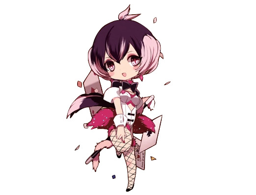
I’ve always liked Funny Trick’s look, and it’s probably because of the pleasant colour palette, unique eyes and two-tone hair (I’m easy to please with two-tone hair). The nail polish and colourful glitter on her fur are also good little details. But apart from that I guess this is only barely strange enough to be any kind of “magical” look rather than just an anime stage magician, but at least that’s pretty close to magical girls already. Also is that a frigging tail again?? At least it goes well with the hair I guess... 8/10.
Kuru-Kuru Hime
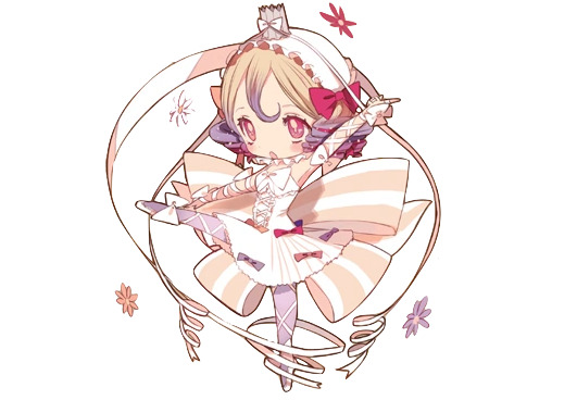
It’s a cute design, but when I think of a ribbon magical girl I somehow expected more ribbons? Like this feels like an the higher end of an average magical girl amount of ribbons? Or maybe it’s totally over the top and my perspective is just skewed since I love ribbons and want them everywhere. Either way I like her outfit from neck down, but I’m not that into the headgear, the combo of the bonnet thingy and the weird crown just sitting on top if it looks strange to me. Nice hair tho even if it could use more ribbons. 6/10.
Weddin
I absolutely love Weddin’s design. The muted and light colour palette is very appealing to me, and the dark chains break up the mostly monochrome design so it doesn’t look dull and faded and also give the otherwise super frilly appearance quite a lot of edge. There’s repeating elements (braids in her hair and veil, the same kind of flowers everywhere, flower yellow also appearing in her eye makeup) so it doesn’t get too complicated, and all of them go well with the wedding theme too. The flame... is a bit of an odd touch and I’d rather associate it with a birthday party or Christmas than a Wedding but I guess you can have candles at weddings too, and I don’t find it too distracting.
I’m not a huge fan of the lingerie like look though, but at least visible garters go with the wedding theme and she’s so covered in veils and frills that it doesn’t look so bad. Also the back train looks kind of lazy. But overall still one of my favourite Magipro designs. 10/10.
Rain Pow
A tail again! However this time I actually like it, since she has that rainbow hoop behind her it looks good to stick something through it, and at least it somewhat resembles her twintails.
As for the rest of the design, it has zero frills and ribbons and looks more like some kind of scifi spacesuit than a typical magical girl design, but somehow I still really like it. I think the weird heart hair is just enough to pull it into magical girl territory for me so my impressions are more on the “an unique take on an mg look” rather than “not mg enough” side. Then all the rings keep the look consistent (I absolutely love the rainbow halo) and the suit itself looks alright enough. I also find it interesting how muted the suit colours are for a rainbow magical girl and even the rainbow is pretty pastel, but I figure this is a better choice than all the expected seven colours in all their eye-strainy glory. 9/10.
Postarie
Please put on some pants, that is a shirt and not a dress.
Not too interested in this one, but I find it a commendable effort on making a design on the idea of “postal delivery girl”. Still lots of repeating elements so that’s a plus, especially the back epaulette is such an absurd idea but somehow it works and its wings and the wing hairstyle add the required fantasy touch. Bonus points for the cute birds. 7/10.
Tepsekemei
An inoffensive genie design but I struggle to really have emotions towards it. Butt flower is silly and I have no idea what the things hanging from it are, but at least they’re consistent with her head decoration. Don’t care for the shoulder spikes in an otherwise soft looking design. Huge earrings and multicoloured nails are a nice touch. 6/10.
7753
Also one of my favourite Magipro looks. It feels like the design philosophy here was “gakuran jacket and some frills, and then some hearts. And more hearts! More! Even more!” and I think it’s a great way to go with when designing a magical girl. Using just hearts everywhere makes the outfit cohesive, but since they’re all implemented in different ways it doesn’t get boring. I especially like the little hearts on her hands and under the eye, and the one in her pocket.
Two-tone hair in twintails is also one of the best design elements out there and the hairstyle is quite memorable (and also manages to incorporate the heart motif) and I’m always a fan of caps too. The green eyes and the little bit of green nail polish which you unfortunately can’t see here go well with the otherwise reddish look. Maybe the hair looks a bit too clunky (I only just realised it appears to be tied in a hoop behind her) but I won’t let it bother me. 10/10.
Mana
A solid witch design, I especially love the dimensional cape and hat. I also like the huge collar with the lace detail, but I’m not sure if it works with the hat brim. Not a big fan of the hair, I think it clutters the design. The snake leg accessory feels weird and a bit out of place but I do appreciate the asymmetry and also having something dark to break up the otherwise plain bottom part of the design.. 7/10.
Gekokujou Hana
I tend not to be a huge fan of kimono-based clothes, but this one is an exception I guess. The great colours must play a part in it, and the bottom part is fun. Then the dangly decorations add the correct amount of strangeness so it’s not just a bunny girl in a mini kimono Also, another tail, but this time it’s almost a requirement and I love how ridiculously huge it is (and also repeats elsewhere in her outfit). But really I can’t think of anything to dislike about this, must be the colours and the tail. 10/10.
Archfiend Pam
I believe this is the record on how little clothing you can wear in this franchise... At least she has the personality to pull that off. But that is not a top! At least it’s something new...? The wings fit the description in the story, but I don’t think these blank rectangles look very aesthetically pleasing. I like the tail best, the fur edge makes it a lot more interesting than just the usual demon tail. I don’t know, if the theme is a sexy demon girl this design definitely accomplishes it in a unique way, but also I don’t care for this fanservicey designs. Also not a fan of the hair. 4/10.
Pythie Frederica
Before drawing her for the chibi series I thought she had some kind of a helmet but upon closer inspection of course it’s a veil. But what are the horns?
Upon closer inspection this one is also very fanservicey, in that her “dress” is actually see-through and the only thing covering the critical areas look like thin belt-thingies. At least she doesn’t look like she’s ten... But a major issue I have is the bottom part of her outfit, like how is it supposed to work? Is it one big piece of cloth, or multiple thin ones? What is the “fire” behind her? Is the dark part her hair, or the clothing, and is it supposed to be black or just shading? I do like the stars; otherwise the design gives a more mature “sexy” air, but the little stars everywhere adds a cute element. The colour palette is pleasing, but as much as I like multicoloured hair it doesn’t grant points this time, because the wiggly stray strands look very out of place here and the colour change makes them even more noticeable. 2/10.
Tot Pop
This one really isn’t my aesthetic, I very much prefer the cutesy style and there isn’t really anything ‘magical girl’ about this design. And it doesn’t really evoke the supposed image of ‘pop star’ to me either, like if you remove the guitar I’d think her theme was a prisoner or halloween. Though I don’t really know what a ‘pop star’ should look like anyway, like can’t they wear anything they want, I know Lady Gaga had a meat dress or something. But as of this design, I don’t think there’s anything specifically wrong with it, the colours are pleasing, the details are consistent and it’s not bland or boring either, but it just doesn’t do much for me because of the theme. I like the blood-stained hair and the spiky hair accessory, the long hanging part makes for a nice silhouette. Meanwhile the skulls on her shoulders feel somewhat tacked on, and in general I don’t care for piercings in anywhere else than ears. 5/10.
Pukin
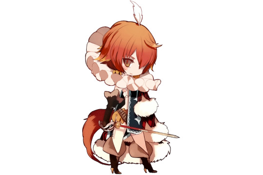
And it’s a tail again. What is it with the stupid tacked on tails on every other design in this franchise? Sometimes it’s not so badly out of place, like if you have an youthful cutesy design, a fluffy animal tail can still add to the cute effect even if it’s otherwise out of place. But Pukin is supposed to be this dangerous and majestic authority figure and a cutesy tail very much doesn’t fit that image. And while we’re on the topic of animal features, the story describes that she has a feather decoration in her hair, but the way it’s drawn as a tiny feather jutting directly up in the middle of her head gives me more the impression of a character whose theme is a baby bird rather than a fantasy prince.
Now that we’ve dealt with the tail let’s get the biggest issue out of the way: I’m aware that there was a time in history when people used to wear these kind of giant ruffled collars but I really don’t care if there’s some kind of history based reasoning. It looks like your head is on a plate and it’s something I can’t ignore. I don’t feel even clowns can pull that off. There is no way getting around this.
When I first read Limited I thought Pukin’s appearance was an absolute mess and an instant 1/10, but upon closer inspection there is stuff I like about it too. She has a good colour palette, great shoes and gloves, and as a friend of multicoloured hair I welcome the yellow hair tips. The big heavy cape balances the small top and pants, and I really like the fur. Earrings go well with the pants too. The theme is a bit confused, or at least I don’t know of any fairy tales about pumpkin prince, but it’s not like I would complain about pineapple or cauliflower princess so that’s not really a problem. 3/10.
Sonia Bean
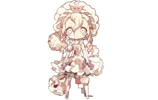
And we end Limited with yet another excellent design. I like how this manages to look kind of tattered and messy without actually being gross and dirty with the patchwork dress, dustball-like thingies, newspaper clippings and asymmetry. Even her hair looks disheveled. The headgear gives the design an old-fashioned vibe which suits her well since she’s so old. The light palette, soft design elements and ribbons give the look a cute feel, but at the same time she feels suspiciously pale, and the manic expression screams danger, like you can’t reason with this girl. She’s like a ghost of a Victorian era child who wants to play with you but you know you definitely should not follow her.
The design only works if I don’t think too much about it though, like dust is gross and newspaper paper is crinkly and not soft at all, but since we’re magical girls here I can ignore that and enjoy the image the clothing evokes. 10/10.
------------------
Limited average: 6,9.
#magical girl raising project#mahou shoujo ikusei keikaku#mahoiku#my stuff#ranking#ranking: magical girl raising project
42 notes
·
View notes