#i just wanted to see if i could follow the tutorial i reblogged the other day
Explore tagged Tumblr posts
Text
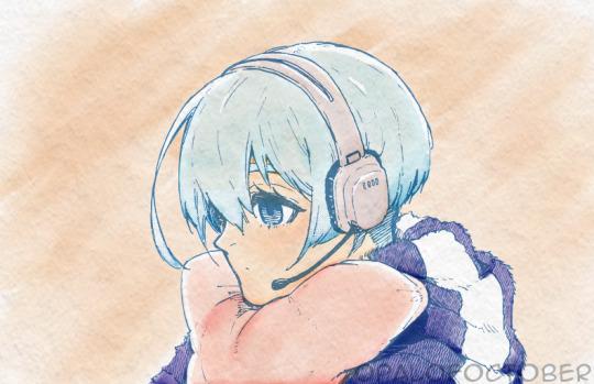
hiori in watercolor
#bllk#manga coloring#blue lock#bllkedit#bluelockedit#bllk hiori#hiori yo#fyeahanimanga#graphics-net#sportsanimedaily#fyeahsportsanime#anisource#autodesk sketchbook#opalofoctoberedits#i think calling the coloring style a watercolor is a VERY generous label#i just wanted to see if i could follow the tutorial i reblogged the other day#regardless i will be experimenting in this style in the future bc i really like it
93 notes
·
View notes
Text
Finding SV Character Heights Part 1
Procrastination leads to wonderful places, and for me that's "hey what if I could get rough estimates for canon heights using the ingame models?" So I did! Unfortunately, this post got long so I only included the heights of a few major characters for now. Teachers, Gym Leaders + League, and Team Star will be in separate posts!
Protagonist: 5'0" Nemona: 5'8" Penny: 5'1" Arven: 5'7" Clavell: 5'7" Sada: 5'9" Turo: 6'1"
I used imageJ / Fiji for analysis and some screenshots from MunchingOrange's playthrough of the game on youtube. I explain the process and attached all the screenshots under the cut so you can judge the legitimacy of my "math" yourself!
A quick overview of how I did this: there's a (free to use) software called Fiji made for processing images (google Fiji ImageJ and it'll be the first link). It's used in a lot of data analysis, which is mostly what I use it for, but it has some fun features to play around with too. (if people want a tutorial lmk I'd be happy to write one up). The most important part for our purposes is the measure function-- if you draw a line on an image, it will tell you how long that line is in pixels. This line can be straight, curved, angled in any direction, or even multi-segmented, making it pretty good for comparing things. Then all I had to do was get images of characters standing next to each other-- from there I could transitive property my way to the height of every character in the game!
First step was getting a good basis for comparison-- I can easily get ratios of character heights but without at least one confirmed height I can't translate it into real world metrics. Since the characters themselves don't have canon heights, it had to be a pokemon. This introduced another problem, which is that in SV, pokemon are varying sizes within a species, so I can't count on the overworld models to work. Plus, some of them aren't even accurate!
However, there was one pokemon I could compare to the protagonist pretty easily whose height was a little less skeptical: the main legendary (koraidon in my case). A few cursory comparisons led me to guess that Koraidon's 8'2" "height" is measured from head to toe while standing in apex form. Anything else gives heights of characters that make zero real world sense so this is what I went with in the end. Thus we get the screenshot that starts it all!

Koraidon's head is bowed, but this was the closest I could get so I guesstimated that the top of the blue ridges was about where Koraidon's head would be. Knowing that Koraidon is 8'2", we get the following heights:
Koraidon: 536 pixels - 98 inches - 8'2" Protagonist: 328 pixels - 60 inches - 5'0" Nemona: 372 pixels - 68 inches - 5'8"
Thus far it looks like we're on the right track! Assuming the protagonist is 14 and Nemona is 16/17, these heights seem pretty normal. Knowing the protagonist's height gives us the ability to find out most other characters, so we're off to a good start!
(side note: the calculation I used to turn pixels into inches was pixels1 / inch1 = pixels2 / inch2. The pixels we can get from the lines on the images, and the inches we know from Koraidon's pokedex entry, so we just solve for inch2)
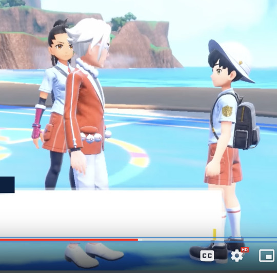
Next up is Clavell (mostly because he showed up first). Something interesting is that he's actually slightly shorter than Nemona, you can see it in the first cutscene in front of Nemona's house (i can add a screenshot in the reblogs / replies but didn't want to clog the post with another image). From this image, we can find:
Protagonist: 685 pixels - 60 inches - 5'0" Clavell: 769 pixels - 67 inches - 5'7"
You heard it here first, the director is a short king

Next up is Arven!
Protagonist: 782 pixels - 60 inches - 5'0" Arven: 880 pixels - 67 inches - 5'7"
(The math actually says Arven is 5'7.5", but I'm not bothering with decimals. This makes him sliiiiiiightly taller than Clavell)
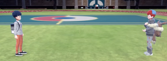
Penny is seen angled from the protagonist in her intro scenes, so I skipped all the way to her boss battle to find a good screenshot. To my surprise, she's actually slightly taller than the protagonist!
Protagonist: 368 pixels - 60 inches - 5'0" Penny: 376 pixels - 61 inches - 5'1"
(Side note 2: Characters are measured from their heels to the crown of their head-- if they have really big hair it doesn't count as part of their height)
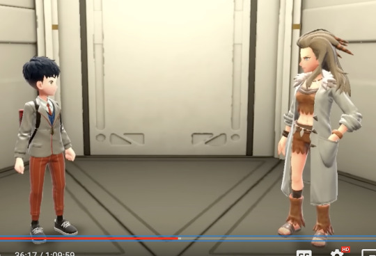
Last one in this round is the professor (Sada in my case, as I'm using a Scarlet playthrough for screenshots). I'm gonna assume that the AI and Professor are the same height for this
Protagonist: 507 pixels - 60 inches - 5'0" Sada: 584 pixels - 69 inches (nice) - 5'9"
Turo forced me to use a different playthrough to grab a screenshot, which used a female protagonist. I'm fairly positive that the male and female protagonist models are the exact same height (if not the exact same model) so I don't think there's any snags with this, but if anyone knows otherwise lmk. Btw, I used the playthrough by Rubhen925 for this screenshot!
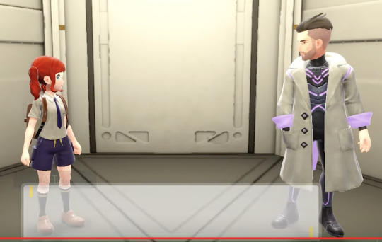
Protagonist: 501 pixels - 60 inches - 5'0" Turo: 611 pixels - 73 inches - 6'1"
Turo is pretty damn tall :0 !
This post is getting absurdly long, so I'm going to make separate posts for the League / Gym Leaders, Team Star, and the teachers! Hope you've enjoyed, and if there's any specific trainer class or other character you wanna know the height of just lmk :) I also plan on making a post of some more silly measurements (like the exact dimensions of Penny's backpack, the proportion of Geeta's height that's just her legs, the size of Arven's camping bag and whether or not his friends could reasonably curl up inside, etc)
101 notes
·
View notes
Text
--currently on tumblr break if you see me posting its probably queue *furthermore i would not recommend sending a donation request ask, because i am logged out i won't see it or be able to help, you're probably better off just sending it to someone else
he/she just use whatever you think is most genderfuck in any given situation
you can call me puff or apuff
i am a minor
i block liberally and dont really have a dni, but PLEASE do not follow me if you are a terf or post nsfw 🙏🙏🙏🙏 seriously
i post art and writing and some assorted shitposts, it's usually about mcr (my wife michael romance 😇😇😈) i do like other music and webcomics and videogames tho
@apuff-rb is my reblog blog
@apuff-comics comic blog
i tag for most common triggers, and i use just the word (eg, blood not tw blood), and usually tag both bright AND flashing things as "eyestrain"
please donate or reblog this fundraiser, verified here :
i have a few different tags for various things in my blog, like:
art (some old art of others' is on here, but it's mostly my art)
apuff's inane ramblings (inconsequential text posts)
mcr (My Chemical Romance is an American rock band from Newark, Ne)
dungeon meshi (you know what this is you're on tumblr)
miku (HATSUNE MIKUUUUU)
art save (things that are pretty, i'm trying to keep tutorials out of this now but i might forget)
save (like..general useful stuff, good websites, not very specific)
things i want to draw (self-explanatory, more for text posts that inspire me than images, which is "art save")
picrew (picrew chains. i reblog the picrew of people that i tag in these because otherwise i can't find them ever)
long post (posts that are long, this is mostly for blacklisting)
free palestine (self-explanatory)
remember this (desperate plea. i don't even know what i use this for)
art tutorials (TAG I JUST MADE UP NOW!!! i probably won't retroactively tag things as this)
-----
ok so for starters for trigger/blacklist tagging i'm using the format of just the thing in the tag, not "cw" or "tw" before or after it. for example, something with blood would just be "blood" not "tw blood."
for bright colors, i'm doing "eyestrain." i'm tagging things with flashing/strobing colors, lights, or light n darkness "flashing lights" if you're sensitive to that, please make sure you have it blocked since i can't cover the absolute myriad of the unstandardized tags for that specific thing on every reblog with it.
let me know if there's something i need to tag on a post, i forget a lot of stuff/autoreblog plus there's fears i don't know about and things
now palestine/gaza related posts are sort of a whole different beast in terms of tagging? i'm trying to put down "free palestine" on every post i reblog about the topic (cause you actually need to do that to get tags to trending) (plus overall blog sorting is good)
now obviously, the entire GENERAL CONCEPT of the current genocide is dark and upsetting, so know that i really can't tag every possible thing that could be upsetting. but, i'm trying to make a system of particularly upsetting things, especially pertaining to images & videos
ok so. for images/videos of children being actively harmed, as well as graphic text descriptions, i'm doing "child harm" this does not cover statistics of children killed or general comments on the fact
things like videos/images of gunfire, shooting and bombing, i'm doing "violence" like the other one this doesn't cover descriptions of those things happening.
"injuries" is self-explanatory- burns, bloody injuries, face trauma, etc, you get the drill (even blurred/pixely censored ones)
"dead body" is also self-explanatory, doesn't include body bags except if they have visible body part sticking out
tags that could mostly apply to anything (like "gun" or "blood") don't have any special tags, i just use the generic ones like i said above
still thinking of a tag for people being distressed about their situation/ their dead loved ones since things like "death"' are too vague and would cause overfiltering but i can't think of something accurate. if you have any suggestions, let me know.
#i just need to add some tags to this so tumblr doesn't keep prompting me to add tags#pinned#about me
18 notes
·
View notes
Text
Soft & Wet

Word count: 1.7K
Summary: Simon has come home and wants to play.
Pairing: Simon “Ghost” Riley x GN!Reader
Warnings: AFAB!Reader, pet names but no pronouns, slight overstim, slight bondage (just the arms), slight dirty talk, aftercare, uhhh let me know if I’m missing anything
A/N: yall i straight wrote this at work but i’m happy with it. title is a jojo reference. my first ~on paper~ smut wowwy. comments, likes, and reblogs appreciated. *muah*
NSFW under cut
Scarlet rope ran over his calloused hands, contemplating on the best way to make you immobile but not hurt you. Even deep in thought he was devastatingly handsome. To add to that, he sat on the backs of his thighs with only black boxers adorning his muscled waist. A pang of affection hit you, until a sharp thwack rang out as he tested the strength of the rope. You laughed a little in shock and felt a roll of wet, molten heat tingle between your thighs.
You stayed laid out on the bed, naked, relaxing against the plush comforter and stacked pillows counting down the seconds until you finally suggested he needed direction. You were entirely content watching him exist, but you’ve been turned on since the moment he had you lay down.
“Why don’t you find a tutorial? I’m sure there are some for beginners…”
“Hmph. I know how to do it. I changed my mind. We’re doing something else.”
“Ooh. Switching tactics, Lieutenant?” You teased.
He growled and leaned down to press his forehead against yours, locking blown out eyes with your own.
“The only thing I need to hear from you tonight is you moaning or crying from how fucking good I’m gonna make you feel.”
That shut you up. You could feel the impatience growing larger now, but quickly simmering when he finally made his first move.
Simon leaned back again - far enough to reach the edge of the bed, and balanced himself on one arm while the other grabbed something from the floor. You honestly had no idea what it could be, but knew that it would leave you deliciously aching for more.
“Close your eyes, honey.” He purred.
You did as told and smiled when the bed shifted again as he got into position. Heart rate now through the roof - you were real excited and real wet.
You gasped when one large, hot hand grabbed your forearms together, ring and pinky slipping into the crutch of your fist. You curled your fingers in further, holding onto whatever piece of him he would offer to you.
Next came the dry drag of rope across the sensitized skin above your clasped hands. Around and around they went, until he gave one, two tugs to make sure your hands weren’t going anywhere anytime soon. Only a little space for your wrists to move apart was allowed. More tugging followed to tie off the ends into what you were sure was the most complicated knot you would ever see if you could.
Whatever Simon grabbed from the floor was now being slotted into your hands, a thick rod designed to be held with a dial in the middle that he quickly shifted away from your palms. The bulbous head already pressed against your wet lips causing a chill to run up your spine.
You had a pretty good idea of what it was, owning a variant of it yourself for those nights before you met Simon. You were honestly glad you didn’t have to put in the elbow grease for things like that now.
To cap it off, Simon’s hands fit between your knees and pushed your thighs back until they framed your tied hands. You imagine he was going to spread them more as the night went on. Lines of arousal sloped the curve of your butt and you desperately wanted to open your eyes at this moment; to see the effect you were having on your silent partner.
“Open your eyes, beautiful.”
White spots clouded your vision momentarily, but the final product got you more excited than you could have ever dreamed. Toys weren't part of you and Simon’s routine, but those two forces together scared you enough with how crazy he already made you feel. His visage both comforted and warned you that your pleasure tonight was entirely in his hands, despite you being in custody of the toy. Two black pools encompassed your own, a searing heat already building in the center of your womb.
“Thoughts?”
“I’m kind of at a loss for words, Simon.”
He tugged his lips up enough for it to resemble a smile.
“I thought about this a lot while I was gone so you better indulge me, sweetheart.”
“Oh, I’m not complaining.”
Simon reached over your hands to finally turn the wand on the lowest setting. The instant thrumming startled you despite all the warnings. The head of the vibe was resting on your lips sparking a gentle but insistent buzzing inside your nethers. Not enough to get you off but rather get you wetter. You hummed in the back of your throat and leaned your head back onto the pillows. His hands never left the backs of your knees, but you quickly felt them travel up and down your thighs before ending on the inside close to the action. You smiled secretly, knowing exactly how he behaved after all this time.
Simon spread your legs farther and farther apart, gripping almost to the point of pain on the tender flesh.
“How’s it feel?”
“Good, Simon.” You swallowed. “It’s nice.”
You might have been putting your foot in your mouth. You couldn’t come from this. He had to know that. While the vibrations were good they weren’t intense or close enough to where you needed them to be.
He seemed to pick up on that, for his next movement released one of your legs to move your bound hands down enough for the head to slip between your spread lips and press against the hood of your clit.
Shit.
You moaned for real this time. Fuuuck - that was good. It was near knee shaking already and it was still the lowest setting. Your hips started to rock into the feeling. With enough time, this could definitely get you there.
“How ‘bout now?”
“Fuck, it’s good. R-really gooood.” A long moan stretched out. A sweat began to build on your forehead and your breath was almost knocked out of you at the increase in sensitivity.
“Fuck, darling. You look really good right now. Good enough to eat.” Simon growled out. When you looked into his lap you could finally see the effect you had on him. His thick length pressed against his left thigh, still trapped under his boxers lifting the fabric up with its weight. You swore you saw it throb. Suddenly your throat was quite parched and painfully empty, but you figured he wouldn’t let you near his third leg for a while.
“Think you can take more?” He questioned. Shit, you really had to think about it. You were definitely getting close, but you loved when the pleasure was just a little too intense to the point of overstimulation; the shakiness of your legs, not being able to catch your breath - it was all amazing.
“Yeah,” you whimpered. Soft puffs of hot air escaped your lungs when Simon’s smile grew. He loved to see you at the point of pain - the edge so close but still so far away.
Simon shifted on his knees, getting down low and using his thick thumb to again slide over the dial, increasing the vibration even higher than the few centimeters he had before. At this point, it was almost to the very max and you began to feel that painfully sweet stimulation. Tears built up and you could feel your walls clenching down on nothing, releasing sweet sticky juices. Your lids became too heavy to keep open. Hiccupping gasps and high pitched cries left your mouth. You couldn’t see Simon’s face anymore but knew he would look as smug as humanly possible.
You pushed your hips away from the plastic to try and gain some sense of balance again, but warm hands quickly grabbed your waist to press you against the comforter. One hand stayed splayed across above your mound while the other reached down past the head of the vibrator to use the hot tip of his calloused thumb to peel back the hood of your clit. The sensation was far worse as you tried to keep the vibrations off your most sensitive area, further annoying Simon.
With the hand that held you down, he used the bottom of the handle to angle the toy down into your folds. While still keeping your hood back, you couldn’t escape the mind numbing frequency pounding directly onto your many nerves. The swollen bud was puffy and irritated - and shit - yeah, now you were really coming. You screamed his name over and over and over again until you forgot your own, only knowing the one word of the only person who could do this to you. You already felt crazy and sweaty and your walls were so tight it hurt and you leaked so much the backs of your thighs were chaffed. This was probably the hardest you had come in your life. White noise traveled between your ears, and you still couldn't see, couldn’t dare open your eyes as your mind tried to process the pleasure and the pain.
After what felt like the end of your meager existence, the vibrations finally stopped short, and it had felt so long that your body didn’t know how to exist without it. The shaking never stopped, the tears, and you were so happy and so messy and never had you looked more beautiful to Simon than in that moment.
His hands were gentle, moving the wand out of your numb hands, and proceeded to untie your wrists. They were only slightly bruised, a dark red to match your overworked cunt. You couldn’t move a single body part, and Simon knew as much. That’s why he massaged your arms, the tops, the back, and the insides of your thighs and fell a little bit more in love when he felt you melt against his touch.
Sufficiently sated and not urgently hard anymore, Simon wrapped his arms around your middle, burrowed into the back of your neck and breathed deep your scent. You had already passed out at the first touch of his massages.
He grumbled something in the secret recesses of the junction of your neck and wandered too into a deep slumber. He might make you privy to his thoughts later; how he secretly wanted you to do the same to him. Maybe he’d let you get your revenge tomorrow.
84 notes
·
View notes
Text
2023 Updates & Changes
The DA Poly Website has been fully updated for 2023, and boy were there a lot of updates to be made. Please read through the changes below the cut and let us know if you have any questions. Also don't forget:
Nominations open in just over a month!
Changes
Communications
After a lot of thought and consideration, we've decided to shut down the exchange twitter. We're sorry for those of you who use that as your main source of news, but the platform has become openly hostile to small projects and creators and it's going to be impossible for us to post there and ensure you actually see our updates. Instead, you can follow our announcements in the following ways:
Our Website We have added a blog to our website which will have an archive of all of our posts from today onward. You can follow the blog in your RSS reader of choice! (Have no idea what RSS is? I highly recommend the in depth blog RSS for Post-Twitter News and Web Monitoring, but you can also find a more bite-sized intro on mod enigmalea's website here.)
Tumblr Our tumblr will continue to host announcements and information about the exchange and will continue to host Poly Sharing (the new name for the former DA Polyshipping Day/Week).
Mod enigmalea's Mastodon If you're on Mastodon, enigmalea will be posting updates there. If you'd rather not follow them directly, you can also follow the dragon age chirp.social and gup.pe groups and see the updates that way!
The Hanged Man Dreamwidth & The Hanged Man Pillowfort If you have an account on Dreamwidth or Pillowfort, we'll be sharing updates in The Hanged Man communities on those sites!
Fandom Calendar Dreamwidth We will be posting a schedule and reminder for each stage of the exchange on Fandom Calendar!
General
Polyshipping Week info was renamed to "Poly Sharing" and updated to reflect that we reblog DA poly content at any time!
Collections for the exchange will remain open at all times for additional treats. If you have a prompt you still want to write from any previous years, feel free to do so!
Website has been updated with all new info. The tumblr pinned post has all updated info, as well.
The AO3 collection now features a short version of the FAQ to save space. Please refer to the website for the in depth FAQ.
The countdown was removed from the tumblr layout. The website homepage still has a countdown!
The website was updated to show all deadlines in your local time.
Rules Updates
The rules have been updated to clarify that previously posted works cannot be added to the collection. An exception to this might be a transformational work of a work already in the collection (for example, if someone makes a podfic for a fic in the collection and doesn’t add it to the collection initially, it could be added later.)
The rules were also clarified to disallow works which are entirely AI generated. Our Exchange Info gives a more detailed explanation of what we mean.
Nominations
There have been no changes to nominations.
Sign-Ups
Sign-Ups require a minimum of 3 ships for requests and offers instead of one. We've received sign-ups with very limited requests and offers lately which makes producing a match very difficult.
Sign-Ups now allow for up a maximum of 60 ships requested and an unlimited number of ships offered. Please see Tutorials - How to Sign-Up for more details.
Your requests cannot consist of entirely ships which use a DNW to limit your creator to creating for only your OC. For at least one of the three ships you request you should be open to receiving any OC (generic, one created specifically for your gift, or your gifter's OC) or should be a ship which has no original characters. Creating for other people's OCs is complex and is not something that everyone is able or willing to tackle within the context of an exchange, so participants should be willing to be flexible for at least one request.
If you are requesting art of your OC we ask that you have more than one reference for both face and body. Otherwise, artists may have a difficult time filling your request.
Other Exchange Stuff
Last, but certainly not least, the mods will be posting a separate Treatless list this year. The link has not been added anywhere yet, but will be shortly after sign-ups close!
9 notes
·
View notes
Note
hi there! I'm relatively new(ish) to tumblr and was looking to make my own "bot" via a long queue, and was wondering if you could give me any tips? I'm not super familiar with the queue system, so any advice you can give me would be good! Thank you!
hello, anon!! welcome to tumblr!
(interloper)
it's an honor to be your tutorial npc :D i will do my best to walk you through the "bot"-making process/queue system!
first of all: this is how many posts are currently in this blog's queue.

[ID: Screenshot showing "Queue: 924". End ID.]
this is a kind of insane amount. i believe i started this bot with....700 posts in the queue? and then just kinda kept adding on more? a lot will depend on how often you want your bot to post. at the current number of posts in my queue and the current schedule of 4 posts a day, it could run for 231 more days without running out of quotes! if i bumped it down to twice a day, it could run for over a year!
what i'd probably recommend doing is adding posts in batches of, like, 20 at a time, and keeping the post amount low until you get up to a number where you feel okay just letting it run for a while without adding anything new. then just put new stuff in whenever you want!
but how do you do the "adding stuff in" part? great question! this is the part where we segway into the mechanics of the queue! this is also the part where i put a readmore because hoo BOY this got long. i am prone to overexplaining lmao
tl;dr: find the queue, make the posts, set times for posting and amount of posts per day, use mass tag editor to do tags, and shuffle queue!
the queue is one of tumblr's most special functions, imo. it will automatically put out a certain amount of posts every day between certain hours-- basically like scheduling tweets, except that the site schedules them for you! some people on tumblr actually queue basically every post they see rather than reblog it-- i call them "queuetuals" :P
Step 1: find the queue
so! first you go to your blog controls, where you can view posts and follower counts from, and then look down. under "drafts" is a section called "queue". hit that, it'll take you here.
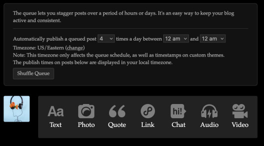
[ID: The Tumblr "queue" page. Up at the top is a text box that reads "The queue lets you stagger posts over a period of hours or days. It's an easy way to keep your blog active and consistent. Automatically publish a queued post (dropbox with 4 selected) times a day between (dropbox with 12 am selected) and (dropbox with 12 am selected) Timezone: US/Eastern (change) Note: This timezone only affects the queue schedule, as well as timestamps on custom themes. The publish times on posts below are displayed in your local timezone." It then shows a Shuffle Queue button and the icon of this blog next to the icons and text for making text, photo, quote, link, chat audio, and video posts. End ID.]
FUN FACT: hitting the text (or whatever kind of post it is you want to make) button from here will automatically set the button that usually says "post now" to "add to queue" instead. i found this out like halfway into making all these posts and it was so helpful to not have to make the switch manually every time. i now pass this knowledge on to you, my protege. use it in good faith. okay where were we
Step 2: make the posts
right. okay . so you hit button you make post you hit other button (make sure it does say "add to queue") and it will automatically be put in your queue!
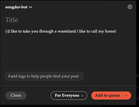
[ID: A drafted post from songder-bot reading "i'd like to take you through a wasteland i like to call my home!", with no tags and the post button set to "add to queue". End ID.]
now just do that like 100 more times and you're set :) (highly recommend, if you're going to be making a text bot like this, writing all the stuff you want to put in down in a text file so you can just copypaste over. i write new lyrics like the above in manually, but i was copypasting for my first couple big chunks)
you can also see up there the places to adjust when and how often your "bot" posts! i have it set to between 12 and 12 so it just posts day-round, but if you want to set it to only post while you're awake or only while you're asleep, that's cool (i did do that for a bit)
from this screen down you'll be able to see what's coming up next in the queue and at what times it'll post!
Step 3: tags and shuffling!
while i was insane enough to manually input over 700 posts in a few days, i was not insane enough to tag them all individually. for that, i used the Mass Post Editor!
found at the very bottom of the list that posts, followers, queue, etc. is on is a little item called Mass Post Editor. this is one of tumblr's other most helpful functions and i truly cannot recommend it enough.
so once i've gotten all the lyrics from a song that i want to get in there, i go in to MPE. up at the top it says "published, draft, queued". go to queued, i select all the quotes from the song i just put in:

[ID: A screenshot of the Mass Post Editor with several posts selected. End ID.]
i go up top, i select "add tags", and i add the tags i want for those posts! boom! mass tagging: SOLVED.
i will add here that the reason my tags are stuff like "lyric - green day" rather than just "green day" is because i don't want these posts to go directly into the main tag. especially if the bot posts often, it'd be pretty spammy and kind of annoying for people trying to look at posts about green day to have to keep seeing random green day lyrics instead. tag etiquette is important!
and the last tip i will give (i promise) is this: remember that screenshot from earlier and the shuffle queue button? whenever you add in new posts to your bot, especially if they're all from the same song or book or something, make sure to hit the shuffle queue! queueing something automatically puts it at the end of the queue, and shuffling ensures that your new posts are equally distributed and can come up whenever!
hope this was helpful!!! i love explaining stuff but also get very very wordy at times, so if you need a tl;dr version or further explanation of something let me know! oh-- and if you're gonna do quotes, lyrics, art, or anything at all, always credit the original creators!
#not bot#:D!!!#this was genuinely SO fun for me tysm#tumblr tutorial#< that is an example of *wanting* a post to go in main tags lmao#also yes i did add welcome to paradise just for this ask#and yes i chose that song specifically because i think of it whenever tumblr gets an influx of new people
2 notes
·
View notes
Text
Yeah this post is so full of corporate bull-speak I can’t even begin to dive into it all.
But this?
Finally getting to read about this new tumblr bullshit. From one of the Reblog:
When I first joined this site in 2009, I was taken through a screen that asked about my interests and I got to pick 3 of those interests. It then showed me the top blogs who posted things related to my interests and I followed some of them. This gave my dash content. It was a lovely little tutorial on how to use the site and how to make it a place that felt like me. Somewhere along the way you seem to have stopped doing that, and thus your new users are apparently 'confused'.
This is STILL how it works. I literally made a new tumblr account completely from scratch unattached to my current one, only about 2 weeks ago, and it required that I pick topics and follow people before I could even get to my dashboard.
All they need to add is an explanation that tumblr doesn’t use an algorithm and that’s that.
New users are only confused bc rn all social media sites EXCEPT THIS ONE use an algorithm. And most people who use tumblr regularly, who have been here and will continue to do so for years (unless it changes completely) do so precisely because we do not LIKE other social media sites.
I cannot stand what twitter has become, even before Musk took over. Because I don’t feel like I can even see the crap I want to. IG is even worse. I stopped using it because I couldn’t ever find any of the content of people I followed and was just being shoved reel after reel after reel, which I do not fucking want.
Reddit has annoyed me for years by constantly sending me notifications I cannot dismiss for reddits I don’t follow and never have even visited, often that have nothing to do with my actual interests.
This sounds all well and good, like “we’ll help make sure newer and less popular creators are seen!!” And yet you keep making changes (like fucking the tags up majorly) that actually makes it even harder to be seen.
And generally, algorithms always favor popular blogs, or people who can afford to use at least half of their time doing the “right” things on social media to make sure they are picked up by the algorithm.
I use tumblr bc that’s exhausting and often futile, a never ending hamster wheel of trying to guess what words to use or when to post to make sure you’ll get picked up… and generally if you’re new or small or niche you will NEVER get picked up.
Stop
Fucking
Trying
To
Make
Tumblr
Like
Instagram or Facebook or Twitter
It’s survived so long largely because it is NOT like any of those sites.
I know it’s why I’ve been here, even when y��all majorly fucked the user experience by changing the navigation.
I get you wanna make this site more profitable. I do. But an algorithm system is NOT what this site needs.
Tumblr’s Core Product Strategy
Here at Tumblr, we’ve been working hard on reorganizing how we work in a bid to gain more users. A larger user base means a more sustainable company, and means we get to stick around and do this thing with you all a bit longer. What follows is the strategy we're using to accomplish the goal of user growth. The @labs group has published a bit already, but this is bigger. We’re publishing it publicly for the first time, in an effort to work more transparently with all of you in the Tumblr community. This strategy provides guidance amid limited resources, allowing our teams to focus on specific key areas to ensure Tumblr’s future.
The Diagnosis
In order for Tumblr to grow, we need to fix the core experience that makes Tumblr a useful place for users. The underlying problem is that Tumblr is not easy to use. Historically, we have expected users to curate their feeds and lean into curating their experience. But this expectation introduces friction to the user experience and only serves a small portion of our audience.
Tumblr’s competitive advantage lies in its unique content and vibrant communities. As the forerunner of internet culture, Tumblr encompasses a wide range of interests, such as entertainment, art, gaming, fandom, fashion, and music. People come to Tumblr to immerse themselves in this culture, making it essential for us to ensure a seamless connection between people and content.
To guarantee Tumblr’s continued success, we’ve got to prioritize fostering that seamless connection between people and content. This involves attracting and retaining new users and creators, nurturing their growth, and encouraging frequent engagement with the platform.
Our Guiding Principles
To enhance Tumblr’s usability, we must address these core guiding principles.
Expand the ways new users can discover and sign up for Tumblr.
Provide high-quality content with every app launch.
Facilitate easier user participation in conversations.
Retain and grow our creator base.
Create patterns that encourage users to keep returning to Tumblr.
Improve the platform’s performance, stability, and quality.
Below is a deep dive into each of these principles.
Principle 1: Expand the ways new users can discover and sign up for Tumblr.
Tumblr has a “top of the funnel” issue in converting non-users into engaged logged-in users. We also have not invested in industry standard SEO practices to ensure a robust top of the funnel. The referral traffic that we do get from external sources is dispersed across different pages with inconsistent user experiences, which results in a missed opportunity to convert these users into regular Tumblr users. For example, users from search engines often land on pages within the blog network and blog view—where there isn’t much of a reason to sign up.
We need to experiment with logged-out tumblr.com to ensure we are capturing the highest potential conversion rate for visitors into sign-ups and log-ins. We might want to explore showing the potential future user the full breadth of content that Tumblr has to offer on our logged-out pages. We want people to be able to easily understand the potential behind Tumblr without having to navigate multiple tabs and pages to figure it out. Our current logged-out explore page does very little to help users understand “what is Tumblr.” which is a missed opportunity to get people excited about joining the site.
Actions & Next Steps
Improving Tumblr’s search engine optimization (SEO) practices to be in line with industry standards.
Experiment with logged out tumblr.com to achieve the highest conversion rate for sign-ups and log-ins, explore ways for visitors to “get” Tumblr and entice them to sign up.
Principle 2: Provide high-quality content with every app launch.
We need to ensure the highest quality user experience by presenting fresh and relevant content tailored to the user’s diverse interests during each session. If the user has a bad content experience, the fault lies with the product.
The default position should always be that the user does not know how to navigate the application. Additionally, we need to ensure that when people search for content related to their interests, it is easily accessible without any confusing limitations or unexpected roadblocks in their journey.
Being a 15-year-old brand is tough because the brand carries the baggage of a person’s preconceived impressions of Tumblr. On average, a user only sees 25 posts per session, so the first 25 posts have to convey the value of Tumblr: it is a vibrant community with lots of untapped potential. We never want to leave the user believing that Tumblr is a place that is stale and not relevant.
Actions & Next Steps
Deliver great content each time the app is opened.
Make it easier for users to understand where the vibrant communities on Tumblr are.
Improve our algorithmic ranking capabilities across all feeds.
Principle 3: Facilitate easier user participation in conversations.
Part of Tumblr’s charm lies in its capacity to showcase the evolution of conversations and the clever remarks found within reblog chains and replies. Engaging in these discussions should be enjoyable and effortless.
Unfortunately, the current way that conversations work on Tumblr across replies and reblogs is confusing for new users. The limitations around engaging with individual reblogs, replies only applying to the original post, and the inability to easily follow threaded conversations make it difficult for users to join the conversation.
Actions & Next Steps
Address the confusion within replies and reblogs.
Improve the conversational posting features around replies and reblogs.
Allow engagements on individual replies and reblogs.
Make it easier for users to follow the various conversation paths within a reblog thread.
Remove clutter in the conversation by collapsing reblog threads.
Explore the feasibility of removing duplicate reblogs within a user’s Following feed.
Principle 4: Retain and grow our creator base.
Creators are essential to the Tumblr community. However, we haven’t always had a consistent and coordinated effort around retaining, nurturing, and growing our creator base.
Being a new creator on Tumblr can be intimidating, with a high likelihood of leaving or disappointment upon sharing creations without receiving engagement or feedback. We need to ensure that we have the expected creator tools and foster the rewarding feedback loops that keep creators around and enable them to thrive.
The lack of feedback stems from the outdated decision to only show content from followed blogs on the main dashboard feed (“Following”), perpetuating a cycle where popular blogs continue to gain more visibility at the expense of helping new creators. To address this, we need to prioritize supporting and nurturing the growth of new creators on the platform.
It is also imperative that creators, like everyone on Tumblr, feel safe and in control of their experience. Whether it be an ask from the community or engagement on a post, being successful on Tumblr should never feel like a punishing experience.
Actions & Next Steps
Get creators’ new content in front of people who are interested in it.
Improve the feedback loop for creators, incentivizing them to continue posting.
Build mechanisms to protect creators from being spammed by notifications when they go viral.
Expand ways to co-create content, such as by adding the capability to embed Tumblr links in posts.
Principle 5: Create patterns that encourage users to keep returning to Tumblr.
Push notifications and emails are essential tools to increase user engagement, improve user retention, and facilitate content discovery. Our strategy of reaching out to you, the user, should be well-coordinated across product, commercial, and marketing teams.
Our messaging strategy needs to be personalized and adapt to a user’s shifting interests. Our messages should keep users in the know on the latest activity in their community, as well as keeping Tumblr top of mind as the place to go for witty takes and remixes of the latest shows and real-life events.
Most importantly, our messages should be thoughtful and should never come across as spammy.
Actions & Next Steps
Conduct an audit of our messaging strategy.
Address the issue of notifications getting too noisy; throttle, collapse or mute notifications where necessary.
Identify opportunities for personalization within our email messages.
Test what the right daily push notification limit is.
Send emails when a user has push notifications switched off.
Principle 6: Performance, stability and quality.
The stability and performance of our mobile apps have declined. There is a large backlog of production issues, with more bugs created than resolved over the last 300 days. If this continues, roughly one new unresolved production issue will be created every two days. Apps and backend systems that work well and don't crash are the foundation of a great Tumblr experience. Improving performance, stability, and quality will help us achieve sustainable operations for Tumblr.
Improve performance and stability: deliver crash-free, responsive, and fast-loading apps on Android, iOS, and web.
Improve quality: deliver the highest quality Tumblr experience to our users.
Move faster: provide APIs and services to unblock core product initiatives and launch new features coming out of Labs.
Conclusion
Our mission has always been to empower the world’s creators. We are wholly committed to ensuring Tumblr evolves in a way that supports our current users while improving areas that attract new creators, artists, and users. You deserve a digital home that works for you. You deserve the best tools and features to connect with your communities on a platform that prioritizes the easy discoverability of high-quality content. This is an invigorating time for Tumblr, and we couldn’t be more excited about our current strategy.
#fucking dumblr#jfc#maybe fucking fix existing problems before deciding to throw the baby out with the bath water??#important#psa
65K notes
·
View notes
Note
Passing this along because I'm genuinely curious.
Hello there! You've been tagged! You don't have to do anything if you don't want to, but if you'd like, list 5 things that make you happy, then put this in the askbox for the last 10 people who reblogged something from you! Learn to know your mutuals and followers! 💖💖💖
Holy crap, I never got a notification I had a message in this inbox, WHOOPS. Casually answering an ask uhh *checks calendar* six months late
5 things that make me happy!
My cats! They all have such funky personalities and quirks that watching them just go about their day is genuinely so amusing and interesting
Finishing projects! Whether it's cross-stitch or a painted miniature or even a session plan, I get so much satisfaction when I get to sit back and look at the product of my hard work. Now if I could only get myself to love the journey as much as the destination...
Exploring character design. I love art books that come with games or books because I love insight into the inspirations and the hidden intricacies of character design. Seeing other people's creative process (even/especially if it's collaborative like a game) is so interesting to me
Baking videos. Maybe a silly answer, but I love watching baking videos (both asmr and just regular old tutorials.) It might be the autism, but watching someone master the science of baking enough to be able to play with it and still get an amazing result just tickles my brain so good
Playing co-op games (especially with my husband!) I really enjoy playing co-op video games or tabletop games, way more than I like competitive games. My husband and I have a Halo game together, a Minecraft server together, a Stardrew Valley farm together, and we have several tabletop/card games that are two player co-op
0 notes
Note
hia. errr... its kinda a weird ask... i read your guide thingy (im trying to be more supportive but i have hard time enggagin) and you said to not behave like a bot. im mainly a lurker (not comfortabel sharing stuff about me online) but i don't want my fav author think im a bot when i like thier stuff. what do i do?
Hi Anon,
I (and your favourite author) appreciate your efforts. <3
Lemme make you a small tutorial to not look like a bot when you are liking their stuff.
HOW NOT TO LOOK LIKE A BOT
What is a bot?
A bot is an autonomous program that interact with systems and users on the internet.
On Tumblr, they may follow or like account (or send users some weird spam links). They often will not have a personalised account (avatar, colour, posts and reblogs, etc...) or will be very obvious spammer (risqué/famous people avatar, weird letter/number name combo or obvious p*rn words, spammy posts/links). The second one usually don't follow accounts.
Aside from the spammers... I don't understand why the other ones exist.
The annoying thing about bots following you is that you can't be sure if this is an actual lurker person who just want to enjoy the ride or an actual bot. For someone following a bit the stats and guessing the potential engagement for posts/announcements, they are really a bane.
You could block and report them, but I can't be bothered (unless it's too obvious) because there are a lot of them. I know some people who block any account that is not a little personalised (see below).
For example, this is what I have in my Follower list for @crimsonroseandwhitelily (I blurred the name, in case the accounts are real people). I think 2 or 3 of those are actually account, but I am not sure.
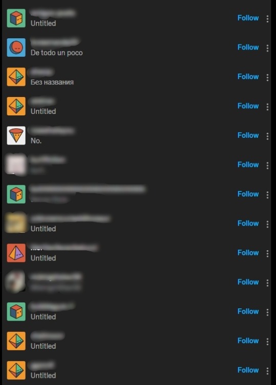
[ID text: In the Tumblr dark mode, the image shows a screenshot of a blog followers list. All names are blurred, personalised avatars and some blog description are blurred too. /end ID]
What can I do not to look like a Bot?
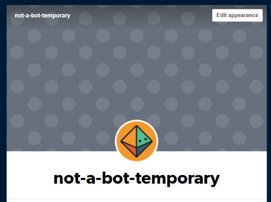
[ID text: Screenshot of the top of the Edit Appearance Page, showing a basic, newly created account. The account is named "not-a-bot-temporary" and has one of Tumblr's basic lozenge avatar and grey dotted background. /endID]
This is my totally not a bot account made for the purpose of this post (will delete it later). It is very plain and has nothing. Aside from the name, it could pass as a bot (i just need to mass-like stuff and sent people weird links :P).
So what can you do?
1. Change your avatar.
Below are the basic Avatars.

[ID text: a screenshot of Tumblr's basic avatars. /endID]
The easiest way not to look like a bot is to change it to any kind of image. It can be literally ANYTHING you want: something you like, something you hate, your fav celebrity/author/artist/..., a planet, a flower, a meme, the letter R...
Here, I made a few of them on Canva:

[ID text: an image with 10 spaced-out squares. The background is Tumblr blue. The squares represent the following: the letter r in a white background, a lineart of a flower on a green background, a picture of a nebula (?), a drawn plate with 3 sushi (salmon, egg, shrimp) on a yellow background, a picture of Terry Pratchett holding an owl with spread-out wings, a vector picture of a forest, a rainbow on a light blue background, a picture of dew on a green leaf, a lineart of a lion on an orange background, a picture of a pizza. /endID]
Use that, take your own picture, do whatever. But change the basic avatar.
How to do that?
In the Edit Appearance page of your blog, click on the Edit Appearance, then the Avatar picture and Choose photo. Upload the one you want.
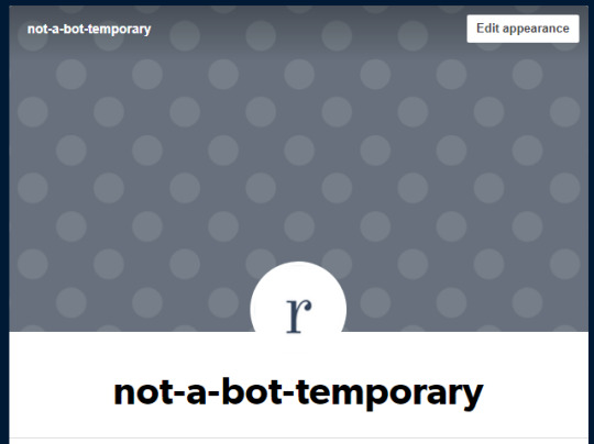
[ID text: same screenshot as the second image, but the avatar is the letter r on a white background. /endID]
Not-a-bot me chose the letter R.
2. Chand the background picture.
Same thing as before. Add whatever you want. Don't want to show yourself to the internet, no worries: it can just be a picture of a colour.
How to do that?
In the Edit Appearance page of your blog, click on the Edit Appearance, then the little pen under the Save button and Choose photo. Upload the one you want.

[ID text: same screenshot as the previous image, but the background is green. /endID]
Not-a-bot me chose the colour green.
3. Change your tag line/description.
When the description is empty, it shows as Untitled in the follower list (or in the user's language). You can change it to whatever you want. It can be a quote you like, your nickname/pronouns, what you enjoy doing on tumblr or key smashing...
A few options if you can't think of one:
I am not a bot, just a lurker.
Lurking is my passion.
Fancy seeing you lurking here.
GREEN.
What am I doing here?
How to do that?
In the Edit Appearance page of your blog, click on the Edit Appearance, then the empty line under your blog name. Click Save to save what you added.
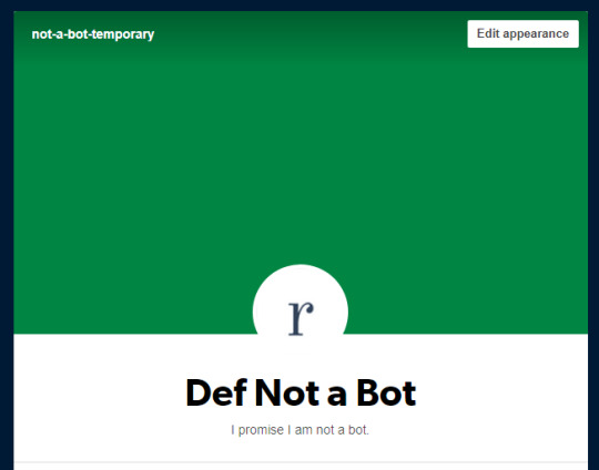
[ID text: same screenshot as the previous image, but the text now shows "Def Not a Bot" as the title and "I promise I am not a bot" as description. /endID]
Not a bot me added a tag line and changed the visible title when you click on the avatar.
And you are done!
If you want to go further:
Add a post to your blog
Reblog posts of stuff you like
Change your Blog Theme (Edit Theme button in the Edit Appearance Page)
I hope this helps! Enjoy your lurking!
66 notes
·
View notes
Text
I'm so grateful for all your feedback and suggestions, thank you! I've had some things to deal with IRL and also needed time to think and brainstorm a bit more about all that has been said, my feelings, my personal reasons why I create, and why I share CC, but now it's time to acknowledge your replies properly!
This time, I will put your comments inside the post because tumblr likes to remove comments after some time has passed and I feel this is the easiest way to bundle all the feedback and my responses! Note: I edited the quotes to merge multiple comments by the same person together.
@frank-e-sleep-n-tea wrote:
"Maybe you can do an initial shot to show off the pattern, followed by what the pattern looks like in game"
Definitely, showing how the patterns look in-game is important to me, as well as giving everyone an overview of what patterns are included. I partly show a lot of WIP images so you can get a feel for the pattern in the game 😊 My WIPs are mostly done, the colors might change and I sometimes fix some quirks or tweak small aspects like the placement, but in general, they are finished enough to give a good first impression.
@medleymisty wrote:
"Look at the reblog chains of the posts with notes you want and see if you can find an “influencer” to hype you up maybe."
I've never consciously thought about that, but you are right, getting bigger blogs to reblog something will broaden the reach. I'm just not sure I have the guts to blatantly ask for that (and I do not want to seem like I use people for clout). But I think bigger blogs could use their influence by featuring other creators, regularly like @ice-creamforbreakfast does on fridays in her new feature showcase posts. I think it's a brilliant idea and we should definitely make that a trend! Even smaller blogs can post about their favorite creators, tutorial writers, modders, storytellers etc. If lots of simmers post about someone once a week, we can cover a lot of ground and that is a great way to show appreciation to all kinds of simblrs in our community. It is also a great way to showcase older, forgotten creations and give them a second chance to shine! How about #simblr feature friday 🤔
@simtanico wrote:
"I like showing them in game and just have an icon to represent the ones shown. I think it helps visually to have people imagine what it’ll look like both in menu and in game! (Also I feel you on the notes thing. I try not to think about it too much but it’s wild how some posts flop and others don’t.)"
It's a good point to mention the menu, I also want people to recognize the patterns and be able to find them in the menu (which is still a bit difficult sometimes since the menu thumbnails are so tiny). That is actually also a reason why I try to mix up my color schemes so that the patterns are easier to distinguish (though that might not be relevant for someone who has hundreds of my patterns anyway).
@gardenof-sims wrote:
"When I was playing TS3, you were the one-stop shop for patterns. Yes, there were the odd ones from other creators, but your quality is consistent throughout, and for me that's what counted. So in game shot on furniture and thumbnails is what I'd go for."
I appreciate the compliment! I definitely like showing off my patterns on furniture, you can often see the pattern repeat too, and see that they are truly seamless.
@aisquaredchoco wrote:
"You know, I really feel you on the notes part. It's kinda disheartening when someone else who makes things pretty much similar to what you make get more engagement. I've already given up questioning tumblr's algorithm and why it hates me, so I already settled with the fact that numbers are well, just numbers. It also feels satisfying when I see my stuff in someone's game screenshots (pretty rare moments, but still rewarding nevertheless). With regards to previews, I'd say do away with photoshopping and show the patterns the way they are in game, and sample usage on furniture and CAS stuff is very welcome too. You're already the GOAT in making ts3 patterns, I'd just like to remind you that, and just do what you always do best..💚"
@kevinvoncrastenburg wrote:
"I personally love the way you present your CC and I don't see the need to change anything if I'm honest. I also have to say that I never ever noticed any differences in the way your patterns look in game vs in previews. Maybe that's on me but I'm always satisfied with the quality of your patterns. Without exception. What I love the most is the transparency in everything you provide. I know what I will get and I can even, if necessary, pick and choose since you provide thumbnail files with each download. I certainly see variety, creativity and development in your download posts and really think you are too hard on yourself. I know it's not a matter of choice, and easier said than done to discard, but I'd just wish you could see what I and probably many others see. I see the hard work and appreciate it, a lot. About the notifications: I noticed that tumblr is swallowing posts. Everytime I log into tumblr I try to go as far back as I can until I recognize the "area" if that makes sense. On the way I see a lot of beautiful things, like them, comment etc. Later I also like to check my favorite tags and notice that my dashboard is not even remotely showing me everything the people I follow are posting. Maybe that's the answer but it's certainly not your way of presenting"
@wavingwheat wrote:
"I'm a cc hoarder and am going through an edit phase of which content and creators I REALLY want in game. Your work is so high quality and I really appreciate it. I echo what @kevinvoncrastenburg said about being too hard on yourself."
@nectar-cellar wrote:
"how about trendier patterns, color palettes, and models/furniture? if the presentation feels modern and on trend with current fashions/designs it can be more eye catching. maxis match or vanilla ts3 can sometimes look too much like it's stuck in the early 2010s for good or bad. also more, steady releases can help build consistency and momentum."
It's true that those original game meshes are just not exciting to look at for the most part! The sad thing is that they are still the best way to show off patterns because they are consistently well-meshed to display patterns in a clear and non-distorted way. About 90% of Conversions and new CC I try have inconsistent UVs that distort, stretch, blur, dissect, or otherwise maim applied patterns. A lot of them also have baked-in textures which may look like they are part of the pattern itself when they are not. It's a bit frustrating, I would love to use more contemporary stuff! Even most converted furniture has those problems. I'm open to any pointers to trendy CC that is well-mapped, I'd love to go on a good download spree 💜
Having a consistent color palette throughout a collection vs different swatches both has pro's and con's. Of course, that looks fantastic in the previews and is great eye candy, but it makes the selection process in the pattern menus a bit more difficult too (though most people probably click through a lot of patterns until settling on one anyway). I often edit patterns and add color channels that have not even been there in the original just to make them extra versatile. I then want to make the channels different enough for people to recognize that they can recolor them. I could also make those extra channels just one color but then people would just not know! And that in general make my patterns seem very colorful, and not exactly minimalist. Some people may prefer the minimalist design. But of course, that is where in-game pics can come into play. I could also show patterns recolored in two-color style even though they could have 4, just to demonstrate the versatility a bit more.
I'm afraid I am not good at sniffing out trends or knowing how to match furniture and clothing to be particularly stylish. I've always thought of myself as a bit quirky in that sense and have pretty much given up on creating sims because they just looked horrific and distorted and I am inept at using custom sliders and make them work properly. Someone told me that you should never ever hit the randomize button when making sims but instead select a premade. I admit that hitting the randomize button is that is what I have done in the past and back then there weren't as many sliders, but now I realize why I have so many problems...and I only recently got the meaning of "base sim" and what they are used for and why they are so important. Of course I cannot get better without practice, but I would need to really start over with getting CC for that and everything and it just feels very overwhelming. Does anyone know a good source for a tutorial or CC shopping list like "basics to get for making decent sims"? Like skins, makeup, and how to layer that stuff so that it looks good. Are people even sharing their sims anymore? It's been ages since I saw a sim for download (maybe it's just my dash). I feel like I'm not a skilled simmer in the sense that I never even play the game anymore and just have limited CC in my game since I want it to load faster for testing CC. I forgot how to do all the cool shit you people do! 😭 But maybe I should ask other simmers to make some previews for me in their gorgeous games 🤔
@sweetdevil-sims wrote:
"Without exaggeration, your patterns are the best I've ever used in this game. Re: notes, it's possible that the posts aren't reaching too many people because you don't post downloads too often. If you have many patterns, dividing them into 2-3 posts could help with that. As for previews, it's fine IMO to do a "cover" image with patterns in w/e colors you want, then 2-3 images with the exact thumbnails of the patterns in-game (which really helps to see how they'll look in the catalog)."
Thank you 🥹
I honestly do not know how tumblr's algorithm even works. Some people get a viral post after months of not posting anything. But if I would post on a schedule then people would know when to look, which would make things easier. The problem is that I am not a structured person at all and I am terrible at planning and judging how much time I need for something. Life gets in between everything too, so consistency is very hard for me, unfortunately. I do dream about pulling off monthly releases though! And I want to find a way to work toward that goal.
@windermeresimblr wrote:
"I think your download posts are wonderful and don't think you need to change anything about them. Maybe splitting your posts like SweetDevil said may help the engagement (and/or showcase some more of your showstopping work)?"
Thank you 💜I think creating smaller sets could work in that regard. In my head, this is a huge deal though as I regularly have to hype myself up to publish anything. It feels like a big deal every time and a lot of effort. The way I create preview pics takes a lot of time , and also uploading the files, posting across social media, patreon, my website, tumblr etc. isn't exactly my favorite thing about sharing CC. And to do that much more often kinda scares me 😶🌫️ but it would probably also mean that I would establish a routine and things wouldn't take as long as they do now.
@baufive wrote:
"Your work is TOP SHELF! I understand the frustration - all of your hard work and you look at another's post and see four digit numbers for likes and they seemingly came out of the blue. One suggestion I might offer is to show the patterns in various color palettes. I have seen those real estate shows where people say 'I hate the color of this room' and buy another house. There are times where people can't see what is in front of them. Give CASt a workout! The other suggestion I would offer is 'brand reinforcement' in that - show a room with all your catalogue of patterns - transform a space the way you want to see it with just your offerings. Your work is consistent and it will play well with your other wares. Make people think about how to mix and match your patterns across your catalogue. I struggle with this problem - so many of us do. Your fans love you and are excited when you release something new."
🥰 thank you, you've got some excellent ideas! Showing off different color palettes would indeed be valuable, as it also shows the versatility of the patterns. I also love your "brand reinforcement" ideas, as this would also give my older collections some love. My followers could help me with that too by showing off their favorite patterns! I remember I did that many years ago, but that idea was not well-received back then. Maybe I can offer some kind of reward for the engagement🤔
@batsheba wrote:
"I think your patterns look great the way you present them! Just do you <3 Oh I forgot…. maybe tag some cc simblrs, so they can reblog your posts as well?!"
Thank you for believing in me! 💜 You mean tagging CC finds blogs? I might do that, even though it feels a bit weird to do (I fear that I may annoy those blogs, what if they do not want to feature me). But maybe the blogs appreciate it to be notified? I could check who featured me in the past though and only notify those!
@sims3thingsbymd3434 wrote:
"I love your Patterns. I go to look for yours before I download anywhere else. My suggestion would be to release a few at a time that you can display. My things I look for are what is recolorable in the pattern if it is at all."
Thanks for the love, I appreciate it! Smaller collections will mean that a single pattern matters more and gets more attention - I could do that with patterns that are very special to me or stand out from a crowd 🤔 I definitely want to show off the recolorability, as this is not a given with pattern downloads. I try to make it obvious which parts can be recolored by choosing different colors for the channels, but I do have patterns that are more complicated when it comes to recoloring. I could maybe explain or show how to recolor those!
@ice-creamforbreakfast wrote:
"Your patterns have never done me dirty and I appreciate your unedited previews. You're doing great imo 💜"
Thank you, that means a lot 🥰 I strive for a clean look that shows off the natural colors of my patterns.
@simdreams wrote:
"you ARE the GOAT in sims 3 patterns, and for me, your work speaks for itself - so detailed and high quality. but I get your frustration! sure you put a lot of work in them! I enjoy your preview style - straight to the point and realistic - and maybe baufive's idea can help? do some type of showcase of your patterns, like a lookbook of sorts?"
Wow, I'm flattered! Thank you! I think lookbooks are a great idea and tie in with what baufive suggested. I can also feature older patterns! I once did a lookbook with my patterns, which was a lot of work, but I put a read more section in there because it was a long post with all the thumbnails and everything. I got only a few notes back then though and no comments, it probably just was not obvious enough... but maybe it is time to try again!
Conclusion
All in all, I get spooked easily by little things because I do not have the best self-esteem. I'm not the best when it comes to consistency or completing goals in a specific timeframe. That sucks sometimes, but I have to remind myself to get back up and try again, and sometimes just do the thing that makes me happy regardless of the notes. Because I know that you are my fans and support me and love what I do. And I'm grateful for people who engage in conversations and genuinely want to help! And in the end, those comments mean much more than hundreds of likes.
Thank you for believing in me and supporting me like you do!
I need your input
I feel like I am always working my ass off with my patterns but still, other pattern creators tend to have more notes. The algorithm and aesthetics have always been my nemesis. I know it is probably because I try to make my patterns look good in-game instead of looking good for previews. Brightness and saturation look vastly different in-game vs in the previews, and sometimes patterns are way too bright and too contrasting in-game if they look good in previews. I really want my default colors to work as-is so they can be used without recoloring them, but then also can be recolored, of course. I've done some patterns that are a bit too bright and too contrasting in the past, but it tends to bug me in-game after a while. What are your thoughts on this? I guess I have to figure out a good way to make them look good in previews while also making them look good in-game but it's so hard, especially because the trend favors very light and bright colors. What do you think, should I just make a preview that does not show them off at all, or maybe just a couple of them on a sim or furniture and provide only the thumbnail pngs that I always include in the download as a preview? Should I photoshop the previews so the patterns look bright and pleasant but then they will not look how they really look in-game? I just wonder what the heck the secret sauce is and how I can get some...
Maybe how my patterns look in-game is my strength and showing that off is better than just an overview... Do you have thoughts or suggestions?
45 notes
·
View notes
Photo

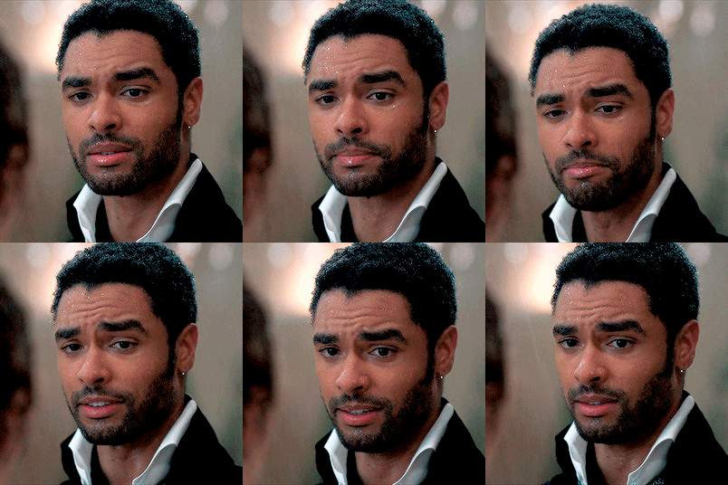


GIF TUTORIAL BY HVITSERKK
This was requested and while I do have older tutorials, my process has definitely changed since my last one. If you need something more in-depth, I have an A-Z tutorial here (which I still use besides the coloring/editing) and a master list of specific gif tutorials here. This tutorial will go over coloring using levels, color balance, curves, channel mixer, selective color and other adjustment layers.
This is what I’ve been using for the past year or so, but we’ll say that this is up to date as of May 2022. Please reblog if this helps!
TUTORIAL BELOW (IMAGE AND GIF HEAVY):
I’ll mainly use the gifs above during the tutorial, but I might add one to show a certain step a bit more clearly. I always use more then one scene for my gif tutorials because I want you to be able to see the steps on more then one gif with different lighting, color tones and skin tones so you can get more of a feel of how to use different adjustment layers.
I’m going to start off right after sharpening, and I still use the action linked in my A-Z tutorial. The only difference is on the top layer (there’s only two), I set it to 70% instead of 60%.
So here are my before gifs (minus one that’s used in the first step):


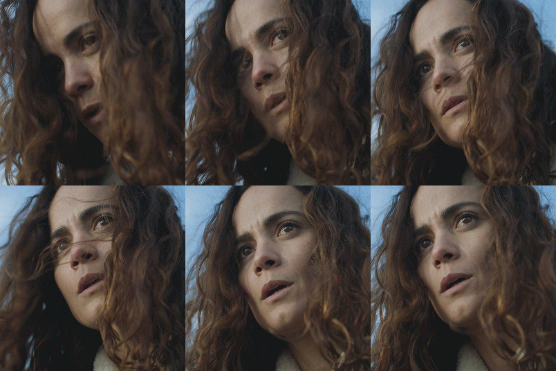
As I mentioned, they’ve only been resized (to 268X268) and sharpened. Now let’s jump right in!
1. The first thing I always start with is a "Levels" layer. I want to bump up the entire gif before so I don't have to use so many other brightening layers later. Nothing to drastic, just move the left slider (shadows) towards the middle, the middle slider to the left and the right slider (contrast + brightness) to the left. Remember to only move them a little bit, the next step using curves will do the bulk of the brightening. Here are my level settings:

And my before gif:

and the gif after levels:

2. The next step is to add two "Curves" layers. You could do the next step on one layer, but I like to keep them separate so I can lower the opacity on each individually. But I name one "Curves - White" and "Curves - Black". Using the black and white liquid droppers, you just click on the the darkest and lightest spots on your gif.

You may have to click around to find the perfect spot, and note that if you click on a blueish white or yellow white, it could alter the entire coloring of your gif, so be sure to find a spot that doesn't do that. Don't be afraid to zoom in and click on one single pixel!
You can also click on slightly darker (with the white dropper) or lighter (with the dark dropper) shades to add more contrast, ie clicking on a light gray cloud with the white dropper will turn that shade and any lighter shade pure white and add a lot (or maybe too much) contrast.
So if you want something pure white (#ffffff) use the white dropper and click on the white area of your gif. Here's my gif, I clicked on the snow that’s stuck to his coat on the left next to his ear:

Now, if you want something pure black (#000000) use the black dropper and click on a dark area on your gif. Here's my gif, I clicked on the darkest spot in the center of his beard:

I used the same gif to show you how big of a difference the curves alone make. Now you can lower the opacity of each layer to your liking. Personally, I like a super contrast look, so I only lowered them 10-15%.
Here's another gif to show you on a different coloring and lighting, the before:

"Curves - White", with the white dropper, I clicked on the sky in the background closer to the window seal where it’s a bit darker:

"Curves - Black", with the black dropper, I clicked on the left side near his eye in the shadow of his hair:

You can see that the gif is way better, but now it’s a bit too pink/magenta. Let’s fix that in our next step.
3. There are two different adjustment layers that I use to balance or “fix” the colors. I'll go over both. The first is the "Color Balance" layer. I only use this if the color looks "off" just a little bit. Here’s the after, followed by how and why:

Like I mentioned, the before gif was a bit too pink. That's a more simple change, so I'll add a "Color Balance" and focus on removing the magenta. If it was more orange, I'd focus on the reds, but pink is more magenta-ish. The shadows (the darkest shades) look fine and so do the highlights (the brightest, near white shades), so I only need to adjust the "midtones". Again, removing the magenta, so sliding the Magenta/Green more towards the green. I also added a bit of blue just to add more of a "cool" tint. Here's the settings I used:

Here's another gif that could benefit from a "Color Balance" layer:

As you can see, the before gif is very colorful, but it's very dull. I can add a color balance layer to give it more depth. The shadows aren't as intense, so I want to add more. I'm only editing the "Shadows" by sliding the first set of colors more towards the red, since my gif is more "cool" (blues, greens) adding red will darken it and add more saturation without turning my gif overly blue. I also add a bit green and yellow to make the shadow more neutral as opposed to just adding a dark red. Here’s my gif now:

And here's the settings:

4. The other way you can balance colors is by using the "Channel Mixer". It may seem super complex, but think of it the same as the color balance, either you add or remove tones from the main colors of the gif. I only use this with gifs that have major lighting issues (lol). Here's my before gif:

and after using the channel mixer:

Huge difference right? Now, you don't always have to use this because some scenes have that lighting and we don't really have to change it and make it "normal". Imagine they're in a photography red room, we definitely don't need to try to make it normal. If they're in a club with neon green lights, same thing we don't need to make it normal. But if it simply needs major adjusting, this is how to do it. Using the guidelines from the "Color Balance" from above, take a look at your gif and see what tint is too much. For this gif, it's definitely too yellow / orange.
To make things easier, what color was with the yellow on the color balance layer? Blue, so basically if I want less yellow, I need to add more blue. That's very surface level, but that will help you to understand for an easy start.
So I want more "Blue" so I need to go to the blue channel and add more blue into the reds and greens. Here are my settings:
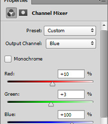
Now my gif:

It's still a bit off, as you can tell it's a bit too peachy instead of a more "natural" tan / beige tone. So I want to go into the red channel and drag the red down until the tint is a bit more natural. Here's my settings:
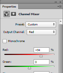
and my before and after gif:


As you can see it's much more neutralized and will be much easier to edit in the next steps.
5. Next is "Selective Color", my personal fave. You can really do a lot with this layer, you can remove colors, change colors and make colors really pop. I only really ever make "natural" looking gifs, so besides the previous edits, I don't do pale, or grayscale gifs at all. So what I'm going for is really vibrant, saturated gifs but still natural looking.
Here's my before:

As you can see in my before gif, there's a lot of popping color. The red in the scarf and the bits of blue/cyan in his jacket and in the background. You can use the selective color layer to target just these colors to really make them stand out. To add more red into her scarf, in the "Red" color, I want to add more red by sliding the first set towards the red side. I also want to add a bit of magenta so the scarf is more of a blood red, instead of a brownish red. Then I want to add a bit of yellow to really add some saturated color. Red is a bit tricky because nine times out of ten, it will also alter skin tones too. Just be mindful of that, and you can still make reds pop. If you do get too much pink in the skin, just go to the "Magenta" color and play around with the settings to neutralize the skin (most often by sliding the magenta to a negative and the yellow to a positive number). Here are my settings:

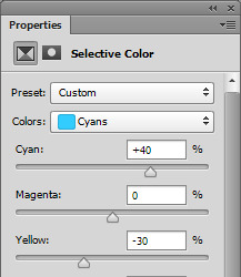
For that cyan, I want to go to the "Cyan" color and with cyans and blue I always slide both the first and last set of colors. I literally never want to go with the green-ish blue that cyan leans to, I want more of a super saturated baby blue, so if I add cyan, I will always add a bit of blue. So, I will slide the first row (cyan) into a positive number to target the cyan tone, then I'll also slide the second to last row (Yellow) into a negative number to add more blue, and less yellow (and less green) to get a more "true" blue color. Here's my settings:
and my before:

and after only editing the reds and cyans:

You can add more or keep it more mild. This is only two colors, so imagine what you can do with all of the colors available in the selective color layer.
5. A super important step when you're using "Selective Color" is the white and black color. I always my color pop selective color (from above) and a "Selective Color - Black" and "Selective Color - White", which ofc you can do on the same layer, but I like the option to lower the opacity individually. For me personally, I like slightly darker shadows and over the top bright white highlights. I also like to further tweak them while I'm there.
So to start, "Selective Color - Blacks". If your gif has a shadow that is too "one color" you can use the black color to balance that out. So for example this gif:

and the after:

You can see in the before that the shadows are too red, too warm. To remove that, I want to go to the "Black" color. So taking what we learned in the color balance layers, the basic tones are: red + cyan, green + magenta and blue + yellow (so to get less red, add more cyan, to get more green, remove magenta). So since my shadows are too red, I want to slide the cyan color to a positive number (thus "adding" cyan). Doing so might alter the color too much in another direction, so if I add too much cyan, it might be overly green, so I need to add magenta, which oops, caused it to be a bit blue, so I need to add a bit of yellow. I almost always slide the top three sliders to a positive number to achieve and almost neutral, no color black, which is why these settings have a bit of everything:
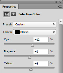
Now, the last slider, the black, basically either adds black, or removes it. Since we're on the black slider, we don't want to remove any black, or it will go white. Since I like my dark colors super dark, I will add black by sliding it to a positive number. Here's my settings:

Adding only a little bit, +4. I usually stick to below +10 because it can easily muddy and ruin your gif.
6. Now "Selective Color - Whites". The same concept of the black color from above, but now the bright, near to white or whites in your gif. I love adding a lot of white to my gifs to make things like the little sparkle in eyes pop, or white backgrounds really bright and a lot of contrast. I don't usually mess with the top three sliders unless there's a lot of color in my white. I mostly change the last slider, the black to a large negative number (so removing black to make white). Here's my before gif:

and after white:

See how it just makes the highlights really pop? You can really see the it in her eyes, around the strands of hair and in the sun spots in the background. You can't always get this look by adding a ton of white because you can over do it. I mostly do this on gifs that don't have a ton of highlight or on lighter skin tones because you just blend the lighter (but not white) tones to much. But for this gif, I can and did, so here are my settings:
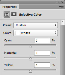
And for good measure a before black and white selective color:

And a ton of black and white:

And my settings:
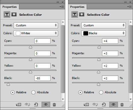
7. Now the last step is up to you, I usually do a mix of the three or just one of the three. I will show you each, but I always finish my gifs off with either a "Brightness/Contrast" layer if my gif is a bit lackluster, a "Levels" if I want an even, overall boost (my usual end) or an "Exposure" if I have enough contrast but want a more bright look.
Don't worry if this step washes out the skintone of poc gifs, I have a very, very last step that will fix that (below the next step).
If your gif isn't as bright or vibrant as you'd like, add a "Brightness/Contrast" layer. As a rule of thumb, I always add to both, but focus on one, that way you don't get that super bright yellow look. So don't add 50+ to both, add a bit to contrast and a lot to brightness, or vice versa. So my settings are simply: Brightness + 18 with Contrast +5
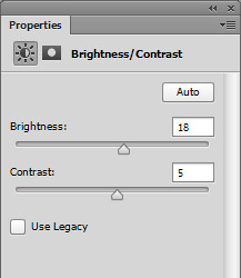
Before:
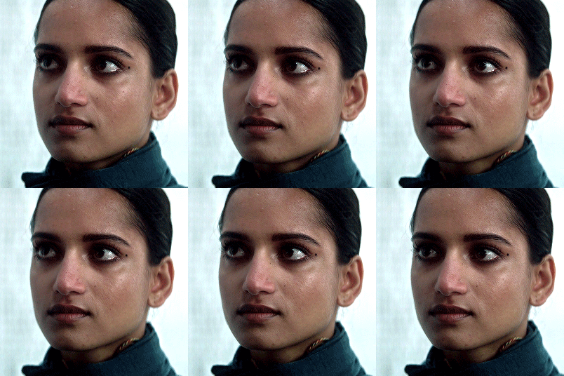
After:
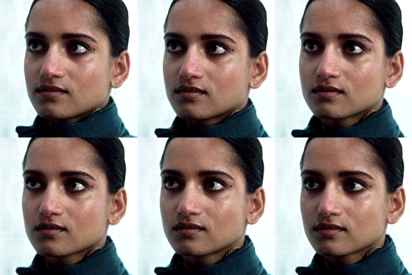
Now if you're gif has enough black and contrast in the dark shades, but is too dark overall, use an "Exposure" layer. For this gif, the dark hair and jacket are pretty much pure black, but my gif is too dark. And exposure layer is pretty much: exposure - add or remove contrast, offset - add or remove black and gamma correction - add more remove brightness. So I want to add to the gamma buy sliding more towards the right. It will almost always wash out your gif, so don't go wild. Then slide the exposure to the right to add a bit of contrast. Incase your gif does get washed out on the black tones, just slide the offset to the left to add more. Here are my settings:
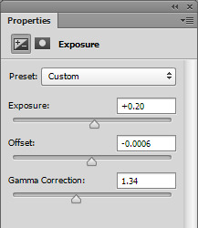
Before:
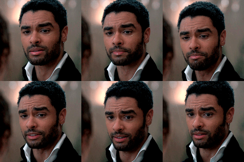
And after:

And lastly, if your gif is pretty good contrast wise, has an okay brightness but you want to boost everything without losing much in terms of color and lighting, use a "Levels" layer. About 85% of my gifs end with a levels layer because I personally love the look it gives. Here's my gif:

and after a levels layer:

The before wasn't too bad, but I definitely want more brightness but I don't want to add to much contrast or just wash out my gif with light. So adding a levels layer and moving the first slider the the left and the middle and last slider to the left will work perfectly. The last slider is the "shadows", the middle is the "midtones" and the far right slider is the "highlights". So adding more shadows to the gif will add more contrast to the dark tones and blacks, adding more highlights will add contrast to the lighter and white shades and the middle will either lighten or darken your gif without adding too much contrast.
I always edit in this order: slide the middle to the left until the brightness I want is reached, then slide the last slider towards the left to add a bit of contrast if the brightness is dull, then slide the first slider towards the right to add more black. Don't go wild, but also don't be afraid to slide them over a good amount. Here's my settings:

Here’s a gif from earlier that also needed a levels layer, the before:

And after:

And the settings I used for that one:
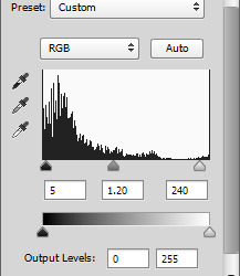
8. The very last step is to even out washed out skintones. This is especially important for this style of gif (as opposed to pale style gifs where the look is still poc skintones, just pale). I don't want a washed out look, because there's no need for it, no reason in my "natural" colored gifs. So to fix this, I always add this layer with these settings and I just lower/raise the opacity as needed.
Since most skintones are mostly affected by the reds (for example add a hue/saturation layer, go to the red color and change one of the settings to see how much it messes with skintones), I only edit the "Red" color. Here are my settings:

my washed out gifs:
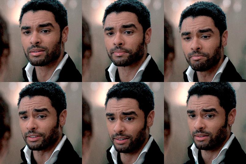

now my more true-to-tone gifs:

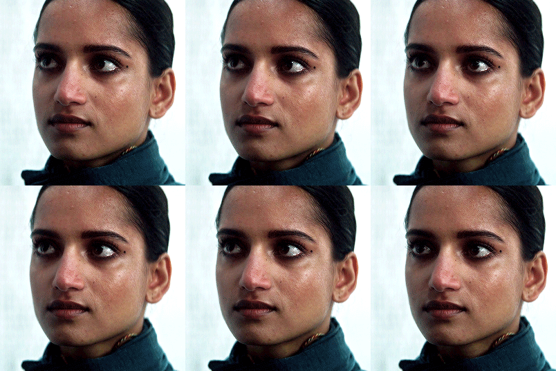
9. As for saving, I only ever use 0.05 on the frame delay except for gifs with fast moving objects (like the snow and hair blowing gifs I used for my main previews) and these save settings.
Another note, I always use 1080 videos, very rarely do I go with 720 and even then it’s always for music videos or movie/tv trailers downloaded from Youtube.
That's the end of my tutorial! I really hope you've learned something and of course all of this is for you to apply to your own style. If you don't like super crispy highlights, don't add so much white or if you want gifs that aren't over the top bright, I hope I've left you with enough tips that have you confident to play with settings and change things up and still love the gifs you end up with.
If you have any questions or need any help, please let me know! I don't mind at all. If you want more in-depth tutorials on specific layers, I do have some on almost all of the things I wrote about, but they are super old so I can update those if needed.
Happy giffing!
123 notes
·
View notes
Text

I posted 326 times in 2022
That's 306 more posts than 2021!
196 posts created (60%)
130 posts reblogged (40%)
Blogs I reblogged the most:
@xiacodes
@shahednasser
@programmerhumour
@theinsaneapp
I tagged 240 of my posts in 2022
Only 26% of my posts had no tags
#programming - 205 posts
#coding - 197 posts
#comp sci - 157 posts
#studyblr - 148 posts
#computer science - 121 posts
#100 days of code - 102 posts
#studying - 102 posts
#software developer - 88 posts
#python - 73 posts
#programmer - 68 posts
Longest Tag: 100 characters
#i said no to doing computer science at university but now i have a module all about computer science
My Top Posts in 2022:
#5
Calling all computer science/programming blogs!
Hello everyone! ʕ•́ᴥ•̀ʔっ
I have been getting dms of people wanting to follow other blogs like mine where I post my progress with programming / experimenting with different programming languages / tips and tricks / resources etc but they can't find them easily soooo I am making a post to reach the blogs these people want to find!
If you post about anything in the list belong, please reblog or comment your blog's @ so the right people can reach your blog:
programming a language
computer science
relevant memes
general talk about either subject
provide resources
student in any of the subjects
do challenges with computer science e.g. 100 days of Code
I just want this to reach as many people so our lil community within Tumblr can grow! Have a lovely day!
563 notes - Posted April 15, 2022
#4
Python Official Roadmap | Resource ♛
* means extras you could learn to enhance yourself
The intent of this guide is to give you an idea about the Python ecosystem and to help guide your learning if you are confused.
Also, please note that the list below is exhaustive, and the items are listed in no particular order. You don't need to learn everything listed in the picture, however, knowing what you don't know is as important as knowing things.
Link to the official site: Python Developer Roadmap by roadmap
-- > must add, the information is from roadmap.sh, but I just put it together in the image
676 notes - Posted April 27, 2022
#3
Python 3 Cheat Sheet | Resource ✎
Link to source: Python 3 Basic Cheat Sheet
1,608 notes - Posted April 20, 2022
#2
Build Your Own X | Resource ✿
GitHub is literally the best, what the fuck? ヾ(・ω・*)ノ
Anyhoo! This GitHub repository contains a list of tutorials that will guide you to build almost anything in web development using a range of programming language that best suits you!
Let me give you an example:
I click "Game" in the table of contents, it jumps me to the Game section. I wanna use C# so I pick a random C# game tutorial e.g. C#: Learn C# by Building a Simple RPG and it takes me to the site where someone made a whole project page with step-by-step guide to help build that game!
See the full post
1,666 notes - Posted April 18, 2022
My #1 post of 2022
800 free Computer Science classes | Comp-Sci Resources ♥
800 free Computer Science classes you could take online right with video lectures!
Link: GitHub - Developer-Y/cs-video-courses: List of Computer Science courses with video lectures
I found this link in a tweet and found the site very helpful! Take full advantage comp sci learners!!!
Have a nice day and happy programming ♥
1,711 notes - Posted April 16, 2022
Get your Tumblr 2022 Year in Review →
22 notes
·
View notes
Text
Tumblr Revival
Tl;dr
Tumblr has a large interconnected community of artists and content creators, and should focus on its strengths and what it does right. Instead of trying to compete for space against Facebook, Instagram, and Twitter. Tumblr should focus on empowering its community and giving that community the tools to develop the site's unparalleled uniqueness.
Tumblr is the crossroads of the internet, with a monthly user traffic of 300 million it is the perfect space for artists, content creators, and small businesses to grow their following without having to fight for a seat at the table against companies with huge budgets.
Hi, I go by Nacho here on tumblr, and I'm sure as many of us on tumblr have noticed, the (hell)site is kinda going downhill. Tumblr was bought by Automattic in fall of 2019, and I am sure they have the best intentions to help tumblr stay afloat. However, I think it's time the community took a more deliberate approach to how tumblr is handled, and hopefully Automattic and @staff will hear us out. I think I have a solid solution to tumblrs money issues, that will help both the site and empower its online communities.
First and foremost, I am not involved with Tumblr or Automattic. I am just a simple blog trying to help out a place that I've been on since 2010, and I would hate to see it die here around 2023.
So, let's get to the root of the problem on tumblr right now. That being money, tumblr is currently costing more money that it produces, as we've seen with its 97% drop in value from 1.1 billion dollar sale to being sold at around 3 million dollars.
So the first thing that must be improved before anything else can be improved on tumblr is how much money they're bringing in a month. I don't think folks on tumblr hate monetization as much as we all collectively say we do, I think the issue is that most advertisers are completely disconnected from the groups they are trying to advertise to on here. Tumblr comprises roughly 65% millennials and 30% gen-z, the two generations that advertisers seem to have the hardest time advertising to for a myriad of reasons. The main one being that they don't fully understand what we want, and sometimes just don't listen to what we are saying.
Lets look at how tumblr makes its money, Tumblr has four main revenue sources,
Ads by sponsored posts
Display ads through video posts
Sponsored Day ads or banner ads
“Premium Themes”
I'll go into depth on all of these and how tumblr could make potential changes to improve their revenue anywhere from three to six months after it implements some or ideally all of these changes.
First tumblr ads and sponsored posts, these changes are going to be contingent on tumblr allowing its users to share, like, and comment on ads much like all other media sites currently allow. Or at least giving advertisers the ability to turn that on or off as a function.
The average tumblr post gets reblogged 14 times, that number increases significantly if the ad is engaging and actually caters to the communities wants and needs. My reasoning for giving users the ability to reblog ads is to increase user engagement while maintaining their current ad vetting process and all of the nonsensical ads that are run on tumblr 90% of the time.
The other reason for allowing tumblr users to share and comment on ads, or have it be an option for advertisers to turn on or off as they'd like, is that the appeal of tumblr is the ability to propagate and obsess over the most niche things (i.e OSHA.)
All the while allowing content that gets shared all over the internet bubble up to the top through the collective hand of the tumblr community. Along with this tumblr has no way for small users to share their own products or services, every single major site has a way for users to advertise their pages or products through the site.
Tumblr is a content machine that creates imagery and memes that get shared all the time across the internet, so the ability to share and curate its own ads is paramount to improving advertising and user engagement on tumblr.
My proposal here is for tumblr to expand its advertising capabilities to all users, while charging a flat rate fee to advertise on tumblr, with additional charges for popular tags or trending tags. Tumblr currently has no self service advertising system much like Facebook does for example. Where facebook charges a daily rate on cost-per-click(CPC) or cost-per-thousand(CPM)
Charging a flat rate fee at a rate of a day, week, month, or quarterly basis with variances in prices based on the lease term and what the advertisers would want to have their ads show up on certain tags. This would open up the doors for small businesses that don't want to advertise on places like facebook, twitter, or google with their complicated CPM and CPC models. Also bringing in more small locally owned businesses with the added value of less competition for ad space on tumblr.
This would also take some of the weight from tumblrs own advertising staff from having to explain a convoluted system to potential advertisers. Creating a simplified model with the the advent of tumblrs own infrastructure able to get a single post to a large variety of users. Where the current ad model uses a “shotgun” method to hit as many people as possible, the tumblr model could encourage advertisers to curate a more personalized and intimate experience that tumblr users would love.
Why not just advertise elsewhere? Tumblr still in fact gets over 300 million views a month as of June 2021 (Statosta), and the added benefit for users to be able to like, share, and interact with ads would allow ads that the community enjoys to be talked about more. Giving advertisers more honest feedback about their ads while increasing their SEO’s.
Also small businesses that can't compete with the vetting processes that are used on other sites, would have a better chance of developing their business and increasing their clientele on tumblr whose core demographics are approximately 60% millennial and 35% gen-z. This core demographic does in fact care about being able to shop at local stores, or even a store across the US that is trying to drum up its own online sales.
These ads could be placed inline on the tumblr dash while moving other sponsored ads to the right of the site on desktop, but making them alternate on mobile between user ads and sponsored ads.
Second, the display ads should be changed to allow tumblr users to share and further interact with ads to generate more user engagement, incentivizing more businesses and companies to build their brand status on tumblr. Tumblr has a good model for creating short diaries or daily vlogs for companies that wish to show off their products on social media. This includes smaller businesses and vlogers that want to post videos or tutorials of themselves on their blog.
Tumblr is a good site for user engagement with a pool of creative potential for anyone wanting to gauge the desire for a particular subject or piece of media, maybe even an upcoming show. Having the ability to share and comment on sponsored ads would also help advertisers by allowing them to get more bang for their buck with a considerable uptick on how users engage with that content.
Third, tumblrs sponsor day ads and banner ads are inexpensive and should be highlighted as a selling point over their competitors. Tumblr 24-hour banner ads are considerably more affordable for businesses when compared to places like twitter with their 200k price point. For the same amount of money on tumblr a business could have their company at the top of the dashboard or app for 8 whole days. Much longer and much better than the competition.
Keeping this price fixed, with a change in the price CPC is still a much more lucrative and attractive selling point than any of the competition on the internet today. I know this might not be exactly what tumblr wants to hear when it is hemorrhaging money right now, but let's look at the cost for these 24 hour daily ads and banner ads. If tumblr hypes up the price point on these ads they could see a significant rise in advertisers considering the lack of competition on tumblr and past success stories of companies who did advertise on tumblr.
At the same time larger advertisers should be encouraged to make engaging ads and blogs on tumblr that will make people want to actually go to their blogs, that then link to an external site or page. Not ads that instantly try to force you to go to some other site, by rewarding or offering special discounts for people who find a special code or something off of the actual blog. Or even for giving the same code to everyone who reblogs a certain post made by the advertiser.
Seems too good to be true? Look at “Asos” back in 2015 when they held a shirt design competition on their tumblr blog. Where they had 900 submissions, four of which were picked, and were sold out of the user generated shirts in 10 hours.
This is not the only case however, but FX ran their own campaign for the show “Man Seeking Woman” where they saw a 2.8% increase in user engagement, 86% increase in their tumblr followers, and they actually saved money through advertising on tumblr.
All this leads me to believe that tumblr actually was and continues to be the best place for brands, small businesses, and artists to develop themselves through genuine user engagement.
Finally, the “premium themes” that are available on tumblr that allow for unparalleled customizations that you hardly find elsewhere on the internet anymore. Tumblrs ability to take a variety of media sources, as well as having an unparalleled level of customization, user interconnectivity, and a vibrant artistic scene shows that it is ripe with potential.
Tumblr could still use its post+ feature, but in the same way that Discord uses its subscription service. For cosmetic changes that can be added modularly to the site or individual blogs for an additional monthly fee. In conjunction with partnering with community artists to bring small cosmetic additions to individual blogs, while paying the content creator and tumblr taking a small portion of the profits over a certain amount.
To be completely honest this is probably the hardest portion of this entire pitch to make changes to in a shorter period of time, considering all the testing and “under the hood” changes that must be made. However, I think that implementing this as well as the other changes I have proposed will bring back more foot traffic to tumblr as well as increase its revenue and profitability.
In closing, I am simply working with whatever information I was able to find online and a good amount of time invested on my part to do this. I think tumblr has a ton of potential still to return as a force for good for the communities that exist and want a change from what the internet has become. Time and time again when any company or public entity dies it was because it did not change and refused to adapt and innovate, oftentimes not at the hands of the people working everyday to keep the site running. Instead at the hands of people who dont see the value in what has fallen in their laps.
If you agree and think this is something that can be done, please reblog this post and follow me for more updates. If I don't hear back or this does not gain any traction by the end of the year, then tumblr can go to its inevitable end. I will be here sinking with the ship.
@support @engineering @music @wip @changes @photomatt
#tumblr plus#tumblr post plus#tumblr staff#advertising#marketing strategy#changes#tumblr premium#post plus protest#community#automattic
418 notes
·
View notes
Text
Recommended Misc Fics of September 2022💖
hello, hello! here are my recs for seventeen & straykids for september! hopefully these beautiful stories get more recognition as well as the writers 💝
** anything in parentheses and bolded are my thoughts that can be disregarded if needed **
🔞smut || 💔angst || 💕fluff || ✅completed || 🔄ongoing || 💯favorite

BEST FRIENDS TO LOVERS AU
My Way To You || @wonwoonlight💕✅💯💯
↳ You don’t remember a time when you don’t have Wonwoo by your side. But when things happen and you’re left to deal with your feelings, you can’t help but wonder if what you have with him can be framed under the name of friendship after all. or, alternatively, Wonwoo’s been in love with you for as long as he can remember and he doesn’t know if he should be thankful or not that you’ve never suspected him for it.
SOCIAL MEDIA AU
Network Love || @cherrycheolliesc💕💔✅
↳ back from europe trip with a devastating heartbreak, yn tries to go through her junior year of uni with as little drama as possible, but still somehow ends up at the center of it every time.
Without You || Sequel (lord while reading the sequel the oc lowkey became toxic, like idk if it was just me thinking that BUT that character growth of all of the characters was great!!)
To My Youth || @viastro💕💔✅💯
↳ in a world where everyone finds out who loves them within a 10 meter radius through the app love alarm, confessing your feelings without the use of the app is no longer considered normal. however, you refuse to download it in hopes that you’ll be able to fall in love without being dependent on love alarm.
STRANGERS TO LOVERS AU
The Athlete || @yutasthetic 🔞💕💔✅💯
↳ You are assigned to do an interview with Kwon Soonyoung, the trailblazing athlete everyone calls Hoshi. But as you spend more time with him, you start to see there are more layers to him than football.

CHILDHOOD FRIENDS TO LOVERS AU/FRIENDS TO LOVERS AU
Happier || @crispy-chan💕💔✅
↳ ❝ I like to think of happiness as a visiting friend. It doesn't have to be something big or grandiose but it comes out of the blue when you need it the most. ❞
Stations and Destinations || @sulfurcosmos💕💔✅
↳ • when did love start feeling like a crime? •
OTHER
In Search Of Happiness || @chogiwow💕💔🔄
↳ in hindsight, there is no sure shot way of finding happiness in life. some say following a wikihow tutorial with images could help, some don’t seem to hold it in great regards. after all, there’s no universal path to follow.
SOCIAL MEDIA AU
All About You || @zoe8stay💕💔✅
↳ you've always wanted to meet your soulmate but after finding the person who you thought was the love of your life it didn't matter who your soulmate really was anymore...or did it?
Knock On Wood || @grassywoozi💕💔✅
↳ moving into your new apartment by yourself was scary enough, but with three rowdy neighbors, you had no idea what to expect.
Push + Pull || @yoongisleftearring💕💔✅
↳ in which you are trying to survive college life but seem to have a thorn in your side in the form of Seo Changbin. After years of hating each other can you decide to remain civil with the handsome rapper? (let's just hope he doesn't come across that private thirst account you have for him)
Do check out all of the other Group Fics that i have reblogged as well!!
** if there is any fics that you guys would like to recommend, please do! i am slowly running out of fics to read **
#stray kids scenarios#seventeen scenarios#seventeen fluff#seventeen angst#seventeen social media au#seventeen best friends to lovers au#stray kids fluff#stray kids angst#stray kids social media au#stray kids childhood friends to lovers au#stray kids friends to lovers au#seventeen fic recs#seventeen recs#stray kids fic recs#stray kids recs#seventeen strangers to lovers au
34 notes
·
View notes
Text
Why we need masks for all
Okay, I am going to put myself out here: we need masks for all. If you live in a country that doesn’t have widespread use of masks in public, this one is for you.

Here is a graph of coronavirus trajectories by country. All those countries in blue have widespread public use of masks, in addition to other measures.
Obviously I am not basing all of this on a few countries that have managed to slow the spread. Here is a link to a summary of 33 scientific papers that show that masks (even handmade ones, we’ll get to that) reduce spread of infection for the general population. Many of these studies are themselves meta-analyses of data. The evidence is mounting that public mask usage is an important strategy to reduce COVID-19 transmission. I want to highlight this paper in particular which modeled that public mask usage could slow or even stop the spread of an influenza pandemic.
(The CDC and WHO still maintain that healthy people should not wear masks. Preserving them for healthcare workers is important, but that is a separate question from whether they work or not. It seems likely from the evidence presented above that they do help at least somewhat)
Of course, there is a nationwide shortage of masks in most countries. Medical grade masks must be reserved for healthcare workers (if you have some, look for local ways to donate them, many hospitals are accepting donations). So where do we get the masks for the public? We follow the lead of the Czech Republic and Taiwan and make our own. Here is a great summary of how the Czech Republic went from 0 to 100% public mask usage, in less than two weeks.
A person makes masks and a “mask tree” where neighbors could donate handmade masks to others. Note that masks (or anything really) can be effectively sterilized by heating above 70C (158F) either in the oven for paper masks or using regular cycle in your washer and dryer for cloth masks.
Studies have shown even basic household materials like t-shirts can be effective at blocking droplets that contain viruses.
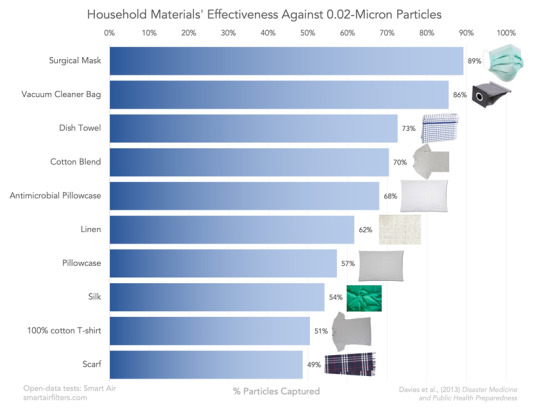
Are they as good as n95 respirators? No. But outside of certain medical procedures, the disease mainly spreads through droplets, and these homemade masks are still pretty good (though not perfect) at blocking those. This goes both ways: the masks provide a layer of protection to protect you, but ALSO contain a lot of the droplets you could be spreading. Some people with the disease don’t have any symptoms at all, so wearing masks is also important to reduce the chance of infecting others.
Masks, like social distancing, don’t have to be 100% effective in order to help flatten the curve.
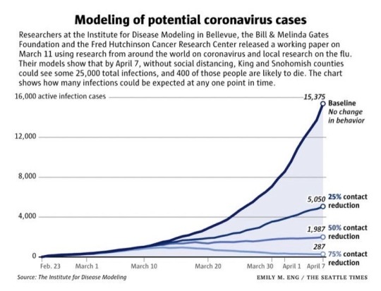
Here is a model from the Seattle area, which shows how small changes in social contacts can effect total case numbers. You can see that even reducing contacts 25% has a profound effect on case numbers after a few weeks. The same thing would be true if wearing masks reduced transmissions by just 25%.
I want to point out that as long as you don’t take risks you wouldn’t take otherwise and keep your hands off the mask, there is very little risk to doing this now as we wait for further scientific evidence. And the evidence is mounting that simple masks reduce risk and slow spread.
In the Czech republic, they went from no one wearing masks to 100% (it is now mandatory in public) in about 10 days. While the mandatory order to cover your mouth and nose is only a week old, they have seen a slower growth of cases than the rest of Europe despite lots of testing.

Basic masks can be made with just a t-shirt and scissors, no sewing required. This video shows you how, just wear your mask higher on your face than this guy. (Video is changed from original post to one that doesn’t require Facebook login)
youtube
And a few more tutorials
DIY facemask with filter pocket from Maker’s Habitat (video)
Facemask with adjustable wire and filter pocket from Easy2Sew (video)
Craft Passion Face Mask Pattern (pattern & instructions)
A Dr Explains how to make a facemask from a HEPA filter (video)

Simple mask that can be made with a sewing machine, from Craft Passion
If you get good at making homemade masks, especially the ones with HEPA filters, some hospitals are now accepting donations of homemade masks as well. Check to see what is going on in your local area.
If the papers cited above are correct, wearing a mask now when you need to leave the house for essential chores will reduce the time it takes to bring our cases down, and public use of masks could be invaluable in keeping cases low when people start to go back to work.
We can change our culture from stigmatizing masks to expecting people wear them. It happened in the Czech Republic in less than two weeks. We can do it too.
If you have the time, please watch this video. It was the thing that really made all of this click for me, and it has a ton of great information. Here is a shorter video from the Czech youtuber who started the movement in his country which I also recommend watching & sharing.
Please reblog & add resouces, tutorials, or mask selfies! There are three main things you can do to help spread the word and normalize mask wearing: 1) share videos & other information on the topic; 2) take a selfie of you wearing a home-made mask; 3) spread the message, with hashtag #masks4all.
16K notes
·
View notes
Text
I posted 414 times in 2022
174 posts created (42%)
240 posts reblogged (58%)
Blogs I reblogged the most:
@continent-of-wild-endeavor
@kaiyonohime
@saxifraga-x-urbium
@roboticchibitan
@cataouatche
I tagged 390 of my posts in 2022
Only 6% of my posts had no tags
#fiber arts - 53 posts
#art - 34 posts
#knitting - 33 posts
#dogs - 31 posts
#garden2022 - 28 posts
#needlework - 28 posts
#my dogs - 27 posts
#omie - 24 posts
#bloomhaven - 22 posts
#tag thing - 14 posts
Longest Tag: 122 characters
#the fuckin almond monocultures are massively unsustainable and a huge part of the beekeeping industry is built around that
My Top Posts in 2022:
#5
Snow bunnies enjoying snacks from the yard.
1,031 notes - Posted January 23, 2022
#4
If you imagine a system in which everybody has access to healthcare, and you reject that idea in favor of the current system because you think it would cause long wait times for care, then we are just coming from very different places on "what would be a good way to run society".
Like there are big conversations to be had about whether it would increase wait times, and how we could structure it to avoid or reduce that problem, but if it takes longer to get care, but everyone can get it? That sounds better. That would be a better way to do things.
You're saying you don't want other people to have any, because then you'd have to have less. Given a theoretical choice between a system that's not ideal but does serve everyone, and one that serves some well and some not at all, you prefer the latter.
1,276 notes - Posted January 18, 2022
#3
A moment for a petty complaint:
When people are explaining how to weave in ends, in a tutorial or any video, and they say to "just follow the path of the yarn" or "double the stitches" and then proceed to do THIS
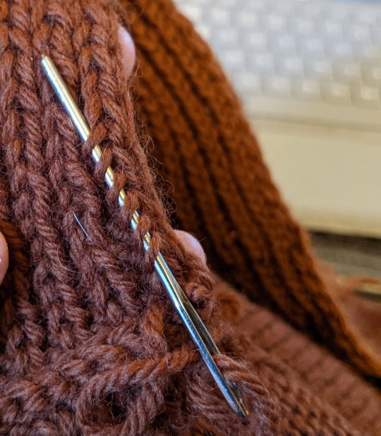
That's a valid way to weave in your ends, assuming your yarn is wooly enough to not slip and it won't be super visible, but that's simply not what you've described.
See the full post
1,467 notes - Posted November 30, 2022
#2
I read somewhere that older ppl in cultures where squatting is more common than sitting in chairs can still comfortably squat, deeply & for long times, whereas what American over 50 can do that and not hurt
It's like a "use it or lose it" thing, so I made sure to spend some time squatting, getting up and down, and it did get easier, though I still can't do it like my little nieces, who can read a book on their knees, but I'm gonna maintain my mobility in this at least
And now it's a nice way to take a break from standing for a bit, or it's the easiest way to do something brief & near the ground, but this is still not what American adults usually do
So sometimes I'm just this strange 30 something woman squatting by the farmstand peeling a peach. And I never think it's an odd thing to do until someone else does.
1,996 notes - Posted July 24, 2022
My #1 post of 2022
I was reading a post about dipping baby carrots in ranch, and it reminded me of what I've previously described as an Additive vs. Subtractive approach to nutrition.
The Subtractive view looks at all the things you're currently eating, or might eat in a given day, and sees a pile of Bad Stuff, with probably some Good Stuff mixed in, which would be better if only you could clean off and remove the Bad. The Unhealthy, the Fattening. So this outlook sees the carrots as Good, and that ranch is Bad, so in order to eat well, the thing to do is remove the ranch.
(I fear I've gotten in too deep with capitalizing Things for Emphasis, so I'm going to back off on that now. You get the point - foods are not *actually* fundamentally good or bad, they are just categorized that way.)
Dipping carrots in ranch is not a healthy food choice, because the ranch is unhealthy. The ranch has "cancelled out" the carrots, by adding all that fat and processed sugar & stuff, so it would be better not to have eaten that at all. Subtractive nutrition is very concerned with lessening the Bad things: calories, fats, trans fats, processed ingredients, carbs, sugar, salt, meat, non-organic foods - whatever their current trend of "healthy eating" says will kill you.
On the other hand, the Additive view (which I think is more sensible) looks at the carrots & ranch snack and says, you ate some carrots! Carrots are objectively good for you, and you got that nutrition into your body. Good job! Sure, you also ate ranch, which nobody thinks is a health food, but a) the carrots are still definitely in there, nourishing you, and b) the ranch made you more likely to eat them, and enjoy them, and so eat them again in the future. Ranch also provides essential nutrients, regardless of whether it's the ~optimal~ way to get them.
Additive nutrition looks at your day and sees what nutrients you consumed, any that are helpful. Any good choices you make, regardless of if there are also bad ones. What's good, and maybe let's not go overboard on "Bad" stuff if we're really worried about it, but what did you eat that helped you? Eat food that serves you, and if you can put in more good things that's great! But if you have ice cream afterwards, it doesn't rip the kale out of your stomach. It just means you had ice cream today, and also you had kale.
And while Additive thinking helps with motivation, because it gives you little mental gold stars for lots of things, and doesn't take any away or call for shame if you do eat all the nachos, it really comes into play in decisionmaking, and weighing options. Subtractive thinking says, don't eat broccoli with cheese sauce, the sauce is bad for you. Just eat the broccoli, plain, steamed, with maybe a little low-salt seasoning mix. But let's be real - you're not going to do that. Or at least, not very often, not if you're starting from "I don't like broccoli unless it's covered in cheese sauce". Subtractive thinking says take ALL the bad stuff out, and make only the Correct choices, and then you're being healthy. Otherwise you might as well not have bothered.
Additive nutritional thinking says the broccoli with cheese sauce is adding broccoli to your diet where it would not otherwise have been. It's not a choice between plain broccoli and cheesy broccoli, not really. Really the choice is, do I add some broccoli to my diet today, along with tasty sauce, or do I not eat broccoli at all, because that's what I would be doing otherwise?
10,113 notes - Posted January 3, 2022
Get your Tumblr 2022 Year in Review →
#tumblr2022#year in review#big jump between 2 & 1 lol#also reblogging myself most - cringe or just good organization?#this is nice bc you get to look at your digital self & go#yeah i like me#also behold my comprehensive tag usage!#i can successfully find things later#and u can 2
4 notes
·
View notes