#i just wanted it for myself i am aware it's not photoshop quality
Explore tagged Tumblr posts
Text
Jimin - Who MV

here have a gif of my favorite oft-overlooked bit of choreo
mp4 version with the audio for the full effect under the cut
#park jimin#bts#who mv#muse#xcz gifs#i love this because it is EXACTLY on the beat#King of Musicality reigns supreme#i just wanted it for myself i am aware it's not photoshop quality#omg i just realized after watching another zillion times that he's catching the loose belt on his jacket#before it can flap woth his movement and ruin the lines#like i never noticed i was too busy looking at his feet and his face#godsDAMN the man is slick and smooth with it
4 notes
·
View notes
Text
How to make GIF's from videos
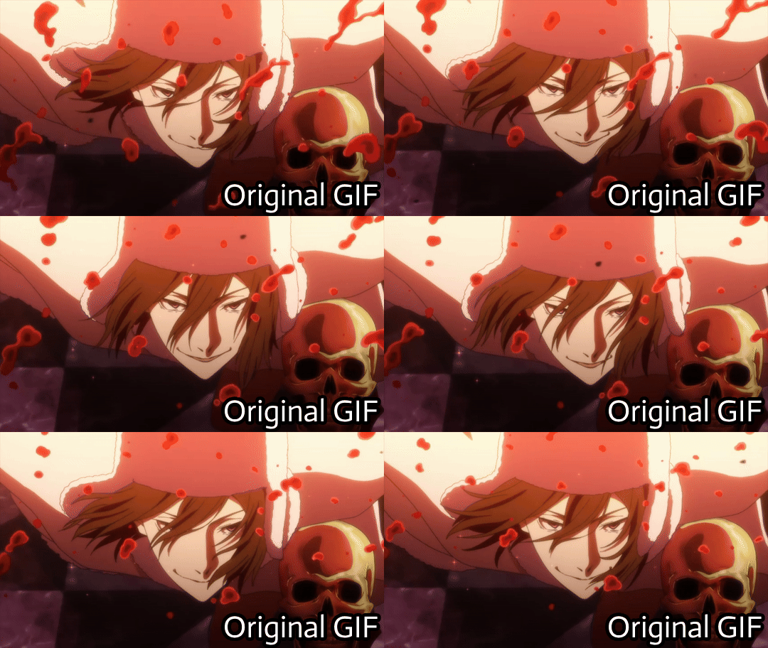

I consider myself relatively knowledgeable on GIF making, but I am not an expert. This tutorial mainly focuses on making GIF's and sharpening, for a PSD tutorial see here.
A few things to note before starting:
I struggle with sharpening GIF's- Especially real-life GIF's. For some reason I can't quite wrap my head around when/if the GIF's look too sharpened, so the tutorial part on this may seem lackluster.
I only use photopea and ezgif for GIF editing and capcut for cutting videos. I won't be able to answer questions about other software's (ie photoshop).
Tumblr has a GIF size limit of 10MB. It's the bane of my life. Always check how big your GIF is.
And with no other questions let's begin.
How to make a GIF from a video
Find the video and download it (real life)
This is a very obvious step but one that is important. I would always recommend finding videos in good quality. I often use tiktok, free videos from sites (like pixabay) and Instagram.
As for downloading them, I would recommend avoiding '[website] downloader' sites for a few reasons. A) they get shut down and replaced with spam sites frequently, thus making them unsafe to use, and B) they often times make you watch an add or remove ad blocker before giving you the highest quality download option.
I would always use cobalt.tools for video downloading.
Find the video and download it (anime)
This is more complex and I won't detail my download methods publicly. All I can say is not to use the anime watch sites to download your videos from, they're often low quality and have watermarks- Plus a lot of the sites have pop-ups ect which make them unsafe.
If you want a video tutorial I can't link you one from YouTube. This is not a YouTube tutorial. Nope.
Anyway, once you have it you will need to use capcut to shorten the video length (and potentially change the file) however you will need to make an account. Annoying I am aware, but it's the best video cutting software I know of and has caused 0 issues for me.
Not that when I first used captut the video save settings had the video at 720 pixels, however you want 1080 pixels because it makes everything smoother and higher quality. Once you change this setting you don't have to change it again.
Make the GIF
I always use Ezgif for this part. You need to use the video to GIF option and upload your video. Then choose the length of the video you want to turn into a GIF.
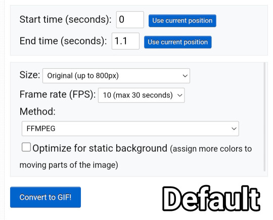
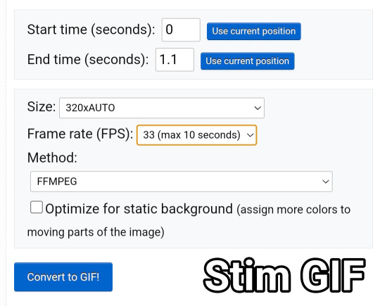
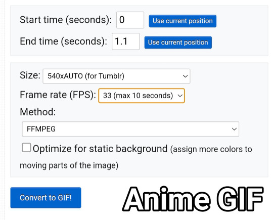
You will be met with a screen like this under the video.
Frankly I do not know what all of this means so that's why I only edit the size and frame rate.
With the size, you don't want it too big, smaller gives you more wiggle room for size with tumblrs size limit. However, with anime videos there's often less colors/detail, so they can be bigger and still look good.
The frame rate is important, the higher the frame rate the better quality it is, so regardless of GIF always have it this size
Then you hit convert to GIF and there you go.
If you need to crop the GIF use the crop tool and if there's any points of the video you don't want (ie frames of the next scene) you can use the frames tool (note that imo it's easier to use the photopea timeline for this)
Editing the GIF
You can just leave the GIF as it is, or you can make it sharper and/or add a PSD in photopea.
For stim gifs I will simply direct you to this tutorial because I can't understand the irl GIF sharpening process without photoshop's tools.
However, for anime ones you can use the smart sharpen tool, I either leave it on the default setting, or turn down the radius to 0.1-0.5
You can find the sharpening tool in filters > sharpen > smart sharpen
And here are some comparisons.


I spoke about PSD's here, but here's an example of the GIF with one and sharpened.


6 notes
·
View notes
Text
Cyberchase: How It All Started (Episode 1)
This comic was later renamed to Cyberchase Web Adventures Episode 1.
When I make posts about certain Cyberchase characters or important events, I sometimes show panels from the prequel web comic "How It All Started", which was released online in December 2001, a month or so before Cyberchase premiered. I have restrained myself from just posting the whole thing, since I don't own it.
However, it is no longer available on the live pbskids.org website. It is available through archives, but there are some difficulties in tracking it down due to missing images in some places. Additionally, even when it was available on the live pbskids.org website, it was free for all to view, so posting it here wouldn't hurt anyone.
The best way to enjoy the web comic is through the FlashPoint Archive Project. This is because the webpages used simple animations in some places. Essentially, each comic page is treated like a tradition animation cell. They have a background layer, and then the webpage places images on top of it that can be exchanged for one another. This produces simple three-frame animations for things like flashing lights or repetitive arm and eye movements. This isn't something I can easily reproduce on Tumblr, since it isn't like posting a single animated GIF. There may be some round-about way to convert it (i.e. take video of the webpage animating and convert it to GIF), but I'm not going to do that. So, this will just be still images. There is no author or illustrator credited for this. The webpages mention a copyright of 2001 for the Educational Broadcasting Corporation, but I don't know if they actually assembled the content in-house, or if Nelvana or WNET did it. I just want to make sure that everyone is aware that I do not own this. I am presenting someone else's creation here, in an unedited form.
There is one other thing I should point out. When the comic was originally released in 2001, it has a certain framing to it.

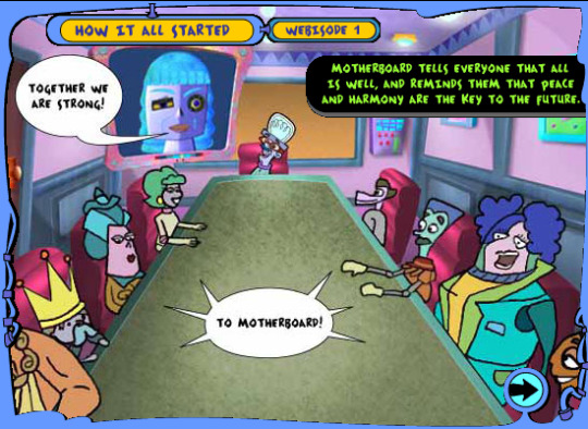
However, in 2002, the Cyberchase website got redesigned, and the comic was changed as well. Some animations were removed, some images were replaced with lower-quality images, and some assets were altered to fit in a new frame. They started calling these webisodes to fit in with Cyberchase Web Adventures, which included an original Poddleville story and one about Hacker trying to knock over Tikis in Tikiville.
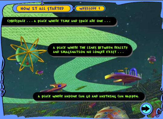
I prefer the original framing, and I dug into the archives to find as many panels with the original framing that I could. However, I was unable to find the original framing for a few pages. It may be possible for someone with better Photoshop skills to try to put the assets back in their original forms. I'm not that person, but the assets are on the Internet Archive and the Flashpoint Project for anyone who wants to try. In those cases, I will use the new framing. All of the images necessary to understand the story are intact. However, there are some special cases that I will note when we get to them.
Anyway, my plan here is to show the panels, transcribe the narration and dialogue, and make some commentary at the end. So, let's begin.

Narration: Cyberspace... A place where time and space are one... A place where the lines between reality and imagination no longer exist... A place where anyone can go and anything can happen.
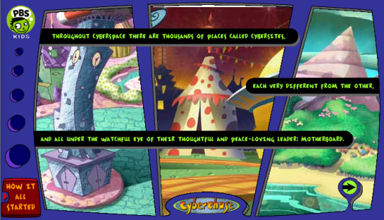
Narration: Throughout Cyberspace there are thousands of places called cybersites, each very different from the other, and all under the watchful eye of their thoughtful and peace-loving leader: Motherboard.
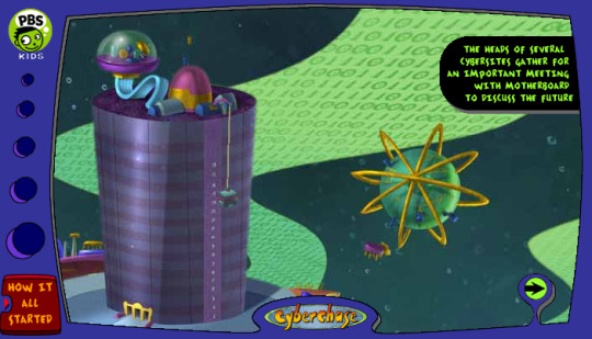
Narration: The heads of several cybersites gather for an important meeting with Motherboard to discuss the future.
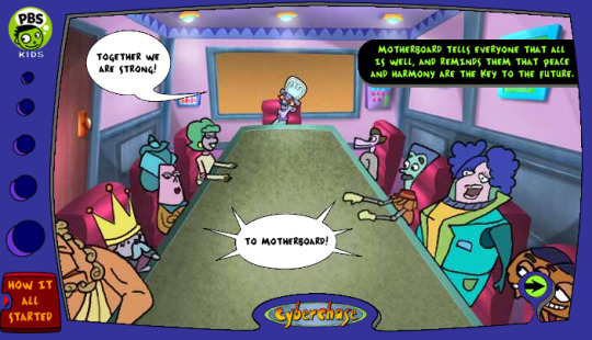
Narration: Motherboard tells everyone that all is well, and reminds them that peach and harmony are the key to the future.
Dr Marbles(?): Together we are strong
Assembled Heads(?) of Cybersites (Ava of Symmetria, Sheriff Judy of Sensible Flatts, The King of Happily Ever After, Zeus of Mt. Olympus, an unknown character, Ollie Nollie of Solaria, Lucky of R-Fair-City, and Two-Headed Sam of Castleblanca): To Motherboard
Editors note: Motherboard is absent from this panel during this version of the comic. I'm not sure if this was supposed to be a shot from Motherboard's POV, or if they just wanted to wait another page before showing her. That speech bubble is so far away from Dr. Marbles, that I wasn't sure if he was even the one saying the line. Maybe they were implying that Motherboard was speaking through the screen behind Dr. Marbles, even though it doesn't have anything on it.
The second version of the comic adds a screen with Motherboard to the background layer, implying that it was supposed to be her saying the line all along. This is confusing.
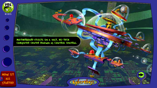
Narration: Motherboard exists in a vast, hi-tech computer center known as control central.

Narration: Motherboard is the brain of the giant computer system that oversees all of Cyberspace.

Narration: The brilliant Dr. Marbles is responsible for keeping Motherboard's parts working smoothly and efficiently at all times.
Dr. Marbles: Your memory is now optimized, Motherboard.
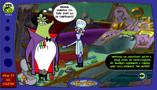
Narration: Needing an assistant with a high level of intelligence, Dr. Marbles assembles a cyborg who calls himself The Hacker.
The Hacker (thinking): Hmmm, someday I'll take over all of Cyberspace!

Narration: Wanting an assistance of his own, Hacker makes a robotic Cybird he names Digit.
Digit: Yoikes!
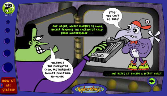
Narration: One night, while Marbles is away, Hacker removed the Encryptor Chip from Motherboard... ...and hides it inside a secret vault.
The Hacker: Without the Encryptor Chip, Motherboard cannot function. Ha-Ha-Ha!
Digit: Stop! You can't do this!

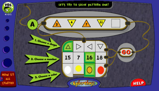
Narration: Digit needs to figure out the combination to the safe so he can replace the Encryptor Chip inside Motherboard before it's too late!
Digit: This is definitely not going to be easy!

Editor's Note: And then, we play "Crack Hacker's Safe". This game still exists on the pbskids.org website almost 25 years later. It was done in Javascript, so it survived the death of Flash that took out most of the rest of the Cyberchase game library. Feel free to pretend that Digit is the one pressing the buttons for these panels. Make up dialogue if you wish.


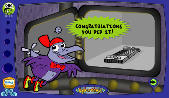
Narration: Congratulations you did it!

Narration: With the Encryptor Chip safely back in place, Motherboard tells Hacker he has to leave.
Motherboard: Your hostile actions cannot be tolerated, Hacker. You are no longer welcome here.
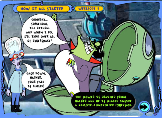
Narration: The power is drained from Hacker and he is placed inside a remote-controlled Cyberpod.
The Hacker: Someday... somehow, I'll return. And when I do, I'll take over all of Cyberspace!
Dr. Marbles: Page down, Hacker. Your file is closed!
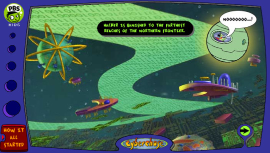
Narration: Hacker is banished to the farthest reaches of The Northern Frontier.
The Hacker: NOOOOOOO....!
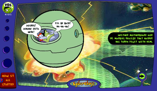
Narration: Neither Motherboard nor Dr. Marbles realize that Hacker has taken Digit with him.
The Hacker: I'll be back! Ha-Ha-Ha!
Digit: Yoikes Lemme outa here!

Narration: Check out webisode 2... ...and find out about Hacker's Evil plan ... and what happens to Digit!
Editor's Note: So, we have the narration inviting us to watch webisode 2. Normally, you would expect the alt text attached to the web page to match the text for the image, so that if someone was unable to load the image, they would still get the text. The alt text is: "Tune in next week and find out about Hacker's evil plan and what happens to Digit!"
This leads me to believe that there was a different version of this image back in 2001 that had narration that was either the same as the alt text, or more similar. However, it appears that that version of the image was replaced, and the original version was not archived.
That's the end of the comic, so let's get to my commentary.
So, what do I think about this comic? I enjoyed reading it. I like the idea of The Hacker's schemes to topple Motherboard starting before the main virus. I find it a bit odd that he was able to remove the Encryptor Chip without either Motherboard or Dr. Marbles being alerted instantly, since it is an essential part.
I suppose Digit was already a good guy at this point. Otherwise, he would have looked the other way, Motherboard would have ceased function, and we wouldn't have gotten the show at all. Now, Digit never being a bad guy is a controversial idea in the fan community. If he was always against The Hacker's evil plans, then it removes the idea of him being genuinely bad and having a change of heart later. I'm also not sure why The Hacker took Digit along after he foiled his plans this first time. Perhaps Digit was able to hide this betrayal from him at the time. But then, who else would have known about The Hacker's secret vault, or the fact that he stole the Encryptor Chip?
It is questionable how much of this is still canon. The Hacker's origin story in particular has been expanded in the years that followed. The modern story talks about him wanting to help Motherboard, and then turning evil later. Meanwhile, this original origin story had him turning evil immediately. At this point, they had not even created the young Hacker that we see in flashbacks, since he only appears (from birth) in his final form.
The show has also animated a flashback of Dr. Marbles exiling Hacker in the same cyberpod. But then, we got Season 5 Episode 6 "The Flying Parallinis, where his banishment involved being trapped on top of Mount Wayupthere until the Parallinis accidentally released him. Both items may have been ret-conned in Season 12 Episode 8 "Hacker Hugs a Tree", when we see him banished via portal. He is also alone in that episode, so he didn't bring Digit along with him in that version of events.
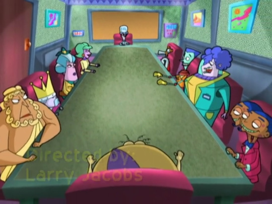
Also, can we go back to the board room with the leaders of a few of the Cybersites?

This was early days for the show, so they only had so many characters created. Now, Zeus makes sense. He is the king of the gods on the Mt. Olympus Cybersite. The King from Happily Ever After also makes sense. Judge Trudy makes sense, I suppose. Back then, we only really knew her and her sister, Sheriff Judy, from Sensible Flatts. This was long before Sensible Flatts had a separate mayor.
Ava from Symmetria is an interesting choice. She runs the factory that produces the symmetrical objects, but is she also the head-of-state on that Cybersite? We don't see anything on that Cybersite other than the factory, so maybe the site really is just the factory.
I'm surprised to see Two-Headed Sam here. We know he runs the Cryoxide factory in Castleblanca, but this isn't really an Ava situation where the entire site is just one factory. Is Sam also the head-of-state across Castleblanca? That would explain his monopoly on the Cryoxide business, and it is a concerning conflict of interest. This was before the mayor we all remember from the Halloween Howl.
Ollie Nollie was the cart driver on Solaria, and Lucky was the cab driver on R-Fair City. I get that Solaria is mostly a vacation resort, and R-Fair City is an amusement park. But it's still weird to me that these two would be the heads-of-state over there.
Does anyone recognize the character in the top right? I can't find any reference to him.
Edit: I was looking back at S01 E21 "Less Than Zero", where we see a meeting of the Cyber Council. They used the same room, and the characters are in much the same arrangement. Our mystery character is replaced by the Mayor of Poddleville. The Mayor of Poddleville is easily the most senior member here, due to his place in the pilot. So, I'm a little surprised that he was the one character to change between "How It All Started" and this episode.
We also get Lachesis, one of the three fates from Greek Mythology, seated across from Dr. Marbles. I'm not sure why only one of the three fates gets a seat at this table. Why would Olympus get two representatives on the council?
#cartoon#cyberchase#2000s#nostalgia#pbs kids#2000s childhood#web comic#how it all started#cyberchase web adventures#cyberchase how it all started
4 notes
·
View notes
Text
End of Semester Reflection
This semester saw us explore three essential Adobe programs: Illustrator, Photoshop, and InDesign. From this list I was very familiar with Photoshop, had had some experience with InDesign, but had admittedly always avoided using Illustrator because I didn't understand how to use it properly. While I still have much to learn, I can happily report I am now significantly more confident using all three of these programs and no longer fear the dreaded Illustrator.
The biggest problems I encountered with this course involved Illustrator - but that's because I was treating it like Photoshop. The missing piece and the biggest lesson I learnt was that Illustrator layers stack whereas Photoshop layers interact (or at least how my brain interprets it). Once I had this locked in I was able to absolutely smash out my book backgrounds on Illustrator with ease. This program was without a doubt my biggest learning curve, but honestly it was the most satisfying to get right.
Learning the Pathfinder tool was probably the trickiest part and the way I managed to finally wrap my head around it was to sit down and just play around with it. While the buttons do say what they're going to do, until you're familiar its hard to compute what they actually mean. If I could do the semester over again I would have taken more time at the beginning to figure this function out as it was a real fundamental I missed and struggled with as a result.
Because I was sick or away for a large portion of Term One I found myself behind very quickly. When it came to catching up I went through all the material provided to us on Moodle and Teams and did all the steps/documented everything myself, but to make sure I was on the right track I was often checking Timothy Still's (timothystillop1.tumblr.com) for a reference point. I definitely don't think he as even aware I was using him for inspiration, but he had a really solid Tumblr to use as an example so if I ever meet him (or have I? I'm not even sure WHO Tim is) I will have to thank him for getting me through the Tumblr side of this course!
Our final project saw us make a nursery rhyme book for a small child, I chose to personalise mine for my three year old niece, Riley. This was without a doubt my favourite assignment of the semester across all my papers and I think that shows in my final spreads.
I wanted to challenge myself by minimising how much I used Photoshop to create my pages as this was the program I always gravitate towards. While I obviously had to cut my Riley images out and edit them on Photoshop, almost all other media featured on the pages was created in Illustrator. I did take my Illustrator backgrounds into Photoshop to add my Riley images so I could make final adjustments, but all in all I'd say 80% was Illustrator.
With this project I got a little bit excited and did stray away from the brief by adding an additional four pages, but I don't feel like the quality of my work dropped with the extra workload. My goal was to create something I could get printed and bound to give her as a gift, and I am so insanely proud with the work I produced I can't wait to give it to her.
One thing I will be revising before getting it printed is changing some of my supporting images into proper vector drawings. For the sake of time I did rip the pirate ship, the drum kit, and the microphone from the internet - but making them vector drawings that I create will allow for more cohesion across the book.
This course taught me a lot and has really inspired me to continue creating digitally. The skills and tools I have learnt across all three platforms will be things that I take away with me no matter what specific field I end up in - because even if I'm not using them professionally, they will be things I use in my own personal projects.
Thank you for sharing your knowledge with us, Toby!
5 notes
·
View notes
Note
hi and belated eid mubarak!! i love your gifs and they have made me interested in gifmaking! i was wondering if you had any advice/tutorials for a photoshop illiterate who wants to make gifs? thanks!
aw thank you anon - both for the kind words and the eid mubarak :)
so I taught myself photoshop and the first bit of advice I would give is to let yourself be bad at it. I deffo think that is easier said than done esp if you're a perfectionist, but you're going to start out with basic things and you're not always going to get it right. and that's fine because ultimately gifmaking is for fun. for me, anyway, it helps keep me sane, lol, so if there are imperfections in my gifs - which there often are - I don't mind so much. I look back on a lot of my earliest gifs and I just hate them. the colouring, the text, the everything basically. it's so bad. but giffing is something that gets better with practice I think.
I've made a couple giffing tutorials here and here but I reckon you'd need to learn the basics before you can start thinking about selective colouring and sharpening and other things like that.
another tip would be to try and download high quality versions of whatever you're giffing. I'd say at a minimum you need 720p but ideally 1080p because it really makes a difference to your gifs' quality.
logos and watermarks - for the love of god, try to crop those out if you can. I'd much rather see less of a character's head if it means I don't have to see an ugly watermark that can ruin a gif. especially if you then add text on top of that.
if you have poc in your gifs, or even if you don't, just be aware that shows can often wash out characters' skin tones etc. you also don't want white characters to be too pink, lol.
when giffing, if you have any sort of "night light" (yknow the setting that reduces blue light to prevent eye strain) on, make sure to turn it off before you start colouring, as that will affect what your gifs look like to everyone.
I'd say start off with making gifs and focus on how to colour them properly, before you start making gifs with text. when you do make gifs with text, feel free to play around with different fonts - there are loads of free font websites on google you can use.
if you want, you can use something like trello or even a word or google doc to keep track of all your giffing ideas, and try to match the scene to the lyric or poem or whatever quote you're using, if it's that kind of text gifset. and of course remember to proofread the text on your gifs and on your captions.
I'm sure there are lots of photoshop tutorials out there for beginners. am not sure where to direct you for those as I mostly learned it by ear, and it was probably over eight years ago that I started messing around with photoshop myself. but I wish you luck, anon, and am flattered that my gifs made you want to start!
1 note
·
View note
Text
In Which I Properly Introduce Myself
Good Morrning Tumblrverse Updated 4/15/2024: My name is Ash Around the internet I am known pretty much ubiquitously as Ash Something Art I am currently active on all of the following platforms:
My wordpress website
Facebook
Patreon
Redbubble
Bluesky
Instagram
DeviantArt
Youtube
TikTok (Backup is here)
Discord (@AshSomethingArt)
Reddit
Creatively
Ello
Fetlife
I am a 35 year old multidisciplinary artist. I’m Genderfluid AMAB, and I live my life as a lifestyle clown. But I’m here on tumblr to focus on who I am as an artist, so let’s dig into that. There is always some confusion when I say I’m a multidisciplinary artist, as it’s not an incredibly common term, but to clear that up out of the gate, it means I don’t specialize in just a single type of art, but work my absolute ass off to create awesome work in a wide variety of styles and media. There’s a lot of push for artists to have a single recognizable style and to only work in a single medium; But this isn’t for the artist’s benefit. I’ve always looked at that as being the same mindset that people have that makes guys tell their girlfriends they’re “Too much” or to tone themselves down. People want artists to have a single style so that artist’s work can fit inside of an easily digestible and recognizable box, where just a glance can tell them which artist did that work. And I hate that. I hate being limited. I do art because I love art, and if I want to do a realistic charcoal work one day then a digital anime style piece the next I’m going to do that. What styles do I use, you ask? That’s a hard question to answer in-depth because I have practiced a wide range of media (Charcoal, graphite, pastels, acrylic, oil and watercolor paints, photoshop, illustrator, pen and inks, colored pencils, Prismacolor markers, lithographic printing, screen printing, woodcarving, leathercrafting, sculpture, photography and photo-editing), and multiple consistent styles with each medium I use. But to simplify and clarify it, I can at least list the styles I am happily ready to market myself in as a professional at any given time because I have spent over ten years doing each of them, and these styles are my own at this point; -Anime and Manga Style - My own Anime style is a bit more on the realistic side; I grew up referencing a lot of Seinen manga, pulp magazine, Death n=Note and stuff like Air Gear, as well as a bunch of Manhwa like Sun Ken Rock and King of Hell. That said, I’ve also practiced (a lot) replicating the big anime and manga’s styles from when I was growing up; Naruto, Bleach, Dragon Ball, One Piece, Nana/Paradise Kiss, etc. I obviously prefer working in the style I developed myself but I have options with the anime and manga styles. -Western/American Comic Style - When I’m drawing in my own comic style, I would say it most closely resembles Michael Turner, my favorite artist from Image Comics, who created Aspen Comics and later worked with both Marvel and DC. I grew up inspired by his work and that led to my work being similarly inspired by him. I spent a lot of time in the comic convention circuit in LA meeting artists and being exposed to their work, and while I was a bit of a fan of Marvel and DC growing up, those titles didn’t come close to how obsessive I was with Image/Top Cow, Aspen Comics, Dark Horse and Heavy Metal magazine. As an adult I’m very aware of how problematic Heavy Metal is, but that doesn’t stop it from being one of my first major artistic inspirations when I came across it as a kid and didn’t know any better; And themes aside, the art was REALLY good; Between Hajime Sorayama, Frank Frazetta, Luis Royo, and a slew of others who did work for them, the visually artistic quality of the magazine was amazing. -Semirealism/Realism - I don’t want to say that this is where I started as an artist, because I I remember correctly I started drawing with anime characters back when I was like 9. However by the time I was 13 I was already trying to draw realistic portraits in pencil, and by the time I was in high school I was already able to do it. I don’t really have a lot of specific inspirations for this style, as honestly it’s the style that came most naturally to me. I have always done my fastest, best work in straight up graphite or charcoal; And I’ve been able to expand that work to a slew of other media, leaving charcoal as my favorite of them all. Given the time, I can do (and have done) massive 18x24″ charcoal portraits and pinups that look almost like a photo (although I do prefer to make the work obviously drawn when I can).
-Cartoon Style - Being a realism artist makes cartoon styles the hardest of the styles out there for me; It’s about simplifying. Simplify simplify simplify. My own cartoon style is a mix of anime/manga chibi styles and things like Jhonen Vasquez and Tim Burton’s art, as well as a few different web comics that I grew up with. I can’t say my cartoon work looks like any specific cartoon artist, but those are at least my go-to inspirations when I’m working in the style. If at all possible I do prefer to avoid this style. -Character/Pinup Style - Unlike the rest of the styles, this one is completely a creation of my own. It mixes semi-realistic shading with a linework style inspired by both anime and American comics, but wouldn’t necessarily fit into either of those brackets. It’s simpler than semi-realism, but a lot more realistic than cartoon, and I’m looking forward to creating a lot of work in this style very soon. -Tattoo Styles - I will preface this with the fact that I have no experience doing tattoos on peoples’ bodies. However, I have had a TON of commissions where people wanted me to design their tattoos, and so I had to study them in-depth so I knew what the tattoo artists would need when the client took my art to them. I am confident in the American traditional style, Contemporary, Cartoon, and Black and Grey styles. -Graphic Design - Originally, I started learning graphic design for my own purposes; How to brand and market myself. Create my own logos, etc. I figured, if I already have the artistic abilities why not do it all on my own? Before I realized it, I was doing paid work for anything from logo and t-shirt graphics, to album art, magazine covers, web banners and profile pictures. I can do both corporate and illustrative graphic design, but I prefer illustrative. -Nagel Style Reproductions - To be clear, this is reproducing his style, not reproducing his work. Nagel was one of my very first formative artistic inspirations. About ten years ago, I decided to do one piece referencing his work as just a style study, and then people wanted me to do portraits of them in the style, which eventually led to me now having a portfolio of about 30 pieces that are various portraits, pinups, etc, in his style. I never expected or wanted to be known for that, as it started as just a practice thing for me, but Nagel is so iconic that it became one of my most demanded styles from prospective clients. So there you go. Eight solid styles that I work in. I don’t mean to ramble, but stopping me from infodumping when I get started is really hard to do, especially if I’m the one who needs to stop himself. In the past, I haven’t been the best at labelling my artwork with the exact style I’m using, and so there’s some confusion as to which I’m using on specific pieces among my current fanbase, but I do hope to rectify that with a new labelling process that I’ve started the last couple weeks for clarification. I unfortunately will not be going back and labelling work that has already been published online, but hopefully you all will start to see the distinctions as I publish more.
#About Me#Introduction#Ash Something Art#ashsomethingart#ashsomething#ashsomethingtheclown#ash something#artist#art styles#multidisciplinary artist#drawing#digital art#digital painting#traditional art#fine art#illustration#pinup#portrait#about the artist#pinned posts#adhd artists who can't shut the fuck up#i started making an introduction post and turned it into an essay again a ten part monologue by me
4 notes
·
View notes
Text
Week 10 - Colour Grading
Introduction
This week was dedicated to colour grading, a topic I am somewhat familiar with as I attempted to colour grade a few weeks back. The lecture was mainly focusing on how colour works and its function in film and in storytelling. A lot of the material is quite familiar to me as I was an art student during high school, so I studied colour theory before. However, it was good to refresh myself, on what colour relationships are available to me and why colour is so important to the style and storytelling of film especially.
Here are some combinations I was not aware of!
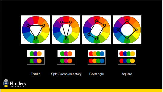
Complementary colours are predictably used the most. They're an easy tool for colouring, and something I use a lot in my own work, so it was funny to see just how prevalent it is in colour grading, and film poster (orange and teal is just everywhere).

Also, it was cool to see how colour affected a film overall. This can be seen in the 'colour stories' of films where every colour of a shot is stretched into a single timeline of the film. It is fascinating to see films like The Matrix and Mad Max: Fury Road stripped down to only their colours but still be so identifiable. This showed how colour is so essential to what makes a film unique.


Workshop - Colour Grading in DaVinci
In this workshop, we focused on colour grading in DaVinci, which is something I had not experienced at all. In my experience with Premiere Pro, I had not seen colour grading done in this way. I used to just apply filters such as Light/Contrast and Hue and Saturation. This is quite different and felt similar to how I would affect images in Photoshop. This gave me much more control over the images and colours I wanted. Jason began the workshop by showing us the files of a professional colour grader.
The Process
It was quite a simple task once I got used to the controls and effects of the program. I did a few test grades on the example footage that Jason gave us, but I felt like I kept copying what had already been done so I attempted to colour grade some of my own footage.
I had some footage of my friend's new puppy so I focused on raising the saturation of the puppy as she had some really beautiful colouring on her fur. I tried to also up the contrast of the colours by making her brown fur redder in contrast with the cooler tones of the grass. I tried to keep in mind the RBG levels of the image and raise the saturation so it looked more colourful.

In the screenshot below, you can see I also did some masking as to keep the same warmth from the barkchips in the background. I did this as it felt too cool and I didn't want to lose the warmth of the scene.

Here is the final as well as a comparison video I created:
youtube
youtube
I quite like how it turned out, the shadows and textures in the grass are much more apparent so it gives the footage more clarity (the quality isn't the best). I also like how the colours in the puppy contrast with the background.
I felt that I could do more work with colour grading as not much editing was involved so I did another example. I don't have a screenshot but the process was very similar to the puppy colour grade. In this example, I wanted to contrast the metal structure she's standing against with the softness of the sand. I balanced the image and bumped up the contrast and saturation. I also masked and tracked the building and coloured it to emphasise the blue tones while colouring the back in a stronger yellow/orange tone. I attempted to use complementary colours here to emphasise the separation between the subject and the background. I had hoped the blue also showed her isolation.
Here is the final and another comparison video:
youtube
youtube
In this example, I felt I had more direction in what I was attempting to convey in my colouring. In my puppy exercise, I felt I was just messing around with what I thought looked nice. So it was nice to try to convey an emotion with the second example. I quite like how this turned out, however, I would adjust the blue tone further so that it looked less green. Still, I like what I was able to convey.
Sources
Yaroslav Shuraev - Woman lighting a cigarette outside - https://www.pexels.com/video/a-woman-lighting-a-cigarette-outside-5978992/
1 note
·
View note
Text
Personal Evaluation - House Of Cards Brief - Remediated
For this brief we had to firstly create our own interpretation and timeline for the project. My timeline i made an extended way rather than a day to day basis as for me that is more realistic in terms of progress, gives me the freedom to go back and forward exploring my work, while still giving me the deadlines for each step.
One of my mood boards I went with a topic I've worked on in the past and I enjoy exploring as it can bring you to different directions, exploring dark imagery, macabre, apocalyptic, death, some items of steampunk, etc. While researching, I found some information about origins and meaning of the cards and their suits, that shown how they’ve evolved along the centuries, This was quite interesting as i wasn't aware of it.
One of the artists that most inspired me was Emil Melmoth. If i recall correctly i found his work on instagram, and it's just amazing! His sculptures are absolutely stunning! (in some dark macabre way) But the composition of them and the ideas he merges I find it so attractive, even though they will definitely shock a lot of the audience, but that's something I appreciate in art! Also one of my favorites, HR Giger, but for this project I focused more on some mechanical imagery of his.
Started by making some quick thumbnails to generate ideas. This was a good way to start because I got some different and interesting things to explore. So from here I designed each suit.
Being a printmaking course, even though this year we didn't get much access to the college facilities, i didn't want to make my work only in digital format, i wanted to have still the image of a printing technique integrated in my designs, so i decided to go for Lino Printing, as its accessible from home and i enjoy this method a lot.
So, as you can see from the record posts on my tumblr, i design each suit, firstly as a drawing, and then proceed to create the lino cuts, which for the purpose of details i made in A5, as any smaller (normal deck of cards size) in my opinion would love quality in the design.
My other moodboard was focused on colours, contrasts, and a more abstract concept. I did some research on it and found some interesting artists like Sonia Delaunay, who has created her own deck of cards designs, which was quite fun to see. She explores the interactions between depth and movements with colour contrasts, and even though it is not my “cup of tea” i found it very interesting how it works together. Using some of these artists' ideas and inspirations we did a workshop with colours and painting with sponges. Personally this wasn't something very exciting for me, but i ended up using some of it as background and development work further ahead.
After having my Linocuts set up and ready, I made some initial prints, from which I created digitally a first idea towards the finals. I think it worked well but for me it wasn't quite there yet...they needed something more!
Sometimes it is good to step away from something to give you a better view, to look back at it with clearer eyes, so i decided to focus for a while in creating my box design.
For this i played with some mark making, collage, drawings, as i had the idea already in my head to give it a mechanical look for the cover, which i would also use on the back of the cards. After I manipulated that imagery on Photoshop, playing with layers, contrast, twisting the images, stretching them to their potential. I am very pleased as to how these turn out.
Coming back to my suits designs...
i decided to work more with mix media on the prints, see where i could take them, and if I could get closer to the idea i had in my head as to how i wanted them to look. In order to create a frame, I used masking tape before using materials like watercolours, pens, posca pens and textures to add some mask making. I am really happy with how these turned out, felt as they have potential and it was getting closer to a final result.
For my finals, I decided to clean my prints digitally using photoshop, and created some displays of the cards as if they were on a table, and the game being played. I used the suits I designed into the usual format of the deck of cards to make it simple and understandable to the viewer to recognize, while still leaving my own trade on the cards. The font I use resembles as if it was a print itself so I feel it works with the designs. Each of the face cards I used was a different design of the actual suit (On my tumblr i show that with the suit of hearts) all designed by me.
Overall i felt this project was challenging as i never did anything like this, at some point a bit frustrating not sure on where it was heading and due to the current circumstances and working a full time job. But once I got my gears right, I picked up the rhythm and I found my way back to what I was making and I really enjoyed and am pleased and excited with the result! In terms of time management i feel i did and handled quite well. Kept updating my page as i went by also to keep myself straight in covering all the necessary topics of the brief. I’m happy with the topic i choose, as i mention before, it kept me interested and wanting to create a more professional looking prints for my finals. I feel they connect with each other in the concept i choose to take forward with developing.
If I was to develop further, I would probably experiment with different backgrounds on the face of the cards. I would love to actually physically create them to make them possible to play because i really like how they turned out. Possibly would make some changes to the box design. Not so much changes but to make it look less digital, i guess i would try the design with screen printing layers! I think that could turn out to be very interesting.
#hnd2#HOC_HNDCPM2#hoc hndcpm2#print#printmaking#creativeprintmaking#creative#cogc#evaluation#development#deck of cards#card suits
1 note
·
View note
Text
Welcome all, and Goodbye Sun! Spent all day on uni today. So here's a reeeeeally long post. A lot to reflect on. My writing style may seem odd to some, but its how I retain a good memory of it all, by putting a lot of words on paper. So here's my paper of reflections on my first day back in #ctec502 with Roy and our korero.
Also my paint arrived. Hell YES. MORE PAINTING.
Carol Dweck on The Power of Yet,
I like that there is this method of teaching, how we think at a very young age, the power of critical and developing thought. It is innately in built into us from a time perhaps before birth, since it is consciousness that we are transforming and interpreting here, using our capacity to think, but CONSCIOUSLY.
There has been a book available in a well voice acted audio version on YouTube called The Tao of Pooh. This insightful little story teaches us the way of the Tao, as in the perspective of Lao Tzu, a particularly old and equanimous monk.
In the famous Winnie the Pooh by A.A.Milne, the archetypal too-busy-working, close/fixed-mindset, is played by the character Rabbit, a woodland creature that is so caught up in their mind they don't actually interpret what they experience or can learn from others or themselves.
In relevance to Carol Dweck's studies into 'the power of yet', it really is all about culture, ethics, opportunities and social conditioning. Childrens minds are like sponges were told, and we see it everyday, even in ourselves. We understand that yes, there is a need for workers and people who can do repetitive tasks, as how it is taught in a modern conventional schooling system, BUT THE ACTUALITY IS to any student where they are given the opportunity to choose what they want to learn, are made aware of how they can learn and evolve when given a certain challenge, in a non judgemental and constructive environment, we can drastically enhance the collective intellect of our whole interlinked social network within the short span of a year as claimed by Carol Dweck.
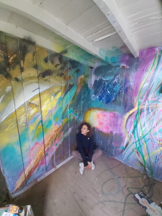
Here is some art that was created by myself during a 4 day Stay at Home MURAL Festival that had the theme of bringing light to issues of the world but in a positive and beautiful way.
With over 700 artists in 50 or more countries... even this simple idea to bring intelligent and simple, beautiful, artistic, childish action, that's bold for its first year running!! All from Covid-19.
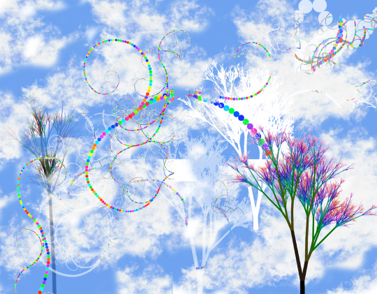
Casey Reas on Digital Algorithm Art
In the first online lecture given by Roy, I was surprised we would be using algorithms so quickly in our physical work, and it took me back to my day of using procedure based processing to create scenes in a program made to generate 3D environments, this program was called Terragen 2.
Using the software called Context Free to render simple shapes and sophisticated 'real' clouds in a 2D representation even if it is generated in 3 dimensions if programmed, (and 4 dimensions if animated) it was interesting to understand why my PC I used up to 10 years ago clogged with animal fur, would die on me when I left it to render a scene in ridiculously high quality over a period of multiple hours. It was because of the amount of shapes I'd set my PC to fully render without understanding that the picture is more sophisticated than a simple blink and reality is made, it is GROWN AS A SERIES OF INTERCONNECTED OBJECTS and it adapts to or from the environment with the interconnectedness that is afforded by their state of consciousness (programming) and the matrix of energy they take form as in this sedimentary moment in reality.
The past affects the future render layer in a moment of rendering. Also the future affects the past layer by building or deleting or transforming itself, this seed from moment to moment. This Animation. To give an object a code or seed to existence, even if you can't control all of its inputs, simplicity can create diversity and complexity and vice versa.
The amount of revelation I can place in rendering in procedural matrix or lattice realities...I would love to see that in my work on mixed media and mixed reality assignments or projects I endeavour to entertain or seek out.
But this in itself is a paradox. Am I pulled to this future by my simple minded flow toward this source, as is entropy, as is the movement of all things. ..There is more than black and white to all situations. Usually it's black and white or white and black. Lighter darks or darker lights.

I wouldn't be at university because I didn't have a revelation to attend it last year. I wouldn't be at university if I felt so depressed I needed to leave. I wouldn't be at university if I wasn't allowed to attend. Nevertheless I know. I know that I am pulled forward to where I'm meant to be, as much as I am falling into old habits, they're not old, they're new, but its my consciousness that calls them old and tries to outdo the habit one moment, while another moment were relieved we didn't listen to the critical mind saying we shouldn't do what we don't want to do. Everything has a cause and effect like the render in window. Like my life on pen and paper. Like my mind engaged in its word spinning and weaving.
I digress back to my art in context of the Casey Rea's YouTube video.
A fun aspect of my art is it would look amazing even in a quick render with plenty of visual noise, but I love the simplicity of procedural based virtual world and object creation and the layers it can develop or devolve into.
Another thing is using Photoshop to apply visual post production enhancements was also something I really enjoyed as a part of the iterative process, and this has been reaffirmed in a book I have just picked up called Photoshop for 3D artists V1 by 3dtotal Publishing.
I watched all the videos recommended by Roy in his pdf today from the lecture and I can summarise my views on them:
Carol Dweck: This type of learning should be more widespread in our culture. Only way it will change is if we change, and teach others the same way. It begins with us. I enjoy the way Roy engages with us in our lectures like we're human beings and not students. I think this is the most important thing about his teaching that enthuses me, and the themes of his classes are quite informative.
Casey Reas: I like his work, I'm not new to this idea of art, but I did like to see his process. I wouldn't certainly seek out a video like that one given but it definitely was insightful into his particular environment and methods of producing ideas.
John Maeda: Wow this guy really looks like he's on the guide for dummies, and he definitely could write a few of them. Was a great insight into his perception of reality and how he expressed his ideas and himself was also simplified complex ideas and that they are readily available to see or interact with including his book. Simple. It's right there in front of you. All it takes is a shift in perception to discover what was currently scanned over as unimportant details by our consciousness. It's all right there in front of us, or if we feel something, from within us.

Warren Berger: Well to be honest, he didn't excite me as many of the other videos because his idea was so simple and not really that much of a paradigm shift within myself. It always can come down to refinement of an unwanted edge. Does one see a wave as something that can be answered? Can you answer that question? How about the question preceding this one? Can a bird fly as well as a fly can bird? Why is a raven like a writing desk? Why do we play 20 questions? We are always in an iterative process of rendering our existence and our legacy in this reality by the choice we have when faced with a question. Depending on its complexity or cryptically contrived hindrances, we will always be faced making a choice, or answer the question of our existence, with our consciousness in this moment. And can we use that moment to ask something we have never thought we had an idea about before...like why isn't my skin purple? Where did my consciousness come from and why is it specifically in belief that I am me, every time I get up at 8 am, but not while I am in the throes of a dream?

Riddle me that and I'll ask you why
Cottleston, cottleston, cottleston pie.
I have seen my lives
In my eye
Simply put, I never die
It's not a riddle, it's who am i
Cottleston, cottleston, cottleston pie.
2 notes
·
View notes
Photo


frequently asked questions / introduction !
⠀ hey, hello! my name is june & i'm your friendly neighbourhood bisexual (and kpop stan) who enjoys making psds in my free time. ⠀ the stuff i do ⠀ as stated above, i make free psds. for those who do not know what a psd is, it basically means 'photoshop document' and in my case comes in the form of a way of editing a photograph / image or gif. as hinted at in the name, you do need photoshop to access my work, or you can use photopea (an online alternative to photoshop of sorts); however i'm aware that it can change the appearance of psds. so i would not recommend it if you want the the full quality! i currently am only limited to psds, however, this does not mean i won't branch out to do other things in the future! ⠀ credits ⠀ all crediting of work goes to me and me only, as i am the only one who runs this sideblog, everything you see published is created by me. while my psds are free, this does not give you any sort of permission to steal parts or the entirety of my psds. if i come across / made aware of someone stealing my work, i will address them privately, i ask those who follow me not to do this for me. if they refuse to take down what belongs to me or give me a hard time about it, then AND ONLY then will i post about it. i do hope people have common sense so things do not result to this measure. ⠀ activity & notes ⠀ i don't like to give myself deadlines or any specific time table for my work as i believe creativity can't be rushed, and with me, that statement is awfully true. i believe if i'm rushing myself to post a psd just for the sake of it, it's not going to be my best work. i went through a period where i wasn't caring for the quality of my psds and it just became a huge problem because i wasn't doing it for the fun of it, i was doing it for the attention. therefore, only a couple of psds i had originally remain. i am still fairly new to the whole psd game and do not consider myself in ANY way talented, i will admit as a creator, there are people out there who, without a doubt, make better work than i do. HOWEVER if you decide to stick with my work or download it and continue to support me, then let me say, from the bottom of my heart; thank you, i am very grateful.
⠀ commissions / requested work ⠀ at the moment, i will not accept commissions and they are therefore, closed. i find them very iffy & my anxiety kicks in, i don’t want to be paid and then the person not like what i give them in return. however! this does not mean i’m not open to requests, as this is a sideblog, if you wish, you can send me a message / ask on my main requesting a certain type of psd, if i feel like i’m capable of making such psd, i will do my best and release one. ⠀ where else can you find me? ⠀ i cross post onto deviantart, and when you go to download a psd of mine, it will take you there. by all means you can watch me (the deviantart equivalent of a follow) there! it would be appreciated uwu. if you’re looking for non-psd social media, then there is my main tumblr blog & my twitter account.
⠀ want to support me? ⠀ i currently do not have a ko-fi or have donations on deviantart open, however i am looking into starting a ko-fi page (by all means you don’t need to donate if i do start one up.) for now, moral support via asks and messages through tumblr and dms on twitter is just fine! i love meeting new people, so i’m always open to talking to you. if we have common interests and you want to be my friend, then that’s great!! please talk to me owo.
⠀ for now, that’s all i have. if you managed to read through all of that, thank you!! here’s a present: click me.
#(⠀ *buzz buzz* june calling!!⠀ )#introduction#faq#owo hello#look at me being all aesthetic#icon boarder credit goes to glorysoaked!#weirdestwitch
33 notes
·
View notes
Text
Joshua Foo Drone Pilot and Content Creator
INTERVIEW WITH JOSHUA FOO @joshuafooo
I first came across Josh’s work on Instagram @joshuafooo. I was immediately drawn to his style. Josh travels the world capturing some really unique places with his partner @five.feet.seven and manages to so it on a shoestring budget. His images take you on a journey and it's hard to believe he only began his photography career a year ago.
Firstly, can you start with a little bit about yourself?
I was born in Penang, Malaysia. When I was 17, I moved from Malaysia to Australia for University and have stayed here for 13 years.
I fell in love with Australia and call it home now!
When did you start your photography journey?
I started photography (seriously) on the 19th of March 2017.
I made a commitment of uploading to Instagram daily, to challenge myself and the rest is history.
What is something people don’t know about you?
Hmmmm… I’m an Engineer and I’m afraid of flying! I know I have to do it to travel but I don’t enjoy it. Haha :D
What kind of equipment do you use?
Canon 70d camera, 10 – 18mm f4.5 kit lens and 18 – 55mm f3.5 – 5.6 kit lens, tripod is Manfrotto, filters and camera bag are from Polar Pro. I used to have a DJI Mavic Pro. However I lost it in Hong Kong and I’m currently droneless.
What is your favourite lens and why?
The right lens for the shot is my favourite lens.
When you travel what equipment do you take?
The bare minimum for every travel photographer is what I have. A drone, a DSLR with a 10 – 18 and 18 – 55 (for APSC) 16 – 35 and 24 – 70 (full frame) & a tripod. These are necessary to get the most basic shots and I couldn’t function without them. The rest are all additions that I’ll be adding as I go along !
Among all the photography equipment you own is there something you purchased that you wish you hadn’t?
Not at the moment, I’m usually on a shoe string budget so I am very careful with what I buy.
Do you prefer sunrise or sunset?
Sunrise for sure! Why? Because if sunrise wasn’t good you still have sunset to look forward to. When I travel I shoot both sunrise and sunsets. Do not waste ANY of them
What methods do you use for editing, Can you explain your workflow?
Nothing special. I just work from top to bottom on the light room panels! You can’t go wrong with it. Photoshop to clean up the photo !
Among all your work what is your most memorable capture?
Phi Phi Islands! I was so looking forward to photographing them but when we went on the boat, It started pouring like crazy and I was super disappointed. I only had half a day left on the Island so on the second day, I woke up at 5 am to shoot it. I was greeted with an amazing sunrise !
How do you educate yourself to become a better photographer? Self awareness is the most important asset I would say. I am constantly judging my work with brutal honesty. I have people that inspire me a lot and I will compare the “quality” of my work to theirs. What’s missing in my photo? What can I do on my part to produce similar quality etc. Reverse engineer and execute till I get the result that I want.
What advice do you have for people wanting to grow their Instagram following?
Post daily, post your best work (probably the most important), use relevant hashtags, have a signature style, and engage with everyone.
What is the most memorable country you have visited?
Without a doubt CHINA.
What country are you dying to shoot in but haven’t yet?
None. Can’t wait to head back to CHINA again!
Who are your greatest influencers?
@jordhammond, @karl_shakur, @emmett_sparling ...too many the list goes on!
What motivates you to continue taking photos?
Progress.
What is one thing you wish you had known when you first started your photography journey?
I have never actually paused to reflect on this. Ask me again in a year haha.
You take a lot of drone captures, what do you enjoy most about using a drone?
The sheer EPICNESS of landscapes that can’t be shot on a DSLR !
What is one piece of advice you would give someone starting out in photography?
Shoot everything until you find what you truly enjoy shooting!
All photos are courtesy of Joshua Foo and remain the property of. Check out more of his work on Instagram. @joshuafoo
1 note
·
View note
Text
Classic Baddies for the Thirteenth Doctor!
As a fan of classic Doctor Who, one of my favourite elements of the new series has been the anticipation as to which classic villains will make an appearance. Not only is it cool to see more of these older monsters, but it’s also exciting to see how they update their look. Some really nail it too. Keeping the classic design of the Daleks while making them look more tank-like and utilitarian in 2005 was a masterstroke. I liked that they embraced the Ice Warriors’ original look as well. While I may not be as hot on the updated Silurians, or Autons, it’s always fun to see classic villains regardless.
When Chris Chibnall mentioned that there would be no classic villains in series 11, my heart sank a little. Are they necessary for Doctor Who to be successful? Not hardly. But it’s fun dammit. Even if they were cameos like the Macra or the Movellans, these were moments I looked forward to. I have a sort of checklist I like to go through with each series of new Who. Are there classic villains? Check. Does the Doctor meet a figure from history? Check. Series 11 has one of those.
It’s been no secret that a major criticism of series 11 has been its lack of compelling villains. I myself have been vocal about this disappointment. So I thought I would make up a list of 10 classic villains I would like to see the Thirteenth Doctor go up against. I’m basing these off a few factors. Personal favourites, Jodie’s vibe, the era, etc. Enjoy! And feel free to add your own!
1. Autons
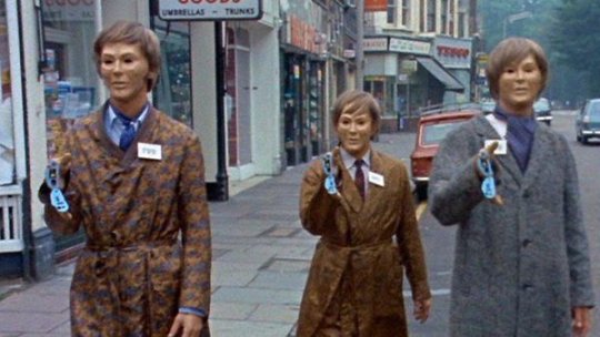
First Appearance: "Spearhead from Space" (1970)
I know they have already returned. I know I said I didn’t like their update. That’s exactly why they’re on this list now. I didn’t exactly hate the updated Autons when I first watched them. At the time, I didn’t have any classic villains to compare them to, as they were new to me. I thought they were pretty corny and not very scary, even as they did openly murder people in the streets of London. But when seeing "Spearhead from Space," for the first time, I was supremely creeped out. The newer Autons remind me of the movie theatre scene in “Human Traffic.” Just a bunch of dancers doing the robot. Not very scary. And turning the Nestine consciousness into a big vat of CGI goo, as compared to a giant plastic space squid seems like a crime. They’re due an update.
2. Voord
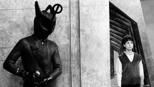
First Appearance: "The Keys of Marinus" (1964)
These guys creep me out. Their costumes are really stupid, and I still find them creepy. They’re like spiky fish men mixed with Egyptian gods. Ignoring the weird "Voord became Cybermen," storyline, and focusing on the fishman aspect would be the way to go. Could you imagine their costume if updated correctly? I picture a mix between Edward Scissorhands and a scuba diver. I’ve wanted to see Jodie encounter these guys ever since "The Ghost Monument," reminded me of "The Keys of Marinus." Something about First Doctor villains with the first female Doctor kinda works for me too. Speaking of First Doctor villains…
3. Zarbi
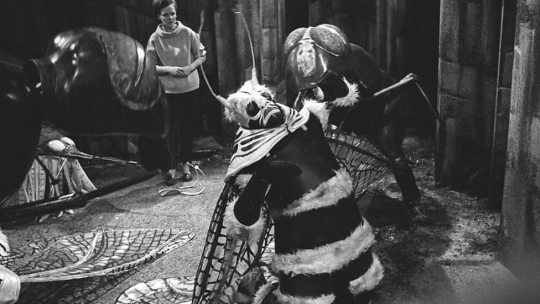
First Appearance: "The Web Planet" (1965)
Ok, so this one is a bit of a cheat. I know the Zarbi aren’t really a villain by their own doing. In many ways, these oversized ants are just dumb animals. But the biggest way this is a cheat is because I just want them so we can have the Menoptera! I love those stupid moth cuties. I think an updated one of them could look really fun. Think the aliens from the queue scene in the "Hitchhiker’s Guide to the Galaxy," movie. Something between realistic, and fantastical. They would also add a much-needed sense of levity to the Chibnall era.
4. The Dominators
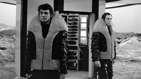
First Appearance: "The Dominators" (1968)
The Dominators are a race of men whose name pretty much describes their modus operandi. Having long ago developed beyond the need for women, these guys seem an obvious choice to go up against a female Doctor. Their look is simple enough to update. They need only to look armoured and militaristic. Their robot drones, the Quarks, would be the real challenge to update, but I’m sure they’d nail it. I would be interested in seeing a more bureaucratic ruling class of Dominators as well. Perhaps instead of having a male and female population, they have the soldiers and the suits. Could be a really interesting way to talk about the insular nature of toxic masculinity. This would fit in well with Thirteen’s villains being chauvinistic shitbirds that don’t like women much.
5. Axons

First Appearance: "The Claws of Axos" (1971)
I’ve heard the Axons get a bit of flack in the past, which is bananas to me. There’s so much potential there. They have a rather psychedelic look, and then they get super gross. I’ve always seen them as very retro style monsters. Jodie’s costume has a real 1970’s "Godspell," look about it, so I always picture her going up against monsters that look the part. They wouldn’t be hard to update either. I would make the golden lines on their humanoid forms slightly raised, like a system of fibres across their skin. And of course, their squidgy red form could be a tangled mass of CGI that kinda bubbles up from the gold lines. The transformation scenes could get very visceral. They’ve got a sneaky nature about them. Like anglerfish, their beautiful golden appearance conceals a horrific monster. They’re known for making Faustian deals with people fool enough to believe their lies. How could we resist?
6. The Mara
First Appearance: "Kinda" (1982)
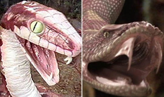
Many people love the Kinda/Snakedance storyline. I wasn’t sure what to make of either serial, as the quality of both waivers. Over time, though, I’ve come to really appreciate them as stories. I have a love for characters that exist as a sort of gestalt. There’s something very unsettling about a hive mind. As The Doctor has three companions this time around. There’s lots of room for one of them to go off and become possessed by an evil snake god for a while. Either Graham or Ryan becoming hosts for the Mara could be an interesting way to explore their relationship. While the DVD release saw an updated version of the Mara’s snake form, I’m sure the modern show can do one better. They’ve already done giant spiders, now let's see them do a giant snake!
7. The Rani
First Appearance: "The Mark of the Rani" (1985)
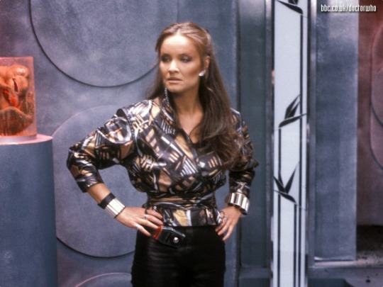
While I am aware many people dislike the Rani, and the idea of Chris Chibnall choosing a character created by Pip and Jan Baker is unlikely, I still don’t care. Any character can be made good in the hands of a competent writer. All it takes is one good idea. Personally, I’ve never really gotten the guff she’s been given. As a woman capable of cruel scientific experiments, the Rani is a ruthless Time Lady with more guile than the Master. People want to see Thirteen with Missy because they’re both women now, but we’ve had an evil Time Lady for years, and I’d be interested to see what regeneration might bring for her… or him?
8. Rutans
First Appearance: "The Horror of Fang Rock" (1977)
First Mentioned: “The Time Warrior” (1973)
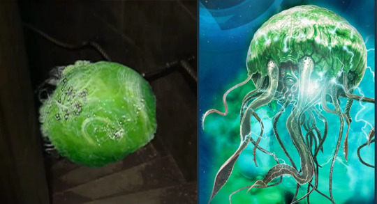
The Rutans are long enemies of the Sontaran race. I would love to see them amp up the danger by getting stuck in the middle of a skirmish between the two races. I would like to see the Sontarans presented as formidable once again. The Doctor Who video game "The Gunpowder Plot," did update their look, to a decent degree. Either way, modern Who could make a Rutan look much more imposing with CGI, or even practical effects. I’d imagine something like a green man o’ war. Jodie’s Doctor’s tendency to mediate during conflict could land her trying to broker peace between the two races. Could she be successful or would she have to count her losses?
9. Drashigs
First Appearance: "Carnival of Monsters" (1973)
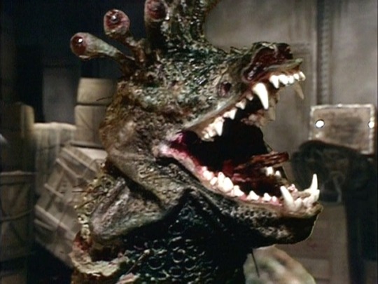
Here we have yet another Robert Holmes creation! (The other two being the Autons and the Rutans) While mostly just mindless monsters that can eat through anything, I’ve always loved these horrific beasts. With heads the size of a Volkswagen bug, and an appetite for anything in their way, these guys could really add in a danger element. I doubt they could really carry an episode by themselves, but they’d make a great threat! They may be alien snake monsters, but you may have a creeping familiarity when looking at them. This is because the puppets used were constructed around the skulls of real dogs! While I’m sure these pups died of natural causes, the information has always given them an air of creepiness and realism. As Third Doctor era baddies go, these toothy terrors were some of the more believable creatures yet! They wouldn’t need much of an update, looks wise. Part of me would still want them to be puppets. I’d imagine Thirteen’s compassion for misunderstood creatures would send her on a danger defying attempt to save their lives!
10. The Scorchies
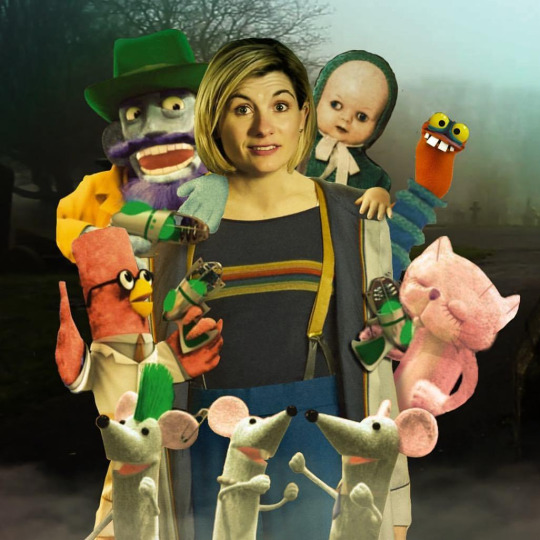
First Appearance: "The Scorchies" (2013)
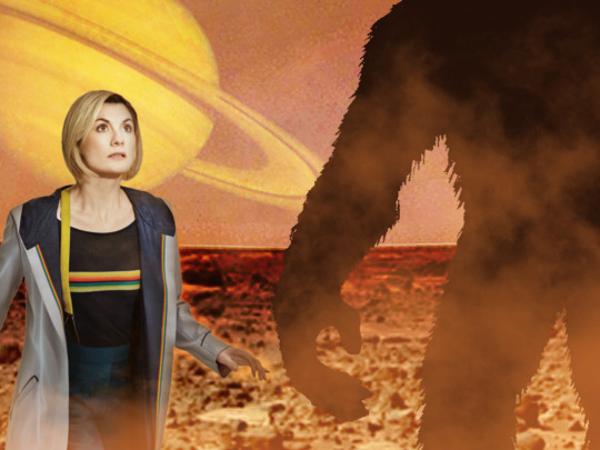
Ok, so this one is another cheat. Technically these aren’t "classic Who" villains. They come from the audios, but I’m counting them because they’re from a Third Doctor era storyline! If you count the mention of the Rutans in "The Time Warrior," this marks the fifth baddie from the Third Doctor era. What is it about that period that is so mineable? Originally a species with bodies, they lost their corporeal form when their planet was invaded and they were transported to safety via television broadcast waves! In their new puppet bodies, they go from planet to planet hypnotising their inhabitants and burning them! Why? Because they’re salty. So why them? Well, for starters, look at these guys! Jodie’s Doctor has always reminded me as a bit of mad kids’ show presenter, with her bright colours and friendly appearance. Seeing her with puppets almost feels natural. I love the idea so much that I photoshopped it! It would also make Doctor Who history. While the Eighth Doctor mentioned his audio companions in "The Night of the Doctor," no audio characters have ever made an appearance in the show (at least to my knowledge). Appearance wise, they’d be easy to create. If they wanted to go the extra mile, they could partner with the Jim Henson Creature Shop for an added distinction. I feel like no matter what you do, these little critters could draw a crowd. People would watch just to see if Doctor Who has lost its damn mind! If done right, it could be a fun romp! Who says Doctor Who villains always have to be serious?
Well, that’s it for my list! Did you agree? Do you think poor Natalie needs to get her head checked out? Feel free to reblog with your own additions! I’d love to read what you think! Expect the review of this weekend’s Doctor Who either Sunday or Monday. I’ve not yet re-watched Marco Polo, which I might actually do today, but it’s on my list to write it next week! It’s going to be the first reconstruction I’m doing, so it should be interesting! I’m not sure if I will supplement any of it with the Target novelisation, but I am thinking not. We’ll see! It’s still early into the series!
#doctor who#jodie whittaker#thirteenth doctor#chris chibnall#classic villians#autons#nestine consciousness#voord#zarbi#menoptera#the dominators#the rani#the mara#the scorchies#drashigs#rutans#rutan host#robert holmes#axons#the claws of axos#kinda#snakedance#the keys of marinus#spearhead from space#the web planet#the mark of the rani#carnival of monsters#the horror of fang rock#the time warrior#TARDIS
10 notes
·
View notes
Note
Self-awareness is key. It’s so weird that that anons sent in something about feeling insecure about how pretty Luisa is when recently I’ve come to the conclusion that, even though it’s completely not her fault, I find myself comparing and putting myself down a lot over Heidi Berger. She is literally my dream EVERYTHING - hair, accent, eyes, stunning figure/ body, funny, wealthy, talented, amazing clothes, hot as fuck boyfriend - the list goes on. // Anon, i definitely feel you but this is not self awareness, actually the exact opposite. You are idolizing someone whom you think that has everything you wanted. By idolizing i don't mean being a fan but more like seeing them as an "idea", as a representation of your dreams coming true, not as who they really are or in person. Social media i think is really dangerous in thay sense bc it makes it easier to create and curate that polished "idea". Like you can show yourself as "funny, kind and nice" when in reality we have no idea if she is bc no one know her. Not only personality but also in terms of looks too, you ca photoshop yourself which she also does. I am not saying this to cheer you up but just to point out that you assigned those qualities to her. It is really hard to realize it but the curated version of yourself, your life and even your looks in social media aren't accurate representation of who you really are.
.
0 notes
Text
Seeing the Light Evaluation
Our first project of the year was called "Seeing the Light", it was a project in which we had to explore using different light modulating techniques and devices. I definitely learned a lot from this brief despite it being quite challenging.
I most enjoyed learning about new techniques and incorporating them into my work, I can now use these techniques in my future work to improve it and strengthen the quality of my images. I also gained a lot of confidence in my ability to take on new challenges in photography.
A new technique that I learned about was flagging, I had never heard of the term before but was excited to try it out to see what images I could take while using the technique. I ended up finding this technique really useful because I have always found myself having to heavily edit shadows in post-production, but with flagging I can help dramatise the shadows more naturally.
I would really like to develop my compositional techniques further as I find it quite hard to vary my viewpoints sometimes. I wish to experiment with different crops and framing techniques to make my images more interesting.
I originally researched a Czech photographer named Milos Nejezchleb and was really touched by a lot of his work as he has an incredibly striking and unusual portfolio, however, I ended up straying from his work as my inspiration and rediscovered Steve McCurry, a photographer I had learned about in Higher Photography last year. McCurry is famous for the portraits he takes of Afghan people in which their gaze is very intense. I wanted to capture portraits that mainly had the model locking eyes with the camera as I believe it would create an intense and enticing feel in my images.
The most successful part of my project was my use of light modulation which I am quite proud of myself for as it is something I have just recently learned. I feel I used my newfound techniques/skills effectively to create some very nice portraits.
The main problem I encountered during this project was time management and organisation as I feel I did not understand some of the brief as soon as everyone else which delayed some of my planning, however, I plan to follow my learning support plan and set up some study sessions with my learning support advisor to help manage my time more effectively for future projects.
Out of all the "habits of mind" I feel I used innovation the most throughout this project. Whenever a problem arose, I faced it head-on and found ways to work through it such as having a photographic assistant cancel last minute and having to prop up a reflector on various different objects to carry out my shoot.
I used self-awareness the most out of "skills for the future: meta skills" for this project. I have been able to be aware of mistakes I have made and take criticism seriously in order to improve my quality of work.
If I was given the chance to do this project again I would organise the project early on with my learning support advisor (unfortunately I did not have access to support until late on in the project) in order to help me process and understand what tasks are expected of me and how to complete them properly.
I encountered quite a few technical issues with my work, a major one being not able to access photoshop as I was not contacted about the license I had applied for. I managed to improvise and use free editing software on my phone and then towards the end of the project discovered free editing software that I could use on my laptop to see my images better on a bigger screen.
If I were to redo this project, I would try to research free editing software alternatives sooner, so that I wouldn't have to deal with the hassle of downloading and uploading from my phone every time I wanted to edit.
0 notes
Text
Ritaban Das: Storyboarding for Effective Storytelling
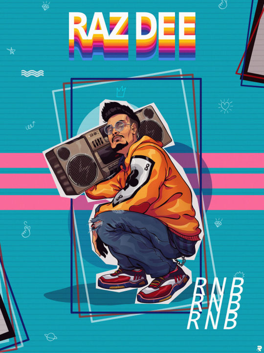
Character designer, illustrator and storyboard artist, Ritaban Das, elaborates on the significance of storyboarding to effectively tell a story and thus also shares insights from his decade-long experience in animation.
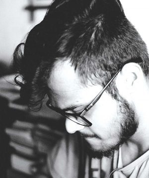
Ritaban Das is a character designer, storyboard artist and illustrator working in the animation industry for the last decade. He’s worked on a wide range of national and international 2D and 3D animated projects for platforms like Nickelodeon, Cartoon Network and Pogo. Recently, he shifted to Toronto, Canada for higher studies, looking to contribute his skills to the Canadian animation industry. He hopes to someday work on his own animated show.
ORDER A CUSTOM ILLUSTRATION
Q. How do you differentiate your approach between the roles of character designer, storyboard artist and illustrator?
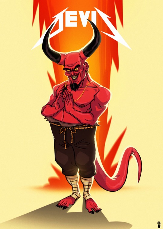
Ritaban Das: At the end of the day it’s all interconnected; it all comes down to ‘story’. When I design a character, I start by thinking about what kind of personality the character has and their role in the story. I think about what I’m trying to communicate through the illustration. This helps me to figure out poses and expressions. As I’m drawing, I’m thinking about shapes, proportions and appeal. I also think about the composition of the illustration. When I make storyboards, I’m telling a story in motion by acting out the characters in them.
Q. What have been the greatest lessons you’ve learnt professionally and personally in your ten years of experience?
Ritaban Das: Draw what you like and the rest will fall into place. Only you know what motivates you.
Q. How did you find your calling to be an artist and, thereafter, how did you nurture your skills to hone your craft?
Ritaban Das: I’ve been drawing for as long as I remember and I’m always very passionate about it. To be very honest, I sucked at studies and my parents knew that very well. I remember spending most of my time with a box of chalk and slate gifted to me by my father. Like every other child, I also loved to sketch my favourite cartoons. I usually sketched these animated characters on the back pages of all my notebooks and also my classmates’ notebooks. It made me known amongst my seniors for my sketches.
That’s the only thing I was good at which I followed blindly. Honing my craft came from lots of practice. I draw almost every day. I also follow and study other artists’ work. Reading or watching their interviews, where they describe their work processes and the likes, helped me a lot to grow as an artist over the years. I try to open my eyes and ears to absorb everything.
Q. Could you take us through your process of how you envision a character and then execute it practically?
Ritaban Das: Being a Character Designer, most of my work is very much character-driven, blended with humour and very graphical too. I always try to convey some sort of story through every character or Illustration I make. I like to play with various shapes and silhouettes and usually keep things simple.
The character design process is, in a way, a combination of different things. I ask myself ‘Who am I drawing? What is his/her personality?’ I sometimes look at influential artists’ work to get some ideas or even start from a drawing I like and translate it into my style. Then, trying to forget those influences, I often start from scratch with a basic shape such as the face as it determines the rest of the character for me, then the body (this can be a circle, oval or even a pear shape – it all depends on the personality of the character I want to draw).
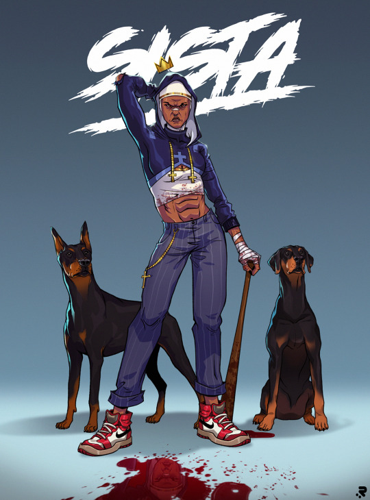
Q. Could you please elaborate on your current pursuit of higher studies and how you came to choose Canada for it?
Ritaban: I completed my studies at Humber College in 3D modelling & VFX and Graphic Design and got a job in an animation studio called House of Cool as a Story artist. I’m working on a very exciting project which will probably start airing next year.
I’ve always been well aware of the Canadian animation industry from the beginning and the kind of projects they do. I worked on a bunch of Canadian animation projects back in India.
We used to do a lot of outsourcing for studios here like Big Jump and Brown Bag Films. Canada’s animation industry always attracted me in terms of work culture, the kind of content they nurture, and the quality they produce, so I want to be a part of it.
“Whether you’re working on a commercial TV spot, web video or film, storyboards are an effective way to quickly tell a story. “
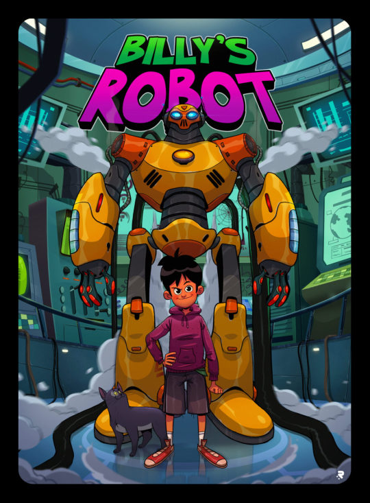
Q. What about the world of animation draws you towards it?
Ritaban: Animation is important because it enables us to tell stories and communicate emotions and ideas in a unique, easy-to-perceive way that both children and adults can understand. Animation has helped connect people throughout the world in a way that sometimes writing and live-action films cannot.
Today, anyone can pick up a drawing tablet and show their ideas to the world. Drawn figures can be funny, sad or serious. It can have a playful, less intimidating feel to it to make the viewer feel more comfortable. Often, it has simply served as a way to make a heart-warming story that makes you think.
Through live-action movies, people can form biases based on the appearance and real-life personality of an actor playing a character. But as an animated character, the character feels like their own being.
Q. What would you say are the most challenging aspects of working in the animation world and how do you tackle them?
Ritaban: Every project is challenging in different ways. The challenging ones are the projects where clients don’t have a clear understanding of their audience and outcome, goals or don’t have an investment or hierarchy for arriving at a consensus on feedback. The most challenging projects always boil down to size and scope and managing a team to produce the animation. Also, animating subject matter that I’m not interested in is challenging. But at the end of the day, we all survive because we all just love what we do.
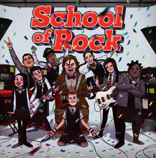
Q. Could you take us through your process of creating a storyboard and highlight its most important aspects?
Ritaban: Whether you’re working on a commercial TV spot, web video, or film, storyboards are an effective way to quickly tell a story. A storyboard is a sequence of drawings that represent the shots planned for video production. It covers all of the major shots, angles and action of your film. The very first step is to read your script and visualise it as an audience would. As I go from scene to scene, I analyse the screenplay and decide how I want each scene to look.
A script breakdown tells you what storyboards you need to create. Then I start doing the rough thumbnails with all the necessary camera angles in Photoshop and chalk out the entire scene I’m planning to do. The important thing is to give anyone who looks at the storyboard a sense of space — where are the objects in relation to the space they’re standing in.
Once I finish locking the scene on thumbnail level, I pitch it to my art director or creative director and take their feedback. After passing the thumbnail phase, I start making the rough staging in Storyboard Pro and work on the required actions and move forward with the scene for the final animation. I might have to rework scenes over and over, combining different elements of the iterations until I finally have what the team is looking for.
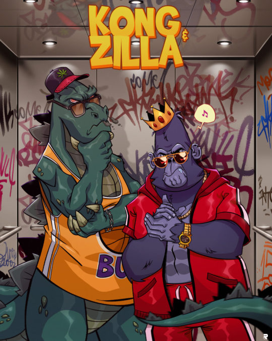
Q. What ways do you apply to understand client needs better and thereby produce results that are in sync with them?
Ritaban Das : Whether I work in any studio or as a freelancer, I always listen to what clients need. Listening to your client will help you understand and retain the information you’re already receiving, even if it isn’t a formal meeting. You need to ask questions to identify needs and paraphrase what they say. It helps with clarification and to enhance your understanding of their needs.
Also, I bring new ideas to the table. I don’t hesitate to propose something other than what the client had in mind. You may have a better service in mind and, if nothing else, this again shows you’re listening and attempting to understand your client’s needs. Understanding client needs is one of the biggest challenges of any business but also one of the most important and rewarding tasks.
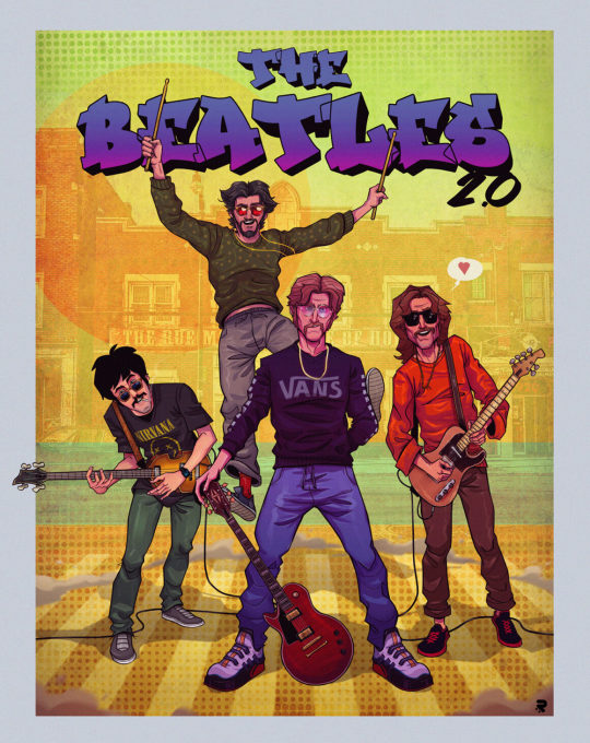
Q. Considering your range of work, could you please elaborate on significant projects and clients you’ve worked for?
Ritaban Das: Over the ten years of my career, I’ve worked on various national and international projects back in India for clients like Nickelodeon, Cartoon Network and Pogo. I’ve been part of the projects like “Camp WWE”, “F is for Family,” “Kuu Kuu Harajuku,” “Evan the Epic,” “Penn Zero: Part-time Hero,” “DC Superhero Girls,” “Cloudy with a chance of meatballs” (series), “Rhythm Warriors” (series-in production) and other numerous animated TV shows.
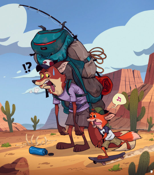
Q. According to you, in what direction should animation be exploring and progressing now?
Ritaban Das: Animation is an incredibly versatile medium that is widely used in many different forms today. Animated films are big business nowadays. Companies such as Disney have had enormous success producing animated children’s films for many years. Animated characters such as The Simpsons and The Flintstones have long been familiar visitors to our television screens. The future of animation looks to be on an interesting journey as the quality of films is becoming higher and higher. Most people would now aim for a 4k film. Also, they’ve been experimenting and coming up with new techniques of animation.
One of the interesting ones is Mix Media, a technique that Disney has been experimenting with for a few years is mixing CGI and traditional 2D animation. The idea is to create an animated film using CGI and then to draw over each frame to give it a hand-drawn quality. The computer gaming industry is also pushing the boundaries of what is possible with animation, leading to the creation of some extremely realistic game footage. Computer game animation has certainly come a long way from the 2D graphics of early arcade games.
Now computer game animators can build environments and objects that react to the player’s actions. The animation looks set to continue delighting audiences for many years to come. With animated films continuing to rise in the blockbuster charts, capturing hearts and imaginations, there is no sign of this genre coming to an end.
0 notes
Text
Reflection
For my film ‘At The Dining Room Table’ I took on multiple roles, as director, screen writer, production design, actor and editor, to manifest my vision and bring the story to life. In pre-production I focused mainly on script writing and production design. The process of writing began two years ago when I first thought of the concept, and when the pandemic hit I decided to adapt the original screenplay as it could be adjusted to suit covid restrictions. When it came to writing my film I changed my writing process completely. Usually I would have my concept completely figured out before putting pen to paper, which prevents me from starting to write as I never feel ready and prepared enough to start. This time however the narrative of the piece evolved and developed through each draft as I got to know the characters better and felt I knew more about how they would interact with each other and react to the situation. This was new to me and I found I struggled to let go of the original concept as it deviated over time, however I am glad I learned to let this go as I am far happier with the end result. I have learned that once a script has a mind of its own it is far easier to write as the characters begin to speak for themselves and I as the writer just have to give them the space to do so. Throughout the process of writing I learnt about how a director needs to understand and be invested a script to be able to nurture it in production to bring it to life on screen. Although I had directed my own work before, this was the first time I had been seriously invested in a project and I feel this is why I gave myself so many roles and responsibilities. At times during pre-production I found directing to be stressful as I was learning as I went along. Organizing my crew and delegating jobs allowed me to become more confident in my abilities and made the job easier. It also me allowed me to develop my transferable skills, such as communication and time management, which will benefit me in the future in my career. I really enjoyed creating the production design for the film, as I had never been head of this role before and I was able to stretch my wings and flourish. With full creative control I used my knowledge of the characters to source costumes I felt would suit them well and give meaning to their performance. I always knew production design was important, but it really resonated with me when deciding the costume for Harry. Taking time to consider what she would wear and how she would prioritize clothing for herself and her daughter gave me a lot of insight to her as a character. This aided me when directing, as I knew more about her and the way she would behave when interacting with her costume, for example, when she handles her locket.
In production I took on the role of director more heavily. Although I had some experience previously, this was a massive learning curve for me and I made a few mistakes that taught me a lot about where to spend more time and energy on set. The main issue I faced was splitting myself between working with the crew and working with my actor. As I also acted in my film I found it hard to know when to be in the scene and when to pay attention to what was going on behind the camera. On the first day of filming this was an issue as I struggled to switch off the directors voice in my head when performing. After the shoot finished I spent time with my producer delegating responsibilities to her so that the next day I would be able to take more time to work with the other actor and fully commit to the scenes. This was very helpful and took a large weight off of my shoulders. I learnt from this experience that if I am to act and direct again I need to put more trust in my producer as she understood my vision perfectly and could direct the crew when needed to get the desired results. Since developing this relationship I am far more confident in myself and have less issues going to others when I need them to help me. I regret not being more assertive in my directing as upon reflecting certain crew members didn’t follow my instructions, which left me with lots of footage that was unusable. For example, half of the shots of G are out of focus and the sound quality is terrible. This gave me far more work to do in the edit to fix these issues that could’ve been avoided. At the time of filming I allowed myself to be swayed into making choices I wasn’t sure about, which I now know will affect the results of the shoot and leave me with footage that deviates from what I actually want. From making this mistake I now know I need to be more firm and self-assured to stop this from happening again. Taking on the role of G and acting in my film allowed me to improve the way I direct actors as I had a better understanding of what I needed to say and do to get the desired results from my actor. I had previous experience acting in stage shows, and through acting for screen I have broadened my knowledge of the job. I have learnt different techniques to perform to get the right result on camera. Now I am more aware of the process actors go through I feel as a director I will be able to communicate more successfully with them to get what I want and will be able to create a better working relationship with any actors I work with.
I became far more confident as an editor in the post production process. Initially I had planned to ask others to edit the parts I didn’t know how to do, however I decided against this and chose to instead challenge myself to learn these things, such as sound design and special effects. Initially this was difficult for me as I found myself questioning my choices, but once I gained more confidence in my capabilities I found that having a better understanding of the editing process aided me as a director as I was able to see the story come to life in the way I had imagined it in my head. I was able to highlight the important details of the script that someone else may have overlooked. I learnt that the process for writing and editing is very similar which assured me as I am confident as a writer. I am now very happy with the final cut of the film and know that I wouldn’t have been as happy if someone else had edited it. In the time I spent in post-production I also crewed on other projects. Initially I was set dresser for Rob O’Connor’s film however through lack of preparation on his part I became production design and made props for the film, and also acted in it as multiple characters. I learnt a lot about being in the art department and working to very short deadlines on this project. If I had taken on these roles before I had begun production for my own film I think the production design would have benefitted and I wouldn’t have had to have fixed so much in the edit. For example, the background of my set had to be edited and parts needed to be fixed in photoshop. Although I improved as an editor learning how to fix these issues I could have saved myself time and energy by avoiding the problems entirely if I had know then what I know now about set dressing and production design. Going into my career I now know I would enjoy being in the art department and have gained good knowledge and experience on set spotting and fixing problems, as well as preventing issues that would have had to have been fixed in the edit.
0 notes