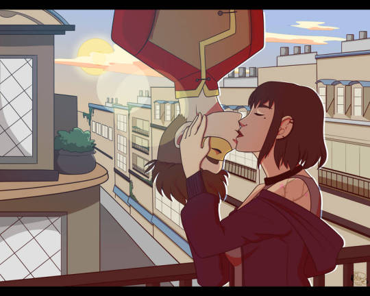
#i just redrew the background from a picture
Explore tagged Tumblr posts
Text
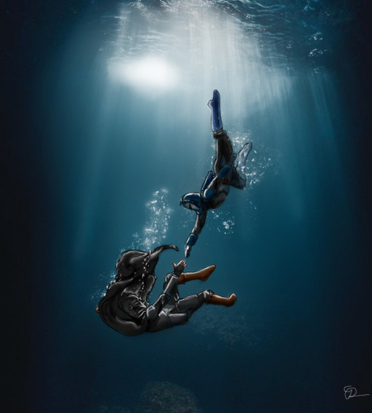
"Mhi solus tome, mhi solus dar'tome, mhi me'dinui an, mhi ba'juri verde"
#dinbo#din x bo#din x bo katan#the mandalorian#bo katan kryze#bo katan#i just redrew the background from a picture#sue me i guess
181 notes
·
View notes
Text
Can't Sleep
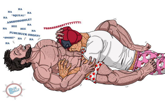
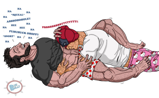
UPDATE 11/16/24 - I made an alternate version with Logan wearing a t-shirt. I was going to draw it like that that originally, but I couldn't resist making him bare-chested because I love drawing muscles. 🤭 But I also like the idea of Wade having to push his shirt out of the way to get unobstructed access to his belly so you get both now. Double the fun! lol
Logan suffers from insomnia, but Wade knows just what will help. Tickle him to pieces until he's completely exhausted and the laughter has filled his mind with endorphins. 😊 Logan tries to avoid letting Wade know he's having trouble sleeping because he's so ticklish, but in the end he's happy to get caught. 💗💛 The tummy raspberries absolutely kill him. 😆
Yeah ok, I spent waaaaay too much time on this, but I'm pretty satisfied with it for the most part. I think I redrew Logan's right leg ten times before I gave up so don't focus on that too much or any other anatomy goofs I made. 😅 Hands and feet are always a bear.
Plus I had to look at many, many pictures of shirtless Hugh Jackman to try to get his muscle structure accurate as best as I could, along with his little arm veins and that one on his lower belly. *sigh* The things I do for you guys. 😏
No background. Too lazy. Just imagine they're on a bed, or wherever Logan decided to try to sleep. lol
(Again if you click the pic to enlarge it then right click the pic and select 'Open Image In New Tab' then you can see it in larger format.)
I hope you guys love it!! 🙏 (I know a lot of you guys just hit the Like button and move on, but feedback and comments are really appreciated by us writers/artists. 💗)
#Finally finished#Logan loves the tickles#tummy raspberries#ticklish!wolverine#ticklish!logan#ler!deadpool#ler!wade#deadpool tickle#wolverine tickle#my art#tickle art#ticklish raspberries
169 notes
·
View notes
Text
1st day as an amateur illustrator. I spent three hours collecting pictures of ancient china only to realise i was looking at the wrong dynasty but I forgot to label the pictures and i dont have an organisational system in place so i have no way of seperating them from the correct dynasty, inadvertently creating the world's dumbest and most low-stakes russian roulette.
4th day as an amateur illustrator. i found some really good sources on ancient china but they're all in chinese and i can't read chinese so i'm been painstakingly Ctr + P --ing it into google translate until finally i get to a scanned pdf and at this point i just decided to cut my losses and get ratio'd by armchair historians.
5th day as an amateur illustrator. im 3 days ahead of schedule and make a vague but grandiose boast about my incredible skills and enviable work ethic. i also have a 50 point essay due in two weeks i haven't touched but that's neither here nor there.
6th day as an amateur illustrator. i realise i've miss-read the dynasty for the Warlord's little hat (apparently ming and han look very similar when you're sleep deprived) so i have to white-out ALL his panels and redraw his hat. it's at this point i start to realise life is imitating art.
7th day as an amateur illustrator. i realise i've been in the wrong dynasty this whole time. op was probably talking about the tumultuous 3 kingdoms period (late 2nd century) NOT the peaceful Han dynasty (early 2nd century) which seems blindingly obvious in hindsight. i fight the urge to convert all my manuscripts to kindling.
8th day as an amateur illustrator. i get some sleep and realise the 3k period was only 60 years long. i can still use my han references. i don't really have to do anything except change my notes.
10th day as an amateur illustrator. I wasn't happy with the background on a panel because the foreshortening was slightly off-center so i cut out the parts i liked, pasted it onto a new sheet of paper and redrew it. no my essay is still not finished stop asking.
12th day as an amateur illustrator. i finally finish the comic 3 days behind schedule. i bus to the library with my stuff in a folder because i don't have a printer at home then i realise in my sleep deprived state i forgot to rub out the pencil lines and you can see them on the scan but i don't have a rubber so i use the pdf editor to white them out with my trackpad and then the wifi at the library keeps cutting out so I can't upload any files. i've decided this is a sign that i should finish my essay before i bus back home.
#wips#life imitates art#never have i ever felt a strong kinship with someone totally imaginary#comic pending watch this space :)
226 notes
·
View notes
Text
Mikey is streaming! He's not using a model, because he's editing it to change up some of the smaller details, like the stickers on his plastron, and a couple of his markings that are stretched weirdly from reshaping the model. River can be heard, but her model isn't on screen.
Mikey: Well at least my spots are only stretched and not leaving a weird gap in the model. That happened to Blues model, his shell didn't want to line up on his back. Made it look like his butt was sticking out more than usual.
River: SunsetFans wants to know if you're willing to show some pictures from when you were a baby since it wouldn't give anything away.
Mikey: You would think that, but hey I can show you this!
On the screen is a couple of pictures of the brothers as turtle tots, but it's edited, filtered and drawn over to look fake. Raph is just staring at the camera with a wide smile with a couple sharp teeth showing his tail is a blur, Donnie and Leo are wrestling with Donnie having his mouth wide open ready to bite Leo, and Mikey is cuddling a teddy bear as nig as him with his eyes closed and a big smile his little tail is wagging fast, but still visible.
Chat is full of cuteness overload. Though some are over analyzing the pictures to find out what were the original images. The chat box actually freezes up for a few seconds because of the mass of messages going through.
River: Did Dee say you could show these to the stream? Or at all?
Mikey: Yes, he did. Besides I redrew everything even the background, so the original pictures don't exist in these drawings.
Mikey takes the pictures off the screen, and rearranges his model to reflect how proud he is on this situation.
Mikey: Now let's figure what changes I should make to my model, let's work shop some new stickers and effects!! Oh me gosh! I just found a new effect for when I make my stickers and spots glow!!
He spends the next hour messing with sticker designs and light effects, before switching to messing with refitting his models outfits to fit the size changes. All while talking to chat, but avoiding obvious leading questions.
---------------------
Masterpost
I sometimes feel I should add fake screen names that Shelldon/River call out, but I don't want to accidentally use someones actual account name. Also should I tag these as fanfiction, because I haven't before.
#VTurtles!#vtuber au#rottmnt au#rottmnt michelangelo#rottmnt mikey#rise michelangelo#rise mikey#rottmnt#tmnt 2018#rise of the tmnt#tmnt rise#rise tmnt#rise of the teenage mutant ninja turtles#teenage mutant ninja turtles#tmnt#tmnt fanfiction
20 notes
·
View notes
Note

hi!! you said it'd be okay to request oc/canon fankids, so i thought i'd toss one of mine into the mix! her name's salt lick cookie, and she's a farmhand on a ranch. she mostly helps with the horses (hence 'salt lick'), and is a HUGE Horse Girl™. she has that THICK southern drawl, and is pretty laid-back in general. her pet would be a little living hobby-horse toy, y'know, the kind on a stick that you'd stand over and run around pretending to ride as a kid.
i think it'd be REALLY cute to pair her with potato cookie, since they both work closely with animals, and potatoes and salt tend to work well together lmao!
i do wanna apologize for a couple things regarding the reference image: since i can't draw, i used a mobile dollmaker app, so the colors aren't 100% accurate… salt licks run the gamut from pure white to a deep, pinky red, but nothing's as dark as the red on her overshirt, so that red should be lighter and more pinkish. (her bandana is supposed to be white and pink, too, not. yellow.) and the website i used to make the background transparent decided to also make her pigtails, shirt, and half of one boot transparent… hopefully that won't make a difference if the canvas is white?
ah, sorry, one more thing, if you ever decide to draw this, i'd prefer if you tagged energy-drink-cookie, since that's my cookie run sideblog!! even if you pass on this, i think it's really cool that you're open to ocs and i hope you're having a good day!

Here you are, this is Potato Chip Cookie
You said to tag @energy-drink-cookie so here you go
Oh and by the way if you’re wondering why the oc looks different in my ref than the one given, it’s because I redrew it myself and afterwards I was told I could use that version if I wanted
Anyways on to the show, so I named him Potato Chip simply because they’re potatoes and they’re usually salty. I mean one’s salt and the other potatoes, what else was I gonna do if not some form of salty potatoes?
Potato chips:
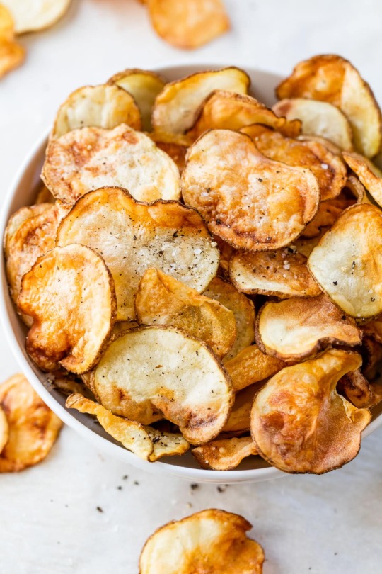
Funny enough when making the initial rough sketch, I thought he looked a bit too much like Salt Lick, but around the time I was finishing up, I thought he looked a bit too much like Potato. I’m willing to say now he’s probably more of an even balance
I do admit that I kind of just gave him Salt Lick’s top hair, just with some more rounded ends to resemble Potato more. I was always planning on making his hair blonde with white streaks since he’s still a potato, but I also made the blonde slightly more orange, though I don’t think it’s very noticeable
I also gave him those dark brown flecks in his hair just because the potato chips I was looking at had some pepper in them. And it tied in with the eyebrow color
I gave him pink eyes because it was supposed to represent the salt, but also I realize that if I didn’t give him pink eyes, he’d definitely look too much like Potato
So with his outfit, initially he was going to be a farmer, but I ended up think “what if he was a chef instead?” and went with that for everything below his scarf (since that was what I had drawn first). But also I didn’t change the initial look, mostly because I really liked it, so I think his top part and his bottom part may not entirely coincide with his theme
When trying to finalize the colors, I wasn’t sure about giving Potato Chip his yellow shirt, since I thought it looked off, but my friend told me to make it flannel and make his scarf red, so I did. I think I’ve gotten flannel mostly down, but truthfully I’m not sure
But yeah overall I quite like his design
Now onto his character
So I said before he’s a chef. Well he still lives on the potato farm with his family, but he also acts as their cook, since he’s got aspirations of one day being a famous chef (though he’s currently a bit too young to pursue these dreams, he’s still a teenager). His dishes mainly consist of various things made of potatoes like potato salad, potato chips, potato pancakes, loaded potatoes, you get the picture. Also if they have a mill for potato flour/starch, I imagine he mans it as his main role on the farm
Other than that, he’s a sweet guy. A bit shy and sometimes easily startled, but he doesn’t have an ounce of malice in his dough. He just likes to make food for the people he cares about
And yeah I think that’s about it for Potato Chip, I hope you like him!
#this is a very recent ask compared to what I usually finish#this one’s in my most recent 15#but I was just drawing rough sketches and I liked Potato Chip’s so much that I had to finish it#I had him almost done last night but I didn’t do the sketch until this morning so he’s slightly late#but he’s done months before I usually finish these#anyways#cookie run#cookie run oc#oc x canon#potato cookie#salt lick cookie#fankid#fanchild#my ocs#my art#not my oc#requests#answers
19 notes
·
View notes
Text
dumb/funny rant
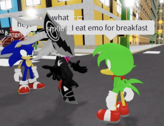
Oh no, you don’t understand what this picture gives me. I found it on yt and I saved it, I kept on looking at it in school. IT’S MY GOOGLE BACKGROUND <3 My friends keep loving this picture, I redrew the picture at some point. I recite it. My friend (who I call Bean [they just accepted that she is bean]) keeps saying stuff like: “That a little -too- much like me” AND I AGREE. I FOREVER REMEMBER *SIP0091*…I even kinda roleplayed from this picture IDK. THIS PICTURE IS A MASTERPEICE TO ME.
#sonic fandom#sonic#bean the dynamite duck#bean is bean#bean the duck#sonic the hedgehog#infinite the jackal#of course I’m aware i have funny problems#All i see is this picture now#IMAGINE
20 notes
·
View notes
Text

June Fran Redraw 22 of 30!
I really love the Sanrio line of merch, it really is super cute. I'm also really happy what they did with Fran's hat here it's nice, and makes him stand out in the line up in comparison to the rest of the Varia, who only really have very tiny things aside from the tie attachment representing their pair. Hell, Xanxus has the second most noticeable one of them and that's the headband he's not even wearing, and Bel only has a tiny little star on his crown. Squalo doesn't even get an additional accessory. he only gets the tie clip.
Also if you’re interested in Submitting for other Varia members for me to redraw in their months you can check what I still need (here~)
The Image I redrew is under the cut, just to keep the post small.
[ID: 1: A full colored digital fanart of Fran from ten years later, from the manga and anime Katekyo Hitman Reborn, and of My Melody from Sanrio.
Fran's full body's drawn, facing us but slightly on his profile. He crouches, smiling and touching My Melody's cheek with his finger. She stands on his knee, smiling too and closing one eye, holding her hands in front of her mouth.
They both wear black suits with a white dress shirt. Fran wears a hat shaped like My Melody's face, wearing the pink hood she always wears, and there's a pin of his usual frog hat on both their hoods.
The background's transparent.
2: The reference picture from the official merch. /End ID]
IDs courtesy of @hopeswriting

so cute... love this image
20 notes
·
View notes
Text
shortcuts I took to make drawing the squatizi comic easier
Used a photo reference for the backgrounds (note: this actually made it harder, I couldn’t figure out which beach was in the picture I was looking at so I only had one angle)
(note 2: I didn’t trace the photo or anything but I did colour pick from it)
made Squalo’s towel fall off his shoulder because it looked awkward and it remains on the ground for the rest of the comic . That stupid fucking blue towel.
for fun I made it visibly do this like you can just see it slowly slide off
didn’t overline the background characters and made them all a solid colour cause fuckem
didnt even draw the background characters in one of the panels even though the lesbians probably still should’ve been visible . I just have to assume Squalo is in the exact position on the frame where they just aren’t visible behind him
there’s a rock in the background but I didn’t draw it at all when the camera angle was facing only tiziano because I fucking hate that rock
If I don’t like how something looks and it’s inconsequential to the overall panel and in a corner I just deform the panel so it’s covered. Cause fuckit
covered one of Squalo’s hands with Tiziano’s hair while they were hugging because it looked wonky and I redrew it too many times
accidentally drew Tiziano’s hair wrong in one panel. That wasn’t a shortcut I just fucked it up and by the time I realised I’d already coloured and shaded it and it sucks and I want to fix it
used speech bubbles to hide shit I didn’t like
used a grid to write most of the dialogue
chibified the boyfriends for 2 panels but that was more because the panels were very tiny.
I would say having Squalo’s arms covering his chest for the first half but that was intended and not a shortcut
One side of Tiziano’s hair was originally over his shoulder but it was very annoying so I scrapped it . Except for exactly one panel where I could not draw his neck/collarbone right in that exact area.
the other side IS partially on his shoulder but not fully. I just think it looks more elegant that way but it has the added benefit that I don’t have to think too hard about shading his neck . Thank fuck for men with long hair 🙌
Tiziano’s hair length is inconsistent because I was having trouble making it not look awkward in certain poses
not drawing the lips
Tiziano takes his stupid sunglasses off for exactly one panel because I could not make them look good and then he puts them back up on his forehead because he needed a free hand and had nowhere else to put them. He is not shown doing this
I save Squalo’s freckles till the last step. Squalo’s freckles go on when I’m done with everything else so I have GOT TO REMEMBER TO PUT THE FUCKING FRECKLES ON ITS GONNA BE SOOOO ANNOYING IF I POST HIM WITH NO FRECKLES
The background characters with speaking roles have the exact same hair and skin colour and I drew their faces simplified even when they’re visible up close for one panel because speaking roles or not they are still background characters. Even though I named them.
as an artistic choice I didn’t refine the lineart in the central panel of page 1 (inadvertently made it easier it was actually a choice for the aesthetic of the panel)
Didn’t try very hard to draw the back of Squalo’s hair.
things that did not make the comic easier
Adding extra panels . and reworking all the dialogue from the previous version because it was awkward
themed dialogue fonts
I HANDWRITE ALL THE DIALOGUE MYSELF ALL OF IT. AND I DECIDED TO FUCKING MAKE THE TITTLES ON THE IS AND JS CUSTOM FOR SQUALO AND TIZIANO. AMONG OTHER THINGS. HELP ME
drawing Squalo’s stupid nose broken
the last minute inclusion of the Portuguese Man O’ War
not knowing how to draw nipples
changing background character with speaking role #2’s swimsuit top and not knowing how to draw boobs
THOSE STUPID FUCKING SUNGLASSES
I draw Tiziano’s eyes so fucking detailed. Because he is beautiful
Emphasising Squalo’s musculature
not saving the base skin colour I used for Tiziano OR Squalo before I started shading
drawing them hugging. 3 1/2 times.
making this post instead of finishing it
2 notes
·
View notes
Text
Because I know people are curious about how I draw so many nice pictures so frequently. This is not an advice list and is just how I operate art wise.
I've been drawing since I was a little kid and I constantly doodled in my notebooks during class from middle school, high school, and college. I try to draw daily, not in a "I HAVE TO DO THIS TO BE A GOOD ARTIST" way like some may recommend but as a "I personally do not like going a day without doodling or sketching something in my sketchbook because I like drawing"
Although this might contradict a bit in my first bullet point, if I'm having art block or don't feel like drawing-I just don't. I've learning forcing myself to do stuff is an easy way to burn out so I just chill sometimes.
I mainly draw my OCs and they are very muscle memory to me. I literally draw Jack in 30 minutes (potentially even less) and Pluto and Sweetheart in an hour. I care a lot about designing characters that feel nice to my hand to draw and ironing out designs helps big time.
I have a very visual imagination which helps a lot in imagining scenes or moments to snatch a snapshot from and put on paper. I both can see my OCs clearly in my mind and yet can't at the same time-IT'S HARD TO PUT INTO WORDS.
My art style is very simple AT LEAST TO ME-Its not overly detailed and a lot of stuff is shorthand for me. I also don't really shade and just smack on some flat colors and rarely make backgrounds. I think that's like...the biggest reason I can share so much of my art.
Accepting that if a picture is going to shit I can just...redraw it. I've drawn whole pictures and lined and colored them only to go "Wow this pose actually really sucks" and just redrew it. 10 times outta 10 the redraw slaps a lot harder than the first.
Reference images. Every artist recommends them. I am one of those artists. Anytime I get stuck on a picture, I just look at a ref and it helps tremendously.
I feel like these are like...the biggest factors for how I put out stuff. Everyone draws at their own speed and I think the way to make your art really good is to find your own pace which I've sorta been figuring out.
#rocky rambles#there's still a ton of stuff I'm still learning#like anatomy so I can draw Bitterbat's body type better#and black hair so I can do my own OCs justice
20 notes
·
View notes
Text
Quirkless Advantage
Chapter five: U.A.
Warning: lots and lots of cussing.....
———
This is her in her school uniform from the back and front. It's hard to see but her hair is in two braids at the front that are pulled back and crossed. I drew everything except the background. I just got the image of a U.A. classroom.
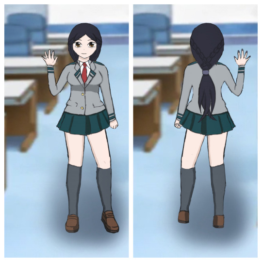
These chapters are going to be stupid and short. Enjoy reading!
———
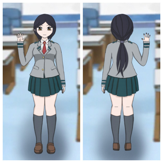
Update: 8/2/22
I redrew everything because I didn't really like the old photos. It's very similar to the first one, it's just a little better and different.
———
"I really don't want to get up." I complain while still laying in bed. Aizawa walks by my open door, "If I have to get up then so do you."
"If I have to get up then so do you," I mimic in his always tired voice. I can hear him stop for a second. Probably thinking about turning around to drag me out of bed.
Yup, that's exactly what he's thinking. I can hear him walking back. I quickly get up and shut the door before he gets to it.
Shiiiiitttt, I slammed it on his face.
"Sorry," I squeak, "I didn't mean to do that!" "Tsuna," Aizawa sighs, "Just get dressed and hurry up so we won't be late." "Ok ok, I will," I say, turning around to go to the closet so I can pull out my U.A. uniform.
I can't believe I actually have a U.A. uniform. I was very tempted to buy one but for a nice one, it was around 50 dollars. I didn't want to pay that much for something that I know looks good in the picture, but will most likely not look the same in person.
I slip on the skirt that is honestly way too short for my liking, then I put on the shirt and tie next. I slid the knee high socks over my legs, walking over to the tall mirror that was hanging on the closet door. "I should have chosen the tights instead. The socks make my legs look fat where it's not covering," I whisper to myself outloud.
My backpack is on my bed so I pick it up and open my door, finally ready to go. "Took you long enough," Aizawa says in the living room standing by the front door with his stupid yellow sleepingbag. I simply ignore him and he opens the door.
The ride to U.A. is nerverecking. I have no idea where to go, what to do, who I'm going to meet, who is in my classes.... This is going to be a lot.
Aizawa looks at me, seeing that I'm messing with the hem of my skirt nervously. "You're going to be fine. If you have any problems or if you are not sure about anything, go find me." I only nod looking down.
We finally arrive at the school when Aizawa took his final turn.
Holy woah, the school is fucking huge!
I walk through the enormous building trying to find my class. Aizawa separates from me to go to the faculty room. "Behave and don't be late," is all he says as he walks away. "Same goes for you!" I yell because of the distance between us. He only looks back and rolls his eyes. I laugh to myself, knowing he's smiling when he turns back around. I continue walking, looking for my class.
Class 3-C...hmmm... So I'm in General Studies like Shinso.
I suddenly feel someone bump into my shoulder pretty damn hard that causes me to fall backwards. Before I feel myself hitting the floor, I feel arms wrap around my waist to hold me up. "Watch it extra!" The person says that bumped into me, glaring at me.
Really, that's how I'm going to meet you Bakugou? By you being a total jerk. Why am I not surprised?
"You're the one that bumped into her, you asshole," a deep voice that I don't recognize says from behind me. The person behind me lets go of my waist as Bakugou decides to ignore his comment and continue walking. "Thanks," I say quietly.
Turning around I see dark red hair and ocean blue eyes. The person is much taller than me, their hair went a little bit past their shoulders, and their eyes were naturally narrow. They remind me of someone from a different anime but I can't think of their name.
"Hey, are you ok? That asshole hit you pretty hard," He says looking back where Bakugou was walking but he isn't there anymore. "Yeah, I'm fine. I should go find my class. Thank you for helping me." I say quickly and walk away to my classroom.
Standing in front of the huge door that has 3-C, I hover my hand over the door to open it but I don't. "If you just stand there not moving, we're both going to be late for class."
That voice, it sounds like the guy from earlier.
I open the door and step into the classroom, not looking back to confirm who it is. I sit down at a random empty seat and try to not look up but I do anyway, seeing that I'm correct. He walks towards me and stops right in front of me.
What is he doing? Why does he have to go to me? What the hell is this? Is he going to ask me to move? Isn't he nice or is that just something he does to draw people in?
"Do you mind?" He asks, pointing to the desk next to me. I look around the classroom and nod. "I don't think we have a choice, all the desks are taken." I say and he smiles, laughing quietly. He goes to sit down but before he does he looks at me again.
Why? Why do people do that? Instead of actually saying something, they just stare. It's honestly pretty creepy and annoying. If you want to say something then say it. Stop staring. Boys at school did that a lot. I don't understand why. Is it because of my weight? I know I'm not the skinniest but still you don't have to keep looking at me. Is there something on my face, in my hair, in my teeth, on my clothes? What the hell is it?
"What's your name? My name is Haru Hayashi but you can call me Haru."
So, he will actually talk to me. Interesting.
"Tsuna Sasaki," I say looking at Haru. He's sitting to the left of me, and turns to me in his seat. "Well, nice to meet you Sasaki," He says, putting out a hand for me to take. I put my hand out, grasping his, "Nice to meet you too."
Why do I have this feeling that there's more going to happen with this guy and it only started with a simple handshake?
———
This is Haru. I was going to draw him in a UA uniform but I'm to lazy.

Here is the link to all of the chapters
Link to next: Chapter six: Classes and Starting War
#art#mha#my hero academia#my hero#dabi x oc#mha dabi#bnha dabi#dabi#dabi x Tsuna#quirkless#quirkless oc#Quirkless Advantage#haru#UA#Aizawa#aizawa shouta#mha aizawa#bnha aizawa#all might#izuku midoriya#mha midoriya#classroom#3-c mha#hitoshi shinsou#shinso#bakugou katsuki#bakugo#bakugou
2 notes
·
View notes
Text
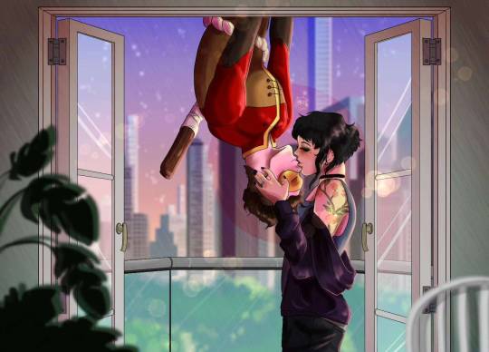
I tried posting this when I finished it, I'm pretty sure Tumblr didn't post it, if it did, oh well, here it is again bc I'm so proud of how it turned out
I redrew an old picture from 5 years ago and decided it needed an update. Monkey Punch and Tera, Spiderman kiss, what could go wrong? Just a lovesick boy falling when he loses grip lol
Pose ref by @/Mellon_Soup on insta


Here's the og image + the background images
#digital art#my art#nova draws#art#my ocs#miraculous mayhem#tera#tera and jay#Jacob Cornelius Stone#monkey punch#spiderman kiss
4 notes
·
View notes
Text
So I got this cute little bag for my birthday :3

And it's got a transparent pocket you can put any picture in. It comes with this cute little bunny, but i knew immediately i wanted to have more pictures to put in it. I still don't have a printer though...
Lately I've been getting into Sanrio (aka finding out there are more characters than Hello Kitty) and i like Cinnamoroll. So i took a picture of him and redrew it! :3

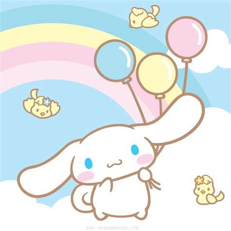
Of course it didn't turn out perfectly. This was my first time drawing Cinnamoroll, so the shape of the head isn't quite right. I also colored the background with a marker before erasing the pencil sketch, and turns out you can't erase the pencil after that 😶 oops. It's barely visible from afar and if you don't know about it. Lastly, i don't have perfect colors on hand, so it looks just a tiny bit off (and even more off on a photo on my phone in bad lighting... Sigh)
And here's how it looks in the pocket :D

HE'S A PERFECT LITTLE BABY!
6 notes
·
View notes
Text
Hand and Eye: Process Part 1
pages 1 and 2:
- added new fish in and centralised it. Made his lips pull up into a small smile to show him content.
- new more detailed drawings also fell more faint against background so they need more line weight.
- added background and made the pattern direct eyes to main fish by making it flow around it
- redrew fish in page one with more refinement to match the ones on page 2
- moved fish on top right corner of page 1 closer to page divide in order to make the two pages look more like one single scene
- deleted line of wave pattern from inside the main fish and drew a slight outline around it in order to bring focus to it

added in new main fish and moved the other to the bottom

moved top right fish from page 1 closer to page 2 to make the two pages more fluid and looking like a big picture

added more line weight to page 2 sketches and redid the sketches in page 1 to look more refined and cosistent with what was in page 2

deleted background pattern line from inside main fish, made it larger, moved the other fish, and added outline in order to draw more forcus to it
pages 3 and 4:
- I first did the sketch of the castle. I could not reuse the ones in my visual diary as the style did not match so I had to redraw it. To make it more interesting I used the photos I had from the same tower, which is part of a bigger structure with another tower and a wall. I traced it as base as the photo was taken by me, but left out some of the details in order to give room to add the door from the other drawing to it, which is not there originally.
- I added the background and pattern to the two pages in a way that guides the viewer’s eyes from the fish towards the castle.
- made the fish bigger and brought it slightly forwards top make him look closer to the “camera””, and then deleted the lines that overlapped the top of the castle but not the front, in order to push the castle to the background and add a feeling of depth.
- I added in the sketch of the door and warped it to be in perspective of the wall, then traced it to match the style of the rest.
- I added underwater plants such as coral and algae to the castle in order to make it feel more underwater castle than just a castle that is underwater. It also makes it more whimsical and intriguing.The coral however felt off to me and so I then changed it into another long algae.
- Added more creatures, jelly fish as it makes the place feel deeper and more separated to the fish community in the first pages, also their flowy figures adds to the whimsical of it. The one near the fish is bigger than the ones near the castle in another attempt to emphasise perspective and depth.
- When I added the shading on castle and jellyfish I also made lineweight overall heavier in order to make the shapes more stark and clear against the pattern-ed background, however I made sure that the lineweight variation was still there as it it could then make the drawing feel less detailed and more flat.\

background was added to fish and newly drawn castle

Brought fish forward towards reader, emphasised by deletiong pattern from inside its shape. Deleted some of the pattern from the castle but not bottom one as it creates distance between fish and castle and pushes it deeper into the background. Added my sketch in but warped it into perspective, ready to be traced.

First attempt at adding underwater plants, but coral felt off and unbalanced.

Changed coral into another algae and it felt a lot mroe balanced. Added jellyfish to distance the place in these two pages from the fish community in pages 1 and 2. The one closer to fish is bigger than the ones near the castle to again emphasise depth and perspective.

Added in the remaining shading and made everything’s lineweight thicker by doubling the layers so the shapes stand better against background pattern. Added highlights like in first two pages, did not erase background pattern from jelly fish as they are semi-transparent creatures, also because keeps focus on fish and castle.
pages 5 and 6:
- Zoomed in same castle from page 4 and chose a different pose for the fish to make it look like it is moving closer to the castle. Also added background pattern, however this time I isolated it only to page 5 and not flow into page 6 as it will have its own individual pattern. This will emphasise that this time around the two pictures are different scenes and not the same whole picture as it has been so far.
- added in more detailed sketch of door in page 6, but this time I traced without warping and used the symmetry tool to make it perfecty symmetrical. I did not have a perspective work of the fish directly from the back so I turned one of the ones I had upside down to make it look like he is swimming forward. Also made him in the centre to keep symmetry and make him look like he is entering the doorway.
- After adding shading to doorway I again did the doubling layers to add the line weightm, but this time around it looked way too strong and the shadow looked too artificial. To find a midway point I lowered the opacity of its second layer in order to add lineweight but not that much.
- Added brick pattern to behind the door as it is the same wall of the castle/ I also added its own water pattern. I had to delete it from within most of the door’s frame to make it more defined, but then it looked lacking. So similar to how I did witht he castle, I added one more line that crossed through the shape so that it feels more immersive as well.

did zoom in of castle and chiose different pose fior fish. Added the backgroun pattern but contained it to its own page as the two pages are not the same picture but yes two different scenes

Added brick pattern and doubles doorway layer to make it more defined but it was too odd and artificial looking.

diminished opacitiy of second layer so that it increased its lineweight but not too much.

added background pattern to page 6 but it looked flat as it was contained behind the doorway.

Added one more line to create dpth and make it more immersive as well and not isolate the pattern to behind the wall. Added the missing highlights to complete the page.
0 notes
Photo


I’M STILL ON HIATUS
I just am posting this so there’s continued flow for my blog
I haven’t looked at anything in a while, and I’m doing ok, but I might be off for a little longer, probably about august? So I thought maybe it’d be nice to show yall some of the art I’ve done since my hiatus started
For context on these top drawings:
1: Fenrir, but more wolf-y, cuz why not?
2.Redrew Beetlejuice and Dottie’s references
3. Gave Annette a reference
4. Redrew my ENA oc
5. Roomies
6. Belladonna in a human disguise (she is still over 9 feet tall)
7. Chloe, Ashley, and Phoebe are three new ocs I made that are friends with Rubi because I feel bad that I don’t give Rubi friends. (Yes, Phoebe has a prosthetic arm)
8. I had this sketch sitting in my drafts so I finished it.
9. Herbert and Rubi, but in the 1920s when the original story takes place, meaning that I drew Lovecraft’s description of Herbert here and it’s cursed.
10. Magic siblings cuz I wanted to draw them
There’s more under the cut:

Redrew both the top pic and the bottom pic, this time using body model references so they look a bit more anatomically correct

Also I included Steve and Martha in the movie night picture now :3

this took me like three days ^

thought I’d draw Rubi and Herbert chilling in Rubi’s room

Redrew the Membrane family picture

drew some au Cal’s

Drew Rubi hanging out with her friends (neighbor is T-posing in the background per Swimy’s request)

When I come back from hiatus, I have some lore I wanna share about this Light Husk and the light husk cult in my story.

And finally, I have created a child for Zinnia’s brother. Her name is Marylin and she’s Zinnia’s niece.
these were done between the 6-24 of June, I’ll have more art for sure, but I just wanted to show yall I’m still drawing stuff
edit before this goes up! I have a few more drawings:


i might have gotten carried away with the 20s!chemistry. I’ve uh... They’re kind of their own canon now.
Also Steve.
See yall in august (these were done after the 24 but before the day these are posted :3)
#werewolf#original content#self insert#body horror#herbert west re-animator#re-animator#beetlejuice#invader zim#original art#art meme#original characters#ship: chemistry#ship: coffeebug#Professor Membrane#ship: Hidden Feelings#non self insert oc#non self insert ocs
10 notes
·
View notes
Text
How to edit and color manga-caps
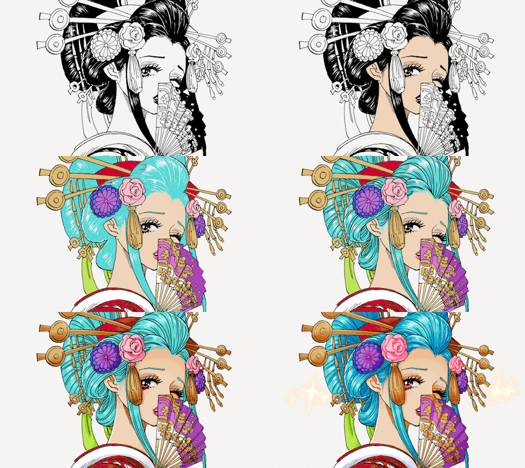
This is a tutorial on how I personally color and edit manga caps in photoshop. I’ve done my best to explain my editing and coloring process but English isn’t my native language so please excuse any grammatical errors! Anyway, let’s get started💛
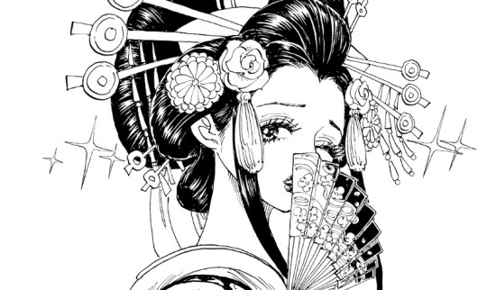
Clean-up
First of all you need a clean manga cap to work with. Start by erasing the parts of the image that you don’t want to keep and redraw parts if necessary. In this case I erased the speech bubble and redrew parts of the sparkles surrounding Komurasaki. Try to stay consistent with the artists original style If you redraw parts of the image as it will be very noticeable if you’ve strayed too far from the original style. I recommend that you study the line width especially and try to emulate that!
Then level the image as seen in this tutorial by @aldiwali, by leveling the image you erase some of those grainy dots surrounding the line-art. I’ve also found that it helps darken the line art! When you are done with clean-up separate the line art from the background. I’ve already made an in-depth tutorial how to do that (and erase more of those grainy dots) so I’ll link that here: X.
Once you’ve cleaned your manga cap and separated the line art from the background you can start putting down your base colors and flats!
Coloring process
Start with a simple base color for the skin, I usually go for #9e7e7d as that will give the skin a nice warm tone once your done! Then make a copy of your base layer. Go to your copy of your base layer, right click and create clipping mask and color it with something more akin to an actual skin tone. Combine the clipping mask and the copy of your base layer, then lower the opacity to your liking, I usually go for around 85% opacity.
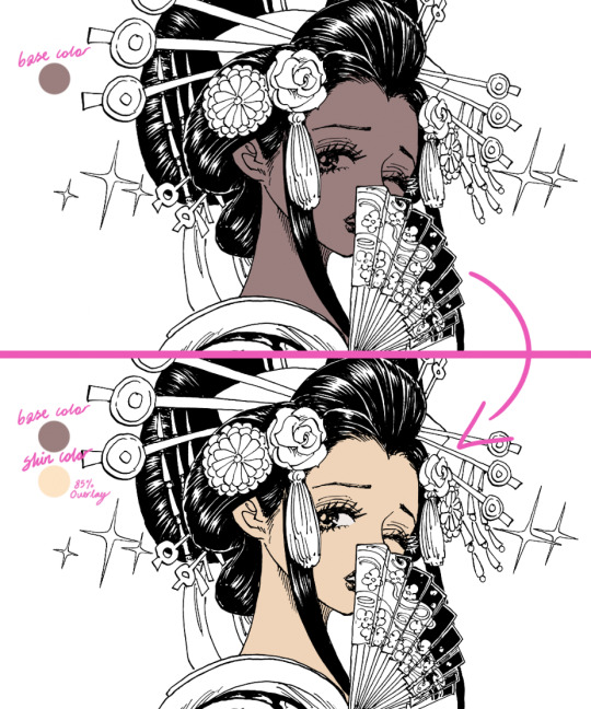
This step is very unnecessary and you don’t need to actually do this (just a normal skin-tone as a base) but I do it out of habit. If you look at some of my older stuff it’s way more noticeable (see example down below).

If you use this method please be aware of that it does tend to lighten colors so I don’t recommend that you use this method for when you’re using darker colors.
BONUS TIP for when you’re coloring: Make a color palette! I try to keep track of what colors I use for different characters but it’s easy to get a bit lost so I actually made a little color palette as a reference for myself. That way I can easily keep track of what colors I like to use for a base and for shading.
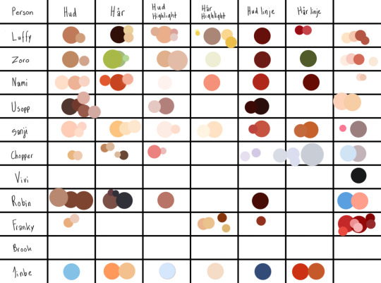
Anyways.... back to the actual tutorial! Time to color the rest of the image! Try to get some good reference pictures of the character/characters (preferably something that was colored by the actual artist) if you’re going for canon colors. I usually play around with hues for a bit before I’m happy with results! For example I gave Komurasakis red dress more of a purple/pink undertone to make it work better with her fan and the flowers in her hair.

Try to divide your colors into different layers to make the shading process easier but don’t make to many separate layers as that can get a bit confusing! I try to divide my layer based on color and placement!
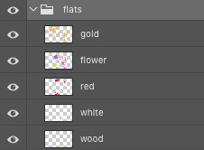
If you’re not using a reference for what colors you’re going to use I recommend that you at least follow a color scheme. Try to find colors that work with each other but still contrast each other. A lot of people will be looking at your graphics trough their phone and a lot of details will be lost so by making your colors contrast each other you keep some of clarity! I’m not saying that you shouldn’t use colors that are very similar but you should keep the format which your graphics will be looked at in mind.
Anyways now that we’ve colored everything we need to add color to the parts of the line-art that aren’t supposed be black, in this case we need to add color to the hair, lips, fan and dress. Go to your line-art layer, right click, make a clipping mask and then you can color the line-art. Your layers should look similar to this:

Make a base which you can work off later as seen below.
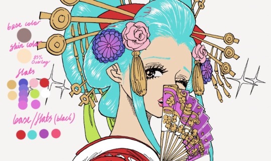
I usually color everything first and then I refine the outlines with the help of the eraser. Try to keep the width of the outline consistent with the rest of the line-art, otherwise it won’t be as seamless. (I did’t outline her hairline as it’s very “feathered” and I wanted to keep that feeling, but I usually outline the hairline too)
You don’t have to separate each color into its own clipping mask as that isn’t going to make any difference when you shade everything later. Now time to add the line-art to the hair!
Line-art
I do recommend using some sort of drawing tablet to make your new line-art. It’s not that isn’t possible to do it without one but it’s a bit tedious to it with a mouse or touchpad.
If you use a drawing tablet use a brush that allows you to control the stroke weight of the brush. I usually go for one of the default brushes but I’m sure that there are a tons of fun brushes out there to play with!
Create another layer just above your manga-cap, this is where we’ll draw the new line-art! Try to follow the “flow” of the original line-art. In this case it’s fairly easy for me to see where line-art would fit naturally thanks to the way Oda choose to illustrate the “shine” on Komurasakis hair!

Look at the area that I’ve encircled, it’s easy to imagine that that’s where Oda would have chosen to add the line-art if he hadn’t colored the hair black. If you can’t find any of these spots try to find a few references for how the original artist does the line-art when it’s in full color. For example I used the cover of volume 92 to get a feeling of how I wanted my line-art to look.

Basically try to find what makes the original artists line-art distinct and copy that for your own line-art!
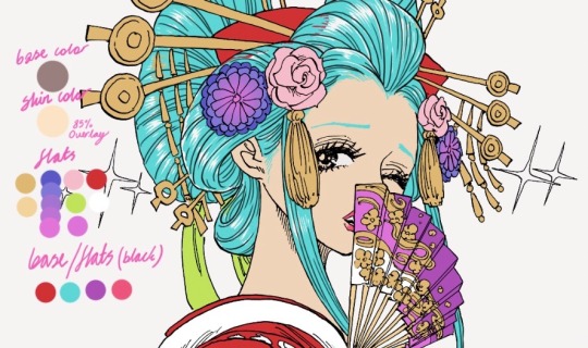
After I’m done with my line-art I go back to the black base and fill in some of the empty spaces that were left by the artist for clarity. Like the gap between the line-art and the deep purple parts of the her fan. When your happy with your base and line-art you can start shading!
Shading
(Before I start shading I generally color in all the stuff I left out like her eyes, makeup and the shine on her hair. I also decided to outline her eyebrows.)
Let’s start with shading the flats! Add a clipping mask to your layer and set the layer style to multiply. The amount of layers I use differ from color to color but I tend to stick between two our four layers of shading. When you’re shading use a color that is soft but with enough contrast to your base so it doesn’t blend into it. I generally use a color with a warmer tone to shade but the you can play around with colors and tones to add different effects.

Create a clipping mask and set the layer style to overlay or soft light to highlight certain areas with a lighter color. I tend to play around a bit with the opacity before I’m happy the results. When you’re finished with shading the flats you can start shading the base!
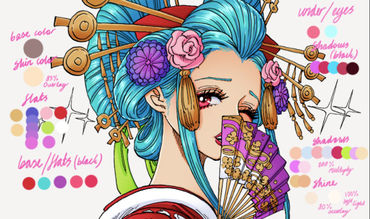
It’s basically the same thought process as before, just add a clipping mask your base layer and set to multiply! Your layers should look like this:

And that’s it! We’ve shaded everything and we’re basically done! There’s just a few more minor things to do.
Details / Coloring the line-art
I like coloring the line-art as it gives the graphic some extra color. To add color to your line-art just do as we did before. Make a clipping mask and color the lines, simple as that! Try to use colors that are dark enough that the line-art isn’t lost.

I did some finale clean-up, colored the sparkles surrounding Komurasaki, added som motion filters to that, fixed the background and that’s that! We’re done! That’s how I edit and color manga-caps! I hope this helps! I might have gotten lost on a few tangents so please feel free to ask questions if you need clarification on anything💛
#gahhhh I hope I spelled everything right#anyways I hope you guys enjoy this#this isnt the only way to color#and edit manga caps its just the way I do it!!! and im not a professional or anything I simply do this because it's fun!#tutorial#coloring tutorial#coloring#manga coloring#manga#one piece#op#shonen jump#opgraphics
640 notes
·
View notes
Text
I love looking back at old art of mine. I tried do hard to make it just right and took an obnoxiously long time for every drawing. However, I'm much happier with my art now, with a simpler style and more opportunity for me to actually enjoy it rather than staring at it for so long that I hate it by the time I'm done. (aka art rant time, since I can do that here!!)
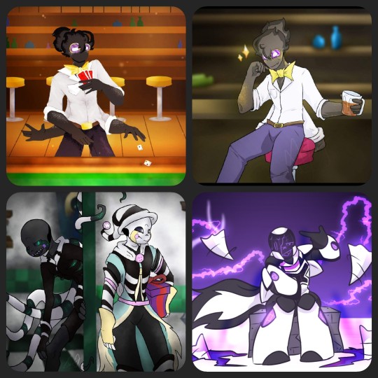
These four drawings are from within a span of at least two years. To explain, the top two are drawings of Catacombtale!Grillby (or Chance). The one on the left was my first version (an entry to a contest to draw Grillbys), the one on the right I redrew later on. The bottom left is something I drew for a crossover contest last year sometime, involving Dream and Nightmare (Jokublog). Lastly, bottom right is another contest drawing for the concept of an X-Tale oc (I used Ec-4o.Nightmare).
The first drawing of Chance is easily a good example of an attempt to make the drawing look fun and inviting. I've got a decently fund pose, the colors are warm, and there's a simple background. However, I did this Lineless. Why? I don't know, but I don't like it. Plain and simple, this is my least favorite of the drawings pictured because I took so long to meticulously shade and color and it still wasn't worth it. Served it's purpose for the time, but that's it.
The second one of Chance is overall better. I used cooler colors, and by now I kinda understood how to put deoth into backgrounds. The style I used for him is fine too. Here, I hate the posing. His composition in comparison to everything else makes him look like he's about to fall off his stool. His second set of arms look stupid too, since I recall I either forgot them or didn't want to draw more hands, so I just folded them unnaturally. Better, but not my favorite.
The Fnaf/UTAU crossover drawing is my favorite in concept. It's not the best drawing style, not the worst. I'd redo the designs slightly if given the chance. However, the composition and background I'd keep almost identical. I really liked how the background came out for this one (minus the doorway) because I started to paint my backgrounds around this time. The character poses, I like Night's more, but Dream's is good enough for it's purpose. The execution of using two characters with brand new designs works well enough here, but as I said, I took too much time with minimal effort for this to be too good. (Also completely skipped shading in favor of darker colored gaussian blur.)
The bottom right, X-Night, is my favorite of these specific four. The body proportions are clearly more rounded and small, the style of lineart and colors are very simple and bold, and most of the real charm cones from the lighting and after affects rather than meticulous shading or complex backgrounds. There were still things I'd change if given the chance, but this is a perfect example of my mindset at the time too. The other three drawings here were fun, but I drew them with other people's expectations in mind. For this piece? I drew what I wanted to, since it was my (relatively speaking) design and my art. I'm not as active or social on the app I drew these for anymore. So, I'm much less inclined to please the overlords that might've gotten it more popular had I drawn it in a more realistic or engaging style.
Don't get me wrong, I loved being on that site and drawing so much. I like all of the pieces I posted on too. However, this is a good chance to reflect on what exactly I've been doing all this time in the UT Fandom and how it helped me improve my art over the course of just barely 3 or 4 years.
More looks back on this, a continuation, will be coming soon. This is gonna be a long rant I'll probably revisit often just to catalog ideas for redraws, as well as notes for myself. (Not all of it is degrading, because I plan my next one to be about what things I have enjoyed drawing and why, followed by a completely redraw-cebtric post!
4 notes
·
View notes