#i just googled 'affine'
Explore tagged Tumblr posts
Visit Tumblr Blog
Explore Tumblr blogs with no restrictions, modern design and the best experience.
Last Seen Tumblr Blogs


Fun Fact
Tumblr has been providing a Korean-language service since 2013.
Note
how many people have asked "is it *really* psx if you're using floats?"
because i love the artstyle but the lack of low-precision warbling is a bit offputting, adding it with, like, randomize verts would solidify it for me imo
nice passive aggressive comment dipshit. also, ur wrong. maybe actually pay attention to the video before making that pathetic attempt at showing off the fact that u googled 'psx vertex jitter integer based' once ☺
#lilith answers#i get at least once of these a month#its so funny#its like#they learned the word 'affine' and just want to show off#while trying to knock a woman down a few pegs in the process#see a video and dont study it and just assume that they didnt do it#cuz how could they they arent as smart as me.#i just googled 'affine'#im obviously the smartest person here
492 notes
·
View notes
Photo


had the desire to draw Fancy Outfits and it got out of hand, and so I now present : the full pantheon of my novel’s world, in matching (ish) outfits !
the Excuse behind which is that this is from right before Universe (center) (They/Them) finished reviving Life (right) (she/her) and Death (left) (he/him) and therefore decided to put Their kids in outfits that They thought were suitable
#from the writer's den#attwdc#void talks#my art#life#death#universe#I've had 75 percent of this done for Weeks but then realized I had to redo universe's lines and colors and procrastinated#this is my largest scale single drawing ever#it's over 60 layers including sketches#I spent like two hours digging through google images trying to find a staircase that matches the one in my head for Life's manor#and then another hour or two fiddling in affinity designer turning it into a background I could slap over a solid color and have look good#this is also my first completed digital drawing of Universe literally ever and I love how They came out :')#They have several (canonical) appearances and this is a mix of a couple#I also just really love how the flourishes on Life's outfit came out#though getting the mirroring right on the boots was. a pain.#BUT! I'm pleased with how they came out :3#also as a somewhat last minute touch added details to death's suit/cloak#I literally never do embroidery for him so this was fun to think of accents that worked for him#in my brain they're kinda like the red embroidery you see on traditional Polish clothing though I didn't want to just copy an actual design#anyway!
2 notes
·
View notes
Text
after discovering this game less than a month ago, me at any point in time: man i wish I was playing limbus company rn
#the withdrawl...Ouyhg...the withdraawal (i havent played the game in 15mins because i was eating)#I DIDN'T EVEN USE THW GACHA SYSTEM EVEN ONCE YET and im only on canto I BUT IM ADDICTED ITS SO FUN#limbusposting#i also kinda only half understand the combat system i kinda just Know by heart the numbers meanings and stuff but if you asked me to explain#them to you id just . uhhhh. so theres some stuff and uhhh idk google it. i understand the sin affinity thing well tho#its fuun im understanding more as i go#(i didnt listen to anytthing in the tutorial caue im NOT listening to Faust infodumping sorry)#i love faust but like girl rhis a horror rpg supposedly why am i getting slapped with walls of text#i should play lobcorp and ruina too but uh ummmmm *broke*#extraterrestrial noises
1 note
·
View note
Text
this call was released anonymously (understandably) but my local Palestinian organizers who I literally trust with my life have endorsed it, and it seems to be gaining momentum in multiple cities, so I encourage you all to get involved:
"A proposal to coordinate a multi-city economic blockade on April 15th in solidarity with Palestine recently received overwhelming commitments to participate around the US and internationally.
The proposal states that in each city, we will identify and blockade major choke points in the economy, focusing on points of production and circulation with the aim of causing the most economic impact, as did the port shutdowns in recent months in Oakland, California and Melbourne, Australia, as just a few examples.
There is a sense in the streets in this recent and unprecedented movement for Palestine that escalation has become necessary: there is a need to shift from symbolic actions to those that cause pain to the economy.
As Yemen is bombed to secure global trade, and billions of dollars are sent to the Zionist war machine, we must recognize that the global economy is complicit in genocide and together we will coordinate to disrupt and blockade economic logistical hubs and the flow of capital."
ETA: since I posted, organizers in St. Louis, Seoul, Brussels, and the Netherlands have signed onto the agreement, so if you saw this before and your city wasn't listed look again. anyone with the capacity to do some outreach, and a few connections to start with, could take the initiative to bring their city or region on board. read the solidarity agreement and check out the resources, and if you know trustworthy people in your area who might be interested in this sort of thing, talk to them about it.
remember that this isn't a series of protests (although some cities are organizing protests in conjunction), it's a commitment to take mass direct action and to maintain a united front in the face of any state repression. many organizers are (and have already been) using an affinity group model to actually coordinate those direct actions. autonomous groups can take action on April 15th whether or not others in their city/region have committed to this agreement. just do your homework (look up know-your-rights info specific to where you live + general direct action safety tips) and take good care of each other Blockades: a short guide to getting in the way Basic blockading Practical Protest Techniques: using your body Blockading: a guide ACT UP civil disobedience guide
tumblr
5K notes
·
View notes
Note
Ok so how does one MAKE a tabletop game because this is something I want to try!! Are there good references out there for non-d20 systems or how to balance mechanics yourself?
oooh, hell yeah! honestly the big thing is to just do it, unlike board and video games the gap between idea and execution in ttrpgs is incredibly narrow, so if youve got an idea just start writing stuff down and see where it starts pulling you, where it feels like something's missing, find what excites you and what you feel isn't working. but that's not very specific, so let's get into it!
first off, read games! read weird games! there's tons of free ttrpgs on itch, lots of people sharing their work here and on other social media, there's 200 word rpgs here and here, and lots of system reference documents written specifically for people looking to hack games. reading other games is a great way to enrich your work whether you're building systems from scratch or working in an existing framework, because every game you read will show you a new way of approaching design problems.
on that note, draw inspiration outside of ttrpgs too! i pull a lot from video, board, and card games in my work, as well as poetry, novels, movies, etc etc etc. im autistic, and ive spent a lot of my life thinking about and dissecting unwritten social rules, so that's another big source of material for me. take your passions, whatever they may be, and put them in your work!
next up, think about the core of your game, sometimes called the minimum viable product. this is whatever the fundamental idea at the heart of your work is, and it's important to keep in mind because it keeps you from spiraling down unnecessary tangents. the core of your game can change, don't get me wrong! in fact, it likely will. what you want to do isn't prevent your work from growing and changing, but have a point of light you can always refer back to and ask "is what im doing important to this game?" you might be surprised by what you find isn't actually as important as you thought at first, and what turns out to be vital to the experience you're going for.
next up, once you start working, don't throw things away. if youre working in a word processor or google docs, it can help to have a section at the bottom of your document that you copy anything youd otherwise delete into. i do the same with my Affinity documents, ill have a few pages i dont export to store all my scraps. i know other folks who keep a dedicated scraps document that they use across projects. whatever works for you! the reason you do this is twofold: it makes it easier to cut things if you know you can always put it back later if you change your mind, and it gives you a lot of raw material that you can pull from in the future. months or years from now, you might find yourself looking to fill a gap in a new design and realize that some cool toy you set aside is exactly what you were looking for.
lastly, i wanna strongly encourage you to practice finishing things. that's often the hardest part for people, cuz we have a lot more experience starting projects than finishing them. here id like to once again direct you to 200 word rpgs, because that strict limit means you wind up with a finished first draft really quickly, and the rest of it is polishing and editing. once you've finished some bite-sized projects, you'll have a better idea of what it entails, what parts you're good at and what parts you struggle with, when to keep working and when to cut yourself off. i find it really helpful to add arbitrary limitations and deadlines on my work because that helps me push myself to finish something when otherwise i'd just keep adding and tweaking, but you'll find what works best for you!
#also gonna add a note about “balance” in a reblog#cuz ive got thoughts about how balance applies to ttrpgs
241 notes
·
View notes
Text
I am full speed ahead on the paperback binding train. This weekend's binds - Heal Thyself (Astolat) and isn't a kingdom and palindrome (@garagepaperback).


The details:
I made these with the intention of having a few things to show for myself when I sign up for the FTH bazaar. The typesets are quick and dirty, adapting @citrusses' Affinity files and popping in the particulars of each fic. The covers are designed in Canva, after extensive staring at a google search and trying to figure out what makes a book cover look commercial. They're all legal quartos, which makes for a nice pocket-sized book.
The cover construction itself I'm quite pleased with. They're printed on an inkjet printer (I'm currently abusing a free HP instant ink subscription) on 80lb cardstock and coated with a satin finish laminating sheet. The end result feels under the fingers like something you'd pick up in a bookshop.
The things that went wrong:
I'm still working on my double fan technique. I'm having more success with balancing the block on binder clips rather than transferring it into a press, but for each of these there were a few pages where I needed to go back with a very small paintbrush and a dab of glue.
I love my guillotine. I do. The edges are delightful and crisp, but it does leave an indent on the spine where I squish the book into place. This may be unavoidable.
The grain direction is off. That's actually unavoidable because I don't feel like buying new paper right now.
Sometimes your title is off-center and that's just a thing that happens because math is hard.
For the sake of completeness, here are the back covers:

92 notes
·
View notes
Text
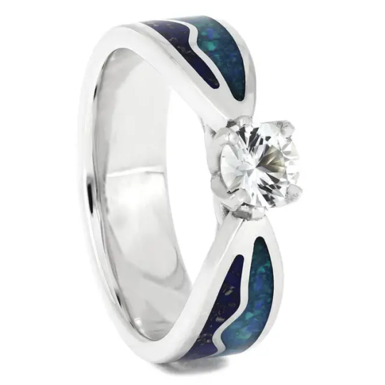
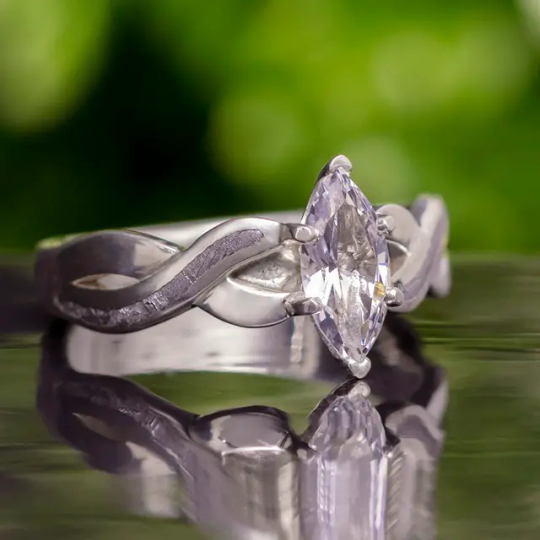
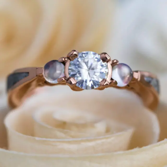
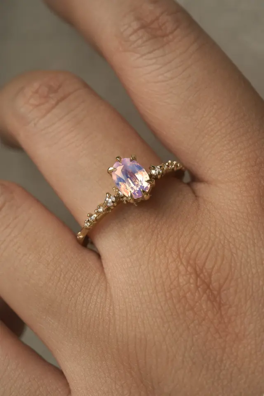
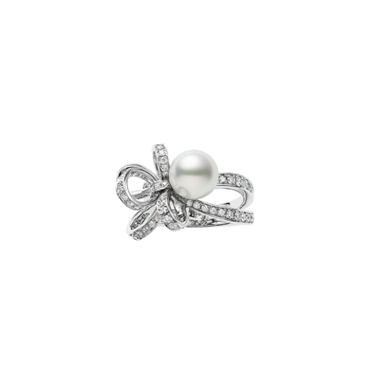
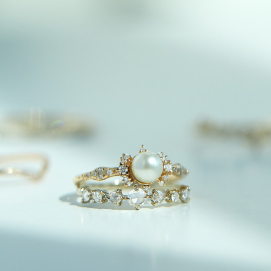
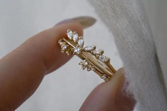
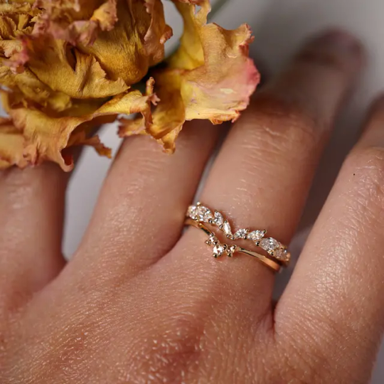
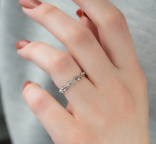
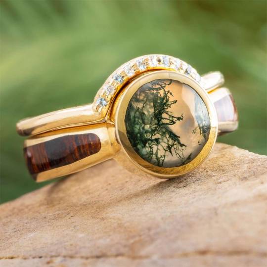
Headcanons: which rings LADS men would use to propose 💍
Now, I'm a married woman, and I made it very clear I want a practical ring that doesn't cost a fortune and that I can wear daily. But that doesn't mean I can't use my own tastes to create silly little what-ifs for MC and her love interests in Love and Deepspace.
I found different types of rings for each of the current 4 LIs based on what we know of them and their relationship to MC. These are *not* based on the rings the player receives in-game for Affinity 100, as I haven't wanted to spoil myself, and because all of us have differing tastes anyway. 😊💕
Minor spoilers of some of their backgrounds/myths.
Note: photos of rings are obviously not mine but scoured from Google and used for silly entertainment purposes only.
Xavier
he can't help but think back to the jewelry the ladies of the court used to wear, and what was the acceptable standard for nobility to court their sweethearts with
isn't in a hurry to find the ring, so he takes his time going around different jewelry stores around Linkon city and beyond. He will know which ring is the one once he spots it... at least he thinks so.
The ring should be elegant with a bit of a futuristic flair: e.g moonstone instead of a diamond or stardust/meteorite embedded in the metal. To make it more special he would offer to supply the stardust himself, locating one that would have fallen around the time you two met.
In the end gets a bit too indecisive, goes a bit too much into his own head, and proposes without it. You don't even notice as the romantic proposal under the infinite stars of the Milky Way is enough to take your breath away. The next day he takes you to the jewelry shop where they have a few custom designs waiting for your pick.
Rafayel
Oh the fishie is designing the ring for you himself. He already knows some jewelers through his work and will only settle for the most talented one. He will agonize over the design, until on one of your romantic getaways inspiration strikes and he stays up all night, just about managing to hide the sketch from you before you wake up.
He is very aware of the importance of the ring in human mating rituals, and wants everyone to take notice of it once you start wearing it. Make no mistake, this is a one-of-a-kind art piece with nothing to match its beauty. Just like you.
Howeverrrr he does realize that carrying around a 30k+ ring isn't practical, so he would also get you a matching simpler band with a romantic engraving that you could wear daily.
A design resembling the beauty under the sea, to suit the Sea God's bride. He would go hunting for the suitable gems and/or pearls himself.
Zayne
Zayne is not one to make a big fuss about the proposal, even if he is inwardly maybe even more excited about it than you, and perhaps a bit terrified as well. He knows you don't like to wear anything too extravagant even on your days off, so he would go for more traditional ring.
He first starts paying special attention to your wardrobe and other jewelry to do the ground work. He would do googling in incognito mode to figure out if gold or platinum suits your skin tone better, and he would discreetly leaf through women's magazines in the hospital to see what is currently trending. Once decided he snags one of your rings with him to a jewelry store he trusts to have a good selection, so that the ring will fit properly on the first try.
Diamonds are a classic option, and with a gold or platinum band they go well with almost any outfit you might have. In the end the designs he is most drawn towards resemble flowers. And from a practical standpoint, a row of small diamonds fits under your leather gloves better than a big rock.
Zayne would also be the fiancé/husband to take it upon himself to clean both of your jewelry on a regular basis. Not that you can't do it by yourself, he just wants to look at it and reminisce about the memories linked to it.
Sylus
C'mon. This is a man who bedazzles your *gun* unprompted. It's a given that no expense is spared when getting you THE ring. However, just getting a big diamond is boring as all hell, and he knows that just a platinum ring with a big rock wouldn't be to your tastes either.
Instead of just dropping a million bucks to a famous jeweler, Sylus uses his vast network to find someone relatively unknown, but whose talents are unmatched. And almost as importantly, one who will never reveal the designs to another soul. Not only is it to secure the exclusivity, but also to protect the both of you.
As for the materials, he scours the ends of the earth for the rarest ones: volcanic ash, dinosaur bone, or unknown gemstones from the Deepspace. The process itself is exciting, especially when he gets you involved, relishing in the knowledge of you hunting for the materials for your own ring without realising it.
As much as he would like you to walk around dressed to the nines every day, showing off the ring he paid more than most people pay for a car for, he realises it's not only impractical, but also potentially dangerous if people in Linkon start to question where you got such a gift. So Sylus has a matching, simpler band made that you can wear every day, saving the grander ring for special occasions, and hanging around at his base.
#love and deepspace#lads#lnds#love and deepspace sylus#lads sylus#sylus#lnds sylus#love and deepspace xavier#lads xavier#lnds xavier#xavier#sylus x mc#xavier x mc#love and deepspace zayne#lads zayne#lnds zayne#zayne#zayne x mc#love and deepspace rafayel#lads rafayel#lnds rafayel#rafayel#rafayel x mc#sylus x you#xavier x you#zayne x you#rafayel x you#headcanons#yuli writes#lnds mc
64 notes
·
View notes
Text

(Credit to @ costcochurros on X for the Google Sheet template)
This is what Sylus mains mean when we say that he's basically a P2W character. I could already tell that certain name wasn't appearing as much when cataloguing my whole wish history, but seeing the result layed out like this is really depressing. Other people have been comparing their rates and 11% seems to be the magic number.
Majority of those pulls are just 3 stars. This is what my 4 star pulls look like between LIs

If you want to clear content as a Sylus main or level up his affinity, you have to basically get every single one of his limited cards. With Caleb's upcoming release and no news of Sylus getting his missing content (and it looks like Caleb will be in the same boat of having 50% less than OG3), the drop pool is going to be even more diluted. The chances of pulling either of their cards are going to drop even lower.
Players have every right to be angry and disapointed. We're not asking for Sylus to have more content than other LIs, we just want him to have what others had at launch. We've heard all the excuses for why this is happening. "You'll just have to be patient, he'll get them eventually", "He's new so of course he has less content", "They couldn't make them due to production issues", "His release was rushed because of leaks". Paper doesn't seem to have any trouble pumping out limited cards every few weeks and Sylus isn't exactly new anymore. And the leak one is just blatantly false: it was only his teaser that was leaked, Sylus was always going to be released in July. People can glaze the company all they want, but Paper has had six months to fix this issue.
On a side note: can we also talk about how unfair bounty hunt is for Sylus. In order to get materials to level up those few memories you manage to scrounge up, you'll have to farm all three different crystal hunts. There's not enough exp bottles and gold to "waste" them on other LIs and all the yellow, purple and red crystals are collecting dust on your account.
#love and deepspace#sylus#rafayel#xavier#zayne#caleb#lads sylus#lads rafayel#lads xavier#lads zayne#lads caleb
58 notes
·
View notes
Text
Free Typesetting Template (Letter Folio)
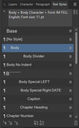
So while I try to get some designs set, I thought I'd clean up and share the template I use for typesetting!
Templates save lots of time, and let me keep 'tools' where I like 'em. Free template here on my google drive ✨.
(As with all my stuff, Personal Use Only!) This file is for Affinity Publisher ONLY. I highly recommend getting Affinity Publisher if you're doing a lot of typesets and want a high degree of control over details. It has most of the features of Indesign, and far more capabilities than Word or Google Docs. There is a learning curve at the start, but overall it is a great program for typesetting and is a one time purchase, versus a subscription like other services. Please note, this template is set for my own personal preferences, and I always adjust it according to the text I'm working on. You can make whatever changes you want to suit it to your needs; I just included the normal settings I tend to use. See below the break for template details! (How to use/notes)*
This template is sized for half letter pages.
140% Leading, 11pt Font Size (Body Text)
The baseline grid is set for these exact preferences. If using a different font size/leading, I change these to match and play with the text boxes for 'Master Body' to make them look nice.
The template has the text boxes set up for where I usually insert text, copy, and headers/footers. I usually fill these out with the relevant details, and adjust the placements and sizes as needed.
I put X down where I usually write my name/imprint. The copyright page has a lot of blank space because I like to include my personal logos on there.
Main text gets copied and pasted into page 9, then flows into the rest of the pages.
The paragraph and character styles I use are all included.
Very important, after pasting in your text, go to Find and Replace, and turn all italics to 'Emphasis' character style to preserve them.
'Body Divider' is how I include dinkuses.
'Special' paragraph styles are for when texts have things like letters or songs included.
Typically, I use 'Chapter Heading' + 'Chapter Character' for chapter titles, and set a table of contents on page 7 using these settings.
You'll notice that on page 9 I have a text box that links into the Master Body pages. This is my sort of 'test' page for chapter titles. I can freely change the size and layout on this specific page. I move it around based on what design I come up with, then copy that design into my 'Master Chapter Heading' spread to apply to the rest of the chapter title pages.
At the very end of a file, I'll usually put in a colophon. This is not in the template, but it's just a blank page at the end with my stamp and notes on the size of the typeset and what fonts I used. *I don't have a fully written tutorial at this time, but I recommend joining Renegade Bindery's discord, where a lot of very talented people have shared their tutorials, and provide very helpful live answers. Edit 9/20: Tutorial post here!
119 notes
·
View notes
Text
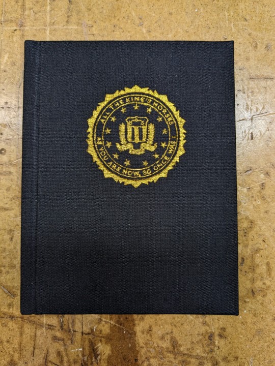
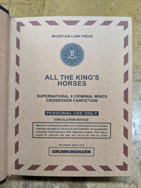
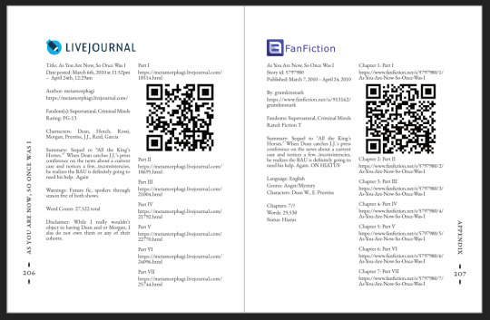
All The King's Horses | As You Are Now, So Once Was I by @samwpmarleau (grumkinsnark)
All The King's Horses [LiveJournal ch1] [Fanfiction.net ch1]
As You Are Now, So Once Was I [LiveJournal ch1] [Fanfiction.net ch1]
Fandom: Supernatural, Criminal Minds
Rating: Teen | PG-13
Category: Gen
Words: ~36,192
All The King's Horses: Protect and Serve. Fidelity, Bravery, Integrity. To what lengths would you go to uphold those oaths? When it comes to a particularly brutal and unsolvable case, the BAU just may have to resort to some more unorthodox methods. SPN/Criminal Minds crossover.
As You Are Now, So Once Was I: Sequel to "All the King's Horses." When Dean catches J.J.'s press conference on the news about a current case and notices a few...inconsistencies, he realizes the BAU is definitely going to need his help. Again. ON HIATUS

About the Book
FORMAT: Letter quarto, flatback bradel binding, french link stitch, no tapes
FONTS: EB Garamond [via Google Fonts], Supernatural Knight [via DaFont], D-Din [via Font Squirrel], Daniel [via DaFont], Permanent Marker [via Google Fonts], Arial
IMAGES: Seal of the FBI [via Wikipedia], Dean's handprint scar [by greenhorn-art]
MATERIALS: 24lb Xerox Bold Digital paper (8.5"x11"), 80pt binder's board (~2mm), 30/3 size waxed linen thread, embroidery floss (DMC #721), 1.9mm cording, brown cardstock, black Cialux bookcloth, gold foil transfer sheet (came with We R Memory Keepers hot foil pen)
PROGRAMS USED: Fic exported with FicHub, word doc compiled in LibreOffice Writer, Typeset in Affinity Publisher, imposed with Bookbinder-JS, title pages designed in Affinity Designer/Photo
.
I first read these stories on LiveJournal back in 2013, some time after I first encountered Tumblr, Supernatural, and the wider world of online fandom. Once I discovered SPNxCriminal Minds crossovers I devoured so many of them. Something about POV Outsider on the Winchesters, the existing connections with investigating monster vs human-crazy cases, and run-ins with the FBI... it's just works so well.
Of all the SPNxCM fics I read and enjoyed, All The King's Horses is among those that bookmarked themselves in my brain. Since it's been living there all these years, I thought it deserved a place on my bookshelf too.
(Rambling below)
Sourcing the Fic
I used FicHub to download the fics off of Fanfiction.net as HTML. Then I pasted them into LibreOffice Writer and created rich text documents of each fic, so I could Place them into Affinity Publisher.
The stories were crossposted, first on LiveJournal and then Fanfiction. I included the metadata from both sites in the appendices.
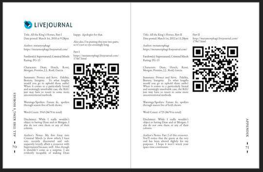
(It's fascinating to see the differences in the same work between platforms. FFN requires genres, so if the author doesn't add them on LJ then by default there's more info on FFN. But FFN limits listed characters to 2, so authors have to pick and choose the most important. Then there's the author's amusing disclaimers and spoiler warnings for these fics, which are only included in the LJ version)
Shoutout to the author for how they linked/listed their accounts on other platforms! Thanks to that I was easily able to track down all the tags/metadata for the fics, and find them here to express my appreciation for their stories!
Typesetting
Fonts
EB Garamond is my new favourite body font, 11pt as per my usual.
The title page is entirely Arial: 1) it was the closest match I have to the case file prop I was copying, and 2) if it was a government doc they wouldn't be using anything but the most basic fonts.
Headings and the the bullets bracketing the page numbers are set it Supernatural Knight, a free font in the style of Supernatural's title.
The location segments are in D-DIN, the closest free match to the font Criminal Minds uses (which is probably DIN).
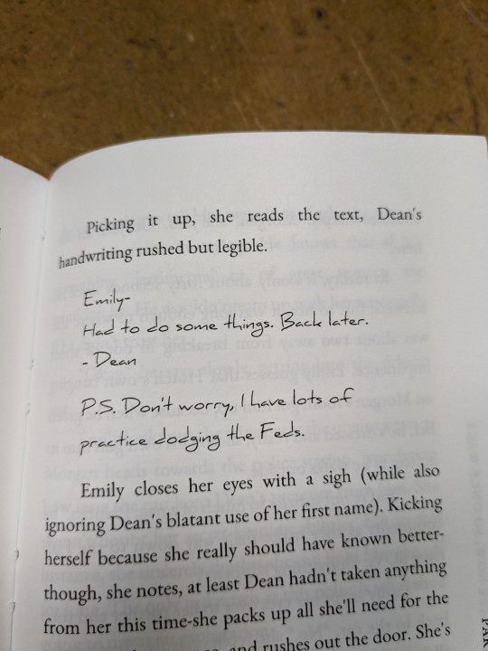
Daniel is used for Dean's 'rushed but legible' note.
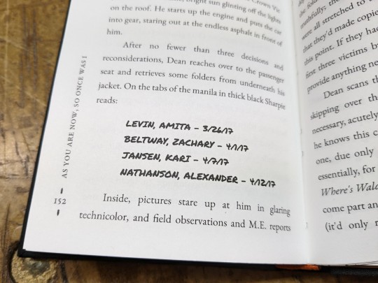
Permanent Marker for the 'thick black Sharpie' case file labels.
Artwork
Title pages designed as FBI case files, copied from a prop found online (specifically Etsy's propfictionstudios', but it's all over the web so no idea who actually created it). I had fun plugging in all the fanfic/bookbinding meta!
The ID# above the author's name is the FFN story ID, and the date is the date originally posted on LJ.
The handprint used in the headings of ATKH is Dean's scar. I traced off of a screenshot from s4e01 Lazarus Rising. I chose to use the handprint instead of the anti-possession tattoo or a Devil's Trap as my SPN art element because 1) it's specific to Dean, and 2) indicates/reminds that the story is not set during the season 3 Agent Henriksen/FBI arc.
Grabbed the FBI seal off of Wikipedia.
Construction
Both fics typeset and printed separately, then sewn together into one book. Title page for the sequel was tipped in like an endpaper prior to sewing.
Endbands sewn with orange embroidery floss (DMC 721) around 1.9mm cording. I chose orange because Dean's being in jail brought to mind the orange prison jumpsuits Sam and Dean wore in s1e19 Folsom Prison Blues.
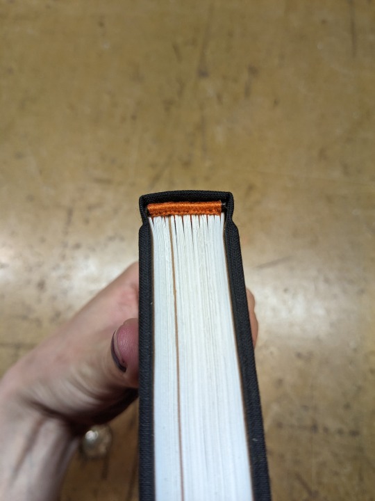
Black bookcloth for the cover, like the Winchesters' beloved black '67 Chevy Impala. (I'd wanted a Supernatural reference to balance out the Criminal Minds-ness of the FBI case files).
I'd originally planned to make lineart of the front of the car, and have it stretch across the bottom of the cover (maybe even wrap around to the back). Even found a useful reference to trace [from here], but it didn't look as good as I'd hoped. Instead I reused the FBI seal and swapped out its text with the titles.
(The effect of shiny foiled FBI symbol on small black book reminds me of one of those FBI badge wallets!)
The foiling process was an unnecessarily long and gruelling affair. My laptop served as a massive power bank for the hot foil pen as I spent 2hrs ever so slowly tracing the image, and then 15mins on the author name and touch-ups. Did it need to take so long? Moving slowly, pushing down hard, going over everything at least three times? I'm sure it didn't. BUT I did not want to chance peeling up the foil to check how I was doing and risk shifting it. It was worth it in my books (haha) ‒ I feel giddy and kick my feet like a schoolgirl whenever I see it!
New Things
Used 24lb paper for the first time, and I love it! It's a little thicker and heavier then regular 20lb printer paper, feels more substantial.
The page numbers & running/section headers are along the outer margin, instead of in the header/footer. This was my way around Affinity's buggy-ness regarding pinning things inline in master pages. (More about that below). If I had been thinking, I could have formatted them like the tabs on a file folder and cut the textblock to match. Oh well, the things you notice once it's printed 😔
This time I also started new chapters/sections using text flow & paragraph spacing settings, instead of using a master. As always, there are pros and cons.
Pro: much faster and less involved. (find chapter start, apply paragraph style VS working from the end cutting text, inserting a frame break, unlinking frames, inserting new pages with master, relinking, pasting, and adding chapter title to a different text box)
Con: images need to be added manually (whether by adding image directly, or by applying a master with the image). I forgot to do this for the second fic, so only ATKH have Dean's handprint scar.
Difficulties Encountered
Affinity Publisher is fighting me on pinning things inline on master pages. They like to disappear on regular pages I've applied the master to. Sometimes it works, sometimes it doesn't, sometimes it only works on some of the pages. Idk what's up. (The bullet character only faces one way so I had use textboxes, flip/mirror one, and pin them inline to the page number).
So instead of having page numbers in the footer, bookended left and right by text boxes with Supernatural Knight's bullet, I put it vertically down the side.
Updated Publisher and all my paragraph styles' fonts changed/went funny. Something to do with the update's variable font support, I think. What was previously 'EB Garamond' regular, was now something along the lines of 'EBGaramond-Regular' which isn't a font. Issue seems to have ironed itself out in my original (near-complete) doc while I was busy remaking it. 😐
On the bright side, the update brought QR code generation to Affinity!
#All The King's Horses#As You Are Now So Once Was I#grumkinsnark#samwpmarleau#fanfiction#bookbinding#fanbinding#supernatural#criminal minds
107 notes
·
View notes
Text
putting my english major to work
AKA
unit 919 favourite (semi popular so you’re not forced to google them all) classics headcanons
starting off strong with morrigan. for reasons i hope are evident i think she is absolutely a gothic girlie, she’s probably got an affinity for poe. i’d say her favourite is the raven, though unlike most poe fan girls i don’t see her as someone who is able to yap endlessly about why she likes him. she’s quite reserved with her interests after all. i imagine she’s capable of giving solid but simple reasons to justify herself when asked (pressed) by her friends but otherwise keeps her thoughts internal.
cadence, this might be a hear me out, has an adoration for oscar wilde. my first thought was dracula actually but as someone who is perpetually cursed to be forgotten i think she’d enjoy the way wilde writes. she finds society frivolous and rather stupid, and wilde is prompt to agree with her on this. i’d say her favourite text is the importance of being earnest, as it’s possibly the most ridiculous piece of nonsense ever, entirely on purpose.
hawthorne was a hard one, as i don’t think he willingly reads anything that he could preemptively deem “boring”. i had to shake my brain like a maraca to try think of something easy and entertaining enough to keep his white boy adhd brain locked in long enough for him to intake it. the conclusion drawn was that i think he could survive through three men in a boat (sincerest apologies she’s a little niche). i found it funny enough, i think hawthorne is capable of switching off his brain and blindly enjoying it.
anah. well. i adore her greatly and i was a little in between. i think she’d ADORE little women. i think she has incredibly strong opinions on all the film remakes and could give you an extensive breakdown of the pros and cons. however. i also think the only CORRECT choice with her is pride and prejudice. she seems like she enjoys a good love story that has her giggling and kicking her legs it just befits her.
now, archan. if you ask he will lie to your face, he will very confidently say the most pretentious book he can think of. this is because his favourite classic dodie smith’s i capture the castle. which isn’t embarrassing by any means, but it is a very silly romance novel (i am strongly passionate about it). i think he likes to read casually more than obsessively and it’s a relatively easy read, and if you get the right copy the cover makes you look very distinguished in public.
mahir was harder as i had to test my knowledge of various translations across the world. he’s definitely a poetry type, i think he likes collections of poems as opposed to large brick novels. poems are more entertaining to translate and test your skill far more. i think he’d like mahmoud darwish (who is unfortunately NOT a classical author but i wanted to bring him up anyway), so i’m marking his as leaves of grass by walt whitman. which i strongly recommend to all poetry enjoyers out there. he definitely would get into translation purism beef online if he could. i know it in my heart.
so francis was kind of hard. i was actually tempted to be sneaky and pick an old recipe book as his favourite without specifying BUT i concluded through my non biased perfectly objective opinions he’s an agatha christie enjoyer. poisoning and cooking are sort of born of the same mother. to me at least. his favourite is dumb witness, as it features a brilliant dog. full disclaimer that’s the one i am presently reading, so i don’t know everything that occurs in it, but i know in my heart he would enjoy this.
thaddea was hard, man. i expended my one easy ish to read comedy on hawthorne and i refuse to repeat. then i remembered treasure island. which i also have not finished (someone stole my copy when i was 50 pages in). i don’t actually think she banks too hard on humour to get through books, she more so is interested in action and adventure. i actually think thaddea enjoys to read, she just has a hard time keeping herself focussed and finding the time to sit down and enjoy it, so she probably leans toward audiobooks.
lambeth. well. i opted against the one i initially was thinking of not because it wouldn’t fit just because i considered the discussion that surrounds it and concluded i didn’t feel compelled to dig into that here. she’s definitely a prose enjoyer, she has probably the most “refined” taste save for maybe mahir (i like to believe they talk books together frequently). after much consideration i concluded on black beauty. on account of the fact that it’s my (second) favourite and i think she would appreciate how gorgeous the craftsmanship is.
#cadence blackburn#morrigan crow#anah kahlo#hawthorne swift#mahir ibrahim#archan tate#francis fitzwilliam#thaddea macleod#unit 919#nevermoor#wundersmith#nevermoor: the trials of morrigan crow#wundersmith: the calling of morrigan crow#hollowpox#hollowpox: the hunt for morrigan crow#also i invite (civil) discourse about this#if anyone wants to dispute me PLEASE do and PLEASE give reasoning#i want to hear your thoughts so bad#also i purposely didn’t pick any greek mythology or shakespeare pieces#bc i’m giving them both seperate posts#at some point#i’m pairing art w the greek myth one so it’s going to take a hot second i fear#i might also kin assign them all popular 21st century books too#we’ll see
37 notes
·
View notes
Text
As I mentioned in my post earlier:
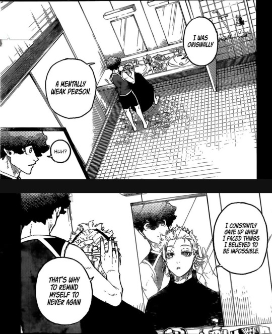
His cuff (that thing around his neck) is near transparent which gives us a lot of room to ponder since we don't exactly know what this chain even represent.
Taking Hiori as an example, let's suppose the chain represents the burden that holds back someone's true ego.
His cuff being transparent gives us two things:
1. It might be plastic which doesn't really make any sense if I were to be honest.
2. It is glass which makes a lot of sense because how's glass? Hell yeah, my geniuses, glass is really fragile which completely fits into what he said:
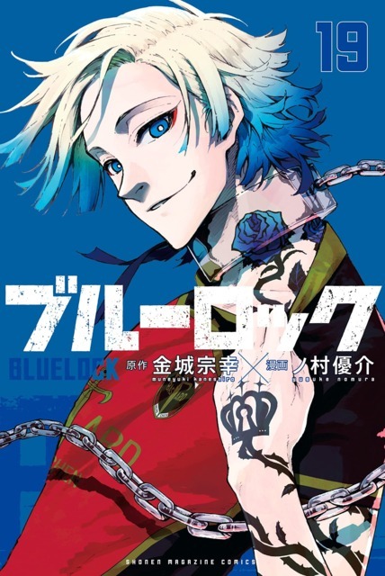
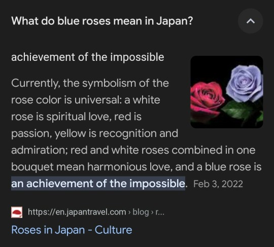
Further, in that volume cover, he has pulled down his collar which puts a lot of spotlight into his blue rose tattoo, and we all know what that tattoo symbolises for Kaiser.
In case you don't remember: Kaiser got this tattoo as a reminder to himself to never fall back into his weak mentality because Blue Rose symbolises the achievement of impossible, and he saw it as an example to turn impossible to reality since Blue Rose, itself, is artificial and defies the natural order.
What is said above can be found with a quick Google search:
But what grabbed my most attention is this panel:

WHY?
If he only wanted to push the soccer industry to despair, then why he is adamant about winning the Champions league and the World Cup?????
Also, contrary to popular beliefs, I don't actually think Kaiser has a superiority complex because, look:
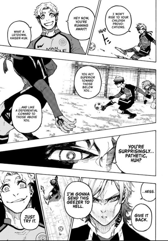
What Chris said could be considered as an exaggerated way to rile someone, but isn't this, indirectly, exactly what Kaiser says after the Manshine City match ended?
Kaiser said something along the lines of, "BM's main character is Noa and it's impossible for me to be the current number one, that's why I came to NEL to use Isagi as a way to increase my value." He even went as far as to say that he is a secondary character in BM because BM is Noa's team.
I don't think so that anyone with superior complex will admit such real facts.
Further, why did he got so angry when Chris said those things? Isn't someone bound to be angrier if the other one was to point out their obvious weak point? So, does this mean, Kaiser actually got an inferior complex?
I'm not a psychologist, so I'm not dwelling too much into it.
However, there is another thing I want to point out:
So, because of that spreadsheet/official art of a very damaged soccer ball beside Kaiser's foot, the Fandom widely believes that Kaiser was poor while growing up .
BUT!
Being poor as a backstory has already been used three times: Naruhaya Asahi, Noel Noa, and Lorenzo Don.
I understand that in any sector with a lot of money and/or fame, there are many people who come from a poor economic background, but this is fiction, baby. No author wants anything be repeated to the point it feels overused.
That's why, I highly believe that Kaiser was either bullied or mistreated by his seniors when he started playing soccer which explains that he practiced fucking hard that the soccer ball was damaged, and also his supposed hatred towards the soccer industry. It also explains his long, unkempt hair because he was too indulged in practice.
OR!
It goes a bit darker, so proceed with caution:
Soccer somehow destroyed his family's peace just like the brotherhood of Itoshi brothers.
I may write about others in another post, but in this post, I would like to think that the person who destroyed his family's peace was his own father. It could be that his father was a soccer player himself and due to some circumstances, he fell off the soccer industry which took a toll on his mental health, and he started physically abusing either Kaiser, his mom or both.
Why physical abuse? Because Kaiser is shown having an affinity to choking.
If we get our minds out of the gutter, then there have been instances when he choked himself because he was frustrated. Also, didn't he say that he stroked his rose tattoo as a good luck before matches and compared it to, "as if tightening a noose," or something.
That's why, I kinda think that, AT LEAST, someone has choked Kaiser as abuse/bullying.
I'll rant about the above thing in another post tomorrow or some time later because I don't want this post to be too long, and also because I'm hungry af.
.
.
.
I remember a vivid dream when Kaiser threatened me to join BM.
125 notes
·
View notes
Text

'title page' assignment for my graphic novel illustration class! At this point in the semester I was itching for some text and panels haha so I incorporated the title into the last panel C:
feat. my beloved Candle Light and her mother Hazel! and Sergeant Green. Zahrati means 'my flower' in arabic; or at least that's my intention anyway, google gave me some conflicting answers (so if anyone knows arabic and wants to confirm or deny I'd appreciate the knowledge! Hazel speaks egyptian arabic specifically, if that's important info)
also I tried lettering this in affinity designer (equivalent to adobe illustrator) as I heard that was a typical professional comic process; I'm glad I tried it but in another assignment I did the lettering right in clip studio paint and that went much easier and felt I had more control over the speech bubble shapes... But augh i just wish CSP would come out with a spell check feature!!! I like typing the text right into the program orz
commission info || ko-fi (tip jar)
#city of mist#com#comic#original character#dnd#ttrpg#illustration#art#oc art#comics#oc#hazel light#sergeant green#candle light#digital art#my art#digital#uni#got some good feedback on it in class too; most i was already kinda aware of lol like how i gotta study how to colour night/dark scenes orz#im falling into the terrible movie trap where movies make it so dark you can't see shit for the sake of 'realism' lmao#first way to get better at smth is to identify the issue! im hoping i'll have time to do night/dark colour studies over the break
43 notes
·
View notes
Note
Do you have any advice/suggestions for getting into bookbinding? What is the process like if you don't mind sharing?
Hello! Very happy to share bookbinding advice/resources 💜 it's a wonderful and delightfully rewarding hobby, and while it can be complicated and easy to get stuck in the weeds with it, you can also get started with some really simple binds with materials you may already have around your living space.
Info below the cut:
First off, there are a lot of instructional videos and guides out there for bookbinding. My favorite YouTube channel for those just starting out bookbinding is Sea Lemon, who has a ton of instructional videos for various styles of bookbinding. Her method of explaining things is clear and concise, and she tends to work with simpler tools and materials that don't cost much and that you may already have on hand. She is not a professional bookbinder with professional tools (afaik) but in my opinion, that's perfect for a beginner because it's not as overwhelming and has a much lower barrier to entry. Perusing her channel and watching a bunch of videos was where I started before even picking up tools to start my first bind.
Another guide I highly recommend is How to Make A Book, by ArmoredSuperHeavy. This is a wonderful step-by-step guide for taking a fic from AO3 and turning it into a book. The most helpful part of this guide, for me, was the typesetting instructions. Typesetting is the act of taking a piece of text (eg. a fic on AO3) and formatting it in the correct way for printing and binding into a book. Note that this guide is specifically for MS Word, though you can also typeset in Google Docs, Libre Office, Affinity Publisher, InDesign, and other programs (even LaTex!).
(Pro tip: save yourself the headache of trying to use Word's bookfold option and just set your document page size to the page size of your finished book (if you're printing on letter paper, this is 5.5" x 8.5") and then use this software to put your pages in the correct order: https://momijizukamori.github.io/bookbinder-js/)
A final resource that I recommend, but that can also get a bit overwhelming, is the Renegade Guild Bookbinding Discord. It's a space specifically for people doing fanbinding, and there are a ton of resources within it, including typesetting guides for various softwares, guides for where to get the tools you need and which tools are best, and people who can answer any questions you may have along the way. It's gotten quite big since I joined, and it can be overwhelming since there's so much information available and so many people who have been binding for a while and thus often offer up solutions or advice that's hard for beginners to understand, but it has never failed me when I've had a tricky question that I needed answered that I couldn't find information on anywhere else.
All that said, here's some more advice from me when just starting out!
Start with a simple bind. A single-section pamphlet bind is easy, cheap, and quick. Here's a Sea Lemon video for how to put together a pamphlet bind.
If typesetting seems intimidating, you can bind blank notebooks. This is also a good way to practice new binding styles if you don't want to go through the hassle of typesetting, imposing, and printing for something you worry you might mess up.
A good word count range for fics when you're learning how to bind case-bound books (ie, the typical hardcover books you see in stores) is 25-50k. Shorter than that, and your books will be thin and a bit fiddly to work with. Longer than that is probably fine, but it will be a quicker process for a thinner book, which is nice when you're just starting out. (And then you don't have to worry about rounding and/or backing, which can be complicated.)
There are very, very few tools that you absolutely need to make a book. There are quite a few tools that will make your life easier, or that will make your book look nicer, or that will make your book last longer, but when you're just starting out (especially if you're trying to minimize cost or deal with space constraints), you can forgo a lot of "required" tools. I'll include a list below of the general bookbinding tools you'll want and some substitutions for them.
You might hear talk about the grain direction of paper or bookboard. When you're just getting started, don't worry about this. Once you get more comfortable with the bookbinding process, then you can start ensuring that your bookboard has the correct grain direction (parallel to the spine) to reduce the warping of your covers. The grain direction of your textblock paper matters the least, and I didn't start using "proper" textblock paper (ie short grain) until about 2.5 years after I started binding.
Bind something you like! Pick one of your favorite fics and bind it, even if it's your first bind and you're worried about it turning out ugly. The excited feeling of having bound your first book will be that much more exhilarating when you're able to put a story that you love on your shelf for the first time.
So you're ready to bind a hardcover book! Here are the tools you will want/need:
An awl, for punching holes in your signatures (groups of paper). You can use a thumbtack for this, or even a strong needle if you have something to cushion the end of it that you'll be holding, like an eraser. Awls are typically pretty cheap, though. You'll want a thinner one so you don't make huge holes in your paper. I have this one and it's worked just fine for me.
A bone folder, for creasing the pages. Historically, these are made out of actual bone, and the reason for using one is to get sharp creases in your paper without tearing or damaging it. You can also use basically anything else in your house that can accomplish this task. When I'm feeling lazy and just need to crease one piece of paper, I use my thumbnail. Bone folders are also cheap, though--I have this one. (As a tangent--when you're making your signatures for your book, you're going to be folding and slotting together usually between 4-6 sheets of paper. Fold the paper normally without creasing with the bone folder, slot them together, and then use the bone folder to sharply crease them all together. Trust me on this--the pages will fit together much better if you crease after putting the signature together.)
PVA glue, for all aspects of gluing involved when making the book. You can, I've heard, use Elmer’s glue for this in a pinch, but I've never tried it. PVA will dry flexible, which is what you need for your book, especially when gluing the spine. For things like attaching decorative paper to your covers, this is less important. If you're making a book that doesn't require gluing the spine (like a pamphlet or coptic stitch book), you may not need PVA. There are also lots of other glue mixtures you can use when bookbinding (paste is a popular one) but I've been a straight PVA guy for over three years now and I can't offer any advice when it comes to other types of adhesives. One note about PVA is it dries quick, so once you've stuck something to it, that's that. Prepare yourself for some crooked books until you get the hang of it.
Gluebrush/paintbrush, for applying glue. I recommend something with bristles; the foam brushes technically work but will absorb most of the glue and will probably cause you a headache. Silicone brushes are wonderful, as you can just wait for the PVA to dry and then peel it off, but a regular glue brush will also work; just be sure to put it in water immediately once you're done with it, otherwise the PVA will dry on it and ruin your brush.
Ruler + pencil, for measuring. Any kind of ruler will do, but if you have access to a quilting square or something similar, this will help you get nice and even right angles.
Needle and thread, for sewing the signatures together. You can use regular sewing needles and sewing thread (doubled up for more strength) if you don't want to buy anything specific for this. An easy step up from this that I recommend is buying a block of beeswax (I got mine for like $4 from a farmer's market) and waxing your thread (running the thread along the block a few times). This will keep your thread from tangling and make it easier to work with. You can also use embroidery thread, especially if you're doing a pamphlet or coptic stitch bind and want some color. I recently upgraded to linen thread (thread weight 35/3), which is the standard for archival-quality books, but you absolutely can use cotton thread and it will be fine.
Paper, for the textblock. You can use your standard white copy paper for this and all will be well. Or, if you want to get a bit fancier, you can use cream-colored paper; 8.5 x 11 hammermill 20lb cream colored paper is easy to find and relatively cheap and will make your books look better, as plain white paper can look almost blue in a book. (That said, I also have some actual published books that use white paper, and I've never noticed anything off about them.) If you decide you want to get really into the proper grain direction, I get my short-grain cream-colored paper from Church Paper. They have both 20lb (typical copy paper weight) and 24lb (slightly heavier) weight. I have both and I actually really like the 24lb; it has a luxurious feel to it, with less bleed from my inkjet printer. If you feel like springing for nice paper, check out their site!
Book press, for pressing your book while it dries and pressing your folded pages before sewing. There are a lot of different kinds of book presses out there, many of which are very very expensive. You can usually make do with some heavy books to weigh down your book while it dries, or thin boards and C-clamps if you have those on hand. If you have access to basic power tools, it's also super easy to make your own press with carriage bolts and cutting boards (this is what I did). There's a lot of videos out there with instructions; here's one from Sea Lemon.
Printer and ink, or a printing service/print shop like Staples. Print shops can get expensive in the long run, and it's nice to have your own printer so you can do test prints of your typesets. If you're going out and buying a printer, I highly recommend either a black and white laser printer (if you're not planning on printing in color; Brother is a good brand) or a tank inkjet printer (like the Epson Ecotank). Do NOT get a new HP if you can help it; their ink subscriptions are brutal. I'm upgrading to a black and white laser this year, but I've been using a very old, cheap HP inkjet that I got off Facebook marketplace for the past few years and it's been reliable (if a bit restrictive). If you do have an inkjet currently that takes cartridges, I highly recommend looking up how to refill your own cartridges. Buying one set of genuine HP cartridges and then refilling them with generic brand ink until they die has saved me probably hundreds of dollars by this point.
Book board, for the covers. Otherwise known as chipboard, which is easy to find on Amazon or at craft stores. This is NOT the same as corrugated cardboard; that will not work. You can cannibalize old three-ring folders, which have chipboard inside them, or even old hardcover books/textbooks. Don't bother with genuine bookbinding chipboard; imo, it's overpriced and unnecessary. You can find chipboard on Amazon for relatively cheap; I recommend the 12x12, as you can get a front and back cover out of one sheet with the correct grain direction. You can use chipboard for your book spine, if you're making a flatback, or you can use a thinner material that you can bend if you're making a rounded book (or for flatbacks as well). For this, thin cardboard (eg. old cereal boxes) or thicker cardstock will work just fine; you don't have to go out and buy genuine bristol board, and I've never bothered with it.
Exacto knife, for cutting things. You could also use a boxcutter, but a craft knife will be easier to handle. You will probably need to frequently change the blade, as cutting chipboard will dull it quickly, so get one that comes with a bunch of replacement blades.
Bookcloth and/or decorative paper, for covering your book board. Bookcloth is basically fabric with a paper backing on it. You can make your own using heat and bond, tissue paper (I use white tissue paper), and fabric; iron the fabric so it doesn't have any wrinkles in it, then iron the heat and bond onto the fabric, then iron the tissue paper onto the heat and bond. There are other methods out there that you may find easier/better, but this is the one I use. The purpose of the paper backing is to prevent glue from striking through the fabric; if you use a thicker fabric or paper, this is not necessary. For your first books, you may find it easiest to just use paper, or to go out and buy some premade bookcloth.
That's a lot of information, but I hope it was helpful! I'm more than happy to answer any more questions you (or anybody else) might have, and happy binding!
26 notes
·
View notes
Text
2024/ RECAP
It's been a long while since I was able to properly write down all of the game updates and my play adventures. There were so many things I was working on prior to my hiatus, but since everything is now out of order I'll just back track and publish those when I have the time/energy. For now I want to look ahead and forward to 3.0!
...but only after I do my end of month recap for December, hehe~


[2024/12] Collection Progress
This monthly/end of the year recap will be different from my previous format because I was on a hiatus for 4 months... oops! I'm not entirely confident that I remembered to record my progress at the end of the month while I was away-- they may be stored on my phone's photo albums or desktop, but idk? I would have to check. For now we'll just go with what was most recent which is for December 2024!
note: there were three limited-time banners this month (Sylus Myth: Where Drakenshadows Fall - Xavier solo: Silvery Polyphony - Multi: Nightly Rendezvous). aside from the 2 new promise memories for xavier and zayne I was only missing four 4-star memories from the Touring in Love event (bc I didn't have enough tokens to purchase them before the end of the year). refer to google sheet for event calendar.

𝔁𝒂𝒗𝒊𝒆𝒓


137 AFFINITY LEVEL 83% PLUSHIES 88% MEOW BADGES 97% MEMORIES; missing [Love Syndrome] and [Planned Crush]

𝔃𝒂𝒚𝒏𝒆


137 AFFINITY LEVEL 84% PLUSHIES 87% MEOW BADGES 97% MEMORIES; missing [Steamy Proximity] and [Stacked Pulses]
𝓻𝒂𝒇𝒂𝒚𝒆𝒍


137 AFFINITY LEVEL 81% PLUSHIES 88% MEOW BADGES 98% MEMORIES; missing [Hearty Knock]
𝒔𝒚𝒍𝒖𝒔


101 AFFINITY LEVEL 68% PLUSHIES 88% MEOW BADGES 97% MEMORIES; missing [Greedy Heart]
#love and deepspace#lads#xavier#zayne#lnds#l&ds#rafayel#sylus#;collection progress#;achievement notes#;affinity notes#;sakura snapshots#;not me rambling into the void
21 notes
·
View notes
Text

September 16 2023
I think it would make complete sense if Big was a Capybara.
1 He's well... big. Capybara's are the largest rodent species.
2 He seems to be chill with everyone. Like a Capybara.
3 He has an affinity to water, and you can't go 5 google image searches before you spot a capybara in water.
4 It'd be really fun to see a bunch of Orange imagery in his design, like his fishing bobber.
5 Sega already uses odd animals for their characters, like making the main character a hedgehog or making an echidna the guardian of a plot device rock (and be the last of his kind). So it'd be nice to see some Capybara appreciation that isn't just a driving test instructor in a short story.
I might draw him as a capybara more than I draw him as a cat, I dunno.
136 notes
·
View notes