#i get to draw personal art so rarely that my blog has visually turned into a minecraft blog whoops
Text
Last week I said i'd include a video of what i've decorated for @littlebeeenergy's house, so here it is! she did the building using a couple of tutorials, though i built cannon's coop based on the design i came up with for my rabbit hutch, and i decorated! now that the back of the house is finished i can begin decorating out back too 83c
she did also convince me to add a couple of mods for it, so we now have furniture and more pets wahee! we're both very excited 83>
#minecraft monday#video#no audio bc i'm in call with a friend while they watch the walking dead#i get to draw personal art so rarely that my blog has visually turned into a minecraft blog whoops#i still draw personal art when i can#you can see a couple of wips on patreon!#but uh yeh i really like how i decorated it 83> and i think her build turned out so cute in the end!
7 notes
·
View notes
Note
[gen] Do you regret becoming popular? In the sense that people mischaracterise your character to be a certain way that he isn't? As you develop him as a character, does it ever bother you that people reduce him to a strict set of traits based on earlier representations before that development happened? I'm curious to know your thoughts!
Maybe I'm too forgiving (nah) but little if not nothing of what I see I really qualify as "mischaracterization" - this is a blog, not a consistent work of writing or visual story-telling like a book or a movie. People might see one comic or drawing and assume x and y - and that's totally understandable and fine. The vast, vast majority of people I interact with are more than anything just curious about it and what the """canonical""" counterpart to their interpretation is. And I love that!
Also, I'm no stranger to the ancient practice of condensing a character down to their weirdest traits for the sake of a good punchline. And I love a good punchline, so I don't mind that either. I cackle every time someone describes my huge scarred up dude as "Babygirl" LOL
The only thing that bothers me is when people misunderstanding my intentions with the Orin storyline I concocted and then turn that into assumptions about me personally, but those are rare and far-between.
If there's two things I resent are A) my art was in a very transitional stage when the butt-grab comic got big, so I just wish It looked more in line with my current style 😂 and B) Chatting with people got a lot harder! I feel bad that I don't just reply to every since ask I get, but If I did that's all I would do. And my DMs are pretty much a lost cause.
Otherwise this has been really fun so far, it's been an immensely creatively fulfilling experience and I don't even know how to express how mind-blowing people's support and excitement toward my work has been.
198 notes
·
View notes
Text
Hello, my name is Syqamor. And I love literature, psychology, and visual art.
I don't know what my first post should be, so I'm just going to go on a little stream of consciousness boat ride.
Why don't you take a cup of tea and join me?

Writing is more important to me now than before, i think. Which may seem less true due to how infrequently I sit down and actually work on my projects. But as I've grown older, life has become so dreary, much more than I imagined in my youth.
In 2021, I wrote a poem, partially about the pandemic and partially about depression. There's this segment:
I sleep with my eyes wide open,
Scrolling mindlessly and thinking endlessly.
Burning my thumb on the phone screen, I wish
For a light, yet cling to shade.
And there, a lone bulb flickers,
Over and over.
And I revisit it because I've noticed an interpretation that I didn't think of before. The lack of actual rest. I take a break from work by scrolling on my phone, or when I get home from work/school, I scroll for hours before finally losing the strength in my eyes. The action seems so effortless - just blink your eyes, absorb 1 million bits of terrible information, and move your thumb until the rhythm draws you into sleep madness.
I rarely feel rested. I don't feel calm very often, and I think that with the state of the world, it's only normal. There's so much to fix, so much to do, meals to figure out with the cans in your pantry, personal problems on top of congested societal problems. The noise never seems to settle.
And I think that's why returning to my stories, even though it's less frequent, feels like drops of cool refreshing water. Writing has always been there for me since the beginning.
I did lose my way for a little while, though. I did initially join Tumblr in 2016 with the intention of building a brand as a teen writer. Many people did. The online writing community was kind of blossoming, but also unfortunately turning into a capitalistic hellscape. We were all trying to become published teen writers, starting youtube channels, writing every day, writing every chance we got, writing more than eating or sleeping, stepping on each other's ideas to scramble to the top.
I think my entire friend group, save for like 3-4 people, completely left social media. Some of their pages are still up, frozen in time, their last writing update from 2018. The rest became... normal people, I suppose, a couple still writing, others writing less. And we became closer throughout all the madness.
Writing became less of a priority as the world around us became mad. But I noticed that each time I was able to return to the pen, my writing skills became so much more sharper. It was no longer about becoming 'successful', but about what writing meant to me originally - a way to escape.
And so now, more than ever, as rain pours outside my window, I can say that writing is more important to me.
And even if no one reads my blog, it's okay. My words have left my congested brain and landed in a little home that people may find if they are searching for.
That is enough for me, I think.
-Syqamor
7 notes
·
View notes
Note
hey! this is chance & here’s this week’s prompt. what websites or resources do you use while you write or develop a character/story? what do you think of them and would you recommend them?
Thanks for the prompt!
I draw from a wide pool of resources. I might throw a bunch of links of my favourites down the bottom.
I particularly like to watch youtube videos by writers and readers who break down story devices, make reviews, explore what they liked about a book/movie/tv show, etc. I find that absorbing all of this information and learning to deconstruct what I like/dislike about different pieces of media gives me a lot of ideas for characters, stories, worlds, and writing tools.
I also like to read through writing advice that I come across on tumblr, which I try to compile in my #resources tag on my blog (which includes art stuff too!).
For worldbuilding inspiration I am often drawing off an idea I have, which usually takes a unique spin on something I've seen before that interests me. If I have recently watched a movie with a mountain setting, that sort of percolates in my head for a while as I decide to put a story in a setting like that. And that's when I start doing research on specific things: topography, tectonics, what kind of trees are there, what the climate is like. How the story's world and events would shape and be shaped by this setting. I've spent a few years illustrating fantasy maps for fun, so that background knowledge kind of sits around waiting for things like this.
When it comes to forming a character, I usually start with a specific scene, or vibe, that plays over and over in my head. I try to construct a person around that moment or that feeling, drawing on what I feel would be a) interesting and b) fitting for this character and their setting. Sometimes I pull little elements of inspiration from designs and aesthetics from artworks I've seen - if I see a really cool drawing of a burly brawny character, I might think "okay, how would I picture my own strong character?" and it will rarely look the same, but that visual aid kind of helps me picture them as a flesh-and-blood person. Once I get a bit of a handle on that, I turn to sites like https://www.behindthename.com/random to look for names I think would suit them and their context. I would recommend this site, it's very simple to work with for me.
I don't always have to grab a name with a deeper meaning, I often grab names that just sound right, but it's nice when a name's origin/meaning fits really well with the character.
Link time!
Brandon Sanderson's 2020 creative writing lectures at BYU (and the rest of his channel): https://www.youtube.com/playlist?list=PLSH_xM-KC3Zv-79sVZTTj-YA6IAqh8qeQ
Hello Future Me, who has huge series on writing and worldbuilding and breaks it down to a technical level because usually most writing advice is vague enough to be unhelpful: https://www.youtube.com/@HelloFutureMe
Overly Sarcastic Productions, especially Trope Talks series and Detail Diatribes: https://www.youtube.com/@OverlySarcasticProductions
Just Write: https://www.youtube.com/@JustWrite
Ladyknightthebrave: https://www.youtube.com/@Ladyknightthebrave
Tasting History (this one is more for inspiring me to think about food and its context in settings; it helps me think of how to make worlds feel alive): https://www.youtube.com/@TastingHistory
Dominic Noble's lost in adaptation videos are fantastic and can break down why things are liked enough to get adapted and is also just a fun watch: https://www.youtube.com/@Dominic-Noble
Shaelin Writes: https://www.youtube.com/@ShaelinWrites especially how Shaelin talks about specificity https://www.youtube.com/watch?v=xgNW3EgtT1E
There are a lot of channels that do short- or long-form essays on media and even if they are about movies or tv shows rather than books I find them incredibly useful for characterisation, storytelling, and worldbuilding in my writing. I find it very easy to translate these things from media that is created from a script to something that would work in a novel since many of these things are interchangeable. I also like seeing what goes on between a book and its adaptation, so I can find out what is better suited to each medium.
And of course for writing resources, I find a lot of good stuff pops up in the #writeblr and #writing advice tags here on tumblr.
My ultimate favourite resource for forming new characters and stories is any friend that is willing to let me just utterly spam them with my ideas. I made a whole discord server for me and my buds so that I could ramble endlessly about my enby werewolf story and use other people either as motivation, as a sounding board. They don't necessarily have to actually talk in there, but I can basically kind of use the rubber duck method to talk my way through character creation and worldbuilding, feeling like I'm chatting to people without accidentally blowing up their dms.
Friends who let me blow up their dms are a priceless resource 💜
2 notes
·
View notes
Text
Misc rambles [6-10-2024]
LimGuda, XanLena, IdaTatsu, JuAli, KuroEne <33333
God I have such a gigantic brain and excellent taste in characters and ships <333
My niche popular and rare pairs (including OC ships) <33
Friend: I noticed this while reading your JuAli AU and KuroEne AU ideas but your quality of writing dialogue is so interesting??? You have very specific ideas and interesting takes, and the way you manage to encompass their characterization and dynamics in these scenarios is top tier
Me: When art/comic ideas come to me, I always imagine these scenes visually. I'm a visual person, AND I'm much better at analytical writing than creative writing.
So it's unfortunate that I can't create fics for my faves (since that's not my expertise, unless I learn to pick up creative writing like fanfic writing. Maybe in the future, but not now).
So, that's why at least for now, I'll mainly be sticking to drawing/art as my main art/creative form.
What I'm aiming for is to be able to draw good enough to be able to turn my AU ideas into drawn form one day.
Also tysm! That means a lot to me <333
I genuinely think that my JuAli AU and KuroEne AU has some of the most interesting dialogue that I've ever written. The dialogue lines are so banger.
Also one thing I'll say about this acc is that I have NO idea what it looks like on the other side, whether people can refer back to my old posts or not, or if my posts ONLY show up in the dash due to my acc being priv?
Like bruh can't Tumblr have non-password locked priv blogs...
Like augh I wish Tumblr priv accs weren't so limited, but I like the comfort of knowing that only my mutuals/friends will be able to read my ideas and discussion rambles, personally.
Also I remember KagePro fandom used to be so active on Tumblr back then from 2013 - 2016+ but maybe things changed throughout the years? Most of KagePro's EA artists are active on Twt.
I was so shocked seeing my KuroEne arts get traction by KR and JP KagePro fan-artists on Twt?
It made me wonder if I posted at the wrong time on Tumblr WHDSHHDS
Well I will continue to post more of them, and spread the agenda of my ships <3
0 notes
Text
Some half-hearted, slightly discouraged ramblings under the cut, not really that heavy just me whinging a bit to try and get it out of my brain.
I started this blog specifically so I’d have a personal dumping ground/virtual display case for the literally thousands of screenshots I take across various games. I went in with the mindset that I was doing this for me, first and foremost, not anybody else, and for the most part that’s held up. I’m not doing it for attention. I’m doing it because I love, love, love taking screenshots, and sometimes writing about my characters, and just bringing my OCs to life either visually or verbally. I’m doing it for me, for my own enjoyment, and that’s not gonna change.
But the other part of this is, as much as we might think of it as selfish, it’s human nature to want to share our creations with other people. And that naturally leads to wanting responses to what we share. Social media as a whole has amplified this to a ridiculously unhealthy degree, no question, so I’m trying and, I think, succeeding, in mostly stepping away from that, when it comes to this blog.
And yet, still, there’s that low, needy pulse of wanting to be seen, of wanting validation, of wanting even just one stranger to step over and say ‘hey, what you posted is neat! I really like it!’ Because while this blog is a celebration of my characters and my virtual photography, even a celebration can start to feel lonely when it’s just you.
Part of this is that I sometimes wonder if people realise how much work goes into screenshots. As with real life photography - sure, anybody can pick up a camera and take a picture - anyone can hit that screenshot button. And I truly believe that, I’m not gatekeeping anyone by trying to judge the merit of screenshots. But at least for me, as with writing or drawing or anything creative, it’s an art form.
I do so much to set up a single screenshot. Especially in Fallout, where I have the tools to control almost every aspect of the scene (not so much in MMOs, but I still do what I can). I play with the weather, the time of day. I choose an outfit for my character, I go through ten or fifteen different poses before I find the one that works, and then I position my character properly. If it’s an action scene, sometimes I have to try a number of times to pause at just the right moment. Lately I’ve even been doing things with my character’s expression to really set the mood. Then when the scene itself is set, I go into the camera aspects. I experiment with the angle, the depth of field, the field of view, the lighting. And all of this takes a lot of time and consideration. I’ve spent half an hour or more on a single shot in a game. And usually I’ll take anywhere between 5 and 30 screenshots of a single moment or scene or setting. (This is why sometimes I don’t get any gameplay done lol) One interesting moment or idea can easily turn into a four hour screenshot session!
So I go to all this work - enjoyable work, to be sure, but still work - and then I’m always so excited to share my favourite shots, so I post them. On tumblr, on twitter, on instagram. And - crickets. A handful of likes. I post almost every day on at least one platform, because so many screenshots, guys - and maybe once a month, someone will comment. Even here on tumblr, where the same sort of algorithmic reign doesn’t exist, it’s noticeably rare that someone will reblog my screens. And because my brain is the way it is, I have to ask myself why?
I think I take decent screenshots. Not awe-inspiring, perhaps, and that’s fine. It’s for fun. But I still can’t help wondering. Is it that nobody sees them? Am I using the wrong tags? Does nobody care? Is it because it’s mostly my OCs, and not general characters or scenery screenshots? I really don’t know. I don’t know if the answer really matters.
Like everyone else, I know I’m guilty of just hitting that like button and moving on. But I’m really trying to be more conscious of the creators behind what makes me smile, and laugh, and pause and go ‘oh wow that’s gorgeous’. I’m trying to reblog more, share more, comment more when something strikes me, because I know how it feels to be on the other end, to put something out there that was made with passion and watch it quickly fade without leaving any sort of footprint.
I’m not here to beg for attention, I’m just here to be a nerd about games and OCs. But nerding is more fun when it’s with other people. Tumblr has a reputation for being the place where you can make your own little corner and just scream into the void about anything you like. But that void is full of other corners with other people. I like hearing their echoes. I guess I wish more people would tell me that they’re hearing mine.
3 notes
·
View notes
Photo
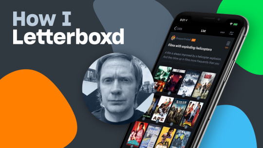
How I Letterboxd #5: Will Slater.
Talking mullets and other manes with the man behind the internet’s definitive ‘exploding helicopters in movies’ catalog.
“Man cannot live on helicopter explosions alone. Even I need some occasional intellectual nourishment.”
A London-based PR man by day, by night Will Slater has a thing (and a podcast, blog and Twitter account) for movies that feature exploding helicopters. According to his Letterboxd bio, it’s “the world’s only podcast and blog dedicated to celebrating the art of exploding helicopters in films… as well as shaming those directors who dishonor the helicopter explosion genre”. As Will tells Jack Moulton, he also loves film noir, Wakaliwood, masala movies and much more. Just don’t get him started on the one action movie cliché that never fails to disappoint.
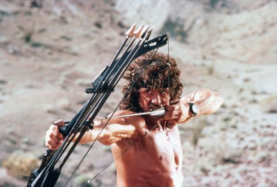
Sylvester Stallone takes aim in ‘Rambo III’ (1988).
First things first, have you ever had a ride in a helicopter?
Will Slater: What, do you think I’m mad? Of course I’ve never flown in a helicopter! If I’ve learned anything from watching hundreds of films where helicopters spectacularly explode, it’s that they are a singularly dangerous form of transport. You never know when Sylvester Stallone is going to pop up with an explosive-tipped arrow and blow you out of the sky.
I’m going to say the words ‘the definitive action hero/heroine’. Who pops into your head first? No runners-up. Go.
Snake Plissken, no question, for a number of good reasons. First, there’s the look: that eye-patch, the beaten-to-hell leather jacket and Kurt Russell’s lustrous mane of hair. Second, there’s the attitude: his contempt for authority, the drawled sarcasm and all-round bad-assery. And I also like that he doesn’t have any special abilities. Action heroes generally tend to be either musclebound slabs of beef—Arnold Schwarzenegger, Stallone—or martial arts specialists—Jean-Claude van Damme, Jackie Chan—Plissken is just a pissed-off, angry dude who’s trying to stay alive. He’s very relatable. Plus, I’d argue he pretty much invented the whole anti-hero formula that rules our screens today.
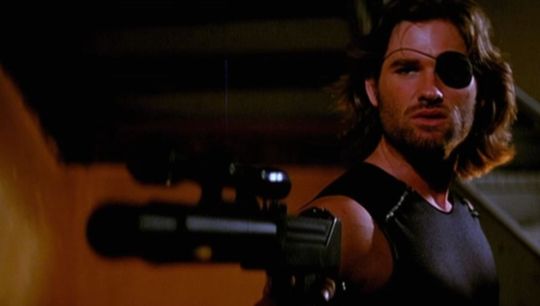
Kurt Russell as Snake Plissken in John Carpenter’s ‘Escape from New York’ (1981).
When did you start your podcast and which film got you into looking deeper into the topic?
It was while watching the cheesily bad Cyborg Cop that I first had an epiphany about the weird and wonderful ways in which helicopters seemed to continually explode in movies. But the film that convinced me to start documenting the phenomenon was Stone Cold. If you’re not familiar with the film, it was an attempt to turn former gridiron star and mullet-king Brian Bosworth into the next big action star. It goes without saying that Stone Cold did not transform ‘The Boz’ into the next Arnold Schwarzenegger, but the film wasn’t a total failure as it features a helicopter explosion that is as brilliant as it is gloriously stupid.
And that was the prompt to start the Exploding Helicopter. I launched the website in 2009, and the podcast followed 2015. Since we started, our aim has been a simple one: to celebrate the strange and inventive ways that helicopters explode in films.
youtube
Motorcycle crashes into helicopter in mid-air, ‘Stone Cold’ (1991).
When did you join Letterboxd? What are your favorite features here?
I’ve been around since 2013. As for the features, the stats are very cool. When you dig into your viewing history, you can learn some very revealing things about yourself. For example, I generally like to think I have a commendably broad taste in film, and watch only the most important and influential works from every decade, genre and country. But then you look at the data and find you’ve watched Thunderball nine times in the last five years, so maybe you’re not as cool as you thought.
We noticed that your profile faves are low-key and explosion-free, given your theme of choice. Why these four and not Die Hard four times?
Man cannot live on helicopter explosions alone. Even I need some occasional intellectual nourishment, between watching whirlybird conflagrations. There’s a little bit of nostalgia tied up in The Ipcress File. I first saw it as a kid, and it made a big impression on me. It’s very stylishly directed, has a great John Barry score and a star-making turn from Michael Caine. I’m a big film noir fan and Sweet Smell Of Success is a beautifully sour tale of cynicism and manipulation. To borrow the words of Burt Lancaster in the film, it’s a “cookie full of arsenic”.
Jean-Pierre Melville is my favorite director and Le Samouraï was the first of his films that I saw. What Melville does so masterfully in this, and his other crime films, is distil the elements of film noir. Basically, he takes the genre’s iconography—the gun, the trenchcoat, the fedora—and familiar plot tropes—the betrayed assassin, the heist gone wrong, the criminal doing one last job—then elevates them above cliché into something almost mythic. And what do I really need to say about Taxi Driver, other than it’s a masterpiece?
Now you say you shame directors who dishonor the art of helicopter explosions? Which directors did you dirty?
Well, one of the biggest names in our hall of shame is Tony Scott. For a man who specialized in hyper-stylized, pyrotechnic-filled action movies, he flunked every helicopter explosion he filmed. In our eyes, one of the most egregious offences you can commit is failing to show the helicopter explosion. And in both Spy Game and Domino, old Tony cheats the viewer by having the chopper fly out of sight before it explodes. Now, I can accept such visual chicanery in a low-budget film, where they presumably don’t have the money to stage the scene, but what’s Tony’s excuse? If you look at his filmography, at one time or another he’s wrecked trains, planes and automobiles in spectacular fashion. But for some reason, he repeatedly couldn’t be bothered to give us a satisfying chopper conflagration. At a certain point, it starts to feel like a personal slight. Tony, what did I ever do to you?
In your immortal words, “a film is always improved by a helicopter explosion.” When has this been especially true?
When you see lists of worst-ever directors, Uwe Boll is a name that always seems to turn up. And, according to the internet, one of his worst-ever films is the video game adaptation, Far Cry. Now, I’m not going to try [to] convince you that the film is a neglected classic, but it does have a very imaginatively staged exploding helicopter scene. It’s too convoluted to explain here, but take my word that it wouldn’t be out of place in a Fast and Furious movie.
What about the unsung heroes; the stunt artists, the pilots, the pyrotechnicians, the VFX wizards who have worked on numerous iconic action moments, all of whom deserve a shoutout?
Personally, I don’t understand why the Academy doesn’t have a stunts category. But if they did, I’d be lobbying hard for Spiro Razatos to get the first award. These days, he works as a stunt coordinator on the Fast and Furious and Marvel films, but I’d like to draw people’s attention to some of his early work. Back in the nineties, he did a lot of work with PM Entertainment films, an independent company that made low-budget action films for the home video market.
They might not have had much money, but they put every cent on the screen with glorious, raucously inventive set pieces that were often more spectacular than big-budget Hollywood offerings. And remember: this was in pre-CGI times, so every death-defying detail was absolutely ‘real’. Go back and watch films like The Sweeper or Rage, and you’ll can see why Super Spiro has now graduated to these more prestigious gigs.
Narrow this list down for us: which is the ultimate most spine-tingly epic “we got company” movie moment?
As you may have gathered, I do like an action movie cliché. When you encounter one in a film, it’s like meeting an old friend. And one of my favorites is when someone uses this classic line of dialog to signal that a car chase or a gun battle is about to start. I’ve heard people deliver the line in all sorts of ways–funny, scared, angrily and often just badly. But if you want spine-tingly, then you can’t beat Harrison Ford in Star Wars. He drops the line during the detention-block scene after failing to bluff an imperial officer. As soon as he says it, John Williams’ iconic score kicks in. It gives you the ‘feels’ every time.
youtube
“Boring conversation anyway.” Han Solo and Chewbacca in ‘Star Wars’ (1977).
And which action movie cliché can you simply not stand?
Stop it: my hackles are raising just thinking about it. For me, the trope that never fails to disappoint is the ‘reluctant’ hero being convinced to take up arms and join the fight. You know the scene. Invariably, the hero has hung up their spurs and is living a bucolic existence ‘off the grid’, when a gruff buddy shows up asking them to risk almost certain death by taking on ‘one last job’. Now, dialog is rarely an action film’s greatest strength, and these beefcake actors generally are not cast for their dramatic chops. Which means we get subjected to the same perfunctory and uninteresting scene over and over again: “I told you, I’m out the game”, “Goddamnit, we need you”, “OK, I’ll do it”. These scenes just never work and are never less than painful to watch.
Which up-and-coming action director are you most excited about?
In terms of up-and-coming action talent, I’d pick the director Stefano Sollima. I first noticed his work on a couple of TV series: the fantastic Italian crime dramas, Romanzo Criminale and Gomorrah. The way he composed shots really stood out, and it was clear he had a very cinematic eye. He rather reminds me of Michael Mann. He’s now on Hollywood’s radar and got to direct Sicario: Day of the Soldado the other year. And he’s lined up to make a Tom Clancy adaptation with Michael B. Jordan. I can’t wait to see what he comes up with.
Have you witnessed the glory that is Wakaliwood—Ugandan DIY action filmmaking—three of which make Letterboxd’s official top ten films by black directors? Which international films do you feel out-match Hollywood?
I love the Wakaliwood films I’ve seen. It’s fascinating to watch action films from around the world and see their different styles and flavors. Recently, I’ve been trying to investigate Indian cinema and, in particular, what are known as ‘masala movies’. These mix action, comedy, drama, romance and dance numbers into one big, crazy, entertaining mess. They’re a unique experience. If you want to check one out, I’d suggest Dhoom 2. It’s bananas.
Can you believe there are only two female directors represented in your exploding helicopter list? Do you believe that’s due to systemic or thematic reasons?
You have to say it’s systemic. Men have dominated filmmaking for more than a century. Until women have the same opportunities to direct and make films as men, it’s impossible to know what their interest may or may not be in blowing up helicopters. [Will has previously written about the search for “true gender equality in the world of exploding helicopters”.]
To address the elephant in the room, how has Kobe Bryant’s unfortunate death earlier this year changed the way you look at these scenes?
Obviously, I appreciate that Kobe Bryant’s death was very shocking and a tragedy for his family and fans. But basketball really is not a thing on these grim shores, so it didn’t register with us unenlightened Brits other than [as] a sad headline about a US sports star.
What was your most anticipated movie event of 2020 before Covid-19 pushed every tentpole back?
That’s easy: No Time To Die. I’m a huge Bond fan and as soon as tickets were available, I booked myself in to see it on opening day at an IMAX. But if the Daniel Craig era is synonymous with anything, it’s lengthy delays between films.
Freerunner Sébastien Foucan in the opening scene from ‘Casino Royale’ (2006).
What’s a fond memory you have in theaters related to the Bond franchise?
I remember going to see Casino Royale. I was excited, but also nervous to see it. The Brosnan era had ended with the risible Die Another Day: invisible cars, kitesurfing and, worst of all, John Cleese’s awful Q. Since that had come out, we’d had Mission: Impossible, Bourne and the Triple X films, so it wasn’t beyond the realms of possibility that Bond might be finished. Then the first ten minutes of Casino Royale happened. And while that outstanding parkour-inspired chase was terrifically exciting, it also hit me like cinematic Valium. I suddenly realised I could sit back and relax, safe in the knowledge that 007 was going to be just fine.
Are you planning on returning to theaters as soon as you can? When would you feel comfortable?
I’m taking a wait-and-see approach. I’d love to see films back on the big screen again, but I want to know more about how cinemas are going to maintain social distancing inside.
Finally, what three Letterboxd accounts should we all be following?
Why not give Todd Gaines, Jayson Kennedy or Fred Andersson a follow? If you’re interested in genre films that are a little off the beaten trail, they’ll likely all steer you towards some hidden gems.
#letterboxd#how i letterboxd#letterboxd member#letterboxd community#cine#film lover#exploding helicopter#chopper fireball#action films
5 notes
·
View notes
Photo
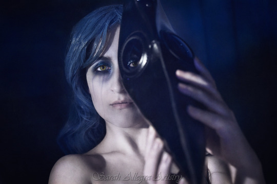
© Sarah Allegra
My regular viewers will probably remember that May 12th is Invisible Illness Awareness Day, or ME Day, in my house, for short. It's a big day in the chronic illness community; it's our Superbowl. Getting a new photo shot for this May 12th was an enormous challenge and there were many times I was sure it wouldn't happen. I started planning this months ago, as I seem to always be scrambling at the last minute and I was determined to NOT do that this year. Then, eight weeks ago, I began getting a recurring fever which took up nearly all my already limited time. So I downgraded the first concept I had into something more manageable. And the fevers continued. This can't possibly last forever, I thought, and came up with another, simpler concept that would work with the time I had left. And the fevers continued.
So things went on until I was able to shoot this image just three days ago. Getting an image turned around, even one without heavy compositing, can take weeks for me. I crammed and pushed my body more than is probably wise considering the fragile state of my immunity, but I got it DONE. Hah! Take THAT, ME!
This self portrait is drawing from the historic plague doctors and the iconic masks they would wear. I recently finished re-reading a favorite book of mine, Doomesday Book by Connie Willis, part of which takes place during the bubonic plague of the middle ages. No mask-wearing doctors appear in it, but the thought was fresh in my mind. That combined with the current Covid-19 pandemic, the scarcity of masks, thinking about immune systems and how easily they can be gotten around by a determined germ... and this was the visual that came to mind.
Of course, a May 12th image wouldn't be complete without it tying in to my experience with having ME (short for myalgic encephalomyelitis; a debilitating neuro-immune disease with no treatment or cure). This year, I asked myself, how could I explain what it feels like to have an incurable illness to someone who's never experienced such a thing? For once, a large portion of the world has actually had a small taste of ME, due to Covid-19. The way Covid has forced you to stay inside, rarely see other people, isolate, protect yourself from any potential germs, taken away your livelihood, these are all hallmarks of nearly every chronic immune-compromised illness. Except that for us, social distancing will never end. Our isolation will never end. We will never go back to work. This is our reality for the rest of our lives.
This is not the life I want to live. No one wants to live forced into a cage, denied the things that make life meaningful and enjoyable. But still, this IS my life right now. Until a cure can be found. I'd gladly take even a treatment. But the medical world has almost nothing to offer me or the millions and millions of others with ME (not to mention all the other disabling diseases like MS, fibromyalgia, Crohn's, EDS and so many more). I cannot break this cage; I cannot pick the lock and let myself out to freedom. But I can scream inside it. I can shout and bang on the bars until someone notices; until enough people notice. And once they notice, they will start demanding freedom for us too.
And maybe, someday, I can actually leave behind this dirty, nasty, bug-infested prison and feel the sun on my face again before I die.
Our illnesses are invisible, but we often feel invisible too. When you drop out of society, only your close friends and family will notice. People who've never met you have no idea that there's a Sarah-shaped void where I used to be; they simply fill it. Chronic illness hides you in its shadows as you're unable to leave your house. I will not be kept secret; I will demand attention and action. ME is an iron mask and shackles, hiding my identity, my potential and my value as a human being. I will not be hidden anymore. The mask is coming off and there WILL be change.
If you would like to be a part of this change, please read my blog post for more information about how you can be the ally we desperately need: https://sarahallegra.wordpress.com/2020/05/06/me-and-invisible-illness-day-may-12th/
You can learn more about ME and other invisible illnesses, there's a petition you can sign, the Millions Missing campaign you can join, excellent documentaries you can watch for free, images you can use as your avatar for the day (or longer!), or, if you'd like, you can donate to ME Action, an organization doing great things for people with ME: https://www.meaction.net
But if you do nothing else, I ask this of you: believe people when they tell you they're sick, even if they don't look like they are. Not every illness manifests outward signs. Just acknowledging that ME is real, despite me (and others) still looking "healthy" on the outside is a huge step forward. Every person in the world afflicted with these evil, insidious illnesses will thank you, starting with me. <3
*Personal Instagram: http://instagram.com/artosthebear * Professional Instagram: https://www.instagram.com/sarahallegraartistry/
*Blog: http://sarahallegra.wordpress.com
*Twitter: http://twitter.com/sarahallegra
*Facebook: http://www.facebook.com/artosthebear
*Red Bubble shop - a wide variety of items, including affordable prints: http://www.redbubble.com/people/sarahallegra*Etsy Shop - Limited-edition, fine art prints: https://www.etsy.com/shop/SarahAllegraArtistry/
*Sarah Allegra Artistry: http://www.sarahallegra.com
#sarah allegra#portrait#self portrait#photography#solitary#single#plague#mask#girl#woman#female#blue#hair#makeup#GoBlue4ME#dark#sad#eye#smokey#bird#beak#doctor#weak#strength#inner#hope#beauty#me#mecfs#fibro
4 notes
·
View notes
Text
The Sunday Morning Post
September 3, 2017 10th Edition
Current News:
Yuri on Ice: ShitBang
On August 31st, if you love Yuri on Ice, your feed may have blown up with stories and artwork created as a means for writers and artists to come together and work on a project together.

What is the Shit Bang you ask? It is an amazing event for writers and artists to come together and write and draw about the amazing anime we all love: Yuri!!! On Ice!
But a little more than that this is a direct - non-hateful - response to THAT blog. You know the one I’m talking about. Yup. THAT one. - @yoi-shit-bang
The amount of stories and artwork has been astounding. From one-shots, to multi-chapters, all written by amazing authors. Then there is all the amazing artwork that has come with it, by some amazing and very talented artists.
Please keep in mind that many subjects may trigger, please read all tags before reading a story.
Story Recommendation:
we have loved the stars too fondly by @thehandsingsweapon
“We live in a blue planet that circles around a ball of fire next to a moon that moves the sea, and you don’t believe in miracles?”
After an academic career at MIT and Oxford, Yuuri Katsuki eschews job offers at places like NASA and CERN to go work at the Very Large Array in what Phichit Chulanont lovingly calls The Actual Middle of Nowhere, New Mexico, monitoring radio frequencies from light-years away. He's loved the stars for as long as he can remember, and the universe feels so big sometimes that Yuuri is sure it would be a cruel mistake for humans to be all alone.
Enter the latest scientist to join the staff of the VLA, enigmatic Russian genius Victor Nikiforov, around whom Yuuri’s entire universe seems to bend to make room, and the strange, recurring dreams Yuuri keeps having, where something like love carries him across the stars.
Does love travel faster than light? Do souls?
“The cosmos is within us. We are made of star-stuff. We are a way for the universe to know itself.”
"Yuri, on Stars!! This lovely short story will resonate with anyone that lives the heavens. Dreamscapes thought to be a figment of Yuuri's imagination turn out to be a more real than tangible science, and Viktor is patient with all his insecurities. With just the right amount of angst to give it depth, this vignette will take you into the endless cosmos!" - @darkrivertempest
Artist Spotlight:
we have loved the stars too fondly by @shadhahvar
Comic:
Good boy by @floccinaucinihilipilificationa (Click title to reblog)

Support:
This week’s Ko-Fi shout-out goes to Discoursemoth | @lowercasewrites (Click to buy coffee)
im sei! im a non-passing trans boy with unsupportive parents, and im using this account primarily to pay for things that could help me pass better, such as a packer and binder. you obviously dont have to donate but i would really appreciate it!

Patreon: YukiPri | @yukipri (Click name to become a patreon)
Hey there!! Thanks so much for visiting my Patreon. I'm Kazu, also YukiPri on Tumblr.
I'm currently a freelance translator and illustrator who is HOPING to support myself primarily through art. My passion is telling my own unique stories through visual media, and I love world-building, costume design, and overall extensively over-thinking all of my stories.
This patreon is a step towards hopefully better sustaining myself off of art so I can continue to grow as a professional artist and produce content that you can enjoy! I am unbelievably grateful to every patron who helps me continue to do what I love doing.
My wish is for the majority of my work to remain public, but I also desperately need to support myself, and also have a variety of content that I'm not comfortable posting publicly for various reasons. As thanks for your support, my patrons will get access to exclusive content, including WIPs/sketches, previews, art progress/tutorials, higher resolution art, early access, and nsfw content!
Fun and Games:
10 Questions Every Fic Writer Secretly Wants to be Asked by @wyseink (Click Title to reblog)
There are a lot of fic questions that float around online, but rarely do they ever ask specific questions about the fics themselves. Ask any writer one or more of these ten questions to learn more about the fic and show support.
1. Of the fics you’ve written, which is your favorite and why?
2. Which scene was your favorite to write in [title of fic]?
3. Which part of [title] was hardest to write?
4. If you could change anything in [title], what would it be?
5. Did you make an outline for [title]? Did you stick to it?
6. Which scenes did you cut, and which were added in [title]?
7. Who was your favorite character to write in [title]?
8. Which came first, the title or the fic?
9. Which idea came to you first in [title]?
10. What are some facts readers may not know about [title]?
Story Prompt:
Monochrome by @diamondwinters
An AU where people who are sad, down, depressed cannot hide it. Whenever you get sad, you start to loose your color. Your skin turns pale, your eyes loose their color, and turn gray or white, and your hair turns gray. Like an old black and white tv show, you loose all your color when you’re very sad.
A little bit of sadness might dim your natural colors, but you wouldn’t loose them. It’s during a time when you feel heart broken, or very depressed that you go Monochrome. Such as a big break up, a death of a loved one, deep depression, etc.
Monochrome is the medical term used by the doctors in this AU to describe turning gray in a world of color.
Some people who are unable to get happy, may use make-up, contacts, and hair color to hide the fact that they’re depressed, but eventually even those things will loose their color and will need to be replaced.
The best thing to do is to find your happiness. Be with friends, and family who can help you bring your color back. The brighter you are, the more vivid your colors are, the happier you are.
Art Prompt:
Imagine your OTP by @bumble-beany
Person A: Are you awake?
Person B: I am now
Person A: I was just wondering...
Person A: What do you think it'd be like to be a pregnant male seahorse?
Person B: Really?! You woke me up for that?
W.I.P. Motivation:
Liquor Stash by @severeminx
I want him.
When the full realization hit him, Yuri felt as though he couldn’t breathe. Detached and fleeting thoughts that had passed through his mind finally took shape in these three words at that exact moment. The I being himself, Yuri Plisetsky, age 17, a Russian figure skater with a list of impressive accomplishments to his name that seemed pretty pointless right now given the context. The want being desire, the need to bury himself, the thought to consume, but never actually act out except behind locked doors in empty beds or shower stalls. The him being the person standing across from Yuri sipping coffee from a take-away cup with creased brows, the low sunlight hitting his face just so to light up his otherwise dark eyes. Someone he considered to be his best friend, who came all the way from Almaty just to spend a week with him and who was blissfully unaware of the fucking turmoil Yuri was feeling in the pit of his stomach. Or at least, Yuri hoped he was unaware.
In which Yuri Plisetsky invites Otabek Altin over to stay with him in Saint Petersburg, freaks out over his feelings and delves into Lilia's liquor stash.
Please go read and support this artist. They are looking for kudos and comments to get them back into finishing this fantastic story!
Fandom Week: (Click each line to go to blog)
Zarkon Week! September 3rd - 9th.
Yuri on Ice Music Week! September 4th - 11th
NSFW Yuri Plisetsky Week! September 11th - 17th.
Guang-Hong Week! Voting will be Sept 15th - 21st
SeungChuchu Week! October 16th - 23rd.
Help Wanted:
Needed: Tumblr theme editor. Please contact Diamond Winters for details.
Story recommendations!! If you find a story that you absolutely love, and you want to see it get some recognition, please submit a link to it with a 2-3 sentence review of the story. This way it could get in the spotlight in a future edition of the SMP. Requirements are that it’s completed, or a one-shot.
Artist Spotlight!! If you find a piece of artwork that needs more love, please submit a link to it so it may be considered for future spotlights in the future.
WIP Motivation: Please send your support to these writers or artist to encourage them to continue their story or artwork. No good story or piece of art should be left unfinished. - If you know of a good story that hasn’t been updated in a while, and would like to offer encouragement to the author, please let me know, so that I can link to their story here.
If there is ever any section of the Sunday Morning Post that you feel you can contribute too, please send an Ask or Submit to either the SMP, or @d2diamond so that it has a chance at making in a future post.
Thank you!
@yoi-shit-bang | @thehandsingsweapon | @darkrivertempest | @shadhahvar | @floccinaucinihilipilificationa | @lowercasewrites | @yukipri | @wyseink | @diamondwinters | @bumble-beany | @severeminx
34 notes
·
View notes
Text
Creator’s update #1
Hey guys! So I’ve decided to start actually blogging on this blog and tell a bit about the various things I’m working on, share WIPs, music I’ve been digging recently etc. I realise that I rarely post anything, so it seems like I’m super inactive - which is totally not true, I just have so much stuff going on and take a long time to finish things, and I’m also pretty picky about what I put up online lol! For the sake of keeping those of you interested in the loop, I’m gonna start this series of creator’s updates in which I’ll update y’all on the progress I’ve made on my various creative projects. The goal is to give an update a few times a month (hopefully lol)!
This past while I’ve been super inactive in the writing department, but very much productive in the art department, so my writing update will be mostly a summary of what I’ve been doing the past few years up until this point.
Mood: Feelin’ real good cuz my parents finally brought my comfy double bed over from my mum’s place this past weekend, which means no more sleeping on the couch yaaaaaas.
Music I’ve been digging recently:
Skye Sweetnam - Boyhunter So, the other day I randomly listened to this song on my way home from work, and I totally realised that Skye Sweetnam is the perfect voice for my character Caitlyn, and this song totally embodies what Caitlyn is all about lmaoooo. (The song isn’t very accurate to the time period Caitlyn lives in, but it’s super accurate to her character essence and personality, and I just find that so lit hahahah)
Fallulah - Out of It This song is basically my MC’s theme song?? It’s performed by a Danish artist and was super popular in Denmark a few years back as it was the theme tune to a Danish tv show (a show I loved!). The lyrics are just so Daniel, it’s not even funny. It mostly fits his mental state at the beginning of Renaissance.
Girl’s Day - Love Again Ugh I just love the tune of this song so much, I can’t really place my finger on it, the emotion is just so great. I love the guitar riff especially, and Girl’s Day is a four member girl group, so it’s one of those songs where I can imagine my main girls Annaliese, Caitlyn, Mary and Serena singing as each member lmao.
Nine Muses - Remember Another four member group now, this song is also one where I can imagine my main girls singing each member’s part lmao, and having that aspect to a song always makes it a little better for me! Forreal tho, this new release from Nine Muses slays, and we all know it. The music video haunts me.
Sistar - Lonely This song makes me sad and happy all at once, cuz I’m not ready to say goodbye to Sistar, but at the same time this ending is probably the best one any fan could’ve wished for because there was no drama or anger, just well wishes and hope for the future. I know these girls will go far, and this song just pulls at all my heart strings man. The melody of the bridge and chorus, Dasom and Soyu’s parts in particular, really works for me. And yeah, Sistar has four members too, and once again I can picture my main girls singing as each member lmao. It’s a thing I have, okay?
Moana OST - We Know The Way + Know Who You Are I recently watched this movie, and while I sorta felt like the plot was a bit rushed and tropey in many ways, I totally adored the visuals and the MUSIC OMG. These two songs are my favourite, Lin-Manuel Miranda’s vocals never miss, and Auli’i Cravalho’s high note is gorgeous! Also dat choir in the background tho, and in context with the movie scene that song just makes me irrationally emotional mkay. (That ending was the best twist ever, it definitely lifted the story up a notch for me!)
Writing
So I’m writing a book! You might have seen me mention it a few times already on here, but I’ve not really shared much insight into my process or what sort of book this actually is (other than talking about characters here and there), and as I’ve not been making huge progress lately (I’m in an art state of mind duuuh), I thought that I’d keep this section short and sweet, with a bit of an introduction into what my book project is all about.
I call it a book project because I don’t feel comfortable just calling it a book when I don’t have rights to publish. Technically my book is a fanfiction based on the horror video game Amnesia: The Dark Descent, and as such I don’t own copyright of the small percentage of my story that features the canon elements. However, I take this as seriously as anyone else would writing their own book, because I’ve poured my entire heart and soul into it, and the vast majority of the content (plot, characters and world) is my original creation. It’s my own little big project lol!
You might be familiar with the game, and even if you aren’t, that’s not a prerequisite for reading my book since everything is introduced and set up just as in any regular book. The protagonist is an Englishman named Daniel, and we know little of his past through the game. I won’t go into too much detail on what the game is about (if you really wanna know, you can look it up), but the point of my book is to explore the protagonist’s life from his childhood up to the events of the game and beyond, and afterwards connect his story to the game sequels featuring other protagonists within the same universe. It’s a bit complex and elaborate, which is just the way I like it!
As the games are set at various points during the Victorian era (game #1 is set in Prussia 1839, game #2 is set in France 1858, and game #3 is set in England 1899), you can probably guess that the entire thing will be pretty long. That’s why I’m making it a series! I have at least seven books planned so far (though there’ll definitely be more, since I’m not near the end of the timeline I need to cover yet), and I currently have the first book written and am writing the sequel - however, the first book will need a complete rewrite once I’m finished with book #2, because I’ve since developed and changed a lot of stuff, and I have many new interesting ideas for a more fleshed out version of the first book. Still, the fanfic version is available online, so if you’d like to read it, you can find it here. You’ll get a pretty good idea of the general story and the characters, but keep in mind that it’s super outdated and will be very different after my rewrite!
For reference, this is the list of books that I’ve planned (and titled) so far, so you can keep up with what book of my series I’m talking about at any given point:
I - Amnesia: Memoirs
II - Amnesia: Renaissance
III - Amnesia: Voyage
IV - Amnesia: Noir
V - Amnesia: Encore
VI - Amnesia: Rogue
So what I’m doing right now with this project is revisions. Uuuuggghhhhh. Yes, that’s right, I’m stuck in revision hell. I’ve not even finished the first draft of Renaissance yet (I know, sacrilege, writing blasphemy, don’t start your damn edits until you’ve finished your draft dumbass), but I had some pretty major changes to make, changes so big that it would be a waste of time and effort to go on drafting without implementing them first. Mainly the changes are surrounding 1) a change of ages of my main cast (I aged many characters up a few years), and 2) changing and figuring out the specifics of the illness which my MC’s sister, Hazel, is afflicted with. She’s not such a major character in Renaissance, but she plays a big role in Memoirs, and since I had all these new ideas for the rewrite of that, I wanted to implement the ripple effects in the second book so it wouldn’t be too much of a hassle to edit later when Renaissance is a finished 3-400k first draft lmao (I have a lot of words okay?). These changes mostly affect the early chapters of my book - chapters I wrote about three years ago, which means that these early chapters really need a face-lift. In addition to the age and illness change, I wanna revise the first five chapters by cutting the fluff and tightening up the beginning so we get to the action a tiny bit faster. Adding to the fact that these early chapters are three years old, the prose also needs an almost complete rewrite. So long story short, all of the edits are taking a long ass time, and I’m not having a good time lmao. Doesn’t help that I had to stop drafting right at one of the juiciest scenes in my book?!?!? (that’s a lie, it gets juicier, but I was just getting to the real good stuff yanno?)
(Side note: for someone who said that I’d keep this short, it sure turned out long lmao. I just have too many damn words.)
Chapters edited: 2/16 (working on 3 right now and it’s an effin’ pain)
Current total word count: 120,591
Current total chapter count: 17 (the number will go down to 16 once I finish the revisions, as I’m merging two chapters)
Look at all the dumb shit I still have to edit for chapter 3. Look at it.

Whyyyyyyyyyyyyyyyyyyy.
Art
Man, I’ve been doing a lot of artwork recently, and by a lot, I don’t mean that I’ve finished any.
I think I’ve been focused on developing my actual drawing skills rather than making finished illustrations, because I’ve been so overwhelmed with inspiration and I’ve wanted to try out drawing a bunch of different motives, so my mind is on a lot of different art projects at once, and I’m making baby steps of progress on each of them because I just wanna do everything lmao. I should probably take a step back and settle on one thing at a time, but at the same time, I feel like this is working for me because I’m so inspired and motivated and super excited for every single art piece; I don’t feel myself losing interest in any of them, in fact I just feel like my switching between different artworks keeps every piece fresh and interesting for me, yanno?
So here’s one thing that I’ve been slowly chipping away at for the past few months. I’m drawing a full body group picture of my main cast from Renaissance!
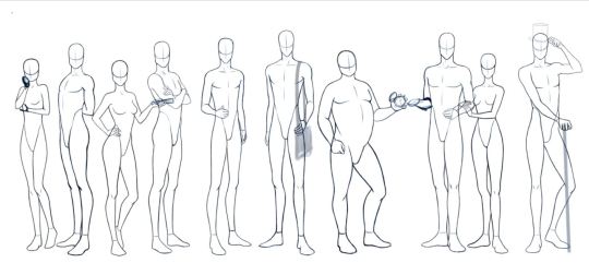
I’ve drawn the anatomy sketches of all the male characters (though I’m debating whether I should add some others), and now I’m adding the female characters one by one, so these are not all of the characters yet. But man, I just love seeing the characters side by side? The variety in their body language, body types and heights is just so interesting to look at, and it’ll be even better once I get around to actually adding their facial features, expressions, hair, attire, and then colouring them as well omg! I’m a sucker for this kind of thing, blame it on @juliajm15 and her amazing diverse character designs.
It’s gonna be a huge picture with a lot of characters, and I’m stoked for it!! This is a piece which I hope I’ll be able to show ya’ll the progress of bit by bit in every few updates. (also, if you feel somewhat familiar with some of my characters, you’re welcome to make guesses at who’s who (; )
Another project I’m working on is making official character portraits of my main cast (and possibly minor characters as well). I just think it’s nice to have official portraits as reference for anyone who’d like to see what the characters look like, and also for myself for whenever I need to refresh the specific features and expression of each character. It’s just a nice thing that satiates my very Type A personality lmao!

So the characters above are Owen Wright (to the left) , Daniel’s puppy bff with the fluffy hair, and then from left to right I’m colouring the portraits of the Armstrong siblings: Caleb, Caitlyn and Tristan. Their dad is a duke! n.n Caleb is the oldest, Caitlyn the youngest, and Tristan is the bland middle child. He’s a little brat LOL but I still love him.
Also, due to this glorious reference I found, I finally figured out how to draw Daniel. Bless this model, I never knew I wanted Daniel to have big puffy lips, but apparently I do.
He looks actually nice now? Which is nice? I’m amazed. Also his hair? I can never draw his hair, but this looks nice so yay? Also, I dunno why I never draw clothes on him, I guess I’m just lazy lol, but he’s gonna need to wear clothes for the official character portrait soooo... That’s a thing I’m gonna have to do.
Now that I’ve figured out his features, it’s gonna be fun to remodel all his family members accordingly. I sense that he’ll have gotten those cute puffy lips from his mum meheheheh.
I also did some Disney fanart of my two favourite Disney ladies; Esmeralda and Kida <3
I actually never really draw fanart any more, it’s been yeeeaaaars since I did, and when I used to do it, I was always very particular about staying as true to the original art style as possible. But now that I’ve spent the past couple years focusing on developing my own art style, I actually decided not to care about that so much and just draw the characters the way I’m used to drawing my own, and lo and behold - it looks pretty accurate to the Disney style?? I assumed that the characters would end up looking very different, but other than the eyes being smaller I feel like they look the exact same lmao. It’s interesting to me, because even when I used to do fanart, I usually did so of Japanese art and manga, not of Disney or any other western art. Also, I don’t consider my own style very Disney, but it pleases me a lot that the characters look so much like themselves even in my art style! The most important thing to me is to capture the essence of the character anyway, so any fan can recognise the character they love so much n.n
So that’s about it for this round! I’ve been working on other things as well, but I’d rather not disclose them to the public just yet - perhaps later, when I’ve made more progress, or (gasp!) actually finished something!! Bahahah, with the many things I’m working on, hell will freeze over before that day comes. *cries*
Youtube
I’m adding this Youtube section because, in addition to writing and doing artwork, I also like to record vocal covers (mainly of kpop songs, but I’ll do anything I’m in the mood for at any given point), aaaaand as of today I'm gonna be uploading speedpaints as well! Which is probably good since I don’t upload my covers nearly as often as I finish them lmao.
I’ve not uploaded any new covers recently (though I really should, I do have some covers lying around on my laptop mwerp), but I’m gonna list a couple of my favourite covers I have on my channel here so you can take a listen if you’d like!
youtube
youtube
youtube
And today I uploaded my very first speedpaint to my channel, so check that out if you’re interested in that sort of stuff! It’s the process of my Christmas portrait piece for Serena. I aim to be more consistent with uploads since I have a few unedited recordings lying around, so keep an eye out for that!
youtube
If you’ve read this far, thank you for sticking around and taking a look at my work, even if it’s only in WIP form. I wanted to start doing these updates because I’ve been watching my friends do them for a long time, and I always love reading their writing updates; they motivate me so much to get working on my own stuff, and I just wanna be able to perhaps do something similar for anyone else who’s watching me out there. So thank you sincerely to @coffeeandcalligraphy, @sarahkelsiwrites and @shaelinwrites for sharing your process with the world and being such an inspiration to me and many others, I love seeing you all make progress on your own projects <3
So that was all for this round, I hope you guys enjoyed a little sneak peek into what I’ve been working on! Until next time, folks!
#Amnesia the dark descent#disney#the hunchback of notre dame#atlantis the lost empire#kpop#update#personal#memoirs#renaissance#voyage#noir#encore#rogue#art wip#writing wip#daniel james wilkinson#owen wright#original character#friends#nine muses#sistar#aoa#snsd
57 notes
·
View notes
Note
This might be too much to ask but I broke my laptop and only have access to mobile and I'm dying to know what I'm actually missing but I can't check would you be able to describe it? Sorry I know this is annoying ignore it if it's too much trouble
It’s not annoying so don’t worry about it, but my posts should all be visible, now? At least my app doesn’t give me the option to request a review anymore… if you can’t see them still they’re all (aside from the one I posted earlier) backed up on my wordpress blog! You can see them from there without me needing to describe them~
Anon said:Franeri-san what dimensions do you usually use for your canvas? When I draw I end up making the canvas too small, so when i zoom in to make details it becomes pixelated. But I also don’t need my canvas too big because I won’t be able to proportion it;; it’s a visual thing… Ah I’m rambling sorry
I use a 6000pxx5000px with a 4px brush, usually, but I really rarely use it all, mostly it’s just like, corners of the whole thing. I tend to draw a lot of things on the same canvas before switching to a new one - that said, personally I can’t draw properly if I don’t zoom in above 100% (usually I work at 150% or 200%, more for details) so I’m really not the right person to ask this haha
Anon said:I saw that profanity is now being blocked more heavily by safe search so our good, good but foul mouthed Baku may be the reason your stuff is hidden. You’ve probably already heard this but I thought I’d let you know~
Rip so I heard orz though let’s not give our Baku all the fault here, I swear a lot by myself too haha I’m my own ruin, seems like - thank you for taking your time to share the info, anyway!!
Anon said:I’m really happy about your blog not being censored seriously. CAUSE YOU MAKE WONDERFUL DRAWINGS THAT FILL MY HEART AND I WAS STARTING TO PANICK. Keep up the good work~. 🖤
And I’m really happy you can properly see my blog, you sweet sweet cute and adorable anon!!!!!!!!!! *O*
Anon said:Hello! First, I love your art and your headcanons and stories! I am in love with bakushima half because of you, you beautiful tart. Second, about Bakugo’s laugh, holy crikey, of course he’s loud and explosive. The boy is a ball of stress and anger and when he laughs for real, it’s rare and takes effort. But like, can you just imagine when his explodo-kill mask cracks his face turns red because he doesn’t want to laugh. But THEN he barks out a laugh and everybody’s stunned and then he just SNORTS
YES!!!!!!! Oh my god yes that’s an hc I have he definitely, definitely snorts when he tries to hold back his laughter it’s so effin adorable I die every day a lot bless that kid
Anon said:Who tops of in your opinion in Bakushima?👀
Maybe either, maybe neither, depends on many things but mostly on how I don’t ever ask myself this question for any of my ships so I got no answer for it at all ever - instead we should ask ourselves the important questions, like who opens the water bottles between them (Kirishima when Bakugou’s palms get too sweaty and Bakugou’s forever resentful about it), who kicks when they sleep and who always ends up sleeping on the floor because of it (Bakugou’s the restless sleeper, poor Kirishima), who takes way too damn long in the bathroom goddamnit Kirishima get out of there already I swear to go——-
Anon said:your blog makes me really happy just keep doing you you’re like the best thing
Thank you so much holy smokes!!!!!!!!!! *O*
Anon said:wait wait wait wait! is Bakugou the one teaching Shark Kirishima sign language?? then does that mean Kirishima learned to sign ‘I love you’ from Bakugou!? (Q/)////(\Q)
They’re learning together!! They have an online dictionary and follow online courses, so Kirishima kind of looked it up for himself at first - he was signing it as love instead of really like thoug, which made Bakugou indecently flustered so in the end, yes, he was the one to teach him how to properly sign it :D
Anon said:Will you still be updating this blog?
Sure will! The wordpress one is just a backup thing!
Anon said:wait so question: in the mer au, does kiri know jsl from before? because the way he reacted to bakugou first attempting to sign at him looked like he recognized it but you said they both had to learn? does he react like that because he recognizes it as bakugou actively trying to communicate? (btw this au is So Good i love how kaminari is just “why are you like this” at kiri but his Gay Ass cant be swayed)
I’m glad you like it!!!!! And nope Kiri didn’t know jsl from before, but mers do have something similar to a sign language (there’s deaf and mute merpeople too, after all) so he recognized it as Bakugou going “I want to talk to you and this is the best way to” - also, he’d never seen a tablet before and Bakugou was showing him an explosion on it to make him understand and instead he went “what is this SORCERY” and got excited about a gif. Good, pure kid. I had no clue how to add that in the comic in a fast way tho so let’s leave it at him being happy they found a possible way to communicate haha
Anon said:Hi Fran!!! Hace you reas the theoriws aboyo kiri o kaminari Boeing traitors? Si you know where they came up? I’m lil bit lost even tho I’m up with the man lmao ALSO pls more maki-chan
So pretty much at some point in the middle of a meeting Present Mic mentioned how there probably was a traitor between them that kept on feeding the villains infos about UA, and the fandom of course got interested in that!! Who could it be? They started thinking it through and for some reason the theories that ended up being more popular are about it being either Kaminari, Kirishima or Hagakure - I don’t think any of these are true, but if you google search “kaminari traitor theory” or the same with the other two names you should easily find the posts explaining the theories and where they come from, if you’re interested!
Anon said:omg fran i haven’t watched/read bnha but still solely bc of your art i am IN LOVE with kirishima. he’s such a pure being I feel like crying every time i see him??? like i just watched the first opening of the anime and you bet i watched the 5 seconds kirishima gets over and over. like all the bnha kids seem great. i am somehow extremely motivated to read bnha now thanks to your art. BUT OH MY GOD KIRISHIMA I LOVE HIM SO MUCH WHAT EVEN
You picked the best fave you could ever pick, anon!!! Kirishima is the BESTEST boy, purest and brightest and energetic and actual sunshine and also super strong and resilient and kind of an ass now and again but in a good way he’s GREAT I’m IN LOVE with him good job your intuition is perfect
Anon said:THE MER AU WAS THE CUTEST THING EVER I LOVE SHARK KIRISHIMA AND THE TAGS ALL GAVE ME LIFE
GLAD YOU LIKED IT OMG!!!!!!!
Anon said:I love all your art, but especially all your self indulgent stuff bc first off HELLS YEAH DO THE STUFF THAT MAKES YOU HAPPY and another is it feels like self indulgent stuff for me but I’m not the one making the thing… So like… It’s Good™ BUT YEAH ANYWAYS I LOVE YOUR ART AND YOU AND YOUR ART MAKES ME HAPPY TBH I HOPE YOU’RE HAVING A LOVELY DAY
AAAAHHHHHHHHHHHHHHHHH THANK YOU SO MUCH also this is super nice to know because sometimes being self-indulgent is all I can manage to do haha r i p but at least now I’ll know you, for one, will like it!!! That’s nice!!!!!!
Anon said:If you were ever bored and wanted to do more of your mershark au thing I wouldn’t be mad at all ! 😝 your art is so cute and easily recognizable and I really enjoy it! Stay beautiful lovely Fran!
!!!!!!!!!!!!! thank you!!!!!!!!!!!!!!!!! And I really, really think I will!!!!!!!! :D
Anon said:I bet if denki tried to do the “if i jump at ______ they will most certainly catch me” with bakugou, bakugou would just let him fall
Oh my god no Bakugou’s reflexes and instincts are too fast and automatic the actual reaction at seeing someone run and jump at him would be without thinking trying to explodo-kill them don’t jump at him Kaminariiiii
Anon said: What to you think of a school dance bnha concept thing???
I read a bakushima about it once and I DIED so actually A++++ great perfect amazing concept I love it
Anon said:I gotta know,what do you think of the “Dabi is Todoroki Shouto’s brother” theory? i personally feel like that 1’s the most likely theory to become a legit thing but im curious
I talked about this on my main just the other day!! And added something about it earlier through another ask! But generally I think it’s believable, and I wouldn’t mind it being true :D
Anon said:But, what are your feelings about this chapters? And Kirishima? God, I love him even more and want him to be happy, but Im also dying to know what happened to him in his past!!
I CRIED I love that boy so much I swear it’s getting ridiculous I’m so so proud of him and how far he’s come and I just want him to be happy??? I do want to know his past tho!!! I’ve just been asking for this for, like, eight months!! I hope next one will be the one I’ll finally learn about my child tbh ;–;
Anon said:Fran you should totally do bnha and haikyuu calendars
………………..boi that sounds like a lot of work, anon. Like, it’s an interesting idea, but also my lazy ass is telling me no way no what the heck go to sleep instead r i p
Anon said:Have you ever thought of an eraser mic fusion?
I’ve drawn it already!!
Anon said:fran i?? i love the way you draw smiles?? idk i was just going through your art and i realized that holy SHIT i really love the way you draw smiles. like each smile is different and has its own specialty. esp bakugo’s smile I LOVE HOW YOU DRAW HIS SMILE!! like usually it’s not really noticeable but then there’s that slight quirk of his mouth (see what i did there?) and it’s so perfect. idk dude i just REALLY LOVE THE WAY YOU DRAW SMILES
THIS IS SUCH A CUTE ASK I DON’T KNOW HOW TO ANSWER HELP ME !!!!!!!!!!!!!! thank you????? so much??????? I’m glad you like them cause honestly I love drawing people smiling and laughing, it makes my heart smile too~
Anon said:Theres a bnhaStuck blog in the works ;)
That’s? Nice! I guess!! I hope whoever’s working on it will have fun with it!!
Anon said:Fran this last BNHA chapter hurt so bad. And then I saw your mer-Kiri and it cheered me up!
Ahhhhhhhhhhhhhhh!!!!!!!!!!!!!!!! I’m glad I could cheer you up cause honestly I felt that pain a whole damn lot too ;A; let’s hope Kiri won’t have to suffer much more in this arc #sob
Anon said:im crying fran, my hard bby kiri in the latest chap,,, my baby boi, i know that i wanted to know more abt him but,, keep my baby safe pls oh goodness gracious… (and as usual ur bootiful art keeps me alive)
I mean nearly all the character arcs we got are damn sad so it was obvious Kiri’s was going to be too, but still ;A; don’t make him suffer too bad Hori I beg u ;A;
Anon said:*takes deep breath* I FUCKING LOVE YOU SO MUCH THANK YOU FOR MAKING QUALITY ART OF MY FAVOURITE SHIPS YOU ARE SUCH AN AMAZING PERSON AND YOUR ART IS VERY PRETTY AND I JUST WANTED TO THANK YOU FOR EXISTING IN GENERAL BYe
THANK!!!!!!!!!!!!!! YOU!!!!!!!!!!!!!!!!!!!! SO MUCH OH MY GOD!!!!!!!!!!!!!!!!!!!!! AAAAAAHHHHHHHHHHHHH!!!!!!!!!!!!!!!!!!!!!!!!!!!!!!!!!!!!!!!!!!!!
Anon said:!!!!!!FRAN!!!!!! YOUR MER!KIRI AU!!!!!!!! AHHHHHHHHHHHHH!!!!!!!!
!!!!!!!!!!!!!!!!!!!!!! :D I’m glad you enjoy it!!!!!!
Anon said:I love your work 😍. You are the only one who makes comics About my favourite ships. I check your web everyday If you post something new. My fav ships are I.waoi, bok.uroo and bak.ushima. Love your work 🙂
Ahhhhhhhhhhhhh thank you!!!! holy smokes!!!!!
Anon said:Do you have an OC for Boku no Hero Academy?
The closest things to bnha ocs I have are the fusions, right now, but there’s a couple of asks in my inbox about a bkkr kid… soon……..
Anon said:Quick question, I want to read haikyuu, I’ve watched the anime already and I was wondering how close the anime follows the manga, like how bnha is basically identical, is it the same? Or is there a bit of difference *^*
I’m SO SORRY THIS TOOK ME FOREVER TO ANSWER - I bet you already found your answer elsewhere, but anyway the anime is pretty much exactly the same as the manga!!
Anon said:Back on the topic of hq!!! I find it funny how people ask about bok.uroo so much as if you dont like them anymore when they’re literally still your header, like if you didn’t care for them they’d think you’d change it to bakushima or something
I’ve literally thought about changing my header so often but then I look at it and I’m like….. my kids………… I can’t do this………………. not yet…………………. same for my icon tbh haha I love them too much rip
Anon said:Okay but what if Kirishima makes a really stupid pun and Bakugou just turns away with a curse and he’s just covering his mouth and quietly giggling into his hand because even he can’t believe he found that funny, and that is SHAMEFUL. And Sero in the distance is just looking at him, all disappointed. Quietly judging the fact that Kirishima and Bakugou are practically meant for one another.
You wanna know the best thing the absolute best thing? My very first bnha comic was something eerily similar to the first part of this ask! Only Bakugou was the one to accidentally make a pun - I’d link it but honestly my style was ridiculous back then so not happening, just know that I’m 100% sure that post is the reason why I keep on drawing bnha comics about puns, my very first post set the path for all the others to come hah a curse I don’t actually mind
Anon said:are you planning on starting another series? like the bokuroteru tattoo shop au you did (it was real dandy and rad) it was what made me find your blog, so i was wondering if you have any future plans for anything similar. i really like your blog lots, i hope you have a nice day!
Right now I don’t actually have any idea orderly enought to make a proper series out of it, rip - maybe in the future, tho! That one comic was fun to make, after all!! And thank you!!!!!!!!
Anon said:IM HARDCORE IN LOVE WITH TODOSHIMA THANKYOU SO MUCH FOR RUINING MY LIFE❤️❤️
I’M GLAD YOU LIKED HIM OH M Y GODS!!!!
#so many damn asks in this one#GAH i need to answer them more often my pAL S#anyway it's#seriously late im going to sleep now#that one drawing i mentioned will have to wait for tomorrow#anonymous
62 notes
·
View notes
Text
Thoughts on Tuesday Nights in 1980
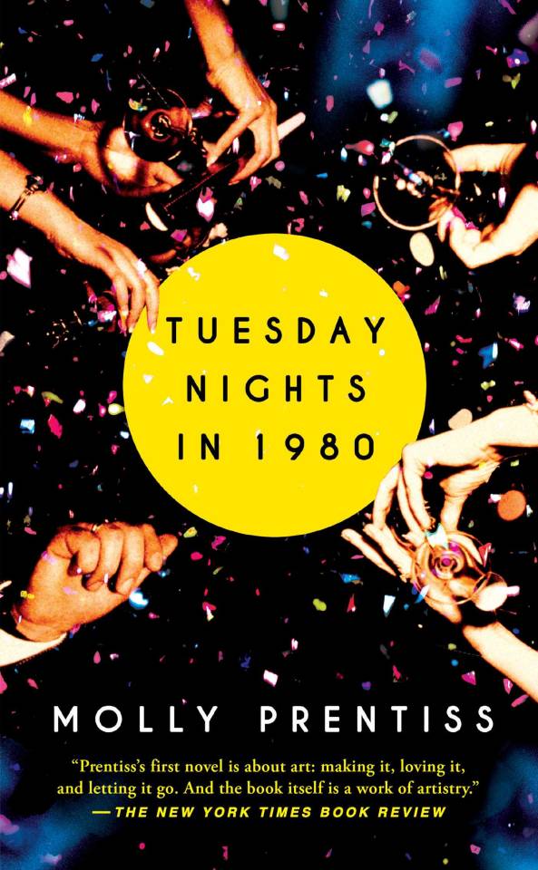
As is the case for most readers, I assume, the cover of a book draws me in, but the cover copy decides whether or not I'll read the book. Thus, as soon as Tuesday Nights in 1980's cover copy compared it to Jennifer Egan’s A Visit from the Goon Squad, I inwardly groaned, and, had I not received my copy free through YPG's Little Big Mouth program, I would have put the book down right then. I can’t stand stories where the POV characters' narratives are removed from one another only to intersect due to the contrivances of "fate" (i.e. the author). Which is why, although I know that it's among many people's favorite Christmas movies, I really disliked Love Actually, even more so than A Visit from the Goon Squad.
However, as previously mentioned (here and here), with free books, I'm not picky.
So I dove in, and considering how much I ended up loving this book - it may be one of my favorites of the year, if not of all-time - I'm thinking that in the future I shouldn't judge a book by its cover or by its cover copy. (But then how will I choose which books to read, you ask? Solution: just read everything.)
I can best convey the experience of reading this book as follows:
Eyes: Glazing over every time this motif recurred. Tearing up when the characters were at their most desperate.
Ears: Distantly aware of the praise that will undoubtedly be heaped upon this debut novel and its author for her experimental writing techniques.
Mouth: Opening in awe of the author's talent at times and yawning at others. Silently screaming at Lucy, whom I found insufferable for all of the reasons that Engales ultimately did, even if it is believable for the youngest character to be naive and idealistic and dependent on others to define her:
Face: Turning the pages frantically, sometimes prematurely, to find out what would happen next. Then, as I neared the end, turning pages more slowly to prolong reading the book.
Heart: The same one beating in the chests of all of the POV characters. The same one bleeding onto the page through the author's pen.
Kind of a cool method of reviewing a book, right? Now imagine that I used this technique three or four more times during this review. Would it still be cool?
Then again, if Prentiss intended her writing itself to imitate art, then her repeated anatomical deconstruction of scenes is appropriate regardless of its subjective appeal: like art, these passages are, at their worst, obtuse and pretentious, but at their best, they're evocative and alive with meaning and sensation.
Most of the time, I adored the writing in this book, pausing to savor lines and mark their pages for later reference. Other times, the writing struck me as tedious and trying too hard. But the former instances surpassed the latter in frequency, and even when Prentiss's writing frustrated me, I always, always admired the effort and artistic ingenuity it displayed.
Aside from the writing, my favorite aspect of this story was its characters, as they read not so much as characters as they did people with lives and histories. The interview with Prentiss included in the back of the book revealed that it took her seven years to write Tuesday Nights in 1980, and that in that time, each character underwent several evolutions. I might've guessed the length of Prentiss's writing journey by how intimately she seems to know her characters.
I might've guessed it by how well she portrays their sadness too. Authors - and lowly writers like me - like to joke about the cruelty we inflict on our characters, but often I come away from a book with a sense that its author has tortured the characters merely because tragedy is more realistic and yet more literary than happiness. Not Prentiss though: she breaks her characters to great effect. I reveled in their brokenness. Had she made less bleak narrative choices, the book would not have been as powerful.
(What's with everyone in this book not feeling like eating when they're sad though? Could there not have been at least one character who gained rather than lost weight due to depression and loneliness? Or perhaps that's not how "beautiful" people grieve.)
Of all of the characters, none is more miserable than the setting, which, yes, is itself a character. Through her sensuous, affecting descriptions of New York City, Prentiss captures everything I love and hate about the place. If sometimes these descriptions tire or overwhelm, then this mirrors the sensory overload characteristic of the city. The below line, in particular, resonates with my image of New York City:
It was then, on his very first day, that he knew he had found his place in New York, a place for the deranged and wrecked and bold, a place where pity couldn't exist if it wanted to because there would have to be too much of it.
That is exactly how I feel when, every morning as I'm trekking to work from Penn Station, I avert my eyes from the numerous homeless people lining the sidewalks. I wonder, then, if I'm the only one purposefully ignoring them (and my conscience), if my fellow pedestrians no longer notice them at all. Each time I swallow my pity, choke it down until it settles uncomfortably yet harmlessly in the pit of my stomach, I think, "I couldn't give change to all of them, even if I wanted to." The same is true of emotional currency: there is a limit to how much sadness, how much sympathy, a person can feel and still have it be useful to the people to whom it's extended.
Don't misunderstand me: I'm not sharing this experience because I want anyone to feel sorry for me. I'm merely trying to illustrate, through this example, how profoundly I connected with Prentiss's portrayal of New York City and its inhabitants.
Perhaps that's the root of why this novel was more enjoyable for me than the structurally similar A Visit from the Goon Squad: unlike the latter, Tuesday Nights in 1980 is about poor, hopeless people. My people. The people I am and am surrounded by every day. People who have earned their sadness and thus can wear it more credibly than Egan’s white middle- and upper-class characters .
How much I liked it aside, this book has also helped me begin to overcome my writer's block. I probably sound like I'm full of crap, especially because I'm posting this review a week late, but hear me out. When, toward the end of the novel, James decides that it's worth writing merely because he can and Engales can no longer paint, I lingered on that sentiment for a long time. Strangely, I'd never thought of the act of creating from the perspective of someone who'd lost the ability to create. The tragedy of Engales's accident persuaded me like no other purely intellectual argument ever had that I should write as much as I can while I can, even if what I'm writing is complete and utter garbage, as I often deem it. Not only is there inherent value in the act of creating, but hey, I might be dead tomorrow! Barring my sudden and untimely death, I might grow old and get dementia; I might be young and get dementia. I might go blind, develop arthritis, lose a hand, and in any of these instances, how I wrote, if I still managed to write, would irrevocably change. Thus, I want to take full advantage of being able-minded and -bodied, because writing time is not infinite. (And to address the late blog post, despite what fiction would have us believe, revelations don't inspire immediate change: overcoming writer's block in order to write more consistently will be a slow process for me, for sure, but it's one that I'm committed to undergoing in a way that I wasn't before.)
Reading time isn't infinite either, which is why I rarely reread books anymore, but Tuesday Nights in 1980 is one book that I strongly believe would improve upon rereading. I mentioned in a previous blog post that I dislike it when I can visualize an author's notes while reading, but Prentiss is such a master at concealing hers that I think it might be fun to go back and try to reconstruct them with the novel’s resolution in mind. Aspects of the plot are somewhat predictable, but they didn't feel predictable while I was reading, which is what matters.
In conclusion, read this book, and, if you're both a reader and a writer like me, cry because you can never write anything as true or as beautiful as just one line from this novel.
Then be like me and James and try anyway.
#tuesdaynightsin1980#mollyprentiss#literaryfiction#books#bookreviews#reading#scoutpress#simonandschuster#ypg#littlebigmouth#publishing#avisitfromthegoonsquad#jenniferegan#loveactually
1 note
·
View note
Text
Introducing the Minimalist Oracle: An Interview with Rachel Lieberman
You might have noticed things have been a little quiet over here on the blog - and by a little quiet, I mean, yikes, I haven't posted since November. What's up with that? Well, I'd always rather save a post until I have something truly epic to share, and while that might not have been the case for the past couple of months, I definitely have something epic for you today!
I'm always on the lookout for new, independently published tarot and oracle decks that exemplify beautiful design and interesting, original ideas, so naturally when I came upon the Minimalist Oracle, I knew I had to have it! As is usually the way when I find a gorgeous new indie deck, I get a copy for myself, and a truckload for the shop, too.
What better way to get to know a new oracle deck than to chat to its creator? Today, we're joined by mystical creative person, Rachel Lieberman (clearly "mystical creative person" is the best descriptor of any artist I've interviewed so far!), who's here to tell us a bit about marrying up minimalist design and divination for deep soul work!
Welcome, Rachel! Tell us a little about yourself as an artist and oracle/tarot reader and human person.
Hi! Thank you so much for having me, Marianne, and for supporting what I have created. Let’s see – I live in Portland, Oregon, where I was born and grew up, though I’ve traveled and lived in lots of different parts of the USA and world. I have a very “normal” non-creative corporate day job as a Project Manager at a large translation company.
I live a sort of double life as a corporate employee and a mystical creative person, which I love. I am really inspired by aesthetically beautiful objects that also hold wisdom and meaning, so it would make sense that I would be drawn to tarot and oracle decks.
I actually knew absolutely nothing about tarot or divination or the mystical world until about two years ago when some unexpected life events introduced me to some unseen things I didn’t know existed. I wanted to make sense of what I was experiencing, so I turned to tools like tarot to help me process. This journey for me has turned out to be about self empowerment, self love, and some very painful but rewarding deep soul work, and the tarot was a very important guide for me.
Tell us a little about your creation, the Minimalist Oracle. Where did the inspiration for this deck first come from? What was the process of creating the deck like?
I knew I wanted to create this about a year and a half ago, but I wasn’t ready. I didn’t know how I would possibly translate the vision inside into something physical. By January of last year, the inner whisper to do it had turned into a scream, and I knew I needed to drop everything and make it happen, so I pretty much did literally that. Last minute I took a week off from my job, and spent the whole week shut in my apartment formulating what this might look like. I’ve always been attracted to minimalist art. I also loved tarot and oracle decks but wasn’t seeing something that I felt really reflected my aesthetic. So, I figured I would create it. That week I only accomplished a fraction of what would be the final deck, but at that point I knew I couldn’t stop. The art I put in the deck is a combination intuition and precise calculation. I would typically sit down and let myself go wild with the color, shape, etc. Then I would carefully edit it until I felt that the emotion I wanted to convey was distilled to the most simple and powerful form possible.
It took almost exactly a year to finish creating it, printing it, and launching it, and a lot of edits and changes took place along the way, but I made it happen! It’s exciting to do something completely new.
Backtracking a little bit, could you tell us a little about your artistic background, and how that has informed and influenced the way you envisioned and created your deck? What does your art practice look like, day-to-day?
To be honest, when I set out to create this, I really didn’t consider myself an artist. I’ve always felt the desire to create, but as an adult I didn’t make it a priority. In a way I think I had a fear and judgment of that impulse in myself, which actually has made this process even more powerful, so I’m thankful for it. Two years ago, I randomly found myself at a point in my life where I had a lot of solitude and space from the rest of the world. I started asking myself the big questions – what do I NEED to do with my life? The answer was – create something visual. So, I started painting, drawing, making paper cut outs, everything I could, just for the sheer joy of it. I had no direction or idea what I was doing, but I came home every night and worked a little bit. Eventually I found that I was getting better at taking what was in my head and finding some way to make it real.
Even now, I don’t create art everyday. Sometimes I don’t create anything for months at a time, though I think that is changing. I make sure to leave the space in my life for it, and when I feel the visceral need, I go for it. However, everyday I consume images through tumblr, instagram, blogs, pinterest. There is something inside of me that feels hungry for it, so I take a little time everyday to “feed” myself. This inspiration helps refine, expand, and stimulate my aesthetic sensibilities.
As much as you feel comfortable sharing it, what role (if any) does reading cards have in your own spiritual practice, and how has working with your own art - both making the deck and reading with it - in this setting influenced and shaped your personal journey?
This deck is, in many ways, based on my own personal journey. The cards I chose to create were themes or feelings I experienced in my own life as I decided to start overcoming fear, limited beliefs, and old patterns. Creating the deck actually helped me define and gain perspective on how I saw both myself and the world, which was really beneficial. In a way, tarot and oracle decks are an organization system for the most chaotic thing in the world – the human growth journey, in all its messy glory. To see my journey in a more objective way was helpful.
Holding my own physical deck for the first time when I printed a test copy was such a magical feeling. Then, I worked with the deck everyday on my own for months before finalizing it and printing it to be released to others. I wanted to make sure that every card’s message was clear and expressed exactly what I wanted to say. Creating this deck was a huge victory for me – it made me feel powerful, free, and confident. It has changed the way I view myself and the way I operate in the world. I’m so glad I get to share it with others but my own desire to make it and use it was really my motivation.
Because we at Two Sides Tarot can never resist a good deck recommendation, what are the tarot or oracle decks that you love to read with? Are there any decks that have been a big influence on the Minimalist Oracle?
The Osho Zen Tarot was my first deck and I would say it was my biggest inspiration for the Minimalist Oracle. It’s a quirky, playful deck with a lot of personality, and I love that about it, though I rarely use it anymore. All of the independently published decks are my favorite now – I met fellow Portlander and tarot deck creator Coleman Stevenson of The Dark Exact during this process, and I love her everything she creates, including her deck The Dark Exact Tarot. Right now I am loving Rachel Howe’s Small Spells Tarot, Spirit Speak’s Iris oracle deck, and the After Tarot.
Finally, how would you like to see the Minimalist Oracle used? Any pro tips for working with it?
I really wanted this deck to have a friendly, loving, but direct personality. It will tell you the truth, but in a thoughtful way. So, I hope that the owners of this deck develop a relationship with it as a companion. It’s a deck that can be used everyday, since it helps connect with emotions, and those are constantly changing. It’s also a great addition to tarot spreads, partially because the clean lines go nicely with almost any aesthetic, which was my intention.
I designed the packaging specifically so that it could withstand being thrown in my bag everyday and come along – it travels well. I bring mine with me everyday to work and draw a card or two for inspiration that day, or use it as a journaling aid. For me, personal growth is at its best when its practices are integrated into our day to day lives – not as something that is limited to any one time or place. Use this deck to turn anywhere into a sacred space for you to connect with yourself!
*
You can find out more about Rachel at her website, and I'm so happy to say that the Minimalist Oracle is in stock now at Two Sides Tarot!
Thoughts? Questions for Rachel? Reflections on these beautiful cards? Leave us a note in the comments or come and say hi on Twitter!
3 notes
·
View notes
Text
dev blog #0000 - Origin Story

You might have heard that I’m working on a video game. This is true. I am working with some utterly incredible folks on a video game. We call it Game One.
I’ve tried to get various game project started over the years. When I first got sick, I ended up with inflammation in my brain that messed me up somethin fierce. Reading, writing, programming, all gone. I worked really hard, and I got the writing back over half a decade or so. Reading too. Nowhere near as good as I was, but passable. Programming, though? That never came back. Maybe, with treatment. Maybe. It would be impossible without other people, though.
Every time I’d suggest a project--that first person XCOM, the tiny linear shooter, heck, the little business management game, the strategy game--people would get all enthusiastic about it, I’d draw up a design document, and, of course, nothing would come of it. Getting people organized online is like wrangling cats. The furthest we got, some art folks actually did art, didn’t tell anyone, played Minecraft, and wondered why we hadn’t made a game of the art we didn’t know existed.
Then along comes my friend Phillip Bastien. I’d hit on this new idea for a story, I thought it was great, I was telling him about it, and he goes silent. Something like ten minutes later, he hits me up with a drawing of a character I’ve been calling the Plague Knight. Not a great name, but it gets the job done, and the drawing? Well, wow. It was awesome.
One of the great things about Phillip is that he gets what’s in my head better than most. The only difference between my vision and his is that I had the guy with candles floating above the head, but I think Phillip’s version works better.
Here’s the most recent finished piece:
We tossed some stuff back and forth. Visuals started taking shape. I’m lucky to have a friend like Phillip. One thing I’ve learned is that the greatest physical motivator is having a visual. People don’t believe the game is real until they’ve got concept art. That’s the key thing. I’d never had good concept art before. Mine is awful, and I don’t know many artists willing to sketch some stuff up to help the project move along. This game would not have happened without Phillip.
It was readily apparent that this shooter was too big; I think an early description framed it as “an RPG shooter that blends elements of Halo, The Legend of Zelda, and Shadow of the Colossus with the movement of Mirror’s Edge” or something. Too big. Way too big. Not like the smaller games. Plus, single-player shooters don’t really sell that well unless they’re big, open-world titles with big brand names behind them.
I knew that making a competitive shooter was simpler--it’s why most mod teams (and Valve, which has that weird flat structure thing) work best with them--but competitive indie shooters don’t sell. There’s a reason most of you aren’t out there playing Nexuiz, Screencheat, Contagion, or Toxikk. Heck, competitive shooters rarely do well in any space.
Co-op I figured we could do. Payday: The Heist and Payday 2 had done pretty well, for instance. Borderlands games are pretty popular. Gamers seem to enjoy cooperative shooters, and good ones sell reasonably well. Horde was Gears of War 3′s biggest mode; Halo fans begged 343i for a return to Halo’s Firefight mode. This genre seemed like a great place to start. Plus, I, and the people I’d been talking about making a game with, were all experts in the cooperative shooter space. If there’s one style of game design we knew, it was this.

I had a world I liked. A visual approach that felt right. And the right genre. I took to calling it Game One, because nothing I tried felt right. Turns out some amazing friends, like my buddies Cameron, Kevin, and Jacob, were into it. We got started properly early in 2016, though various real-life events (graduation, moving, illness, computer death, learning how to use source control) conspired against us. Progress is being made. It’s slow-going, but it’s happening. This game is real.
I’m trying to describe a nonlinear process in a linear way; this may seem kinda disconnected because of that. Sorry. Things will start making more sense in future blog posts.
Personally, I don’t want to talk about the game world much; I don’t like reading about other people’s lore until they achieve the end result. In general, I think a lot of folks get caught up in talking about their lore and how interesting they think their lore is, and that’s all well and good, but it’s not what interests me. I’d rather surprise you with a cool universe you can explore in-game than go into detail about it right now. What I can do is tell you about the most interesting ideas.
Game design is, ultimately, a means of problem solving, and Game One is meant to address a bunch of problems, which I’ll talk about in the coming weeks.

Problem 1: The Abilities Need To Be Interesting
One of my comrades, Kevin, expressed a big problem he had with a lot of shooters, which is that a lot of characters have just one ability. In Borderlands, you pick a class, and that class uses that ability and that ability only. Same thing in Destiny. You have multiple sub-classes, but it takes time for abilities to charge, so when you switch sub-classes, you have to start over from 0, so effectively, you have just one ability in most missions.
This isn’t a bad style of design, mind you, but it is predominant, and it can get old after a while. We wanted to have provide players with a more interesting way to play.
Problem 2: The Guns Need To Be Interesting
You’d think this would be a given. If someone is making a shooter, shouldn’t their weapons be interesting? Unfortunately, way too many shooters utilize the same basic weapon paradigms; the resulting combat rarely requires thought from the players. How do you make shooter guns interesting again?
Problem 3: How to Eliminate The Boredom Created By Min-Maxers
One of my good friends became a bad person to play games with. He was directly responsible for my waning interest in Payday 2, because he wanted to play the same two missions over and over again, because this let him earn the maximum possible XP. This gets boring after a while because, well, you’re only playing two missions.
Destiny faces a similar problem, especially early on; repeating content gets boring, especially when it’s predictable. When content becomes repetitive, players naturally want to start optimizing. Pretty soon, Destiny got to a point where players all had to use similar loadouts (Gjallarhorn was the optimal rocket launcher, for instance) or risk being dissed by their peers. I remember playing one particular match where I started using a gun I liked, only to be asked, with disgust, why I would ever use that gun, when I should be using more ideal weaponry. “Because it’s fun” was met with jeers.
This goal was important to me personally; I’m a big shooter fan in part because I love shooting creatively. It’s frustrating to hear a friend say “this shooter was boring because I only used one gun the entire game, but it was the best gun.”
I think having a good metagame is important, but all too often, players find ways to run with optimal loadouts or play styles, and I wanted to do my best to circumvent that, encouraging players to try new things rather than doing the same thing over and over again.
Problem 4: Movement Needs To Make A Comeback
Shooters ought to have interesting movement. Since I started messing around with Game One, a bunch of games, like Destiny, Doom, and Titanfall have launched, pushing the need for movement into the foreground. Awesome. I still think there’s some room for improvement, so I’ll be talking about that at length really soon.

There’s a bunch of other stuff I could talk about, but that’s for future devblogs. Tonight, I just wanted to let you know what the plan is: in between my normal games criticism stuff, I’m going to start showing how I’m trying to practice what I preach, and, way more importantly, how absolutely incredible my brothers in arms are, and the lessons we’ve learned along the way.
Anyways, we’re making the game now. It’s a real thing. It’s playable. We’ve got dedicated servers working, and we can play the game together. It’s rough, of course (a lack of manpower working part time will do that to you), but it’s getting there. Hopefully, we’ll find a cool indie publisher willing to back us so we can get this thing out the door soon.
Stick around, would you?
2 notes
·
View notes
Link
The following blog post, unless otherwise noted, was written by a member of Gamasutra’s community.
The thoughts and opinions expressed are those of the writer and not Gamasutra or its parent company.
Despite being a fairly mediocre artist, I get a lot of comments and compliments on the artwork and visual design in Ikenfell. This makes me very happy, of course. Obviously, those who dislike it are much less likely to say so to me personally, but I love that lots of people are very receptive to the look and style of the game. I’ve been asked several times to talk about my approach to the pixel art, and what kinds of rules, palettes, and inspirations I use for the game. So this will be a large, orderless, and rambling post about all of that!
About Ikenfell
Perspective
Inspiration
Colours
Process
Characters
Portraits & Dialogue
Battles
Ikenfell is a heartwarming turn-based RPG about a school of magic and its troublesome students. It is currently in active development, and we're aiming for a 2018 release on Steam and the Humble Store. Humble Bundle Inc. is publishing the game.
Official Website / Official Press Kit
If you write about the game in a blog or article, please use assets from the official press kit!
A note about "good" pixel art
As with most art styles, there is a lot of contention about what good pixel art is and what best practices should be. I follow some general guidelines, but most of what I do is from just repeatedly doing lots of pixel art and tweaking my style until I get the results I desire. A lot of amazing pixel artists produce work that is far beyond my capabilities, but I do the best I can within my limits.
This overview is not about how to make good or popular pixel art, it is about my design decisions regarding my own game, my inspiration, and my reasoning behind them.
Now, let’s begin!
Ikenfell’s camera, like a lot of 2D games (especially RPGs), has a birds-eye view of the game world.
The camera is looking down at the world, if you imagined it in 3D, at about ~60 degrees (this is a rough estimate, in this screenshot alone you can see I am very liberal with the actual angle of objects). The projection is orthographic, meaning that as objects get further away from the camera, they do not actually look smaller (as in real life), they are “flattened” onto the screen.
Often game developers will just make 2D games and take all this for granted, and just draw the art, but I like to think about camera and perspective a lot, as it’s one of the key relationships in the game between the player and the world itself. Knowing the details of this relationship can make the difference sometime when you’re making a visual design decision, as even technical details can help you highlight where and when it’s most important to break these rules.
Ikenfell’s visual design is inspired by several games. I found a screenshot from each game that was relatively similar to the Ikenfell screenshot I posted above, so you can easily see where I drew ideas from each!
Link's Awakening
I love Link's Awakening’s extremely reserved use of tiles, and efficiency with space. Every room has an interesting shape, the background tiles use a very minimal amount of antialiasing to occasionally introduce interesting shapes and curves, and rooms are often reduced to their very basic ideas. But you don’t want multiple rooms to feel the exact same, and Link’s Awakening does this wonderfully. Here’s a simple 4-screen graveyard in the game:
This simple area is wonderful. You get an off-purple colour and haunted trees to give you a sense of unease (ghosts will pop out of graves and attack you, but the visuals make you ready for it). The little rubble tiles and weedy overgrowth convey that this is an old, run-down graveyard, not well-kept. The cliff in the bottom screens gives you a sense of location (the graveyard is on a raised-up plateau, giving some sense of the burial rites of whoever owned these graves). The exits to the left and top have different terrain types, indicating that this graveyard is a bridge from one area to another, so we know we’re leaving our previous location. And, finally, despite the 4-rooms containing all the same elements, they are each differently shaped and detailed. You have multiple paths to walk through each room, so there is no correct path, just a strange haunting area to navigate through (while avoiding mean ghosts).
I could talk this much about every single screen in Link’s Awakening, so I’ll stop now, but this kind of overthinking is what drives a lot of Ikenfell’s inspiration. What a gorgeous game.
Pokemon Ruby/Sapphire
While I am not particularly fond of the character designs (or the pixel art in general) of Pokemon Ruby/Sapphire, I do like their buildings and interiors a lot, so they served as inspiration for a lot of Ikenfell’s architecture.
I like how, to create the least amount of view-obstructing details, these games often just eliminate the side and bottom walls of interiors. In this screenshot, there’s some subtle shadows on the side to give a sense of the ceiling’s height, and the bare minimum amount of details scattered about to give a sense of this character’s lifestyle:
Interiors were often cramped, but so many buildings in this game have completely unique artwork, which was very inspiring. When a building or a house looked completely different from others, I was always inspired to search it, and it was always pleasing to explore its interior with its wonderful new details. This bike shop, with its tiled floor, yellow/orange highlights, thin interior walls, and details scattered about was such a cool looking little area:
This game inspired me to research dozens and dozens of building styles and designs, and always to try to make new houses, buildings, and interiors look and feel distinct.
Mother 3
The simple lines, bold flat blocks of color, and almost childish flat look of Mother 3 wonderfully disguises its immense cleverness and wonderful use of space. I thought this game was a huge step-up visually from Earthbound, and if, after playing, you go back and just look at a few rooms, you start to see how nicely arranged a lot of them truly are.
Just like in the above screenshot, this screenshot below shows another night-time scene. Rather than use a real lighting system (difficult on a small system like the GBA), the game uses beautiful blue/purple palettes for dark areas.
The game just has this wonderful way of breaking up monotony as well. In the next screenshot, it’s a simple room with a stairway leading up to a door. But the building is run-down, so they create little 3D indents in the walls, break off pieces of the siding, carpet the stairs, stain the walls, and just create a series of interesting edges that turn a room that would look very boring into a very visually appealing place to walk through. All you have to do here is hold right, but somehow it feels like so much more, this place has a history and you can feel it down to its very skeleton.
The dark outlines around characters and objects in Ikenfell is very inspired by Mother 3, as well as the bold colours and inner-edge lighting. If you look at this side-by-side comparison (Mother 3 on the left, Ikenfell on the right), you can see how solid objects have dark outlines at their edges, but edges inside the sprite use a highlight colour instead, rather than another dark line cutting across them.
I really like how minimal this is, makes objects seem whole, and gives a strong sense of shape and body to things without cluttering them up with detail. If all the edges of an object use dark line, even in their interior, they tend to look really messy and ugly when done at such a low resolution.
Minish Cap
This game is so utterly gorgeous, I wish I could do it any justice by saying I’m very inspired by its visuals, but I can’t really. I often look at dungeons, buildings, forests, and mountains of this game when creating artwork for Ikenfell, but rarely can I even come close to making it look even remotely as good.
When colouring, I like to look at this game, because it does a wonderful job of ramps. The way these trees darken closer to their base is just beautiful, and the little way so much detail is suggested rather than shown is expertly done. Notice how the grass is mostly flat, but there are just a few tufts here and there?
Minish Cap, like Mother 3, also makes tremendous use of huge bodies of flat colour. Detail is often suggested with little bits, like the clouds in the screenshot above. It also serves a helpful gameplay purpose: very often, flat coloured areas are places you can walk, and highly textured objects and tiles are solid. I take great inspiration from this when pixelling Ikenfell's scenery.
Ikenfell actually does the inverse of this. Often, floors and the ground are textured, but objects like furniture and walls are flat, so they look like big obstructing blocks of colour, and you know you cannot pass them. If we highlight all the large flat blocks of colour in this room, we can see a very clear shape, making the room very easy to read, despite being cluttered with a lot of details and characters.
So while I take a lot of inspiration from the games above, and it is very clear how they inspired me, I quite often will deviate from their rules where I feel it works best for my game. By doing so, I have a huge amount of other screenshots and locations from those games I can look at for reference, but I’ve managed to give the game its own unique look and feel, despite having very strong influences.
I find colouring very difficult, and it often takes me a ton of experimentation to end up with something I’m happy with. In Ikenfell, lots of the areas will still probably be changed and re-coloured a lot before the game is done, but I still have a few patterns I find myself repeating.
Most areas of Ikenfell can be divided into two colour groups: a base and a highlight. There is usually one or two base colors, and one or two highlights. Here are a few screenshots and their respective main colour pairings:
Here’s an image that shows my general process when creating environment tiles for a new area. I usually pixel a room, and then break it up into tiles after I know what I want it to look like. Then I can use those tiles to piece together new rooms.
Here is an animated version of that same image, so you can see how each step improves the look:
This example environment doesn’t really have much colour. Sometimes I colour it right away, other times I’ll just work with values (like the above example) and then colour it after. It depends how I’m feeling, and how complex the tiles are.
Since the entire game occurs in a single place, the titular school of magic itself, it’s quite a contained story. This makes character design really fun, because I don’t have sprawling cities or huge towns to worry about. There are probably only about 30–40 characters in Ikenfell, and each has a unique design. There is no character template I use, I pixel each one from scratch, and usually have a couple others next to it for reference so I can make sure it fits in the game.
Here you can see twelve of the game’s characters and their respective silhouettes. The legs are the only thing that they really all have in common, and looks kinda templated. If I was able to start the game from scratch again, I think I would like to play around with size more (make kids shorter, have fatter characters be fatter, and taller characters be taller, muscular/etc.) With so few characters, though, they’re all very identifiable, so I’m pretty happy with them like this.
Not much else to say here. You’ll notice that most characters also follow a two/three-colour scheme. The choice to leave out eyes was because their sprites are too small: eyes ended up just looking the same on all characters (which I didn’t like), or they were comically large. Since the game has portraits during conversations, I felt like it was more important to emphasize their faces and expressions there.
Speaking of which…
For a good several months of development, Ikenfell actually didn’t have portraits for dialogue. The sprites would just move around and have conversations, and that was it. I didn’t have confidence to draw large character portraits (I am terrible at drawing humans and anatomy), and I already felt like the game was becoming too large for me to handle.
But, on a whim one day, I drew little portraits for each of the main characters in my notepad, with a pencil. I loved how these little drawings looked, so I drew them again with a few expressions, and I couldn’t unsee them. I decided that it’d be a lot easier to pixel them if I drew them in pencil first, then translated that to pixel art, which is how I’ve done most of the character portraits now.
Here are a few and their respective silhouettes. Notice that every single character is asymmetrical. I learned early on that if a character’s left/right side is a mirror-image, they look really creepy and strange. This is probably normal art school stuff, but I learned it the hard way.
I’m very happy I did this. I think the characters come alive so much more when you see them talking and expressing themselves like this, and now I can’t even imagine the game without it.
Here you can see how they look in action. The portrait and the textbox slide in, but there is no text immediately. Your eye goes to their face, so you first see their expression. Then the text prints out, and your eye naturally moves to follow it. I pushed the face down into the textbox, instead of on top of it, to reduce how much screen space the dialogue took up as much as possible.
Characters can only speak in short sentences this way, longer sentences being broken into multiple chunks, but this allows me to shift between micro-expressions while they talk. Here you can see Maritte’s anger transition into more of a general frustration, which is a lot easier to notice than if it only had the text.
When I originally was working on the game, it was actually an action RPG, more like Link’s Awakening. It was quite a few months into development before I had some issues with this, and transitioned the game into a turn-based tactical RPG instead.
The reason for this was that I didn’t like how, because the gameplay took place in the school itself, all the rooms had to be designed for fighting and maximum movement. Interesting room shapes and cramped spaces suddenly weren’t viable when I wanted them to be, because real-time fighting wasn’t very fun or interesting in those kinds of rooms.
So I moved battles into a completely separate screen, which allows me to design them however I want, while also designing the overworld to be whatever shape I want as well. The battles are much different than the overworld. Suddenly the graphics are huge and details, and the characters are much more animated and alive!
These battles are 12 x 3 tiles, so they are much more horizontal than vertical. Because of this, characters can also only face left and right. This means I can flip animations, greatly reducing my workload. You’ll also notice that the battlefield is skewed as well, but why?
If we remove the skew, it becomes readily apparent:
Without the skew, we have a problem with occlusion: characters on a tile immediately above another character are almost completely covered if the sprite is large. As soon as we skew the battlefield, though…
We no longer have this problem, since characters can only ever be vertically aligned if they are two tiles apart, and most sprites aren’t tall enough for that to be an issue. I also think it simply makes battles look more dynamic and exciting anyway.
I hope you enjoyed reading this! There’s a lot more to talk about, but this is a simple overview to explain a lot of my graphical choices while designing the game. I might do some smaller posts talking a bit more about the technical details of how I approach the pixel art, but this was a good introduction.
I can’t wait until you can all play this game! I’m having so much fun working on it, I hope you enjoy it when it is released. Please email me if you have questions about anything, my inbox is always open.
@ChevyRay / [email protected]
Artwork by Darcy Dee
0 notes
Photo

Наслов: Inclusive Illustrations, By Design, Линк: http://ift.tt/2pgc4Tg , Садржај:
I like to think that designers solve problems, while artists ask questions. And when the two go hand-in-hand, real magic happens. Why? Because the right question gets answered with the right solution — art asks, and design responds.
Here at Automattic we were extremely fortunate to recently get to partner with independent artist and designer Alice Lee, who seamlessly integrates abstract ideas with concrete solutions. The following is an interview with Alice that is followed by another interview with Joan Rho, the designer who led the project.
JM: How did you become an illustrator?
AL: My path is a little nontraditional. I was always an artistically curious kid growing up, but was never of the “stand-out art star” variety. Rather, I went to business school, and after graduating, I worked at Dropbox as an early product designer.
Some of my first few projects there involved designing for externally facing projects (new user education, onboarding flows, home & landing pages), and I found that adding illustrations really elevated my work — understandably, no one wants to read paragraphs of text describing file sharing. At the time, there weren’t any dedicated full-time illustrators on the team, so I decided to just do it myself, learning as much as possible on the side and receiving guidance from teammates. Eventually I transitioned over into brand and communications design at Dropbox, working full-time as a product illustrator. I left to freelance almost three years ago and have been illustrating since!
JM: I’ve found that many people confuse an illustrator as someone who is “good at drawing.” I’ve found that description to be terribly narrow-minded. Anything to add?
AL: That’s a really interesting question because it describes two key qualities to being an illustrator. The first is the technical ability to draw — one doesn’t necessarily need to be the “second coming of art,” but it is important to possess a foundation in basic draftsmanship. The second is the conceptual ability to think like a designer — as an illustrator, you’re interpreting challenging design prompts and figuring out how to present visual ideas that often represent complex topics.
Having one piece but not the other is extremely limiting; a great illustrator balances and sharpens both. If you have more of the technical art / draftsmanship piece, this limits the type of high-level projects that you can take on and requires a heavy hand by an art director to guide you through. If you’re more of a conceptual thinker but lack drawing fundamentals, it limits the way that you can express your ideas — e.g. perhaps you can only work in a few basic styles. It’s never so black-and-white, of course, but putting the two together in illustration yields high-quality, conceptually brilliant work.
JM: Having worked in the technology world for many years, what recurring patterns have you seen in the kinds of commissions you’ve been awarded?
AL: I’m excited by the fact that illustration has become a huge part of the tech branding landscape; so many companies are incorporating illustration as keystones of their brand. Companies are now developing their own unique illustration styles that build into their brand voice, exploring different mediums, differentiating themselves, etc.
This is exciting to me because I love to work in a variety of styles and mediums; it’s a great feeling to extend yourself as an artist. Many of my recent projects have involved building illustration branding systems in addition to creating the illustrations themselves, and I love bring analog media and textures into a traditionally vector world. We experimented with this a bit on this WordPress.com illustration branding project, of adding a subtle, candid brush stroke to accent vectorized, precise shapes. With little touches here and there, under an editing eye, this interplay between mixed media does a lot to elevate what an illustrative voice is saying.
JM: Tell me about your commission from Automattic.
AL: This project had two parts: 1) the first, building out an illustration branding system: the voice and style guidelines for how to create illustrations that extended the brand; 2) the second, producing 50+ illustrations that expressed this style to be used for the product and marketing collateral.
We went through lengthy explorations of the illustration style: what brand did we want to express, and how could it be expressed visually? A key tension was in balancing the friendly, fun, accessible direction of the brand with the business need of still being professional and refined. In many ways, our final output reflects this: it’s a combination of sturdy, grounded shapes that fill out most of the composition, guided by the expressiveness and imperfection of linework that adds in quirky detail. The solidness of these geometric shapes is still tied in to the prior style of illustration used in the product, but the linework adds in personality, playfulness, and a hand-drawn quality.
JM: What was the same with respect to your past work for tech companies, and what was different?
AL: One thing I’ve noticed is that this balance of “warm, relatable, friendly, fun” and “polished, serious” is a common tension in past work for tech companies. I think this is due to a few factors: first, it’s a natural tension to exist when you’re trying to express complicated, often technical concepts via visually appealing illustrations. Second, though I work with each company’s unique brand voice, you can still see my personal voice coming through across all of my work: energetic, bright, and purposeful.
Something different that I loved was how the team uses the WordPress product to document and comment on the design process, because everyone is remote! We had a central illustration blog where I would post up each round of exploration, pose questions to the team, and receive feedback. At the end of each major deliverable, it was nice to look back on the progression and evolution of the style and work produced. It was a very structured way to document the process, which is lacking when your working files exist solely in emails or asynchronous chat tools.
JM: How did it feel to be pushed harder on the inclusion question?
AL: It was something that I deeply appreciated. We all carry our own internal assumptions and biases; and just like in design, assumptions should be challenged and improved with different perspectives, user research, and critical thinking.
For instance, John, you had just gotten back from doing user research in the field, talking to small mom and pop shops and individual entrepreneurs in the suburbs. In some early illustrations, I had drawn a lot of younger characters sipping coffee on their computers to illustrate people working on WordPress.com, and you challenged the “perfect latte / laptop world” that is a common backdrop in tech illustrations.
This made me realize that there was a whole range of characteristics I was missing from my internal definition of inclusiveness in illustration, due to my own biases: age, occupation, location, lifestyle, socioeconomic background, etc. I worked to place characters outside of the “perfect latte / laptop world,” drawing different backdrops in the larger scenes, expressing different jobs and backgrounds through props and attire, and including a section on how to depict age in the style guide.
JM: What is difficult about taking this direction? And what is easier?
AL: It is always challenging but necessary to address your own biases and assumptions in order to produce better work. In the above example, for instance, user research about who actually uses the product helped inform what the brand illustrations looked like — which in turn results in visuals that are more in line with the business objective of catering to the actual users.
It can be difficult because it’s also personal: the biases in a person’s artwork can also reflect their personal biases. Sometimes it can be hard to be challenged on that, but it’s necessary to acknowledge and no one is ever finished with this journey. I also think it is easier to start with inclusion and representation as core values than it is to tack it on after you’ve finished the branding process.
JM: What are your hopes for how people use this language you’ve produced for us?
AL: Artistically, I hope that this language can be extended and applied across the platform by many collaborators: designers, illustrators, animators, etc. I always love to see how a style evolves, and I also think it is really cool to have distinct mini-styles within a larger brand family — so that would be neat to see.
Socially, I hope that we can use these conversations around inclusivity to spark a larger dialogue in the illustration community about what it means to be inclusive in the work we produce. For instance, I personally rarely see people of color depicted in tech product illustrations (or, on a personal note, even Asian characters). When John pointed out the “perfect beautiful latte / laptop world” bias that’s common in tech illustration, I sat back and thought to myself, “you’re so right!” It made me realize some of my own assumptions about what should be depicted in illustration, and I hope that we can continually challenge each other within the illustration community.
Just like photographers, art directors, and designers, we as illustrators have the power to be thoughtful and inclusive in our work, to create artwork that shows people that anyone can use these products, not just a certain perceived stereotype of who “should” be.
I’ve found over the years that behind every innovative project launched by a company partnering with an outside artist, there’s a special somebody within the company who cared enough to make the case for doing things differently. That person, in the case of this project, is Joan Rho — one of our new Marketing Designers here at Automattic.
JM: How did you come by the work of Alice Lee?
JR: I’d seen Alice’s illustration work before and admired both the quality of her work and range of styles she was able to execute. After a brief initial chat with her about her work, her process, and learning that she was already familiar with our platform having been a longtime blogger on WordPress.com, I could tell she’d be a great collaborator who could help us elevate and unify our brand’s visual language.
JM: What is “design”?
JR: It’s communication, it’s innovation, it’s aesthetics, it’s optimization, and it’s strategic. Design shapes the way a message or experience is delivered. Good design is informed by human behavior—it makes things easier to use, more intuitive, and more enjoyable to experience.
JM: Can you describe the development of this project — from its conception to completion?
JR: Our company, Automattic, was founded on open-source principles: community, collaboration, and hard work. We’re fully distributed with our ~550 employees spanning the globe representing over 50 countries and over 76 different languages. WordPress.com, our major product in our family of offerings, is powered by WordPress, the open-source software project (which was co-founded by our CEO). WordPress.com has been around since 2005 and is primarily known as a powerful blogging platform. However, these days, you can use WordPress.com to do much more—such as starting a website for your business, creating a portfolio, or even just getting a domain name. So, as part of updating our message to communicate this better, we wanted our visual language to also reflect what we stand for and what we offer.
This illustration project was a collaborative effort that looped in many different members of our Automattic team spanning various timezones, cultures, and backgrounds. Some of our collaborators weren’t even designers, but one thing they all had in common was that they intimately knew WordPress.com and Automattic, which helped me greatly as a relative newcomer to the company. I had the benefit of working closely with Kjell Reigstad, a more veteran designer on the team, who was my “brand partner” in this project from the start. Kjell’s knowledge of our brand’s history helped us develop an illustration language that combined a geometric style in line with how we historically represented the WordPress.com brand with a newer, organic style that felt more distinctive and embodied our brand values and personality.
JM: What are a few turning points in its evolution where you saw “inclusion” coming into the picture?
JR: During one of our creative reviews, we were exploring the representation of human characters (which we hadn’t ever used before across our site pages or UI) and it was actually a comment by you, John, that initiated the discussion of introducing more diversity in skin tones, body types, hair color, age, etc. into these characters. Many Automatticians joined the conversation thanks to a prompt by Mel Choyce, sharing personal stories and pictures of themselves and their friends representing a wide variety of people, backgrounds, and personal styles. This provided inspiration for the diverse cast of characters you can now see across our brand illustrations. As a minority female who grew up seeing mostly Caucasians represented in media and design, it’s been very rewarding to help shape a more inclusive brand identity.
JM: When you consider our company, as a fellow newbie as we joined around the same time last year, what lessons do you take away from leading this project with Alice?
JR: Your best work will always be the result of collaboration. Great collaboration happens only with equal trust, respect, and engagement from everyone involved. Leadership isn’t about bossing people around; it’s about fostering an environment that encourages great collaboration.
JM: Any shoutouts for other designers who participated in this work?
JR: Shoutout to Alice Lee, Kjell Reigstad, Ballio Chan, John Maeda, Ashleigh Axios, Dave Whitley, Davide Casali, Mel Choyce, and all of the Automatticians who participated in the brand discussions and creative reviews throughout the process.
You can find these new illustrations by Alice Lee on any of our main pages, such as /create-website, /create-blog, /business, /personal, /easy, /premium, and more!
And you can read the complete story behind these illustrations at Alice Lee’s site right here from the same titled post, Inclusiveness in Illustration.
Filed under: Design, Diversity & Inclusion, WordPress.com
0 notes
Last Seen Blogs

depuertoplata-blog
depuertoplata

moomin279
I am not a dreamer, I am a football romantic

female-led-couple
👠Female led Relationship🔐

joaodunne-blog
FREE APPS FOR PC DOWNLOAD

hyosaegi
ᴇᴜɴᴏɪᴀ