#i didnt like the lighting in the reference image so i used a different and more epic one
Explore tagged Tumblr posts
Text

incredibox secret santa gift for @totallyredacted!!! this was super fun :D
#incredibox#incredibox fanart#ourbox#luis castillo#carlisle cabot#theyre so cute i wish straight people were real/lh#i didnt like the lighting in the reference image so i used a different and more epic one#theyre so <3<3<3#i was so excited to paint this i literally pogged when i realized i got redacted as the person im drawing for#sparks creations#art
33 notes
·
View notes
Text
Zhongli's Dragon, Part 2: Appetizer
◆I did not expect so many people to like this story so far wowowow <:3 !! this part ended up being a bit longer than expected, but nonetheless still good :D◆
◆cw: smut ft dom!zhongli x sub!reader, reader is half dragon, breeding kink (?), size difference, oral (reader giving), pet name use (good girl), swallowing, probably more qwq
◆NSFW under "Keep Reading"
series tag: #◆zhongli's dragon
◆◇◇◇◇◇◇◇◇◇◇◇◇◇◇◇◇◇◇◇◇◇◆
◆A/N: For reference, reader is a dragon girl :D you have little horns on your forehead that point up and back, long thin fluffy ears on the sides of your head, sharp teeth, clawed hands, little dragon wings, and a dramatically long fluffy tail with two rows of dorsal spikes similar to te scutes on a crocodile tail.◆
You felt frozen in time. It was as though the heat of the moment had paused everything in the universe except for the two of you.
Zhongli couldnt help but to chuckle at just how flustered you were as his gloved hand ran down to the small of your back to pull your body flush against his, causing you to yelp in surprise. He tenderly stroked your long, silky-soft ear between his thumb and index finger as he gazed down into your blown out pupils, "You can breathe, (y/n), there is no need to be so shy. Must i point out the obvious?" he taunted, slowly lowering his face so his lips were only a breath away from yours. You took a deep breath, daringly placing your clawed hands against his chest- it was warmer than you expected, inviting, even.
"I-I dont know what you mean, but..." you trailed off, the tip of your lengthy tail wagging as it snaked around his thigh and gently squeezed, egging him on, "Id like to be informed, i-if you dont mind." A gentle smile crossed your lips and your half-hooded gaze met his.
Your brave attempts at seduction were more than successful, earning yourself a light kiss on the lips as his hand left your ear and lifted your chin to meet his. He was much taller than you, so he still had to bend down, but he didnt mind at all- in fact, he preferred it. Zhongli always found it amusing how you looked up to him with those big doe eyes, your cheeks always tinted a light pink and your voice nothing more than a sheepish peep. The way you flinched at even the most gentle of touches- a light pat on the shoulder, a kind nudge, even when he offered to fix the messy fur on your ears when youd arrive late due to sleeping in (which was a common occurance. Being a nocturnal species of dragon, you often found yourself accidentally staying up far too late into the night)- it never ceased to remind him of just how adorable you truly were. Though he would find it difficult to admit, every once in a while Zhongli would fantasize about making you his. The mental image of your pretty little face making lewd expressions, your soft voice panting his name, your body craving his as much as he craved yours- it only made him all the more protective and possessive of you.
You eagerly kissed Zhongli back as though you were starved of physical affection. He easily took notice, the hand that was once on the small of your back moving up to tease the insides of your wings, causing you to gasp and fall onto his chest, "Z-Zhongli..!" embarrassed, you blushed heavily and attempted to lift yourself off of him, but his firm hand told you to stay where you were as it continued to play with your sensitive wings.
"Please, allow yourself to relax, (y/n). There is no need for such struggle," he cooed, his voice hot against your neck before his lips connected with your soft skin. You lifted your head a bit more, allowing him easier access. You whimpered and whined as he licked, sucked, and gently nibbled at your neck and shoulder, practically eating you up. He fondled your wing more intensely while his free hand squeezed your inner thigh, pushing a soft moan from deep within your throat. Zhongli knew exactly how to rial you up, and you expected nothing less. Only dragons knew just how sensitive to touch the inner wings were. You leaned further onto his chest, holding his upper arms with your hands to ground yourself as the heat of your core grew to an uncomfortable point. As if out of your control, one of your hands moved down to his hip, your claws tracing a feather-light trail before landing on his hip dangerously close to the hem of his pants.
"So eager already, are we?" he teased, his forked tongue licking up the full length of your neck before his teeth landed on your ear and gently nipped at it. Your breathing deepened and you nodded, your fingers fingers slightly dipping under the band of his pants.
"I-I want... to taste it..." you nervously pleaded. Zhongli sat up, a lustful string of saliva momentarily webbing between his tongue and your neck.
"You want to taste what, (y/n)?" he said, a devious smile playing at his mouth. His thumb ran over your lips before pushing into your mouth, swiping over your teeth as if to examine them. The simple action caused you to whimper, betraying just how needy you had become and just how much power he had over you. "If you would like something, you must be more specific. So, do tell me what it is you so eagerly want a taste of?"
Youd be lying to yourself if you said his teasing didnt turn you on 10x over. You opened your mouth for his fingers, baring your sharp little teeth for him as though you could read his mind, "Please, I-Id like to taste you, Zhongli..." you said, breathless. Your tail tightened around his thigh and your wings twitched with apprehension, the feeling of his thumb and forefinger caressing each and every inch of it causing you to let go of any dignity you may have still held onto.
Zhongli lifted an unsatisfied brow as he pushed his thumb against your forked tongue and lifted your chin up for a better view of your adorably needy expression, "Hmmm... I still dont quite understand what you are getting at, my dear (y/n). What part of me, exactly, do you so hungrily want a taste of?" he demanded, fingering the inside of your cheek open. He knew what you wanted and he wanted it just as much, but the sight of you so desperately begging for it amused him and caused a sense of power to flow through his already aroused mind.
You couldnt help but to whimper, your fingers wrapping around the edge of his pants as your brows slightly furrowed together. You couldnt take it anymore, his intoxicatingly arousing pheromones pushing you past the point of no return. You needed him, needed to taste him, needed him to use you. "I want to taste your cock, please, i want it in my mouth, to feel it on my tongue, i want you to hold my horns and fuck my throat like im nothing but a toy," you burst out, surprising even yourself.
Your eyes widened and your ears flattened back as you realized just how desperate you sounded, but before you could even speak, Zhongli's tongue dove into the far corners of your mouth in a passionate, rough kiss. You instantly melted into his dominant grasp, kissing him back with furvor and moaning into his mouth as his strong hand ran up the inside of your thigh, squeezing and massaging in all the right places. Your fruitless grasp on Zhongli's arm tightened as he bucked his hips against yours, allowing you to feel just how hard he was. All of the combined arousing sensations made your lower stomach tighten. He kissed you ferventhly, tasting and feeling every corner of your mouth with his tongue before breaking the kiss and stepping back, leaving you cold. Your body begged for the return of Zhonglis firm hands and for more attention, causing you to whimper as your eyes meet his.
"I must say, you have more than earned what you beg for," he chuckled, amused by your neediness. He motioned for you to hop off the desk and get on your knees before him, and you followed his command without hesitation. Your claws wrapped around the hem of his pants a final time to tug them down, freeing his already precum slicked member from their cruel confines. It didnt matter that you had never mated before- your instincts took over the moment his mouth watering pheromones flooded your mind.
"S-so big, I...." you licked your lips hungily as one hand found itself already stroking his length, "I need to taste it, please, Zhongli," you whined, earning a smirk from the tall-statured archon as his hands wrapped around your cute little horns. Your claws dropped to hold his thighs as your gaze briefly flicked down to the tantalizing treat just inches from your nose.
"Open wide, (y/n)~"
Without so much as a word, your mouth opened and your forked tongue lolled out, hot strands of saliva making it all the more inviting. Zhongli grinned at the sight, pulling you by your horns to land your mouth over the throbbing tip of his cock before beginning to fuck your face, "Mmmh, good girl," he groaned in pleasure.
You never broke eye contact with him as he fucked deeper and deeper into your throat, though it was evident that you were as blissfully cock-drunken as you could get at the moment. The way your tongue traced every vein, every dip, every curve, the way your lips sucked so eagerly with each pull he made out of your throat, only to reward him with a breathless, slutty moan as he bucked back into your mouth, the way tears welled in the corners of your eyes and drool made messy trails down your chin- it made it so, so hard for him to not pin you down and fuck you without mercy right then and there.
Your grip on Zhongli's thighs intensified and your whimpering moans became more frequent as he pulled your horns harder and sped up, his head tilting back as he grunted with bliss, "Mmh, (y/n), your throat is so tight around me..." Zhongli growled, his cock twitching as the thrusts gradually became erratic, "Be a good little girl and swallow every last bit of my cum," he shakily said between merciless thrusts. You nodded and he managed a couple more rough thrusts before pushing your head all the way down his impressive length, filling your mouth with his hot seed. You couldnt help but to gag as Zhongli's throbbing tip hit the back of your throat, but you fought against the sensation and sucked the last remnants of his salty nectar out of his still twitching member, swallowing all of it just as he commanded.
Zhongli kept himself inside your mouth for a few moments more, gazing down as though to memorize the incredibly lewd, satisfied face you were making. He eventually pulled his hips back, a steaming strand of saliva webbing from your drool-laden lips to the tip of his still hard cock. You panted, your heart racing and your belly full, and looked up to him. He crouched down, wiping tears from your eyes and slobber from your lips with a sadistic smirk painted across his lips.
"My, my, (y/n). You were such a good girl for me," He cooed, leaning in closer to lick the now dry, salty tear trail from your cheek. The way his long, forked tongue swiped over your face made your core throb- and Zhongli took notice. His hands dangerously roamed your thighs and he leaned into your fluffy dragon ear, his voice husky and low.
"Now, you must agree, its only fair that i get to do a taste test as well~"
◆◇◇◇◇◇◇◇◇◇◇◇◇◇◇◇◇◇◇◇◇◇◆

#zhongli x reader#zhongli smut#zhongli#genshin x reader#genshin fanfic#genshin smut#genshin impact smut#genshin impact x you#smut#◆zhongli's dragon
502 notes
·
View notes
Note
Hii first of all, I FUCKIN LOVE YOUR ART! ITS GORGEOUS AND IM SURE EVERYONE CAN UNDERSTAND YOU REALLY GIVE YOUR SOUL INTO THAT🤧 Your color palette looks so good, What do you pay attention to when painting? (Like when do you think its better to use multiply or something like that and etc.)
first off, I'M HAPPY YOU CAN TELL THAT I PUT MY SOUL INTO MY ART!!! im genuinely in love with drawing and am always finding ways to make creating art enjoyable and impress myself with what i can achieve and learn :D
second, thanks for asking your question!! i dont mind answering it, but my response is quite long. here's my thinking process:
(you specified layer modes like multiply, so im gonna gear my answer towards that a bit) 1. REFERENCE SEARCHING IS KING. color is actually extremely hard for me, so i search around for artworks with palettes i'd like to use and study how an artist uses it. some situations i have a clear idea of what i want, but usually the images in my head are extremely vague, so i borrow palettes from various other artworks that fit the vibe of what i want. an example is this one. my main palette reference were from these artworks. im looking at this artist's use of high saturates and how drawings are overlayed on top of each other. while looking at references, im asking myself how is this artist using warm/cools, where are these warm/cools placed, if their illustration used any form of texturing (like halftones, hatching), how do they use their palette to render form/shape/gradient, when/where do they saturate/desaturate their colors. those questions inform my decisions when using colors too.
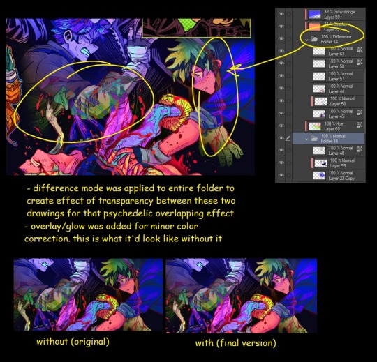
2. USING LAYER MODES WHEN NECESSARY. i used to be reliant on multiply for everything, which atp i dont do since i can definitely push colors more first before using layer modes. only when i feel like my current colors are lacking do i start tinkering with tone curves and/or brightness/contrast/hue/saturation/luminosity settings. and if that doesn't work, then i start using layer modes. using layer modes do help with achieving certain effects, color corrections, or when i want to fuck around and find out. i think having a better understanding of what these modes can do makes you more decisive on how you can properly utilize them and to achieve a particular look (like using multiply for a cel shaded style). here's an example:
this leads into my next point:
3. BALANCING OUT VALUES. big thing that makes an illustration hard to read is if values blend together which affects the hues and contrast. i check for what elements need to be distinguished from one another and if it can be read clearly. using layer modes can either help with this or not help at all. it's very dependent on the type of layer mode. here's this example where i applied pin light:

back to #2, there are various instances where i'm using layer modes for quick color corrections and/or to help with readability:


other times, i start off having my entire subject in gray and to figure out main shadow/lights (similar to the multiply cel shaded process i linked ealier). im thinking about what this should look like if i only used 2 value tones:


when in doubt though, i check my artwork in grayscale to ensure values aren't overly blended into each other, especially if i didnt start with grayscale like this one:

painting for me takes into consideration a lot of different aspects. im thinking about how colors should interact, where/when to give contrast, checking/balancing out values, etc, but im also making it a time to study off of how other artists use their colors through the references i collected.
hope this answered your question! lmk if there's more :]
#answered art process questions#answered asks#this one took me a couple of hours to form out my thoughts while editing in examples ngl
149 notes
·
View notes
Text
comic book creator research again (part 1, part 2)
very convenient where these posts happened to split up because the next ones are the misc creatures
they seem to be in this wallpaper though that was also used for the website footer

basically none of them are in final, and this entire post is just going to be the misc creatures because theres 20 of them
-
misc_1/misc_1/photo_0524997a_ful, photo_0524997b_ful and photo_05249979_ful are named like test drive screenshots (for example like CRE_Kalien-2562db8d_ful.png; CRE_-22fcbc88_ful.png for unnamed creatures)
and they LOOK like test drive screenshots
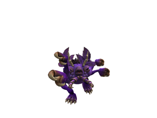
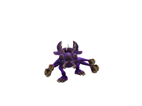
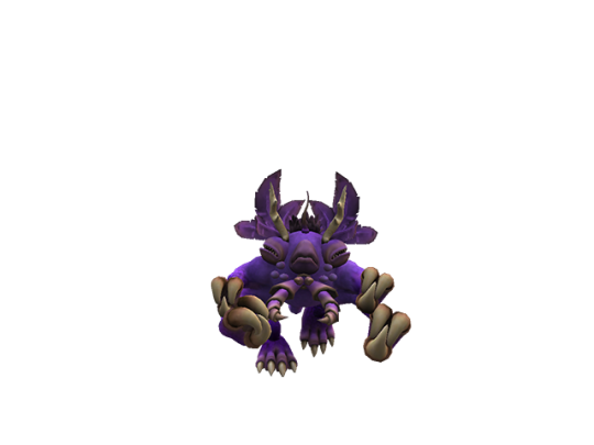
and these have lighting closer to the actual ingame lighting, as opposed to all these beige tinted renders, so you get a better look at how the game rendered creatures at the time
also these are dated to november 6 2008, but obviously this is from an older version of the game, around early 2008 or some point in 2007 id imagine?
also these actually have bumpmaps this time. this looks remarkably closer to the final game, but the larveyes look unpainted, and also the screenshot is curiously anti aliased which doesnt happen with the final test drive _ful screenshots
-
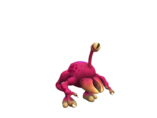
misc_2/photo_051dc762_ful and photo_051dc763_ful
has an early version of stalkgazer when it had a split pupil (also it had no middle variant?), lighting feels kind of different but not much to remark on otherwise. this is remarkably similar to the final game

-
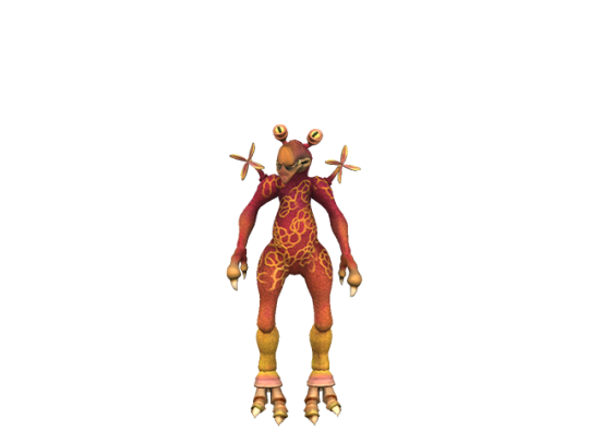
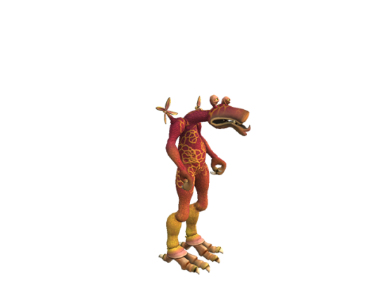
misc_3, im gonna stop noting the other folder names because theyre not that remarkable
this one also has ... what looks like meanstalk actually, with the same slit pupils, but it also has the cut paint from the previous post that gnosh had
-
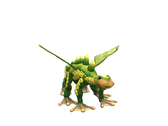
misc_4. not much to note here but i like this thing. fauxry wings seem to not be using the morph handles that it had up until the creature creator demo?
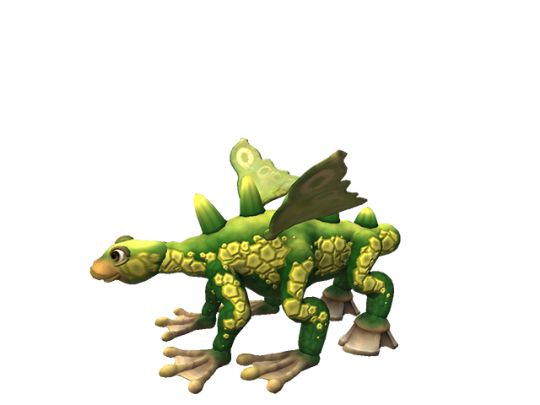
-
misc_5, its doing an idle animation in the second image i guess
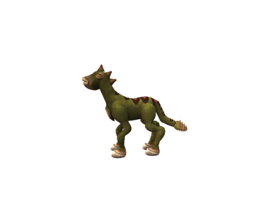
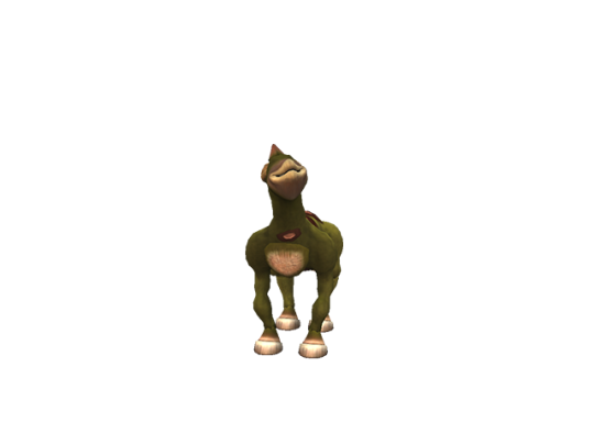
-
misc_6
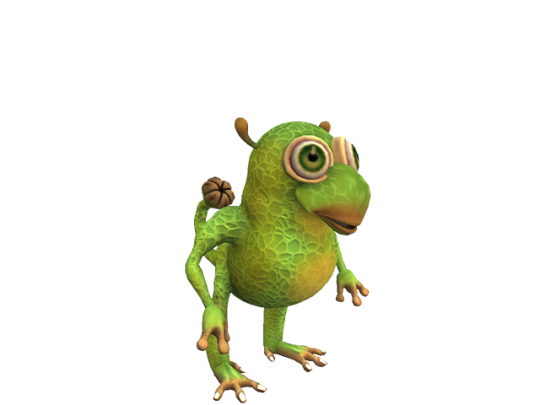
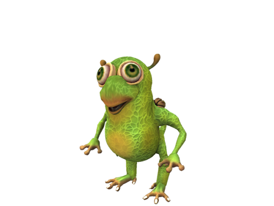
this one actually looks like the final game's Frog Boy and Ballboy, its possible it might have been repurposed into one or the other
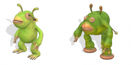
it also crops up on the spore website occacionally

-
misc_7, same paint again, same early eyes again
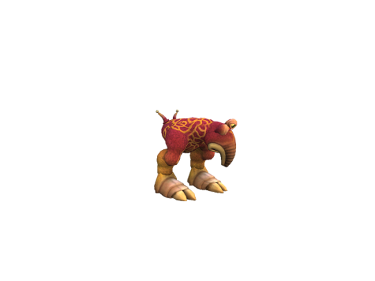
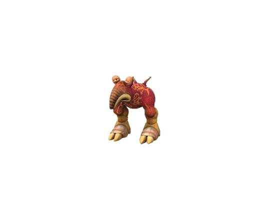
-
misc_8
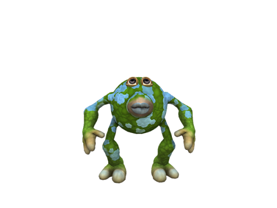
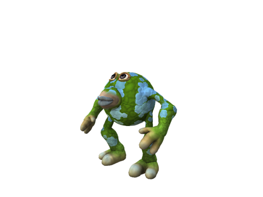
this one was on the spore website!!! where its seemingly always referred to as greenball in the filename, and uses the left screenshot

-
misc_9. it seems like the wings didnt have a closing animation at the time. this one also uses neo-teeny eyes but they look kind of weird. im also not sure these wings get affected by paints this strongly in final
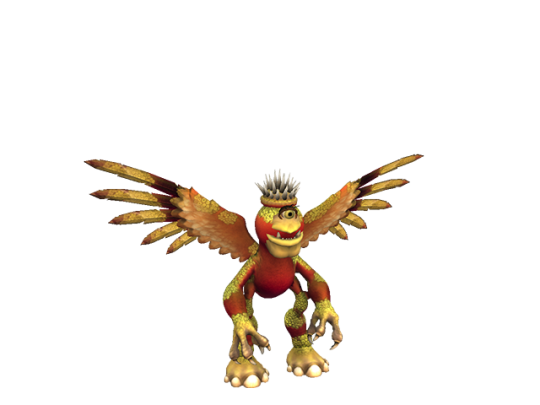
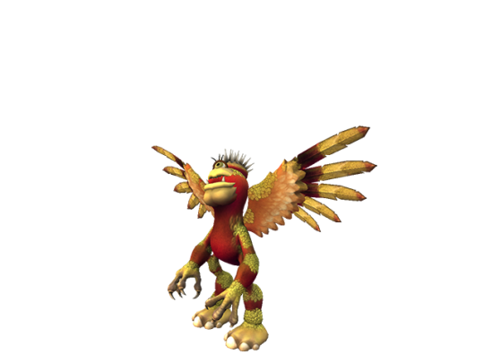
-
misc_10
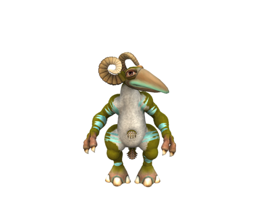
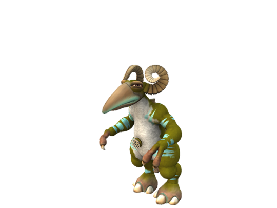
this one is VERY familiar, besides the group art, but i cant remember what else it was in
-
misc_11. paints look kind of weird?
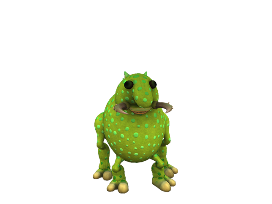
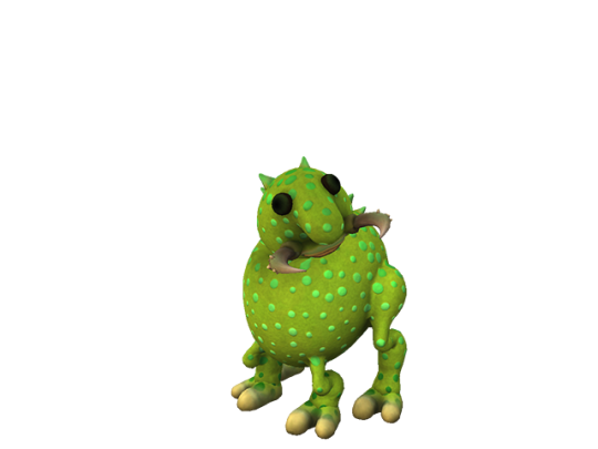
-
misc_12 is the worst maxis creature on earth
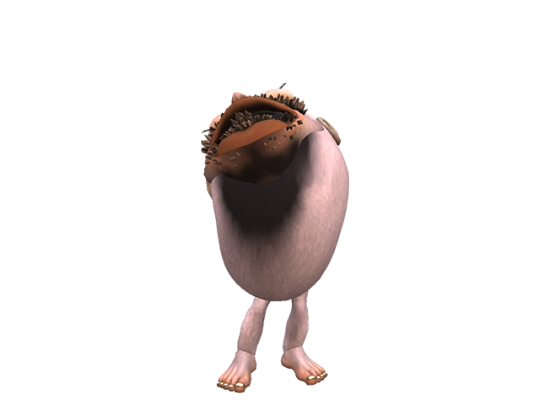
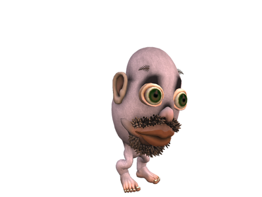
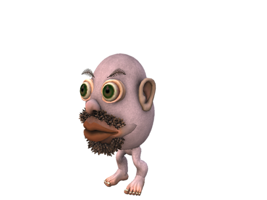
6 notes
·
View notes
Note
Hello! I was wondering what the difference between pixels, decome and favicons is? I saw an old response but would like to ask for more details (such as why they're named the way they are and examples) tysm!
no worries!!
pixels is, just that! pixels! they dont have a set size limit on what they can be. the name comes from pixels on screens, which are squares of light showing a single color, and when together can create an image identifiable to a person.
decome (also called sozai) are 20x20 px page decorations you can use on certain old blog pages or forums, theyre about the same size as the text so they dont disturb the flow of the page. they can be larger, but the most common ones I see are about that size. I believe they originated in japanese blog sites around 1990s, but thats an assumption and not at all a fact. theyre called decome because they are... well, decorations! a lot of rentry (and sometimes carrd) collectors love to use them in today's age, and if not theyre fun to collect anyway!
favicons are 16x16 or 32x32 big pixels that specifically have the purpose of being the small site symbol next to the name of the site on an internet explorer tab. it is also used to refer to the same things as decome in rentry/carrd spaces, specifically the 16x16 ones. I dont know the origin of favicons.
I dont have any examples on hand but all the pixels I make fall into the decome category. besides the wing ones, I didnt know the difference between decome and favicons so I used 16x16 for them T T
I hope this helps, somewhat?
7 notes
·
View notes
Text
Here is what i have been listening 2 lately yes im avoiding something no i dont listen to a lot of """new""" music
"This corrosion" the sisters of mercy - nothing revolutionary here, its a goth (sorry eldritch) classic with the big stupid jim steinman bombast that i love. If you want a good time search "andrew eldritch interview" on youtube, he's a huge bitch its so funny
"My lady of mercy" the last dinner party - a cute fizzy indie pop song that splits open into huge, triumphant stoner rock choruses. Its my understanding this band has weathered "industry plant" rumors despite being like, not. Anyway if industry plants made shit like this id be ok w the concept
"Kybalion" killah priest - my friend sold this wu tang associate to me by saying a) he's into the occult, b) not sure if he's actually any good, c) hes making animal noises on the new album. "Hermes trismegestis of lyrics that specialize in physics and pyramids" literally what else do i have to tell you
"Blood makes noise" suzanne vega - i love when a singer songwriter chick has one hard track on her album and this one sounds urgent and clanging and ominous im having a great time
"You aint no celebrity" jungle - everybodys losing their shit over "back on 74," and rightfully so, but this is the ass shaker on the album, its like an update on all those 2000s sean paul hits i liked before i heard at too many bar mitzvahs (it actually knicks the buzzing theremin from "get busy," which was always better than "temperature")
"Naked eye" luscious jackson - 90s crunchy touchy feely divine feminine radical vulnerability nonsense
"Come together" primal scream - these guys were kind of narrowly revolutionary in the 90s and i dont hear anybody under 40 talk abt them ever but i loooove the early 90s uk "what if classic rock was dance" shit that was happening with them and i guess kind of madchester?
"Obsession" animotion - this is the loud obnoxious goofy 80s pop hit all the other ones want to be. The boy-girl vocals are really fun BONUS the singers fell in love and are still married, go look up a recent performance of this song theyre so old and so horny for each other i love it
"The big sky" kate bush + "chains of love" erasure - two very different 80s pop classics, but i listen to them the same way, and frequently right after each other. I have a theory of art and fiction i call, for the moment, "mythological awareness." I use this to refer to work that knows what old folkloric/mythological/archetypal symbols and narratives and images it evokes. Work that knows that any love story is every love story, every mad scientist is a wizard and a shaman and a hacker as well. Kate is singing about the things we pay attention to as children and forget as adults, the sky is a marvel its easy to forget about because its there every day, but that doeant mean its any less a marvel. This might be the most straightforward u2-ish rock single bush ever put out, but it feels like shes marching at the head of an army of zeppelins and airplanes and rockets powered by the laughter of gods. Andy bell of erasure is singing about a fictionalized pre-aids era of gay utopia like its something that used to be real and can be real again if we all clap our hands. He details a world of "sisters and brothers" open to the pleasures of the world, fucking and loving and worrying about what theyll do for dinner rather than whether they can get into the hospital to watch their loved ones die. And over an unstoppable synthesizer bounce, falsetto floating over clouds of gospel-inflected backing vocals, you believe him. He could be talking about atlantis or hobbitton or erewhon or the greek age of heroes and he knows that, the halcyon past is a myth none of us can get away from, maybe we need to understand it and use it rather than disavow it. I was born years after both of these songs hit, and my parents didnt listen to either of these artists, so they come to me fresh and bright and veiled in the light obscuring mist of morning, for me and no one else (everyone else)
5 notes
·
View notes
Text
congratulations. you said something so stupid it actually made me get up so i can type on a keyboard instead of my phone.
photography is not "art that can be made with 'very little effort.'" if photography is just "the push of a button," then a pencil sketch is "just a couple of lines." the fact that you simplify photography this much is already making your argument vapid, but ill give you the benefit of the doubt and assume you just, werent thinking clearly. exposure time, depth of field, differences in camera lens, lighting quality, lighting contrast, lighting colors, waiting for a certain time of day, picking the right subject, the right angle to capture the subject from. it is not "the click of a button." initially, photography was a process that took a *long* time. exposures would last from 5 minutes to half an hour.
every example you gave of using generative AI iN A MOrAl WAy is still the fucking thing making something for you instead of you putting in any effort to try and collage it yourself. no, it is not the same as looking through a stock photo site. i dont know how many times i have to explain this- THE FUCKING AI IS DRAWING SOMETHING FOR YOU. just because "ouuhh its just a widdle part of the background!!!" doesnt mean it didnt literally pull data from hundreds of thousands of millions of images online just to mash them together especially for you. like i dont know how this isnt a concept you can visualize. there is an explicit difference between transforming content you find online, and asking a robot to do it for you.
imagine the world was made of pudding. you can imagine a lot of things- do a single thing to make it a reality. find a single option out there that even remotely does what you're referring to.
....? is this really the angle you're going for? "uumhmm, theres actually even LESS eithical ways of doing art!! so...ai really isnt that bad!!!!" like, sincerely?
"where do we draw the line" it's pretty fucking simple. when the robot draws the thing for you, you're no longer putting your own will into the creation- why would anyone put their own will into looking at or interacting with it.
i literally dont care what your excuse for using AI is. if you didnt put your own effort into making it im not putting my own effort into interacting with it.
#utter dunce#please do me a favor and DONT respond regardless of how aggressive you perceive this reply#i cannot stand you people in my notifs
57K notes
·
View notes
Text
i know this isn’t particularly interesting or unique buut i DID have a good time doing it so its time to talk about DRAGON DESIGNING
so here are images+inspirations and i’ll give some explanations too- although most of this is about personal preference- more so a look into my arrogant hubris brain more than anything else :>
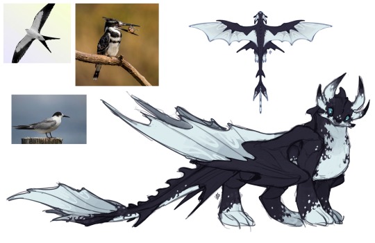
here’s the thing about this guy. for some reason there was like some sort of. massive issue with conceptualizing him which was that they had to make a fury that didn’t milk toothless’ design for once and to make it look unique they made some. very odd choices.
i just decided to have some fun with this one and based him off some seabirds (florida kite, tern, kingfishers which i KNOW are freshwater birds but still) while trying to keep the catlike elements, especially with the double-layered wings meant to mimic rows of feathers. he also has a more airplane-like tail- one big fin with smaller ones at the sides. most of this was just looking at him and going “how do i make this different but with the same appeal”. as for the actual genetic trail of this guy, hes evidently a night fury+light fury, but with some stormcutter influence too- the extra wing layering and three-way tail give better steering.
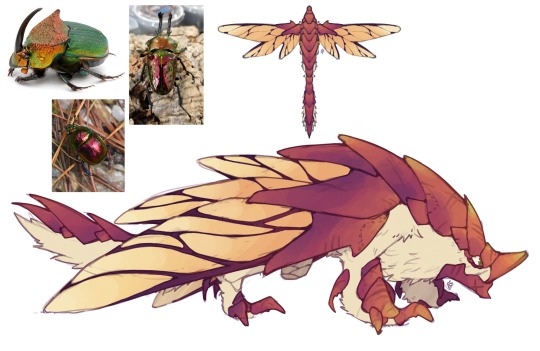
i still can’t seem to find the post about effectively combining animals to make a new one but- the original for this gal just felt so slapped together. it was a good concept (i love beetles) but it had some poor execution.
this is honestly just an example of me combining a lot of what i love about beetles to make a more put-together design- including that they have little hairs that sometimes get thick enough to resemble fur. These specific beetles are rainbow dung beetles/scarabs and rainbow stags- although i wanted her less green bc for some reason they just dont make magenta dragons like they used to. i am a huge sucker for blue but it just… didn’t feel right to me? idk man. i also love making those stacked wings. this is a rumblehorn/deathgripper hybrid, with a bit of gronkle too, as it possesses their ability to do the hummingbird hover :>
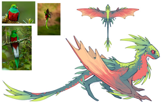
this one wasnt bad to start out with!! most of the problems i had ran pretty personal, such as the attempt at bright coloration and the just. plainness of the overall design. to me it just didnt embody the tropical bird inspiration enough.
honestly i just went off on my own thing with this, but i did have the resplendent quetzal in mind- one of my favorite birds and what i would guess to be the original inspiration for her. her original colors were somehow just too dull to me- and she felt too bulky and not like a stealthy camouflaging dragon- i thought that those sorta “stalker legs” would fit much better on her design than large paws would. as for her lineage, i like to think shes a nadder/changewing hybrid but with a good chunk of thunderdrum- the frills on her chest cover vents that she uses to rapidly intake air in order to do her sonic scream thing.
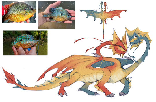
there are. many issues with the original of this one that other people have very good in depth explanations of so ill keep this short and technical. from my perspective, it felt… forced? almost like they were trying to cram too much into it. it did have good colors, though, i guess ill give credit for that?
for this one i just sort of started scribbling, but wanted to incorporate some more fishlike elements, given that this is a tidal class dragon, so this one references longear (and other species of) sunfish, both with the split red/blue coloration on a yellow base, and their tall and spiny fins. I also wanted to give the heads each a more definitive aspect to them instead of just “parts are different sizes”- but that was a personal thing, more than anything i was trying to have fun with these. This one is a zippleback and shockjaw hybrid, and also has scauldron in there too, especially with the boiling/freezing water shots
#art#my art#long post#character design#httyd#dragons nine realms#concept art#last nr post for a while unless yall have questions#also if you made it through this??? epic thanks for the read#also ive seen other redesigns out there too#they’re incredible#redesigns#dragon#dragons#sketch#doodle#drawing#illustration#i hope you guys are making this something fun for yourselves#bc i sure am and its cool and fun#but yeah!! thank you for staying here for the saga of me redesigning cartoon dragons
546 notes
·
View notes
Text
THE PHELPS
A sally face extended story.
Part 1
Alright,this post will be my deep dive into the story that I invented for my favorite Sally face character Travis Phelps.I spended a long but a really LONG time making up a story for Travis and his family,so much that I wated to write this whole ass post on tumblr about his family and why his dad is evil because I can.
PART 1
THE DESIGNS


The images above are the first ever designs I sketched out for Julie and Kenneth. Since I normally didnt draw in a cartoonish style it took me quite a while to figure it out a design that fit both the game and what I had in my mind for what they could possibly look like.Normally,their appearances are very irrelevant for the game itself but,since Travis is my literal kin I decided I want to go as deep as possible to make his parents and the rest of his family come true. I took inspiration from some other artists who drew Kenneth before me so his design was a bit easier to make than Julie's as in her design took longer to create due any lack of appearances in the game or even reference photos. The only canon things we know about Travis parents is that he is multi racial AND Kenneth had skin just like him.(from this image in game)

Even with the lighting I can still say that his skin is also dark just by his hands.I dont wish to go too deep into it but there's more to that too.

As I sketched more I began having a more clearer design for Travis mom,Julie.She was the one I wanted to give the bright neon hair and the color purple as if Travis only used purple because of his mother with purple being her favorite color(similar to Sal's mask.) She wore a purple dress and she had a black eye too as she was also a victim of Kenneth costant abuse.Her hairstyle is also somewhat similar to Travis,he is supposedly taking more after his mom than his dad when it comes to hair and such.

I finished the designs in digital form along with Phillips parents because why not? It came out looking better than expected but,Kenneth in the end of the game I made him have a different haistyle,the one you are seeing now is Kenneth during ep 1 2 and 3 but by episode 4 his hair gets longer and he gets facial hair.
Part 2
THE BEGINNING
The story begins around 1930-1940s when Kenneth is still a teenager and his dad Fred is Nockfell's local priest.The chruch that Fred is SO proud of has been in the Phelps family for an eternanity and its been passed down from generation to generation.The story here is that Kenneth was the last Phelps who was able to own it.

Kenneth was a teenager when he met Julie,an young girl who just moved from Mexico to the Nokfell city and suprisingly frequently went to the chruchs mass on Saturdays. Kenneth or Ken was going to be the new local priest in a few months with him being almost 18 at the time he met Julie.They both made eye contact and fell in love,Ken of course was a little shy at first but he eventually got the courage to invite Julie on a date. She accepted and quickly began falling in love and dating in secret as Fred was completly repulsed by the idea of his son dating a girl with a family with completly different beliefs than the Phelps.Fred assigned Ken to marry a young girl that lived not too far from where they lived,her name was Mary and she was suppose to be the girl Ken would marry and contine the bloodline with however that didn't happened and Fred was furious. At the age of 19,Kenneth and Julie had run away ,Julie was pregnant and Kenneth was doing everything he could to keep all of them safe from his own family. A few years went by and everything was going fine until Fred found out about their new location and threathen Kenneth to either go back in a sort of 'temporarly trip' to the chruch with him or he would kill Julie and Travis(who was still a baby in this time period). Kenneth accepted and he left Julie with baby Travis for 5 years to lead the chruch before coming back from the trip.
When he came back however,Kenneth was not the same.He was no longer caring or smilling,he seemed emotionless and when he wasnt he was cold and extremelly agressive.When julie had asked him what happened Kenneth began beating her along with Travis who was 5 years-old,Travis has no memories of his dad before his trip so the only memories that last was all the abuse he went through before and after his mother's passing. Before her padsing,Kenneth made Julie move back in Nockfell because he chruch was still there and Fred was still insisting that Kenneth was the only one that could keep up with the family tradition.
Despise never being mentioned in the game,Julie had sacrificied herself to the cult because of her husband.She got killed by the cult members and Kenneth had show no signs of guilty while it happened.Travis had since then feared his father deeply with the possibility he would be next if he wouldnt be obedient to his strict rules and his absurd orders.
Travis would then live with his dad alone and in the same household,however,despise the family's tradition Kenneth never forced Travis to marry a woman but still forbidden him to ever fall in love with another man.
Part 3
THE PHELPS AND THE ROPERS

The Ropers and the Phepls were very different families,especially in terms of religious beliefs.While the Phelps had always kept the same beliefs for decades the Ropers had no comflicts over wanting to know more about various religions.Julie's parents for example were botj from seperate religious families but still choose to let their daughter choose what she liked best, the father Jeff was jewish and Julie's mother was simply atheist but still followed the cutural traditions from her homeland.
However the Phelps were a much different story.
Fred or Frederic was a very very greedy man since little.Very malicious and cynical,only caring about himself and nobody else not even the mother of his son,her name was Margie.


Her story is also a very sad one,not very different from what Julie went through only a x10 worst as she was murder cold-blood by Fred himself than no other reason than the fact she bothered him by simply existing.Ken has no memories with her because he was too little to understand what was going on and he refused to ask his dad about it too. Her death didn't change much about Ken's life or the cult.
The first photo shows the wedding and Frederic in his late 20's with his wife.She was never happy and unlike Julie she had never had onve loved her husband while alive. She was starved and killed by the same man she married and since she met him her life was a living hell,the only thing she liked in her life was Kenneth being born but even that didnt last long.
Frederic's design is mostly based on a cult members's ghost who is seen in the temple.I like to think as a punishment his soul and ghost form was forever stuck in that temple as a punishment from all the bad he had done to others while he was alive.

To be continued...(1/2)
90 notes
·
View notes
Note
dear tumblr user crim wickedpact pls write the essay/dissertation about nicky being shakespeare's fair youth (if you have time, ofc!!)
Not To Imply Nicky Was Shakespeare’s Fair Youth But Ive Read The Fair Youth Sonnets & Nicky Was Definitely Shakespeare’s Fair Youth, an essay by me, tumblr user crim wickedpact
background knowledge: our man shakespeare wrote some 120 sonnets about a young man referred to as the Fair Youth during the mid 1590s; there has been some debate among shakespeare enthusiasts whether shakespeare’s interest in the Fair Youth was platonic or romantic (but like. they were definitely romantic). no one knows for sure who the Fair Youth was, but it was definitely nicky and my first and most important piece of evidence regarding this hypothesis is the ‘lmao babe do you remember that guy who had a crush on me?’/ ‘i try not to remember the guy who had a crush on you’ look joe and nicky exchange when Merrick brings up shakespeare during the movie. especially since gina confirmed in a tweet that joe and nicky canonly did know shakespeare
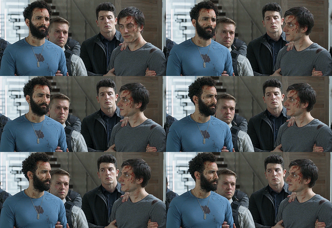
my second piece of evidence is that it just Works (except for a couple small facts like.. the Fair Youth was prolly closer to his 20s than his 30s. and the fact that shakespeare implies that the Fair Youth slept with his mistress at one point. but he doesnt know what hes talking about shhh we IGNORE)
long post under cut
A. The Description Matches
when describing the Fair Youth (who I’ll call the FY from now on), shakespeare says he has a ‘gold complexion’ and ‘beautiful eyes’ and compares him to a ‘summer’s day’. He says the FY has “A woman’s gentle heart" and “An eye more bright than [women’s are], (...) Gilding the object whereupon [they] gazeth”
As much as shakespeare’s perceptions of sexuality and gender are very........ late 1500′s (whoo boy sonnet #20 is a wild ride) ...... the description does match, and also:
B. The Fair Youth Refused to Get Married
it’s never really said why one way or another (shakespeare assumes it’s because the FY is selfish) but the FY didn’t/wouldn’t take on a wife and have a kid, and this was something that was a real sticker for our man Willy S. because, as he says in his sonnets a million times: beauty doesn’t last forever, but having a child not only passes down the FY’s beauty, but also blesses the woman the FY would have a child with (im not saying shakespeare wanted to bear the FY’s children, but he definitely did)
Whose fresh repair if now thou not renewest, Thou dost beguile the world, unbless some mother. For where is she so fair whose uneared womb Disdains the tillage of thy husbandry?
(ie. If you don’t renew yourself/ have children, you deprive the world and deprive a woman from having your child, since what woman out there is so beautiful that she wouldn’t want to bear your child?)
Like.
1.) if nicky is the FY then so many of these poems center around the idea of nicky growing old sometime soon and that must have been pretty funny to Nicky and
2.) the fact that shakespeare would have been So Desperate for nicky to find a wife must have been the opposite of funny to joe. considering the ease of his and nicky’s relationship and the fact that being gay in late 1500s england was probably not a walk in the park, it is very likely shakespeare wouldn’t have known they were in a committed relationship-- or at least not known how close they actually were. Thus:
C. The Rival (aka. Joe)
shakespeare mentions having a poetic rival in regards to the FY in several sonnets. In sonnet #21 he talks about how he’s not like Those Other Writers who use grand metaphors to talk about their muses
So is it not with me as with that Muse, Stirred by a painted beauty to his verse, Who heaven itself for ornament doth use And every fair with his fair doth rehearse, Making a couplement of proud compare With sun and moon, with earth and sea's rich gems, With April's first-born flowers, and all things rare,
(ie. I’m not like other poets who, when inspired by a ‘painted beauty’ use heaven and every other beautiful thing on the planet to make a grand comparison to their muse: he specifically lists the sun and moon as examples as well as other beautiful things)
He then goes on to say
And then believe me, my love is as fair As any mother's child, though not so bright As those gold candles fixed in heaven's air:
(ie. my love [the FY] is as beautiful as any other beautiful person, though I wouldn’t compare them to the stars/heavens (which is what he means by the 'gold candles’. those are stars.))
So shakespeare insults poets who compare their subjects to the sun, moon, and stars (amongst other things) and in the comics, Joe does literally exactly that
That man is the stars in my sky, and the sun that lights my days. That man is the moon when I'm lost in darkness, and warmth when I shiver in cold.
shakespeare also goes on to say in the same sonnet “Let them say more that like of hearsay well / I will not praise that purpose not to sell” which is to say ‘let people who like that kind of language use it, I wont because I don’t want anyone else to have the subject of my affections (the FY)’.
(which is a bit of a contradiction regarding his feelings abt the FY getting married, but these sonnets are full of contradictions. shakespeare was a confused dude; man spent the first 100 or so sonnets convinced the FY loved him back only for him to start wondering if the FY ever loved him near the end)
(not to mention Marriage For Love wasnt really.. much of a thing in Ye Olden Times but thats a different conversation. so shakespeare prolly didnt associate marriage with love/competition? anyways)
Shakesy-boo goes on to complain about this rival several times. In #79, he says
Yet what of thee thy poet doth invent He robs thee of, and pays it thee again. He lends thee virtue, and he stole that word From thy behaviour; beauty doth he give, And found it in thy cheek: he can afford No praise to thee, but what in thee doth live.
(ie. everything ‘your poet’ (as the FY apparently favored this unnamed rival) says about you, he takes it from you in the first place. he talks about your virtue, but learned the word from watching your behavior. he calls you beautiful but only discovered beauty by looking at your face. every compliment he gives you he took from you in the first place)
[and, as a smaller example, he also bemoans the fact that people want to paint the FY in #67, saying, “Why should false painting imitate his cheek, / And steal dead seeming of his living hue?”. and yknow. Joe’s an artist.]
And then another example in #86
Was it the proud full sail of [the rival’s] great verse, Bound for the prize of all too precious you, That did my ripe thoughts in my brain inhearse, Making their tomb the womb wherein they grew?
Was it his spirit, by spirits taught to write Above a mortal pitch, that struck me dead?
(ie. he’s talking about how he’s having difficulty writing abt the FY and is rhetorically asking if ‘the proud sail’ of the rival’s verses was the reason his ‘ripe thoughts’ were killed in their ‘womb’. He then asks (again rhetorically) if it was the rival’s ‘spirit’ (or creativity, maybe) ‘’’‘by spirits taught to write’’’’ that killed his own drive to write. none of the analyses I’ve read really explain what shakespeare means by ‘spirits taught to write’, other than maybe being a joke or reference to something we dont know, but... ‘taught by dead people to write in a way mortal people can’t’ very much sounds like a description of an immortal poet, eh?)
Which brings me to,
D. Willy Boy Thinks There Are 500 Year Old Writings About the Fair Youth
shakespeare talks about people having written about the FY ‘500 years ago’ from the late 1500s in #59 which......................... would have been around 1100 AD. :thinking face:
Oh that record could with a backward look, Even of five hundred courses of the sun, Show me your image in some antique book, Since mind at first in character was done, That I might see what the old world could say To this composed wonder of your frame;
(ie. Oh if I could look back 500 years and see how you were described in some old books so I could see/reference what people used to write about you)
Which again brings me to,
E. I’m Not Saying shakespeare Stole From Joe, But:
1.) In #22, shakespeare says this,
For all that beauty that doth cover thee, Is but the seemly raiment of my heart, Which in thy breast doth live, as thine in me:
(ie, your beauty is due to the ‘clothes’ my heart gives you-- probably means something like ‘you’re beautiful because i love you’. goes on to say his heart lives in the FY’s chest, and the FY’s heart lives in shakespeare’s chest)
so: shakespeare tells the FY he has shakespeare’s heart. in comparison, Joe calls nicky ‘my heart’ in the comics...... :thinking face x2:
2.) In #109, shakespeare tells the FY ‘thou art my all’,
For nothing this wide universe I call, Save thou, my rose, in it thou art my all.
which rings similar to Joe’s ‘he’s all and he’s more’ as well as (from the comics) ‘he is my everything’
and just saying. joe looks pretty #done the mention of shakespeare.

F. The last One
Despite shakespeare writing 30+ poems about the FY eventually growing old, the very last poem he writes about/for the FY says,
O thou, my lovely boy, who in thy power Dost hold Time's fickle glass, his sickle hour; Who hast by waning grown, and therein showest Thy lovers withering, as thy sweet self growest.
(ie. you [the FY] have power over the ‘mirror’ (fickle glass) of time as well as time’s ‘harvesting’ ability (sickle hour) and as you grow older, you remain beautiful while your lovers [shakespeare] wither and grow old)
The transition from ‘get married and have a baby before you get old!!!!’ in #1-20 to talking about the FY’s presence in 500 y/o books in #59 to admitting the FY isn’t growing old in #126 kinda seems to imply shakespeare learning of/about nicky’s immortality at some point, and this last poem is him accepting it.
TLDR: not only does it make perfect sense if nicky was the Fair Youth from the FY sonnets, but it also makes perfect sense if joe was the Rival from the FY sonnets. its canon nothing will convince me otherwise
1K notes
·
View notes
Text
happy Weblog Wednesday, its time for cancan color editing how-to
So, step one is make an animation. I'm not telling you how to do that here. Learn to animate elsewhere. I made this delightful little 8 frame loop, so simple.

BUT I kept each layer of each frame separate, so instead of just exporting that one gif, I exported each set of layers as its own gif. That's 5 gifs total. In order, these are lineart and pink bits, fur/skin, clothes, hair floof, and a extra layer of shading for the floof (which i made very hurriedly and poorly. hence why there's random green bits in there. the hair didn't even need to be green for this i didnt chromakey it)


If I wanted to get real fancy I could've like. Made all the clothing articles separate too, but that seemed like overkill. I do wish I'd made their freckles separate tho, I could've been way more creative with those. Oh well, next time.
Then, I re-lined 'em all up in After Effects, so I could do different effects on each layer! Makes editing very easy. The two main After Effects tricks at work for this video are Track Matte and the Hue effect.

[my full layer list, if that interests anyone. look at all those jpegs.]
Track Matte is how I did the "chowder thing" on their hair. There's lots of ways to get that effect, but this is the easiest I've found. You link the image you want shown to the layer you want it shaped like and it uses that layer's alpha channel, just like the clipping or layer masking features in stuff like Photoshop. The reference layer moves, but the texture doesn't.
Now, the Hue effect does a lot more than just change the hue. It's actually got sliders for the saturation and lightness in there too. The HANDY thing about it is it lets me keyframe these values, so I can animate them changing! That's how I get the colors to nicely gradient from one song to the next (and how I set colors to shift Continuously in an epic rainbow loop for the caramelldansen bit :3) It also means I didn't have to export a separate gif for each song! Like I did for most of Blue's playlist. After Effects make editing gif speed this easy Please.
There's lots more After Effects bullshit that went into this, like the tedious process of making a gif loop properly, or makeshifting a drop shadow by duplicating and blurring a copy of the gif, but I don't know how interesting or important all that is. I think I've rambled plenty. Send me an ask if you want more of this :]
youtube
Video is up for reals! Enjoy some party jams and pretty CanCans :3
#and because i included the gif pieces in there: you can now Make Your Own CanCan Look :D for the low low price of Acquiring Adobe Product#chayos speaks#weblog wednesday#my animation#id make a similar breakdown of blue's playlist but you should NOT do what i did to make blue's playlist. learn from my hubris.#that playlist was an Ordeal it took Weeks. i adore the final product i really do but i am Never doing that again.#hence why the other sages' playlist are on pause. i gotta figure out an easier way to do all that. or just Not do ALL THAT.
4 notes
·
View notes
Text
gonna post progress pics from my volo painting and write a bit about my process since some1 asked for them!
excluding adjustment layers this has 20 layers in all. i wont show all of them bc some of them just have minor differences but ill show my general progress
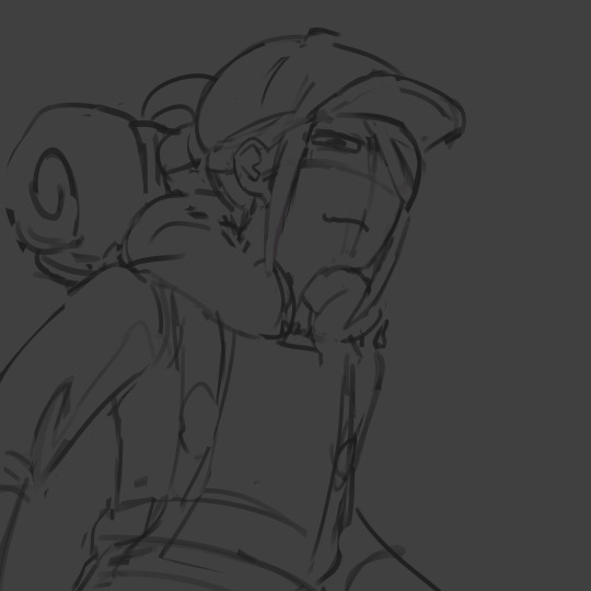
sketch. just super loose but has enough visual clarity to be able to work off of and not have to fix issues caused by poor anatomy etc later
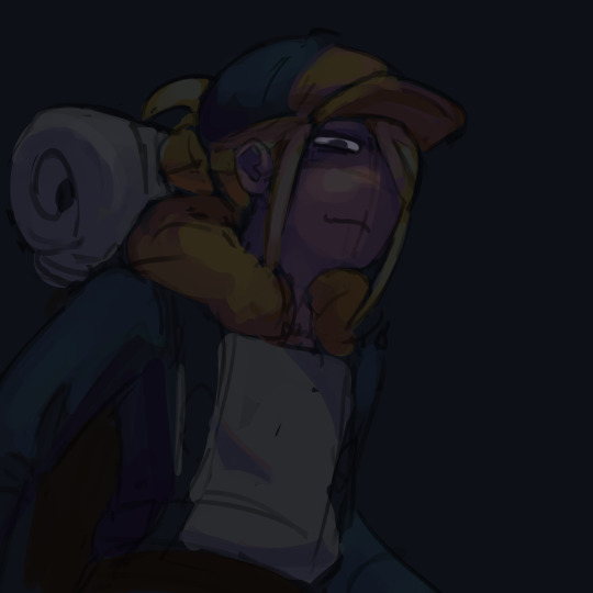
background color + painting under sketch. to choose colors, i go on the color wheel and just kinda choose colors freely and almost randomly & paint w them by very lightly pressing with a hard round elliptical opacity brush set to a large size, blending other colors on top of them this way. i dont use this brush the whole way through but honestly i couldve and it still wouldve turned out good

a lot of trial and error but because were doing it so loosely its pretty easy to find something that works quickly (also sorry the painting is so dark at this point oops)
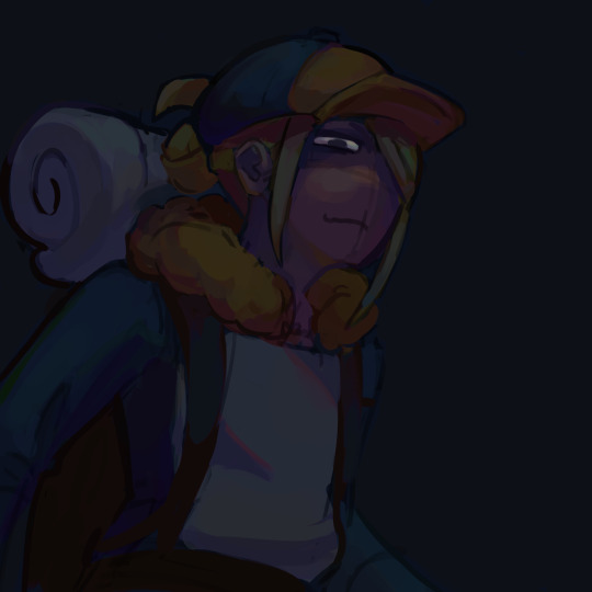
developed painting a bit more and upped saturation in some places using an adjustment layer.
to get a lot of the color variations im getting here, i colorpick from other areas of the piece, ie colorpicking from the face and using it as subtle lighting for the hair, seeing i like how those colors look, and using that as a jumping off point and using a more intense pink for the hair shading. you can also see i got some of the yellowish on the sleeping bag or whatever tf he has on his back from the hair/hat/etc, just brushed it on there really lightly and it looks cool. another place i like to colorpick from is where the sketch overlaps with the colors underneath, it creates some interesting desaturated colors.
you can also see im developing linework a tiny bit here, its pretty early on and a lot of it will be painted over later anyways but i start being like, okay the 3d forms i've been making are working, let's draw on top of the sketch a bit to encapsulate those areas
but yeah uhh definitely a lot of this is just testing stuff out when i'm this early in the painting, i am aaaalways in motion, never stopping and just working off of instinct and what looks cool. and if i mess something up, i can just erase it and i'll have the layer underneath to fall back on.
also im just straight up not thinking about anything at this point unless im trying to closely replicate a reference image, which i didnt do very much. i use reference for eeeeeeverything i make. i took a pic of myself at a similar angle to this and then loosely based the sketch off of it, looked at pics of volo, later on looked at some reference of how ppl paint fabric, grabbed some pics of how i drew one of my ocs who makes a similar expression w his eyes, grabbed images of other digital paintings i'd made! because i wanted to work in a certain style i'd done maybe only twice before. for reference images, i use pureref, which i would highly recommend to any artist, especially ones without dual monitors (like me). basically just allows you to make a reference board and pin it on the very top of your screen
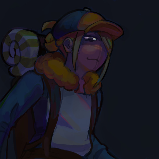
just developed more in the same fashion, then threw a couple adjustment layers over it. i toned back some of these adjustments later but yeah. you can see the lineart really starting to come together, a lot of the color variation on it colorpicked from accidental overlapping colors that ended up looking cool. btw i need to make it clear i do lineart and rendering on the same layers. also i did the stripes on the pack just by using a multiply layer, then giving it more love on the layer immediately above it so it doesnt look cheap
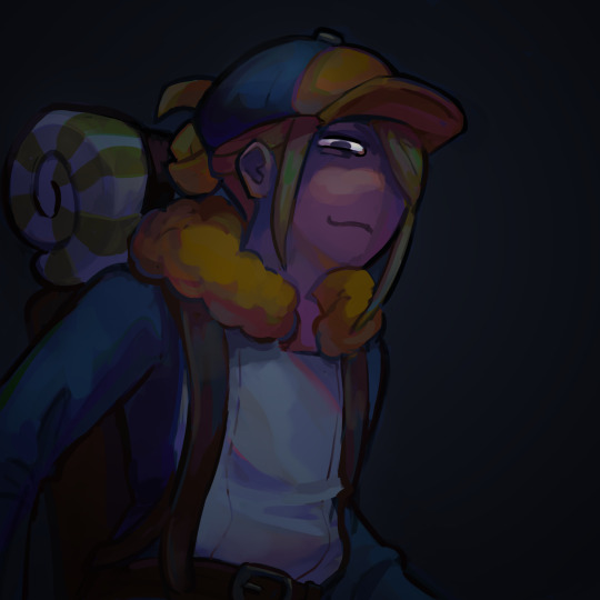
more rendering, got a vignette going w a multiply layer. actually started using reference for fabric folds. theyre really simply done honestly and dont look like. amazing. but they work
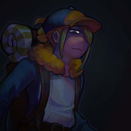
painted over the vignette in the background to make it a bit more interesting & not just a gradient, more rendering as usual, threw in some subtle highlights to make it a little more interesting! i probably couldve gone further with them honestly. also decided to do a really subtle outline around him cuz it looks cool. lineart is basically done at this point and this is where i started to think i was just about done

desaturated it a little bit, re-added some details i forgot about, generally fiddled with stuff and corrected some mistakes, added signature. and its DONE. i think this took me about four-four and a half hours? yeah something like that
other general notes:
-probably favorite part of this is the sleeping bag or whatever the hell that thing is on his backpack
-not entirely happy with how i did the fluffy part, it has some really cool color shifts but it doesnt feel like a proper 3d form all the way through to me. definitely pretty 2 dimensional in spots, but i was like eh i dont care enough to fix it
-although i think the pose works well enough, its definitely another example of me using pretty static poses and basic composition in my art. which isnt too terrible but i really need to start getting outside of my comfort zone on that stuff. this definitely couldve looked cooler if i developed the pose more and did better foreshortening but i didnt cuz that shiht is hard to me. im really awful at foreshortening
-on that same note, i worked off of the first sketch i made and didnt warm up beforehand which you do NOT want to do. thumbnail stuff out and make multiple sketches. 80% of the time the sketches following the first one will be better
-IM NOT AN EXPERT lots of stuff i still need to learn dont follow this 1:1
OVERALL im really satisfied with this though especially for how quickly it took me to make it. & i hope this was interesting, lmk if you have any more questions on my process !
12 notes
·
View notes
Text
Ultraman Trigger August Scans
Let us first address the elephant in the room

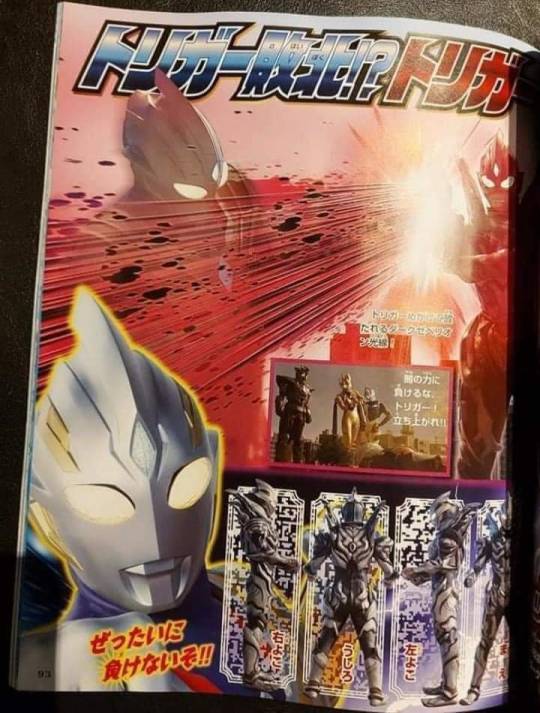

Yep, now having a closer look at Trigger Dark, he definitely looks very similar to the concept art, not to mention the dude's color scheme definitely fits the Dark Giants theme, guess it was just the lighting previously. Really liking the design so far with it being so sinister
Now that aside, what's revealed here about Trigger Dark's appearance is pretty jarring
So apparently he was 'removed' from Trigger by Carmilla using her magic after defeating him
And now apparently his goal is to absorb Trigger's light
So yeah, MANY questions
But before that, at least now we know that Ignis isn't the host for Trigger Dark, which begs the question of just what Ignis is referring to when he alluded to him obtaining a power similar to Trigger then? Let's also not forget that he is pictured alongside another dark silhouette in the OP and the leaked image of him having a dark version of the GUTS Spark Lens.
It all sounds like an Evil Trigger setup that is totally seperate from Trigger Dark entirely
Now back to our original premise,
So is this Trigger Dark an entirely seperate, sentient individual? Or is he being controlled by Carmilla since she basically pulled him out of Trigger?
And why does he want to absorb Trigger? Perhaps to be recognised as the 'true' Trigger? Or would absorbing him grant him greater power?
So let us now discuss the implications of this development
At this point, Trigger's situation really hasn't changed all that much despite such a reveal since he literally stood no chance against any single Dark Giants in the first place, throwing Trigger Dark into the mix dosent really make any difference
So theres actually 3 ways i can see the plot progressing here from this point:
1. Yuzare fully awakens
Now what does that have to do with this?
Well since we knew that Yuzare was the one that initially somehow convinced Trigger Dark to turn to the light, perhaps having such an alarming development would trigger (no pun intended) her full awakening and then convince him again to return to the light
And of course this would be accompanied by major exposition of what exactly happened 30 million years ago
Trigger Dark then willingly gets reabsorbed by Trigger and Trigger would now be able to utilise Trigger Dark as a form to finally actually stand a chance against the Dark Giants
2. Ignis manages to get the power of an Ultra in the nick of time
This possibility is built up on the whole ambiguity surrounding what exactly is Ignis' role in the series as I briefly went over earlier
So by the power of plot convenience, Ignis manages to get whatever catalyst to turn him into Evil Trigger or whatnot and team up with Trigger to repel the Dark Giants at least temporarily (may lead to possibility 1 or 3 after that)
Basically any reason to allow Kengo to retreat and consolidate his thoughts on the vast history leading up to this confrontation and for Ignis to drop major exposition in order to plan for the next course of action as Ignis did show that he has some in depth knowledge on whatever going on
3. Glitter Eternity clutch
Probably the least likely considering that Hudram pointed out that (possibly) only Yuzare knows where the Eternity Core is which means that possibility 1 must happen first before this
Then GE proceeds to wipe the floor with everyone
But then again, although really unlikely considering the amount of setup that needs to happen first, TsuPro could always just cheese through the whole thing lmao
Personally, I think that option 1 will be the most likely option since there has to be a conclusion to the seperation of the two Triggers and its about time we finally get some actual context as to the history of the Dark Giants and the Ultra Ancient Civilization
And all of this would help setup 2 and 3 actually as Yuzare will now be awakened and can lead Kengo to the Eternity Core. While Ignis is probably looking for another sealed Ultra to basically hijack like in Tiga and the logistics or which would make more sense once the major exposition drops first
And also of course whats a New Gen series without the Ultra's Super Form being Trigger Dark, with the theme of 'using the power of Darkness for Light', basically the same as TB in Orb
Perfect opportunity to link to future major arcs
And onto the other only interesting tidbit of jazz we got for this month's scans:
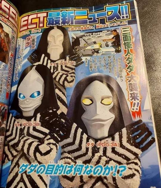
Yeah, definitely didnt expect to see a POWERED suit at all,
Like
Ever
But then again, I dont expect much with regards to possible future powered suits since those suits are incredibly expensive iirc
Tho then again, TsuPro might just figure ways to make cheaper versions of it while still retaining its 'Powered' aesthetic
Definitely nostalgic since I grew up with Powered
12 notes
·
View notes
Note
excuse me hold on i didnt end up finishing skyward sword does demise not wield ghirahim in a proper sword form??? why is it degrading im picturing him fighting link just holding this petrified ghirahim-shaped club PLEASE elaborate
OH dude, no, me saying not a proper sword form is an act of snobbery. It is, in fact, technically a sword! It’s even KINDA COOL I GUESS conceptually, because it’s clearly “the master sword, except evil”, but the thing is it’s this, y’know, big meaty serrated chopper. This thing’s almost as large as Link’s entire body. A friend of mine referred to it as a “spiked oni club” and that description stuck in my head ever since.
I can see the appeal of a [that one fish from Spongebob voice] big! meaty! sword! but the fact of the matter is Ghirahim is pretty strongly and consistently characterized before then as valuing aesthetic elegance, precision, efficiency; the weapons he wills out of his power for his own use, while made of the same materials, have a lot more in common with Ganondorf’s Wind Waker swords than what Ghirahim himself turns into when Demise grabs him for the final boss fight.

[image attached; Ghirahim’s sword form. image description: a large black sword isolated on a white background. The sword has a curving, pointed crossguard, a diamond-shaped ruby stone in the hilt, and some red filigree and an inverted triforce symbol (three triangles touching at the tips to create a larger triangle with an ‘empty space’ in the middle). The blade of the sword consists of three diamond-shaped segments, each with protruding spikes. It is a heavy weapon with a broad flat plane of a blade before tapering to the bronze-colored edges. the entirety of the blade is silhouetted in a red glow. end description.]
This very clearly has the look, to me, of a sword belonging to someone who lives by the statement of “when the whole world looks like nails to you, all you want is the biggest hammer”. It doesn’t have a pronounced cutting edge that would make use of the extra weight, nor is it particularly useful as a shield given how small it is to Demise and how he uses it. The spikes are threatening but not even positioned like a harpoon or arrowhead so Demise couldn’t, say, stab and then rip his sword out for maximum ouch.
So like, I find Ghirahim’s final form demeaning to him personally less because it’s a garbage sword and more because I feel like ideologically, Ghirahim is established as a very precise and careful person who is extremely dangerous for how efficient, tenacious, and creative he is, but his sword form makes it very clear the only thing Demise ever wanted for him wasn’t even the qualities that made him capable of resurrecting Demise in the first place.
Ghirahim is straight-up an absolute bastard to fight for the very reason that he’s a true ‘rival to Link’ in many ways. We finally get knocked off our high horse to realize just what those poor bokoblins and moblins we massacre our way through on the regular must feel having to deal with our shit- someone who is unbelievably light-footed, will tenderize you with projectiles before springing in for the kill from oblique angles or from behind. Also, nearly unique among Zelda antagonists, he wastes absolutely no time hiding or dawdling- we run into him on the front lines not because he’s been expecting us but usually because he has his own business in the same places we do. He’s dungeon-crawling!
And Demise is an evil god, and he lives up to his hype. That’s not remotely what I’m saying- he’s horrifying. But I think that it’s very clear that he’s weak in ways that both Ghirahim, and Ganondorf, are strong- in precision and creativity. You can even compare The Imprisoned as a more or less mind-scrambled Demise, to Calamity Ganon as a more or less mind-scrambled Ganondorf- one is a titanic and formidable beast but lumbering, only lazily puts out features and slightly more complicated strategies as its attempts to shuffle upstairs are thwarted- and the other is a hyper-detailed, all-terrain mobile, complicated attack pattern creature whose attempts to glue itself together and even recreate Ganondorf’s human face were aborted early and even then, it seems to have yanked together as much of itself as possible from ready-made sheikah tech parts.
And if anything this kinda works as more of a boast for Demise- it tells us Demise hasn’t needed to be particularly inventive, or cautious, or tenacious. I think it’s really interesting to compare/contrast Demise’s curse in Skyward Sword to Ganondorf’s in Ocarina of Time, because one is a deliberate metatextual shoutout to the other, but they have completely different tones. It’s like how different productions of Romeo and Juliet play Mercutio’s final speech- one might have him cheerfully joking around tonally until he suddenly drops dead and the other one does the whole thing in barely-contained screaming before he gets to A PLAGUE ON BOTH YOUR HOUSES.
80 notes
·
View notes
Text
hello i just felt like talking about an art piece i mad and also talking about why references are gOOD actually! i never knew people thought references were bad til i saw it on tumblr, i did art as a GCSE and an A level and like they make you take photos to use as references, its a part of your final grade to use your own references, so anyway here it is
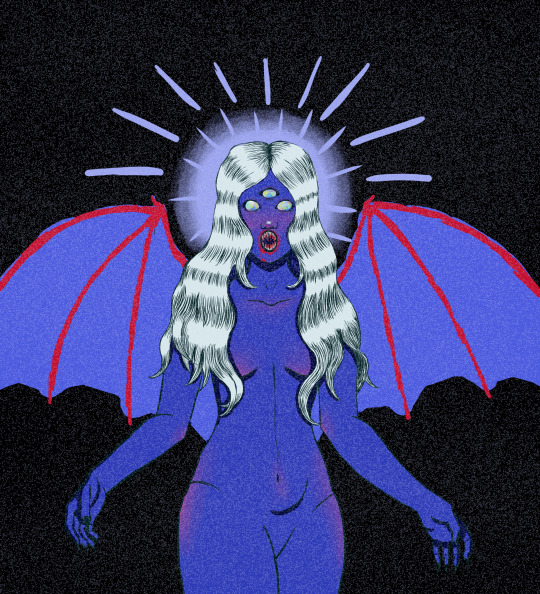
(i dont know how to add read more bits on tumblr mobile im sorry!)
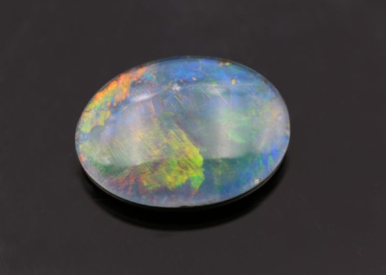
this is the official piece it was based off of that monster prompt thing but i edited it after finishing to make it look a bit better, she has blue skin coz of my favourite colour, white hair coz of the top i was wearing, bat wings coz i love bats, opal eyes because my birth stone is opal, and fangs again coz of bats, oh and a third eye coz i wear glasses
ANYWAY this is a simple piece but reference images are always a great tool for artists! dont ever let anyone tell you not to use references coz even the great artists of old used them (van gogh and monet both painted things they could see right infront of them!)
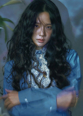
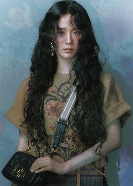
so here are the references i used for this! i usually have some pose/body references, and then some mood references
so here we have my initial pose references! i never fully copied either, i mostly took the arms of the first one and added it to the body/facial position of the second
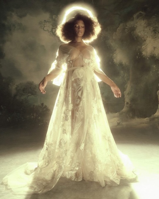
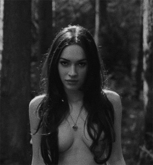
then these are my mood pieces! so i will say my piece went down a different route to this kind of vibe but these were integral for me to be able to picture the piece and to help make decisions in the inital stages that would help the piece feel cohesive and whole. and again i didnt go down this route quite so much as i wish i had but if i had i do think it wouldve come out a much stronger piece than it did. anyway so for mood references i think what youre looking for mostly is colours and lighting that inspires you that you can try and emulate or take inspiration from
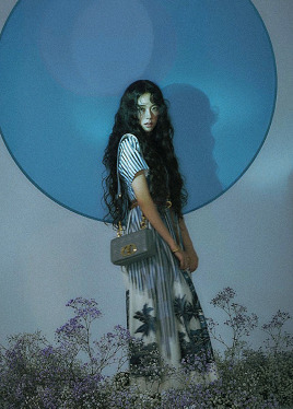
then ive got my reference for the opal eyes which also helped with the mood of the piece
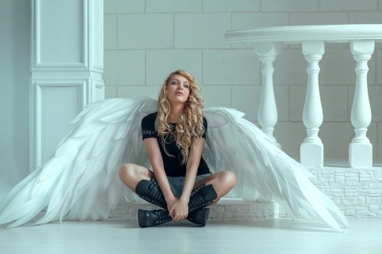
then here i have my two options for the wings!
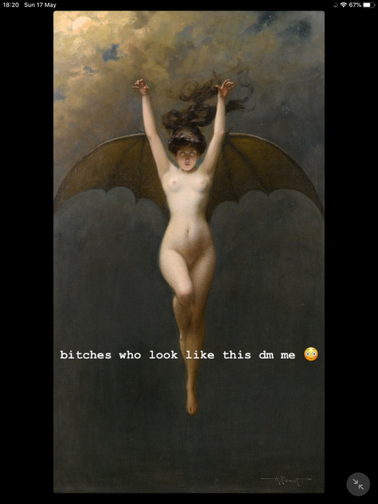
final things to say are when youre looking att hese reference photos, my piece doesnt look like a direct copy of any of them, it takes heavier influence from some over others but its not a study of any, ive been able to mish mash them together and still have my own agency and direction with it, im not saying my piece is super strong but im just saying like, pirate that shit bitch! use the fucking references, thats what all the art schools make you do
12 notes
·
View notes
Text
Notes from the AHWM Explanation Livestream
This will be long, so fair warning! If you're on computer, you can press the spacebar to skip this post if you want!
There was CG smoke for the bomb
The last shot was running after the bomb goes off, filmed during the day
Many cursed images
(0:56 - Guns Blazing) November 5th = gunpowder treason & plot (a reference)
Ethan is the one yelling during the run
Helicopter/Car was filmed in a place formerly known as Spiderwoods (spiders, snakes, and bugs everywhere)
Mark's patented method to get rid of snakes is to tell them to fuck off
There was big black snake near the library
Chica snore-grumbles
Most of the choices were pretty evenly split in the video data
The guy who owned the field in Helicopter/Car also owned the helicopter
It was hard to get the cameraman to know that the camera is an interacting character
They filmed up to 10 pages a day
Prison was the first 2 days of shooting, as well as the part with the most characters/extras (12 people)
Mick gets typecasted in roles of authority
The Prison location is a functioning mental hospital
John was a Prisoner, first mate, and is a realtor IRL
There is no "why" to recording this to keep a broad audience and have fun after Mark was in a depression and made WKM
The Gregory Brothers / Schmoyoho made 2 renditions of I Don't Wanna Be Free (which is on Apple/iTunes/Spotify)
The musical was a production/recording nightmare on the 2nd day
They had 20 minutes max. to learn each segment; they had a choreographer helping them learn the dances
The original vocals didn't have the accent
Mark had to do the vocals, acting, blocking, etc. in 30 mins
Mick was supposed to cross frame during the top-hats-part, but they had already recorded it; the producers weren't comfortable telling Mark "no" yet, so they had Amy do it
The smashed bricks were styrofoam; Mark was typed to a rope that was pulled
The director of photography was Phillip J Roy; he took a pay cut to work on this project
Yancy's sleeve tattoo is the whole map again
Yancy's tattoos are Tiny Box Tim and Mark/Dark across his knuckles; those were Makeup's ideas
The Musical was only 1/4 of a recording day
There was 3 work weeks of shooting (15 days)
Day By Dave made a remix
Yancy was named "Prison Mark" until the fight scene started to be made in post-production, where he needed a name; Mark liked Yancy and Amy was very against it originally
Yancy killed both of his parents; Mark knew people were gonna fall in love with him anyway
"Yancy stans, go, march on"
Yancy has an emoji bandaid
Heapass (canonically) makes an appearance in Thanks and also Yes Please; he had "Heapass" on a cast, but it was on the wrong side from the camera
Holt Boggs (the cell guard) is an amazing man; he was overqualified ("soft hands")
The cell was in a green-screen soundstage, so there was more improve
Yancy was supposed to be hidden in the ceiling or beside the bed, but under the bed turned out better; he's hidden under the bed the whole scene
The Red Gemini was the camera that they used for this project
Mark just runs off frame in Thanks and also Yes Please
The audio-only part was very convenient for filming and fitting for a 1st-person perspective
Yancy's talk at the gate was Mark real-acting & the late shot of the 1st day of filming, which made all of them realize that the project could actually work
Yancy WANTS to be in prison; he knows all the ways out - he'd leave if he wanted to
The items in the box are more representational achievements
Mark needs our help to promote AHWM, through liking the video(s), commenting good things, and spreading the project; the performance of this dictates the ability to make another similar project
Mark worked for FREE for 5 months, taking no cut of the budget for himself
"Yancy is just Prison Mark with amnesia" "There could be a time-skip there; it could work"
Robert Rex, "a god walking amongst mere morals;" has always wearing the same thing; Mark didn't know that he was going to do different accents
Amy is the hand with the feather-duster
The Warden's desk moves into the hallway after a smash-cut
Mick's line had to be rewritten so it can be ambiguous; you can only tell if you were looking
The Warden embodies "big strong hands," something Mark writes into dialogue a lot (along with "trust you me"); everytime he touches something it cracks (his desk, Yancy's shoulder)
Pulling stuff from behind Mark's back was on-the-spot
The dirt joke was a prop-person and Mark throwing buckets
Mark helped Holt Boggs make a short video
HOLT BOGGS
The truck in Prison was a one-take-wonder; they actually bashed the truck through the wall in a such a cartoony, perfect way
The Bob/Wade skit was a reference to Prop Hunt
Mark comparing the disappointment of people not liking the video to a cup of dirt under the Christmas tree
The lid to the sewer says "a heist with markiplier"
The sewer was in an actual sewer treatment plant, which took about a week of filming; some parts were flooded so they couldn't film there; this place was scheduled to be torn down
Mark forces us to choose the Light Tunnel first
Cranbersher, GrittySugar, and Lixian collaborated for the Light Tunnel; it was originally going to be live action with a green-screen and a pre-made raft; Cranberser offered when he had a 3-month break from other projects
Amy notes that Mark did a lot of "falling"
Mark had to carry a 200 pound man and a heavy camera rig to carry Y/N
There was poison ivy, snakes, spiders, etc. on the island
The Game Grumps voiced the aliens; Erin originally was meant to play the Warden & Danny was meant to play one of the guards
Many roles fluctuated due to scheduling
Getting abducted is a reference to ADWM ("not again!")
Mark loves MatPat's scenes and acting (Build a Shelter)
There were so many mosquitos near the Cave and the actors couldn't put on bug spray because they had to preserve their makeups
There was a giant hole in the Cave from which grasshoppers rained down
They were a mile into the cave; they weren't able to staff them for 3 days, so they recorded for 2 days and had fo cut some shots
The Cave freeze-frame was unscripted; the camera director didn't tell cut and it was too funny
The Hermit was originally supposed to be Jacksepticeye but scheduling errors were in the way
Mick was originally supposed to be Crazy Ed
When the sound-guy didnt have a sound effect, one of them riffed something at the mic and it was modulated to fit as best as possible
Mark's camera loses signal/battery power
Mark has done the hot-wire-while-moving in Car before (van videos)
The blue flash during Car is you from the future/another timeline
Mark was actually driving the car; someone flashed the blue light so it was a bit dangerous
Tyler and Ethan make appearances as Zombies
Tyler actually let Mark hit him with a rock
There was a dead beaver in the shed during the Zombie Apocalypse
The Zombie Apocalypse shots were in VERY hot weather
The barricaded front door but very open back door was intentional humour
Ethan's zombie handshake was thought up on the spot
Moe was the man screaming from the fire and zombie attack, making everyone behind the camera laugh
Rosanna Pansino sings opera & speaks Chinese
The Scientist had to be broken up (the cuts are in the gunshots)
243 is a chemical identification symbol in an actual laboratory, nothing meaningful to the plot
The code leads to the AHWM website
What's truly inside the box is the real timeline, which is the team making the project
The room where the monitor was in (Amy, script manager, etc.) was locked out and no one could see what was going on, only hear it through headsets
Mark threw 2 dummies (main video, Absolutely Not!)
Chica likes to climb through the cords underneath Mark's desk
The true/canon ending is For The Greater Good, which leads to ADWM
SodaPopIn hasn't really done this before, but he went with it because he was told Mark was nice; he continued even during harsh weather, many planes, and a long take/monologue
The sandwiches are a callback to ADWM
The montage endings were inspired by the ones Amy made for ADWM
There was never any time set aside to get photos for the montages, so they had to continuously get pictures
Catherine makes an appearance in the Warfstache bit
Warfstache is just a meta joke > you respond by writing in the comments as a survey, producer Catherine is more powerful than the video-editing, ringing the bell for notifications
They rented the same place for the Warfstache bit that they used to film all the other previous Warfstache bits
Dark inserts himself wherever he feels like being
There is charity (#TeamTrees) merch for each of the egos/Mark characters in this project (including the new ones)
Edge of Sleep's last episode aired yesterday (as of the stream - 6/11/19)
A "reverse" charity livestream is happening soon
The next project(s) are already in the works
SPREAD THE WORD ABOUT HEIST
Amy originally wasn't going to work on this project until they went to Texas; she became Creative Producer once Mark put himself into too many places
Iba originally auditioned for the man in the burning truck, but his voice was so good he became the seer/guide
The project has been "cooking" since May
The next project would be a completely different project, not a continuation
SPREAD THE WORD ABOUT HEIST
Regular uploads start again tomorrow (7/11/19)
#ahwm#a heist with markiplier#a heist with markipler spoilers#markiplier#long post#explanation livestream#ahwm explanation livestream#tw snakes#tw spiders#ahwm yancy#tw prison#tw poison ivy#tw mosquitos#tw grasshoppers#tw zombies#ahwm the box#chica the dog#wilford warfstache#darkiplier#edge of sleep#SPREAD THE WORD ABOUT THE HEIST#very long post
2K notes
·
View notes