#i did try out some different rendering techniques here and some fun new brushes and i’m SO HAPPY with the results
Explore tagged Tumblr posts
Text
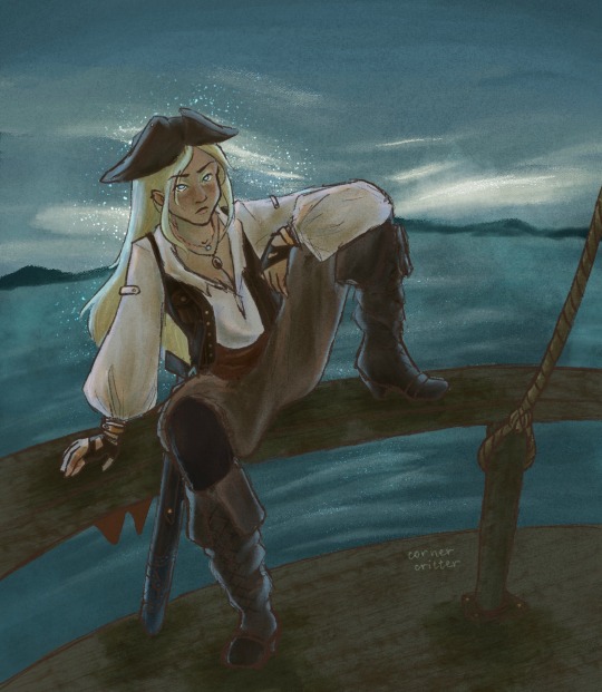
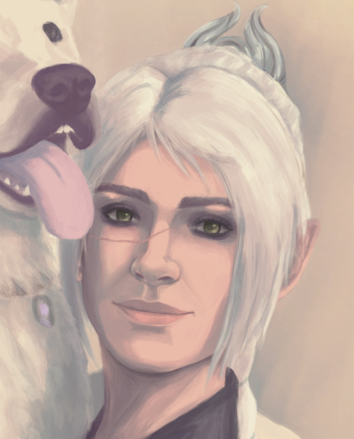
look, i know the chances of false being on pirates smp are phenomenally low, but just hear me out—
look at her. look
#hear me out.#HEAR ME OU-#falsesymmetry#falsesymmetry fanart#pirates smp#<-kind of#my art :)#i did try out some different rendering techniques here and some fun new brushes and i’m SO HAPPY with the results
814 notes
·
View notes
Text

that's a wrap on art posts for 2024!
like what you see? all the art I posted this year is visible on my art tag!
wanted to try something different after last year's formatting disaster, so this is less of a summary and more of an everything-I-made-and-liked collage. as in that's what it is that's what you're looking at
this was a big year for me (I started university and lived away from my parents for the first time, yayyy) and I think you can see that in how my art style evolved in the past 12 months. I'm really happy with where it is now!
last year I picked one piece from each month to talk about, so I'll be doing that again for this year below the cut
january

this is the still version of an after effects animation I did for a design class in my last year of high school. I initially wanted to post this as a gif, but I knew nothing about how gifs worked at the time and it came out both massive and heavily artifacted. I can't even post the gif on tumblr, but the animated version is up in an mp4 format (that does have more colour correction and generally looks better)
february
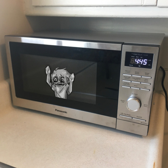
this is a weird pick to represent february (it wasn't even on the collage image) but this... thing does represent that month to me lol. this doodle took me all of 20 minutes and represents the most important battle of 2024... shaman king flowers stream vs frost's microwave
march
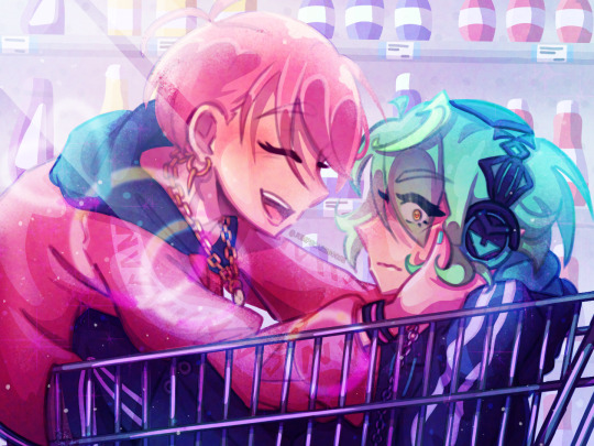
kentareo happened (in earnest, they've been here since the end of january)
april
I don't like anything I drew in april enough to put here
may
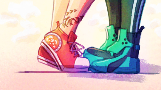
march-may was my flop era this year and I blame these two. at the start of the year I was using a LOT of heavy colour overlays to hide my inability to colour good and those really showed their weaknesses when it comes to pieces with strong complementary colour palettes. this one's nice though, I hated drawing kenta's shoes
june
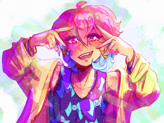
big month for tss news! I really love the colours I got with my tss art from june, you can tell the overlay technique can work when you're not shackled by the kentareo colour palette
july
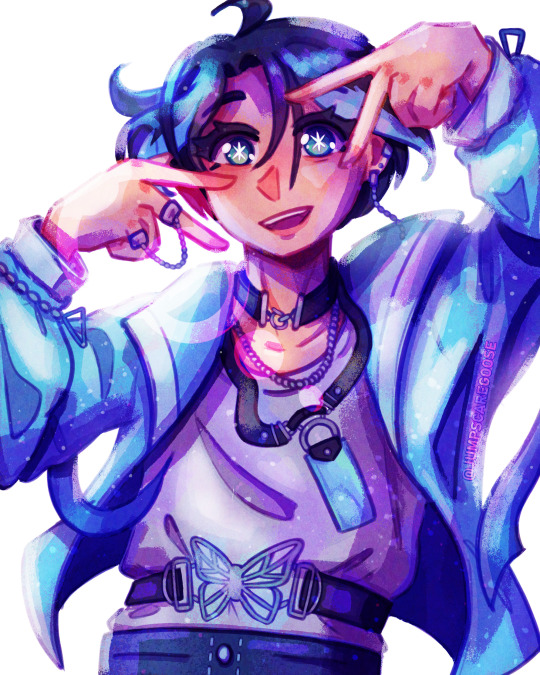
(wow this is really the same pose again. I promise I drew more things in between)
my first month out of high school! had a lot of fun going into the outfit details with this one
august
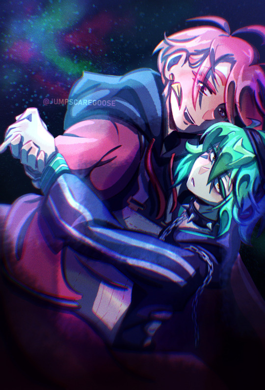
the most important change as far as this list goes- I switched programs to clip studio paint! I'd used adobe fresco for almost all of my digital art career, but I got a pc in august and finally made the switch. it took a while to adjust, mostly because my fresco process had emerged basically via natural selection under the program (and hardware) limitations I was working under. a lot of things (like the heavy texture) I had to relearn in csp with more intention (the august piece is a bit smooth, isn't it?)
september
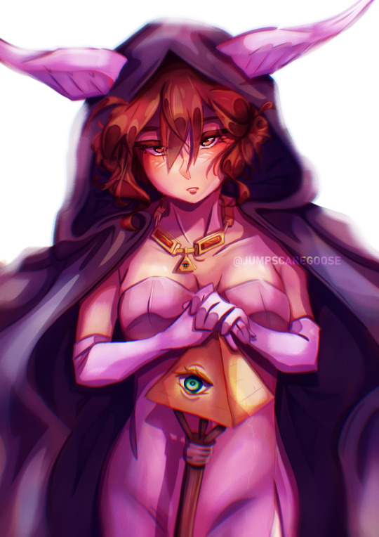
I moved into uni and spent most of the month adjusting to the major life change. I spent most of my drawing time on this piece, trying to figure out techniques and download brushes to get the kind of texture I wanted. this one took absolutely ages
october
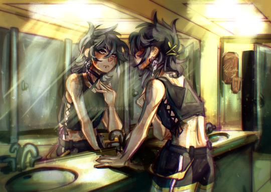
clip studio finally clicked for me. I figured out how to speed up the parts of my workflow that sucked (flat colours) and embraced a more paint-heavy, brushstrokey rendering style. the speed increases also meant I suddenly had the energy for backgrounds!
november
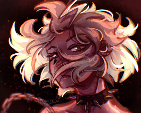
I drew the most this month out of any in the year. I also stopped needing the overlays to make my colours look nice, and so the palettes in my art got more diverse. this piece I remember drawing in about an hour at midnight when I had to wake up at 6:45 the next morning for work, and being so happy I finally captured this specific glowing hair effect
december
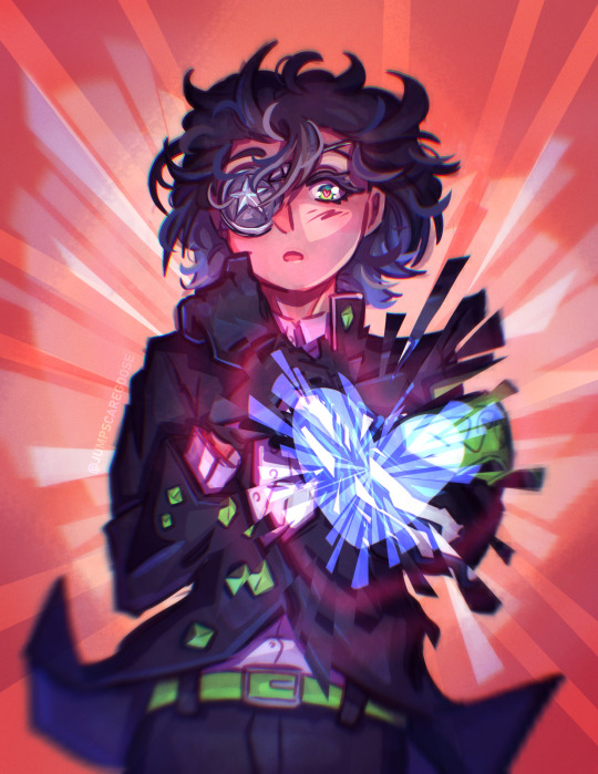
I drew so many full background pieces this month, but I want to shout out this non-background one for the shattering effect I got with the selection tool
and that's the end! many more things coming in the new year (some I've already drawn, actually)
#goose draws#artists on tumblr#digital art#one year later and I still can't tag these#this is my once annual art yapping post okay
8 notes
·
View notes
Note
Hiii can u pls do a face tut pls I’m begging you
heya! sorry this took some time, i just moved and it's been really hectic @@
and thank you for the question! i'll use stuff for bela and shadowheart as an example for ya for the two styles i usually do
warning, i am not a teacher and i'm still experimenting and learning so uhh some of this might be scuffed but is how i do it :>
also noting that i use csp or photoshop depending on my mood and what brushes i want to use but the same technique works for either and i use 2 brushes for the main bits and additional brushes if i want to add texture
--
1 - so after i have the sketch roughed, i usually put it on a multiply layer and add a background layer under it (i leave it white or almost white if i'm just doing a doodle or sketch) and i start to figure out the lighting and shading under the outline layer
the lighting is usually pretty rough and i'll start to understand what i'm going for as it starts to shape up but i try not to reduce the brush size too much so i don't get too muddled
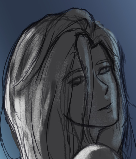
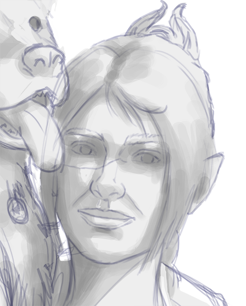
(at this point i'm going thru my mantra of "trust the process" and breathing into a paper bag and kicking and screaming about how i want to quit)
--
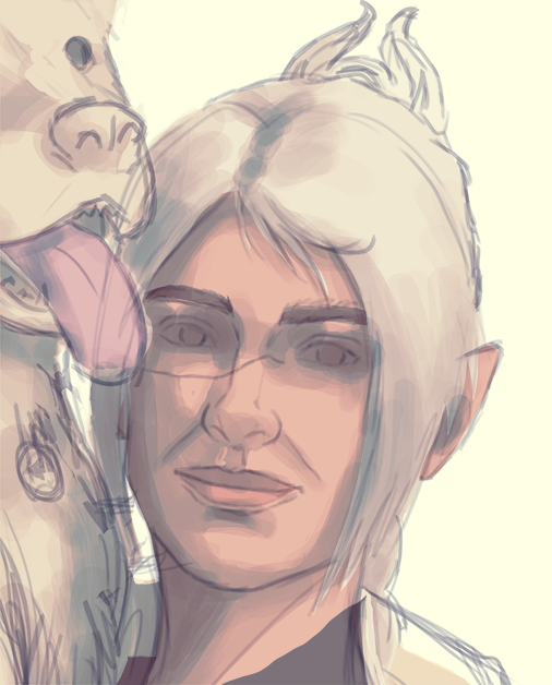
2 - once i have the lighting somewhat how i want it, i start tweaking the color and i do it by using adjustment layers and manually painting. this part is kinda like cooking and tasting as you go, if i feel i want the image to feel colder/warmer i'll adjust accordingly but i will tell you how i did it for both examples below:
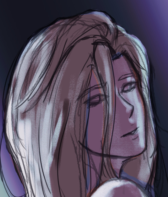
for bela, i actually painting above the shading/lighting layer and used "soft light" and "hard light" blending modes for the hair and skin to fit more with how i wanted it to look. i used color balance and curves for the background to get it to more of a purple/blue and darker
for shadowheart, i actually put the color below the shading/lighting layer and left the color as is and swapped the blending mode for the shading/lighting layer to "multiply" and then did adjustments using curves and gradient maps using "hard light" and "soft light" too and i think i had a "color burn" just for fun
this is my fav part of the process bc i just experiment and mess around with different layers. i usually have a vision for how i want the color and lighting to look but there's always room for new ideas! so i just mess around for a while here till i'm happy!
--
3 - rendering time! um i don't really have much advice here except i just start going in and rendering in closer detail. and remember references are your friend!!!
bela render progression:
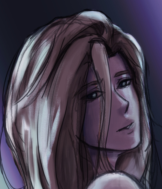
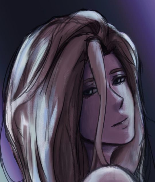
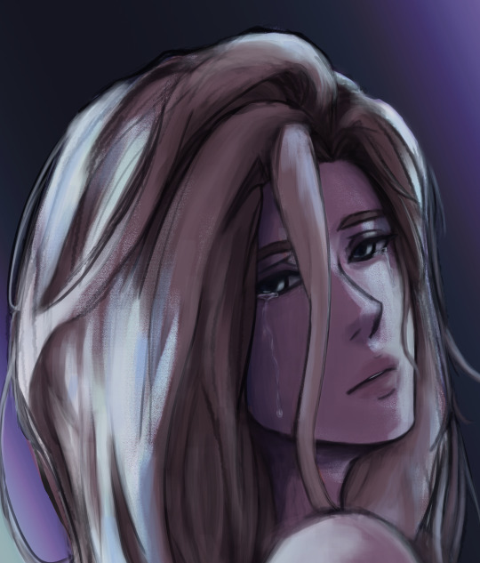
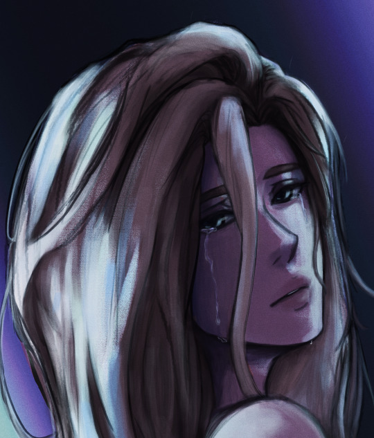
shadowheart render progression:


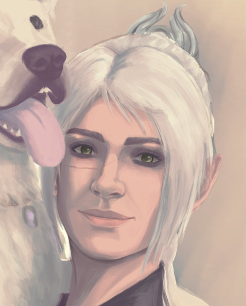
i sometimes end up changing the drawing quite a bit during rendering but that's okay bc as you go into detail, you will notice discrepancies from the pre-render stages
for the style i used with shadowheart i just paint over the outline pretty much with some bits of it left it and i blend more to smooth it out more. for the style i used with bela, i add back in any outlines i painted over that i wanted to keep
--
and at the end of the day it's your art and how you express it is what's always gonna be the best so trust your gut (and references) but also it's okay to take creative liberties and go with the "cool rule" :3
and keep practicing!!!! i def feel i've gotten better with drawing faces compared to a year ago
i hope this helps and if it didn't ":3 i hope you had fun reading
#i hope this makes sense#i had to go back into my files and disable layers to get these screenshots Dx and i have a LOT of layers but for you anon i did it#i didn't know if u just wanted a broad tut of how i draw the face or if you wanted smth specific but i hope this helps anyways#i didn't promise this would help#pretty long post#asks#anonymous#my art
5 notes
·
View notes
Text
Retrospective: Illustrated Merlin Alphabet Challenge
Finally finished the Merlin Alphabet Challenge, so here's the artist notes no one asked for! See below the cut for comments on each piece by order of creation. Be warned folks, it's a long post.
Before we begin: credit to @merlin-gifs for the challenge, which can be found here. It's awesome, go do it.
First thing you should know is I did probably 80-90% of these while on phone calls or in Zoom meetings and that's reflected in the simplicity of most pieces -- the compositions aren't complicated, the lines aren't refined, the coloring is slapdash. If you noticed variation in quality of the pieces, that's why!
Second: I tried to focus on trying something new for each drawing. Didn't always happen, but this challenge did succeed in helping me push me out of my own comfort zone.
Without further ado...
A is for Arthur Pendragon
Textures, baby! Brushed metal of his armor, scratchy linen texture of his shirt, wispy softness of hair and skin. I'd recently gotten my tablet out of storage after a year of figuring out where the hell I was going to live and this was one of the first pieces of digital art I spent time on. Glad it was Arthur kicking us off!
B is for the Beginning of the End (1x08)
Fun fact, I did not draw this with my tablet. I drew it with my work computer's touchscreen. It was awful, would not recommend.
C is for Camelot
I wanted to get used to different brushes, so landscape of the castle it was! There are brushes that help with drawing grass; I did not use said brushes and my wrist hurt afterward. That being said, I really enjoyed working on this and it was one of the few pieces I didn't do while multitasking.
D is for Daegal
Also drawn on my work computer's touchscreen, not my tablet. I didn't learn my lesson from B and the experience was even worse. This is my least favorite piece which sucks because it's Daegal so I'm slated to redo this sometime in the near future. Gotta do our boy justice.
E is for Elyan
Oh, I adored drawing this. Elyan often gets shafted in terms of fandom appreciation so I made sure to choose Elyan for this prompt and to participate in the Elyan fest. Plus, I love a good ghost story and figuring out a way to include the druid spectre was fun. Didn't multitask on this piece because Elyan deserved my full attention.
F is for Freya
Ho boy. This piece. I have such mixed feelings on this drawing. Really really didn't like it after I'd decided it was done and very nearly scrapped the whole thing. I had a vision in my head that I just couldn't render into reality and it frustrated me SO MUCH. Looking back, I like it much better than I did when I first created it.
G is for Gwaine
What can I say, he's pretty when he's cold. I didn't stretch too much with this one -- it's my normal drawing style, I was just trying to find a brush that mimicked the softness of pencil.
H is for Hunith
Another one that didn't stray too far from my comfort zone. I was stupid sick and slammed at work, so a motherly Hunith manifested herself. I blame the bad brush choice on the cold medicine.
I is for Isolde
I woke up and chose violence! Tried to vary my figure drawing style a little in this piece but my brain resisted, resulting in... this. Not mad at it, but not happy with it either. Poor Isolde.
J is for Juggling
Ah, this lovely piece was drawn during a particularly vexing meeting at work. Fun fact, there's another version of this line art that's less about Merlin's stress and more about mine.
K is for Knights of Camelot
Continuing the theme of doodling through bad news and shit meetings. Like I said above, normally meeting doodles aren't complex because I'm concentrating on something else. This one was more involved because I didn't want to concentrate on the meeting. I have a few issues with this from a technical standpoint (perspective, my nemesis) but it's still one of my favorites. Tried some funky coloring technique, didn't hate it.
V is for Vibrant Colors
And here is where we said fuck the rules and started going out of alphabetical order! This one was really fun to do and I loved kicking off Albion Party with this as my first submission. The colors were a challenge (as I hoped they would be) and this is the first time I had to do some color tweaking midway though and after finishing the coloring process. Vibrant Arthur, my beloved. This started as a multitask doodle but took dedicated time to finish.
O is for Old Religion
The concept for this one was buzzing in my head for a bit before a quote-prompt solidified it. I adore the thought of more visible, tangible representations of Merlin as the son of the elements, of "magic itself" -- not just sun-gold eyes, but sea-water hair and sandstone-skin. A complement to the vibrant Arthur portrait.
S is for Sorcerers
When I said I wanted to challenge myself, I wasn't kidding. Ho boy, this was fun but frustrating. I wanted to completely illustrate a gif. So I did. Will I do something like this again? Maybe. A while from now.
M is for Morgause
See above -- same illustrated gif style so at least I was able to reuse some drawings. Poor Morgause ended up looking a little wretched here because I was mentally done with this when I was drawing her. Love the concept of tarot cards + Merlin but others are doing it so I won't continue this series.
Z is for Zzzz
This one was specifically done to test out some custom brushes I made in Krita to make abstract background drawing easier for me. I think they turned out well! Plus who doesn't love bb iridescent Aithusa.
L is for Leon, P is for Percival
Quick, minimal doodles of the boys! Mentally, I was going for a Brady's-style retro ensemble cast TV show credits feel. Not mad at it! Some boys look closer to their actors than others (I think my brain broke drawing Percy, my apologies to Tom Hopper).
T is for Tristan
It wasn't until after I posted this that I realized there was more than one Tristan in Merlin. Could have drawn Isolde's bf but I drew Ygraine's dumb jock undead brother instead. Had some fun with dark greys and blacks here regardless.
Q is for Queen Annis
Best royal in Albion, bar none. I tried a different coloring technique here and I kinda like it! may make it my go-to but we'll see. Old habits are hard to break. Also: our queen deserved more badass clothes.
X is for Arthur X Merlin
Oh, be still my shipper heart. Doodled and colored during a meeting. I had hoped to spend more time on it outside of multitasking but alas, work is a bitch. This one is slated for a rework sometime in the future; I adore the concept too much to let it go without creating another version of this that isn't an utter mess.
U is for Uther's Ward
And here's my attempt at forgoing line art. Not fun, do not like.
Y is for Young Warlock
Channeled some pain into this one. Those are the dead eyes of someone who had been told that he'd succeeded when his friend died. That the destiny he'd been expecting to carry on his shoulders into old age was done and dusted before he turned 30. Grief plus the existential dread of the aimless immortal. Oof. One of my favs.
N is for Nimueh, R is for Rising Sun, W is for Will
And we end on this sorry offering. I was away from home for a while without my tablet and I just got tired of waiting. So, pen doodles at the airport. This was a challenge in its own right because 1. pen only and 2. I wasn't able to pull Netflix up for a reference on the fly. Which is why Will's face is obscured and Nimueh looks.... not like Nimueh lol.
In summary: this was a goddamn joy to do. I finished 26 letter prompts in approximately 21 weeks, which exceeded my own unspoken goal of filling one letter per week. I found a good, happy corner of the Merlin fandom after a years-long hiatus away from being a fandom creator. If you did make it this far with me, thanks for reading my inane comments and giving this little project even a moment of your time -- I'm so grateful.
23 notes
·
View notes
Text
Star Wars Episode VIII: The Last Jedi - A Masterpiece that Reminds us why Star Wars is Important
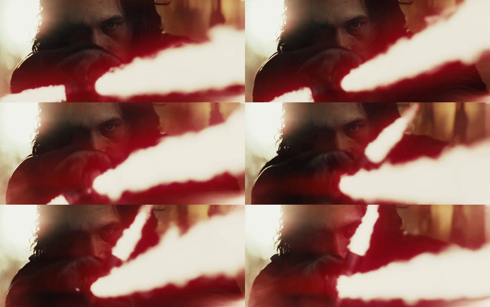
A warning up top: I cannot fully talk about this movie without giving out SPOILERS. I’ll try to keep them somewhat lite, but when it’s necessary events of the film will be described.
Everyone’s story of how they came to love Star Wars is very similar: they most likely saw it young and were absolutely enchanted by the imagination, creativity, and pure fun on display. There is no better escapism than Star Wars, as it allows us to forget the doldrums of our reality while also being a perfect example of Campbellian story-structure and a fascinating distillation of both Western and Eastern popular culture and philosophy. Since its release in 1977, it has grown into something much larger than it was intended to be. One can make a very compelling argument about its artistic merit being nearly completely absent since Return of the Jedi, but many filmmakers in the past have managed to slip thematic points and messages into even the most commercial of movies. It seems as though Star Wars, the epitome of commercialism and marketability, would be the last place nowadays one would look for thematic depth, but in maybe the most stunning upsets of the year for movies, Star Wars Episode VIII: The Last Jedi is an intensely emotional and thematically deep entry in the franchise that enriches its mediocre predecessor and pays a beautiful tribute to anyone that has been entranced by the magic of movies.
The general consensus around the that last entry, The Force Awakens, is that while it might have been a fun return to the universe, it was bogged down by being so subservient to the previous films in the franchise. Fan service can be a nice reward to those who have stuck with a property for a long time, but pointless references and retreads of previous plot-points can render the movie effectively inert when it comes to the spirit of the movie. But then comes along Rian Johnson, a director with a clear understanding of genre trappings, as shown in his high school Neo-Noir Brick or his paradox-ignoring time travel thriller Looper. Johnson smartly applies the same type of subversion techniques to Star Wars, meaning instead of simply parroting events or cliches from the previous movies, he alludes to them for a very specific reason and point. Gone are the moments where Ponda Baba and Dr. Evazan walk into the frame for a moment for no discernible reason, or the moment where Finn bumps the game board featured in A New Hope. Many fans, including myself, were concerned when the trailers featured AT-AT-like walkers, fearing a retread of the most-loved Star Wars entry. Instead, we got a film that challenges what we know about not only the characters we met in the last film, but challenges the entire concept of the original Star Wars trilogy by having us re-examine Luke Skywalker himself. And I am happy to say that Luke overcomes this challenge to reestablish himself as a true hero.
Earlier this year, while marketing Guardians of the Galaxy Vol. 2, the second movie in a planned trilogy, Marvel Studios claimed the movie’s tone would be “Empire-esque”. This is a term that has cropped up in film discussions, especially discussions of franchise films series, that has been used to describe a film with a darker tone than its predecessors that isn’t afraid to move in unexpected directions. However, The Last Jedi is much better described by that term than the second Guardians film is. What makes The Empire Strikes Back work so well as a sequel, and why it is often considered a better movie than the original Star Wars, is the fact that it broadened the universe, concepts, and characters of its predecessor in a way that was true to the essence of the original. The Last Jedi does this not only for The Force Awakens, but for the original trilogy as well. And it does it in the same way Empire did: by revealing that Luke Skywalker is a flawed human being that still has things to learn about the force, the nature of conflict, and of course himself.
As mentioned above, I will be discussing spoilers, and this is were I have to start getting into them, as the central theme of the movie cannot really be discussed without mentioning an appearance by a certain character. At a pivotal moment for Luke, he is visited by one of his old mentors, the spirit of the Master Jedi Yoda, who tells him that the best teacher of all is failure. And we see this sentiment ring true for every other character in the film. Rey fails to redeem Kylo Ren and places him in a higher position of power, where he will only be more dangerous. Poe makes a fool-hardy decision that almost entirely destroys the Resistance. Finn’s heart is not yet fully into the Resistance, and has anger building up over the injustices in the galaxy. Kylo Ren’s failure in the last movie has made him realize his reverence for Vader is only holding him back. Even minor characters like Admiral Holdo learn by making mistakes; if she had been open with Poe, he would not have planned subterfuge against her. But these mistakes and failures serve to round out our characters, give us a clearer picture of who they are, and allow them to overcome them in order to grow into more complete people. None of the failures are more destructive, and therefor more educational, than the mistake Luke made when he panicked about Ben Solo’s darker tendencies. But this failure allows him to eventually see what a Jedi teacher really should be, which is much different than what most fans think of when they think of a Master Jedi.
“War does not make one great” is one of the Yoda-isms we hear in The Empire Strikes Back, but until now no one has really given that line any credence. The reason Kylo Ren becomes so fascinated with Darth Vader is because of his status as one of the greatest warriors in their history. The good he did as a Jedi Knight, and as a reformed man at the end of Return of the Jedi, is of no interest to Kylo. Even the fans of Star Wars are more into Vader as a villain who slaughters people rather than a complex person who has strayed from the good path (just see the demand for and reaction to the Vader scene in Rogue One). And the prequel movies did nothing to help this issue of “warrior-worship” by giving all of the Jedi, including the peace-loving Yoda, fantastic battle abilities. But the way that Luke wins in Return of the Jedi is by throwing away his weapon - refusing to fight. Resolving conflicts with violence will only beget more violence. This is also the reason Obi-Wan refuses to engage with Vader in A New Hope, and why he is allowed to become one with the Force immediately afterwards. A Master Jedi must be a pacifist, inspiring others through peaceful means rather than inspiring others with violence. At the end of The Last Jedi, Luke demonstrates this to the entire galaxy with a legendary stand-off against Kylo Ren and an entire First Order invasion force. Shortly afterwards, he is allowed to become one with the Force, much like his beloved mentor Obi-Wan Kenobi. In the final scene, a child slave is hearing the legend of Luke Skywalker before being chased outside by one of his captors. He uses the Force to pull a broom towards him, looks to the sky, and sees a ship entering hyperspace. Inspired by his hero Luke, he dreams of adventure, a better world, a better life. That child is anyone who has been enchanted by the story of Luke. That child is Rian Johnson, J.J. Abrams, Gareth Edwards, and any other filmmaker that was raised on the original trilogy. That child is anyone, anywhere that has watched any of the Star Wars movies and fallen in love with the characters and the universe. It’s anyone who has watched a movie and been emotionally affected by it.
There are so many criticisms one can level at the film franchise Star Wars and the countless merchandising campaigns that it has spawned, but the true spirit of Star Wars has always been important. And this movie contains the true spirit of Star Wars. It has always been more philosophical than some people realize, but cloaked in a fun and creative sci-fi/fantasy setting. The Force Awakens didn’t deliver on the usual spirit of Star Wars, because it felt like a more corporate take on the original film. The Last Jedi feels like a true sequel to the franchise, pushing its characters in interesting directions, revealing more mysteries of the Force, and allowing us to see the characters in a new way. There are issues with the movie, things I can’t defend as being “good”, but the parts that work come together to form a beautiful film. A painting may have a few bad brush strokes here and there, but it doesn’t stop the entire picture from being great. Rian Johnson has directed a masterpiece that easily stands among the original Star Wars trilogy and will hopefully in time be just as loved as they are.
#the last jedi#star wars#episode viii#rian johnson#mark hamill#daisy ridley#oscar isaac#carrie fisher#adam driver#john boyega#luke skywalker#rey#kylo ren#finn#poe#leia#film#film essay
48 notes
·
View notes
Text
Interview: Sto Len
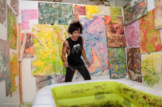
There is magic in the murk.
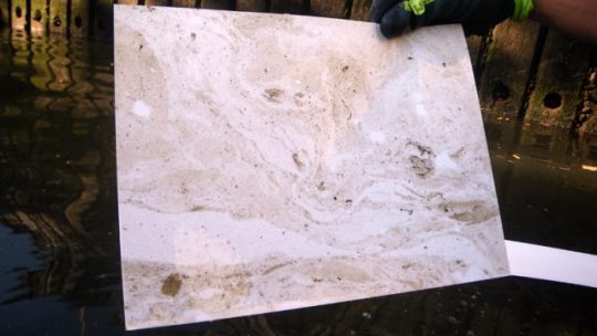
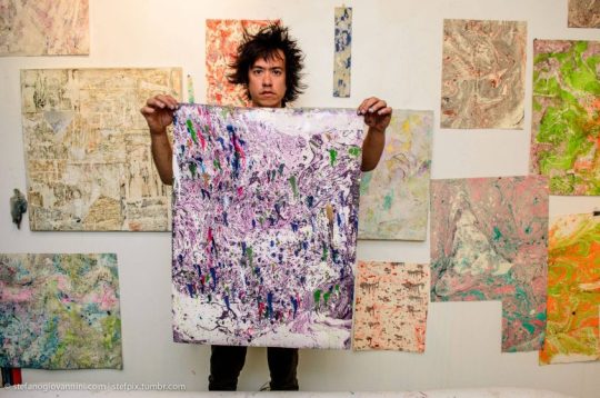
Brooklyn-based artist Sto Len isn’t so much a magician as he is alchemist and soulful choreographer, revealing graceful, swirling gestures from the surface of New York’s most polluted waters, en plein air, from the edge a rowboat. That something so immediate and arresting could be rendered from a shameful and alarming human imposition on nature is how Sto Len draws attention to environmental crises through his creations. It’s radical, political art-marking through traditional craft. His is a curious mind seeking to expose what’s right in front of us.
For Mapping Mespeatches, his recent exhibition at The Gallery at Ace Hotel New York, Sto Len exhibited prints pulled from the surface of Newtown Creek and Corona Park through an original process he calls tsunaminagashi — a mix of traditional suminagashi and his own techniques — mirroring toxic impact as a moving spectacle of psychedelic beauty. Following the show, we spoke to Len about transitioning his practice from the studio to urban wilderness and the question, “where does all the garbage go?”
Hi Sto, where am I catching you?
I'm up in Mendocino County right now. It’s really pretty here. Horses and cows, in the middle of nowhere.
What are you doing on the west coast?
I have a solo show in San Francisco at Parlor, a new space that’s in an old Volvo dealership, so I came out here to cool off for a minute, finish some paintings, and then I’ll drive back down to San Francisco. And I’ll be doing the San Francisco Art Book Fair as well. It's my first time doing it, but I love doing book fairs. I make a lot of books and stuff, so I will be tabling all weekend. I'm also teaching a workshop at the Minnesota Street Project — they have an outdoor courtyard and I’ll do a workshop there on suminagashi, which is how I got into my current body of work. It’s super fun. You use sumi ink, which is the black ink normally used for calligraphy, and you paint on top of water. Sumi ink naturally floats on water so you make a print from its surface.
How did you start doing that?
I went to Japan and I just loved the hand-painted signs that used black ink. I took a lot of photos, came back here, got sumi ink and some of the traditional calligraphy brushes, and I started to paint with it. And I loved painting with it. I mean, I love painting with it. The ink is super smooth and elegant, it's really sexy to paint with and your line lasts a really long time.
I totally fell in love. I tried doing calligraphy for a while and then started doing paintings with the ink. Then I realized that the ink floated, so I started doing these water paintings by creating a composition on top of the water and pulling prints from that. I just got obsessed and started to treat water like a canvas. I started adding other elements to it, started using color, oil paints, and natural materials like dirt and all kinds of stuff — I was getting crazy with the water.
How much can you manipulate? How much control do you have with the surface of water being the way that it is? Is it that you can control the color, but the shape is left to the water? Or have you been able to gain some control after doing it for so long?
You start to get a sense of what can happen or what will happen. I love the fact that you can't control it completely, right? You give up some of your control but, certainly, you learn what little brush strokes will send paint down the water in a certain way. I also use time to do a lot of the work — I'll set colors up in inflatable swimming pools in my studio, let the water sit for a couple days, and patterns will form over time, naturally, in the water.
These days, I'm really interested in that type of technique where I’ll set it up as these experiments in the water, let them do their thing, come back to it, manipulate it some more, and then print from it.
Over the past couple of years, I’d get really obsessed with a material and then just have to try everything. It’s part of the fun that you don’t know what’s going to happen. I love that part.
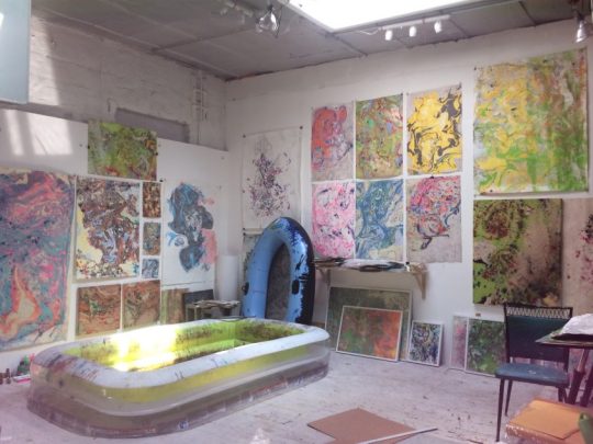
You’ve been working with the Newtown Creek area of New York and I want to know how that came to be. Were you looking out at the water one day and thought, “this is exactly like the inside of the studio.” How did you start working outside?
I just experiment like crazy in the studio. I started bringing more natural elements inside the studio, like dirt, and the more I was thinking about it, the more I realized I was basically making oil spills on water inside my studio and that Green Point is actually home to one of the biggest oil spills in the country, right where Newtown Creek is.
And I thought, “well, what if I went out there and printed from an actual oil spill?” I lived right by the creek when I first moved to New York and I had seen stuff floating in it for a long time. I was like, “oh my God, it's kinda what I've been working on anyways. I should go and try it.”
A friend of mine, Marie Lorenz, has been doing a project where she builds around boats and takes people on boat rides in New York City. A couple of summers ago, her theme was to take people to work. I had told her that I had been printing off the shore, that I've been doing some print experiments with the creek, and that it was working. I was really excited about it and so she said, “why don't I take you to work?” She took me on her boat and we went out and I printed from her boat. I realized that, with a boat, you could get to more places and it was super fun to cruise around on a boat, just printing.
She showed me the ropes on how to launch your boat from different places in New York and — I didn't know this at the time — but you actually don't have to get a license or anything, you can just get a boat. As long as you're wearing a life-jacket, you can go rowing around New York City. I love that aspect of it, that I could just do this. So I got a boat and started exploring, and because the Newtown Creek is fairly desolate (besides the factories that are there), I've been able to keep my boat there for the past couple years and use that as a home-base for my printmaking journeys.
vimeo
It's so interesting because you'd think that there'd be a lot of traffic on that canal, you'd think that New Yorkers would think of it as a free and clear highway.
Well, it adds another aspect to New York, right? We're surrounded by water but most people don't actually have that much contact with it except maybe going to the beach sometimes. It's known that it's polluted, so people don't really go swimming in the water, but they don't even think of boating as a thing that they can do. I've always enjoy saying, “check it out, you can just go do this!”
Were you initially thinking about the environment when you were in the studio, or were you more interested in the formal aspects of suminagashi? When you went out on to the water, did you suddenly realize that the canal was basically made of oil paint? I’m curious to know how these concepts emerged.
I think it was a natural evolution and a natural conversion. My art practice has always been pretty improvisational and I like to adapt to situations, I like to let my material take me places. I think exploring water as a medium was slow and gradual, but when I realized what I was doing out on a rowboat, in the pollution, I realized that this was all different fucking versions of my love for New York and my love for the planet.
All of a sudden, a lot of other concerns in life were converging with the art work. None of that was necessarily intentional, but once I realized all these threads that were connecting — that all were really important to me — I was that much more excited, I knew that was the right path.
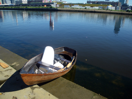
Does the type and the intensity of colors you get from the prints tell you anything about what’s in the water? Do you have a rainbow of colors that indicates diesel fuel, or lady’s hair dye, a color map of pollution that indicates some sort of pattern?
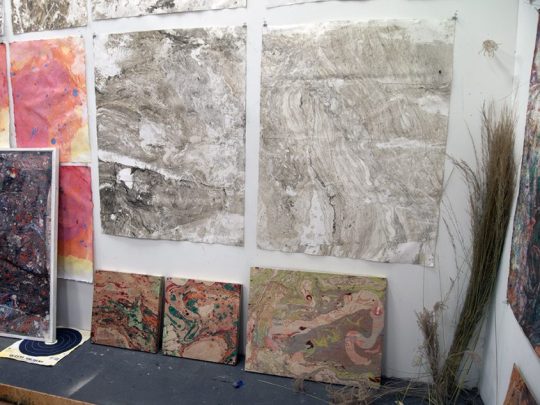
Yes. Every trip I go on, I make journal entries to note where each print was made and, looking back through them, it’s interesting to see that certain areas produce certain types of color. It’s all different shades of reds, browns, blacks and grays, but when you really look at them (and recently at the show at Ace Hotel) you see that “oh, this one’s super light in some parts.” It was pointed out that one of the pieces in the show was really different — that’s because the piece was actually done in Staten Island. The more I do this, the more I realize that there are all these subtle differences in different bodies of water. It makes me want to go around the world doing them.
It’s like research, my way of researching colors and textures and trying to figure out what causes them. A lot of times I do these prints and I’m like “oh my god, what causes this?!” It’s this nasty cocktail of oil and sewage...
Were you an environmentalist before or did this trigger that aspect of yourself?
It's always been a deep concern of mine. I've always wanted to speak about it — I've certainly had it in my mind — but I haven't, until now, really made work that addressed it. And this was just perfect for me because it wasn't premeditated. Now that I see it acting as a way to create dialogue around how we treat our water and what we're doing to the environment in general. I think it's a vehicle for me to be able to talk about things that I've always been interested in talking about.
Do you have specific hope for the viewer when you exhibit these?
One of the great thing about these prints is that they're not didactic. They still hold a place for the viewer to exist and have a little bit of their own experience. It doesn't hit you over the head too much, which I think is really nice. I like not being didactic in that way. I love viewers to have their own interpretation of the work. In exhibitions, I love how people approach them because they can be these beautiful images, but they reference nature in their forms.
A lot of people will think they're photographs or that they're maps. It's so up to interpretation before you really know how they're made. And I love, love when people don't immediately get it and take time to look at them as objects. And then, when they realize the process behind it, it brings a whole other aspect to it. I like people to spend time with them and take them in slowly. It's subtle work, in a way. You can enjoy them without the idea behind it, but for me, it's great to have that in there as well.
Absolutely. Do you see more environmental awareness in the city these days? Has this work brought you to those communities or have you noticed that people are maying more attention?
There's definitely been more awareness in New York...and in general. There are more groups that are specifically focused on water preservation. The city is supposed to be fixing it — and I think that they are trying — but it's a really slow process so other groups crop up that are taking matters into their own hands. And while I'm not affiliated with any group, I still do it in my own way.
I wonder if the prints will also become relics one day when the creek is finally clean — a bright, optimistic future in mind — but that people will look at these and think, “I can't believe that this was right next to where we lived, ate, bathed, had kids...”
Totally. It's a document. It's exactly what was in the water. That's exactly what what was right next to your condo.
As an artist who works in so many different mediums, does each medium speak to a different artist inside of you or do you see yourself as the same artist throughout?
I thought about that recently and I could see, in hindsight, how there are ongoing threads through everything. With the prints, it's so process oriented: I have these materials, I have a boat, I have some paper, and then I go out and it's unpredictable to know what's going to happen — but I'm so down for this journey. And I think the same thing is true with my performance work where I have these specific things I use to make music, to make sound, and then I always have a journey, I don't really know where it’s going to take me. And I think that process has been an ongoing thing for me throughout everything I've done.
I also just like to bounce around from material to material, keep things very interesting, and they all end up informing each other.
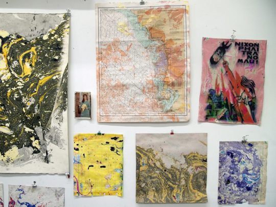
When you're doing something like leading a workshop, do you have certain things that you say to your class to get them free, to be able to create with whatever sparks their interest?
I actually make it a part of the workshop, usually at the beginning, to have an automatic drawing session where I try to break people out of thinking too much. I think sometimes we think too much and, especially when it comes to art, people and non-artists will say, “ah, I don't know to draw, what should I draw, I can't really draw,” and these ideas get stuck in people's heads. I think a great way to get people free is to erase some of that stuff.
At the beginning of a workshop, I have a thing (which I personally do almost every day), to use just ink and paper and not be allowed to paint anything specific. Just get your hands moving and your mind clear. Approach it like a meditation practice.
I've noticed that once people start, they’re still drawing trees, etc. And then, after five, ten, 20 minutes, they really start to give themselves over to simple movements of their hand and then we can start working with the water. But I guess I’m trying to break people free of thinking too much.
It's so amazing that five to 20 minutes can be a revolution in someone’s art experience and they had no idea because they never let that five to 20 minutes even happen.
Totally. It's like meditating. I'm sure a lot of people haven't sat down and meditated for 20 minutes. It might seem really long at first, but if you do it, it goes by super quickly. I love introducing that to people, I think that's a big part of who I am as a person, but it’s also just a nice exercise for people to do.
What are some artists or ideas that you look to that makes you want to make work? That really inspires you?
I'm always inspired by music. I'm constantly listening to music and discovering new music and film so I'm always inspired by that. And I feel like I'm inspired by things that aren't necessarily like what I do. I just watched The Fly last night, directed by David Cronenberg who I love, and there's this creepiness. He always sort of has these fleshy, grotesque, bloody, kind of messy... I don't know, I like to get messy.
I love that The Fly is one of those things that is still a timeless, disgusting — but amazing — movie that inspires you.
It's kind of gross but it's also super thought provoking, right? And I love that. People get grossed out by these prints and at the same time, they're like, “oh, they're really beautiful” or, “you know, now I'm really thinking about all this other stuff.” I love that kind of art where it just gets you on different levels.
Especially because that's just so human, too. We are amazing in growth.
Yeah, we're super great.
What are you listening to right now?
Recently I listened to some Lightning Bolt, and I listened to some Jimi Hendrix. The new Tribe Called Quest record's good.
Are you reading anything right now that you think is cool?
I recently went back and read this book called Gone Tomorrow: The Hidden Life of Garbage by Heather Rogers that tracks where all the garbage goes, what happens to it, and it's super fascinating to see every step.
You can think about it next time you throw something away.
I'm starting to get really conscious about what I'm getting rid of. I also just borrowed a book called You Can't Win by an author named Jack Black — not the actor Jack Black, hah — and I'm excited to read it. Apparently, it had a big influence on William Boroughs.
Do you have any advice for young artists or environmentalists?
I think what I've realized is that actually going out to these places has demystified some of that for me in this positive way. I've talked to a lot of people who really care about Newtown Creek, for instance, but who never go there. I went to a city council meeting that was about Newtown Creek and there were a lot of different kinds of people who were really invested in it, but I could tell I was one of the few people that actually went in the creek, in some of the worst spots. I had this first-hand knowledge and I wanted to use that knowledge to help in some way.
So, just get out there. Discover things on your own and use what you're good at to be part of the solution. I'm not a scientist. I want to work with scientists, but I do what I do as an artist and can at least use that for some sort of good.
Challenge things with the voice that you have. If everybody did that, we'd get closer to a better place.
#sto len#artist#new york city#yes#Tsunaminagashi#suminagashi#mapping Mespeatches#ace hotel new york#nyc#interview
2 notes
·
View notes
Text
My name is James Nyika and I’m originally from Nairobi, Kenya in East Africa (currently residing in Maryland). Many years ago in my teenage years, I recall pouring myself into watercolor artwork in a way that I could neither explain nor resist. I had initially discovered great works of art at the British Council Library in Nairobi – a (possibly) embassy funded public library in the heart of that city that sought to help Kenyans hoping to study abroad in the ways of the British and American universities.
Some of the works I recall vividly include Constable’s “Hay Wain”, Vermeer’s ‘View of Delft’ and Caravaggio’s ‘Calling of St. Matthew’. All these works, while not watercolors, had one common thread – unbelievable light treatment and eye-popping color and realism. Watercolor however, offered a very different treatment of the same material when I could find it.
These were, after all, the days before the internet and all I could find were a few watercolor books with the works of the watercolor giants. But they were amazing. I wanted to be that person, who could produce the same kind of work.
In about 2012, I was looking for a hobby that I could take up that I was going to fully apply myself to. I remember my excitement at discovering watercolor in my youth and decided to explore it further.
A few searches on the internet revealed amazing bodies of work by my favorites such as Sargeant, Alvaro Castagnet, Herman Pekel, Joseph Zbukvic, Eugen Chisnecean, Keiko Tanabe and David Taylor. Keiko Tanabe’s story was particularly poignant because it illustrated that it was possible to transition from a busy employee role to a full time artist career. So I leapt into my new hobby and I have never turned back.
Energized and determined, I started painting in earnest in 2013. I could afford better materials and I was wiser about the need to set up a schedule in order to truly improve along the trajectory that I wanted. So as not to lose my momentum, I chose to focus very narrowly on subjects that interested me and that I would not open to judgement, not from anyone else, including myself. I schedule 1 painting a week and when possible at least 2. Each painting was done on a quarter sheet (larger sheets were too intimidating).
Each painting session had a few crucial rules
(Most important) No matter how dire it seems, you are not allowed to leave it unfinished.
No painting was to be discarded, no matter how much I did not like it.
Each painting should take no more than 1 hour.
Each painting focused on a theme, or specific lesson I wanted to work on.
Progress was slow and sometimes it still feels that way. I bought almost all the DVD video lessons from the greats mentioned prior and I would watch them repeatedly, listening for new details each time – while I did the dishes! To my complete and utter surprise, the painting improved. Since then, I have sold many paintings, received commissions and am now trying to broaden the knowledge of the work.
My Subjects
I consider myself an impressionist landscape painter. My goal is to render one perspective of any reference scene I want to paint. It is only an interpretation but one I hope others share and like. I also like technical subjects such as aircraft and, in recent weeks, I started painting more and more airplanes at the most exciting moments of flight. I have found that there is a great response to these and if enough people want a workshop, I might arrange one.
My Process
I begin by capturing reference material – photos mainly using my camera and from travels. I will then perform preliminary sketches and print out grayscales to better see values but not always. These days I can see the value changes quite well. I then decide what my focal point will be and then work the painting from light to dark, back to front.
I usually try to finish a painting in 3 washes. First the underpainting, a light series of washes to set the main chromatic hue of the painting and underlying colors. The second wash fills in shadows and darker tones and values. The third wave is really about using dry technique and vibrant color to recapture highlights and create interest.
Challenges I Face
The most difficult things for me are:
Remembering and sticking to having a focal point. Cannot tell you how serious this can be.
Remembering to let the water do the work for you. It is watercolor after all.
Avoiding flat dead color – There is no such thing as a flat color, even in nature. The light will vary the hue. Shouldn’t you?
Returning to basics – review your color wheel every so often. Repaint basic scenes again and again to (re)discover a principle you forgot.
Managing Fear. This will never go away. Learn to recognize it and put it back in the box.
Materials I Use
Paints: Sennelier Professional Watercolor Paints (they activate easier than any other in the industry). For some esoteric colors, I use Holbein (Cobalt Turquoise, Lavender, Pyrol Red) or Daniel Smith’s Perylene Maroon.
My base palette: Ultramarine Blue, Royal Blue (sennelier color), Neutral Tint, Perylene Maroon (Daniel Smith), Yellow Ochre, Burnt Sienna, Indian Yellow, Titanium White, Indigo, Dioxazine Purple, Burnt Umber, Raw Sienna
Special highlight colors: Cadmium Red Light, Pyrol Red, Lavender (for getting warm greys with burnt sienna), Cerulean blue (the color of sky.. Like no other)
Brushes: All kinds but my standbys are Princeton (you need stiff brushes to do some of the detailed aircraft work), Alvaro Castagnet’s Neef brushes for washes, Isabey Mop brushes (squirrel) for my day to day washes and Pro Arte sword liners for fine detailed work.
Paper: Almost exclusively either Arches 140lb / 300gsm Rough paper in Pads or Loose 22×30 sheets or Saunders Waterford 140lb / 300gsm Rough paper in Pads or Loose 22×30 sheets. I have never used Cold Press or Hot Press paper.
Lifesaver tools
Hotel Key cards – I travel a lot and I save these to help me with making marks on paper for buildings.
Spray bottles – minimum of two – you need these to add water liberally to allow the water to do its work
Paper towels – help achieve fading effects and catch messes before they ruin a picture
Pencils – a range of lead types but a good professional mechanical pencil is a must. Go for a Rotring as a starter.
Tracing paper – Technical subject are best traced if you want them to look good. Get a good tracing paper and graphite transfer paper.
Gatorboard – Light but strong for holding your work.
Tripod – I do not yet do as much outdoor plein air but I am going to be getting a ball head tripod for holding the gatorboard.
Some of my Guiding Principles
I have a few guiding principles with the work I produce…
First, painting in general, and watercolor specifically, provide an outlet for me. I believe that I do paint for myself. Others benefit because I am open to sharing my work, but ultimately, I first try to please myself. It helps me relax and takes my mind off of computers and software.
Second, the objective with all paintings is to evoke an emotional reaction – a fleeting memory of something past, interest, awareness, fear, – anything! If the painting does not do that, then it is merely an illustration (in the general banal sense – I am not knocking illustrators.)
Third, human beings are imperfect and so are paintings. A painting is a fiction. It is an illusion. It is something designed to evoke an image in your mind’s eye. For this reason, I generally believe that imperfection in paintings, and especially watercolors, is one of their main draws. As one of my mentors once said, ‘Paintings are the perfect expression of the perfect imperfection.”
Fourth, practice, practice, practice. But make it fun. Pick subjects you like, Make time to do the work and have no expectations other than to learn something new each time you paint.
Parting Words From Inside The Net
Here is the bottom line. Talent is truly overrated in my opinion. While we do have some very naturally gifted artists out there, they are the exception – not the rule. I have come to believe that you can achieve amazing work with patience, fortitude, a dedicated schedule, professional materials and good learning materials. It is truly up to you.
Take the leap. Believe. And do not stop. No matter what. Ever.
James Nyika Pixels Saatchi Art
#WorldWatercolorGroup GUEST ARTIST:"Leap And The Net Shall Appear!" by James Nyika #doodlewash My name is James Nyika and I'm originally from Nairobi, Kenya in East Africa (currently residing in Maryland).
#WorldWatercolorGroup#doodlewash#East Africa#featured#inspiration#Kenya#Nairobi#painting#watercolor#watercolour
0 notes