#i cut it resize it sharpen it adjust brightness and contrast
Explore tagged Tumblr posts
Note
Hi! I don't know if you already have a tutorial but would you mind sharing your gif making process? Thank you!
hiiii anon!
thank you for sending this in :) it's my first time getting a tutorial request hehe i tried to explain each step i do as best as i can.
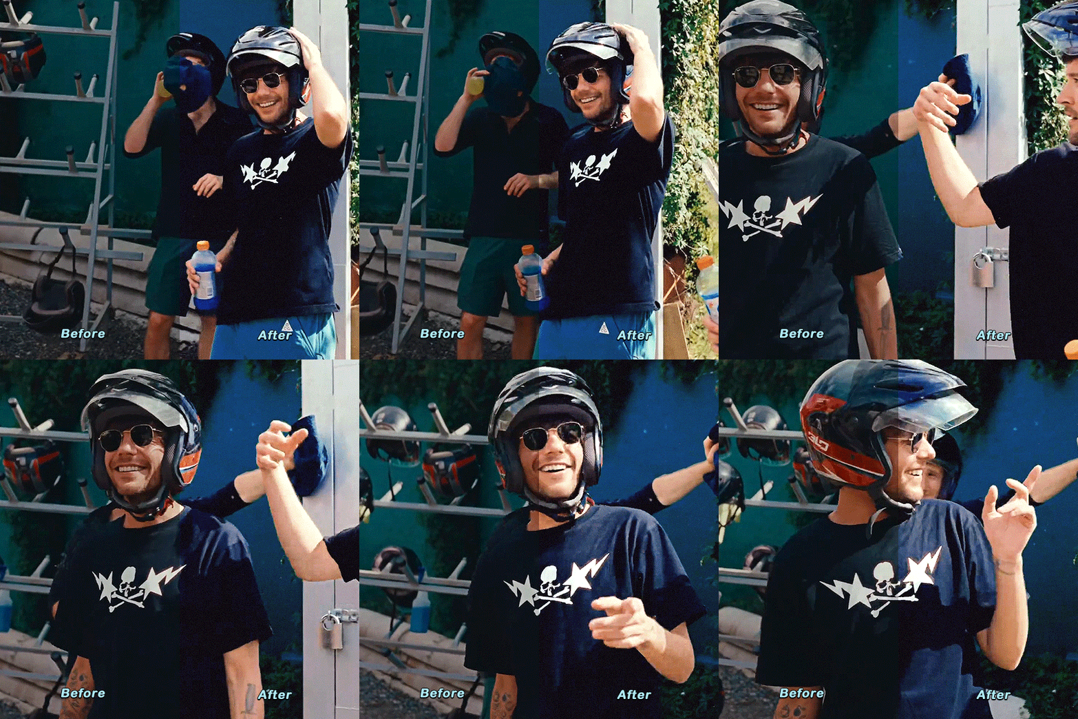
i'll put the gif making process and tutorial under the cut bc it's image + text heavy
before starting, i'd just like to share what i use in creating gifs:
i'm on mac (i used to do them on windows... the ps steps are the same if you're using one)
i'm currently using photoshop 2022
i use 9xbuddy or video downloadhelper extension on firefox mainly for downloading videos
best quality to download for hq gifs is ideally 1080p and above. (although you can get away with 720p for smaller gif sizes)
i use mplayer-osx extended to get the screencaps/frames for my gifs (if i'm not doing the import option in photoshop)
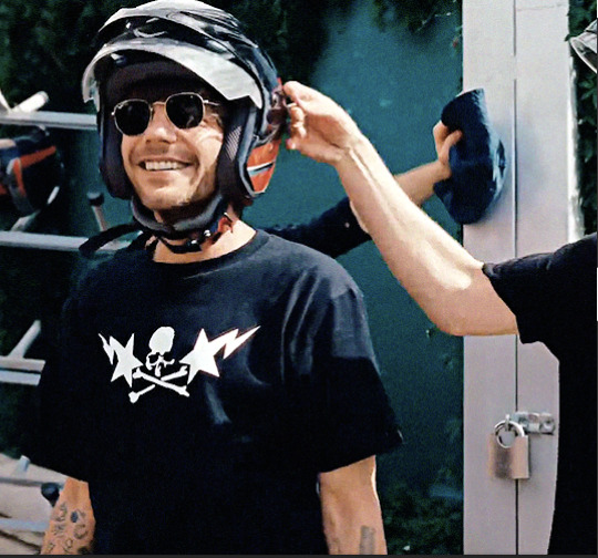
for this tutorial, i'm using the latam highlights video from louis' ig reels to make today's gif. on to the tutorial / process!
please click the screenshots i've included below and zoom in on the texts on them to see them clearly (apologies for the quality!)
IMPORT YOUR FRAMES. once you've downloaded your video, open photoshop and click FILE > IMPORT > VIDEO FRAMES TO LAYERS
SELECT THE PART YOU WANT TO GIF. the shorter, the better because you want to keep it crisp and keep the file under 10mb when you save it after all the layers. here are the settings i use:

toggle the smaller arrows under the bar to select the parts you want to gif. once you have your frames loaded, it should show you a timeline table at the bottom and their corresponding layers on the right side. (if you can't see the timeline, go to WINDOW > click TIMELINE)
3. DELETE EXTRA LAYERS, CROP PARTS YOU WANT TO FOCUS ON, AND RESIZE.

after cropping the parts of the gifs, resize them according to the tumblr sizing to prevent your gifs from looking blurry once you upload them. you can use this size guide for your reference :) the gif's height can be any size as far as i know. go to IMAGE > IMAGE SIZE > INPUT THE SIZE. for this gif, we'll do 540 x 540
4. CHANGE GIF SPEED and CONVERT TO SMART OBJECT

once you've selected all frames
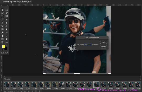
set the delay to 0.07. this is usually the natural, normal speed for gifs on here. it depends on the number of frames you have but i usually do .07 or .05 (sometimes .08 haha)
with all your timeline frames still selected, then select all the layers on the right side. go to SELECT > ALL LAYERS
then convert them to smart object so we can edit all the layers all at once. go to LAYER > SMART OBJECTS > CONVERT TO SMART OBJECT
5. SHARPEN (one of my fave parts!)
this is the basic one that most users use:
STEP 1: go to FILTER > SHARPEN > SMART SHARPEN

radius usually goes from 0.3-0.4
STEP 2: Repeat STEP 1, but this time change the settings to:

you can stop here but i like my gifs crispier and to have more texture! i use the sharpening settings from this tutorial or these sharpening action packs from user brainwasheds. i highly recommend these! i mix and match the settings when i'm not happy with how they look on my gifs. but for this gif we'll use the sharpening settings from this tutorial.
in addition to the settings from that tutorial, i also added FILTER > OTHER > HIGH PASS at 3.4 radius, then set the opacity to 60-80
then lastly add FILTER > ADD NOISE > NOISE at gaussian setting with 1.5 amount, then set opacity to 20-30
6. BRIGHTENING, COLORING, BALANCING, ADDING TEXTURE
now for the fun part!
STEP 1: BRIGHTEN UP THE GIF this is my go-to way to increase the brightness. go to LAYER > NEW ADJUSTMENT LAYER > BRIGHTNESS / CONTRAST then change its blending mode from NORMAL to SCREEN
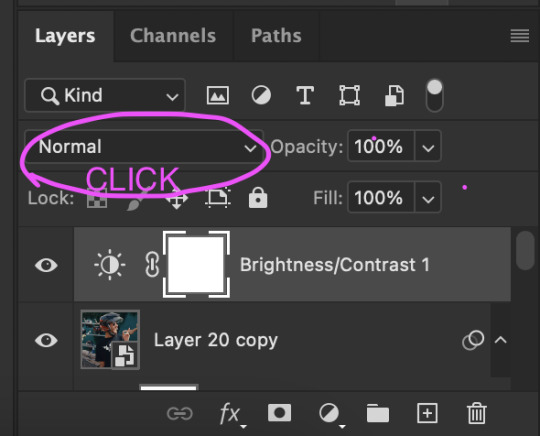
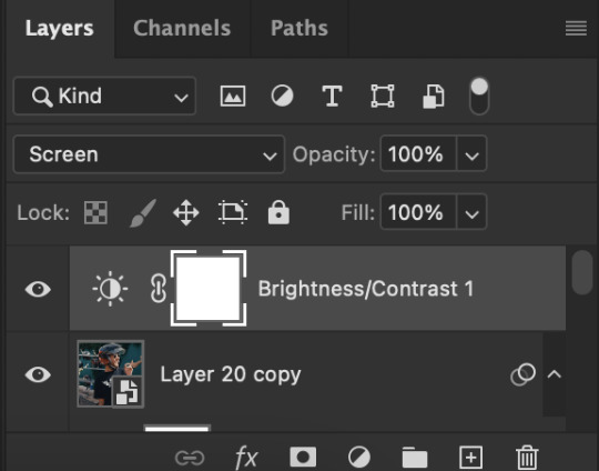

you now have a very bright, highly saturated gif but we'll fix that lol
STEP 2: ADD CONTRAST BY FIXING THE BLACKS AND WHITES add a new adjustment layer > LEVELS

i usually play around with these. middle and black arrows add shadows and contrast while the white arrows add highlights/brightness to the gifs.

these are my settings! these are not definite bc it varies depending on what you're working on, so adjust them accordingly. next, add another adjustment layer > CURVES

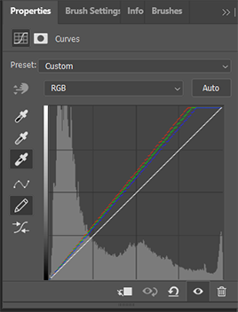
i usually zoom in to locate the darkest / black area using the black dropper. then once that's done, do the same and locate the brightest/white area. this adds further contrast to your gif that wasn't done in the previous step.
STEP 3: COLORING (my fave part!!!) add a new adjustment layer > SELECTIVE COLOR this is the part where i like to neutralize the skin color when it gets too yellow or red, make the colors pop, and sometimes change them too. louis' skin was looking too red heavy, so i wanted to reduce that! i start with balancing out the skin color with REDS & YELLOWS.
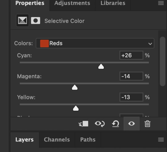

these are my settings for this gif! adjust them and observe the changes it makes on the person's skin. if you know color theory, it's helpful to see how it affects the colors on your gifs. putting the arrows more on the left side, adds more 'cool' tones, whilst putting the arrows to the right side, adds more 'warm' tones.
i like to deepen the blacks on my gifs further so, go to selective color's BLACKS and on the black scale, add more to the right! for this one, i added +10
add a new SELECTIVE COLOR adjustment layer. for this one, we'll make the surrounding colors pop more!

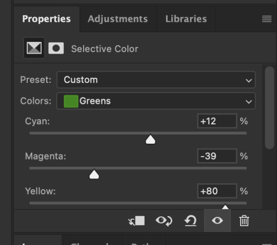
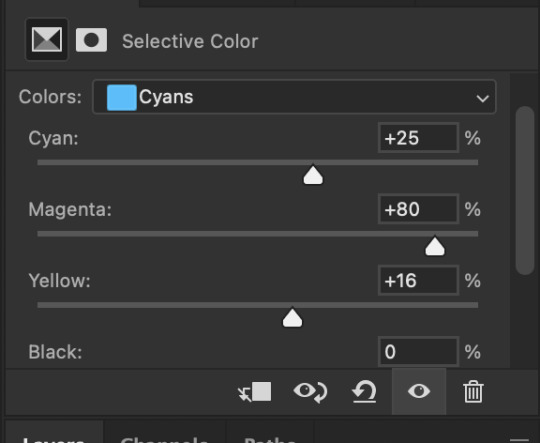

for these settings, i made the leaves more vivid while the teal(?) wall, i adjusted them made it more blue.
next, add a new adjustment layer > COLOR BALANCE this is where you can make further adjustments on the overall colors of your gif. you can also change the color tone of your gifs here if you want to make it more 'cool' tone or 'warm' tone looking.


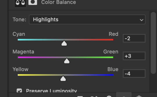
earlier's color theory applies here as well!
6.5. OPTIONAL STEP: ADD TEXTURE/OVERLAYS after the last step, you can save your gif as is but again, i like adding textures to my gifs so we'll add one. i use the textures/overlays that i got from here :)
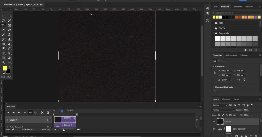
i like to use film, grainy textures! add the texture you want on top of all the layers.

then change the blending mode to LIGHTEN or SCREEN. adjust the opacity to 20-40%. for this gif i used screen with 40%.
7. EXPORT AND SAVE YOUR GIF time to save your gif! click FILE > EXPORT > SAVE FOR WEB

this is my default setting for my gifs. i also tick the interlaced option sometimes.
here's the finished gif:
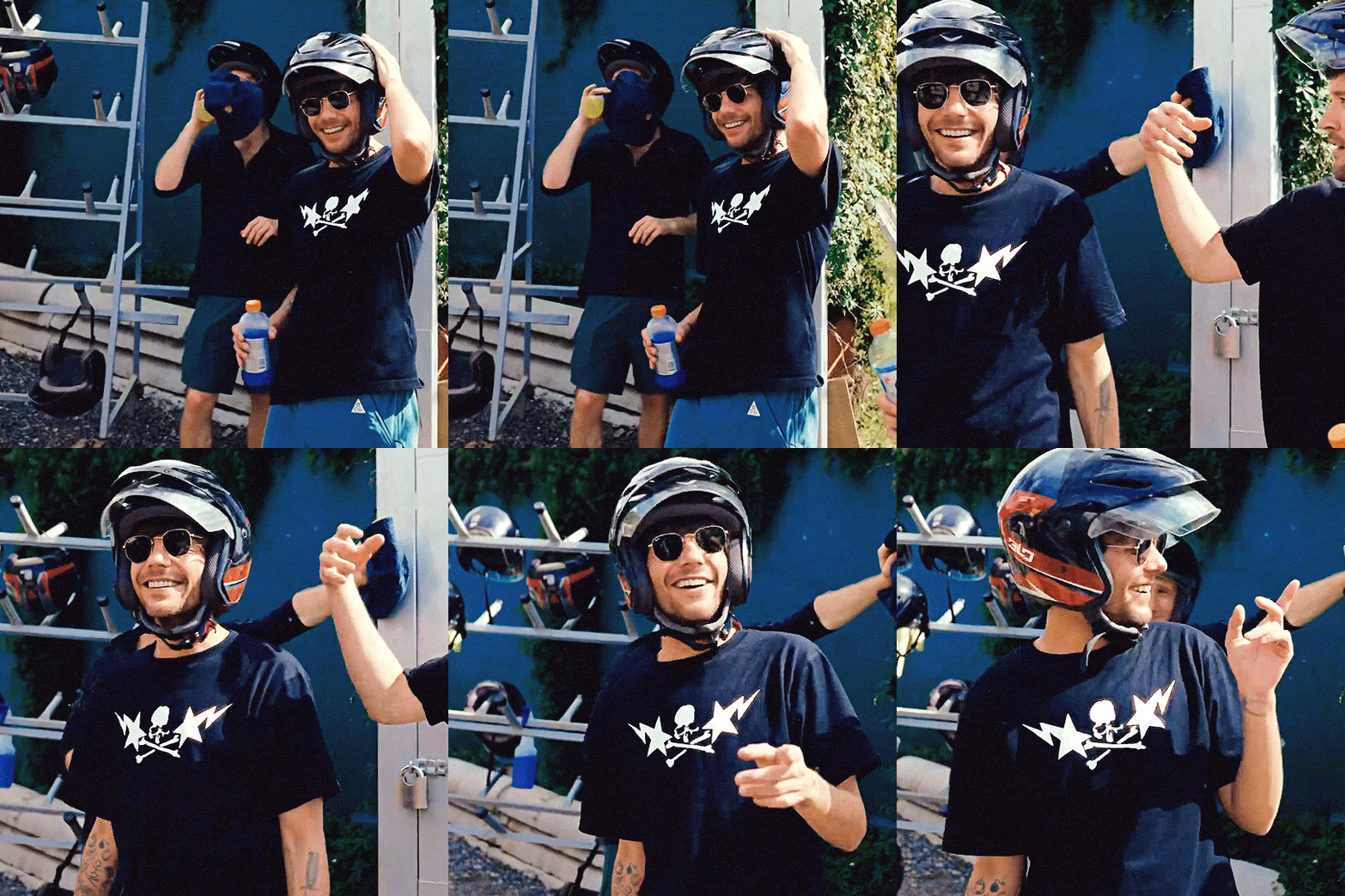
there you go anon! :) if you have any more questions, just lmk or you can directly dm me off-anon if you want.
i also get inspo, guides, and other tutorials over at @usergif
80 notes
·
View notes
Note
omg jesus christ how the hell you can sharpen the gif that.. sharp 🥹🥹 im such a fannnn please let me know some tips thank you
Hello, sweet Anon! I’m beyond flattered and honored that you would ask me for giffing tips and tricks 💙 “is he/she mad” sdfghjkl sounds about right - thank you!! 😂
Okay, let’s delve into it without much further ado:
(more underneath the cut)
1. HQ Videos
The most important thing is to get high-quality video files. I usually work with 1080p and got mine from dr*maday.me - you can find other kdramas there as well. It’s the go-to source for most kdrama gifmakers.
2. Brightness/Contrast
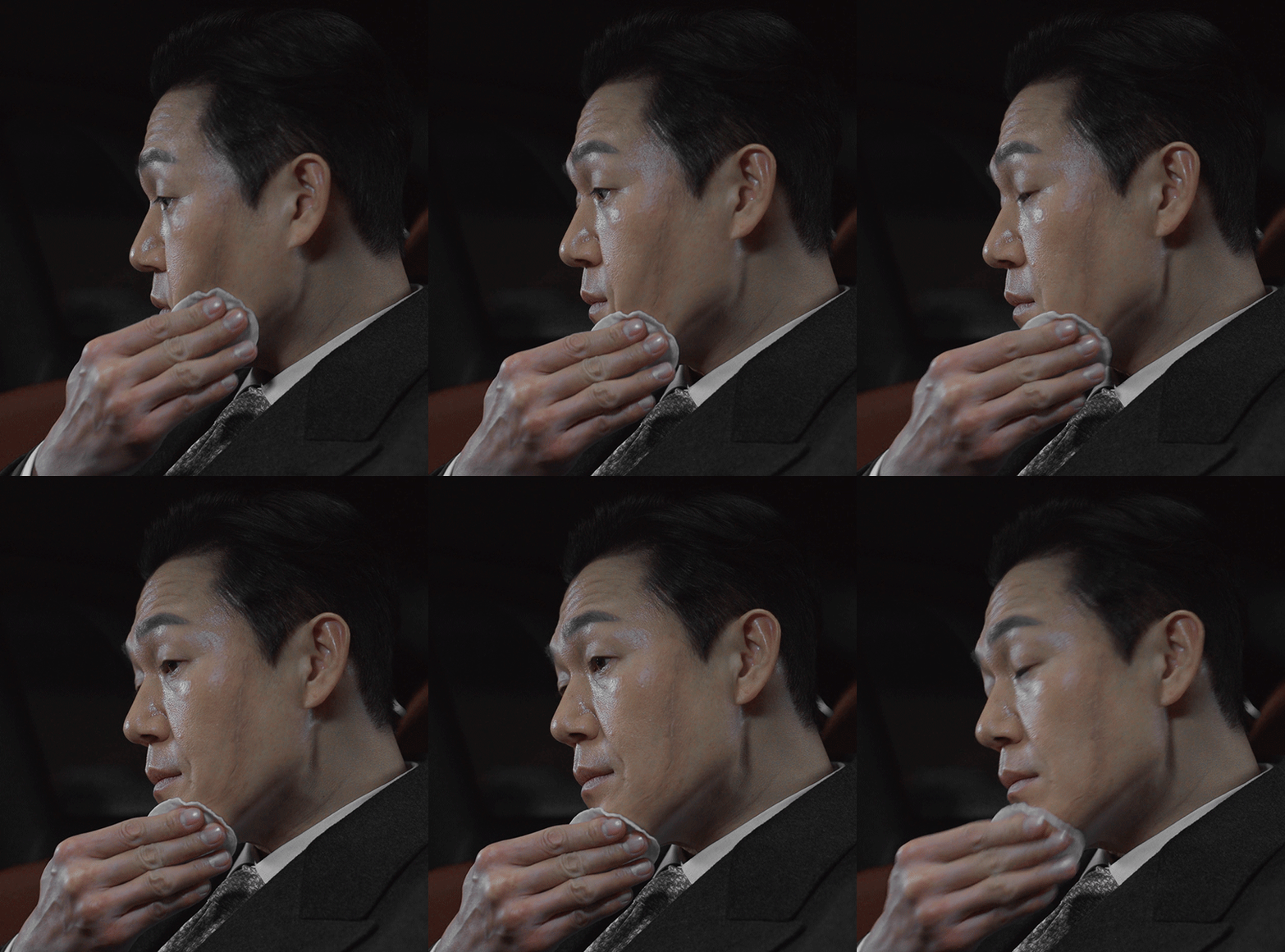
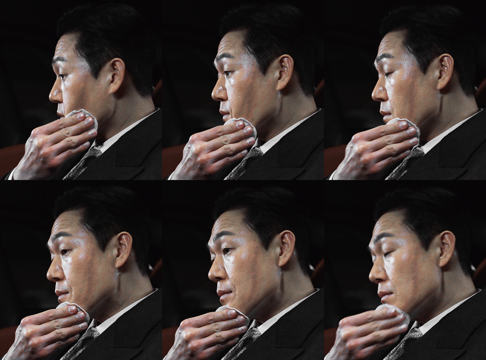
Make sure to get some good contrast with a Brightness/Contrast layer. That’s how you get the vibrancy, brightness, and deep blacks to make everything look more dynamic and quite sharp already even before the actual sharpening, though usually the colors end up too saturated and vibrant, so you’ll have to tone those down.
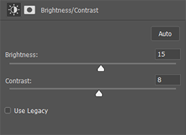
For the first gif in this set I used these settings:
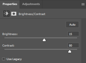
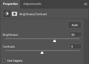
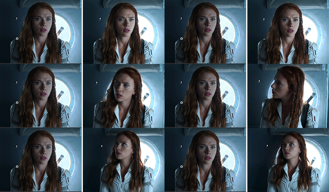
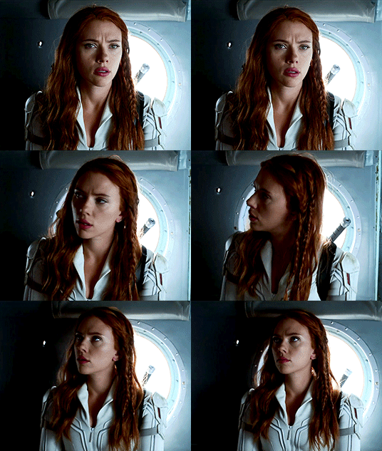
This is what the gif looks like without any Brightness/Contrast layers (but still with all the other adjustment + coloring layers) vs. what it looks like with them:
3. Basic Sharpening
I like to leave the sharpening for last since it fits better into my workflow. For the basic sharpening (two Smart Sharpens) I use these common settings:
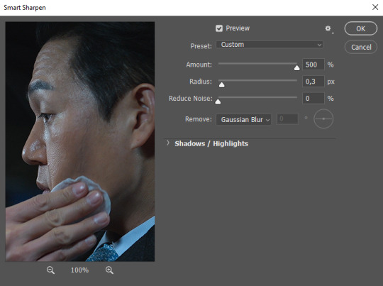

This is what it looks like after the two Smart Sharpens:
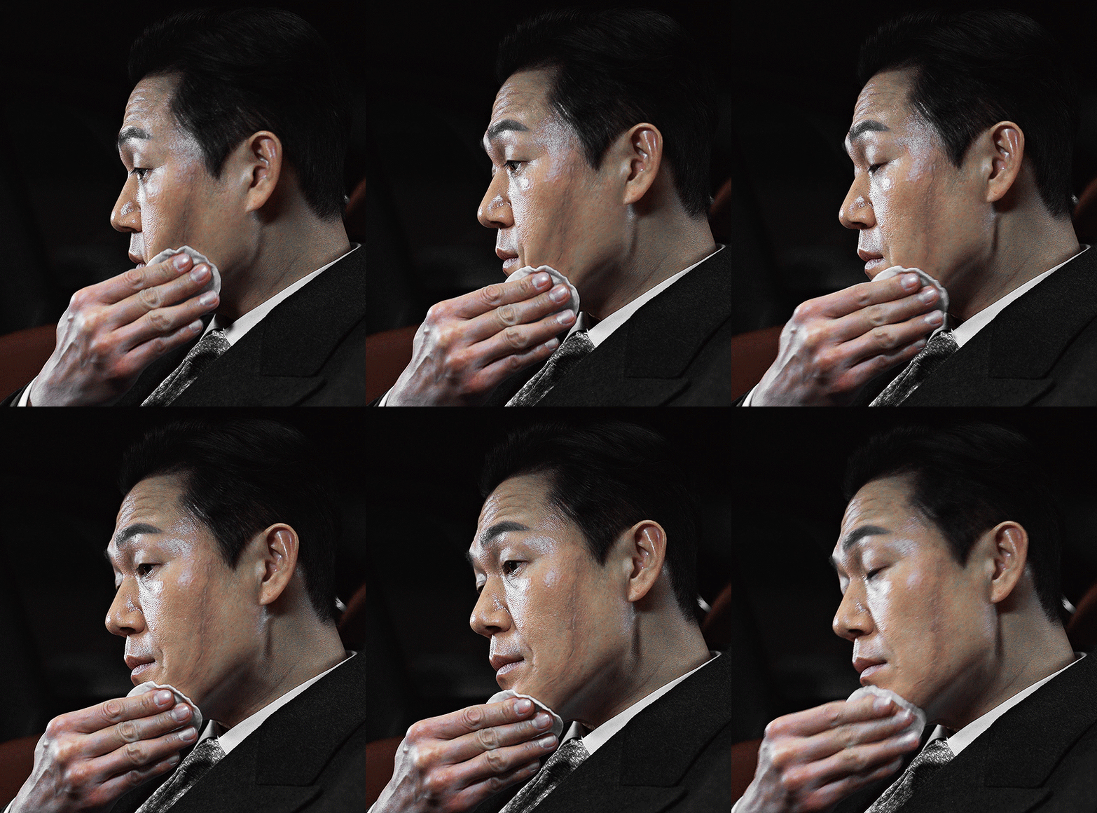
4. Vivid Sharpen (VS)
a. Full VS
For big gifs that are 540x500px or larger, I do a Vivid Sharpen after the basic two Smart Sharpens, and that’s what I did for the gifs in this set as well since they are 540x600px. I follow this tutorial, keeping the same settings (3.0px for the Gaussian Blur, 30% opacity for the VS group): https://sidonidoneeey.tumblr.com/post/667301663059656704/a-really-nice-anon-requested-a-gif-sharpening
And voila, there you have your beautiful crisp gifs! You could let it stay at that, but personally I also like to add an extra step…
b. Masking (Partial VS)
Hope you are familiar with masking, Anon!
If you aren’t, that’s okay too. Basically, you click on the icon of a circle in a square and a masking layer will appear on your VS group layer (as indicated by the red circle and arrows in the screenshot below). You can use a soft brush on that masking layer to hide and show what you like. Black = hiding the layer effect; white = showing the layer effect. After making the whole masking layer black (by inverting the colors with Ctrl+I), I use a white brush on the spots where I want to apply the VS:
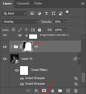
Narrowing down the area of the sharpening is quite useful since VS tends to make gifs REALLY big, and the Tumblr size limit for gifs is currently at 10 MB, so that's something to keep in mind.
I also do it for depth of field (i.e. when the object in the foreground is sharp and the background is soft/blurry). Masking is a good way to amplify that, play with the soft/sharp contrast, and direct the viewer’s gaze.
With Park Sung-woong I found that VS works well on the dips and grooves in his skin, so I just generously used it on his whole body and face; with Woo Do-hwan I feel like VS looks a bit too harsh on his face, so I tried to use it mostly on his body + his hair, eyes, and mouth, leaving out the rest of his face (as best as I could since there's some movement), the way I did in gif 4 with the masking layer looking like this:
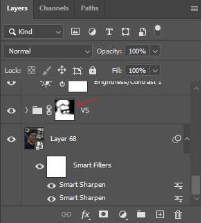
Here you can compare the screenshots of a partial VS vs. a full VS:

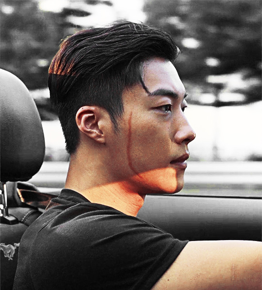
IMO the second one with the full VS looks slightly too harsh on his skin and darkens his face a bit, which I don't want; the background ends up looking grainier as well.
To get back to the first gif, here are three versions with different levels of sharpening for better comparison:
No Sharpening:

Smart Sharpen x2:

Smart Sharpen x2 + Partial VS:

And here you have the original footage (after cropping and resizing) vs. the final colored and sharpened gif:
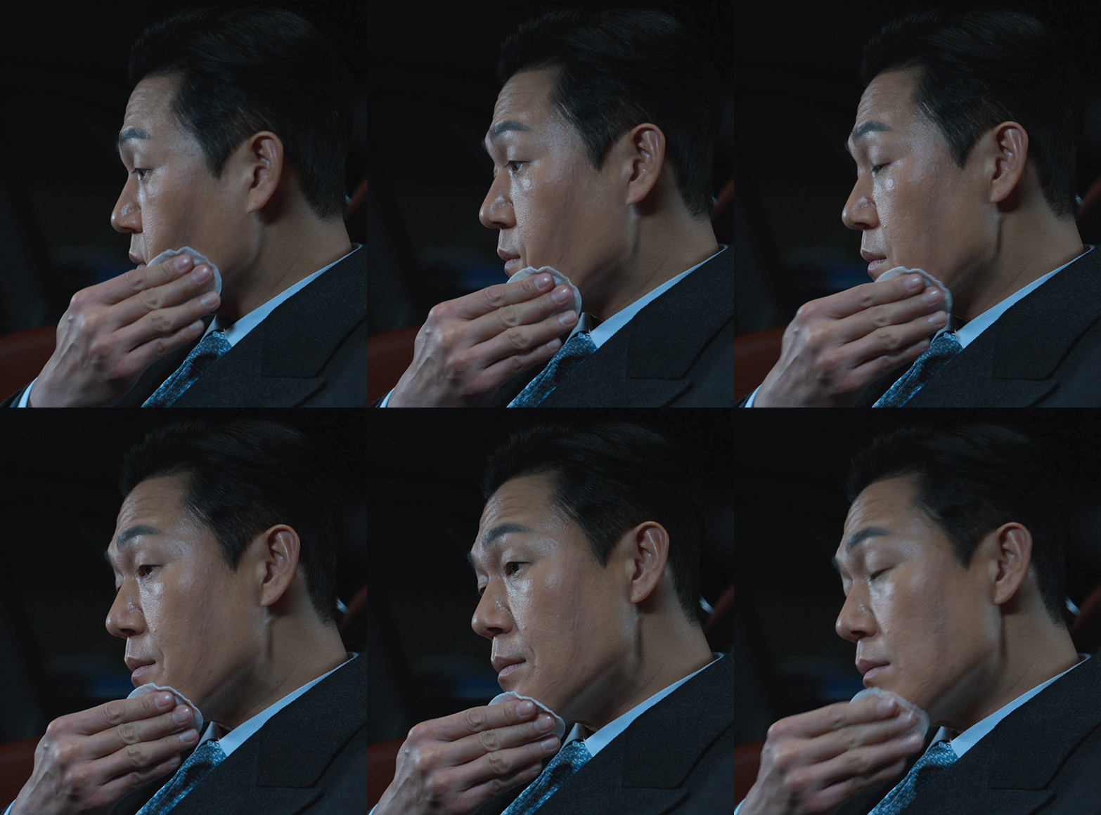

...and that's how I did the sharpening for this gifset. Hope you found this helpful, dear Anon!
39 notes
·
View notes
Note
hi! do you have tips and advice for making gifs? i love your gifs so much!
awww thank you so much, that really means a lot to me as I'm still rusty and a bit insecure because I've learned how to make gifs like 10 years ago? things didn't changed that much in terms of method and yet it's still scary, but at the end people like you make it worth!! 🥺🥺🥺
a little disclaimer: I'm colorblind, I can see colors okay! but I just see them a little bit different than most people so sometimes my edits may seem a little weird and that's the reason
Okay It will definitely be a long answer so I'll put under the cut ☺️
My advices would be:
- Just go for whatever scene you like the most, and try to focus on things you enjoy. I like to gif what I love, things I find beautiful as it gives me so much joy to look at the final result 😌
- Fortunately tumblr is full of people willing to share their knowledge and skills and there is lots and lots of blogs with the main theme being tutorials or even inspo and sources, so I always try to follow them to keep up with whatever is trending and just to learn new tricks and tips, some of my faves are @completeresources @gifmakerresource @allresources and @chaoticresources
- Be patient with yourself, if you are trying a tutorial and it is giving you a hard fight you can always stop and try again another time. It happened to me more than once that a tutorial or a particular idea I was trying gave me such a bad fight that I ended up so frustrated, exhausted, angry and feeling shitty but then I would pick another time to give it try and the thing worked hahahaha, so don't forget to respect your time and wellbeing
In terms of tips and tricks:
- Always use high quality videos, like the best quality available as it really makes a difference in terms of the final result
- Oh always resize your gifs!!! I use the crop tool and then I adjust the image size to keep it high quality, I think this is BY FAR the best tutorial as it explains quite well if you are new to editing
- So far I have tried many many different methods over the years, my fav is to cut the scenes I want to edit and for this use any video editing software really and after choosing a couple of scenes I import all of them to Photoshop (my version is the 2022 edition) and then I use the video timeline method (i don't really remember where I learned it but I found this really good tutorial that might be helpful)
- I slow down the gifs I make (idk how to explain it in english I'm sorry) but I set the speed for something in between 50% to 70%, depending on the scene
- In terms of colouring I don't really have a specific preset or fav PSD, I adjust them one by one just trying to focus on what the scene gives and then I work my way around it depending on what I'm trying to achieve or how do I want my gifset to look like (a good example was the Ron one on my last gifset i didn't wanted to look so yellow as it would be too different from the other gifs, it was a nightmare) BUT I guess I tend to use lots and lots of adjustment layers like I start with brightness/contrast, curves, and levels and then I proceed to selective colors, hue, vibration and saturation, sometimes I even use gradients and/or solid color layers with different blending options like soft light, overlay, opacity and fill settings to correct colors (I always use the color wheel principles of opposites and/or complementaries)
- Use smart sharpening!!! Peopel are so brilliant that they gave us actions, it is literally just a click away from all the trouble to do it manually, and it speeds up my process. Personally I have been using this amazing one I found quite recently, and it's really doing wonders to my edits
anyway thank you so much for being so kind and supportive, my ask box and dm are always open if you have any doubts or just want to exchange ideas. Really hope it helps you ❤️
7 notes
·
View notes
Text
gif with a colored background and reference image tutorial: part 1 of 2
hi! so a while back I made a tarot card set for the old guard and was asked for a tutorial, and since I was planning a tarot set for 911 lone star, I decided to use that for this tutorial (apparently the tutorial is too long for one post, the continuation is here)
I will be showing how to make this gif from scratch:
(sharpening and coloring the main gif, coloring the background, coloring the image, adding both to the same canvas and adding the typography)

the tutorial is below the cut!
loading the frames:
after getting the frames (I use adapter for mac and set the conversion rate to 24 frames per second and input the start and end of the scene I want to use) I import the frames into photoshop using stacks
1. file > scripts > load files into stack > browse > select the file with the frames and select all > open > okay

important: make sure your timeline is visible (if not, go to window and make sure the timeline is checked)
2. once the frames are loaded, click “create frame animation”
photoshop should look like this:

3. next, click the lines button on the top right of the timeline and select “make frames into layers”

4. click the same button again and this time select “reverse frames”

and now we’re ready to get to work!

resizing and sharpening:
1. for this set, the gifs are 540px x 380px, select the crop tool from the left menu and input your dimensions and crop the gif to your liking
2. after cropping, I play the gif and delete frames I don’t want (you can also do this step at the very end but I find that for me, the shorter the gif, the more smoothly and quickly photoshop works)
3. next, resize the gif: (I use the shortcut option + command + I) but you can go to image > image size > type the dimensions > click okay

4. next, convert the timeline into a video timeline by clicking the timeline button on the left under the timeline

5. then go to select > all layers > in the layers panel, right click and select “convert to smart object”


6. for sharpening, go to filter > sharpen > smart sharpen

and these are my settings:

7. I add some gaussian blur to my gifs too (its up to you if you wanna add some but I find that it makes the gif a little bit smoother) go to filter > blur > gaussian blur

and these are my settings:

8. on the gaussian blur filter in the layers panel, right click on it and select “edit smart filter blending options” a window will pop up, I change the 100% to 10% then click okay


next up, the fun part: coloring!
coloring:
the first adjustment layer I use depends on the scene I’m coloring (like for example if its tinted with yellow or blue, I use channel mixer first) but overall the adjustments I use are more or less the same every time
1. since this gif looks pretty neutral, I start with a curves layer, layer > new adjustment layer > curves
using the black dropper, I select the darkest part of the gif, and on the same curves layer, I use the white dropper to select the brightest part of the gif (this really gives depth to the gif and does a lot of the heavy lifting)
2. next adjustment layer is brightness/contrast

3. then I add some levels to brighten the gif some more without losing its depth

4. next, one of the adjustments that save me, photo filter (the trick with using photo filters is to use the one that’s opposite of the tint in your gif, so for this gif, its really yellow/warm, so I choose one of the cooling filters to contrast that, and for example if the gif is very blue/cool, then use a warming filter, its mostly trial and error with photo filters so feel free to experiment too!)

5. now, to add some more depth, I add a selective color layer under the curves layer, set it to absolute, go to the blacks tab and increase the black (usually +1 or +2 does the trick)

6. then go back up the layer panel and add a color balance layer above the photo filter, I use the color balance to decrease the red a little
highlights tab:

then midtones tab:

then shadows tab:

(don’t worry if it looks pale, we’ll add some color soon)
7. next, add another selective colors layer and set it to relative
reds:

yellows:

(no greens, cyans, blues) (note: use this layer to pop up the already existing colors in the gif, I’m not using them because they aren’t in the gif but if they’re in yours, then definitely use them)
magentas:

8. now add a vibrance layer

9. I personally feel like it needs more color so I add another vibrance layer but this step is optional and depends on your gif/who’s in it and your own preference

10. I add a curves layer to smooth out the gif some more

11. I see some green around the gif that I don’t want, so I add a hue/saturation layer, go to the green tab and decrease it all the way

12. and finally, add an exposure layer to bring out the gif a little

and the coloring is done!
if you see anything you wanna adjust, go ahead and add the layers you want/need
saving:
1. file > export > save for web (legacy)

2. and these are my settings:

now you need to open the gif itself to fix the time delay
1. open the gif > select all the frames in the timeline > click on the little arrow under any frame > other > set time delay to 0.05 > okay

2. save it again the same way you did the first time, with the same settings and you’re done!
the result:

next, I’m gonna show how I color the background. depending on how much movement you have in your gif, you can color the background using two different methods. I have a tutorial here for gifs that have minimal movement and I’ll show in this tutorial how I do it for gifs with a lot of movement
gifs with a lot of movement take a lot of time because the gif is edited frame by frame, and if you’re new to coloring backgrounds, I would recommend starting with a gif with minimal movement because those are easier and simpler to color
(if you’re going to use my other tutorial, you can skip here until coloring the reference photo)
coloring the background:
1. first, I open the gif I’m using and then I create a new document with the same dimensions, file > new > (make sure its set to pixels before you put in the dimensions) insert in the dimensions > create

2, click on “create frame animation”
3. now go to your gif, click the lines button on the top right of the timeline and click “select all frames”

4. click on it again and click “copy frames”

5. go back to the new document, click the same button and then “paste frames”

6. a window will pop up, choose “paste over selection”

7. now make sure the first frame and last layer are the ones selected

8. create a new layer and set it to color (this is the main layer we’ll use to color the background)

9. now pick the color you want for the background and start filling it in using a small/medium brush with low hardness (mine is 65px and 0% hardness)

10. I want the purple to be a little stronger, so I duplicate the color layer twice and set the top one to either darken or multiply, depending on which looks the best

in this gif, I prefer darken but its a bit too much so I lower the layer’s opacity to 45%
11. now group the three layers and apply a mask to the group

the color layers have been applied all the frames, which is a problem because of marjan’s movement, and there’s already some purple on her face
this is where editing the gif frame by frame comes in
(continued here)
#photoshop#tutorial#gif tutorial#photoshop tutorial#completeresources#chaoticresources#yeahps#itsphotoshop#dailyresources#allresources#coloring tutorial#gif colored background#coloring gif background#fyeahps#sourceblog#tuserdi#userk8#userhella#resourcemarket
263 notes
·
View notes
Note
hii would you be kind enough to share how you edit your gameplay posts? :) also stupid question… what did you mean by keyboard shortcuts? is it like Ctrl C & Ctrl V thing??? or am I just dumb
ok so long post but here is how i edit! With visuals, some of my settings, and other tips
This may seem like a really long process at first glance but the shortcuts really cut down half the time.
I edit in rows of my screenshots, typically grouping them by post or multiple small posts.

The first thing I do is crop. My crop ratios for my posts are 7:5 for landscape and 4:4.5 for portraits.
The next thing I do is run topaz clean. I could set up a keyboard shortcut for topaz clean but I'd have to pick my preset anyways. Now for the rest of the photos I have open, I can use my most recent filter with Ctrl+Alt+F, instead of opening topaz clean and the preset every time. It will automatically use the last topaz clean preset instead.
Here are my topaz clean settings. Shout-out to the other simblrs' topaz clean settings I stared at to understand and find a starting point of what I should use for sims screenshots (mostly @sojutrait <3)
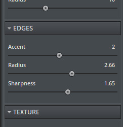
Next is my adjustment layers. I typically use brightness, exposure, and saturation. There isn't a set formula for it but here's my general method. I don't use shortcuts for adjustment layers because I'll being selecting my settings in the same space anyways.
if the screenshot isn't that bright from the get-go I'll use brightness first. If it is well lit, I will only use exposure.
I use exposure rather than brightness to brighten images and to improve highlights, add a glow-y effect, add vibrancy, and also add a little saturation.
It's pretty easy for me to tell what is too much but I suggest picking how much you want and doing a little less. The amount varies a lot per image (+0.11-0.67)
I only use a little saturation (+1-8) since I already get a lot from my gshade. Or I just don't use it
If a screenshot starts off too saturated I'll adjust the curve or lower the contrast a tiny bit instead of lowering saturation.
Then I resize the image to 1000px using the shortcut Ctrl+Alt+I. I don't resize the portrait crops because they are already at about 900px from the crop anyways. The purpose of resizing is so tumblr does not slightly blur the preview images as it does with pictures of a large size. You don't need to click on the field for width it will automatically select it. Just enter your amount and press enter.
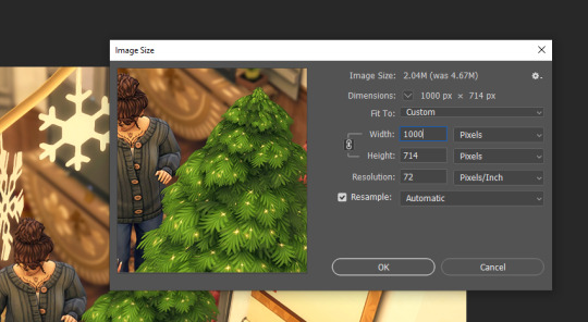
If I am adding in a speech bubble, psd, notif, etc. I will do it AFTER I resize. Placing it on the smaller image will keep it sharper. I like to put my psds and such underneath my adjustment layers but if they are too overexposed I'll put them at the top and make a clipping layer (left click on the layer for the drop-down) for the overlay to match the brightness of the image.
Next part is important for my process. Before I move on to the next image in the row I will make sure I select the background layer (it makes sense later)
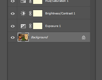
I don't save the image at this point!
I repeat the process for the rest of the images that I've opened and then I go back to the first image.

This time I use the smart sharpen filter. Here's my presets settings. I won't use smart sharpen on zoomed out exterior shots sometimes because it makes it a little crunchy. I made sure I selected the background layer before so the smart sharpen goes on the actual image and not any of the adjustment/overlay layers.
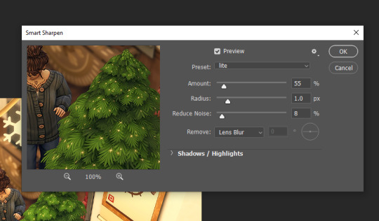
Then I save as with Ctrl+Alt+S. I'll talk about saving more further down and why I don't use quicksave.
So now I can just quickly go through every image opened using Ctrl+Alt+F (filter) and then Ctrl+Alt+S (save as). The reason I do it this way is so I can use the recent filter shortcut instead of switching back and forth between filters for every image. Again you could make a shortcut for your filters, but you will then have the filter's settings open every time. It also gives me a chance to take another look at the edits and see if there is anything I want to change after seeing it again.
After that I'll choose close all, select a new row of images, and repeat the process.
Other info
Why save as and not quick save? If you don't know, you can assign a keyboard shortcut to quick export as png. I don't use this because it doesn't follow the "save as to original folder" setting being toggled off. So you'll have to select the folder you want to save to everytime.
So I toggle off the "save as to original folder" and use the save as shortcut. After your first save to the folder you want, it will remember the folder you just saved to and that you saved as a png. Then you can just quickly press enter twice through the save as and png format option prompts. The original folder setting is in file handling (where to find file handling is under the next question)

Making a keyboard shortcut? You can view all shortcuts by menu and insert your own shortcuts for ones that don't have one or for preference. Just make sure you don't overwrite another shortcut you care about. You can also just see the shortcuts displayed in the drop-down menus next to the option.
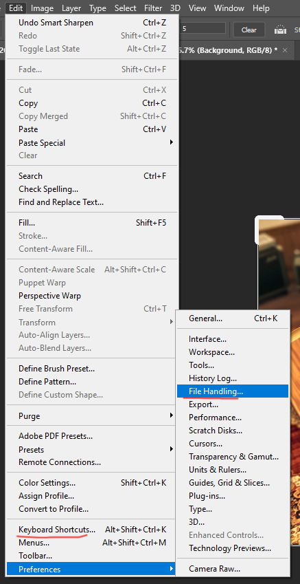
please leave any questions in my ask box and not in the replies!
78 notes
·
View notes
Photo


Texture Tutorial for GIFs by @antoniosvivaldi
This tutorial is requested by @glorious-sunrise and is based on this post. In this tutorial, I will show you how I set up my workspace and apply textures onto my GIFs.
The structure of this tutorial is as follows:
Getting started
Useful Photoshop tricks
Applying textures
Additional examples
Where to find high quality textures
For quick reference, here are the additional examples included in the tutorial: these are modified from the GIFs that I've made in the past.

What you need & need to know:
Software: Photoshop
Difficulty: Intermediate; knowledge in making gifs assumed
Key concepts: Blend Modes / Adjustment layers / Smart Object Layers / Layer Mask
Supplementary resources: tutorial textures
Tutorial under the cut. Like/reblog if you find this useful.
1) Getting Started
The first thing you need to do is to capture your GIF as usual on Photoshop. After capturing your GIF, your Photoshop interface should look like this:

Personally, I prefer to work on the final GIF from a separate PSD composition file since this is more convenient when I want to add composite GIF’s. So here's how I set up my workspace before I start applying textures.
Captured GIF file: This is the gif that you’ve just captured
The basic idea is to convert yout GIF to a Smart Video Layer.
At the bottom of the animation timeline interface, click on “Convert to video timeline” (see the button highlighted in red below)
2023 note: the gif speed as shown below is no longer what I work with now. I now work with everything set in 0.03s and only adjust the frame delay to 0.05s before exporting the final version of the gif

After converting to video timeline, your interface should look like this.

Then select all layers (Alt + Ctrl/Cmmd + A) and convert this to a smart object (Filter > Convert for Smart Filters)
Voila! This is now your prepared captured GIF. All you need to do with your captured GIF is to sharpen it and save (Ctrl/Cmmd + S) as a PSD document.

Main composition file: This is the separate composition file where I apply textures & colourings onto the final GIF that I’ll export
On Photoshop, create a new composition (Ctrl/Cmmd + N), set it to a dimension of your liking (N.B. Tumblr full width GIF’s are 540px wide), and press Enter.
In this new blank composition, you need to "Create Video Timeline” (highlighted in green in the screenshot below). If you can’t find this button you can find this interface from Window > Timeline.

From your documents, drag your captured GIF file directly onto the blank composition that you just created. Resize the GIF layer and then press “Enter“.
Then you need to check that the video timeline length of your overall composition is same as your GIF layer. If they aren’t the same, you need to drag the markers to the correct start / end points. (highlighted in red below)

Now you’re prepared your workspace, you can start applying colourings & textures onto your GIF from here :D
2) Useful PS Tricks
About Blend Modes:
Photoshop provides a wide range of Blend Modes, and using these could be very useful when you want to achieve a certain colouring style. Here are two websites to familiarise yourself with the properties of each Blend Mode:
{Examples with solid colours} / {Examples with images}
Here are the most common Blend Modes that I use in my edits & their effects:
Multiply: This darkens your composition based on the Blend Layer
Screen: This lightens your composition based on the Blend Layer
Soft Light: This normally increases the contrast of your composition
Hard Light: Also increases contrast of your composition, but the effect is harsher than Soft Light
Colour: This transfers the Hue of your Blend Layer onto your composition, but the brightness / luminosity is preserved
Changing layer Blend Modes:
You can change the Blend Mode of your layers via the layer panel.
Select the layer that you want to Blend and click on the dropdown menu (highlighted in yellow in the screenshot below).
N.B. If you couldn’t find the layer panel, you can enable this panel from Window > Layers

You can choose the Blend Mode that you want to apply onto your layer from this dropdown menu

Adjustment / Fill layers:
These layers are very useful when you colour your edits! The really cool thing with adjustment layers is that you could easily transfer your colouring to a different composition.
Adjustment layers: You can add new adjustment layers from the Adjustments panel or alternatively from Layer > New Adjustment Layer

Fill layer: You can add a new Fill layer from Layer > New Fill Layer. And then you have the choice between Solid Colour, Gradient, and Pattern.
You can also change the Blend Mode of these layers to experiment with different colourings.
Smart Object Layers:
There’s a lot you could do with Smart Object Layers and the nice thing is that these adjustments are non-destructive so you could tweak them without destroying the original image resolution.
When you drag a texture directly to your Photoshop composition, you automatically create a Smart Object Layer.
There will be a small thumbnail showing that a layer is a Smart Object (highlighted in red) and the adjustments on this layer is known as the Smart Filter (highlighted in green)

To add a Smart Filter, select your Smart Object Layer and add a filter (from the Filter menu) or an adjustment (from Image > Adjustments).
Adding / modifying layer masks:
Layer masks are very useful when you only want to reveal part of the layer in your composition.
Select a layer from the layer panel and click on the “Add layer mask” button (highlighted in blue) to create a layer mask.

The layer mask is displayed in grayscale. Revealed portions of the layer are in white and the hidden portions are in black.
If you want to make adjustments on the layer mask, just click on the square (highlighted in yellow) to the right of your layer thumbnail.

There are a few convenient tricks to make use of layer masks, which I will quickly show you here.
- Making selections for layer mask: Hold Ctrl/Cmmd and click on a Shape / Text layer. Then "Add layer mask” on the layer that you want to mask
- Create smooth faded effects: Select your layer mask, grab the Gradient Tool (with Black and White gradient), then click & drag to create a layer mask.
To select the Gradient Tool, press G on Photoshop or right click to find the Gradient Tool.

The Gradient Tool interface looks like this. You can select the gradient colours and the gradient types directly on the Photoshop interface.
Note that I am selecting the radial gradient (I’ll be using this in the tutorial).

In the demo composition below, I used the radial Gradient Tool to hide the middle portion of my texture. So in the layer panel, the layer mask shows that the centre portion is black and slowly fades out to white.

3) Applying textures
So this is the fun part and you can be as creative as you want! The textures, blend modes, and adjustments that you apply will greatly vary depending on the colouring style that you want for the final GIF.
For this tutorial, I will show you the steps on how I created the texture effects as seen from darker purple gif that I’ve used in the post banner.
After adding some base colourings, I drag a purple texture to my composition, press Enter, and set the Blend Mode to Soft Light.

To make the purple more vibrant, I added a Fill Layer on top and set the Solid Colour to a shade of purple. For this layer, I changed the Blend Mode to Hard Light to bring out more vibrance.

Now I want to add some starry effects onto my GIF, so I add a starry texture (with dark background) to my composition and set the Blend Mode to Screen.

I actually want to hide some portions of the starry texture that I just added onto my composition. To do this, I select this texture layer and “Create layer mask”.
After selecting the layer mask, I grab the Gradient Tool (with Black and White gradient) and apply a radial gradient from the centre of the composition.
So here you get some basic ideas of how I apply textures:
Blend Modes: texture & adjustment layers
Creating layer masks
Adjusting layer masks using Gradient Tool

After playing around a bit more with my textures & adjustments, I get something like this.

Then I just add more stuff onto the composition for the final GIF that I export.
4) Additional examples
I experiment with a wide range of colouring styles and textures in different edits, so I'll provide a few more examples in this section & a few more editing tips.
Dark GIFs
The basic idea here is that the colouring of your GIF is dark enough that white / light coloured text is legible, but not so dark that you couldn’t see the subject in the GIF.
In these GIFs, I usually apply the following Blend Modes onto my texture layers:
Multiply: to darken the overall composition
Screen: applied onto textures with dark background to bring out the lighter coloured details
Soft Light: I apply this to either increase contrast or add some colours
Example 1: {based on this post}
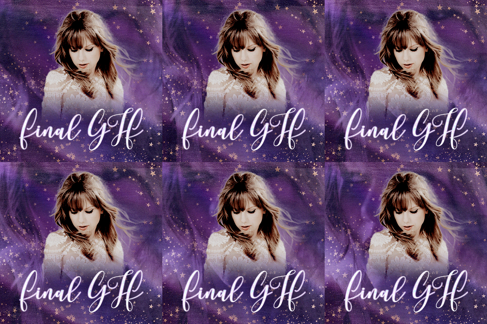
The Taylor Swift GIF below showcases the usual type of textures that I apply onto my darker GIFs.
For the starry effects, I add a starry texture (with a dark background) and set the the Blend Mode to Screen. Then I just played around with the layer masks until I am happy with my GIF.
Note: see the final version of this GIF in the full gifset

Example 2: {based on this post}
The Maisie Peters GIF below is an interesting example where I experimented with different Blend Modes to bring out specific details from my textures.
I used multiple foil textures (Multiply and Soft Light Blend Modes) to create the grainy effects.
I also added a bokeh texture on top and set this to Pin Light. This is because the luminosity of my specific bokeh texture is at mostly around 50% gray. After setting the layer to Pin Light, only the lighter spots are revealed.
After I added my textures, I adjusted the layer masks until I am happy with the end result.
Note: see the final version of this GIF in the full gifset

Pastel GIFs
The basic idea here is that the colouring of your GIF is light enough that darker coloured text & other shapes are legible, but not so overexposed that you couldn’t see the GIF underneath your adjustment layers.
Usually I treat this type of GIF as a canvas where I add other objects on top of the composition.
The usual Blend Modes that I use in these GIFs are:
Screen: To lighten the overall composition
Soft Light: To increase contrast (light coloured textures) or add some colours (colourful textures) onto my composition
Hard Light: Normally I apply a light coloured texture to further lighten my composition so that my darker text layers are legible against my GIF
Colour: to change the hue of my composition
Example 1: {based on this post}
I use multiple light coloured textures & set the Blend Mode to Soft Light to lighten my composition and create some contrast. For the purple colouring, I added a purple texture and set that to Soft Light.
Then I just played around with more adjustment layers & layer masks.
Note: see the final version of this GIF in the full gifset

Example 2: {based on this post}
The GIF below is treated as a background canvas. So I applied multiple light coloured textures (Hard Light) to lighten the composition. Then I also added a colourful texture (Soft Light) to add some colours to the background.
I also added a few more adjustment layers to make sure that the text layers / other objects that I add above this GIF.
Note: see the final version of this GIF in the full gifset

Giffing POC
If you make a GIF of a person of colour, you need to make sure that you don’t whitewash / overly alter their skin tone when you apply colourings & textures onto your composition.
Here are a few useful resources to read about on how to avoid whitewashing POC when you colour your GIFs.
As of the textures, you’ll need to choose your texture layers wisely (try to stick to something that meshes well with the POC’s original skin tone). You might also need to mask your texture / adjustment layers appropriately to avoid altering their skin tones.
For example in this Olivia Rodrigo GIF, I applied a yellow Solid Colour Fill layer (Multiply) and a gold foil texture (Hard Light).
Then I masked the middle portion of both layers (using the radial Gradient Tool) to avoid altering Olivia’s skin tone.

Bonus: masking layer groups
Masking layer groups on Photoshop is a very powerful trick! This is a trick that I commonly use when I apply very different colouring styles to multiple regions in a GIF.
For example the GIF below contains two distinct colouring styles:
Background: Vibrant pink and starry overlays
See-through text: Pastel rainbow / foil textures / photo negative effects
So I will quickly show you how I used layer masks in groups to apply a different set of textures onto “Hermione”.

This is what my composition looks like after applying my first set of my textures.

Add a new text layer. In this example I chose a bold font and set the text colour to white.

To select the pixels of your new text layer, Ctrl/Cmmd + click on this text layer (highlighted in red below). Then “Create a new group” (highlighted in green)

Now click on the new layer group (highlighted in blue) and click on “create layer mask” (highlighted in red) to mask your layer group.

So now you’ve created a layer mask from the pixels of your text layer. Here I also dragged the text layer into this layer group.

After this, I just changed my text layer Blend Mode to “Exclusion” to create the photo negative effect.

I also added a few more textures into this group to get the colouring that I want. So here I have a GIF containing multiple regions of different colouring styles and this is done by masking layer groups!

I hope the examples are helpful and feel free to message me if you need assistance or want to ask a question related to this tutorial post!
5) Where to find high quality textures
FreePSDVN
Creative Fabrica
Creative Market
Design Cuts
TheHungryJPEG
Design Bundles
#tutorial#photoshop tutorial#gif tutorial#resourcemarket#completeresources#allresources#dearindies#codingcabin#tusermelissa#arthurpendragonns#usershreyu#userleanne#usercardigan#tuserheidi#*#my resources#my tutorials
638 notes
·
View notes
Note
icon tutorial?
Sorry! I’ve been so busy, I completely spaced it. Here you go!
Tutorial under the cut:
Step 1: Choose your screencap. Especially if you're a beginner, try to choose one that has good lighting and looks easy to cut out. For this tutorial, I'll be using this screencap of Alexis:

Step 2: Cut out the figure. I usually use the magnetic lasso tool because I find it the easiest. You start by clicking once, then you just drag along the figure, and it automatically makes an outline (you will have to adjust afterward though), then connect back to the first point. It should look like this:

Then, making sure your layer is unlocked, click this button in the corner to mask it:
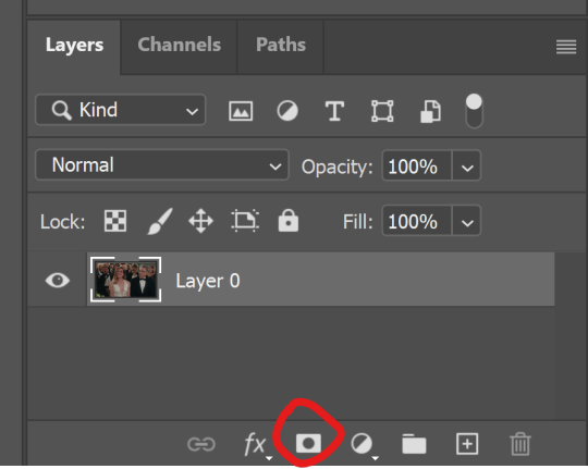
That should give you your transparent image! Then, you just adjust the edges by using the paint tool on the masked layer (black paint gets rid of more of your layer, and white adds it back on). After that, I like to crop the image into a square (but I still keep it the same size otherwise at this point)

Step 3: Edit. First, I like to lighten her face up a bit. I start with brightness (the first icon under adjustments on the right) and curves (the third icon). You'll have to play around with these depending on your screencap.
*Make sure you to right click on these after you add them and press create clipping mask!*

Step 4: Add a background. Create a new layer by pressing the little plus mark in the bottom right corner. Move new layer below original image layer. Then, use the paint bucket tool (on left side of screen) to add color. You can also add a gradient here if you want.

Step 5: Color-fixing. Here, I like to fix some of the colors of her skin and adjust vibrancy. Again, you'll have to play around with this, but my go-to is the color balance tool (looks like an equal scale). Basically, the idea is you're adjusting the red, blue, and green tones of the image (don't forget to clip this one, too!).
I also will click on the vibrancy tool (fifth tool on the top) to add more color.
Finally, I add a soft layer of the background color overtop (usually soft light) and adjust the opacity lower. (Make sure to put this layer above all the others). You can see my settings on the side of this image:

Step 6: Fine-tuning. I like to add some extra color to hair/cheeks/lips. I do this by making extra layers for each and painting over the areas with a brush. Then, I adjust to a different setting (soft light, sometimes hard light, whatever works).
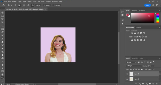
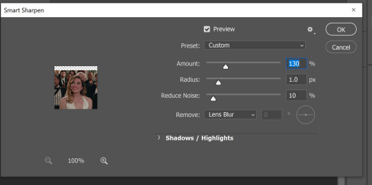
Step 7: Sizing. Next, I’m going to size the icon. I like making my icons 250x250, but that’s just my preference. Then, once I resize, I’m going to sharpen. When you sharpen, make sure you’re clicked on your layer with your person on it. For sharpening, go to filter, sharpen, smart sharpen. Here are my settings:
Step 8: Finishing up. I add some more adjustments based on what I want changed. For this icon, I used the exposure tool (fourth icon on top) to give me more contrast.
And here’s the final product!!
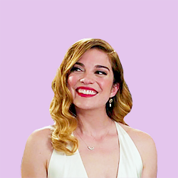
Hope this was somewhat helpful!!
64 notes
·
View notes
Photo

Simple Coloring Tutorial
— photoshop: cc 2020, but this should be compatible with most versions of PS — level: beginner — please like/reblog if you use/find this helpful — tutorial under cut:
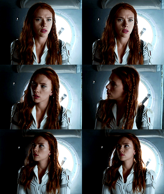
you will obviously first open your caps or import your clip, crop/resize your gifs, and add sharpening. here is my gif after sharpening and before any adjustment layers:

STEP 1: curves
add a new curves adjustment layer, choose the bottom dropper and choose one of the brightest points in the gif.
you can see the spot i chose circled below:
add a second curves adjustment layer and choose the top dropper, and choose one of the darkest points in the gif

you can see the spot i chose circled below:

STEP 2: basic coloring
next, i add a levels adjustment layer. on this one, i prefer to only adjust the middle and left arrow. the left arrow adjusts the dark points and the middle arrow adjusts the midtones (and the right arrow adjusts the bright points). i move the middle arrow left to add brightness and highlights and i move the left one right to add depth and contrast. here are my settings for this gif, but i suggest playing around with these two arrows to find what works right for your gif.


i then like to add a photo filter (warming filter (85)). i keep the density at 25% but change the opacity. i prefer 40% opacity but anywhere between 30-50% usually works well. this doesn’t add much adjustment to the color but it helps to balance out the colors, if that makes sense.


then add a brightness/contrast layer. again, brightness will depend on your specific gif and how bright you want it to be. for contrast, i would suggest not going higher than 15 (i prefer between 5 and 15), but again, it will all depend on the gif.
i then add a selective color layer and adjust the blacks. for most gif, below 10 will work will. it will help add some contrast without overdoing it. i know i sound like a broken record, but again, it all depends on the gif.

STEP 3: color balance/vibrance
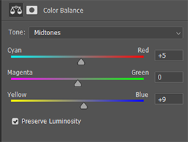
next, add a color balance layer. this will all depend the coloring of your gif, but i will try to give a quick explanation of how it works. for this gif, i slide the bottom arrow towards blue some, because i think nat’s skin is too yellow. i also added a bit of red to add some more depth and coloring to her skin.
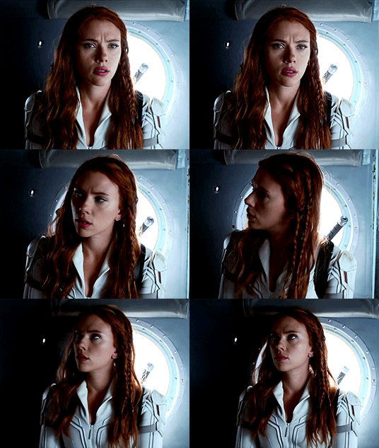
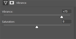
now add a vibrance layer. for this one, i added vibrance at 75%. however, most gifs don’t need this much. you can usually easily tell the right amount of vibrance by just paying attention as you move the arrow. i prefer not to mess with the saturation because i don’t like how it looks.

finally, add one more simple curves layer. most times, i use an auto curves layer. sometimes i don’t like how it looks, just add a simple curves layer by adjusting RBG just a little bit.

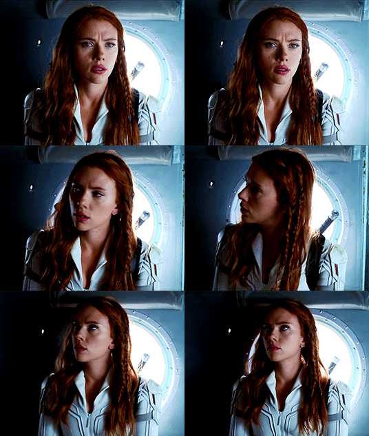
OPTIONAL COLORING
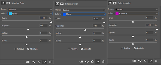
now if you want your gif to be brighter/more colorful, there’s a couple more steps i would suggest. first, you can add a selective color layer. for this gif, i adjusted the cyans and blues to make the background more vibrant and magenta to add more color to her lips.

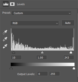
if you want to make your gif brighter, you can add another levels adjustment layer. for this one, you will actually adjust the right most arrow (the one that adjusts the bright points) and the left most arrow again (the one that adjusts the dark points.) these are my adjustments, but you can find what works best for your gif.
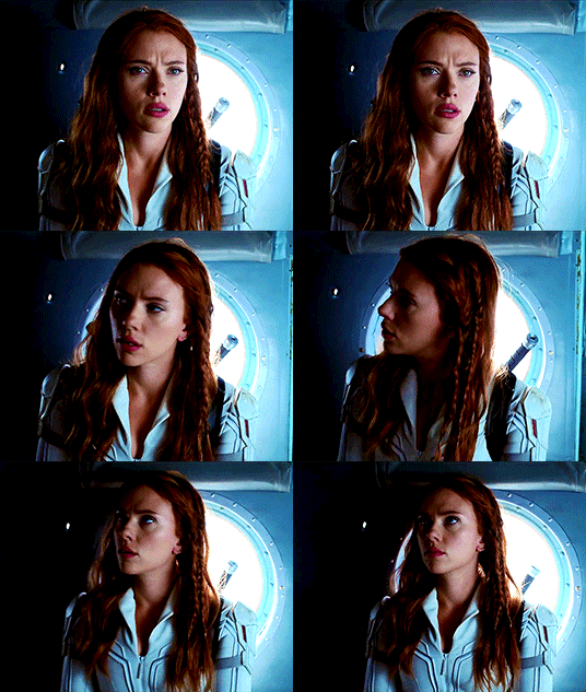
MORE RESOURCES
(my preferred) sharpening settings by @anya-chalotra
font i use for subtitles: utsaah (bold) set to bold and italic
how to fix orange washed characters by @aubrey-plaza
anti-white washing psd by @evansyhelp
#completeresources#resouces#tutorial#coloring#usertana#userpavi#usermarcy#tusersan#useramina#usermorgan#userannalise#tusersammy#usershrimp#jaskierbatey#userholtz#userelm#tutorials#**#tutorial*
663 notes
·
View notes
Note
How do you make gifs? They look sooo flawless btw
That is so kind of you to say. Thank you!!
How do I make gifs? Well...
Acquire a high quality copy of the show.
Convert it to mp4 format.
Find the exact scene I want to gif within the show.
Import that scene into Photoshop using the Frames to Layers option.
Pick out exactly which frames I need and delete the rest, but leaving some extra frames in so I can tweak later.
Crop if changing the dimensions or cutting out opening credits covering the bottom of the picture.
Resize to the exact width tumblr will display the gif, plus 1 extra pixel on each edge.
Crop off those extra pixels to clean up the edges.
Sharpen. Sometimes twice. I use a Photoshop action for this... which I made.
Adjust the brightness and contrast using various adjustment layers.
So many layers.
Adjust the colouring using various adjustment layers.
So many layers. (Or sometimes just one. Each scene is different. Even within the same scene, each shot is often different.)
Add text if needed.
Adjust the frame rate.
Sweat over the colouring and brightness some more.
Decide it's decent enough I guess.
Tweak exactly which frames to include for optimal looping and filesize.
Export as .gif using as high quality settings as possible while keeping within tumblr filesize limits. (10 MB maximum, or under 5 MB for best display quality on mobile. I think. This is always changing so who even knows.)
Repeat that process for each additional gif.
Easy Peasy. 😅
Some people use a slightly different process but that’s basically how it’s done. If you want to start making gifs yourself, I suggest you find some tutorials. They explain each step in detail and are very helpful!
18 notes
·
View notes
Text
GIF Tutorial for Beginners
People keep asking me to teach them how to make gifs and I end up writing them long confusing messages, so I figured maybe it’s time to just write up an actual clean tutorial instead! This is supposed to be for total beginners! (Or people who want to switch to a new process that I’ve curated and streamlined over 8 years of making gifs.) I’ll try to keep this as barebones as possible, and won’t include all the advanced stuff I usually add. I hope it’s easy enough to follow, and I’ll include some links at the end for more stuff. I really do think it’s better to make a few simple gifs before doing more complicated stuff though, just to get used to it!
There will be three sections in this tutorial: #1 Basics - How to make a gif in PS at all #2 Sharpen - How to use sharpen/denoise filters in an easy way #3 Colouring - Just a few very basic adjustment layers
What you need:
A video (most common formats should work, although .mkv doesn’t always)
Photoshop (I use PS CC 2018 - this one because I'm morally opposed to Adobe’s subscription model - but versions aren’t super different from each other)
In the end, you should hopefully be able to make something like this:
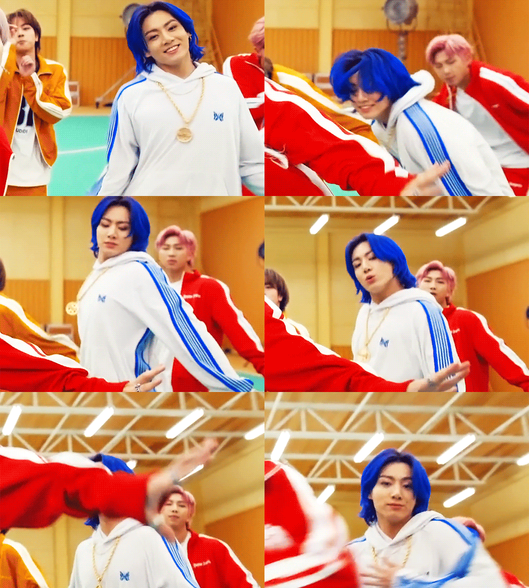
This is gonna be so long. Sorry. You can make a gif with just part #1! The rest is just to make it look better.
#1 Basics
If any of the tools/functions aren’t where they should be for you, your best bet is googling it, you might need to change something in your preferences!
Make sure to save your PS file... often. PS has a tendency to crash, especially on laptops.
First, you need to get the video file. I recommend a shorter video, a few minutes long, if it’s longer you might want to cut it into shorter parts beforehand. This is just because PS’s video import tool sucks.
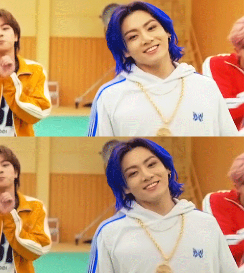
I chose the Butter MV, specifically Jungkook’s body roll at 1:24 because that’s what I want to look at for the duration of this tutorial. No further questions, thanks.
1. Open PS, go to File > Import > Video Frames to Layers

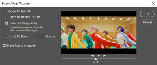
2. In the little pop-up, choose the part of the video that you want to gif. This will import every frame of the video into PS as a layer, so it has to be a relatively short part, or it’ll take ages (and gifs can’t be that big anyway). Now you can also see why it’s almost impossible to select the correct part if the video is too long.
The little controls at the bottom are for trimming, the one in the middle just for the preview. Make sure “Make Frame Animation” is selected! Then click OK.
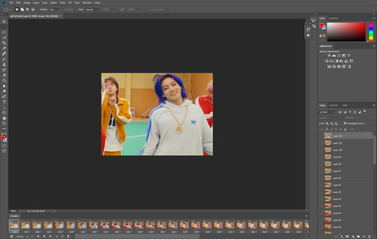
3. Now you have your layers, and you have a frame animation! On the right are your layers, that’s where we’ll apply the colouring etc. later on. On the bottom, that’s your timeline or frame animation - that’s what the gif will be in the end! So if you delete frames, the layers will still be there, but they won’t show up in the gif. If you click on a frame, you can see the little eye checkmark on the layer that’s currently visible.
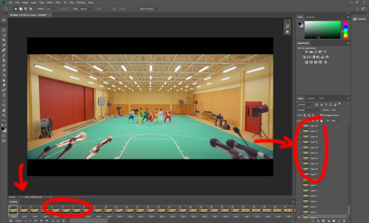
4. The timeline controls at the bottom that are relevant right now: set to “forever” so the gif will loop, you can play the animation with the play button, and you can delete the selected frame(s). The number on each frame is the speed of the gif, depending on the video I usually set it to 0.05 or 0.06 (photoshop lies to you when you play the animation, the only way to test this is to open the finished gif, preferably on tumblr or wherever you want to upload it).

5. As you can see, the animation starts a bit before the actual part that I want, so go ahead and delete all the frames in the animation that you don’t want! You can delete the corresponding layers too if you want, to make the PS file smaller, but it has no influence on the gif. (Hold Shift to select multiple frames as usual)
6. Next, we’re gonna crop the gif however we want! You can do this with the crop tool in the left sidebar, but with gifs like this where there’s a lot of moving parts, I sometimes just use the selection tool in the left sidebar, like so:
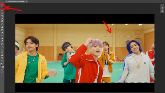
When you click on different frames, the selection stays, and you can check to make sure Jungkook doesn’t suddenly go out of frame if you crop it like that!
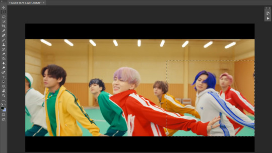
At this point, make sure the selection/crop isn’t smaller than you want the gif to be! For tumblr, what matters is the width (in pixels) of gifs. In the end, the width dimensions on tumblr should be 540px (1 gif per row), 268px (2 gifs per row), or 177/178px (3 gifs per row). Anything else will lead to very shitty resizing!
For this gif I’m going full sized, meaning 540px wide, so I made sure my selection isn’t smaller than that.
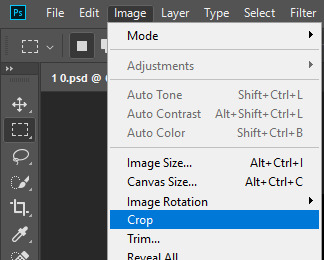
Then just go to Image > Crop, and it’s done!
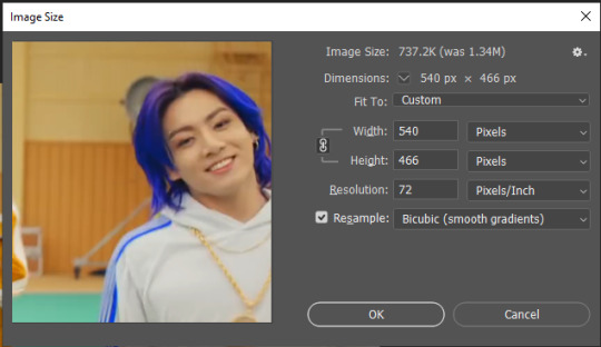
7. Check to see if this is what you want, then resize: go to Image > Image Size to resize the picture. Make sure the little “link” between Width and Height is active (to keep the same aspect ratio), then set the width to 540px or whatever you chose. I always set the resample option to Bicubic.
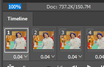
Once that’s done, set the zoom to 100% right above the timeline, to see what it really looks like.
Almost done! A little note about the sizing: width is the important part for tumblr, but if you want to make a whole gif set (especially with more than 1 gif per row!!!) make sure to make all the gifs the same height, otherwise they won’t line up and tumblr will do whatever it wants.
I ended up making mine 540 x 400 and ended up with this:
8. Time to save the gif!! Go to File > Export > Save for Web (OR just use the shortcut Ctrl + Shift + Alt + S) (or whatever it is on Mac).
In the pop-up, you can change things about the gif, but most things should already be the way you want it (Image size, Looping option forever). Selective should be the default, just like the rest.
You can choose between Pattern and Diffusion, some gif makers swear on one or the other, I go back and forth.
On the bottom left, you can see the size of your gif. Keep an eye on that! I believe Tumblr allows every single gif to be up to 10mb, but I try to keep mine under 5mb or close to it, because I think tumblr adds compression if it gets closer to 10mb?? Anyway back in my day you couldn’t upload anything over 1mb. You’ll never know our struggles.
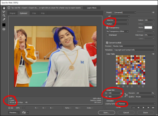
Then just save it, and that’s it, you made a gif! Well done!! Here’s the end result:
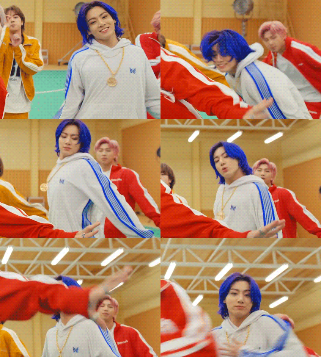
:)
#2 Sharpen
There are countless ways out there to make gifs as smooth and clean as possible! Here I’ll show you the easiest way, but it also provides a good basis for other methods. The main difficulty is that you you need to sharpen the layers, but you don’t want to 100 layers one by one. So what we’re gonna do is convert the layers into a Smart Object, which functions as one layer!
1. Convert the frame animation timeline to a video timeline with the little button right underneath on the left:
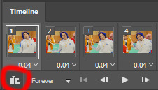
It should look like this, and I’m sorry but I can’t explain this one because I’m not an expert here, but you can just ignore it:

2. Select all layers: Select > All Layers, or just manually.
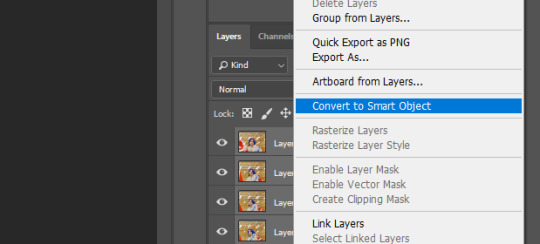
Then right click on the layers > Convert to Smart Object. Now there’s only one layer left, but don’t worry, the frames are still there!
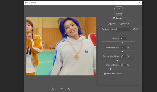
3. De-noise! It reduces noise, takes away some of that grain. More necessary in some videos. It also makes it less sharp, so I do this one first. Filter > Noise > Reduce Noise

My default settings are, Strength: 6, Preserve Details: 60, Reduce Color Noise: 45, Sharpen Details: 25, Remove JPEG Artifact: No. But you can play around, especially with the strength, and see how the little preview looks. Don’t apply too much of it! Or it will look weirdly smooth with no details in the end.
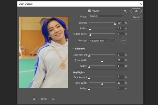
4. File > Sharpen > Smart Sharpen.
Settings: I usually have mine at Amount: 500, Reduce Noise: 5, and Radius at either 0.2 or 0.3, depending on the video. I’ll actually do 0.3 here, because I find it a bit blurry otherwise. If you sharpen more, it can quickly get grainy.
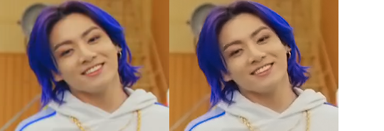
The difference isn’t huge, but here’s a little before and after denoise & sharpen:
5. Technically you can just save it as a gif (save for web) as shown above now, or you can convert it back to a frame animation, which I’d recommend especially if you use certain other sharpening methods (I’ll show you how to convert it back at the end of the colouring part), but for now, let’s go straight to the next part:
#3 Colouring
Now, you CAN do this part right after part #1, still in frame animation, without a smart object. I prefer it like this because sometimes PS acts weird, but if you want to skip the smart object stuff: select all frames, and add the adjustment layers at the very top, above all the other layers. (It only affects selected frames; and it only affects the layers under it.)
The adjustment layers should be above the layer tray, and these are the ones we’ll use today: Brightness/Contrast, Curves, Vibrance, Color Balance, Selective Color.
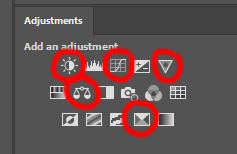
All of these are optional! You can do one, or all, or any combination. This is just the very most basic for me to get a gif to a point that I like. I’d recommend sticking to these for a start, but once you get the hang of it, definitely feel free to play around! It’s fun! Every gif maker has different preferences here, too, so there’s tutorials for everything.
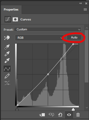
1. Curves: Just click Auto, tbh. You can play around, but Auto works fine for me as a start, just to brighten or darken some parts as a base.
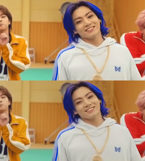
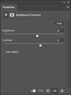
2. Brightness/Contrast: Usually videos are a bit dark, and contrast can help to make it seem sharper AND cut down on gif size, so I usually just up both of them a bit (but not too much! Or it’ll look cheap). Here I put them at B: 19, C: 23
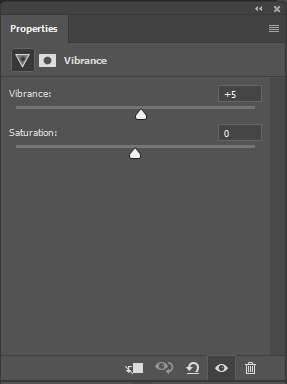
3. Vibrance: I love very vibrant and colourful gifs, so I usually up the vibrance (and sometimes the saturation). This one is already very vibrant, so I only put +5, but if you try to colour, say, a very moody tv show, this can help wonders, especially if you want to work with the colours more later.
If you prefer less vibrant gifs, you can also lower the values here!
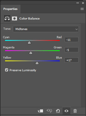
4. Color Balance: getting a bit more complicated now. Often, videos will have a slight yellow or green or blue tint, and this is where you can correct that. This video is a bit yellow, so I added +17 Blue. It was still too warm, so i added -11 Cyan as well. This neutralized the yellow tint, but I wanted some of the reddish tone back, so I added -5 Magenta. I usually do a similar process like that, depending on the tone.
Instead of Midtones, you can also do this for Shadows and Highlights individually.

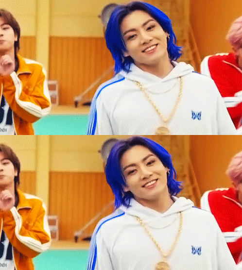
5. Selective Color: now this is the most complicated, but also the most fun to play around in my opinion! Be careful here, if you do something too extreme it’ll look like shit or make the gif super grainy. I some rough goals in mind here: make the blue hair as blue as possible, make their skin tone a bit less pale, and enhance the black and white (which I always do).
You choose a colour at the top, and then add or subtract cyan/magenta/yellow/black values for that colour.
Skin tone: yellow and red. For this gif, I just added black to both, making them darker. Sometimes, if you change one or both those colours for a different part of the gif (for example, if I wanted to make the background less yellow, I’d subtract yellow from the yellows - but then I’d add yellow to the reds, to make the skin tone natural again.)
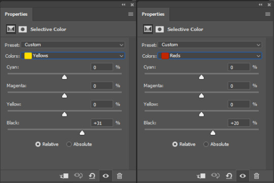

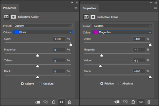
Blue hair: Just ramp up the cyan for the blues. Be careful with putting anything to +100, but here it’s already so bright that it should be fine. His roots are more purple, so I changed the magentas by adding cyan and black, and subtracting magenta and yellow. It’s not super clean, but fine for our purposes.
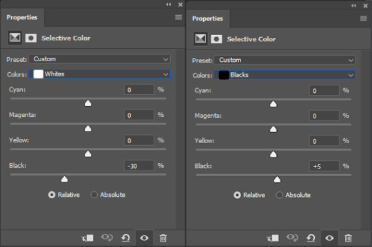
Black/white: depending on the gif, I often either add or subtract black to the whites. Adding makes the highlights less blinding, a bit darker, and flatter (I like to do that if one side of the face is bright white in the sunlight, for example). Subtracting creates contrast, makes it brighter, can wash it out. It can also lessen the gif size, and here it’s mostly just the tracksuit instead of important details, so I subtracted black. For the blacks, I almost always just add a bit of black, to make it more intense. Just like adding contrast, this can make the gif seem sharper and less grainy.

And done!
6. You could just save it as gif now, but as I said, I prefer to convert it back to frame animation timeline first, if only because I like to let it play through before I save it, and it works better for me there than in the video timeline.
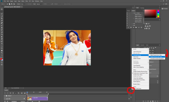
Select all frames, then click the little menu on the top right of the video timeline > Convert Frames > Flatten Frames into Clips
7. When you scroll down to the bottom of the layers now, the old smart object + adjustment layers should be at the bottom, under all the new layers. Delete the old ones, we don’t need them anymore.
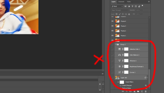
8. Convert the timeline back to frame animation, by clicking the little button at the bottom left of the video timeline:

9. Click on the menu top right of the timeline again > Make Frames from Layers
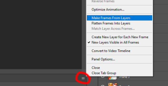
10. Now, just some potential cleaning left to do. Sometimes, there’s a doubled or empty frame or layer at the beginning or end, just delete those as necessary. The timing of the frames is probably off, too, just select all frames and set the delay time to 0.05 (or whatever).
Now your done! Save as gif, and you should get this:

I included some bonus links and tips after this but tumblr ate that whole part so I guess it’s going into a separate post. (Here is is)
Anyway, I tried to make this as easy to follow as possible for beginners, but feel free to send me an ask for clarification anytime. Hope this helps, now go make gifs and have fun!!
#photoshop#tutorial#gif tutorial#ps tutorial#btsgif#*#*tutorial#this took so much longer than i expected i'm not giffing for at least a week now
233 notes
·
View notes
Note
Hi Nia! You're gifs are so pretty! Is it possible for you to show how you get your WandaVision gifs too look so clear and hd? And how do you do your colorings too? (specifically the wanda maximoff in episode 3 gifset ITS GORGEOUS) I'm new to giffing and all the tutorials are kind of old. It's okay if you don't want to though! I understand it may be time consuming.
omg no! never feel intimidated to ask!! i don’t mind at all!
so, i’m going to show you how i made and coloured this gif
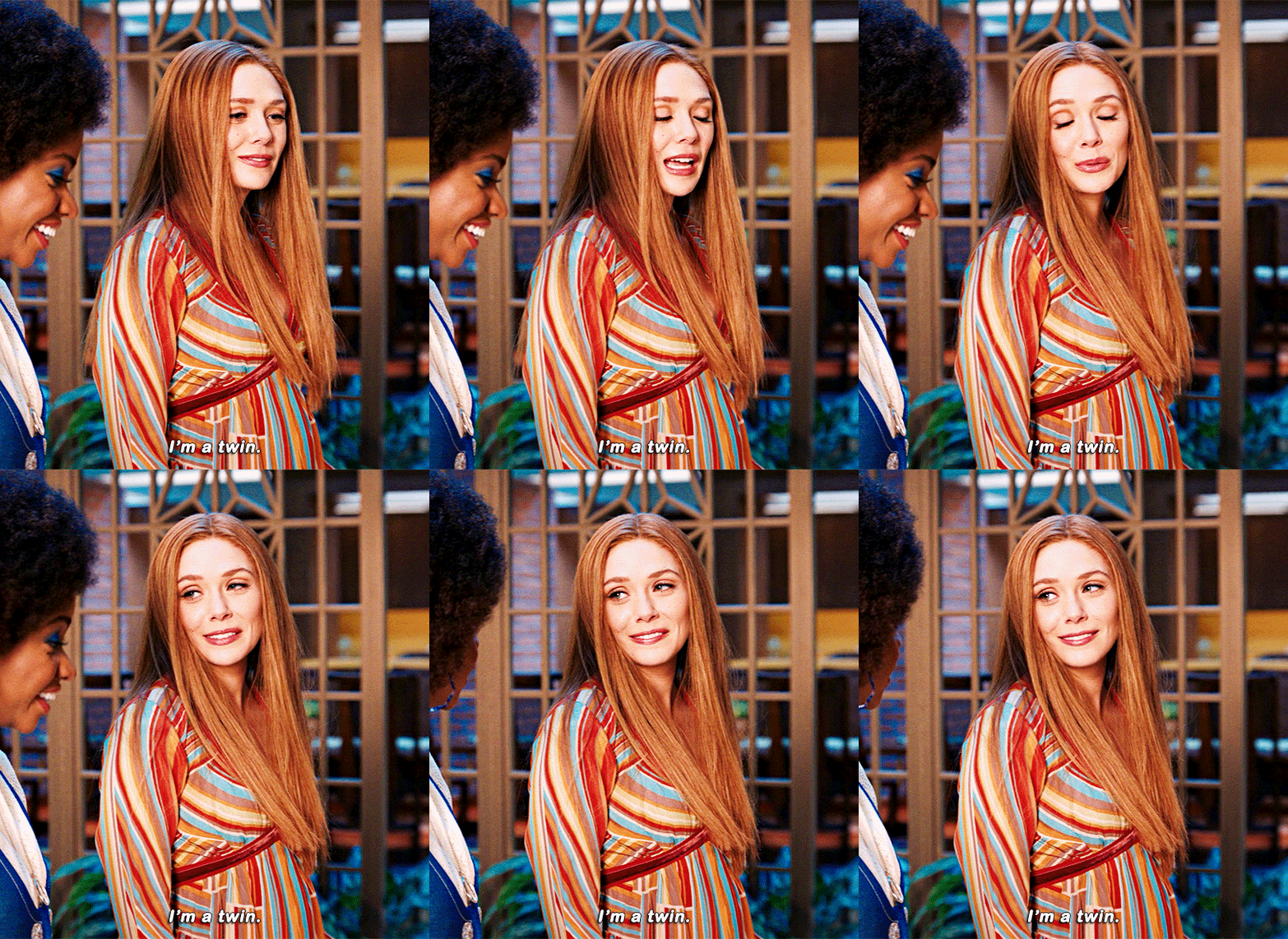
mostly bc it’s the only gif in that set w text and i’m going to share my text settings too!
tutorial is below :)
WHAT KIND OF VIDEOS ARE BEST?
.mkv files (the bigger the better BUT i usually think anything above 5 gb is excessive and unnecessary for an episode of television BUT for a movie worth it) itunes downloads (logolesspro on twitter, hd-source on tumblr, live-action-raws on tumblr have some DEPENDING on what you’re looking for) (also, there’s a chance that if you search "show/movie hd download tumblr” you’ll find a tumblr with its itunes download available)
THAT IS IT NO OTHER TYPE OF FILES MAKE YOUR GIFS LOOK GOOD
- my suggestion is always if its new (like just came out the past month) t*rrent it! it’ll be downloaded quickly and .mkv files look the best! BUT if not check the sources above see who has the BIGGEST file if they even have what you’re looking for and then if not then you look to t*rrenting!!
here are the wandavision files i use so you can see!!
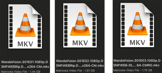
SCREENCAPPING
-if you have windows use potplayer! i have a mac so i can’t show you how to use it and it’s not available for me :( HOWEVER back when i had a windows potplayer was the best method in screencapping!!
-I HAVE A MAC! so i use mpv!! (go to mpv.io and follow the directions) BUT DON’T DOWNLOAD THE LATEST ONE (it has a bug that skips frames) try each before the latest one bc from what i heard different ones work differently for everyone!! and i don’t know which one i use (yikes!) THERE ISN’T THAT MANY I PROMISE AND IT’S WORTH IT BC MPV IS THE BEST (i used to use adapter but they didn’t take impressive screencaps in my opinion and it was evident in my gifs you can see it too! )
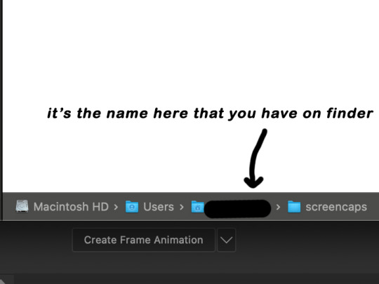
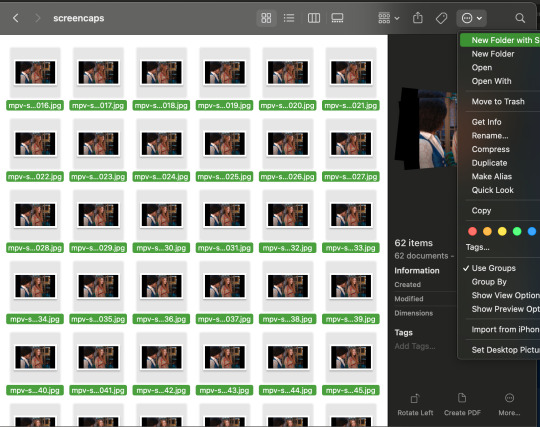
create a folder for your screencaps! and make sure to rmb the directory order! now we want to create a text file on our built in textedit app on mac! type up all this down below (i like jpg but you can replace jpg w png if you want) AND SAVE THE FILE AS mpv.conf THIS IS IMPORTANT SO DON’T FORGET IT! save it somewhere you’ll find easily and NEVER delete it until you don’t use mpv anymore
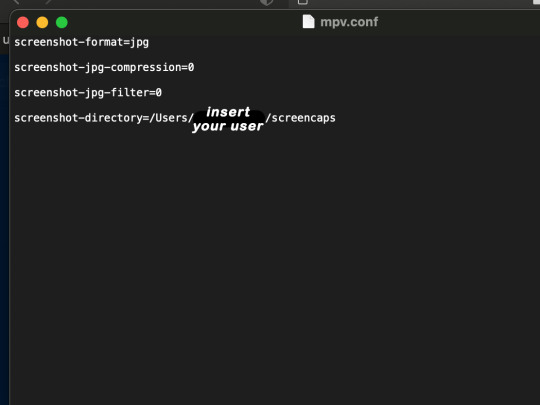
just in case you don’t know what to insert after, go to your screencaps folder
now you want to open mpv and go to the corner towards mpv -> preferences and they’ll tell you that there is no .conf file SO GO LOOK FOR THE TEXT FILE WE JUST MADE AND DRAG IT TO THE FOLDER THEY OPENED FOR US AFTER SAYING THERE IS NO .CONF FILE
(i learned all this from @kylos tutorial!! so if any of what i just said about setting up mpv makes NO SENSE to you check out their tutorial at kylos(.)tumblr(.)com/post/178497909311)
now we can screencap!
so let’s find the scene we want RIGHT BEFORE and MAKE SURE SUBTITLES ARE OFF
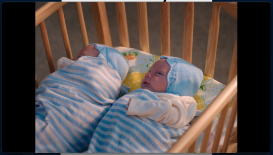
i pause and then press (option/alt + s) and then SCREENCAPS ARE BEING TAKEN!! and to end the screencaps being taken you once again press (option/alt + s)!!
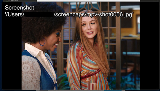
now we want to delete the excess frames! and put it all into one folder!! DO NOT DELETE FRAMES IN THE MIDDLE OF WHAT YOU WANT TO GIF!! WHEN YOU SKIP FRAMES IT WILL BE NOTICEABLE!!

MAKING THE GIF
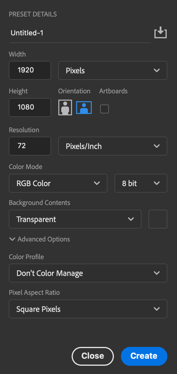
this method isn’t used that much BUT I LOVE IT so this is how i put my frames in! first i check to see the size of my frames: 1920 x 1080

so i create a NEW file on photoshop with those dimensions w these settings
now i set my tool on photoshop to path selection tool bc if you have it set on smth like move tool or crop tool at the end you might end up moving or cropping frames you don’t want to!

ok so now we select ALL our frames and drag it on top of our new file on photoshop and the MOMENT we see our first frame in photoshop JUST KEEP CLICKING ENTER until all the frames are loaded!!

you can do file -> scripts -> load files into stack but it is WAYYY slower in my opinion!
now i crop out the excess BUT i don’t resize the gif yet! the dimensions wandavision is filmed in is 4:3 so i go to crop and set the settings to this:

MAKE SURE IT’S ON RATIO SO WE’RE PRESERVING THE ORIGINAL SIZE JUST CUTTING OFF THE BLACK EDGES!! We are going from 1920 x 1080 to 1440 x 1080 this is the dimensions after i cropped

WE ARE KEEPING THE QUALITY BY NOT CHANGING THE DIMENSIONS OF ANYTHING INSIDE !!
now we want to go to actions and create an action!! open up actions w one of these two depending on what your dash looks like!!


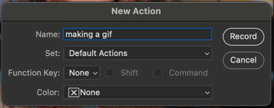
so we create an action with this button on the bottom of actions and we’re gonna title it making a gif and hit record!!

NOW LET’S GOOOOO!!
1. make sure you have timeline on your dash!

2. create frame animation (if you see create video timeline just click the arrow next to the button to see your other option which is frame animation!!)

3. now let’s meet our best friend!! the little bar in the top right corner that has all the commands for making our gifs and MAKE FRAMES FROM LAYERS
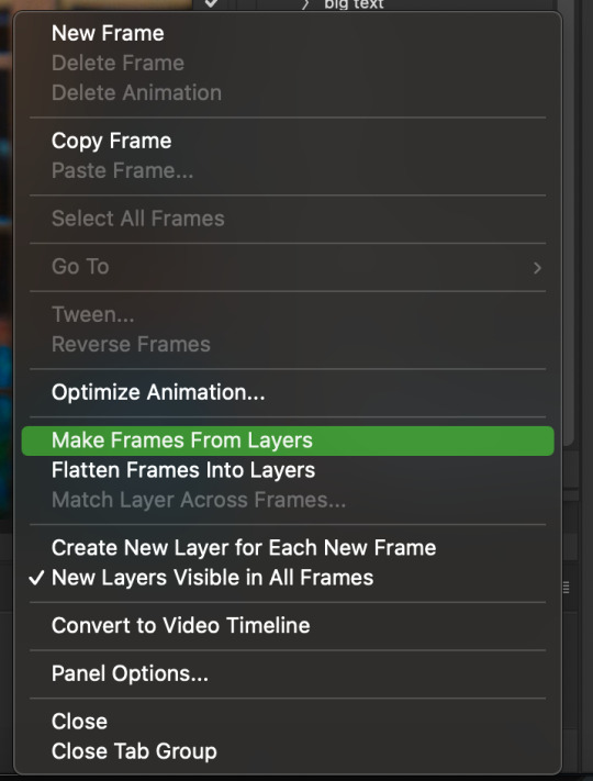
4. WE HAVE TO SHARPEN OUR GIFS NOW BUT TO DO THAT WE NEED TO CONVERT TO A SMART OBJECT SO NOW WE ARE GOING TO CONVERT TO VIDEO TIMELINE there are two ways: the button in the bottom left corner or the button in the top right corner w all the other commands!

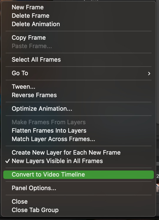
5. select -> all layers DON’T MANUALLY SELECT THEM ALL BC THE ACTION WILL ONLY SELECT THAT SAME NUMBER OF FRAMES SO IF THERE ARE MORE FRAMES YOU WON’T GET THEM IN THE SMART OBJECT!!

6. filter -> convert for smart filters
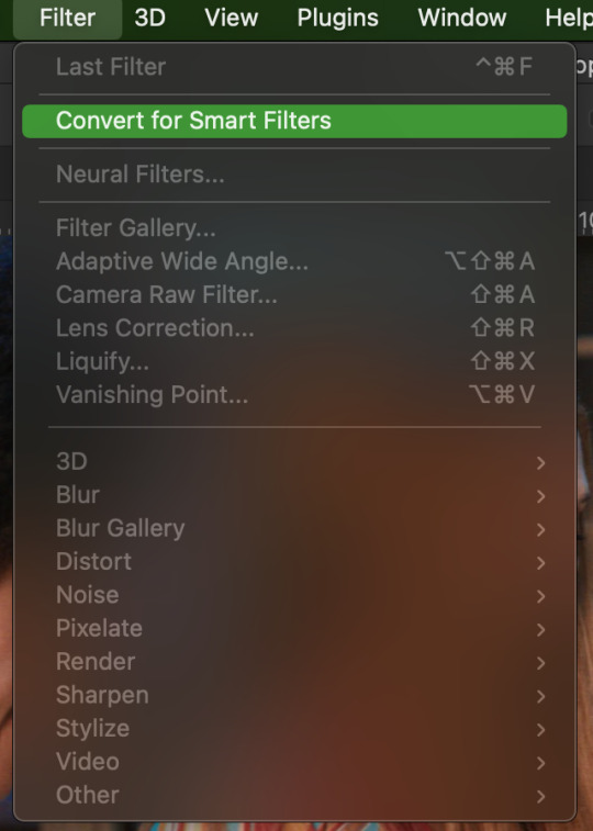
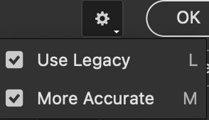
7. NOW WE SHARPEN!! (filter -> sharpen -> smart sharpen) i sharpen twice!! first, make sure we are on legacy w more accurate and remove gaussian blue! the first sharpening will be 500% with 0.4 px radius. NOW SHARPEN AGAIN (filter -> sharpen -> smart sharpen) also w legacy, more accurate and remove gaussian blur BUT this time 10% with a 10.0 px radius!



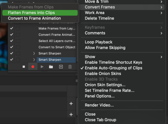
8. it’s hd now!! so let’s flatten frames into clips!! go to the top right magic button again!! and you should see a pop up saying layers are being made

9. now we convert back to frame animation w either the bottom left button or our magic top right command center!


10. make frames from layers

11. select all frames w our magic command button
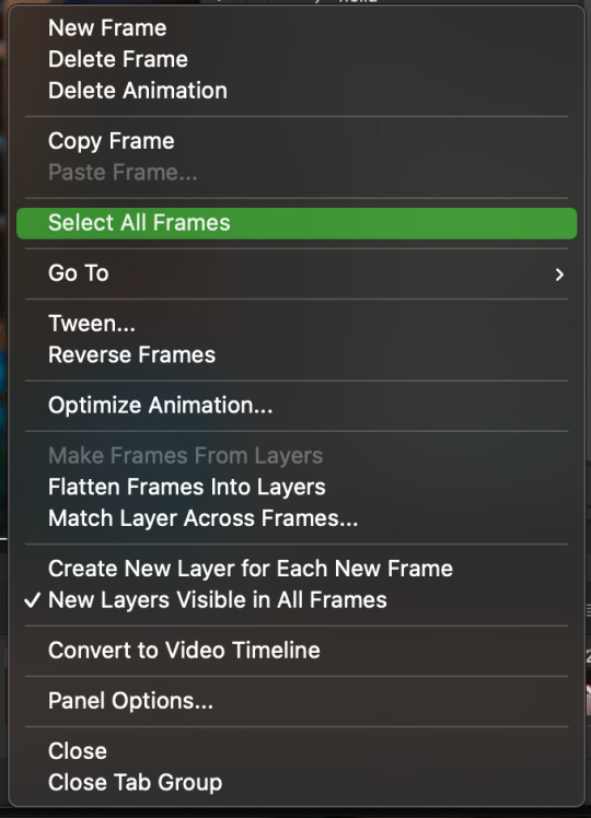
12. set the animation delay to 0.05 THAT IS THE BEST ONE ALWAYS ALWAYS ALWAYS only use 0.06 when the character is moving really fast in the video itself and it makes the gif itself look awkward BUT NEVER GO ABOVE 0.06 it’ll look slow and laggy and we don’t want that and don’t go below 0.05 bc then it’ll be tooo fast and we don’t want that either!


13. now delete the very first frame on the timeline bc it is an oversharpened duplicate of the second frame! end the recording w this button!

this is what your action should look like expanded! if you made mistakes on the way and it shows up you can just click the specific step and press the trash can on the action tab to delete in from the order!!

NOW AFTER LOADING YOUR FRAMES AND CROPPING THE EDGES OF YOUR FRAMES IF YOU NEED TO JUST PLAY THE ACTION AND THEN YOUR GIF WILL BE MADE FOR YOU!!!!
now i delete some unnecessary frames in the beginning and end and this is what my gif looks like (the size was 46 mb and the limit is 10 mb so the dimensions of the gif are 540 x 405 to get it to 5 mb BUT I HAVEN’T CROPPED IT YET SO THIS IS ME CROPPING JUST TO SHOW YOU WHAT IT LOOKS LIKE)
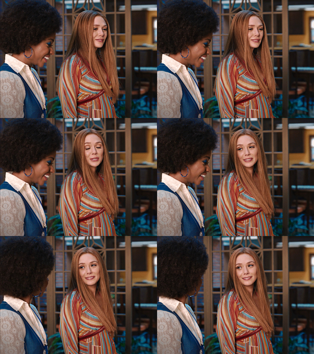
CROPPING THE GIF
in my opinion if you want your gif to look hd you shouldn’t crop before you sharpen!! i believe that if you crop before you sharpen you don’t allow photoshop to sharpen all the pixels whereas if you crop beforehand there is less to work with!!
dimensions is all up to you!! just make sure to go by tumblr rules!! 540 is the max width and if you want to make two gifs per row then my suggested width is 268 and for three gifs per row my suggested is 177 px! Just have the right width and the length can be whatever you want!!
now i’m going to crop my gif to 540 by 590!!

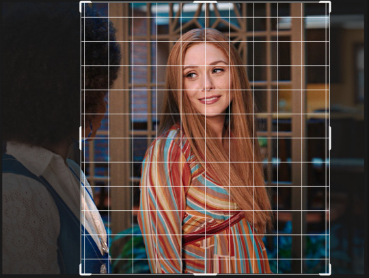
NOW THIS IS WHAT MY GIF LOOKS LIKE!
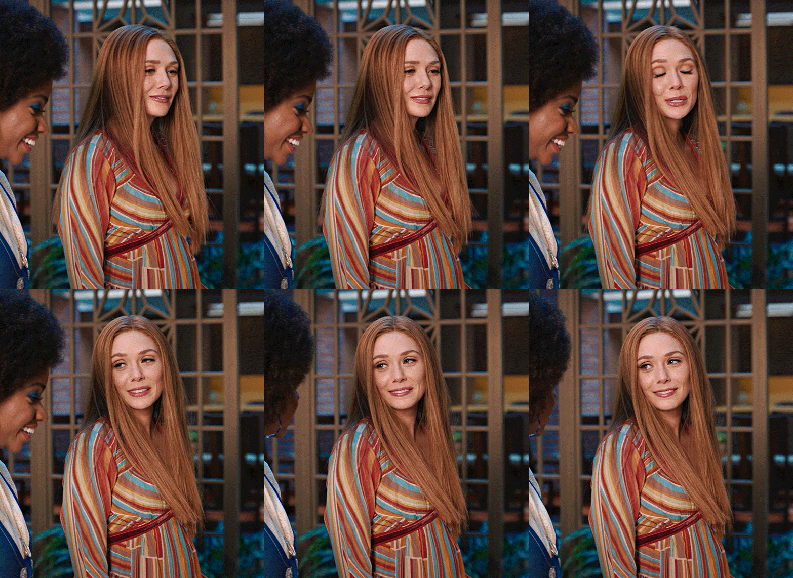
COLOURING BASICS
let me show you the best adjustment tools in my opinion and a brief explanation for what they do!!
brightness/contrast: pretty simple increase/decrease the brightness/contrast BUT one of my techniques for when i first start colouring a gif is i select all my frames and do nothing to the settings of the adjustment but i set the layer to screen LIKE THIS

curves: ik others use curves to change brightness/contrast w the squiggly thing BUT i like it to set a white point and black point, this is also a technique i use when i first start colouring a gif when screen doesn’t look good for me SO you use white point to select a pixel on the gif to set as the lightest color on the gif (setting the white point) and you use black point to select a pixel on the gif to set as the darkest colour on the gif (setting the black point) usually the white point makes it TOO bright and that’s why we use the black point to counter it and same goes for when i use screen with brightness/contrast, it gets too bright so i use black point to counter it below is the button for white point and the button for black point, respectively they are shaped as color picker tools


vibrance: generally, i never use this except for color p*rn sets but they work really well in making colors seem more strong
hue/saturation: like vibrance, i never use this except for color p*rn sets but this adjustment is to help change the colors or hue of a color for example: turn blue into purple or turn a blue into a little lighter shade of blue
color balance: I ALWAYS USE THIS!! except for in black and white gifs BUT THIS IS MY GO TO AND IF I DON’T USE IT MY GIFS ARE JUST BLAND i feel like color balance is what essentially balances the colors on your gif and adds dimension to it, it makes your gif go from looking way too yellow to a more golden neutral look and it is an essential adjustment in my opinion
channel mixer: i rarely use channel mixer BUT it is so so useful when you are working w a dark scene just play w the settings and all of a sudden all the blue in a dark scene will be a little more yellow and red and your scene will kind of just look brighter and more visible
selective color: THIS IS ALSO AN ESSENTIAL this helps SPECIFIC colors pop you’re working on a scene where there is too much red on someones face you use this tool to remove the magentaness from the yellow section OR when you feel someones face is TOO yellow and needs more blush you add more magenta in the yellow section of selective color
gradiant map: gradiant map is perfect when you’re lazy if you feel like your gif looks more neutral and you want some red in it but you don’t want to mess with any other adjustments just set a red to black gradiant on soft overlay with a very low opacity and BOOM slightly red but not too much red added!
NOW TO COLOR THE GIF!
today i have decided to start with a brightness layer set on screen

and this is what we got!

now that’s a little to bright and washed out in my opinion SOOOO to counteract it, i’m going to use my black point tool in curves and i’m going to select this point on the gif (it’s better to choose smth in the background and not smth that’s paid attention to such as monica’s hair or either of their eyelashes)

now my gif looks like this! the base color is complete!

now i think i need to balance all this yellow and red! SOOOO WE GONNA USE COLOR BALANCE!!
i think the best way to use color balance is to keep swinging the balancer until you see what you like and then keep going midtones i think i want more red and i don’t want a cyan midtone and then for shadows i think i want more cyan to counter the redness of the gif but highlights i don’t touch that much NOW HERE ARE MY SETTINGS SO YOU CAN SEE

and this is what my gif looks like

now you can stop here if you want but in my opinion i think the gif looks a lil too dead still SO IMMA USE SELECTIVE COLOR
i think there needs to be a lot lot more RED so i amp up the yellow magenta and black in the red! but i also think the yellows need to be LESS RED so i remove magenta from the yellow! and bc there’s some cyan and blue bc of monica and the flowers in the background im going to make the cyans more cyan and the blues a lil more black! i’m going to remove some yellows from the magenta!! and i add more black to the neutrals and black!! i think it’s always important to add more black to neutral and black bc it adds more depth to the gif by not just making it a bunch of bright colors and having dark colors to contrast to!! my settings are below!

and the result!
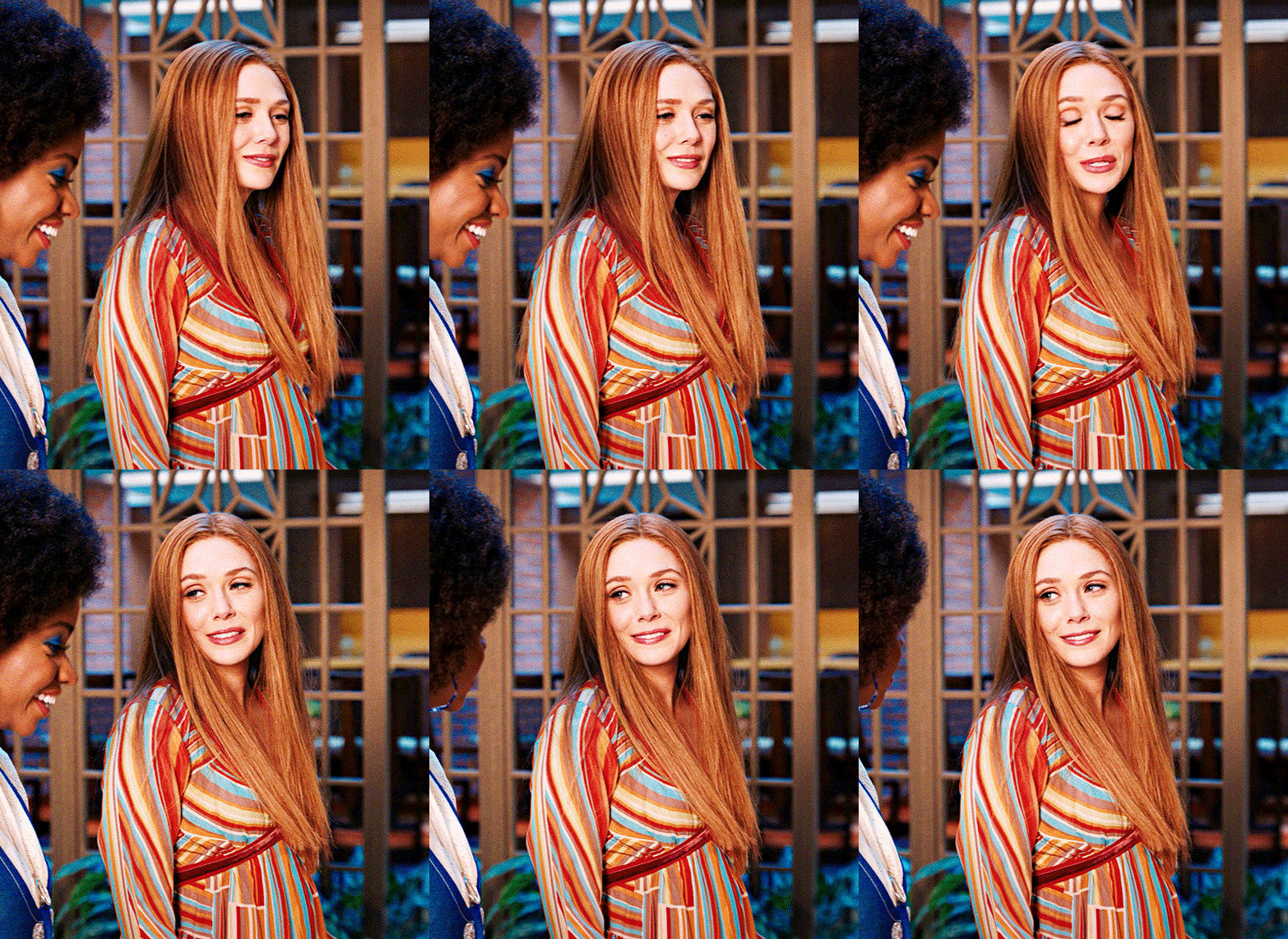
now let’s see everything together!

and the before and after!

I HOPE MY COLOURING EXPLANATION MADE SENSE!! if not you can always ask me more questions i don’t mind!!
ADDING SUBTITLES
we want to grab the text tool!
make a text box from anywhere in the middle from the left to right edge. this is so we can make sure our text is centered and will be in the same place for when we have sets w more than one gif w text!

type your text out and make sure you highlight the whole text so that all the settings apply to EACH character! you can find the alignments (for center) in the paragraph tab!

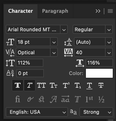
now lets right click on the text layer and go to blending options! add stroke and drop shadow!
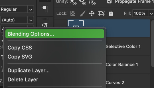


now drag it to the desired height you would like and make sure to keep it in mind for when you have more than one subtitled gif in a set!
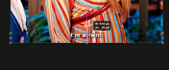
NOW TO MAKE SURE THE TEXT STAYS IN PLACE AND THE BLENDING STAYS YOU HAVE TO CONVERT TO SMART OBJECT!!

if you want to only have the text applied to certain frames instead of all frames, select the frames you don’t want by clicking the first frame in ur don’t want section ON THE TIMELINE and WHILST HOLDING SHIFT click the last frame of ur don’t want section and then toggle the eye switch next to the text layer
now you see the text

now you don’t

tip: use opacity to fade the text in and out!
the text is going to be on all my frames so i don’t need to toggle the eye but i just wanted to show you just in case!!
now here’s my FINAL RESULT

save for web (file -> export -> save for web)
your gifs have to always be under 10 mb! so, if your WAYYY overboard YOU HAVE TO DELETE FRAMES! or you can divide the gif in two and have two gifs instead of one! however, if you plan on going the deleting frames route MAKE SURE YOU DELETE FROM THE BEGINNING OR END OF YOUR SELECTION i promise you that most of us won’t notice that your characters dialogue is being cut off BUT WE WILL NOTICE IF FRAMES ARE BEING SKIPPED so, don’t delete frames in the middle of ur gif!! idc how little you do it IT WILL RUIN YOUR GIF AND I SAY THIS FROM EXPERIENCE i would delete every fifth frame to cut down my gifs and that may seem like not that big of a deal BUT IT IS my gif looked choppy and poor so it is way better to cut from the end/beginning of the gif
ANOTHER LAST PIECE OF ADVICE in the bottom left of when the save for web menu shows up THERE’S A PREVIEW BUTTON click on it! it’ll show you your gif on your default browser and show you what it’ll look like once uploaded! this is perfect to check the speed of ur gif and the colouring and to notice if there’s a problem with your subtitles or maybe there’s an obvious jump in frames you never noticed before!! i always use preview bc the built-in photoshop viewer of ur gif shows the colors differently and the speed is NEVER ACURRATE!
I USED THESE SAVE SETTINGS!! many say to use selective pattern but i DISAGREE and i think these save settings are the ✨ best ✨
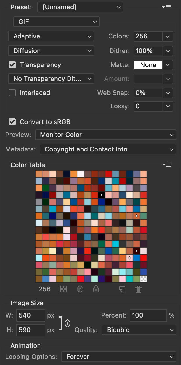
OK NOW THAT IS THE END OF THIS VERY LONG GIF TUTORIAL!! I HOPE THIS IS WHAT YOU WANTED!! IF YOU HAVE ANY QUESTIONS DON’T BE AFRAID TO ASK I SINCERELY DON’T MIND!! JUST DON’T BE RUDE OR ANYTHING BC PPL HAVE BEEN RECENTLY :(
I WISH YOU ALL THE LUCK AND FUN IN YOUR GIFFING ADVENTURES !!
#tutorials#asks#sourceblog#allresources#completeresources#itsphotoshop#dailyresources#resourcemarket#chaoticresources#onlyresources#hisources#sibylresources#dailypsd
417 notes
·
View notes
Note
Hi! Your gifs are always so vibrant and pretty. What's your giffing process if you don't mind me asking?
Thank you for this sweet message!
I don't mind at all anon! This is going to be a pretty basic coloring tutorial, for more advanced stuff I would recommend looking at @clubgif or other photoshop resource blogs.
I do want to say that I am by no means an expert in photoshop, and that there are many different ways to make and edit gifs/photosets. This is the method I've found works best for me :)
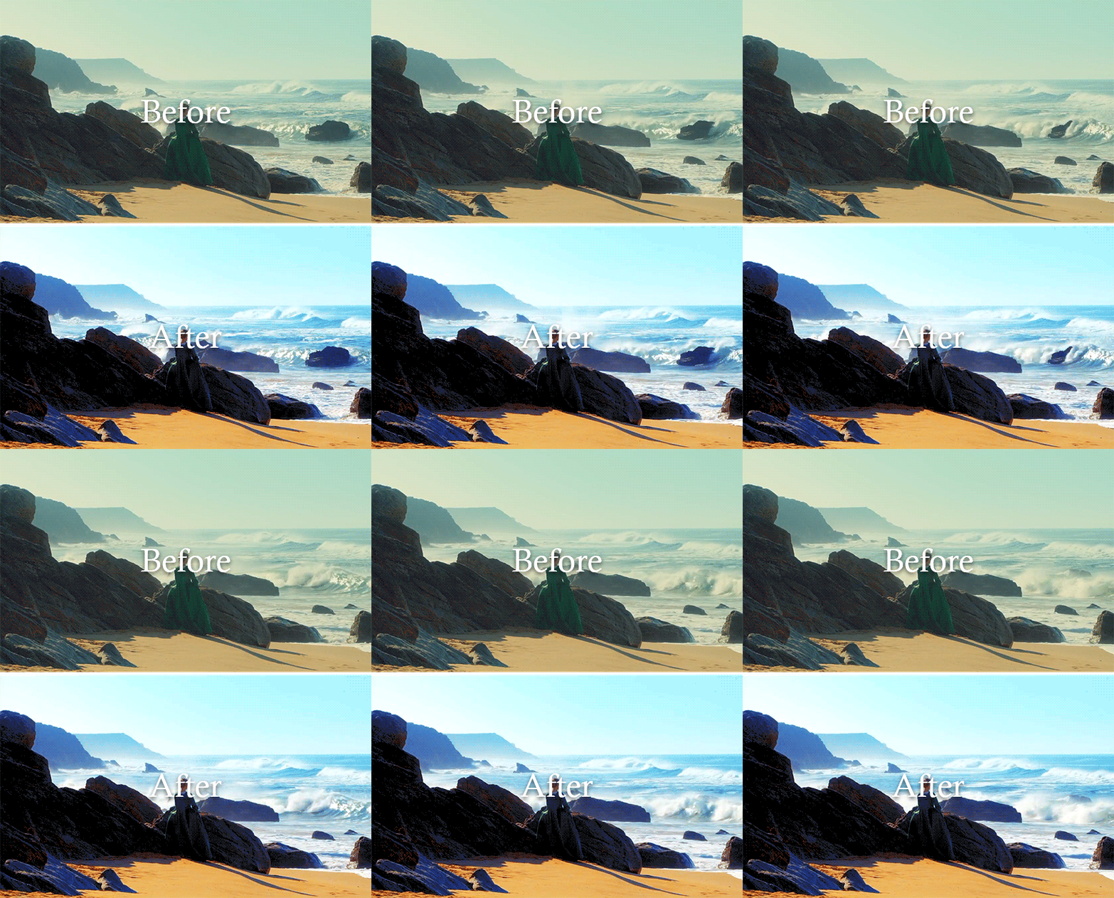
Putting this under the cut because it's long:
Here is an explanation of how I make gifs using "import frames to layers." I've tried doing the screencap method but the screencapping programs always give me viruses so I prefer video frames to layers. I use clipconverter.cc to download videos from youtube. And always try to use 1080 videos (720 can work for smaller gifs).
So after I've made my basic gif, the first thing I do is crop. I set the crop ratio to 5:3, but you can play around with the dimensions all you like.
After I've cropped, I recently started using @grimreaper 's hd sharpening action. I've tried a lot of different sharpening methods, but this is the one I've found to be the easiest and highest quality.
Then I use the curves layer to brighten up the gif. I click the white eyedropper and then click the part I want to be brightest, in this case the white sea foam:
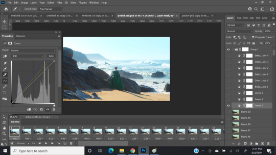
Then I make a second curves layer, select the black eyedropper, and click the part I want to be the darkest (the folds of her dress) to give it contrast:
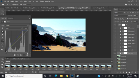
Then I add a levels layer to balance things out: (Usually I just click auto, but if that doesn't look good I'll play around with the arrows until I like the way it looks)
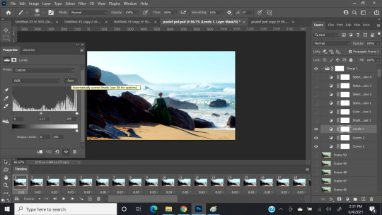
Then I add a brightness/contrast layer, same steps as above:

Then color balance. You don't need to go too crazy with this layer, since most of the coloring happens with selective coloring, CB can help balance out a strong tint. I just adjust until I'm happy with how it looks:

Now for the fun part! This gif has four main colors: Red, yellow, cyan, and blue. It's already got some good base color, so I don't use neutral, white, or black selective color. For murkier scenes (like anything from Vikings), I'll use those three to add some color and dimension. I start with red selective color, and just play around with the settings until I like how it looks:

And repeat for yellow:
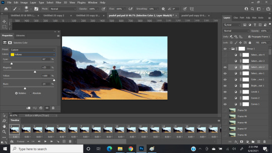
For both red and yellow, I decrease the cyan, and increase magenta and yellow to make the warm colors pop.
Repeat for cyan:

and for blue:

I increase cyan and black, and adjust magenta and yellow until I find the shade I like.
After all of this, I resize the image to width of 540 if it's a single gif, or 268 if it's two side-by-side gifs. Personally I like to sharpen and color before resizing, but it's up to you what order you do things. Then save for web and I'm done!
I also highly recommend @inejz-ghafa 's coloring tutorial. It's actually the method I used to color my pride set.
I've also shared some of my psds, so feel free to use them! You'll probably have to adjust the curves and levels layers, but you can try playing around with the other layers as well! I actually got started by using other psds, and then adjusting the layers to fit my style.
That being said, some shows/movies are just easier to color than others! I really enjoy giffing Reign, Portrait of a Lady on Fire, Aquaman, Pacific Rim, The Good Place. I struggle with coloring Vikings, Black Panther, and a lot of Bollywood movies. This is my general giffing process, I make adjustments depending on what scene I'm workign with. Hope this helps!
#photoshop#ps resources#yeahps#gif resources#coloring psd#coloring tutorial#gifmaker tag#my graphics
180 notes
·
View notes
Text
Icon Tutorial
Anon asked me for an icon tutorial, specifically for this icon:

I am using Windows and Photoshop CC 1. finding pictures 2. cutting out 3. resizing and placing 4. coloring 5. gradient and sharpen
Let’s go:
1. first you need to find a base image. either you use screencaps or episode stills
for screencaps put the name of your show/movie and "screencaps" into google. chances are it will lead you to one of these sites:
screencapped.net (zip dowloads) kissthemgoodbye.net & grande_caps (gallery & zip downloads) homeofthenutty.com (gallery)
for episode stills I have two sites:
farfarawaysite.com daydreaming (this one sadly hasn't been updated since 2019, but the gallery is still HUGE)
other places to find images are the IMDB galleries, fandom wiki's and, again, google.
the image for this icon is an episode still from daydreaming HERE
2. now that we have our image, we need to get rid of the background.
lately i've been using remove.bg which has saved me SO MUCH time. it works on most pics suprisingly well, and when it doesn't work (mostly because the screencap is just TOO DAMN DARK) I go back to using the pen tool in photoshop.
Pen Tool How-To: click around the edge of your subject as shown in this tutorial. then right-click -> make selection -> set feather radius to 0,5 px. When you have your selection, set a layer mask by clicking this
at this point I like to save the pic as a png, just in case I want to use it again in the future, but that is of course up to you.
for this image I used remove.bg and got a pretty good result
3. now we finally have our pic cut out and ready in photoshop, it's time to make the actual icon!
select the crop tool and at the top put in 100px by 100 px (some people like to use 200px by 200px or 128px by 128px. again, up to you. it's just what i'm used to)
cut out your icon. at this point it doesn't matter yet to place it right, we'll do that in a moment.

when you have it cut press ctrl + t to resize and place it how you want (depending on your version of photoshop you might need to hold the shift key while resizing or click this to not mess up the proportions of your image)

4. time for some color! first choose a background color. i went with a bright pink

now to coloring our person. in this case, because I used an episode still and they already have good brightness, contrast and color, there isn't as much to do as with a screencap.
Important: all the adjustment layers are clipped to the cutout so they don't affect the background. to do this either hold alt and click on the line between layers in the layer panel or right-click on the adjustment layer and select "create clipping mask" or (my way) in the properties panel click this
curves (to brighten it up)

selective color (to get rid of some of the yellow. something i do almost always with pink and purple backgrounds)

levels (more brightening and I also use levels to get the contrast right. usually I start by dragging up the midtones and bringing down the shadows. in this case I also dragged up the highlights)

vibrance (because all that brightening really washed the color out, we're bringing it back!)

that's it for adjustment layers, the next layer isn't clipped anymore.
5. add a gradient fill layer with these colors set it to softlight. adjust the opacity (for this icon it's 53%) and the angle of the gradient by double-clicking on it in the layer panel and then adjusting this

because I always use the same gradient for every icon, I made myself a handy little photoshop action that adds the gradient fill and sets it to softlight so I only have to adjust it. It's here if you want it
and lastly, sharpen! I use a mix of topaz clean and smart sharpen. I also made a photoshop action for this, you can find that HERE (obviously you need topaz clean installed for this to work) then save it as png and done!
And that's it! That's the finished icon!

if you have any more questions, or if anything is unclear come into my askbox or send me a message. I'm always happy to help.
also, now that I have this detailed tutorial, I am up for making just coloring tutorials for icons as well, so if you want to know how I colored a specific icon, let me know!
147 notes
·
View notes
Text
COMPREHENSIVE GIFFING TUTORIAL (vapoursynth + ps cc 2018) + some tips and tricks on color correction, blending and subtitles
You guys asked for it, so here we are! This is by no means the gold standard to giffing. Rather, this is simply my process and my own preferences. Take it as you will. Additionally since I use a mac some of my controls/panels may look different than what you would see for windows users.
DOWNLOADING YOUR SOURCE
This step is extremely important to the quality of your gifset. If you want high-quality gifs I would recommend giffing sources in 1080p whenever possible (especially if you’re going for larger dimensions). You may get away with 720p for smaller gifs. For kdramas, your go-to source would be dr*maday or torrents. (you can search my faq tag if you’d like to know specifics on finding and downloading torrents).
IMPORTING + PROCESSING YOUR FILES WITH VAPOURSYNTH (VS)
Please note that this tutorial does not cover basic installation and set-up of vs. If you would like to know how to download and set-up vapoursynth (it works for both mac and pc) along with some of it’s basics you can find more information at: https://hackmd.io/@nibreon/vapoursynth-book/%2F%40nibreon%2Fvapoursynth-book
Once you’ve identified what portion of your video you’d like to gif, simply drag your video file into VS. Specify the start time and duration of the clip you’d like to import. Typically you’ll be aiming for ~3-8 second clip depending on how big your gifs will be. I am very lazy when it comes to importing. The less of it I have to do, the better. Therefore, I often import clips that are 10-15 seconds long, sometimes even up to 20 seconds. I wouldn’t recommend going over 15 seconds most of the time though, because this will usually bring you over the 500 frames photoshop allows you to import at once. (when I do go over, I will sometimes import the processed VS file into PS in segments). You can also choose to import the VS output as segments if you want all your gifs on separate canvases. (I'll go into more detail on this later)
Once you’ve imported the clip into VS your screen should roughly look like this once the resizer pops up:
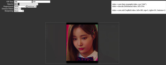
In the top left is where you will be applying your cropping, sharpening and denoising filters. Cropping: Keep in mind the Tumblr dimensions: 540px for full-width gifs and 268px for half size gifs, 177/178/177px for 3 gifs across. The height is completely up to your own preference. Usually I work in 540x300px. Once you edit those parameters you can drag/resize your video file to fit your new canvas. Sharpening + Denoising: You can choose to skip this if you would rather sharpen in ps. I personally do all my cropping, denoising and sharpening in vs. I use finesharp and KNML for sharpening and denoising respectively. Once you select those two filters from their drop down menus, be sure the select the checkbox as well. You should now notice 2 additional lines of code in the top right box. The line that reads: video = core.knlm.KNLMeansCL(video, 0, 6, 4, 1.2, channels="YUV") is where you will adjust your denoising parameters. You will only be adjusting those 4 numbers. I usually use: 0, 1, 0, 1.2. Now find the line that reads: video = hnw.FineSharp(video, sstr=0.22). These are your sharpening parameters. once again we’re only adjusting the number at the end. I typically use somewhere between 0.33-0.55. Depending on the quality of your source and preferences these parameters may change.
Here is a breakdown of the KNML parameters (source: @/nibreon HackMD):
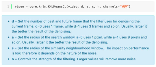
Once you have finalized your parameters, copy all the code in that top right box and paste it into your vapoursynth editor. Note: you can ‘inactivate’ certain lines of code by adding the # symbol at the start the line. That line of code will then be greyed-out. This is what your code should now look like (the highlighted section is the part I just copy and pasted):
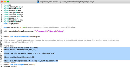
If you would like to preview your filters and see if you need to make any adjustments, simply navigate to the top bar and select script > preview. If you like what you see, great! If not, you can adjust the parameters directly in the editor until you see a result you’re happy with. Once you’re happy you can move onto the final step in vs: processing.
Processing: Once again, navigate to the top bar and select script > encode video. Another window should pop up. Make sure you set ‘header’ to ‘Y4M’ then click ‘start’. Patiently wait for that to finish processing. The longer your clip is and the more filters you add, the longer it will take.
IMPORTING YOUR CLIP INTO PHOTOSHOP (PS)
Now you’re done with the vapoursynth section! Not too hard, right? I use the timeline method when I gif. To import your video file into ps navigate to file > import > video frames to layers. Here you can use the sliders to further specify what range you would like to import. Make sure the ‘make frame animation’ box is checked. To optimize smoothness of your gif, avoid checking the ‘limit to every _ frames’ box. Hit ‘OK’ and wait for the frames to import. Depending on the size of your clip, ps may notify you that you are importing a large file and it may take a long time to process, simply say ‘ok’ to this. UNLESS you get a message saying it will limit to 500 frames. This means your clips contained more than 500 frames and you should select a smaller section to avoid cutting out any critical parts. (Note: you can always go back and repeat this process to select a smaller range of frames from the same video clip until you’ve imported all the frames you need).
Timing: You can adjust the timing of your gifs before converting to timeline. Select all the frames (Navigate to the icon with the 4 bars at the bottom right of you screen. Select “select all frames”). Click the drop down next to the timing of any of the frames. Select ‘other’ and input a your preferred timing. I personally use ‘0.04′ but I've seen people use anywhere from 0.4-0.8ms. Also as a note: when you convert your gif to timeline it has a tendency to mess up your timing so even if you input 0.04 or 0.05 it won’t actually be that timing later. If you want the true frame rate you can set your timing right before saving. You can also adjust timing at the end. (see export/saving gif section for more info)
Now the next part can be tedious and for that reason I’ve created numerous actions to speed up this process. But for the sake of this tutorial I will walk you through the steps. At the bottom of your screen is your timeline. As you can see, it defaults to frames, but we want to convert this into a smart object so that all your coloring/edits are made to all of the layers. To do this: 1) Navigate to the icon with the 4 bars at the bottom right of you screen. Select “select all frames” 2) Now select all your layers in your layer panel. On mac you can use cmd + option + A as a shortcut. 3) Back to the icon with the 4 bars, select “convert to video timeline” 4) Right click on all layers (which should still all be selected) and find “convert to smart object”
(Aside: Actions) actions are SUPER helpful to streamlining your giffing process. you can find actions people have made available on resource blogs like itsphotoshop OR you can choose to make your own custom actions. To do this, all you need to do is locate your action panel. Then from the controls at the bottom of the panel select the one that looks like a sheet of paper to “create a new action” Once you’ve named it and hit ‘ok’ the record icon should now be red. PS will now basically ‘record’ whatever you do. To stop recording hit the square icon. Now whenever you want ps to execute the same set of steps you just did, you can locate the action you just made and ‘play’ it by selecting the triangle icon. I highly recommend making an action for the steps I just outlined above to convert your gif into a smart object timeline. It will make your process much faster and more painless.
COLORING
Now the fun part! I focus on emphasizing the colors already present in the video source or getting rid of some less-than desirable overtones when I color. It gives the gif a natural look, but makes everything pop a little more. We will be working with selective color, curves, levels, and brightness/contrast mostly. This is the original gif I will be using to demonstrate coloring:
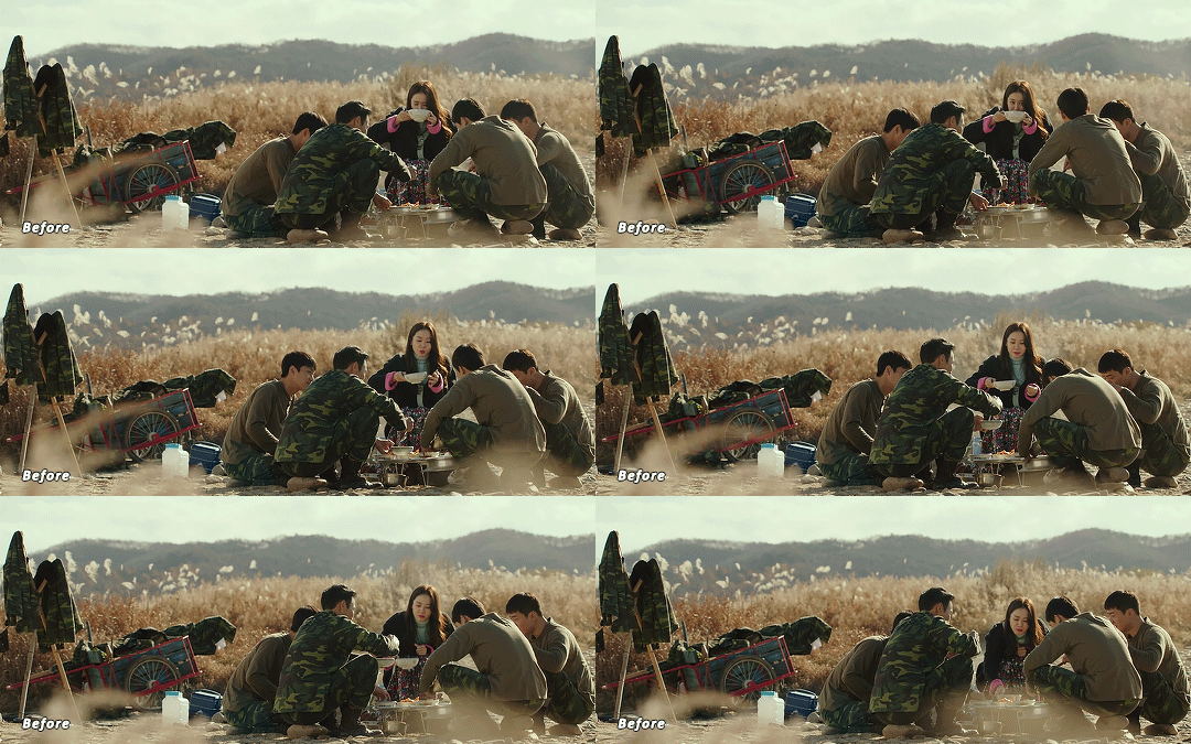
Curves: I always start with curves. The first curve layer I use to set a desirable black point. To do this, locate the top dropper icon from the curves panel and select the darkest point of your image. This will set that section to “true black” Feel free to play around with this until you find a desirable outcome. Now add another curves layer. This one we will be using to adjust the brightness/contrast. First, I always start off with ‘auto’ and see where that takes me. If you like the outcome, great! If you don’t play around with the different curve points until you get an outcome you like.

Selective Color: This adjustment layer will be your best friend. For me, I will typically work with reds, yellows, and black. If the source has a lot of blue/cyan I will use those too. Basically look at your source and determine which base colors you’d like to emphasize/alter. For blacks I usually up the black by +1-5 depending on the source. For reds, it also depends on the source. But I will typically either decrease cyan (to make red stand out more) or increase cyan (to make the red not look so overexposed). You want to be careful here. Overexposing the red can make your skin tones look like red tomatoes! And for my content base, where most of the actors are of asian descent, we should be emphasizing the yellows and NOT the reds (see aside on color correction + skin tones for more info). After altering the reds to my liking, I do the same process for the yellows. To bring back natural skin tones and color, you will likely want to darken the yellows, expose them a bit more and maybe even up the yellow slider. A common rule of thumb: if you want to make any of the colors less exposed, increase the cyan. If you want to increase exposure on any of the colors, decrease the cyan. If you want a color to appear more strongly or prominently, increase the black. The magentas and yellows I use more to adjust hues. You can add multiple selective color layers to further emphasize your changes.
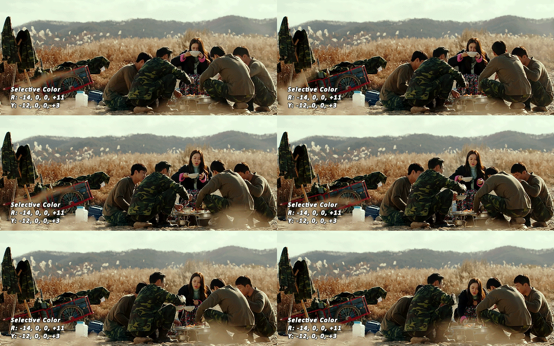
Levels: Now we will work on the lighting some more. This creates more contrast and depth to your gif, often making them look ‘crisper’ To emphasize the bright parts, move the right-hand slider to the left. The emphasize the dark parts, move the left-hand slider to the right. You may also choose to move the middle slider to adjust more neutral lighting. Do so until you find a setting to your liking.
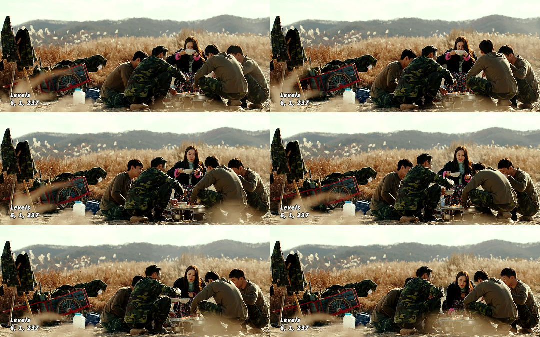
Miscellaneous: Depending on your gif you may need to play with other adjustment layers. Some other ones I often use are the brightness/contrast and exposure to adjust lighting and add more dimension to the gif. For additional color correction I use color balance and to a lesser extent hue/saturation and vibrance.
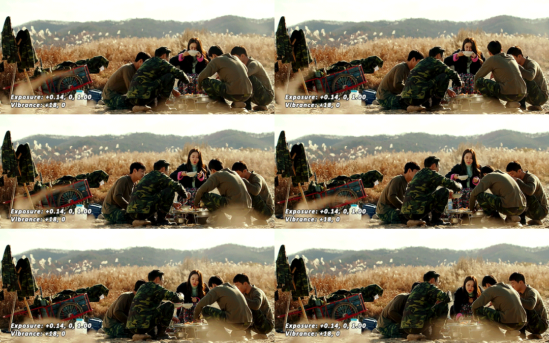
(Aside: Color correction + skin tones): We are anti-whitewashing and anti-redwashing when it comes to asian media. Like I mentioned earlier, natural asian skin tones have yellow undertones, not red/pink. Therefore when you’re bringing in color you should be mindful of this delicate balance. Adding more red does NOT equal un-whiteashing. Be VERY careful how you balance the yellows with selective color/hues/color balance.
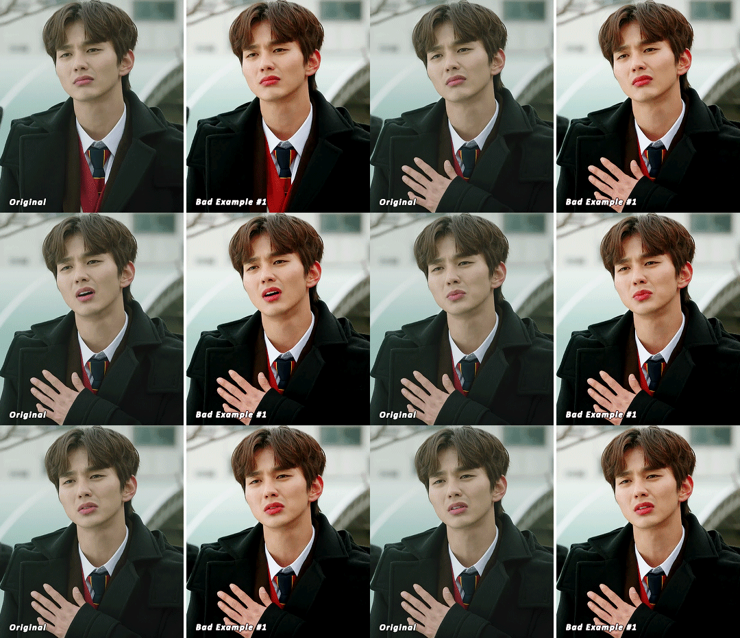
^^ Here is an example of what I mean by overexposing the reds. Poor seungho is looking as sunburnt as a cherry tomato. Note: if your original source is already overexposed with red, fix it! You can do this by applying the same basic principles I explained earlier. Try upping the cyan on the reds in selective color, or shifting the color balance to favor cyan over red with the color balance adjustment layer. You may also choose to favor the yellow over blue.
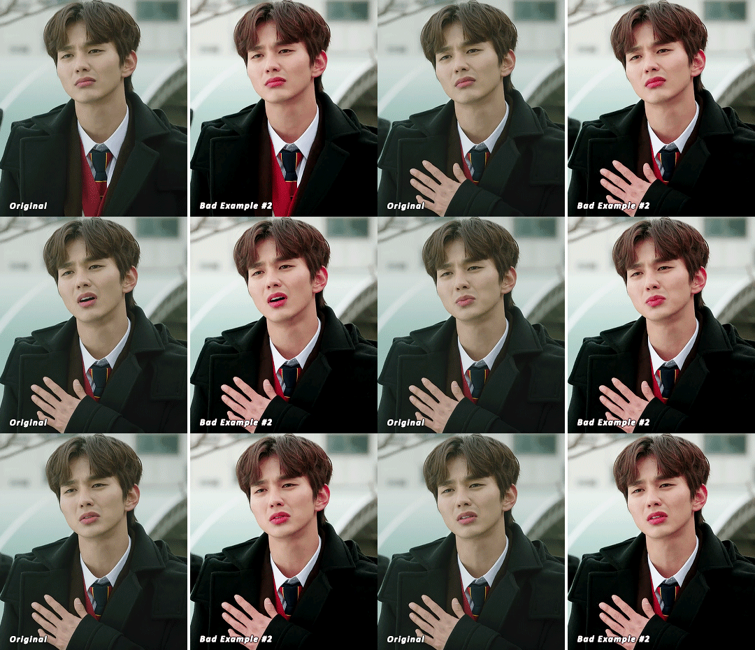
^^ Now this is straight-up whitewashing. This is what happens when you are not careful with your correction of yellow. I’m not saying you can’t touch the yellow slider or get rid of some yellow form the overall image (because sometimes it is very much needed), but you should be very mindful how your corrections can affect skin tones. If you decide to decrease saturation of yellows, or decrease yellow in the selective color section of the reds, do so with caution. If your reds are looking too pink, add some yellow in the red selective color, up the yellow and black of the yellow selective color.
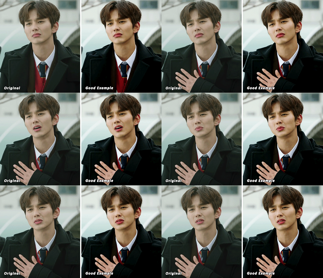
^^ If you hit that happy medium, you can emphasize the natural skin tones without overexposure. Here the underlying tones are very much still in the yellow range.
(Aside: Blending): I will very briefly talk about how to blend two gifs together. First make sure you’ve imported both your gifs into ps and converted them into the timeline format. On one of the gifs, right click the gif layer in the layer panel > duplicate layer > select the canvas of the gif you’d like to blend the gif with. On the canvas you just copied your second gif to, you can now drag the two layers around the on the canvas to get your desired positioning. On the top gif apply a layer mask. This can be found in your layers panel at the bottom, and is indicated by the white rectangle with the circle. Next, make sure you select the mask in the layer panel (it will show up as a white rectangle on the layer you applied the mask). Grab your paintbrush tool and make sure your color is set to black. Now you can effectively ‘erase’ the part of the top gif you don’t want to show anymore. I recommend setting your brush hardness to 0% to get a smoother transition. You can also play with the opacity settings. If you want to add back in a part you erased, just switch to a white paintbrush and you will be able to undo what you had just ‘erased’ with the black. When you merge the gifs, they will play the same number of frames. This means your blended gif length is limited by the gif with the fewer number of frames. You can move around your timeline layer and shorten the included portion by dragging either end of the timeline layer in until you get both gifs to play the parts you want.
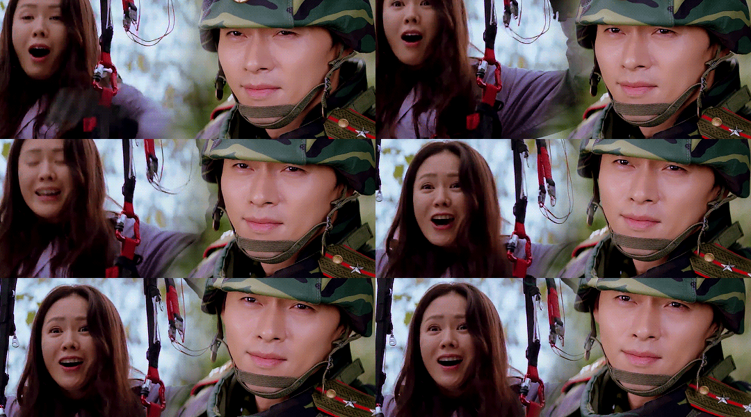
CAPTIONS/SUBTITLES
I often get asked about my subtitle font/styling settings. Personally I find the best fonts for subtitles are calibri and arial. I use calibri with the following settings: 12-14px, bold italic plus faux bold, 1px black stroke (optional: drop shadow set to ‘multiply’ at around 85% opacity), and tracking (VA) set to 75. If you would like your subtitles to fade-in or fade-out you can apply the ‘fade effect’. Locate the b/w square icon in your timeline panel. Select fade and drag it onto your text layer in your timeline. You can then right click on the wedge shape to adjust your fade duration. I usually use 0.35s. If you drag and drop the effect towards the beginning of your text you can get the fade-in effect. To get the fade-out, simply drag and drop your fade towards the end of your text layer.
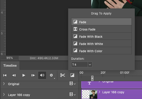
SAVING/EXPORTING YOUR GIF
We’ve reached the final stretch! If you need to adjust your frame rate timing: you will need to revert your timeline to frames. To do this: 1) Navigate to the icon of 4 bars at the right of your timeline panel. Select convert frames > flatten frames into clips. 2) Navigate to the icon of 4 bars at the right of your timeline panel. Select convert frames > convert to frame animation > when promoted hit ’ok’. If at this point you see more than one frame in your timeline panel, delete the frames until only one is left. In the example below I would delete the first frame by hitting the trash icon from the timeline panel.

If there is only one frame, leave it as is. 3) Navigate to the icon of 4 bars at the right of your timeline panel. Select ‘make frames from layers’ You will most likely need to delete the first frame in your timeline panel (it won’t have your coloring). Sometimes ps adds in some ‘blank’ frames as well, delete those too. Now you can adjust your timing.
Once your timing is set: When you’re saving your gif, just keep in mind it must be under 10mb. Navigate to file > export > save for web. When it comes to your save settings I typically use either selective diffusion or adaptive diffusion. I also also occasionally use adaptive pattern (I find this is best for dark scenes without a lot of contrast). Set colors to 256, quality to bicubic and looping options to forever. If you want to preview your gif, hit the preview button in the bottom left. Otherwise, go ahead a hit ‘save’ and you’re DONE!
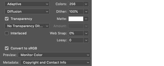

ADDITIONAL RESOURCES
Feel free to check out my ‘ps things’ tag for more photoshop stuff/mini tutorials. Additionally @/nibreon and the hackmd site I linked previously are your best resources for vs questions. If you would like to see my giffing process in motion feel free to check out this video. It’s sped up but you can slow down the playback. Additionally be sure to check out resource blogs like itsphotoshop for more helpful tutorials and resources.
If you reached the end of this beast, kudos to you! I hope this helps and never be afraid to reach out with any questions.
542 notes
·
View notes
Note
can i ask how you color and sharpen your gifs? they’re so vibrant 👀
Of course! I don't know how helpful I can be because I don't do anything special, so this is mostly an incoherent ramble and offers absolutely no insight. There's so many amazing coloring tutorials out there, so I would recommend any of those rather than reading the jumble of words below the read more lmao. The best resource ever is this blog. You can find tutorials for everything ever.
First, I crop by using width x height x resolution rather than just plain cropping and then resizing the image. I have no idea if that actually makes a difference in the quality, but I've gaslit myself into believing it's a difference maker. My settings are usually 542 px x 400 px at 135 px/in. The reason I do 542 is because then I go into canvas size and do 540 x 398 to cut off those tiny transparent borders that always show up after you crop (I don't think it's noticeable at all when you upload a gif but I'm just in the habit of doing it). Once it's cropped, I flatten my frames into layers and use a sharpening action. I have no idea what tutorial and specific sharpening action I downloaded because it was years ago, but there's so many out there. Here's just some random ones I found, but there's a lot if they don't work for you [x, x, x].
As for coloring, I color every gif from scratch each time. I know a lot of people use PSDs, and then might alter them slightly based on the gif. That looks great and is faster and works very well, and it can be a great option for you to seek out. I'm just a control freak who wants to manually adjust everything.
Gifs with a dark or solid, colorful background are my favorite to color because it's so much easier to make the person stand out. I can just talk you through my mindset for this gifset.
I used exposure, brightness/contrast, selective color, color balance, vibrance, and levels. Exposure was +.53 and offset was -.0015 (I like using offest and gamma correction when I have a very dark background I want to emphasize, but I keep them at very very very low levels). Brightness was 9, contrast 7. I don't really like using brightness/contrast too much, but a little contrast in the right color conditions does sometimes make things more visually interesting. Selective color in black under the black subheading was +26. I go wild to make a dark background darker. If it had been a pretty blue background, however, I would've been in the blue and cyans section just messing with the sliders until I got a nice shade of blue I liked, and then I would've gone to the blues under hue/saturation to make it even brighter. I didn't use any 'selective color: neutrals' on this gifset, and I kind of avoid them because it's really easy to wash someone out or give the gifset a kind of ugly color tone if you're not very cautious.
Specific color balance numbers would be annoying for you to read through, but make sure you work with all 3 of the shadows, midtones, and highlights. I almost never go more than a +/- 5 on any of the sections, and I always hide the layer after to make sure I actually like the colors I added because you might accidentally take a totally normal gif and suddenly, all the blacks are looking magenta toned because you went too wild in color balance. I just added a tiny bit of vibrance (+8) to make sure I wasn't washing him out, and then I finished off messing with levels to once again emphasize the dark background.
90% of the gif coloring I do is done in exposure, selective color, and color balance. Those three are the backbone of my gifmaking. I spend so much time messing around in selective color with all the standout colors in the gif. I wish I could drop a magic secret here, but I really just go through and adjust the sliders until I find a balance I like.
I think color balance is so important to making sure the person isn't a weird shade after you mess with other colors - it ensures sure they're not super yellow or overly cool-toned. When I have a colorful background that isn't a red/yellow/orange (because messing with those colors will mess with a person's skintone), I also usually make it brighter through selective coloring and hue/saturation. I cannot emphasize enough how much selective coloring changed my life. It's my world. When I finally do upload my gifs, I always save them to my drafts and view them from mobile and desktop to see if there's anything that looks super weird that I need to fix. Sometimes a gif will look great in photoshop but suddenly the person is bright red on mobile, so it helps me make adjustments.
I used to be very conservative in adding lots of color and I tended to wash people out and was too afraid to make a colorful background even brighter or a dark background darker. For example: this old gifest I made on my main just looks so .. dull? There's no life in that skin. What I would do differently now, just as a basic starting point, is brighten the blues and the reds in his skin through selective color + hue/saturation, add more exposure, and use color balance to make his skin tone more human. With just those adjustments alone on top of the gif (which did already have coloring on it!), it looks way better and brighter. I mean, does it look good? No, it's a screenshot of a gif from almost 2 years ago and I spent 30 seconds on it, but it's better!
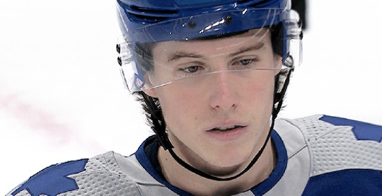
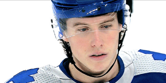
My advice is just to not be afraid to mess with colors and make them stand out. I have zero comprehension of color theory and no artistic background, so I was flying blind when I started adding all these adjustment layers and was very timid about them. I really just think the best thing to do is to mess around in photoshop working on gifs with different colored backgrounds so you practice how you want to mess with those colors. I seriously spend so much time making gifs that will never see the light of day because it's fun to do and it helps me learn the adjustments. My understanding of color also significantly improved when I started trying to make more edit-y style gifsets, because I'd try to recolor the background of the gif with the brush tool and changing the blend mode and wouldn't understand why the color I'd painted over top an orange background wasn't turning out exactly how I wanted when I changed the blend modes.
I'm sorry that this is an absolute mess with no real advice besides "I like these adjustments" and "just mess around!" I know that's not particularly helpful, but I'm honestly too busy being flattered that I was even asked for advice.
#ask#this is my first ask on this sideblog#and it's just a full 'i haven't taken my ritalin in months' word scramble#i am so sorry#but i'm so honored to even be asked#i am NOT qualified to be giving photoshop advice but have it anyway!
2 notes
·
View notes
Note
Hey ! Do you make gifs for kdramas, and if so, how do you go about doing so? Thank you 😀
yep i do! first of all you’d need to have some sort of a software to create your gifs with. i do everything on photoshop so i won’t be able to be of much help for any alternative methods 😢
when it comes to giffing, everyone has their own method that works for them, there’s no 1 set way to go about it so don’t be afraid to play around and experiment as much as possible to discover what you like! i get inspiration all the time from all the creations i come across on here 💜
really, just have fun with it!! there are no rules (except for a few lol) ✨✨
before you even gif you’ll need to make sure you’re able to source high quality downloads bc that is really the key to everything - here’s an ask i answered where i linked some resource posts for giffing dramas
sharing my typical workflow below to give you an idea of the steps involved. you’d probably be able to look up more detailed tutorials for each step or you can always DM me if you need more specific help :)
1) download the video file making sure it's minimally at least 1080p for the best quality gifs
2) pick out the moment you wanna gif and identify the timecodes (to give you an idea depending on the file 4 seconds of video would usually translate to around 99 frames)
3) trim those moments using some sort of a clipping software (or i think you can also do this directly using ps), i use handbrake for this purpose
4) when cropping and resizing, i prefer to do it using vapoursynth bc i find it a lot more efficient and i have more control over maintaining the same framing across gifs. but again, you can do this directly in ps if you prefer and don't wanna learn how to use a bunch of different software 😝
5) for resizing, it’s very important to use the correct tumblr post dimensions or tumblr might resize it for you and the gifs you worked so hard on could end up looking pixelated after posting! here’s the recommended widths for photoset posts
6) and since i’ve already resized and cropped the clips in the previous steps, once i import the files into ps (file > import > video frames to layers), they can actually already be saved immediately as gifs (file > export > save for web)
7) but of course you probably won’t wanna stop there bc you wanna make sure your gifs actually look good! i recommend playing around with the smart filters to see what looks nice to you - to do this, first switch to timeline mode and then convert your layers for smart filters (select all layers > filter > convert for smart filters). the filter i highly recommend using (and is what most creators use) would be smart sharpen but you can also try out some of the others like camera raw filter, noise, etc.
8) once you’re satisfied, it’s time to colour!! i usually switch back to animation mode to do this (convert frames > flatten frames into clips > make frames from clips > convert to frame animation). the adjustment layers i typically use are curves, brightness/contrast, selective colour and levels but if you’re new at colouring, you can also make use of ready psds that people have already uploaded on tumblr and tweak them to your liking so that it suits the scene that you’re editing (the same exact colouring usually won’t work across every single scene/show). but just don't reupload the colouring and claim as your own!
9) final step before saving is to adjust the frame delay, some prefer their gifs a little faster/slower but i usually set mine at 0.05 bc i find that it’s most comfortable for the eyes
10) now you’re ready to save your gif 🙌 i usually save it in adaptive diffusion mode keeping the colours at the default max of 256. if you’re planning to upload onto tumblr, the file needs to be under 10mb or it won’t upload! so if you have trouble keeping your gif under the size limit, you’ll have to go back and cut down on the number of frames (i would remove frames from either the start or the end and avoid skipping any in between or your gif could end up looking “choppy”). alternatively, adjusting your colouring can sometimes help reduce the file size too (the lesser variation of colours in your gifs the smaller the file size).
happy giffing! xx
2 notes
·
View notes