#i changed the green the most because the green stripe in the ply flag is the most frustrating color i've ever encountered
Explore tagged Tumblr posts
Text

demigirl / gray asexual / polyromantic flag combo
for @curlyburp but if by some chance it applies to u too go wild use it

#i changed the green the most because the green stripe in the ply flag is the most frustrating color i've ever encountered#it hurts ur eyes and doesn't go with anything#so i was like fuck it make it pastel#the other colors were already mostly fine#og post#gray ace#acespec#ply#mspec#demigirl#demigender#nonbinary#lgbtq+#lgbtq#mogai#rad inclus#inclusionist#pride flag#gray asexual#graysexual#ace#asexual#polysexual#polyromantic#queer#eyestrain#aes#ace nbs#terms#flags
13 notes
·
View notes
Text
I redesigned the polysexual flag.

I would love it if this got shared around!
Use it in art! Use it in merch! Use it on your pronouns.page! It's public domain! No credit needed!
Reasons for the redesign, flag meanings, additional flags, templates, silly stuff, and emojis below the cut.
As a polysexual person, I have mixed feelings about the original polysexual flag. The simplicity of the flag is good; it has three stripes and three colors. I also like the color choices in concept: pink for attraction to women, green for attraction to enbies, and blue for attraction to men. The contrast between the stripes is pretty good too, though the contrast between green and blue could use some improvement.
However, the hot pink clashes with the green, which can be displeasing to the eye, or even painful. This clashing isn't as bad on physical merch most of the time. I have some pins and bracelets where it looks just fine. But I think that it's important for the flag to be accessible online too, especially since many polysexual people can't show pride outside of online spaces.
There's also a problem with its similarity to the bisexual and pansexual flags. I know that this was done on purpose to show the identities being related, and I think that this is sorta fine. But...
It can be misleading, as I find that polysexuality is often fundamentally very different from the other "big four" multi-spec orientations, i.e. bi, pan, and omni. Polysexual people are not attracted to all genders, while bisexual people often are, and pansexual/omnisexual people always are. The lack of separation between the polysexual stripes implies that we're attracted to all genders as well, when we aren't.
It also makes it harder for us to stand out on our own. Polysexuality rarely gets its own spotlight independent from other identities. Most often, we just get a passing mention in a post about the broader multi-spec community, or get our flag shown in a post alongside several other flags, if we even get that at all. Our flag being so indistinct only furthers this invisibility.
Polysexuality, as a result, doesn't really get to be its own thing. We're just another tag, another flag, another passing mention of validity to tack onto a post that isn't really about us. This can feel really isolating, especially as many of us don't even strongly relate to the other identities that we're often grouped with.
I don't identify as bisexual, not even as an umbrella term, because I don't relate to common bisexual experiences. I am not attracted to binary men, and I'm not attracted to all genders. But "polysexual representation" is almost exclusively about common bisexual experiences, and it isn't ply-focused. The flag adds insult to injury.
So, I wanted to try to redesign the flag.
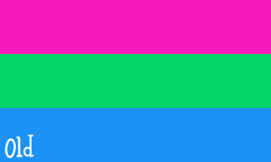
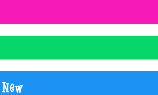
I like the colors that are already associated with polysexuality: pink, green, and blue. I want to keep these colors, and I'm also keeping their original meanings. The ply pride colors aren't changing if I have anything to say about it! As obscure as polysexuality is, this color combination is very recognizable and well established in our community, and if applied well, they look really nice together.
However, I've also added two thin white stripes to the flag. These stripes serve three purposes:
1. Visual appeal.
The white stripes prevent clashing between the pink and green, and also add some more contrast between the green and blue.
2. Separation between stripes.
The white stripes allow the colorful stripes to exist separately, since polysexual people are not attracted to all genders. For example, I am represented by pink and green, but not by blue, because I am not attracted to binary men. Another polysexual person might be represented only by green and blue, only by green, etc.
3. Distinction from other flags.
The white stripes create distinction from other m-spec flags. This flag distinction can represent the disconnect from m-spec spaces that some polysexuals experience, since m-spec spaces tend to revolve around attraction towards all genders, which is inapplicable to polysexual people unless varioriented or fluid. M-spec spaces also often revolve around attraction towards at least both binary genders, and many polysexual people, including myself, lack attraction towards at least one binary gender.
This flag distinction also calls attention to polysexuality as its own identity, which does not always need to be dependent on other terms, and can shine on its own. We are not just a tag, or just a flag, or just a label to put in posts that aren't about us. We are a community! We are individuals! We are people! We are experiences!
The flag is still somewhat similar to other m-spec flags in its color choices, so the solidarity with our m-spec siblings is still there! But now we get to have something that feels more like it's for us.
I hope that the difference in stripe size makes the flag more accessible to colorblind people as well, because I don't see many flags with a 2:1:2:1:2 stripe ratio, whereas there are a lot of flags with three evenly sized horizontal stripes.
This flag can be used by all ply people! Whether polysexual, polyromantic, polysensual, polyalterous, varioriented, fluid, questioning, etc... This is for all of us!
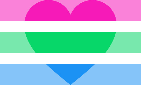
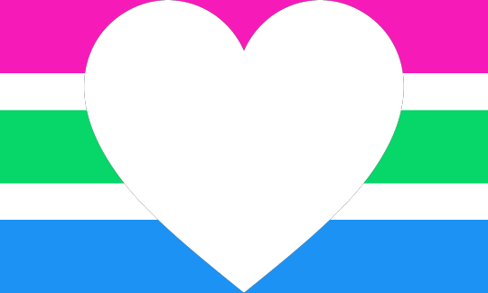
Additional flags, templates, silly stuff, and emojis:

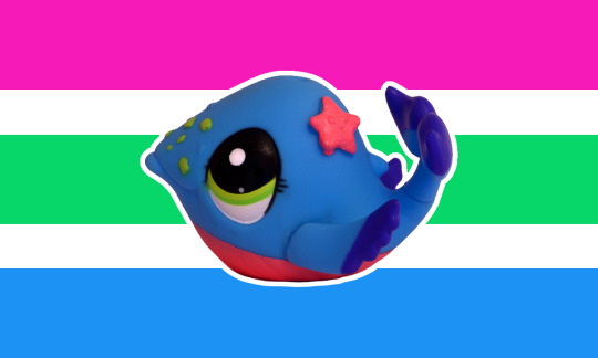
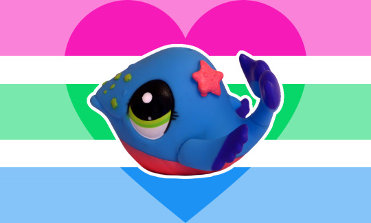
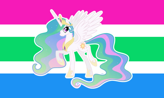




#my flags#polysexual#polyromantic#poly#poly pride#ply#ply pride#poli#poli pride#plysexual#plyromantic#polisexual#poliromantic#actually polysexual#I'm polysexual#lgbt#lgbtq#lgbtqia#queer#pride#pride flag#pride flags#pride flag redesign#pride flag edit#pride flag art#polyalterous#polysensual#polyaesthetic#plyalterous#plysensual
16 notes
·
View notes
Text
Text copied and pasted from below the cut:
As a polysexual person, I have mixed feelings about the original polysexual flag. The simplicity of the flag is good; it has three stripes and three colors. I also like the color choices in concept: pink for attraction to women, green for attraction to enbies, and blue for attraction to men. The contrast between the stripes is pretty good too, though the contrast between green and blue could use some improvement. However, the hot pink clashes with the green, which can be displeasing to the eye, or even painful. This clashing isn't as bad on physical merch most of the time. I have some pins and bracelets where it looks just fine. But I think that it's important for the flag to be accessible online too, especially since many polysexual people can't show pride outside of online spaces. There's also a problem with its similarity to the bisexual and pansexual flags. I know that this was done on purpose to show the identities being related, and I think that this is sorta fine. But... It can be misleading, as I find that polysexuality is often fundamentally very different from the other "big four" multi-spec orientations, i.e. bi, pan, and omni. Polysexual people are not attracted to all genders, while bisexual people often are, and pansexual/omnisexual people always are. The lack of separation between the polysexual stripes implies that we're attracted to all genders as well, when we aren't. It also makes it harder for us to stand out on our own. Polysexuality rarely gets its own spotlight independent from other identities. Most often, we just get a passing mention in a post about the broader multi-spec community, or get our flag shown in a post alongside several other flags, if we even get that at all. Our flag being so indistinct only furthers this invisibility. Polysexuality, as a result, doesn't really get to be its own thing. We're just another tag, another flag, another passing mention of validity to tack onto a post that isn't really about us. This can feel really isolating, especially as many of us don't even strongly relate to the other identities that we're often grouped with. I don't identify as bisexual, not even as an umbrella term, because I don't relate to common bisexual experiences. I am not attracted to binary men, and I'm not attracted to all genders. But "polysexual representation" is almost exclusively about common bisexual experiences, and it isn't ply-focused. The flag adds insult to injury. So, I wanted to try to redesign the flag.


I like the colors that are already associated with polysexuality: pink, green, and blue. I want to keep these colors, and I'm also keeping their original meanings. The ply pride colors aren't changing if I have anything to say about it! As obscure as polysexuality is, this color combination is very recognizable and well established in our community, and if applied well, they look really nice together. However, I've also added two thin white stripes to the flag. These stripes serve three purposes: 1. Visual appeal. The white stripes prevent clashing between the pink and green, and also add some more contrast between the green and blue. 2. Separation between stripes. The white stripes allow the colorful stripes to exist separately, since polysexual people are not attracted to all genders. For example, I am represented by pink and green, but not by blue, because I am not attracted to binary men. Another polysexual person might be represented only by green and blue, only by green, etc. 3. Distinction from other flags. The white stripes create distinction from other m-spec flags. This flag distinction can represent the disconnect from m-spec spaces that some polysexuals experience, since m-spec spaces tend to revolve around attraction towards all genders, which is inapplicable to polysexual people unless varioriented or fluid. M-spec spaces also often revolve around attraction towards at least both binary genders, and many polysexual people, including myself, lack attraction towards at least one binary gender. This flag distinction also calls attention to polysexuality as its own identity, which does not always need to be dependent on other terms, and can shine on its own. We are not just a tag, or just a flag, or just a label to put in posts that aren't about us. We are a community! We are individuals! We are people! We are experiences! The flag is still somewhat similar to other m-spec flags in its color choices, so the solidarity with our m-spec siblings is still there! But now we get to have something that feels more like it's for us. I hope that the difference in stripe size makes the flag more accessible to colorblind people as well, because I don't see many flags with a 2:1:2:1:2 stripe ratio, whereas there are a lot of flags with three evenly sized horizontal stripes. This flag can be used by all ply people! Whether polysexual, polyromantic, polysensual, polyalterous, varioriented, fluid, questioning, etc... This is for all of us!
I redesigned the polysexual flag.

I would love it if this got shared around!
Use it in art! Use it in merch! Use it on your pronouns.page! It's public domain! No credit needed!
Reasons for the redesign, flag meanings, additional flags, templates, silly stuff, and emojis below the cut.
As a polysexual person, I have mixed feelings about the original polysexual flag. The simplicity of the flag is good; it has three stripes and three colors. I also like the color choices in concept: pink for attraction to women, green for attraction to enbies, and blue for attraction to men. The contrast between the stripes is pretty good too, though the contrast between green and blue could use some improvement.
However, the hot pink clashes with the green, which can be displeasing to the eye, or even painful. This clashing isn't as bad on physical merch most of the time. I have some pins and bracelets where it looks just fine. But I think that it's important for the flag to be accessible online too, especially since many polysexual people can't show pride outside of online spaces.
There's also a problem with its similarity to the bisexual and pansexual flags. I know that this was done on purpose to show the identities being related, and I think that this is sorta fine. But...
It can be misleading, as I find that polysexuality is often fundamentally very different from the other "big four" multi-spec orientations, i.e. bi, pan, and omni. Polysexual people are not attracted to all genders, while bisexual people often are, and pansexual/omnisexual people always are. The lack of separation between the polysexual stripes implies that we're attracted to all genders as well, when we aren't.
It also makes it harder for us to stand out on our own. Polysexuality rarely gets its own spotlight independent from other identities. Most often, we just get a passing mention in a post about the broader multi-spec community, or get our flag shown in a post alongside several other flags, if we even get that at all. Our flag being so indistinct only furthers this invisibility.
Polysexuality, as a result, doesn't really get to be its own thing. We're just another tag, another flag, another passing mention of validity to tack onto a post that isn't really about us. This can feel really isolating, especially as many of us don't even strongly relate to the other identities that we're often grouped with.
I don't identify as bisexual, not even as an umbrella term, because I don't relate to common bisexual experiences. I am not attracted to binary men, and I'm not attracted to all genders. But "polysexual representation" is almost exclusively about common bisexual experiences, and it isn't ply-focused. The flag adds insult to injury.
So, I wanted to try to redesign the flag.


I like the colors that are already associated with polysexuality: pink, green, and blue. I want to keep these colors, and I'm also keeping their original meanings. The ply pride colors aren't changing if I have anything to say about it! As obscure as polysexuality is, this color combination is very recognizable and well established in our community, and if applied well, they look really nice together.
However, I've also added two thin white stripes to the flag. These stripes serve three purposes:
1. Visual appeal.
The white stripes prevent clashing between the pink and green, and also add some more contrast between the green and blue.
2. Separation between stripes.
The white stripes allow the colorful stripes to exist separately, since polysexual people are not attracted to all genders. For example, I am represented by pink and green, but not by blue, because I am not attracted to binary men. Another polysexual person might be represented only by green and blue, only by green, etc.
3. Distinction from other flags.
The white stripes create distinction from other m-spec flags. This flag distinction can represent the disconnect from m-spec spaces that some polysexuals experience, since m-spec spaces tend to revolve around attraction towards all genders, which is inapplicable to polysexual people unless varioriented or fluid. M-spec spaces also often revolve around attraction towards at least both binary genders, and many polysexual people, including myself, lack attraction towards at least one binary gender.
This flag distinction also calls attention to polysexuality as its own identity, which does not always need to be dependent on other terms, and can shine on its own. We are not just a tag, or just a flag, or just a label to put in posts that aren't about us. We are a community! We are individuals! We are people! We are experiences!
The flag is still somewhat similar to other m-spec flags in its color choices, so the solidarity with our m-spec siblings is still there! But now we get to have something that feels more like it's for us.
I hope that the difference in stripe size makes the flag more accessible to colorblind people as well, because I don't see many flags with a 2:1:2:1:2 stripe ratio, whereas there are a lot of flags with three evenly sized horizontal stripes.
This flag can be used by all ply people! Whether polysexual, polyromantic, polysensual, polyalterous, varioriented, fluid, questioning, etc... This is for all of us!
Additional flags, templates, silly stuff, and emojis:


#Mod Kylo#flag#polysexual#polyromantic#plysexual#plyromantic#polisexual#poliromantic#polyalterous#polysensual#polyaesthetic#mspec#pluralian#ply#lgbt#lgbtq#lgbtqia#queer#text post
16 notes
·
View notes